Search the Community
Showing results for tags 'diamine'.
-
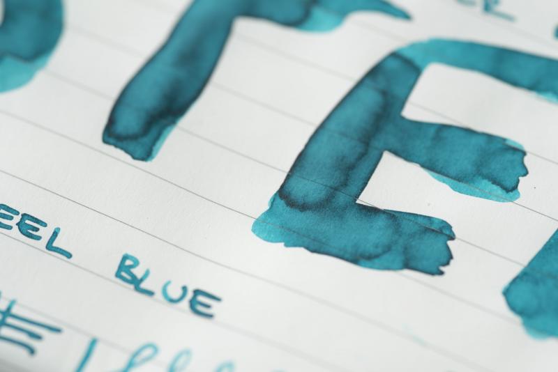
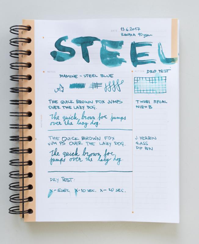
Hi folks, I have decided to finally post a review and not just spy around Diamine Steel Blue is easily one of my favourite Diamine colours, it's that happy-teal-colour family which we cannot get enough of I took couple of notebooks and written a page to demonstrate what the ink looks like on each paper. Please do let me know if there are any other papers you'd like to see...so far we have Leuchtturm, Rhodia White & Ivory and Tomoe River. Enjoy! Mishka (^_~)

-
Hello inky friends! I have a trusty TWSBI (?eco) piston refill pen and it is wonderful. I use diamine ink, which is lovely. However, now the little bottle is getting lower and lower, I can't get the pen in low enough to suck up the ink. I feel like there must be an obvious solution, and it probably isn't what I tried (tipping the bottle, dropping the bottle, mopping up ink). Feeling rather foolish, and the worst thing is that I have no ink in my pen!!
-
Does anyone know which inks Diamine was producing in the 90s (red inks in partcular)? Novel research. I had a character writing in Syrah, but that's wrong. Inks from the 80s which were still being produced in the 90s would also be awesome, but honestly, any inks at all definitely produced in the period would be great to know.
-
This ink has been reviewed many times, so please refer to others. This review is my subjective opinion of this ink and will differ from others. This is one of the first Diamine inks that I have tried. About a year ago, I needed some cartridges for an upcoming trip, and ordered Diamine Turquoise for both the price and color of the ink. I have been pleasantly surprised with this ink. It is not a pretentious ink. It is a lovely color of turquoise - not too blue and not too green - just unashamedly turquoise. It reminds me of the beautiful turquoise skies in Arizona, and of my husband's hobby of collecting rare and beautiful turquoise gemstones. But the behavior of this ink is not pretentious either. I noticed little to no sheen even on Tomoe River paper, but some shading is evident on Tomoe River and Rhodia papers. It is clearly a smooth writing ink - minimally lubricated but with nice flow. And it dries fairly fast, which is always a positive for left handers. It is also fairly water resistant. I did notice on some cheap papers that there was an expected bit of feathering and bleedthrough when I used a wet stub, and some showthrough on Tomoe River paper. My overall opinion: 7.5 out of 10 - a solid, hardworking turquoise ink!
-
http://inks.pencyklopedia.pl/wp-content/uploads/Diamine-Sherwood-Green-nazwa.png Manufacturer: Diamine Series, colour: Sherwood Green Pen: Waterman Hemisphere "F" Paper: Image Volume 80 g / cm2 Specifications: Flow rate: good Lubrication: good Bleed through: possible point Shading: noticeable Feathering: unnoticeable Saturation: very good A drop of ink smeared with a nib http://inks.pencyklopedia.pl/wp-content/uploads/Diamine-Sherwood-Green-kleks.jpg The ink smudged with a cotton pad http://inks.pencyklopedia.pl/wp-content/uploads/Diamine-Sherwood-Green-wacik.jpg Lines http://inks.pencyklopedia.pl/wp-content/uploads/Diamine-Sherwood-Green-kreski.jpg Water Resistance http://inks.pencyklopedia.pl/wp-content/uploads/Diamine-Sherwood-Green-woda.jpg Sample text http://inks.pencyklopedia.pl/wp-content/uploads/Diamine-Sherwood-Green-txt.jpg Ink drying time ca. 10 sec. Other tests carried out: Sample text in an Oxford notebook http://inks.pencyklopedia.pl/wp-content/uploads/Diamine-Sherwood-Green-Oxford.jpg Sample letters in a Rhodia notebook http://inks.pencyklopedia.pl/wp-content/uploads/Diamine-Sherwood-Green-Rhodia.jpg Ink drops on a handkerchief http://inks.pencyklopedia.pl/wp-content/uploads/Diamine-Sherwood-Green-chromatografia1.jpg Chromatography http://inks.pencyklopedia.pl/wp-content/uploads/Diamine-Sherwood-Green-chromatografia2.jpg
-
http://inks.pencyklopedia.pl/wp-content/uploads/Diamine-150th-Anniversary-Terracotta-nazwa.png I present to test the ink Diamine 150th Anniversary Terracotta with a beautiful terracotta color. Ink very well written, very quickly dries out and beautifully shades already at nib F. The ink was developed to celebrate the 150 th anniversary of the company Diamine. The series consists of 8 new colors not available in the standard palette, packaged in a triangular bottle that set the sides together form a closed circle. I would recommend. Manufacturer: Diamine Series, colour: 150th Anniversary Terracotta Pen: Waterman Hemisphere, nib "F" Paper: Image Volume (80 g / m2) Specifications: Flow rate: good Lubrication: good Bleed through: unnoticeable Shading: noticeable Feathering: unnoticeable Saturation: good A drop of ink smeared with a nib http://inks.pencyklopedia.pl/wp-content/uploads/Diamine-150th-Anniversary-Terracotta-kleks.jpg The ink smudged with a cotton pad http://inks.pencyklopedia.pl/wp-content/uploads/Diamine-150th-Anniversary-Terracotta-wacik.jpg Lines http://inks.pencyklopedia.pl/wp-content/uploads/Diamine-150th-Anniversary-Terracotta-kreski.jpg Water Resistance http://inks.pencyklopedia.pl/wp-content/uploads/Diamine-150th-Anniversary-Terracotta-woda.jpg Ink drying time http://inks.pencyklopedia.pl/wp-content/uploads/Diamine-150th-Anniversary-Terracotta-wysychanie.jpg Ink drops on a handkerchief http://inks.pencyklopedia.pl/wp-content/uploads/Diamine-150th-Anniversary-Terracotta-chromatografia1.jpg Chromatography http://inks.pencyklopedia.pl/wp-content/uploads/Diamine-150th-Anniversary-Terracotta-chromatografia2.jpg Sample text http://inks.pencyklopedia.pl/wp-content/uploads/Diamine-150th-Anniversary-Terracotta-txt.jpg Sample text in an Oxford notebook A5 (90 g / m2) http://inks.pencyklopedia.pl/wp-content/uploads/Diamine-150th-Anniversary-Terracotta-Oxford.jpg Sample letters in a Rhodia notebook No 16 (90 g / m2) http://inks.pencyklopedia.pl/wp-content/uploads/Diamine-150th-Anniversary-Terracotta-Rhodia.jpg
-
http://inks.pencyklopedia.pl/wp-content/uploads/Diamine-150th-Anniversary-Blue-Velvet-nazwa.png I present to test the ink Diamine 150th Anniversary of Blue Velvet with a beautiful, deep shade of blue. Very well saturated with ink. Super fast drying. Same advantages. The ink was developed to celebrate the 150 th anniversary of the company Diamine. The series consists of 8 new colors not available in the standard palette, packaged in a triangular bottle that set the sides together form a closed circle. I would recommend. Manufacturer: Diamine Series, colour: 150th Anniversary Blue Velvet Pen: Waterman Hemisphere, nib "F" Paper: Image Volume (80 g / m2) Specifications: Flow rate: good Lubrication: good Bleed through: noticeable Shading: noticeable Feathering: unnoticeable Saturation: very good A drop of ink smeared with a nib http://inks.pencyklopedia.pl/wp-content/uploads/Diamine-150th-Anniversary-Blue-Velvet-kleks.jpg The ink smudged with a cotton pad http://inks.pencyklopedia.pl/wp-content/uploads/Diamine-150th-Anniversary-Blue-Velvet-wacik.jpg Lines http://inks.pencyklopedia.pl/wp-content/uploads/Diamine-150th-Anniversary-Blue-Velvet-kreski.jpg Water Resistance http://inks.pencyklopedia.pl/wp-content/uploads/Diamine-150th-Anniversary-Blue-Velvet-woda.jpg Ink drying time http://inks.pencyklopedia.pl/wp-content/uploads/Diamine-150th-Anniversary-Blue-Velvet-wysychanie.jpg Ink drops on a handkerchief http://inks.pencyklopedia.pl/wp-content/uploads/Diamine-150th-Anniversary-Blue-Velvet-chromatografia1.jpg Chromatography http://inks.pencyklopedia.pl/wp-content/uploads/Diamine-150th-Anniversary-Blue-Velvet-chromatografia2.jpg Sample text http://inks.pencyklopedia.pl/wp-content/uploads/Diamine-150th-Anniversary-Blue-Velvet-txt.jpg Sample text in an Oxford notebook A5 (90 g / m2) http://inks.pencyklopedia.pl/wp-content/uploads/Diamine-150th-Anniversary-Blue-Velvet-Oxford.jpg Sample letters in a Rhodia notebook No 16 (90 g / m2) http://inks.pencyklopedia.pl/wp-content/uploads/Diamine-150th-Anniversary-Blue-Velvet-Rhodia.jpg
-
http://inks.pencyklopedia.pl/wp-content/uploads/Diamine-150th-Anniversary-Blue-Black-nazwa.png I present to test the ink Diamine 150th Anniversary Blue Black with a wonderful, very saturated blue-black. Perfectly given the nature of blue-black. Good performance, quite fast drying. I think that the ink is worth buying. Manufacturer: Diamine Series, colour: 150th Anniversary Blue Black Pen: Waterman Hemisphere, nib "F" Paper: Image Volume (80 g / m2) Specifications: Flow rate: good Lubrication: good Bleed through: possible point (copy paper, paper Oxford) Shading: noticeable Feathering: unnoticeable Saturation: very good A drop of ink smeared with a nib http://inks.pencyklopedia.pl/wp-content/uploads/Diamine-150th-Anniversary-Blue-Black-kleks.jpg The ink smudged with a cotton pad http://inks.pencyklopedia.pl/wp-content/uploads/Diamine-150th-Anniversary-Blue-Black-wacik.jpg Lines http://inks.pencyklopedia.pl/wp-content/uploads/Diamine-150th-Anniversary-Blue-Black-kreski.jpg Water Resistance http://inks.pencyklopedia.pl/wp-content/uploads/Diamine-150th-Anniversary-Blue-Black-woda.jpg Ink drying time http://inks.pencyklopedia.pl/wp-content/uploads/Diamine-150th-Anniversary-Blue-Black-wysychanie.jpg Ink drops on a handkerchief http://inks.pencyklopedia.pl/wp-content/uploads/Diamine-150th-Anniversary-Blue-Black-chromatografia1.jpg Chromatography http://inks.pencyklopedia.pl/wp-content/uploads/Diamine-150th-Anniversary-Blue-Black-chromatografia2.jpg Sample text http://inks.pencyklopedia.pl/wp-content/uploads/Diamine-150th-Anniversary-Blue-Black-txt.jpg Sample text in an Oxford notebook A5 (90 g / m2) http://inks.pencyklopedia.pl/wp-content/uploads/Diamine-150th-Anniversary-Blue-Black-Oxford.jpg Sample letters in a Rhodia notebook No 16 (90 g / m2) http://inks.pencyklopedia.pl/wp-content/uploads/Diamine-150th-Anniversary-Blue-Black-Rhodia.jpg
-
http://inks.pencyklopedia.pl/wp-content/uploads/Diamine-Amazing-Amethyst-nazwa.png Manufacturer: Diamine Series, colour: Amazing Amethyst Pen: Waterman Hemisphere "F" Paper: Image Volume 80 g / cm2 1. A drop of ink smeared with a nib http://inks.pencyklopedia.pl/wp-content/uploads/Diamine-Amazing-Amethyst-kleks.png 2. The ink smudged with a cotton pad http://inks.pencyklopedia.pl/wp-content/uploads/Diamine-Amazing-Amethyst-wacik.png 3. Lines http://inks.pencyklopedia.pl/wp-content/uploads/Diamine-Amazing-Amethyst-kreski.png 4. Water Resistance http://inks.pencyklopedia.pl/wp-content/uploads/Diamine-Amazing-Amethyst-woda.png 5. Ink drops on a handkerchief http://inks.pencyklopedia.pl/wp-content/uploads/Diamine-Amazing-Amethyst-chromatografia_1.png 6. Sample text http://inks.pencyklopedia.pl/wp-content/uploads/Diamine-Amazing-Amethyst-txt.png Parametry techniczne: 7. Flow rate: good 8. Lubrication: average 9. Bleed through: a noticeable 10. Shading: noticeable 11. Feathering: unnoticeable 12. Saturation: good 13. Ink drying time: ~ 5 sec. Other tests carried out: 13. Sample text in an Oxford notebook http://inks.pencyklopedia.pl/wp-content/uploads/Diamine-Amazing-Amethyst-oxford.png 14. Sample letters in a Rhodia notebook http://inks.pencyklopedia.pl/wp-content/uploads/Diamine-Amazing-Amethyst-rhodia.png 15. Chromatography http://inks.pencyklopedia.pl/wp-content/uploads/Diamine-Amazing-Amethyst-chromatografia_2.png
-
http://inks.pencyklopedia.pl/wp-content/uploads/Diamine-Crimson-nazwa.png Manufacturer: Diamine Series, colour: Crimson Pen: Waterman Hemisphere "F" Paper: Image Volume 80 g / cm2 Specifications: Flow rate: good Lubrication: good Bleed through: possible point Shading: noticeable Feathering: unnoticeable Saturation: very good A drop of ink smeared with a nib http://inks.pencyklopedia.pl/wp-content/uploads/Diamine-Crimson-kleks.jpg The ink smudged with a cotton pad http://inks.pencyklopedia.pl/wp-content/uploads/Diamine-Crimson-wacik.jpg Lines http://inks.pencyklopedia.pl/wp-content/uploads/Diamine-Crimson-kreski.jpg Water Resistance http://inks.pencyklopedia.pl/wp-content/uploads/Diamine-Crimson-woda.jpg Sample text http://inks.pencyklopedia.pl/wp-content/uploads/Diamine-Crimson-txt.jpg Ink drying time ca. 5 sec. Other tests carried out: Sample text in an Oxford notebook http://inks.pencyklopedia.pl/wp-content/uploads/Diamine-Crimson-Oxford.jpg Sample letters in a Rhodia notebook http://inks.pencyklopedia.pl/wp-content/uploads/Diamine-Crimson-Rhodia.jpg Ink drops on a handkerchief http://inks.pencyklopedia.pl/wp-content/uploads/Diamine-Crimson-chromatografia1.jpg Chromatography http://inks.pencyklopedia.pl/wp-content/uploads/Diamine-Crimson-chromatografia2.jpg
-
http://inks.pencyklopedia.pl/wp-content/uploads/Diamine-Amber-nazwa.png Manufacturer: Diamine Series, colour: Amber Pen: Waterman Hemisphere "F" Paper: Image Volume 80 g / cm2 Specifications: Flow rate: weak Lubrication: good Bleed through: unnoticeable Shading: noticeable Feathering: unnoticeable Saturation: good A drop of ink smeared with a nib http://inks.pencyklopedia.pl/wp-content/uploads/Diamine-Amber-kleks.jpg The ink smudged with a cotton pad http://inks.pencyklopedia.pl/wp-content/uploads/Diamine-Amber-wacik.jpg Lines http://inks.pencyklopedia.pl/wp-content/uploads/Diamine-Amber-kreski.jpg Water Resistance http://inks.pencyklopedia.pl/wp-content/uploads/Diamine-Amber-woda.jpg Sample text http://inks.pencyklopedia.pl/wp-content/uploads/Diamine-Amber-txt.jpg Ink drying time ca. 5 sec. Other tests carried out: Sample text in an Oxford notebook http://inks.pencyklopedia.pl/wp-content/uploads/Diamine-Amber-Oxford.jpg Sample letters in a Rhodia notebook http://inks.pencyklopedia.pl/wp-content/uploads/Diamine-Amber-Rhodia.jpg Ink drops on a handkerchief http://inks.pencyklopedia.pl/wp-content/uploads/Diamine-Amber-chromatografia1.jpg Chromatography http://inks.pencyklopedia.pl/wp-content/uploads/Diamine-Amber-chromatografia2.jpg
-
http://inks.pencyklopedia.pl/wp-content/uploads/Diamine-Bilberry-nazwa.png Manufacturer: Diamine Series, colour: Bilberry Pen: Waterman Hemisphere "F" Paper: Image Volume 80 g / cm2 Specifications: Flow rate: good Lubrication: good Bleed through: possible point Shading: noticeable Feathering: unnoticeable Saturation: very good A drop of ink smeared with a nib http://inks.pencyklopedia.pl/wp-content/uploads/Diamine-Bilberry-kleks.jpg The ink smudged with a cotton pad http://inks.pencyklopedia.pl/wp-content/uploads/Diamine-Bilberry-wacik.jpg Lines http://inks.pencyklopedia.pl/wp-content/uploads/Diamine-Bilberry-kreski.jpg Water Resistance http://inks.pencyklopedia.pl/wp-content/uploads/Diamine-Bilberry-woda.jpg Sample text http://inks.pencyklopedia.pl/wp-content/uploads/Diamine-Bilberry-txt.jpg Ink drying time ca. 10 sec. Other tests carried out: Sample text in an Oxford notebook http://inks.pencyklopedia.pl/wp-content/uploads/Diamine-Bilberry-Oxford.jpg Sample letters in a Rhodia notebook http://inks.pencyklopedia.pl/wp-content/uploads/Diamine-Bilberry-Rhodia.jpg Ink drops on a handkerchief http://inks.pencyklopedia.pl/wp-content/uploads/Diamine-Bilberry-chromatografia1.jpg Chromatography http://inks.pencyklopedia.pl/wp-content/uploads/Diamine-Bilberry-chromatografia2.jpg
-
http://inks.pencyklopedia.pl/wp-content/uploads/Diamine-Blue-Black-nazwa.png Manufacturer: Diamine Series, colour: Blue Black Pen: Waterman Hemisphere "F" Paper: Image Volume 80 g / cm2 Specifications: Flow rate: good Lubrication: good Bleed through: unnoticeable Shading: noticeable Feathering: unnoticeable Saturation: very good A drop of ink smeared with a nib http://inks.pencyklopedia.pl/wp-content/uploads/Diamine-Blue-Black-kleks.jpg The ink smudged with a cotton pad http://inks.pencyklopedia.pl/wp-content/uploads/Diamine-Blue-Black-wacik.jpg Lines http://inks.pencyklopedia.pl/wp-content/uploads/Diamine-Blue-Black-kreski.jpg Water Resistance http://inks.pencyklopedia.pl/wp-content/uploads/Diamine-Blue-Black-woda.jpg Sample text http://inks.pencyklopedia.pl/wp-content/uploads/Diamine-Blue-Black-txt.jpg Ink drying time ca. 5-10 sec. Other tests carried out: Sample text in an Oxford notebook http://inks.pencyklopedia.pl/wp-content/uploads/Diamine-Blue-Black-Oxford.jpg Sample letters in a Rhodia notebook http://inks.pencyklopedia.pl/wp-content/uploads/Diamine-Blue-Black-Rhodia.jpg Ink drops on a handkerchief http://inks.pencyklopedia.pl/wp-content/uploads/Diamine-Blue-Black-chromatografia1.jpg Chromatography http://inks.pencyklopedia.pl/wp-content/uploads/Diamine-Blue-Black-chromatografia2.jpg
-
Diamine Ancient Copper has been reviewed at length, I arrived at it looking for an alternative to Montblanc Leonardo and other inks; it's a good looking ink, but it didn't do it for me, so I gave it way; this is what remains in a Lamy Vista with an F nib. The paper is Fabriano Ecoqua, it seems to bring out the best of several inks, it's smooth and dries much faster than Clairefontaine and Rhodia. First row of other colours: Ama Iro, Kon Peki, Souten, Équinoxe 6, Tsuyu Kusa, Asa Gao. Second row: Inti, Ina Ho, Lie de Thé, Yama Guri, Ajisai, Myosotis. Third row: Chiku Rin, Vert Empire, Verde Muschiato, Perle Noire x 2, Verdigris. Fourth row: Orange Indien, Fuyu Gaki, Mandarin, Poppy Red, Rouge Hematite.
-
My second CRV ever. Thank you, amberleadavis! I'm glad I got to see so many inks. I had never seen any of them on paper in person. These are not all the pages, I'm trying to come up with things to doodle in the other pages. Seitz-Kreuznach Palm Green and Pelikan 4001 Dark Green. Seitz-Kreuznach Palm Green + Rohrer & Klingner Verdigris
-
I have mixed feelings about Diamine inks - I like the variety of colors and their intensity but many of them aren't well behaved (they tend to clog pens, cause nib creep / nib crud). Ancient Copper has amazing color that I enjoy a lot but it causes terrible nib creep / nib crud. It's almost artistic in its expression: http://imageshack.us/a/img560/2622/ogfj.jpg http://imageshack.us/a/img541/2440/g8gp.jpg http://imageshack.us/a/img833/8135/uprn.jpg Still, the color is great http://imageshack.com/a/img540/4342/4izB4I.jpg Kitchen towel http://imageshack.com/a/img909/2676/M2Ee1F.jpg Software ID: http://imageshack.com/a/img912/2886/sqmbNe.jpg Color range http://imageshack.com/a/img674/8295/rAHj6j.jpg Linum notebook - TWSBI 580, stub 1,1 http://imageshack.com/a/img673/5459/jC1zze.jpg http://imageshack.com/a/img913/9102/396plh.jpg http://imageshack.com/a/img673/3589/6bhDpM.jpg
-

Diamine Sunshine Yellow, Robert Oster Yellow Sunset, Diamine Amber, Robert Oster Peach
Jan2016 posted a topic in Ink Comparisons
Not the same, but all 4 pretty close to each other, see the chromo's -

More New Diamine Packaging - 30Ml Bottles And Cartridges!
The Good Captain posted a topic in Inky Thoughts
There have been changes to the packaging of Diamine's 30ml bottles and cartridges as well, as some of you might already know. My photos from my phone don't do them justice, but then although I'm a professional photographer - albeit retired! - I never did 'macro' stuff at all. So you'll just have to take my word for it. The theme continues with the boxes for the 80ml bottles, with a coloured and labelled 'swatch' of the relevant ink: on the label for the 30ml bottle and on the boxes of the 18 and six cartridges. They look a whole lot better I must. Judge for yourselves but don't let my pictures put you off...! I think that Diamine have made a big step forward with their whole new product concept and long may it continue! -

Ink Shoot-Out : Diamine Jade Green Vs Robert Oster Sublime
namrehsnoom posted a topic in Ink Comparisons
Ink Shoot-Out : Diamine Jade Green vs Robert Oster Sublime Winter is coming to my part of the world, which means that outside it’s damp and dark and depressing. Well… never mind – there’s always an ink to improve your mood, and make you think of the spring season with yellow-green grassy colours. I got a sample of Robert Oster Sublime from Catherine at Sakura, and couldn’t miss the similarities with Diamine Jade Green. Time to do a detailed comparison, and find out which of these is the better ink. Enter... the Ink Shoot-Out. A brutal fight spanning five rounds, where (in this case) featherweight inks do battle to determine who is the winner. In the left corner – the English reigning champion: Diamine Jade Green. In the right corner, the challenger from Australia, Robert Oster Sublime. Let’s get a big round of applause for our champions! May the best ink win… Round 1 - First Impressions These are indeed featherweight inks … a very light yellow-green colour, with little contrast to the page with my Lamy Safari M-nib on Rhodia N°16 notepad paper. These inks are not my piece of cake … my guess is that they require broad nibs and non-glossy paper to shine. Both inks are a type of lime-green or yellow-green, that looks fresh and reminds me of springtime. They look quite similar, but there are some differences: Jade Green wrote much drier than Robert Oster Sublime, resulting in a less saturated line of text, and really low contrast with the paper.RO Sublime has visibly more yellow undertonesIn my opinion, shading with Sublime looks nicer than with Jade GreenOn first impression I preferred the more yellow-green appearance of Sublime. In comparison, Diamine Jade Green is more of a lime-green type of ink. Also, the RO ink was much better lubricated and wetter - Diamine Jade Green wrote really dry and the written text looks too undersaturated for my taste. As such, this round is a definite win for the Australian challenger. Well done, matey! Round 2 - Writing Sample The writing sample was done on Rhodia N°16 Notepad with 80 gsm paper. Both inks behaved flawlessly, with no feathering and no show-through or bleed-through. With the fine nibs, Diamine was a noticeably drier ink – in comparison, Sublime was much more pleasant to write with. With the broad nib, both inks were on par with each other. The Robert Oster ink disappointed with the EF nib – here the writing looks really spindly and ugly. The Diamine ink handled the EF nib much better. Colourwise both inks look similar in writing, although there is definitely more of a yellow undertone in the Robert Oster ink. Both inks also shade nicely, without too much contrast between light and dark parts. This aesthetically pleasing shading gives more character to your writing. For this round, the focus is on writing, and here both inks showed some weak points. RO Sublime lost points with the EF nib, and Diamine lost points because of its drier writing. Neither ink made impressive moves in this round – the crowd is boo-ing and urging the combatants to put more spirit into the fight. As far as the judge is concerned, this round ends in a draw. Round 3 - Pen on Paper This round allows the batlling inks to show how they behave on a range of fine writing papers. From top to bottom, we have : FantasticPaper, Life Noble, Tomoe River and Original Crown Mill cotton paper. All scribbling and writing was done with a Lamy Safari M-nib. Both champions did well, with no show-through nor bleed-through. But this round is not about technicalities, it is about aesthetics and beauty. Are the fighters able to make the paper shine ? One thing is immediately apparent: being yellow-green inks, you should not use them on yellowish paper, where these inks lose their punch, and look drab and uninteresting. The inks did really well on the more absorbent Fantasticpaper (top), where they look glorious. In written text, Robert Oster Sublime leaves a more saturated line, and manages to look a bit better. Personally, I also prefer the heavier yellow undertones in the RO ink. Both inks are on par with each other, but Sublime has a slight advantage in the looks department. For this round, victory is granted to Sublime. Not a knock-out, but definitely a win on points. Round 4 - Ink Properties Diamine Jade Green dried quickly around the 10 second mark, with RO Sublime taking almost double this time to dry. As such, you need to be more careful with the Robert Oster ink not to smudge your writing. Even with a dried line, Robert Oster Sublime is much more prone to smudging – this is really obvious when dragging a moist Q-tip cotton swab across the text lines. To test water resistance, I dripped water on the grid and let it sit there for 15 minutes, after which I removed the water with a paper towel. Both inks are completely lost in this situation. All the ink disappears, and no readable residue is left. Your writing will be lost forever! This is also clear from the bottom part of the chromatography, that clearly shows that the ink completely detaches from the paper. For this round, another disappointing fight. Neither champion offered strong moves, although Diamine scored a point for its smudge resistance. This round goes to the English ink, on points. But c’mon guys, a bit more spirit ! We want to see some punches ! Round 5 - The Fun Factor Welcome to the final round. Here I give you a purely personal impression of both inks, where I judge which of them I like most when doing some fun stuff like doodling and drawing. Both inks do well, and allow for some nice effects when using a water brush. I really enjoyed using them. For drawing though, there really is no competition. Robert Oster Sublime completely overshadows Diamine Jade Green. First of all, Sublime is a wetter ink, making it easier to draw with … LEFT HOOK … It also leaves a much more saturated line, giving more punch to your drawings … RIGHT HOOK … Personally, I also prefer the more complex look of Sublime, with its heavier yellow undertones – which makes it the more beautiful ink for drawing … UPPERCUT … and knock-out !!! The crowds are cheering. This round is a definite win for the Australian champion. The Verdict Both inks are fine yellow-green inks, that really need broad nibs and absorbent white paper if you want to use them for writing. For drawing, they are a great choice, and look very fresh and beautiful. But counting the points, the story is clear: Diamine Jade Green manages to win only one round on points. The Australian Robert Oster Sublime wins one round on points, and delivers a resounding knock-out in the fifth round. This fight thus has a clear winner: Robert Oster Sublime ! -
Thank you Tas for sending me the sample of Blue Velvet. I have mixed feelings about Diamine inks - I like them but I find many of them risky (they tend to clog pens, cause nib creep / nib crud). The colors are pretty awesome though. As many of you already know there are sopme new Diamine inks on the market. Tas has kindly sent me samples of two of them. Blue Velvet is nice and it flows really smoothly in TWSBI stub. http://imageshack.com/a/img538/8199/Pgznn1.jpg Kitchen towel http://imageshack.com/a/img633/1184/ISvuni.jpg Software ID: http://imageshack.com/a/img661/1861/Mi1XyP.jpg Color range http://imageshack.com/a/img538/5061/IPx6WT.jpg Linum notebook - TWSBI 580, stub 1,1 http://imageshack.com/a/img538/4563/xcrsVG.jpg http://imageshack.com/a/img537/4479/pjT3P6.jpg http://imageshack.com/a/img673/6936/MENnXu.jpg http://imageshack.com/a/img537/8397/XECwKO.jpg
-
Manufacturers since 1864, Diamine Inks relocated to this purpose built 'state of the art' factory in Liverpool in 1925, where they successfully carried on using the traditional methods and formulas for ink production. Over the years the company has changed hands and are now located close to the world famous Aintree Race Course. Diamine offers plenty of inks in few lines. At the moment their standard line consists of more than one hundred inks and each year new ones appear. In 2017 a new ink chosen by fountain pens subreddit users was added to the line. After hearing words Earl Grey I expected something brown. And yet it's not the case. Earl Grey is purplish grey. The ink is pretty well behaved and flows nicely from the pen. The ink is reasonably saturated and pleasant to use. Lubrication could be better but it's acceptable. Ink Splash Drops of ink on kitchen towel Color ID Color range Copy paper, TWSBI Mini, stub 1.1 Fabriano, TWSBI Mini, stub 1.1 Rhodia, TWSBI Mini, stub 1.1 Water resistance
-
Pumpkin is cool. It's not very eloquent to say this but that's what I think This ink is really, really cool. Saturated, well-behaved (OK, it CAN cause some nib creep but it's just small inconvenience that won't stop me from using it). If you like oranges you can also check my comparison of 32 oranges and yellows. INK SPLASH http://imageshack.com/a/img540/8832/UVsd0x.jpg DROPS OF INK ON KITCHEN TOWEL http://imageshack.com/a/img912/3580/IAiaWF.jpg SOFTWARE IDENTIFICATION / COLOR RANGE http://imageshack.com/a/img661/4674/qbQeMe.jpg COLOR RANGE http://imageshack.com/a/img538/9638/VMRc6h.jpg Review written with Kaweco Sport B http://imageshack.com/a/img909/3142/hXtvPc.jpg Calendar http://imageshack.com/a/img673/1754/UAjalR.jpg http://imageshack.com/a/img908/1223/WqgGD9.jpg COPY PAPER http://imageshack.com/a/img908/8452/TvN1is.jpg http://imageshack.com/a/img911/9281/t6SZ3P.jpg http://imageshack.com/a/img913/4605/xGO8o4.jpg
-
Hello again to all my FP friends, [This review has been sitting on my desk for months and I finally got around to posting it. Stay tuned for a comparison of Diamine Cornflower and Penbbs #116 Cornflower.] Diamine needs no introduction on this board. Suffice it to say that they have been making inks for over a century and produce many, many beautiful hues, a lot of which are prone to feathering and bleed through on everyday office paper. This ink up for review is from Diamine’s Flower Series. It is named after the cornflower (centaurea cyanus) which can be various shades of blue or lavender. I’ve never seen the flower in person, but by just comparing with various photographs online, the ink looks like a pretty good match to the flower. Diamine Cornflower is a deep and very saturated blue with a dash of purple. This ink dries quickly on absorbent paper, but has an average dry time on nicer papers. Sheening is nice and shading possible with wet nibs on good paper. It can be quite a stunning color with the write combination. Unfortunately, this ink’s downfall as a daily work ink is its tendency to feather and bleed through. Although feathering with finer nibs wasn’t too bad on copy paper, even the Japanese fine nib produced noticeable bleed. Water resistance is passible; a dark purplish line remains legible. This is a lovely vibrant color that reminds me of a dark counterpart to Noodler’s Baystate Blue. The color is also standard enough that it could be used in most professional environments. They only thing that keeps me from buying a bottle is that the feathering and bleed through make it impossible to use on any paper I would run into outside the house. However, if you like saturated, slightly purplish dark blues and mostly use good paper, then this is not an ink you’ll want to miss. *A special thanks to lapis for sending a sample of this ink to me! Pens used (in order): 1. Pilot 78G Fine 2. Lamy Safari Broad 3. Pilot Plumix Italic 4. Noodler’s Nib Creaper Flex 5. Hero 5028 1.9mm Stub Swab Paper Towel Drop 80gsm Rhodia Tomoe River *Many thanks to Lord Epic for kindly sending me some of this paper! Check out that subtle sheen! 70gms Deli Copy Paper Moleskine Water Resistance Comparison (More blues to be added later) Thanks for reading! SDG
-
I've got a Faber Castell Ambition inked-up with Diamine Eclipse. Unfortunately it drys out after a couple of days of not being used. I'm not sure if this is a function of the pen's nib (it has no breather hole), the ink, the cap, or the storage. It is stored with many other Waterman and Kaweco pens in a dry box - none of which exhibit this problem. Can anyone provide any insight into this problem? Having to dip the pen and invariably getting ink on my fingers each time I use it , is frustrating and discouraging its use. Will a change of ink make a difference? thanks tbzbbt
-
Manufacturers since 1864, Diamine Inks relocated to this purpose built 'state of the art' factory in Liverpool in 1925, where they successfully carried on using the traditional methods and formulas for ink production. Over the years the company has changed hands and are now located close to the world famous Aintree Race Course http://www.diamineinks.co.uk/images/DimaineFactory.gif http://www.diaminein...uk/AboutUs.aspx As I've mentioned few times I have mixed feelings about Diamine inks, however I tend to use them from time to time. They have some amazing colors. Last year Diamine inks introduced their 150th anniversary inks in triangle bottles: http://www.diamineinks.co.uk/images/BB_TerracotaL.jpg http://www.stilografica.it/writable/Oggetti/Inchiostro%20boccetta/Diamine%20150th%20Anniversary%20Collection%20Ink.jpg There are eight colors in this series of inks: Blue Black Blue Velvet Carnival Regency Blue Safari Silver Fox Terracota Tropical Green Regency Blue is quite nice, not the color I would often use but I appreciate its depth / intensity. Ink splash http://imageshack.com/a/img908/2366/JAe1C7.jpg Drops of ink on kitchen towel http://imageshack.com/a/img913/9831/Myb7Hg.jpg Software ID: http://imageshack.com/a/img901/6517/iB2QsB.jpg Color range http://imageshack.com/a/img631/6564/U8iFIs.jpg Oxford recycled - Kaweco Sport Classic, eyedropper, B http://imageshack.com/a/img538/1132/r21V0s.jpg http://imageshack.com/a/img673/9721/yUbdO5.jpg http://imageshack.com/a/img540/4968/W3mJL5.jpg http://imageshack.com/a/img913/2379/XPoUXy.jpg Comparison http://imageshack.com/a/img540/134/NruqvT.jpg