Search the Community
Showing results for tags 'diamine'.
-
desaturated.thumb.gif.5cb70ef1e977aa313d11eea3616aba7d.gif)
Diamine Inkvent (Blue Edition) Seasons Greetings – a lazy review
A Smug Dill posted a topic in Ink Reviews
Earlier in 2020, Diamine released the 25 ink colours that it produced and included in its Inkvent (2019 advent calendar) product as separate retail products in four-legged 50ml Blue Edition bottles. The inks in the series are categorised as standard, sheening, and shimmering — and each is priced accordingly. Seasons Greetings is one of the sheening inks. Base colour: Dark teal Flow: Moderate Feathering: Not observed on Rhodia Dotpad 80g/m² paper, looking closely at the thinnest hatching lines, and words/glyphs ‘reverse-written’ with the nib upside-down (i.e. the bottom of the feed facing up) Show-through: Low to nil Bleed-through: Not observed Drying time: A smidgen over 20 seconds Smudging after fully dry: A small amount; this ink is slightly susceptible to being re-wetted by the moisture on one's fingertips. I rubbed my dry thumb over the stippling dots (just after the scan shown above was done), and that caused some very minor streaking that took a loupe to spot. However, just now when I was handling the ink review sheet over 48 hours later, I managed to smudge some of smaller Japanese characters Water resistance: So apparently poor that I don't think I need to soak some part of the sheet for an hour or so Shading: Negligible. In spite of the apparent shading in the image above, the darker parts are actually manifestations of sheen; see image below. (I confirmed it by checking the ink review sheet under a loupe and a bright LED lamp.) Sheen: Plenty of pink sheen, evident in almost every ink mark on the page, other than the thinnest and driest of the hatching lines I did by ‘reverse-writing’ (with nib upside-down and the bottom of the feed facing up) which apparently this pen-and-ink combination, or maybe just the pen, doesn't support Shimmer: None My thoughts: Now that I have detected a bit more susceptibility to smudging with this ink, I might have to rethink whether I feel comfortable using it to write in my journals and notebooks of which the content I intend to revisit. Nevertheless, the degree of smudging doesn't seem to be quite as severe as with some other Diamine (ultra-)sheening inks such as Iridescink Herbert or November Rain. -
-
Diamine Dark Forest (150th Anniversary II) The ink maker from Liverpool is one of the staple brands in ink-land. They consistently produce solid inks for a very reasonable price. In 2017, Diamine released their second ink series to commemorate their 150th Anniversary. I obtained my set shortly thereafter, but more or less forgot about them when my attention drifted to Japanese inks. About time to do the reviews. Fortunately, these anniversary inks are still easily obtainable, so if you like what you see you can still get them. Diamine Dark Forest is another lovely ink in this Anniversary series. A dark & saturated green with strong blue undertones. My first reaction when seeing the ink was “definitely a dark green”. And then I got like “hmm… maybe a dark teal… lots of blue in there”. And after preparing the review material, I got to “well… not a teal yet, but going there.” I love it when inks leave the well-trodden path, and meander between the colour lines. More often then not they gain in complexity and beauty. Dark Forest is no exception – I find it to be a very interesting ink with lots of depth. This Diamine ink is very saturated and lays down a dark blue-green line when writing. With a wet-writing pen, the colour can almost turn black. Where the ink gets overly saturated, you can often glimpse a reddish sheen. I like it that the ink looks totally different, depending on the wetness of the nib/pen combination. Teal-leaning in drier pens, and going dark green to green-black in wetter pens. To illustrate the colour span of this Diamine ink, I did a swab on 52 gsm Tomoe River paper, where I really saturated portions of the paper with ink. Dark Forest has a broad colour span, with a substantial difference between the light and darker parts. This translates to strong (even harsh) shading when writing. Shading is present in all nib sizes, even the finer ones. Personally, my preferences go to soft & muted inks, and this Dark Forest is quite the opposite. But still, I like the complexity of its character. On the smudge test – rubbing text with a moist Q-tip cotton swab – the ink behaved badly. Tons of smudges, although the text itself remains very readable. Water resistance is almost zero in practice – from the bottom part of the chromatography, I had expected a better result. But no, this ink is very prone to watery accidents. This makes it - for me at least - unsuited for use in the workplace. I’ve tested the ink on a wide variety of paper – from crappy Moleskine to high-end Tomoe River. On each scrap of paper I show you: An ink swab, made with a cotton Q-tip 1-2-3 pass swab, to show increasing saturation An ink scribble made with a Lamy Safari M-nib fountain pen The name of the paper used, written with a Lamy Safari B-nib A small text sample, written with the Lamy Safari M-nib Source of the quote, written with my Yard-o-Led Viceroy Standard with F-nib Drying times of the ink on the paper (with the M-nib Safari) The multi-paper writing test shows that Dark Forest can cope with a wide range of papers. With the lower-quality papers (Moleskine, copy paper) there is just a tiny bit of feathering, and a small amount of bleed-through. Drying times are in the 10-15 second range on harder paper, and around 5 seconds on the more absorbent low-quality papers (with the Lamy Safari M-nib). This dark blue-leaning green works well with both white and creamy paper. Because scans don't always capture an ink's colour and contrast with good precision, I also add a few photos to give you an alternative look on this Diamine ink. In this case, the real colour seems to sit a bit between the two. Writing with different nib sizes The picture below shows the effect of nib sizes on the writing (written on Rhodia N°16 80 gsm paper). All samples were written with a Lamy Safari. I also added a couple of visiting pens: a wet-writing Yard-o-Led Viceroy Standard Victorian, and a Pelikan M120 (which writes quite dry for a Pelikan). As you can see, the ink can look quite different depending on nib/pen combination – almost a teal in the 1.9 calligraphy nib, almost black in the Yard-o-Led. But in all cases quite saturated and with heavy shading. Related inks To compare Diamine Dark Forest with related inks, I use my nine-grid format with the currently reviewed ink at the center. This format shows the name of related inks, a saturation sample, a 1-2-3 swab and a water resistance test – all in a very compact format. The ink that comes closest in comparison is the 2017 LE ink Lamy Petrol, which has just a touch more blue. With Lamy Petrol being unobtanium these days, this Dark Forest could be the replacement you were looking for. Inkxperiment – excalibur With each review, I try to create an interesting drawing using only the ink I’m reviewing. This is often quite challenging, but it has the advantage of showing the ink’s colour range in a more artistic setting. I enjoy doing these little drawings immensely – it’s quite a fun extension of the ink hobby. Always good for a fun couple of hours. For this inkxperiment, I had zero inspiration. So I started with word associations to get me going: English ink, dark forest… medieval woods… runes and druids… Avalon… King Arthur… Excalibur. OK - good enough to get the drawing started... I used an A4 piece of HP photo paper, that I covered with a paper towel on which I dripped water-diluted ink to create the textured background. Next I used pure Dark Forest to paint in some darker patches for the stone & sword, and as a background for the runes. With the side of a piece of cardboard dipped in ink, I added the branches of the medieval forest. Finally, I used cotton Q-tips with bleach to draw in the runes and Excalibur. The result is not a masterpiece, but it gives you an idea of what can be achieved with this Diamine ink in a more artistic context. Conclusion Diamine Dark Forest is a saturated blue-leaning dark green that can look substantially different depending on your nib/pen combination – it can span the whole range from green-leaning teal to dark green black. A heavy shader that shows a bit of a reddish sheen in heavily saturated areas. For me personally, this Dark Forest is a bit too dark & harsh, but it’s certainly a complex and interesting ink. I enjoyed playing around with it. Technical test results on Rhodia N° 16 notepad paper, written with Lamy Safari, M-nib Backside of writing samples on different paper types
-
So, at one point of another... we have all said.. "Wow, I wish I could get THAT ink".. but is discontinue/expensive/unobtanium .. etc So, here is the place where you should come and check if "THAT" ink has a Doppelgänger (look-alike, double, one who nearly or completely resembles another).. I will start... I will remind you, that even the same ink looks different depending on nib/flow/paper .. so these are examples inks with the same/similar hue.. that depending on your nib/flow/paper it might look identical.. Have you heard of Sailor Tanna Japonensis (Evening Cicada).. what about Sailor Shin Zan (Deep in the Forest).. well if you can't get those, you can grab a bottle of Safari.. is cheaper, not exclusive, and easy to find. photo below... (in real person they look almost identical) Knowing how famous scanners and pictures are for not completely represent what your eyes perceived, you get both... and take my word for it.. With the right pen you can get the exact look. C.
-
Is anyone here planning on getting this year's Diamine Inkvent (Red edition) calendar? Instead of twenty-four 7ml bottles of ink, this time it comes with twenty-four 12ml bottles. The twenty-fifth bottle is still 30ml. Both Cult Pens and La Couronne du Comte have already added the product to their catalogues and taking pre-orders, and LCdC covered it in its newsletter sent out yesterday. Cult Pens says, ”Expected September”; whereas LCdC says “Available October 2021”. Given past performance, I know which retailer I'd go with, given their track records of delivery, if I wanted a jump on everyone else to review the inks on social media. Except I won't be ordering it at all. May as well sit back, wait for others to do the reviews, and then only buy specific colours in large bottles as standalone products, when they're released in several months' time.
-
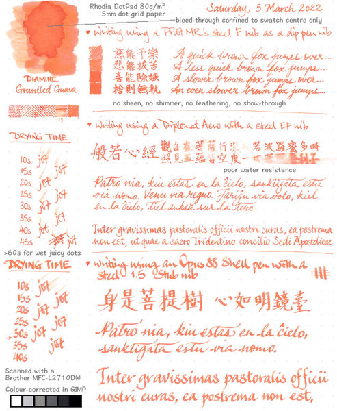
From the album: Ink review
I did this mainly just to test certain aspects of the two named pens; otherwise, I wouldn't have bothered using two different writing instruments that are both not dip pens, just the purpose of reviewing an ink.© A Smug Dill
- 0 B
- x
-
-
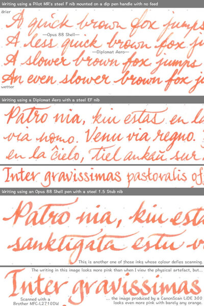
From the album: Ink review
Photographed to better represent the colour, as the scans by both my Brother MFC-L2710DW and my CanonScan LiDE 300 came out pretty much pink with very little orange.© A Smug Dill
- 0 B
- x
-
-
-
Diamine Lilac Night (150th Anniversary II) The ink maker from Liverpool is one of the staple brands in ink-land. They consistently produce solid inks for a very reasonable price. In 2017, Diamine released a second ink series to commemorate their 150th Anniversary. I obtained my set shortly thereafter, but more or less forgot about it when my attention drifted to Japanese inks. So, it's about time to do the reviews. Fortunately, these anniversary inks are still easily obtainable, so if you like what you see you can still get them. My first reaction when seeing the ink was loudly cursing Diamine… the colour shown on the box suggests a rather boring purple, which has nothing to do with the actual ink that sits within. What comes out of the bottle is a beautiful dusty grey-purple that simply looks wonderful. Curse them threefold! This treasure has been sitting in my cabinet for over 3 years, hidden away behind that bland box picture. Lilac Night has a lovely colour, reminiscent of the summer night sky some time after sunset. Dusty grey-purple with strong blue undertones. Lilacs are often delicate and playful inks, but in this case the grey tones create an aura of seriousness that makes Lilac Night very suitable for the workplace – a good replacement for more traditional blue-blacks. As can be expected from Diamine, the ink performs well, and writes a saturated line in all nib sizes. Lilac Night also exhibits fairly strong and aesthetically pleasing shading The ink itself is on the wet side: combine it with wet pens, and you get a deeply saturated line of very dark grey-purple. With dry pens the blue-lilac comes more to the front. Lilac Night prefers good quality paper. On print/copy paper it has a tendency to feather, and exhibits a fair amount of show-through and bleed-through. To illustrate the colour span of this Diamine ink, I did a swab on 52 gsm Tomoe River paper, where I really saturated portions of the paper with ink. Lilac Night has a medium colour span, with moderate contrast between the light and darker parts. This translates to soft shading when writing. Shading is prominently there, starting with F nibs and above. Really nice! On the smudge test – rubbing text with a moist Q-tip cotton swab – the ink behaved well. There is smearing, but the text itself remains crips and clear. Water resistance is only so-so: most of the dyes disappear, but a faint-puple ghost image of your original writing remains, which is still more or less readable. I’ve tested the ink on a wide variety of paper – from crappy Moleskine to high-end Tomoe River. On each scrap of paper I show you: An ink swab, made with a cotton Q-tip 1-2-3 pass swab, to show increasing saturation An ink scribble made with a Lamy Safari M-nib fountain pen The name of the paper used, written with a Lamy Safari B-nib A small text sample, written with the Lamy Safari M-nib Source of the quote, written with an Esterbrook Estie with jounaler nib Drying times of the ink on the paper (with the M-nib Safari) The multi-paper writing test shows Lilac Night’s preference for good quality paper. With cheaper copy/print paper there is visible feathering, and you also get lots of see-through and bleed-through. It’s best to use this ink with high quality hard-surface paper – that’s the paper eco-system that it prefers. Drying times for this ink are mostly in the 5-10 second range with a Lamy Safari M-nib. Because scans don't always capture an ink's colour and contrast with good precision, I also add a few photos to give you an alternative look on this Diamine ink. In this case, the scans do a better job – in the photos the ink appears too blue. Writing with different nib sizes The picture below shows the effect of nib sizes on the writing (written on Rhodia N°16 80 gsm paper). All samples were written with a Lamy Safari. I also added a couple of visiting pens: a TWSBI VAC Mini with M-nib, and an Esterbrook Estie with a journaler nib. I especially like the way Lilac Night looks with the Esterbrook: a dark grey-purple line with really nice low-contrast shading. Add the stubby nature of that nib, and you get some true eye-candy! Related inks To compare Diamine Lilac Night with related inks, I use my nine-grid format with the currently reviewed ink at the center. This format shows the name of related inks, a saturation sample, a 1-2-3 swab and a water resistance test – all in a very compact format. I have no other ink like it. The closest I have is TACCIA aomurasaki, which is a darker grey-purple with less blue in the mix. Inkxperiment – shattered As a personal challenge, I try to create interesting drawings using only the ink I’m reviewing. I find this to be a fun extension of the hobby, and these single-ink drawings always push my creativity. These inkxperiments are great for exploring the colour-range nuances that are present in the ink. I love doing them! Inspiration for this drawing comes from the COVID19 pandemic that has been defining our lives for way too long. At work, I have colleagues that have been screen images in video calls for almost 2 years now, instead of human beings of flesh and blood. And looking around at our society, I can’t help but notice that we are rapidly losing empathy for our neighbours. The lack of direct contact shatters and distorts our view of the world – we get irritated way too quickly, blow out of proportion the smallest mistakes or differences of opinion… I am convinced that we absolutely need to make a conscious effort to interact more positively with each other. So start today… and look behind the shattered glass. I tried to capture this feeling in my inkxperiment. I started with an A4 piece of HP photo paper. I dripped some ink in different water/ink ratios on the paper, and spread it out using a piece of cardboard. This produced the patterned background. Next I drew in the people figures with a brush and slightly diluted Lilac Night. I finally used my B-nibbed Safari to add the shattered glass foreground. Using Lilac Night in this artsy context was pure pleasure. The ink looks great in drawings, and the HP photo paper definitely enhanced the soft lilac tones. Conclusion Diamine Lilac Night is a dusty grey-purple that not only looks beautiful, but also writes well with good saturation and pleasing shading. And if you enjoy drawing with your inks, you’re in for a treat – this Lilac Night can produce stunning tones in inky paintings. I really enjoyed this one, and I can definitely recommend you to try it. Technical test results on Rhodia N° 16 notepad paper, written with Lamy Safari, M-nib Backside of writing samples on different paper types
-
I am thinking about using lubricating ink on a 14k M nib 1911s model and Diamine inks is in my budget. What's your opinion? What about the shimmering inks Diamine offers?
-
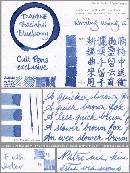
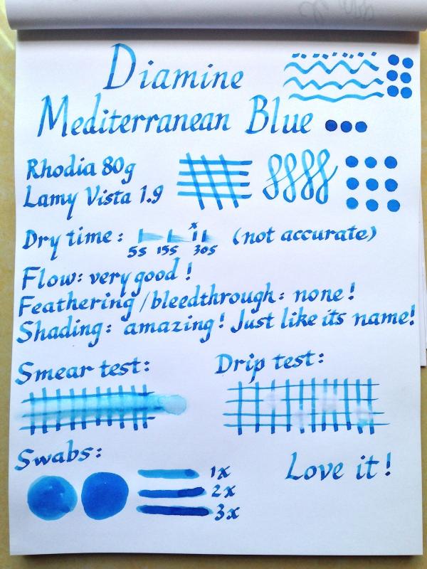
I've just got this ink and I love it so much that I'd like to share with you, although I know there've been a lot of reviews of this ink already. I used a Lamy Vista 1.9 nib on Rhodia paper for this simple review. The colour is a bright ocean/cerulean blue well worth its name. The shading is amazing (plus this nib tends to bring out the shading of an ink), from a bright clear blue to a deep ocean blue. It runs very wet on this nib, so the drying time is not accurate. The water-resistency is basically none, as can be seen from the drip test and the smear test, in which I ran a wet finger through it twice. This is my first ink in the turquoise/blue range and I love it. The photo doesn't do it much justice, because it's more vibrant and less green than it's shown in the photo. In fact I had wanted to go for Iroshizuku Kon-peki, but the price made me hesitate. After reading a post here where a FPN member compared these two inks and I was not able to distinguish one from the other, I ordered this, and I don't regret this choice! I have been eyeing Noodler's Navajo Turquoise or Turquoise Eel as well. I wonder how they compare with Mediterranean Blue.

-
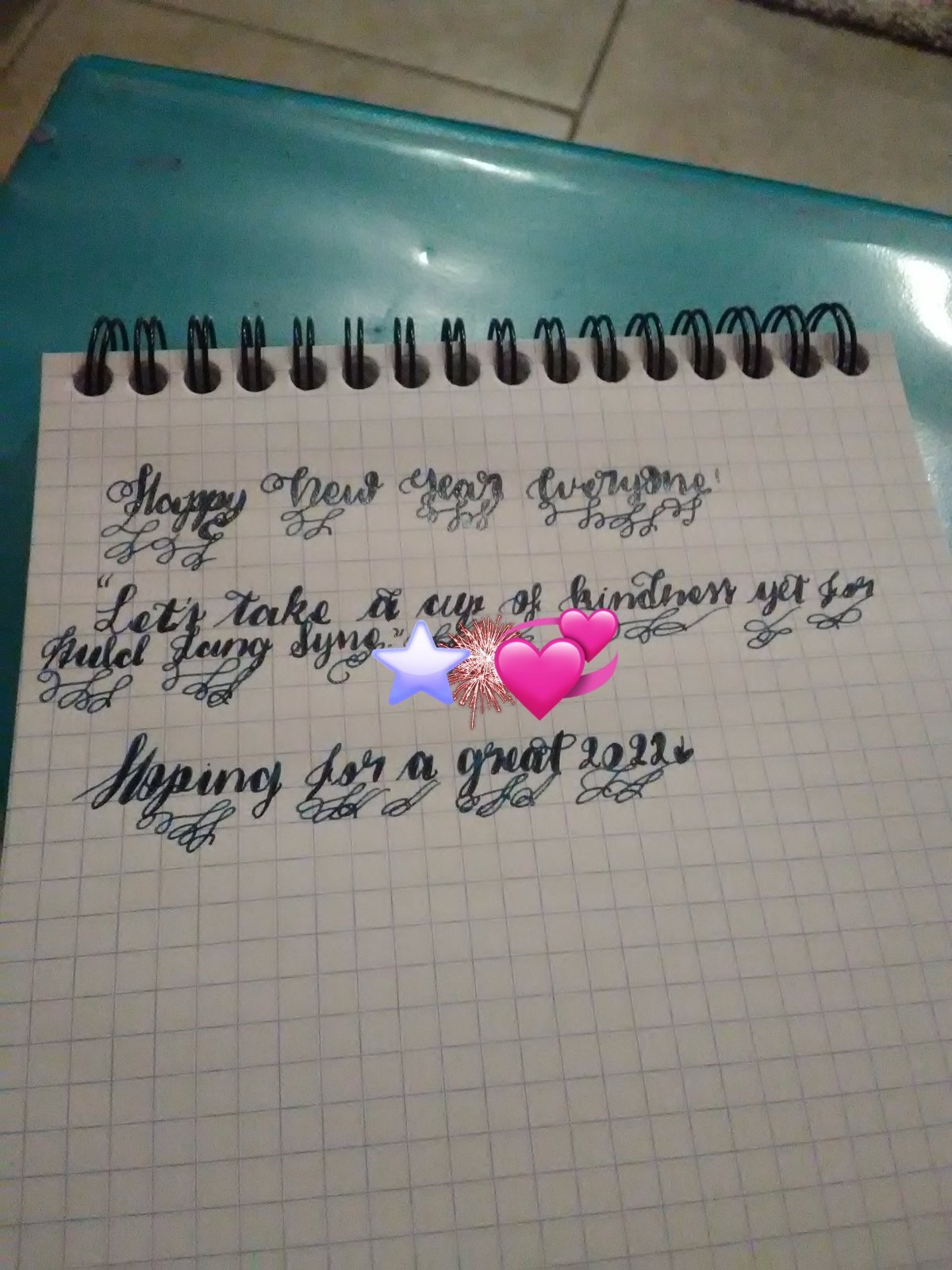
Happy New Year everyone! Let's hope that '22 will be much better than the past two years! 🖋️➡️ Pilot Kakuno 📜➡️ Rhodia Bloc N°16 🔏➡️ Diamine Enchanted Ocean 🌊 Have a great day/night!🏳️🌈
-
If you had to choose 5 diamine inks to represent the brand what would you choose? Im currently looking to buy a twsbi eco with some diamine inks and alt goldgrun and am having a hard time deciding. This should help! The inks I have chosen so far are: Autumn Oak Oxblood Maybe sherwood green One of the turquoise colors
-
Diamine – Earl Grey The ink maker from Liverpool is one of the staple brands in ink-land. They consistently produce solid inks for a very reasonable price. In 2017, Diamine teamed up with the Reddit community to produce a special-edition ink – Earl Grey. This ink colour was chosen by the members of the r/fountainpens group, a wonderful Reddit community of fountain pen enthousiasts. LizEF’s EFNIR review mentioned in the comments that the ink’s colour doesn’t look anything like the tea. Well… this triggered me to do my own examination. In writing, this Diamine ink lays down a dark grey line, slightly purple-leaning. There’s indeed nothing there that resembles the tea. But… if you look at the ink’s chromatography, you’ll discover some unexpected complexity: there’s a lot going on here… grey, purple, cyan-blue, green… a whole kaleidoscope of colours. And these colours do reappear when you look at dry Earl Grey tea, which also shows a dark shimmer of these same colours. For me, that’s good enough to approve the choice of this ink’s name. Diamine Earl Grey writes wet and well saturated. While writing, there is a green tinge to the ink, which disappears when the ink dries, leaving a dark grey line. Saturation is very good – this ink can easily be used with the whole nib range, from EF to B and beyond. But I also noticed some technical issues: Earl Grey has a tendency to feather and bleed on quite a number of papers, mainly the cheaper ones. With high-quality and/or hard-surface paper, the ink works really well. It’s on the more absorbent paper that I noticed some real problems. Also, for some reason, this ink loves to stain my fingers. Every time I opened the bottle, I got ink on my hands – even when I was extra careful. Not sure why… To illustrate the colour span of this Diamine ink, I did a swab on 52 gsm Tomoe River paper, where I really saturated portions of the paper with ink. Earl Grey has a fairly narrow colour span, without much contrast between the light and darker parts. This translates to soft shading when writing. Shading is prominently there, starting with F nibs and above. Due to the narrow colour range, it never gets harsh – exactly the way I like it. On the smudge test – rubbing text with a moist Q-tip cotton swab – the ink behaved perfectly, with very limited smearing. Water resistance is totally absent though – both with still and running water. With Earl Grey, you cannot survive watery accidents. This is also apparent from the lower part of the chromatography – almost no dyes remain attached to the paper. As such, not a good ink to use at the office. A pity, because the ink’s colour and saturation would translate well to a work environment. The chroma clearly shows the complexity of the dye mix. Who would have guessed that this combination of dyes translates to a dark grey colour? I’ve tested the ink on a wide variety of paper – from crappy Moleskine to high-end Tomoe River. On each scrap of paper I show you: An ink swab, made with a cotton Q-tip 1-2-3 pass swab, to show increasing saturation An ink scribble made with a Lamy Safari M-nib fountain pen The name of the paper used, written with a Lamy Safari B-nib A small text sample, written with the Lamy Safari M-nib Source of the quote, written with a Pelikan M405 Stresemann with cursive italic F-nib Drying times of the ink on the paper (with the M-nib Safari) The multi-paper writing test shows Earl Grey’s biggest weakness. This ink only works well with certain types of paper. You really need hard-surface paper for best results. Otherwise you will get some feathering and show-through/bleed-through. This Diamine ink definitely won’t cooperate with the cheaper copy paper you find at the office! Earl Grey is a bit snobbish – with a definite preference for high-quality paper. Drying times for this ink are in the 5-10 second range with a Lamy Safari M-nib. Because scans don't always capture an ink's colour and contrast with good precision, I also add a few photos to give you an alternative look on this Diamine ink. Writing with different nib sizes The picture below shows the effect of nib sizes on the writing (written on Rhodia N°16 80 gsm paper). All samples were written with a Lamy Safari. I also added a visiting pen: a Pelikan M405 Stresemann with a nice cursive-italic F-nib. On the hard-surfaced Rhodia paper, Earl Grey looks really nice, and can handle all nib sizes without a problem. Shading is hinted at with the EF-nib, but is definitely present with F-nibs and above. Related inks To compare Diamine Earl Grey with related inks, I use my nine-grid format with the currently reviewed ink at the center. This format shows the name of related inks, a saturation sample, a 1-2-3 swab and a water resistance test – all in a very compact format. Earl Grey is a bit on the blue-purple side, and looks like a slightly more saturated version of Callifolio Gris de Payne. Inkxperiment – Wheel of Time As a personal challenge, I try to create interesting drawings using only the ink I’m reviewing. I find this to be a fun extension of the hobby, and these single-ink drawings often present a real challenge. These inkxperiments allow me to explore the colour-range nuances that are present in the ink. I love doing them! Inspiration for this drawing comes from the cycle of life. While recently playing with the 3 and 5 year old youngest members in the family, I couldn’t help but notice two things: 1/ their world is huge and full of wonder – a trip to the playground is an adventure, the small cluster of trees at the end of the garden a strange and unexplored continent. And 2/ - time is stretched out for a child - when you are constantly discovering new things and experiences, hours can seem like days. While growing older, a subtle change takes place, and spacetime seems to shrink: your world appears to grow smaller, and time has a tendency to fly… I tried to capture these aspects in Earl Grey’s inkxperiment. I started with an A4 piece of HP photo paper. I covered the paper with a kitchen towel, and dripped some water-diluted Earl Grey on it. The ink separated in its component dyes, that colour the underlying photo paper. This produced a really nice background, with grey, purple and green colour tints. Quite surprising… I had expected a greyish background, not the kaleidoscope of colours that you can see. I next used different sized glass jars to stamp in the life circles. The scenes in the circles and the background details were painted in with a combination of B-nibbed fountain pen and glass dip pen. The end result gives you a good idea of the colour range that can be achieved when using Earl Grey in a more artistic context. An interesting ink to draw with! Conclusion Diamine Earl Grey looks like a fairly standard dark grey when writing. The ink definitely prefers high-quality paper, and doesn’t tolerate the cheaper papers in my test set. With the right paper, Earl Grey is a pleasure to use, writing wet and nicely saturated, and working well with all nib-sizes. But it’s when using this ink for drawing that the magic happens: Earl Grey contains within a kaleidoscope of colours that simply don’t surface in everyday writing. An unexpected pleasure that - for me - lifts this dark grey above the crowd. Technical test results on Rhodia N° 16 notepad paper, written with Lamy Safari, M-nib Backside of writing samples on different paper types
-
-
Ink Shoot-Out : Diamine Meadow vs TAG Kyoto kyo-no-oto moegiiro Not so long ago I did a review of kyo-no-oto moegiiro – a yellow-green ink from TAG Kyoto stationery shop. I enjoyed the ink a lot – I just love this shade of green. While preparing the review, I noticed that Diamine Meadow looks really similar. This could be a doppelgänger ink! Time to do a detailed comparison, and find out which of these inks I like the most. Enter... the Ink Shoot-Out. A brutal fight spanning five rounds, where look-alike inks do battle to determine who is the winner. This time around, the battle is between lightweight boxers from different continents. In the left corner – from Liverpool, England – the well-established but relatively unknown champion Diamine Meadow. In the right corner, from the Japanese city of Kyoto, the challenger: kyo-no-oto moegiiro. Both champions make their way to the ring, while the crowd fills the arena with its thunderous cheers. Let the fight begin and may the best ink win… Round 1 – First Impressions The bell rings and the fighters start circling each other. A flurry of strikes and counterstrikes follows, with the champions looking for weaknesses in the other’s defenses. Great moves, feints and blocked-off strikes. This fight looks lively, and both inks make a great first impression. These inks have a lovely yellow-green colour, that looks on the light side but is sufficiently saturated to make for easy reading. Contrast with the page is definitely ok. Shading is fairly heavy, even in finer nibs. Not too harsh though, but really elegant. These inks are almost doppelgängers, but there are some differences: Diamine Meadow looks a tiny bit more yellow, with a somewhat lighter presence on the page. A bit less saturated, but contrast with the paper remains good. Kyo-no-oto moegiiro is a bit more saturated at the darker end of its colour range. It lays down a line that is a bit darker than that of Diamine Meadow. Both inks are great shaders, but with moegiiro the contrast between the light and darker areas looks a bit more interesting with better aesthetics. There is more depth to the shading, which adds character. Both champions make a great first impression. Colourwise, there is little to differentiate these inks. But the slightly darker saturation point of moegiiro adds extra depth to this ink, makes for a more pronounced presence on the page, and provides more aesthetically pleasing shading effects. Both fighters did really well, but it’s the elegant moves from moegiiro that you’ll remember. The Japanese ink clearly dominated this round. No solid hits and no knock-outs, but for this judge, the ink from Kyoto wins this round on points. The chromatography clearly shows that both inks have lots in common. They have a really similar composition, with only a touch more yellow in Diamine Meadow’s mix of dyes. The biggest difference appears to be in the degree of water solubility of the dyes. Round 2 – Writing Sample The writing sample was done on Rhodia N°16 Notepad with 80 gsm paper. Both inks behaved flawlessly, with no feathering and no show-through or bleed-through. The inks look good in all nib sizes, even the EF-nib. Shading is also prominently present, just a hint with the EF-nib, but really pronounced with M nibs and above. Shading with the Japanese moegiiro looks a bit nicer though, with more depth of character. Beware that the scan exaggerates the shading in the broader nibs – in real-life it looks much less harsh. So, below you'll find a photo that provides an alternative look: The writing sample also clearly shows the more saturated nature of moegiiro. Diamine Meadow is a bit lighter on the page, probably because it has more yellow in its mix of dyes. Overall, I feel that moegiiro shows a bit more character, and looks better in written text. I also noticed that Diamine Meadow writes a bit more scratchy, appears less lubricated than the Japanese ink. But this could also be an artifact of the nibs in my test-pens. The Safari pens used for Meadow had the black Lamy nibs – and I’ve read that these write drier than the corresponding plain steel nibs. For this round, the focus is on writing, and here the advantage clearly belongs to the fighter from Kyoto. The Japanese champion breaks several times through the defenses of Diamine Meadow, delivering solid strikes. Better saturation and with it a superior presence on paper… bam! More character in the shading… bam! No knock-outs, but these punches definitely hurt! This round is a solid win for kyo-no-oto moegiiro. Round 3 – Pen on Paper This round allows the batlling inks to show how they behave on a range of fine writing papers. From top to bottom, we have : FantasticPaper, Life Noble, Tomoe River, Original Crown Mill cotton paper, and Midori notebook paper. All scribbling and writing was done with a Lamy Safari M-nib. Both champions did well, with no show-through nor bleed-through. But this round is not about technicalities, it is about aesthetics and beauty. Are the fighters able to make the paper shine ? Both are lovely yellow-green inks that look good on both white and cream paper, but really show their best on pure white paper. On their own, both the English and Japanese ink look beautiful. But it’s when you put them next to each other that the richness of moegiiro becomes fully evident. A bit less yellow, a bit more saturated… these small differences have a significant effect on the end result. Diamine Meadow tries its best, but it cannot reach the depths and elegance that moegiiro has to offer. Again, the scan exaggerates the contrast in the writing, so below is a photo of the same information: The Japanese champion shows much better footwork, moves more fluently. With his superior technique, he continuously puts his adversary on the offensive. Still no knock-out, but moegiiro clearly dominates the play. And the public agrees… they’re now chanting for the fighter from Kyoto who’s stealing the show. This round is definitely a win for the Japanese ink. Round 4 – Ink Properties These inks are not fast-drying, requiring about 15 seconds to dry. Diamine Meadow even takes a little bit longer. Both inks are reasonably smudge-resistant. Some colour rubs off when using a moist Q-tip cotton swab, but the text itself remains crisp and clear. To test water resistance, I dripped water on the grid and let it sit there for 15 minutes, after which I removed the water with a paper towel. Both inks show their weakness in this respect. With Diamine Meadow, nothing remains on the paper (from the bottom part of the chroma, I had expected better). And kyo-no-oto moegiiro just leaves some unreadable smudges. Neither ink likes to come into contact with water. For this round, the fighters just keep circling one another. Neither makes an attempt to please the crowd. The public is now boo-ing. This is not what they paid for… The bell rings, signaling the end of this disappointing round. Round four thus ends with a draw. Round 5 – The Fun Factor Welcome to the final round. Here I give you a purely personal impression of both inks, where I judge which of them I like most when doing some fun stuff like doodling and drawing. Yellow-green inks are usually fun to play with, and these two are no exception. Both inks do well, and are great for creating some artwork. The colour range you get is just perfect, with light and darker areas complementing each other nicely. I really enjoyed using them. In the picture, I used different water/ink ratios to draw in the background. The horizontal tree bark was painted in with a piece of cardboard and pure ink. The trees and decorative elements were added in with a B-nib Lamy Safari and pure ink. Both inks work well as drawing inks. Personally, I prefer moegiiro a bit more, mostly because the range between light and dark parts can be a bit wider, and because it’s easier to get a darker saturated green. But either ink is just excellent to draw with. A big thumbs-up for both champions, that really did their utmost to please the public in this final round. No real winner, only a real spectacle that is greatly appreciated by the crowd. As such, round five ends with a draw. The Verdict Both inks are joyful yellow-greens that are great for journaling and drawing. Diamine Meadow and kyo-no-oto moegiiro look quite similar… real doppelgängers. But in the end, the Japanese ink has a bit more depth and character to it, which makes it the nicer one of the two. No knock-out in this fight, but a solid win on points.
-
I have bought dozens of Diamine ink bottles - I find that less than 3 pounds per 30ml bottle is a steal for such a quality ink. Bought a number of 150th Anniversary inks, too. One thing I found about them is, they seem to come too saturated/concentrated, almost black. They look different from the swabs, either the (horrible) pictures of the Diamine site or the (great) pictures of Goulet. I have also bought samples and bottles from Goulet as well, but these ones seemed to have the right dillution - the color was more or less the expected. Save for the brighter colors, I add around 10% water in every Diamine bottle, and then the color gets "there". Has anyone experienced something like that?
-
@OCArtwas kind enough to supply the Chesterfield, so I figured the least I could do was compare it to something! I like dark greens. Still sugar cane paper from Office Depot, and the same legal pad that shadows when I take pictures as I had to fold it in half to make it fit in a bag.
-
Am I the only one who noticed that many inks are dirt cheap at Cult Pens? I can’t be, right?
collectorofmanythings posted a topic in Fountain & Dip Pens - First Stop
I haven’t heard many people talk about this, so I just wanted to make those who are unaware now aware. Here is just a quick thing on some price comparisons. “Retail” price was taken from online fountain pen and ink retailers: DIAMINE 30ml Cult Pens- $2.47 Retail- $7.50 PELIKAN 4001 30ml Cult Pens- $4.82 Retail- $11.75 ROHRER & KLINGNER 50ml Cult Pens- $5 Retail- $11.95 PARKER QUINK 57ml Cult Pens- $5.21 Retail- $11.02 DIAMINE 80ml Cult Pens- $6.21 Retail- $14.95 WATERMAN 50ml Cult Pens- $6.51 Retail- $12 PELIKAN 4001 62.5ml Cult Pens- $7.52 Retail- $16.50 DIAMINE 150th ANNIVERSARY 40ml Cult Pens- $8.15 Retail- $15.50 HERBIN 30ml Cult Pens- $8.40 Retail- $12.95 KAWECO 50ml Cult Pens- $8.41 Retail- $12 CROSS 62.5ml Cult Pens- $9.47 Retail- $16 LAMY CRYSTAL 30ml Cult Pens- $9.99 Retail- $16 JACQUES HERBIN 1670 50ml Cult Pens- $18.39 Retail- $29.50 JACQUES HERBIN 1798 50ml Cult Pens- $21.02 Retail- $29.50 MONTBLANC AROUND THE WORLD IN 80 DAYS BLUE 50ml Cult Pens- $33.66 Retail- $40 I just wanted to tell all of you who weren’t aware. Have a nice day, W. Major -
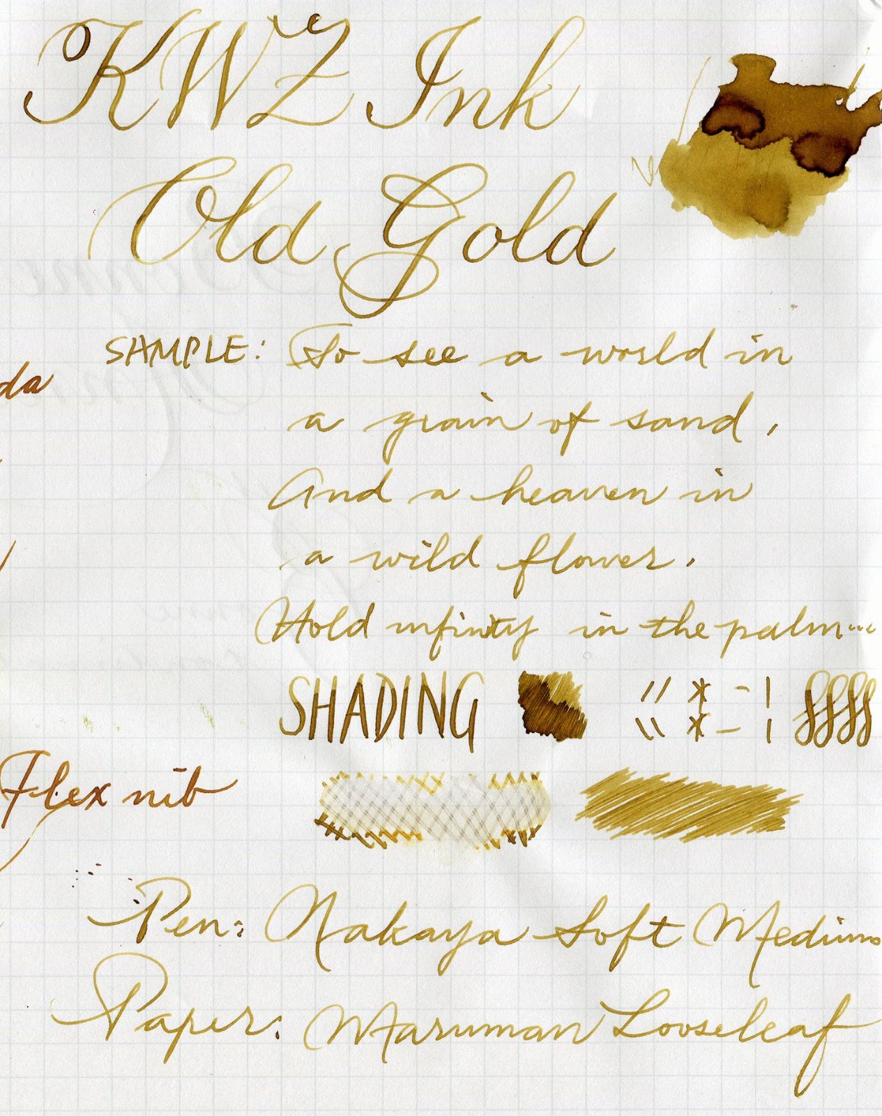
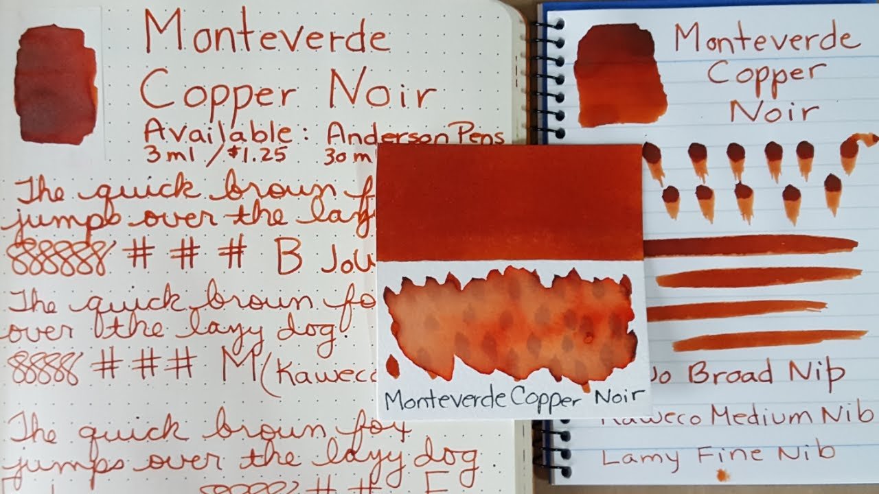
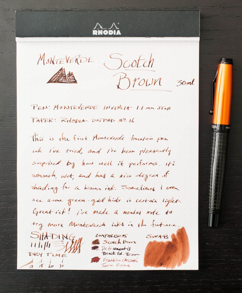
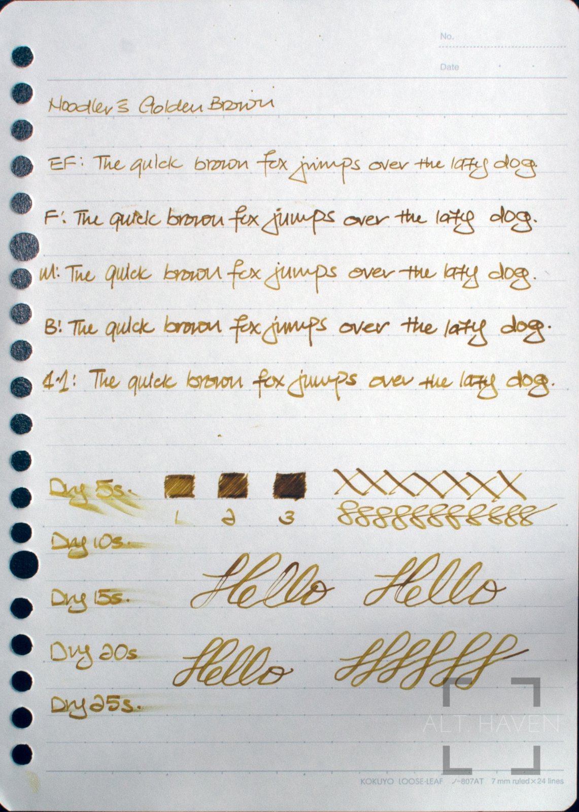
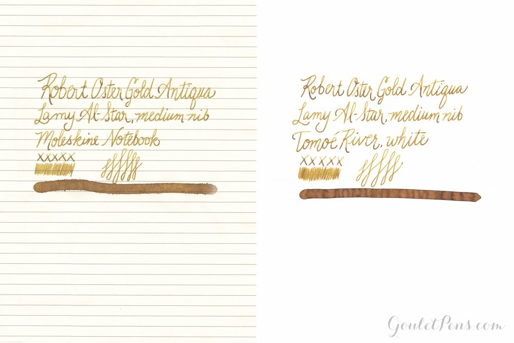
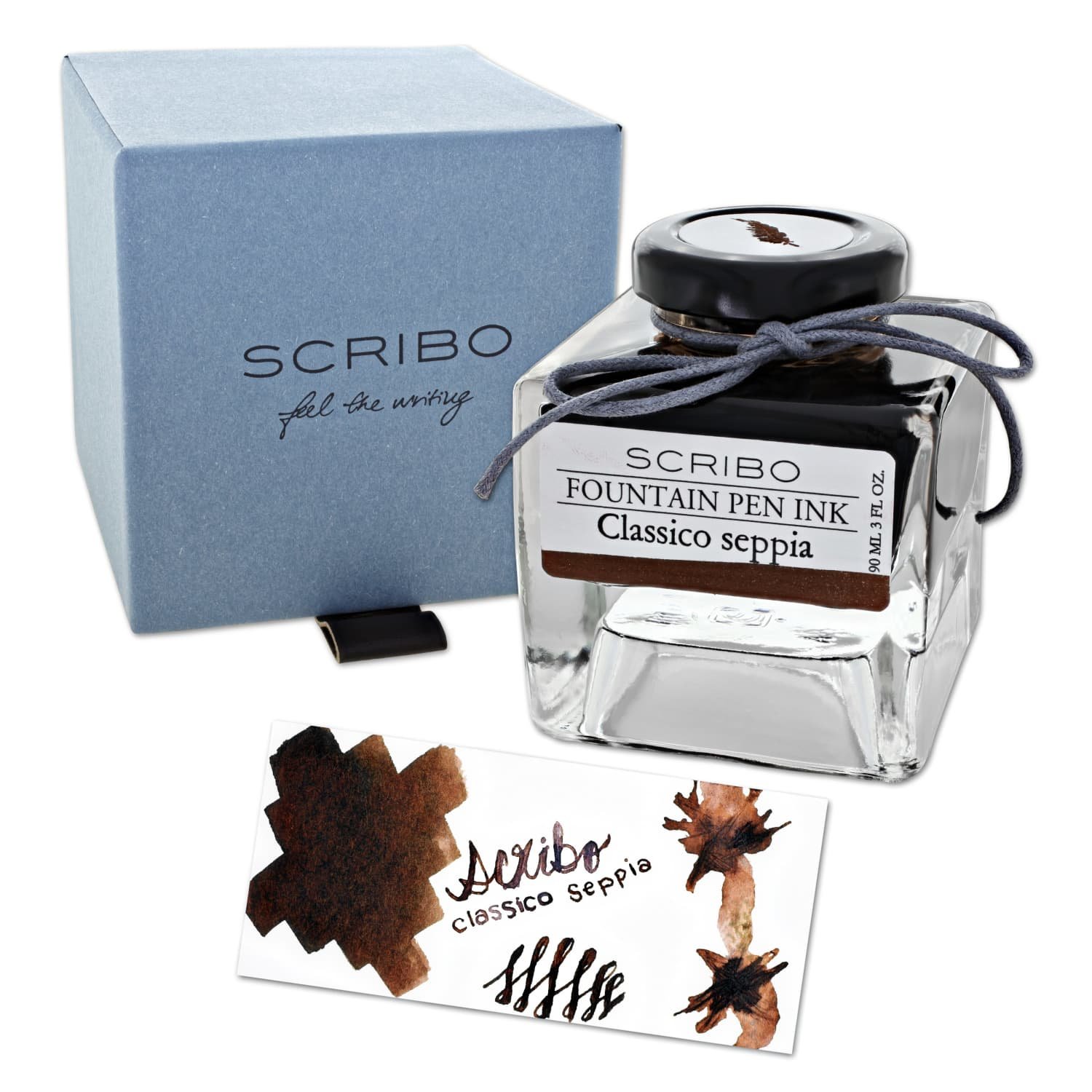
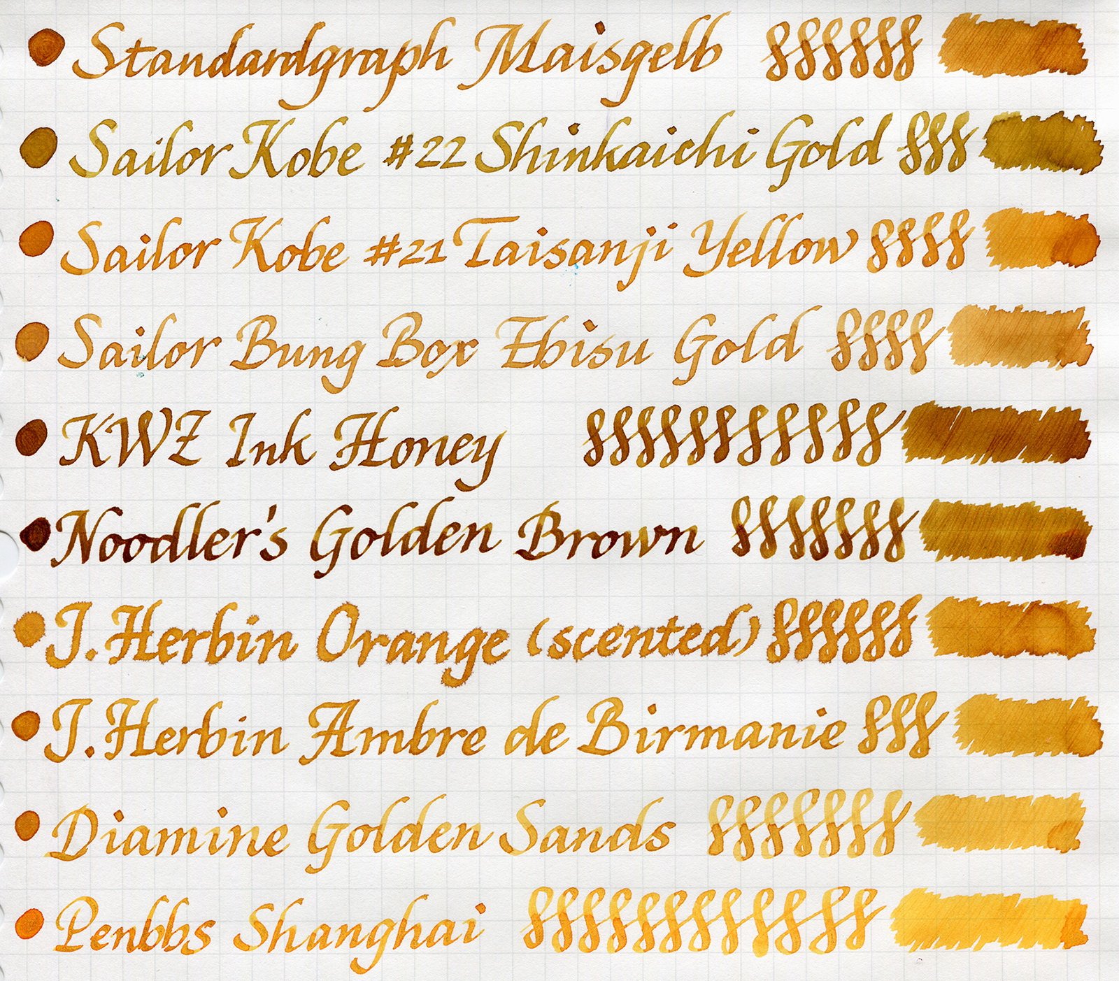
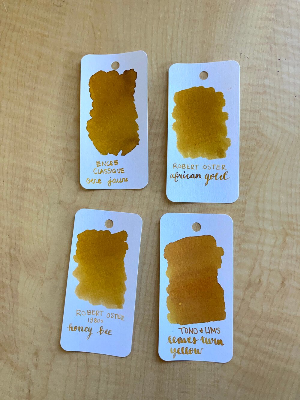
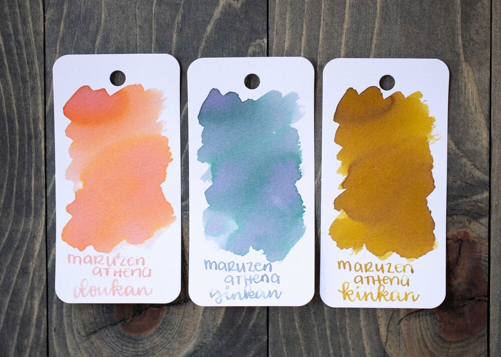
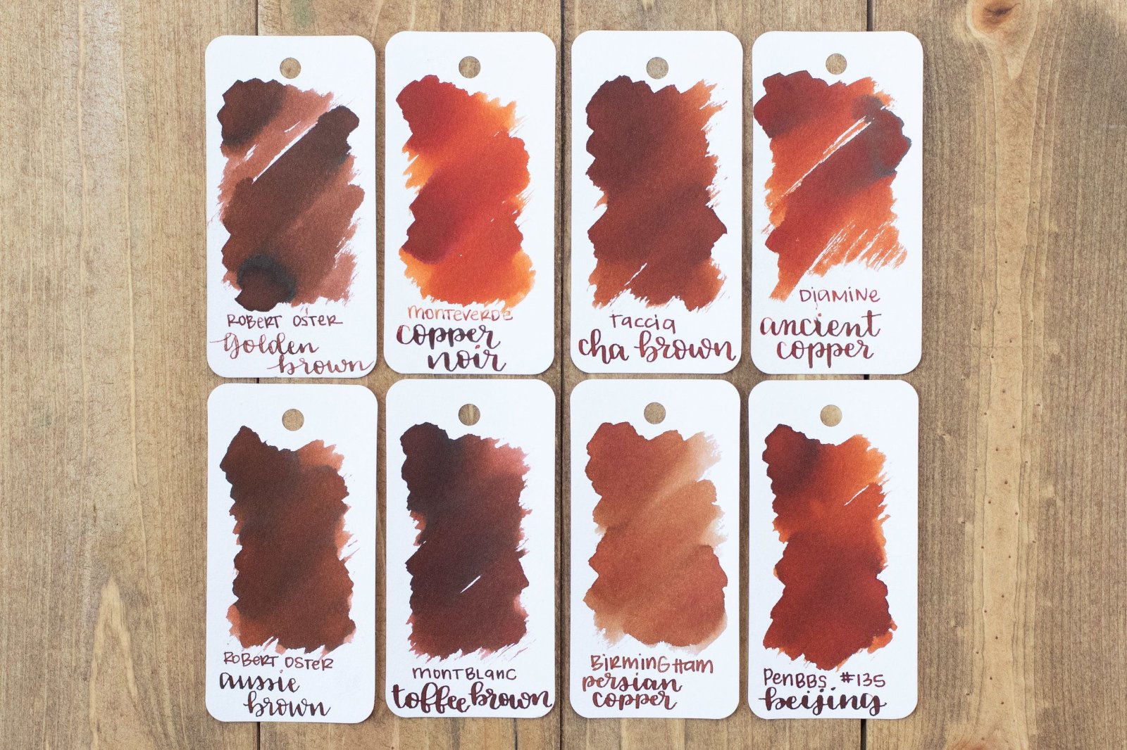
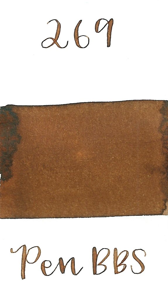
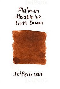
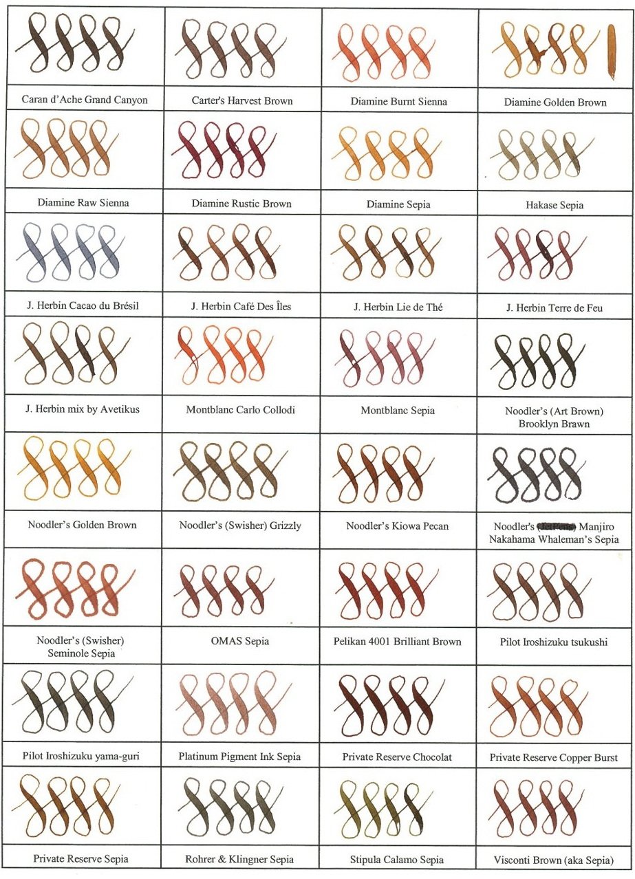
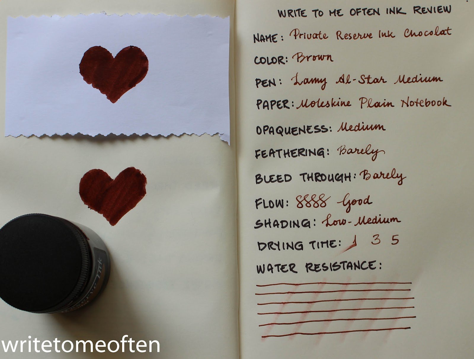
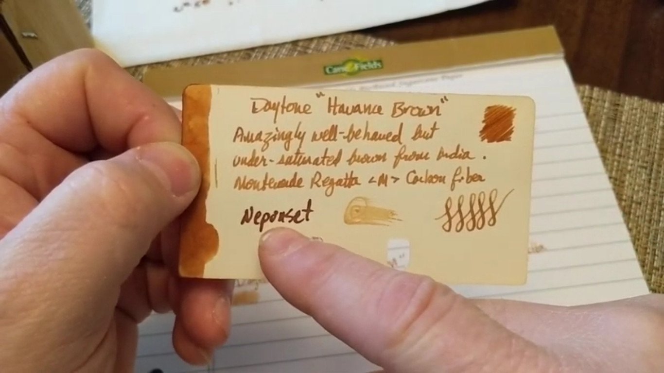
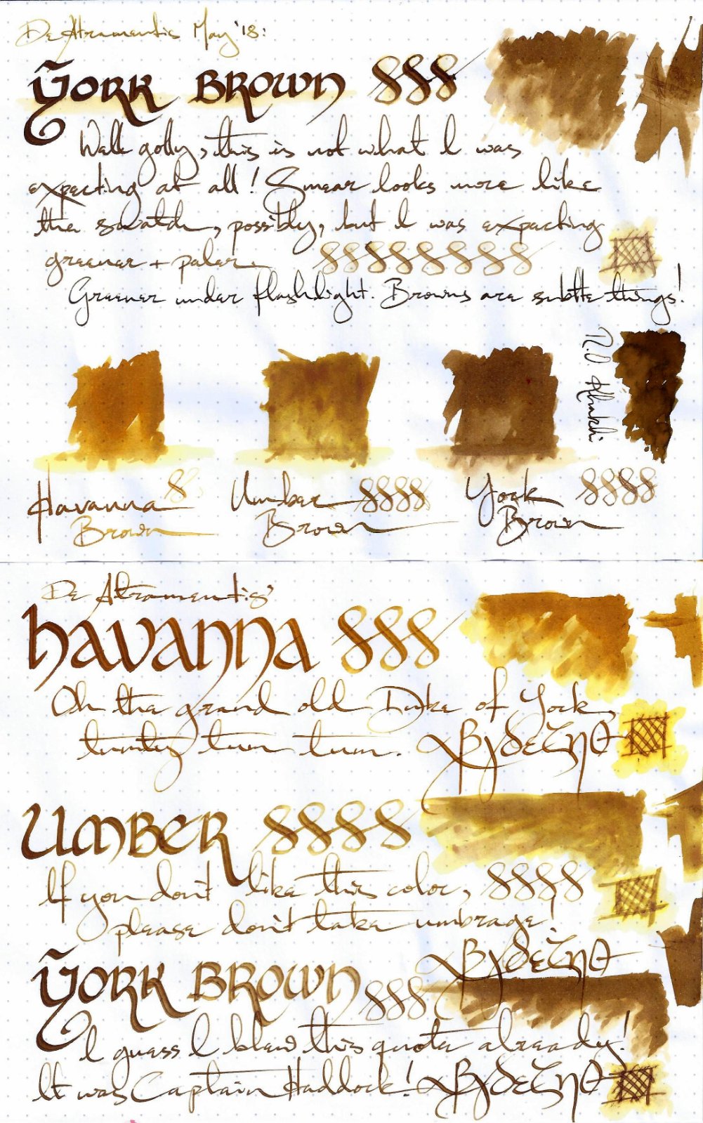
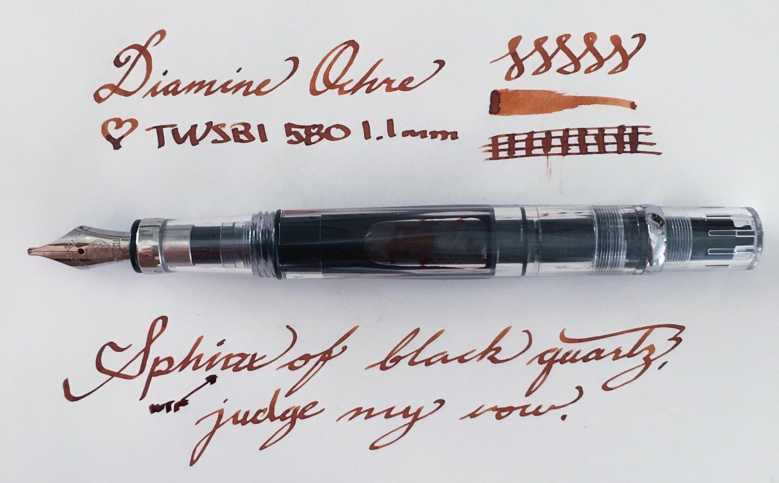
This collection has been made in an intensive attempt to find the most ideal and complete shades of brown color fountain pen inks over the internet and as long as writing with a medium size fountain pen is what I'm concerned of, the "infinity symbol" on a regular paper is the thing I've considered saving these samples. I've also benchmarked the index card samples for those which were not available in infinity sample. All the top-rated fountain pen inks – even those which are not mentioned here probably for the lack of a quality brown ink – have been taken into account. ~ Here's the list ~ Akkerman Hals Oud Bruin Akkerman SBRE Brown Chesterfield Antique Copper Colorverse #25 String Colorverse Coffee Break Daytone Havana Brown De Atramentis American Whisky Brown Gold De Atramentis Havanna De Atramentis Scottish Whiskey Diamine Ancient Copper Diamine Chocolate Brown Diamine Desert Burst Diamine Golden Brown, Carter's Harvest Brown, Diamine Raw Sienna Diamine Ochre Diamine Terracotta Diamine Tobacco Sunburst Faber Castell Hazelnut Brown J. Herbin Café Des Iles J. Herbin Caroube De Chypre J. Herbin Lie de The J. Herbin Terre d'Ombre KWZ Honey KWZ Iron-gall Aztec Gold KWZ Iron-gall Mandarin (Corrected Version) KWZ Old Gold L'Artisan Pastellier Callifolio Cannelle Leonardo Sepia Classico Monteverde Copper Noir Monteverde Joy Sepia Monteverde Scotch Brown Noodler's Golden Brown Noodler's Kiowa Pecan OMAS Sepia Private Reserve Chocolate Private Reserve Copper Burst Private Reserve Sepia Robert Oster African Gold Robert Oster Antelope Canyon Robert Oster Caffe Crema Robert Oster Gold Antique Robert Oster Toffee Sailor Kobe #22 Shinkaichi Gold Sailor Storia Lion Light Brown Scribo Classico Seppia Standardgraph Maisgelb by @lgsoltek Taccia Tsuchi Golden Wheat Vinta Heritage Brown Vinta La Paz Diplomat Caramel Krishna Bronze Leaf, Krishna Yellow Valley L'Artisan Pastellier Callifolio Anahuac L'Artisan Pastellier Callifolio Itzamna L'Artisan Pastellier Encre Classique Ocre Jaune Maruzen Athena Kinkan PenBBS #135 Beijing PenBBS #269 45th POTUS PenBBS #504 Vernal Equinox Platinum Mix-Free Earth Brown Taccia Ukiyo-e Hokusai Benitsuchi Tono & Lims Kela Nuts Vinta Terracotta Vinta Ochre Note: the absorption of the ink to the paper could vary. Before purchasing any of the inks above be aware some of them are dry while the others are wet. Plus, based on the fountain pen model and paper you use, the colors could look different. Make sure to use fountain pen inks only, otherwise your fountain pen will clog. Stay away from drawing, calligraphy, lawyer, and India inks. They are not designed for the fountain pens. Platinum and Sailor have some pigmented-based inks; avoid them. Take all these into account.
-
Manufacturers since 1864, Diamine Inks relocated to this purpose built 'state of the art' factory in Liverpool in 1925, where they successfully carried on using the traditional methods and formulas for ink production. Over the years the company has changed hands and are now located close to the world famous Aintree Race Course http://www.diamineinks.co.uk/images/DimaineFactory.gif Golden Brown is interesting ink. It may appear to light when it hits the paper but it actually is quite easy to read on various papers. In wetter/broader nibs it shades beautifully. The flow and smoothness are average. Software ID Color range Tomoe River - Caran d'Ache Leman, medium nib Leuchtturm 1917 - Kaweco AL Sport, broad nib CIAK, TWSBI 580, stub 1.1
-
From the album: Ink review
The label on the bottle of Les Couleurs du Comte Bleu Cuivré is dull and dark to the point of being illegible. I don't have any other commercial 30ml bottled ink product that's nearly quite as bad. It's a shame, because the ink itself should be comparable quality-wise to Cult Pens's Iridescink Maureen, or other inks in Diamine's own standard product catalogue.© A Smug Dill
- 0 B
- x
-

From the album: Ink review
Yes, yes; I'm aware I spelt the name of the ink wrong.© A Smug Dill
- 0 B
- x


.jpg.e953d46aa30a670f20d0ff630c1e945c.jpg)