Search the Community
Showing results for tags 'diamine'.
-
Some time ago Diamine felt the urge to follow example of J. Herbin - they've decided to hit the market of glittering inks. The line of Shimmertastic inks premiered in 2015. Personally I dislike shimmering inks / inks with particles. I didn't expect to like this line. A friend of mine bought full line and sent me the whole bottles to review. I've tried them all. I don't like them but I'll review them. Maybe you'll like them more than me? After strong punch from Diamine that offered ten colors I wonder with what 1670 ink J. Herbin will come this year? Anyway there's ten inks in the line: Blue Lightning Blue Pearl Brandy Dazzle Golden Sands Magical Forest Night Sky Purple Pazzazz Red Luster Shimmering Seas Sparkling Shadows Six with golden particles And four with silver particles SHIMMERING SEAS Blue Lightning is bright blue ink. It could be good without the particles. Drops of ink on kitchen towel Software ID Tomoe River, Kaweco Sport Classic, B Leuchtturm 1917, Kaweco Sport Classic, B
-
Now based in Liverpool, the history of Diamine dates back to 1864 when the company was founded by T Webster and Co. in London. The business moved to Liverpool in 1925 and T Webster and Co. changed its name to Diamine in 1964. Diamine now produces one of the largest ranges of fountain pen ink and fountain pen cartridges as well as the famous Registrar's Ink for permanent records. http://www.diamineinks.co.uk/images/DimaineFactory.gif Diamine offers amazing variety of colors. Steel Blue is strange ink. It's not blue. It's not green. It's in between. Personally I dislike the color but it's my only issue with this one. In terms of performance it's very good ink. I haven't experienced any feathering or bleed through with this ink and the flow is more than satisfying. It's not too wet or too dry and lubrication is pretty good as well. If you spill something on this ink you will like lose most if not all of the writing - it offers no water resistance. Drops of ink on kitchen towel Software ID Tomoe River, Kaweco Classic Sport, B Leuchtturm1917, Kaweco Classic Sport, B Rhodia, Kaweco Classic Sport, B
-
Some time ago Diamine felt the urge to follow example of J. Herbin and they offered a line of Shimmering inks. Personally I dislike shimmering inks. I strongly dislike inks with particles. I didn't expect to like this line. A friend of mine bought full line and sent me the whole bottles to review. I've tried them all. I don't like them but I'll review them. Maybe you'll like them more than me? After strong punch from Diamine that offered ten colors I wonder with what 1670 ink J. Herbin will come this year? Anyway there's ten inks in the line: Blue Lightning Blue Pearl Brandy Dazzle Golden Sands Magical Forest Night Sky Purple Pazzazz Red Luster Shimmering Seas Sparkling Shadows Brandy Dazzle could be nice color if it didn't contain golden particles. I find them irritating. Sorry. Also the flow of this ink is average at best. The feed needs time to catch up after writing few sentences. In this one the shimmer is rather understated. Drops of ink on kitchen towel Software ID Tomoe River, Kaweco Sport Classic, B Leuchtturm 1917, Kaweco Sport Classic, B Oxford, Hero 5028, stub 1,9
-
Hi folks, I've done some snooping around reviews and threads and can't seem to find the info. for which I'm looking. Basically, I'm looking for the perfect (or 'pur'-fect purple) ink. I know what works for me, but I can't seem to find one ink that comes close on enough of the characteristics. I figured I'd throw this out to the ink-brain trust and see what y'all think. Here's the short version: I like the properties of NAV and the color of Diamine Majestic Purple. Here's the long version: For many of its properties, Noodler's North African Violet feels great to me: limited feathering and bleed through, water resistant, relatively fast drying and a great flow. But (there's always a but) ... once it's dry it's hard for me to tell the difference (at a glance) between it and BSB in terms of color. This is relevant to me because I color-code my notes, lists and various other scribblings. Sparingly, I love using BSB - there's no other blue quite like it. Here's the rub: I've found a purple with a great color for me: Diamine Majestic Purple. But I'm not a big fan of its properties. If I want to use cheaper paper, it's great if I want to make bleeding art (pun intended). Dry time is okay, but it feels like the very definition of NOT water resistant. The nice part about that is that it's easier to clean but if my hand is even damp, my nearly illegible writing will be completely unreadable - even to me. A friend of mine, before leaving the country, gave me what was left of her bottle of Purple Martin. I have plenty of that - almost a half-bottle - but smudges like crazy on ink-resistant paper, seems to take a while to dry and (again) lacks much water resistance. I'm not sure what to do with the rest of my bottle of that. For now, I've just set it aside - might do a PIF of Purple Martin samples at some point. I buy ink twice a year. Usually, it's purchase ... test ... purchase again ... wait for next year. Now is one of those times and I'm stuck on my purple conundrum. I'm putting in an order to replenish some of my dwindling stock. It's not that I don't have an ink acquisition disorder. It's more that I simply can't afford one, so I set aside money as I use at a rate a little faster than I use. Oh yeah, that's the other thing. I'm on a shoestring budget. Really. I thought about buying a bottle of NAV and then adding some pink to it, but I've never tried anything like that and would hate to buy a bottle for naught. My current thinking is including a small bottle of (Diamine) imperial purple with my semi-annual order to GPC. It's properties are closer to what I need (not as good as NAV) and the color stands out a bit more (compared to NAV) but it's still a little dark. Or maybe try a few more samples. But which ones? What say you? This topic may have been covered before in another thread. If so, point me in the right direction and away I'll go. Thanks to all. ps. Apologies for the typos, rambling narrative, etc.
-
Ink Review : Diamine Vivaldi (Music Collection) Pen: Lamy Safari, M-nib Paper: Rhodia N° 16 notepad 80 gsm Review Venice, Piazza San Marco, March 23th 1723 Buone sera signore, welcome to Venice. My name is Antonio Lucio Vivaldi, and I'm enjoying this beautiful spring evening at the beginning of spring. Look at that magnificent twilight sky... that purple-grey color stretching from horizon to horizon. Nature truly shows its beauty in every season. This purple-grey color inspires my muse... time to get to work on composing a fitting concerto. I think I'll call it "Le Quattro Stagioni" In 2015 Diamine released the Music Collection, a set of ten inks named after well-known composers. This is a collection of serious, subdued colors. In this review, I take a look at Vivaldi - after the above introduction, you're sure to remember that this is a purple-grey ink. Diamine Vivaldi is a purple-grey - i.e. more of a grey with purple undertones. It really is something special. The color is subdued, classical, and can easily be used for business correspondence. And yet... it has that special touch that will give your writing a more personal flavor. This is not an ordinary ink, not at all ! It shows that you - as a writer - care about your correspondence. There is also some subtle shading going on, which gives the ink some extra character. The ink also exhibits good flow and writes fluently. I'm really fond of it! You really need to see this ink in person - in the scans the subtle purple undertones are difficult to capture, but believe me: they are there, and they make this ink shine! OK - but how does it behave on paper ? For this, I did some tests: Rhodia N° 16 notepad 80 gsm - drying time ~25 seconds, no feathering, no show-through nor bleed-throughPaperblanks journal paper - drying time ~20 seconds, no feathering, no show-through and no bleed-throughGeneric notepad paper 70 gsm - drying time ~15 seconds, no feathering, no show-through and no bleed-throughMoleskine journal - drying time 5-10 seconds, a tiny amount of feathering, significant show-through and noticeable bleed-throughVivaldi is a well-behaving ink. It's only with the notoriously bad Moleskine paper that it starts behaving badly. On better paper, it really shines. The ink has only limited problems with smudging. Running water will remove most of the color, but a perfectly readible light-purple trace of your text remains. Not bad at all! Conclusion This ink rocks! It is a really interesting color that feels at home with any type of writing. Very suitable for both personal journaling and official business correspondence. And that color... it's just stunning. In my personal opinion, Diamine scored a winner here ! I just hope it will be possible to get this color in individual bottles, outside of the Music Collection. My overall score: A+

-

First Time Writing In Over A Year, Maybe Two :/
bekki2308 posted a topic in Handwriting & Handwriting Improvement
Since I no longer study regularly and changed jobs I spend my life hammering a keyboard, writing only numbers with some printed letters in a notebook in the lab which I then type up and never look at the hand written version again. It has been a while since I wrote anything cursive with even a biro nevermind a fp. So today I picked up my esterbrook and inked it up, bought this lovely pen off a lovely lady on here many years ago. The only paper I found was a pukka pad 80gsm wide rule, I prefer seyes or narrow rule as my writing is small but nvm. I also have arthritis in my hands so I didn't expect much. Attached are some of my doodles, it could have gone much worse!
-
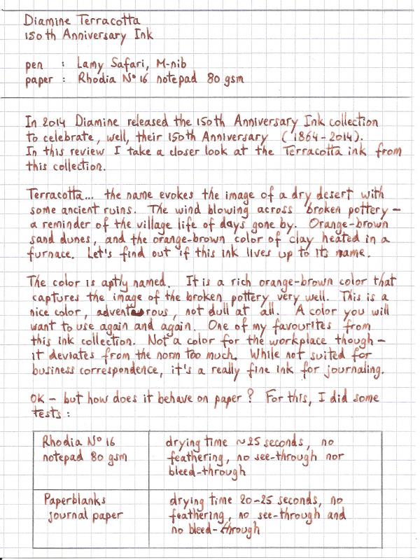
Ink Review : Diamine Terracotta (150th Anniversary Ink) Pen: Lamy Safari, M-nib Paper: Rhodia N°16 notepad 80 gsm Review In 2014 Diamine released their 150th Anniversary Ink collection to celebrate - well - their 150th anniversary (1864-2014). In this review I take a closer look at the Terracotta ink from this collection. Terracotta... the name evokes the image of a dry desert with some ancient ruins. The wind blowing across broken pottery - a reminder of the village life of days gone by. Orange-brown sand dunes, and the orange-brown color of clay heated in a furnace. Let's find out if this ink lives up to its name. The color is aptly named. It is a rich orange-brown color that captures the image of broken pottery very well. This is a nice color, adventurous, not dull at all. A color you will want to use again and again. One of my favorites from this ink collection. Not a color for the workplace though - it deviates too much from the norm. While not suited for business correspondence, it's a really fine ink for journaling. OK - but how does it behave on paper ? For this, I did some tests: Rhodia N°16 notepad 80 gsm - drying time ~25 seconds, no feathering, no show-through nor bleed-throughPaperblanks journal paper - drying time 20-25 seconds, no feathering, no show-through and no bleed-throughGeneric notepad paper 70 gsm - drying time ~15 seconds, no noticeable feathering, minimal show-through (only in the darker parts), no noticeable featheringMoleskine journal - drying time ~10 seconds, minimal feathering, definitely very noticeable show-through, some bleed-through (mainly in the darker parts)There is some very nice, but subtle shading in this ink. This is not a dull monotone ink, but one that catches your attention, and brings some variation to your writing. Really nice. This ink behaves very well, even on cheap paper. It even works in a Moleskine journal - which is not at all fountain-pen friendly. Despite the show-through, it's still possible to use both sides of the paper. Our pottery was found in an ancient desert ruin, where rain is seldom seen. The same can be said for this ink. It doesn't like water at all. Short exposure to running water obliterates your writing. Faint traces of the text remain, and you'll probably need an archaeologist to reconstruct the original writing. You have been warned... keep water away from this ink. Conclusion This really is a beautiful ink, that behaves very well on high-quality paper, and is certainly usable on lower grade paper like Moleskine's. The ink has some nice and subtle shading, which makes it interesting. A very fine choice for journaling. Overall score: A
-
Anniversary Collection – on release from 17th November 2014. To celebrate 150 years of the Diamine brand they have created the “Anniversary Collection”. The new triangular design ink bottles contain 40ml and will be available in eight stunning colours: these bottles when collected can be arranged into a beautiful round desk display. I haven't been given any notification of price point yet but unlike the previous two Diamine collections, all these new inks will be available separately from the start. AND there are possible rumours of additional colours in the future! As usual, my scans are of dip-tested writing, using Lamy Safari pens with M nibs. I use a small sable paintbrush for the 'swatches' but don't re-dip the brush between each one. The paper is my normal Rhodia 80gsm dot grid A5. Diamine 1864 Blue Black As you might expect, this is my favourite of all the Anniversary inks. A wonderful, rich dark blue-black with plenty of character. Obviously suitable for business and personal use and when compared alongside a black ink, 1864 definitely isn't! Fabulous! Diamine Silver Fox This is a mid grey in my opinion and although not one of my favourite 'colours' this one from Diamine will almost certainly be a winner. Along with Graphite, it will certainly find its way into my collection. Diamine Regency Blue A wonderful, deep blue which is nice and rich. Plenty of character and this again could be used for business and personal writing. Diamine have been careful not to make these inks similar to any others of their range and I can't compare it to any at all. Obviously, others out there might well liken them to others by different manufacturers but that's all part of the fun, isn't it?! Diamine Safari What can one say? The 'missing link' between Salamander and Evergreen! A fantastic colour and one which will definitely get into the Limoges collection. My joint second-favourite, it reminds me of that wonderful 'bush' grass colour and if I had to compare this one, I'd say it was like Epinard. But I could be wrong...! Diamine Carnival Gorgeous red – if that's your bag! I don't use them as a rule but have to say that this ink and colour impressed me a lot. I can imagine it being popular and, along with Ciamine/Cult Pens Deep Dark Red, could well complete my collection at this part of the spectrum. Diamine Blue Velvet This wonderful ink is my second-favourite of the set; but only just and by the proverbial gnat's whisker! Bright and cheerful are the best words I can use to describe it and I just love it. It seems to be between Aster and Cornflower from the Flower set and it fits in that gap nicely. A lovely blue and my second favourite of the set. Diamine Terracotta This one has grown on me since I did the test and have typed this out. Not too pale at all and even dipped and on Rhodia it seems to shade quite well. Not that that bothers me in the slightest. A good colour but not one of my usual ranges. Diamine Tropical Green A good mid green with just a hint towards the blue side, according to my eyes. I bet it would look great on ivory or yellow/legal paper. It could be the only green to get if that's a colour that you hadn't considered before. As I mentioned, these eight inks are being sold separately and that is going to be a real bonus for Diamine. A newly-designed and hand-illustrated box with ink colour label completes the packaging. Each bottle is labelled uniquely, with the colour on the label and side panels which are printed on the sides of the boxes although that isn't quite clear from the photograph, supplied by Diamine.) This example is for the 1864 Blue Black. Finally, as if we didn't know, the inks have been developed to celebrate the 150th Anniversary. May we all wish Diamine well - a wonderful British achievement!
-
Hello, Has anyone used Diamine Royal Blue ink in a vintage Sheaffer Snorkel? What has your experience been like? Were there any issues with ink flow or pen clogging? Any information would be appreciated. Thanks, newkid
-

Ink Review - Diamine Tropical Green (150Th Anniversary Ink)
namrehsnoom posted a topic in Ink Reviews
Ink Review - Diamine Tropical Green (150th Anniversary Ink) Pen : Lamy Safari, M-nib Paper : Rhodia N°16 notepad 80 gsm Review In 2014, Diamine celebrated their 150th anniversary (1864-2014). Recently, I decided to check out their 150th Anniversary Ink collection. Living in Belgium, I ordered a set from La Couronne du Comte in the Netherlands. As always - great customer service and prompt delivery. For this review - my first ever - I've chosen the Tropical Green color. The name evokes images of a lush rainforest, the sun spearing through the trees, creating all kinds of shadows. Moist, sweaty, ... Let's find out whether this ink lives up to its name. This is a green ink, and I happen to like green inks - but my impression is that they are difficult to get right. There's tons of fabulous blue, red, purple... inks out there, but nice green inks are difficult to find (at least, that's my experience). This one however really got my attention, when the ink set arrived in my mailbox. It is a nice dark green color, with tons of shading. I really like it ! As far as the color goes - this is maybe the best green ink I've ever seen. Ok so far, but how does it behave on paper ? For this, I did some tests: Rhodia N°16 notepad 80 gsm - dry time ~25 seconds, no noticeable feathering, no see-through or bleed-throughPaperblanks jounal - dry time ~25 seconds, no noticeable feathering, no see-through or bleed-throughgeneric notepad paper 70 gsm - dry time ~15 seconds, a little feathering, almost no bleed-through, some see-throughMoleskine journal - dry time ~10 seconds, significant feathering, really bad see-through and bleed-through The rainforest is harsh on materials. So is this ink - it only likes good quality paper. On lower quality paper, it behaves badly. If you like your Moleskine journal, you should stay away from this ink - it seems to really hate Moleskine paper. Definitely not an ink for an everyday-carry pen. No, this ink is for the writing chamber, where the finest quality paper is used. Myself - I love it for journaling in a Paperblanks notebook. I also did some water resistance tests. This is where this ink really disappoints. The rainforest would make short work of it, because this ink has no water resistance at all. Even worse - it smudges very easily, even for text written days ago. The oil on your hands is moist enough to trigger this smudging. So - don't touch the written word ! Again - no problem for journaling if you take care of your journal. But don't use this ink in the workplace - it will definitely result in messy documents. Conclusion Overall, I really wanted to like this ink. The dark green color really hits the mark, and the shading is simply impressive. However, the total absence of any water resistance severely limits the usability of this ink. It's fine for jounaling in a high-quality notebook, but for other applications you should stay away from it. Overall score: B -
Does anyone know which colour of Chesterfield is the match for Diamine Asa Blue? I have read through many of the threads but not found this....and I love Asa Blue! Alternatively, anyone know a great inexpensive source for Diamine inks (that does not involve a large shipment from the UK)? Or want to unload some Asa Blue for a good price? thank you
-
Comparison: R&k China Blue(青花瓷) & Diamine China Blue
chingdamosaic posted a topic in Ink Comparisons
1. Rohrer & Klingner- China Blue (Taiwan limited edition, 2014) Dip pen "Blue Pumpkin" on ROSSI paper: http://blog-imgs-84-origin.fc2.com/c/h/i/chingdamosaic/RK04.jpg 2. Diamine- China Blue Also with Blue Pumpkin on ROSSI: http://blog-imgs-84-origin.fc2.com/c/h/i/chingdamosaic/RK05.jpg Shades of Diamine China Blue on calculating paper: http://blog-imgs-60-origin.fc2.com/c/h/i/chingdamosaic/jiahsin5.jpg Diamine China Blue fades REALLY FAST. This is how it's supposed to look when it's still wet: http://blog-imgs-84-origin.fc2.com/c/h/i/chingdamosaic/RK07.jpg Compared with R&K: http://blog-imgs-84-origin.fc2.com/c/h/i/chingdamosaic/RK08_20151102020452d92.jpg Diamine acquires a slightly greenish hue when it dries. And neither of the two inks is water resistant: http://blog-imgs-84-origin.fc2.com/c/h/i/chingdamosaic/RK09.jpg http://blog-imgs-84-origin.fc2.com/c/h/i/chingdamosaic/RK06.jpg Comparison: with Blue Pumpkin/ glass dip pen/ Platinum 3776 14K EF nib R&K on Moleskine with Blue Pumpkin and red watercolor: http://blog-imgs-84-origin.fc2.com/c/h/i/chingdamosaic/RK10.jpg ------------------------------------------------------------------------------------------------------------------------ If you read Chinese, here's a more detailed review on my blog: http://chingdamosaic.blog.fc2.com/blog-entry-51.html Thanks:) -
I would like to buy at least one bottle of Diamine Shimmertastic ink but am also looking to get some more standard inks too. Which inks would best fill in the gaps in my current collection? Grey, Merlot, Scarlet, Poppy Red, Oxblood, Dark Brown, Ancient Copper, Macassar, Rustic Brown, Grape, Amaranth, Salamander, Ultra Green, Kelly Green, Delamere Green, Imperial Purple, Blaze Orange, Teal, Steel Blue, Sunshine Yellow, Mediterranean Blue, Twilight, Havasu Turquoise, Bougainvillea (free sample), Prussian Blue (free sample).
-
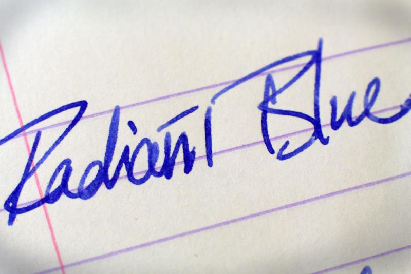
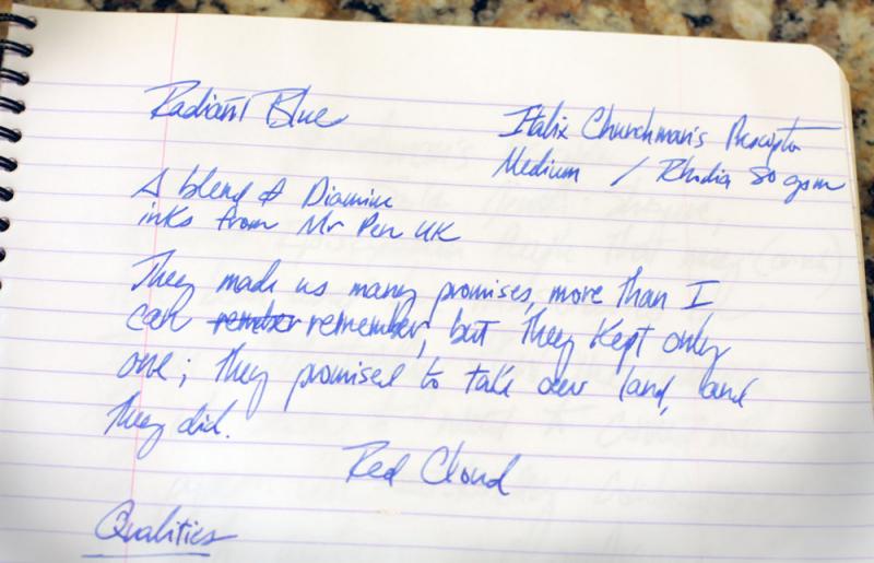
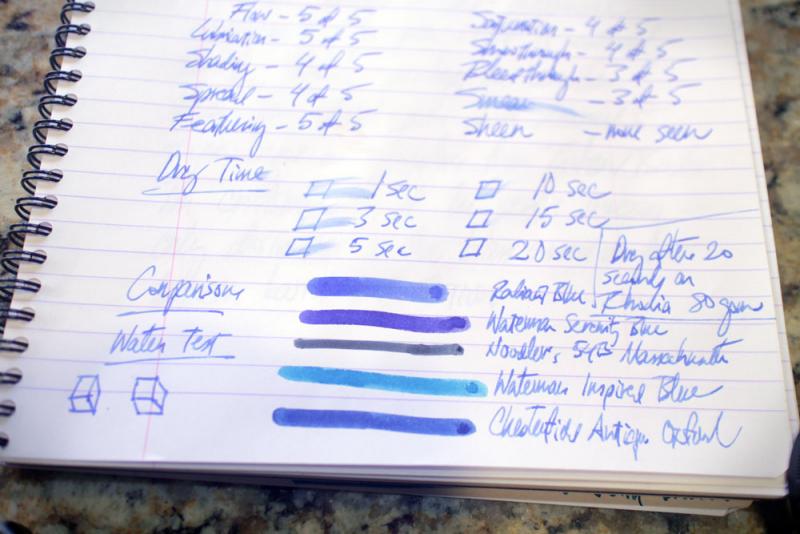
Purchasers of the popular Italix pens from Mr. Pen in the United Kingdom receive an instruction sheet that recommends the use of Diamine ink. They may not realize that the company also offers a custom Diamine blue ink blend. The ink, Radiant Blue, recently accompanied my purchase of an Italix Churchman's Prescriptor. The ink is a cerulean blue, lighter than both Waterman Inspired Blue and Chesterfield Antique Oxford (itself supposedly a version of Diamine Majestic Blue). The founder of Mr. Pen, Peter Ford, describes the ink as the result of adding four drops of a special ingredient to a Diamine blue ink. This ingredient is a mystery, but a good guess on the base ink is Washable Blue or Royal Blue. His description suggests Radiant Blue was a Diamine color from a couple of decades ago. As a supporter of attempts to recreate legendary ink colors, and as an enthusiastic fan of Mr. Ford's ability to imbue stationery products with uniquely English names and characteristics, I tried it. The ink offers a great deal of shading and a solid, business-like, not-too-flashy professional presence, with well-behaved flow and cleaning characteristics, though with perhaps a touch of showthrough to the other side of a sheet of Rhodia 80 gsm notebook paper. No observable sheen. Written with an Italix medium nib, the ink dries completely after about 20 seconds on this paper. If you like blue ink and enjoy the idea of English ink in an English pen, it may be worth ordering Radiant Blue along with your next writing instrument from Mr. Pen. I forgot to complete the water-resistance test in the accompanying photographs; if you're interested, the ink is not waterproof.
-
Hello Everyone, I've been looking through this site for many years but only gained the courage to join today I went to a school from ages 9-13 where use of a fountain pen was compulsory. The pen of the day was Parker - but I don't remember owning one at that age. Biros were banned from the school. I quite liked that we had to use a fountain pen. Back then, it was one of the things that set us apart from other local state schools along with having to wear a uniform and learn a musical instrument. I've been fussy about stationery ever since, but only linked my nerdy relationship to pens and paper back to my middle school very recently. I like to have the perfect pens, the perfect inks and the perfect writing pads - perfect for me that is! I don't mind others using different stationery and I don't dictate. I don't need to own an expensive pen to enjoy writing with a fountain pen. Currently, I have some fantastic Chinese pens (Duke Ruby & Jinhao Bookworm Celluloid fountain pens), a lovely Cross Beverley White and a decadent Grifos Cappuccino. I like highly pigmented inks, so my blacks would be Aurora or Lamy. However, I prefer purples/violets though and I'm currently enjoying Diamine Shimmer Purple Pazazz in my Cross & Grifos pens and Private Reserve Tanzanite in my Duke Ruby. When I'm unable to write with a fountain pen (I often have to write on self duplicating paper) I revert to gel ink pens because of the depth of colour of the ink. My writing pads for home and work are A4 Black n Red Wirebound 90gsm notebooks. I don't really have a problem with the ink seeping through to the other side of the page. Now that I've exposed the true extent of my nerdiness, I'll sign off. Many thanks!
-
Diamine Registrar's is my go-to ink for work, because it doesn't feather/bleeds through even the cheapest papier. It's quite expensive though, and I've bought some Ecclesiastical Stationery Supplies Registrars, which is three times less expensive (factoring in shipping costs). After a workday of using both inks, the differences I've noticed : 1. The colour is virtually undistinguishable. 2. ESSRI is less dry than Diamine, so it's the ink of choice for drier pens. 3. ESSRI does feather slightly and does bleed through slightly, whereas Diamine almost never does. See the comparison here : Recto : http://i.imgur.com/gZ5LGby.jpg, Verso : http://i.imgur.com/3PWCJwE.jpg The first two lines are written with ESSRI, and the rest with Diamine.
-
30 needed to reduce the price to $69.99 + shipping! There are 8 days left to join as of today ... https://www.massdrop.com/buy/diamine-ink-boxed-gift-set
-
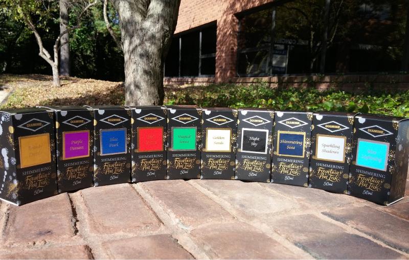
BEAUTIFUL SHIMMER- TASTIC!! In stock now all 10 colors. Golden Sands Blue Pearl Purple Pazzazz Night Sky Magical Forest Brandy Dazzle Shimmering Seas Red Lustre Sparkling Shadows Blue Lightning Have any questions let us know you can call 1800-263-2736 or 410-992-3272 and also email at Support@penboutique.com
-
Here is a review of Diamine's Chocolate Brown, a dark brown, slightly reddish. One some papers it appears much like a chocolate, others a little darker. Diamine has been making inks for a long time, and that shows in the ink's ability to "just work". It has some subtle shading which is nice, but they seem to use the same underlying red which seems to be not very waterfast. The ink basically lifts right up when blotted when hit with water. The photos didn't work out so well, the light being poor recently, so the ink appears darker than in reality. The ink is not a replica for PPM as it is too warm, and a bit lighter. Tested on Mohawk via Linen, Hammermill 28 lb inkjet paper. I've run out of my little Tomoe River booklet.
-
Ten beautiful colours which will bring your handwriting to a higher level. http://www.sakurafountainpengallery.com/en/boutique/diamine-inkt-amp-vullingen Enjoy, Catherine
-
Diamine Shimmering Set (Half Of The Line Part 2) Overview
attika89 posted a topic in Ink Comparisons
Hi everyone! I've got a chance to review some of Diamine's new Shimmering inks line! I've posted about half of the line earlier, but luckily here is the other half as well! Huge thanks to Bureau Direct and Diamine! http://www.cultpens.com/files/cp/imagelibrary/brands/product/diamine.jpg The pen I used is a Cerruti 1881 Zoom, with a really wet stub nib. Paper is Tomoe River! If the photos wouldn't show up, take a try here. Prepare for the photo-flood! Lets start with a shot of all 10 inks of the line: http://kephost.com/images/2015/10/01/274745e6f6a56d1d38fc057ff31bd317.jpg Closer look on the "new" five: http://kephost.com/images/2015/10/02/dd7a35b46035a89beb3071cd24ea7bb1.jpg First of all, here is a scan: http://kephost.com/images/2015/10/02/e3c7f169c59a721b49e0866bd6bd5182.jpg Sparkling Shadows http://kephost.com/images/2015/10/02/1fb3e92c056de676d1d9b20f6a3ea9da.jpg http://kephost.com/images/2015/10/02/0898c1d7b4453c1a11a806cc5e09806f.jpg http://kephost.com/images/2015/10/02/74e10e8aa3fedae1a345c28afaa82a9e.jpg Magical Forest - a really nice surprise for me! http://kephost.com/images/2015/10/02/f9ce03550b308e534677ccf8ba45266c.jpg http://kephost.com/images/2015/10/02/1d62c39e3812f6723d69027196919aba.jpg http://kephost.com/images/2015/10/02/a0940a8de53f0343895615bdd40f6b67.jpg Red Lustre http://kephost.com/images/2015/10/02/8193f4f203e5874922e441ee3272ebf0.jpg - I need to correct myself here. It has a lot more pink when it dries, but when it's wet, it is really a nice red. http://kephost.com/images/2015/10/02/cf354ceda3ad4cc06d24b1d0e9317c3e.jpg http://kephost.com/images/2015/10/02/8ebf3fbdf24fcab896b427d0f1c08362.jpg Golden Sands http://kephost.com/images/2015/10/02/6da99c2df856f03eedb373abb47967e0.jpg http://kephost.com/images/2015/10/02/e0fbdc06f5057a269fb34e95cc339953.jpg http://kephost.com/images/2015/10/02/d0bc0fc5042e0ced6c6c1283fe712b6c.jpg Night Sky - Look at THAT! http://kephost.com/images/2015/10/02/90afde2a3085ed4cafdf13d20100192b.jpg http://kephost.com/images/2015/10/02/17cf245850ef28b4bb252e9ae3069990.jpg http://kephost.com/images/2015/10/02/a833b5c7344378423676302c663114af.jpg That's all folks! I really hope you liked it! -
Hey all, (Sorry if this is posted in the wrong place) I love Diamine Majestic Blue: not so much the sheen, but the juicy tone. However, I'm getting serious burping/blobbing issues with a TWSBI Vac700 (my daily). I'm pretty sure it's the ink & pen combination, as haven't had burping in that pen with Havasu Turqoise or Burnt Sienna, but I'm not completely sure. Even uncapping it is asking for trouble at the moment! Could be to do with warming in my hands, but again, I haven't had this with other colours. I've definitely noticed this ink is *very* wet in this pen: I can barely make out the feed fins, or whatever they're called and it practically flies out when writing. Can I just check if anyone else has had similar issues, or if there are any tips. Would love to use the combination if possible. Is it just this ink, or have I done something to the pen somehow? I'm nearly finished the reservoir, so can try testing with another colour and/or re-assembling the pen. For science! Thanks in advance, Evy [edited for clarity]
-
I love anything purple, and naturally this extends to fountain pens and inks! However, from my limited exposure (mostly Goulet Pen's selection), I can't seem to find a true lavender ink. Even Private Reserve's Purple Haze, the lightest purple Goulet carries, ends up being a standard medium purple in my EF Pilot Penmanship. I know Diamine and J. Herbin make "lavender" inks, but it seems from from my limited experience that they're actually closer to a regular purple rather than the pastel-like shade you'd expect a lavender to be. Short of diluting my purple inks, are there any truly lavender inks any of you can recommend?
-
http://www.sheismylawyer.com/album/Ink/slides/2015-10-17-19-00-04.jpg
-
I have decided to review some of my inks. These aren't necessarily in any particular order. This one is Diamine Crimson. I would call it a bright, blood red. It's a well behaved, saturated ink with plenty of shading. I found it flowed smoothly across the page, and had no problems with lubrication in the 2 pens I used. It looks really bright in the 1.1 nib. This ink shows through and bleeds through on my thick paper, so I tried it on some cheaper paper. Showthrough and bleedthrough are both noticeable on there. I also tried this ink in my Pilot CH74 pen with F nib. That nib is like a nail and it needs adjusting because it's too scratchy. However, when using it on the thick Xerox ColorPrint paper, I spotted a little dark, almost black, spread around some of my down-strokes, specifically on letters 'I' and 'L.' This was very faint, and it didn't show up on the scan, but it was there. I didn't see similar spread with the Lamy pens I used on this review sheet. I think that the scratchy Pilot F nib dug into the paper more, and that caused the ink to spread. It was probably the way I write. The water test on the review form shows this isn't a waterproof ink. Bearing in mind the paper I use is very smooth, and the nib used at that time was a M, this ink took 16-18 secs to dry. It flows through the pen well and lubricates the nib well. I saw no skips or hard starts from either of the pens that both stayed uncapped while I swapped and changed, and did swabs and comparisons with other inks. It is currently available in 80ml glass bottles or 30ml plastic refill bottles. It's also available in cartridges. Diamine sell it directly to end-users on their web-site. It's a reasonable price