Search the Community
Showing results for tags 'diamine'.
-
My guess is that Cult Pens has quite a cult following in the UK. They apparently stock nearly everything they can get their hands on in the way of pens of all kinds, many inks. I have a feeling that if I spent much time on their website I'd end up with a fairly expensive cart of booty. Well they have Cult Pens ink made by Diamine. These are the "Deep Dark" inks, and they are not rebranded standard Diamine inks. The Deep Dark Brown has been rated by those in the know as the closest to the long-discontinued Parker Penman Mocha. But I personally could never justify to myself to order just a couple bottles of ink given the exchange rate, and added shipping costs. Thankfully an FPN friend sent out some samples of a couple of these inks. This is the Deep Dark Green. And I will tell you that at $1.23/£1 an 80 ml bottle of Diamine retails for £4.92, about $6, compared to nearly $15 in the US. I'm not sure there'll be nearly $9/bottle of shipping charges. So some bargains may be had for the adventuresome inky pirate. The green here is not a murky green per se, not like the KWZ ones, for even F-C. This is a fairly pur dark color. It reminds me of viridian or perhaps phthalo green watercolor. It's quite bluish, no leaning towards yellow. Much darker than F-C Loden. Perhaps not quite as dark as Sailor Miruai. No way of mistaking the color as green. Pen: Pelikan M400 (14kt-F) Papers: MvL=Mohawk via Linen, TR=Tomoe River, Hij=Hammermill 28 lb inkjet There is considerable red sheen wherever the ink pools, in punctuation, loops. Quite pronounced. A bit of water-resistance when washed over, less so when blotted.
-
Manufacturers since 1864, Diamine Inks relocated to this purpose built 'state of the art' factory in Liverpool in 1925, where they successfully carried on using the traditional methods and formulas for ink production. Over the years the company has changed hands and are now located close to the world famous Aintree Race Course http://www.diamineinks.co.uk/images/DimaineFactory.gif http://www.diaminein...uk/AboutUs.aspx Diamine Salamander is a bizarre (=unique looking) ink. If you like the color of gutter water and can look at the way it swirls for hours, chances are you'll enjoy this color. The hue you see on paper is strongly dependent on the nib and paper you use. In places it can be almost black but even in wetter pens yellow undertones are visible. This ink doesn't belong to one color family - it has dark green, brown, yellow, black in it. The flow is smooth, it appears to dry quickly and evenly. In finer nibs drying times are fast and the ink won't smudge if you happen to pass a hand through the paper. It doesn't really offer water resistance. Drops of ink on kitchen towel Software ID Color range Tomoe River - Kaweco Classic Sport, broad nib Leuchtturm 1917 - Kaweco AL Sport, broad nib Clairefontaine, Lamy Al-Star, broad nib Water resistance
-
I'm currently reviewing some of my favourite Diamine inks. This one is Diamine Steel Blue. It's quite a greenish turquoise, and in trying to do comparisons, I find that all of my others are blueish turquoises. This ink is quite a bright shade. Bearing in mind the paper I use is very smooth, this ink dries quite quickly in 10-12 seconds.It flows reasonably wet, and lubricates the nib quite well.No start-up problems noticed. No skipping noticed.It is currently available in 80ml glass bottles, or in 30ml plastic refill bottles directly from Diamine or from many online stores. The bottles don't have inkwells.This isn't a waterproof ink.Diamine sell it directly to end-users on their web-site.It's reasonably priced.
-
Hi, I did a couple of searches, but if this is answered elsewhere I didn't see, just point me to it. I just got a TWSBI 580 and put some Diamine Kelly Green in it. The ink looks like it has tiny spots in it and I can't figure out why. I know at least one other time this happened, but I don't remember the pen/ink combo. Anyone know what causes this? how to fix it?

-
Diamine is a well known, very long time ink maker based in the UK. Many pen repair folks, at least in the US, advise their customers to use Diamine inks as they consider them safe for fountain pens. And their line of inks is extensive. Some of my earliest ink purchases included some Diamine inks. Unfortunately, my purchase decisions were based on what others raved about (Oxblood! Ancient Copper!) rather than inks I myself might actually like. And I never really investigated the Diamine line after that. Recently I received this ink as a "thank you" from a retailer where I'd purchased a pen. So I decided to give it a try. The ink is a soft purple or red-violet. It has decent handling. It's not especially bright, rich, or dark. Perhaps a bit of a vintage feel to it. Maybe with a wider nib you'd get more color. The ink probably has normal wetness and flow, but since I typically use wet inks (Sailor, KWZ) this felt a bit drier. I don't want to give the impression that this is a dry ink, it's not. Just relative to what I've used in the past in this pen. Pen: Edison Premiere (F-steel) Papers: MvL=Mohawk via Linen, TR=Tomoe River, Hij=Hammermill 28lb inkjet. The MvL and Hij had a little bit of show through, these are more absorbent papers, so perhaps that was a factor. It wasn't anything that would prevent writing on the verso.
-
My guess is that Cult Pens has quite a cult following in the UK. They apparently stock nearly everything they can get their hands on in the way of pens of all kinds, many inks. I have a feeling that if I spent much time on their website I'd end up with a fairly expensive cart of booty. Well they have Cult Pens ink made by Diamine. These are the "Deep Dark" inks, and they are not rebranded standard Diamine inks. The Deep Dark Brown has been rated by those in the know as the closest to the long-discontinued Parker Penman Mocha. But I personally could never justify to myself to order just a couple bottles of ink given the exchange rate, and added shipping costs. Thankfully an FPN friend sent out some samples of a couple of these inks. This is the Deep Dark Orange. And I will tell you that at $1.23/£1 an 80 ml bottle of Diamine retails for £4.92, about $6, compared to nearly $15 in the US. I'm not sure there'll be nearly $9/bottle of shipping charges. So some bargains may be had for the adventuresome inky pirate. I love the color of this ink, it reminds me of blood orange. The color is really nice and rich, not bright, deep and not thin. There's nice shading. Excellent handling, with very good flow and lubrication. There could be some sheen on Tomoe River, but you might need a wide nib to really bring that out. I'm not normally an orange or red ink fan, but for some reason this ink makes me go oo la la. This probably wouldn't become an everyday ink, but would be a joy to use whenever brought into rotation. If you live in the UK, you are one lucky person. The only downside is it's not very waterproof. Pen: Edison Nouvelle Premiere (M-steel) Papers: MvL=Mohawk via Linen, TR=Tomoe River, Hij=Hammermill 28 lb inkjet
-
Ink Review : Diamine Tchaikovsky (Music Collection) Pen : Lamy AL-star, M-nib Paper : Rhodia N°16 notepad 80 gsm Review St.Petersburg, 1891 Well met stranger... my name is Pyotr Ilyich Tchaikovsky, and I'm here at our famous Blue Bridge looking for inspiration for a wonderful fantasy ballet called "the Nutcracker". This blue setting makes me think of a magical dance, playful blue roses... why not waltzing flowers ? Yes... that's it ! I see the music before me, a magical dance called "the Waltz of the Flowers". In 2015 Diamine released the Music Collection, a set of 10 subdued ink colours named after well-known composers. In this review, we take a look at Tchaikovsky. After the above introduction, you're sure to remember that this is a wonderful blue ink. Daimine Tchaikovsky is a wonderful true-blue ink that just looks good without being pretentious. The ink writes smoothly with good contrast in the finer nibs, making it perfectly usable in a business setting. But it's with the broader nibs that Tchaikovsky really opens up with some fantastic shading. I really like it... this ink is doing its best to entice me to move up a notch from my current comfort zone of F/M nibs to a broader M/B spectrum. The ink exhibits good flow and performs well on a wide variety of paper. And with the right kind of paper (like Tomoe River) and a wet nib, it produces a striking red sheen. Rhodia N°16 notepad 80 gsm - drying time ~15 seconds, no feathering, no show-through nor bleed-through.Paperblanks journal paper - drying time 10-15 seconds, no feathering, no show-through and no bleed-through.Generic notepad paper 70 gsm - drying time ~10 seconds, no feathering, no show-through nor bleed-through.Moleskine journal - drying time ~5 seconds ! Just a hint of feathering, significant show-through and bleed-through. Nevertheless - looks great, just don't expect to be able to use both sides of the paper.Tomoe River paper - drying time 15-20 seconds, no feathering, no show-through, no bleed-through. Really nice red sheen on this non-absorbent paper !Original Crown Mill cotton paper - drying time 10-15 seconds, no feathering, no show-through nor bleed-through.Impressive behaviour ! Even on the lower-quality paper. This is an ink you can use on the cheaper paper in the workplace. Unfortunately, Tchaikovsky has no water resistance to speak of. The blue colour quickly dissipates when the ink comes into contact with water. What remains on the paper is barely decipherable. A pity... Conclusion Diamine Tchaikovsky is a true-blue ink that is at home with all types of paper, even the lower quality ones. The ink works well with finer nibs, but is really meant for use in broader nibs where it exhibits a beautiful shading. And on the right kind of paper, the ink shows a striking red sheen. This is one of the better classic-looking inks of the Music Collection. If you're looking for the perfect true blue ink, this might be it, if you're willing to ignore the total lack of water resistance. A great ink form a great collection ! my overall score: A
-
Manufacturers since 1864, Diamine Inks relocated to this purpose built 'state of the art' factory in Liverpool in 1925, where they successfully carried on using the traditional methods and formulas for ink production. Over the years the company has changed hands and are now located close to the world famous Aintree Race Course http://www.diamineinks.co.uk/images/DimaineFactory.gif http://www.diaminein...uk/AboutUs.aspx I believe this ink was made for those who want to break with bad habit of using solely black ink but are to shy to make it with vibrant red or green or bold orange. It's really dark but not as monotone as black inks as you see purple tones in it. While the color isn't really exciting it will certainly give some character to your notes, especiaally at closer inspection. The ink is wet and feels nicely lubricated. I haven't observed any feathering but I use mostly good paper so I'm not sure how it would behave on cheap absorbent papers. Some bleedthrough may occur, I suspect. Also it's rather affordable ink so if you're not one of ink hunters & collectors but I enjoy writing with fountain pen and look for something less banal than black, this one delivers nice writing experience. Personally I find the color boring in most pens and on most papers. Drops of ink on kitchen towel Software ID Color range Tomoe River - Kaweco Sport Classic, eyedropper, B Leuchtturm 1917 - Kaweco Sport Classic, eyedropper, B Oxford, Hero 5028, stub 1,9 Rhodia, TWSBI 58o, stub 1,1 Water resistance
-
Hey there! This is my very first ink review so it's very possible that I have left out stuff. Suggestions for future reviews are very welcome! The ink I will be reviewing today is the Diamine Marine. It has been well documented, but it is such a bright, happy blue with such beautiful shading that I couldn't resist adding another to the list. Coming from the Namiki Falcon onto Rhodia, Marine is a beautifully shading ink. The colour ranges from a light turquoise to a pretty dark teal. Dry time on Rhodia is fairly extended with the ink completely drying only around the 25- 30 second mark. However, writing with a pen that has a more controlled flow yeilds a dry time of around 15- 20 seconds. The ink is not very saturated and there was no bleedthrough (and only minor showthrough) on the back of the paper after the third pass. Water resistance is negligible. Lubrication and flow are very good, as with all Diamine inks I have used. There are no start up issues even if I do leave my pen uncapped for up to fifteen minutes. I've mis-written one of the cons(oops!): it does feather on copy paper, but only very little and there is no bleedthrough. The ink is comparable to Diamine Soft Mint, but it is more blue-ish. Shading from a flex pen! Oh, on a final note, my 30ml bottle of Marine isn't the plastic I've seen in other places, but a rather more attractive glass one. Just thought it worth mentioning; hope you liked the review
-
I just ran out of ink in my Pilot Varsity. I recalled that the "surprise me" ink sample from my most-recent Goulet Pens order is Diamine Shimmertastic Blue Lightning, and was getting ready to fill the Varsity with it. I then remembered that the Varsity uses a wick in the feed, and I was wondering if that would make it impossible for the shimmer particles in the Blue Lightning to make it to the nib. Has anybody used one of the shimmering inks (Diamine or the J. Herbin 1670 line) in a Pilot Varsity? What was your experience?
-
Dear Friends, It is my pleasure and honour to share the latest Shimer Inks from Diamine due to be released this month. There are 12 colours and I have been able to review them all thanks to Diamine. I welcome your thoughts and feedback, as always. EDITED TO ADD SCANS
-
Manufacturers since 1864, Diamine Inks relocated to this purpose built 'state of the art' factory in Liverpool in 1925, where they successfully carried on using the traditional methods and formulas for ink production. Over the years the company has changed hands and are now located close to the world famous Aintree Race Course http://www.diamineinks.co.uk/images/DimaineFactory.gif http://www.diaminein...uk/AboutUs.aspx Diamine Twilight can be considered as a member of blue-blacks family. It's a solid performer with some shading and good overall performance (unless lack of water resistance is an issue). The color is quite complex - it leans towards green, grey, and teal-like hues, depending on the pen/paper combination you use. It's not bad, but this kind of color is not my favourite one. Drops of ink on kitchen towel Software ID Color range Tomoe River - Geha Gold Wing, M Leuchtturm 1917 - Kaweco AL Sport, broad nib Kokuyo Campus Myo, Geha Goldwing, medium nib Water resistance
-
Anyone try this ink before?
-
Manufacturers since 1864, Diamine Inks relocated to this purpose built 'state of the art' factory in Liverpool in 1925, where they successfully carried on using the traditional methods and formulas for ink production. Over the years the company has changed hands and are now located close to the world famous Aintree Race Course http://www.diamineinks.co.uk/images/DimaineFactory.gif http://www.diaminein...uk/AboutUs.aspx Majestic Purple has nothing majestic in it. It's decent but rather boring purple ink. I don't really like it although the performance is good. Drops of ink on kitchen towel Software ID Tomoe River - Kaweco Sport Classic, eyedropper, B Leuchtturm 1917 - Kaweco Sport Classic, eyedropper, B Moleskine - Kaweco Sport Classic, eyedropper, B Comparison
-
I've just completed my simple review of the latest twelve new inks in the Shimmer range, from Diamine. Six with gold particles and six with silver. Although I don't like 'particle' inks, per se, this new release is actually superb. Let's be honest though; it's purely my opinion and I don't really think that any judgement should be made before trying them out for yourselves. As with any ink/pen/paper combination. But, we should all know and respect that... There are a dozen new colours as I mentioned and I will just post a simple scan of my test. I've recently had to get a new phone but it has a rather better camera than my last one, so pictures, rather than scans, will follow tomorrow. However I will say, that the particular distribution shows up with this batch, better than the first one, even with a flat-bed scan, so I think there has been a real improvement. I decided to use the Sailor Sapporo B nib for the tests, as before, and have to say that there was NO problem in cleaning out the pen between inks. After each fill I used the converter to rinse out the nib section eight times, under a running tap - not TOO much due to the water meter! - and even before the end of that cycle, there wasn't a hint of any metallic particles. I then just checked the converter, and gave it a flush. Then I used a rubber bulb to flush through the nib and section. Only after all twelve inks, did I finally take the section apart and there wasn't a hint of metallic or dye residue at all. I'm impressed. So now to the colours. All I have to add to my comments, is that I may have made different notes to the writing of a particular ink. The differences are purely due to distractions - there are no differences with any of these colours. They all perform very well with the pen and paper I used for the tests. First, the gold particle inks. <img src='https://www.fountainpennetwork.com/forum/uploads/imgs/fpn_1475100387__golden_oasisshimmer_2_gold_0006.jpg' alt='Golden Oasisshimmer 2 gold_0006.jpg' /> And now the silver particles! I will post pictures of some of these, to try to show the particles but, in the meantime; enjoy!
-
Need Replacement For Diamine Blue/black And Majestic Blue
ahmet_yuce posted a topic in Inky Thoughts
Hi; Bought eight 30ml bottles of Diamine inks some time ago, have troubles since the begining. I got Pelikan, Waterman, Sailor inks usually happy with them but Diamine. When i just bought them, most of them were too wet. Bleedthrough almost on all papers, worst was Pilot MR medium nib, it was blotting while writing. After 2 years sitting in a drawer with caps firmly tightened, now they are not as wet as before. But colors shifted (most noticable is Oxblood) and now they are drier. Even Majestic Blue clogs TWSBI Classic frequently. Anyway i like Diamine's colors, price is good, but got enough trouble with them. Desperately looking for replacements especially for Diamine Blue/Black (a nice old looking blue-black with green hue) and Majestic Blue. Any suggestion wellcomed. -
Are Diamine Eclipse and Private Reserve Ebony Purple close in colour and tendency to look like black ink? I'm thinking of getting the latter but Eclipse, for me, looks black way too often (not a fan of black ink) but that close-to-black-but-clearly-not-black is so good when it shows up though.
-
Some time ago Diamine felt the urge to follow example of J. Herbin - they've decided to hit the market of glittering inks. The line of Shimmertastic inks premiered in 2015. Personally I dislike shimmering inks / inks with particles. I didn't expect to like this line. A friend of mine bought full line and sent me the whole bottles to review. I've tried them all. I don't like them but I'll review them. Maybe you'll like them more than me? After strong punch from Diamine that offered ten colors I wonder with what 1670 ink J. Herbin will come this year? Anyway there's ten inks in the line: Blue Lightning Blue Pearl Brandy Dazzle Golden Sands Magical Forest Night Sky Purple Pazzazz Red Luster Shimmering Seas Sparkling ShadowsSix with golden particles And four with silver particles GOLDEN SANDS Golden Sands is light but legible yellow ink with nice shading. Drops of ink on kitchen towel Software ID Tomoe River, Kaweco Sport Classic, B Leuchtturm 1917, Kaweco Sport Classic, B Oxford, Hero 5028, stub 1,9 QuoteMultiQuote
-
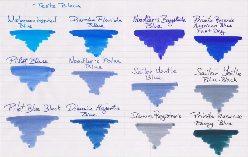
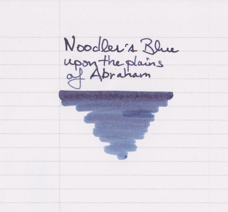
Hello all, I felt like comparing my blue inks after acquiring Noodler's Baystate Blue yesterday, so here they are : - Waterman Inspired Blue - Diamine Florida Blue - Noodler's Baystate Blue - Private Reserve American Blue Fast Dry - Pilot Blue - Noodler's Polar Blue - Sailor Jentle Blue - Saior Jentle Blue-Black - Pilot Blue-Black - Diamine Majestic Blue - Diamine Registrar's - Private Reserve Ebony Blue All names are written with a J. Herbin glass pen. The swabs are done with Q-tips. For each swab, the upper line is 3-pass and the bottom is only one with what is left of ink on the q-tip. The paper is Rhodia 80 g/m2. This is my first post, but I read FPN posts since 2012. Thank you everyone for creating and feeding such an amazing source of information! Edit : ... And I initially forgot a newly acquired Noodler's Blue Upon The Plains of Abraham :
-
Sometimes inks are not made for being used at work, for taking notes, for normal correspondence... but they are so gorgeous that you simply don't mind what other people could think of you and keep using them like there's no tomorrow. The review which is going to follow is the complicated love story between me and Diamine Shimmertastic Sparkling Shadows. Diamine Shimmertastic Sparkling Shadow is a interesting grey ink, dark enough to be definitely usable, with high ammount of nice shading on every paper, and lots of nice gold glitters. Like most Diamine Inks, has really good characteristics: marvellous flow (despite the presence of glitter I've never experienced cloggings), well lubricated, smooth feeling when writing with every type of nib, no feathering, not a single bleedthrough (even under the third swab test). Dry times are fairly long, and it's not waterproof. But let's sto wandering around the main thing around this ink: It's a glittery ink. Glittery inks are not made for everyday based use, it's unlikely you'd be signing a paper with this kind of ink, it feels unprofessional and not respectful in front of the person you're writing to. I definitely agree, I respect the social convention by not using it if inappropiate, but I really cannot give a look to this ink without finding it gorgeous. It's a wonderful grey ink (and it's definitely not easy find a good grey ink) that gains a sort of third dimension by the adding of extremely thin gold particles. It ends to be an ink suitable only for drawing, for other artistic purposes, for signing holiday cards or doodling around... But the pleasure you feel while writing, the shining trace of ink you leave on the paper is something I find difficult to find in other inks. Ink with such glittery particles are usually known to be difficult to clean, I've to say that this particular one it's a little more difficult to clean and needs a little more mantainance, but just a little, cleaning is not a big issue in my opinion. So, the usual final question is : It is worth it? A bottle of 50 ml of this ink costs around 12€, and you acquire a huge ammount of a extremely well ingeneered ink. It's up to you, in my opinion this ink is worth every cent, but I like using it for different and personal reasons. If you want something you're like to use every day probably this is not made for you. If in doubt, buy it, for 12 € it's worth trying. COPY PAPER SCHIZZA & STRAPPA PAPER TRACING PAPER INKDROP CROMATOGRAPHY SHIMMER CLOSEUPS
-
Manufacturers since 1864, Diamine Inks relocated to this purpose built 'state of the art' factory in Liverpool in 1925, where they successfully carried on using the traditional methods and formulas for ink production. Over the years the company has changed hands and are now located close to the world famous Aintree Race Course http://www.diamineinks.co.uk/images/DimaineFactory.gif http://www.diamineinks.co.uk/AboutUs.aspx As I've mentioned few times I have mixed feelings about Diamine inks, however I tend to use them from time to time. They have some amazing colors. Last year Diamine inks introduced their 150th anniversary inks in triangle bottles: http://www.diamineinks.co.uk/images/BB_TerracotaL.jpg http://www.stilografica.it/writable/Oggetti/Inchiostro%20boccetta/Diamine%20150th%20Anniversary%20Collection%20Ink.jpg There are eight colors in this series of inks: Blue Black Blue Velvet Carnival Regency Blue Safari Silver Fox Terracota Tropical Green Safari is my personal favourite. Ink splash http://imageshack.com/a/img901/5355/CAlBa7.jpg Drops of ink on kitchen towel http://imageshack.com/a/img673/4523/upghJy.jpg Software ID: http://imageshack.com/a/img537/5998/vtAIAI.jpg Color range http://imageshack.com/a/img538/7959/Rm63We.jpg Oxford recycled - Kaweco Sport Classic, eyedropper, B http://imageshack.com/a/img661/9162/MFDA8F.jpg http://imageshack.com/a/img905/301/K4soto.jpg http://imageshack.com/a/img905/7504/YQ4z1O.jpg http://imageshack.com/a/img540/8237/K46meU.jpg In Hero 5028 1,9 stub and on copy paper the color looks darker and brownish. http://imageshack.com/a/img537/478/ggMHS8.jpg http://imageshack.com/a/img540/6887/bVpVGX.jpg Comparison http://imageshack.com/a/img540/611/Vg02lr.jpg
-
I like red inks and I use them on every day basis. I'd like to present you short comparison of ten colors. Of course it would be great to compare more reds but then my samples of Oxblood and Monaco Red are empty. Next time. So the inks I've compared are (in alphabetical order): BRILLIANT RED - Diamine http://imageshack.com/a/img834/7010/tg6s.jpg BRILLIANT RED - Pelikan http://imageshack.com/a/img842/8815/x797.jpg BURGUNDY RED - Montblanc http://imageshack.com/a/img843/6245/qxoy.jpg CIEMNY CZERWONY (Dark Red) - Nicpoń* *Nicpoń is chemistry PhD Student that's active on Polish fountain pen network. He'c created limited line of nice, saturated inks in many colors. http://imageshack.com/a/img834/7862/c9n5.jpg GARNET RED - Graf von Faber-Castell http://imageshack.com/a/img834/7862/c9n5.jpg MATADOR - Diamine http://imageshack.com/a/img834/6818/pmh4.jpg MORINDA - Rohrer & Klingner http://imageshack.com/a/img835/3799/pvp4.jpg RED - Hero http://imageshack.com/a/img842/9356/rew0.jpg RED DRAGON - Diamine http://imageshack.com/a/img842/1002/kwg3.jpg RUBY - Diamine http://imageshack.com/a/img836/6886/yi84.jpg There was an accident. I was ready to make "splash painting" with Ruby. The sample was standing near the sink, I don't know why, but I've abruptly turned and my hand pushed the sample. The rest of the ink flow down the sink to some foreign lands. Ruby is a great color, so it's a pity I couldn't compare it this way. SWABS ON SCAN (Canon MP 250) http://imagizer.imageshack.us/v2/1024x768q90/843/9jsta.jpg SWABS ON PHOTO http://imagizer.imageshack.us/v2/1024x768q90/842/jpna.jpg FEW DROPS OF INK ON KITCHEN TOWEL http://imagizer.imageshack.us/v2/1280x1024q90/835/bqr6.jpgTEXT WRITTEN WITH PILOT 78G, B NIB in Oxford notebook http://imageshack.com/a/img838/576/fra5.jpg TEXT WRITTEN WITH PILOT 78G, B NIB in notebook http://imageshack.com/a/img841/5115/eifu.jpg TEXT WRITTEN WITH PILOT 78G (B NIB) IN CALENDAR http://imageshack.com/a/img842/3936/qgzj.jpg TEXT WRITTEN ON CHEAP PAPER (inks are listed as above) http://imageshack.com/a/img845/3366/v4ws.jpg http://imageshack.com/a/img835/7620/sqyd.jpg TEXT WRITTEN ON CHEAP COPY PAPER PRINTED WITH DOTS http://imageshack.com/a/img834/2382/c4e57.jpg http://imageshack.com/a/img834/7564/p4hw.jpg http://imageshack.com/a/img843/7411/bud7.jpg SUMMARY RED DRAGON stomps. It's amazing deep color. I love it. Second and third place are taken by CIEMNY CZERWONY and MORINDA / MATADOR ex-aequo. There are also colors I dislike, namely: Pelikan's BRILLIANT RED (it sucks: I can't find anything interesting about this ink), GARNET RED (moderate flow, dull), BURGUNDY RED (dull, not interesting). What's your opinion? You can choose few inks from the poll.
-
Hi All, Fountain pen newbie here with some questions on ink. I am experiencing bleeding on inks that most people do not have bleeding problems with. Specifically, Diamine Majestic Blue, De Atramentis Magenta Violet and Rohrer & Klingner Cassia. I am using a Leuchtturm 1917. I have read different articles about dilution but several ink reviews for these inks do not mention any bleeding problems. I have added a photo of the reverse side of a Majestic Blue list and a ink sample page. When I first started using Noodler's Black, I had problems with "ink transfer" (not sure if there is a term for this). Dried ink on one page A would transfer to another page B (Page A and B are faces of a notebook A|B where | is the spine) when I wrote on the reverse side of page B. A little dilution got rid of this problem but the problem comes back when the ink starts to dry. Using ink seems pretty intuitive... Take ink from bottle, put in pen, write. Am I doing this wrong? Why am I having so many problems? Should I be diluting all of these inks? I know Rhodia paper handles ink better but I would like to find a solution that works with the Leuchtturm -- which should still be able to handle fountain pens! Thank you!!!
-
Ink Review : Diamine Schubert (Music Collection) Pen : Lamy AL-Star, M-nib Paper : Rhodia N°16 notepad 80 gsm Review Vienna, autumn of 1821, banks of the Danube river Greetings wanderer, my name is Franz Peter Schubert and I am enjoying my afternoon walk along the banks of our famous Danube river. Thunderclouds are gathering and the sky is gleaming with a magical light, that colours the river a deep green-blue. This setting inspires my muse - I've got an idea for a wonderfully complex piece. I think I'll call it "Wanderer Fantasy". In 2015 Diamine released the Music Collection, a set of ten subdued and seriuous-looking inks named after well-known composers. In this review, we take a closer look at Schubert - after the above introduction, you're sure to remember that this is a green-blue ink. Diamine Schubert fits in the spectrum of blue-green colours, but leans heavily towards the green side. Personally, I find it a rather dreary colour that's not really to my taste - dirty riverwater indeed ;-) Me, I like my blue-greens more on the bluish side, like Iroshizuku ku-jaku or Pelikan Edelstein Aquamarine. In broader nibs, the ink looks more lively and exhibits more shading. But still, this colour is not really my thing. OK - but how does it behave on paper ? For this, I did some tests: Rhodia N°16 notepad 80 gsm - drying time 15-20 seconds, no feathering, no show-through nor bleed-through.Paperblanks journal paper - drying time 10-15 seconds, no feathering, no show-through and no bleed-through. Looks better on this off-white paper.Generic notepad paper 70 gsm - drying time ~10 seconds, no feathering, no show-through, bleed-through only on the ink-swab.Moleskine journal - drying time ~5 seconds ! No feathering, significant show-through and bleed-through.Tomoe River paper - drying time ~20 seconds, no feathering, some show-through, no bleed through (with the exception of minimal bleed-through on the ink-swab).Original Crown Mill cotton paper - drying time ~10 seconds, no feathering, no show-through and no bleed-through.Technically, Schubert does really well on a wide variety of paper, and even behaves on the lower quality ones. In a Moleskine journal, it is perfectly usable if you use only one side of the page. In my opinion, the ink looks nicer on off-white, more yellowish paper. On white paper, I'm not a fan of the colour. The ink is reasonably smudge-resistant, and exhibits a fair water-resistance. Even after 30 seconds of running tap-water, I still had no difficulty reading what remains. On the 15 minute droplet test, the ink did behave poorly - in this case the text has all but vanished. Conclusion Diamine Schubert is a well-behaving ink on a broad range of paper, and has a fairly OK water resistance. Technically - I see nothing wrong with this ink. But for a teal ink, I personally find it too green for my taste. The resulting colour is not to my liking. In my opinion, blue-greens only look nice when they are closer to the blue side of the spectrum. my overall score: B
-
Hello, FP friends. My wife gave me a bottle of Diamine Shimmertastic "Purple Pazzazz" for my birthday. I'd heard these inks can be finicky, so I didn't want to load it into one of my existing pens, all of which are unusual fillers or finer nibs. So, I bought a Kaweco Classic demonstrator with a broad nib, since it was inexpensive and I thought it would be neat as an eyedropper loaded with this shimmery ink. I loaded the pen, and I have to say the experience has been disappointing. Initially, there was good distribution of the gold fleck onto the written page, at least for the first few letters in a sentence. Giving the pen a gentle shake would help "recharge" the fleck, and I could get a few more letters with shimmer. That was fine, as I really didn't expect this to be for everyday writing anyway. However, now I get no gold fleck at all. no matter how I shake, rattle and roll the pen before writing. There's still gold fleck in the barrel, but none comes out of the nib in writing. It's just purple. Any idea what might be wrong? I'm going to disassemble and clean the pen, but figured I'd ask. Did I choose the wrong pen for this shimmery ink? Thanks!