Search the Community
Showing results for tags 'diamine'.
-
INK : DIAMINE SALAMANDERPAPER : RHODIA #16 A5 white linedPEN : Onoto Magna 261 Medium nib tweaked for wet flow by John Sorowka (Oxonian). Scanner : IT8-calibrated Epson V600 flatbed Colour Space : Adobe RGB Matte : 50% grey and 100% white Post-process : Unsharp MaskColour Balance : Neutral http://www.dcoffey.co.uk/images/fountainpennetwork/ReviewSalamander.jpg DRYING TIME : Fairly long, particularly since I use a nib and feed adjusted for very wet flow. I found that 15s was about right for copy paper and a good 30-45s for Rhodia. This was from a well-cleaned pen with very high flow however. May not be suitable for left-handed over-writers. SATURATION : Salamander is a moderately saturated ink. It achieves its colour without excessive dye and is easy to clean. It does not smudge at all when dry. In natural light, there is good contrast on the paper and the ink is easy to read and relaxing on the eye. It would probably be work-safe unless you live under the rule of Blue or Black Only. BLEED THROUGH : I saw moderate bleed-through on Pukka 80gsm copy paper but only the odd pin-(bleep) on Rhodia. I suspect that a finer pen or one with more moderate flow would not have significant problems on marginal papers. If you want to use a fat, wet pen with this ink, make sure to use paper designed with fountain pens in mind. LUBRICATION : Diamine Salamander feels very smooth under the nib and starts very readily. I have had no problems with the pen drying out but then again the Onoto does not have a safety breather hole in the cap. Flow was high to very high but despite this the ink didn't feather at all even on copy paper. Line quality was excellent. It works well on very dry papers such as those with a Laid finish and might be worth checking out on off-white or cream papers such as G Lalo Vergé de France. Here is a close-up of the swab. http://www.dcoffey.co.uk/images/fountainpennetwork/ReviewSalamanderSwab.jpg Diamine Salamander is a nice olive greeny-brown with a touch of grey. It is similar to other colours such as Noodler's El Lawrence and Mont Blanc Racing Green. To the eye it has a little more green than in these scans but the scanner is freshly calibrated. Salamander looks at its best in natural daylight. And a close-up of the shading. http://www.dcoffey.co.uk/images/fountainpennetwork/ReviewSalamanderShade.jpg While there is some shading when used in a wet pen like this one, I feel that in a pen with more typical flow or a finer nib, the shading would not be very evident. There is no sign of sheen on any of the papers I used. The typical water tests... http://www.dcoffey.co.uk/images/fountainpennetwork/ReviewSalamanderWater.jpg As is typical of many Diamine inks, Salamander is not at all water resistant. There is a barely legibly residue, just enough to tell you what you have written if you look carefully. Almost all of the colour lifts readily, especially a yellow component which is visible on paper towels. The plus side to this is that it is very easy to clean and does not cling to the walls of a converter.
-
Ink Review : Diamine Strauss (Music Collection) Pen : Lamy AL-star, M-nib Paper : Rhodia N°16 notepad 80 gsm Review Vienna, summer of 1873. Last night in a red-brick dance-hall in the centre of Vienna, I witnessed bats flittering across the ceiling. Their playful aerial acrobatics were an amusing sight. This setting inspired my muse: I can see the notes of a similarly playful musical piece… a fitting overture for an operetta. I think I will call it “Die Fledermaus”. In 2015 Diamine released the Music Collection, a set of 10 subdued ink colours named after well-known composers. In this review, we take a look at Strauss. After the above introduction, you're sure to remember that this is a red-brick coloured ink. Diamine Strauss is a kind of red-brick colour, to my eye a red-brown ink but firmly on the red side of the spectrum. Technically the ink performs well – flow and lubrication are ok, and the ink doesn’t feather. It can handle even fountain pen unfriendly paper like Moleskine, where there is only minimal bleed-through. The ink looks somewhat flat in finer nibs, but becomes more lively with decent shading in the broader nibs. Contrast with the paper is excellent, resulting in an easy read. And yet… for an ink of the Music Collection, this one doesn’t sing to me. For me, the colour doesn’t work – it seems the ink can’t make up its mind: does it want to be a red or a brown? What you get is an in-between colour that I personally find unsatisfying. And it’s not that I dislike red-brown inks ! When done right, they can be really beautiful – Diamine Terracotta e.g. is one of my favourites. For some reason, this ink doesn't scan well. The non-colour-corrected scans turn out too purple. I first tried to colour-correct, but ultimately decided to go with the original scan - I'll add a photo to the comments later on. Diamine Strauss is fairly smudge-resistant – when rubbed with a moist Q-tip cotton swab, the text remains very readable despite a reddish smearing of the ink. Water resistance is totally absent though – when the ink comes into contact with water, all text is completely obliterated, leaving only some reddish-brown smudges. Definitely not an ink to use when some measure of water resistance is required. Strauss is an ink that is technically ok, but with a red-brick colour that is not to my liking. In my opinion this is the worst ink of the Music Collection. I’ve used it for a week or so in preparation of this review, but it is unlikely that it will find its way into my pens again. If you’re looking for a red-brown ink, my personal advice is to look elsewhere. My overall score : C
-
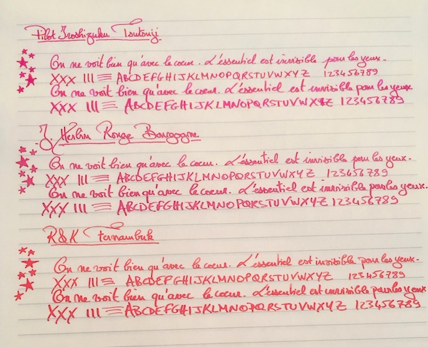
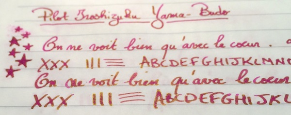
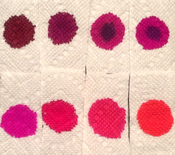
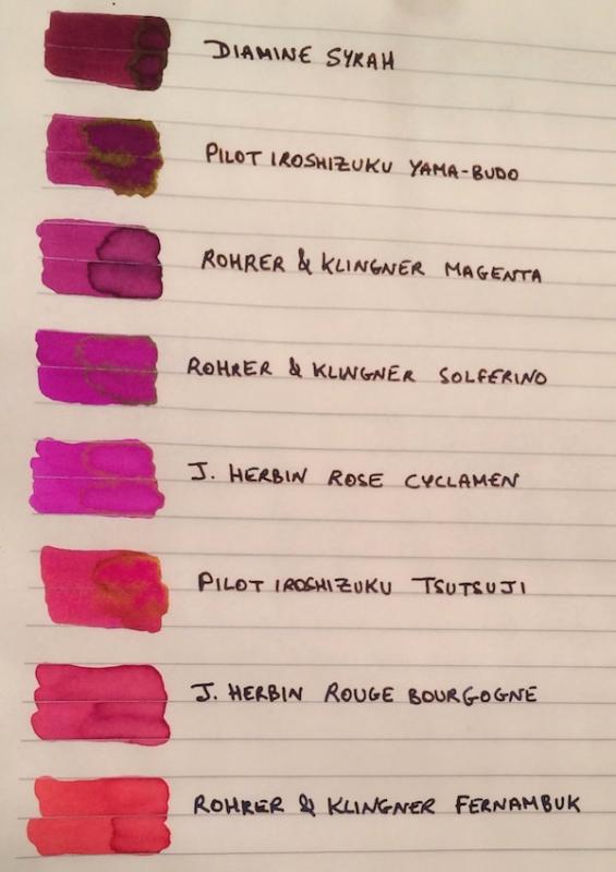
I've been wanting to try some kind of pinkish ink for a while. I didn’t want a pastel or cotton-candy pink, but other than that I was pretty open, so after going through the FPN boards and using the Goulet swatch tool, the eight finalists ranged from burgundy to magenta to purplish and reddish pinks: Diamine Syrah, Pilot Iroshizuku Yama-Budo, Rohrer & Klingner Magenta, Rohrer & Klingner Solferino, J. Herbin Rose Cyclamen, Pilot Iroshizuku Tsutsuji, J. Herbin Rouge Bourgogne, and Rohrer & Klingner Fernambuk. Although I liked some of the colors, I didn’t see myself using pink enough to warrant buying a full bottle (given that I am trying, though not very well , to stick to a stricter ink budget). I didn’t want the samples to go to waste though so I thought it might be helpful to post a comparison on here for anyone else who might also be thinking of going “pink.” The writing samples were done on Rhodia using a random steel nib pen (that I use as a dip pen) and a Pilot Custom 74 B nib ground down to a smooth stub by Mike Masuyama (also used as a dip pen to be able to test all the colors quickly). I’ve included a second set of samples on Tomoe River Paper, since some of these inks (especially given their sheen) could make for beautiful options for special letters, cards or notes on heavily "sheening" paper. PS I would need to ink a pen with it to accurately test its smoothness and flow, but if I had to pick one pink ink that I could see myself using often enough to purchase a full bottle it would be R&K Magenta. Which one of the eight would you pick? 1. On Rhodia: Closeups Ink Swabs 2. On Tomoe River Paper: Closeups Highest "Sheening" Ink Close-up Ink Swabs 3. Ink on Paper Towel: Top Row: Diamine Syrah, Pilot Iroshizuku Yama-Budo, Rohrer & Klingner Magenta, Rohrer & Klingner Solferino Bottom Row: J. Herbin Rose Cyclamen, Pilot Iroshizuku Tsutsuji, J. Herbin Rouge Bourgogne, Rohrer & Klingner Fernambuk

-
This color is really high on my hate list. Not the first, but near the top. It's nightmare. If one day you'll want to make me suffer, close me in a room painted in this / similar color. INK SPLASH http://imageshack.com/a/img903/1354/im8Pvg.jpg DROPS OF INK ON KITCHEN TOWEL http://imageshack.com/a/img631/4896/tNJm64.jpg CHROMATOGRAPHY http://imageshack.com/a/img540/6379/vBvNer.jpg SOFTWARE IDENTIFICATION / COLOR RANGE http://imageshack.com/a/img537/3947/VSsTlN.jpg COLOR RANGE http://imageshack.com/a/img661/4985/OqEPBv.jpg Review written with Jinhao 599 http://imageshack.com/a/img631/6786/2UOYcn.jpg http://imageshack.com/a/img674/783/1VCIAz.jpg http://imageshack.com/a/img908/8098/86Qh5K.jpg COPY PAPER
-
After seeing Chrissy's excellent review of Diamine Classic Red, I thought I'd put one up for Ruby. While Ruby is a bright, intense 'red' red, it's a bit darker than Classic and not quite so eye-searing. It's fairly well-behaved in that it has decent flow, a tiny touch of feather, light show and light to moderate dots bleed on copy. No shading on the copy but some moderate shading on the BnR where the lighter area suggests a slight pink-ish lean. Didn't fare too well in the water drops but did better with the wet swab wipe. On copy, the ink looks about as good as Skrip red, although the Skrip color wins hands down; on better paper, Ruby retains a bit more presence and doesn't look quite as 'flat' when it dries as the Skrip does. (And, as you can see, the Skrip shows some shading even on the copy.) I originally had the Ruby in a Parker Frontier F and had a bad problem with it drying out pretty quickly after a day on two if unused. Usually holding the nib against a paper towel would get it started but sometimes I'd need to swipe it under the faucet. I moved it to a Deli S668f F and that pretty much took care of the problem; now I can leave it for much longer and it usually starts right up. On its own, Ruby is a lovely ink, a very 'red' red and if what you're looking for is a bright, intense red, Ruby is a good choice. I certainly enjoy taking it work on occasion. Seen next to the Skrip, however, I think it suffers because the Skrip is, well ... 'wow'. But I generally prefer darker colors so take that with a grain of salt. If you're looking for bright and vibrant, go with Ruby. The color in the scan and photo are both pretty accurate, I think. Here a snip on the BnR showing the shading.
-
In 2014 Diamine released their 150th Anniversary Ink series to commemmorate their 150 year existence (1864-2014). The set consists of 8 interesting colors, some of which are really stunning. A very fine way to celebrate a birthday, and much appreciated by us inkaholics. The presentation is also well thought-out : triangular ink bottles, that together form a circle. The set consists of the following inks (with links to full reviews): Tropical Green (namrehsnoom, visvamitra, Bhavna)Terracotta (namrehsnoom, visvamitra, Bhavna)Safari (namrehsnoom, visvamitra, Bhavna)1864 Blue Black (namrehsnoom, visvamitra, Bhavna)Silver Fox (namrehsnoom, visvamitra, Bhavna)Blue Velvet (namrehsnoom, visvamitra, Bhavna)Canival (namrehsnoom, visvamitra, Bhavna)Regency Blue (namrehsnoom, visvamitra, Bhavna)The 150th anniversary ink series gives you a nice mix of colors. Below you find a quick sample to get an idea of the available colors: Other useful information can be found in the chromatographies of these inks. This gives you an idea of the ink's complexity and number of dyes used in its composition. You also get an idea of the ink's water resistance. The more water soluble dyes are found at the top of the chromatography - the water-resistent parts at the bottom. The bottom of the picture gives a good idea of what remains of the ink when exposing it to water. And these chromatographies are also just nice-looking representations of the ink's character. Enjoy...
-
I'm mixing my own colours. I keep samples in these small airtight lab tubes. I kept this small amount overnight with the tube standing upright. Next day, the ink is still sloshing all over the tube, but it seems like some of it is "stuck" to the walls of the tube. Is this surface tension from the tube? I believe if I keep it upside down, the amount WILL eventually go down, and will not stain. I was actually worried about it staining my pens, but having tried it, it doesn't. Any inky thoughts?
-
Does anyone know whether Diamine shimmer inks can be mixed? It seems that it might be possible to put together a CYMK set from the Diamine inks -- perhaps Blue Lightning, Golden Sands, Magenta Flash, and Sparkling Shadows. It should be possible to make other colours so long as one doesn't particularly mind whether the sparkles are silver or gold
-
After buying a bottle of Diamine Sparkling Shadows, I had a quick thought before using it.. Before using inks like this with gold glitter, you are supposed to shake the bottle to evenly displace the glitter, but how does this apply to the ink when it's IN the pen? At some point the ink will settle once again in the pen, so will I need to somehow mix up the glitter again, or not? If so, how should I do it?
-
Manufacturers since 1864, Diamine Inks relocated to this purpose built 'state of the art' factory in Liverpool in 1925, where they successfully carried on using the traditional methods and formulas for ink production. Over the years the company has changed hands and are now located close to the world famous Aintree Race Course http://www.diamineinks.co.uk/images/DimaineFactory.gif Delamere Green has mid to dark green colour, very good flow and is well saturated. Drying times are not that great (especially if you like using broader nibs), but unless you tend to rub written text, it shouldn't be a problem. There's some feathering on cheaper and absorbent paper and visible bleedthrough on copy paper. I'm quite surprised by this ink - usually I'm not that much into similar colors but I kind of like this one. I imagine it can look really cool in wet 1,5 stub. Drops of ink on kitchen towel Software ID Color range Tomoe River, Kaigelu 316, medium nib Leuchtturm 1917, Kaigelu 316, medium nib Maruman, Kaigelu 316, medium nib Midori, Kaigelu 316, medium nib
-
Manufacturers since 1864, Diamine Inks relocated to this purpose built 'state of the art' factory in Liverpool in 1925, where they successfully carried on using the traditional methods and formulas for ink production. Over the years the company has changed hands and are now located close to the world famous Aintree Race Course http://www.diamineinks.co.uk/images/DimaineFactory.gif If you like somewhat flat rusty browns, Burnt Sienna won’t disappoint you. It performs fairly well but the hue does little to me. The ink is maybe more watery than other Diamine inks. Drops of ink on kitchen towel Software ID Color range Tomoe River, Kaweco Al Sport, broad nib Leuchtturm 1917, GvFC Tamitio, medium + (grinded from Moleskine, medium + (grinded from No-name notebook manager, GvFC Tamitio, medium + (grinded from Water resistance
-
Made a little something on a groggy English morning... Quite pleased Autumn Oak + ~1/4 Red Dragon --> Red Oak. http://i.imgur.com/zYLiio2.jpghttp://i.imgur.com/HrGhSUp.jpg?1 I haven't really mixed any inks before, so this was a happy accident more than anything else. The result is a darkened Autumn Oak that is not so harsh to read for a long time, improved shading on Red Dragon with some orange flair, and damn great shading. Mixing two well behaved inks, the result seem to be okay -- no feathering or bleeding on Rhodia 80gsm paper. (Unfortunately this isn't super calculated so I can't give you exact amounts I used... I literally went out on a whim and decided to do this). http://i.imgur.com/lh0dOS4.jpg
-
Thank you Tas for sending me the sample of Terracotta. I have mixed feelings about Diamine inks - I like them but I find many of them risky (they tend to clog pens, cause nib creep / nib crud). The colors are pretty awesome though. As many of you already know there are some new Diamine inks on the market. Tas has kindly sent me samples of two of them. Terracotta is nice but not as nice as I expected it to be. I have some of it ion some cheap pen so I'll check in some time whether it causes any nib creep. Stay tuned. http://imageshack.com/a/img538/3194/vspkfI.jpg Kitchen towel http://imageshack.com/a/img907/7862/7viJIO.jpg Chromatography: http://imageshack.com/a/img538/1446/F1TnMg.jpg Software ID: http://imageshack.com/a/img911/2252/Vwzqus.jpg Color range http://imageshack.com/a/img901/5050/zuYXHi.jpg Cheap notebook - TWSBI 580, stub 1,1 http://imageshack.com/a/img538/4059/KI2q9J.jpg http://imageshack.com/a/img673/2593/NbPnv4.jpg http://imageshack.com/a/img911/6845/GBw9kP.jpg http://imageshack.com/a/img911/8651/euA0aY.jpg One day I'll draw proper ghost. For instance that's what I can manage http://imageshack.com/a/img673/5376/8j7Tdy.jpg Copy paper - TWSBI 580, stub 1,1 http://imageshack.com/a/img540/2705/DiAuV7.jpg http://imageshack.com/a/img910/2803/NUtazz.jpg http://imageshack.com/a/img538/8162/s9oBZm.jpg
-
Ink Review: Diamine Regency Blue (150th Anniversary Ink) Pen: Lamy Al-Star Ocean Blue, M-nib Paper: Rhodia N° 16 notepad 80 gsm Review This ink is part of the 8-color ink series that Diamine released to celebrate their 150th anniversary (1864-2014). The set has some wonderful subdued colors. This dark blue business-like ink is one of them. Regency Blue - the name evokes the image of Marie-Antoinette, Queen of France and spouse of Louis XVI, sitting in a room at the Château de Versailles, writing a letter to her "amant du jour" with this dark blue reginal ink. A droplet forming at the tip of the quill, on its way to make a splash on the paper... This is a nice dark blue ink. Some shading, but it mostly gets hidden due to the darkness of the color. This is an "old color" ink, that reminds me of the 1700's... it breathes "antique" to me. The name Regency Blue is well chosen. Personally I like this ink's color a lot - it's a color that looks nice on the paper. Also very well suited for use at the office. In the 18th century, the nobility was more into perfumes, not that much into taking a bath. Water was not Marie-Antoinette's favorite fluid. This ink also loathes water. Hit it with water, and the color disappears. Almost no trace is left on the paper. A shame... Let's have a look at how this ink behaves on paper. For this, I did some tests: Rhodia N°16 notepad 80 gsm - drying time ~20 seconds, no feathering, no show-through and no bleed-throughPaperblanks journal paper - drying time ~10 seconds (that's fast for this paper), traces of show-through, no bleed-throughGeneric notepad paper 70 gsm - drying time 5-10 seconds, no feathering, traces of show-through, no bleed-throughMoleskine journal - drying time ~5 seconds, no feathering, serious show-through, some bleed-throughRegency Blue is a very well-behaved ink. It also dries very fast on most paper. It writes surprisingly well on trashy paper, like a Moleskine journal (provided you only use one side of the page). The good drying time makes it ideal for fast note-taking. Given its fast drying times, it might also be a good ink for lefties (just an educated guess...) Conclusion I like Regency Blue a lot - especially as a working place ink. The dark antique look appeals to me. A fast drying time and good behavior on all types of paper are a big plus for using this ink at work - no Tamoe River, Clairefontaine or Rhodia paper there - just generic copy paper. For me, this is an ink I'll use on a regular basis. my overall score: A
-
I've had my Parker Quink black ink bottle for over 5 years and still going strong. Yeah, I never used it that much, did I? The bottle would still have been half-full or more already if I hadn't it tipped it and poured lots of ink on my carpet recently. To my eyes, the black Quink had a somewhat greenish tint, and on tissues, a lot of yellow separates from the black. I wanted to buy a mix, so I thought I'd get something that is both the same series as the rest of the inks that I will be using, as well as being more black and lacking in tints. Now that my fountain pen fetish has finally re-awoken, I finally bit the bullet and bought 4 inks for mixing from Diamine. For the black, I chose Onyx Black because, in the reviews, it seemed to be the blackest black they ever blacked. It seemed uniform and opaque, in writing as well as in swabs. Having received it, the Onyx Black has a VERY STRONG purple base to it. If I soil my fingers with it, the black washes away and the purple remains, very stubbornly. I'm thinking maybe the purple base is permanent or waterproof, somebody tell me, while the black itself is washable, but I regret that it may also affect the mixing as black is only supposed to add darkness to the mix. It may in fact be shifting the colours slightly. What are your thoughts on the blackness of this ink, using it independently as black ink, and also about using it for mixing? If you were to replace it with a different ink for mixing, what would that one be and why?
-
Manufacturers since 1864, Diamine Inks relocated to this purpose built 'state of the art' factory in Liverpool in 1925, where they successfully carried on using the traditional methods and formulas for ink production. Over the years the company has changed hands and are now located close to the world famous Aintree Race Course http://www.diamineinks.co.uk/images/DimaineFactory.gif http://www.diaminein...uk/AboutUs.aspx As some of you know I strongly dislike black inks. I received this one Iin 30 ml bottle) as a gift for Christmas and two weaks ago I started testing it. Quartz Black isn't really black. It's more of a dark grey ink. It won't stand a chance compared to Aurora Black or J. Herbin Perle Noire if you enjoy smooth black inks that give velvety feel. On the other hand if you enjoy grey inks (and I do) this one may be an interesting choice for a dark grey. It seems some people experienced some problems while using this ink (clogging, hard starts, bad flow) but it wans't my experience. It's not wettest Diamine ink and lubrication could be better but overall writing experience was plesant. It has no useful water resistance. Drops of ink on kitchen towel Software ID Color range Tomoe River - Kaweco Classic Sport, broad nib Leuchtturm 1917 - Kaweco AL Sport, broad nib Maruman, Kaweco Classic Sport, broad nib
-
An inky friend sent this sample a while back and now I've gotten to a review. This is from the Diamine Flowers set, which seems to be difficult to find now in the US. Anderson seems to have this ink in small bottles. Several UK sites seem to sell 30 ml refills, so if this is an ink you like, it is possible to get more. The ink didn't do well in my Edison Premiere, while not feeling dry, the flow wasn't good enough to get decent color. I'd have to slow down my writing to do so. In a Pelikan with a broad nib, that few of my inks can tame, this one fit the bill. I got a rich orange line. So the old saw of matching pen and ink applies here. Still a bit of a light color, but sometimes delicacy is called for. Not water resistant at all. Pens: Edison Premiere (M-steel), Pelikan M205 (B-steel) Papers: MvL=Mohawk via Linen, TR=Tomoe River, Hij=Hammermill 28 lb inkjet, Rhodia=Rhodia 90g ivory. Camera: iPhone 7
-
Hi all, I'm in the market for a turquoise ink. Still a student—and an unemployed one at that—so it's best not to recommend something on the more $$$ end of the spectrum. It will also mostly be for mark-up of documents so I don't need anything fancy. As for criteria, I'd like it to have things closer to blue than green, a lighter shade, and generally good performance (doesn't take an eon to dry, doesn't feather on average quality copy paper, won't fade like a washable blue, and minimal show-through). Perks like sheen, shading, and water resistance would be nice but are not necessary. So far I am looking at: Lamy Turquoise Skrip Turquoise Diamine Turquoise Diamine Havasu Turquoiseand would love to hear from owners/users of them, as well as anyone who would have other suggestions. Thanks!
-
I have decided to review some of my inks. These aren't necessarily in any particular order. This one is Diamine Soft Mint from the standard range. I decided to give this one a try because I wanted to see how close a match it is to Caran d'Ache Caribbean Sea. It's an unusual mint green colour, that matches it's name very well. I found it's a much closer match to Caran d'Ache Caribbean Sea than Diamine Steel Blue is, as Steel Blue is both darker and more saturated. I was surprised when using my comparison sample of C d'A CS how blue it was and how unsaturated it looked. As an alternative to Caran d'Ache Caribbean Sea, this ink might be worth a try. It's about the same brightness, but only very slightly more green. I had Soft Mint in both of my Lamy Nexx M pens for several days while writing parts of the review, and I didn't experience any flow or lubrication problems. I found the ink flowed very freely on the smooth Xerox 100 g/sm ColorPrint paper that I frequently use for my ink reviews. It was a pleasure to write with this ink. As usual for a Diamine ink, it's a well behaved, fairly saturated ink. It shows some shading. This ink exhibited some showthrough and a few odd dots of bleedthrough on my Xerox ColorPrint paper. The water test on the review form shows this isn't a waterproof ink, although it was reasonably resistant.Bearing in mind the paper I use is thick with a shiny surface, and the nibs used were a M and a stub, this ink was fairly quick drying. It dried in less than 10 secs. That's a very unusual result on this paper.It flows through the pen well and lubricates the nib well. I saw no skips or hard starts while I did swabs and dry time tests and changed over uncapped pens.It is currently available in 80ml glass bottles, 30ml plastic refill bottles or cartridges.Diamine sell it directly to end-users on their web-site.It's a reasonable price
-
Manufacturers since 1864, Diamine Inks relocated to this purpose built 'state of the art' factory in Liverpool in 1925, where they successfully carried on using the traditional methods and formulas for ink production. Over the years the company has changed hands and are now located close to the world famous Aintree Race Course http://www.diamineinks.co.uk/images/DimaineFactory.gif http://www.diaminein...uk/AboutUs.aspx Umber is quite interesting green ink. While it's not most unique color in the world, it still stands out among the sea of other greens. The ink is a little muted but I wouldn't call it unsaturated. It's ok as it is. The drying time is reasonable and the ink behavior is nice. It has no water resistance so if you look for it in your inks, look elsewhere. Drops of ink on kitchen towel Software ID Color range Tomoe River - Kaweco Classic Sport, broad nib Leuchtturm 1917 - Kaweco AL Sport, broad nib
-
Hello FPN I was going through my inventory of ink that I bought and never used and decided to give them away instead of pouring them down the sink. I would like to find a new home for the below inks since I will probably never use them since I have way to many. Just to let you know, you must pick up the ink/s since I will not ship them. Also, you must bring your own containers to hold the ink since I transferred all my inks to empty Iroshizuku ink bottles. Here is what I have so far: (1) Diamine Majestic Blue (2) Diamine Washable Blue (2) Diamine Florida Blue (2) Private Reserve DC Supershow Blue PM if you are interested. Andy
-
Hello All! In my quest for the perfect teal- green mix, I have been tirelessly scouting ink reviews... However, much to my dismay, not many of them are readily available in India. Options are fairly limited to Diamine, J. Herbin, some colours from Private Reserve, and some from Mont Blanc. So I played mad scientist instead. This mix uses Diamine Marine and Kelly green. Unfortunately, I added random quantities of ink till I had a colour I liked, so I don't have exact proportions. However, I will mix some more when I run out of the current batch, so I'll post ratios then if anyone's interested! On to the ink itself... I have had it mixed in an ink bottle for two weeks and in a (disposable) pen for over a week with no reactions atall so I am certain the mixture itself is stable. As I was hoping, mixing two well shading inks meant that this particular mix also has good shading properties and it looks fetching. I am very satisfied with it; it's the exact colour I was looking for, shades well, and has no flow problems. Dry time on Rhodia is a bit prolonged (around 35 seconds from a wet pen) but I don't really mind. Water resistance is zilch. Here are some shots. The colour is true to life on my monitor.
-
Manufacturers since 1864, Diamine Inks relocated to this purpose built 'state of the art' factory in Liverpool in 1925, where they successfully carried on using the traditional methods and formulas for ink production. Over the years the company has changed hands and are now located close to the world famous Aintree Race Course http://www.diamineinks.co.uk/images/DimaineFactory.gif http://www.diaminein...uk/AboutUs.aspx Sherwood Green is wet and saturated dark green ink. In flex pens the shading will be dramatic. In regular nibs it will be still visible. Basically the ink behaves well however it's not smudge resistant. If your hands tend to be sweaty you risk to smudge text written with Sherwood Green. Drops of ink on kitchen towel Software ID Color range Tomoe River - Kaweco Classic Sport, broad nib Leuchtturm 1917 - Kaweco AL Sport, broad nib Clairefontaine, Lamy Al-Star, broad nib Rhodia, Nakaya Long Cigarr, medium nib Water resistance (10 sec under current water)
-
Manufacturers since 1864, Diamine Inks relocated to this purpose built 'state of the art' factory in Liverpool in 1925, where they successfully carried on using the traditional methods and formulas for ink production. Over the years the company has changed hands and are now located close to the world famous Aintree Race Course http://www.diamineinks.co.uk/images/DimaineFactory.gif http://www.diaminein...uk/AboutUs.aspx It seems (judging by the number or rather lack of reviews) that Diamine Misty Blue is one of least oppular colors in their Standard line. It's quite surpring as it's a blue with the twist. It's not really regular, boring blue ink. There's some subtle turquoise component to it. Anyway the ink is fairly wet and gives nice saturated line that starts to fade as it dries. When the ink dries the line is significantly lighter and medium saturated. I haven't observed feathering or bleedthrough on papers I used with this ink. It has no water resistance. Lubrication is rather pleasant and the writing expeirence was positive. As for the color - I'm not crazy about it but I do believe it's not just another blue ink in the sea of blue inks. As I've mentioned there's some twist to it. Drops of ink on kitchen towel Software ID Color range Tomoe River - Kaweco Classic Sport, broad nib Leuchtturm 1917 - Kaweco AL Sport, broad nib Clairefontaine, Lamy Al-Star, medium nib No-name notebook, Lamy Al-Star, medium nib
-
Manufacturers since 1864, Diamine Inks relocated to this purpose built 'state of the art' factory in Liverpool in 1925, where they successfully carried on using the traditional methods and formulas for ink production. Over the years the company has changed hands and are now located close to the world famous Aintree Race Course http://www.diamineinks.co.uk/images/DimaineFactory.gif http://www.diaminein...uk/AboutUs.aspx Diamine Imperial Blue was first produced in 2005 as a limited edition to celebrate the 25th Anniversary of the formation of the Writing Equipment Society. This first batch had a special 25th Anniversary silver label as well as the usual Diamine label. A year later, at the end of 2006, the ink went on general sale but still labelled "WES" for "Writing Equipment Society". From what I see now it's called just Imperial Blue. Anyway the ink is quite vibrant violet blue that's quite pleasant to look at. I haven't experienced any flow issues or other misbehavior. In finer nibs the ink will look much less saturated. If you enjoy blurples this one won't disappoint you. Drops of ink on kitchen towel Software ID Color range Tomoe River - Kaweco Classic Sport, broad nib Leuchtturm 1917 - Kaweco AL Sport, broad nib Rhodia, Lamy Al-Star, broad nib