Search the Community
Showing results for tags 'custom'.
-
Hi All! Here comes a new "ruthless review". My ruthless reviews have a few peculiar features: Concise;Very strict. If a pen costs hundred of euros, no faults are allowed. A good pen gets a 60/100, a great pen an 80/100, an almost perfect one a 90/100. Only a divine pen can have above 90. Add a few peculiar criteria: "Nib appearance", "Usability in shirt pockets", and "Out-of-the-boxness", meaning to what extent a nib was perfect right after leaving the seller. Also, don't care about the box.NOTE: I've introduced a change in this review. Previously I used to rank each of the ten factors on a 0-10 scale, adding up to 100. However, I've decided that some aspects should be made more important. Here they are, ranked by importance and by number of points they get as a result ("Construction" and "Quality of materials" have been merged into one). There's also a bit of logic as to why some factors are more important than others: Criteria 1. "Nib performance" gets a max. of 30 points - Why? Is there anything more important than the nib? A pen is a worthless piece of plastic if the nib does not write well.2. "Appearance and design" gets a max. of 20 points - Why? What good is a FP if it's not beautiful? Note: I hate flashy pens, so a LE Montegrappa would probably get a zero3. "Nib appearance" gets a max. of 10 points - Why? A nib is what you'll most likely see when writing with a FP. It has to be beautiful, otherwise you're going to hate your pen.4. "Cost and value" gets a max. of 10 points - Why? Not among the top-three points because after all, we don't collect FPs because of their cost-value ratio, I guess. 5. "Construction and materials" gets a max. of 10 points - Why? This is quite important but not as much as, say, in a car rating, for we almost all use pen cases anyway.6. "Out-of-the-boxness" gets a max of 5 points - Why? Since most of us know how to do nib-fixing (and a nib meister is never too far), I've reduced the importance of this factor.7. "Filling system and maintenance" gets a max. of 5 points - Why? Hard to rate as it's subject to individual preferences. I'll keep it among the lower-importance factors.8. "Weight and dimensions" gets a max. of 5 points - Why? For me it's almost ininfluential: I like both small and big pens. So it will be a low-importance factor.9. "Clip and usability with shirts" gets a max. of 5 points - Why? Can be very important for some, but irrelenvant for others. So, here's the review! Pilot Custom 74 - Blue with 14k n.5 M nib (pictures here: http://global.rakuten.com/en/store/atn/item/fkk-1000r/) · Nib performance: 30 out of 30 This pen has a magnificently good nib! It's soft, springy, with a bit of feedback but not too much, with a bit of line variation but not so much that you lose control, it's basically the perfect everyday nib. I'm going to keep this inked forever, always ready on my desk. I'm absolutely amazed. · Appearance and design: 15 out of 20 Conservative, not very creative, but with a nice combination between the blue of the body and the gold trims. It makes it classy without being banal. Note: this is not the demonstrator version, but the plain blue one you can get from Rakuten. · Nib appearance: 8 out of 10 This is a small, pretty nib, with some nice scrollwork. The only thing is that it would be nice if it had a rhodium masking in some places to make it bicolor. · Cost and value: 10 out of 10 Ok here comes the awesome part (well, the other awesome part, after the nib): I paid USD 72 for a 14k gold nibbed pen with a fantastic nib, from a world-class manufacturer. Compare it with the USD 150 you pay for a Lamy 2000 with its dull nib, and you get the idea. This Pilot is awesome value for money! · Construction and materials: 6 out of 10 Good, although not the best: the plastic has a slightly cheap feeling, but nowhere close to the cheapness of a Platinum pen. · Out-of-the-boxness: 5 out of 5 This nib's absolute perfection was achieved with no tuning or fixing at all: it was perfect straight OOTB. I didn't even need to flush it! · Filling system and maintenance: 4 out of 5 It's a cartridge/converter pen, which is not great, but 1. hey, it's a USD 72 pen! And 2. the converter is Pilot's famous con-70, which is by far the best converter in the market. So we definitely cannot complain here · Weight and dimensions: 3 out of 5 This pen is a little bit too long for many people, but being super-light-weight, this is not likely to be a major issue. The only complain is that the section is perhaps a bit too thin for some people. · Clip and usability with shirts: 2 out of 5 Pretty bad: the pen is so long that it probably won't fit in many shirt pockets. It's great for jacket inner pockets, though. Final score: 83 out of 100. This, for a ruthless review like these, is a really high score. Trust me, if you've never tried a Pilot n.5 14k gold nib, you must get one. I've never had such a great experience on a daily writer. This is pure pleasure to write with, a perfect nib in an elegant design, with good quality and very convenient price.
-
I fear I may already know the answer to this question, but I want to be sure that I'm not just missing something (my Google-Fu is notoriously weak)--does the Pilot Custom Heritage 91 in Tsukiyo (or any of the other colors) come in the soft fine or soft extra fine nibs (like the ones on the Pilot Falcon/Elabo)? I've only seen listings for the black CH91 with a soft fine nib, so I'm also kind of trying to make sure that's not a typo (and checking if the black comes in the soft extra fine)? Sorry if this should be obvious. For extra background, I'm considering making my first purchase of a non-cheap pen for potential everyday carry, and I like the idea of having a little flex (and was kindly allowed to try a SEF in a Falcon at my first pen show). I started with pointed dip pens and then fell into fountain pens by the happy happenstance of inheriting one, but I understand that fountain pen nibs are a slightly different animal in that arena, so I'm tempering my expectations. I have read that the FA nib can be more finicky than the SF/SEF, so I figure I'll start with the soft family of nibs and then perhaps consider the FA for next time. I was looking at the Falcon/Elabo and then came upon the suggestion that the same nib could be had in the CH91 for cheaper and the CH91 looks rather like the CH912 (which is what I'm hoping to get an FA nib in eventually), and I came to fancy the idea of potentially getting the CH91 in Tsukiyo. Leaning towards the SEF over the SF to maximize line width variation.
-
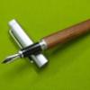
For some odd reason I've found myself liking the simple and plain lines of the Parker 15/ Jotter fountain pen family as of late. So after buying a couple of them, but not feeling entirely satisfied with the looks of any, I decided to create my own by combining the steel cap and clear section of the somewhat rare demostrator version, with the barrel of the Matte Black model. The result as you can attest, it's quite striking! The weight is still on par with that of the flighter since both -barrel and cap, are metal but the looks are more of my liking than that of the current Jotter, which has a shiny finish. Also, the clear section looks way less cheap than the black one -that shows moulding lines. What do you think?

-
This is my first formal fountain pen review. Today's subject is the Venvstas D'art. https://www.venvstas.com/dart This is a custom plastic lacquered fountain pen in an irregular geometric form. From the website, the description is; Hexagonal irregular section 12mm/15mm - 5mm ink feed, length 155mm closed, 143mm open. Cap do not post. Weight 15g loaded. Links to all photos are here https://photos.app.goo.gl/3ZjY3wF8wyvfP6pU8 The nib is a bit of a nail and feels a lot like using a ballpoint pen. You don't have to adjust the pressure too much so this makes it a very suitable beginner's fountain pen. I grip the pen normally and the irregular shapes aligns with my finger placement. I didn't have to contort or hold it any different. The pen was comfortable for long writing sessions. The nib and feed keeps the pen wet for fast writing without any issue. The ink also doesn't dry up for extended 4-5 days sitting idle in the pen cap. Overall, a solid fountain pen and a bit of a conversational starter with its unique shape. edit: trying to upload pictures, but it keeps failing will save this post as a place marker for now
-

My Last (And "first" Too) Dip Nib Pen Holder (With "reservoir")
franzrogar posted a topic in Pictures & Pen Photography
Hi, I present you my last dip nib pen holder hand-made by Renée Meeks (Scriptorium Pens) and my first hand-engraved by myself using drypoint technique. Where it should be the ink holder (if it were a fountain pen), there's an empty space to hold other dip nibs :-D Here are two videos of it with my mobile :-) Sorry for the shaking video, but I've thalassemia and it's really hard to keep my hand steady (I had to place the phone against my chest to stabilize it). Let me know what you think of it ;-) -
Hello again to all my FP friends! I just wanted to share some writing samples of the 4 nibs I had custom ground by fpnibs.com (no affiliation, just a satisfied customer). Their work is fantastic, reasonably priced, and with excellent service. These nibs all write wonderfully. The 1.1 Oblique Cursive Italic is especially dreamy and now a daily user for me.
-
Hello Everyone, Today I am going to review another creation from Mr. Subramanium of ASA pens, named ASA 'Azzadi' . This pen have been reviewed before, but never formally launched by ASA pens in their website, which in my opinion is a big mistake. This is one of the best models created by ASA along with their Nauka model. You can say the beauty of the product compelled me to do a full review and urge Mr. Subramanium from the FPN board to launch this pen and give the world a chance to use this product. now, kindly read the following line carefully: It is comparatively easy to attain and perform at a certain level in any sphere of life, but even minute improvements after that common platform require huge amount of extra efforts. This is true for sports, academics, politics, management, business and obviously pen making. We'll refer back to this line throughout the course of the review. As these pens can be fitted with #6 standard JoWo or Schimdt or Bock nib units, the selling point becomes the design, appearence and materials. We would focus on these parts more than the nibs. 1. Appearance and design: Its a medium sized pen. The pen is a homage to CS Churchill model. It was designed by a few Indian fountain pen enthusiasts, lead by FPN member Prithwijit (@Prithwijit). He successfully created a pen design which gave the feel of a CS pen, but at fraction of the price of original one. I have one piece made of stock blue- dark blue swirl acrylic offered by ASA and another pen made from CS blank. Both looks beautiful and elegant. Its a duofold like design with almost cylindrical appearance. The cap has straight lines with a black coloured ebonite finial. This finial has five concentric circular grooves inspired from the finial of Churchill pens. At the other end there are two metal rings to protect the cap lip. the clip is a simple ball end clip without a clip ring. The golden trims are vintage brass made trims that in my opinion compliments the design better. The body gently tapers both towards the section above and towards the bottom below. At the bottom of the body there is a black ebonite lower finial separated by another golden ring. There is a step down from the body towards section, followed by cap threads on the acrylic material. The section proper is made of black ebonite and starts after the threads, tapers slightly towards nib, and then flares up 5 mm below the margin, creating a nice notch to grip the pen. Both the top and bottom surface of the pen are well polished flat end. Overall the design is rich, attractive and very easy to use. Though this design is inspired, it has its own flair and originality as well. 2. Construction and Quality: The most important part. Here my above statement comes into play. You get what you pay for. I am not going to describe the CS blank in much detail as its a known material in fountain pen community and any user who have commissioned pens with that material can vouch for the quality. The stock acrylic material offered by ASA comes in four colours till now. Blue-dark blue, Red-black, Orange-black and white-black. the dark portion creates swirling patterns on the body. The material has opalescent glow when direct light reflects off it. Its fascinating to look at the depth of the material while turning the pen in hand. I have the blue-dark blue swirl acrylic and its slightly transparent. The polish and finish is very good on both pens. I had expected good finish on CS material as its a common norm and ASA did superb job in turning a very well finished custom product keeping up with their reputation. But, the finish on stock acrylic pen is superb as well, going as far as the material allowed. I have two beautiful pens as far as finish and making is concerned. The construction is good. The pen feels sturdy and well built. I have been using the pens for 2 months now and there is no problem yet. The trims are also made of quality material. The cap secures on the body with slightly more than two turns. The section is secured tightly with body by ten turns. If we consider the clip as 12 o' clock, the ASA Azzadi branding is there on the top of the body at 9 o' clock position. Now the negative points. The cap threads are a bit tight at the end in both the pens, so it might be due to the tools used to create such threads. I would request Mr. Subramanium to look into this. It might not be a big issue, but some people might be influenced by this while comparing this pen with pricey machine made pens. The branding is not to my choice as its almost imperceptible and looks like some impurities or defect. Though these appear simple issues, as I have stated above, minute improvements like these can take up substantial efforts, but once corrected, these improvements can go a long way in establishing any brand. I would also ask him to look into the threading of Schimdt nib units in the section as in one of my pen, the schimdt unit got stuck. JoWo unit in the other pen was easy to remove and replace. The cap rings and lower end rings in both the pens are well fitted. 3. Dimensions: Its a medium sized light weight pen. Length capped- 142 mm Length uncapped- 131 mm Section length (including cap threading)- 30 mm Cap length- 68 mm Top finial- 8 mm Bottom finial- 12 mm Thickest part of body- 13 mm Diameter of notch in section- 10 mm Weight- Medium weight Posting- Not possible or practical 4. Nib & Performance: The pen can be fitted with any standard #6 nib units like JoWo or Schimdt. The nibs perform according to their reputation. \ Its a very well balanced pen, suitable for long writing sessions. 5. Filling System & Maintenance: Its a cartridge converter pen accepting standard Schimdt converters. I would suggest not to use it as Eye dropper as the lower finial can leak in unfortunate cases. Though ASA states that the lower finial is sealed well, still there is no need in my opinion to push this pen to be an ED. There was no leak or burping while using the pen with converters in my 2 months of usage. 6. Cost & Value : This is an awesome pen at the price it is being offered, around 60$. Its beautiful, engaging, sturdily built, and can be used as an EDC pen. There have been some issues raised by a few Indian FPN members regarding missing of deadlines by ASA pens in supplying custom orders and stock pen orders. I am sure Mr. Subramanium will look into this and sort out any malfunctioning in his supply line. Timeliness is a big issue in any business and even in this case, minute improvements might need drastic forward steps for ASA. But yet again, satisfied customers are the basic support of any seller, and he should do everything in his power to make them happy. My Comparison: Kaigelu and Conklin duragraph are other two pens with similar designs that I have used. In my opinion, ASA Azzadi is better than Kaigelu considering the superior customization options and superior nib choices. But when it comes to Duragraph, ASA Azzadi needs to improve its finish even further to compete. The Duragraph material is really amazing and one of its kind. The Conklin nib is also great if you've not received a lemon. I would suggest Mr. Subramanium to try to improve his product further, even if those improvements take much efforts. Whatsapp no of Mr Subramanium (as this pen is not listed on their website)- - +91 91 7660 7660 Their website- ASA My Suggestions to ASA pens: 1. List this pen in main website 2. Look at the threading process for cap 3. Try constantly to improve finish, which he will gladly accept. Thank you.
-

How Can I Get A Replacement Nib And Feed For My Pilot Custom 823?
nanonome posted a topic in Of Nibs & Tines
Hi everyone, Ive been given a pen from a friend, however it does not have the nib or feed. I understand that pilot does not make replacement nibs however, I was wondering a few things. 1. Do any stores carry size 15 pilot Nibs (FA or normal) 2. Does a Size 10 Nib & feed fit into the pen 3. Does a goulet pens size 6 Nib fit the pen 4. Are there any other nibs/ways to use my pen or is it just garbage? Thank you everyone -
http://i.imgur.com/WIYALJz.jpgStylo Art Karuizawa Karuizawa, about 80 miles from Tokyo, is a small town nestled on the slopes of Mount Asama, an active volcano (because: Japan). Famous for its jams and honey, you could be forgiven for thinking this green, leafy, sleepy, place was outside of time and far removed from the world, but its fingerprint on history is larger than its diminutive size: it is the only place to have hosted events at both summer and winter olympics (Tokyo 1964, and Nagano 1998); welcomed Yoko Ono, Jon Lennon and family every summer; was where the current Emperor of Japan met his wife (playing tennis); and was the location from which was sent the telegram ending WWII. Less momentously, my own family history runs long through Karuizawa. This was where my grandparents bought a house in the 1940s, where my mother and her siblings ran through the shaded gardens as Tokyo scorched beneath the scalding summer sun. My own children now play on that same moss, beneath those same trees, and so when I heard about Stylo-Art, a small pen-maker crafting their own creations in such an emotionally resonant location, I knew I had to visit. Motoshi Kazuno and I first tried to arrange a meeting 18 months ago, but Karuizawa is noticeably less in demand as a ski resort than as a summer retreat, and the Kazunos were away visiting relatives. Time passed, and this week I was finally able to make the 30-minute journey through the mountains to the hamlet Motoshi and his wife Shuko call home. Anyone familiar with Japan will understand that this was not a simple undertaking - the address (a series of concentric zones culminating in a radius of a few blocks) dropped me in a semi-rural jumble, and it was only thanks to the photograph of the house kindly sent me by Shuko that I managed to stumble on the little plot and two-story building. I pulled my car onto their driveway (or perhaps their lawn), and waited for a sprightly, deceptively young man in a grey t-shirt to wander out to investigate. This was Motoshi Kazuno, Mr. Stylo-Art himself, and his welcome could not have been warmer. http://i.imgur.com/PkJ0iHB.jpg The 'showroom'. I was invited in and, over iced green tea, learned of Motoshi's progression to pen-maker from salary-man in Tokyo, via existential angst and a short spell in carpentry. With great and well-placed pride he described how he had built, by hand, the home we now sat in as all the while, Shuko looked on with great affection. It is clear that she holds her husband's work in high esteem. http://i.imgur.com/CaQomtx.jpg Shuko and Motoshi Kazuno, and their wood collection. Throughout the living room were scattered trays of pens (most, apparently, being prepared for the upcoming San Francisco pen show) in a rainbow of colours and textures - woods and urushis - clean and ink-stained ("this one is washed with pilot blue black") - as well as maki-e work from "friends" in Wajima and Naoshima. I was led out to the workshop to see the array of woods neatly organised, the lathe and work-table, the frankly indecent collection of drill-bits ("my obsession") and was talked through the three days of work that leads to a completed pen. http://i.imgur.com/RmxWExL.jpg The worktop (and a very few of the vast collection of drill-bits). I must admit that, having browsed Stylo-Arts website, I was unmoved. All the pens seemed flat and lifeless, lacking any delicacy or soul. Nothing could have prepared me for the reality though, for the finished items are impeccably crafted with true care and attention, and each and every wood and embellishment has a unique character - a character carefully enhanced by Kazuno-sans respectful diligence. http://i.imgur.com/QZAdNKB.jpg Ink-stained and urushied pens (the ink used is for fountain pens, among them Pilot Blue-Black and Iroshizuku Momiji). http://i.imgur.com/TDM2oNp.jpgMore ornate urushi. http://i.imgur.com/AITjRAK.jpgMaki-e from Wajima and Naoshima (central two). I fell in love with so many, but he urged me to hold and study each one individually and at length, to feel the weight and density of the material, to explore the depth of the pattern, the way it reflected or absorbed the light, even to raise each pen to my nose and inhale deeply. Over time, I managed to cull from the many to the few. It was the scent that finally swung me - Japanese cedar, light and delicately veined, its gorgeously pungent aroma reminiscent of the tatami mats of my family home, and of long, hot, steaming Japanese baths as the snow falls beyond the window. http://i.imgur.com/z6Ed8w6.jpg My own shortlist. Note: the elastics denote different nib housing - grey for Pilot, red for Sailor 21k. The third from the left would become my pen. Although Motoshi-san crafts pens to accept Pilot, Sailor and Platinum nibs, since Nagahara-sans death it has become increasingly difficult to purchase Sailor nibs in any meaningful quantity. My pen required a Pilot, and so Motoshi pulled from his desk a collection of no. 5, 10 and 15 nibs, and we proceeded, as the sun lowered in the sky and a faint rain fell upon the roof, to whittle them down to a no. 10 FA that he expertly smoothed and coaxed to my hand. It was with this pen that I wrote a quick note in the Stylo-Art visitors book, and learned, with some surprise, that I was the first gaijin (foreigner) to ever make the trip and meet Motoshi and Shuko in their home. The honour was entirely mine. http://i.imgur.com/XbV814R.jpg Motoshi working on my nib.
-
Hooligan Raging Red Custom Pen January 2017 photo credit: Tim Cullen First Impression Reverie... This is a custom pen designed and created by Tim Cullen of Hooligen Pen Co. I first saw Tim's work on Facebook in the fall of 2015. On December 26, 2015 after much discussion with Tim, I ordered two pens... 1 - Irish Oak Bog 2 - Tuxedo Pen but with Green barrel and possible Jade dome on cap Both pens were to have ruthenium 18 kt nibs. We also discussed timing and Tim estimated that it would be late 2016 or early 2017 before the pens would be ready. photo credit: Tim Cullen - Irish Oak Bog from Tim's gallery of work photo credit: Tim Cullen - Irish Oak Bog from Tim's gallery of work photo credit: Tim Cullen - Tuxedo from Tim's gallery of work photo credit: Tim Cullen - Tuxedo from Tim's gallery of work photo credit: Tim Cullen - Barrel material for my Tuxedo In October 2016, Tim reached out to finalize the design and well one thing lead to another and the two pens morphed into one expensive pen - but is it a BEAUTY! So the final design kept the Irish Oak Bog and flat top cap with lot of Damascus and the barrel became a Damascus ring of steel. So Tim began to create the pen. The cap was just right from the beginning, but the barrel just didn't sing to me. Now don't get me wrong - it was lovely in it's own right and I had decided to take and if it didn't grow on me ask Tim to change. Well Tim wasn't having it and changed the acrylic from the lovely golden brown to the raging red. This persistence on Tim's part is what make him a great artist with a keen focus on the customer. photo credit: Tim Cullen - Hooligan MP part 1 photo credit: Tim Cullen - Hooligan RR oh yeah! When I saw that red against the Damascus I knew it is a hit!!! Appearance and Design (10/10) It's the custom pen of custom pens. The size is perfect for my big hands - see photo below of comparison to other pens. Construction and Quality (10/10) The fit and finish are perfect. PERIOD. Exactly the same as the Hooligan V. Weight and Dimension (10/10) Tim warned me multiple times, long before construction began that this would be a heavy pen - and I still said go for it. Weight: Whole pen inked: 1.9 oz Barrel inked: 0.9 oz Dimensions: (rough no calipers handy) Length Capped: 6 3/16" (15.5 cm) Length Cap: 2 13/16" (7.1 cm) Length Barrel and Nib: 5 3/8" (13.5 cm) Length Posted: 7 5/16" (18.5 cm) Max Diameter - Top End of Cap: 9/16" (1.5 cm) Min Diameter - Section: 7/16" (1.1 cm) Pen comparison Line-up from left to right: TWSBI 700 Vac, Pelikan M800, Visconti Homo Sapiens Blue Crystal Swirl, Hooligan RR, Holligan V LE#2/20, Lamy Al-Star, Pilot Metropolitan. As you can see the Hooligan RR is slightly smaller than the Hooligan V. The cap will post, but I usually set the cap upright on desk while I write only holding the barrel. I think that it would be an awesome display to post and place on stand! (of course with no ink) Nib and Performance (10/10) 18k ruthenium board nib cut by Mike Masuyama to cursive italic - I use several different nibmeisters and Mike always does outstanding work - he is at the top of the game and if you haven't tried his cursive italic, I highly recommend that you try it - writes very well. Filling System (10/10) Standard converter - works well. Easy to fill / clean / maintain. (So why not a 8 - like I gave the same converter on the Hooligan V? Well I have decided after this week - that my first choice on any pen is going to be converter. I know that a lot of custom pen maker are offering button and piston fills, and I love the capacity of my Conid but I don't mind refilling if it makes maintaining easier. My vintage ONOTO is a top 10 pen in my collection but the cork maintenance is a absolute pain.) Cost and Value (10/10) The pen is the most expensive pen in my collection at $1200. This price includes the ruthenium 18k nib and nib customization by Mike Masuyama. This price also includes a second ruthenium nib that was purchased for the pen that was consumed by this masterpiece. No worries that nib will be used on my next Hooligan. Now $1200 is a lot for a pen - I get it - but this is my perfect pen - Tim built the length and section diameter to my exact specifications so I love to write with it. Overall (10) Now for those of you who are wondering - yes this is the one and only time that I scored any pen a perfect 10. I could gush on and on about how wonder it is - but the engineer in me says hold up - just the high points. So.... - This is the number one pen in my collection. - Damascus steel and Irish Oak Bog play off each other in a way that is contemporary and ancient all at the same time. - The red acrylic just pops - the contrast is stunning. The ruthenium nib look fab and writes like a dream. - Tim is always pushing the edge and his work continues to amaze his collectors. photo credit: Tim Cullen - Hooligan RR before logo on clip photo credit: Tim Cullen - Hooligan RR photo credit: Tim Cullen - Hooligan RR photo credit: Tim Cullen - Hooligan RR cap Hooligan logo photo credit: Tim Cullen - Hooligan RR clip Hooligan logo photo credit: Tim Cullen - Hooligan RR
-
Hooligan V #2/20 photo credit: Tim Cullen photo credit: Tim Cullen First Impression WOW! Pictures do not capture the luster of this pen! It is gorgeous. Last month, I returned from a week of arduous statistical training and awaiting me was the lovely Model V from Hooligan Pen Company! The V is a limited edition model and I have #2 of 20. The pen is a design collaboration between Tim Cullen and Dr. Joseph Vitolo. The nibs are tuned by Mike Masuyama to the purchaser's request and each pen is accompanied by a custom pen stand from Dan Brown. Appearance and Design (9) The clip and cap band are damascus which balances well with the acrylic. The engraving and numbering clearly id each pen - but each pen has a different clip (all custom made by Tim)... below is a photo of pen #1. (So why did I not rate appearance and design a 10? Personal preference only - my pens are usually flat tops - but this one hooked me straight away and I love it.) photo credit: Tim Cullen Construction and Quality (10) The fit and finish are perfect. PERIOD. And I have a reputation for being keen on the details. Tim also has a reputation for being a perfectionist and it shows in this flawless pen. In general, I do not cap my pens - and this pen is no exception BUT I do find that I hold the cap in my left hand while writing just because it feels that good - seriously there are zero rough edges or defects. Weight and Dimension (9) cap and barrel (inked): 1.3 oz cap: 0.5 oz barrel: 0.8 oz length: capped: 6.25" cap: 3" barrel and nib: 5 7/16" section diameter: just under 1/2" largest diameter on cap: just over 5/8" no calipers available so the diameters are close but not perfect measurements. This is a large pen and I love it! This pen is well balanced and comfortable with which to write. I love taking notes at work with it but have to be very careful - in only a few short weeks - 3 different folks have wanted to borrow it! (So why not a 10? Again personal preference - usually I would go for a smaller section diameter but it hasn't been an issue for me with this pen.) Be warned that the pen will not fit in all cases. But does work well in my Franklin-Christoph penvelope. Below is a comparison photo of the V and a Pelikan 800, Lamy Al-Star, TWSBI 700, Visconti Homo Sapiens Blue Swirl an Pilot Metropolitan. Nib and Performance (9) 18k two tone extra-fine nib tuned by Mike Masuyama and engraved with the Hooligan logo - writes very well. (So why not a 10? Again personal preference - my ideal nib is single tone - with the damascus clip I would have normally selected ruthenium finish.) Filling System (8) Standard converter - works well. Easy to fill / clean / maintain. (So why not a 10? Nothing fancy or unusual... but after spending the afternoon dealing with a vintage piston filler that has lost its cork - well I love the fact that I will never have that problem with this pen!) Cost and Value (10) The pen is an exceptional value at $650. This price includes the custom stand made by Dan Brown and nib tuning by Mike Masuyama. Tim is a true artist and his pieces are sure to increase in value. Overall (9.2) This pen has rocketed into my top 10 overall. There are pens in that group that cost much more and much less as I base my top group on function and not form. But it is "oh so nice" when the form challenges the function in such a gorgeous pen! Tim is a joy with which to work and I encourage anyone seeking a unique, high quality pen to seek out Hooligan and pick up one of his limited editions or a custom. This is not my first Hooligan. That pen is a personal custom design - that pen's review will post on July 2nd.
-
Pilot has a popular range of pens called “Custom,” but as far as I can tell they are all regular production models with nothing custom about them. I’m also a clarinetist, and Yamaha makes a range of clarinets called “Custom,” again just regular production models. Can anyone shed some light on this? Does the English word “custom” have a different meaning in Japanese than in English?
-
I think it's time there was a specific thread to give this remarkable pen-maker his due; he's coming out with some really extraordinary designs at the moment and deserves recognition in the fountain pen community. There's an introductory profile piece up on United Inkdom already, and we've just reviewed his eye-popping Streamline design too - indeed if you're jolly quick you can even win one! Has anyone else tried one yet? My feeling is that the Streamline would be even better with a gold nib but I'm not sure if that's been tried 'in the flesh' just yet...
-
Hello, penfolks! This review will be of limited use, as a. the pen in question is brand-new to me at the time of this writing and therefore still suffused with new-purchase glow; b. I’m writing with it as regularly as I can, but I’m still only a couple of fills in, which means I haven’t had too much opportunity to get to know it; and c. my cellphone photography skills leave something to be desired, but I nonetheless took lots of pictures that are eating up your bandwidth as you read this. All caveats aside, I was itching for more reviews to read while I waited for my Pilot Custom Ichii to arrive, so I’m paying this forward for the next obsessive (bleep) who needs something to read and reassure them that the pen they just spent lots of money for is going to be lovely. (TLDR: I think this pen is lovely.) Box and Packaging: My Pilot Custom Ichii came in a large, leatherish black box, which is massive compared with all of the boxes my previous pens came in. It contained, in addition to the pen itself, Pilot’s generic Use and Care Guide (a folded sheet with basic information about operating their pens’ cartridges and converters), an insert in Japanese and English “About the ‘Ichii Tree,’” an English-language insert describing the Inden lacquered-deerskin pen pouch, some Japanese-Language pamphlets advertising said lacquered-deerskin pen pouch, and a black, lacquered-deerskin pen pouch, carefully rolled up and tied with an attached leather strip. A sealed black cartridge of Pilot ink was also included. The inside of the box is lined with black satinesque fabric, and a raised cardboard mold takes up the front half of the available space, with more satinesque fabric loosely attached to present a crushed, squishy (casually luxurious?) look. The Pilot Custom Ichii sits in a tailored indentation within this structure, held by two fabric-covered prongs so as to rest at a jaunty angle. A rectangle of black foam is placed between the pen and the inside of the lid to prevent jostling, but all of this was thoroughly deranged by customs inspectors by the time I received it. The entire box was contained in a white outer cardboard box with some sort of (bespoke artisanal) texture and an opening front flap that further foiled the customs inspectors and drove them to feats of rage and crumplement, alas. (No lasting harm was done.) Pouch: The included pouch is made of soft, matte, black leather taken directly from the still-weeping Bambi’s sainted mother; it uses another strip of black leather to wrap it. The inside of the pouch is a soft, black, felty material that might also be leather with a different finish. The outside features a tidy crosshatch of glossy black lacquer which is gorgeous to look at and completely scares me from using it for its intended purpose by taking it out of the house. It fits the Ichii snugly and securely, and will live safely in my desk for the foreseeable future. Appearance and Finish: The Custom Ichii’s design is based very closely on Pilot’s flagship Custom 845, which I’ve lusted after for years. I’m not a huge fan of black pens, though (and because I’m an uncultured rustic, etc., the appeal of urushi-lacquered ebonite has not sufficiently gripped me to justify the premium it commands), so when I discovered the Custom Ichii, and it transpired that I had some money saved away for an extravagant pen, the decision got made. I’m not a wood expert, and sources seem to vary, but I think the ichii is made from Japanese yew praised for its fine grain (so sayeth Pilot’s Japanese-language product page, despite the included insert which says it’s oak; “ichii” on its own seems to translate to “first rate”). So, whatever: it grew in the ground once and evidently takes an amazing polish, as even on the knots, the wooden surface of my pen feels almost flawlessly smooth (though rubbing it produces a subtly different whisper than do my lacquered and resin pens). The wood feels cooler in my hand than does the plastic grip section, and displays subtle chatoyancy as I turn it in my hand. Grooved, gold-plated rings mark the finials, which more or less continue the grain pattern on the barrel and cap. Both ends of the pen are flat with the slightest hint of convexity, and the edges created are flawlessly crisp and smooth in a way that makes me never want to risk taking the pen away from the safety of my desk. The mouth of the cap has a broader band than the Custom 845 and extends all the way to the lip, probably to preserve the thin, tapered wood against shock and stress. (It’s hard to tell if the cap has any exposed wood on the inside, or if it’s all plastic; the barrel absolutely does.) The clip on the cap appears to be Pilot’s standard Custom-series stepped triangle and ball affair, and is very stiff. The band reads, “*** PILOT JAPAN *** CUSTOM ART CRAFT” in engraved all-caps, over and over and over again until you get bored. The section appears identical to the black, injection-molded plastic used on the Custom 845, with a chiseled hourglass profile bulging at the nib and a 1mm flush gold ring separating it from the cap threads. The section unscrews to reveal metal threads (with an o-ring) and a metal housing for the included CON70 converter; the inside of the barrel is wood except for the counterparts of the threads and something shiny at the end, in the finial. The barrel tapers very subtly toward the finial ring and then continues afterward, a bit narrower. Where the barrel screws onto the section, perhaps to accommodate the substantial cap band, the wood takes a subtle, smooth step inward and looks awfully sexy to me. The large (Pilot #15, Bock #6+ish?), two-toned 18k nib fits the dimensions of the rest of the pen in a way that’s very attractive to me: I think it elongates and streamlines the overall appearance in tandem with the subtle taper, even though this is a large, broad-sectioned pen. The feed appears to be Pilot’s dark, slightly translucent plastic, and is perfectly centred on the nib slip when I look through it against the light. In the lower left corner of the nib is the date stamp: “616,” for June of last year, I’d assume. Still looks pretty fresh, though… Design, Size, and Weight: From what I’ve read, the design and size are identical to the Custom 845; some people think it weights slightly more, and some slightly less. (If anyone would like to donate an 845 to science, I’d be more than happy to update this section.) It feels lighter in my hand than any of my other pens (unposted Cross Townsend and Faber-Castell Pearwood Ambition being what I have the most experience with), and is plenty-long for writing unposted. The pen just borders on oversize, to my eye, but the graceful taper of the barrel and the elegant thrust of the nib prevent it from looking bulky (the way I found the Visconti Homo Sapiens did when I tried it in-store, for example). The length of the pen, the placement of the clip, and my preciousness with the finish of the wood discourage me from clipping the Ichii into my shirt pocket as I normally do with my pens. If this ever does leave my desk, I’ll probably carry it in the included leather pouch. Maybe. Nib and Writing Experience: Pretty darn great, I won’t lie. It’s worth pointing out, though, that this is my first nib anywhere close to this size, so some of my excitement with the sensation of writing with this pen may be explained that way. I’ve been writing with #5ish (Bock-reckoning) nibs exclusively since my first pen, a steel Sheaffer Prelude, about 16 years ago. I wrote my thesis with a juicy, but equally petite 18k Cross Townsend nib, and have put in some time with a broad, flexy 14k Falcon nib. I hold my pens fairly far back on the section, which I don’t do as much with the Custom Ichii because the section is shorter and the nib is (substantially) longer. The effect, with this background, has been the sensation that I’m flicking a wand or flourishing a rapier, more than directing a nib. This is an extremely satisfying sensation for me and has spurred me to feats of scrivened loquacity I haven’t enjoyed for years. Your mileage may vary, but I’d urge you at least not to wait as long as I did to try a properly honkin’ nib, based on this experience. The Ichii has not been adjusted in any since it left the factory, to my knowledge, and is almost too smooth. My Falcon is too smooth and is exhausting to write with as a result, becoming quickly sloppy and uncontrolled on the page; the nib on my Custom Ichii has a whisper of feedback and feels (on my preferred Rhodia paper) like a fine, polished dowel being drawn across a sheet of taut, suspended silk (as opposed to a cool stick of butter across the surface of a mirror). The Japanese medium writes a hair broader than my American fines, which is what I was hoping for and told to expect, and it lays down a manageable, wet line that sits at about 6 out of 10 on my arbitrary wetness scale. It’s given me pleasing shading with each of the inks I’ve tried. My first writing with this pen was Diamine Chocolate Brown, which has been my favourite ink colour for a few years. On Clairefontaine and Rhodia, even with a fresh, juicy fill, I had a bit of hard starting. More alarmingly, once the initial flood of the feed had been written out, I found the pen drying to a halt every paragraph or so; I haven’t washed anything out with soapy water yet, so it might be manufacturing oils or a disagreement with the ink, rather than catastrophic nib failure. Reassuringly, I tried Iroshizuku Asa-gao next and had a much more positive experience: no starvation, almost none of that initial skipping, and the pen felt more lubricated yet controlled on the page, somehow. It was a complete pleasure to use, and among other things, I wrote the first half of this review on that charge. The Ichii is now inked with Faber-Castell Moss Green, which flows about as well, though it doesn’t lubricate the same way. Still chuffed. The nib has a bit of flex – really just a touch of firm cushioning compared with my steel nibs, and in contrast to the squashy plushness of the Falcon. I can get a bit of variation with pressure, but the nib doesn’t invite it, and it doesn’t give me much pleasure to try. What is neat is that I can pull the nib across the page without any downward force, and the line remains as broad and wet as it appears with my usual pressure. None of my other pens do this, and along with the broader section and lighter build, this encourages the development of a lighter hand (as I’ve been meaning to do for a while now anyway). I naturally grip near the threads, which are smooth and comfy. The balance, unposted, is flawless for me – exactly like my Townsend. Filling-System: I don’t seem to mind the CON70 converter as much some people do, and I was happy for its inclusion. This one is not urushi-lacquered like the part that comes with the Custom 845 (a cosmos-sundering tragedy I’ll probably eventually learn to live with). The CON70 is a push-button converter, filling with about five or six firm pumps (though it foams up the ink a bit, making it hard to tell). The capacity is reported to be much larger than Pilot’s other twist and squeeze solutions, though probably smaller than most piston-filler pens. This is fine with me: I love switching inks and am fastidious about cleaning my pens between colours. Value for Money: I dunno. At the time of writing, the Custom Ichii only retails in Japan (50,000 JPY); eBay sellers are offering it for between $550 and $775 CAD plus substantial shipping for the large box, which would not have been a no-brainer for me, even though I’d been saving for a year for my first extravagant pen and could technically afford it. I saw this one on auction, picked a low ceiling, and (first time ever!) won it for around $400 CAD including shipping. That unexpected sweetness definitely makes the value proposition more palatable for me; I don’t know how useful it is to you, and as much as I’m loving it, I don’t know if I’d buy it again at full price. It would probably have more cache for a professional wood-fancier, but it may also turn me into one as I rotate it in my hands. I’m darn happy to have it, and most people I’ve read are positive about the value of the Custom 845, which goes for the same price. There’s also a version in the series called the Custom Enjyu, made from a coarser-grained, darker wood. So, pick your material and decide for yourself? Conclusion: I’m very happy with my unexpected, lucky, perfect pen. Yay!
-
The Pilot " Custom", A Marvel Of Japanese Mass Pen Manufacture.
hari317 posted a topic in Fountain Pen Reviews
The Pilot Custom lineup today starts with the model FK-700R-B at the bottom. Pilot calls this pen just the "Custom", no suffixing numbers. The pen is available in black plastic with golden trims. 4 nib grades are available, EF-F-M and B. This review deals with the B example. Thus the complete model number/ordering code of this pen becomes FK-700R-B-B. The pen came to me in this simple flip up pilot box (Z-CR-EN). http://i991.photobucket.com/albums/af39/hari3171/Pilot%20Custom/IMG_0204.jpg http://i991.photobucket.com/albums/af39/hari3171/Pilot%20Custom/IMG_0205.jpg The pen will arrive sealed in a poly sleeve with the hangtag on the clip. I have been using this pen for while and removed the tag etc. but i show them here for the sake of documentation. No converter was included, the Con-20 is compatible, but has to be purchased separately. One black cartridge and instruction leaflet for the pen were provided. http://i991.photobucket.com/albums/af39/hari3171/Pilot%20Custom/IMG_0206.jpg The tag: http://i991.photobucket.com/albums/af39/hari3171/Pilot%20Custom/IMG_0225.jpg http://i991.photobucket.com/albums/af39/hari3171/Pilot%20Custom/IMG_0224.jpg Moving on to the pen. It is slim, cylindrical and has a quiet elegance. It will likely not catch much attention when carried clipped to one's shirt pocket. It is a top quality pen in my view, despite the low asking price, that is the achievement of Pilot and a triumph of their mass production techniques. http://i991.photobucket.com/albums/af39/hari3171/Pilot%20Custom/IMG_0207.jpg The cap is press fit type unlike the rest of the pens in the present Custom lineup. The cap engagement is precise with an audible click. http://i991.photobucket.com/albums/af39/hari3171/Pilot%20Custom/IMG_0208.jpg http://i991.photobucket.com/albums/af39/hari3171/Pilot%20Custom/IMG_0209.jpg The clip details: A strip of black lacquer runs down the middle. The name CUSTOM is stamped at the end of the clip itself: http://i991.photobucket.com/albums/af39/hari3171/Pilot%20Custom/IMG_0211.jpg The clip and the printed Pilot on the cap lip are not perfectly aligned on my example, that is the only error that i could find on my pen. The cap says Japan at the back: http://i991.photobucket.com/albums/af39/hari3171/Pilot%20Custom/IMG_0212.jpg Side profile of the clip, simple, but provides good tension: http://i991.photobucket.com/albums/af39/hari3171/Pilot%20Custom/IMG_0213.jpg The clip button is attached to the flat clip bar at just two points, very nicely done spot welding: http://i991.photobucket.com/albums/af39/hari3171/Pilot%20Custom/IMG_0216.jpg Closeup of the cap imprints: http://i991.photobucket.com/albums/af39/hari3171/Pilot%20Custom/IMG_0217.jpg http://i991.photobucket.com/albums/af39/hari3171/Pilot%20Custom/IMG_0218.jpg The Nib: Open Flared nib, plain, unadorned without any scroll work etc. The nib is soft and responsive, no flex however. The nib looks very similar to the nib found on the 78G, NSF pen (Non Self Filling), Pilot MR etc. However this nib is flat in cross section where as the steel counterparts are rounded in cross section, there is a profile difference. http://i991.photobucket.com/albums/af39/hari3171/Pilot%20Custom/IMG_0219.jpg Hallmark of a well made gold nib, see how the gold sheet is thick towards the tip and thins down towards the section, yielding a good friction fit in section. http://i991.photobucket.com/albums/af39/hari3171/Pilot%20Custom/IMG_0221.jpg http://i991.photobucket.com/albums/af39/hari3171/Pilot%20Custom/IMG_0222.jpg The section threads: http://i991.photobucket.com/albums/af39/hari3171/Pilot%20Custom/IMG_0223.jpg Some comparison pictures: http://i991.photobucket.com/albums/af39/hari3171/Pilot%20Custom/IMG_0227.jpg L-R: Custom 74, Custom, Pilot NSF pen(quite old, notice the old style sticker), 78G http://i991.photobucket.com/albums/af39/hari3171/Pilot%20Custom/IMG_0228.jpg The nibs: http://i991.photobucket.com/albums/af39/hari3171/Pilot%20Custom/IMG_0229.jpg L-R: 78G, NSF, Custom, Custom 74 http://i991.photobucket.com/albums/af39/hari3171/Pilot%20Custom/IMG_0230.jpg Feeders: http://i991.photobucket.com/albums/af39/hari3171/Pilot%20Custom/IMG_0231.jpg Some writing samples: http://i991.photobucket.com/albums/af39/hari3171/Pilot%20Custom/IMG_0232.jpg http://i991.photobucket.com/albums/af39/hari3171/Pilot%20Custom/IMG_0233.jpg Performance: The nib needed no adjustment. the slit was perfectly gapped, amazing performance. The B is a nice smooth juicy writer. Cost: Pilot has priced this gem of a pen at just 7000JPY plus 8% tax. With some discounts and adding shipping and import duties to it, I was able to buy this pen from sellers based in Japan at a landed price of 5980JPY which roughly translates to INR 3700/- or USD60. I think it is a remarkable achievement of Pilot and their engineering to offer such a nice pen with a gold nib at the 60USD price point. Nothing short of a marvel in my book. Cheers! Hari -
Hello there, For a while, I was lazy about arranging photos of our new pens.. Thanks for watching.. http://i392.photobucket.com/albums/pp3/KilkPens/FPN00005_zpse1ussbfk.jpg http://i392.photobucket.com/albums/pp3/KilkPens/FPN00007_zps4t66yahx.jpg http://i392.photobucket.com/albums/pp3/KilkPens/FPN00006_zpsk1vminbx.jpg http://i392.photobucket.com/albums/pp3/KilkPens/FPN00002_zpssfsoy6jq.jpg http://i392.photobucket.com/albums/pp3/KilkPens/FPN00003_zpsalbvfq6q.jpg http://i392.photobucket.com/albums/pp3/KilkPens/FPN00004_zpsz0oc09wh.jpg http://i392.photobucket.com/albums/pp3/KilkPens/FPN00011_zpsaxwz6zcz.jpg http://i392.photobucket.com/albums/pp3/KilkPens/FPN00010_zpsg5rws1wy.jpg http://i392.photobucket.com/albums/pp3/KilkPens/FPN00009_zps4dcivk6a.jpg http://i392.photobucket.com/albums/pp3/KilkPens/IMG_1462_zpsgelqn8ty.jpg http://i392.photobucket.com/albums/pp3/KilkPens/IMG_1465-1_zpsgbw9xloe.jpg http://i392.photobucket.com/albums/pp3/KilkPens/FPN00025_zpsbk0rblyp.jpg http://i392.photobucket.com/albums/pp3/KilkPens/FPN00023_zpsuxmutv1x.jpg http://i392.photobucket.com/albums/pp3/KilkPens/FPN00024_zps1wmcqme9.jpg http://i392.photobucket.com/albums/pp3/KilkPens/FPN00022_zpsf42411ic.jpg http://i392.photobucket.com/albums/pp3/KilkPens/FPN00021_zpsdiziqaoz.jpg http://i392.photobucket.com/albums/pp3/KilkPens/FPN00015_zpsf8fubndy.jpg http://i392.photobucket.com/albums/pp3/KilkPens/FPN00016_zpsnhmagoce.jpg http://i392.photobucket.com/albums/pp3/KilkPens/FPN00001_zpssgfdtbte.jpg http://i392.photobucket.com/albums/pp3/KilkPens/FPN00000_zpst1ph6jfc.jpg http://i392.photobucket.com/albums/pp3/KilkPens/DSC00511_zpsq2bofeif.jpg http://i392.photobucket.com/albums/pp3/KilkPens/DSC00515_zpsmneaa3ie.jpg http://i392.photobucket.com/albums/pp3/KilkPens/DSC00524_zpsnarzeizx.jpg http://i392.photobucket.com/albums/pp3/KilkPens/FPN00020_zpsco3alvci.jpg http://i392.photobucket.com/albums/pp3/KilkPens/FPN00018_zpsng6slfmy.jpg http://i392.photobucket.com/albums/pp3/KilkPens/FPN00014_zpsldw7kckj.jpg http://i392.photobucket.com/albums/pp3/KilkPens/FPN00012_zpsrkj0ivsp.jpg http://i392.photobucket.com/albums/pp3/KilkPens/FPN00029_zps8sf7lnvm.jpg http://i392.photobucket.com/albums/pp3/KilkPens/FPN00030_zpsogmud9wa.jpg http://i392.photobucket.com/albums/pp3/KilkPens/FPN00028_zpsa5wdfacr.jpg http://i392.photobucket.com/albums/pp3/KilkPens/FPN00027_zpsyssatnvy.jpg http://i392.photobucket.com/albums/pp3/KilkPens/FPN00026_zpssvyom2cq.jpg
-
I just bought a Pilot Custom from 1971 (one of the black striped ones). The nib just fell off. It looks like it just slides on, but still doesn't stay. Can anyone give me a pointer for how to attach this nib (firmly)? Thanks, Paul
-
I recently bought this Omas ogiva - beautiful pen. It seems that the nib was customised to write as and italic from the original nib marking (medium). The customisation looks like it was made by grinding or clipping the top of the nib off including the tipping which means that when I use this to write I will be writing directly with the gold part onto the surface of the paper. Given how soft these nibs are, I am not quite comfortable with that. So before I go spending 100s of Euros/Pounds on getting this one retipped and reground to an italic or cursive italic does anyone have any thoughts? EDIT: Another option might be to just get a replacement nib, so if anyone has any suggestions along those lines please let me know.
-
I was just wondering. It might be stupid. But. I'm going to ask anyway. Is there anyone that would make a custom gold nib? Like just the nib? Because I find branded gold nibs unreasonably expensive.
-
Here are a few of recently finished pens in our pen studio.. I hope you like... Plunger mechanism up to 1.7ml of ink. AA Resin and German elforyn. 24k plated rings, clip and plunger rod. JoWo #6 Nib unit. http://i392.photobucket.com/albums/pp3/KilkPens/zb22_zpsk3qucnwf.jpg http://i392.photobucket.com/albums/pp3/KilkPens/zb25_zpsbkxvrjoo.jpg http://i392.photobucket.com/albums/pp3/KilkPens/zb23_zpsfufqnrym.jpg http://i392.photobucket.com/albums/pp3/KilkPens/zb24_zpsn3lhobmt.jpg French vintage celluloid and SEM Ebonite material.. 24k gold plated custom/handmade cap band and clip. JoWo #6 nib. Convertor and cartridge available. http://i392.photobucket.com/albums/pp3/KilkPens/zb12_zpsqsstmd45.jpg http://i392.photobucket.com/albums/pp3/KilkPens/zb13_zps7pk0qeli.jpg French vintage celluloid and SEM Ebonite material.. JoWo #6 nib. Convertor and cartridge available. http://i392.photobucket.com/albums/pp3/KilkPens/zb19_zpsboynzl5g.jpghttp://i392.photobucket.com/albums/pp3/KilkPens/zb21_zpsbrjgy6h1.jpg http://i392.photobucket.com/albums/pp3/KilkPens/zb20_zpshaenhu3z.jpg Exotic bubinga wood and indian molted ebonite. Brass metal ring and roll stopper. Jowo #6 Nib, eyedropper and cartridge available. Finish on wood is oil finish for aobut 20 coats in a week, then carnouba wax. http://i392.photobucket.com/albums/pp3/KilkPens/zb14_zpsnz6wm9hu.jpg http://i392.photobucket.com/albums/pp3/KilkPens/zb15_zpsv9ism4iv.jpg
-
Asa Galactic, Pen Review, Burping, Learning And Custom Cartridge Conversion
rahulchandna posted a topic in Fountain Pen Reviews
ASA GALACTIC My handcrafted pen journey started with ASA Galactic, a beautiful pen from ASA pens (www.asapens.in/eshop). Honesty Note :- I am very lazy and my only motivation for writing this is to get a discount coupon from Mr Subu. and then use it to buy ASA Daily . When I ordered ASA Galactic, there was a shipping mistake and mine was sent to Spain. So the first Galactic I received had "Gilly" written on it, but Mr. Subu. is very cool, he sent me another Galactic and added Click Tulip (for free !!) . Now there are many reviews of this pen eg. mehandiratta's, but since I am an engineer ( by choice ) so this review is all about the experiments I did with the pen !. Edit Note :- Please read this post from an reverse engineering point of view and all I care about is learning how things work, not what makes them pretty, not what the simple solution is, nor i even care if I end up ruining the pen. The experiments started when one fine Dehradun morning (4 am), I was studying algorithm space-time complexity concepts and the Galactic burped !. The review :- Pen looks amazing when inked up ! The pen has a massive ink capacity and there are no leaks from the side of the barrel. So I was writing at 4 am and then as I paused while still holding the pen in writing position, to read all the weird complexity stuff I wrote, when I came to the bottom of the page I saw the BURP !! The pen was leaking from the top of the nib, bottom of the feed and from the tip of the nib as well. The standard process is to apply 100% silicone grease to stop the leaks from the side of the nib and feed. The fix for burping is to either change the feed or ink up the pen. Now I wanted to see if I can find another solution using only the things I had at home. I started with toothpaste, yea you read it correctly, i applied toothpaste and it worked for a few minutes until the toothpaste started to mix with the ink ! Then I used cello tape, which worked but as I fixed the position of the nib and feed the tape broke and nik started to leak again. So I used Glue stick and it worked for a few minutes but ink started to leak again. As you can see below, by this time I had already broken the feed tip and the nib was bent ! Then I thought I should try to reduce the ink flow. Now flow reduction worked but the ink flow was not consistent, so I removed the pipe that was connected to the ink channel, but then wax broke and started to block the ink flow. So I removed all of it and replaced it with an injection cap (needle removed), the cap fit perfectly and securely. I created a hole on the top of the cap, the ink would flow from there to the feed and the pipe (coming out from cap) would bring extra ink back from feed to the tank. Now this worked beautifully, no leaks no burps, ink flow reduced and we finally have a fix !!. But it looked ugly so now it was time to optimise it (fix the problem first and then find a better solution). So I looked at it for some time and then vola (syringe always goes securely inside its cap) ! What if I remove the top of the cap, rotate it, insert it in the pen and then use the syringe as a cartridge !! I removed the bottom half of the syringe and left the syringe piston rubber inside it to prevent any leaks (since that is what its job is ). Now all of this looks good but the ink flow was not consistent because there was no capillary action happening between the nib section and the cartridge. So I added the pipe (I reduced its size afterwards), and now due to capillary action the ink would stick to the sides of the pipe and flow from syringe to the nib section. The syringe converted cartridge is basically going inside it's cap, so obviously connection is very secure/strong and so there are no leaks. After this conversion the pen stopped leaking from the nib and feed as well and there was no burping. The final product ! I really enjoyed doing these experiments, hope you enjoyed them too ! Edit :- Now lets use this knowledge to create our own pen So all we require is a nib, feed, some body and ink ! So i found an old use and throw pen, took Jinhao Nib and Click Tulip feed. Wrapped them together using plastic wrap that Galactic came in. Filled the pen with ink and securely placed the nib and feed in it. My pen is not handcrafted but oh well ! Ah !, the happiness of finally satisfying the engineers "how things work" and "do it yourself" itch...
-

Torelli "51" Fantasy Demonstrator With 1.3Mm Minuskin Stub
zaddick posted a topic in Fountain Pen Reviews
In the world of fountain pens, there are forgettable pens and famous pens…. and then there are the icons. Those are the pens that have a wide appeal and a cult like following. You may love them or not, but there is no denying their impact and the passion they generate amongst devotees. One of these icons is the Parker “51”. There is an abundance of information about these great pens, and I will make no attempt to repeat all the details. I will simply point out that there are two primary filling systems used in the life of the pen – the vacuumatic plunger filler and the aerometric filler. The vac filler was the first system used and I draw this distinction because the pen I am reviewing uses this method. Sometimes iconic pens inspire tributes or fantasy versions where people create a pen they want to see, but it never came from the factory. When this is done with the intention to add character or widen the scope of a pen, I think it has the potential to be a thing of beauty. (When it is done to deceive or to make a pen that is represented as a rare factory original, I find this despicable and blight on our hobby.) There are many folks who have created so called fantasy “51” pens including Ariel Kullock, Paul Rossi, Ralph Prather, and Brad Torelli. Each has their strengths and their products cover a wide range of prices, depending on materials, hours invested, and parts used. While I admire the work or all four men, the pens that appeal the most to me in general are those by Brad Torelli. Although he is a master of many pen skills, plastics are the area of expertise he focused on for this pen. He essentially took standard “51” vac parts and crafted a new barrel, hood and blind cap. In addition, he put new jewels on the top and bottom of the pen to make is a “double jewel” or DJ version of the pen. This particular pen is a demonstrator in a lovely transparent brown, almost the color of a refreshing root beer. I find the color pairs well with the gold cap. The transparency also gives one a real appreciation for the mechanics of these pens. Manually creating a vacuum to pull ink through the collector and breather tube in order to fill the ink chamber – simple but effective. One of the best things about Brad’s pens is the warranty. He likes to say he offers a lifetime guarantee on his work and his materials. The part that always amuses me is that he means his lifetime. I have no desire to publicly share his current age, but he has joked that he probably has 20 good years ahead and then maybe another 5 or 10 so so years (so get that warranty work done!). In all seriousness, I have personal experience with him standing behind his work and going above and beyond what any large manufacturer would do in support of their pens. Besides the giant pain in the rear it is to clean a “51” vac, the other issue for me personally is the limited range of nib widths available. To remedy this I turned to a custom retipped nib from Greg Minuskin. Greg sells a lot of “51” nibs that he retips and stubs in various widths. The one I picked was a fairly broad 1.3MM tip and Brad mounted in into his pen for me. Now I have a demo pen with a tip that is wide enough to suit my preferences. I’ll close by saying that if, like me, you found the Parker “51” a little lacking from the factory the good news is there are artists who can make your desires a reality. I have a soft spot for demo pens, wide stubs, and pens hand made by artisans. This pen met all these criteria in one slim, iconic form factor. -
Hi, I bought a Custom 74 recently, and it was very dry attempting to write on Rhodia paper with Iroshizuku ink. I took it apart, widened the nib tines until I could see light all the way to the tip, made sure that the tines were aligned and tried again. Now the pen writes quite well, when it writes. Unfortunately, it does occasionally hard-start on Rhodia paper, especially on upstrokes and side-strokes. As far as I can tell, it does not have baby's bottom, and the tines are well aligned. I don't want to go to micro mesh if it doesn't need it. When I write on lousy copier paper, it's fine. I'm at my wit's end with this nib. The pen seems perfectly wet so I don't think it's a feed issue. What else could cause this behaviour? Thanks, Mike
-
This is my Vac 700 with a custom section sporting a vintage 14kt Mabie Todd “Swan” no.6 flex italic nib. The Pen Holder: I am sure many of you here have already seen quite a few reviews of the TWSBI Vac 700. Like many others out there I was impressed with the looks and quality of this pen. The clear EF nibed pen I received directly from TWSBI wrote perfectly out of the box, but my personal preference is for flexi nibs so I immediately began searching for an adequate replacement. The Custom Section: After a long tedious search I was unable to source an appropriate nib that could be easily transplanted to the TWSBI section. As such I decided to go custom. I had a fantastic Mabie Todd Swan no.6 nib and feed without a matching body so I thought they would be a great match for this pen. Our own Appleman here on FPN was the gentleman who did the wonderful work shown in the attached photos. The custom section is made out of black ebonite. Appleman did a great job creating a girthy section with a nice curvature which is extremely comfortable to hold. As you can see in the images, there is also less of a step from the barrel to the section when compared to an unmodified Vac 700. This was a huge plus as well! The ebonite feels warm to the touch and due to its solid construction moves the balance of the pen toward the front of the pen which I prefer. I find that if I remove the clip to the pen from the cap then the pen is actually quite reasonably balanced when posted. I am sure the very large chunk of gold at the front end helps as well Although I do not have a Vac 20 yet, I hope that this pen will still be compatible with TWSBI’s Vac inkwell. The Nib: Before this project I had the nib in a Noodler’s Konrad which wrote well. However a nib of this quality needs a pen holder which offers the sense of luxury. So I was not happy with that set up. When it was in this pen body, I had the tip customized to a rather sharp cursive italic by Mr. Pendelton Brown. He did fabulous work. In the TWSBI pen holder the Swan writes an amazing M (western) cursive italic that can easy flex to a glorious 3+mm downstroke. Whether or not this is a “superflex”, “wet noodle” or otherwise is beyond my experience as I have only used a handful of flex nibs. I will say that the force required to flex this pen is small enough that flexing on every letter can be done without fatigue. The cross strokes can be hairline thin when a light hand is used. The nib is very responsive, but the flood of ink that comes with the flexing can sometimes puddle up if the stroke is not followed through on. None-the-less, the full flex writing experience is smooth and quite enjoyable on higher quality papers. The matching vintage Swan ladder feed manages to keep up very well considering how much ink is laid down. After long sessions of flexing the flow does require some time to catch up (as you can see by the time I get to “jumps”), but honestly I am surprised these vintage feeds can supply as much ink as they do. The Rhodia dotpad paper crinkles under the stream of ink… Of full flex writing the pen only manages to write about 5 pages of text (single stroke fill-60%ish full). This is quite surprising considering the Vac 700’s large ink capacity. However I do not anticipate writing pages of flex writing so this is not an issue. Under normal writing conditions the ink supply will last a long time. When writing with a light hand the nib handles with ease. The pen is smooth and flow is generous but not uncontrollable. I would be comfortable using this pen on cheaper printer paper for unflexed writing. On some 30% recycled copier paper the pen writes without feathering, but the line is a more stubish M-B line. Most of my inks are of the Iroshizuku line which to my understanding are quite wet. I will need to try some dryer inks. (any recommendations?). I have been considering some iron-gal inks but am unsure if R&K Salix or Scabiosa will react with the steel plunger rod. If anyone has some experience with these inks and Vac 700’s please let me know. Conclusions: This pen has blown away all my expectations and it is truly going to be my prized pen for many years to come. This mix of vintage and modern has created a sweet spot for me personally. I am left wondering if I will ever need another pen again. The balance of the pen leans toward my preferences, the looks are stunning and eye catching and most importantly the writing experience is heavenly. Thank you all for looking! ~Hanryy