Search the Community
Showing results for tags 'cursive'.
-
a
-
I have been helping HBO's news program LAST WEEK TONIGHT research a matter relevant to my profession and to our shared interest: namely, misrepresentations made by legislators in numerous US states, in order to require cursive. That I dislike so much about cursive-as-we-know-it is not the point of the program — the point is that the cursive boosters are systematically misrepresenting research documentation in order to make the documentation support cursive. This has been going on for a couple of years now, as you may know, in a number of state legislatures and school boards where various organizations and lobbies are "working with" state legislatures to have those legislators present — under oath — misstatements on handwriting as fact because such misstatements are necessary in order to promote cursive. The legislators, in bills they introduce & in hearings/testimony on those bills, misquote research they cite — and make other documentable misrepresentations — which the salesmen for certain textbook companies, as well as pressure-groups such as "Campaign for Cursive" (yes, an actual group!) are presenting to the legislators as fact. In some cases, it gets worse, and the legislators involved have not been "fed" anything by lobbyists, but have outright and unashamedly been making up THEIR OWN facts.) This is why the LAST WEEK TONIGHT researcher, Liz Day, phoned me yesterday for help (she'd been reading things I post as blog-comments on the Net, as well as news-pieces citing me, and had also seen state-legislature footage that showed people who were under oath, stating "facts" that were easily documented as being misrepresentations of the stuff that these people claimed to be quoting or citing), so I have spent today and tonight getting together all the documentation to send to her. So I MAY get on TV ... Or at least, my information will, and I will apparently be credited in some way. The episode airs on Saturday, November 2, 11:00 PM Eastern time.
-
Does anyone have more specific information as to the writing styles prominently used in France during Napoleon Bonaparte's lifetime? And the dip pen Nib type they used, and modern close equivalents? All I have to go on are photographs of Napoleon and contemporary's letters. this one looks like a roundhand with Pfannenfeder type nib? or Italic stub? http://hybridtechcar.com/wp-content/uploads/2014/01/pocherk_0117.jpg So the first question is, what types of nibs did people in that era use? or was it just a variety of everything except copperplate types?
-
Flow: Easy, smoth, moderate flow. Ideal. Lubrication: Moderate or slightly more. Shading: A surprising amount on Clairefontaine considering how pale it is, but it does shade, absolutely, but only on good paper. No such luck, or rather, harder to get on Staples bagasse and/or cheaper. Saturation: Not saturated, but readable. Sheen: Again, a surprising amount, considering its saturation. Feathering: See below… Ghosting/Bleeding: Not really. You need to lay down a rather heavy line to get any ghosting, but when you do it, it MAY bleed. Smearing: None, even in the areas of heavy flexion. Dry times: About 15 seconds for a moderately wet Japanese XF line. Observations: As far as lubrication goes, it's great and slick on good smooth paper, but I can feel a noticeable difference on cheaper stuff. DRY TIMES: It's not a miracle worker, and able to dry quickly in widely flexed lined on ink resistant paper, but it's very good in that regard. FEATHERING: Only on the cheapest copy paper under flexion (a terrible idea anyway). See Staples bagasse attachment. Honestly, my first impression of this ink was made before I wrote with it the first time; I looked at the pale, yellow orange liquid in the sample vial and thought, I'd never be able to use it because it would be too hard to see, well, I was mostly wrong. In my preferred type of nib fine or XF, this is unusably light. In anything broader or wetter, it's workable. In a flex pen, it's refined and delicate.

-

Cursive Endangered? Chronicle Of Higher Ed Editorial
mbankirer posted a topic in Handwriting & Handwriting Improvement
http://chronicle.com/blogs/conversation/2014/06/27/ive-seen-the-writing-on-the-wall-and-it-is-in-cursive/?cid=pm&utm_source=pm&utm_medium=en -
http://chronicle.com/blogs/conversation/2014/06/27/ive-seen-the-writing-on-the-wall-and-it-is-in-cursive/ This is an article in the Chronicle of Higher Education by the Director of the Rare Book and Manuscript Library at the University of Illinois at Urbana-Champaign about a summer program for teaching children cursive. The project is motivated by the fact that students who can't write cursive usually don't read it well, either, and are then cut off from all sorts of literary and historical materials. (And not just archival materials. Last year, I finally gave up on writing on the board in cursive in the university-level mathematics courses I teach, because the students couldn't read it. My handwriting is generally regarded as pretty clear; it was definitely the cursive.) Not to mention the benefits for understanding, etc., with handwritten notes. And the article says that "Activities during the camp will include lessons in developing one’s own signature, a short course in handwriting analysis, writing cursive on the campus plaza with sidewalk chalk, courses in the history of writing implements, mixing up recipes for invisible ink, and a 'cursed cursive' contest in which students compete to concoct their best Shakespearean curse before writing it elegantly in cursive on the blackboard. The prize? A fountain pen, of course!"
-
Hooray for the PBS Newshour! http://www.pbs.org/newshour/bb/schools-still-insist-lessons-elegant-cursive/
-

Wow! A Handwriting-Related Tweet Of Mine Got "favorited" By The Site That It Critiques!
KateGladstone posted a topic in Handwriting & Handwriting Improvement
WOW! A handwriting-related message by me got "favorited" BY THE NEWS-MEDIUM that I was countering therewith! See below ... (The news-medium is an education-news service which had been promoting, as fact, a PBS news-segment that misrepresented research on handwriting to make it appear to support cursive.) ---------- Forwarded message ---------- From: NewsHourAmGrad (via Twitter) <notify@twitter.com> Date: Wednesday, May 7, 2014 Subject: NewsHourAmGrad (@NewsHourAmGrad) favorited one of your Tweets! To: Kate Gladstone <handwritingrepair@gmail.com> Kate Gladstone, Your Tweet got favorited! Kate Gladstone @KateGladstone @NewsHourAmGrad Research shows that #cursive does NOT #help #reading, #language, or #spelling. See "Does (cont) tl.gd/n_1s1lkq1 12:51 AM - 07 May 14 Favorited by NewsHourAmGrad @NewsHourAmGrad @NewsHourAmGrad reports with in-depth coverage on the latest in education news. Ideas? Contact ejones AT newshour DOT org -
I wanted to share couple of my handwritings...pens are vintage flex pens.
-
Hello, I have been trying to improve my handwriting in the past several weeks. Despite my best effort, my handwriting still looks crappy and it is not quite what I wanted. So I would like to get feedback as well as pointers what I need to do to improve. Attached is a sample of my handwriting. Thank you. Henry
-
Hi, I am interested in refining my handwriting. When I was in grade school, I was taught the cursive handwriting. I believe it was the Zaner-Bloser system or a variant of it. As I grew up, I made a switch to print block letters, and eventually adopted a mixture of print block letters with some cursive. It was okay, practical, and legible, although it wasn't very pretty. Recently, in an attempt to improve my handwriting, I returned to the cursive system. I thought the ZB system that I was taught as a child was a bit too plain and not good looking. I tried the Ornamental and the Spencerian systems from the IAMPETH website, but they are a bit too flowery for every day uses. I am looking for somewhere in between: an elegant-looking cursive system that looks practical, as if the writing is done without any conscious effort by the writer to embellish the letters and yet it looks pretty. If you guys have any recommendation of such system, please share. A sample of handwriting or an alphabet chart would be great. Thanks. Henry
-
What's the best way to learn the intricacies of nib grinding? All the well known grinders started somewhere, and I'm curious how they learnt their craft. Also, do they all need that grinding wheel the cut and polish, or are there other methods which aren't too laborious?
-

What Happened To Handwriting?
GabrielleDuVent posted a topic in Handwriting & Handwriting Improvement
Recently I've been getting/seeing notes from whom I assume to be quite elderly people (I assume that simply because they're 'thank you for buying' notes from online antique vendors). I've gathered quite a collection of them, and the beauty of their handwriting - no doubt quickly written, most often with regular ballpoints or even pencils - amaze me. Then I remember the handwriting of my peers and they have the grace of Twilight prose in comparison to Evelyn Waugh. Did people from the 1960s and beyond have more writing under their belt? But I remember doing quite a lot of writing myself as a schoolgirl, as typed material weren't allowed until university. Penmanship classes? But I had them too. Fountain pens...? They're just pens, it's not like they magically transform handwriting. In all my (scant) years, I haven't actually seen handwriting from any of my peers that made me say, "wow, that is beautiful" (it's mostly 'this is illegible, I don't think this is in any known alphabet'). But I see them all the time amongst the antique vendors. Does anyone know the reason why? Do antique vendors just all have beautiful handwriting...? Or is this a generation thing? -
-

How Is My Handwriting I Want To Improve Please Help Me
Shahab Mirza posted a topic in Calligraphy Discussions
Hello fountainpennetwork.com, My problem is concerning handwriting, I have been struggling to improve my handwriting since years but could never been satisfied with my own handwriting so I moved to www.fountainpennetwork.com, I have attached photos showing my handwriting, I write in 20 different fonts but I am confused which handwriting should I use in college and exams, please see my handwriting in photo attached and tell me which one should I finalize as my handwriting and please answer following questions. 1: Can I use Italic writing in exams? 2: Is it better to write on the line or in middle of 2 lines? 3: Is Italic writing good or non Italic? Looking at my photos tell me which writing is suitable for me and help me improve my handwriting. Should I write in such a way that bottom of letter touch line or should I write in middle of line help me please. Thanks and please reply quickly its urgent please Thanks.
-

#6 Side-Writing Lefty Seeking Attractive Cursive Script
vossad01 posted a topic in Handwriting & Handwriting Improvement
I just got my first fountain pen (Visionnaire Noir [yes, I am aware of the controversy]) which I wanted because I had taken to hand writing letters. Having the pen, I want to tackle my handwriting. My current is an abysmal print (chicken scratch), and I would like to develop a respectable cursive. I currently I do not even know how to produce all of the cursive capitals. My goal from this endeavor is to be able to pick up "any old pen" (ballpoint, gel, standard-nib fountain) and be able to write a nice cursive for "everyday" writing. I intend all my practicing to be with a fountain pen. I just do not want spend a lot of time learning to write nicely but require a special pen (flex nib, oblique holder, etc.) to be able to do it. I considered just acquiring some primary school cursive guide sheets and figuring it out; however, I am thinking that formal resources on how to write and try to learn a 'proper' method would give give better results. I know it will be slower and more work; though, as I understand it, side-writing is the worst configuration for left-handed FP so the effort is likely worthwhile. I am willing to put in the effort of relearning how to hold a pen so long as the method had clear instructions how to do it. I would even be willing to change writing hands if that is strongly recommended. Switching hands would not be high on my priorities (I like being recognized as a lefty), but I am ambidextrous so switching to right-handed writing would not be too great of sin. I write exclusively with my left because a primary school teacher needed me to not switch hands to be able to teach me how to hold my pencil properly [with a little grip thingy added to the pencil]. Before I properly did research, I picked up Platt Rogers Spencer's Spencerian Penmanship (Theory Book & Copybooks) thinking I would just work through that. I now realize that would best be done with a flex nib but I would prefer not to buy a new pen right now to get a flex nib. If it is a a strong recommendation I would. (I figure Spencerian would still look nice written without a flex nib once learned.) Ideally I would be looking for a recommended resource that I could work through. I spent a good portion of the day looking through posts and linked resources, but there end up being a lot of options. A common message was "do what works for you" and there are "ways to make it work." If I am going to try to learn a new writing form I would prefer proven guidance on something that works; or at least a good list of pros and cons so I can make an informed decision. Much of what I was finding just recognizes "different" options with the choice having been natural then adapted to work. The Spencerian book has instructions on how to orient the paper, and hold the pen, but only for right-handed use. I am looking for any advice or wisdom the community has. Your input will be greatly appreciated. ___ What I currently have for this undertaking: Visionnaire Noir Pen, Medium Round Standard NibVisionnaire Noir Black Ink (not especially saturated, seems to dry fairly quickly) Mohawk Strathmore Writing 24lb, Wove, Natural White Paper Spencerian Penmanship (Theory Book plus five copybooks) by Platt Rogers Spencer -
Hi guys, it has been a long time that I am struggling for legible and good handwriting, I went through different types of handwriting, first I wrote in cursive but never became fluent with it then I tried separate words but were looking kind of childish writing, then I wrote on middle of the line then again I jumped back on the line with different techniques of writing, so I came to this form so that you good people can help me improve my handwriting. My one more problem is that I can write in more than 20 styles (2 of which are attached in the photo) this has became problem for me because which one style should I finalize and choose. My handwriting attached in this photo are 2 writings, open photo it will be named "1" and "2" in other photo attached (written in red colour on the photo) so you people can distinguish between two different handwritings of mine, my both handwritings in both pics are legible means I can write it fast and fluent but tell me by looking at the photo that is such writing acceptable or not and which one should I choose, thanks.
-

Vertical Writing By E.c Mills + An Early Bio. Of Him
Columba Livia posted a topic in Calligraphy Discussions
From the late 19th century to the 1950s there were several penman's magazines in America. These promoted the art of calligraphy (penmanship) with news, articles, history, instruction, examples of calligraphy and so forth. There is nothing else like them in the world and if you are interested at all in modern calligraphy they are well worth a look. You can find them on archive.org (search for "the penman's art journal", and "the business educator" and/or look on iampeth.org) Edward C. Mills is renowned as one of the most skilled writers of business writing (What Americans know today as "cursive") there has ever been. Here is an article written by Edward C. Mills, from The Penman's Art Journal November 1896 issue, which considers the merits of vertical writing (Vertical writing was promoted in the late 19th century in America and Europe, however it doesn't seem to have been especially successful in America: almost completely losing out in the long term to slanted business writing): http://archive.org/stream/penmansartjourna20unse#page/201/mode/1up http://i.imgur.com/nCeAarv.jpg http://i.imgur.com/EpEG4Hm.jpg http://i.imgur.com/r4cfmNw.png http://i.imgur.com/gk95NlD.png http://i.imgur.com/FsjqzPj.png Edward C. Mills published a series of copy slips of his vertical writing, alas I have been unable to locate a copy. If you have one please do scan it. It'd be extremely interesting to see: http://i.imgur.com/yPNn9RO.jpg ^ http://archive.org/stream/penmansartjourna19unse#page/78/mode/1up/ Note that Kelchner, Zaner and Doner were all skilled teachers and calligraphers in their own right. Here is an early bio. and photograph of Edward C. Mills from the same magazine in September 1895: http://i.imgur.com/QNiUVTx.jpg http://archive.org/stream/penmansartjourna19unse#page/199/mode/1up -
Hello all- I've decided to try and revive my cursive handwriting, as a long time ago it was actually quite legible and pretty. It's not been used in ... I'd say, six or so years. My problem is that I write with a pronounced slant, and that sometimes compresses my loops, such as "e" vs "i", and that makes it hard for some to read. Hence the switch to print! However, I like the flow of cursive, and would like to not forget how to write legibly, of course. I know it's possible So, please critique! The first is my normal everyday print. Iti's quite straight and small, as you can see. The next section is my natural unlined current cursive, followed by what I considered "pulled back/neater" cursive, which is bascially what my print is like if it had a lovechild with cursive. Which cursive style should I adopt/ improve? Thanks!
-
What the heck is going on in America?... "Is Cursive Writing Dead?" Read article dated 28 June 2013 here: http://www.livescience.com/37831-is-cursive-dead-cursive-writing.html Excerpting: A single sentence, uttered in the trial of George Zimmerman for the shooting of teenager Trayvon Martin, has catapulted an issue into the national spotlight. When asked if she could read a letter in court, witness Rachel Jeantel, her head bowed, murmured with embarrassment, "I don't read cursive," ABC News reports. and... "Cursive should be allowed to die. In fact, it's already dying, despite having been taught for decades," Morgan Polikoff, assistant professor of education at the University of Southern California's Rossier School of Education, told The New York Times.
-
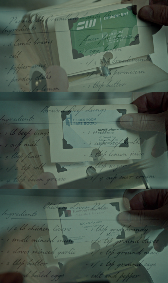
Hi, I found the handwriting on the superimposed recipe cards in this image particularly elegant and pleasant to read. What is its provenance? What is this style called? Are examples of this style available in sources that come to mind? What are some similar handwriting styles? I'm really glad there's a community of experts here to offer insight. Thanks!
-
I'm curious because my interest on fountain pens brought me back to the calligraphy sheets and the intent to relearn cursive writing after 25 years of print writing (engineering school is to blame). My choice is number 4. I also believe choice 5 is not getting a single vote, but one never knows. http://www.freesmileys.org/smileys/smiley-confused009.gif . What about you? Best Regards, Marcelo
-
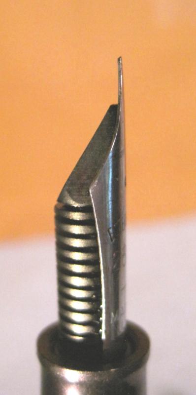
Is it really an Esterbrook nib or is it a QA issue? I would like comments from anyone having purchased an Esterbrook nib that had its tip ground to resemble a block sheave - )( - front to back and/or has asymmetrical shoulders/tip material. Two nibs (2556 and 1461) had material scalloped out from the center of the tip but not matching the shoulder curve. I lost the tip material trying to remove the problem of severe scratching caused by the grind marks -- ended with two good working (Fine?) cursives. Before these problamatic nibs, I had purchased my first SJ with a very good 2668. This nib was made in the US and from the get-go laid ink almost perfectly. A little polishing and so smooth (was like butter but roughed it cause I like some read) one could write effortlessly all day. I have included a couple pics each of the 2668 and the two working cursives for comparison. Unable to provide a macro of the 2668's tip profile with avail cam, but viewers should be able to notice it does not have a - )( - shape. Eventually I may reposition this NOS nib in its collar but it's been boxed some time now. The uneven tip seen face side (E2668.1) was taken care of. I currrently have no Fine nibs to compare the cursives with. I made very rough measurements of the stroke width (0.5mm) from the 2556 using a 10X and a finely etched ruler. Not sure where I will purchase my next nib(s), but I seriously doubt it will again be the internet monster vendor machine unless someone in FPN can vet the posting seller. Hopefully I will find a couple of good Fine nibs so I can post writing samples from these "customized" nibs. Pics: E2668.1 - Demo good shoulder/tip symmetry - no sheave shape.E2668.2 - Good tip material shape.E1461.1 - Bad tip portion ground down - slightly wide tip for a Fine but now symmetrical with shoulder curve.E1461.2 - Tip also beveled in, shaping foot into a ~Fine cursive.E2556.1 - Tip shaped to match shoulder curve.E2556.2 - Cursive with sufficient material for wear.