Search the Community
Showing results for tags 'cursive'.
-

How Do You Differentiate Confusing Letter Combinations In Sutterlinschrift?
hdd113 posted a topic in Calligraphy Discussions
I have been practicing Sutterlinshcrift lately. What I noticed is that there are certain letter combinations in this type of handwriting that I expect would be confusing to differentiate with another. For example, an and om are quite similar, and a looks a lot similar to oc. In most case I expect this to be less of a problem since you can get the word from the context, but it won't be as easy for Names or uncommon vocabularies. How can you differentiate the letters in these cases?
-
Hello FPN, I am a student and is wondering whether to write in cursive or print in my exams. My worry is that my cursive may be less legible than my print, which may subconsciously affect the markers opinion on my work. I have attached a picture of my handwriting, both in cursive and print, I would love some opinions on the best type I should use in exams. Thanks
-

Italic Lower Case: How Many 2 Stroke Letters Do You Use?
jbutle04 posted a topic in Calligraphy Discussions
For written (now drawn) italic—I'm talking about everyday script, but we can exclude post-it notes and such—I think there's room for disagreement on whether the following letters are better written with 1 or 2 strokes: d, e, p, and w. I find myself going back-and-forth, especially on e and p, and I'd like to finally settle on either 1 stroke or 2, and not have to think about it anymore. So, I'm curious what's most common among the FPN crowd (this sub-forum, anyway). I feel like the sources I tend to look at for Italic ductus and exemplars, etc., are pretty evenly split on d and p. But there seems to be a consensus among Italic experts in favor of 2 stroke e, with the middle bar joining to the next letter. I've always been rather incredulous about that formation—it's hard for me to imagine that there are any benefits to 2 stroke e over 1 stroke—but maybe people here can convince me otherwise? Same goes for the d ascender. Perusing the Society for Italic Handwriting site, it looks like there's a preference for 2 stroke d (bowl + ascender) even in everyday cursive Italic. But I'm definitely in the opposing camp on that one. So I guess, generally speaking, I just wanted to ask for thoughts and advice on the topic of 1 versus 2 stroke lowercase Italic letters in everyday script. Thanks, guys! -
I just recently got into the fountain pen hobby. Just this past couple of weeks I purchased a few pens, inks, and paper. I created a separate thread about the pens and inks I was looking into and eventually purchased if anyone is interested. That thread can be found at this link: https://www.fountainpennetwork.com/forum/topic/312663-first-timer-entering-the-world-of-fountain-pens/ I'm really enjoying my pens and inks, but the real reason why I was able to get interested in pens so fast besides all the shinies!!! lol; was the goal of improving my handwriting. I am in the computer science field so handwriting kind of went to the back burner as I primarily take notes on my laptop; I however just went back to college to finish up my degree. I have in the past enjoyed writing poems, notes, etc... so the want and need to improve my writing is there. To start improving my handwriting I decided that writing whenever possible is a good place to start since practice makes perfect. I decided to start taking my college notes on paper first, along with grocery lists instead of using my mobile phone, and any other notes I may take throughout my day. Anything I want to keep I just scan into OneNote at the end of the week to have it in digital form. I think my handwriting is terrible; however, I noticed my cursive is a lot better than it used to be since I started using fountain pens; my printed writing is way worse. My everyday workhorse/fast style of writing tends to be between cursive and printed. Now that I have given a little background of my intentions and goals I can get to my question. Are there any good sites, youtube channels, or any other type of media out there that is widely considered to be the best or most respected in terms of improving handwriting. I would greatly appreciate any guidance in terms of where to look to help me improve my writing. Here is a writing sample of my writing. I don't know why but I was nervous posting this lol.
-
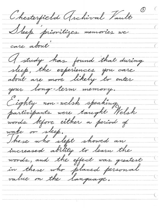
Hi All, I've been practicing my cursive and wanted to provide a sample for your review. I know it might not be the purest form of cursive, maybe a bit too squashed vertically and too spread out horizontally. I'm going for the most legibility and then accuracy and consistency with speed, so I took what I learned from Michael Sull's class last year on American Cursive and sort of adapted it. Any aesthetics pointers here would be appreciated. Also anything that is executed irregularly everytime and thus needing practice would be good for me to focus on. Thanks all. Implements: Paper - Ampad Gold Fiber Writing Pad Ink - Chesterfield Archival Vault Pen - Pilot Prera with M nib Credit: Copied from BBC article Sleep 'prioritises memories we care about'
-
[Whoops! I posted a dupe. Catbert posted about this before - sorry. Moderators, remove the thread if you like. David] The Comeback of Cursive Once derided as a relic of the past, handwriting looks poised for a revival The Economist, Sep 7th 2016 EXCERPT: PARENTS are not the only ones bemoaning the way so many schools have given up teaching children to write longhand. Researchers are also aware that more than mere pride in penmanship is lost when people can no longer even read, let alone write, cursive script. Not being able to exchange notes with the boss or authenticate signatures, for instance, can hurt a person’s chances of promotion... Read the full article (for free) here: http://www.economist.com/news/science-and-technology/21706459-once-derided-relic-past-handwriting-looks-poised-revival-comeback-cursive Note: I am not affiliated with U.K.-based print magazine The Economist; just an occasional reader.
-
I just read a beautiful book, published this summer, about artists and their handwriting. I think it will interest many who follow this forum. It is like a really beautiful art exhibit, in book form. "Pen to Paper: Artists Handwritten Letters, from the Smithsonian's Archives of American Art," edited with an introduction by Mary Savig. Reproductions of letters are included, along with brief biographical info about the artists, analysis of the handwriting and how it reflects that individual's approach to art, and other interesting bits. (Full typed transcriptions of the handwritten letters are also included at the back of the book.) I borrowed the book from the library. Hardcopies and a Kindle edition are available at: https://www.amazon.com/Pen-Paper-Handwritten-Smithsonians-Archives/dp/1616894628
-

The "correct" Angle To Position Pen V. Direction Of Writing
capillaryAction posted a topic in Handwriting & Handwriting Improvement
Background: Right handed. Been using fountain pens on and off for a couple of years. Only recently gotten more serious about pens, cursive writing, nib types etc. My goal is to improve my cursive handwriting, and eventually to move on to calligraphy and advanced scripts. So I recently got some flexible nibs, played around with line variation, and came upon an article that says the "sweet spot" is when the pen is under the lining of writing, and the nib is perpendicular to it. This makes a bit of sense to me, so I tried it out (quite weird to say the least!). My original way of writing is a kind of side writing. One thing I did notice upon switching to underwriting at 90 degrees is that pens write wetter and line variation much more achievable (esp for nibs previously thought to be nails).' So I just want to throw this out to the community of much more experienced writers. Which is the more "correct" way to position the nib with regard to the direction of writing? Right now I find the need to rotate my page awkward and underwriting somewhat fatiguing to the wrist. Any tips of advice? The bottom line is that I want to get started with the correct writing posture, that will serve me well if I move onto dip pens and calligraphy. My original way of holding pen: New, correct?? way of holding pen:
-
Samples Of The Most Recent Handwriting Systems — Latin Scripts After 1990
Anderglan posted a topic in Handwriting & Handwriting Improvement
Hi there, I'd like to compare samples of the most recent handwriting systems — whether joined handwriting style, or «print», particularly Latin scripts developed/introduced after about 1990. Let me start with two* very fine French examples Unfortunately, I cannot upload the pictures, so please help yourself here: https://fr.wikipedia.org/wiki/Modèles_d%27écriture_scolaire_A_et_B *) or more correctly eight: each has an upright and an italic style, and one can choose either rather sober or slightly adorned upper case letters. -
Article: The Advocate (Baton Rouge) June 15, 2016; 11:22 a.m. http://theadvocate.com/news/16115564-148/edwards-signs-cursive-writing-mandate-for-schools-into-law Gov. John Bel Edwards has agreed to a mandate that cursive writing must be taught in Louisiana’s public school classrooms. The governor’s office announced Tuesday that Edwards had signed the requirement bill by Republican Sen. Beth Mizell, of Franklinton, into law. The measure requires public schools, including charter schools, to introduce cursive writing instruction by third grade. Instruction will have to continue through 12th grade. The mandate will take effect on July 1, 2017, to give schools time to prepare. A handful of states have similar requirements, including Arkansas. LA Senate Bill 275/ACT No. 482. Link to .pdf of ACT No. 482: https://www.legis.la.gov/legis/ViewDocument.aspx?d=1011795
-
Hey world! I'm a new member to the forums, and I thought I'd forgo the introduction forum and come straight here. I'm a bit of a handwriting experimenter, so I thought I'd just leave this here to show off a bit :] The railroading would probably get on a lot of nerves here, but I'm personally a fan of it. (Though i've been looking for solutions recently. It's been getting worse lol)
-
My signature was never exceptional but devolved over the years into illegible chicken scratch. In the past year or so, I've gotten it back to something neat and legible but nothing noteworthy. If any of you have nice penmanship and are so inclined, I'd love to see my name in signature (cursive) format to get some ideas on how I might adapt it to make it more distinctive and aesthetically pleasing. It needs to be a style/format that can be done without a flex nib and doesn't take a hour of calligraphy! Something pleasant yet functional. My name (aka the raw material for your artistic endeavor): Dylan J. Valliere. (With or without the middle initial is fine.) Thanks! Oh, and I've looked for an online tool with lots of cursive fonts to attempt this same feat by that means and have failed to find a suitable solution. If you know of one, I'd love to hear about it.
-
Hello, occasional lurker, first time poster. Curious if anyone has contemporary (within last 100 years) of cursive used in Spain. I've googled and googled but am not having any luck finding anything. Thanks in advance!
-
Hi Folks, I am on and off in learning cursive from a palmer book--business writing. The oval and slanted lines drills are pretty hard; but once I feel I got some control in doing them, I lag behind in speed. The drills sometimes ask for up to 200 stroke to the minute or so. I feel it is unrealistic. Any experience or advise? Thanks.
-
Let me begin this post by admitting that I am no expert in handwriting, and that my own handwriting is nothing about which to be proud. That being said, I have observed that the attribute known as "flex" seems to have assumed something of the aspect of a Holy Grail in penmanship. Certainly, I mean no offense to those who value this attribute; and certainly, in the hands of expert penmen, the ability to utilize expressive variance in line thickness evokes my profound admiration: but my worship of flex is tempered by the following considerations: 1) I have read stories of modern and antique nibs being destroyed in the attempt to achieve line-thickness variation. 2) I have seen nineteenth-century and early twentieth-century examples of utilitarian handwriting--business and personal letters and such--that show considerably less flex than one typically finds in latter-day attempts to achieve this quality with a fountain pen. 3) Based on my observations under 2), as well as my own handwriting, and that of members of my family's older generation, it is my impression that, except for calligraphy and the most exalted examples of Spencerian handwriting, flex is something that usually happens naturally, without much conscious effort on the part of the penman. Even most modern rigid-nibbed fountain pens produce a natural and subtle line variation which, while far short of Spencerian standards, is nonetheless most attractive and expressive. 4) As one who regards the fountain pen as a useful tool, as well as a thing of beauty in its own right, I am personally most interested in pens that can write rapidly and easily on a variety of papers, and which are robust enough to survive in a utilitarian environment. It is my understanding, based in part on personal experience, that the more flexible nibs tend to be harder to manage, slower, and more fussy in regard to paper. It is also my understanding that the general trend of fountain pen nibs since the 1920s has been towards rigidity, reliability, and durability--for our forebears did not regard the fountain pen as an exotic trophy, but, rather, as a practical writing instrument, as we regard the computer today. 5) My father had an incredibly beautiful handwriting; but even though he used to reminisce about the eyedropper-filled Waterman's fountain pen that he owned as a boy, which, he related, was capable of great variation in line thickness, his own handwriting, with both fountain pens and ball-point pens, showed no more than the subtle variations in thickness of line to which I have already referred. Beauty and elegance in penmanship does not necessarily require flexibility in the thickness of the line. 6) When I learned penmanship in the early 1950s, using dip pens and inkwells recessed in screwed-to-the-floor desks, my teachers said nothing about variations in line thickness as a criterion of good handwriting--even though they apparently covered everything else, and drove me half-crazy with their punctiliousness. As regards the whole matter of "flex," I am reminded of the exaggerated messa di voce that was much in fashion amongst early-music musicians in the 1970s. Although loosely based upon the writings of Quantz and other 18th-century theorists, their execution of this adornment transcended the boundaries of good taste and belonged--like so much that they did (and still do, alas) to the realm of mannerism. Without, once again, impugning those who rightly cultivate the beautiful and expressive art of flexibility of line variation, I am sensible of the need to beware of being more orthodox than the ancients themselves in this respect.
-

Computer Nerd In Search Of Better Handwriting.
gamingoodz posted a topic in Handwriting & Handwriting Improvement
Hello there I'm 29 about to turn 30 this month and currently a student working towards my associates degree in Network Administration. I am on a computer all day long and I love computers and technology, but I also love the relaxing and personal nature of handwriting. When I went back to school I realized that my handwriting was horrible. Having used a computer so much and never handwriting anything I had lost any tiny amount of skill I might have had in the past. So I started a quest to improve my handwriting which lead me to fountain pens and my new addicting lol. The thing is though I really do not know where to start. I've looked through plenty of threads and searched a good deal online but there are multiple styles of script and multiple resources so I'm a little overwhelmed. Also I just gained 2 penpals from the penpal thread but I'm afraid they won't even be able to read my letters, I figured it would be nice to handwrite letters to folks and that also might improve my writing but now I'm ashamed to even show them my writing. I don't know what script to choose or what resources online to use to practice. I don't have money to buy practice books which I see recommended often. Spencerian script is nice but it is to "fancy" and I don't think it would suit everyday writing. I need a suggestion on a good practical everyday cursive script that still looks nice and that has resources freely available online I can use to practice. If someone could help me out I would greatly appreciate it! I debated even posting this image because I'm extremely embarrassed but I feel its important to show just how much work I really need.. Which is quite a lot..
-

Michael Sull At The San Francisco Pen Show August 28 2015
httpmom posted a topic in Calligraphy Discussions
Here's a juicy one! Michael Sull made individual name place cards for all the students in his class yesterday at The San Francisco Pen Show. This is mine and it's really spectacular, wouldn't you agree!? The class was from 1:00-5:00 but it got a bit frazzled at the start* so he continued on past the allotted time by an hour and a half....he is such a giving person and a wonderful teacher. He helped me get my pen 'hold' in order and it's made a remarkable difference. I bought two of his pens for the flanges are especially made by him to facilitate proper Spencerian. Also such a treat to hear him tell all the stories he's accumulated over the years of being a calligrapher. I feel overwhelmingly privileged to have taken his Spencerian Class. Never forget it. *I was frazzled and late as well, because I got a very scary full blown out tire on a super busy S F Bay Area highway on the way to the Sofitel Hotel. His mannerism was so calm and relaxing however, that I completely let go of the stressed mental state in which I started the class. We should all be so graced by our teachers. Here is a book he signed. I also have a video of a book signing but I am unsure if those are allowed on FPN and/or if it would be proper/acceptable to be putting up someone else's work.
-
Which style of penmanship would you use with an: a) extra-fine or fine nib? b ) medium nib? c) broad nib? d) stub nibs (bellow 1.9)? I took three days, an hour in each, to practice cursive and I was really impressed by how much it improved my handwriting! However, it looks much nicer on finer nibs than on wider nibs. I looks weird on a stub 1.1mm nib. Then I saw some of you using spencerian and it seems to require a flex nib. So, I am wondering, which style would you use for different nib widths?
-
Hello to all the cursive lovers out there! Here is my handwriting: It has developed gradually over time this way. I love writing in cursive, but my fiance and my friends (most of whom use print writing) say it is hard to read and do not like it. My mom calls it a doctor's style handwriting Here's a picture taken from my notes from class, when I wasn't too bothered by neatness and a lot drowsier: Seeing everyone improving and working on their handwriting on this section of the forums (you handwriting experts on improvement!) I wanted some critique and suggestions on how to improve it. I've heard the old saying "practice makes perfect". However, in my case, this handwriting has developed over ~10 years, so I am not sure what kind of practice in particular, I should do to improve it. Any particular suggestions on lettering are welcome! Thanks! EDIT: Apologies on the crazy big pictures, I am new to this forum so any suggestions to improve the size would be appreciated
-

Fahrney's Holding Cursive Writing For Kids Workshop
Tasmith posted a topic in Clubs, Meetings and Events
Fahrney's Pens in Washington, DC is hosting a Cursive Handwriting for Kids workshop on Saturday, 25 April 2015. http://www.fahrneyspens.com/pdf/cursive_handwriting_shop.pdf -
Hello, everyone! I would love to start a weekly handwriting practice on here. Every week, I'll post one or two poems, excerpts, or other interesting things (hopefully) for you guys to copy in your favorite handwriting, or a handwriting you're trying to improve! The only rule that I have is that if you'd like to be critiqued, please indicate it in your post, otherwise, only positive comments will be allowed. Please refrain from offering constructive criticism if the poster does not indicate that it is wanted! This rule is in place in order to provide a safe place for people to post their writing samples, without any fear or anxiety! Other than that, you may choose to copy one, or both of the samples if you so desire. Whatever style you prefer is allowed here, whether it is print or cursive, or some symbolic language you made up for private journaling ! Please, participate and have fun! P.S. This is not an original idea. I found it on a handwriting forum and thought it would be fun to start one here on FPN. This week's sample:
-
Tennessee Schools To Teach Cursive Again
Tasmith posted a topic in Handwriting & Handwriting Improvement
Hope more States will follow. http://www.wrcbtv.com/story/27986804/cursive-coming-back-to-tn-classrooms -
School Children Design Website To Teach Cursive
Tasmith posted a topic in Handwriting & Handwriting Improvement
Via Fahrney's Facebook page: http://www.theday.com/local/20141211/students-design-website-to-teach-cursive -

Pen With Cursive Italic Around 0.9Mm Below $50
AngraMelo posted a topic in Fountain & Dip Pens - First Stop
Hello friends! I'm looking for some pens to practice different styles of calligraphy. I would like to buy 2 or 3 with different nibs (could be different pens too). The main idea is to have some cheap pens just to try the style out. I already own a lot of nibs for dip pens so that is out of the question for now. They could be chinese, could be just the nib for FP (number 6 is probably what I would go for) could be used, anything. Also, I want to use lined paper with regular spacing, so nothing too broad that would make me blank paper. Finally, I am a beginner in the FP world, so treat me like a 15yo child! thank you for your time! best! -
While writing with fountain pens in my medical practice (an activity soon to cease, thanks to the U.S. Government), I often get comments from young patients, or the children of patients: "Gee, what a neat pen!" I decided to be prepared if a youngster shows a genuine interest by ordering ten Pilot Petit1 pens in various colors, along with accompanying cartridges--total cost about $50. My first candidate was a 14-year-old football player whose mother was lamenting his lack of interest in his school work and his school's failure to teach cursive writing. Instead of the usual eye-rolling sneer that one gets from most teenage boys, I got the impression that this kid might be interested in improving himself. I sent him on his way with one of the Petit1s, after showing him how to load it, and gave his mother a note about Michael Sull's "American Cursive Handwriting" book. Who knows? At worst, I'm out a few bucks, but the kid seemed grateful--it beats handing out Tootsie Roll pops or Mickey Mouse bandaids.