Search the Community
Showing results for tags 'copperplate'.
-
I have recently purchased a new box of nibs, Zebra comic G, for copperplate calligraphy. They're nibs I used in the past with happy results, very flexible and nice fine lines in my opinion. I used them with regular fountain pen inks (like Waterman, Pelikan, Lamy, MontBlanc and so on) but also with some self-made mixes and gum arabic. The old set worked just fine as soon as it was out of the box, no need for cleaning or set-up: they just held ink perfectly. This new box seems exactly the same, same finishing, and it was purchased by the same vendor. However the nibs don't hold ink properly: it will pool around the reservoir and refuse to flow towards the tip. When it does flow, it very often comes down all at once creating splotches. I tried different ones, so it's not just a faulty one of the box. I have tried cleaning them with: saliva - which had worked fine in the past with other nibs: slightly better, but the issue is definitely not solved water - no improvement, almost made the issue worse if possible flame - held it over a lighter, at first just a second, then when it was not working I held it for several seconds: again the situation got somewhat better, but it's not solved Things I heard but haven't tried yet: toothpaste - I'm afraid to ruin the tip: should I go for it? chemicals, like solvents: acetone, nitro thinner or simple kitchen degreaser - I really don't know what's going to happen with the metal and/or the ink. I'm not keen on playing the little chemist, so I'd rather leave this as a last resort. intervening on the ink - maybe some inks will solve this problem? Maybe they need to be thinner? Do you have any recommendation or low-risk methods I could try at first? I really want to solve this because I love these nibs and would be very sad to start looking for different kinds to fall in love with also I have a deadline coming up for a job and need to sort this out rather quickly! Thanks and apologies for my English.
-
In order to improve my handwriting, I'm going through two exercise books: Michael Sull's "American Cursive Handwriting" and Austin Palmer's "The Palmer Method of Business Writing." The former includes practice sheets but the latter doesn't. In lesson 32, page 70, Mr. Palmer writes "As there are six-sixteenths of an inch between the rule lines in the practice paper generally used, and in all the the Palmer Method practice paper... ." So, where do I get this 3/8" paper or "Palmer Method practice paper?" Also, what is Seyes paper? Where do I get French-ruled Clairefonte paper or notebooks? I wrote to Michael Sull and asked him what is the spacing on his Clairefontaine Tablets but didn't receive any response. I also wrote to John Neal Books asking about the spacing of guidelines in their P76 Strathmore Writing Pad, lined, P35 Clairefontaine Lined Pad; and P86 Logos Calligraphy Copperplate Pad, but again didn't receive any response. I don't have access to a printer so I would like to buy paper with guidelines (and maybe 52 degree or 55 degree lines) on it.
-
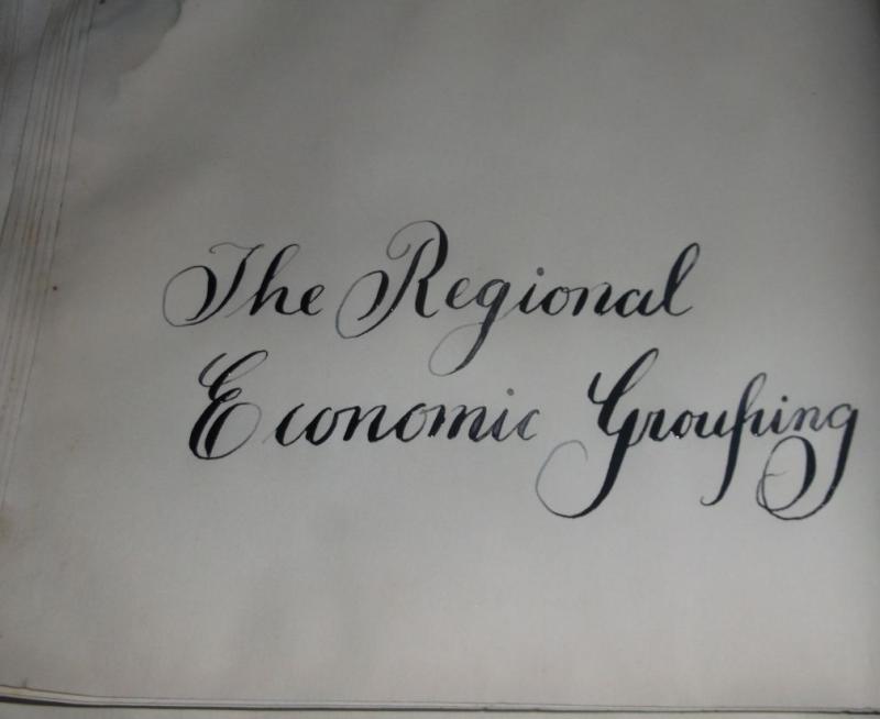
I'm continuing to work on my Copperplate script, and used holiday greetings and vocabulary here. Feedback and suggestions for improvement are appreciated. I had to switch to a Blue Pumpkin nib midway here because my Brause EF was catching on my paper. Happy holidays to all!

-
Hello, I have been considering some different flex pens for copperplate and as I can already write with a fountain pen and messed about with some of my friends flex pens, which pen would be better. I am looking mainly at either a modified fountain pen with a zebra g nib, a cheep calligraphy set or a vintage Conway Stewart 759. Any help would be appreciated.
-
I'm thinking about buying a Desiderata Pen for Copperplate calligraphy. Most of the time, I use a proper pointed dip pen and calligraphy ink for Copperplate, but sometimes I'm lazy and use a Noodler's Ahab for practicing so I don't have to clean my nibs. Plus it's a good way to use all this fountain pen ink I have! I'd like to find a flex nib pen that gets a closer feel to a true pointed pen. If you have experience with a Desiderata Pen, can you do Copperplate with it? How is the experience of using the pen? Will the feed be able to keep up with the flexible nib ink flow? Thanks so much to anyone who can help!
-
 First of all greetings to all I am new at The fountain pen network and in the magnificent world of fountain pens at the moment I only have one lamy logo and within a month I will get a 2000 lamy. I am a young man of 20 years old who since childhood my mother taught me the art of writing. I use the palmer method to write and I love it and more when I use stub nibs because of the effect of line variation.And I've had some curiosity about trying out new calligraphy styles like Spencerian or Copperplate and I really do not know which one to start with first and which one is going to make it easier with Palmer's bases.and with respect to the tools that are used I have never used flexible nibs I have only used round and stub, I do not really know how hard a flex is.So what do you recommend? Is it worth trying or should I continue with palmer?I also leave some samples of my handwritingDocumentos escaneados.pdf
 -
Learning Copperplate As promised, I am adding my Copperplate lessons here. We will start our study of Copperplate with the small letters i.e. the minuscules. I have divided the minuscules into four groups. The first three groups are based on strokes common to the group. The last group contains the letters that do not share a pattern with other letters - these are the misfits. The process is that students will study each lesson, do their practice and submit the assigned words for feedback. Students move on to the next group only when sufficiently proficient with the current one. Each group will have it's own thread so things don't get mixed up. We will need some materials before we start. I always recommend using the best materials you can afford for practice. The time we spend practicing is our most valuable asset. It does not make sense to waste a second of it fighting with uncooperative paper or ink that doesn’t flow well. Here is what I recommend: Ink: I will start with ink because it determines the other materials to some degree. I know the following to work well: Higgins Eternal with a few drops of Gum Arabic. Walnut ink (can be bought in liquid form or as crystals that are dissolved in water to make ink). Pelikan Black with a good dollop of Gum Arabic - experiment to find what works best for you. Noodler’s Black with a good amount of water added. Fountain pen inks contain surfactants which sometimes causes the ink to slide off the nib in an uncontrollable manner. The last two inks on my list are fountain pen inks but work well with pointed pens in my experience. Please feel free to experiment with other inks but stay away from pigmented inks like Sumi or India. These can be made to work well with pointed pens but I don’t think it is worth the effort to fiddle with these inks when one is learning. Paper: The paper you use should be smooth and should be able to take the ink you have chosen to work with. Higgins Eternal has a higher tendency to bleed than the other inks but it flows well. Some experimentation will be needed here. Also, I recommend printing the guidelines on the paper you will be writing on. It makes a big difference over placing printed guidelines underneath the paper you are writing on. The paper you choose should be suitable for printing guidelines on the type of printer you have. You can use paper with pre-printed lines on it e.g. Rhodia pads. Please make sure the lines are at least 6mm apart though. On such papers you will only need the slant lines. We will be writing Copperplate at the traditional 55 degree angle from the baseline. You can either draw these on your paper or place a printed sheet with just the slant lines underneath. Nib(s): We will be writing the minuscules at ¼ inch x-height i.e. letters without ascenders or descenders will be ¼ inch tall. We will need a nib that can handle writing at that size. I can recommend the following: Speedball Hunt 101. These are commonly available in art stores and work very well. Speedball Hunt 22. These are stiffer than the 101’s and a bit smoother. These work well for people who find the 101 difficult to use. Brause 66EF. These are easily available online and in some stores. This is very small nib but has more than enough flexibility for our purposes. It works well with inks that might be problematic with other nibs. Because of it’s small size, it needs a specially adjusted holder. Leonardt Principal EF. This is an excellent nib and could have been at the top of the list. I have placed it at no.3 because it requires a delicate hand to get the best performance from it. Also, there have been reports of loss of quality lately (new nibs turning out bad). Gillot 303. This is also an excellent nib but can be hard to use as it requires a delicate touch on the up strokes. There have been quality issues with this nib too but reportedly Gillott has invested in new tooling that will take care of these issues. Nibs produced with the new tooling are expected to be available in a few months from the time of this writing (May, 2016). Various G nibs are very popular and often recommended for beginners because of their forgiving nature. These are excellent nibs but are a bit too stiff for writing at the size we will be practicing with. By all means get some (my favourite is the Zebra G) to play with. You will definitely find a use for it outside of these lessons - or for practicing Copperplate at a smaller size. Holder(s): Oblique holders are usually recommended (but not absolutely necessary) for right handed people. I use one and do recommend it highly. However, you can write Copperplate with a straight holder if you want. You will need to turn the paper so that the slant lines are lined up with the direction of your holder shaft. The goal is to allow the nib to spread evenly on both sides of the shade on the down strokes. Left handed people, if they are underwriters, can use a regular oblique holder (like the one used by right handed people) and write with the paper turned clockwise between 40 and 60 degrees. It is difficult to draw the hairlines as upstrokes using a straight holder. One of the advantages of an oblique holder is that it presents the nib at a shallow angle to the paper. This helps sharp nibs make smooth hairlines on the upstroke without catching on the paper. In my opinion, this is a big enough advantage to consider using one - even for left handed scribes. Left handed oblique holders are available but I believe a regular one works better for left handed calligraphers. Guidelines: As mentioned above, we will be using ¼ inch x-height. I have prepared the guidelines in 2 sizes, A4 and US Letter. Both are attached to this post as pdf files. Please download the appropriate one and print it out on the paper of your choosing. The illustration shows how the guidelines are laid out. The traditional proportions for Copperplate are 3:2:3 i.e. the ascenders and descenders are 1.5 times the x-height. However, at the ¼ inch x-height we are using, the ascenders will be hard to draw at those proportions. We will be drawing our ascenders and descenders at 1 times the x-height. Some exceptions apply though and will be noted as we go along. http://thesixapp.com/smk/CopperplateLessons/Copperplate-Guidelines-Explained.gif Copperplate Minuscules - Group 1 OK - enough about the preparation. Let's get started with some Copperplate. The first group of letters we will be working are based on the ‘i’ stroke i.e. the stroke that makes up the letter ‘i’. The ‘i’ stroke starts at the waist line and goes down to the base line. The stroke is started at full shade (i.e. the full thickness of the letter) and drawn at this thickness down ⅔ rds of the way down. As the illustration shows, pressure is released in the last third while simultaneously moving the pen to the right. This causes the right tine of the nib to keep drawing a straight line down while the left tine closes down making an arc as the tines come together at the base line. This is where you stop. Pick up the pen off the page and put it back down to start the hairline stroke that will connect to the following letter if there is one. http://thesixapp.com/smk/CopperplateLessons/structure-i.gif The picking up of the pen ensures that the bottom of the shade comes to a point as well as avoids pulling excess ink into the hairline. Here is the group of letters based on the ‘i’ stroke: http://thesixapp.com/smk/CopperplateLessons/CuPl8-group1.gif i - Start with a hairline at the base line and go up to the middle of the x-height or slightly above - this is the entry hairline. Now place the pen at the waist line and apply pressure to the nib to spread the tines and pull down towards the base line. The stroke should be placed such that it meets the entry hairline halfway down the stroke. Gradually release the pressure on the nib two-thirds of the way down while moving the pen to the right bringing the stroke to a point on the base line directly below the right side of the stroke. This will cause the left side of the stroke to have a curved shape. Now lift the pen for a beat, put it back down and draw the hairline back up to the middle of the x-height, this is the exit hairline. The dot is placed directly above the ‘i’, halfway between the waistline and the the 1st Ascender line. It is the same thickness at the letter - no more. You can go back and make the top of the starting stroke ‘square’ now. In time, you will learn to square the tops directly at the start of the stroke but there is no need to spend time on it at this time. It is worth your while to practice this stroke until you can do it without thinking. The best way to do that is to use Mr. Geoff Ford’s method of practicing in groups of 5. Here is how you do it: Write the letter 5 times. Now stop and look at each letter you have drawn and place a tick mark against ones that are good. Now pick the best one and try to replicate or improve on it 5 more times. Repeat. This process not only take the boredom out of the practice, it helps sharpen the eye in the process. Once you can see what a good letter is, making it well is just a short distance behind. So when do you know when you have it? When you can consistently make 3-4 out good ones in a group of 5. u - All that practice with the ‘i’ will come in use here. The ‘u’ is nothing more than two ‘i’s written next to each other i.e. the exit hairline of the first ‘i’, is the entry hairline of the second. All done. w - The ‘w’ is just a ‘u’ with the exit stroke drawn all the way up to the waist line. The ‘blob’ in the end comes ⅓ of the way down and back up to the waistline, or the following letter if there is one. You can draw the blob without any pressure on the nib and then fill it in - or you can make it one go if you feel like it. Please note that the hairline stroke becomes pretty much parallel to the main stroke as it reaches the waistline - it does not curve back into the letter. t - Now things are getting interesting. The ‘t’ is drawn like an ‘i’ that starts halfway between the waistline and the 1st Ascender line and goes down to the baseline. The tapering at the bottom is the last third of the ‘i’ part of the letter so if you cover the tops, the bottoms of the ‘t’ and the ‘i’ would look the same. The crossbar is drawn halfway between the top of the letter and the waistline. l - This is beginning to feel like cheating now. The ‘l’ is just and ‘i’ that starts at the 1st Ascender line and goes all the way down to the baseline. As with the ‘t’, the tapering at the bottom should match that of an ‘i’. b - The ‘b’ is an ‘l’ that is finished like a ‘w’ i.e. the exit stroke it taken all the way to the waist line and then the blob is drawn. j - Things were getting a bit repetitive with the ‘i’ stroke so we will play with something a little different. The ‘j’ is not strictly based on the ‘i’ stroke but it begins like one. It is used in a few other letters so practising it with the first group will pay dividends later. You start just like with the ‘i’ but keep moving down at full thickness through the baseline. As you move below the baseline, start to taper your stroke towards the right gradually until you come to a point at about the 1st Descender line. Continue to draw the stroke as you go a little (about 1/3rd) below the 1st Descender line and come around to form the bowl of the letter and go up to join the downstroke just below the baseline where you lift the pen. The exit stroke continues on the right side of the downstroke as a hairline. The reason you pick up your pen is to avoid drawing excess ink into the hairline exit stroke from the still wet downstroke. The dot is placed above the main stroke just as in the ‘i’. This completes our first group. Take your time with it. When satisfied with your work, post the following words for review: ill, will, built, jilt and a word of your choice made up of these letters. A note about joins: This is the standard join when the hairline exiting at the baseline joins the following letter at mid-height between the base and waist lines. This is the simplest join. http://thesixapp.com/smk/CopperplateLessons/joins/till.jpg Care should be taken to make the join as seamless as possible. Leaving a very small gap (as in the first hairline before the ‘t’) helps to avoid ink from the following shaded stroke bleeding into the hairline. This is quite acceptable although the gap in this example is a bit too big. The exit hairline should be nearly in line with the slant lines at mid-height. This ensures that the join with the following letter is seamless. The second type of join in Group-1 is from letters that end at the waist line. http://thesixapp.com/smk/CopperplateLessons/joins/wit.jpg These letters (‘w’ and ‘b’) end with a blob at the top of the final stroke. This blob is drawn about ⅓ of the way down from the waist line and a looping connector is drawn to the following letter. The bottom of the loop is about halfway between the waist and base lines allowing a join to the following stroke a little below the waist line. This join is slightly steeper than the ones starting at the base line but the transition can still be made smooth by drawing the hairline loop in such a ways that it matches the slant of the letters at the place where it joins the following stroke. Video Demonstration I made a short video demonstrating the letters in this group with the exception of the 'j'. I will add that in the future. You can find the video here: Copperplate Lessons - Group 1 I made a separate video for the 'j' stroke as I also wanted to tackle the 'g' and 'q' at the same time. You can view it here: Copperplate Lessons - j, g & q Copperplate-qtr in-US Letter.pdf Copperplate-qtr in-A4.pdf
-
I have a suspicion that I have ignored a specific but essential part of the formula for easy use of flex pens -- which ink works? The variation of line width in flex writings depends on the ink flow creating a consistent connection and fillng of the line being developed between the tines. When the flow of ink only flows off the tines, not remaining connected across the gap between them, you get railroading. When the ink stretch between the tines is not broken as the pen moves a clear, solid line develops as the ink transfers to the paper. Often wide stretch between the tine breaks the ink bridge by not feeding the ink to it quickly enough -- or ink running out on the tines not transferring to the nib from the feed quickly enough. So far this newbie (me) has found a plethora of articles and videos on fitting nibs and feeds, modifying feeds and writing slowly -- but so far no real analysis or comparative testing of fountain pen inks for their efficacy of use or appropriateness for flex use. Also noted are the notes that India ink has the proper viscosity for flex use in dip pens, but is rotten for use in fountain pens clogging them, corroding them and doing bad things. Also articles indicate that fountain pen inks vary viscosity and "stretchability" between the tines not only by brand, but often by color within brand. And sometimes, batch to batch, an ink will limit or open the width of line being attempted at a normal speed before it breaks the bridge or runs out of the nib/feed arrangement. So, the question then becomes what inks work or do not work for fountain pen flex work and within what parameters of width, speed of movement, color, feed type and feed modification, and which do not work? Is there a brand that consistently, across colors or partly in XXX colors that will work well in flex? Is there an additive that can be put in to an ink that normally would not flex which would increase the ink's range AND not damage the fountain pen. Dip pen users use gum arabic for this addtive, but none recommend using that substance in fountain pens citing severe gumming and plugging issues. Maybe this is the sort of challenge Nathan at Noodler's could take on to release a line of designated flex friendly inks in various colors or somehow mark current inks as to "flexworthiness." This might not be a profitable set of tests/developments at first, but I imagine it as a fun challenge. Lastly, if you got this far -- what has your experience shown so far as the best ink to use for flexing -- and does that vary drastically with the nib metal, feed configuration. and cleaning regime required for your flex pen?
-
Hello FPNers, I'm all about vintage flex and want to use a rough adaptation of Copperplate for journaling and letters. A while back I purchased a lovely little gold-filled ring top Wahl FP with a wet noodle #2 nib. The nib writes about a Western EF when not flexed, so I'd like to get a finer nib. My question is: should I have the nib reground to a finer point for calligraphy purposes or should I get another pen entirely? Will the small size of the pen make it harder to control for styles like Copperplate or Spencerian, or does the weight of the all-metal construction make up for it? Control is fine with the EF nib, but I'm wondering if it will be harder to control with a needlepoint nib. My big pen purchase goal for next year is to score a wet noodle Waterman 52. Would it be better to have the nib on a larger pen like that made into a needlepoint? Thanks for any advice!
-
Beauty through Adversity - This thought kept echoing in my mind as I was carving this holder. Just like a hardship caused this Maple to become so uniquely beautiful, we too become stronger, better and uniquely beautiful through adversity. This holder celebrates the beauty in all of us as we face life's trials and tribulations. It is available in my online store along with a couple of others :-) - Salman
-
Hi there, I am an avid user of fountain pens and I also love to write with an italic or stub nib for calligraphy. However, I'd like to venture into copperplate and Spencerian script so I'm looking for dip pen nibs. I want to be able to write small letters so that I can write things like letters without running out of space. I'm new to this area so I don't know if it's possible or even desired to have writing that would fit onto the lines of standard lined paper, but that is what I'm looking for. Any suggestions for nibs? Also, is it necessary to have an oblique holder for calligraphy? Thanks, Danny
-
I am offering a small selection of these premium holders just in time for your Christmas shopping. These are all ready to ship and available in my Etsy store at: Expressions Art Shop 1-1 & 1-2 - These are my 'short-form' holders. These 4.5 inch holders are carved from Cherry with Zebrano and Rosewood accents in the grip area and Bubinga in the finial. Although short, they feel like full sized holders in the hand. ($120 for the set) Sold 2 - This 'Swan' holder is carved from Cherry. It was a challenging project but I am happy how it turned out. ($140) 3 - This 'Tulip' holder is carved from Bloodwood and Tree of Heaven. ($140) Sold 4 - This classically styled holder is carved from Olive wood for the grip area and Bubinga for the shaft. Two Brass ring accents are placed where the two woods join. The finial is separately carved from Curly Maple and Ebony. ($140) 5 - This holder combined light and dark Walnut and sports a triangular grip. It will suit users with a modern grip who like to hold their pen high. ($120) Please feel free to browse my Etsy store or PM for purchase or custom orders. - Salman
-
I am happy to announce my workshop on Copperplate Calligraphy on January 7th 2017. I will be introducing my system for learning Copperplate Calligraphy in this 4-hour workshop. We will work through the fundamental forms that make up the minuscule (small) and majuscule (capital) letters of the alphabet. This class will benefit both beginners and those with some experience in Copperplate or other pointed pen scripts. Tickets for this even are available here: Copperplate Calligraphy with Salman Khattak - Jan 7th, 2017
-
Practitioners of Copperplate and Engrosser's Script know that the spacing in these scripts is fairly 'automatic' i.e. things fall in place rather nicely when the exit hairlines are drawn correctly and meet the following letter at about halfway up the x-height. It is interesting to ponder exactly why that is so. It turns out (no pun intended) that the bottom turns of the straight letters (i, t, l) etc are actually similar to the rounded letters (o, c, e). When drawn correctly, i.e. like the bottom right side of an 'o', exit strokes will be at the correct angle (i.e. match the slant) when they meet the following letter. What is even better is that the join won't be jarring even if the hairline meets the following letter a little bit below the halfway point - this typically results in an abrupt 'impalement' of the hairline into the following letter if the hairline is drawn a bit too shallow. Here is an exercise I give my students. The following image shows the bottom halves of 3 words 'ice', 'lit' and 'tie' - can you tell which one is which? (you can see the whole image here) The challenge is to write these three words and see if the bottom halves give them away. I will be looking forward to your participation. - Salman
-

Question Regrading The Forefathers Of Copperplate And Spencerian- And Their Paper
calligriophile2 posted a topic in Calligraphy Discussions
Nowadays, when one wants to begin to learn copperplate,or spencerian, one of the first questions I usually see is "well, what kind of paper should I get?" Granted, there is nothing wrong with wanting the best paper for the job, and in todays market, there seems to be a plethora of paper types that are made spegifcally for pointed pen calligraphy, which I am admittedly extremely thankful for. That being said, I always wonder if the pioneers of pointed pen calligraphy were as spoiled as us when it came to paper selection. In my mind, I cant help but imagine that, in its infancy,calligraphers had very few types and weights of paper to choose from. I know that as calligraphers today, we are fortunate that there is seemingly "special paper" designed to be used in the different disciplines of handwriting/calligraphy. Can anybody offer me some insight as to whether or not a copperplate calligrapher could go out and buy practice pads specifically for use in copperplate or spencerian scripts, or did they have to make due with what they were able to obtain ? Just a question that I have always thought about bur figured if I askedn it here, I'd be thought of as some one who had a very limited knowledge of what penmanship consister of in the early days of the Golden Age of penmanship. -
Hi all, I am excited to announce my upcoming class on Copperplate Calligraphy. This 6-hour class will be held at Wonder Pens in Toronto. This is a Level-1 class where we will start our study with the structure of the minuscule letters. Both beginners and practitioners of Copperplate are welcome. The class is limited to 10 students. This ensures that I will be able to spend plenty of time with each participant. Further details are available at: Copperplate Class with Salman Khattak I hope to see some FPN'ers there. - Salman
-
Hi all For about the past month and a bit I've been practicing writing in Copperplate because I love the look and style of it and always wanted to write in it. But now I'm getting to the point where I'm becoming more confident at it, so I'm wondering where I go from here to get a little more from the art and use it in a creative and (hopefully) fulfilling way? If I just carry on writing sentences and doing drills I'm sure I'm likely to get bored, and end up dropping it to chase another dream. So what do you all do to add a bit of spice?
-
Hey guys! Just sort of polling the community here. I'm curious as to what scripts you all are learning! Do you think it's a good idea to practice two scripts at the same time? I've been learning Copperplate but recently my eye has really been taken by the beauty that is Spencerian. Should I double team them or focus on one? Thanks and can't wait to hear what you all are learning!
-
Hi! I just joined this network, and I'm new to calligraphy world. I'm looking for a workbook to practice copperplate font. Suggestions?
-
I'm really fond of the dip nibs especially my Brause No 141 . But I'm looking for a flex nib Fountain pen under Rupees 1000 . I have no qualms about the exterior design I rather hardly care about its age . But then I'm low on budget right now and wouldn't mind a bad looking pen I just want an Extra fine or fine tipped flex pen . I have checked the Lucknow stores the price they quoted me was over 25000 .I have high hopes from FPN.
-

Proof That Instruction And Guides Are Better Than Figuring It Out On Your Own
AAAndrew posted a topic in Pointed Pen Calligraphy
So, about a month ago I began playing around with my first flexible fountain pen, and then for the past few days with some dip nibs and my attempts at shaded writing looked like this just two days ago (the 6th). Yesterday evening I printed out my first practice sheets and started working my way through Dr. Vitolo's wonderful eBook for the iPad Script in the Copperplate Style. It's a multimedia compendium of his articles and videos on how to write using the Copperplate or Embossed style of calligraphy. And then today I was able to run over to John Neal (just an hour west of here) and pick up an oblique holder (was using a straight holder with my vintage nibs). I have a day job so I've only made it through the small letters and a few capitol letters, and only the barest introduction to these forms (no long hours of practice yet), but just that little bit of actually doing it the right way, with the right tools has made my letters only horrible rather than criminal. I still need tons of work on just about every aspect (sizing, consistency, proportion, angle) but already I can see a huge difference. So, if you're wanting to learn, don't try to do it on your own. Find some good instruction, there is a lot out there for free on the internet, and the practice sheets you can get for free on the IAMPETH web site truly make a difference. And if you own an iPad, download this free book now. It's incredible with great explanations, illustrations and even embedded videos. It will make a huge impact on your progress. -
Here's one of my first attempts at copperplate handwriting LOL It is very childish .. Hope you might see some improvement from me in the coming days..
-
Well, I am currently on a quest to improve my penmanship. It all started with finding a few old Sheaffer School fountain pens in the attic. (I loved those pens). In the 50’s, I had perfect penmanship in elementary school. I was actually quite good at 'Chancery Italic Hand' with a dip pen and India ink back then. (I missed many a boring class while my hand was put to work for the greater good). However, high school and college note taking ruined my cursive and got me started printing in order to take fast notes in class. The printing was acceptable. But the advent of the internet and e-mail has reduced my practice to nothing but household lists. Alas, I find my old School Pens and the race is on! I found Goulet Pens! 3 Sheaffer School Pens, 2 Lamys (medium), 2 Pilot Metropolitans (fine), 1 Pilot Varsity (don’t know how that happened), and a Platinum Nice Limited Edition Century 3776 coming to me from friends in Japan. For calligraphy (which I hope will help improve my everyday hand) I purchased a Speedball Deluxe Oblique Pen Holder, a Cork Tip Pen Holder, a handful of nibs, 2 styles of ink, 2 books, Rhodia Paper, 2 reams of HP Premium Choice Laserjet Paper, and other accoutrements. I already had a light box. I can't decide if I should take up 'Copperplate' or 'Spencerian Script. I am leaning toward Spencerian because I have always loved to look at it. Also I am confused by what is being called 'Modern' or 'Contemporary' Calligraphy on the Internet. Not sure what it is exactly. Calligraphy without rules? A Retired Graphic Designer in her 60’s, Casey (Typography Junkie) Haven P.S. Any advice on a good flexible nib fountain pen would be much appreciated.
-
I wanted to be able to practise Copperplate without having a bottle of ink and dip pen out, mostly due to having young children who are fascinated by the ink and pen, and always manage to find them if they're not locked away! *The ink and pens, not the children! I decided to try out a couple of Ackerman pump pens, and compare them to the Desiderata Daedalus. My aim is to have an easier, less risky way of practising. Apologies again for the photos quality, handwriting, and verbosity in this review. Ackerman Junior Hunt 101 & Gillot 303 AU$17.29 each Postage AU$2.67 each 3 weeks to arrive in Australia 15 g with a tiny bit of ink inside and lid on. Lid 4 g. These pens arrived in a standard C5 (or similar USA size) envelope with a printed invoice or packing slip, and in a squished, flimsy white cardboard box with "Ackerman Pens" on it. I won't keep or reuse the box. Due to the cheap price, I don't expect any more fancy packaging, though being wrapped in a layer of bubble wrap or similar would offer more protection than the box. That's not to say that nicer presentation wouldn't be appreciated. Once again it would have been nice for at least one page of instructions or a welcome note or something to be included. This pen has a different appearance than is shown on the website. It is plain black (no red stopper) and has no clip on the lid. It is a plain matt black cylinder, darker than the Daedalus and perhaps more consistent in appearance, though not as smooth to the touch. There is an oval hole where the yellow rubber tube shows, and can be "pumped". There is an orange O-ring on the pen body to hold the lid secure. The lid pushes on and is held secure by the O-ring. There is a thinner section inside the lid to prevent it being pushed down too far (fine with Hunt 101 but could possibly still hit the end of a longer nib). The lid posts, although it's a bit loose, but, as with the Daedalus, this makes the pen a bit heavy for me. The feed is pointy and goes almost to within a few mm of the end of the nib. It has quite a high profile, which looks strange hanging down under the nib, but doesn't seem to get in the way. The feed has a hole in the back of it, then a hole in the top (presumably they connect) then a slit that stops just before the end. The Hunt 101 feed is the one designed for the "Principality" nibs according to the Ackerman website (Manga G, Hunt 99, Hunt 101, Esterbrook 375, Falcon, Brause B, Brause C), and as such is slightly too long for the Hunt 101, so to compensate the nib is slid slightly forward. I found the fit a little bit loose - the nib slides back a bit with too much pressure on the tip. Although this shouldn't happen in normal writing situations, I got so frustrated with the lack of ink flow that I tapped the tip of the nib on the paper (not too hard!) and this made it slide back too far. I like both the Hunt 101 and Gillott 303 nibs. They don't require too much pressure to spread the tynes, although they are more likely to catch on the paper than the G nibs, and don't bounce back to a point quite so enthusiastically (even if their point is finer). Filling is fiddly. One of my pens came with an end stopper that was fairly easy to remove, the other one has an O-ring on the stopper which makes it really hard to remove. There is a rubber tube inside the pen body which needs to be filled by eye-dropper. I have only tested these pens with Higgins Enternal. I don't have any eye-droppers, and couldn't find the one pipette I own, so used a soy sauce fish instead and tried to introduce the ink one drop at a time (didn't work very well - surface tension meant it was inclined to block off the end of the tube) or by inserting the nozzle of the fish into the tube (didn't work very well as it sealed the end, making it difficult to displace air to allow the ink to squirt in). With one of the pens, when I finally did get 5 or 6 drops of ink into the tube, it suddenly all poured out the nib. With the other, sometimes each drop would drip out. With a bit of mucking around (including pushing the nibs and feeds further in), and a lot of mess including ink getting in between the tubing and the pen body and now leaking out through the oval pump hole), I finally got enough ink into the pens to do some writing. I feel worried about ink leaking out of the end where the stopper is, although this may be unfounded. I found that the nibs ran dry and railroaded fairly quickly. Pumping by itself did nothing, possibly due to the small volume of ink, except when it made sudden big blobs of ink. Giving the pen a flick to get some ink to move down, loosening or removing the stopper, plus a gentle pump, seemed to get some ink flowing. I found myself wanting to dip the pen so I could keep going, which really defeats the purpose. The pen spontaneously dripped ink on one occasion, whilst doing a down stroke, blotting the page badly. These pens look nice and I had no hesitation buying them to try out (not least of all because one pen plus postage costs the same as postage alone on the Daedalus). I had read reports online of problems with customer service and delivery delays, but decided for the relatively cheap price I was happy to risk it. Then pens arrived (I'm in Australia) 22 days after I ordered them. I am completely happy with that. I am disappointed with the performance, the fiddliness, and the mess. I can't work out why they don't work better, even just with gravity feed, and I will try them out with some other inks and a better eye-dropper/pipette. The pens look nice and would be a lovely tool if they actually worked. Update ---------- I decided to carefully inspect the Ackerman pens. One of the pens had a patent barrel. I could see straight through the tube to the other end. The other pen I couldn't see through. I pulled it apart and discovered a white plastic grommet sitting sideways inside the tube. I pulled them out and then tried to reinsert them. This was so difficult, even with the help of a lot of detergent and water to lubricate. I managed to pierce a hole in the tube while using a cotton bud or chop stick or skewer to try to poke it back in. The tubes are made of Thera-Band, which luckily I have some of to replace it with, but I couldn't find any yellow tubing around the house. I used red, which has a minutely larger diameter, but I managed to get it back in and position the grommet at the end of the tube near the section/feed (which I assume is where it's meant to be). I have not disassembled the other pen to see if it also contains a grommet in that position. I inserted the feed and Hunt 101 nib, and filled the pen with Winsor & Newton Blue Black ink (the blue lid bottle, not red) using a small syringe. The ink dripped straight out, so I tried holding the pen almost horizontal, squirting some ink in, and putting the stopper on quickly. The dripping ceased as soon as I got the stopper on, and there seemed to be some ink still in the pen. I wrote a couple of lines quite successfully after cleaning the nib up a bit. I then had to put the lid on and go off to do something. When I came back to it a couple of hours later there was ink in the lid and all over the nib. I got it writing again after dipping in water. The next time I needed to fill the pen I removed the nib and feed, and filled it from the front end with the stopper in place so the ink didn't run out. This was still a bit messy, but seemed to work better. I had to dip the pen in water again to get it writing. Before dipping it in water, if I pumped the pen I could see the ink seeping through the vent, but it didn't make its way to the tip. I think some ink must have dried out between the nib and the feed, and dipping it into water resolved this. The next two times I went to used the pen, when I took the lid off I was faced with a lot of spilt ink inside the lid, and on the nib, feed and pen body that inserts into the lid. This is very messy and so I think the Ackerman pens need to be cleaned and emptied between writing sessions. Pros: Non-dip flex pen (when the ink flows) Easy to remove and clean or change nibs. Cheap Nice plain design Cheap enough that I don't mind playing roughly with it (piercing tube!) Cons: Leaks Leaks when trying to fill Leaks ink into its lid Messy to fill Ink flow is inconsistent Blots spontaneously Not portable
-
I wanted to be able to practise Copperplate without having a bottle of ink and dip pen out, mostly due to having young children who are fascinated by the ink and pen, and always manage to find them if they're not locked away! *The ink and pens, not the children! I bought a Desiderata Daedalus so I would have an easier, less risky way of practising. Apologies for the poor quality photos, handwriting, and verbosity in this review. Desiderata Daedalus AU$66.06Postage AU$19.82Took just under two weeks to arrive.16 g half full ink, including lid.Lid 2 g. *ETA - I'm very pleased with this pen, and it satisfies my requirements. I'm worried this review sounds hyper-critical. The pen arrived in a mailing box, wrapped in a couple of layers of paper. I would have liked a page of instructions, "Quick Start Guide", web links, or similar. A sheet of bubble wrap would seem less haphazard packaging than a sheet of newsprint paper. For the price (I say this from a buyer's perspective, with no knowledge of manufacturing time or cost), it would be nice to have a cloth bag or box or something as well, or even for the pen to be wrapped in a nice piece of cloth for transit. This pen is a plain matt black cylinder. There is visible evidence of machining although it's perfectly smooth to touch and has a nice satin matt feel to it. The lid screws on (I think too many turns). There is some evidence of swarf on thread. The lid has a little metal bump on it to stop it rolling - I'd prefer if it didn't as I like really plain, unadorned things. The lid posts, but this makes the pen a bit heavy for me. The feed has a slightly rustic appearance (but this does not matter). The feed has a channel down its length finishing a mm or two from the front which is about 1.5 mm wide. The feed is rounded off and so the last cm or so of the nib is not covered by the feed. I found it almost impossible to remove the nib and feed, and not being able to find any pliers, resorted to using my teeth. When I wanted to re-insert the nib and feed, I found it almost impossible to push it in far enough again, and ended up holding it with a big wad of toilet paper and shoving and turning a bit, with a lot more brute force than I would have liked. The section also screwed in too tightly (probably due to my efforts to get the nib and feed back into place) and I once again had to resort to using my teeth to get it undone when I needed to refill it. I don't own a vice, or any large pliers (and can't find my small craft ones at the moment), so unfortunately couldn't think of any option other than teeth I now understand why some pens have an unattractive metal ring between the pen body and the section, and I'm thinking of adding something like that to the Daedalus so I don't end up with it stuck again. The pen comes with a Zebra G nib. I find the Zebra G requires a bit too much pressure to spread the tynes and get a nice thick downstroke, and so I get a sore hand after a few lines. I like that the Zebra G doesn't catch on the paper very much and doesn't rust as quickly as some other nibs. Also, it's a very nice looking nib. Filling is done by squeezing the ink sac. I find rolling the sac down into a spiral works well. The pen stopped writing with approx 1 cm of ink in the sac which was stuck up in the top of the sac and didn't want to shake down. I am a little bit worried that the ink sac could come lose as it is just slipped onto the section and not secured. Mine did slide up a mm or two when I was fiddling with it. I have tested this pen with Higgins Eternal and Winsor & Newton Blue Black (blue lid bottle). Ink flow seems to be almost perfect out of the box. Only takes a couple of words to get wet enough to do downstrokes. Possibly just a little bit too wet at times - although I'm aware there is a fine balance between too wet and railroading. Some ink seeps near where nib and feed enter the pen body, initially this was not enough to drip or make a mess, but after disassembling and reassembing the pen it is seeping quite a lot more and I keep getting it all over my fingers. I'm hoping that it will get clogged up a bit with dried ink and stop making a mess. I have successfully carried it in my bag (pointing upwards) and there were just a few droplets of ink on the nib when I next went to use it. I'm finding that I need to dip then nib and feed in water to get it started each time I get it out to write with. I wipe the excess ink off with toilet paper before storing the pen. Pros:Non-dip,real flex pen!Works reliablyPortableWasn't messy until I pulled the feed outPractical, no frills design (my preference) Cons:Moderate ink volume (I think flex nibs use more ink than normal fountain pen nibs)Very difficult to remove feed and nibSection screws on too tightly and gets stuckPossibly restricted to G nib (though I will try it with some others soon)Messy ink seeping out where the feed insertsExpensive (for an investment in an item of unknown quality and functionality)Expensive postageNot an item of great beauty.