Search the Community
Showing results for tags 'conway stewart'.
-
It's been some time since I wrote these first impressions but there's little to add. The Duro remains a delight to behold and to use. I've kept it at home and take it out of its dark cupboard every other night to write a page or two just for the fun of it. It starts without hesitation and keeps on going.
-
Asa Azaadi Recent Group Buy For India Pictures
subbucal posted a topic in India & Subcontinent (Asia)
Hi All, Recently, we did an India Exclusive Group Buy, for ASA Azaadi. A model which was designed after Conway Stewart Churchill model. Here I am producing a Group Picture of the pens made with Conway Stewart, Omas and Cocktail Blanks, for some of our customers. Thanks for looking. Subramaniam
-
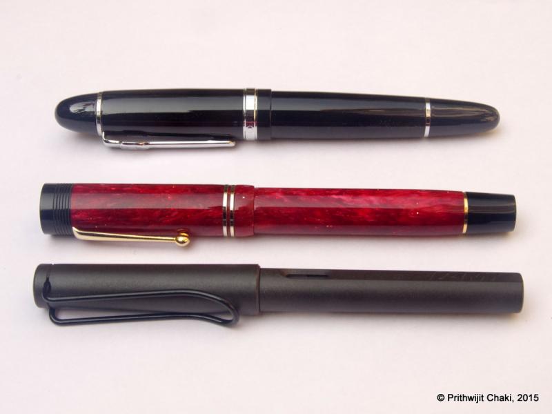
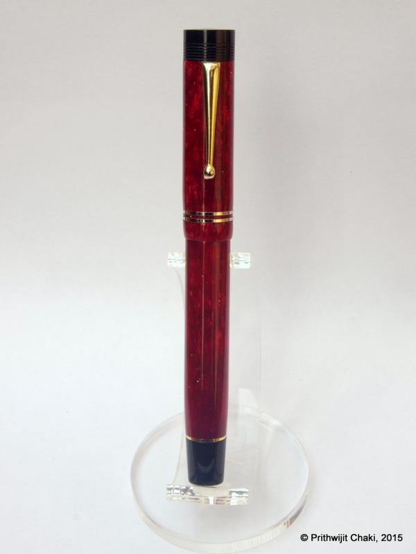
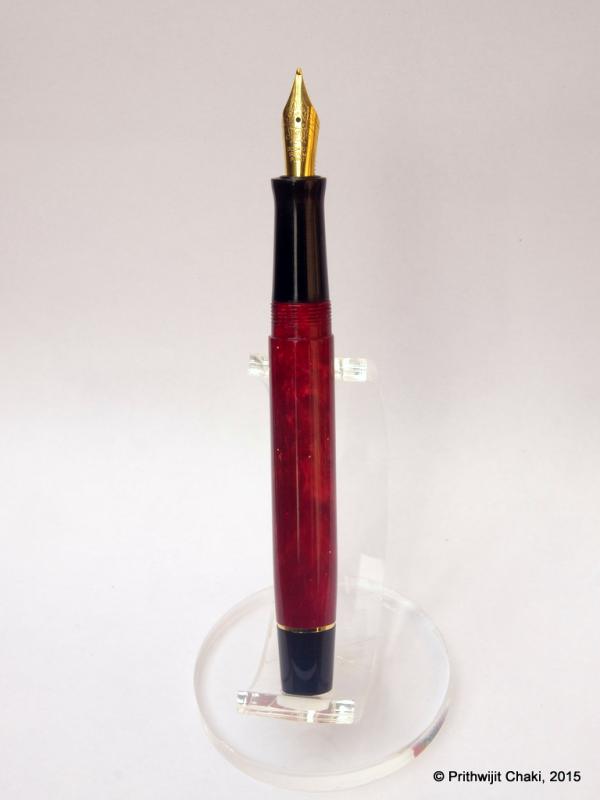
ASA Azaadi in opal Creating a new ASA Azaadi in opal gave me a four-part tutorial in pen design. I commissioned the Azaadi after reading an account of a stunning similar pen in casein by Prithwijit Chaki, a prolific contributor to the Fountain Pen Network. Inspired by the fine white-on-ivory veins of the casein, I set about looking for a material that would simulate the elegance without the fragility. [/url] Capped, the Azaadi is about 1 centimeter longer than a Lamy Safari. Uncapped, it’s about the same length, and considerably thicker. Lesson No. 1 – Material Selection The Azaadi, as explained by Chaki, is based loosely on the Churchill design of the most recent version of the Conway Stewart company in the United Kingdom. When Conway Stewart closed shop in 2014, Vince Coates of The Turners Workshop in Newcastle purchased the remaining inventory of blanks and rods, and some of these materials are still available. There wasn’t a matching, veined white material, but opal offered a similar, classic quality. Coates shipped the opal to L. Subramaniam at ASA Pens in Chennai, who sometimes makes custom pens with material supplied by his clients. This opal doesn’t look like the gemstone. It includes translucent shades of amber, honey, and ivory, like the biscuit color of stained glass table lamps in the Mission, Arts and Crafts, or Tiffany styles. Whatever is underneath the acrylic opal material is visible, especially if what’s underneath is dark. The Azaadi design typically uses black acrylic for the section and finials. Because the opal material remains relatively thick near the finials, most of the black acrylic underneath is obscured. But at the section, where two sets of threads overlap (the cap to barrel and the barrel to section), the material is extremely thin. At this joint, the black section shows through the opal material. The opal material is translucent, but white teflon tape masks the black section under the barrel-to-cap threads. If I were making the pen again, I would probably select a medium-toned, opaque ivory or amber color for the finials and section. But my error also presented a solution – the white Teflon tape used by plumbers to seal pipe fittings. It’s designed to be an extremely thin, white, sealing dry lubricant. Wrapped in a single layer around the threads between section and barrel, it masks the black section underneath. The tape needs to be replaced with ink changes, like lithium grease in an eyedropper, but it’s not a particularly big deal. Lesson – think not just about material aesthetics, but about how the materials fit together. Lesson No. 2 – Ink Compatibility This pen uses a Jowo No. 6, 1.1 mm italic nib and a Schmidt K-5 cartridge-converter. I’ve used this nib in other pens, and never had an issue with ink lubrication. But this particular Jowo nib is choosy about the ink it prefers. The first ink I selected worked beautifully -- a green-olive-brown color mix created by FPN contributor Chrissy, resembling the wrapper of a “candela” cigar. It uses Noodler’s permanent Bad Blue Heron and three Diamine inks. But then I realized that specks from the permanent ink component could stain the interior of the translucent material and show through to the outside. So I swapped out the ink for a conservative Waterman brown. Too dry. I tried Diamine Saddle Brown, another conservative choice. Too dry. My fourth choice, Pilot Iroshizuku yama guri, works smoothly and beautifully. Lesson – nibs and materials sometimes require different inks. Pilot Iroshizuku yama guri ink flows smoothly in this Jowo 1.1 mm italic nib. Lesson No. 3 – Furniture The ASA Azaadi has been reviewed several times, including Chaki and Sanyal Soumitra. A regular refrain is that the furniture could be better, and they are right. Furniture is the jewelry of the pen, the first thing people notice, setting a tone for everything else. This furniture is adequate, but no match for the elegant workmanship of the rest of the pen. Lesson – clips, bands, and rings make a difference. ASA tolerances and workmanship outclass the metal furniture. Lesson No. 4 – Azaadi The Azaadi is an Indian pen derived loosely from a Conway Stewart design named after Winston Churchill. Chaki explains that the pen was named “Azaadi,” (आजादी in Hindi), meaning "independence, freedom, or liberty.” The name is partly cheeky repartee to Churchill, who strongly opposed Indian independence, and partly a reference to the pen’s launch date on August 15, Independence Day in India. Azaadi also signifies political, spiritual, and intellectual enlightenment, with various spellings in other Indian and Iranian languages. Beyond the dictionary, the concept of azaadi is rooted in the Indian struggle for independence and the role of Netaji (meaning “Respected Leader”) Subhas Chandra Bose between 1920 and 1945. Bose revamped the Indian National Army and opposed the British during World War II, creating an independent, nationalist legacy that ultimately led to a British decision to withdraw from India. Bose's clarion call -- Tum mujhe khoon do, mein tumhe azaadi doonga (Give me blood, and I promise you freedom) -- shows the importance of azaadi. Based on a British design with a British material, constructed in India, named Azaadi in response to Churchill -- the ASA Azaadi pen is a story about a complicated relationship between India and the UK. Lesson – a pen is a symbolic tool of intellectual enlightenment. Pens tell stories, but they can also be the story. In Conclusion – Taking Risks Creating a new custom pen involves risks. My risks were minimal, because the design already had been used in several other iterations. Some things in my version worked perfectly, including the elegance of the opal material, the balance, and the writing comfort of the section and the nib. Some things didn’t, including my first ink choices, the translucent barrel-to-section joint, and the furniture. In other custom pen designs, I’ve seen how some choices work and some don’t. Conclusion – regardless of whether risks result in wins or losses, they offer independence of choice, freedom to make mistakes, and opportunity to learn. Writing sample from another country's declaration of independence. This particular Jowo 1.1 mm italic nib is choosy about the ink it prefers, and permanent inks could stain the interior of the translucent material. Iroshizuku yama guri flows smoothly.
-
I have just stumbled upon a lovely blog. There are some great posts on Pitman's shorthand, Platignum pens and school pens from the 60s. I hope you enjoy reading it as I did. Link: https://shorthandtypist.wordpress.com
-
I recently won an auction containing a bunch of beautiful Conway Stewarts. I'm in the process of getting them ready for the San Francisco pen show and sale in general. I opened one up late last night and instead of the usual flakes felt something solid, I pulled gently and got a very fun little surprise. Included also is a photo of the whole lot, mostly English celluloid, just for eye candy!
-

Conway Stewart 756M - I'm Looking For Cap
muscava posted a topic in Great Britain & Ireland - Europe
Hallo, I'm looking for cap for Conway Stewart 756M, because pen is whithout it (photo attached). If anyone from You have such a cup, please give me a sign - I'd like to buy it. Regards. Artur
-
Hello from cold London (-5). I like fountain pens, but also have a Yard o Led ballpoint and one from Pelikan. My fountain pens (all broad nibs) are Grand Victorian by Yard-o-Led which is a great pen, albeit have nib replaced, Conway Stewart Churchill Poppy Edition, Conway Stewart Rudyard Kipling, Visconti Bronze oversize Homo Sapiens, Visconti Dali and a bright orange Visconti. I am just about to buy a Onoto Shakespeare. I use Diamine ink :- Royal blue, crimson, green, purple and red. So the collection is quite small and I have only started in the last four years. Any feedback or recommendations are welcome. After the Onoto I am thinking of a Sailor pen with one of their very broad nibs.
-
Introduction: The Conway Stewart brand has always been one of Interest, Desire and Pride in the Fountain Pen community more so since the unfortunate events that befell it. But it seems that a conscious and considerable effort is being made to revive the brand. I was fortunate enough to attend my first pen show at Los Angeles in February of this year. After the initial “pen”sory overload, the hunt for a memorable “First Pen Show” Pen began. A word of caution, such hunts can begin and end at a single table if you’re not careful with your cash! And for me this could have been Sarj Minhas’s table, hadn’t it been for the overinflated valuation of an Omas Arco. So I had to move on…to Syd Saperstein’s table where a lively discussion on Conway Stewart was underway between a few patrons and Mr. Emmanuel Caltagirone himself. We come to know Manu has a few of the new Model 100 Conway Stewart pens for sale and we move to his table. And there is where my hunt ended; with me pocketing an Omas Ogiva Alba and the Model 100 in Classic Green (some call it Pistachio). I have been using the Conway Stewart daily for the past 1 month and would like to share my review of the pen. Packaging: The pen comes in a hard case with faux leather. The Cover of the box can be inverted and used as a pen rest which is lined with velvet and has the Conway Stewart branding. Inside is a booklet, in the recent redesign, with a lot of information on the history of the Company right till the recent acquisition. As per the specifications The New Conway Stewart Model 100 comes in 4 colors; Beluga Black, Blue Lapis, Pistachio and British Green. Solid Semi Flex 18k Nib. Special Engraving on the Nib. Greek Art Deco band on cap. Piston Filler Operated. The Pen: I chose the Classic Green just because I don’t have many green pens. It is the well-known Green Freckled material with lots of random sparkly bits (? Cellulose Acetate) and with Gold Trim. The pen is of a good size, comparable to large pens. Here are some size comparisons. (L to R): Platinum 3776 Kawaguchi, Omas Ogiva Alba, New Conway Stewart Model 100, Mont Blanc 149, Lamy Safari. The pen seems to have the Classic Model 100 Shape; I do not have the original for comparison. The Golden Trim I was told is Gold plated. The thicker Cap band has a Greek Key Motif and the New Conway Stewart Branding. The barrel tapers gradually and there is no Engraving like previous Conway Stewart pens. The cap takes exactly 1 complete turn to open and posts securely. In hand the pen feels well made with tight tolerances, fit and finish. The material does not feel plasticy and the pen has a pleasant weight to it. The balance is towards the barrel end but I find that it rests well on the web of my hand. The cap is light and posting the pen does not alter the balance. The posted size is very comfortable too. The section might be considered a bit short. It has flare towards the nib and the difference in thickness of the section is 2mm. The cap threads are polished and do not prevent you from gripping the pen over them. Filling System: The end of the barrel has the Piston Turning knob. I think this pen has a Captive Converter Piston. The knob does not move away from the barrel during operation as usual Piston fillers eg. MB 149, Lamy 2000. The piston action has been very smooth and the ink capacity is around 1.2ml. The Nib: The Nib is 18k Gold with engraving similar to the New Eversharp Decoband. Visually the difference between the glossy and matte areas is very striking. This is one of the few nibs that looks good with Nib Creep but also a pain in the butt if you like to keep your nibs pristine after inking.Compared to the Vintage Nib which I always found a bit boring, I like this better. Due to the limited number pens available for sale at the show I could only get a Medium nib whereas I prefer Broad Nibs. I did a dip test and was happy with the performance. The nib was very smooth out of the box, an 8/10 on wetness and soft. Then Manu points out that the nib is pretty soft and suggests I push it a bit! And I was sold. Writing Sample below. The last 3 lines were written with the Vintage Conway Stewart nib. I feel the people behind Eversharp’s Flex nibs might be behind this nib too and I feel the variation would be more apparent if the nib was a Fine to begin with. Compared to the Vintage Nib, the new one gives out more line variation when pushed and feels more soft/springy during regular writing. I might go as far as to say that the New CS Nib has equal, if not more, variation that a recent Flex Nib from an Italian Manufacturer! Having tried both at the L.A Pen Show. Size comparison to a Conway Stewart Wordsworth: The Little Things: The Cap Finial on my pen is dark brown in color with a bit of marbling. Would have been better if it was solid black or same color as the rest of the pen. The Clip is very secure. The capping/uncapping motion is very smooth. The flare on the section seems to create an air tight space like the Slip and Seal System found in Platinum pens. I have not faced any dry starts on this pen. The Greek Key cap band has ITALY marked on it! An ink window is sorely missed. The Piston knob has a mild resistance at the 2 extreme positions but continues to turn even beyond this point. Might this damage the mechanism over time? Conclusion: This being my first “Show Pen” it will be treasured always and being an almost perfect pen for me It has managed to be always inked. I do not know what the Retail price of the pen will be but for the sub $400 price I paid for it I am completely happy with it. The Conway Stewart Material, piston converter, and of course the Star of the Show, the Nib make for a good $400-500 Pen. Looking at the “New” Conway Stewart as a company it obviously has a lot of Italian influences behind it. I guess the British Heritage behind the name should be forgotten and the New Model 100 makes a good case for it.
-
I used to work t Conway Stewart in early 2003 for a few months as one of their Laser Engravers until I was made redundant. Just found this site and joined today whilst researching a Conway Stewart Cracked Ice 24 that came into my business yesterday. I gather from some comments I am getting I have been posting details of some of my pens in the wrong forum. "Chatter"
-
Hi all. Today I bought a Conway Stewart 466 lever filler from an antiques market. The pen is in nice condition and fills properly, but when writing with it it feels "scratchy" to me - at least compared to my TWSBI Eco(F). The pen has a 14ct gold nib(not sure of the size) and it is a flex nib. However, the nib looks like this: http://i.imgur.com/6rZpQNp.jpg?1 (Apologies for the slightly poor out-of-focus picture) Is the nib supposed to have that subtle "bend" in it at the end? Or am I just using a flex nib wrong? I gave the pen to my mother to try(she writes with a "straighter" grip with the pen more perpendicular to the paper if that makes sense) and she said it was fine but I could still hear it audibly scratching a fair amount. Is the nib at fault here or am I just failing to use a flex nib pen?
-
TL:DR There are wires in the ink channel of a Conway Stewart 75: 1) are these original, 2) can they be removed for the cleaning/restoring process? Longer version A friend has an inherited Conway Stewart 75, which he wants to restore to working order. Inevitably, there is a lot of dried ink in the channel and feed that doesn't come out (4 days of soaking only loosened up a little of it). The obvious thing to do would be to knock out the nib and feed and clean it manually. However, there are several wires stuck down the ink channel. We have removed one (it came out easily) and it runs the length of the channel. I've not seen anything like it before. My guess is that the previous owner inserted the wires to reduce the flow, and that they can be removed without any concern as part of the cleaning process. But given that it is an heirloom, we're being quite conservative and don't want to simply proceed without advice. Any ideas? Also, what size sac would a 75 take? Pictures follow: Picture 1 shows one of the wires; you can see the ends of the other wires sticking out. Picture 2 shows the wires sticking out of the ink channel.
-
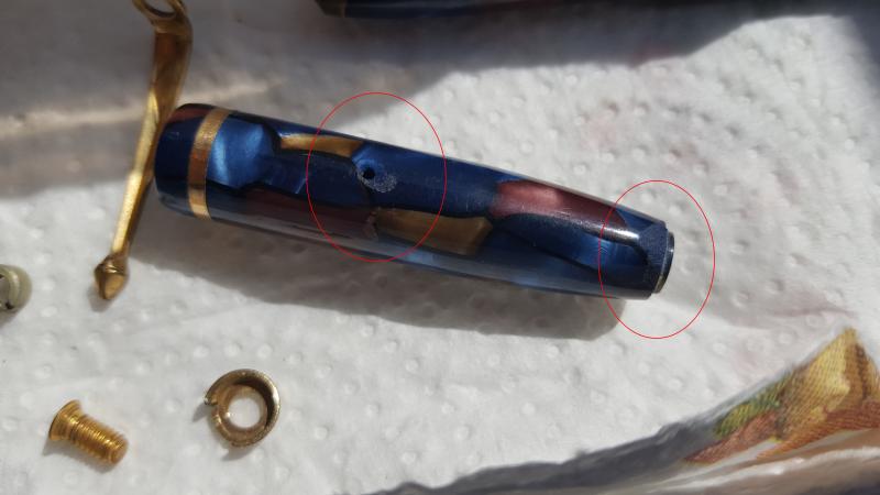
Here I am with a question about restoring casein. I already cleaned the body, removed the old petrified sac, and ordered a new one (I'm waiting for it, I should receive it within days) The cap of the pen has some "corrosion" marks, see in the attached image the red circled spots. There is a way to fill that marks and then sand them? I've also practiced static modelling in the past (tanks, airplanes, ships...) so I'm quite used to work with plastic materials and resins. I'm wondering if there is any safe material to use to fill that marks, maybe a transparent paint or some resin? Thank you in advance for any suggestion. Matteo
-
Hi all. I've discovered lots of modern Conway Stewart for sale on this website, www.retail-world.net. I really like the Winston Lapis Blue and I was thinking on ordering (it's offered here: http://www.retail-world.net/conway-stewart-the-winston-pen.html). Does anyone have experience on this website? Thanks for the information! João.
-

"conway Stewart America?" Hoax On Evil Bay?
dms525 posted a topic in Great Britain & Ireland - Europe
There is a pen purported to be a Conway Stewart Model 100 made by the "new Conway Stewart America" company. The nib engraving and band are like nothing I have seen before. One of the photos has a brochure with a CS logo I have never seen before and a URL that is Mary Burke's old site. The pen looks like a Model 100 superficially. Supposedly is celluloid (not usual for CS). The gold rings and the cap jewel are not like the Model 100. Here is the link to the offering: New listing CONWAY STEWART MODEL 100 BLUE CELLULOID NEW MODEL ** NEVER BEEN USED **REF The seller is in Italy and has moderate numbers of sales with 100% positive ratings. Google doesn't come up with any new American CS company. Anyone know anything about this? David -
The announcement was made last night here at the DC show that Kenro will be the US distributor for the latest reincarnation of Conway Stewart. They hope to be back into production by late fall.
-
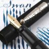
. INTRODUCTION: This 58 is the first “vintage“ FP I bought. The moment I first saw the pictures of this iconic Conway Stewart, I was impressed by the classic old-fashion design. When I found one in near mint condition (at about 120 UK pounds) I was happy. The overall aspect is a high quality one. Inside its cardboard box (even this near mint), there was the FP and the original warranty sheet. The pen has even the original price tag (32 shilling and 6 pence), useful for dating purposes (until 1952 the price has been 31/6) . Appearance & Design (10-10) – This Conway Stewart pen has a classy and traditional appearance. It shows the classic glossy black with yellow gold plated accessories and a yellow 14 Kt. gold nib. A good example from the fifties. Construction appears solid (the FP body and cap are made in celluloid, and even the filling lever is thick and sturdy). The imprint is very readable “Conway Stewart 58” and “MADE IN ENGLAND” in two rows (late production – perhaps after the 1954). The design is today unusual, being rather short and quite fat (12.7 cm long and 1.3 cm large), approaching the size of the Sailor Professional Gear FP . . Construction & Quality (9-10) – The pen appears quite delicate, since it is celluloid and more than fifty year old. In the hand the feeling is warm, and the overall feeling is really pleasing. I can’t see any manufacturing flaw and only few very light scratches (I would define this pen as a new old stock; I see no signs of use – e.g. the dreadful posting rings- but there are the unavoidable signs of time). I imagine that the surface be delicate and I prefer to lay down my pen on a microfibre cloth than in its own original box. The gold layer appears heavy on the clip, the rings and the lever, without evident brassing. When dismantling the cap (warning, you need a custom modified screwdriver) the clip appears substantial, and the heavy plating is appreciable on the entire surface of the clip complex. . Weight & Dimensions (9.5-10) – The size and the weight of the pen are exactly what seen in the specialized literature. Closed it measures 127 mm, I don’t know (and i don’t want to know…) how long it may be when posted. The diameter is about 13 mm at the largest point and the weight is comfortable even if unposted. I feel ok with the balance in my hand (I have average hands). As above, I would relate the overall size to the Sailor Professional Gear, even if the 58 is a trifle thinner. It managed well even in long writing sessions. . Nib & Performance (9-10) – The nib appears to be the original Conway Stewart Duro 58. It appears as a Medium size. The tines are in superb shape and well aligned. This translates in good performance and smoothness. Iridium on the tips (or whatever white metal it may be) had been employed unsparingly. The feeder is flat (ebonite ?). Other than smooth, my nib writes with good flex . It has a quite wet behaviour with the Diamine Mediterranean Blue ink I employed until now. The nib writes medium as expected (actually on the medium/broad side), being able to put down good variability both on xerox paper and on high quality Fabriano Fabria paper 100 gr/sqm. The nib is able to write smoothly as a fine one when turned 180 °. . Filling System & Maintenance (9-10) – The filling system is a classic lever-filling one. The lever has to be pulled at 90° and then repositioned along the body for a complete sac filling (one movement appears to be sufficient). Today the lever-filling system seems completely outdated. I had suspicious expectations about this, nevertheless the lever is a simple and straightforward method to charge the pen (and not a flimsy one…) . Cost & Value (10-10) – I saw many samples of CS 58 on eBay and vintage pen websites. Prices are quite variable from few UK pounds to some hundreds, depending on both the condition and the finish. I believe I paid a fair price for my NOS sample. The signed for, international parcel arrived safely in three days from Great Britain to Italy (Royal Mail and Poste Italiane were the carriers) at a cost of 10 UK £. I think this is not only a delicate collection piece, but also a good deal for a good daily writer. . Conclusion (Final score, 56.5/60) – The overall feeling is good after some (even long) writing sessions. The pen seats well in my hands, I always had some”warm” impression and the old nib performs flawlessly. My expectations have been heavily exceeded, because I did not plan a nib so good and smooth. Even the size, the weight and the feeling of celluloid are on the pleasing side. I believe to employ this pen more and more in the future. For the next weeks it will find place on the breast pocket of my white working dress, helping me in writing prescriptions. I do not see absolutely any space to sell this pen in the future. To be heavily recommended if you can find one ! Greetings from Italy !
-
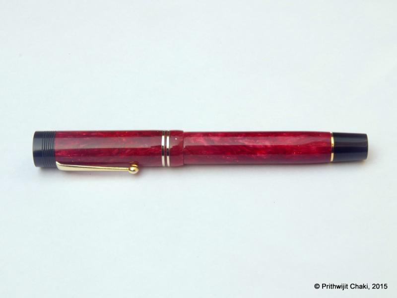
Introduction The cigar shape has been an all-time fountain pen classic. Whether it is the Sheaffer Balance of 1920s or modern Meisterstruck or KOP, the shape has an enduring appeal and is often the signature design for top of the line pens from their respective pen marques. The shape and form have morphed into being a hallmark of quality exemplified by such storied models such as MB 149, Sailor KOP, Namiki Emperor or even the platinum president line. Not all cigar shapes however are created equal and there are many variations within the broader design. Intrigued, I dug a bit deeper and this source provided an enlightening education on the topic. To summarize, there are two basic cigar shapes: "parejo" and "figurado." A parejo is a cigar that has straight sides and a rounded head.A figurado is any shape other than a parejo.http://i1097.photobucket.com/albums/g346/prithwijitchakiPrithwijit/Fountain%20Pen%20Reviews/ASA%20Santulan%20Review/Parejo_zpsulicy0zv.jpg We can further classify figurados into Belicoso: A figurado shaped cigar that tapers sharply at the head like some kind of munition.Pyramid: A pyramid starts tapering right at the foot of the cigar.Torpedo: A torpedo has a longer and more gradual taper than other figurado designs. http://i1097.photobucket.com/albums/g346/prithwijitchakiPrithwijit/Fountain%20Pen%20Reviews/ASA%20Santulan%20Review/Torp-Beli-Pyra_zpskt0vci95.jpg There are many torpedo shaped fountain pens. These tend to be cylindrical in shape with smooth tapering towards rounded ends. Nothing exemplifies the genesis of this shape than the classic torpedo shaped Sheaffer’s pens such as the Balance and the Sovereign series. There are many contemporary pen makers who are churning out excellent torpedo shaped pens. From top of the mind recall, a few like Ranga, Edison and Guider come to mind. I wanted a few such pens to be made from different materials and requested Mr. Subramaniam of ASApens to make a variant of the torpedo shape. This was the genesis of the pen I am about to review. Fellow FPNers Kapil (@springrainbow) and Pradeep (@pdg84) christened the pen “Santulan” which means “Balance” in Hindi and is an obvious homage to the pioneering model of this design language. Design In case my rather lengthy and rambling introduction doesn’t make it clear enough, the Santulan is a cigar shaped pen. To be a bit more pedantic it is a cigar shaped pen with a torpedo like barrel and a pyramid like cap. There is a discernible step between the barrel and the section with a fairly large area where you have the threading for the cap. The section itself is long and comfortable. It is a new design by ASA and is mildly concave with the diameter at the barrel side being just a tad larger than the diameter near the nib, thus allowing for a gentle inward slope. The material used is the Conway Stewart Red Whirl acrylic. It’s a beautiful shade of emerald green with hues of pearlescent effect. The red swirly patterns add to the mystique and brilliantly complement the Stahl Rot (“Red Steel”) nib that has been used with this pen. The entire pen has been buffed smooth and gives off a nice shine. Trims have been kept deliberately to a minimum and there is just a clip for utility purposes. It’s a beautiful regular sized, light and robust pen that is meant to be used daily. http://i1097.photobucket.com/albums/g346/prithwijitchakiPrithwijit/Fountain%20Pen%20Reviews/ASA%20Santulan%20Review/IMGP2037_zpsbikd6ct5.jpg http://i1097.photobucket.com/albums/g346/prithwijitchakiPrithwijit/Fountain%20Pen%20Reviews/ASA%20Santulan%20Review/IMGP2042_zpsvft7oudt.jpg http://i1097.photobucket.com/albums/g346/prithwijitchakiPrithwijit/Fountain%20Pen%20Reviews/ASA%20Santulan%20Review/IMGP2040_zpsmxrptdar.jpg http://i1097.photobucket.com/albums/g346/prithwijitchakiPrithwijit/Fountain%20Pen%20Reviews/ASA%20Santulan%20Review/IMGP2041_zpsy69fe6hc.jpg http://i1097.photobucket.com/albums/g346/prithwijitchakiPrithwijit/Fountain%20Pen%20Reviews/ASA%20Santulan%20Review/IMGP2048_zpsbjvqy8k4.jpg Size and Balance At 153mm capped, the specifications may indicate that this is a heavy oversized pen. Nothing can be further from the truth. This is one of the lightest, slimmest and most comfortable ASA pen that I have ever used. Partly the reason for it’s lengths is the inherent length required of torpedo and missile like shape at the two finials. But a very slim barrel width of 10mm and section width of 8mm should leave no doubt about the fact that this is firmly an EDC (Every Day Carry) pen. This is the slimmest section in an ASA pen that I have ever used and should put to rest any concerns that anyone might have with regards to the thicker than normal girth of Indian handmade pens. Not only the thickness, but also the shape of the section is meant to accentuate the feeling of comfort. Nothing beats the feeling in hand once you start writing with it and realise feather-light weight and the comfort. Needless to say, the pen is well balanced and provides comfortable writing for extended periods. http://i1097.photobucket.com/albums/g346/prithwijitchakiPrithwijit/Fountain%20Pen%20Reviews/ASA%20Santulan%20Review/IMGP2051_zpsoexo6bjv.jpg http://i1097.photobucket.com/albums/g346/prithwijitchakiPrithwijit/Fountain%20Pen%20Reviews/ASA%20Santulan%20Review/IMGP2049_zpsjnj5vh21.jpg Nib Lately I have developed a fascination for experiencing nibs made of different materials. Given that The Bock 250 triple system seems to have the widest range of conceivable material options, its hardly surprising that I have embarked on developing a collection of different Bock 250 nibs. For the Santulan I had opted to use the “Bock 250 Stahl Rot” unit in medium width. This is essentially a steel nib with an anodized red coating. The coating process gives the nib a matte red outer appearance. The nib colour brilliantly complements the red whirl finish of the material. A big thank goes out to fellow FPNer Tervinder (@romee_win) and his brother Rajdilawar who took great pains and got it for me from Germany. Filling Mechanism Like most pens that I order, the Santulan too comes in a Cartridge-Converter system and accepts standard international cartridges and compatible convertors. In my opinion this provides the the optimum combination of value, system longevity, convenience and widespread compatibility. The pen comes with a Schmidt K5 convertor out of the box. Build Quality The Santulan exhibits the standard ASA quality attributes. As usual, the fit, finish and the tolerances are excellent and the joints are seamless. A lot of attention and care has been put into polishing and buffing to ensure a very high quality of the finish. However one has to keep in mind that it is an entirely hand-made pen and there is likely to be some fine trace marks under minute inspections. Writing Experience Bock is one of the most (if not the most) renowned independent manufacturer of nibs in Europe and worldwide. Their clientele include who’s who of leading pen brands in the world. Naturally expectations were very high from the nib. Unfortunately, out of the box the nib was extremely dry and maybe even a bit scratchy. While the initial experience was underwhelming, Mr. Subramaniam assured me that once properly tuned, this nib would be a joy to use. True to his words, he has done magic with this nib. Post tuning, the nib is smooth and glides over the paper. There is just a hint of feedback and that too the sort that is usually so enjoyable and adds character to the writing experience. I am very happy with how the pen writes now and can heartily recommend a tuned Bock to all. The only additional ask if I may add would be a slightly increased ink flow which would make things perfect. The nib does not have any softness or flexing characteristics and can be considered a nail. Overall, a great nib and a wonderful writing experience. There has been one major drawback of the tuning process which I feel compelled to highlight. While flossing the nib and adjusting it, the nib started to loose its red anodized coating and some flakes of paint have chipped off revealing the steel nib underneath. This is a big disappointment and severely undermines the aesthetics of the finished pen. http://i1097.photobucket.com/albums/g346/prithwijitchakiPrithwijit/Fountain%20Pen%20Reviews/ASA%20Santulan%20Review/IMGP2050_zps0rtjibja.jpg Price and Value The Santulan was a limited run based on orders given by myself and a few other group members. While we each paid a premium for our pens, much of that premium went towards the special material and the nibs that we had ordered. ASA however made it easy thanks to the affordable pricing for making the pens. The price reflects the price of components and the effort that goes into making each pen. To summarize, the pen represents good value at an affordable price point. Specifications The measurements shared below have been taken with a simple ruler and my bare eyes. While they may lack precision, they should still be adequate to give you an overall picture of the size of the instrument. Length (capped) – 153 mm Length (uncapped) – 137 mm Length (cap) – 71.5 mm Length (section) – 23 mm Maximum width (cap) – 11 mm Maximum width (barrel) – 10 mm Maximum section width – 8 mm Minimum section width – 7 mm Conclusion Mr Subramaniam of ASA pens has been very gracious in entertaining the Santulan order even though it is not part of the standard line. The very few who have owned or used this pen, have appreciated it’s balance, comfort and overall writing experience. It is an elegant pen oversized pen this is still lightweight. The design lends itself to using most #6 nibs that are available. With the risk of inherent bias clouding my judgement, I would still have little hesitation in recommending this pen to others. I am sure all of you would enjoy it too. The only caveat I would add is to opt for other standard Bock or Jowo nibs and not the Stahl Rot colour due to the fact that it’s a poor performer out of the box and while tuning it is likely to suffer flaking or loss of coating during tuning. Useful Links Conway Stewart Red Whirl blanks from www.theturnersworkshop.co.uk Bock 250 Stahl Rot nib from www.starbond-europa.de Bock nibs are also available at www.beaufortink.co.uk Pen made by www.asapens.in
-
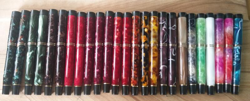
Hello Enthusiasts, I am an amateur collector of fountain pens with a particular interest in specific models (as opposed to entire brands). However, I have found that am particularly drawn to Conway Stewart’s of all models. I find the designs attractive and, in general, like the feel of pens in my hand and the smoothness of the nibs. I recently acquired a pen clearly marked as follows: Conway Stewart Pen The International No. 350 M (Mottled) It is the 5th pen from the left (top row) in the attached photo. I have found numerous references to the 350 but not in a mottled version. Does anyone know anything more about this pen? Michael Reich
-
Introduction Recently my interest in all things fountain pen related has spawned a specific sub-genre - a fascination for experiencing nibs made of different materials such as gold, titanium, palladium, etc. Looking around, it seems that the Bock 250 triple system is the ideal platform for experiencing material differences since they seem to have the widest range of conceivable material options for this particular nib. It is thus hardly surprising that I have embarked on developing a collection of different Bock 250 nibs. To eradicate as many variables as possible, I am getting all of them in medium tip so as to focus solely on experiencing material differences. Amongst the earliest Bock 250 sets, I got a Titanium one thanks to the help of fellow FPNer Tervinder (@romee_win) and his brother Rajdilawar who got it for me from Germany. Just looking at the colour of the Titanium nib convinced me that it will go very well with oxidized silver trims. Since Manoj is the only Indian pen maker that I am aware of who is using silver accoutrements, I approached him with a request to get a pen made. To match the colour of silver trims and titanium nibs, I opted to use Conway Stewart Heather blanks and hence the moniker used for the pen. Design Instead of creating a design from scratch, I shared with Manoj one of the drafts I had of the Azaadi design. This was largely similar in concept except for being slightly larger and having only one broad ring in the cap instead of having two slimmer ones. It is a classic design with simple straight lines for the cap and with only a slight tapering of the barrel. The top of the cap and the bottom of the barrel are flat and polished. The body of the barrel and the cap are polished smooth and shiny. The broad silver hand crafted band on the cap with elaborate motifs add a touch of flair. Just like the Azaadi (and its muse the Churchill), this pen too has the concentric circles on the cap finial to give it a crown like look. The clip and trims used are all made of silver. The turquoise/teal base colour of the heather material and its pearlescent properties nicely complements the muted colour of the silver trims and the titanium nib. Size and Balance At 155mm capped, this is a card carrying member of the oversized pens club. But don’t let the length let you have misconceptions about its heft. Being a completely kitless pen with no metal other than in the nib, clip and bands means it is in-fact surprisingly light. Despite the length, it is nicely balanced and can easily provide comfortable writing for extended periods. The simply sublime section design adds to the comfort quotient. One can post the cap if so desired, but I prefer to use the pen unposted. The excellent Conway Stewart acrylic material is light and yet strong and hence the pen despite being oversize doesn’t compromise on the weight aspect and this contributes a lot towards the overall comfort. Nib The Bock 250 Titan nib in medium width is the heart and soul of the pen. As I had mentioned earlier, this pen exists for the sole purpose of allowing me to experience this nib. From an appearance perspective, this nib looks exactly like any other Bock 250 nib out there. Only the subdued matte grey colour and the Titan branding on the nib below the Bock logo gives you a hint that it is a wolf in sheep’s clothing. The clip nib and bands complement each other nicely thanks to their colour. Filling Mechanism The thing I like about European pens is how most of them use the standard international system for cartridges and compatible convertors. I like this system better than any other because of the wide compatibility, system life longevity, value and convenience. So I am not at all surprised and quite delighted that Bock 250 triple systems adopt the same standard. This pen has paired the nib unit with a Schmidt K5 converter to use bottled inks and can also accept cartridges from a host of brands. Build Quality Manoj is a master craftsman who is known to work on only one pen at a time with an eagle’s eye focus on the details. That naturally translates to hallmark of quality and the pen benefits from the same. The fit and finish and the tolerances are impeccable for a handmade pen. It is obvious that the pen has been made with care and a considerable amount of time has gone into polishing and buffing to ensure a very high quality product. Writing Experience I know all of you are interested about the writing experience more than anything else. I will keep it short and unambiguously state that this nib is simply awesome. The nib is super smooth, appropriately wet and glides over the paper laying down a nice wet line. There are no skips or false starts and overall the pen is a superb writer. The closest analogy I can think of is a couple of Visconti Dreamtouch nibs I have tried and this nib feels exactly the same. Just to ensure that I am not being prematurely exuberant, I have been using this pen in continuous rotation for over a month now all the time keeping it inked with Daytone Blue-Black. I am happy to say, a month of cohabitation has not changed my opinion a bit and I still smile at the prospect of putting the pen to use. Please note that I am well aware that there are likely to be significant unit to unit variations between nibs and your personal experience might vary. So while I am no authority on whether all Bock Titanium nibs are great, the one I have received certainly makes me very happy. Price and Value I will make a distinction between the value proposition of the pen as made by Fosfor and the overall pen’s cost including that of the Titanium nib which I had procured by myself. As far as the standalone pen is concerned, it is incredibly VFM. I may have mentioned this before but I will do it again that I am not aware of any other custom pen-makers who offer this level of quality and individualization at this price point other than Manoj and Mr. L Subramaniam of ASA Pens. They hear you out, try to understand what is it that you wish to achieve and the satisfaction persists long after the cost concerns have receded. Given how happy I am with the Titan nib, it is no wonder that I find the overall pen an amazing value for the quality and beauty that it offers. I am under no illusion however that part of the value perception comes into the picture because I wanted to experience something different in a Titanium nib. There may be quite a few steel nibs that can be tuned equally well (and I may have quite a few of them as well) and your perception of value is likely to be influenced by this fact. To Summarize, the pen is a great value with a properly tuned steel nib and an amazing value with the Titan nib if such a nib is what you are specifically seeking out. Specifications The measurements in this section have not been taken with any precision instrument or laboratory techniques but should suffice to give you a fair idea of the size of the instrument. Length (capped) – 154.5 mm Length (uncapped) – 137 mm Length (cap) – 71 mm Length (section) – 22 mm Maximum width – 14 mm Minimum width – 8.5 mm Maximum section width – 10 mm Minimum section width – 8.25 mm Conclusion I had commissioned this pen with a very specific objective and it has successfully delivered without an iota of doubt. Not only do I like this pen, it has managed to wriggle into my regular list. I rarely ink up the same pen for four successive weeks and this one is breaking all records. It is very comfortable, well balanced and an excellent writer thanks to the wonderful Bock Titan nib. The silver clip and band is a unique Fosfor signature lends the pen a degree of exclusivity. I have no hesitation in recommending this model to others. Useful Links Conway Stewart Heather blanks from www.theturnersworkshop.co.uk Bock 250 Titan nib from www.starbond-europa.de The nib is also available at www.beaufortink.co.uk Pen made by www.fosforpens.com
-

Ordering From Bespoke British Pens? Feedback?
Feathers posted a topic in Great Britain & Ireland - Europe
Hi all, I was just looking at the latest Bespoke British Pens newsletter and it got me wondering if anyone has ordered a Conway Stewart or Onoto from them yet? While I understand why they are selling CS pens, and new editions made by BBP themselves from CS parts, I am confused as to why they are selling Onoto, when that brand (in as far as I am aware) still exists? Does anyone have any further info on this? That question aside, I am looking at ordering another CS from BBP, and was wondering if anyone else here has done the same and if they were happy with their purchase. I'm also curious about their new flexible nib - anyone have any further info on this nib? I'd love to hear some feedback on your ordering experience. -
Introduction Often in life one learns to appreciate the value of something only after the object is long gone. In my case, something along the same lines happened for Conway Stewart pens. One fine evening in July of 2015 I chanced upon a store selling off the last few Conway Stewarts they had in stock and I was mesmerised by their beauty. One look at the price tag however quickly brought me back to my senses. Modern CS pens were never known to be on the value end of the price spectrum and the huge custom duties and other applicable taxes in India meant that they were well outside my grasp. I was however acutely aware that CS pens would soon not be available anywhere anymore and was desperate to get a piece of the pie. Once back home, I resorted to trawling the internet and found the source for last few CS blanks being made available from their liquidation sale by Vince Coates (www.theturnersworkshop.co.uk). With the help of fellow FPNer Kapil Apshankar (@springrainbow) I managed to source some materials in sufficient quantity to make a few pens. I did not bother receiving the material in hand and instead had those sent directly to Mr. Subramaniam of www.asapens.in with full faith that he would help me make something nice out of them. I also found out that CS essentially used Bock 250 nibs in their pens and grabbed a small collection of nib units as complete triple system from www.beaufortink.co.uk. We worked on a design that was original and yet paid homage to CS and especially their flagship model Churchill. Once the outline was worked out, we launched the pen in the “Fountain Pen Pals India” WhatsApp/Telegram group on August 15th where it was received with incredible enthusiasm. After some ups and downs, we stabilized at around 30 orders within the group. That’s quite an achievement considering the fact that at that point of time, the group has fewer number of members than 30. While everybody didn’t necessarily book one Azaadi, there were quite a few members who opted to get more than one. Since it was launched on 15th August which happens to be India’s Independence Day, it was only fitting to call the pen “Azaadi” which means “Independence” in Hindi. It was also a cheeky repartee to Churchill whose opinions about Indians and the notion of Indian Independence weren’t necessarily very appropriate. Design I knew that I wanted an original design which would not be a rip-off of any existing Conway Stewart model and yet should provide some kind of a homage to the brand. We all know that the concentric circles on the cap filial of Churchill gives it a distinctive crown like look and decided to incorporate a similar crown in black ebonite in the pen we designed as a homage element. Other than that, it is a solidly utilitarian design that combines the best of the breed in a number of areas. Size-wise, we designed it to be approximately the same size as a Lamy Safari and fitted it with the section design from ASA I-Can / I-Will in black ebonite which is a personal favourite for the comfort it offers. The end of the barrel is also made using black ebonite and the barrel end was also tapered a bit as another homage clue to the CS Churchill. The clip used was a special vintage ball clip made of brass which is quite unique in itself. Design wise it’s a classic with simple straight lines for the cap and with only a slight tapering of the barrel. The top of the cap and the bottom of the barrel are flat and polished. The body of the barrel and the cap are polished smooth and shiny. The concentric golden bands on the cap add a touch of flair. All in all the pen was designed to be regular sized, light and robust with the two ends having design cues that pay homage to CS. Final CAD drawing of the pen design that went into production Since we didn’t have CS blanks for all, the pen was launched with the option of using a broad set of acrylic materials. Unsurprisingly, the pearlescent acrylic blanks used in the ASA Rainbow turned out to be the most popular. We were pleasantly surprised how the shine of the acrylic blanks was nicely complemented by the muted colour of the ebonite components helping offset the monotony. The materials and colours complement each other and their interplay enriches the design whether posted or unposted. Size and Balance At 140mm capped, this is the perfect size for an EDC (Every Day Carry) pen. The shape of the pen and especially the section design is also meant to accentuate the feeling of comfort. But nothing beats the feeling in hand once you start writing with it and realise the comfortable. Needless to say, the pen is well balanced and provides comfortable writing for extended periods. Nib While I did get a set of different bock nibs, the quantity available wasn’t sufficient to satisfy 30 orders. Hence the pen was launched with two nib options excluding Bock. One could get a Schmidt (Model FH 452) nib in F/M/B or else go for a Jowo/WIN nib (Model 12-56) in EF/F/M/B/1.1/1.5 tip options. Since I already have a considerable collection of Jowo nibs, I opted to get the pen with a Schmidt nib with a broad tip in golden finish. From a design standpoint, the clip nib and bands complement each other quite nicely thanks to the golden colour. Filling Mechanism I am a stickler for pens that accept standard international cartridges and compatible convertors since in my opinion they the optimum combination of value, system longevity, convenience and widespread compatibility. It is therefore hardly a surprise that the ASA Azaadi supports the same and it comes with a Schmidt K5 convertor out of the box. Build Quality The Azaadi exudes the usual hallmark of quality from ASA pens. The fit and finish and the tolerances are fine for a handmade pen. The joints are seamless and only discernible due to colour variations. It is obvious that the pen has been made with care and a considerable amount of time has gone into polishing and buffing to ensure a very high quality of the finish. The only improvement area that I can think of are the bands used in the cap. It isn’t as if the bands aren’t fitted properly, but rather I wish ASA had access to better (read thicker) bands to go with this pen. Writing Experience Schmidt is a renowned maker of triple units and their systems have a large user base thanks to a number of brands that use them. Such widespread adoption wouldn’t have been possible if the nibs weren’t of top notch quality. It is little surprise then that I am very happy with how the pen writes. Being a broad tipped unit means that the nib appears extra smooth and glides over the paper laying down a nice wet line. This nib however isn’t soft or flexible and is quite rigid or nail-like. We have to accept that as a characteristic of the nib and be happy about the excellent writing experience that it provides. Price and Value The ASA Azaadi is poised to be one of the flagships within ASA’s line up and its price is currently perched as amongst the highest in the line. That however doesn’t mean much in cost terms since the entire ASA line is so affordable and the pens so wonderful. Personally to me the price reflects the effort that goes into making each pen and that no compromises were made in using components within the constraints of what’s available in Chennai. AT the end of the day, the pen represents great value at an affordable price point. Specifications Since I have the benefit of having access to the original CAD drawing, I will be quoting the specifications from that. Actual production pens are likely to have small piece to piece variances given the nature of making handmade pens. The measurements should suffice to give you a fair idea of the size of the instrument. Length (capped) – 140 mm Length (uncapped) – 135 mm Length (cap) – 65 mm Length (section) – 25 mm Maximum width – 16 mm Minimum width – 10 mm Maximum section width – 12 mm Minimum section width – 10.5 mm From top to Bottom - Jinhao 159, ASA Azaadi and Lamy Safari Conclusion It is not very often that one gets an opportunity to be involved in getting a fountain pen design. It is even rarer to get an opportunity to direct the design and see the pen getting launched as a regularly available product in the vendor’s catalogue. For that reason alone the Azaadi is very special to me. People who have got a chance to own this pen have been very positively impressed by it’s balance, comfort and writing experience. The pen has been designed from the ground up as an EDC (Every Day Carry) pen and in my opinion it fulfills that role in a fitting and stylist fashion. I have no hesitation in recommending this pen to others and I am sure you would enjoy it too.
-
I am the proud owner of a Conway Stewart Oxford fountain pen (brown tortoise shell in colour) and I am trying to research the pen with respect to how many were sold etc. One rarely sees them advertised for sale second hand, as opposed to other modern Conway Stewarts. I have conversed with Bespoke British Pens who took over what was left of Conway Stewart and they cannot find any records. If anyone has any information historically on the CS Oxford, or if anyone owns one, I would be grateful if you could post it here. Thanks
-
Review Of Fosfor Islander In Conway Stewart Flecked Amethyst
Prithwijit posted a topic in Fountain Pen Reviews
Introduction Manoj Deshmukh of Fosfor pens (http://www.fosforpens.com) is a master pen turner and I always wanted a pen made by him. Given that the Islander model is considered the flagship of his line, it is only natural that I would like to have one of those in my modest collection. Normally Islanders are made of exotic wood burls or hand cast resin that Manoj personally prepares based on individual preferences. Personally, I am not a big fan of wooden pens and didn’t have much faith in my aesthetic abilities in specifying the right colours to cast the resin. Instead I opted to use Conway Stewart Flecked Amethyst blanks that I had got from Vince Coates (http://www.theturnersworkshop.co.uk). I had always thought that the Flecked Amethyst material would be complemented nicely by the silver trims used in the Islander and decided to round off the look with a solid steel polished Jowo #6 nib in broad tipping. Design The Islander design is quite unique and distinct amongs't the India pen models. The cap portion is cylindrical while the barrel has a cigar like tapering towards the end filial. Both the cap and the barrel are ends are flat and polished. The body of the barrel and the cap are polished smooth and shiny. The cap is flushed with the barrel with no step down where the cap and barrel meet. The most important design element of the Islander and the raison d'être of this pen in my collection is the beautiful hand crafted silver band and clip combination. It is an artisanal product and I am not aware of any other pen with such and unique clip/band combination. The clip is springy and it is curved with a raised bottom for easy clipping. There is intricate hand-made design in the band above the clip and it is made of pure silver. One of the joys of getting a Fosfor pen is the customization in terms of section design that Manoj allows you to do to best suit your preferences and comfort. I opted for modified hourglass design which has proved to be extremely comfortable. In hindsight however, the design may have benefited is the edge at the end of the section was rounded off a bit. Size and Balance At 150mm capped, this is not a small pen. Despite it’s length, it is nicely balanced and can easily provide comfortable writing for extended periods. While the cap can be posted with some effort, I use it unposted as I find the length to be too long when you post the cap. The acrylic material is light and yet strong and hence the pen despite being oversize doesn’t compromise on weight or balance. Nib The standard Islander comes with a choice of Schmidt #6 nibs (Model FH 452) in either F/M/B. Schmidt nibs come with their logo embossed and I wanted a cleaner look on my pen. So I decided to go for a Jowo #6 polished steel nib instead which was devoid of any logo. Since I have many nibs with medium tipping, I opted for a broad tipping on this pen. Filling Mechanism My Islander is a non-proprietary cartridge/converter pen that accepts standard international cartridges and compatible converters and it comes with a Schmidt K5 converter out of the box. As I have mentioned in many of my earlier reviews, this is my favourite filling system since in my opinion it represent the optimum combination of value, system longevity, convenience and widespread compatibility. Build Quality Manoj has a reputation for focusing on the details and the pen clearly benefits from his focus and the resultant build quality is impeccable. One can easily appreciate that the pen has been made with care and a considerable amount of time has gone into producing it. Writing Experience Jowo is generally considered as being amongs't the top two or top three western nib OEMs and their nibs are widely used on a variety of pen brands. Their popularity itself is a testament to their general quality. Needless to say, I have been very satisfied with Jowo nibs in general and have quite a collection of them in different tipping. It is little surprise then that I am very happy with how the Islander performs. The broad Jowo unit is super smooth and glides over the paper laying down a nice wet line. There are no skips or false starts and overall the pen is a superb writer. Price and Value Currently as of December 2015, Islander pens are listed for a price that ranges between $75 and $99 based on the type of wood being used. These prices however are for pens with Schmidt nib units. If you opt for Jowo, then there is a slight price premium. I am not aware of any other custom pen-makers who offer this level of quality and individualization at this price point other than Manoj and Mr. L Subramaniam of ASA Pens. Needless to say, these pens are incredible value and the quality lingers in your hand long after the cost has left your mind. Specifications The measurements in this section have been taken with a simple ruler and may not be precise being subject to some amount of parallax error. Length (capped) – 156 mm Length (uncapped) – 141 mm Length (cap) – 70 mm Length (section) – 24 mm Maximum width – 16 mm Minimum width – 10 mm Maximum section width – 12.5 mm Minimum section width – 10.5 mm Conclusion This is my first Fosfor pen and I am very happy with what I have received. It is very comfortable, well balanced and an excellent writer thanks to its Broad tipped Jowo nib. The silver clip and band is unique and adds a touch of exclusivity. I have no hesitation in recommending this model to others.
-

Vintage Conway Stewart: Model And Date, Anyone?
stephanos posted a topic in Great Britain & Ireland - Europe
I bought this vintage Conway Stewart model at an antiques market late last year and have done some work on it since. I'm very pleased with the way it looks and writes now. But I have no idea of the model or dates of production. Can anyone help? I was going to upload some pictures using the Attach Files option at the bottom of the text box (as I have in previous posts), but when I try, I get the message, "uploading is not allowed". So I'm going to try using the Upload option instead. I hope this means that you'll be able to see pictures at the end of this post. Here is the description in the meantime (measurements are approximate, subject to measurement error). The nib has a heart-shaped breather and is marked, "Duro," "Conway Stewart" and "14ct gold." It puts down a fine line by modern standards and is very responsive to pressure, making for a pleasant and expressive writing experience. The feed looks like ebonite to me; whatever it is made of, it ensures a good flow of ink to make for a juicy (but not gushing) writer. The pen is a deep mottled green, lever-filler, with gold-coloured furniture (gold-plated, I presume). The extremities of the pen (end of barrel and finial) and the section are black. Capped it's 130mm long. Posted it's about 163mm long. The section is a tiny bit short for my liking, so I tend to hold the pen at or just below the threads (which are not sharp and do not bother me). The section has a lip at the end, which I like. Maximum section girth is 10.5mm. The base of the barrel is flat enough that I can stand the pen upright. The barrel itself is fairly straight, tapering off somewhat at either end. The imprint (which is still crisp), reads, "The Conway Stewart" along the length of the barrel. Horizontally, near the base of the barrel, you can also make out "Made in England" - this marking is not as crisp, and it is covered when you post the pen (it posts securely). The cap has one band, and the clip provides another band between the green of the cap and the black finial, which is dome-shaped. So that's it. Any help gratefully received. Pictures (I hope): Top of cap, showing finial Pen plus hand-written description End of barrel Cap with band Nib and section shown Imprint -
Good evening to all. Pleased to have found this site as I have a love of fine pens and am a (rusty) calligraphist. Hope to learn more about some of the pens I have been wanting for years! I recently purchased the now liquidated Webster's Pen Shop (UK) stock, so have many pens for sale too which I will post in the classified section when I am allowed to.