Search the Community
Showing results for tags 'celluloid pen'.
Found 3 results
-
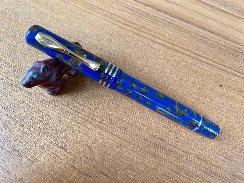
To celebrate the store's 70th anniversary, Novelli had Visconti make a celluloid fountain pen with a 14kt gold nib in a limited edition of 70. I ordered one with a stub nib, pretty much as soon as Marco announced it. The pen arrived a couple days ago, and I am very happy with it. Appearance and Design The style of the pen is somewhat old-fashioned in a positive way. The length is the same as that of the Homo Sapiens. The clip is a style that predates the current arc of the Homo Sapiens, I think. The clip is quite springy. For me, the tension is about perfect. The celluloid is dark blue with islands of gold and is much more attractive than what you see in my photos. Manufacturing quality is superb. The pen has a very comfortable section. There is a clear ink window, which i happen to like. Nib and Performance The nib is a 14 kt stub and writes rather wet. It is my first Visconti with a gold nib. The others I own all have the palladium nibs Visconti used for a number of years. I first loaded it with Visconti Blue - a good ink with a good color match for the pen. I then loaded it with Pelikan 4001 Blue-black to see if a very dry ink with provide a crisper line. Both inks performed about the same. The nib is rather springy and smooth writing but with a bit of feed back. The only negative is that there is mild hesitancy in ink flow after a brief break in writing. Ink flows well after the nib is gently flexed. I may (or may not) eventually ask a nibmeister to make it a bit crisper for my italic handwriting. The engraving on the nib is different from Visconti's usual. It is quite simple. I don't know if it has a particular symbolic significance. Filling system The pen has Visconti's well-known power filler, and it works well. As stated above, there is a clear ink window which I find a positive feature. Cost and value This is not an inexpensive pen, but the price is less than that of most of the Homo Sapiens limited editions. For a celluloid pen of this quality, I think the price is almost a bargain. Conclusion This is a handsome pen that is a pleasure to see and use. The only negative is the slightly hesitant ink flow described above. Once you are writing, ink flow is excellent. Overall, I am happy with the pen and feel it is a good value for a high-end fountain pen. David

-
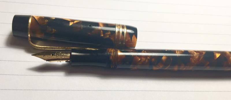
Lotus is a new brand to the Indian handmade pens scenario. It has carved a niche for itself, crafting high quality pens from high quality materials. They are priced well for what they offer. I got one after great thought and I'm happy to say its worth all the hype it has been getting. Design and Material I knew I had to get a Lotus. I knew I had to get a Lotus in the Honey Dew Celluloid. But what I did not know was which model to get. Finally, I decided on a design based on the Churchill, and I couldn't be happier. I am a huge admirer of the Churchill by Conway Stewart but since that pen isn't affordable for me, I got one made based on it. This design for some reason shows off the Honey Dew material much better than any other design (in my opinion). It is a flat shaped pen with a small taper towards the end on the barrel. The top finial has ridges on it which I love. The first trim ring appears just below it and then comes the clip. Then there's a wider trim ring above the cap lip. Right where the taper begins on the barrel, is another trim ring. And then the last one is at the section threads. I asked for all brass trim but some of it was gold plated but it wasn't hard for me to sand it down and polish it so that now all's just brass. The clip originally had a pseudo diamond like end which I shaped into a sharper diamond shape. The Honey Dew celluloid is a beast in itself. It's a deep black with flame like orange and red flecks. It looks like a flame caged in the belly of a pen. The only branding is done on the clip and on the nib (the branding on the clip got sanded off while I was removing the gold plating). In sunlight, the pen looks like it's gonna ignite. I love the way this pen looks. Construction and Quality The Lotus Churchill is the best made Indian pen I have in my collection but I still feel it can be improved. The polishing is great but the finishing is where things go a bit off track. There are a few lathe marks here and there and the section has a poor polish. I'm pretty sure this isn't captured in my pictures though. But not all's bad. I would rate their making miles above many makers in India (with due respect to all). The quality of materials seem pretty good and only time can tell how it'll all hold up. The trim rings are all nice and thick. One thing I would say is that the nib unit was screwed in too tight and that caused the feed to crack inside the unit while I tried to unscrew it for cleaning. I couldn't take screw out the unit since there was nothing protruding that would let me unscrew it. Lotus was prompt to offer a new section but I managed somehow managed (with tips from some of my friends) to screw the cracked unit out by using a knockout block to first get the broken feed out and then use a screwdriver to remove the collar. This deemed the unit useless but the nib was unharmed. I just took a new unit and slathered a ton of silicone grease and now it screws and unscrews just fine. Filling Mechanism It's a good old CC. Uses any international converter. Mine came with the Schmidt K5. It is a convenient mechanism and works well. I also put in an agitator ball from a cartridge just so that I won't end up with any air gaps inside. You can see a hint of the metal part o the converter in the following photo. Comfort This is no small pen. It borders on the oversize and that's exactly what appeals to me. Its tall enough to be used unposted and the balance is pretty much perfect. I would prefer a tiny bit more heft. Maybe a metal threads insert at the section might help. The section first has a taper towards the nib and then a small flare up. It is gently curved and is very comfortable to hold. Writing Ah, the most important part of a pen. I'm have to say that this was the most disappointing part for me. Lotus offers stock grinds with their pens and I had asked for a #6 JoWo gold tone CI with the intention of making it a two tone nib and was very excited for it. What I received was a flimsy stub that had a triangle shape and a TON of scratch. Under the loop, I could make out the tines being off alignment and once I had aligned them, it wrote okay. It was still feedback. I had to then grind the nib to make it write the way I liked. I couldn't make a cursive italic out of it due to the shape but managed an uber smooth stub. I was much happier but for some reason, the nib doesn't seem to connect with the pen. I'll be getting a regular broad at some point and use that in this pen. The #6 nib is a good match but it does deserve a bigger nib, but I don't really have the funds for that so I'll live with this. (The stub I ground) (Writing sample) Wrapping Up Its a pen that I love. I would highly recommend it to anyone looking for a good quality celluloid pen. It does have a few flaws here and there, but nothing that couldn't be fixed. Edit 1: I forgot to mention that the material is see through at the orange flecked parts.
-
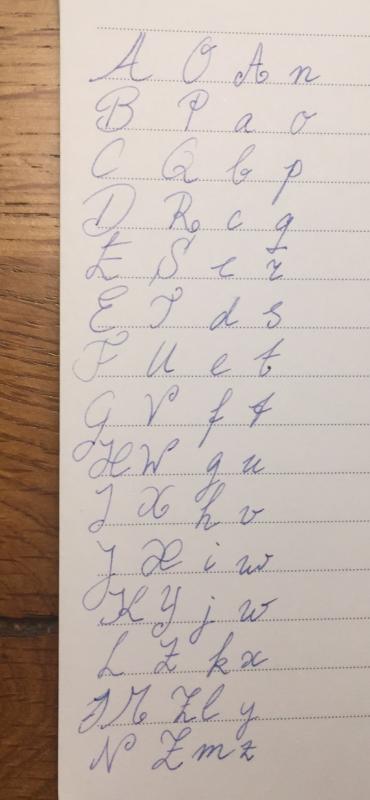
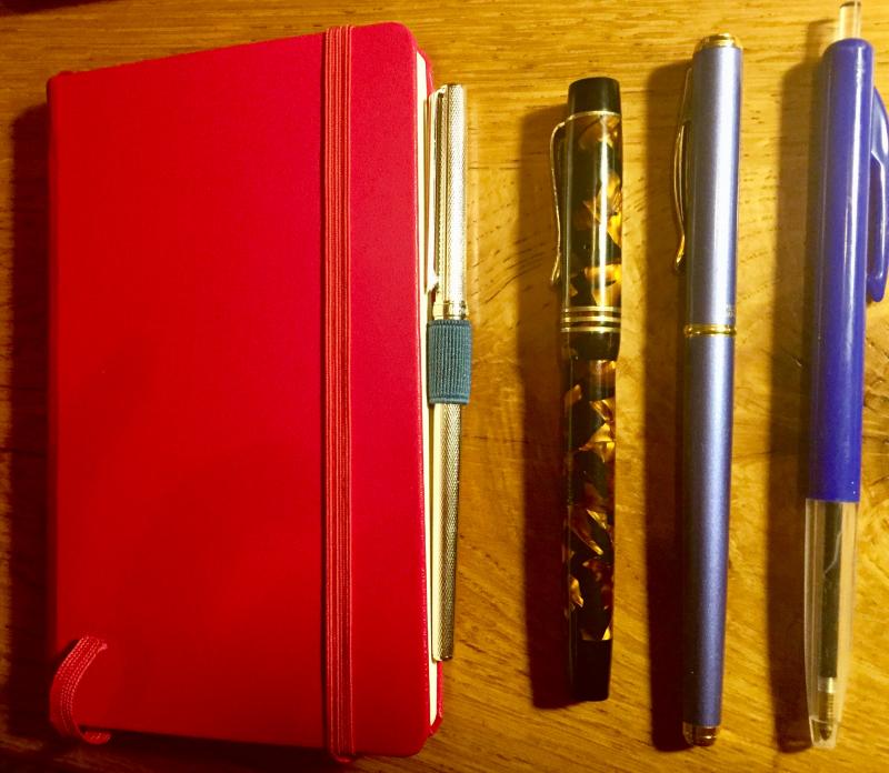
Hi, my name is Anna. I was given a fountain pen September 2018, a Pelican M205 with a broad nib. It brought back the joy from learning writing at school in the '70s. We used a slanted French round hand in the Netherlands, with fountain pens. The Pelikan showed me quickly that I prefer lighter pens, with finer nibs. And that I hold my pen ridiculously far away from the nib. Somewhere half way the pen? And use it uncapped. As I went out and looked for a pen matching those preferences I found out I may be a bit of an odd duck with today's enamourement with broad heavy cigar type fountain pens. I had a lovely trip to Akkerman in The Hague and to the Nijmegen Pen Shop. At Akkerman I bought a Sailor Chalana which I use daily as it fits into my notebook. And some glitter ink (Diamine) that clogs up fine nibs... The owner of the Nijmegen Pen Shop taught me a lot about my preferences. He kept pulling pens from everywhere! Light pen, fine nib, usually a click closure to prevent holding it at the thread and.... a gold nib. I love how one can talk about these nuances -for which I of course lacked the words, I only know what my hands tell me- but a professional recognizes what's important. He educated me. Showed me variables. Let me feel the variables. Together we found the fountain pen that suits me to a t: a celluloid Boston Diamond from the 1930's. What? yeah. It's the one that my hands loved. It was My Pen the moment I picked it up. It's a vintage if not antique Dutch brand. Parts came from various countries and assembly was in the Netherlands. Celluloid. Mine is more slender than usual and an absolute light weight. It has a push system(? I do not possess all the words yet. It has a sack inside.) Here are some pictures and also a picture of the font I was taught at school, at age 6. I let my muscle memory do the work, hence why there are some wrong ones like the first E and the w. Hope you enjoy and hope to talk to you. I've learned so much already on this forum. It was my first go to when I wanted to learn more about fountain pens last November. And I keep coming back.