Search the Community
Showing results for tags 'cassis'.
Found 2 results
-
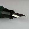
L'Artisan Pastellier Callifolio - Cassis L’Artisan Pastellier is a small company in southern France that specialises in natural pigments, and offers customers authentic and reliable products in beautiful colours based on mineral or vegetable pigments. In a collaboration with Loic Rainouard from Styloplume.net, the chemist Didier Boinnard from L’Artisan Pastellier created the line of Callifolio fountain pen inks. These pastel-colored inks are traditionally crafted, and can be freely mixed and matched. Overall these inks are only moderately saturated, and have low water-resistance. The inks were specifically designed to work well with all types of paper, and all types of fountain pens. Being pastel-tinted, these inks have a watercolor-like appearance, and are not only fine inks for journaling, but are also really excellent inks for doodling & drawing. I only recently discovered them, and they are already the inks I gravitate towards for personal journaling. In this review the spotlight is on Cassis, which presumably gets its name from the drink “Crème de Cassis” – a beverage distilled from blackcurrants, and also the favourite beverage of the famous Belgian detective Hercule Poirot. If you’ve set your sights on a dark purple colour, you’ll be disappointed. In reality, Callifolio Cassis is a nicely saturated dark grey with subtle purple undertones. Cassis is a nicely saturated ink, that works well with all nib sizes. It can live perfectly with an EF nib, laying down a well-defined line that contrasts nicely with white or cream paper. In broader nibs it additionally shows some really classy shading. Nice ! The purple undertone is there, but very subtle. With normal writing it’s barely visible, but nevertheless it gives this grey a certain panache. Personally, I really like it. Like all Callifolio inks, this one is also great for doodling & drawing. Depending on the paper used, the purple undertones will show their appearance when using a water brush. On the smudge test – rubbing text with a moist Q-tip cotton swab – Cassis behaved acceptably. There is definite smearing, but the text remains very legible. Water resistance however is almost completely non-existent. The droplet test leaves only greyish smudges with a ghost image of the original lines. The test with running tap water washes away all the colour – leaving only a barely readable residue of the original text. This is not an ink to consider if you require some measure of water resistance. When using Cassis for drawing, the lack of water resistance can be a plus. As the chromatography clearly shows, there are purple tones hidden within the ink. With waterbrushing it’s possible to bring these purple undertones to the surface in your drawings. I’ve tested the ink on a wide variety of paper – from crappy Moleskine to high-end Tomoe River. For the Callifolio reviews, I’m using a new format to show you the ink’s appearance and behaviour on the different paper types. On every small band of paper I show you: An ink swab, made with a cotton Q-tip1-2-3 pass swab, to show increasing saturationAn ink scribble made with an M-nib fountain penThe name of the paper used, written with a B-nibA small text sample, written with an M-nibDrying times of the ink on the paper (with the M-nib)Cassis behaved perfectly on all the paper types, with no apparent feathering even on the lower quality papers in my test set. Drying times with an M-nib varied from 5 to 20 seconds, depending on the paper used. Surprisingly, the ink looks consistently similar across all paper types. The purple component is really apparent in the ink swabs – here you are reminded that this is not a pure grey. When writing the purple undertones are nearly invisible, but tantalizingly present, lifting this ink above a pure neutral grey. I also show the back-side of the different paper types, in the same order. The ink behaved perfectly with almost all paper types. Only with the Moleskine paper, there was significant show-trough and some minor bleed-through. All in all a really well-behaving ink. Conclusion Callifolio Cassis is a really nice dark grey ink with subtle purple undertones. I found it a pleasure to use, both for writing and drawing. The ink works really well with finer nibs – leaving a well-defined and nicely saturated line with good contrast on the paper. I also liked the way the ink shades in the broader nibs. The barely noticeable purple undertones lift this ink above a neutral grey – personally I consider this a plus that provides some extra character to the ink. If you like grey inks, this one is certainly worth looking at. Technical test results on Rhodia N° 16 notepad paper, written with Lamy Safari, M-nib
-
J HERBIN LARMES DE CASSIS ( My first ink review, Suggestions highly appreciated) Ink reviewed here from an Indian point of view. I do not think that there are so many Indians using high quality note books or papers regularly. I am not. Went to one paper mart and asked for the highest quality paper, and he suggested JK Excel Bond paper. So my review goes like this. Brought this bottled ink from PensAvenue – As usual -happy customer, no affiliation- ( I should be happy, as this ink not available elsewhere). For 30 ml- 695 Rs. As a lover of Blue shades,I was thinking of a nice violet color, but frankly I was little unhappy initially. What color is this? Violet – definitely NO Pink – But I would like to call some other color as Pink. Then what ? A bottle of Pink ink was lying there just like that… then J Herbin wanted to fill a Hero pen with some Black ink already in the it, and spoilt the whole ink in the bottle..? Any way after filling in few pens I have started writing in my work sheets. After 3-4 days, the following points were observed. Now I am more using pens filled with this ink than others. If the color were pure Pink, I would have stopped using this long before, especially in my work place. If it were pure Pink, it wouldn’t be as legible as this. My friends were appreciating this color. If it were pure Pink, they would have considered this as more feminine color. These are not just excuses for wasting money on inks, I am really appreciating the color. So What color is this ? This is the swab to analyze.. This picture shows a Pink in the darker side. Strongest component is Red, least is Green and Blue in between. A simple chromatography shows Blue and Red components of this ink. This is how it appears in a bottle diluted with water…. More violetish…. Diluted ink also show almost the same color components, the darkness is reduced.. I have to say that the mother nature also shows few examples for Larmess De Cassis! Color components of the above flower. COLOR ON PAPERS FINE NIB, A 4 PAPER FINE NIB, JK EXCEL BOND MEDIUM NIB, A4 MEDIUM NIB, BOND BROAD NIB, A4 BROAD NIB, BOND. VARIOUS WIDTHS, ARUL SCRIPT NIBS. THIS IS DEFENITLY A FLOWERY COLOR….. COLOR PROPERTIES OF THIS INK The itself is having a slight variation in color according to the tip size and flow of the pen. Here the Fine tipped nib was that of Camlin Trinity, which was having high flow and medium tipped was Lamy Safari with only moderate flow. 2. Shading is there theoretically …. when writing with a CI nib, there is much contrast between horizondal stroke and vertical strokes. As the flow of the pen increases, these contrast tends to disappear. The slight shading we are getting in Lamy with moderate flow in not seen even in Broad tip when flow is increased. FOR ALL PRACTICAL PURPOSES I CONSIDER THIS INK AS NON SHADING. 3. Saturation - I consider this as medium one. Defenitly not a thick ink. PROPERTIES IN PEN On seeing the color, first I remembered about PR Shell Pink, which have given me a tough time with flow with a pen. But, here no concerns, it’s flowing well without hiccups. In a variety of pens, Convertor, Piston fill, Direct fill with a variety of nibs, ink have performed well. No nib creeps. Ink staining… Very happy here. PROPERTIES ON PAPER Welll, my predominant writing involves cheap quality papers… ball pen quality and ball point friendly papers. Sorry, Larmes De Cassis, You have go through a rough time. I have to say that this ink was well behaved in almost all papers except the cheeeapest news print like papers, where only it shows feathering and bleeding. BLEEDING Cheapest paper A4 paper. FEATHERING Feathering, Cheapest paper. Feathering, A4 paper. FOR THESE FEATHERING, I CAN BLAME ONLY THE PAPERS AND NOT THE INK. DRYING. Theoretically it takes around 10 seconds to dry. But there are no practical issues here. While writing I considered this as a fast drying item, but was surprised with the test. I was expecting this to dry in 5 sec or so. WASH RESISTANCE This in the area were this ink shows its weakness. Can be fully washed out! See the under lying blue dye, the red component washed out entirely- The ink is made of atleast two dye components. Thanks SK.