Search the Community
Showing results for tags 'calligraphy'.
-

How Is My Handwriting, I Want To Improve, Please Help Me
Shahab Mirza posted a topic in Handwriting & Handwriting Improvement
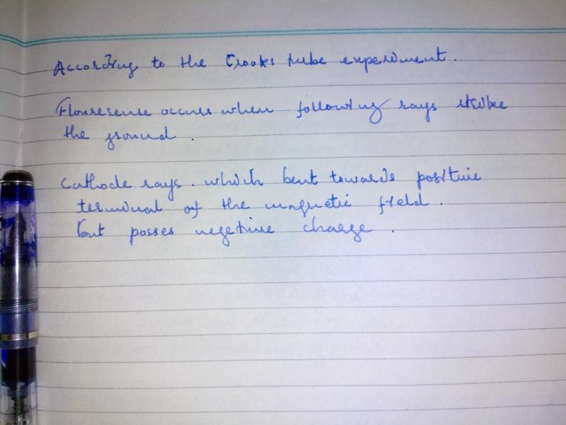
Hello, I am handwriting lover, in school, in college etc I always focused on my handwriting, I used to be obsessed that much with my handwriting that I used to change my handwriting daily in the school but after a long journey of this I finally made my hand legible enough to get a better grip on paper, so I have uploaded a sample of my handwriting here, my question is that 1) tell me that what type of handwriting is this? 2) Is this handwriting suitable for exams? 3) Is it legible and easy to read? 4) Is my handwriting beautiful good looking or bad looking? 5:) Should I continue to write like this? and please also rate my handwriting out of 10. Thanks.
-
Starting in July, 2014, the winners of the 2014 Graceful Envelope Contest will be displayed at the National Letter Carriers Headquarters Building, 100 Indiana Avenue, Washington, DC 20001 for one year. For more information and to see the winning entries, check out www.calligraphersguild.org/envwinners2014.html Would be well worth a side trip from the DC Pen Show in August.
-
DIY Calligraphy Nibs Not mine, but mildly interesting... http://www.instructables.com/id/DIY-Calligraphy-Nibs/ (Yeah, I don't like Instructables either. But all the info is there if you can stomach the site.)
-
Hi all, After reading a lot about the Gama pens on here, I visited the ASAPens site and found a nice desk pen by Gama called Ezhuthani. It's the Tamil word for Stylus or Desk pen It looked like a dip pen but is an eyedropper filling pen. My other purchases from ASA (no affiliation) were the regular Gama fountain pens, reviews of which are plentiful on this forum. As always, excellent service from Mr. Subramaniam and I received the pen in 3 days time. It came packed in a lovely velvety pouch. I ordered a Light Brown and black mottled shade. Absolutely gorgeous to look at. The stock nib with the pen was a steel fine nib Gama FIVE. I pulled the pen apart and was immediately taken back with the size of the feed. This pen has a LONG LONG feed. I am not sure about the design aspect of this but in all the Gama pens I have, the feed sticks out of the section and into the barrel. Cleaned out the parts and inked it up with some Camel Black Ink. I had a dip pen made by Ranga before to take a Nikko G nib. I wanted to try a flex nib on this pen too. The only nib that fit without any modifications to the nib or pen was a Gillot 303. I didn't do any writing with the standard nib that came with the pen, so I can't really comment on the way it writes. A few pictures: http://i.imgur.com/dIesEoJ.jpg The pouch packing http://i.imgur.com/Wl07M4D.jpg http://i.imgur.com/u0kCLfA.jpg The pen with the stock nib http://i.imgur.com/qajXPQa.jpg The humongous feed http://i.imgur.com/nh0tZJd.jpg Fitted with the Gillot 303 nib http://i.imgur.com/nNXDLzF.jpg This is a Wonderful pen and works beautifully with a Gillot nib.
-
How To Hold A Flex Fountain Pen - Revisited?!
dragos.mocanu posted a topic in Calligraphy Discussions
I'm 'training' with my Noodler's semiflex nib (in a Konrad), with the prospect of owning a vintage full flex (superflex?) fountain pen in mind. So I started searching for the proper way of holding a flexible nibbed pen (so I won't ruin a 100 year old pen when I purchase it) but guess what...not everyone agrees to the same thing. I have 2 sources that state exactly the opposite of each other: first is https://www.fountainpennetwork.com/forum/index.php/topic/43939-how-do-you-hold-your-vintage-flex-nib-pens/ which is a very delectable read, specifying that the vintage flex pens should be held as flat (horizontal?) as possible, meaning in between the thumb and index fingers. That's fine and dandy, but here comes http://www.vintagepen.net/how-to-use-flex-nibs.html which states that the pen should be held rested atop the first knuckle of the index finger. At least both sources agree on one thing: the index finger must be atop the pen section and the flexing is done with the index finger. How do you do it? And why? Is there a 'proper' way? Or does everyone uses the hold that suits them best? Dragoş -
hello FPN members 2 days ago i bought this Sheaffer Viewpoint FP:http://i112.photobucket.com/albums/n187/hfarmawi/IMG089_zps976ecc73.jpghttp://i112.photobucket.com/albums/n187/hfarmawi/IMG091_zpsde7cc149.jpghttp://i112.photobucket.com/albums/n187/hfarmawi/IMG090_zps0c9dbe75.jpg i bought it for 10$ a good price i found it on ebay for 7.5$ still need shipping so the price is not a problem... the color and looking of this pen is relly nice i liked the blue one there was a brown and a black colored pens but i liked the blue, the quality of this pen is good as a 10$ FP....... its a calligraphy FP so it gots that Flat nib, its a stright flat M steel Nib, not that smooth but i like how it perform on the 80gsm printing paper. it come with 2 black ink cartridges. so..... The look (7/10) The cost (9/10) The Nib (7/10) The felling system (8/10) i dont like the ink cartridges overall (8/10) as a practice FP i found it really nice.
-
(Video) Homemade Paint Brush-Like Calligraphy Nib
andybiotic posted a topic in Fountain & Dip Pens - First Stop
This is just a Pilot Prera with a regular steel nib, nothing special... But then I carefully and methodically bent the tip of the nib into a smooth curve (and smoothed it), and now the topside (engraving side) of the nib is able to put ink down somewhat similar to an oriental paint brush with a large variety of line widths depending on the writing angle and pressure used. It also gives sharp pointy end strokes (not sure what the technical term is...) if done properly. The bottom (normally correct) side of the nib still writes in extra fine lines. This is similar to the Condor (trademarked) nib by Mr. Richard Binder (I am not saying this IS the Condor nib). Of course, Mr. Binder can do a much better job than me and his nibs are much much more professionally finished than mine. But for what it is worth, it is a very good attempt. (I am not selling a service here, it is just a demonstration) This nib is able to produce Japanese (Kanji) or Chinese calligraphy when used carefully and in specific ways as shown in the end of the video. Although I've never tried it, it should be able to do a certain degree of painting / drawing as well. I have more fountain pen / writing related videos on my youtube channel if anyone is interested. -
Hi, I wanted to share some of my calligraphy writings...the first one is for my 8 year old niece, her name "serra cakallioglu" written in the form of elephant...the second one is for my friend "sefik guldibi", meaning of his name was rose. So, I try to put his name in the form of a bee and rose. Enjoy...
-
Hi folks, I am a little puzzled. If the nib, section and ink reservoir are the same, what exactly is the difference between the Lamy Joy and Lamy Vista apart from body shape? Does the body shape play a significant part in the application of calligraphic skills? The reason that I ask is that the Vista can be had for half the price of the Joy. Your thoughts, as always, appreciated.
-
My friend, an events planner, is about to lose her calligrapher to retirement! She is in need of an EXPERT calligrapher located in Chicago who can approximate several fonts (to match wedding invitations, etc.). She does a LOT of events so this could be a good gig for the right person. Pam Spitzner
-

In Search Of The Elusive Calligraphy Pen
CharleeT posted a topic in Fountain & Dip Pens - First Stop
Does one exist??? I have been searching for months for a fountain pen with a calligraphy nib. I am a Persian linguist and love to write my text with a calligraphy pen. The only pens I can find are plastic and that is not acceptable. I did find one for $350, but that is not possible. Every pen I find that is long and heavy and says calligraphy ...is a regular fountain pen nib. I am hoping there is a pen expert or two here that can help me solve this dilemma. Thank you! Charlee -

Exhibition And Lectures On Calligraphy & Islam At Reed College
dms525 posted a topic in Calligraphy Discussions
For your interest: An exhibition on Calligraphy and Islam is currently displayed in the Cooley Gallery at Reed College in Portland, Oregon. Later in the Month, there will be two associated lectures and a special scriptorium conducted by Dr. Hamidreza Ghelichkhan. For more information, click on this link to the Cooley Art Gallery David -

How To Develop Good And Consistent Penmanship?
mountainrider posted a topic in Handwriting & Handwriting Improvement
Hi all, I just bough a new fountain pen, a Lamy Safari. I purchased a converter for the ink, and two nibs. (A fine nib, and a 1.1 italic nib) I have been using the Safari for about two weeks now, and have gotten used to writing with it. However, I want to have handwriting that is neat and consistent, but I don't know which font to choose, and where to find the alphabet so that I can practice using it. So my question(s) are... 1. What are some good fonts to follow and learn? How should I go about mastering this font so that it is neat and consistent? 2. What are some good calligraphy alphabets for me to start learning with the italic nib? I want to use the fine nib for schoolwork and such, and the italic for calligraphy. Please include links to where I might find the alphabet of a font that I can follow, or share a picture with your own penmanship so that I can get a general idea of what I like. Thanks in advance, mountainrider -
Hello Well, my name is Gabriel and I am new to this community, which as far as I have seen I like very much. Notice that I am spanish so if i misspell words or have grammar mistakes, well, I am sorry! So, I started to use fountain pens a couple of moths ago when my father gave me what i think is a Waterman Hemisphere for my birthday, and since that day I just love them. Weeks passed and I commented to my mother that I loved writing with fountain pens and surprise, she told me she had a bunch of fountain pens she didn't use anymore and told me I could have them! As you can see, there I was with a bunch of really cool fountain pens, ( i will include a picture of them), but I just felt that they were a bit too scratchy so I decided to buy a Lamy Safari, because of all the great critics I had heard from it. Well, turns out that it really is as great as they say, at least from my opinion, it was waay smoother than my other fountain pens. Whit my Lamy Safari I also bought a 1.1 nib, and, for my surprise, my handwriting was incredibly better!! That is something i have had a lot of trouble in my life, I have horrible a handwriting and teachers almost couldn't read what I wrote. Now I am studying Aerospace Engineering and it turns out I start to care about my handwriting when the tests are choose-a-option type ( I don't know what you call them ) so nobody was going to read what a i wrote. Well, the fine nib my Lamy safari came with is great for me when it comes to writing in a test in order to choose the right option, because i can write really fasta and smooth, but, for writing things that I am actually going to study from the 1.1 nib is just fantastic BUT, a bit too scratchy, so, here goes the question. Which fountain pen do you recommend me for writing, with a 1.1 nib or something like that. I thought about the Art Pen by Rotring, but I have also considered an oblique nib, even tough i have never tried one! What do you think? So, this are some of the pens i have, form left to right, ( or up to down) I think they are : Sheaffer, whit a 14k gold nib, ( ni idea which model), Waterman (Thats all I have discovered form this one hahaha), Waterman Hemisphere, Inoxcrom ( no idea which model either). Even tough they are not bad it jus fells that they should be smoother, i dont know, maybe their nib is broken or something like that, and i say this because the lamy safari writes waaay better that the sheaffer with 14k gold . http://i883.photobucket.com/albums/ac39/Gabrieljauma/20140109_131850_zps9e25c5b3.jpg[/url] These are some of my other fountain pens, the las three i made them myself!! http://i883.photobucket.com/albums/ac39/Gabrieljauma/20140109_130245_zpsb0d7d52a.jpg[/url] And finally a writing sample of how bad a i write hahaha! http://i883.photobucket.com/albums/ac39/Gabrieljauma/20140109_131627_zpsd02bfd4f.jpg[/url] Thanks for reading!!!
-
I wasn't really sure where I should post this, so I apologize if it's in the wrong section. I'm looking into getting a dip pen for more Spencerian or Copperplate writing rather than Gothic or Italic. My question is where do I start? Like what are some good (preferably cheap) products to get started with. I have read that Gillot 303 and 404 nibs are good, What makes them so good? What type of ink should I be using? What type of holders are good? Will all nibs fit in all holders? What website can I get all of this stuff from? Thank you very much!
-
So I'm looking for a wet noodle, or a fountain pen with a great deal of flex. I will be using it for calligraphy, as well as an everyday pen. I want one that is under $100 and will ship to CANADA. I have recently bought a vintage waterman 518?, or something similar that claimed to have a flex nib. I think it's more of a semi-flex. I have attached 2 files, small writing samples of my namiki falcon, and one of my waterman. I would like to know what these would be classified as in terms of flexibility. As well as where I could find a wet noodle. Lastly, I'm 13 and use fountain pens only. Is this normal?
-
"the Golden Thread – The Story Of Writing" – New Book By Ewan Clayton
Estefa posted a topic in Calligraphy Discussions
"We are at one of those turning points, for the written word, that come only rarely in human history. We are witnessing the introduction of new writing tools and media. It has only happened twice before as far as the Roman alphabet is concerned – once in a process that was several centuries long when papyrus scrolls gave way to vellum books in late antiquity, and again when Gutenberg invented printing using movable type and change swept over Europe in the course of just one generation […]. Changing times now mean that for a brief period many of the conventions that surround the written word appear fluid; we are free to re-imagine the quality of the relationship we will make with writing, and shape new technologies. How will our choices be informed - how much do we know about the medium's past? What work does writing do for us? What writing tools do we need? Perhaps the first step towards answering these questions is to learn something of how writing got to be the way it is." I am quoting here the introduction to a book I am very much looking forward to read: "The golden thread" by Ewan Clayton. It sounds so promising and interesting, just about two things I hold very dear - (the history of) reading and writing, written from the perspective of both a calligrapher and designer. So far I just managed to read about 40 pages and it is packed with information and ideas. You can find a short review here on the website of the FT http://www.ft.com/intl/cms/s/2/c36c371e-3006-11e3-9eec-00144feab7de.html#axzz2hsO9lNXP and more about the author here http://www.ft.com/intl/cms/s/2/4240f110-1a04-11e3-93e8-00144feab7de.html#slide0 I thought maybe some of you may be interested as well. Stefanie (I hope this is the right forum, I wasn't sure. But I didn't put it in the book section because it is not "only" about calligraphy – but if it should be moved there I am totally ok with that ) -
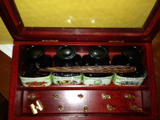
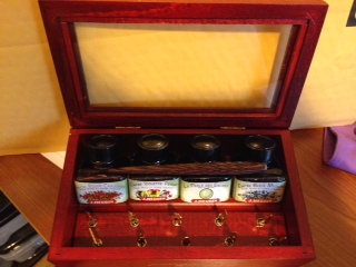
Hi, I just found a Jean Pierre Lepine calligraphy box set and as luck has it, I cannot find any information on it. The set consists of 10 nibs, 1 wooden spiral grooved nib holder, 4 bottles of Herbin ink with what appears retro styling. All in a stained red hardwood box with a glass top. The box has the inscription"Jean Pierre Lepine, Paris on the front. I was hoping someone could share their information with me and the board? Please find a few pictures attached (not up to the usual standard on this board ;-( ) Thanks sxl2004
-
"hand To Type – Scripts, Hand-Lettering And Calligraphy"
Estefa posted a topic in Calligraphy Discussions
Another amazing book I just aquired. It covers not only a lot of contemporary takes on calligraphy / lettering as well as script-style font design but also some chapters about current developments in non-latin writing systems such as arabic, indian and japanese. Some of the examples are totally applied and practical, others completely free and more veering towards art. There are some very insightful interviews with great typographers / calligraphers for example with Brody Neuenschwander (who did some famous movie projects with Peter Greenaway). Apart from that it is a very beautiful book, a joy to browse in and a great source for inspiration! Here are some more reviews – http://www.amazon.com/Hand-Type-Scripts-Hand-Lettering-Calligraphy/product-reviews/3899554493/ref=dp_top_cm_cr_acr_txt?showViewpoints=1 http://www.amazon.co.uk/product-reviews/3899554493/ref=dp_top_cm_cr_acr_txt?ie=UTF8&showViewpoints=1 Besides the book contains one of my favourite quotes about calligraphy: "The one hard thing about calligraphy is that is does take a hell of a lot of practice" - said mexican designer Mr. Gabriel Martínez Meave. So true! Stefanie
-
Hi all, I always though the Reforms are a bit elastic as per se. This is just a sample of what can be achieved with a bit of patience. The pen is very wet and the nib has been re-grinded to add flexibility. There is some rail-roading but considering the size of the letters, I think is acceptable. Thanks for wathcing!
-
Hey, guys, I thought I'd maybe start a thread for some of my calligraphy and illumination. I'm a member of the SCA (society for creative anachronism) and I do a lot of scribal work there. Gothic Blackletter practice: http://farm8.staticflickr.com/7431/9602616378_d88cb6d696.jpg http://farm3.staticflickr.com/2860/9608435937_961d27f9e1.jpg http://farm4.staticflickr.com/3716/9633544926_e69cfd139b.jpg http://farm6.staticflickr.com/5528/9647959342_790d413f6f.jpg
-
Its a tradition in my school to hang around posters for a person's birthday. "H" will be on one sheet of leeter-sized paper, "A" on another, "P", "P", and so on... So you can imagine that the letters are really large. I want to do the same, but with calligraphy. The problem is, I don't have a big enough nib for such a project. And suggestions for me fpn?
-
Very Quick Heads Up: Bbc Radio 4 In 20 Mins!
migo984 posted a topic in Fountain & Dip Pens - First Stop
BBC Radio 4 Midweek programme on at 9.00am UK (BST) time includes an interview with Calligrapher Ewan Clayton. Sorry for short notice but should be available on iPlayer later. Edited post broadcast: Well that was really interesting. I'm now tempted to buy his book (reviewed here) http://www.telegraph.co.uk/culture/books/historybookreviews/10304108/The-Golden-Thread-the-Story-of-Writing-by-Ewan-Clayton-review.html -
We are having an event for our 5th anniversary on September 20-21, at our store in Cambridge, Ontario. 1. Our Penmanship Instructor, Heather Held will visit the store for 2 hours on both days to offer the following complimentary sessions: A Demonstration and History of Ornamental Offhand Flourishing. A Demonstration on The Decorated Name (with samples for as many visitors as we can!) 2. Visits and some demonstrations by some of our pen reps. They will be available for any questions or queries you may have about their brands. 3. A pencil giveaway to the first 50 visitors to the store each day (in honour of this being our 'wood' anniversary). 4. An anniversary sale - 30% off all in-store merchandise, excluding RIMOWA. 5. Prize draws. We hope you will join us, in celebration!