Search the Community
Showing results for tags 'calligraphy'.
-

Can You Turn A Noodler's Ahab Nib Into A Chinese Calligraphy Nib?
AgentVenom posted a topic in Of Nibs & Tines
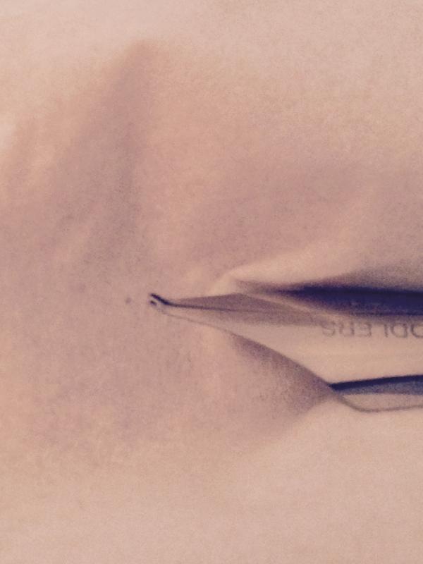
So, after penvangelizing my mother, she quickly went and bought herself a Noodler's Ahab. The very first day she took it to work, she dropped it on the floor and bent the nib. Heartbreaking, I know. But the way she bent it reminded me of a Chinese calligraphy fountain pen nib. It got me thinking: Is it possible to successfully mod an Ahab to make it write like a Chinese nib? I know it wouldn't write exactly like it, but would it be able to approximate the line variation? I'm very curious to see if anyone has ever tried to mod an Ahab in this way. On a side note, how hard would it be to fix the nib? She's not nearly as curious about the potential as I am.
-
... where life is like a box of chocolates! I am a physician and, partly because very few could read my writing, partly because of my long-forgotten love for fountain pens, I decided to get a few pens I would love to write with and start writing the way I used to write when I was younger. Because of the pens (and, maybe, my hard-headedness) in the past two weeks nobody asked me to clarify any orders. Even better, my seven year old can read my writing. My favorite pen is a Visconti Homo Sapiens medium bronze. Maybe I got lucky (there are a lot of people thinking they are too wet) but, the moment I started writing, it was love at first sight. I wrote with many pens before and I never expected to be this surprised. Happy to be part of this forum! Cheers, Rad
-
Hello, I recently received a Jinhao x450 from China via eBay. This particular pen has a calligraphy nib. The funny thing is that once I took a closer look at the nib, instead of the "MADE IN CHINA" script that was shown on the listing's picture, it reads "GCROWN 22KGP." As far as I can tell the Shanghai G.Crown Fountain Pen Co., which I assume manufactured this nib, makes Duke pens and not Jinhao. Please correct me if I'm wrong. And on Duke pens I've only seen the nib script says "DUKE 22KGP." So I'm wondering whether G. Crown supplies Jinhao with calligraphy nibs or if it's simply that the seller just put a spare calligraphy nib of a random brand on a Jinhao pen. I'm guessing the latter. I know it's trivial, I'm just curious if anyone knows. I've asked the seller this, but I don't know if they understand what I'm asking.
-
After many years I have decided to going back to practicing my calligraphy. The thing is that I have lost the original book which I learnt from originally. I was wondering if maybe someone could suggest a low priced, but good quality workbook for me so I can get going again. Thanks
-
Hey there everybody! i just ordered my very own monteverde impressa (broad nib) but don't have a very good handle on how to get going. is there anyway you guys here could help me out a bit? I was going to ask some more talented hands to provide an example I can work to re-create and then later personalize and make my own. Id rather take direction from the experts, if you know what I mean The three separate texts I am wanting to write are "YOSPOS" , "TANE" and "CHOME" silly, yes, but it's for an art project and Id like to get going on it! thanks in advance -am
-
Hello, This is my first post so I hope I have put it in the right place I'm just getting into calligraphy and am hoping to use it on our wedding invitation envelopes. I have bought a few products but I'm unsure if the combination I have is correct as it just doesn't seem to be working for me. I have purchased an oblique pen holder which I prefer much more than the straight one so far. Nib wise I have (don't know if these are the proper names) Nikkopen G, Speedball C6, Hunt Imperial 101 and Brause 66EF (snapped 1 tine already.) Ink I have an unlabelled black ink which seems to be very thin but works with most of my nibs and also Winsor & Newton calligraphy ink in white and metallic gold. I've been trying to use the Imperial 101 as I really like the flexibility but with the metallic gold ink (what I'm wanting to use on the envelopes) it just isn't working. When I do my down stroke when I start to put a little bit of pressure on it it's like all of the ink just drops out. I'm also having trouble with getting the ink to flow through properly, I find I having to play around every few letters to try and get the ink to flow properly. Any suggestions you have on the equipment or if I'm just doing it wrong would be greatly appreciated Thanks, Cassie
-

A Solution To Your Handwriting Issues... Let The Forgery Begin...
basterma posted a topic in Fountain & Dip Pens - First Stop
So you don't even have to bother with the business of cleaning nibs, swapping cartridges and all that fountain pen nonsense.... http://sploid.gizmodo.com/robot-imitates-your-handwriting-using-a-fountain-pen-1679656771 So what do people think? -
Does anyone know which three tine nib is the one in this series of videos? Thanks!
-
I've been really inspired by a week-long course I recently attended on Gothic calligraphy and illumination. Since it was in the school holidays it split about fifty-fifty between adult calligraphers and children plus parents, the children aged from (I'm guessing) about eight to fourteen. Day one: some of the children found it hard to settle, particularly three boys who had come together and were pretty noisy and distracted from time to time. One or two of the children knew quite a lot about the topic, others knew nothing. (I think all the adults had already worked with the tutor before.) Day two: a couple of the girls were already producing some very nice work. Day three: suddenly I became aware that there was complete silence in the room. The three little boys who had been quite disruptive on day one were completely absorbed in their work, two writing alphabets with the dip pen and one copying a foliage design. Day five: At the end of the course I was really impressed by some of the work they had turned out. One little girl had produced quite fine Gothic textura, and went off with a newly purchased dip pen and nibs as well as a book on calligraphy. There is something in the process of writing these old scripts that really seems to appeal. I hadn't expected the little boys to get so 'into' it - but they really did. And they enjoyed the birds and beasts in the margins - one or two idiosyncratic additions to the menagerie also appeared later on (though I didn't manage to find room for the bagpipe-playing pig I wanted to add. Next time...) I think the future of the fountain pen is in safe hands! Has anyone else got good stories of how to introduce kids to FPs and calligraphy?
-
Hello all, Another wonderful product made with the amazing support of Mr. Kandan of Ranga pens. There has been a lot of posts commanding his customer service and I want to mention it again. He is just a pleasure to work with. I decided to have myself a calligraphy xmas. I had Mr. Kandan make a dip pen with a feed for me which accepted a G nib a while back, so I contacted him and asked if he could modify his existing fountain pens to accept a pointed flex nib. It worked, not in time for xmas but just in time for a wonderful new year. He turned a couple of basic holder blanks also, for me. I got my pens in a wonderful velvet gift box. Extra feeds also given by him to fiddle around with different nibs. http://i.imgur.com/kXng1mD.jpg Gift box - totally excited to open it http://i.imgur.com/BXaYetj.jpg my treasure :-) http://i.imgur.com/3A2uU1O.jpg The fountain pens. The Ranga Ebonite 4C (left) and Ranga Thin Bamboo (right) http://i.imgur.com/4F6EzWp.jpg http://i.imgur.com/i2XVoQu.jpg The 4C with a Tachikawa G nib and the Bamboo with a Leonardt Principal EF. These are full ebonite pens, eyedropper filling with ebonite hand cut feeds. The pens needed a little tinkering to write smoothly. Main tinkering was heat setting the feeds to the nib and adjusting the how far the feed covered the eyelet on the nib. Took a few attempts to get it just right and the results were lovely. http://i.imgur.com/iRtY3Ya.jpg Please don’t judge the writing. Was way too excited to focus on letterforms. Just wanted to fill the pens and scribble away :-) With the LP EF I can get a flex width of 2mm with hardly any railroading. But have to write at the same speed as a dip pen, slow and steady. With the Tachikawa nib, the writing can be a little faster but obviously it does not flex as much as the LP. Mr Kandan has done it again. :-) -Prasad
-
http://i900.photobucket.com/albums/ac209/jasonchickerson/_FUJ6448.jpg Would any of you calligraphic masters be willing to provide a gentle critique of the above sample and give me a clue as to what to work on to improve? I recently purchased my first dip pen and have been attempting this type of writing for just a short while. Before I go forward, I'd like to make sure I don't cement bad habits with my practice. The problems I see with my own writing include inconsistent/improper spacing between letters and words and a shaky/indecisive hand. There are also some letters that I'm really not happy with, including lowercase f, y, w, and k. Lastly, it seems my natural, comfortable slant angle is about 35 degrees, much more upright than traditional copperplate or spencerian slant. I've attempted to write over a slant guide, but it seems to make my penmanship worse. Do I just need practice? I did not use a guide for the sample. Sample was written with a Tachikawa G nib and comic holder with Iroshizuku Kiri-same ink on O. Crown Mill Pure Cotton paper. I realize I might get better lines and control with a real calligraphy ink, but I'd like to stick with fountain pen inks as I have a Desiderata pen on order. Thanks for looking!
-
Hi all, Wanted to write a review about a flex pen that I purchased. The pen is the Desiderata Sleek. There have been reviews about other models of the Desiderata but not one of this model. I just wanted to first talk a little bit about the service offered by Pierre. This was a prototype he launched in November ’14 and I ordered one. The website said that deliveries would commence in 2nd week of December and I got a tracking number by the 11th of December confirming this. However I could not track the shipment and the status never went beyond “shipping label printed”. I did not get a response immediately from Pierre. After a few days (end December) i received a refund of my shipping costs. (Shipping to India from the US is expensive) I had no communication on wether my order was cancelled or shipped. About 10 days later I get a parcel with a long hand written note of explanation. There was some logistic problem by USPS and Pierre was extremely apologetic about it. He explained the problem to me and not only did he ship the pen “FREE OF COST” to me (saved me $40) but also sent me 6 extra Zebra nibs complimentary. There was absolutely no need for him to refund the shipping costs to me, as the delay was not his fault. I found this very very professional of him. On to the pen now. http://i.imgur.com/sHDgJ89.jpg The rest of the review will be typed. :-) Takes a long time to write it all out. Design. The cap (on both sides) has a stopper not a clip and is great as the pen does not roll off the table even when uncapped at one end. The size of the pen: Capped at both ends - 155mm (6”) Uncapped at one end - 140mm (5.5”) Barell Dia - 12mm Section Dia (at the thinnest) - 8 mm Packaging The pen came packed very securely in a lot of bubble wrap with a hand written letter from Pierre. Also came with extra nibs for me and a printed 5 page document going over all parts of the pen, usage, maintenance and troubleshooting. It’s a very detailed document that can be downloaded from his site too. Performance. Pierre does mention on his site and in the document that though he tests all pens, there may be some minor tweaking required to get it to work smoothly for your particular style of writing. Being a pointed nib, each person has different writing pressures and grips. I did not do any tweaking and just filled ink into both sections. One side wrote perfectly out of the box. just had to rub the top of the nib with a saliva coated tissue and it was smooth writing. The other side need a little adjustment. All it needed was to adjust how much of the eyelet is covered by the feed. This is a very easy thing to do and the other side also started working perfectly after that. Full flexing and continuous writing gave no railroads or skipping. But you have to write a little slower with this than a normal FP, because the tines spread a LOT and give a swell of up to 1.8 to 2mm width. Now for some pen pictures The full capped pen http://i.imgur.com/BLcLKbh.jpg http://i.imgur.com/76V5x9o.jpg http://i.imgur.com/G3Og1PH.jpg http://i.imgur.com/sDQAEAw.jpg Conclusion: I am not affiliated to Pierre in anyway nor his company. This pen is a wonder to write with. It is portable and you can fit out a normal nib on one end and a G nib on the other, giving you great flexibility in writing styles. It is well worth the money and for people looking for an affordable flex option, this is highly recommended. His other models are single sided and hold a lot more ink of course. The one thing is that this pen will only take the Zebra G nib. I tried using other G’s like the Nikko and Tachikawa and they don’t fit perfectly and don’t give a smooth writing. I don’t think any other pointed nibs would fit this. Though Pierre is working on sections for different types of nibs. I don’t really mind this as I have other pens that take a wide variety of nibs for me. my Indian flex pen. Overall, this is a great pen and wishing Pierre all the best for his endeavours in newer models and great sales. -Prasad
-
I got some old ink....new, unopened, still in the blister pack....and am just checking to see if it's definitely ok for fountain pens. It's two smaller size bottles of Sheaffer Skrip, one lavender, one grey: it says "for the calligrapher" on the front, and at the bottom, developed for use in all fountain pens" so it should be ok, but I thought I'd ask just to make sure. Alex
-
I'd like to buy a Lamy Safari with a 1.9mm nib as a starter calligraphy pen. I know that the Lamy Joy usually comes with this nib which is also interchangeable with the Safari. I prefer the looks of the Safari over the Joy but I can't seem to find a US retailer who carries the Safari with this nib. Any recommendations will be appreciated. Thanks.
-
Calligraphy class is starting on February 17, 2015 at Montgomery College, Takoma/Silver Spring, MD campus. http://aceitoc.montgomerycollege.edu/course/CourseView.aspx
-
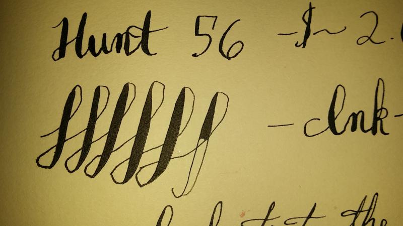
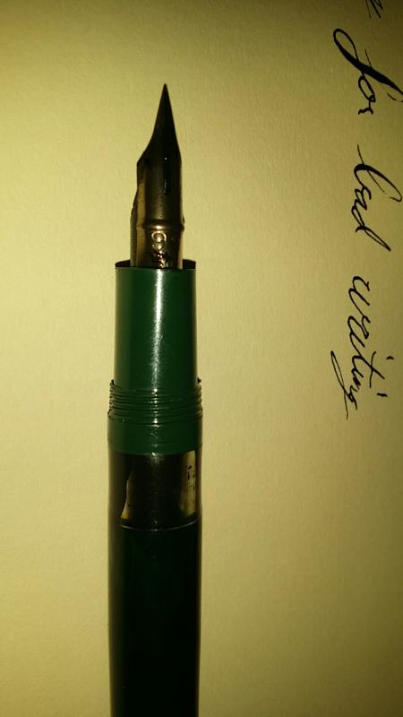
Hello everyone, I was told to move my mod over here to discuss it. It is a Noodler's Konrad with a Hunt 56 nib in it. I had to heat set the feed for it and I may have accidentally heat up the grip section during the feed setting but I did squeeze that as well just in case. I say that the grip section may have been set as well because after the mod it appears not to be able to close in the cap as smoothly. That being said, I am very pleased with my work and I tried a few nibs but this one worked the best for this configuration.It flows well and you can see one railroad but I was going pretty fast and trying to go to bed. So these aren't the best pictures but if you guys are interested I can post more detailed photos later or a video to Youtube if anyone really cares. I just don't want to put a lot of effort in if you guys don't care about modding your Konrads. I haven't had any starting issues with the pen and it does not railroad under normal writing conditions. The ink is Noodler's X-Feather and the paper is G. LALO.
-
Hello all! SO I have started my adventures in learning Gothic lettering (after many years of being intimidated in the amount of strokes required), and I just can't wrap my head around the letter C. (And, I suppose the letter E too since they are practically the same). The angle of my top stroke keeps shooting off in weird directions. Does anyone have any tips or tricks on how to do this right?
-

First Pen- A Noodler's Ahab? Also Beginner Calligraphy Help?
corina posted a topic in Fountain & Dip Pens - First Stop
I've been researching Noodler's Ahab Flex for a while, and I really really like it. Particularly the flexiness. I've been interested in fountain pens for a couple years, and my actual firsts were a pack of pilot varsities, which turned me off from fountain pens because of their weird scratchiness (which may or may not have been my fault; I was younger and dumber) I know the ahab can't compare it to a true flex pen, but I'm a poor high school student, so 20 bucks is a lot to me. It totally seems worth it from what I've seen, even though a lot of what I've seen tell me (beginner) to stay away from it till I've amassed some experience. I've also looked at "flexy" fpr dillies that have a similarly affordable price that seem to have a rep for being pretty safe (or safer than an ahab at least), but I don't really like their appearance, and the ahabs seem to have more line variation and flexibility, which is what I'm totally in love with. I also really like the ahab because I am equally obsessed with calligraphy, and would like to learn it myself, so I was thinking about buying the speedball calligraphy kit on amazon, but I'm not sure if I should go with the type with an oblique holder or a straight one. I'd like to try Ornamental/Spencerian/Engraver's type calligrapby rather than gothic. One of the reasons I want the Ahab despite obvious drawbacks (like my newbity and tinkering) so much is because of the beautiful works I've seen done with the pen, which I'd also like to be able to do someday. Does anyone know if this is a decent book to staft with? (http://www.amazon.com/gp/aw/d/0486409511/ref=ox_sc_act_image_6?ie=UTF8&psc=1&smid=ATVPDKIKX0DER) I have looked into a lot of other types of pens that probably would have been way better as a first pen for me like lamys and pilots or preppies and jinhaos and the like, but I also feel like I couldn't survive without the Ahab. Should I just give up on the Ahab and go for something more dependable (like a workhorse lamy or a cheaper and safer dilly)? Like I said, I'm a really poor hs student with only like 50~70 dollars to burn on a fountain pen, both calligraphy and fountain pen ink, a calligraphy set, and a calligraphy book. Sorry for the trouble, and thanks for the help -
Recently I bought a calligraphy pen set that is not identified (link below). Can anyone tell me the manufacturer along with any comments you may have? Thanks! James http://www.ebay.com/itm/Calligraphy-Pen-Set-w-Tips-Ink-Storage-Tin-/351267121798?ssPageName=STRK%3AMEBIDX%3AIT&_trksid=p2047675.l2557&nma=true&si=g5rVIveoDQ106tBkWukPAC0R180%253D&orig_cvip=true&rt=nc
-

"manuscript" Clear Calligraphy Set Review 5 3.5 4.5 7 3.5 4.5
ThegreatandpowerfullR posted a topic in Fountain Pen Reviews
Pen being reviewed: Manuscript Clear Calligraphy Set w/ five nibs Cost: ~12$ Appearance: 5/10 This is a clear demonstrator that is neither ugly nor pretty, it just kinda exists without being spectacularly bad or good. The cap is the same diameter throughout with 12 facets and an enormous clip that looks well enough to not be a problem. The body has the same 12 facets but is thinner than the cap and then thins further, ending in a dome shape. The pen is/looks small, and the nib is even smaller. The nib looks nondescript and vintagey if anything, with "MANUSCIPT" in an arc and "ENGLAND" and the nib size underneath and inside the arc. Construction And Design Quality: 3.5/10 The plastic is a clear and very cheap. a big rectangular piece of plastic at the domed end with a continuous thin rectangular piece of plastic going down the cap with barely any tension serves as a clip. While tightening the barrel onto the pen a little too much it cracked and from there got worse. I see the cap cracking as well with further use, the barrel is also cracked pretty badly (more on that later). The section is very thin, and the grip is a pyramid design that is moderately comfortable, more so than if they had chosen a smooth grip because the section is so slim. The threads are also very hard to use, they slip out of alignment very easily and it is hard to get them into alignment in the first place. Couple this with the fact that the plastic cracks easy you get a little nervous. Weight and dimensions: 4.5/10 This category is very subjective, and this pen does not gain any advantage like most cheap pens. It is light as a feather because the plastic is even lighter than most plastic, coupled with its small size. This pen is very slim, and I like slim pens and am not bothered by the thinnest of pens, but others may feel differently. Nib Performance: 7/10 The pen came with five nibs/sections (five times as much as most pens and as many section colors), but I have only tried one. It was neither wet nor dry but was smoother than most cheap pens without adjustment. It was stub rather than an italic, but this is not a problem and it was not labelled as so, just "calligraphy". There is no extra tipping, just a squared off end. Filling System and Maintenance: 3.5/10 This pen apparently has it's own cartridges and converters and does not fit other systems. I tried to make it an eyedropper by filling the body up with ink and sealing the section with silicone grease, but the ink leaked through the nib and filled the cap after putting it down and walking away for less than 4 minutes. I then tried to put a converter in the pen but it is apparently too big and after i had tried to screw the section back in the barrel cracked when it was almost in and got stuck (I did not even notice the converter was to big because there did not appear to be a problem screwing it in). I tried to take it out with pliers but it barely came out after scratching the end all up and possibly ruining it. The cartridges are also shaped differently at the tip, leading me to suspect that other cartridges do not work. Cost and Value 4.5/10 This pen is made up of cheap, easily cracked plastic. It restricts the user to in-house c/c's that are not well made and this pen does not come with a converter. It also is very leaky. The nib I tried was good, and it comes with extra nibs and differently colored sections. I think this pen was not a very good use of my money, especially compared to similar calligraphy sets, but it is not too bad if you do not expect much. Conclusion: 5.6 This pen did not pass the "Is this a good pen" test. I am also disappointed to learn that a pretty mush wasted my money and am mow missing money that could have been used to buy a better pen, even in the same price range and purpose. Do you know of any better calligraphy sets in the same price range? I would prefer if it could be made into an eyedropper for the extra ink or if it is completely clear, as it kinda looks dumb to see a c/c in a clear pen as you are not really showing anything, but c/c is fine otherwise I can also post pictures later, but they will be taken with a smartphone so will not be very high quality. (the numbers in the title were from when I was calculating the final score, I forgot to take them out and now cannot change them) -
Hey guys, my name is Alex and I’m brand spankin’ new to calligraphy. As in just-started-yesterday new to calligraphy. Anyway, I’m hoping to be able to give you guys some details as to my situation and current supplies and maybe get some recommendations as to how to improve my experience. I asked for a beginner’s calligraphy set for Christmas, and this is what I received: http://www.amazon.com/Sheaffer-Calligraphy-Maxi-SH-73404/dp/B000MFHVM8/ref=sr_1_1?ie=UTF8&qid=1419800919&sr=8-1&keywords=beginner+calligraphy+set It came with 3 nibs (1.1mm, 1.5mm, and 2.0mm) and a bunch of different colored “Skrip” ink cartridges. It seems like a good start, but I’m having a bit of trouble with it. I read that as a rule of thumb, a calligraphy pen should be held so that the nib is at a 45 degree angle, so that’s what I’ve been doing, however, a lot of the time my pen will stop writing halfway through a stroke. It’s like the ink flow just cuts off for some reason. In addition to this, regardless of whether I move the pen to make a thin line or a thick line, it seems to bleed into roughly the same width. My thin and thick lines are hardly distinguishable, even when I move the pen straight down vs. straight across. I’m really enjoying starting out on this and I was hoping for some advice! I’m thinking about buying a new pen or two. I was hoping to start off with a fountain because I’ve read that they’re better for beginners (don’t hesitate to let me know if this is false). Anyway, I’m looking for a decent quality fountain pen that I can either refill or buy more cartridges for. I’d like something that either comes with multiple nibs or allows me to buy different nibs so that I can experiment. I’m looking to spend about 15-20 dollars for something decent, but if this is unrealistic, feel free to tell me I also feel like it’s worth noting that I’ve tried practicing on both standard printer paper and a type of cardstock and experienced the same lack of distinction between my line widths with all 3 nibs. If you all have any recommendations on some affordable paper to practice with, that would also be great!
-
Hey, guys I’m trying to get into the calligraphy portion of writing... I want to choose something fairly inexpensive so that I practice on before I move up. Any suggestions?
-
Hello. I am a very new fountain pen owner (a simple Lamy Safari) and I would like to learn about calligraphy to improve my handwriting. I live in Adelaide, Australia which have no courses on offer at the moment. Is there an online course that is worth taking? Thank you in advance! Cheers
-
In another thread, the idea of pen classes has been raised. I think this is an interesting idea worth looking at in some depth. (I may be the only one that thinks this.) First lets define what the class is and how it would work then lets decide what it is worth to attend. Lets say the work shop/class is held at a pen show, perhaps a day before or on a non-public (trader pass only) day. The subject of the work shop could be anything pen related from Pens 101 to a Calligraphy class. The workshop would be ~4 hours long and is taught by a recognized expert in the subject matter. Lets also say you would need to provide your own pens but the class might provide any consumables like polishing pads, ink, paper, etc. Tuition may also include a take home kit of supplies, a book, etc. as appropriate to the subject matter. Lets also say the class was limited to 8 or 10 participants. The class might include lecture time on the subject, demonstrations, hands on practice with with guidance from the expert teaching the class. Some topics that I have heard in back channel communications include: Nibs Repairs (basic, advanced, pen/filler specific are all possibilities) Pen Basics Calligraphy Of course this doesn't come free but what is it worth to attend and what would one expect? Lets explore. Farmboy
-
I've taken advantage of a big piece of practice for my calligraphy class (the one I go to, that is - I don't teach it, far from it!) to do a review of the various calligraphy pens in my collection - Lamy Joy, Rotring Artpen, Sheaffer Nononsense, Reform calligraphy pen and Calligraph (yes, those are two different pens: as Facebook says, "it's complicated"), Pelikan Graphos, Pilot Parallel and Online 'nuwood' calligraphy pen (a bit of a Waterman Serenité knockoff. Or hommage. Or something). Winner, for me, was the Lamy Joy. I love its looks, particularly the contrast of black and red, the shininess of its plastic, and the little touches like the red accent on the 'tail' end, and the ink window (the same as in the Safari). I also find the triangular grip really comfortable to use, and it prevents the pen rotating slightly in my fingers and spoiling the 45 degree angle of the nib - something that sometimes happens with my dip pens. http://1.bp.blogspot.com/-buK-13rPdhA/U-0AMtPbh7I/AAAAAAAABTs/cqJe5tijOQ4/s1600/lamy%2Bjoy%2Bpen.jpg Joint second is the Rotring Artpen - a very wet writer, and as easy to use as the Lamy, but aesthetically, not quite as pleasing. It just doesn't have quite that Bauhaus style. But it's a really lovely writer and very comfortable to use. However, I hate the ridges on the section, not because they're uncomfortable - they're not - but because somehow, they always manage to retain a bit of ink however much I wipe, so I can never use this pen without getting my hands dirty. http://2.bp.blogspot.com/-ESvcpdCxEQs/U-z-YW_BZvI/AAAAAAAABTM/S_LJ7ha0ZZ8/s1600/rotring%2Bartpen.jpg And the other joint second is the Reform Calligraph - looks like a Pelikan, and is a smart little black and gold piston filler which contains a really good load of ink. I particularly like it as unlike the Lamy and Rotring, it will fit in a regular pen case. Nice and crisp writer. I would love to find out more about this pen - for instance, when was it produced? I got mine at a car boot sale, in a rather fetching box with a second Calligraph (this one's 1.1m, can't remember offhand what the other one was); they do pop up occasionally on ebay. http://3.bp.blogspot.com/-6GWjlxQmgf4/U-0CNRLkT2I/AAAAAAAABUQ/CptHEcSEdUs/s1600/reform%2Bcalligraph%2Bpen.jpg The Pilot Parallel is a lovely pen, but at 2.4mm just a bit too big to use in regular calligraphy, though it's my go-to pen for swash capitals. It's a very modern style and to my mind the design does properly what the Reform calligraphy pen (below) did badly - a very simple, vividly coloured cap, long tapered body, injection moulded components. The collector, I suspect, is the single thing that affects its quality the most - the flow of ink is wonderfully even across the width of the nib. http://1.bp.blogspot.com/-dWQP1DnVsM4/U-0Bq0l4ZmI/AAAAAAAABT8/uPuGyNwGL7Y/s1600/pilot%2Bparallel%2Bpen.jpg The Online 'nuwood' calligraphy pen is one that I bought with three interchangeable nib sections. It's a stunning looking pen in stripy wood, with a triangular cross-section to barrel and cap, and the curved looks of a Japanese katana or, more to the point, the Waterman Serenité. However... it doesn't quite live up to its looks. The section keeps unscrewing itself when I cap or uncap the pen. The section is really short, and thin, and there's a pronounced sharp shoulder between barrel and section, which make it quite uncomfortable to use. However, the nibs are good - reasonably wet writing with nice crisp edges and good line variation. http://4.bp.blogspot.com/-PPGEOzsVTZc/U-0DaX_0JoI/AAAAAAAABUk/SSF2AO7BBjI/s1600/online%2Bnuwood.jpg The Pelikan Graphos is horrible. Maybe I would get good results out of it if I devoted about a week to learning how to use it properly. Then again, maybe I wouldn't. It's not really a calligraphy pen anyway, it's a technical pen that was also used for lettering. A pity, because it is aesthetically very appealing in its functional and simple way. http://4.bp.blogspot.com/-CbCR4NxTA4w/U-0EiGwRt3I/AAAAAAAABUs/ct83g8iUlRo/s1600/pelikan%2Bgraphos%2Bpen.jpg The Reform Calligraphy pen is also just nasty. It is very cheap in construction, and the nib is both dry and scratchy. Move along, nothing to see here. http://3.bp.blogspot.com/-77uxMzST-U8/U-z_5aoeg6I/AAAAAAAABTk/57V1o2ZDE54/s1600/reform%2Bcalligraphy%2Bpen.jpg It really did amaze me how great the difference was between the two Reform pens. Even looking at the nibs, it's apparent - the Calligraph has a rather lovely nib with good tipping and two breather holes, the Calligraphy pen has a bit of brass sheet with a slit in it. Finally the Sheaffer NoNonsense, transparent red with a rubber section and 'M' nib. I find it a bit annoying that they don't tell you how wide the nib is; everyone else does! I found this rather a dry writer, though perfectly adequate and quite comfortable to use. It's a nice robust pen for an EDC. http://1.bp.blogspot.com/-SUC8zHf8e-E/U-0Evo6zZJI/AAAAAAAABU8/RuWkgnVESrY/s1600/sheaffer%2Bnononsense.jpg I do want to try to get hold of a couple of other calligraphy pens to try out; Kaweco Sport calligraphy set, andPelikan Script (which I understand has now been discontinued by Pelikan).Apologies for the very poor calligraphy. I'm practising the French style of ecriture ronde, and apart from a couple of alphabets, can't find any extensive examples to follow. You'd think there'd be a few pages of decent writing on the internet somewhere, wouldn't you? Of course my textbooks, all being English or American, are no help here! The full version of the review, with more pictures, is at my blog, Fountain Pen Love.