Search the Community
Showing results for tags 'calligraphy'.
-
Father Robert Palladino passed away on February 26, 2016. It may be that, as he feared, Fr. Robert will be remembered only as the person with whom Steve Jobs studied calligraphy after he dropped out of Reed College. To me, he will be remembered as the person who filled Lloyd Reynolds' very large shoes when Reynolds retired from the Reed faculty. Fr. Palladino came to Reed after I had graduated, and I did not meet him until 2011. I am sorry I didn't know him better. Later, I will be uploading some of Palladino's instructional materials, in his beautiful italic calligraphy, to FPN, but, for now, I will provide some links to online materials that will give those interested an introduction to a significant person in the history of American calligraphic arts. Obituary of Fr. Palladino from The Catholic Sentinel Fr. Palladino Interview for oral history project (2008) Video of Reunions 2011 calligraphy demonstration by Fr. Palladino David
-
Hey all, my name is Nate and I'm an amateur fountain pen enthusiast, and calligrapher. I'm still very new to everything and would love your help getting further into the art. I have a full set of Pilot parallel pens that I love, and a hand made wooden fountain pen that a friend made for me as a gift, as well as a set of dip nibs. One of my biggest questions is how or if I can change the nib on my fountain pen? I know nothing of the brand or size as it was made as a gift. I have a bottle of Parker Quink that my friend gave me with my pen and was wondering if it will work in my parallel pens or will it clog the receiver, if I can't use it what ink would you suggest? (or more so what ink should I avoid on a functional level, since ink is such a personal preference)
-
Thoughts about this? Would you give it a flex nib? http://gizmodo.com/this-is-the-handwriting-robot-ive-always-needed-1764683921
-

Arrighi's "operina" Versus Benson's "arrighi's Operina"
dms525 posted a topic in Calligraphy Discussions
I have had a photocopy of Arrighi's Operina for several years. For this who do not know, the "Operina," or "little work," of Ludovico Vicentino degli Arrighi, first published in 1522, is commonly regarded as the first of the Italic handwriting instructional manuals. The author is usually referred to as "Arrighi" these days, although, in his own time, he was more commonly called "Vicentino." This little book was addressed to anyone wishing to learn "Cancellaresche Corsiva," or "Chancery Cursive." That style of writing had been adopted by the Vatican for all diplomatic correspondence some years before Arrighi's time. In 1522, presses with moveable type were in use in Italy, but Arrighi's book was written entirely in the hand it was teaching and then carved into wooden blocks from which the book was printed. In his preface Al benigno lettore (To the Kind Reader), Arrighi admits that the wood blocks cannot reproduce hand written script with complete accuracy. He says he did the best he could and expresses the hope that his text provides clear enough instructions that the reader can forgive the limitations of the press to in tutti ripresentarte la viva mano (entirely represent the living hand). It has been my observation that many who have studied the Operina, rather than following the instructions, have adopted some of the errors introduced by the printing techniques and of which Arrighi warned the reader. They copied what they saw. These errors, in my opinion, largely consist of converting smooth parabolic curves into sharp angles. These occur when the movement of the pen changes direction, at entry and exit strokes and at the bottom of letters with bodies like the a, d, q, for example. This week, I received a copy of John Howard Benson's "The First Writing Book: Arrighi's Operina,"first published in 1954. This was, I believe, the first complete English translation of Operina, and Benson wrote out his translation in Arrighi's chancery cursive hand and in Arrighi's format. So, in effect, he created a translated reproduction of Operina for the English-speaking world. The Forward and Introduction to Benson's book are also written in a beautiful Chancery Cursive hand. Benson included a photocopy of a first edition of Operina, so that both the translated text and the handwriting can be compared to the original by the reader. This little book is a wonderful resource and is highly recommended for anyone interested in either the history of letters and writing or in learning to write chancery cursive. One other point: Benson's copy of Operina is a photocopy of Arrighi's first printed edition. Therefore, it has all the shortcomings of which Arrighi warned his readers. Benson's translation, on the other hand, is reproduced photographically from his hand-written original. It is free of the limitations imposed by reproducing hand written text by carving it into wood blocks. So, while Benson's writing cannot be absolutely identical to Arrighi's hand in every detail, it may be closer in certain important respects than the wood block copy represented in Operina. I wonder. David -
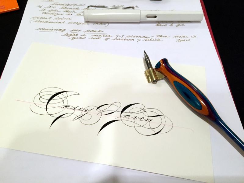
Greetings, All -- I wanted to share some calligraphy samples with my Desiderata Mercury Flex Pen -- the Zebra G nib is a lot of fun! Great line variation in a cheap nib. https://www.youtube.com/watch?v=snyUjb2-imo
-
Hi all - it is time for another workshop. This time I am going to go over the process of carving a holder with basic tools. All supplies will be provided. You just need to show up with some enthusiasm and walk home with a holder crafted with your own hands. I am going to demonstrate the complete process with the participants following along at each step under my guidance. We will only be using basic tools like knives, files and pliers so no special skills are required. I am looking forward to seeing some FPN'ers there. Oh - and the details are at: wonderpens.ca - Salman
-
Hi everyone I have loved fountain pens since secondary school bk in early 2000s with my huge lamy since then I have always wanted to reown one but alas life happened so im a complete noobie and would love to learn more on them One day my partner surprised me with a hand made custom pen to which he won't tell me where or how much but it did kick my fountain pen hand into wanting more I have Parker vector with 3 nibs and the 4 pilot parallels now looking into lamy as that was my first pen but like the look cross watermans Twisbi pilot I have natural slant joined handwriting but I write with the paper landscape and write up if u get me I'm wondering if there is anyone who could advise me on techniques to write calligraphy or copperplate as there are no fountain pen clubs groups closer to me than 40/5 miles as the videos I've seen write with paper portrait I tried that omg it was funny my natural slant was backwards all different hights I have since bought learn calligraphy by Margaret Shepherd looking to buy her copperplate book too Think it's a case of practice practice practice Sorry for the essay Speak soon HROBERTS_08
-
I was in Portland, OR last week for some alumni activities at Reed College, and I was able to attend the Thursday evening Scriptorium. Jaki Svaren, a professional calligrapher, author of Written Letters: 33 Alphabets for Calligraphers and a student of Lloyd Reynolds at Reed in the '50's. Jaki usually attends the weekly Scriptorium and has been of great help, coaching Greg MacNaughton who actually does the teaching. I captured some copies of a handout Jaki had provided for the attendees with her version of italic minuscule ductus and numerous instructive notes on each letter. I got her permission to upload them to FPN. I hope you find them helpful. Happy writing! David P.S. The handout refers to 22 alphabets. The current expanded & revised edition has 33 alphabets.
-
Regarding Jacqueline Svaren's Books On Calligraphy
dragos.mocanu posted a topic in Calligraphy Discussions
Greetings, I want to acquire a copy of Jacqueline Svaren's 'Written letters', and from what I can tell, there are actually 3 versions of this book, one with 22 alphabets, the second with 29 and the last one with 33.. Does anyone know which 4 alphabets were added in the last version? Thanks! Cheers! -
Hello Fountain Pen Network users, I am very new and ignorant about Fountain Pens. I came here in the hopes of learning some more. I am impressed at the wealth of knowledge, activity, and support that is found here. I am learning calligraphy. I have a somewhat vintage pen that needs a little restoration; I will attempt to submit a question in reference to that pen, in your Repairs Q and A subsection. Thank you for all your contributions. Jairo in Longwood.
-
Just a quick warning to anyone considering Daler Rowney Calligraphy paper....don't. I haven't had wonderful experience of Daler Rowney notebooks so perhaps I should have known better, but I saw a book of sheets of calligraphy paper for sale and thought they looked like quite nice textured paper. The pad actually has three different shades of paper in it, all at 90gsm. It feathers. It's horrible and scratchy even with the smoothest of nibs. It bleeds and has show through. Horrifically bad paper at a premium price. Do not buy, it's just nasty. I find I get really irritated by poor, sub standard paper which is charged at a premium price; especially when they charge a lot of money for it. It is becoming more common these days because it's not so noticeable that it is actually junk paper if you are writing with a biro, but then I'd really appreciate it if they charged the junk price rather than rip me off and charge a premium for junk.
-
http://uproxx.com/life/2015/08/master-penman-craftsman-jake-weidmann/
-
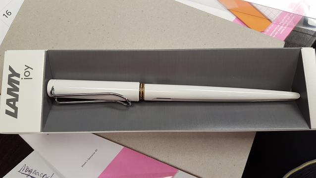
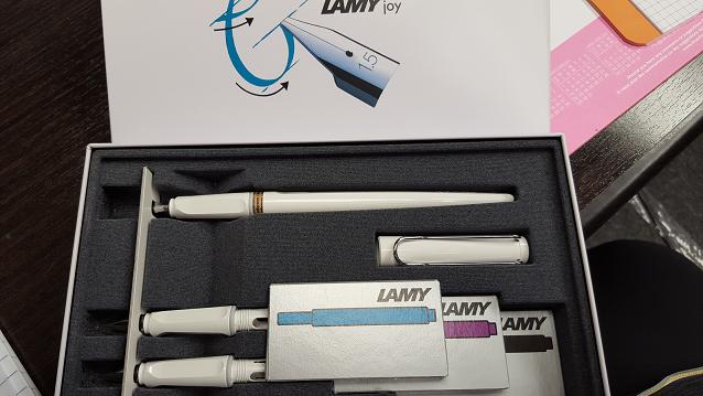
Lamy Joy Calligraphy single pen and gift set is now available in white!!! The single Lamy Joy comes only in a 1.5mm however they are nib switchable. We carry all point sizes in the individual nibs. The gift set contains the 1.5mm pen and an extra 1.1mm and 1.9mm nib section in the box along with 3 packs of cartridges : Black,Turquoise and Violet. The LZ 24 Converter would need to be purchased separately. You can place your order by phone. Or if you have any question you can email. 1800-263-2736 or 410-992-3272 Support@penboutique.com

-
Hello fpners! I am hoping to tap the brain trust about a couple of cranky calligraphy nibs, a TWSBI 1.5mm stub for my mini and a 1.9mm Kaweco sport calligraphy nib. I can't get either of them to behave. Both require a lot of pressure to get a solid downstroke (think particularly nasty ball point), and neither will produce reliable side strokes. I've flushed both thoroughly, flossed the tines, pulled the nibs and scrubbed the feeds with a toothbrush, and made sure the tines are properly aligned. I am using Herbin tea brown in the kaweco and Rouge Opera in the mini. I've never had any problems with either ink. I'm writing slowly and being very careful about the nib angle, so I don't think it's me. Also, I've used smaller stubs in the past, both custom ground and factory 1.1's, and had no problems. Any suggestions?
-
Hi all, I am very excited to announce that I will be offering a 6-week calligraphy course in Toronto in partnership with Wonder Pens. This course will focus on the fundamentals of broad pen calligraphy and will include instruction as well as projects to develop both skill and understanding. Classes will be held from 6:30 p.m. to 9:30 p.m. every Wednesday starting October 28th. The classwork will be supported by a private forum where participants can upload their homework (yes, there will be homework) and ask questions. My goal for this course is for the participants to develop command of at least one hand (both Majuscules and Minuscules) along with understanding the fundamentals of broad pen calligraphy. Projects include exercises in development of a new hand as well as composing newspaper headlines. I expect the course to be both fun and a learning experience. More detail are on the Wonder Pens Blog. I hope to see at least a few FPN'ers in class. Regards, Salman
-
Hello, I want to get myself an easel for practicing calligraphy, and I stumbled across this: http://www.greatart.co.uk/Canvases-Easels/Easels/Mabef-easels-Studio-Furniture/Mabef-M34-Table-Display-Easel.html . Do you think it would be suitable? Cheers!
-
Hello, A while ago I started practicing italic calligraphy with a bit more dedication, and so far my go-to pen is the 3.8mm Pilot Parallel, filled with Pelikan 4001 Brillant Schwarz. I tend to use what paper I can find in the office, and this ink really helps keep the feathering/bleedthrough in check; however, I was thinking about switching to a darker ink, since the one I'm using now tends to look quite grey if I write with the very broad 3.8mm nib. Living in the EU, my options right now seem to be 3 of the Noodler's inks: Black, Heart of Darkness and X-Feather. Does anyone know how these inks compare when used in a 3.8 Pilot Parallel in terms of 'blackness'? Cheers!
-
Hi I'm looking for calligraphy pens with nib sizes from 0.7mm to 2.5mm. I'm looking for branded pens, not on the luxury side of course, but for regular script writing. Any ideas where and what to look for?
-

Michael Sull At The San Francisco Pen Show August 28 2015
httpmom posted a topic in Calligraphy Discussions
Here's a juicy one! Michael Sull made individual name place cards for all the students in his class yesterday at The San Francisco Pen Show. This is mine and it's really spectacular, wouldn't you agree!? The class was from 1:00-5:00 but it got a bit frazzled at the start* so he continued on past the allotted time by an hour and a half....he is such a giving person and a wonderful teacher. He helped me get my pen 'hold' in order and it's made a remarkable difference. I bought two of his pens for the flanges are especially made by him to facilitate proper Spencerian. Also such a treat to hear him tell all the stories he's accumulated over the years of being a calligrapher. I feel overwhelmingly privileged to have taken his Spencerian Class. Never forget it. *I was frazzled and late as well, because I got a very scary full blown out tire on a super busy S F Bay Area highway on the way to the Sofitel Hotel. His mannerism was so calm and relaxing however, that I completely let go of the stressed mental state in which I started the class. We should all be so graced by our teachers. Here is a book he signed. I also have a video of a book signing but I am unsure if those are allowed on FPN and/or if it would be proper/acceptable to be putting up someone else's work.
-
As I said in my intro http://introduction I got taken by fountain pens finding the old calligraphy set from my father. And as requested by FPNer Sasha Royale I want to show it to you: I do not want to go into great detail as of every basics are already beautifully explained by FPN-member Mendes back in 2010. https://www.fountainpennetwork.com/forum/topic/169078-manuscript-calligraphy-pen/'] Long story short the set is from Manuscript and looks like that: The manuscript box with four different nibs, from fine to double-broad: The pen assembled (I write with the cap posted to have a better feeling for its balance) a closer look and last but not least, my first writing test for FPN:
-
http://uproxx.com/life/2015/08/master-penman-craftsman-jake-weidmann/
-
Hello! I'm a novice calligrapher from Norfolk, Virginia. I used to practice calligraphy as a kid (from age 12-14), and recently decided to get back into it. I'm now 32 years old. I've been practicing on and off for about a month, using Pilot Parallels, standard Pilot Parallel ink cartridges, and working with just the basic Gothic exemplar from the Parallel Pen packaging, though I also have a variety of calligraphy textbooks I'm working through. Here is a sample of my work: http://puu.sh/fdCip/6c1a732b8c.png At the same time, I've become interested in fountain pens. Learning to use them was dead easy after getting used to writing with calligraphy pens. You can see my standard LAMY Safari there in the picture, and I very recently acquired a Pilot Vanishing Point Fermo as well. I have a bottle of Iroshizuku Shin-Kai and Iroshizuku Ina-Ho so far, lots of Doane, Leuchtturm, and Rhodia paper and journals, cleaning supplies... I'm going nuts over here. I look forward to reading about people's work and experiences in the world of lettering, fine pens, fine inks, and fine papers, and sharing my own as I continue to improve over the next months and years.
-

New To Fps But I Love Me Some Ink! (Hailing From S Florida)
uberneko posted a topic in Introductions
hi all! i'm a south florida resident, newly reacquainted with calligraphy and potted inks. waaay back in high school i had fiddled around with calligraphy. at Uni, a course on Illustration introduced me to the joys of ink and nibs. i've dabbled off and on with drawing in inks but never with actual fountain pens. which might become a new love. i'm on the verge! lol PENS!!!!!!!!!!!!!! ---currently own: 1. one lonely Sheaffer med nib FP. *(silver cap, acrylic body in what i like to refer to as "blacklight purple", thin body, small, requires posting). it writes like an absolute champ. tho the ink tends to feather a bit on cheap paper, it is too bold for everyday writing. i have NO clue what the model is, though i would like to. it was purchased back in.... ugh... 1997??? maybe? (i have vague hopes of finding a converter for it and making it a drawing pen. or just using pale, colored inks) ---soon to be in my collection: 1. Pilot Prera, solid, yellow, F nib 2. Pilot Kakuno, pale blue and white, F nib 3. *Pilot Prera Iro-Ai, demonstrator, Calligraphy/Italics nib 4. *Noodler Ahab, flex nib so i went on a spending (and researching) rampage. lol!! i started with just looking at nibs to add to my collection but then the FPs became a small obsession. the Iro-Ai and the Ahab i haven't officially ordered yet. i'm very interested in inks as well. colors, shaded inks, etc. so far i have a Noodlers waterproof black on the way. artwise, i need something that can stand up to watercolor, dontcha know. i seem to be showing a bias for Pilot but that isn't really true... was just looking for a pen that fit the needs, didn't break the bank, and that LOOKED NICE. looks aren't everything, but pen that writes beautifully is even better if you like the design. i read/watched reviews and the ones i chose seemed to be good bets. PEN SHOW!!!! i'm wondering if i should wait until the Miami pen show......... or if i should go ahead and pull the trigger, so to speak, and order up the last 2. i'm super interested in refurbed vintage pens, though i'm not sure if any are in the affordable range or if they are all hundreds of dollars. MISC i'm really interested in meeting new people from all over. and those that are interested in calligraphy and art uses of FPs. also, if anyone likes to do old school snail mail with their mad callig skillz (haha. or their non-skills. whichever. lol!), i think that could be a fun way to practice! NICE TO MEET YA! -
Not sure if this is the right place to post this, but I saw this article in The New Yorker today and wanted to share: http://www.newyorker.com/culture/cultural-comment/calligraphy-stars-instagram?intcid=mod-most-popular An excerpt: Getting rid of cursive seems to imply that one day no one will need to set pen to paper. Instagram calligraphy is a great visual argument for why “need” should not be the only factor in saving script. Watch long enough, and you, too, will start Googling “Lamy fountain pens” and “copper ink.” Articles like this make me happy.
-
Hello all, This is my first post on the FPN. I am looking for an opaque or at least very saturated with little to no shading red ink. This is mainly for use in a 6mm Pilot Parallel calligraphy pen. I've tried several colors but to no avail. I've highlighted the problem exemplars in yellow in the images below. Diamine Red Dragon is my favorite red ink, and it almost gets the job done, but it still looks blotchy in the 6mm PP: Here is Noodler's Park Red: I prefer the shade of the Red Dragon, but I need something that doesn't look splotchy when going over the same area with multiple strokes. Also, don't cringe too badly at the letter forms here, they were part of my practice . Any suggestions are very much appreciated. Also, I'm looking for a rich red pigmented ink for dip pens. I'd like something akin to sumi-e, the best I've found in that family is an orangish red though.