Search the Community
Showing results for tags 'calligraphy'.
-
Shadow nibs make for interesting writing, but they are really a useful tool when learning a script written with a broad nib. They make your nib angle and stroke direction more obvious. Thus, they make it easier to identify (and correct) errors. David
-
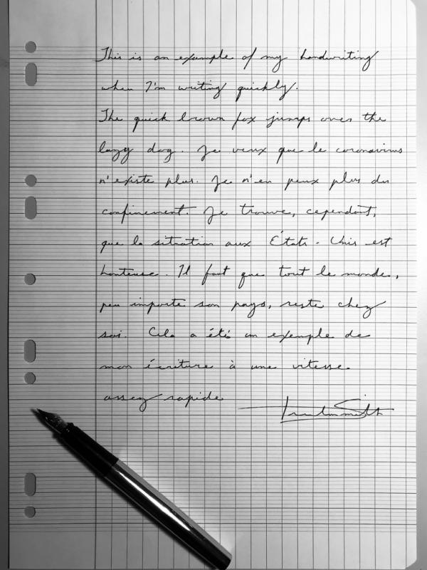
I’m here to discuss what I have found to be the most efficient ways of producing beautiful handwriting as a left-handed person. I have tried and am familiar with numerous writing positions known to lefties including underwriting, side writing and overwriting (hooking). What I present to you is not the sole way of going about lefty calligraphy, it is simply what has worked best for me and some of the most capable left-handed calligraphers. If you find another method that works well for you, if you’re getting positive results, great! Do that if it works. I hope this will be of help to some of my fellow lefties. Let’s make one thing clear: lefties are just as able as right-handed people to produce beautiful writing. If the proper positions are used, any type of calligraphy is possible. If one searches thoroughly enough, one can actually find a decent amount of information regarding left-handed calligraphy and left-handed writing in general. Unfortunately, little of this information is standardized (especially on online forums), and a good portion of it is misleading. I’ll start with something that causes perhaps the most confusion: scrips that require a broad nib like gothic, uncial, etc. In this case, I turn the paper 90 degrees clockwise and write vertically toward myself. The advantage of this is twofold; I never have to worry about smearing ink, and I can use a standard-cut broad nib (straight across, not an oblique) to achieve the proper angles desired. This puts me at exactly the same angle as a right-handed calligrapher. The only thing you might have to get used to is seeing the letters vertically. Tip: While practicing, turn your reference script (if you’re using one) 90 degrees as well so as to familiarise yourself with what the alphabet looks like at this angle. It’s very possible to use a left oblique nib. In this case, one should angle the paper clockwise at around 45 degrees. The paper should be positioned slightly to one’s left. This produces the proper angle. I prefer to write vertically at 90 degrees because it seems like the angle is more stable and it allows me to use a standard broad nib (not a right cut oblique, however). I highly recommend watching this video concerning the subject: https://www.youtube.com/watch?v=NrCFFt9uac0 Let’s talk about pointed pen calligraphy. There are two very effective methods: using a straight holder and writing under the writing line (this naturally achieves the correct line thickness), or using a right oblique nib holder and angling the paper clockwise somewhere between 45 and 90 degrees, the latter of which one is essentially writing vertically under the line as in the previous section on broad nibs. I go back and forth between the two methods. I think both are completely acceptable and efficient for pointed pen work. I will say, however, that making flourishes seems to be easier using an oblique holder. Here’s a demonstration by the wonderful left-handed penman John DeCollibus: https://www.youtube.com/watch?v=TOjh0SkwyCM As for standard cursive writing, I tend to angle the paper clockwise and write under the line. This works very well if you’re a frequent user of fountain pens as you won’t have to worry about which ink to use, nib size, flex, etc. With this position, any combination of nib, paper and ink work well. You might have noticed that all of the positions that I’ve discussed are “underwriting” positions. That’s what I use and what I esteem to be the most effective technique for lefties; however, this doesn’t make other forms of lefty writing like side writing or hooking incorrect. Unfortunately, in many calligraphy books the sections dedicated to lefties are often short and lacking in detail. There are very few books dedicated solely to the left-hander. Nevertheless, here are a few helpful resources on left-handed writing and calligraphy: Left-handed calligraphy by Vance Studley. The Calligrapher’s Bible: 100 Complete Alphabets and How to Draw Them by David Harris. The Italic Way to Beautiful Handwriting: Cursive and Calligraphic by Fred Eager Calligraphy 101 by Jeaneen Gauthier https://www.iampeth.com/lessons/left-handed https://www.nibs.com/content/left-handed-writers This has been a quite lengthy post, but I hope that you got something out of it. If you have any questions, feel free to contact me. For calligraphy and art related things, find me on Instagram @trsmith_art Best, Trenton Smith

-
desaturated.thumb.gif.5cb70ef1e977aa313d11eea3616aba7d.gif)
Pilot Steel Italic Nibs Of Different Widths
A Smug Dill posted a topic in Fountain & Dip Pens - First Stop
Now that it is possible to buy Pilot Plumix pens — which are fitted with broad-edged nibs — with different (F, M and nib widths, I bought a new set (as opposed to the old three-pack all fitted with M nibs; I still have another one of those sitting in a drawer unopened, although Amazon Australia don't seem to sell them any more), with the expectation that I might use them as nib donors for three new Prera pens, which have remained unopened for over a year because in themselves they aren't such interesting pens. This is how they write, compared to the standard round-tipped F and M nibs on the Pilot MR (or Prera, 78G, etc.): I now have a second set of those pens on order, after seeing the results! -
I am opening this topic in this forum, because the Montblanc forum is one of my favorites on this network, but not only. In fact, I present an exercise, which was born to give my ideas a calligraphic shape, made with two of my Meisterstück 149, the recent Calligraphy with its beautiful flexible nib and another 149 with BB nib, a pen from 1984. And on the same sheet I also present a drawing, made with the Calligraphy pen, which engages in a self-portrait and a portrait of her sister with the double bold nib. Very Montblanc, as you can see ... An anecdote about the realization of this operetta. I drew the second pen, the one next to the cap, after shading the first one on the right. While drawing, it is frequent to turn the sheet to give it the best orientation with respect to the position of the hand and to be able to execute the lines without hesitation. On various occasions, as I moved the paper, I perceived the pen drawn on the right out of the corner of my eye and I got ready to grab the pen before it rolled off the table, ha ha ha ... Deceived by my own trompe l'oeil! The second frame adds nothing to what we already know from the first, but the light reflected by the chronograph dial was so magical that I had to photograph it, and now share it with the friends of the forum.
-
Rigidity Index of the new Meisterstück Calligraphy 149 Expression Nib In September 2019 Montblanc introduced to the market a new collection of fountain pens called “Calligraphy” that have as their central core a flexible nib called “Expression”. In this presentation, we briefly discuss the new Meisterstück 149 equipped with an Expression nib made of 18kt yellow gold. This version is called "Montblanc Calligraphy Flexible Nib Special Edition". The base is the famous 149 made of black resin and with yellow gold trims. The pen has a total weight of 33.1 grams with ink (22.3 grams, without cap and with ink) and a closed length of 15 cm and 13.5 cm without cap. All of its elements are the same as the standard 149 pen, including the ABS plastic feeder. The Montblanc Calligraphy 149 has a very fine nib, EF-type nib if written without pressure, with a line width of 0.3 mm. When applying pressure, the flexibility of the tines is felt and a stroke up to 1.4 mm wide can be generated, according to the official press release. In our tests we have untroubledly achieved strokes of 1.2 mm width. We have also achieved almost 2 mm strokes with formation of "railroads" in many cases (this depends on the fluidity of the ink used). All this performance without excessive pressure and with a complete recovery of the nib when the effort ceases. Due to our support angle we have not experienced feeder friction on paper in our tests. The bending capacity of the Flexible Nib Expression is excellent and applying the methodology of characterization of the Rigidity Index (see link below), that allows us an objective assessment, we obtained the following measured data (237-217-261-271-256-253-268-245-265-289-282), with an average value obtained of 284.4. This value characterizes this nib like an IR2/FLEXIBLE. So it is a flexible nib that offers the feeling of being writing with a dip pen but with the cleanliness, softness and touch of a high-end fountain pen with the best performance. Only we can propose an improvement to this wonder with a traditional ebonite feeder, which would certainly improved the ink flow in major openings (this is something that can be solved at the buyer's own risk). Thanks for reading and best regards. Thanks to ValenSpain for special contribution in the realization of this analysis. References. Press Release: “The Fusion of Art and Writing: Montblanc Meisterstück Calligraphy Collection, a Tribute to the Beauty of Handwritten Self-Expression”. https://www.fountainpennetwork.com/forum/topic/343637-mb-149-expression-nib-calligraphy/ https://www.montblanc.com/en-shop/collection/writing-instruments/meisterstueck/119700-meisterstueck-sol-gold-leaf-flex-nib-fountain-pen.html https://www.relojes-especiales.com/foros/estilograficas/indice-de-rigidez-metodo-sencillo-para-valorar-flexibilidad-de-plumin-368039/ https://www.fountainpennetwork.com/forum/topic/291773-rigidity-index-a-simple-method-to-evaluate-the-flexibility-of-a-nib/ http://estilograficas.mforos.com/2126518/12874704-metodo-sencillo-para-cuantificar-la-flexibilidad-de-un-plumin-indice-de-rigidez/ http://vintagepensblog.blogspot.com.es/2015/07/measuring-nib-flexibility.html https://fountainpendesign.wordpress.com/fountain-pen-nib/flex-nibs-experience/flex-nib-quantitative-classification/
-
It all started on a very warm summer's day in July of 2016. I was working out of Shanghai at that time, and was going to a mall close by to meet a friend for lunch. It so happened that there was a promotion by Montblanc of their heritage rouge et noir line right on the main atrium on the ground floor of the mall which I completely chanced into. While waiting for my friend, I was browsing around their exhibits and lo and behold, spotted the famous, or rather infamous Axel, Montblanc's resident nib guru. I recognized him by face because Tom K at that time shared his experience getting a bespoke nib. At that time, he was about to finish his one on one sessions which you had to sign up for, and was preparing to head to the airport. I started to just chat with him about various MB nibs and expressed my dream of one day owning their calligraphy nib. He proceeded to invite me to sit down and chat. I started to pull out my notebook and when I showed him some of my writings, he immediately started to show me some of the nibs he could make. Long story short, I ended up with not one, but 2 bespoke nibs that day. One calligraphy nib, and one italic nib. I have seen and tried both the signature nib and calligraphy nib before when Montblanc first rolled out this service. That was at my local boutique in NYC with no guidance from a nib expert about a couple year back. It was super fun to use these nibs, but the bar of entry was high. Not just with the price, but also the process. They had to test you!!! I have always entertained the idea of getting one of these mythical nibs, but the idea of putting a deposit of such a HUGE sum of money sight unseen was not very reassuring. However, this time, with the ability to work with Axel in person, and his guidance, I decided to bite the bullet and commit. I went for the calligraphy nib, and I have to say it was a very good choice. The wait however, was not fun. When I finally got said pens in hand, it's February 2017. The calligraphy nib is nothing short of amazing. There is nothing in my 150+ collection of pens that come even close to it's width and special abilities. The closest I have is the 2.4 Pilot Parallel. It's actually even wider than the 2.4 as Axel called it 3.0 width. Unlike a lot of other very wide fountain pen calligraphy nibs, this nib does not have starting or starvation issues. It writes immediately when you touch the nib to paper. The other very special thing about the nib is it can still work when you lift the nib and write with the corner for thinner flourishes. This unique ability is something other VERY wide fountain pen nibs can't do. That's because this nib has extra channels cut into the corners of the nib that deliver ink to the entire width of the writing surface. Because this is a bespoke nib, I had an option to engrave my name to the nib. I find the idea of a nib with my name so strange because I have always intend to use this pen as a functional tool. I never wanted to get it as a significant occasion pen, which I guess most people do. So I decided to engrave the function purpose of the nib onto the side. Montblanc found this VERY unusual and asked many times whether the words I chose was correct:) I did say I had another nib made. Which was an italic. Perhaps I was caught up in the moment, and thought it might be very special to also get a Montblanc italic nib. On hindsight, it's definitely not as special as this calligraphy nib. In fact other pen makers make italic nibs that are much better without the high price and wait. If I were to do it again, I would only get calligraphy nib. Definitely stratospheric in price, but recommended wholeheartedly!
-
 Hello. I'm wondering what dip pen nibs should a beginner that is serious about learning purchase? I'm okay with spending a decent amount of money if the quality justifies the price, considering I don't plan on randomly dropping the hobby and I'm absolutely *determined* to get good at calligraphy. Also: Does it matter what nib holder I purchase? If so, what would you guys recommend (for both a straight holder and an oblique holder)? Thanks in advance for any responses. =)
 -
My appreciation for writing instruments began in college while taking a calligraphy class some 30-odd years ago. I later began a career as a draftsman (Think T-squares, triangles, rotary erasers, lead holders, pens & mechanical pencils). Over the years I've dabbled in design & sales until landing in a management position. I do travel for my company and before each trip, I research and pen stores/shows within driving distance. It is physically impossible for me to leave a pen shop without buying something.
-
Calligraphy & Lettering Techniques Before we begin, it is important to understand the difference between Calligraphy and Lettering and also their importance in today's culture. Though these two terms are used synonymously, there is a difference - Calligraphy is the practice (or art) of writing beautifully while Lettering is the art of illustrating individual letters. Lettering is the broader variant often used to draw letters rather than write letters whereas calligraphy is more likely to be used in longer pieces of writing. Now, Irrespective of the type of writing, you must make sure that you are pressing hard on the downstrokes and light on the upstrokes. This is the perhaps Calligraphy 101, you will be very cognizant with this technique initially but after a while, you will get used to it and will come naturally. Before we describe the various styles of writing, you must be aware of the tools that you will be needing to get started with this art form- Plain paper with no texture or patternsSmall RulerBrush pensPencilClassic dip pens (and ink)Fine LinerMarkerAll these various tools will be needed at different times and strokes while writing and can be very important and powerful tools in your bag. Now that you have what you need, let's begin. Bounce lettering This is a fairly simple and basic form of modern calligraphy and is slowly becoming very popular due to its mass appeal and easy comprehension. As the name suggests, there is a very bouncy feel to the letters and words and is used in a lot of social media and modern artwork. Following are the steps - Draw baselines in the form of a table on a sheet of paper, like you would in elementary school. These lines will serve as the guide for you to write and they can be of any size or shape you would likeDraw the sketch of the words by pencil so that you can make your edits whenever needed. Please ensure in the case of bounce lettering that every consecutive alphabet is above and below the baselineGo over the sketch with a brush pen of your choice Spaced lettering Once again, as the name would suggest, this style of calligraphy is far more spaced out and flowing. A bigger font size would be preferable in this style but not mandatory. Following are the steps - You can keep the base grid a bit more slanted for this style since the overall style will be of that natureStart drawing a rough skeletal sketch of your design with a pencil, and try to extend the ending strokes of each letter while leaving more space between them as wellMaking sure there is not too much space left in between the letters, go over the pencil sketch with a brush pen Faux Calligraphy A very popular and interesting form of calligraphy, especially since it can be made with any kind of writing tool. Faux means fake and this technique is kind of a way to imitate real calligraphy through various stroke patterns and techniques. Following are the steps - You can start off by drawing evenly spaced out perpendicular lines on the paperNext, with a fine liner, write a word or phrase in cursiveClearly mark out your downstrokes on the written piece with a pencil so you know where you need to emphasise your writingLastly, fill up the downstrokes with a fine liner or a brush penMake sure that all the ink has dried off before you touch the piece to ensure there are no smudges or marks Customize You can always go this route and try to bend the rules of traditional and modern calligraphy. You can try to amalgamate the various kinds of calligraphy styles or of course create something completely unique and wow your audience. For this, you can take inspiration from the various techniques and nuances from the various styles. TIPS FOR WRITING As previously mentioned, the upstroke and downstroke techniques are perhaps what differentiates calligraphy from normal everyday writing. You must consider that as the baseline for all calligraphy and artistic writing. Always remember thin upstroke and thick downstroke. Now coming over to some other very important tips and tricks you must consider while writing - Angle - You must hold your pen at a 30-60-degree angle and must remain that way throughout your writing. This is major because the kinds of pens being used for writing are different from the ones we generally use. Nib - The nib of the pen must be at all times pointed towards a single direction and you should not twist it around. Parallel Lines - As you must have noticed, the first step to start off any artistic writing is to create a base of lines that you can later leverage. You must ensure these lines are clearly prominent and parallel to one another to create consistency. Consistency - Most of the calligraphy is created for aesthetic pleasure and this means that if it doesn't look good then it does not really have much use. So, you must try to be as consistent in your approach as possible, of course, there is no need to chase perfection because that might just be impossible. Spacing - Though you may want to create your own unique style of writing, there should be a balance of spacing between the letters, not to close and not too far apart. Lastly, just like in any other form of art form or expertise, you must practice becoming better at it. Though it may be cliche, it is true and the best way to practice would be for a brief time every day. Try the various styles and figure out what suits you and what your unique style is. Oh, and one last tip Have Fun! You can get best calligraphy books from here.
-
I Finally Get My First Vintage Flexible Fountain Pen!
Edo98 posted a topic in Fountain & Dip Pens - First Stop
Hello everyone. In the past I had made a publication that was to make a decision to get my first vintage flexible fountain pen and finally I could own one of these beauties.It is a moore safety pen in black hard rubber with a very good ink capacity since this is a long but slender pen.The pen feels quite comfortable and light in my hand is a pretty beautiful pen that always impresses people when they see a retractable nib of my moore.The 14k gold nib is small but has a good flexibility as the seller told me on his website that he lists it as a nib superflex. The 14k nib is an extra fine point when used without any pressure and not a single stroke has failed me and we add that to be an extra fine nib it is quite smooth. When I write cursive with the flexibility of this nib it is quite satisfactory and does not tire me and they offer me a beautiful line variation without the need to put a lot of pressure. I also want to comment on you that the nib is something dry but without being annoying (I mean feeling scratchy or skipping strokes) and even in rhodia paper using flex it dries almost instantly without fear of accidentally stains on your sheet or In hands, it may be that the somewhat dry sensation is due to the pilot blue-black ink that I use since it has some time that the lid broke and I stuck it with adhesive tape and this may be somewhat thicker by evaporation.And what is most impressive about this great fountain pen is that it has never shown railroading when I use it in flexible mode :notworthy1:and I don't have to be dipping it in the inkwell at all times as with my dip pens. Although we cannot deny that the dip thought of what I have managed to see in the hands of a calligraphy expert they can create an extremely beautiful calligraphy. Although I personally have bad luck in finding a good combination of dip nib and ink XD and it is somewhat complicated to get ink at a good price in my country. Unfortunately I don't think I have time to improve my handwriting for an approximate six months since I find myself doing my professional practices at the university to be a lawyer. I attach my results with dip pen:FP FLEX NIB AND DIP FLEX NIBS IT IS VERY ENJOYABLEI became addicted to flex nibs! -

Montblanc Meisterstück Calligraphy Collection With The New Flex Nib
Appelboompen posted a topic in Montblanc
Hello fellow Montblanc fans, We made a video overview of the new Montblanc Calligraphy collection. Let us know what you think of this new Flex nib and the Gold Leaf Solitaire! https://www.youtube.com/watch?v=K6meE30Dk_Q -
Hello FPN Group, Recently I have ordered a Platinum Preppy EF 02 Fountain Pen, Made in Japan, it is a very low cost and is affordable by anyone who wants to test it at-least once. The price in INR is about 350. The nib is made up of steel and the body is plastic. The grip section, screws off and by default it comes with one cartridge. The only thing troubles is that the cartridge is more expensive, but you once the cartridge is empty you can remove it and can convert it to eye dropper by applying silicon grease. But one thing I need to say is it writes like a charm.
-
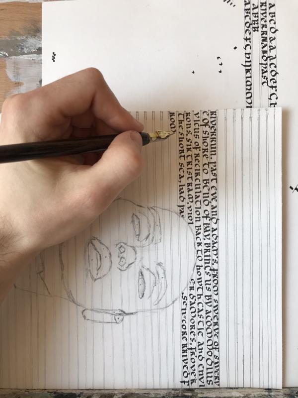
A thread for fun with versals.
-

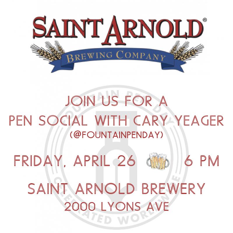
Pen Social/meet And Greet With @fountainpenday Aka Cary Yeager Houston
DromgoolesHouston posted a topic in Clubs, Meetings and Events
Hello everybody its Michael here at Dromgooles. If you are in Houston on Friday April 26th I have got the place for you to be! We are having a social/meet and greet with Cary Yeager aka Fountain Pen Day at 6pm at Saint Arnolds brewery. This is a casual hangout to meet with other like minded people, and show off your favorite inks, pens, papers etc. We are also going to be doing door prizes and giveaways of some new exciting stuff with high odds to win! Cary, isn't in town often so please stop on by to meet and hangout with him, he is a real pleasure. The "event" will run until it all fades out, so even if you only have a little bit of time, we would love to see you. Also, for those interested, we are having a pen show at the store Saturday April 27 with Anuj Poddar of AP Limited Editions and some of his new pens including the amazing bulkfiller in some, also featuring Cary, so there should be a fun crowd hanging around (10am-4pm). Snacks and drinks will be provided! If you have any questions at all please feel free to reach out and we will be glad to help!
-
Pen Social/meet And Greet With @fountainpenday Aka Cary Yeager Houston
DromgoolesHouston posted a topic in Clubs, Meetings and Events
Hello everybody its Michael here at Dromgooles. If you are in Houston on Friday April 26th I have got the place for you to be! We are having a social/meet and greet with Cary Yeager aka Fountain Pen Day at 6pm at Saint Arnolds brewery. This is a casual hangout to meet with other like minded people, and show off your favorite inks, pens, papers etc. We are also going to be doing door prizes and giveaways of some new exciting stuff with high odds to win! Cary, isn't in town often so please stop on by to meet and hangout with him, he is a real pleasure. The "event" will run until it all fades out, so even if you only have a little bit of time, we would love to see you. Also, for those interested, we are having a pen show at the store Saturday April 27 with Anuj Poddar of AP Limited Editions and some of his new pens including the amazing bulkfiller in some, also featuring Cary, so there should be a fun crowd hanging around (10am-4pm). Snacks and drinks will be provided! If you have any questions at all please feel free to reach out and we will be glad to help! -
Hi, Im Matthew from Southport. Im 46 and have just started using fountain pens again. I got a Lamy Safari as a treat to myself in January for helping my son complete a 30 day handwriting challenge. Id wanted a Safari for ages, but couldnt justify is as I hardly write anything. Now, I keep a journal, have 2 Safaris and have rediscovered my old Parker 45 I had in school. Its now in full working order and in rotation. I guess my fascination for pens comes from my dad who does calligraphy, from luxury watches and from EDC. Hope this tells you what you need to know! Matthew
-
Calligraphy lovers rejoice! Today Shanghai Jingdian started offering sets of five italic nib units that will screw into Delike pens and a few models of Moonman pens. These are currently in their Taobao store, but keep your eyes peeled for them to start showing up on eBay soon. http://m.tb.cn/h.37htpcP?sm=9758e2
-

Flex Nib Recommendations And Information
Choronzon posted a topic in Fountain & Dip Pens - First Stop
Hi all, I am looking for information and recommendations on flex nibs. I am new to FP and really liking the broad nib on my Safari. I alsa want to get into caligraphy and was looking into getting calligraphy pens when I found out about flex nibs. I love the idea, especailly what I saw on this video of the conklin empire, https://www.youtube.com/watch?v=Y0mB3GxPyhg although unfortunately the pen didn't appear to work. I would look to spend about £20 and interested out to £100. I am a bit lost at sea when searching for information so thought I would make a post. Hope this is OK. I have heard the noodlers ahab is OK, are there any other suggestions, especially if it can go very broad like the conklin empire. -
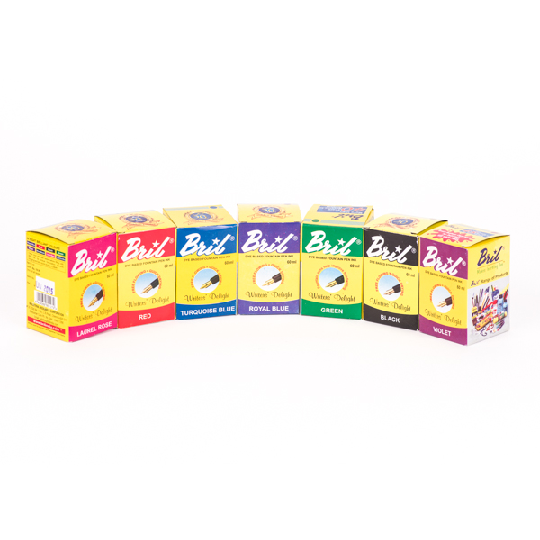
Fountain pen lovers, Bril, India's leading fountain pen ink brand will ship internationally in 2019 and we have just started a Global Handwriting Movement to make children write properly again. Our crowdfunding campaign has awesome perks whether you are an adult who loves world-class, pocket-friendly ink and fountain pens or you want your kids to learn to write the proper way. Do visit our Indiegogo campaign and support us, so we can ensure that the dying art of handwriting is brought back to life again, and our children's lives are enhanced in more ways than one! Thank You! :-) https://www.indiegogo.com/projects/bril-ink-make-children-write-again#/
-
Finger Writing Vs Arm Writing,what Is The Right Way?
Edo98 posted a topic in Calligraphy Discussions
Hello everyone. I have been practicing cursive since I was a child but not long ago I was researching how to improve my handwriting and I found that some people use the cursive they call handwriting.I write with my fingers and I really do not know if I'm right or wrong.So I ask you to compare which ones with the advantages and disadvantages of these two writing techniques.I have no idea how it is to write using the whole arm sounds complicated -
Hello, I have been considering some different flex pens for copperplate and as I can already write with a fountain pen and messed about with some of my friends flex pens, which pen would be better. I am looking mainly at either a modified fountain pen with a zebra g nib, a cheep calligraphy set or a vintage Conway Stewart 759. Any help would be appreciated.
-
I'm thinking about buying a Desiderata Pen for Copperplate calligraphy. Most of the time, I use a proper pointed dip pen and calligraphy ink for Copperplate, but sometimes I'm lazy and use a Noodler's Ahab for practicing so I don't have to clean my nibs. Plus it's a good way to use all this fountain pen ink I have! I'd like to find a flex nib pen that gets a closer feel to a true pointed pen. If you have experience with a Desiderata Pen, can you do Copperplate with it? How is the experience of using the pen? Will the feed be able to keep up with the flexible nib ink flow? Thanks so much to anyone who can help!
-
First of all greetings to all I am new at The fountain pen network and in the magnificent world of fountain pens at the moment I only have one lamy logo and within a month I will get a 2000 lamy. I am a young man of 20 years old who since childhood my mother taught me the art of writing. I use the palmer method to write and I love it and more when I use stub nibs because of the effect of line variation.And I've had some curiosity about trying out new calligraphy styles like Spencerian or Copperplate and I really do not know which one to start with first and which one is going to make it easier with Palmer's bases.and with respect to the tools that are used I have never used flexible nibs I have only used round and stub, I do not really know how hard a flex is.So what do you recommend? Is it worth trying or should I continue with palmer?I also leave some samples of my handwritingDocumentos escaneados.pdf
-
I was born in Dec 1972 in Cairo , Egypt , I have graduated from the faculty of specific Education , communication Branch , Ain Shams University since 1995. I began my discovery of calligraphy, when I heard about ACI ( Arabic Calligraphy Institute ) in Cairo, I decided to join it, I have studied all kind of Arabic Calligraphy art for 6 years. I have awarded a Diploma in Arabic Calligraphy and gilding since 2005, and I gained a Certificate to teach Arabic Calligraphy in Elementary schools. ACI made me really understand the letters,how they are built up and relate to each other I did my best to learn it . I have been fascinated with Arabic calligraphy styles , specially Thuluth style, because it is the most attractive and captivating Style in Arabic Calligraphy , it has a complexed and intertwined lettering , but has a charming view , at the same time. I have learned Styles of Arabic Calligraphy which include Naskh , Reqaa, Kufi,Dewani, Farisi and Thuluth, Each Style has its own characteristics. My love and infatuation with Arabic calligraphy led me to take more steps towards learning the logo design to serve the business sector who may need the Arabic calligraphy art interweaved with logo design. I have designed many Logos for Companies and corporations all over the world. I have a website on Arabic Calligraphy
-
Scroll Modified Pilot Parallel Pens are now available in 2.4, 3.8 and 6.0 mm sizes. (Buy Now) The 3.8 mm and the 6.0 mm sizes can be ordered with either 2-line or 3-line modification while the 2.4 mm is only available with a 2-line modification. These pens are a lot of fun and add a new dimension to your Calligraphic projects. We will be happy to do a left oblique modification on any of these pens - just drop us a line. - Salman