Search the Community
Showing results for tags 'calligraphy'.
-
From the album: j1tters
A self-correction note: the horizontal strokes are a little unevenly spaced in 首 in the regular script, and perhaps the 辶 shouldn't be touching the 首; not the easiest character to write. In hindsight I really should be practising the characters on a spare sheet of paper before writing this in my journal. But I guess I am too lazy to have done that. I may (or not!) try to be more mindful next time.
- 0 B
- x
-
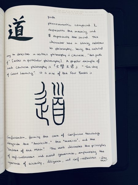
Doing some Chinese character studies of the most commonly used characters. I intend to do one a day for at least 1000 characters! It's fun and you should totally join me in this journey! Feel free to do your own character study and post it in the gallery (or here in this thread)! Today I will do the character 的. In Chinese, the character 的 is one of the most commonly used characters and serves several grammatical functions. Its primary usage is as a possessive particle, indicating possession or association. Here's a breakdown of its main functions: 1. Possessive Particle: 的 is commonly used to indicate possession or association between nouns. For example: - 我的书 - "my book" - 他的车 - "his car" - 中国的文化 - "Chinese culture" 2. Adjectival Modifier: 的 can also be used to turn a phrase or clause into an adjective to modify a noun. For example: - 美丽的花 (měilì de huā) - "beautiful flowers" - 好吃的食物 (hǎochī de shíwù) - "delicious food" 3. Nominalizing Suffix: In some cases, 的 is used to turn a verb or a phrase into a noun. For example: - 做饭的 (zuòfàn de) - "the one who cooks" or "cooking" - 看书的 (kànshū de) - "the one who reads" or "reading" 4. Emphasizing Possession: Sometimes, "的" is used for emphasis, especially in written or literary contexts. For example: - 他的书 (tā de shū) - "his book" (standard) - 他书的 (tā shū de) - "his book" (emphasizing possession) 5. Part of Compound Words: "的" is also used as a component in many compound words and phrases, such as "的确" (díquè) meaning "indeed" or "certainly," or "安全的" (ānquán de) meaning "safe." Overall, "的" is an indispensable character in Chinese, playing a crucial role in indicating possession, forming adjectives, nominalizing phrases, and more. Its versatility and frequency of use make it an essential element of the language. Pens/Inks: Kuretake Fountain Pen Brush No. 50 with original pigment cartridge, Pilot Prera F with Pilot Black Paper: A5 Stalogy 365 full year size Notes: I will be using both traditional and simplified characters, view at your own discretion. This is not a lesson in Chinese language, will be mostly focusing on the calligraphy and aesthetics. I will do the calligraphy in traditional character and brief explanation in English scattered with traditional or simplified Chinese. In addition to the regular script, I will experiment with other scripts like the ancient "small seal" script.

-
From the album: j1tters
Doing some Chinese character studies of the most commonly used characters. I intend to do one a day for at least 1000 characters! It's fun and you should totally join me in this journey! Feel free to do your own character study and post it in the gallery! Today I will do the character 的. In Chinese, the character 的 is one of the most commonly used characters and serves several grammatical functions. Its primary usage is as a possessive particle, indicating possession or association. Here's a breakdown of its main functions: 1. Possessive Particle: 的 is commonly used to indicate possession or association between nouns. For example: - 我的书 - "my book" - 他的车 - "his car" - 中国的文化 - "Chinese culture" 2. Adjectival Modifier: 的 can also be used to turn a phrase or clause into an adjective to modify a noun. For example: - 美丽的花 (měilì de huā) - "beautiful flowers" - 好吃的食物 (hǎochī de shíwù) - "delicious food" 3. Nominalizing Suffix: In some cases, 的 is used to turn a verb or a phrase into a noun. For example: - 做饭的 (zuòfàn de) - "the one who cooks" or "cooking" - 看书的 (kànshū de) - "the one who reads" or "reading" 4. Emphasizing Possession: Sometimes, "的" is used for emphasis, especially in written or literary contexts. For example: - 他的书 (tā de shū) - "his book" (standard) - 他书的 (tā shū de) - "his book" (emphasizing possession) 5. Part of Compound Words: "的" is also used as a component in many compound words and phrases, such as "的确" (díquè) meaning "indeed" or "certainly," or "安全的" (ānquán de) meaning "safe." Overall, "的" is an indispensable character in Chinese, playing a crucial role in indicating possession, forming adjectives, nominalizing phrases, and more. Its versatility and frequency of use make it an essential element of the language. Pens/Inks: Kuretake Fountain Pen Brush No. 50 with original pigment cartridge, Pilot Prera F with Pilot Black Paper: A5 Stalogy 365 full year size
- 0 B
- x
-
From the album: j1tters
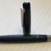
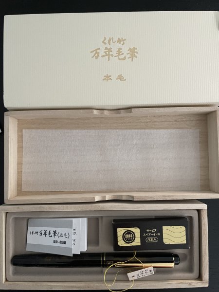
Pen: Kuretake Fountain Brush Pen, Model No. 50 Paper: Hobonichi Original TR Ink: Pigment ink cartridge that came with the pen, Kuretake-branded A first test. The ink began almost immediately (there's no feed like in fountain pens to go through, I suppose). Initially, the ink appeared brown due to residual oil, but gradually turned into a true black. Initial impressions: love the pen, and the ink that came with it. It feels like this ink will be friendly on all papers as it is fairly dry (but still writes smoothly/wetly, an insane combo). I mean the ink probably still has a lot of residual factory oil in it, and still no feathering/showthrough/bleeding? Come on. I swear I don't work for Kuretake (I wish), but starting to become one of my fav stationery brands!
- 0 B
- x
-
-
I just found this mini-documentary on YouTube and found it fascinating so I thought I'd share it.
-

Exploring Chinese Calligraphy with Fountain Pens: Share Your Experiences!
2ouvenir posted a topic in Calligraphy Discussions
Greetings fellow fountain pen enthusiasts! I'm starting this thread to connect with others who share this interest and to learn more about your experiences with Chinese calligraphy using fountain pens. Whether you're a seasoned practitioner or just dipping your nib into this art form, I'd love to hear from you! Here are a few prompts to get the conversation going: How did you first become interested in Chinese calligraphy? Do you actively practice Chinese calligraphy with your fountain pens? If so, what pens and inks do you prefer? What challenges have you encountered when adapting Chinese calligraphy techniques to fountain pen writing? Are there any particular resources, books, or online tutorials that have helped you improve your skills? Do you have any favorite Chinese calligraphy styles or scripts that you enjoy writing the most? Feel free to share tips, tricks, favorite tools, or simply your thoughts and experiences. Let's explore the world of Chinese calligraphy together and celebrate the beauty of writing with fountain pens! Personally, I just use a regular Japanese fine for all my Chinese "calligraphy" (some might argue you can only do Chinese calligraphy with an ink brush, I differ) and any fountain pen friendly paper with a light grid layout. The ink should be legible, i.e. not too light. A tip I have is to do reverse writing (if your fountain pen allows) for characters that are extremely complex like 鬢 to get all the details within the confines of your grid, if you decide to have all your characters have the "same size" and equally spaced apart. Before, I go, some inspiration: Looking forward to hearing from you all! Warm regards, 2ouvenir -
I recently acquired a bottle of Diamine's gold Drawing & Calligraphy Ink (acrylic base) and a bottle of Dominant Industry's Hologram (unknown base but smells a lot like Testor's enamel paint). I am hoping to inspire (in myself) more dedicated calligraphy practice and give myself a chance to increase my range of paper color options. I gave both inks a vigorous shake prior to opening the bottles and grabbed some nib holders. Then came the problem: both inks want to dry on the nibs faster than I can get them transferred to paper. I managed to struggle my way through what could loosely be called "writing" but it was a frustrating experience. I realize that most inks won't last very long on the nib (ie, I was expecting to have to dip the nib into ink several times to complete a word, sentence, or sweeping decoration) but I was having difficulty in lining a single 5mm downstroke with a Jinhao medium nib on some grid paper. I don't think there is anything wrong with the inks, per se. I've seen videos where Hologram gives other people (presumably more talented than I) some troubles. The Diamine Gold is cheap and the Hologram is very... experimental...ish? I assume that they aren't high-end options but any ink that isn't water-based is a new beast to me. The Diamine ink would immediately start to separate and needed to be mixed often but in all other respects the inks behaved admirably. Does anybody have experience with these types of inks and can offer tips and tricks? Do certain nib materials or shapes work better than others? Are nib holders the best way to go? or brushes? Can they be thinned and put through an air brush?
-
David
-
Hi, I just posted a new YouTube review of the Pumix Calligraphy Fountain Pen Set. I don't think it is as good as the Lamy set, but it is cool that you can put the nibs they give you onto other Pilot pens and also the Wing Sung 3013. It is quite affordable and it is a good way to get italic/stub nibs for something like the Metropolitan or the Explorer.
-
From the album: First look
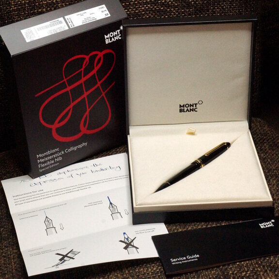
I know I said I wouldn't get this, if for no other reason that it's a Montblanc.© A Smug Dill
- 0 B
- x
-

Third edition of Jaqueline Svaren's classic "Written Letters"
dms525 posted a topic in Broad (or Edged) Pen Calligraphy
The third edition of Jaki's book has just been released! For more information, see: Enjoy! David -
Third Edition of Jaqueline Svaren's classic "Written Letters"
dms525 posted a topic in Handwriting & Handwriting Improvement
The new edition is finally released. For more details, see: David -
The third edition of Jaki Svaren's classic calligraphy and paleography book has just been released. This edition is very similar to the long-out-of-print second edition with some improvements in design. It is slightly larger in format, including the handwritten text, and it is spiral-bound, so it lies flat when opened. Many of us old folks learned from the earlier editions and treasure them. Now, this masterpiece of calligraphy history and instruction will be available to a new generation of those interested in beautiful writing through the ages. One of the best features of this book is that Jaki includes the ductus for each letter of each alphabet, along with comments about the choices one makes in forming written letters and about special techniques used. Jaki was a student of Lloyd Reynolds at Reed College in the 1950's and has had a long and distinguished career as a professional calligrapher and calligraphy teacher. For your interest, here are photos of the cover, title page and table of contents. And here is an example of why (pun intended) I think this is such a great resource: This book is available now through John Neal Booksellers. Enjoy! David Full disclosure: I have no financial interest in this product. I am a graduate of Reed College. I took a class from Lloyd Reynolds. I know Jaki Svaren socially through Reed College calligraphy events. The book was produced by the Curator and Director of the Cooley Art Gallery of Reed College, Stephanie Snyder, who is my daughter-in-law.
-
A third edition of Jaqueline Svaren's classic calligraphy reference book, "Written Letters," is about to be released. More details can be found in the Handwriting Section in the following topic: Enjoy! David
-
A third edition of Jaqi Svaren's classic book of calligraphic hands with historical, technical and philosophical annotations is about to be released. "Written Letters" originally had instructions for 22 historical and modern calligraphic scripts. The second edition had 33 scripts. The third edition has a new introduction and other new content, but I do not have details on what has been added. Jaqueline Svaren was a student of Lloyd Reynolds in the 1950's. She has worked as a professional calligrapher and teacher of calligraphy. In my opinion, her book is a treasure. The third edition of "Written Letters" is now available for pre-order through John Neal Booksellers. Disclosure: The editor and designer of this book is my Daughter-in-Law, Stephanie Snyder. She is Director and Curator of the Cooley Art Gallery on the Reed College campus in Portland, Oregon. She nor I have any financial interest in this publication. David.
-
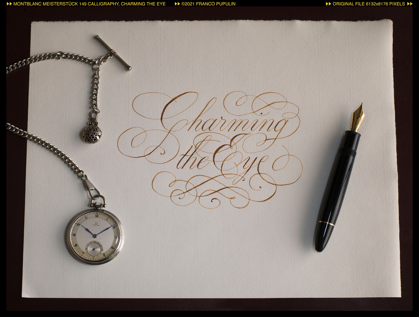
What does calligraphy do? Rounds the letters and make them flourish, engrosses the strokes here and there and transforms the words into painted shapes… It charms the eye. I wrote the first sheet with the Montblanc 149 Calligraphy and the Black Permanent ink that I have been using for a year in this pen, alternating it from time to time with Blue Permanent. I took advantage of the nice choice offered by Hahnemühle's Ingres pad, with its laid paper in nine different colors, ranging from pure white to slate gray and dark hazelnut. For the theme of “enchantment”, it seemed interesting to me to use one of darker sheets, with an almost burnt color. To further increase the sense of mystery and charm for the eye, I decided to add the drawing of a "magic symbol". The symbol is an unpretentious invention, the synthesis between different figures that are used to populate the world of magic and mysteries. But the enchantment of Calligraphy is actually white magic, innocent, sunny and bright like the beautiful shapes of letters and the intertwining of words. So I decided to make a new version of the text, on a light and bright sheet of paper. For this reason, and taking advantage of the fact that the ink of my Calligraphy was now on the point of running out, I filled it, for the first time in a year, with a light ink: Diamine Golden Brown. I quite like the effect... It seemed interesting to me how the mood suggested by the two sheets, even with the same text, can be so different, and I hope it may have seemed curious to you too.
-
Does anyone know what happened to the Montblanc Calligraphy ink - red version? I've seen a few photos. I've seen listings at stores that were then taken down. I've seen no writing samples, no one saying they have purchased it. Was this ink ever actually released? Does it exist?
-
Shadow nibs make for interesting writing, but they are really a useful tool when learning a script written with a broad nib. They make your nib angle and stroke direction more obvious. Thus, they make it easier to identify (and correct) errors. David
-
Shadow nibs make for interesting writing, but they are really a useful tool when learning a script written with a broad nib. They make your nib angle and stroke direction more obvious. Thus, they make it easier to identify (and correct) errors. David
-
desaturated.thumb.gif.5cb70ef1e977aa313d11eea3616aba7d.gif)
Pilot Steel Italic Nibs Of Different Widths
A Smug Dill posted a topic in Fountain & Dip Pens - First Stop
Now that it is possible to buy Pilot Plumix pens — which are fitted with broad-edged nibs — with different (F, M and nib widths, I bought a new set (as opposed to the old three-pack all fitted with M nibs; I still have another one of those sitting in a drawer unopened, although Amazon Australia don't seem to sell them any more), with the expectation that I might use them as nib donors for three new Prera pens, which have remained unopened for over a year because in themselves they aren't such interesting pens. This is how they write, compared to the standard round-tipped F and M nibs on the Pilot MR (or Prera, 78G, etc.): I now have a second set of those pens on order, after seeing the results! -
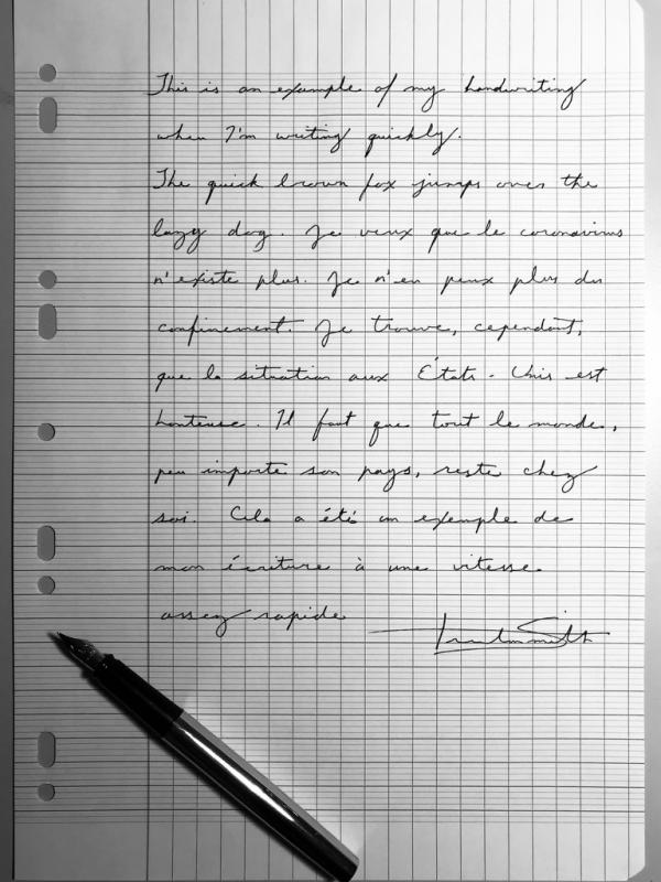
I’m here to discuss what I have found to be the most efficient ways of producing beautiful handwriting as a left-handed person. I have tried and am familiar with numerous writing positions known to lefties including underwriting, side writing and overwriting (hooking). What I present to you is not the sole way of going about lefty calligraphy, it is simply what has worked best for me and some of the most capable left-handed calligraphers. If you find another method that works well for you, if you’re getting positive results, great! Do that if it works. I hope this will be of help to some of my fellow lefties. Let’s make one thing clear: lefties are just as able as right-handed people to produce beautiful writing. If the proper positions are used, any type of calligraphy is possible. If one searches thoroughly enough, one can actually find a decent amount of information regarding left-handed calligraphy and left-handed writing in general. Unfortunately, little of this information is standardized (especially on online forums), and a good portion of it is misleading. I’ll start with something that causes perhaps the most confusion: scrips that require a broad nib like gothic, uncial, etc. In this case, I turn the paper 90 degrees clockwise and write vertically toward myself. The advantage of this is twofold; I never have to worry about smearing ink, and I can use a standard-cut broad nib (straight across, not an oblique) to achieve the proper angles desired. This puts me at exactly the same angle as a right-handed calligrapher. The only thing you might have to get used to is seeing the letters vertically. Tip: While practicing, turn your reference script (if you’re using one) 90 degrees as well so as to familiarise yourself with what the alphabet looks like at this angle. It’s very possible to use a left oblique nib. In this case, one should angle the paper clockwise at around 45 degrees. The paper should be positioned slightly to one’s left. This produces the proper angle. I prefer to write vertically at 90 degrees because it seems like the angle is more stable and it allows me to use a standard broad nib (not a right cut oblique, however). I highly recommend watching this video concerning the subject: https://www.youtube.com/watch?v=NrCFFt9uac0 Let’s talk about pointed pen calligraphy. There are two very effective methods: using a straight holder and writing under the writing line (this naturally achieves the correct line thickness), or using a right oblique nib holder and angling the paper clockwise somewhere between 45 and 90 degrees, the latter of which one is essentially writing vertically under the line as in the previous section on broad nibs. I go back and forth between the two methods. I think both are completely acceptable and efficient for pointed pen work. I will say, however, that making flourishes seems to be easier using an oblique holder. Here’s a demonstration by the wonderful left-handed penman John DeCollibus: https://www.youtube.com/watch?v=TOjh0SkwyCM As for standard cursive writing, I tend to angle the paper clockwise and write under the line. This works very well if you’re a frequent user of fountain pens as you won’t have to worry about which ink to use, nib size, flex, etc. With this position, any combination of nib, paper and ink work well. You might have noticed that all of the positions that I’ve discussed are “underwriting” positions. That’s what I use and what I esteem to be the most effective technique for lefties; however, this doesn’t make other forms of lefty writing like side writing or hooking incorrect. Unfortunately, in many calligraphy books the sections dedicated to lefties are often short and lacking in detail. There are very few books dedicated solely to the left-hander. Nevertheless, here are a few helpful resources on left-handed writing and calligraphy: Left-handed calligraphy by Vance Studley. The Calligrapher’s Bible: 100 Complete Alphabets and How to Draw Them by David Harris. The Italic Way to Beautiful Handwriting: Cursive and Calligraphic by Fred Eager Calligraphy 101 by Jeaneen Gauthier https://www.iampeth.com/lessons/left-handed https://www.nibs.com/content/left-handed-writers This has been a quite lengthy post, but I hope that you got something out of it. If you have any questions, feel free to contact me. For calligraphy and art related things, find me on Instagram @trsmith_art Best, Trenton Smith
-
I am opening this topic in this forum, because the Montblanc forum is one of my favorites on this network, but not only. In fact, I present an exercise, which was born to give my ideas a calligraphic shape, made with two of my Meisterstück 149, the recent Calligraphy with its beautiful flexible nib and another 149 with BB nib, a pen from 1984. And on the same sheet I also present a drawing, made with the Calligraphy pen, which engages in a self-portrait and a portrait of her sister with the double bold nib. Very Montblanc, as you can see ... An anecdote about the realization of this operetta. I drew the second pen, the one next to the cap, after shading the first one on the right. While drawing, it is frequent to turn the sheet to give it the best orientation with respect to the position of the hand and to be able to execute the lines without hesitation. On various occasions, as I moved the paper, I perceived the pen drawn on the right out of the corner of my eye and I got ready to grab the pen before it rolled off the table, ha ha ha ... Deceived by my own trompe l'oeil! The second frame adds nothing to what we already know from the first, but the light reflected by the chronograph dial was so magical that I had to photograph it, and now share it with the friends of the forum.
-
 Hello. I'm wondering what dip pen nibs should a beginner that is serious about learning purchase? I'm okay with spending a decent amount of money if the quality justifies the price, considering I don't plan on randomly dropping the hobby and I'm absolutely *determined* to get good at calligraphy. Also: Does it matter what nib holder I purchase? If so, what would you guys recommend (for both a straight holder and an oblique holder)? Thanks in advance for any responses. =)
 -
My appreciation for writing instruments began in college while taking a calligraphy class some 30-odd years ago. I later began a career as a draftsman (Think T-squares, triangles, rotary erasers, lead holders, pens & mechanical pencils). Over the years I've dabbled in design & sales until landing in a management position. I do travel for my company and before each trip, I research and pen stores/shows within driving distance. It is physically impossible for me to leave a pen shop without buying something.