Search the Community
Showing results for tags 'burnt orange'.
Found 5 results
-
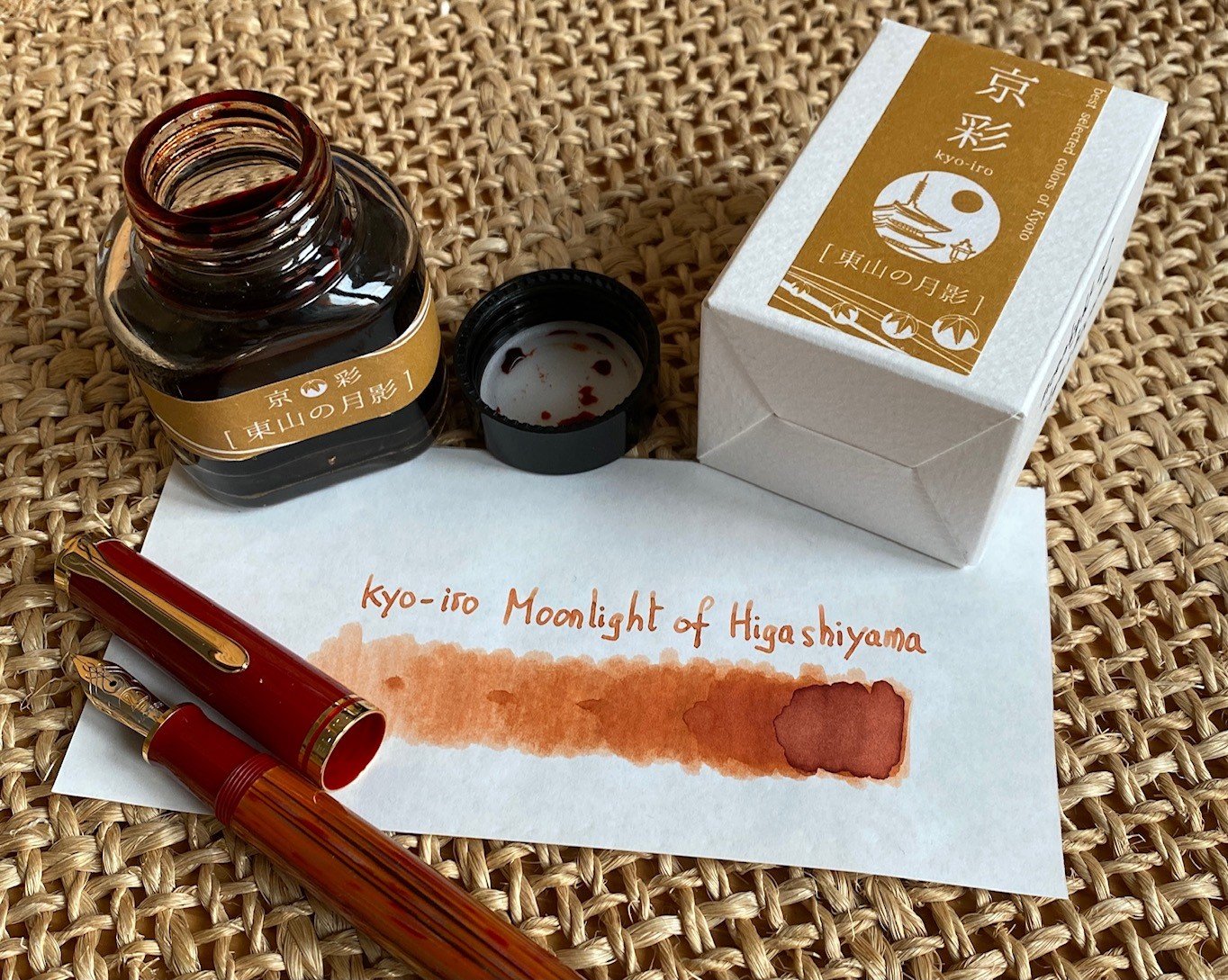
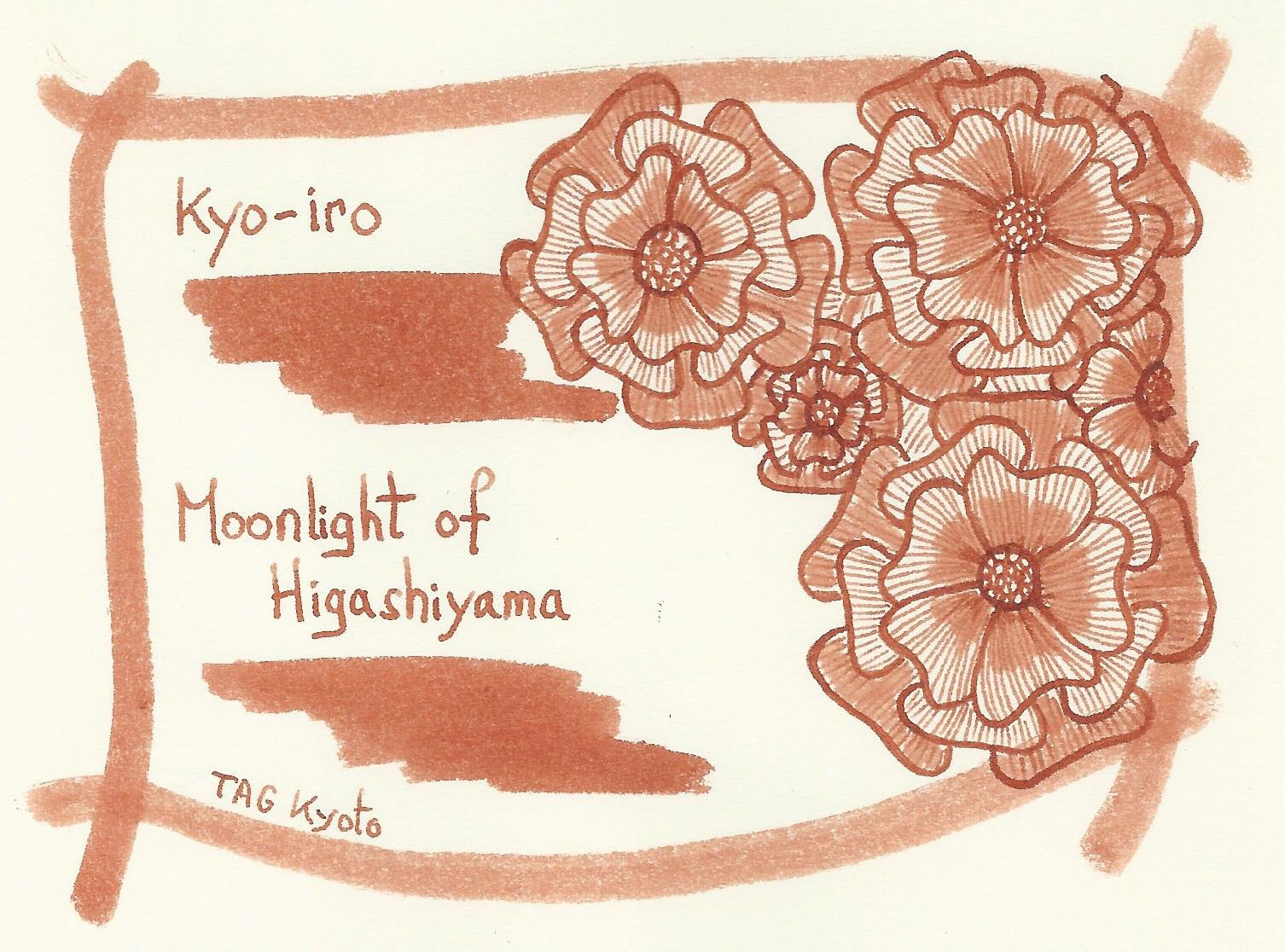
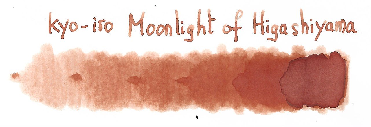
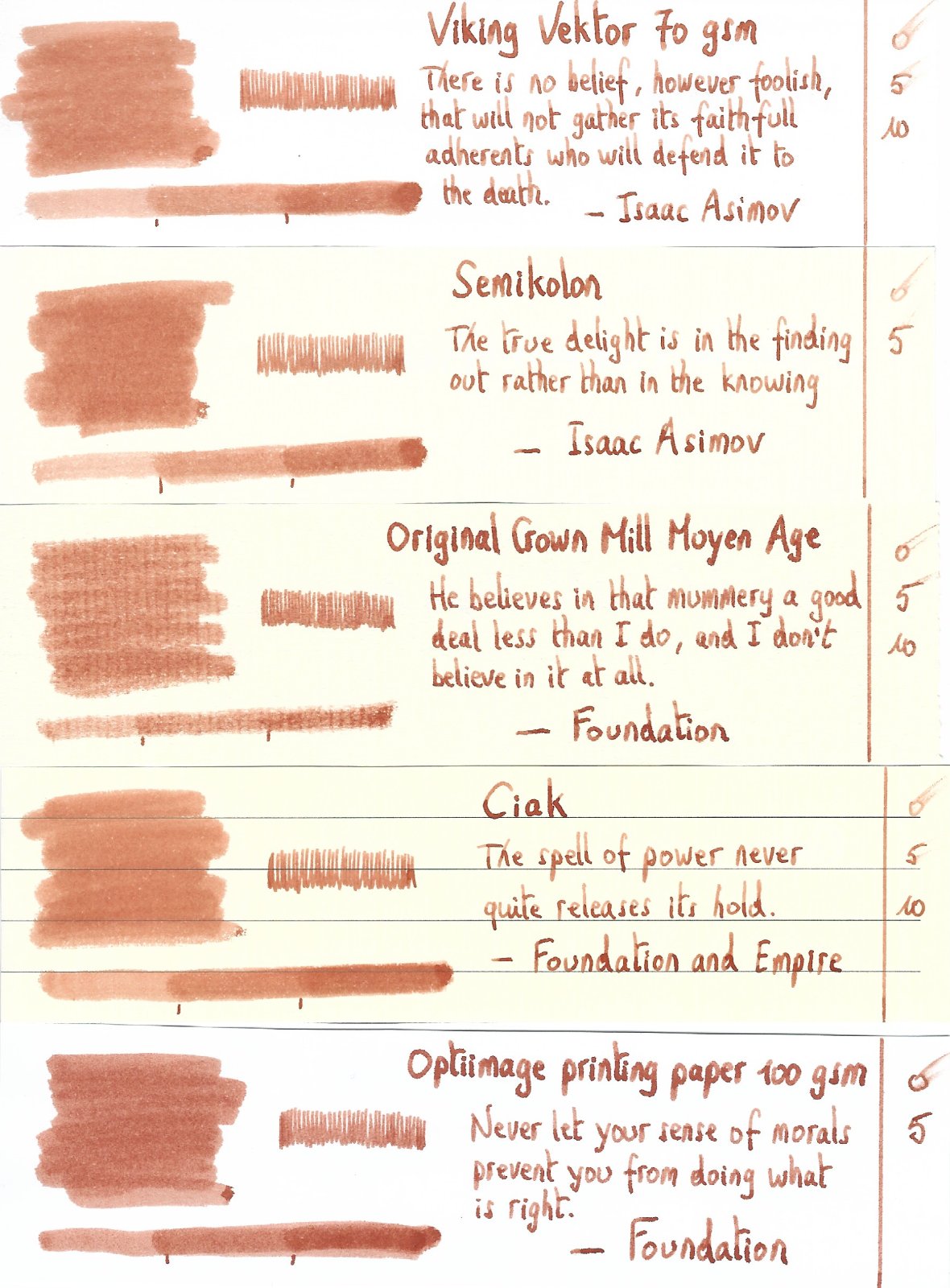
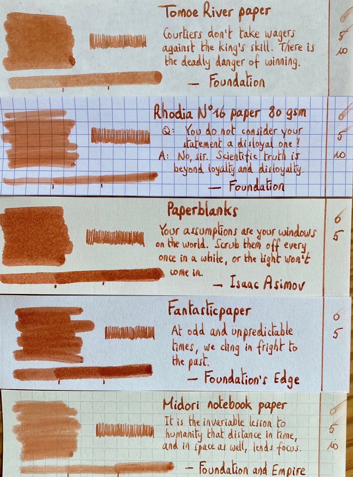
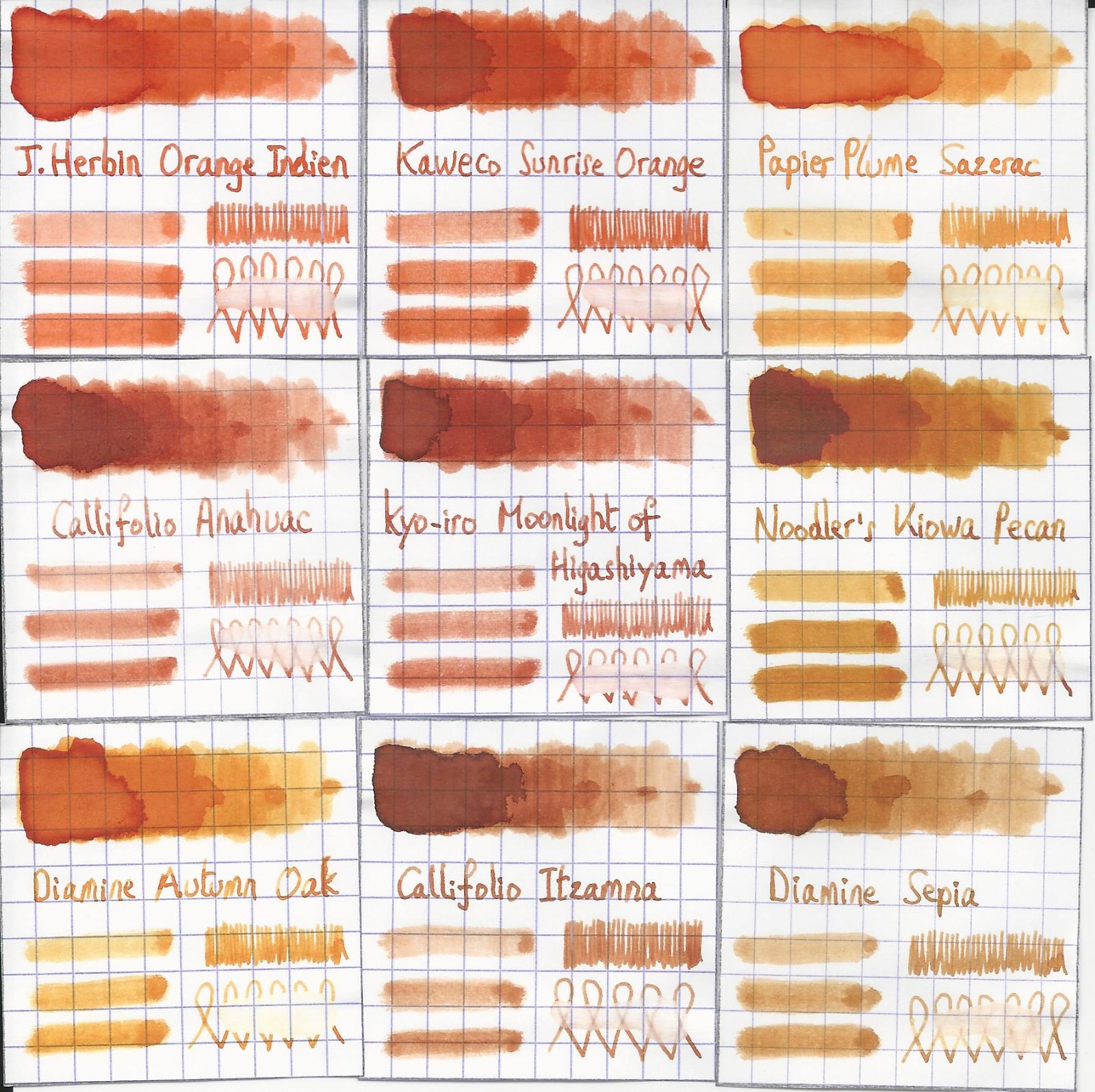
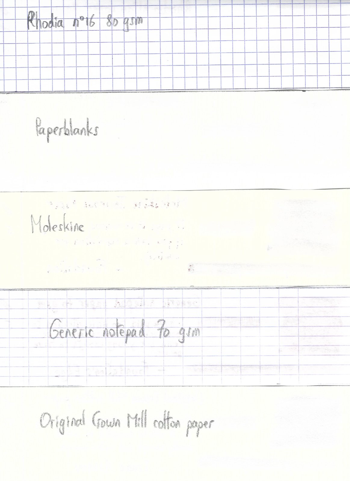
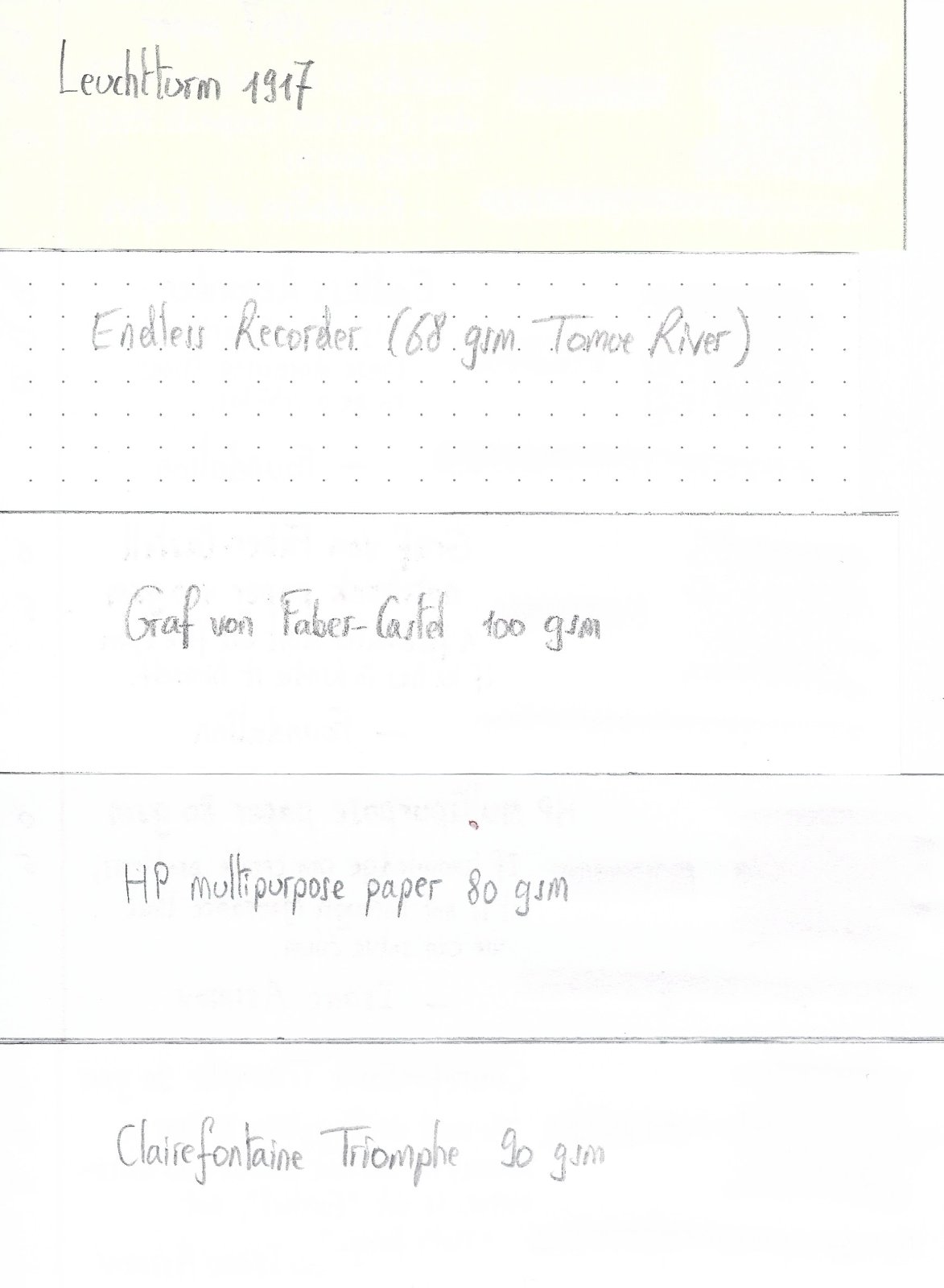
TAG Kyoto – kyo-iro – Moonlight of Higashiyama TAG is a stationary shop in Kyoto (Japan) that produces some interesting soft watercolour-style inks. With the kyo-iro series they produce a line of inks that that are inspired by the city’s many beautiful and historic sights. Each of these inks is dedicated to a specific town in the Kyoto area. The inks come in 40 ml bottles, packaged in luxurious thick paper with a texture that feels like heavy watercolour paper. In this review I take a closer look at Moonlight of Higashiyama. This ink’s colour is a warm burnt-orange, that is inspired by the traditional wooden Machiya houses in Kyoto’s historic Higashiyama district. Like many TAG Kyoto inks, this one looks subdued and delicate, with tons of shading. And the shading is really well executed: very present, but never too harsh. My first impression: a seducing beauty, that is ideally suited for wintertime journaling. There is big but though… this ink is really dry (about on par with kyo-no-oto hisoku), which will probably be a show-stopper for some. Adding a bit of flow-aid solves the lubrication problem, but also results in increased saturation which completely destroys the delicate nature of the ink’s colour. So I hunted for a workable pen/nib/ink combination, which I found with my new treasure: a Pelikan M600 Tortoiseshell Red with M-nib. Here the ink writes with quite tolerable lubrication; still dry but no longer uncomfortable. Moonlight of Higashiyama is a soft ink with moderate saturation. Still, it produces a very readable line on paper, even with the finer nibs. Bear in mind: with EF/F nibs writing is a scratchy affair due to the ink’s dryness and writing is definitely not a pleasant affair. The ink works well with both white and more yellow paper. Personally I prefer this ink on the more yellow paper – the yellow/orange combination enhances the softness of the ink. To show you the impact of saturation on the ink’s look & feel on paper, I made some scribbles where I really saturated portions of the Tomoe River paper with ink. This gives you a good idea of what the ink is capable of in terms of colour range. Moonlight of Higashiyama has a limited colour span, which translates to soft shading. Very elegant and eye-pleasing – I like this ink’s shading a lot. The ink’s chromatography shows yellow, orange and red tones. It also indicates that the ink’s dyes are only loosely attached to the paper. This is clear from the bottom part of the chroma: almost all colour dissipates with water. This already indicates that Moonlight of Higashiyama has no water-resistance to speak of. I’ve tested the ink on a wide variety of paper – from crappy Moleskine to high-end Tomoe River. On every small band of paper I show you: An ink swab, made with a cotton Q-tip 1-2-3 pass swab, to show increasing saturation An ink scribble made with an M-nib Lamy Safari The name of the paper used, written with a B-nib Lamy Safari A small text sample, written with the M-nib Safari Source of the quote, with a Pelikan M600 with M nib Drying times of the ink on the paper (with the M-nib Safari) The ink looks great on all papers, but – as I already mentioned – I prefer its looks on the more yellowish paper. See-through and bleed-through are not a problem. Only with the Moleskine paper did I get visible bleed-through. Drying times are in the 5 second range with the Lamy Safari M-nib. The ink has a tendency to feather a bit on some papers in my test set. Unexpectedly, I also noticed some feathering on the Paperblanks paper, which is usually very fountain-pen friendly. Because scans don't always capture an ink's colour and contrast with good precision, I also add a few photos to give you an alternative look on the ink. Writing with different nib sizes The picture below shows the effect of nib sizes on the writing. Moonlight of Higashiyama writes with good contrast in all nib sizes, but feels horribly dry in the EF/F nibs. I like it best in a wet Pelikan M600 with M-nib – here is still looks subtle and elegant and with beautiful shading, while also loosing enough of its dryness to make for pleasant writing (word of warning: I have a high tolerance for dryness, so what I consider pleasant may not fit your definition). Related inks To compare Moonlight of Higashiyama with related inks, I use my nine-grid format with the currently reviewed ink at the center. This format shows the name of related inks, a saturation sample, a 1-2-3 swab and a water resistance test – all in a very compact format. Callifolio Anahuac comes close in colour, but shows harsher shading. Inkxperiment – Kindergarten I love to experiment with my inks in an artistic context. With my inkxperiments, I limit myself to the single ink I’m reviewing, allowing me to explore all of its colour range nuances. This is the part where I play with the ink, experiment with drawing techniques, and just have loads of fun. For this review, inspiration comes from the drawing of a lion that the youngest member in the family brought home from Kindergarten. “Kindergarten” … the word triggered an association: a child’s drawing in a garden setting. Et voilà, this inkxperiment was born. I started with a piece of A4-sized HP photo paper. This has become one of my favourite media for ink drawings. The photo paper really enhances any ink’s colour, making it look that much more vibrant. I created the background using a piece of kitchen sponge. Next I drew in the lion’s mane, and added flower stems. As a final step I used my fountain pen and a glass dip pen to add structure to the lion’s mane of the three flowers and to draw in the lions faces. The end result is my Kindergarten, which shows what can be accomplished with Moonlight of Higashiyama as a drawing ink. In my opinion: an ink with lots of potential for artistic purposes. Conclusion TAG kyo-iro Moonlight of Higashiyama has a beautiful burnt-orange colour. A soft-looking and elegant ink, warm and glowing, and ideal for winter-time journaling. But also: annoyingly dry and with a slight tendency to feather. Hunting for the right pen/nib/paper combination is a must with this ink. But still… I personally like the looks of this kyo-iro ink a lot, and really appreciate its potential in more artistic settings. Not an ink for everyone, but for me Moonlight of Higashiyama totally works. Technical test results on Rhodia N° 16 notepad paper, written with Lamy Safari, M-nib Back-side of writing samples on different paper types

-
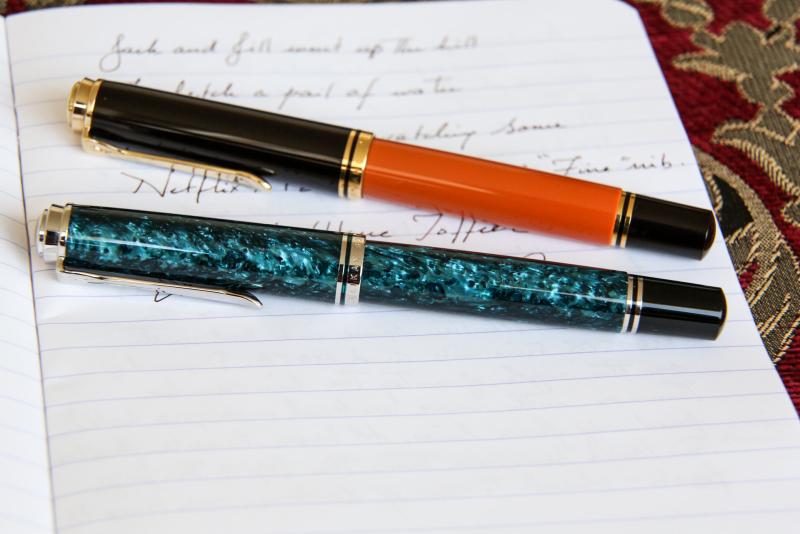
The M805 Ocean Swirl is a stunning yet controversial 2017 Special Edition from Pelikan. While my initial view was ambivalent, in actual use, the pen has moved into the same vaunted category as the understated, equally variable, City Series San Francisco. I was fortunate enough to see seven copies among the local DC/MD stores and two additional copies from Pen friends; 9 in total. Particular thanks goes to Pen Boutique for helping me land mine. Pattern and Color Distribution: Some posts seem to hint that some pen copies may have "nearly" 100% blue-green and others verging on total black. Not what I saw and may be due to range in perception. All 9 copies had clear bands of fluorescent blue-green swirls alternating with darker bands of shimmering deep blue-black occurring in approximate quarters as a constant. None of them were nearly one color, and certainly not pitch black (see a true black pen comparison side-by-side below). Granted, as a matter of degree, two copies leaned toward the darker side a tad more, but most were ~50/50 distribution, or close. The fluorescent bands are striking when light hits them and depending on the warmth there is a bit of green peaking through, but to me its a blue-leaning teal or brilliant turquoise in most instances (Yama Dori calls!). Pattern Alignment: Much has been made of the alignment or the lack there of between the fluorescent and darker bands in some copies. This is true. Not all the pens had aligned-patterns, but most seemed to have at least one vibrant band that aligned upon choosing the right cap-thread. I am sure there are some cap/body combos out there that do not align at all, along any thread. If this is important, seeing pens in person, or getting pics may help, but unaligned patterns look quite nice to my eye when in actual use. My copy does align, but when misaligned purposefully, the darker cap still looks elegant to me (pic below). YMMV. Work-appropriateness: almost black, but not quite My Ocean swirl saw more use simply because it was not a pen that immediately attracted attention, but still had a subdued elegance about it. In conservative settings, pulling out even a marginally showy pen, may go without comment but not without notice. This pen is work appropriate. In comparison, the Burnt Orange frequently invites comment (lovely nonetheless). Dr Jekyll and Mr Hyde Two's Company: Here's the Ocean Swirl next to the somewhat showy Burnt Orange Nib: I chose a Fine nib. Luckily, it turned out to be a true fine, not "Pelikan- Fine". My take on it: The color pattern is truly beautiful and unique. The pattern alignment issue can't be helped unless there is a way to nail down each body to a specific cap all the way through the supply chain and retail counters: fairly a tall order once it leaves the Pelikan factory given the number of hands that may handle them. Also when misaligned, the black cap contrast actually looks ok to me in actual use, YMMV. There are scores of pens out there that cover the whole pen with a single mosaic pattern from countless manufacturers including Pelikan (M620 Chicago anyone?). What's novel in that? This is more of a brave choice from Pelikan that is fairly subtle and renders a different look from one lighted room to another. Yet I doubt they will ever try this again. Cheers!
-

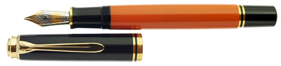
Which Pelikan? M800 Burnt Orange Or M800/m805 Blue Striped
mfyorulmaz posted a topic in Fountain & Dip Pens - First Stop
Hi guys, I am trying to select my next Pelikan. I have reduced down my choices to three: 1-M800 Burnt Orange and M800/M805 Blue Striped. Burnt Orange has a very attractive warm color which I really like. 2-M800 Blue Striped with Gold Trim 3-M805 Blue Striped with Rhodium Trim Which one would you choose and why? Thanks
-
We have received a small amount of the lovely Pelikan Special Edition M800 Burnt Orange fountain pens. We offer these for € 440.- (including the German VAT) or € 369,75 without the German VAT. Should you have any questions please feel free to contact us at service@fritz-schimpf.de.
-
Pelikan will release the Pelikan Special Edition Souverän 800 Burnt Orange fountain pen and ballpoint pen in October 2015. We offer a 20% discount on both pens.Pre-orders can now be placed. If you wish to pre-order please choose "Vorauskasse" (payment in advance) as payment option. This way you will be notified once we know the exact delivery date and then you can transfer the money). More information is available here: http://www.fritz-schimpf.de/Schreibgeraete/Fuellhalter/Pelikan-Souveraen-Special-Edition-M800-Burnt-Orange-Kolbenfuellhalter.html Please note that the prices in our webshop include the German VAT of 19% which is not applicable to shipments outside the European Union.