Search the Community
Showing results for tags 'brown'.
-
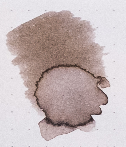
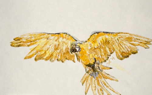
Forgive my reviewing an ink that has been reviewed thoroughly before. This is my first review and I wanted to start with an ink that I have a lot of experience with. The written review was done in the Rhodia dotpad. The Titmouse sketch was done with J. Herbin's Terre de Feu and Cacao du Bresil in a Stillman & Birn Gamma Series sketchbook. Edited to add color wash detail, which I previously forgot to upload. Reasonable care was taken to ensure color accuracy.

-
Well here is my review for the Sailor Bungbox Nostalgia ink. I'd gotten this last year when these were readily available. Sometimes you can find them at Vanness Pen Shop web site, currently priced at $43 a bottle. If you are in Japan, or traveling there, you can shop at the Bungbox store itself. The usual papers MvL=Mohawk via Linen, Hij=Hammermill 28 lb inkjet, TR=Tomoe River. The ink is not waterfast or resistant at all. It's not supposed to be, but thought I'd mention it. In the range of brown inks I own, this one is unusual. By that I mean it doesn't match color-wise anything else I have. Of course I don't have every ink, so it may well be similar to something else. The ink is perfectly nice, but pricey. After a couple weeks in the pen the ink did darken up somewhat since more water evaporated. It's nice either way.
-
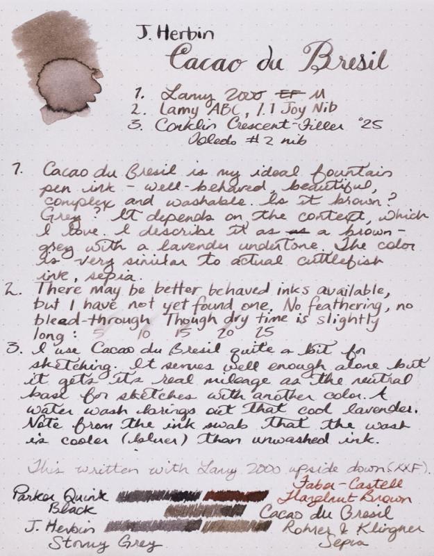
Cacao du Bresil is my most used ink. I keep it in my daily carry pen 90% of the time. It is so versatile, understated and beautiful. If you can't tell, I quite like it. Warbler sketch was done with Cacao du Bresil, J. Herbin Terre de Feu and Rohrer & Klingner Alt-goldgrun in a Stilman and Birn Gamma Series sketchbook. Reasonable care was taken to ensure color accuracy.
-
Well, Noodler's perhaps doesn't need an introduction, as everyone knows that Mr. Nathan Tardiff creates this inky lineup at his secret inky factory. A very extensive line of inks it is. Some are basic, some are more interesting. This one falls into the more basic range. That is not a negative, as not everyone wants a super shady, sheeny ink with glitter. Sometimes you just want an ink that works without fuss and I think this ink fits that criteria. This ink falls on the drier end of the wetness scale, but it is but no means "dry". I used a Lamy AL-Star (M-Steel) which is decently wet, but with this ink I got a bit finer line than I might have expected. I also tried the ink on some cheap Cambridge notebook paper which usually has serious problems with show through and bleed through, and while there was a good amount of show through, the bleed through was limited. It has reasonably short dry times on the papers used, and no problems with skips, start-up, etc., and the converter experienced no staining. There was a little bit of ink collecting on the top surface of the nib, but nothing major, and it wiped off easily. The ink is water resistant, so another plus. Papers used were MvL=Mohawk via Linen, Hij=Hammermill 28lb inkjet, TR=Tomoe River. As is typical, the images all seem to show the ink as darker than in reality. It's a middle brown, and it never shows as black or even dark brown. It's much lighter than Sailor Kobe #3, perhaps a little lighter than Iroshizuku Tsukushi. It is definitely a cool brown.
-
There are four KWZ inks having "brown" in their name: Brown #2, Brown #3, Brown #4, and Dark Brown (this ink). These are the warm browns, the red-leaning ones, that some people don't like. That's not an issue for me so long as it's a nice color, and the handling is how I like it in my pens. Each has their own qualities in handling and appearance, however, only one of them, #3, is actually a brown to my eyes. With this preview out of the way, let's look at the individual inks. This ink is more of a black to my eyes. It's somewhat shady, relatively fast-drying, but basically it serves as a black. In certain light and at certain angles, you can see it more as a greyish-brown. I tried this ink in my driest pen, as it was available. Maybe if I'd used a different pen, I'd feel different about the ink. It seems more like Iro. Take-sumi than Sailor Doyou. There are a number of good dark browns out there that are really dark browns, to the near blacks, and I have to admit this ink doesn't excite me. I'd like it better if it was wetter, and if it had more brown character. The images show the ink as more one-dimensional than it is. They are too dark. The chromatography shows there is potential here, but the realization needs to be met. Not water resistant, as expected.
-
I presume nearly everyone knows of the Iroshizuku line of inks. I'm sure this ink has been reviewed many times, but decided to add my two cents. Most browns on the market fall into the reddish-brown category. Tsukushi is not an exception. This ink has a strong burgundy undertone while Iroshizuku's Yama-guri has a much more green cast to it. As expected, a very well behaved ink. The chromatography isn't terribly interesting. The ink has some water resistance, a lot of the ink washes away, but some if left behind to be readable. As usual papers are MvL=Mohawk via Linen, Hij=Hammermill 28 lb inkjet, TR=Tomoe River.
-
There are four KWZ inks having "brown" in their name: Brown #2, Brown #3 (this ink), Brown #4, and Dark Brown. These are the warm browns, the red-leaning ones, that some people don't like. That's not an issue for me so long as it's a nice color, and the handling is how I like it in my pens. Each has their own qualities in handling and appearance, however, only one of them, #3, is actually a brown to my eyes. With this preview out of the way, let's look at the individual inks. This is a definite brown, and it looks somewhat golden, and more of a brown undertone. The wettest of the four browns, and the slowest drying. This has the kind of handling I like the best, and so this one is my favorites of the four. But the pictures are lacking in their ability to show the nice brown color, as they push it too far red, and/or too dark, certainly the latter. Anyway, you can get a sample and see how it looks in your pens, on your paper. The usual papers: MvL=Mohawk via Linen, Hij=Hammermill 28 lb inkjet, TR=Tomoe River. Sorry, I forgot to retake this image, and uploaded the fuzzy one. Definitely showing as too dark and one-dimensional here. Again too dark. Far too red, but yes, not water resistant. It's a fish!
-
There are four KWZ inks having "brown" in their name: Brown #2 (this ink), Brown #3, Brown #4, and Dark Brown. These are the warm browns, the red-leaning ones, that some people don't like. That's not an issue for me so long as it's a nice color, and the handling is how I like it in my pens. Each has their own qualities in handling and appearance, however, only one of them, #3, is actually a brown to my eyes. With this preview out of the way, let's look at the individual inks. Brown #2 to me has the most interesting shading of the group. But to my eyes it's more of a red than a brown, quite a muted red, maybe along the lines of the watercolor often called "English Red", or "Venetian Red", perhaps even redder. The most reddish-brown ink I have is Sailor Kingdom Note T. dichotomus, and this is more red than that. The handling is fine. This ink is not as wet as some of the others, it dries a bit faster than the others as well. It is not water resistant at all. The images here are showing up more red than in reality. And probably darker as this has the lightest value of the four brown inks. The usual papers: MvL=Mohawk via Linen, Hij=Hammermill 28 lb inkjet, TR=Tomoe River.
-
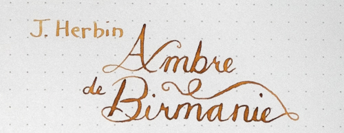
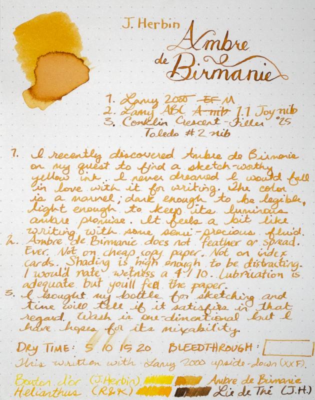
I am seriously in love with this ink. It will be in my daily carry pen for a while. Or at least until my bottle of Shin-kai arrives. This ink loves a dip pen, too. Forgive my heavy-handed example above, but perhaps you can see the promise. In better hands, this would be remarkable dipped. Sketch was done with Ambre de Birmanie, J. Herbin Bouton d'Or (the most useless ink I've ever put in a pen) and a touch of Iroshizuku Shin-kai. Not a success but that is hopefully more my total lack of experience with these three inks than anything else. I still have hope. Reasonable care was taken to ensure color accuracy.
-
Just read through the Inky TOD Brown ink thread...... Lots of beautiful brown inks..... However, not sure if any of those are similar to the old manuscript writings one sees as in Da Vinci's journals, etc. See image below. Anyone have any suggestions for an old time look sepia brown ink such as this? Thanks for any and all suggestions. Mark http://i473.photobucket.com/albums/rr100/ArchiMark/codex-atlanticus-page_zps0a0ebqqw.jpg
-
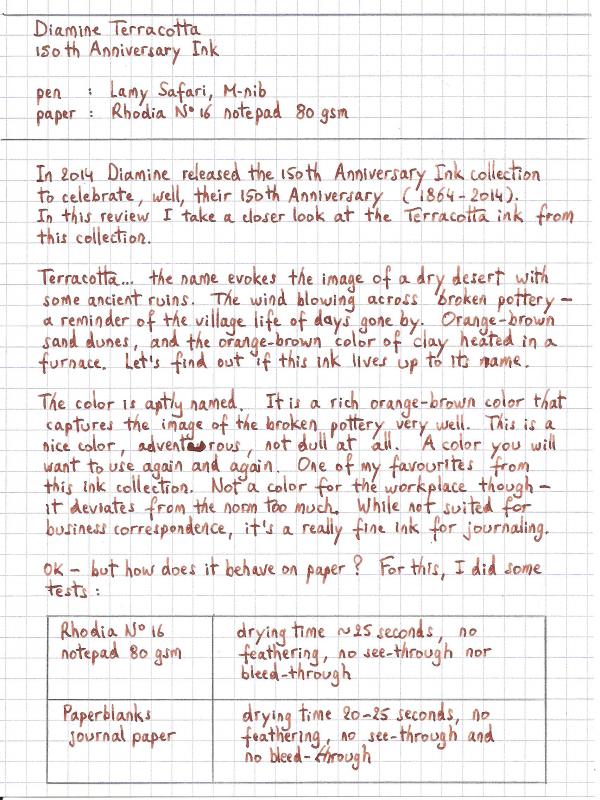
Ink Review : Diamine Terracotta (150th Anniversary Ink) Pen: Lamy Safari, M-nib Paper: Rhodia N°16 notepad 80 gsm Review In 2014 Diamine released their 150th Anniversary Ink collection to celebrate - well - their 150th anniversary (1864-2014). In this review I take a closer look at the Terracotta ink from this collection. Terracotta... the name evokes the image of a dry desert with some ancient ruins. The wind blowing across broken pottery - a reminder of the village life of days gone by. Orange-brown sand dunes, and the orange-brown color of clay heated in a furnace. Let's find out if this ink lives up to its name. The color is aptly named. It is a rich orange-brown color that captures the image of broken pottery very well. This is a nice color, adventurous, not dull at all. A color you will want to use again and again. One of my favorites from this ink collection. Not a color for the workplace though - it deviates too much from the norm. While not suited for business correspondence, it's a really fine ink for journaling. OK - but how does it behave on paper ? For this, I did some tests: Rhodia N°16 notepad 80 gsm - drying time ~25 seconds, no feathering, no show-through nor bleed-throughPaperblanks journal paper - drying time 20-25 seconds, no feathering, no show-through and no bleed-throughGeneric notepad paper 70 gsm - drying time ~15 seconds, no noticeable feathering, minimal show-through (only in the darker parts), no noticeable featheringMoleskine journal - drying time ~10 seconds, minimal feathering, definitely very noticeable show-through, some bleed-through (mainly in the darker parts)There is some very nice, but subtle shading in this ink. This is not a dull monotone ink, but one that catches your attention, and brings some variation to your writing. Really nice. This ink behaves very well, even on cheap paper. It even works in a Moleskine journal - which is not at all fountain-pen friendly. Despite the show-through, it's still possible to use both sides of the paper. Our pottery was found in an ancient desert ruin, where rain is seldom seen. The same can be said for this ink. It doesn't like water at all. Short exposure to running water obliterates your writing. Faint traces of the text remain, and you'll probably need an archaeologist to reconstruct the original writing. You have been warned... keep water away from this ink. Conclusion This really is a beautiful ink, that behaves very well on high-quality paper, and is certainly usable on lower grade paper like Moleskine's. The ink has some nice and subtle shading, which makes it interesting. A very fine choice for journaling. Overall score: A
-
I like this one a lot! I tried to capture the halo effect: A comparison:
-
DeAtramentis makes some interesting inks, and usually they have good behavior and handling characteristics. This ink conforms in that regard. This is a very reddish-brown, it's almost to my eyes more reddish than brown. I find it hard to define as sepia, but that's what the maker calls it. I'm not much for red or reddish inks as I personally have little use for them, while brown is an ink color whose appeal is hard to deny. You may personally really like this color. But not for me, so it's hard for me to get excited about the ink. I think the color is appearing a bit dark for the actual ink, as it seems lighter on the paper compared to the screen. But it handles quite well. Somewhat water resistant, in that the red washes away, leaving some of the brown behind. The usual papers appear here: MvL=Mohawk via Linen, Hij=Hammermill 28lb inkjet.
-
I'm not a fan of brown colours, but I entered the other day in an old stationary store and saw some old Parker ink bottles getting dust. http://i1094.photobucket.com/albums/i455/rendergroup/Parker_01.jpg http://i1094.photobucket.com/albums/i455/rendergroup/Parker_02.jpg http://i1094.photobucket.com/albums/i455/rendergroup/Parker_03.jpg You can see a Sapphire bottles besides the Brown colour. Only major brands are available in my country: Parker, Waterman, Lamy, Rohrer & Klingner and Faber Castell. Fountain pens are also in the same brand offer, so if you use a FP you are "out of this world". The price per bottle was an interesting bet for testing, almost $5, the bottles have been sitting for a long time in the shelves,the store owner could not give me an estimate how many years were "getting older", after opened some bottles most of them were half full, the content must be evaporated through the years. http://i1094.photobucket.com/albums/i455/rendergroup/Fountain%20Pen/brwn_parker_09_zps8afb9691.jpg This is my first ink review, tried to make an scan but this colour is very difficult to reproduce the exact hue, most of the written samples were snapshots from camera photo. The test was made using a Lamy Safari with different nibs: EF,F,M. Paper used: 80 grms. Photocopy paper (Atlas) , a commond peruvian brand. Ink used: Permanent Brown (UK) Photo size: 800x600 (if you like bigger size i could consider posting some of them). Enjoy! http://i1094.photobucket.com/albums/i455/rendergroup/Fountain%20Pen/brwn_parker_15_zps48af5a74.jpg http://i1094.photobucket.com/albums/i455/rendergroup/Fountain%20Pen/brwn_parker_11_zpse2e742fa.jpg Full Scan http://i1094.photobucket.com/albums/i455/rendergroup/Fountain%20Pen/INK0100_zps860788d9.jpg http://i1094.photobucket.com/albums/i455/rendergroup/Fountain%20Pen/brwn_parker_07_zps82ef318b.jpg Close Up http://i1094.photobucket.com/albums/i455/rendergroup/Fountain%20Pen/brwn_parker_04_zps29e4d3e3.jpg http://i1094.photobucket.com/albums/i455/rendergroup/Fountain%20Pen/brwn_parker_05_zps7146de31.jpg http://i1094.photobucket.com/albums/i455/rendergroup/Fountain%20Pen/brwn_parker_02_zpsa15d6505.jpg http://i1094.photobucket.com/albums/i455/rendergroup/Fountain%20Pen/brwn_parker_01_zps0e5fceee.jpg http://i1094.photobucket.com/albums/i455/rendergroup/Fountain%20Pen/brwn_parker_08_zpsa4be0756.jpg http://i1094.photobucket.com/albums/i455/rendergroup/Fountain%20Pen/brwn_parker_03_zpsac5ae5c7.jpg Water Test Well... no so Permanent http://i1094.photobucket.com/albums/i455/rendergroup/Fountain%20Pen/brwn_parker_14_zps1771fe47.jpg Conclusion: Not a bad bargain I returned to the store for second time and purchased another bottle to complete the contents of the first one. I'm using this ink more frequently and in my opinion, this ink have some special characteristic, as a result of the special hue, it can be similar to black colour, but this ink is unique, it has some redish hue that is not visible in the photos, tried to simulate the colour using photoshop, but the paper turns red.
-
My review sheets simply call this "brown", but it may be "chestnut brown". I'm not exactly sure which ink was sent, and the original picture of the bottles doesn't show the name on the brown ink. So perhaps someone can correct me and indicate the correct name. Anyway, an FPN member sent some samples out and I agreed to review three: the blue, the brown, and the green. This is the brown (obviously). I'll say this is a light cinnamon color. The water droplet test shows a single dye ink, and it's not super concentrated. The ink handled perfectly OK, was fairly fast drying. I think the ink is relatively inexpensive, say $8/30 ml bottle. So not a bad ink at all, but not really anything special to my way of writing. I tested this on Mohawk via linen (MvL), and Hammermill 28 lb inkjet papers. It's possible this is the most boring image of ink droplets on a wet paper towel ever presented to FPN.
-
OK, here is an ink that lovers of brown ink will take delight. It's somewhat old hat now, but Sailor makes ink and pens. They are a Japanese company. They also have a master ink maker who blends custom inks for certain special shops in Japan carrying Sailor products. For a while, these inks were available with some diligence as these shops did not have international ordering on their web sites. But now however those days are gone with the rise of the "ink speculator" and the "jewel bottle shortage". Some shops now only sell to someone in person, and other popular ones are sold out within hours, while another has raised prices 50%. Accept my apologies for posting a review of an ink you may not be able to purchase anytime soon. And I have further bad news for you, dear reader: this ink is a close match for Parker Penman Mocha. So I am unsure if I should just always have a pen filled with this ink until the bottle is empty, then place it upon the shelf, and remember the good "inky times" we once had. Or whether I should save it, preserving it for the future. Alas, why wait for a future that may never come? It will be used. With that introduction, the review. As typical for me, the papers used are Mohawk via Linen, Hammermill 28 lb Inkjet, and as long as this book has a blank page, Clairefontaine. As typical, these iPhone photos show the ink as darker than it really is. It is not black, but a dark brown. I'm not sure whether Sailor's Do-you is darker, it may well be. Not sure how this will wash. An ink smear is a brown, but here some dirty red was showing up. Some experimentation would be in order. The ink did not spread very much, but you can see a number of colors at the edges. A close-up.
-
Warning! This is a long, picture-heavy rant about my Pelikan journey. My Souveran M400 and M800 Brown Tortoises under morning light. As I've posted here before, my ultimate goal from the beginning of my fountain pen days was to acquire these two pens. Or at least it was once I discovered the existence of these two pens. Of course back then, the new M800 Brown Tortoise didn't actually exist nor was there any indication that it ever would. What I liked was the old style M800 BT, but that is such a rare pen and is way too expensive for me to even want to buy. What I wanted more in general was an M800. Either the blue M805 or the green M800. But I just couldn't commit to either pen and it wasn't until the new M800 BT was announced that owning a Pelikan was a realistic consideration. The Brown Tortoise duo was really more of a fantasy. If it was ever to happen it was going to be over a decade into the future, and I certainly didn't expect to acquire both pens in a short period of time. It took me over a year after saving up for the new M800 BT to finally commit to buying it. I had handled an M800 before but couldn't remember what it had been like, so I had reservations about its size and balance. In February, while I was on Regina Martini's site to bid on it, I came across the M400 and jumped on it. I most likely overpaid. I really should have thought it through but I psyched myself out wondering how long it would be until I came across an old style M400 BT again, if ever. I was much more enamored with the idea of owning the set than the practicality of it. But I'd had this fantasy of a Brown Tortoise fp set for so many years that I was set on the idea. Being so suddenly faced with the possibility of making my fantasy a reality, I didn't stop myself to think. If you read some of my previous posts, you know that I was extremely excited for this pen to arrive and once it actually did, was shocked by its lightness. I then whined about it to you guys and even posted the pen on the Classifieds to immediately get rid of it. My beef in particular was with the cap. On one hand it's a testament to Pelikan's quality that they can work with such a material to make such a durable, thin, and light cap, but on the other it initially felt cheap and fragile. I got over it and can now appreciate its ergonomics and suitability to posting, but it made me really hate the pen at first. M800 on top, M400 on bottom. While I was considering what to do with the M400, I was given some money and took the opportunity to splurge on what had been my goal in the first place, the M800 Brown Tortoise. And this pen did not disappoint in any capacity. That's a first. With every pen I've ever gotten I was initially disappointed with, but the M800 exceeded my expectations. If I had the benefit of visiting B&M stores beforehand to see and handle the pens I'm sure this would be the norm but unfortunately that's not the case. The M800 is definitely a hefty pen. I've been constantly handling it ever since it arrived and I can still feel that it has weight. Thankfully, I hold my pen at a fairly low angle so it rests on the web where my index and thumb fingers meet and doesn't cause me fatigue. Posting the pen makes it too long for my liking but surprisingly doesn't change the balance by much, whereas the M400 becomes a much more back-heavy pen posted. The M800 is back-heavy in the first place. There is a noticeable difference between the BT finishes of the two pens. The M800 BT has more vibrant orange tones and metallic silver sheen. Its stripes are more consistent and longer than those of the M400 BT. However, it is actually a darker pen overall. Both pens have areas in which several stripes in a row are muted and the color seems to be under the surface. I absolutely hated this at first, but it's grown on me. According to Regina Martini, the BT finish of the M400 is actually the same as that of the old style M800 BT, and that was one of the big draws of the M400 for me. I wanted to be able to own examples of both the old and new BT finish. The stripes of the M400 are a bit more fragmented and less likely to reach from the top to the bottom of the barrel. Instead of being metallic, the M400 BT has more of a pearl-like (not swirly) golden sheen. It has a lighter golden honey color and is slightly less conspicuous than the M800 BT. The overall effect is that the M800 BT colors are shinier and flashier, but the M400 BT colors are richer and classier. New style M800 Brown Tortoise, M nib. The M800 I'm keeping for the rest of my life, no question. I haven't completely decided what to do with the M400. It's grown on me and I'm not so sure I want to sell it anymore. It's so pretty and it's part of a set! But I don't feel so good about keeping it. Buying both pens was a rash decision and while I don't have an acute need for funds, fountain pens are relatively frivolous things to own and I'm not comfortable with owning such expensive pens. Buying the M400 was a flight of fancy and owning it may be little more than a hassle and a poor use of money. Old style M400 Brown Tortoise, BB nib. There's also the fact that these are extremely similar pens. Kind of the point of the Souveran range is that it's the same pen in different sizes, and I have pretty much the same finish on both. Wouldn't it be redundant to keep the M400? I happen to be a person who prefers to keep a very limited number of pens. I can't see the point in ever having more than three pens inked at the same time or owning more than six or so good ones. I don't know whether I'd get enough use out to both to justify their stay. I also want a broader nib to have ground down to a cursive italic on the M800, and that can't be done without the funds that would come out of selling the M400. Sell M to get BB to grind? Or keep M and have it ground? But that's a whole other can of beans.
-
Franklin-Christoph is a fairly new American purveyor of fountain pens and their accessories based in North Carolina. visvamitra as reviewed some of their inks. From what I understand, they manufacture their own pens at their facility, and bottle the inks there as well. It's not known who actually makes the inks for them. The pens have some very interesting designs. The inks seem to be pretty interesting as well. The is a very reddish-brown to slightly reddish-brown depending on the paper. I;m not sure my images capture this. It's quite a shady ink. It was very wet in my Pelikan M400 on the Mohawk via Linen, but it acted much drier on the inkjet paper. I haven't had that kind of issue often, so this ink's behavior may be somewhat paper dependent, and whether you like a wetter or drier ink may determine which you employ. The usual paper suspects were used here. The ink washes quite reddish, an earth red. It is not waterfast at all. Blotting lifts nearly all the color up off the paper. The ink is definitely not as dark as it appears in this pic. Again, not as dark as it really is. But on this paper is appeared more brown than red-brown like it did on the MvL. Quite interesting chromatography. Too bad it doesn't wash with those colors.
-
Here is a review of Diamine's Chocolate Brown, a dark brown, slightly reddish. One some papers it appears much like a chocolate, others a little darker. Diamine has been making inks for a long time, and that shows in the ink's ability to "just work". It has some subtle shading which is nice, but they seem to use the same underlying red which seems to be not very waterfast. The ink basically lifts right up when blotted when hit with water. The photos didn't work out so well, the light being poor recently, so the ink appears darker than in reality. The ink is not a replica for PPM as it is too warm, and a bit lighter. Tested on Mohawk via Linen, Hammermill 28 lb inkjet paper. I've run out of my little Tomoe River booklet.
-
As part of my expansion of the ink collection in the brown range beyond its already vast range, and from visvamitra's reviews of some of their other inks, I picked up this ink, as well as the Brown which I've already reviewed. Color-wise, it's not quite the match for PPM that I had hoped, being an authentic brown instead of a brown-black, but a very good ink. Tested on Mohawk via Linen, Hammermill 28 lb Inkjet, and Clairefontaine papers. The iPhotos came out darker than I wanted. The wash is closer of an Indian Red instead of the brown shown here. Not terribly waterfast in the blotting test. Even after just a minute, nearly all the ink lifts off the paper. The ink washes with an Indian Red earth color (for those familiar with the traditional watercolor earth pigments). Fairly interesting chromatography.
-
Toucan is an Australian ink producer, I think they mostly distribute the inks in pouches to save on shipping which is expensive in Australia. Also reminiscent of those marsupials that roam around their country Umber is an interesting and unusual brown. Totally not waterfast at all. The least waterfast I've found. Not waterfast at all, and doesn't even leave much ink behind in the wash. The most interesting aspect of the ink is its unusual dye mix.
-
Here is a review of one of the Sailor inks made for Ishida Bungu shop on Hokkaido, Japan. This one is called IAI135 "School Brown". I'm not certain of the reference to IAI135 whether it is an identifier of a particular school in Hakodate, or a class, or what. Perhaps someone from Japan can help educate us on its meaning. The ink is really great though. Similar to Sailor's Do-you, but not as dark, and somewhat cooler in hue. Some of the images seem to have captured the ink color too darkly. I've reviewed as usual on Mohawk via Linen, Hammermill 28lb inkjet, and Tomoe River papers. This image seemed to capture the brown hue best. Ink dropped on a damp paper towel shows brown with grey, green, and bits of orange. Most interesting. Not bad waterfastness. Note: the paper color is not pink, it's white. Ah, the joys of the iPhone.
-
http://inks.pencyklopedia.pl/wp-content/uploads/Sheaffer-Skrip-Brown-kleks.png I present to test the ink Sheaffer Skrip Brown with a wonderful light chocolate color. Very tasty color. For many people underrated. The ink has very good properties. He writes it very well. Drying also at a good level. Shading already noticeable at nib F. Nothing can accuse him. I honestly recommend! Manufacturer: Sheaffer Series, colour: Skrip Brown Pen: Waterman Hemisphere, nib "F" Paper: Image Volume (80 g / m2) Specifications: Flow rate: very good Lubrication: good Bleed through: unnoticeable Shading: noticeable Feathering: unnoticeable Saturation: very good A drop of ink smeared with a nib http://inks.pencyklopedia.pl/wp-content/uploads/Sheaffer-Skrip-Brown-kleks.jpg The ink smudged with a cotton pad http://inks.pencyklopedia.pl/wp-content/uploads/Sheaffer-Skrip-Brown-wacik.jpg Lines http://inks.pencyklopedia.pl/wp-content/uploads/Sheaffer-Skrip-Brown-kreski.jpg Water Resistance http://inks.pencyklopedia.pl/wp-content/uploads/Sheaffer-Skrip-Brown-woda.jpg Ink drying time http://inks.pencyklopedia.pl/wp-content/uploads/Sheaffer-Skrip-Brown-wysychanie.jpg Ink drops on a handkerchief http://inks.pencyklopedia.pl/wp-content/uploads/Sheaffer-Skrip-Brown-chromatografia1.jpg Chromatography http://inks.pencyklopedia.pl/wp-content/uploads/Sheaffer-Skrip-Brown-chromatografia2.jpg Sample text http://inks.pencyklopedia.pl/wp-content/uploads/Sheaffer-Skrip-Brown-txt.jpg Sample text in an Oxford notebook A5 (90 g / m2) http://inks.pencyklopedia.pl/wp-content/uploads/Sheaffer-Skrip-Brown-Oxford.jpg Sample letters in a Rhodia notebook No 16 (90 g / m2) http://inks.pencyklopedia.pl/wp-content/uploads/Sheaffer-Skrip-Brown-Rhodia.jpg
-
Im fond of a sepia shade, for regular writing use. Got some Diamine Sepia, and I really don't like it. Too.....well, the only description which keeps coming back is....sorry.....poopy. Not poppy, poopy. Any suggestions for a sepia or brown ? Thanks Alex
-
Hello FPN, I need some advice on what well-behaved golden brownish inks are out there. I have been searching and searching for a while and doing research on this, but it always results in some problem people have with the ink. 1) Noodler's Golden Brown is reported to be dry and leaves a residue on demonstrators 2) Diamine Golden Brown is also dry 3) Diamine Ochre seems to get gunky and stains demonstrators 4) PR sepia has issues with clogging Now the thing is, I want to use this ink in a demonstrator - either a Kaweco sport clear as an eyedropper or a TWSBI 580 Diamond, both with either fine or extra fine nibs. So my concern is both, staining and dry inks in fairly fine nibbed pens. Any ideas out there on what else is there to try? (Also would be great if it is not too pricey!) Thank you! EDIT: Please feel free to tell me about your favorite warm-toned brown inks as this is something I am open to as well! Thanks!