Search the Community
Showing results for tags 'brown'.
-
This time last year German ink makers Rohrer & Klingner introduced their first limited edition ink Aubergine. Right on cue the LE ink for 2019 has appeared - Kastanienbraun. This year R&K have conjured up a chestnut brown, or Maroon ink (as the company is mistranslating for the international market). No matter, since to my eyes it is neither a Chestnut nor a Maroon but rather a true brown, the colour of grandmother's cocao powder. Brown inks can be classified as Golden, Redish and the Dark Side. This one lies in the center with a slight tendency to the red. Even when the ink is showing shading the colour remains a constant mid brown. Brown all the way down. Bottle, Wing Sung and Dwell Discourager The ink comes in a sensible bottle and costs a refreshing 12 Euros for 50ml. This is 3 times what their standard-line inks costs on the German market but in this era of 70 Euro Montblanc inks it seems more than reasonable. R&K is a kind of anti-luxury brand - a serious minded East German firm, from the land of Luther - unfrivolous, quality products for decent prices. Put it this way: R&K are not about to introduce an ink line called Sheen Godzilla or Scented Twinkle any time soon. This sober attitude carries through to packaging. "How can we make the LE ink look a little more exclusive without being superficial or environmently unfriendly?”, "I have a idea", said the creative. “Let's package it in a toilet roll. Yes, the kind used for that scratchy, dwell discourager paper in the staff WC." So must the converstation have run. So what of the ink? How does it write? I inked up a wet, medium nib (Waterman Man200) and tried the ink on Moleskine textured paper and Oxford Optik paper as well as torn off pieces of envelope lying around my desk. The performance was excellent, with no excessive feathering on the cheap paper and great shading on the higher quality papers. Oxford Optik, Man200 Then I inked up my everyday brown pen - a fine nib Wing Sung 626. This nib married less well with the ink. It began to feel dry and needed some encouragement to write fluently on the Optik paper. It did fine on the Moleskine. Moleskine WS626 Doodle How does it compare to other inks? I don"t reach often for R&K Sepia; Kastanienbraun is much warmer than that. It's lighter than Diamine Chocolate yet more highly saturated than Saddle Brown. Despite the saturation, R&K dries quickly and has not tendency to smear once dry. It's a nice ink. I will use often. If you like brown inks and have a wet nib you will enjoy it too. Try it on your dry pens too and see if it works for you - but quick R&K LE inks really are limited. Aubergine was hard to obtain by mid December and this will certainly sell just as quickly.
-
the main review is below. This is an Indian notebook called ITC classmate which is dirt cheap and exceptionally fountain pen friendly - doesn't feather or spread with the worst offenders (in my case, Noodler's 54th Mass for spreading, Noodler's forest green for feathering); dry time is quick but inks retain their vibrancy and shade nicely. Only strikes against it is that it doesn't particularly help with sheen and its not bright-white (there's a slight red tinge to the pages). Anyway, enough about the paper. This review was written with a PenBBS 480 with a Mini fude F nib. Really its more like an M. Writes wetter than normal. Note: the color balance is off in the top 5th of the page - probably due to paper not being totally flat. The ink in that area looks murkier than in real life. Here are some comparisions to other browns (Kiowa Pecan is similar, Yama Guri, not really). Also how the inks looks on blobs, swatches, smudges and dry times. Overall thoughts: It is a very nice brown, rich color with shading variations and possibilities of sheen (and a nice ink even without the sheen); with good flow, quick-ish dry times and no major drawback as far as I can see, except the tendency to stain clear plastic (though not sure if it was just that one cartridge converter). Will be receiving some Clairefontaine and Tomoe River shortly (I am out of stock now and all but essentially deliveries are closed due to C-Virus). Will check on sheening then. The pooled ink drop shows some green sheen around the rim of the darker area.
-
For years, Ive been hoping that Lamy would release a chocolate brown, textured Safari with a black clip. Today, I saw that just such a thing exists for the South Korean market (Line Friends?) So Im looking for a reputable place to buy one. By reputable, I mean a dealer who will sell me a genuine brown Safari made by Lamy and not a fake. If it has to come in a fancy box with cute animals, so be it. But all I really want is the fountain pen. Ive seen them available on eBay but I dont know which sellers deal in genuine Safaris. Can anyone suggest where to buy this pen, please?
-
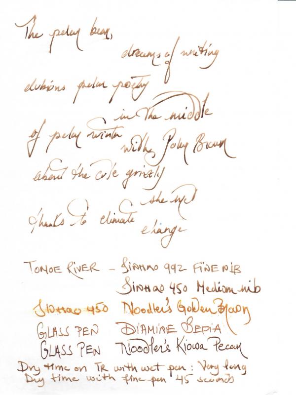
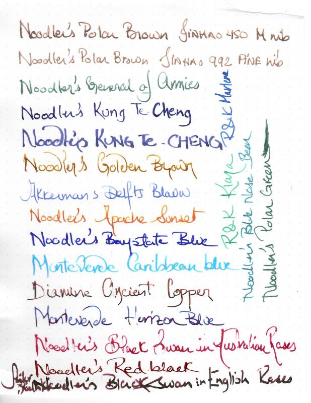
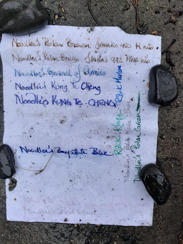
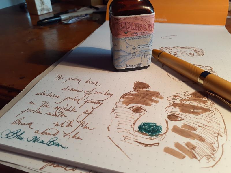
Polar Brown is one of my favorite inks. Ironically, I’m not a fan of the color. It’s somehow bland. It can be a frustrating and finnicky ink, depending the pen used. But in this day age, where the veil on life’s non-permanence and uncertainty has been torn to bits, an ink, as permanent as the paper it bonds with is a source of comfort. When I first got into inks, being too lazy, I ordered a bunch of mystery samples. There were two Polar Browns. When I inked my pen, I told myself, what have I done to deserve such an ink in double amounts. But it grew on me, to the point that I bought a bottle, and I always have a couple of pens inked up, just in case, I have to jot down some important information, words of wisdom, sign a check or write a shopping list. Not a pleasant feeling when your painstakingly craft list melts after an impromptu drizzle or stray snowflake…… It dries in less than 10 seconds with a wet medium nib, and 3 with a fine on Rhodia dotpad. On copy paper it’s instantaneous. However, it takes forever to dry on Tomoe River with a wet nib, but it shades. With a fine nib, 45 seconds, until smudge free… It is also one of the easiest inks to clean out of a fountain pen. I’ve tried it even in a vintage Waterman and cleaning was a breeze. Personally, this is one of those rare inks that I would not use with a stub/ oblique nib/ fude. With a wet/ wide combo it would ghost and bleed through unabashedly. Though sometimes I prefer that dark rich brown, haunting the paper, than the mild muted brown it usually is. I’m not sure if it would be happy in a dry pen. I have had it in a Jinhao 992 for a year with no problem. In a Jinhao 450 with a fude nib, it had flow issues but when I changed the nib to a medium it was much better. When it flows, it’s a joy to write with. And unsurprisingly Polar Brown, loves Noodler’s nib creeper. On Rhodia dot pad Rhodia Back On Tomoe River Swab comparaison On Amazon Copy paper - Front Back On Hilroy - King of the fountain pen unfriendly notebooks Back Yesterday it was raining. So, I decided to do a permanence test.... Note the Black Swan in English Roses was actually Sailor Yodaki... Before After 2 hours under rain/sleet/snow After 18 hours under constant rain Finally I subjected the visible texts to swabs of alcohol on the left side and bleach to ride side....

-

A Dark Brown/chocolate That Will Flow Well In Modern Flex Nibs
jonathan7007 posted a topic in Inky Thoughts
All: I need help choosing a chocolate or dark brown ink that will flow well. Wet, in other words. I write pretty quickly with Noodler's and Fountain Pen Revolution(FPR) flex nibs. I also like stubs and italics. I have only one old 1935-1939 "Ink-Vue" Waterman pen with a true old-style moderate flex. Love this sweet old writer. But my question is about the inks that have a consistently good flow down the spreading steel nibs we use to give handwriting character if we're budget-constrained. I jam together odd combinations of body and nib for fun. I take notes of plans and projects, write letters, keep track of things with pen and paper. In a Neponset with the Neponset feed and an FPR "super-flex" #6 I found good results from a now old (over ten years, I think) less-than-half-bottle of Private Reserve Chocolate (not the fast dry variant.) Okay, I thought, since it's lubricated in some way (described as "ITF") Monteverde should also work. I switched to my new bottle of Monteverde Canyon Rust. Railroaded all the time. I haven't tried Mr. Tardiff's "eel" formulations partly because there aren't as many colors. I do like X-Feather with these nibs. A wonderful black but takes extraordinary care over drying time in some papers, which limits its use, especially out in the wild. I'll post separately my question about when we'll see the *brown* X-Feather color. I am considering ordering a new bottle of Private Reserve Chocolate but I had heard there are a lot of changes in the formulations due to the death of the PR founder. (Too bad, I liked some of the colors and bought a lot of PR inks in the early 2000's.) So, since it appears I need a *very wet* ink, and perhaps a lubricated ink, who knows of a almost-black dark brown that will flow through challenging nib gyrations I enjoy? Remember, I am using these pens to write notes at a fast cursive, not slowly forming attractive labeling, invitations... Thoughts and suggestions welcome. Thanks, in advance. -
L'Artisan Pastellier Callifolio - Sepia L'Artisan Pastellier is a small company in southern France that specialises in natural pigments, and offers customers authentic and reliable products in beautiful colours based on mineral or vegetable pigments. In a collaboration with Loic Rainouard from Styloplume.net, the chemist Didier Boinnard from L'Artisan Pastellier created the line of Callifolio fountain pen inks. These pastel-coloured inks are traditionally crafted, and can be freely mixed and matched. Overall these inks are only moderately saturated, and have low water-resistance.The inks were specifically designed to work well with all types of paper, and all types of fountain pens. Being pastel-tinted, these inks have a watercolour-like appearance, and are not only fine inks for journaling, but are also really excellent inks for doodling & drawing. I only recently discovered them, and they are already the inks I gravitate towards for personal journaling. In this review the center stage is taken by Sepia, one of the ochre-type inks of the series. This one is an earth-toned pastel-type sepia-brown, that is great for drawing, but - in my opinion - too undersaturated for writing in many of my pens. In finer nibs with dry pens, the ink lacks character for writing. Only with wet pens does the ink obtain decent saturation and starts to look good on paper. I found the ink to be a bit on the dry side in my Lamy Safari test pens, with lubrication being somewhat subpar. A wet pen solves this problem. The ink shows little shading with fine nibs or wet pens. With broader nibs in dry pens (like the Lamy Safari) Sepia becomes a strong shader, even a bit too harsh for my personal tastes. As a writing ink, this one does not really convince me. To show you the impact of saturation on the ink's look & feel on paper, I made some scribbles on Tomoe River where I really saturated portions of the paper with ink. This gives you a good idea of what the ink is capable of in terms of colour range. As you can see, this ink has a fairly wide colour span ranging from a very light pastel-like sepia to a reasonably dark brown. This explains the harsh shading you get with broad nibs in dry pens. With wet pens, you get the darker version (right part of the saturation swab), with very little shading. On the smudge test - rubbing text with a moist Q-tip cotton swab - Sepia behaved very good. There is limited smearing, and the text remains very sharp and readable. Water resistance is quite good for a non-waterproof ink. An easily readable brownish residue remains even after longer exposures to water. This is also apparent from the lower part of the chromatography. I've tested the ink on a wide variety of paper - from crappy Moleskine to high-end Tomoe River. On every small band of paper I show you: An ink swab, made with a cotton Q-tip 1-2-3 pass swab, to show increasing saturation An ink scribble made with an M-nib Lamy Safari The name of the paper used, written with a Lamy Safari (B-nib) A small text sample, written with an M-nib (also Lamy Safari) The source of the quote, written with a wet Pelikan (F-nib) Drying times of the ink on the paper (with the M-nib Safari) Sepia behaved fairly well on most paper types, but did show some light feathering on papers where I didn't expect it (like the 100 gsm Optiimage printing paper, which usually works really well with fountain pen inks). Drying times are around the 10-second mark with the M-nibbed Lamy Safari. The ink looks best on pure white paper, and looks fairly underwhelming on more yellowish paper. At the end of the review, I show you the back-side of the different paper types, in the same order. With the low-end Moleskine there is prominent show-through and a bit of bleed-through. The GvFC paper also suffers from some show-through - a characteristic I have seen with several inks, and which you wouldn't associate with 100 gsm premium paper. With the other papers, Sepia's behaviour is impeccable. Overall, the ink copes well with a wide variety of paper types. Writing with different nib sizes The picture below shows the effect of nib sizes on the writing. All samples were written with a Lamy Safari, which is typically a dry pen. I also added a visiting pen - a wet-writing Pelikan M101N Bright Red with a fine nib. With this wet nib, the ink writes much more pleasantly. It also shows a substantially more saturated line. Personally I prefer the ink's more saturated look with the wet Pelikan pen. Related inks To compare Sepia with related inks, I use my nine-grid format with the currently reviewed ink at the center. This format shows the name of related inks, a saturation sample, a 1-2-3 swab and a water resistance test - all in a very compact format. I have only a limited number of browns in my ink collection, and no close match to this ink. This Callifolio ink is the most pastel-tinted brown that I own. Inkxperiment - a day at the farm As a personal challenge, I try to create interesting drawings using only the ink I'm reviewing. For me, this really brings extra fun to the hobby, and these single-ink drawings are great for stretching my drawing skills. With these small pictures, I try to give you an idea of what the ink is capable of in a more artistic setting. For this drawing, the earth-toned colour of the ink triggered memories of childhood holidays at my grandparents farmhouse. I started off with 300 gsm watercolour paper, on which I painted a background with water-diluted Sepia. The fields in the foreground were drawn with Q-tips, and multiple water/ink ratios. I then added the farmhouse and tree on the horizon line with a B-nibbed fountain pen. Finally I painted in the wheat stalks, and added some texture to the fields with my M-nibbed Lamy Safari filled with Sepia. The resulting picture gives you an idea of the colour range you can expect when using Sepia as a drawing ink. Conclusion Callifolio Sepia is a pastel-toned sepia-brown ink, that is at its best in wetter pens where it produces a dark and saturated line, and where it doesn't suffer from the subpar lubrication present wih dry pens like the Lamy Safari. Sepia fails to impress me as a writing ink, but shows some promise for use in pastel-toned drawings. Technical test results on Rhodia N° 16 notepad paper, written with Lamy Safari, M-nib Back-side of writing samples on different paper types
-
Just picked this Parker FP yesterday. I collect 51s to 75s so I am unfamiliar with pens before 1940. Can anyone give me a model to get me started? Any information on this style would also be helpful. Thanks, Cabbie
-
Ink Review : Pelikan Edelstein Smoky Quartz --- Ink of the Year 2017 --- In 2011 Pelikan introduced the Edelstein series of high-end inks, available in a variety of colours. The theme of the Edelstein concept is the gemstone – each ink corresponds to the beautiful colour of a gem. The Edelstein line of inks is presented in 50 ml high-value bottles, that are truly beautiful, and worthy of a place on your desk. In this review I take a closer look at Smoky Quartz, the Edelstein Ink of the Year 2017. This is a limited edition ink, that could be gone in the near future, although it’s not unheard of for Pelikan to change its mind. In any case, with 2017 slipping past, I thought it appropriate to further examine this ink. Smoky Quartz is a warm brown ink, that spans a broad palette, ranging from very light (the smoky part) to almost black-brown. It is a rather complex mix, with some orange and grey-green undertones, as evident from the chromatography. The result is a very fine writing ink, that can handle all nib ranges without a problem. In finer nibs, the ink is more of a light brown, but the broader/wetter your pen, the more the darker brown appearance of the ink comes into the picture. Combine this with some nice shading, and you get an ink that’s worthy of your attention. To show you the impact of saturation on the ink’s look & feel on paper, I made some scribbles where I really saturated portions of the paper with ink. This gives you a good idea of what the ink is capable of in terms of colour range. When fully saturated, Smoky Quartz becomes a very dark – almost black – brown. Technically, the ink behaved perfectly, with good flow and saturation, and a good contrast with the paper even in the finer nibs. With broader nibs there is some really nice shading that enhances your writing. Overall a pleasurable ink to write with. Drying times are quite reasonable in the 10 second range with M-nibs. Smoky Quartz copes well with a wide variety of paper – and can even tolerate the crappy ones. Only on Moleskine, the ink looks quite ugly, and has noticeable feathering and bleed-through. On other papers the ink behaved impeccably, looking good on both white and more yellowish paper. Surprisingly, Smoky Quartz is a very water-resistant ink (see water test at end of review). With the droplet test - where I drip water on the paper, and keep it there for 15 minutes – readability remained excellent, with only some minor smudging of the text. With running tap water, a perfectly readable green-gray image of your writing remains, even after a 30-second exposure. Respect! This certainly is an ink you can use in the workplace. Inkxperiment -Eerie Woods When using Smoky Quartz for drawing, you can get some interesting results – owing to the orange & green-grey undertones in the ink. In the drawing I used 90 gsm sketch paper, that I completely soaked in water. I then spread a line of Smoky Quartz with a brush, and added some accents with a glass pen dipped in bleach, defining the trees. Final touches around the trees were made by dipping the still wet paper with a Q-tip cotton swab with a tiny bit of Smoky Quartz on the tip. Conclusion For me, Edelstein Smoky Quartz is one of the best Inks of the Year that Pelikan ever released. It’s a warm brown ink with a broad tonal range, that not only looks nice, but is also very water resistant. This makes it a fine ink for use in the workplace. If you like brown inks, and haven’t gotten a bottle of this ink yet – now is the time. Highly recommended! my overall score: A+ Technical test results on Rhodia N°16 notepad paper with Lamy Safari, M-nib Backside of writing samples on different paper types
-
Nice, dryish ink. Great shading. I don't own anything to really compare with, and have never written with anything even close. Apologies for the two toned review. the first part is with a dipped pen, so inconsistent, and then I finally emptied a pen to load this ink into.
-
Today i was a little bored and then think of doing some wannabe-calligraphy I proceed to fill my pilot parallel with sheaffer brown/sepia and i find this kind of green. The last image a sample of how the ink used to write when I first got it.
-
I was recently looking at my profile and debating whether I should add a favorite ink. One of my favorites when using cartridges has always been Graf von Faber-Castell's Hazelnut Brown. Graf's inks no longer seem to be available at the U.S. stores I normally order from (Goulet, Pen Chalet). The manufacturer's site doesn't seem to have a direct-to-consumer sales option. The ink does still appear to be in production, and is available at JetPens, but it seems slightly ridiculous to order a European ink from Japan to go the Americas. Does anyone know the status of these inks in North America? Thanks.
-

Sailor Kingdom Note - Tale Of Genji - 帚木(ははきぎ) Hahakigi (And/or Monogatari)
white_lotus posted a topic in Ink Reviews
As you may know, Sailor makes custom inks for shops in Japan. Kingdom Note is one such shop in Tokyo. They have started a series this year based on the famous early 11th century Japanese novel Tale of Genji. The usual series of KN inks comprise five inks, but this series already has eight inks. It's unknown how many inks are planned, or how long they'll be available. Perhaps someone in Japan has inquired about these matters and could comment. This is a golden brown ink named Monogatari which is according to Wiki a traditional Japanese literary form in which the Tale of Genji was written. The translation of the Japanese by Google on the page for this ink is quite confusing, and it's very unclear what the underlying meaning for this ink might be. I think the iPhone7 made the ink appear a bit darker than it is in reality. It's a little darker than Sailor Ishida Bungu Hakodate Curry and Sailor Maruzen Athena Fukurou, brighter but nearly the same value as Noodler's (FPH) Old Dutch Colony Sepia. The ink has very nice shading, no sheen that I can see, some water resistance. No staining at all on the Pelikan. Excellent handling as expected from Sailor. Many browns fall into the red-brown range so it's nice to see a golden brown. This is one that is fairly golden, but not yellow. Quite readable. For some reason we get pretty accurate color here... -
Sailor For Kingdom Note Trypoxylus Dichotomus "rhinoceros Beetle"
white_lotus posted a topic in Ink Reviews
Sailor makes inks for select shops carrying their pens and standard inks. One of those shops named Kingdom Note has a line of inks after Japanese wild birds, insects, and fungi. They have been sought after by ink cognoscenti to the detriment of their pocketbooks and wallets. Many of the inks may well be the best Sailor has produced. This ink is named after a particular Japanese beetle known as the "Rhinoceros beetle". It is sometimes sold as a pet in Japan and other parts of Asia. If I remember correctly it only lives for about 4 months or so as an actual beetle. They live about a year underground in larval form. The shell of the beetle is a red brown color, and this ink attempts to capture that hue. From photos I have seen, it appears that they have succeeded. The color is definitely brown, with a strong red, red-violet undertone. The handling as with so many Sailor inks is on the juicy, wet side which I prefer. On Mohawk via Linen paper. On Hammermill 28lb Inkjet paper. I definitely like this ink. EDIT: here is the pic of the waterfastness test: -
-
When I started out on my quest for inks that look nice AND have very good water resistance properties, honestly the last ink series I thought I'd be getting were J. Herbin's standard fountain pen inks. I had a very misguided opinion of the line as being too faded looking, low saturation, dull, certainly not water resistant. That's until I accidentally found some reviews that showed water tests of J. Herbin's Lie de Thé. I also realized how interesting of an ink it is. It led me down the path of reanalyzing the whole line of inks, and I almost got a large size of Poussiere de Lune and some other colors. But back to Lie de Thé! I take back what I thought and welcome this ink with open arms to the top of my favorite inks list. The color: It's a very complex sepia color! It keeps shifting between looking more green? or is it more orange? or yellow? As a paper towel drip test below shows (green-gray-brown base, orange and yellow elements over that), this ink has all of those colors, and due to the excellent shading property, all those colors are visible to some extent. But this ink definitely keeps you guessing if you stare at it for a while, influenced also by lighting conditions. Shading: Amazing shading! Not only that, but there's some color variation between different intensity parts of writing. This ink's ability to shade comes through well in all of my pens: from dry writers with wide italic nibs to wet writers with round nibs. Sheen: none, I really tried to make it appear, but it's not there Ink flow: Pretty high flow ink in all of my pens, lubrication is medium, not as high as, say, Organics Studio Walden Pond Blue, which is highly lubricating. Bleed-through: none observed on Fabriano's Bioprima or Clairefontaine paper. A small amount with a wet nib pen on standard [low quality] printer paper Feathering: none on high quality paper, a little bit on cheap paper. Water resistance: another stand-out property of this ink! Some pale color wash off, but what remains is a highly legible and neat gray-green-brown base color. Photographs were made in diffuse natural daylight indoors on a somewhat sunny day. I don't like using my scanner to show inks, as it's not terribly accurate. I can get accurate photographs much more easily with my set-up (paper shown below is Fabriano Bioprima 85g/m2, pale cream color)
-
Noodler's #41 Brown does what it was created to do, and it does it very well. Will it win an award for the best behaving, best shading, and best sheening brown ink ever created? No. It should, however, win an award for being a ridiculously awesome bulletproof brown ink. I love it for that reason and highly recommend it. Quick stats if you don’t want to read all the details: Flow/Lubrication: 2 of 5 Saturation: 4 of 5 Shading: 3 of 5 on Tomoe River; not much on standard papers Feathering: none Bleedthrough: none Showthrough: none Water-Resistance: 5 of 5 Dry Time (FP friendly): <30 sec Dry Time (non-FP friendly): <5 sec! Smearing (dry): none Sheen: None Cleaning & Maintenance: above-average (needed more frequently) Staining: possible on converters and demonstrators - easily remedied with diluted bleach Buy again: absolutely - will always have in my collection *A quick side note...This is my first ink review. Also, my photo editing skills aren't the best. Hilarious combination.* I love brown inks and #41 Brown was one of the first bottles of ink I bought years ago. It is a dark and deep sepia color, according to the founder of Noodler’s Ink. My first thoughts when seeing it on paper, ‘Yep, that’s brown.’ Anytime I want a bombproof brown ink, this is the first bottle I reach for in my collection. Lamy 2000 fine - Tomoe River (yep, I mistakenly went from 'h' to'j' hahha) TWSBI Vac 700 broad - Tomoe River Lamy 2000 fine & TWSBI Vac700 broad - Leuchtturm1917 Noodler’s 3oz glass bottles are simple and functional, filled to the brim. Here’s a closer look at the label on the bottle (read Mr. Tardiff’s description of the ink for more backstory): If you want the best behaving brown ink you’ve ever experienced in your fountain pen’s life, this isn’t for you. #41 Brown doesn’t behave badly, but it does require careful pen maintenance (as does every other highly water-resistant ink regardless of brand and color). I would not leave this ink unused in a pen for very long. It wants to work, not to sit idly waiting around for days or weeks at a time. As long as you use your pens often and clean them regularly, you’ll be fine. Even better if it’s a pen you can easily disassemble. Compared to regular fountain pen inks, water-resistant and bulletproof inks tend to dry out on the nib a bit more quickly when left uncapped - #41 is no different. As long as you’re conscious of this and keep your pen capped when not writing, it should pose no issue. During extended sessions, I had no problems with the nib drying out as long as I kept writing. When I did leave the cap off too long, a quick wipe on a paper towel (or my finger) had the ink flowing again. Dry times were weird on Rhodia and Tomoe River (anywhere from 8-30 seconds pending on how much ink pooled) and exceptional on lesser quality paper (under 5 seconds!). If you’re a lefty or anyone who needs a fast drying ink and you use standard paper more often than Rhodia or Tomoe River, #41 Brown is a great option. Tomoe River (smears you see are my fault - my cat kept jumping on the desk...) There was little to no feathering on every paper I tried, including a junk-mail envelop and a Walmart spiral notebook. Impressive! No bleedthrough and little to no show-through. It’s a drier ink which is awesome if you’ll be writing on lower quality papers. On FP friendly papers, a juicy nib will work best (that is, of course, just MY preference). There is some shading with wetter lines on Tomoe River and Rhodia. How about the bulletproof & waterproofness qualities? Post-soak. On Rhodia and Tomoe River, a tiny bit of ink slightly smeared with a wet finger (and I do mean tiny). On all other paper where every bit of ink could bond with the fibers, nothing moved. Here are a few quick comparisons to some of the other brown inks I have: I must admit, I'm biased. I love Noodler’s Ink & Nathan Tardiff and have a keen appreciation for his water-resistant & bulletproof inks (as well as his mission). When I was first getting into fountain pens, I only wanted waterproof inks and Noodler’s was the first brand recommended to me. It wasn’t until I had a dozen or more bottles of Noodler’s bulletproof inks that I started exploring other non-bulletproof inks and other brands. Though I have a wide variety of inks now, from most brands and companies, I always have at least a couple of pens in my rotation filled with Noodler’s bulletproof inks.
-
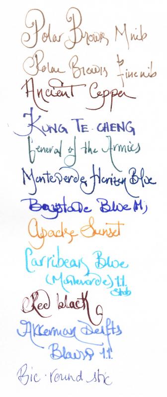
Birmingham Pens Honus Wagner Infield Brown Based on the positive review of some of the inks from the Birmingham Pens shop in Pittsburgh, PA I ordered the full sampler pack of 30 inks. I know some won't be to my taste, but many seemed quite interesting. The inks certainly win the award for the longest names. I stashed the samples away for relatively easy access, and this was the second ink I blindly selected for review. Brown inks are one of my favorites, but it can be challenging to find interesting ones. Many manufacturers' brown inks are based on red-brown, and this one is not an exception. It's quite nice, but honestly there is nothing special about it. It cleans very easily from the pen yet is reasonably dark. I'd say it is along the lines of MB Toffee Brown, Visconti Brown, and similar inks. Not as pure brown as Noodler's Brown nor as red as Noodler's Beaver. It shades nicely across the papers I used. No show through or bleed through, though it wouldn't be unexpected on the cheapest papers. The ink isn't water resistant but handles better than many. Pen: Pelikan M400 (M) Papers: MvL=Mohawk via Linen, TR=Tomoe River, Rhodia=Rhodia 90g ivory. Camera: iPhone 7 using Camera+ app The images were fairly decent, but the FPN uploader seems to modify the images making the ink appear darker and with less range than in reality. Most are decent, but the MvL one definitely has been shifted darker. As always with ink reviews, you may want to order a sample prior to diving in on a full bottle.
-
L'Artisan Pastellier Callifolio - Havane L'Artisan Pastellier is a small company in southern France that specialises in natural pigments, and offers customers authentic and reliable products in beautiful colours based on mineral or vegetable pigments. In a collaboration with Loic Rainouard from Styloplume.net, the chemist Didier Boinnard from L'Artisan Pastellier created the line of Callifolio fountain pen inks. These pastel-coloured inks are traditionally crafted, and can be freely mixed and matched. Overall these inks are only moderately saturated, and have low water-resistance. The inks were specifically designed to work well with all types of paper, and all types of fountain pens. Being pastel-tinted, these inks have a watercolour-like appearance, and are not only fine inks for journaling, but are also really excellent inks for doodling & drawing. I only recently discovered them, and they are already the inks I gravitate towards for personal journaling. In this review the spotlight shines on Havane, one of the many ochre-brown-orange tints in the Callifolio line. Havana is a light-brown ink without much of a red undertone... you could call it cigar-brown, to stay in line with the ink's name. Brown inks are often constructed from a mixture of primary colours, but this one seems to be based on light-brown dyes, as shown by the chromatography. The colour is subdued, and stays in line with the pastel-like character of most Callifolio inks. Havane works well with all nib sizes, providing excellent contrast with the paper even in the finer nibs. The ink also provides subtle but still very visible shading, which is aesthetically very pleasing. The shading is mostly absent in the finer nibs of my dry Lamy review pen, but shows up really nice in broader nibs, or wetter pens (like the visiting pen in the nib-size sample below). The ink looks good on both white and more yellowish paper. It writes smoothly and with good lubrication - even in my dry Lamy Safari test pen. To show you the impact of saturation on the ink's look & feel on paper, I made some scribbles where I fully saturated portions of the Tomoe River paper with ink. This gives you a good idea of what the ink is capable of in terms of colour range. Havane has an average colour span - with not too much colour difference between light and dark parts. This reflects in the shading the ink exhibits, which stays in the background but is definitely present. Quite nice, actually. [Edited] When posting the review, I noticed that the colour looked much redder than I see it with my eye. Turns out that this is another example of a "chameleon" ink, i.e. an ink that changes tone with the wavelength of ambient light. Below you find two other saturation photos of exactly the same ink swab: the first one is taken in daylight, the second one under artificial light. Under artificial light, this ink really turns into an orange-brown (that I quite like, but that is alas only a disguise). On the smudge test - rubbing text with a moist Q-tip cotton swab - Havane behaved really well, there is smearing but this doesn't impact the readability of the text. Water resistance is not great though. A faint orange-brown residue remains on the paper, which can still be deciphered with some effort. But I wouldn't go so far as calling this ink water-resistant. I've tested the ink on a wide variety of paper - from crappy Moleskine to high-end Tomoe River. For the Callifolio reviews, I'm using a format that shows you the ink's appearance and behaviour on the different paper types. On every small band of paper I show you:An ink swab, made with a cotton Q-tip1-2-3 pass swab, to show increasing saturationAn ink scribble made with an M-nib Safari fountain penThe name of the paper used, written with a B-nibA small text sample, written with the M-nibDrying times of the ink on the paper (with the M-nib)Havane behaves really well on most paper types: no feathering, and very limited show-through. Moleskine paper is the exception: here the ink exhibits some minor feathering, and very prominent show-through and bleed-through. Drying times are in the 10 second range on most papers. The ink works well with both white and yellow paper. I quite like the way it looks on Paperblanks, which I use for daily journaling. At the end of this review, I also show you the back-side of the different paper types, which gives you an idea of the amount of show-through / bleed-through. [Edited] On scans, the writing samples show a bit more red than in daylight. Below I show you a photo taken in daylight of some of the same writing samples. These show a lighter brown that the one captured by the scan: Writing with different nib sizesThe picture below shows the effect of nib sizes on the writing. All samples were written with a Lamy Safari, which is typically a dry pen. I also added a visiting pen - my wet Pelikan M400 Brown Tortoise with an F-nib. Here the ink leaves a very saturated line, which shows off the subtle shading that is exhibited by Havane. You can also see that this ink works well in all nib-sizes, even the finer ones. [Edited] And again, here is the same writing sample, but now as a photo taken by daylight: Related inksTo compare Havane with related inks, I use a nine-grid format with the currently reviewed ink at the center. This format shows the name of related inks, a saturation sample, a 1-2-3 swab and a water resistance test - all in a very compact format. I hope that you'll find this way of presenting related inks useful. Bringing the reviewed ink in close proximity with eight related inks makes it easy to spot the sometimes subtle differences. Inkxperiment - flying the tardisAs a personal challenge, I try to produce interesting drawings using only the ink I'm reviewing, keeping things simple and more-or-less abstract. I find this to be a fun extension of the hobby, and these single-ink drawings usually provide a nice challenge. It also gives you an idea of what the ink is capable of in a more artistic setting. My inspiration in this case came from the Doctor Who intro, which shows the Tardis spinning into a spiral. For the drawing I used 300 gsm rough watercolour paper. I thoroughly soaked the paper with water, and then applied Havane with a brush, adding some highlights with a 20% bleach solution. This forms the background for the drawing. On a separate piece of paper, I saturated the surface with pure ink, giving a nice dark-brown shade. This paper I cut into squares, and glued them in a spiral shape on the painted background. Et voilà... flying the tardis. The end result gives you a good idea of what can be obtained with Havane when using the ink for doodling & drawing. ConclusionCallifolio Havane from L'Artisan Pastellier is a cigar-coloured light-brown ink with a pastel-like character. The ink works great in all nib sizes, looks good on any paper type and exhibits some very sophisticated shading. I quite liked reviewing this ink, although it's not one of my favourite colours (I prefer my browns much darker than this). If you enjoy light-brown inks though, this one might well be worth your attention. [Edited] Be aware that this ink shows a totally different character depending on the lighting conditions. In daylight, the ink is more of a true brown, while under artificial light it turns into a much nicer orange-brown. Technical test results on Rhodia N° 16 notepad paper, written with Lamy Safari, M-nib Back-side of writing samples on different paper types
-
J. Herbin - Lie de Thé La Société Herbin, Maître Cirier à Paris, was established in 1670. This makes J. Herbin probably the oldest name among European ink makers. Today, Herbin produces a range of beautiful fountain pen and calligraphy inks, writing instruments, gift sets and accessories. Herbin inks are made in France, and the finishing touches on the bottles are still done by hand in Paris. J. Herbin is probably best known for their inks in the "La Perle des Encres" series. In this review, the spotlight shines on one of the stars in this line-up: the gorgeous golden-brown Lie de Thé. This ink immediately grabs the attention with its wonderful colour - a golden brown with yellow-orange undertones. This is a soft brown with tons of character and a tremendous colour range, ranging from a whispy sepia-tone to almost black-brown when fully saturated. The ink looks great on most paper types (Moleskine excepted), and exhibits elegant shading without too much contrast between the light and darker parts. J.Herbin truly scored a winner with this one. The ink has quite satisfactory lubrication, even in drier pens like my Lamy Safari. With wetter pens like my Pelikan Smoky Quartz with B-nib, the ink leaves a very saturated brown line, and loses a bit of its golden qualities. To illustrate the broad colour span of Lie de Thé, I did a swab on Tomoe River paper where I really saturated portions of the paper with ink. This beautifully illustrates the ink's broad colour range. This J. Herbin ink moves effortlessly from a very light sepia to a very dark, almost black brown. On the smudge test - rubbing text with a moist Q-tip cotton swab - the ink behaved perfectly, with only minimal smearing. Water resistance is amazing - the ink effortlessly survived even longer exposures to water. Really well executed! This is also apparent from the lower part of the chromatography, which shows that the grey components of the ink remain on the paper. If you need a water-resistant ink, Lie de Thé certainly fits the bill. This is an ink that will be at home in the workplace. Lie de Thé dries relatively fast on more absorbent papers (5-10 second range), but takes significantly longer on less absorbent paper. On Tomoe River e.g. the drying time is about 25 seconds with my relatively dry Lamy Safari with M-nib. I've tested the ink on a wide variety of paper - from crappy Moleskine to high-end Tomoe River. On each scrap of paper I show you:An ink swab, made with a cotton Q-tip1-2-3 pass swab, to show increasing saturationAn ink scribble made with a Lamy Safari M-nib fountain penThe name of the paper used, written with a Lamy Safari B-nibA small text sample, written with an M-nibDrying times of the ink on the paper (with the M-nib)Lie de Thé looks great on both white and more yellowish paper. I didn't detect any noticeable feathering, not even on the notoriously bad Moleskine paper. With Moleskine paper, there is however significant show-through and bleed-through - not unexpected for this fountain-pen unfriendly paper. Writing with different nib sizesThe picture below shows the effect of nib sizes on the writing. All samples were written with a Lamy Safari, which is typically a dry pen. I also added a visiting pen - my very wet Pelikan M200 Smoky Quartz with a B-nib. Here the ink leaves a very saturated line, which leans towards black-brown, unfortunately taking away some of the golden-brown beauty that appears with less wet pens. Related inksTo compare Lie de Thé with related inks, I use a nine-grid format with the currently reviewed ink at the center. This format shows the name of related inks, a saturation sample, a 1-2-3 swab and a water resistance test - all in a very compact format. I hope that you'll find this way of presenting related inks useful. It's a bit more work, but in my opinion worth the effort for the extra information you gain. Inkxperiment – Autumn VillageAs a personal challenge, I try to create interesting drawings using only the ink I'm reviewing. I find this to be a fun extension of the hobby, and these single-ink drawings often present a real challenge. It also gives you an idea of what the ink is capable of in a more artistic setting. For this abstract autumn village, I got my inspiration from some pics I found on Pinterest. The drawing was done on 200 gsm cold-pressed watercolour paper. To create the different tones in the picture, I used different ink-water ratios (from 1:20 for the really light parts, to 1:2 for the darker parts). The rooftops were done with pure Lie de Thé. The end result gives you a good idea of what Lie de Thé is capable of in a more artistic setting. ConclusionJ. Herbin Lie de Thé is a gorgeous golden-brown ink, that pleasantly surprised me on all fronts: a beautiful colour, great shading, good saturation - and all this even in finer nibs. The ink also has great water resistance, which is a plus if you want to use it in the workplace. This is an ink that deserves a place in anybody's ink collection - recommended! Technical test results on Rhodia N° 16 notepad paper, written with Lamy Safari, M-nib Backside of writing samples on different paper types
-
http://inks.pencyklopedia.pl/wp-content/uploads/De-Atramentis-Wood-Brown-nazwa.png Present test ink De Atramentis Wood (Brown) with a nice nutty color and very good properties, namely: the perfect flow, pen glides across the paper photocopier perfectly, good drying time and a nice saturation. If you like these shades, it will be very satisfied with my purchase. I would recommend! Producent: De Atramentis Series, colour: Wood (Brown) Pen: Waterman Hemisphere "F" Paper: Image Volume 80 g / cm2 Specifications: Flow rate: very good Lubrication: good Bleed through: possible point Shading: noticeable Feathering: unnoticeable Saturation: good Ink drying time: ~ 5 sec. A drop of ink smeared with a nib http://inks.pencyklopedia.pl/wp-content/uploads/De-Atramentis-Wood-Brown-kleks.jpg The ink smudged with a cotton pad http://inks.pencyklopedia.pl/wp-content/uploads/De-Atramentis-Wood-Brown-wacik.jpg Lines http://inks.pencyklopedia.pl/wp-content/uploads/De-Atramentis-Wood-Brown-kreski.jpg Water Resistance http://inks.pencyklopedia.pl/wp-content/uploads/De-Atramentis-Wood-Brown-woda.jpg Sample text http://inks.pencyklopedia.pl/wp-content/uploads/De-Atramentis-Wood-Brown-txt.jpg Other tests carried out: Sample text in an Oxford notebook http://inks.pencyklopedia.pl/wp-content/uploads/De-Atramentis-Wood-Brown-Oxford.jpg Sample letters in a Rhodia notebook http://inks.pencyklopedia.pl/wp-content/uploads/De-Atramentis-Wood-Brown-Rhodia.jpg Ink drops on a handkerchief http://inks.pencyklopedia.pl/wp-content/uploads/De-Atramentis-Wood-Brown-chromatografia1.jpg Chromatography http://inks.pencyklopedia.pl/wp-content/uploads/De-Atramentis-Wood-Brown-chromatografia2.jpg
-
Yama Guri found its home in an Imperial Blue Lamy Studio, with a really smooth fine nib that lays a fat line; it seems to evaporate less than in other pens, which lets you see the subtle yellow and grey nuances. First by itself on two papers; Fabriano Traccia brings out more nuances than Rhodia's pad n. 8, in good sun light. Next a comparison with other colours on Rhodia: First row of other colours: Chiku Rin, Vert Empire, Verde Muschiato, Ina Ho, Inti, Lie de Thé, Perle Noire, Verdigris. Second row: Mandarin, Ama Iro, Kon Peki, Souten, Équinoxe 6, Tsuyu Kusa, Asa Gao, Myosotis. Third: Fuyu Gaki, Orange Indien, Ancient Copper, Rouge Hematite, Diamine Poppy Red, Perle Noire, Ajisai. And then on Fabriano Traccia:
-
This ink is a really neat brown. It flows consistently well, has no problems with cleanup, and is decent on lubrication. It's a really good all-rounder ink if you don't mind it not being permanent. Or, for that matter, water resistant at all. On a ten-point system, 10 being the best: Flow: 8 Lubrication: 6 Dry Time on Tomoe River Paper : 20-25 sec Shading: 7 (Depends largely on the pen) Bleed: None. Ghosting: Just a bit, nothing too heavy. Color: 7 - I like it a lot, especially in my Monteverde Invincia with a Pendleton BLS Nib. Its a very nice brown with good shading in this pen. Overall: 7 - This is a brown ink I could see myself returning to! Written Review: Photo: Scan: After capturing, I noticed there were bits of these really neat silvery black sheen where the ink pooled up enough. It probably won't be seen unless your pen is REALLY flowing on very ink-resistant paper, but it is there! I'll leave two pictures. One of the sheen circled and one not circled. The pictures do not do it much justice as in real life it sheens much more especially under light. I had real trouble picking up any sheen on my camera. Thanks for checking out my review! -Nick
-

Ink Shoot-Out : Pelikan Edelstein Smoky Quartz Vs J. Herbin Lie De Thé
namrehsnoom posted a topic in Ink Comparisons
Ink Shoot-Out : Pelikan Edelstein Smoky Quartz vs J. Herbin Lie de Thé Last year, Pelikan pleasantly surprised me with its Ink of the Year 2017 - Smoky Quartz, and I've been really enjoying this smoky brown liquid. Fellow member Jan2016 then suggested that J. Herbin Lie de Thé is a very similar ink. That of course peaked my interest... so I got me a bottle of Lie de Thé and decided to pitch both inks against each other. Time to do a detailed comparison, and find out which of these is the better ink. Enter... the Ink Shoot-Out. A brutal fight spanning five rounds, where truly formidable inks do battle to determine who is the winner. And this time it's really a battle of giants! In the left corner - the new star from Hanover and Prussian heavyweight : Pelikan Edelstein Smoky Quartz. In the right corner, the crown jewel of Paris and offspring from a long line of giants : J. Herbin Lie de Thé. The boxing hall is packed to the roof, the crowds are cheering! Let the fight begin and may the best ink win... Round 1 First Impressions These are indeed heavyweights with a firm impression on the paper. Both inks leave a well-saturated line with excellent contrast to the page when used with my Lamy Safari M-nib on Rhodia N°16 notepad paper. Both inks also show subtle shading, without too much contrast between the light and darker parts, which I find aesthetically pleasing. The inks look quite similar, but there are some differences: Lie de Thé is a lighter brown, with more yellow undertones. This also shows in the chromatography of the inks. This lighter nature of Lie de Thé is most obvious in swatches, less so in written text.Lie de Thé lays down a wetter line. Smoky Quartz in contrast is a drier ink, but a really well lubricated one. With broader nibs, e.g. with the scribbles made with a 1.5 mm calligraphy nib, Smoky Quartz shows a bit more character, with a more pleasing appearance.Both inks make a great first impression. But when they climbed into the ring, the German champion radiated more confidence. I prefer its slightly darker hue, and the fact that it shows more character with the calligraphy nib. These inks are well matched, but for this round Smoky Quartz gets a small advantage from the judge. The chromatography clearly shows that both inks have lots in common. They have a really similar composition, with only a touch more yellow in the French ink's mix of dyes. Round 2 Writing Sample The writing sample was done on Rhodia N°16 Notepad with 80 gsm paper. Both inks behaved flawlessly, with no feathering and no show-through or bleed-through. With the EF nib, the darker complexion of Smoky Quartz comes into play, resulting in more contrast-rich writing. I also noticed that Smoky Quartz leaves a crisper line on the page, especially when using broader nibs. My guess is that this is due to the really pronounced initial wetness of Lie de Thé, which results in a slightly less well-defined line. Colourwise both inks look similar in writing, although there is definitely more of a yellow undertone in the J. Herbin ink. Both inks also shade nicely, without too much contrast between light and dark parts. This aesthetically pleasing shading gives more character to your writing. For this round, the focus is on writing, and here Smoky Quartz got a slight advantage. It works better with EF nibs, and also shows a crisper line. Not much of an advantage, but enough to result in a win on points. Round 3 Pen on Paper This round allows the batlling inks to show how they behave on a range of fine writing papers. From top to bottom, we have : FantasticPaper, Life Noble, Tomoe River and Original Crown Mill cotton paper. All scribbling and writing was done with a Lamy Safari M-nib. Both champions did well, with no show-through nor bleed-through. But this round is not about technicalities, it is about aesthetics and beauty. Are the fighters able to make the paper shine ? One thing is immediately apparent: these inks are at home on a wide range of papers, both white and off-white ones. On more absorbent paper like Fantasticpaper (top), the inks look really similar. With Tomoe River - definitely a non-absorbent paper - Lie de Thé shows its lighter nature. But it also lays down a less crisp line, making it look less interesting and losing some of its beauty. Both inks are on par with each other, but Smoky Quartz has a slight advantage in the looks department - it shows a more consistent look across the range of papers. For this round, victory is granted to Smoky Quartz. Not a knock-out, but definitely a win on points. Round 4 Ink Properties These inks are not fast-drying, requiring 20-25 seconds to dry completely (with an M-nib on Rhodia paper). Lie de Thé takes a bit more time to dry. Both inks are reasonably smudge-resistant. Some colour rubs off when using a moist Q-tip cotton swab, but the text itself remains crisp and clear. Being the lighter ink, the smudging is less pronounced with Lie de Thé. To test water resistance, I dripped water on the grid and let it sit there for 15 minutes, after which I removed the water with a paper towel. Both inks are remarkably water-resistant! The brown colour disappears, but a clearly readable dark-grey residue remains even after a 15 minute soak. Really impressive. For this round, both champions were well-matched, but Lie de Thé gets a small advantage for its less pronounced smudging. Round 5 The Fun Factor Welcome to the final round. Here I give you a purely personal impression of both inks, where I judge which of them I like most when doing some fun stuff like doodling and drawing. Both inks do well, and allow for some nice effects when using a water brush. I really enjoyed using them. With both inks, you can coax a broad colour range out of them. Dilute them with water, and you get the yellowish hues used for the background. Really saturate them, and you get a very similar looking dark brown. The foliage in the picture shows the undiluted colour, where Lie de Thé is obviously the lighter coloured ink. But overall, both champions did equally well, and no clear winner emerges. So for this round, I call it a draw - I greatly enjoyed playing with both of them. The Verdict Both inks are real jewels, that work on all types of paper. And being water-resistant, they make fine inks for use at work in an EDC pen. Is there a clear and definite winner? No. But the German champion did show a bit more promise : better contrast with EF nibs, and overall a crisper line on non-absorbent paper. Small advantages, but enough for this judge to declare Pelikan Edelstein Smoky Quartz the winner of this fight. -
-
In the few short months I've been involved with fountain pens I've bought and used around a half dozen ink samples. My favorite so far is Diamine Syrah. (Most of the images online show too red [or my sample isn't red enough!], but this FPN review is what I see on Rhodia paper.) Although in gel pens I tend toward dark colors (black, green-black, brown-black), so far I've found I like medium tones like this particular brown with a hint of red. I like it more than the cartridges I have in the darker Diamine Chocolate Brown. But... I'm a lefty and this ink's long dry times are getting me down.And the ink feathers on cheap paper I sometimes need to use (at least with a M nib) What are some alternative mid-brown inks that similarly have a hint of red in them that I might want to consider trying that dry faster, perhaps while also being more paper-agnostic? (Not too red though - for example I like Diamine Oxblood but not pages of it.)