Search the Community
Showing results for tags 'bock'.
-
I got this the other day, blugged into a German postwat piston-filler - it's gold and quite flexible, and possibly prewar. the beast on the nib makes me think it's a Bock...does anyone know? Here's a picture: I'm probably going to plug it into a prewar (maybe) Reform ringtop which needs a nicer nib than the one it came with.
-
Hi All, Does anyone know if the titan #5 nib from bock with housing will just screw in place of the standard faber castell nib for example on the basic or ondoro... Has anyone tried it. Thanks William
-
Greetings everyone, I'm new to the fountain pen world and just joined this forum. I recently purchased a Blackstone Maxim Heavy Metal Pen that was shipped from Australia (I'm not aware of any US dealers). http://justwrite.com.au/fountain-pens/Blackstone-Fountain-Pens/Maxim-Heavy-Metal-Fountain-Pens/copper-fountain-pen I'd like to get another nib assembly, but don't want to pay the international shipping. Does anyone know if other nib assemblies would be interchangeable? Here's a link to the nib assemblies they sell. http://justwrite.com.au/fountain-pens/Blackstone-Fountain-Pens/Maxim-Nib-Assemblies Nib Size: #5 (5mm) Thanks in advance for any help.
-
Topic Removed From Nibs And Tines Subforum Without Prior Notice.
Frank66 posted a topic in Of Nibs & Tines
On Dec 17th, I posted a topic ''Bock Rollerball Nib In Jinhao 886 Pen Beaufort Ink Converter'' in the Nibs and Tines sunforum of the FPN. I misspelled the name Beaufort Ink (where I get the Bock nibs from in the UK) in the title, but the FPN does not allow you to edit the title of the post once there. So on Dec 19th, I contacted both moderators of FPN Nibs and Tines subforum to ask for help to correct the spelling mistake. The following day, I discovered my post was missing and after some search I discovered it was placed in a different subforum, namely the ''It Writes, But It Is Not A Fountain Pen....'' subforum. I think this has not done justice to my post. And here is why: As stated in the FPN home page, The ''Of Nibs & Tines'' subforum heading includes topics such as ''Questions and Discussions about Nibs of any Materials, Preferences, Feeds, Flow Adjustment, the Why, How and What all go here.'', and my modified Jinhao pen with the rollerball nib fully qualifies under such description, since: - it involves a fountain pen body - it uses fountain pen ink, and not a rollerball refill - it includes a fountain pen converter - it has a feed - it has a nib, even though it is a rollerball nib. Subforum description does not state that only pens with Nibs WITH tines should be mentioned here. There are other other fountain pens with alternative nibs, for instance, the Pilot Parallel pen that have 2 plates as a nib but who can claim that they are not fountain pens and do not belong to be discussed in this subforum? Also there are the Hero 360 degree nib fountain pens, who can argue if they are fountain pens or not? - The subforum heading is ''Of Nibs & Tines'' and it is not ''Of Nibs WITH Tines'', If this was the case, then the subforum description should clearly state so. - Finally I do not understand how my modification should stand along with other posts in the ''It Writes, But It Is Not A Fountain Pen....'' subforum, including typewriters, ballpoint pens, pencils, gel refill rollerballs etc. With all due respect to the moderators of ''Of Nibs & Tines'' subforum, I would appreciate it if they kindly reconsider transferring my post back in its initial place, which is a place we all have contributed and loved. Sincerely. -Frank66 -

Stylos Titanium Ink Fountain & Rollerball, Artliner, Pen
kostavox posted a topic in Fountain & Dip Pens - First Stop
Hi All, Just wanted to introduce you to the latest version of STYLOS - Titanium: https://www.kickstarter.com/projects/2026090977/stylos-titanium-ink-fountain-and-rollerball-artlin What makes this version special is that I've created "universal nib holders" which can accomodate a variety of different nibs from different manufacturers. And, of course, I can add more nib holders to the project in the future. Catalogue: http://metaxas.com/stylostitanium_2016.pdf warm rgds, Kostas Metaxas www.metaxas.com -
So, here's my latest acquisition. The Namisu Nova pen, made from sandblasted titanium, with a Bock EF titanium nib : http://i1149.photobucket.com/albums/o594/keirwilliams98/DSC_0175_zpszcobk7aa.jpg http://i1149.photobucket.com/albums/o594/keirwilliams98/Nova-Bead-Side_f3f67538-9657-4d73-826d-743404a4a11d_1024x1024_zpsdeqxiwr7.jpg This is my first pen that is from Namisu, and my first pen that originated on Kickstarter. They had made the pen in Aluminium and brushed Ti before, but this finish was new, and I thought it was about time to check out their pens. I also like that they are from Fife in Scotland, where I have family. I preordered the pen in September, and it arrived the next day after shipping. It came in a simple slide out box, with nothing apart from the pen and converter. No ink cartridges were included, which I find a little odd, although that doesn't bother me as I use bottled ink. http://i1149.photobucket.com/albums/o594/keirwilliams98/namisuuncapped_zpss7hnpm2t.jpg The pen is beautifully made; there are no machining marks, and the finish is consistent across the body. The section is polished but not to the extent where it is remotely slippery(the Lamy studio comes to mind) and tapers slightly towards the nib. There is quite a step between the section and the body but it is not sharp. I prefer to hold the pen further back, nearer the threads as it is slightly back heavy, and it is still comfortable there. The pen is not light, at 40g capped and 30g uncapped, this is not for you if you're a fan of lightweight resin pens, although it is comfortable for long writing sessions. The pen does not post, but if it did, the pen would be extremely unbalanced. http://i1149.photobucket.com/albums/o594/keirwilliams98/namisusectionnib_zpsfmdklglr.jpg The nib is available in several options. For a lower price, a steel Bock #6 nib is used in sizes EF,M or B, and with a higher price, a titanium nib in EF or M. I opted for the ti EF nib. I think it is a little odd not to include a Fine grade, and I think the option of a gold nib would be nice, considering that Bock make gold nibs in the #6 size. The nib is the first ti nib I have used; it is wonderful. Out of the box it was wet and smooth, although 10 seconds on micro mesh brought it to the level of smoothness that I like. It is soft, and I think that it could easily be sprung with a heavy hand. With a light touch however, you can create juicy line variation from EF to BB without railroading. It never hard starts and doesn't skip, even with the fastest speed of writing. I would say that it is rather broad for an EF, and I would consider it closer to a Western Fine. I really enjoy the matte finish on the nib, although nib creep is inevitable from the first fill ! Here are some comparisons to there nibs: http://i1149.photobucket.com/albums/o594/keirwilliams98/namisuink_zpsmwv6wubm.jpg It is very close to a Lamy Safari F, although it is wetter. The feed is big and can keep a lot of ink within the fins: http://i1149.photobucket.com/albums/o594/keirwilliams98/namisufeed_zpso2ap57xb.jpg There is no logo on the outside of the pen. Instead, by the section threads, there is a minimal 'N'. I really like this: http://i1149.photobucket.com/albums/o594/keirwilliams98/namisusectionconverter_zps1mct3g0z.jpg For me the pen is a good size, but I have included some comparisons to other well known and popular pens : http://i1149.photobucket.com/albums/o594/keirwilliams98/comparisoncapped_zps4azu3jdv.jpg From L-R - TWSBI Eco, Jinhao X450, Lamy 2000, Lamy Safari, Namisu Nova, Pelikan M400 & Kaweco Sport. Uncapped/posted: http://i1149.photobucket.com/albums/o594/keirwilliams98/namisucomparison_zpsywi7ii8v.jpg The Pelican and Kaweco are posted as I consider them a little small to use un-posted. As you can see it is in a similar size to the Safari and 2000. Dimensions are : Length (Length uncapped) – 137mm (131mm)Maximum diameter: 15.2mmGrip diameter: 11mm In 2016, I paid £98 for the pen, which included a Schmidt converter. With a steel nib, the pen is £70. In the US, for Ti it is $120, and with a steel nib, $85. Shipping is free in the US and the UK. Is it worth it ? In my opinion, yes. Titanium is a difficult material to work with and is expensive. The only other pen similar to this is the Nakaya Ti Piccolo which is $1000. Make your own judgement ! The finish and attention to detail is impeccable, and the pen wrote well out of the box, with an amazing, soft nib. I wouldn't hesitate to recommend it. The only faults I can think of are slightly sharp section to barrel threads which are a little squeaky, and the pen is slightly top heavy. Apart from that, I cant find anything else to criticise it on. Oh, the nib availability. I'd like to see it with a gold nib please. Get it here at : http://www.namisu.com 9/10
-
This pen arrived in the mail today, and I'm not even going to pretend this is a thorough review - I just wanted to get some pics up there, for those of you who might be thinking of grabbing one of these down the track. This is one of four Kickstarter pens I've backed in the past 12-18 months - the 'Nexus' and 'Nova' from Namisu, the 'TiScribe' from Urban Survival Gear... and now the 'Gist' from Tactile Turn (https://www.kickstarter.com/projects/eimim/tactile-turn-gist-simple-fountain-pens-that-really/). It's hard to say which is my favourite - but I've gotta say, straight out of the box I'm really impressed with this one. Speaking of which... here's a picture of the box: http://i.imgur.com/2yCxjOD.jpg And a picture of the pen still inside the box: http://i.imgur.com/Uh26Wht.jpg I opted for the full polycarbonate model of the pen - it was also available in brass, copper, bronze, steel, damascus steel or titanium... or in polycarbonate with a metal grip and finial. The pen came with a #6 Bock nib, a 1.1mm stub - but as optional extras I ordered a stainless steel grip and a Fine #6 nib (these were packed in a separate plastic container). Also included in the packaging was a 'thank you card' that includes a 25% off discount for pens purchased via the Tactile Turn website: http://i.imgur.com/oROuT77.jpg The following measurements come from the Kickstarter Campaign page: And here are some comparison photos - with my Lamy 2000 and Safari pens: http://i.imgur.com/XrIipvZ.jpg http://i.imgur.com/CraWsV0.jpg The pen is a little shorter than the Lamy 2000 - 11mm shorter, to be precise - but other than that the pen has a very similar profile. The big difference, of course, is the nib - where the Lamy 2000 sports a 14K gold hooded nib, the Gist employs a Bock #6 nib, in a nib assembly that's readily replaceable or interchangeable. A couple of slightly blurry close-ups (sorry, I don't have a proper macro lens!): http://i.imgur.com/mg2BMGC.jpg http://i.imgur.com/7FHrBLk.jpg The Gist takes standard international ink cartridges - and comes with a good quality cartridge converter installed: http://i.imgur.com/Z5JhDmT.jpg So, what's my experience of writing with this pen so far? (1) The pen is really cool-looking - I love the all-black polycarbonate body, and the ridged finish makes it extremely 'grippy' so it won't easily slip between the fingers when writing. The stainless steel grip section, likewise, allows for firm grip. (2) It's extremely light-weight (~19g with the full polycarbonate body - I haven't tried the stainless steel grip section yet), but very well-balanced and comfortable in the hand. The grip section tapers down from 11.5mm near the threads to 9.5mm nearest the nib, which is a great fit for my hand. (3) The pen easily assembles and disassembles - the acme threads for the cap are smooth and ensure a good seal when the pen is capped; the thread securing the grip section onto the barrel is much finer, and I think there's a good chance the pen could be 'eyedroppered'. (4) The fine stainless steel nib is a true fine, and writes very nicely. I've got a few pens now that use the same Bock #6 nib assembly, and like the fact that they're so readily interchangeable. (5) The pen is equally comfortable to write with, posted and unposted. How the Gist holds up over time remains to be seen - but first impressions are very favourable. Will try and provide some updates as I 'break the pen in'. Would love to hear from others who jumped on board the Kickstarter campaign - but wanted to get the ball rolling... One last shot - a short writing sample: http://i.imgur.com/FgEmcCq.jpg
-
Here are some of June harvest of Kilk Custom Pen Studio. All ebonites are German. Nib units are Jowo #6 18k Solid Gold with exception of Blue ebonite; Bock #6 Titanium SemFlex. Finials and bands are silver, exception is reddish ebonite, it has 24k gold plated bands and clip. Clipless cigar like pen has an abalone inlay at the back.. For further information, please refer to our website: www.kilk.ist http://i392.photobucket.com/albums/pp3/KilkPens/Blueripple_01_zpszpwi8vqg.jpg http://i392.photobucket.com/albums/pp3/KilkPens/Sefahan_3_zpsgtbws5nx.jpg http://i392.photobucket.com/albums/pp3/KilkPens/Sefahan_1_zpseanzdiak.jpg http://i392.photobucket.com/albums/pp3/KilkPens/Blueripple_04_zpskcxottek.jpg http://i392.photobucket.com/albums/pp3/KilkPens/Kerem3_zpsggi0wxo0.jpg http://i392.photobucket.com/albums/pp3/KilkPens/Keremabalone_zpsmmzhuluz.jpg http://i392.photobucket.com/albums/pp3/KilkPens/Ulvi_3_zpstdw0f2f8.jpg http://i392.photobucket.com/albums/pp3/KilkPens/Ulvi_4_zpsr2j421qu.jpg
-
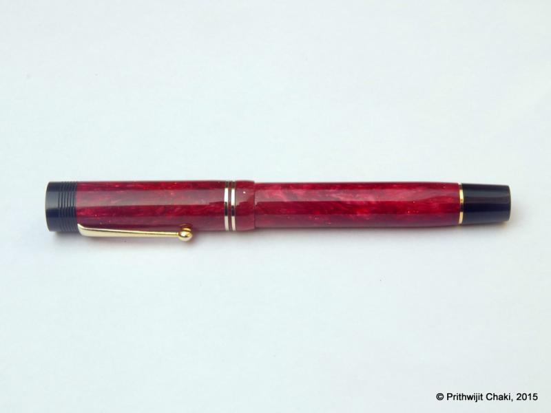
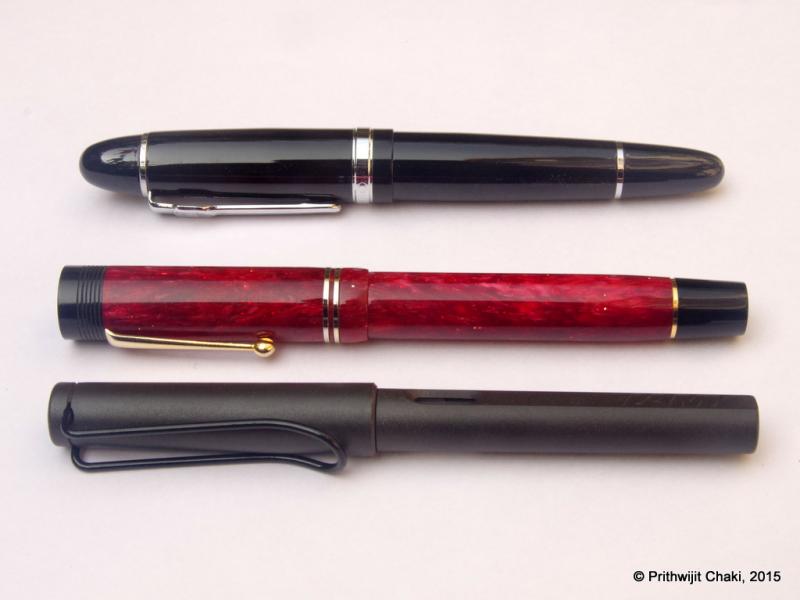
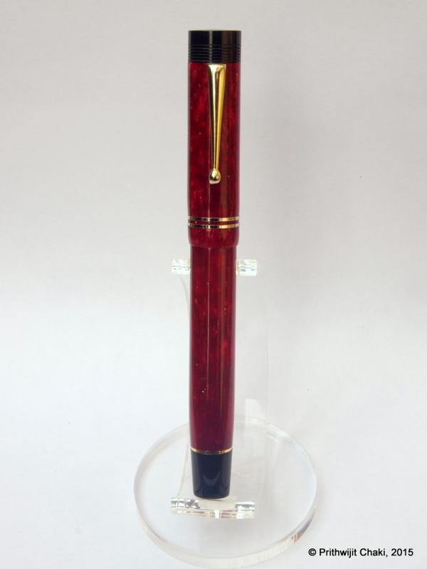
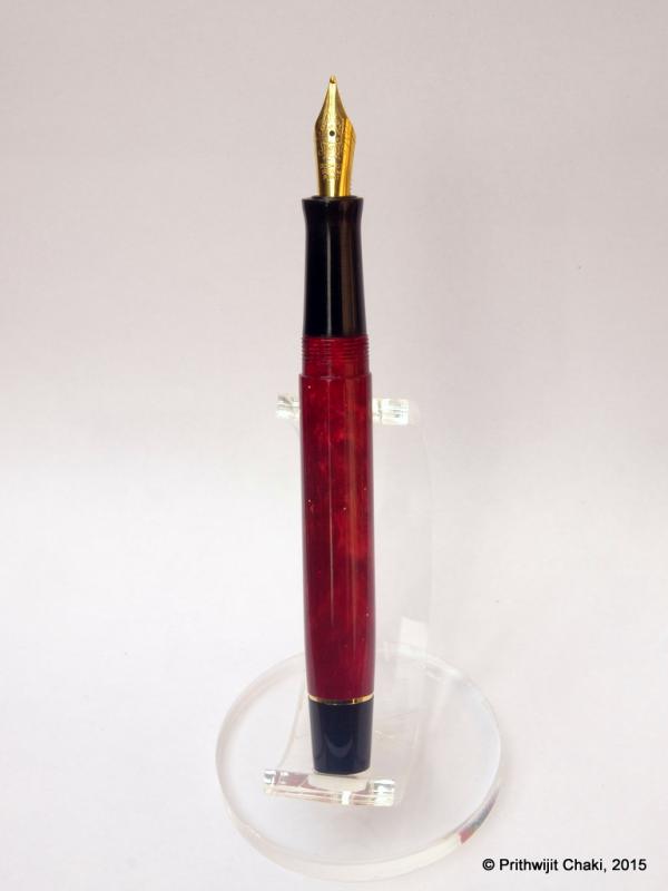
Introduction The cigar shape has been an all-time fountain pen classic. Whether it is the Sheaffer Balance of 1920s or modern Meisterstruck or KOP, the shape has an enduring appeal and is often the signature design for top of the line pens from their respective pen marques. The shape and form have morphed into being a hallmark of quality exemplified by such storied models such as MB 149, Sailor KOP, Namiki Emperor or even the platinum president line. Not all cigar shapes however are created equal and there are many variations within the broader design. Intrigued, I dug a bit deeper and this source provided an enlightening education on the topic. To summarize, there are two basic cigar shapes: "parejo" and "figurado." A parejo is a cigar that has straight sides and a rounded head.A figurado is any shape other than a parejo.http://i1097.photobucket.com/albums/g346/prithwijitchakiPrithwijit/Fountain%20Pen%20Reviews/ASA%20Santulan%20Review/Parejo_zpsulicy0zv.jpg We can further classify figurados into Belicoso: A figurado shaped cigar that tapers sharply at the head like some kind of munition.Pyramid: A pyramid starts tapering right at the foot of the cigar.Torpedo: A torpedo has a longer and more gradual taper than other figurado designs. http://i1097.photobucket.com/albums/g346/prithwijitchakiPrithwijit/Fountain%20Pen%20Reviews/ASA%20Santulan%20Review/Torp-Beli-Pyra_zpskt0vci95.jpg There are many torpedo shaped fountain pens. These tend to be cylindrical in shape with smooth tapering towards rounded ends. Nothing exemplifies the genesis of this shape than the classic torpedo shaped Sheaffer’s pens such as the Balance and the Sovereign series. There are many contemporary pen makers who are churning out excellent torpedo shaped pens. From top of the mind recall, a few like Ranga, Edison and Guider come to mind. I wanted a few such pens to be made from different materials and requested Mr. Subramaniam of ASApens to make a variant of the torpedo shape. This was the genesis of the pen I am about to review. Fellow FPNers Kapil (@springrainbow) and Pradeep (@pdg84) christened the pen “Santulan” which means “Balance” in Hindi and is an obvious homage to the pioneering model of this design language. Design In case my rather lengthy and rambling introduction doesn’t make it clear enough, the Santulan is a cigar shaped pen. To be a bit more pedantic it is a cigar shaped pen with a torpedo like barrel and a pyramid like cap. There is a discernible step between the barrel and the section with a fairly large area where you have the threading for the cap. The section itself is long and comfortable. It is a new design by ASA and is mildly concave with the diameter at the barrel side being just a tad larger than the diameter near the nib, thus allowing for a gentle inward slope. The material used is the Conway Stewart Red Whirl acrylic. It’s a beautiful shade of emerald green with hues of pearlescent effect. The red swirly patterns add to the mystique and brilliantly complement the Stahl Rot (“Red Steel”) nib that has been used with this pen. The entire pen has been buffed smooth and gives off a nice shine. Trims have been kept deliberately to a minimum and there is just a clip for utility purposes. It’s a beautiful regular sized, light and robust pen that is meant to be used daily. http://i1097.photobucket.com/albums/g346/prithwijitchakiPrithwijit/Fountain%20Pen%20Reviews/ASA%20Santulan%20Review/IMGP2037_zpsbikd6ct5.jpg http://i1097.photobucket.com/albums/g346/prithwijitchakiPrithwijit/Fountain%20Pen%20Reviews/ASA%20Santulan%20Review/IMGP2042_zpsvft7oudt.jpg http://i1097.photobucket.com/albums/g346/prithwijitchakiPrithwijit/Fountain%20Pen%20Reviews/ASA%20Santulan%20Review/IMGP2040_zpsmxrptdar.jpg http://i1097.photobucket.com/albums/g346/prithwijitchakiPrithwijit/Fountain%20Pen%20Reviews/ASA%20Santulan%20Review/IMGP2041_zpsy69fe6hc.jpg http://i1097.photobucket.com/albums/g346/prithwijitchakiPrithwijit/Fountain%20Pen%20Reviews/ASA%20Santulan%20Review/IMGP2048_zpsbjvqy8k4.jpg Size and Balance At 153mm capped, the specifications may indicate that this is a heavy oversized pen. Nothing can be further from the truth. This is one of the lightest, slimmest and most comfortable ASA pen that I have ever used. Partly the reason for it’s lengths is the inherent length required of torpedo and missile like shape at the two finials. But a very slim barrel width of 10mm and section width of 8mm should leave no doubt about the fact that this is firmly an EDC (Every Day Carry) pen. This is the slimmest section in an ASA pen that I have ever used and should put to rest any concerns that anyone might have with regards to the thicker than normal girth of Indian handmade pens. Not only the thickness, but also the shape of the section is meant to accentuate the feeling of comfort. Nothing beats the feeling in hand once you start writing with it and realise feather-light weight and the comfort. Needless to say, the pen is well balanced and provides comfortable writing for extended periods. http://i1097.photobucket.com/albums/g346/prithwijitchakiPrithwijit/Fountain%20Pen%20Reviews/ASA%20Santulan%20Review/IMGP2051_zpsoexo6bjv.jpg http://i1097.photobucket.com/albums/g346/prithwijitchakiPrithwijit/Fountain%20Pen%20Reviews/ASA%20Santulan%20Review/IMGP2049_zpsjnj5vh21.jpg Nib Lately I have developed a fascination for experiencing nibs made of different materials. Given that The Bock 250 triple system seems to have the widest range of conceivable material options, its hardly surprising that I have embarked on developing a collection of different Bock 250 nibs. For the Santulan I had opted to use the “Bock 250 Stahl Rot” unit in medium width. This is essentially a steel nib with an anodized red coating. The coating process gives the nib a matte red outer appearance. The nib colour brilliantly complements the red whirl finish of the material. A big thank goes out to fellow FPNer Tervinder (@romee_win) and his brother Rajdilawar who took great pains and got it for me from Germany. Filling Mechanism Like most pens that I order, the Santulan too comes in a Cartridge-Converter system and accepts standard international cartridges and compatible convertors. In my opinion this provides the the optimum combination of value, system longevity, convenience and widespread compatibility. The pen comes with a Schmidt K5 convertor out of the box. Build Quality The Santulan exhibits the standard ASA quality attributes. As usual, the fit, finish and the tolerances are excellent and the joints are seamless. A lot of attention and care has been put into polishing and buffing to ensure a very high quality of the finish. However one has to keep in mind that it is an entirely hand-made pen and there is likely to be some fine trace marks under minute inspections. Writing Experience Bock is one of the most (if not the most) renowned independent manufacturer of nibs in Europe and worldwide. Their clientele include who’s who of leading pen brands in the world. Naturally expectations were very high from the nib. Unfortunately, out of the box the nib was extremely dry and maybe even a bit scratchy. While the initial experience was underwhelming, Mr. Subramaniam assured me that once properly tuned, this nib would be a joy to use. True to his words, he has done magic with this nib. Post tuning, the nib is smooth and glides over the paper. There is just a hint of feedback and that too the sort that is usually so enjoyable and adds character to the writing experience. I am very happy with how the pen writes now and can heartily recommend a tuned Bock to all. The only additional ask if I may add would be a slightly increased ink flow which would make things perfect. The nib does not have any softness or flexing characteristics and can be considered a nail. Overall, a great nib and a wonderful writing experience. There has been one major drawback of the tuning process which I feel compelled to highlight. While flossing the nib and adjusting it, the nib started to loose its red anodized coating and some flakes of paint have chipped off revealing the steel nib underneath. This is a big disappointment and severely undermines the aesthetics of the finished pen. http://i1097.photobucket.com/albums/g346/prithwijitchakiPrithwijit/Fountain%20Pen%20Reviews/ASA%20Santulan%20Review/IMGP2050_zps0rtjibja.jpg Price and Value The Santulan was a limited run based on orders given by myself and a few other group members. While we each paid a premium for our pens, much of that premium went towards the special material and the nibs that we had ordered. ASA however made it easy thanks to the affordable pricing for making the pens. The price reflects the price of components and the effort that goes into making each pen. To summarize, the pen represents good value at an affordable price point. Specifications The measurements shared below have been taken with a simple ruler and my bare eyes. While they may lack precision, they should still be adequate to give you an overall picture of the size of the instrument. Length (capped) – 153 mm Length (uncapped) – 137 mm Length (cap) – 71.5 mm Length (section) – 23 mm Maximum width (cap) – 11 mm Maximum width (barrel) – 10 mm Maximum section width – 8 mm Minimum section width – 7 mm Conclusion Mr Subramaniam of ASA pens has been very gracious in entertaining the Santulan order even though it is not part of the standard line. The very few who have owned or used this pen, have appreciated it’s balance, comfort and overall writing experience. It is an elegant pen oversized pen this is still lightweight. The design lends itself to using most #6 nibs that are available. With the risk of inherent bias clouding my judgement, I would still have little hesitation in recommending this pen to others. I am sure all of you would enjoy it too. The only caveat I would add is to opt for other standard Bock or Jowo nibs and not the Stahl Rot colour due to the fact that it’s a poor performer out of the box and while tuning it is likely to suffer flaking or loss of coating during tuning. Useful Links Conway Stewart Red Whirl blanks from www.theturnersworkshop.co.uk Bock 250 Stahl Rot nib from www.starbond-europa.de Bock nibs are also available at www.beaufortink.co.uk Pen made by www.asapens.in
-
Introduction Recently my interest in all things fountain pen related has spawned a specific sub-genre - a fascination for experiencing nibs made of different materials such as gold, titanium, palladium, etc. Looking around, it seems that the Bock 250 triple system is the ideal platform for experiencing material differences since they seem to have the widest range of conceivable material options for this particular nib. It is thus hardly surprising that I have embarked on developing a collection of different Bock 250 nibs. To eradicate as many variables as possible, I am getting all of them in medium tip so as to focus solely on experiencing material differences. Amongst the earliest Bock 250 sets, I got a Titanium one thanks to the help of fellow FPNer Tervinder (@romee_win) and his brother Rajdilawar who got it for me from Germany. Just looking at the colour of the Titanium nib convinced me that it will go very well with oxidized silver trims. Since Manoj is the only Indian pen maker that I am aware of who is using silver accoutrements, I approached him with a request to get a pen made. To match the colour of silver trims and titanium nibs, I opted to use Conway Stewart Heather blanks and hence the moniker used for the pen. Design Instead of creating a design from scratch, I shared with Manoj one of the drafts I had of the Azaadi design. This was largely similar in concept except for being slightly larger and having only one broad ring in the cap instead of having two slimmer ones. It is a classic design with simple straight lines for the cap and with only a slight tapering of the barrel. The top of the cap and the bottom of the barrel are flat and polished. The body of the barrel and the cap are polished smooth and shiny. The broad silver hand crafted band on the cap with elaborate motifs add a touch of flair. Just like the Azaadi (and its muse the Churchill), this pen too has the concentric circles on the cap finial to give it a crown like look. The clip and trims used are all made of silver. The turquoise/teal base colour of the heather material and its pearlescent properties nicely complements the muted colour of the silver trims and the titanium nib. Size and Balance At 155mm capped, this is a card carrying member of the oversized pens club. But don’t let the length let you have misconceptions about its heft. Being a completely kitless pen with no metal other than in the nib, clip and bands means it is in-fact surprisingly light. Despite the length, it is nicely balanced and can easily provide comfortable writing for extended periods. The simply sublime section design adds to the comfort quotient. One can post the cap if so desired, but I prefer to use the pen unposted. The excellent Conway Stewart acrylic material is light and yet strong and hence the pen despite being oversize doesn’t compromise on the weight aspect and this contributes a lot towards the overall comfort. Nib The Bock 250 Titan nib in medium width is the heart and soul of the pen. As I had mentioned earlier, this pen exists for the sole purpose of allowing me to experience this nib. From an appearance perspective, this nib looks exactly like any other Bock 250 nib out there. Only the subdued matte grey colour and the Titan branding on the nib below the Bock logo gives you a hint that it is a wolf in sheep’s clothing. The clip nib and bands complement each other nicely thanks to their colour. Filling Mechanism The thing I like about European pens is how most of them use the standard international system for cartridges and compatible convertors. I like this system better than any other because of the wide compatibility, system life longevity, value and convenience. So I am not at all surprised and quite delighted that Bock 250 triple systems adopt the same standard. This pen has paired the nib unit with a Schmidt K5 converter to use bottled inks and can also accept cartridges from a host of brands. Build Quality Manoj is a master craftsman who is known to work on only one pen at a time with an eagle’s eye focus on the details. That naturally translates to hallmark of quality and the pen benefits from the same. The fit and finish and the tolerances are impeccable for a handmade pen. It is obvious that the pen has been made with care and a considerable amount of time has gone into polishing and buffing to ensure a very high quality product. Writing Experience I know all of you are interested about the writing experience more than anything else. I will keep it short and unambiguously state that this nib is simply awesome. The nib is super smooth, appropriately wet and glides over the paper laying down a nice wet line. There are no skips or false starts and overall the pen is a superb writer. The closest analogy I can think of is a couple of Visconti Dreamtouch nibs I have tried and this nib feels exactly the same. Just to ensure that I am not being prematurely exuberant, I have been using this pen in continuous rotation for over a month now all the time keeping it inked with Daytone Blue-Black. I am happy to say, a month of cohabitation has not changed my opinion a bit and I still smile at the prospect of putting the pen to use. Please note that I am well aware that there are likely to be significant unit to unit variations between nibs and your personal experience might vary. So while I am no authority on whether all Bock Titanium nibs are great, the one I have received certainly makes me very happy. Price and Value I will make a distinction between the value proposition of the pen as made by Fosfor and the overall pen’s cost including that of the Titanium nib which I had procured by myself. As far as the standalone pen is concerned, it is incredibly VFM. I may have mentioned this before but I will do it again that I am not aware of any other custom pen-makers who offer this level of quality and individualization at this price point other than Manoj and Mr. L Subramaniam of ASA Pens. They hear you out, try to understand what is it that you wish to achieve and the satisfaction persists long after the cost concerns have receded. Given how happy I am with the Titan nib, it is no wonder that I find the overall pen an amazing value for the quality and beauty that it offers. I am under no illusion however that part of the value perception comes into the picture because I wanted to experience something different in a Titanium nib. There may be quite a few steel nibs that can be tuned equally well (and I may have quite a few of them as well) and your perception of value is likely to be influenced by this fact. To Summarize, the pen is a great value with a properly tuned steel nib and an amazing value with the Titan nib if such a nib is what you are specifically seeking out. Specifications The measurements in this section have not been taken with any precision instrument or laboratory techniques but should suffice to give you a fair idea of the size of the instrument. Length (capped) – 154.5 mm Length (uncapped) – 137 mm Length (cap) – 71 mm Length (section) – 22 mm Maximum width – 14 mm Minimum width – 8.5 mm Maximum section width – 10 mm Minimum section width – 8.25 mm Conclusion I had commissioned this pen with a very specific objective and it has successfully delivered without an iota of doubt. Not only do I like this pen, it has managed to wriggle into my regular list. I rarely ink up the same pen for four successive weeks and this one is breaking all records. It is very comfortable, well balanced and an excellent writer thanks to the wonderful Bock Titan nib. The silver clip and band is a unique Fosfor signature lends the pen a degree of exclusivity. I have no hesitation in recommending this model to others. Useful Links Conway Stewart Heather blanks from www.theturnersworkshop.co.uk Bock 250 Titan nib from www.starbond-europa.de The nib is also available at www.beaufortink.co.uk Pen made by www.fosforpens.com

-
Introduction Often in life one learns to appreciate the value of something only after the object is long gone. In my case, something along the same lines happened for Conway Stewart pens. One fine evening in July of 2015 I chanced upon a store selling off the last few Conway Stewarts they had in stock and I was mesmerised by their beauty. One look at the price tag however quickly brought me back to my senses. Modern CS pens were never known to be on the value end of the price spectrum and the huge custom duties and other applicable taxes in India meant that they were well outside my grasp. I was however acutely aware that CS pens would soon not be available anywhere anymore and was desperate to get a piece of the pie. Once back home, I resorted to trawling the internet and found the source for last few CS blanks being made available from their liquidation sale by Vince Coates (www.theturnersworkshop.co.uk). With the help of fellow FPNer Kapil Apshankar (@springrainbow) I managed to source some materials in sufficient quantity to make a few pens. I did not bother receiving the material in hand and instead had those sent directly to Mr. Subramaniam of www.asapens.in with full faith that he would help me make something nice out of them. I also found out that CS essentially used Bock 250 nibs in their pens and grabbed a small collection of nib units as complete triple system from www.beaufortink.co.uk. We worked on a design that was original and yet paid homage to CS and especially their flagship model Churchill. Once the outline was worked out, we launched the pen in the “Fountain Pen Pals India” WhatsApp/Telegram group on August 15th where it was received with incredible enthusiasm. After some ups and downs, we stabilized at around 30 orders within the group. That’s quite an achievement considering the fact that at that point of time, the group has fewer number of members than 30. While everybody didn’t necessarily book one Azaadi, there were quite a few members who opted to get more than one. Since it was launched on 15th August which happens to be India’s Independence Day, it was only fitting to call the pen “Azaadi” which means “Independence” in Hindi. It was also a cheeky repartee to Churchill whose opinions about Indians and the notion of Indian Independence weren’t necessarily very appropriate. Design I knew that I wanted an original design which would not be a rip-off of any existing Conway Stewart model and yet should provide some kind of a homage to the brand. We all know that the concentric circles on the cap filial of Churchill gives it a distinctive crown like look and decided to incorporate a similar crown in black ebonite in the pen we designed as a homage element. Other than that, it is a solidly utilitarian design that combines the best of the breed in a number of areas. Size-wise, we designed it to be approximately the same size as a Lamy Safari and fitted it with the section design from ASA I-Can / I-Will in black ebonite which is a personal favourite for the comfort it offers. The end of the barrel is also made using black ebonite and the barrel end was also tapered a bit as another homage clue to the CS Churchill. The clip used was a special vintage ball clip made of brass which is quite unique in itself. Design wise it’s a classic with simple straight lines for the cap and with only a slight tapering of the barrel. The top of the cap and the bottom of the barrel are flat and polished. The body of the barrel and the cap are polished smooth and shiny. The concentric golden bands on the cap add a touch of flair. All in all the pen was designed to be regular sized, light and robust with the two ends having design cues that pay homage to CS. Final CAD drawing of the pen design that went into production Since we didn’t have CS blanks for all, the pen was launched with the option of using a broad set of acrylic materials. Unsurprisingly, the pearlescent acrylic blanks used in the ASA Rainbow turned out to be the most popular. We were pleasantly surprised how the shine of the acrylic blanks was nicely complemented by the muted colour of the ebonite components helping offset the monotony. The materials and colours complement each other and their interplay enriches the design whether posted or unposted. Size and Balance At 140mm capped, this is the perfect size for an EDC (Every Day Carry) pen. The shape of the pen and especially the section design is also meant to accentuate the feeling of comfort. But nothing beats the feeling in hand once you start writing with it and realise the comfortable. Needless to say, the pen is well balanced and provides comfortable writing for extended periods. Nib While I did get a set of different bock nibs, the quantity available wasn’t sufficient to satisfy 30 orders. Hence the pen was launched with two nib options excluding Bock. One could get a Schmidt (Model FH 452) nib in F/M/B or else go for a Jowo/WIN nib (Model 12-56) in EF/F/M/B/1.1/1.5 tip options. Since I already have a considerable collection of Jowo nibs, I opted to get the pen with a Schmidt nib with a broad tip in golden finish. From a design standpoint, the clip nib and bands complement each other quite nicely thanks to the golden colour. Filling Mechanism I am a stickler for pens that accept standard international cartridges and compatible convertors since in my opinion they the optimum combination of value, system longevity, convenience and widespread compatibility. It is therefore hardly a surprise that the ASA Azaadi supports the same and it comes with a Schmidt K5 convertor out of the box. Build Quality The Azaadi exudes the usual hallmark of quality from ASA pens. The fit and finish and the tolerances are fine for a handmade pen. The joints are seamless and only discernible due to colour variations. It is obvious that the pen has been made with care and a considerable amount of time has gone into polishing and buffing to ensure a very high quality of the finish. The only improvement area that I can think of are the bands used in the cap. It isn’t as if the bands aren’t fitted properly, but rather I wish ASA had access to better (read thicker) bands to go with this pen. Writing Experience Schmidt is a renowned maker of triple units and their systems have a large user base thanks to a number of brands that use them. Such widespread adoption wouldn’t have been possible if the nibs weren’t of top notch quality. It is little surprise then that I am very happy with how the pen writes. Being a broad tipped unit means that the nib appears extra smooth and glides over the paper laying down a nice wet line. This nib however isn’t soft or flexible and is quite rigid or nail-like. We have to accept that as a characteristic of the nib and be happy about the excellent writing experience that it provides. Price and Value The ASA Azaadi is poised to be one of the flagships within ASA’s line up and its price is currently perched as amongst the highest in the line. That however doesn’t mean much in cost terms since the entire ASA line is so affordable and the pens so wonderful. Personally to me the price reflects the effort that goes into making each pen and that no compromises were made in using components within the constraints of what’s available in Chennai. AT the end of the day, the pen represents great value at an affordable price point. Specifications Since I have the benefit of having access to the original CAD drawing, I will be quoting the specifications from that. Actual production pens are likely to have small piece to piece variances given the nature of making handmade pens. The measurements should suffice to give you a fair idea of the size of the instrument. Length (capped) – 140 mm Length (uncapped) – 135 mm Length (cap) – 65 mm Length (section) – 25 mm Maximum width – 16 mm Minimum width – 10 mm Maximum section width – 12 mm Minimum section width – 10.5 mm From top to Bottom - Jinhao 159, ASA Azaadi and Lamy Safari Conclusion It is not very often that one gets an opportunity to be involved in getting a fountain pen design. It is even rarer to get an opportunity to direct the design and see the pen getting launched as a regularly available product in the vendor’s catalogue. For that reason alone the Azaadi is very special to me. People who have got a chance to own this pen have been very positively impressed by it’s balance, comfort and writing experience. The pen has been designed from the ground up as an EDC (Every Day Carry) pen and in my opinion it fulfills that role in a fitting and stylist fashion. I have no hesitation in recommending this pen to others and I am sure you would enjoy it too.
-
Just received my .4mm 14k bock stub custom ground by John Mottishaw. What a pleasure to write with. Always happy with John's work. I think the plain gold nib looks kind of cool on this pen as well.
-
As you all know Dr. Sreekumar is a nibmeister extraordinaire from Kerala, India. I saw some of his works here in FPN and was introduced to him by an Indian FPNer. I had bought a bunch of pens from him earlier. S-K generally sells Kim pens with tuned nibs, but occasionally turns some beauties. I had already reviewed one of them- the vaib pen (https://www.fountainpennetwork.com/forum/topic/293684-sreekumars-vaib-pen/) This is another one of his creations, which he calls the EVO . The Evo pen is a minimalistic design in Black ebonite. It is a ED pen, fitted with a Bock/Conklin B nib. The design is almost Lamyesque. DESIGN: The pen is a minimal cylinder design. It has a tapered section, which is small for the size of this pen. It has a screw-on cap which opens in 4-5 turns. The threads have a tight tolerance and they are not sharp at all. The pen can be posted, but not recommended. It is a decent size pen and has perfect balance. NIB AND FEED: The pen is fitted with an ebonite feed and a Bock/Conklin B nib. The Kim feeds are modelled on Sheaffer NNS feeds, so the burping problem is almost nil. The nib is one of the smoothest I have ever used and is a pleasure to write with. The B nib writes a wet line, giving a fat medium/ thin broad width. WRITING SAMPLE: COMPARABLE PENS One of the designs that is most similar to the Evo is another great pen from ASA, I can. The I can is a larger pen with a hourglass section which is the most comfortable for me. The I can is also similarly priced to the Evo. One another pen of the same size is the Fosfor Bombay. CONCLUSION If one wants a no-fuss pen which can get the job done, consider the Evo. It has been reasonably priced and finishing is good. And you get a nib tuned by a nibmesiter.
-
Hello to all of you! I am designing a fountain pen and I am hesitating between three nib brands: Jowo, Schmidt and Bock. The nibs would be made of steel. Not only am I hesitating between the 3 brands, but I am also confused on all the sizes and models available. Do the physical dimensions affect the writing qualities? Between these, which one would you choose and for what reason (apart the physical dimensions)? Jowo #5 or #6 Schmidt FH41, FH241 FH452 Bock #060, #076 or #180 What is your experience with these nibs? Thanks for sharing your thoughts and experience.
-
What kind of service do Bock provide? It seems like so many pen makers use Bock nibs, yet so many reviews also comment of the various properties of company specific features like the "conway stewart", or "Visconti" feel of a nib. Surely, nib material aside; Bock made nibs must be fairly similar to each other?! That is unless of course, that Bock provide some kind of consulting process in which the pen maker brings what they want, which Bock then go on to manufacture. Any thoughts or insights?