Search the Community
Showing results for tags 'blue-black'.
-
Manufacturer: Aurora Series, colour: Blue-Black Pen: Waterman Hemisphere „F” Paper: Image Volume (gramatura 80 g / m2) Specifications: Flow rate: good Lubrication: good Bleed through: unnoticeable Shading: noticeable Feathering: unnoticeable Saturation: good A drop of ink smeared with a nib The ink smudged with a cotton pad Lines Water resistance Ink drying time Ink drops on a handkerchief Chromatography Sample text in an Image Volume (gramatura 80 g / m2) Sample text in an Oxford notebook A5 (90 g / m2) Sample letters in a Rhodia notebook No 16 (90 g / m2) Sample letters in a Clairefontaine (gramatura 120 g / m2) Palette of shades
-
Dueing this wonderful period with no pubs/bars/restaurants and the like open, I thought I'd just scan some of my currently-inked Blue-Black inks. I do have others around but these were the first pens that came to hand. I wasn't totally surprised at the results but in one case, quite a bit. As usual, they were done on some pretty-awful paper I got from the University where I used to work which was made into small square pads. It's probably 90GSM. Soaked for 30 minutes then rinsed and dried. The biggest surprise came from the Pelikan 4001 that was in the long cartridge - it still retains most of its colour, unlike my favourite bottled version. However, that pen was filled some time ago so could be a little 'long in the tooth' - a bit like me! The Platinum stayed true to form, being visually really a 'dark blue' and the Pilot is a little paler. Edelstein & Sailor are about right - somewhat blurred but reasonable legible and would probably behave better if only subjected to a liquid spill. The 4001 Violet was only included as I've recently inked a new addition with it and haven't really done this test on it before.
-
Ink Review : Pelikan Edelstein Tanzanite Pen: Lamy AL-star, M-nib Paper: Rhodia N°16 notepad 80 gsm Review In 2011 Pelikan introduced the Edelstein series of high-end inks, available in a variety of colours. The theme of the Edelstein collection is the gemstone - each colour corresponding to the beautiful colour of a gem. The inks themselves are presented in 50 ml high-value bottles, which are truly beautiful, and worthy of a place on your desk. Here I review Tanzanite, an ink that was added as a standard colour to the Edelstein line-up in 2012. This is the blue-black of the Edelstein inks, a really nice colour that feels at home with all kinds of writing. Myself, I use it equally at home for journaling and at my workplace. The are a number of things that I really appreciate in this ink. First and foremost : it exhibits some really nice shading even with the finest nibs. It's not often that you find an ink with such visible shading in an EF nib. Well, Tanzanite provides, and gives my small handwriting that extra touch ! The ink also writes wonderfully smooth with EF nibs - it's really well lubricated. And with the right paper and the right kind of lighting, it shows a beautiful red-golden sheen with text written with wetter nibs. This ink really delivers - thank you Pelikan ! The ink is remarkably well water-resistant. With running tap water, the text remains perfectly readable even after 30 seconds under the faucet. And even a 15 minute droplet test poses no problem for this ink. As the chromatography shows, the ink has a solid permanent grey-blue base. This water-resistance makes it a really suitable ink for the workplace. Tanzanite behaves well on most good quality paper. For some reason though, it's one of the few inks I have that doesn't behave in a Paperblanks journal - here there is some minor, but annoyingly visible, feathering. A pity, because Paperblanks is my notebook of choice for keeping a daily journal. Rhodia N°16 notepad 80 gsm - drying time 15-20 seconds, no feathering, no show-through or bleed-throughPaperblanks journal paper - drying time 10-15 seconds, some minor but visible feathering, minor show-through, but no bleed-throughGeneric notepad paper 70 gsm - drying time 10-15 seconds, no feathering, some show-through, no bleed-throughMoleskine journal - drying time ~5 seconds, some minor feathering, significant show-through and bleed-throughTomoe River paper - drying time 20-25 seconds, no feathering, visible show-through but no bleed-throughOriginal Crown Mill cotton paper - drying time 15-20 seconds, no feathering, no show-through and no bleed-throughThe ink behaved very well, even on the Moleskine paper (if you use just one side). A pity about the annoyingly visible feathering in the Paperblanks journal. The ink looked particularly stunning on the Original Crown Mill cotton paper where the golden-red sheen is very prominent. Conclusion Pelikan Edelstein Tanzanite is currently my favourite blue-black ink. It writes extremely will with finer nibs, and has a more than decent water-resistance. I particularly like the way it shades, and the golden-red sheen it produces if the circumstances are right. I'm glad this is one of the standard inks of the Edelstein line, so that I'm assured to find a new bottle when my current one has been emptied. my overall score: A+
-
-
Hello again to all my FPN friends, I happened to have 2 pens of similar flow and nib size inked with these and thought it might be helpful to compare them. Both are iron-gall inks and somewhat similar in color. However, at least in my experience, Hero 232 is much drier than Pelikan 4001 Blue-Black. It's so dry that it stopped flowing at all in the pen I used for this comparison once the converter wasn't completely full. The dryness may be due to high iron gall content. I assume this because when I flushed the pen, there was a notable strong smell of fresh blood that I've only experienced before with the super-charged iron gall ink ESSRI. Hero 232 usually has the same smell many other Chinese inks, as well as Pilot Blue-Black, but when mixed with water in the sink the iron smell took over. So all you vampires out there will probably enjoy Hero 232. General observations: - The Hero is drier than the Pelikan. - The Hero is darker and more saturated than the Pelikan. - The Pelikan shades easier than the Hero. - The Hero can produce a nice, deep indigo when fully saturated, slightly reminiscent of my favorite Kung Te-Chung. - In China, the Hero is one tenth the price of the Pelikan. - Both are iron gall inks, but not so much as to harm your pens or leave sediment behind. - On absorbent paper, both are almost completely waterproof. The Hero looked completely unchanged, but some slight fading with the Pelikan. - Both are great inks if you have wet pens. The pen used for the Hero 232 writing is a Pelikan P30 with soft 14k broad nib. The pen used for Pelikan Blue-Black writing is an ebonite FPR Himalaya fitted with an extremely flexible steel Artus/Degussa oblique broad ("BS") nib and feed. I just scribbled this out on a cheap notepad, so I don't know how different they would look on better papers like TR or Rhodia. Comparison Close-ups: Hero 232 Close-up: Pelikan 4001 Blue-Black Close-ups:
-
L'Artisan Pastellier Callifolio - Baikal L’Artisan Pastellier is a small company in southern France that specialises in natural pigments, and offers customers authentic and reliable products in beautiful colours based on mineral or vegetable pigments. In a collaboration with Loic Rainouard from Styloplume.net, the chemist Didier Boinnard from L’Artisan Pastellier created the line of Callifolio fountain pen inks. These pastel-coloured inks are traditionally crafted, and can be freely mixed and matched. Overall these inks are only moderately saturated, and have low water-resistance. The inks were specifically designed to work well with all types of paper, and all types of fountain pens. Being pastel-tinted, these inks have a watercolour-like appearance, and are not only fine inks for journaling, but are also really excellent inks for doodling & drawing. I only recently discovered them, and they are already the inks I gravitate towards for personal journaling. In this review I take a closer look at Baïkal, one of the many blue-toned inks of the series. Callifolio’s blue inks get their name from seas, rivers and the like. Baïkal is no exception – it is named after lake Baïkal, a rift lake in southern Siberia. The lake’s age is estimated at 25 million years, making it the most ancient lake in geological history. The ink is aptly named – it is in essence a blue-black ink, but one with a faded and worn-out look. It feels old and ancient within a few minutes after writing. There’s also a bit of a purple undertone that provides a vintage feeling. At first, I almost dismissed this ink as yet another blue. But I quickly grew fond of that aged look, which makes your writing look like it’s decades old. Really nice, and sufficiently different from my other blues. Technically, Baïkal behaved very well, with good performance in all nib sizes and good contrast with the paper. The contrast with the paper is just right – with high contrast inks, a full page of text can look crowded and eye-searing. That’s certainly not the case with this ink. Baïkal flows well, but I found it a bit lacking in lubrication. Shading is almost absent in the finer nibs. It’s only with the broad and calligraphy nibs that you get some subtle shading. I personally like that the ink deals well with F and M nibs, which are my typical nib sizes. On the smudge test – rubbing text with a moist Q-tip cotton swab – Baïkal behaved very well with only minimal smearing. Water resistance is almost totally absent though. Reconstructing text after a 15 minute soak in still water might just be possible, but running tap water almost immediately obliterates your writing. There is less ink left on the page than you might infer from the chromatography. I’ve tested the ink on a wide variety of paper – from crappy Moleskine to high-end Tomoe River. For the Callifolio reviews, I’m using a new format to show you the ink’s appearance and behaviour on the different paper types. For this review I’ve added OCM Moyen Age to the paper mix. On every small band of paper I show you: An ink swab, made with a cotton Q-tip1-2-3 pass swab, to show increasing saturationAn ink scribble made with an M-nib fountain penThe name of the paper used, written with a B-nibA small text sample, written with an M-nibDrying times of the ink on the paper (with the M-nib)Baïkal behaved perfectly on all the paper types, without any feathering even on the lower quality papers in my test set. Drying times are fairly short in the 5-10 second range on most papers. The ink works well with both white and more cream-coloured paper. I really like the way it looks on Tomoe River paper. My personal favourite though is OCM Moyen Age – a more toothy paper with a name that matches the faded and worn-out look of the ink. At the end of the review, I also show the back-side of the different paper types, in the same order. The ink behaved superbly on all paper types. Only with Moleskine there was very visible show-through and bleed-through. Baïkal is a really well-behaving ink. Conclusion Callifolio Baïkal from L’Artisan Pastellier is a well-performing ink that you might at first sight dismiss as just another blue. But look again, and you will see a really nice vintage-style ink with a faded and worn-out look. Your writing immediately looks as though it was written decades ago. Personally, I’ve grown really fond of it. If you’re into vintage-style inks, this one certainly deserves your attention. Technical test results on Rhodia N° 16 notepad paper, written with Lamy Safari, M-nib Backside of writing samples on different paper types
-
L'Artisan Pastellier Callifolio - Equinoxe(5) L’Artisan Pastellier is a small company in southern France that specialises in natural pigments, and offers customers authentic and reliable products in beautiful colours based on mineral or vegetable pigments. In a collaboration with Loic Rainouard from Styloplume.net, the chemist Didier Boinnard from L’Artisan Pastellier created the line of Callifolio fountain pen inks. These pastel-coloured inks are traditionally crafted, and can be freely mixed and matched. Overall these inks are only moderately saturated, and have low water-resistance. The inks were specifically designed to work well with all types of paper, and all types of fountain pens. Being pastel-tinted, these inks have a watercolour-like appearance, and are not only fine inks for journaling, but are also really excellent inks for doodling & drawing. I only recently discovered them, and they are already the inks I gravitate towards for personal journaling. In this review the center stage is taken by Equinoxe(5), one of the many blue inks in the series. You could say that Equinoxe(5) is a blue-black, but that would be selling it short. This is not your typical run-of-the-mill blue-black. This one is gray-leaning and has a faded look straight out of the nib, resulting in a nice vintage look. I like it a lot. And on top of that, the ink has a beautiful red sheen, that is always there right beneath the surface. It gives a special twist to the ink’s appearance. Really nice! I can safely say that I loved this ink on first sight. Let’s see if this ink can also convince me on the technical front. I found the ink to be a bit on the dry side in my Lamy Safari test pens, with lubrication being somewhat subpar. A wet pen solves this problem. Saturation is very good though, even with finer nibs. The wetter your pen, the darker the colour and the more the red sheen surfaces. The ink shades very prominently: there’s quite some contrast between light and darker parts, but not so much that it becomes too harsh. To show you the impact of saturation on the ink’s look & feel on paper, I made some scribbles on Tomoe River where I really saturated portions of the paper with ink. This gives you a good idea of what the ink is capable of in terms of colour range. As you can see, this ink has a moderately wide colour span ranging from a dark blue to a true blue-black. On the smudge test – rubbing text with a moist Q-tip cotton swab – Equinoxe(5) starts to show its weakness: this is an ink that has absolutely no water resistance. It smudges very badly, though the text remains quite readable. Bring it in contact with water though, and all ink quickly disappears. Both the droplet test and the running tap-water test result in a fail. This is not an ink to use if any form of water resistance is on your list. For personal journaling, I couldn’t care less. But this is definitely not an ink to use in the workplace. Don’t let the chromatography fool you – from the lower part, it looks like quite some ink remains on the paper, but unfortunately what remains are unreadable smudges. Not readable at all. I’ve tested the ink on a wide variety of paper – from crappy Moleskine to high-end Tomoe River. I recently added a number of fine writing papers to my test set, bringing the total to twenty. On every small band of paper I show you: An ink swab, made with a cotton Q-tip1-2-3 pass swab, to show increasing saturationAn ink scribble made with an M-nib fountain penThe name of the paper used, written with a B-nibA small text sample, written with an M-nibDrying times of the ink on the paper (with the M-nib)Equinoxe(5) behaved perfectly on all the papers in my test set, with no apparent feathering even on the lower quality papers. Even the Moleskine paper behaved flawlessly with this ink (which is quite unusual). Drying times are mostly around the 5 to 10 second mark. The ink looks beautiful on both white and more yellowish paper. A fine grey-blue-black with a classic look & feel. This ink truly has a vintage vibe! At the end of the review, I show you the back-side of the different paper types, in the same order. None of my papers had problems with show-through or bleed-through. Equinoxe(5) can cope really well with a wide variety of paper types. Writing with different nib sizes The picture below shows the effect of nib sizes on the writing. All samples were written with a Lamy Safari, which is typically a dry pen. I also added a visiting pen – a wet-writing Pelikan M205 Demonstrator with an M cursive italic nib. While writing with this ink, I noticed a small hiccup with fine nibs. Here the ink is prone to drying out on the nib. If you don’t write with it for a short while (a minute or so), you might experience a hard start. I could consistently reproduce this with a number of F-nibs. Starting with M-nibs or using wetter pens (like Pelikans) makes this behaviour disappear. Related inks To compare Equinoxe(5) with related inks, I use my nine-grid format with the currently reviewed ink at the center. This format shows the name of related inks, a saturation sample, a 1-2-3 swab and a water resistance test – all in a very compact format. Inkxperiment – pine tree mountain As a personal challenge, I try to create interesting drawings using only the ink I’m reviewing. I love to experiment with inks outside the usual writing frame, and these single-ink drawings are great for stretching my drawing skills. With these small pictures, I try to give you an idea of what the ink is capable of in a more artistic setting. For this drawing, I used 300 gsm watercolour paper. I started off with heavily water-diluted ink to paint the sky background. I then used a Q-tip and multiple water-ink ratios to draw in the mountain section. The cracks in the mountain and the pine trees were added with pure Equinoxe(5) using my B-nib Safari. As a finishing touch, I added the birds in the sky. The final picture gives you a good idea of the colour range that Equinoxe(5) is capable of when used as a drawing ink. Conclusion In my opinion, L’Artisan Pastellier produced a very fine ink with Callifolio Equinoxe(5). This ink is a beautiful grey-leaning faded-looking blue-black, with a definite vintage vibe. It also shows a really nice red sheen, that lifts this ink above the crowd. Equinoxe(5) has zero water resistance, and some technical shortcomings. Nevertheless, I am totally enamored by its looks, and heartily recommend it. Technical test results on Rhodia N° 16 notepad paper, written with Lamy Safari, M-nib Back-side of writing samples on different paper types
-
I have an old, pre-reformulation glass bottle of Diamine Blue-Black, and a pre-reformulation glass bottle of Diamine Onyx Black. Both of these inks were purchased around 2010 and have been used periodically since then, but not very often as I don't particularly like the purple undertone of the black, and the teal undertone of the blue-black. Recently, I have noticed that both inks are drying out in multiple different pens' feeds after they have been unused for a day or so. If the pen is shaken then some ink enters the feed and a dozen or so words can be squeezed out before the pen runs totally dry again. Even then, ink flow is much reduced and proper flow can only be restored by priming the feed. For many years these inks flowed perfectly. I wonder if perhaps the inks have thickened, so to speak, as air has evaporated. Or perhaps they have just chemically degraded. I have noticed that the blue black appears to have some small solids that are adhering to the inside of the glass, even through the ink itself looks perfectly liquid otherwise. Both have been stored in a dark and relatively humid closet with a stable environment. Does anyone else have experience of inks degrading over time like these Diamines? Is this, perhaps in part, why they were reformulated?
-

Pilot Blue/black - Not Available In Bottles In The Uk - Why?
Mercian posted a topic in Inky Thoughts
Hi, I would like to buy a bottle of Pilot Blue/Black ink, because I have read many complimentary things about it on here, but... ...I live in the UK, and it seems that Pilot won’t let us British types buy it in bottles The only bottled inks that Pilot will let us buy are the 60ml bottles of Namiki Blue or Namiki Black.(Well ok, they do also sell the Iroshizuku ‘luxury’ inks here too. At much higher prices.) AFAIK, there’s only one UK retailer that even sells Pilot Blue/Black in the IC100 pack of Pilot’s proprietary cartridges.But proprietary cartridges aren’t much use to anyone who uses a piston-fill pen (e.g. a Pilot Custom Heritage 92), and nor are they much good to anyone who uses a Pilot ‘MR’.(Pilot’s version of the Metropolitan for the European market; it is a Metro that has been ‘chambered’ for ‘Short International’ cartridges.) Given that Pilot do sell the ‘Custom Heritage 92’ here, can anyone tell me definitively why they won’t sell Pilot Blue/Black in bottles to UK customers? It can not be because the ink contains has been ‘Unpersoned’ at regulatory level (e.g. for containing an ingredient that is persona non grata), because if that were the case the cartridges would be off-limits to us too. Are Pilot & Namiki perhaps two entirely-separate companies who have, after centuries of inter-Corporate feuding, agreed to a mutual-co-operation treaty for the European market that is policed by Weapons-grade Corporate lawyers, and in which Pilot have bound themselves to selling only Namiki’s bottled inks in Europe?But then, Namiki don’t even sell a blue-black, and how would the Iroshizuku range be exempt from such an arrangement? Are Pilot perhaps trying to push me towards buying the ink direct from Japan (from where I will also be able to buy a Custom Heritage 92 for much less than its UK RRP)? My thanks in advance to anyone who can solve this mystery. Cheers,M. -

If Pelikan 4001 Blue-Black Isn't Iron Gall, Then What Is It?
The Good Captain posted a topic in Ink Comparisons
As the title suggests, what is in 4001 that makes it so special? I've just done a little comparison of some of my favourites. The inks don't need any special introductions and as usual, the paper that was wet had been soaked for about 30 minutes then rinsed before drying. -
Just got hold of several old bottles of Parker Super Quink Blue ink that came in cheap looking, black plastic bottles that look nothing like Parker Quink ink -or any other ink for that matter! They were manufactured in Parker's plant in Mexico sometime in the 1980's and they differ from their American counterparts in that there's no mention of Solv-X in them -which from what I've read, these inks had- and it only states the ink as permanent. Upon opening the first bottle I found that evaporation took the better half off it and that it has a chemical aroma that is not present on any other ink I've tried so far. So being a cautious guy, I proceeded to fill my trusty old and cheap Manuscript Chinese pen with the liquid and give it a try. I followed the recommendations of fellow FPN users on testing that the ink had no strings attached while submerging a stick into it. I also made sure no mould or other foreign items were floating around. So after using it for a while, I found that the ink colour is more blue-black or dark blue than anything I've got on my ink stash, so I decided to compare the ink with other old cartridges I have from pens I recently bought in NOS condition. And here am attaching the result. Not of a big fan of blue hues, but in this particular case, I kind of love how dark and saturated this ink is. I had since refilled the bottle with distilled water in order to restore the original volume, but I've yet to try the diluted version. I'll post updates as soon as I fill my tester pen with it. What do you all think? PS Sorry, forgot to attach the image

-

Pelikan Flock Review - M215 M400 M605 M640 M805
Betweenthelines posted a topic in Fountain Pen Reviews
Introduction http://i.imgur.com/Gn9XxeS.jpg Well. Where to start? I guess a good question is, how the hell did I get here? I let one little bird in my window and now, somehow, I have an entire flock roosting in my pen case. Let me begin by admitting that I was once a huge Pelikan skeptic. When I first started out in this hobby, I walked into a brick and mortar shop and sampled the pens at the $100+ range, one of which was an m200. I held this small, light, cheap-feeling steel nibbed pen in my hand, and was baffled that it cost as much as a Lamy 2000. So, I wrote off Pelikans as overpriced and continued on my fountain pen journey. Then one day I spied a picture of the M805 in blue stripes, and as much as I stubbornly crossed my arms and held my ground, this pen served as a constant tempter. Like a celibate monk gone bad, I would turn my nose up at Pelikans by day then secretly gaze at photos of the M805, and other beauties, by night. Yes, my mind was tainted. And there was no turning back. I still could not justify spending the sticker price on a Pelikan, but one day, in a moment of weakness, I threw up a wanted ad in the FPN classifieds, which was answered by the member Pajaro, who had a very interesting pen I had not previously looked at for sale at an excellent price - an M640 Polar Lights. I was at the time trying to get an m800 to fit my large hands, but Pajaro pointed out that the M640 line is heavier than the m800 and fills the hand well with the bulge design. I wasn't really a green-pen type at the time, but have always held a strong connection to the great north, and this pen pulled me in. It was all downhill from there - next was the vintage brown tortoise - because - it's the brown tortoise. I love the color brown (tiger's eye is my favorite stone) and this is arguably the king of the brown pens (perhaps tied with the golden pearl Vac). Then, by a stroke of good fortune, I received a trade offer for a Black Luster 1911 I had up - and this good member had the original Grail - the M805 in blue stripes in EF. During the time of the trade from the point it left his home to mine, I stared at the picture he sent me with a writing sample probably, oh, 200 times. And finally, I had this gorgeous pen in my hands. Bliss. In fact, I was in so much bliss that I blacked out, and when I woke up I found two won ebay auctions for an m215 and an m605 marine blue. Talk about an expensive hangover. So that is how I ended up here. Yes, I still would never pay retail price for a Pelikan. I still personally believe the modern pens are overpriced for what you are getting functionality-wise - a piston filler with a wet nail for a nib, many of which require adjustment because of poor quality control. But man... holding one of these beauties in your hand... there really is nothing like it. These are true luxury items. The Flock http://i.imgur.com/KjH16bP.jpg http://i.imgur.com/XWO1O4m.jpg http://i.imgur.com/Q6tMwyx.jpg Let's go from smallest to largest - http://i.imgur.com/xnvynZW.jpg M215 Orthogon Medium Nib http://i.imgur.com/4Eq6Tcr.jpg This is actually the last Pelikan I purchased, but the first to be reviewed. While I have never gravitated towards the M2XX series because of its size (I have large hands) and its price (so many other fantastic gold-nibbed pens at this price point), I grabbed this one up because of its heavier weight and lacquer design. I figured it could be my 'beater' piston filler for the road. Appearance and Design: 9/10 I really liked the orthogon design the best out of all the m215's. From what I've read, I seem to be in the minority here. I like it because it's interesting and different. The only one I was able to find for sale was on eBay, a discounted display model from Germany, so I made sure to grab it up before anyone else did. Holding it in person, the pen looks great. The silver trim and rectangle design is really sharp looking, and are complemented by the silver Pelikan logo on the cap and the steel nib. For a black pen, this one has a lot of personality. It also has an ink window, which is handy and in my opinion a necessary feature for a nice piston filler. Construction and Quality: 9/10 This is really the reason I opted for an m215 over an m200 - because of the metal lacquer body, this pen has a nice heft to it and feels really solid in the hand. It posts extremely well, with a very snug fit on the back of the pen, and fills my hand nicely, though it is still on the small side for me with my big hands, especially the narrow section. As with all Pelikan's I've tried, it has a rather small section with sharp-feeling threads - really my only gripe with these pens. The piston mechanism works flawlessly, nice and smooth, as with all Pelikans I've tried. The cap doesn't even take 1 full rotation to remove, which can be a benefit for those in a hurry, or a downside if it becomes loose in a pocket. Weight and Dimensions: 8/10 While this is a heavier pen than the m200/m205, it is by no means too heavy. It is well balanced while posted and can easily be used for longer writing sessions. Again, it is on the smaller side, so is not ideal for those with big hands, but still feels solid enough to use. Because of its size combined with the small section, it is not an ideal fit for my hand, but by no means uncomfortable. Nib and Performance: 8/10 http://i.imgur.com/XCSK4I6.jpg The stainless steel medium nib I received is very nice indeed. Smooth with perfectly consistent flow right out of the box - neither wet nor dry. It actually writes about the same line width as the XF nibs on my M605 & M805 - go figure. I think it's partly because it is not nearly as juicy as the XF's, but I do also believe the physical width of the nib is smaller as well. I'm not sure if this is standard for the steel nibs vs. the gold nibs, but I believe I've read others who have reported similar findings. The nib does have some spring to it, as others have reported, more spring than the gold nibs. That all being said - I'm not really crazy about this nib. I'm not sure why, exactly. I think I just find it a bit... boring. It certainly does the job well, but there's no shading, and the feeling of writing with it is just not as good as the gold nibs, even though it has a bit more give to it. I would like to at some point have it ground to a stub or CI. Filling System and Maintenance: 10/10 Pelikan's standard-setting piston-fill systems, along with their looks, are the biggest traits that set them above the rest. I have never experienced the kind of smooth operation of Pelikan's piston mechanisms in other piston-fill pens. Every pen has worked flawlessly with no issues (knock on wood), and this one is no exception, with the piston knob turning with ease and filling every time. Compared to Pelikans, the pistons on my Lamy 2000's feel clunky and prone to breaking (and actually the piston rod on one 2000 did in fact break). This m215, like all the rest, has a (relative to the size of the pen) nice big ink capacity so you won't be needing to refill often. There's just nothing better than a piston fill pen, and if you use them enough, they kind of ruin other filling mechanisms for you. Cost and Value: 8/10 My past self would balk at the idea of paying over $100 for a steel nib pen, but I gotta say this m215 is quality. The heftier feel of the metal lacquer finish makes it feel much nicer than its m200/m205 counterparts. The nib is very nice despite being steel, and the piston filler is fantastic. I still would recommend a Lamy 2000 or a Pilot Custom 92 over an m2XX any day of the week, and do prefer both of those pens over this one. Nonetheless, you do get a decent bang for your buck with this pen. Final Score: 8/10 A solid B+ workhorse pen to add to your rotation. Not a shining gem, but not to be dismissed either. M400 Brown Tortoise (W. Germany, 1980's) Custom XF nib by Michael Masuyama http://i.imgur.com/FRQMGuS.jpg I grabbed this pen up for the looks, and to experience a truly springy vintage Pelikan nib. Unfortunately the nib arrived out of alignment and very scratchy, and no matter how many times I adjusted it, it still would sing. Actually, not just sing - it would screetch. Like a metallic nail on a chalkboard. Shudder. So I sent it off to Michael Masuyama of mikeitwork.com to adjust it and grind it down to the equivalent of a Sailor MF (0.36 or so). It returned to me an utter delight, and I've actually used this pen the most out of all my Pelikans. Appearance and Design: 10/10 It's a Pelikan brown tortoise. It is an utterly beautiful design. If you disagree, you're wrong (kidding.. kind of). Brown tortoises tend to vary in coloring, from lighter tans to darker browns to greenish hues or yellows. I really love the rich golden and dark brown shades of this particular pen. And though I'm normally not a fan of gold colored trim, I give this one a pass. I much prefer the design of the vintage 400 over the 400NN, with rounded off ends similar to modern Pelikans. This particular pen doesn't have much transparency left, but I can still see the ink level when it's held up to the light. Construction and Quality: 9/10 This is a well-made pen. The piston mechanism is a bit stiff, but it's been going since the 80's so I can't be too hard on it. While many other vintage pens will feel fragile in the hand, this one does not, and feels like it will hold up for many more decades to come. Weight and Dimensions: 10/10 This pen defies my usual trends and preferences, somehow bending the laws of physics to make it a joy to write with in my big hands despite it being rather small and light. It's more comfortable than the m215, and doesn't feel as small in the hand. I can't really explain it. When I first got this pen I was put off by its size. But then I found myself writing more and more with it, and today it's one of my very favorites, and I can write for long sessions. I think it is because, when posted, this pen has utterly perfect balance in the hand. Combined with a springy gold nib that requires a light touch, it becomes an extension of the hand. Nib and Performance: 6/10 (before tuning) 9/10 (after tuning) http://i.imgur.com/1WTQgzg.jpg As I said, the 14K Fine nib arrived screetching and out of alignment, and I could not get it to write well no matter how many times I adjusted it. So off it went to Mike Masuyama, and he brought it back to life as an extra-fine. It is nice and springy and light - the modern Pelikan nibs are nails and rather thick nibs, these vintage nibs are thinner and very expressive. The nib still gives a fair amount of feedback, and will get toothy if I use too much pressure or don't have it on its sweet spot. I would like to try a couple more vintage Pelikan nibs with more flex. Filling System and Maintenance: 9/10 The vintage piston fill mechanism has held up well, though it is a bit stiff compared to its modern counterparts. I can't really fault it too much for this considering it was made in the 80's, and could probably be remedied with some silicone grease if I were bothered enough to take it apart. Cost and Value: 9/10 Considering modern M400's cost nearly double, I'd say ~$150 for this pen is an excellent value. You get a nice (hopefully you have better luck than I) springy gold nib, a piston-filler, and a beautiful timeless design. The plastics may not be as high quality as modern pens, but really, this is a great vintage pen. Final Score: 9/10 A wonderful Pelikan that I use daily and a great value for those not wanting to fork over the modern prices. I wouldn't mind adding a few more to my collection. M605 Marine Blue Extra Fine http://i.imgur.com/RYayk0N.jpg I really wanted a deep blue demonstrator, and had been eyeing the 3776 Chartres Blue for a long time, but was hesitating because I'm pretty sick of C/C pens. But then popped up the M605 Marine Blue on closeout - and what beauty it is. Oh, there is that minor detail that even on closeout it was 3 times the cost of the 3776, but let's just live in denial, OK? OK. Appearance and Design: 10/10 This pen is absolutely stunning. Photos don't do it justice. I get why it wasn't the most popular limited edition - that folks prefer the classic stripes in Pelikans and that demonstrators can look a bit "cheap", but I gotta say - and I never thought I would say this - this pen is arguably better looking than my M805. One other member here said it best - "the blue goes on forever". It's just a gorgeous deep transparent blue that reminds me of the ocean. It's just transparent enough to see the ink, but not so much that it diminishes the color. The transparency actually adds to the color, making the blue really glow and have that incredible depth. I think if more people could see this pen in person they would agree. Construction and Quality: 9/10 I can not find a flaw with this pen's construction - it feels very well made, the piston mechanism works flawlessly.. it's just a really nice pen. That being said, it doesn't feel quite as solid as the m805 or the m640. Now obviously the m805 is bigger and heavier, with a brass piston mechanism, and the m640 has that metal lacquer finish and bulge, but I will say that I don't feel as confident that this pen would survive a drop as the other two (and yes, I dropped the m640 once, soiled my pants, but other than that it survived just fine). Weight and Dimensions: 9.5/10 I always assumed that the m805 would be the best fit for me, but actually this pen is far better balanced while posted (and I almost always post my pens). Because of the brass piston, the m805 is back heavy, but the m605 is perfect when posted. Light but not too light, and great for long writing sessions. My only gripe, as with the other pens, is the small section with sharp threads. Nib and Performance: 8.5/10 http://i.imgur.com/nrs2qTU.jpg The 14K EF nib arrived just a tiny bit out of alignment, and it is such a wet writing nib that the misalignment was barely noticeable. But my OCD 6th sense honed in and I adjusted it to be perfectly aligned. It is a fairly rigid nib, and is the juiciest of the bunch, laying down a rather broad line for an extra fine. I have to say I wasn't a wet nib fan until I wrote with Pelikans. This pen in particular has turned me on to wetter nibs. It is a real pleasure to write with. It is very smooth with just a whisper of feedback and feels better than the steel nib of the m215 even though it has less give. Hard to describe. It is, however, bordering on too wet as far as practical use goes. Often all I can see is the sheen of an ink. Bonus sheen shot: http://i.imgur.com/Rzq7mZu.jpg Filling System and Maintenance: 10/10 No complaints here - another flawless Pelikan piston mechanism. Cost and Value: 7/10 OK, so it is a gorgeous piston filler pen, with a nice juicy nib. But you can grab a similar-looking Pilot Custom 92 for half the price, and the 92 is a fantastic pen with a far more expressive, springy nib. http://thumbs3.ebaystatic.com/d/l225/m/mRh5mIkcNJ92zSAgSkj5Vrw.jpg This pen does feel more luxurious than the 92, and its big wet nib is a pleasure to use, but here is where function intersects with form - as a pure writer, I actually prefer the Custom 92. But the Pelikan is the prettier, "nicer" pen. Pelikans really are luxury items, and you paying for the luxury. "Good value for the money" is not a phrase often used with Pelikan pens. Conclusion: 9/10 I really like this pen. It is one of the best looking pens I own, and it is high quality. The nib is buttery smooth and wet, and brings out all the sheen in an ink. I kind of spoiled myself by buying this, and was not necessarily in my right mind, but I don't regret it. I think this is the best execution of a colored demonstrator on the market. M640 Polar Lights 0.4mm Stub by Mike Masuyama http://i.imgur.com/SwVCgZX.jpg As I said, this was my first Pelikan experience, and I was really impressed. I had not owned such an extravagant pen before, and still it remains one of, if not the nicest pen I own. This is in large part due to the metal body & lacquer, which gives it a heavier weight and a smoother finish. It is really a work of art. Appearance and Design: 9.5/10 This is a really beautiful pen, with an impeccable finish. The Polar Lights design is very nice, with the gradient from black to green to white, broken by the silver streaks of varying height, creates a wonderful effect, especially when turned in the hand. The lacquer finish really brings out the beauty in this pen, and you really feel like you need to baby this one. While I have not been a green or white pen fan, this one holds a special place in my heart. The bulge is certainly interesting, and provides a fantastic feeling in the hand, but the appearance of the bulge is my one of my only mild complaints - I prefer the look of the straight body of standard Pelikans. I also prefer the traditional Pelikan bill clip, was was replaced on this model with a different design (sorry, don't have a photo handy, but can easily be googled). Lastly there is no ink window, so no way to tell how much ink you have left in the pen. And beware, a little over half a rotation uncaps the pen. Nonetheless, while these changes may deter Pelikan traditionalists, this remains a one-of-a-kind, unique pen, and I personally respect Pelikan for pushing the boundaries of its traditional design. Construction and Quality: 10/10 This is one heck of a well-made, high quality pen. It actually feels nicer than my m805. Again, this is due to the metal body and lacquer finish, meaning a heavier pen. Combine that with the bulge, and you've got one solid pen in your hand. I was blown away the first time I turned the piston knob, for it functions so smoothly compared to others I've tried. Weight and Dimensions: 8.5/10 So on the one hand, the added weight and heft really made this pen a pleasure for my big hands. On the other hand, when posted, it is back heavy, and a bit heavy overall. But when unposted, it is a little too short for my hand. So it's somewhat of a predicament writing with this pen. I have gone back and forth between writing posted and unposted and neither is perfect for me. I would say that if you have smaller hands than me this may be a perfect pen to write with unposted. Again, the bulge feels great in the hand. Man... writing about pens is sure explicit. Nib and Performance: 7/10 (before grind) 9.5/10 (after grind) http://i.imgur.com/adxaDWq.jpg The extra fine 18K nib on this pen was just mediocre when I received it. It had perfect flow, but was far too toothy for how broad it was (my Japanese fines were smoother) and rather boring, being a rigid, unexpressive nib. I do know that Pelikan has a bad track record when it comes to XF nibs, and this one was one of their poorer quality ones. I sent it off to Michael Masuyama of mikeitwork.com to grind me a 0.4mm stub, my smallest stub yet. When I got it back I was overjoyed. Now it writes wonderfully, nice and wet but not overly so, very smooth with some satisfying feedback as long as it's on its sweet spot, and incredible line variation for how small of a stub it is. Filling System and Maintenance: 10/10 A smooth-as-butter piston system. Wunderbar!! Cost and Value: Varies This one is hard to pin down. For one, I bought this used and at a great price. I am rather attached to this pen, even if I don't use it as often as others. It is my first Pelikan, and my first Masuyama grind, and the first truly premium pen I bought that went far beyond function and well into form. For two, this pen is a really unique work of art, so if it really jives with you it's hard to put a value down. For three, this pen is now discontinued. Artistic design aside, is it worth the now-skyrocketing discontinued prices? Probably not. Only you can decide if it's worth it for you to spring for that price. Maybe you can get lucky and grab one used at a good price. But not mine!! Conclusion: 9.5/10 This is a pen that will stay with me for many, many years. It is such a unique, classy, beautiful pen - I don't think I could ever bear to part with it. M805 Blue Striated Extra Fine http://i.imgur.com/s2vWo9b.jpg Last but certainly not least, a grail of mine since the day I saw it, the m805. Finally holding this pen in my hands was a rather emotional event - yes, grown men do weep. Ok, but seriously, does the reality live up to the legend? (short answer - YES) Appearance and Design: 10/10 Do I really need to explain anything here? Scroll back up to the top of this post and look at it. If you're still unsure, go and do it again. This pen is the definition of beauty. From the blue stripes, to the rhodium trim, pelikan bill clip, and cap logo, to the nib... ohhh the nib. We'll get to that later. I adore the rhodium trim on this pen, and much prefer it to gold trim. The breaks in between the blue stripes are transparent, so you can see how much ink is in your pen, but it is not obvious and you pretty much have to hold it up to a light to see it. I like subtle design with this pen - no ink window, and you wouldn't know it is transparent from looking at it, but hold it up to the light and voila - there's your ink. Construction and Quality: 9.5/10 A wonderfully constructed pen. Another flawless piston mechanism, and the m805 is equipped with a brass piston, giving it a heftier feel. This pen just screams quality and class, and is sure to last for decades to come. The only thing that kept this particular pen shy of perfection is a couple OCD-torturing imperfections in the stripes that appear to be manufacturing defects. They look like small little divots in the stripes, and are definitely under the surface (i.e. not caused by the previous owner). Oh well. Wabi-sabi is the path to enlightenment, right? Weight and Dimensions: 9.5/10 This pen feels wonderful in my hand. The girth is perfect for me (oh man.. there should be an innuendo count akin to word count - this is getting obscene), and that small section is less noticeable on this pen. However, because of the brass piston, the pen is back heavy when posted. It isn't a huge issue, but this means that I have a slight quandary similar to the m640 in that neither posted nor unposted is perfect for me. However, because it is a longer pen than the 640, it is more comfortable unposted, and because it is a lighter pen, it is also more comfortable posted. So again, not a big issue, but if you have big hands you might be in the same boat as me. I would love to try an m1000 unposted and see how that feels. Nib and Performance: 10/10 http://i.imgur.com/VWl2xvE.jpg Look at that nib!! LOOK AT IT. From what I understand Pelikan is substituting all-rhodium nibs for their newest M805's, which I think is a shame because the bicolor nibs look so freaking good. I was very happy to learn that the one I was receiving would have this older style of nib. And when I first uncapped the pen, I was blinded by its aura. Really, though, the nib on the m800's is epic, only topped by the m1000. It is in my opinion the prettiest nib out there. I know that many have had bad experiences with Pelikan's extra-fine nibs, but this one got a heavy portion of fairy dust at the factory. It is an absolute joy to write with. Smooth and wet, but not overly wet (which the m605 borders on), with a hint of utterly satisfying feedback to let you know there's paper under that big, beautiful nib. The previous owner said that the nib had some tooth, but I'm still searching for it and not finding it. The bigger nib actually adds a different feel to the pen, as you are writing from a higher point. It's hard to describe, but writing with a big nib adds a feeling of importance and power to your words. Probably why men with small nibs buy huge trucks. (Sorry, I had to). The nib is firm with no spring to it, but I wouldn't call it a nail. Rather, there is a very slight cushion to it that comes from its size and the 18K gold content. Here's a bonus sheen shot: http://i.imgur.com/rdE7nh7.jpg Filling System and Maintenance: 10/10 Yep, another perfect Pelikan piston filler. And the bigger the pen, the more satisfying it is to fill it up. The ink capacity on this pen won't leave you dry for many, many pages. Cost and Value: 8/10 Well, this pen is certainly a modern classic and a legend that is rivaled by only a few. Again, this is certainly a luxury item that goes well beyond function. So if you're expecting the amount of dollars to be reflecting in how well the pen writes, think again. In the function realm, you pretty much cap out around the $100-150 mark. But if you consider the writing experience to include gazing lovingly at your pen for a while, holding it up to the light to see the ink slosh around, slowly uncapping the pen and marveling at the nib, gazing some more, then writing one delicious word after the next, then yeah, it's worth the money. For me personally, I got this pen in a trade, and it is 10000% worth what I traded/paid for it. Will it be for you? Who knows. I recommend getting one used, or ordering straight from Germany or Japan. The upside is, it doesn't look like Pelikan prices are going to stop rising any time soon, so resale values will stay high. Final Score: 9.5/10 (because the perfect pen is the lure that keeps us going!) And finally, here are all the writing samples together for comparison: http://i.imgur.com/ogmWTkJ.jpg The End! Hope you enjoyed these reviews. -
http://inks.pencyklopedia.pl/wp-content/uploads/Sheaffer-Skrip-Blue-Black-kleks.png I present to test the ink Sheaffer Skrip Blue-Black. But as you can see the smeared drops, added must also be some other color responsible for specific luster. I bet bright green. Ink admittedly slightly dry in the pen, but this is not a problem. He writes nicely. Drying at a good level. Worth buying, but you should also look at other blue-black. Manufacturer: Sheaffer Series, colour: Skrip Blue-Black Pen: Waterman Hemisphere, nib "F" Paper: Image Volume (80 g / m2) Specifications: Flow rate: very good Lubrication: good Bleed through: unnoticeable Shading: noticeable Feathering: unnoticeable Saturation: good A drop of ink smeared with a nib http://inks.pencyklopedia.pl/wp-content/uploads/Sheaffer-Skrip-Blue-Black-kleks.jpg The ink smudged with a cotton pad http://inks.pencyklopedia.pl/wp-content/uploads/Sheaffer-Skrip-Blue-Black-wacik.jpg Lines http://inks.pencyklopedia.pl/wp-content/uploads/Sheaffer-Skrip-Blue-Black-kreski.jpg Water Resistance http://inks.pencyklopedia.pl/wp-content/uploads/Sheaffer-Skrip-Blue-Black-woda.jpg Ink drying time http://inks.pencyklopedia.pl/wp-content/uploads/Sheaffer-Skrip-Blue-Black-wysychanie.jpg Ink drops on a handkerchief http://inks.pencyklopedia.pl/wp-content/uploads/Sheaffer-Skrip-Blue-Black-chromatografia1.jpg Chromatography http://inks.pencyklopedia.pl/wp-content/uploads/Sheaffer-Skrip-Blue-Black-chromatografia2.jpg Sample text http://inks.pencyklopedia.pl/wp-content/uploads/Sheaffer-Skrip-Blue-Black-txt.jpg Sample text in an Oxford notebook A5 (90 g / m2) http://inks.pencyklopedia.pl/wp-content/uploads/Sheaffer-Skrip-Blue-Black-Oxford.jpg Sample letters in a Rhodia notebook No 16 (90 g / m2) http://inks.pencyklopedia.pl/wp-content/uploads/Sheaffer-Skrip-Blue-Black-Rhodia.jpg
-

Ink Shoot-Out : Mont Blanc Midnight Blue Vs Pelikan Edelstein Tanzanite
namrehsnoom posted a topic in Ink Comparisons
Ink Shoot-Out : Mont Blanc Midnight Blue vs Pelikan Edelstein Tanzanite Pelikan Edelstein Tanzanite was my very first blue-black ink, and one that I like a lot - it's usually to be found as the perfect companion for my Lamy 2000. Then I read visvamitra's review of Mont Blanc Midnight Blue, and found another blue-black that spoke to me. Recently I managed to get my hands on a bottle of the MB ink. A great opportunity to do a detailed comparison, and find out which one of these inks I like the most. Enter... the Ink Shoot-Out. A brutal fight where heavyweight inks do battle for four rounds, to determine who is the winner. In the left corner - the challenger: Mont Blanc Midnight Blue. In the right corner - my current favorite: Pelikan Edelstein Tanzanite. Which champion will remain standing at the end of the fight ? Let's find out... Round 1 - First Impressions For the first round I made my usual swabs and scribbles on Rhodia N°16 80gsm notepad paper. Both inks are a pleasure to use, and exhibit a very professional-looking blue-black color - perfect inks for the workplace and for daily business writing. They also shade nicely, even in smaller nib sizes. But... darn... on this paper, I'm hard pressed to notice any difference. Maybe a small hint that the Tanzanite ink is a bit darker ? Time for a second first impression ;-) For this I used Midori Traveler's Notebook N°13 Refill paper - this is a lightweight paper that's supposed to be close to Tomoe River (and has the advantage of being readily available here in Belgium). Yes... on this paper the Edelstein ink is definitely darker. And a further test on Moleskine paper confirms this - Tanzanite is the darker-blue of the two inks. Both inks are on par with each other, but there are some differences: MB Midnight Blue shows a wider range of hues on different paper types, ranging from a more greyish blue to real dark blue-black. Tanzanite exhibits a more consistent blue-black across papers.I didn't notice any sheening on the Rhodia paper, but on the Midori paper... wow... Tanzanite definitely is a real sheener ! You get a very prominent red-golden sheen where the ink is laid on thickly. The Mont Blanc ink doesn't stand a chance ! Both Midnight Blue and Tanzanite are top-of-the-line inks of their respective brands. And as expected, both are very fine-looking blue-black inks. For me personally, I appreciate the fact that the Edelstein ink is a darker blue-black, with a more consistent color range across different types of paper. And there is absolutely no competition for Tanzanite's splendid red-golden sheen. Knock-out ? No. But this round definitely goes to the Pelikan ink on points. Round 2 - Writing Sample The writing sample was done on Rhodia N°16 Notepad with 80 gsm paper. Both inks behaved flawlessly, with no feathering and no show-through or bleed-through. Both inks also showed good ink-flow and smooth writing with the EF nib. Here I was pleasantly surprised by Tanzanite - usually Edelstein inks are considered to be a bit dry in fine nib sizes, but that's not the case here ! I also like that both inks show decent shading even with the finer nibs. With many inks, shading almost disappears with EF/F nib sizes, losing some of the ink's character. Not so with these inks ! On the crappy Moleskine paper, both Midnight Blue and Tanzanite exhibit some minor feathering, as well as significant show-through and bleed-through. In my opinion, both inks indubitably (hey - not often you get a chance to use a word like this ;-) measure up to each other, and no clear winner appears. As such, this round ends in a draw. Round 3 - Ink Properties Both inks have drying times in the 15-20 second range on the Rhodia paper, with Tanzanite closer to the 15 second range, drying a bit faster than Midnight Blue. Both inks also do fine on the smudge test, where a moist Q-tip cotton swab is drawn across the text lines. There is some smearing, but the text remains perfectly legible. For the droplet test, I dripped water onto the grid and let it sit there for 15 minutes, after which I removed the water droplets with a paper kitchen towel. Midnight Blue is clearly the more water-resistant of the two inks, and did really well on this test. But although Tanzanite did worse, the written word did not disappear and remained perfectly readable. I will absolutely call these inks water-resistant ! The chromatography shows that Midnight Blue leaves a darker footprint after soaking in water - as shown by the bottom part of the picture. The chroma's look really similar, which probably explains why these inks are so alike. In this round, the Mont Blanc ink had a better technique, especially on the droplet test. Again - no knock-out, but this round definitely goes to the challenger - on points. Round 4 - The Fun Factor Welcome to the final round. Here I give you a purely personal impression of both inks, where I judge which of them I like most when doing some fun stuff like doodling and drawing. For this round - I really wished for a clear winner - but that's not to be... The dark-blue color of the inks is well-suited for some gloom-and-doom doodling and drawing. And both inks put their heart into it - nice flow, easy drawing, beautiful gloomy color ... what's not to like ? But in the end, they performed equally well, and no clear winner emerges. I'm sure there will be more of a difference on other papers - where Tanzanite is guaranteed to be a bit darker. Nevertheless, for this round, I call it a draw ! The Verdict Both inks deserve their place at the top of my ink collection. They are beautiful professional-looking dark-blue inks. Both MB Midnight Blue and Pelikan's Tanzanite win a round, with the other rounds ending in a draw. Nevertheless... it's the Belgian judge that gives the points. Although Midnight Blue has some technical advantages, I find Tanzanite the more aesthetically pleasing of the two. You just can't compete with that golden-red sheen ! And Tanzanite has a more consistent behavior across paper types, which I also appreciate. Both champions came out very close. But it's the judge's opinion that round 1 was the decisive one, and that Tanzanite comes out on top and remains the reigning champion ! -

What Ink Is Closest In Colour To Vintage Parker Quink Permanent Blue-Black (With Solv-X)?
antichresis posted a topic in Parker
There's a wide variability in the scans available (ranging from an indigo to a lightly toned blue-black to a bluish grey) so I'm having a hard time matching more accessible inks or making a blend with all the variables involved so I thought I should crowd-source this since I'm sure others have tried, with the end goal of finding an alternative or a series of alternatives much like the Faux Penman Sapphire series. A modern, affordable clone will do or a blend of such inks. From what I have gathered, the following are supposedly close: 50% Quink blue-black, 40% Waterman blue-black, 5% Quink blue, and 5% black (Quink or Pelikan) by JRG Diamine Denim OS Manganate V (this is hard to get by though) 5:1 Quink Blue to Quink Black Quink Blue-Black with a red ink I've looked into getting a bottle myself but there isn't a more recent bottle available* or it's just too expensive to ship internationally**. *Post-Super Quink, with the same bottle shape as the current one so that we can rule out evaporation. **It will cost me more than two bottles of Iroshizuku, which is more than this student can't afford. I don't even own one bottle of Iro. -
This review is part of a series of "blues reviews". I was fortunate enough to obtain a bottle of Sailor's custom ink for Bungbox 4B through Vanness while they had some. The papers are Mohawk via Linen, Hammermill 28ln inkjet, and Tomoe River. The ink appears to be a single dye, similar to pthalo blue. Reasonably waterfast. Note: one should also mop up water on an inky page with a paper towel, and one should blot up the water. Using a tissue is an error as these do not mop up the water well. Also, do not wipe as this causes the ink to spread and may obliterate your writing.
-
About ten months ago, I wanted a blue-black ink but for economic reasons I didn't want to purchase one outright. Also, the boy chemist in me never dies, but I'll save that discussion for another time. Since I had both Noodler's Bad Blue Heron and Bad Black Moccasin inks of the Warden Series in stock, I figured I would try and mix the two to create a blue-black ink. So, I mixed Bad Blue Heron and Bad Black Moccasin at an approximate 3:1 ratio, respectively. I really like the color it produced, and plan on mixing up more. I refer to the mix as "Bad Blue-Black Flying Water Snake" Odds are pretty good that someone here has already created this, so I apologize for any re-inventing of the wheel. Just thought I would share this. (EDIT: I failed to mention that this mixture flows very well, almost too much so for one of my pens unless I write really fast)
-
Hello from Italy! Introducing myself after lurking for some time on FPN, I've used fountain pens on and off for some years now, lately I try to use them at home and at work - I usually carry 2 pens with me, one with blue ink, the other with brown ink. I have some Parker pens (45, 75, 180, Vector), a old Pelikan 400, a Montblanc Generation and 144, a Pilot 78g. My favourite inks are Waterman Blue-black, Pelikan Blue-black, Diamine Sepia, never use black ink. I cannot draw and my handwriting is just average, I need to practice and work on it. Thank you for your support
-
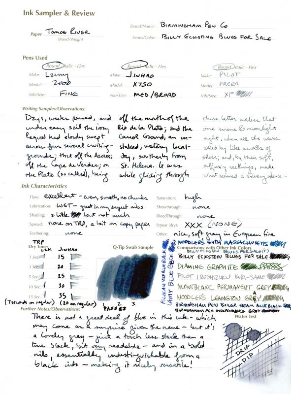
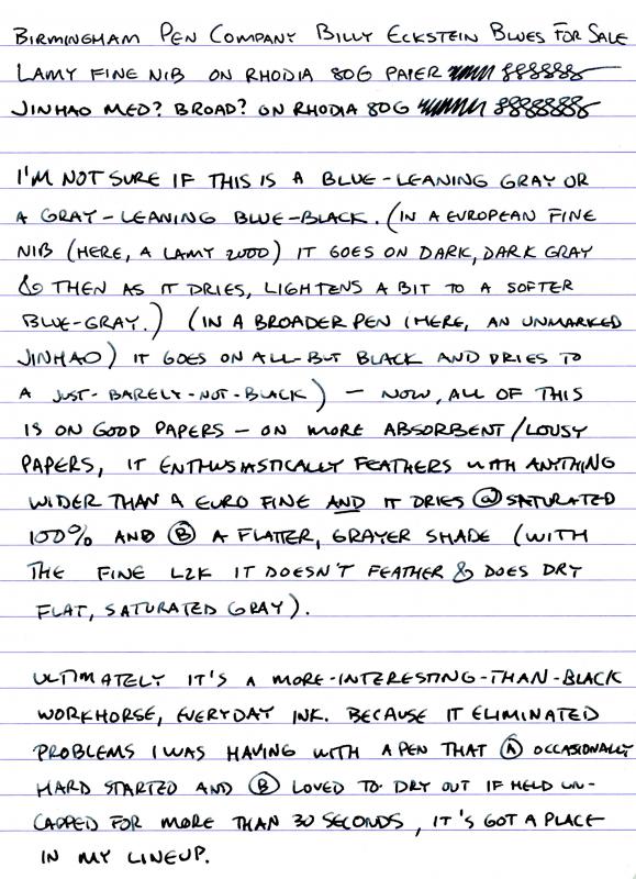
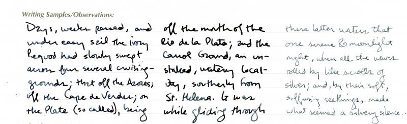
These inks continue to integrate themselves into my regular use. I'm not sure anyone in my family would have suggested I should grab a few more blue-blacks, but there's a few Birmingham inks that lean that way that are different enough from what's out there that I've found uses for them. Billy Eckstine Blues for Sale is one. This is a wet ink that I've wed to a couple of dry writers and hard-starters to good effect. Pardon the misspelling of the name in the images below... On Tomoe River it is highly variable depending on nib width, going from an all-but-black to a silvery blue-gray: It takes some time to dry on TRP and coated papers like Rhodia: And although shading is not its marquee feature, it does a little; on TRP: and on Rhodia: At the end of the day, this adds something to a fairly vast world of blue-black/dark-dark-blue inks, and the variability available with different nib widths makes it like two or three inks in one bottle; I'll be picking up a full bottle when my sample runs out.
-
I picked up a 50ml bottle of Montblanc Blue-Black ink at a large stationery store here in Asia. It's not the kind of place I would expect to find counterfeits (they don't stock anything high end, apart from some Rotring 500 pencils, and don't sell to tourists or people who would be impressed by brands). And, the price was about $10... given the old-style rounded tip shoe design, I figured this was a bottle that had been sitting in their stock since back when $10 was the going rate for these inks. The bottle has the proper inlaid white mountain top, it's not painted on. However... When I compare the ink to my usual stand-by Pelikan 4001 blue, the Pelikan writes much more smoothly. The Montblanc is much thinner in consistency. Next to the Pelikan 4001 the color of the Montblanc also seems thin by comparison. The Pelikan is much more vivid. The Montblanc also seems to develop bubbles much more easily, and takes longer to settle. I've never used Montblanc inks before, which is why I bought it. What are the odds I got a knockoff?
-
As most of you know from Algester's excellent topic, Sailor produces a lot of stunning inks for japanese shops. Only small fraction of their inks is available worldwide through official retailers. Many inks are sold only in Japan and only in specialised shops. It seems Shousaikan inks can't be bought online unless you;re ready to pay almost 200 $ for a bottle (I"ve just stumbled upon ebay auction where the price is 184 $). It's a shame, really. Anyway I know only about two colors offered by Shousaikan: one is called Seiran(青藍 and my google translator translates it as Blue) the other one Shinzan - "Deep in the Mountains" (深山). Seiran is deep and wet blue black ink, I can see it make some of blue/black fans drool. I do agree it's nice ink however it's not perfectly behaved. It has one drawback that I find most irritating in inks. It tends to clog the pen when it's left uncapped for 20-30 seconds. After such short time the nib tends to skip- in other words it's hard starter. For me it's a deal breaker, for others it's acceptable. Apart from drying on the nib it performs rather nicely. I gaven't experienced feathering or bleedthrough. It has no water resistance. Drops of ink on kitchen towel Color ID Color range Tomoe River, Kaweco Classic Sport, medium nib Leuchtturm 1917, Kaweco Classic Sport, medium nib Kokuyo Myo, Kaweco Classic Sport, medium nib Maruman, Kaweco Classic Sport, medium nib Water resistance
-
Blue-black inks were one of the most common inks in my original collection. To me there wasn't much else to get other than a black ink and a couple blue-blacks. Done. Right? That was a long time ago, and blue-black inks came into the collection, but they were quite dark. The KWZ Blue-black seems kind of ho-hum in comparison. It's not really dark at all. It's middle-of-the-road dark. But it does have a very vintage look to it, it shades very well. Usual KWZ flow and lubrication. This ink dries quite fast on absorbent papers, and was quite decent on Rhodia where more saturated inks can take 20 seconds or more to dry. Again the iPhone images are making the ink look much darker than it actually is. Samples are readily available in the US and EU from various retailers, so it's very easy to try before you buy a bottle. A lot will depend on what you expect and want from a blue-black ink.
-
A friend a while back sent some samples from Japan and this one was included. I'd never had the chance to try any of the inks from this shop. The used to have a page on Rakuten, a Japanese sales site, but I don't this that's active any longer, unless they shifted it under a new name. This is a really nice "blue-black" ink; the kind of ink that gets called "blue-black" these days that is a fairly dark, grayed-blue. This kind of color always brings me comfort, a solid ink, an ink for adults; serious ink. No harm can come to you when you write with inks like this, all negative forces cower in the presence of blue-black power. This one leans greenish. It's pretty close to Sailor Bungbox 4B, similar to Pelikan Edelstein Tanzanite but leaning green. There are probably others. There is some show through and near bleed through on the MvL paper. It is absorbent paper, and the pen was a wet one. No problems on papers with surface sizing. I only finished my review halfway on MvL before emptying the pen. I'd forgotten that I hadn't finished. It was nice to try an ink from this shop, and I'll definitely use up the last of this sample soon.
-
The full review can be found here. I'm also still figuring out a better way to make reviews (more comprehensive), and share them (better photos), but I'm sharing these photos now because they are colour-accurate, which I think is the most important part of an ink review. nb. I got this bottle years ago and I've hardly used it. It was way too green for me then but now the teal-black colour comes off quite well to my eyes. Unusual and visually interesting. Great performance too!
-
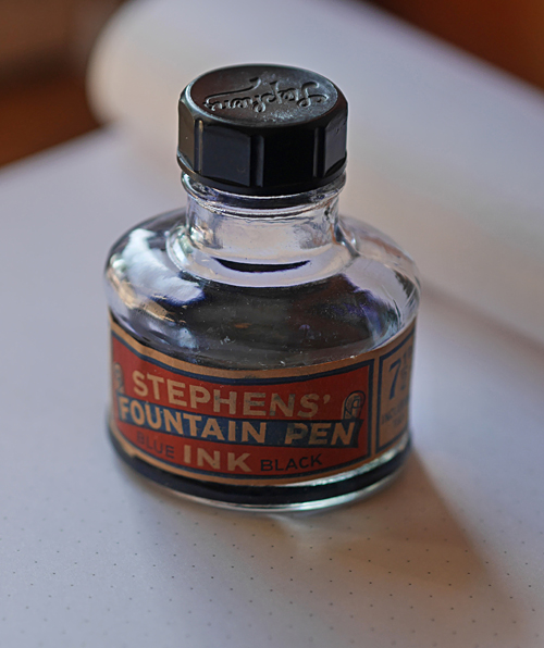
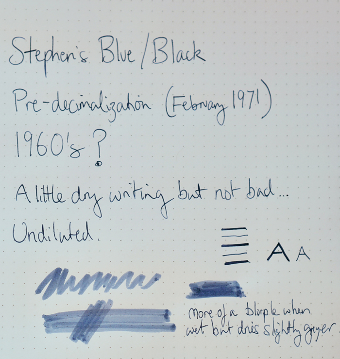
Not really a full review, but it's probably a little unfair to judge an ink that's older than me too closely on it's current performance. Stephens' were founded in the early 19th Century but effectively disappeared in the 1980s, although I think the brand name was bought out. Once one of the best known British Ink manufacturers. Stephens' blue-black was used to sign the Treaty of Versailles. This bottle is priced 71/2 d so definitely dates from prior to 1971 when decimalization came in, but I can't date it in any better than that. Effectively this is an ink that's around 50yrs old. Obviously I had to ink up a pen (Namisu Orion with Bock xf nib): I used it undiluted, as it doesn't appear to show evaporation issues. It's very quick drying - around 10 seconds and highly water resistant when dry. It looks very blue in the bottle, writes more like a dark blurple when wet, but the purple element changes to dark grey as it dries, leaving a true blue-black. Not an exciting colour, but a well behaved ink that showed next to no feathering or bleed through even on cheap paper. Not the most lubricated ink I've written with (although not terrible), and writes slightly on the dry side. It was still commonly found in Stationers in the 1970s so I suspect other part used bottles could be found with limited effort.