Search the Community
Showing results for tags 'blue'.
-
-
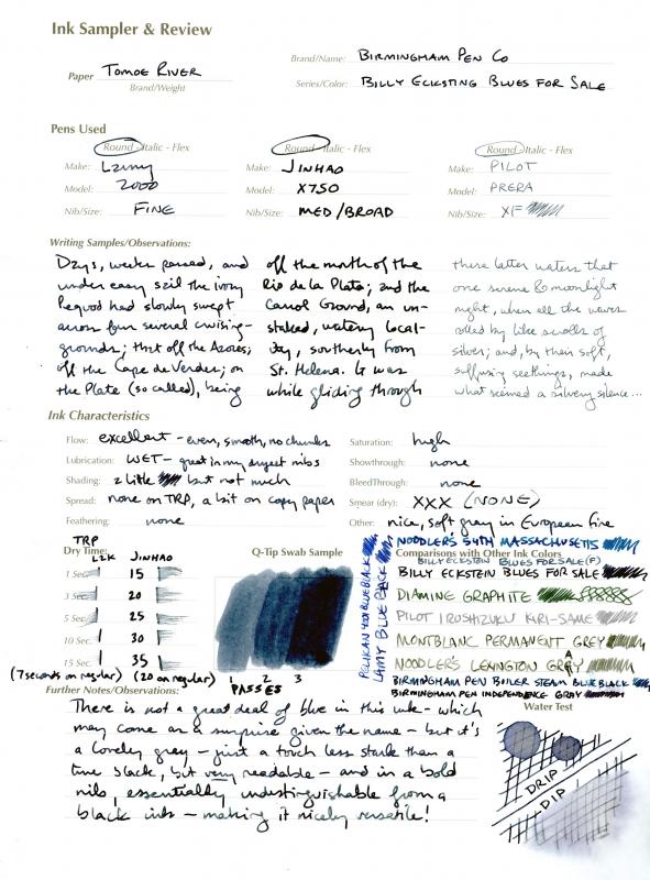
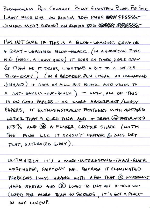
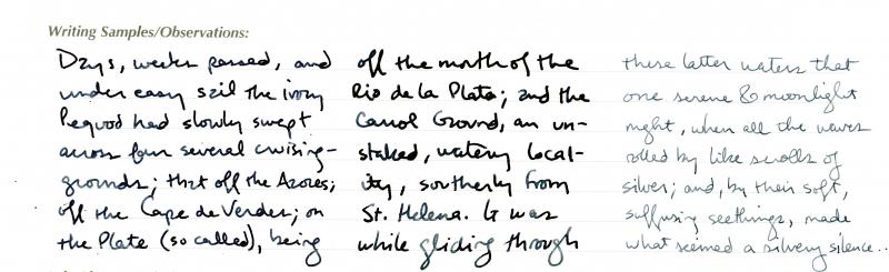
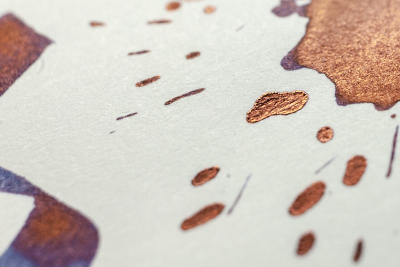
These inks continue to integrate themselves into my regular use. I'm not sure anyone in my family would have suggested I should grab a few more blue-blacks, but there's a few Birmingham inks that lean that way that are different enough from what's out there that I've found uses for them. Billy Eckstine Blues for Sale is one. This is a wet ink that I've wed to a couple of dry writers and hard-starters to good effect. Pardon the misspelling of the name in the images below... On Tomoe River it is highly variable depending on nib width, going from an all-but-black to a silvery blue-gray: It takes some time to dry on TRP and coated papers like Rhodia: And although shading is not its marquee feature, it does a little; on TRP: and on Rhodia: At the end of the day, this adds something to a fairly vast world of blue-black/dark-dark-blue inks, and the variability available with different nib widths makes it like two or three inks in one bottle; I'll be picking up a full bottle when my sample runs out.

-
The name means 'colour of mysterious beauty'; the beautiful, subtle light-green colour resembles the delicate colour of Celadon pottery.
-
-
-
Ink Review - KWZI IG Blue #4 KWZI inks are developed by Konrad Zurawski, a Polish chemist and fountain pen enthousiast, who started in 2012 with his own line of inks produced in an artisanal manner – i.e. handmade in small batches with lots of care & craftsmanship. The KWZI IG line consists of Iron Gall inks, that darken over time and are waterproof. Since I was looking at waterproof inks for use at work, I decided to give Konrad’s IG inks a closer look. Be advised that Iron Gall inks require more care from the fountain pen user in comparison to standard inks. Practice good pen hygiene! Update: Thanks to feedback, I learned that this was a very early KWZI ink, that has been discontinued a few years ago, because it didn't live up to its maker's expectations. This review thus refers to my specific bottle of "unobtanium", that contains an ink that oxidizes to a nice waterproof dark grey. In this review, I take a closer look at KWZI IG Blue #4 – my very first Iron Gall ink … although in reality, I would consider this a grey ink, with maybe a hint of blue in the undertones (at least in the bottle I got). But that’s exactly the reason I chose this IG Blue variant, because it is the most grey-leaning ink of his blue range of colours. I was really fascinated by the writing experience offered by these Iron Gall inks. This particular one really shows the writing chemistry. The pen lays down a pale orange-brown line, that quickly oxidizes to a nice grey-black. Fascinating ! This is top-rate chemistry at work. The chromatography of this ink is equally strange. What you see are the orange-brown components, which are most likely the IG chemicals involved in the oxidation process. And then there are the grey-blue parts that are indicative of the ink’s colour palette. Thanks to the Iron Gall chemistry miracle, IG Blue #4 ultimately produces a nice dark-grey text line, with good contrast on all types of paper. This ink works well in all nib sizes – even with EF nibs the resulting line is nicely saturated and contrast-rich. With broader nibs, the ink’s shading emerges with a fine balance between the lighter and darker parts, resulting in pleasing aesthetics. This definitely is an ink with character. To show you the impact of saturation on the ink’s look & feel on paper, I made some scribbles where I really saturated portions of the paper with ink. This gives you a good idea of what the ink is capable of in terms of colour range. With IG Blue #4 the colour ranges from a pale light-grey to almost black. The strong point of IG inks is their waterproofness. And in this area, Blue #4 definitely does not disappoint. This ink is rock solid when confronted with water – see my “water test” at the end of this review. Once dried, the ink is impervious to smudging and easily survives longer exposure to both running and still water. Even a 15 minute soak was easily survived – there is only some minor degradation of the text, which itself remains completely readable. Respect ! I’ve tested the ink on a wide variety of paper – from crappy Moleskine to high-end Tomoe River. On every small band of paper I show you:An ink swab, made with a cotton Q-tip1-2-3 pass swab, to show increasing saturationAn ink scribble made with an M-nib fountain penThe name of the paper used, written with a B-nibA small text sample, written with an M-nibDrying times of the ink on the paper (with the M-nib)Konrad’s IG Blue #4 behaved perfectly on all paper types, and even wrote surprisingly well on Moleskine paper (although with noticeable show-through and bleed-through). The ink is equally at home on both white and more yellowish paper. While writing, the ink lays down a pale wet line, that dries within the 10 to 20 second range (with an M-nib). Soon after writing, the IG oxidation process will start to visibly darken the line, reaching its almost final state after a couple of minutes. After that, the text may still get marginally darker over the next couple of days as the oxidation process tapers off. Conclusion KWZI IG Blue #4 is a good-looking grey ink with beautiful shading. And being totally waterproof, this ink is made for use at the office. If you expected a more blue ink, you’ll have to look elsewhere – to my eye this evidently is a grey ink, with a hint of blue undertones. That of course is exactly what FPN reviews are for : to give you the opportunity to find out what an ink is about before committing to a bottle. If you’re into greys, you can’t go wrong with this one. Technical test results on Rhodia N° 16 notepad paper, written with Lamy Safari, M-nib Back-side of writing samples on different paper types
-
Love this one from Konrad! Apologies for the somewhat blurry pics - I'm using the native FPN upload instead of Flickr, so I've had to reduce the quality/size. I'll keep fiddling around to find better quality... Up close: Comparison of some KWZ blues:
-
Disclaimer: I don't swear by my scanner's quality, so I've tweaked the colors a bit. They look ok on my monitor, but mileage may vary, so I apologize in advance. I've actually used 2 pens for this review. Most of it is written with a Lamy Safari (f), but for the comparison with Scabiosa (in the water test part) I used a Jinhao x750 (m). The paper is finocam, a spanish brand that you may or may not have experience with. It's fairly good for fp use; line widths run true to size and there isn't any feathering or bleedthrough, although you can see some minor showthrough, which has been exacerbated out of proportion by my scanner. It's actually not bad at all. The paper has some texture, which results in some feedback from nibs ranging from medium to anything narrower. The color is creamy, almost yellowish. http://i.imgur.com/mg562CY.jpg?1 http://i.imgur.com/87smCVD.jpg?1 http://i.imgur.com/gpNLvpg.jpg?1 I performed this test under running warm tap water for 10 seconds. As you can see, there is some saturation loss going on in the salix sample, but it does not impact legibility at all. That's why I rated the ink's water resistance as "very good". http://i.imgur.com/P5evCCK.jpg?1
-

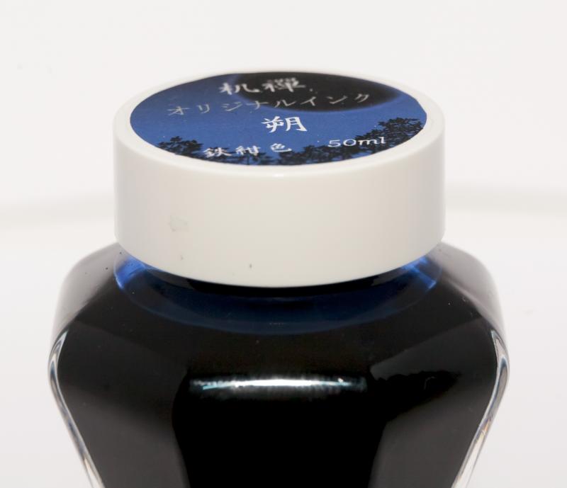
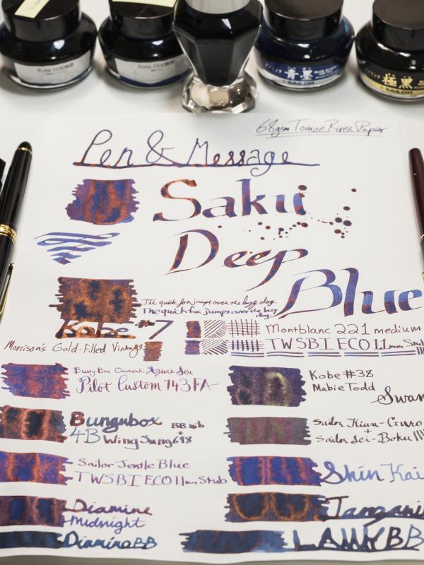
Pen And Message Saku Deep Blue My First Old Style Sailor Bottle.
catalyst posted a topic in Ink Reviews
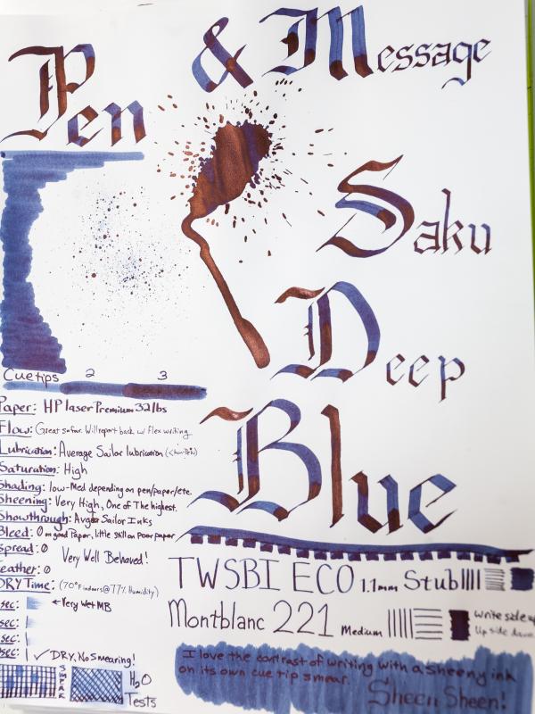
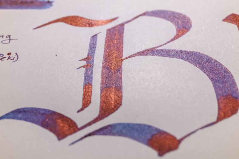
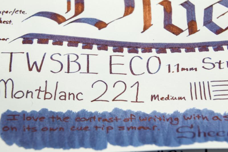
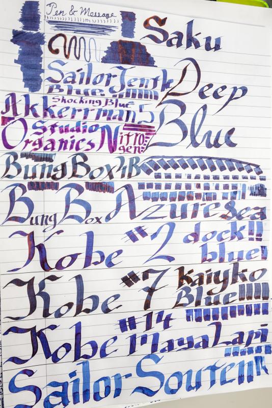
I became aware of the world of fountain pens (other than Montblanc) through Goulet on Youtube earlier this year and got sucked in. I write a lot so initially this was all justified, but now its clearly gotten out of control. Goulet no longer sell Sailor, so it took a couple months, but I then became aware of Sailor and how supposedly great Sailor inks were. Of course it was not long after that I became aware of their special store inks. I also found out that I missed out on when Sailor was offering the old style tall bottles more commonly with their regular inks, and everything I was buying now comes with the short stubby ink bottle, which is boring at best. I do not think the short bottles should be used on Sailor's inks which tend to be more expensive. Anyways, a goal of mine has been accomplished, I have acquired Pen and Message Saku Deep Blue in the old style bottle. I love the look of the bottle, but as so many have stated the cap can get stuck. I would have to say Pelikan Edelstein make the best bottle I have tried: They look great, feel solid, they are heavy with a wide base and the cap always works. I have never tried the Akkerman bottle. Ok tangent over. I adore this ink so thats a plus as well. Overall I love this ink, the look, the feel, the sheen, how it behaves so similarly on so many different papers. I still cant pick a favorite blue, but this is definitely a contender. I don't know anything about the ink or the company, so I'll just skip to the photos and the review in the photos: I decided since I was taking photos I would take photos of all the pens and ink bottles I have acquired this year since starting my addiction, but I kept the focus on the Saku for this review: If someone knows what this says on the top I would appreciate a translation: I'm no calligrapher, I havent even read a book, I just looked up letters online, so be easy on the handwriting haha. Review on HP Premium Laser 32lbs: Written with an italic dip pen: On 68gsm Tomoe River Paper vs Kobe #7 Kaikyo Blue, Bungubox Omaezaki Azure Sea, Bungubox 4B, Sailor Jentle Blue, Diamine Midnight, Diamine Blue-Black, Kobe #38 Kitanozaka "Kitano Hill" Night Blue, MIXTURE: Sailor Kiwa-guro and Sei-Boku, Pilot Iroshizuku Shin Kai, Pelikan Edelstein Tanzanite, Lamy Blue-Black: Water-resistant testing on Rhodia:These inks do ok after being left to dry for about 12-15 hours, especially considering they are not marketed to be water resistant. It does appear that there is some component of the ink remaining after putting water on it for about 30 seconds. More on Rhodia with a Brause #361: Saku Deep blue written with an italic dip pen on 90gsm Optik Paper from a Black n Red notebook vs Sailor Jentle Blue, Akkerman #5 Shocking Blue, Organics Studio Nitrogen Royal Blue, Bungubox 4B "Bung Box Blue Black", Bungubox Omaezaki Azure Sea, Kobe #2 Dock Blue, Kobe #7 Kaikyo Blue, Kobe #14 Maya Lapis, Sailor Jentle Souten:
-
A bit of backstory... I've had a complicated history with blue inks. Ever since elementary school I've disliked blue ballpoint pens. Something about them is just... "blah". When I got into fountain pens last year, I carried this prejudice along with me, focusing on purples, greens, browns, grays - pretty much anything other than boring old blue or black. Soon enough, though, I got swept up by sheer variety of blue inks and the enthusiasm people have for them. I started from the edges, with vivid sky blues like Iroshizuku Kon-Peki and subtle blue-blacks like R&K Salix, gradually expanding my comfort zone inward toward the standard, medium blues. While I often find "the one" ink of a certain color (however short-lived the title proves to be), I've never found "the one" blue ink. I've tried many nice blues - Namiki Blue, Waterman Blue, Ottoman Azure, Bad Blue Heron, Eclat de Saphir, Diamine Sapphire, etc, etc - they were all either too light, too dark, too flat, too purple, too green, or just too not-quite-well-behaved-enough to really have the "it" factor I needed to declare them "the one" bottle-worthy standard blue. Until now. Ink: Noodler's Liberty's Elysium Pen: Pilot Vanishing Point, F Paper: Staples Sugarcane notebook http://i513.photobucket.com/albums/t331/InkandPaper88/Libertys%20Elysium/Review_zps7f4a26da.jpg Liberty's Elysium is a true blue, leaning neither towards purple, as many standard blues tend to do, nor towards turquoise, as do many sky blues. In keeping with the Noodler's tradition of historically themed inks, this ink is dedicated to those who fought and died for the sake of religious and political freedom in colonial America. http://i513.photobucket.com/albums/t331/InkandPaper88/Libertys%20Elysium/Color_zpsead45cde.jpg This ink is surprisingly close to Sailor Jentle Sky High, but it is a richer, more neutral blue. It also seems to write a bit broader than other inks - a seemingly common characteristic of Noodler's inks. Overall performance is good. It will feather and show through on the worst papers but no more than any other ink that isn't an iron gall or Noodler's Black. http://i513.photobucket.com/albums/t331/InkandPaper88/Libertys%20Elysium/Compare_zpse622cfff.jpg You can see the color and shading here, but there is a depth and vibrancy to the ink that goes beyond what I can be captured in a picture. I think that is what people are seeing when they compare it to Kon-Peki, which also has that quality, despite being much more turquoise than Liberty's Elysium. http://i513.photobucket.com/albums/t331/InkandPaper88/Libertys%20Elysium/Detail_zps5771827b.jpg As it was quickly (and loudly) discovered following this ink's release, Liberty's Elysium is not a true "Bulletproof" ink. That said, it is *highly* water resistant, and, given the quirky tendencies of other Bulletproof inks, I think this is actually just fine. http://i513.photobucket.com/albums/t331/InkandPaper88/Libertys%20Elysium/Waterproof_zps56aa92eb.jpg Add to all of the above that it is one of the cheapest inks by volume that you can get in the US, and Liberty's Elysium is a no-brainer for me as my "the one" workhorse blue. Of course, being "the one" is a far thing from being "the one and only". In particular, Eclat de Saphir gives a nice change of pace, and Kon-Peki is a delightful indulgence. Sky High is also a nice compromise between indulgence and practicality. And there are times when the sheer brazen dullness of Namiki Blue or Waterman Blue is charming in its own way... I guess what I'm really saying is that if feels good to pretend that I've settled something.
-
Omas was a great brand and part of that "Made in Italy" that made my country renown around the world. Unfortunately Omas shut down the last year, leaving us pen enthusiast, all a little poorer. For this reason I was very happy to find in an old stationery near where I live, two bottles of ink from this brand: Omas Blue Black and Omas Blue (Roma 2000 edition) Omas Blue-Black is a colour that I would define a dark sapphire. A dark royal blue, with hints of purple, stronger when wet and that tend do disappear while it dries. A closer look to the cromatography shows a strong similarity with the one I've made for Pelikan Edelstein Sapphire . The ink behaves quite well on all sort of paper, with little bleedthrough and feathering on cheap copy paper. There's not much to ask to shading as it is a quite dark colour, but there's some, especially on fountain pen friendly papers. There's a really little waterproof purple component in this ink, but does not keep texts and drawings to fade. In the end, is this ink worth it? It's a discontinued ink in a beautiful bottle. It's a decent blue black which stands out amont other blue blacks. If you find it, grab it, at least you may say that you've acquired a piece of a great Italian story, unfortunately ended the last year. COPY PAPER PIGNA EXTRA STRONG TRACING PAPER INKDROP CROMATOGRAPHY WATERPROOF TEST (SOAKING 15 MINS) - BEFORE - DURING - AFTER
-
Another ink sample from Japan sent by a friend. I've picked up a few of the Style Dee shop exclusives, and given that I appreciate blue-black inks, this is definitely one of them. The ink is in the similar hue as the Sailor Joyful Honda Tanigawadake Blue but much darker. Maybe a little darker then Sailor Kobe #38. Again, no real shading on many papers, but the better ones like Tomoe River or Rhodia have some nice shading. On Tomoe River there is very distinctive light green sheen especially on periods, the dots above the i, etc. I can easily imagine walking through this district at night, with many other folks, and seeing the bright lights of the shops. Oh, here is a nice little udon noodle shop, let's stop in... Hopelessly romantic, that's me. The image here on the MvL and Tomoe River once posted to FPN looks almost just black. That is not the way it looks in reality. Even in Preview there's some of the character there. This Edison Premiere is one of my wettest pens, so you'll probably get more interesting writing in something not so wet.
-
So It seems that my favourite inks estabilished for now as follows: 1. Sailor Yama Dori 2. Diamine Schubert 3. Diamine Eau De Nil 4. Diamine Steel Blue (which is actually greenest of the bunch) 5. Lamy Petrol Blue Who else is into Blue-Greens? I'd love to hear some advice on professional BGs, what other good ones are out there?
-
Greetings fellow stationary nerds. I come to you from the far north, the land of Lego, pastries and wind power, with this, my first pen review. The subject in question, the Jinhao Y3. This is an interesting one, because I literally couldn't find anything resembling a review of this pen prior to my purchase, so it was a bit of a jump into nothingness, but it looked good and it was only about 8 bucks on Aliexpress. The pen came in the most luxurious and decadent cheap, gray, foam padded cardboard box, as with most pens of AX. Oh well, waddya expect. Appearance/Design: The pen is really a looker. Flat, and cylindrical in design with only few tasteful appointments. The cap features a black gloss laquer/paint and is made of brass as well a the body of the barrel. The outside of the barrel is covered in a machined piece of rosewood which really astonished me, because CITES has just this January banned the international trade and sale of all types of rosewood, since it is an endangered species (much to the dismay of musicians as myself, who enjoy rosewood used in musical instruments). It made it through customs, but I dont think I'll try my luck again. The clip is medium stiff, and very useable. The chrome appointments are very nicely done, and the branding is stamped very deeply into the metal, and looks great. The section is a matte metal finish and has the Jinhao chariot logo stamped into it. Again, very nice and tastefully done. Overall, I feel that the pen has a cool asian vibe to it. I like it. Oh, and it comes with a nice standard Jinhao converter. Length: Capped: 13,9 cm Uncapped: 12,4 cm (against a TWSBI ECO for scale) The weight (Take a load off Fanny) is a healthy 19g uncapped and a rather heavy 32g capped. This means that a lot of the weight is in the cap, and by far most of it is in the very heavy end cap beyond the clip, making it very unbalanced when using it posted. And very unsatisfyingly when posted it doesn't post all the way down to the chrome ring at the end, making it look pretty goofy (as seen above). Construction/Quality: All in all, I'm very impressed. No gaps to be found. The rosewood is beautiful. The clip is sturdy but not too hard. The gloss finish has no imperfections, and the cap sits securely when on, but is not a two man job to take off (like my X450). I have no complaints. Nib/Performance: The nib in this pen seems to be a #5, and it does indeed say "5" on the back of the feed, but I have no replacement nibs to try, so this is a guestimation. It is a nice glossy steel, and features the jinhao logo, but it also features a stamped "F", indicating, that this indeed is a fine nib. First time I've seen this on a Jinhao nib. It arrived reasonably smooth with a bit of feedback. A bit too much feedback to my tastes, so I smoothed it a bit, and now it has the perfect feel for me, which is just enough feedback, so I feel the connection with the page and it isn't slipping and sliding (yes, to me a nib can be too smooth). Not much in the way of line variation and flex, but just a tiny bit. Here the writing is compared to my much broader and wetter X450: Cost and Value: It's amazing what you can get for $8 with free world wide shipping. As with my other (but cheaper) Jinhaos, this pen is sure a kick above it's price range, and i don't regret the purchase one bit. Conclusion: It's just great. It's stylish, writes well, looks great, is relatively cheap, is stunning in appearance, is a bit of a naughty one because of the forbidden wood (no boner jokes please) and did I mention how good i think it looks? Has become one of my new daily note takers. - Haun
-
KWZ inks are my favorite inks after Sailor. And last year I had the chance to snag a bottle of the Chicago Blue LE from the Chicago Pen Show. Woo-hoo! Only recently did I get to open the bottle and try it. I first loaded up an Edison Menlo, and the ink was so wet it simply flowed from the nib when pointed down. That was unexpected. So I switched pens and filled one of my Edison Beaumont pneumatics. Not as wet as the Menlo, useable. But still it was very very wet ink. Placing the nib on absorbent paper caused a spreading blob of ink on the paper. That doesn't happen with other inks. They may leave a dot, but ink flows when you write. Another unexpected behavior. Because of this behavior it dried instantly on absorbent paper, but with lots of heavy show through and some bleed through. Quite a bit of spread. No shading on MvL, but decent on Tomoe River and Rhodia, though over 30 seconds dry time on the Rhodia. The color is a nice rich blue. Now if you have a really dry pen... This is the only KWZ ink that ever disappointed me in its behavior. Someday I'll have to give it a go in my Aurora or a fine nibbed Pelikan and see it this ink can be tamed. It'll probably be pretty nice in that case.
-
It's been a while since I've done any ink reviews, and I don't have as much time to be as exhaustive as I once was, but perhaps this will be useful to someone. Sailor Bungbox Omotesando Blue Pen: Aurora Ipsilon Deluxe (M) Papers: MvL=Mohawk via Linen, TR=Tomoe River,Rhodia=Rhodia 90g ivory. Camera: iPhone 7 A friend sent me a sample of this ink a while back, and I noticed that is was also available at Vanness, the US Source for Bungbox inks in the US. This is a fairly strong blue, fairly bright. The iPhone image is a good bit darker for sure than the actual image — it's a moderately bright, medium blue. The image in Preview is much closer to the actual image on paper, the one uploaded is shifted darker. As always, images are what they are. If you think you might like an ink, especially for its color, then purchase of a sample to confirm the look and feel of an ink prior to purchasing a bottle is a recommended, though not foolproof, practice. Especially so when the price of an ink is near $45 for 50 ml. The ink shades well on Tomoe River and Rhodia, and there is a decent amount of reddish sheen on TR in artificial light. The dry times on absorbent paper is quite fast, a good deal slower on the better papers. There could be some show through and/or bleed through problems on the more absorbent papers. There was a little show through on MvL but nothing problematic.
-
L'Artisan Pastellier Callifolio - Oconto L’Artisan Pastellier is a small company in southern France that specialises in natural pigments, and offers customers authentic and reliable products in beautiful colours based on mineral or vegetable pigments. In a collaboration with Loic Rainouard from Styloplume.net, the chemist Didier Boinnard from L’Artisan Pastellier created the line of Callifolio fountain pen inks. These pastel-coloured inks are traditionally crafted, and can be freely mixed and matched. Overall these inks are only moderately saturated, and have low water-resistance. The inks were specifically designed to work well with all types of paper, and all types of fountain pens. Being pastel-tinted, these inks have a watercolour-like appearance, and are not only fine inks for journaling, but are also really excellent inks for doodling & drawing. I only recently discovered them, and they are already the inks I gravitate towards for personal journaling. In this review, I take a closer look at Oconto, one of the many blue inks of the Callifolio series. Their blue inks are named after bodies of water, so this one is presumably named after the Oconto river in Wisconsin, USA. Oconto turns out to be a very nice blue ink, that looks real businesslike. And yet, it has a tiny bit of a green streak, which gives it just that little extra to stand out from the crowd. I consider it a wonderful ink for use at work – the ink grabs the eye, yet is classical enough not to get frowned at in a business setting. I love it! The ink is also a great choice for doodling and drawing. I was pleasantly surprised by the way it looks in some of the doodles I made with it. A splendid type of blue! Not that the ink doesn’t have its flaws. I found it to be a bit too dry and undersaturated in EF and F nibs. With these finer nibs, the ink’s lovely colour and subtle shading fail to materialize, resulting in too flat a look. But starting with M nibs, the ink really takes control of the paper, and becomes a classic beauty. On the smudge test – rubbing text with a moist Q-tip cotton swab – there is some of the blue dye that rubs off, but the text itself remains basically untouched and very readable. Even better, accidentally spilling some water on your notes is not a problem. You can just dry it off with a paper towel, without much impact on the written word. This becomes clear from the droplet test, where water is dripped on the grid, and left there for 15 minutes. Running tap water does more damage to the text, but the remaining residue of your writing remains perfectly decipherable. Oconto definitely has a rather good water resistance, which is great for an ink used at the office. Keep in mind thought that this is not an archival ink – so it’s not completely waterproof! I have tested the ink on a wide variety of paper – from crappy Moleskine to high-end Tomoe River. For the Callifolio reviews, I’m using a new format to show you the ink’s appearance and behaviour on the different paper types. On every small band of paper, I show you:An ink swab, made with a cotton Q-tip1-2-3 pass swab, to show increasing saturationAn ink scribble made with an M-nib fountain penThe name of the paper used, written with a B-nibA small text sample, written with an M-nibDrying times of the ink on the paper (with the M-nib)Callifolio Oconto behaved perfectly on all the paper types I used, with no visible feathering on the lower quality papers in my test set. It even looks great on Moleskine paper – if an ink manages that feat, it can definitely cope with the lower quality paper that’s typically found in an office setting. Drying times are on the short side in the 5 to 10 second range – another plus for an ink you use at work. At the end of the review, I also show the back-side of the different paper types, in the same order. The ink behaved superbly on all paper types. Only with Moleskine did I notice a tiny bit of bleed-through. Conclusion Callifolio Oconto from L’Artisan Pastellier is a robust blue ink, that is really well suited for a business setting: the ink has a classic look, is surprisingly water-resistant and is quick drying. All qualities that are greatly appreciated in an ink you want to use at the workplace. Oconto also has a tiny bit of a green undertone, which results in a blue colour that’s just that bit different from a standard blue. As such, it will draw the eye, without being too playful. If you’re looking for a business ink, this one will surely fit the bill (and it’s a nice variation from the staple blue-blacks that are often seen in this setting). The ink is also a fine choice for personal use. I especially enjoyed using it for doodling & drawing – great colour! Technical test results on Rhodia N° 16 notepad paper, written with a Lamy Safari, M-nib Backside of writing samples on different paper types
-
Hi everyone! I'm in the market for a nice Senior sized striped duofold. I'm particularly interested in the blue pearl version! Are there any places in Australia who may have a nice one of these? Or anywhere great in the states or other overseas areas? I have been waiting for a reasonable one on ebay but no luck. I can't quite post a WTB yet here, but will once I hit that (30) mark. Lastly, what price are we looking at if we're being fair? Thank you so much!
-
I absolutely love Kon- Peki, any other inks that are similar in color?
-
We took our daughter to the zoo today, and one of the picnic areas featured wandering Peacocks. I got to thinking "that blue on the male peacock's neck would be the ULTIMATE blue." My fiance who's completely sick of all things pens even agreed. So far based on some limited research, I can't find anything that fits the bill. I've also got a semi-exhaustive collection of 22 blues that don't meet that specific criteria either. Anyone have any suggestions?
-
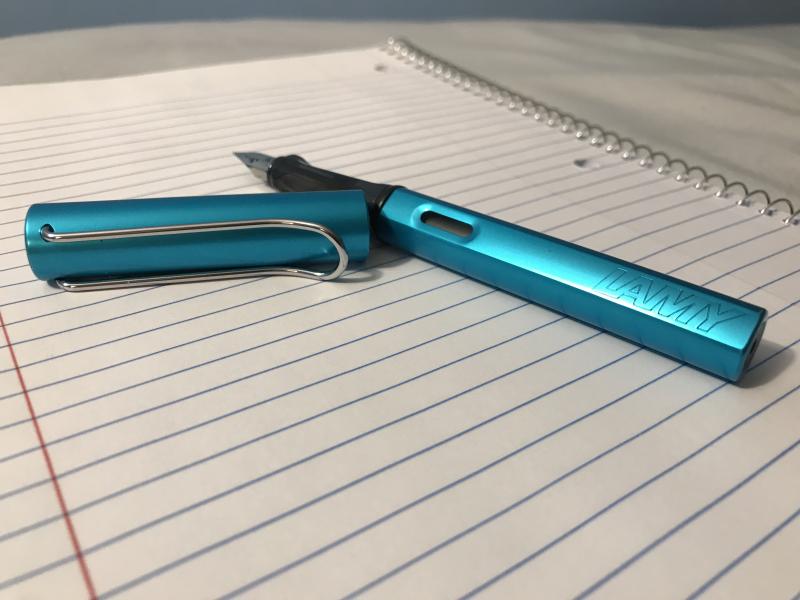
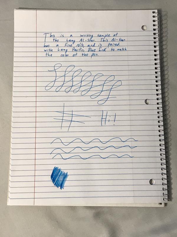
The Lamy Safari is 17 grams and 37 years of design excellence that’s been the beginner’s fountain pen of choice for almost all those years. Its design is one of the most strikingly simple yet modern in the pen world, yet it has proven to be as timeless as any of the classics. The Al-Star is its big brother. Made from aluminum instead of ABS plastic, the Al-Star weighs more and feels more solid in the hand, but is nearly identical to the Safari in every other way. They share the same nib, design, and internal functions. The Al-Star is a way to own the classic yet modern design in a sturdier and slightly heavier body, and it appeals to people who like the feeling of metal in their hand while writing. Each year, a unique color is released as a limited edition for both the Safari and the Al-Star. This year, the Al-Star came in Pacific Blue. The Pacific Blue Al-Star Along with a Regular Blue Safari and a Dark Lilac Safari Appearance and Design The Pacific Blue color of this year’s Al-Star is striking and vibrant, yet light enough to not be overly flashy. The silver coloring of the nib and clip match well with the blue, creating a look of warm ocean waters. One factor of the design to be aware of, if you don’t already know, is that both Lamy Safaris and Al-Stars have a triangle grip, so they can be uncomfortable for some people to hold. For most, though, the grip is perfectly comfortable. As someone who enjoys having slightly unique pens, this limited edition is a truly gorgeous one, and in my opinion Lamy really nailed it with their color choice this year. The Al-Star Alone Construction and Quality This is a solid pen. In preparation for writing this review I used this pen daily for a little over a month, and in the course of use I dropped it countless times on varying surfaces, none of them particularly soft. The pen has yet to get a scratch. (These were all with the cap on however; you may fare far worse if the pen is dropped nib first.) Safaris have a bit of a reputation for being indestructible, and the Al-Star is a Safari but stronger. If you get this pen, you won’t have to worry about breaking it. Additionally, the overall quality of the finish is excellent. Lamy’s quality control is famously excellent (every pen is tested with a bit of blue ink before being shipped) and their care is on display in their pens. The Al-Star Deconstructed Weight and Dimensions If you’ve ever seen a Safari, it’s that but slightly heavier. As someone with large hands, it fits nicely posted in my hand while writing. I asked a friend with much smaller hands to test the pen as well, and she had no issues, although she did prefer the pen unposted. The pen posts easily, and I haven’t had any issues with scratching on the back of the pen from the cap, as I occasionally do on other pens. Nib and Performance So here’s the thing. It’s a steel nail. A very boring steel nail. But is boring so bad? The nib comes smooth straight from the box, and is incredibly reliable and consistent. In short, there’s nothing exciting going on but it’s a real work horse, and it’ll be smooth and ready to go from the get go. The nib sizes on these pens do tend to run broad, so if you aren’t used to Lamy nib sizes (or German sizes in general), I’d get one size smaller than you would usually buy. A Writing Sample with the Al-Star Filling System and Maintenance The Al-Star is a Cartridge/Convertor pen. It fits proprietary Lamy cartridges or a Lamy convertor, which can be purchased for give or take five dollars from wherever you buy the pen. The accompanying ink for this Limited Edition, Lamy Pacific Blue, can be purchased in either cartridge or bottle form, and matches the color of the body of the pen nicely. Cost and Value An Al-Star will set you back just under $40. Is it worth it? That’s up to you. For the same cost, you could have a gold-nibbed Platinum PTL-5000a or most of a TWSBI Diamond 580, both definitively better, or at least more interesting, pens to write with. The Al-Stars price forces it to compete with pens outside the Safaris league when it’s essentially a Safari with fancy skin. For me, the pen was worth it for the color. As a big fan of limited edition Lamy’s, I loved the Pacific Blue. But if you aren’t that into the color, there are other, better options for the price.
-
Monteverde's revamped line of inks recently got my attention for their comprehensive lineup of clear, distinct hues, as well as good value. A 90ml bottle can be had for about $13-$15 USD from the better known online retailers in the United States, making it a very good deal. Monteverde touts their "ITF Technology". From Monteverde's promotional material, here's how it claims to benefit us writers: At my recent visit to the 2017 LA Pen Show, Monteverde gave a free bottle of Malibu Blue ink to all show attendees. A company representative had all their inks available for sampling with swabs, as well as show discounts. I brought home four bottles of Monteverde ink, and post-show I've purchased a few more online:Malibu BlueCapri BlueHorizon BlueSapphire BlueMonteverde also offers two blues I am missing: Caribbean Blue (turquoise), and a Blue-Black. I am posting individual reviews for each of the four Monteverde inks I have. I filled a variety of pens with these four inks, with nibs ranging from fine to double-broad stubs. Here's a snapshot from my Bullet Journal Ink Log, showing the pen/ink assignments and a writing sample from each. Monteverde Sapphire Blue This one is my hands-down favorite of the Monteverde inks I have tested. If I could have only one of these four inks, it would be Sapphire for sure. Clairefontaine paper sample. Color/Saturation Sapphire Blue is a rich, dark ultramarine blue. It reminds me of Levenger Cobalt Blue but without Cobalt's issues (very long dry time, smearing even after dry). I compared my writing sample of Monteverde Sapphire to Levenger Cobalt, and they're very close. Cobalt has a touch more purple. Otherwise they're dead ringers in terms of vibrancy and saturation. Shading/Sheening Shading is light to moderate on this Tomoe River sample. A little bit of a reddish-purple sheen appears in the wide lettering. Flow This ink flows beautifully from both my Pilot 78G BB Italic, and from the Lamy Safari. It is the best of the blues in this comparison. Lubrication Lubrication is also great with this ink, and is the best of the Monteverde inks I have tried so far. Like the other Monteverde inks, this one has a slight stiction feel with my Lamy Safari pen. Dry Time Dry time for this ink is very quick, under 15 seconds on Clairefontaine paper with the Lamy Safari. I should give this ink a try for note-taking. Feathering Sapphire Blue performs well in the feathering test on cheap office paper. Bleedthrough There is a medium amount of bleedthrough on the other side of the page on the cheap office paper. Water Resistance Sapphire Blue is not a water-resistant ink in the 10 second immersion test. Before After Comparison to Other Inks Here is a comparison with other ultra-marine type inks and related blues. Click on it for an enlargement.
-
Sailor makes a number of store-exclusive inks for shops in Japan. The inks available fro, the Kobe Nagasawa shop is practically a line of inks all on it's own. Current up to 62 inks as of this writing. They are perhaps the easiest of the store exclusive inks to obtain, especially at reasonable prices. They can be found at Vanness Pen Shop online store, as well as Nagasawa's own page on Amazon. You can also get them through cool-japan on ebay. This particular color doesn't seem to get much interest. I bought a sample while ordering some other inks. For starters, there's nothing wrong with this ink. It is a vintage-style, less saturated ink, in a traditional color: indigo blue. It's pleasant to use without issues at least for me, in the pen I've been using with it. No sheen, but it does have some nice shading. It seems to have some water resistance. Pen: Gate City Belmont (M-steel) Papers: MvL=Mohawk via Linen, TR=Tomoe River, Rhodia=Rhodia 90g ivory. Camera: iPhone 7
-
Sailor makes a number of store-exclusive inks for shops in Japan. The inks available fro, the Kobe Nagasawa shop is practically a line of inks all on it's own. Current up to 62 inks as of this writing. They are perhaps the easiest of the store exclusive inks to obtain, especially at reasonable prices. They can be found at Vanness Pen Shop online store, as well as Nagasawa's own page on Amazon. You can also get them through cool-japan on ebay. This particular color doesn't seem to get much interest. I bought a sample while ordering some other inks. The name also appears as Minatojima Island Blue. There's some reviews from a few years back that complain of excessively long dry times with this ink. I didn't experience that to be true, but the nib, while quite wet, was a fine. Perhaps it would be an issue with wider nibs. The ink is fairly saturated, but not to the level of say Kobe #14 Maya lapis, which is often used as a point of comparison with this ink. This doesn't have as much red in it as that ink either, and it seems to have a bit more gray in it's value, it's not as bright blue as #14. There's some definite shading, some pink sheen that amazingly sometimes even appears on the absorbent paper such as MvL (which never shows sheen). It's a strong looking, professional blue. Depending on the paper, I don't think the dry times are that bad for papers such as Rhodia, Tomoe River. The ink is not water-resistant, it tends to spread to the back side of the paper and run, so don't count on saving any writing in such cases. There are many blue inks in this line, over 27%, and they all vary in saturation, and relative degree of red vs green in their hue, it may well benefit the potential buyer to get some samples of inks they think they'll like. That way they can give an ink a reasonable test before an actual purchase. While a few of the most popular inks go out-of-stock on occasion, they are usually readily available. Pen: Edison Mina (F-steel) Papers: MvL=Mohawk via Linen, TR=Tomoe River, Rhodia=Rhodia 90g ivory. Camera: iPhone 7
-
Hi folks. Pen lust is a problem. It's even more of a problem when you can't find the dang thing. I found the photo at the bottom of the post on Pinterest a while back and have *needed* this pen ever since. It's supposedly a Sailor Sapporo in "Sparkling Blue" and I, for the life of me, haven't been able to find more information than that, though it's very likely a simple case of not knowing where to look. Can somebody point me in the right direction? Does anybody happen to have info on it?