Search the Community
Showing results for tags 'blue'.
-
Hey all, Have you ever started something and found yourself unable to finish it? I've had these scans and photos on my computer for over two years now! I was initially hoping to write a detailed comparison and then things got nuts so I kept pushing it off and completely forgot. This comparison is so old that it dates back to the very start of my Sailor obsession At the time, I really wanted to see how many of the blues that I had read so much about compared when placed side by side. I wanted to look at a range of basic blues and also included a couple indigos. Hopefully the comparison will still be helpful after all this time! The 30 inks compared are: Aurora Blue Caran d’Ache Idyllic Blue Diamine Majestic Blue, Diamine Sapphire Blue, Diamine Sargasso Sea J. Herbin Eclat de Saphir J. Herbin 1670 Bleu Ocean (Original Formulation) Lamy Blue Montblanc Royal Blue Montegrappa Blue Omas Blue Pelikan Blue Pelikan Edelstein Sapphire Pilot Iroshizuku Ajisai, Pilot Iroshizuku Asa Gao, Pilot Iroszhizuku Tsuyu-Kusa Pilot Namiki Blue Rohrer & Klingner Konigsblau Sailor Bung Box Sapphire Sailor Jentle Blue, Sailor Jentle Nioi-Sumire Sailor Kobe #14 Maya Lapis, Sailor Kobe #37 Island Blue Sailor SankoDo Ozone Blue, Sailor SankoDo Port Blue Sailor Shousaikan Sei-Ran Sheaffer Blue Stipula Deep Blue Visconti Blue Waterman Serenity Blue The writing samples were done using a 1950s 146 and were tested on Rhodia paper. SCANS http://i45.photobucket.com/albums/f99/emrys1221/Scan%201_zpspcxwwkbb.jpeg http://i45.photobucket.com/albums/f99/emrys1221/Scan_zpsetspxgxa.jpeg http://i45.photobucket.com/albums/f99/emrys1221/Scan%202_zps3tuy9vv0.jpeg http://i45.photobucket.com/albums/f99/emrys1221/Scan%203_zps4ep73ddz.jpeg http://i45.photobucket.com/albums/f99/emrys1221/Scan%204_zpstmyap70k.jpeg http://i45.photobucket.com/albums/f99/emrys1221/Scan%205_zps6bt6vnyi.jpeg?1488081421898&1488081424613&1488081437127 http://i45.photobucket.com/albums/f99/emrys1221/Scan%206_zps0zvzhpzd.jpeg?1488081890075&1488081893405&1488081901400 PHOTOS IN NATURAL LIGHT http://i45.photobucket.com/albums/f99/emrys1221/IMG_0112_zpsdiuwypxu.jpg http://i45.photobucket.com/albums/f99/emrys1221/IMG_0111_zpskxybhefg.jpg http://i45.photobucket.com/albums/f99/emrys1221/IMG_0113_zpsqd9qk6uq.jpg http://i45.photobucket.com/albums/f99/emrys1221/IMG_0114_zpsx5owomej.jpg http://i45.photobucket.com/albums/f99/emrys1221/IMG_0115_zpsjigvzevr.jpg http://i45.photobucket.com/albums/f99/emrys1221/IMG_3976_zpsuiwcajdw.jpg http://i45.photobucket.com/albums/f99/emrys1221/IMG_3975_zpsj1twkgss.jpg
-
This is my first real contribution to the site- please forgive any unintentional faux-pas! A friend of mine wanted to see what Pilot Blue-Black (one of my favorite inks ever!) looks like on Tomoe River paper, so I write a thing up for her to check out in person using lyrics to one of her favorite songs. Since I can't really figure out how to make file uploads here work just yet, I've linked to an imgur album of the pictures I took here: https://imgur.com/a/q4HSckJ The pics were taken with my phone camera, with no editing done on them at all. The only light used was the evening sunlight from my window. While the demonstration was intended merely to show off the appearance of the ink, I'll include my thoughts on its performance for you all: I love this ink. It's nondescript enough to be used in a professional setting, but also quite exciting (just look at the shading, and the SHEEN that it has on Tomoe River paper!). It's easy to clean out of a pen, and is pretty darn water resistant (so much so that I use it to address envelopes to penpals, but it isn't directly advertised as waterproof of archival by any means). In terms of flow, I would define it as being wet, but not gushy. I haven't used it on a particularly broad nib as of yet, but it has behaved marvellously on all of the EF through M nibs that I've used it with. I haven't experienced any bleed or feathering with it on cheaper paper; as such it's become my daily-carry ink, along with my EDC pen, the Lamy CP1 (f nib).
-
Not usually a color I'd go for, but for som reason, this one works for me:
-
I haven't done a 'quickie' ink review in a while, and some of my thoughts on the approach have changed in the meantime. Drying time: Long. Exceeds 30 seconds on Bloc Rhodia 80g/m² notepad paper. At 45 seconds (not shown), where the horizontal and vertical strokes in the digit '4' intersect, colour still came off and smudged readily. Water resistance: Mild. There's a fair chance you'll be able to read what was there before, after a minute or so under the tap or in a bath, but the colour that come off already dried writing into a water droplet or onto a wet cotton swab could well render that faint shadow illegible. Flow: I'd say more wet than moderate, when you compare the colours seen in the writing and the long straight lines against the multi-pass bar done with a Pilot Parallel pen; the 'single-pass' colour is not often seen. Feathering: Not on Rhodia paper, but because of the ink's 'wetness', I've seen it leave 'woolly' lines on other types of paper. Shading: Some, and the potential is definitely there, but because of the ink's 'wetness', it's more of a case of the 'two-pass' colour transitioning straight into sheen territory, overwhelming the shading effect unless one is using a very 'dry' pen. Sheen: Evident even in narrow lines coming out of a 'Japanese fine' nib, on various types of paper I tried. Show-through: Not enough to warrant mention. Bleed-through: Evident with three or more passes of the ink. Interestingly, it's not just the amount of ink left wet on the surface of the page to dry over time; there is no bleed-through where ink pooled at the end of a stroke with a Pilot Parallel 6mm pen ever with two passes. Contact with moisture/water for 60+ seconds did not cause any (more) bleed-through. See also: https://www.fountainpennetwork.com/forum/topic/346552-kwz-walk-over-vistula/?p=4210293
-
For some reason I've never been much drawn to the Pelikan inks though I know they have their fans. But I got a bottle of the 4001 Konigsblau (King's Blue) with a pen purchase, and thought I'd give it a try. There's nothing bad about this ink, but it just didn't excite me. I've heard reasonably good things about the 4001 lineup, so it could just be that I didn't have the right pen for it with the right nib. This review done with a Pelikan M201 (. This review done with a Lamy Al-Star (M). This review done with a Pelikan M201 (. Worked pretty well here. A straight up blue dye. Not very waterproof, but that wasn't expected.
-
I love writing with Waterman's mysterious blue ink and used it for years. But now it's increasingly difficult to find where I live and so I wonder if anybody here, knowing the original by Waterman, could suggest a good replacement. Is there anything similar by Diamine (a brand easy to find here)? Your suggestions are very much appreciated.
-
L'Artisan Pastellier Callifolio - Bleu Azur L'Artisan Pastellier is a small company in southern France that specialises in natural pigments, and offers customers authentic and reliable products in beautiful colours based on mineral or vegetable pigments. In a collaboration with Loic Rainouard from Styloplume.net, the chemist Didier Boinnard from L'Artisan Pastellier created the line of Callifolio fountain pen inks. These pastel-coloured inks are traditionally crafted, and can be freely mixed and matched. Overall these inks are only moderately saturated, and have low water-resistance. The inks were specifically designed to work well with all types of paper, and all types of fountain pens. Being pastel-tinted, these inks have a watercolour-like appearance, and are not only fine inks for journaling, but are also really excellent inks for doodling & drawing. I only recently discovered them, and they are already the inks I gravitate towards for personal journaling. In this review the spotlight is on Bleu Azur, one of the many blue inks of the series. The blue Callifolio inks are named after rivers, lakes and oceans – in this case I think of the azure blue colour of a tropical lagoon. This is more or less a traditional royal blue ink, with a bit of a purple undertone. I'm not myself a fan of this ink style, so this one didn't exactly wow me. I found the ink to be on the dry side in my Lamy Safari test pens, with lubrication being somewhat subpar. I also find the shading a bit too pronounced to my liking. In fine nibs, the ink shows a rather bland appearance. It's only with broader or italic nibs that I start to appreciate what I see. To show you the impact of saturation on the ink's look & feel on paper, I made some scribbles where I really saturated portions of the paper with ink. This gives you a good idea of what the ink is capable of in terms of colour range. As you can see, this ink has a broad colour span ranging from a light purple-blue to a really dark royal blue. On heavily saturated parts, you get a reddish sheen. I like the ink most in the middle tones, where the purple comes to the foreground. On the smudge test - rubbing text with a moist Q-tip cotton swab - Bleu Azur shows a lot of smearing. The text remains legible though. Water resistance however is almost non-existent. The droplet test leaves only unrecognisable blue smudges. The test with running tap water washes away almost all the colour - only faint traces remain. If you need some measure of water resistance in your ink, look elsewhere. When using a water-brush with doodling & drawing, you get a nice light-blue shading effect. Like all Callifolio inks, Bleu Azur is an excellent choice for inky drawings. I've tested the ink on a wide variety of paper - from crappy Moleskine to high-end Tomoe River. With this review, I have added Viking Vektor paper to my test set - Catherine from Sakura generously gifted me a pad of this paper to try out. On every small band of paper I show you: An ink swab, made with a cotton Q-tip 1-2-3 pass swab, to show increasing saturation An ink scribble made with an M-nib fountain pen The name of the paper used, written with a B-nib A small text sample, written with an M-nib Drying times of the ink on the paper (with the M-nib) Bleu Azur behaved perfectly on all the paper types, with no apparent feathering even on the lower quality papers in my test set (with the exception of Moleskine, which is a nightmare for fountain pen writing). Drying times are mostly around the 5 to 10 second mark. The ink looks best on white paper. In my opinion, it's not a good ink for yellowish paper, where it looks underwhelming. My advice: stick to white paper with this colour. At the end of the review, I also show the back-side of the different paper types, in the same order. With the low-end Moleskine there is prominent show-through and a little bleed-through. With the other papers, Bleu Azur's behaviour is impeccable. The ink copes really well with a wide variety of paper types. Writing with different nib sizes The picture below shows the effect of nib sizes on the writing. All samples were written with a Lamy Safari, which is typically a dry pen. I also added a visiting pen - a wet-writing Pelikan M120 with a fine nib. With this wet nib, the ink writes much more pleasantly, but also shows much harsher shading, which I personally dislike. Related inks To compare Bleu Azur with related inks, I use a nine-grid format with the currently reviewed ink at the center. This format shows the name of related inks, a saturation sample, a 1-2-3 swab and a water resistance test - all in a very compact format. I hope that you'll find this way of presenting related inks useful. It's a bit more work, but in my opinion worth the effort for the extra information you gain. Inkxperiment – reach for the sky As a personal challenge, I try to create interesting drawings using only the ink I'm reviewing. For me, this brings extra fun to the hobby, and these single-ink drawings are great for stretching my creativity. With these small pictures, I try to give you an idea of what the ink is capable of in a more artistic setting. For this drawing I started off with HP Premium photo paper and a Scotch Brite dishwashing sponge. I used the soft side of the sponge with water-diluted ink to draw in the background. The rough side with less diluted ink was used to sponge in the foreground. I cut out a round section of sponge, and used this to stamp in the flower halos. Next I used a brush with pure Blue Azur to paint in the flower stems. I quite like the end result - and the dishwashing sponge has been added to my drawing toolset. This mini-picture gives you a good idea of what can be achieved with Callifolio Bleu Azur as a drawing ink. Conclusion Bleu Azur is a royal-blue style ink that looks best on pure white paper. The ink works well with all nib sizes, but is on the dry side. You need wet pens to make for a pleasing writing experience. Unfortunately, with wet pens you get contrast-rich harsh shading, with I personally dislike. Like most Callifolio inks, water resistance is almost non-existent . All in all, not an ink that I would recommend. Technical test results on Rhodia N° 16 notepad paper, written with Lamy Safari, M-nib Back-side of writing samples on different paper types
-
http://inks.pencyklopedia.pl/wp-content/uploads/Sheaffer-Skrip-Blue-kleks.png I present test ink Sheaffer Skrip Blue with a very nice blue color resembling the bright side of the stone lapis lazuli. The ink very well with a pen. Writing is a pleasure. Very good parameters, a good drying time - is essential. Sheaffer everything meets. Bravo. Manufacturer: Sheaffer Series, colour: Skrip Blue Pen: Waterman Hemisphere, nib "F" Paper: Image Volume (80 g / m2) Specifications: Flow rate: very good Lubrication: good Bleed through: unnoticeable Shading: noticeable Feathering: unnoticeable Saturation: good A drop of ink smeared with a nib http://inks.pencyklopedia.pl/wp-content/uploads/Sheaffer-Skrip-Blue-kleks.jpg The ink smudged with a cotton pad http://inks.pencyklopedia.pl/wp-content/uploads/Sheaffer-Skrip-Blue-wacik.jpg Lines http://inks.pencyklopedia.pl/wp-content/uploads/Sheaffer-Skrip-Blue-kreski.jpg Water Resistance http://inks.pencyklopedia.pl/wp-content/uploads/Sheaffer-Skrip-Blue-woda.jpg Ink drying time http://inks.pencyklopedia.pl/wp-content/uploads/Sheaffer-Skrip-Blue-wysychanie.jpg Ink drops on a handkerchief http://inks.pencyklopedia.pl/wp-content/uploads/Sheaffer-Skrip-Blue-chromatografia1.jpg Chromatography http://inks.pencyklopedia.pl/wp-content/uploads/Sheaffer-Skrip-Blue-chromatografia2.jpg Sample text http://inks.pencyklopedia.pl/wp-content/uploads/Sheaffer-Skrip-Blue-txt.jpg Sample text in an Oxford notebook A5 (90 g / m2) http://inks.pencyklopedia.pl/wp-content/uploads/Sheaffer-Skrip-Blue-Oxford.jpg Sample letters in a Rhodia notebook No 16 (90 g / m2) http://inks.pencyklopedia.pl/wp-content/uploads/Sheaffer-Skrip-Blue-Rhodia.jpg
-
I know that this topic is already kind-of discussed in various places on FPN but I can't seem to find a straight answer. My question: I would like to find a nice water resistant or proof, good performance on cheaper paper blue, black or blue-black ink safe for my vintage Sheaffers (Touchdown and Snorkel). I've been using some vintage Watermans B/B that I picked up a while ago, but it's too pale and doesn't perform very well on cheap paper. I wanted to try Namiki Blue, but I read some other reviews that people don't recommend it in vintage pens-- It's a shame. It's one of my favorite blues. Would some of the modern IG Inks ( Diamine Registrar, Rohrer & Klinger, Mont Blanc, etc....) be ok to use? Any or all suggestions would be really appreciated.
-
My reliable little carry pen is my blue Esterbrook SJ. I have a new check supplier and the paper is even less fountain pen friendly than the last supplier's. I was foolish enough to fill my Estie with Asa Blue, which is VERY WET, and now my fine nib writes like a BBB. I would like to find a nice blue ink (really, I'd like to find the same color as Asa Blue) that is much dryer. I don't think iron gall inks are going to work for my vintage pen which may sit in my purse for days without being written with. Most of the dry inks recommendations I've found are for brown inks -- like Pelikan 4001 Brown, which I have and like .... but is there something BLUE that would work? I've tried writing with black and gray and gray-purple and gray-green and they bore me to death so those are out.
-
J. Herbin - Éclat de Saphir La Société Herbin, Maître Cirier à Paris, was established in 1670. This makes J. Herbin probably the oldest name among European ink makers. Today, Herbin produces a range of beautiful fountain pen and calligraphy inks, writing instruments, gift sets and accessories. Herbin inks are made in France, and the finishing touches on the bottles are still done by hand in Paris. J. Herbin is probably best known for their inks in the "La Perle des Encres" series. In this review, I take a closer look at Éclat de Saphir - a good-looking blue-with-a-bit-of-purple ink, that to my eye belongs to the Royal Blue / Sapphire Blue family of colours. The ink writes very purple when wet, but quickly dries to a standard royal-blue colour, with the purple still there just below the surface. The ink is quite saturated, and works well with all nib sizes and with all types of paper (white as well as more yellow ones). Shading looks best in M-nibs and broader, but remains subtle without too much contrast between the light and darker parts. Quite nice. The ink has excellent lubrication, even in drier pens like my Lamy Safari. With wetter pens like my Pelikan M120 with M-nib, the ink leaves a very saturated blue line, and in the process loses most of the shading. My guess is that with wetter pens, you need broader nibs to bring out the shading again.. To illustrate the colour span of Éclat de Saphir, I did a swab on Tomoe River paper where I really saturated portions of the paper with ink. This perfectly illustrates the ink's colour range, which moves from a fairly light to a really dark royal blue. The purple undertones surface most easily in the lighter parts of the swab. On the smudge test - rubbing text with a moist Q-tip cotton swab - the ink behaved perfectly, with only minimal smearing. Water resistance is not so good: the ink disappears quickly from the page, but leaves behind a ghost image of the original text, which can still be read when using some effort. Your writings will not be lost, but it's definitely not a water-resistant ink. Éclat de Saphir dries fast on all my test paper, typically in the 5 to 10 second range. That was a surprise, because it writes with a really wet line - I would have expected longer drying times from this ink. I've tested the ink on a wide variety of paper - from crappy Moleskine to high-end Tomoe River. On each scrap of paper I show you:An ink swab, made with a cotton Q-tip1-2-3 pass swab, to show increasing saturationAn ink scribble made with a Lamy Safari M-nib fountain penThe name of the paper used, written with a Lamy Safari B-nibA small text sample, written with an M-nibDrying times of the ink on the paper (with the M-nib)Éclat de Saphir looks great on both white and more yellowish paper. I didn't detect any noticeable feathering, only with the notoriously bad Moleskine paper some barely visible feathering is present. With the lower quality papers in my test set (Moleskine, Generic paper), there is however significant show-through and a tiny bit of bleed-through. You can check this for yourself at the end of the review, where I show the backside of the writing samples. Writing with different nib sizesThe picture below shows the effect of nib sizes on the writing. All samples were written with a Lamy Safari, which is typically a dry pen. I also added a visiting pen - a wet Pelikan M120 with an M-nib. Here the ink leaves a very saturated dark-blue line, taking away most of the shading that shows up with drier pens. The ink contrasts very well with the paper, even in my EF nibs. With run-of-the mill office paper, you typically need smaller nib sizes to compensate for the lower quality of the paper. Combine this with fast drying times, and you have an ink that is quite at home for office-related note-taking. And even though Éclat de Saphir looks like a standard Royal Blue, there remains that purple undertone that makes it just that bit more interesting. Related inksTo compare Éclat de Saphir with related inks, I use a nine-grid format with the currently reviewed ink at the center. This format shows the name of related inks, a saturation sample, a 1-2-3 swab and a water resistance test - all in a very compact format. I hope that you'll find this way of presenting related inks useful. It's a bit more work, but in my opinion worth the effort for the extra information you gain. Inkxperiment - Visit to the Lands of FaerieAs a personal challenge, I try to create interesting drawings using only the ink I'm reviewing. I find this to be a fun extension of the hobby, and these single-ink drawings often present a real challenge. It also gives you an idea of what the ink is capable of in a more artistic setting. For this abstract landscape, I experimented with using HP premium photo paper as a medium. I started off by wetting portions of the paper with water, and drawing in the horizon line with the trees and parts of the foreground. The water on the photo paper lets the ink bleed out nicely. I then applied some bleach - purely as an experiment to bring in some highlights. Next I completely submerged the paper in water, and added some drops of ink. This reacted nicely with the photo paper, resulting in the light blue-purple haze that covers most of the drawing. Once dry, I painted in the fence and little girl in the foreground. I quite like the end result, which shows off the eery magic of Faerie land. You also get a good idea of what Éclat de Saphir is capable of in a more artistic setting. ConclusionJ. Herbin Éclat de Saphir has a royal blue style colour with a definite purple undertone. The ink works great with all paper types, is well saturated, and shows good contrast with the paper even in the finest nibs. This is an excellent choice of ink for use at the office - not too extravagant, but still playful with that purple undertone just below the surface. Personally, I'm not particularly fond of this type of blue - but there's no denying that this is a very good ink. If you like the colour, you will not be disappointed if you give Éclat de Saphir a try. Technical test results on Rhodia N° 16 notepad paper, written with Lamy Safari, M-nib Backside of writing samples on different paper types
-
Hi I got this waterman pen at a car boot sale and would like to know more information on it could anyone help me, it has the Waterman logo on the top of the cap and clip, and on the bottom of the pen and nib "Waterman made in France". It also uses cartridges.

-
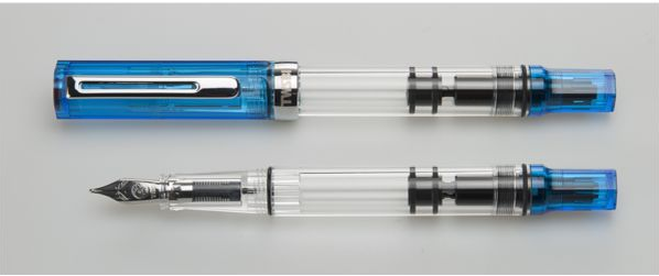
Came across this: https://purepens.co.uk/acatalog/TWSBI-Eco-Fountain-Pen-Blue-Transparent.html Picture from PurePens. I saw an Instagram post from them about a release date in September, but I can't find that post anymore. What do you think?
-
JETSTREAM & easyFLOW In my pursuit for a perfect ballpoint refill I’ve came across with these 2 brands: JETSTREAM & easyFLOW. Why ballpoints? Because sometimes you need something else then a fountain pen to write on different surface: like napkins, fabric, wood, skin, you never know when or where. So I have narrow down my options for these hybrid ballpoint refills. Both write smooth, dark lines and both have water-proof and sun fade-proof characteristics. uni-ball JETSTREAM was developed in 2003, it’s an evolution of their gel refill “Signo 207”. Can be found in medium or fine strokes, also the main refills can be adapted to replace gel refills like Pilot G2 or European standard roller-ball refills. The blue refills are actually blue, quit dark lines, black is almost true black. SCHMIDT® easyFLOW 9000 was introduced later, in July 2007. Their main characteristic is based on Parker style refill (large capacity refill size G2 as per the standard DIN EN ISO 12757), making them ready available for many ballpoints producers, without any modification. The blue refill is more on the purple side, but still a vivid colour, black is a bit much darker then JETSTREAM. Also easyFLOW smudge a bit more than JETSTREAM. Somewhere back in 2014 I had to use a pen to write a polite note for a car parked illegally on our parking lot at work (a standard A4 printed polite note where you need to write registration number, date and time). And I used a Parker Big Red roller ball. Big mistake, with a bit of rain all my writing was washed out, completely! The car’s owner comes down to check what was with that note on his car and all my writing was gone. That was the point to search for a better ballpoint refill with water-proof characteristics, smooth writing, fast drying and vivid colours. After a lot of research I bought my first two hybrid ballpoint refills: easyFLOW 9000 in blue and black. After a while I have found JETSTREAM to be as good as easyFLOW 9000, but for different pen body, like roller-balls or Energel, other than Parker style. That being said I run a test to prove water-proof and sun exposure fading test of these two refill brands. For this test I have used some common refills along with my 2 favourites. I have used normal paper and glossy paper (from a magazine). One normal paper and one glossy paper it was washed through heavy water after 2 minutes of writing have dry. Everything was exposed in a closed shed with windows, where the sun can reach for about 3-4 hours daily, when not cloudy. Also there is high humidity on our little island, temperatures varying from 25˚ summer to 8˚ winter times. Refills in test: Schmidt easyFlow 9000 blue Schmidt easyFlow 9000 black Uni-ball Jetstream 1.0 blue Uni-ball Jetstream 1.0 black Uni-ball Jetstream sport blue Uni-ball Jetstream 0.7 black Pentel Energel 0.7 blue Pentel Energel 0.7 black Schneider Topball 0.5 black Inoxcrom gel M black Fisher Space M black Faber-Castell B black Parker M black Parker Quinkflow M blue Parker M blue Lamy M66 black Senator M blue Zebra F-series blue Pilot G2 0.5 black Pilot G2 0.7 black After this test I will stick with easyFLOW and Jetstream as my main refills for ballpoints. Also Inoxcrom gel refill and Lamy are really good, recommend them. A big surprise is Parker Quinkflow failing so hard. The test was run in my condition, feel free not to accept my observations. Also if you click on the pictures you can download them from Flickr and enlarge them to see some close ups. Except on single photo, the rest are scanned. Starting test June and July 2016 Normal Paper running water, June 2016 Normal paper, photo, not scan, July 2016 Glossy paper, July 2016 Ending test December 2016 Normal Paper running water Normal paper Glossy paper running water Glossy paper
-
Just got hold of several old bottles of Parker Super Quink Blue ink that came in cheap looking, black plastic bottles that look nothing like Parker Quink ink -or any other ink for that matter! They were manufactured in Parker's plant in Mexico sometime in the 1980's and they differ from their American counterparts in that there's no mention of Solv-X in them -which from what I've read, these inks had- and it only states the ink as permanent. Upon opening the first bottle I found that evaporation took the better half off it and that it has a chemical aroma that is not present on any other ink I've tried so far. So being a cautious guy, I proceeded to fill my trusty old and cheap Manuscript Chinese pen with the liquid and give it a try. I followed the recommendations of fellow FPN users on testing that the ink had no strings attached while submerging a stick into it. I also made sure no mould or other foreign items were floating around. So after using it for a while, I found that the ink colour is more blue-black or dark blue than anything I've got on my ink stash, so I decided to compare the ink with other old cartridges I have from pens I recently bought in NOS condition. And here am attaching the result. Not of a big fan of blue hues, but in this particular case, I kind of love how dark and saturated this ink is. I had since refilled the bottle with distilled water in order to restore the original volume, but I've yet to try the diluted version. I'll post updates as soon as I fill my tester pen with it. What do you all think? PS Sorry, forgot to attach the image
-
I need a nice blue ink for school that can stand out from pencil easily and works well with medium quality paper like printer paper and notebooks. Ive been using iroshizuku shin kai, but it seems a little bland and does not really stand out on paper, I tried sailor Yonaga but its almost the same color as shin kai. Can anyone reccomend a vibrant and saturated blue or dark blue ink that is just blue without any purple or green tones? Ill be using a pilot vp fine most of the time. Thanks for your help.
-
Pelikans and this model in particular have been reviewed at length, so I'll keep it short and hopefully useful. Preamble: Anyone who knew me at school would scoff: Twenty something fountain pens? You?? But no one understands your handwriting, not even yourself! True, but I decided to retrain myself, so after much effort it is now legible, if not particularly pretty; but more importantly it helps me organize my very dispersed thoughts. I tried mostly utilitarian pens, with seven Lamy Vistas, four Mujis and a Pilot Metropolitan, and eventually realized it's a lot more about the inks than the pens for me; still there were a few designs I drooled over, particularly Pelikans which are way above what I would be willing to pay for a pen, no matter how beautiful or well made: m1005, the mythical dunkelblau m405, m406 and m805, the clear and aquamarine m205 demonstrators, but I'd never been able to see them in person, save for a Marine Blue m605 which I didn't care for. So I kept away from Pelikan, and ended up with a Sailor Professional gear, an Ambition in pearwood, two Lamy Studios (one in Imperial Blue to scratch the dunkelblau itch), besides the other pens I already had, Le Man 100, m600. Enter serendipity? Used m205 blue demo for about $60 on that well known online bazaar, I can't remember if thanks to a coupon. Too good to be true? I took the plunge, sent it to a friend who resends stuff to me... It took six months to get to me, but it was well worth the wait: It's beautiful, even better than I though. And it was in almost perfect condition, save for some barely visible ink trapped in the inner cap. Design: 5/5. In its clear blue and silver trim pen this is now my most beautiful pen, dislodging a Faber Castell Ambition in pearwood, which looks awesome. Even the inner workings of the piston look great, in a futuristic way. It's a timeless design few brands are able to achieve. To me Pelikan Souverains and classics are the closest thing to perfect pens, although I must confess I dislike most of their special editions, marbled finishes and gold trims, which means the vast majority. It's so good looking I think I might be done with looking for a solid blue with rhodium trim model, and even the new clear (2018) m205. Ergonomics: 5/5. It's a small pen but with a decently wide section, works fine with my large (L size gloves) hands. I don't post but that works too. It's light and well balanced. I wouldn't mind a slightly bigger pen, at a reasonable price. Construction: 5/5. Looks good, feels good, works good. I disassembled the cap and in the process a tiny speck fell off, which might have been my fault or the previous owner's, but the inner cap and ring still work well to provide a good seal. Someone less clumsy shouldn't have a problem, and I'm leaving caps well enough alone from now on. Nib: 5/5. Smooth fine nib, writes thinner than the fine 18k on my old style m600. It makes Rohrer & Klingner look good, and that ink in turn makes all pens write a little more smoothly. Take into account I write on HP LJ 32 lbs, Clairefontaine, Rhodia, Fabriano and Tomoe River. Filling system: 5/5. Easy to fill, holds a lot of ink, doesn't evaporate so inks don't change colour, what more could you want. Reliability: 5/5. This is a seldom seen parameter, but one I care for a lot. Zero starting or skipping problems, smooth nib. My m600 has been my most reliable pen, by far, and I expect the same from this m205, since they are basically the same design. Maintenance: 5/5. These are very low maintenance pens, although I wouldn't use them with inks that produce gunk. If you swap inks a lot like I do, the nib and feed units are not as easy to clean as others which disassemble easily, but after much rinsing it can be done. Price: 6/5? Hit the jackpot, particularly for a brand in which any pen above the m200 range is way too expensive for me. Even at msrp it's a pen you could use for a long time without any problems. Conclusion: 5/5. This is sort of my accidental holly grail, if I'd seen this in person I would have got it a long time ago. I can't stop looking at it and it makes me want to write more, which is my ultimate test. My other pens would get ratings ranging from 2/5 to 4/5, even my m600 which has a slightly smoother nib can't compete on looks.
-
http://inks.pencyklopedia.pl/wp-content/uploads/Noodlers-54th-Massachusetts-nazwa.png Present test ink Noodler's 54th Massachusetts with cool gray-blue color. Ink writes great! The real pleasure of writing. Also color my type. Worse with the smell. It reminds some laboratory chemicals. Sharp and unpleasant. But nobody tells us to smell the ink. Note: TOTAL waterproof. I would recommend! Manufacturer: Noodler's Series, colour: 54th Massachusetts Pen: Waterman Hemisphere "F" Paper: Image Volume 80 g / cm2 Specifications: Flow rate: very good Lubrication: good Bleed through: possible point Shading: noticeable Feathering: unnoticeable Saturation: good A drop of ink smeared with a nib http://inks.pencyklopedia.pl/wp-content/uploads/Noodlers-54th-Massachusetts-kleks.jpg The ink smudged with a cotton pad http://inks.pencyklopedia.pl/wp-content/uploads/Noodlers-54th-Massachusetts-wacik.jpg Lines http://inks.pencyklopedia.pl/wp-content/uploads/Noodlers-54th-Massachusetts-kreski.jpg Water Resistance http://inks.pencyklopedia.pl/wp-content/uploads/Noodlers-54th-Massachusetts-woda.jpg Sample text http://inks.pencyklopedia.pl/wp-content/uploads/Noodlers-54th-Massachusetts-txt.jpg Ink drying time ca. 5 sec. Other tests carried out: Sample text in an Oxford notebook http://inks.pencyklopedia.pl/wp-content/uploads/Noodlers-54th-Massachusetts-Oxford.jpg Sample letters in a Rhodia notebook http://inks.pencyklopedia.pl/wp-content/uploads/Noodlers-54th-Massachusetts-Rhodia.jpg Ink drops on a handkerchief http://inks.pencyklopedia.pl/wp-content/uploads/Noodlers-54th-Massachusetts-chromatografia1.jpg Chromatography http://inks.pencyklopedia.pl/wp-content/uploads/Noodlers-54th-Massachusetts-chromatografia2.jpg
-
http://inks.pencyklopedia.pl/wp-content/uploads/Parker-Penman-Sapphire-nazwa.png Manufacturer: Parker Series, colour: Penman Sapphire Pen: Waterman Hemisphere "F" Paper: Image Volume 80 g / cm2 Specifications: Flow rate: very good Lubrication: good Bleed through: noticeable Shading: noticeable Feathering: unnoticeable Saturation: very good A drop of ink smeared with a nib http://inks.pencyklopedia.pl/wp-content/uploads/Parker-Penman-Sapphire-kleks.jpg The ink smudged with a cotton pad http://inks.pencyklopedia.pl/wp-content/uploads/Parker-Penman-Sapphire-wacik.jpg Lines http://inks.pencyklopedia.pl/wp-content/uploads/Parker-Penman-Sapphire-kreski.jpg Water Resistance http://inks.pencyklopedia.pl/wp-content/uploads/Parker-Penman-Sapphire-woda.jpg Sample text http://inks.pencyklopedia.pl/wp-content/uploads/Parker-Penman-Sapphire-txt.jpg Ink drying time ca. 5 sec. Other tests carried out: Sample text in an Oxford notebook http://inks.pencyklopedia.pl/wp-content/uploads/Parker-Penman-Sapphire-Oxford.jpg Sample letters in a Rhodia notebook http://inks.pencyklopedia.pl/wp-content/uploads/Parker-Penman-Sapphire-Rhodia.jpg Ink drops on a handkerchief http://inks.pencyklopedia.pl/wp-content/uploads/Parker-Penman-Sapphire-chromatografia1.jpg Chromatography http://inks.pencyklopedia.pl/wp-content/uploads/Parker-Penman-Sapphire-chromatografia2.jpg
-
This ink has been reviewed many times, so please refer to others. This review is my subjective opinion of this ink and will differ from others. This is one of the first Diamine inks that I have tried. About a year ago, I needed some cartridges for an upcoming trip, and ordered Diamine Turquoise for both the price and color of the ink. I have been pleasantly surprised with this ink. It is not a pretentious ink. It is a lovely color of turquoise - not too blue and not too green - just unashamedly turquoise. It reminds me of the beautiful turquoise skies in Arizona, and of my husband's hobby of collecting rare and beautiful turquoise gemstones. But the behavior of this ink is not pretentious either. I noticed little to no sheen even on Tomoe River paper, but some shading is evident on Tomoe River and Rhodia papers. It is clearly a smooth writing ink - minimally lubricated but with nice flow. And it dries fairly fast, which is always a positive for left handers. It is also fairly water resistant. I did notice on some cheap papers that there was an expected bit of feathering and bleedthrough when I used a wet stub, and some showthrough on Tomoe River paper. My overall opinion: 7.5 out of 10 - a solid, hardworking turquoise ink!
-
Noodler's Polar Blue A Newbie's Perspective In my last review I mentioned that my favorite color is Green. If I had to choose a second favorite color, I would choose blue. I like this blue, yet, I wish it had shading. I really like inks that have nice shading properties. Anyways...
-
L'Artisan Pastellier Callifolio - Bonne Esperance L'Artisan Pastellier is a small company in southern France that specialises in natural pigments, and offers customers authentic and reliable products in beautiful colours based on mineral or vegetable pigments. In a collaboration with Loic Rainouard from Styloplume.net, the chemist Didier Boinnard from L'Artisan Pastellier created the line of Callifolio fountain pen inks. These pastel-coloured inks are traditionally crafted, and can be freely mixed and matched. Overall these inks are only moderately saturated, and have low water-resistance. The inks were specifically designed to work well with all types of paper, and all types of fountain pens. Being pastel-tinted, these inks have a watercolour-like appearance, and are not only fine inks for journaling, but are also really excellent inks for doodling & drawing. I only recently discovered them, and they are already the inks I gravitate towards for personal journaling. In this review I take a closer look at Bonne Esperance, one of the many blue inks of the series. The blue Callifolio inks are named after rivers, lakes and oceans - this blue liquid gets its name from Cap de Bonne Espérance in South-Africa. Colourwise this is a more or less washed-out dark grey-blue ink, with a bit of a vintage feel. For me personally, the ink lacks a certain complexity, and as such looks a bit dull and uninteresting. Not an ink that I'm excited about. Technically, the ink feels rather dry in my Safari test pens, and really needs wetter nibs for a pleasant writing experience. When left uncapped, I experienced hard starts after a minute or so. Not so good. On the plus side, Bonne Esperance shades nicely, with an aesthetically pleasing balance between the light and darker parts. This shading is even present in finer nibs, but really comes to the front in B-nibs and above. To show you the impact of saturation on the ink's look & feel on paper, I made some scribbles where I fully saturated portions of the paper with ink. This gives you a good idea of what the ink is capable of in terms of colour range. Bonne Esperance disappointed me a bit here: it's dynamic range is rather limited, which might explain why the ink feels a bit dull and flat. On the smudge test - rubbing text with a moist Q-tip cotton swab - Bonne Esperance showed a lot of smearing, but the text remains readable. Water resistance is low: most of the dyes quickly wash away, leaving only a faint greyish residue, that is barely readable. Not an ink to use when water resistance is high on your list. I've tested the ink on a wide variety of paper - from crappy Moleskine to high-end Tomoe River. For the Callifolio reviews, I'm using small strips to show you the ink's appearance and behaviour on different paper types. On every band of paper I show you:An ink swab, made with a cotton Q-tip1-2-3 pass swab, to show increasing saturationAn ink scribble made with an M-nib fountain penThe name of the paper used, written with a B-nibA small text sample, written with an M-nibDrying times of the ink on the paper (with the M-nib)Bonne Esperance behaved perfectly on all the paper types, with no apparent feathering even on the lower quality papers in my test set. With Moleskine, a tiny amount of feathering shows, but you almost need a magnifying glass to spot this. Drying times are mostly around the 10 second mark, with a low of 5 seconds on the more absorbent paper. The ink is equally at home with both white and off-white creamy paper. The ink looks really nice on Paperblanks and Fantasticpaper - on the other papers I found the ink's expression to be underwhelming (too washed out, and - dare I say - a bit boring). I also show the back-side of the different paper types, in the same order. With the low-end Moleskine there is some show-through and bleed-through. With the other papers, Bonne Esperance's behaviour is impeccable. The ink copes really well with a wide variety of paper types. Inkxperiment – Moon over GizahI've recently started to experiment with ink drawings, keeping things simple and more-or-less abstract. I find it to be a fun extension of the hobby, and have found single-ink drawings a nice challenge. It also gives you an idea of what the ink is capable of in a more artistic setting. For this drawing I used 300 gsm rough watercolour paper. The background was brushed on with water-diluted ink. I then painted in the pyramids and other details with undiluted ink. For the moon, I used a touch of bleach to create the cratered surface features. For drawing, Bonne Esperance's limited colour range makes it more difficult to obtain interesting results - definitely not an easy one for doing a single-ink drawing. ConclusionBonne Espearance is a dark grey-blue ink with a washed out look. The ink works well in all nib sizes, with some decent shading. Technically, I found the ink to be too dry for pleasant writing. You really need a wet nib to compensate for this. The ink also has zero water resistance, and is prone to hard starts when left uncapped for short periods of time. For me personally, this ink lacks somewhat in complexity, and even feels a bit dull. Not an ink that I could get excited about. Technical test results on Rhodia N° 16 notepad paper, written with Lamy Safari, M-nib Backside of writing samples on different paper types
-
This is an ink I've been scratching my head over ever since I received a bottle of it several months ago - and having just re-inked a couple of pens with it, I figured it was time to 'go public' with my confusion. This wasn't actually an ink that I chose to buy: it was sent to me (along with a couple of other inks) as a kind of apology / substitute for an ink I'd ordered online, and paid for, that my supplier didn't have in stock. I'd wanted Omas Blue - I received Noodler's Steel Blue, Noodler's General of the Armies, and this ink. The first thing I noticed was that on the box, Organics Studio Blue Merle was described as "a medium saturation blue-black ink that is perfect for business and personal use". Except that in my Pilot Vanishing Point (with F nib), it came out a kind of nondescript grey. I flushed the pen, and put this ink away - only pulling it out again last week, when I decided to try it in a pen with a broader nib. Nothing had changed, though: this ink *still* came out grey. I have to confess, I'm now puzzled. A couple of posts on FPN suggest that an earlier formulation of this ink was more of a blue-grey - and/or that the ink is prone to discolour in the bottle over time. And the box *definitely* says it's meant to be blue-black. On the other hand, my online research into Australian blue merle Shepherd dogs (for whom this ink was named) suggest that their fur is actually a dappled grey rather than either blue or black. This ink is now (I believe) discontinued - don't know if it'll be back. Not being mad keen on grey inks, I'm not sure I'll use it often - but it behaves pretty well in my pens. In any case, I thought it was worth sharing my observations and a couple of scans, given the fact that it's not been widely reviewed on FPN. So here is my written review: And here's a close-up of the Q-tip swab:
-
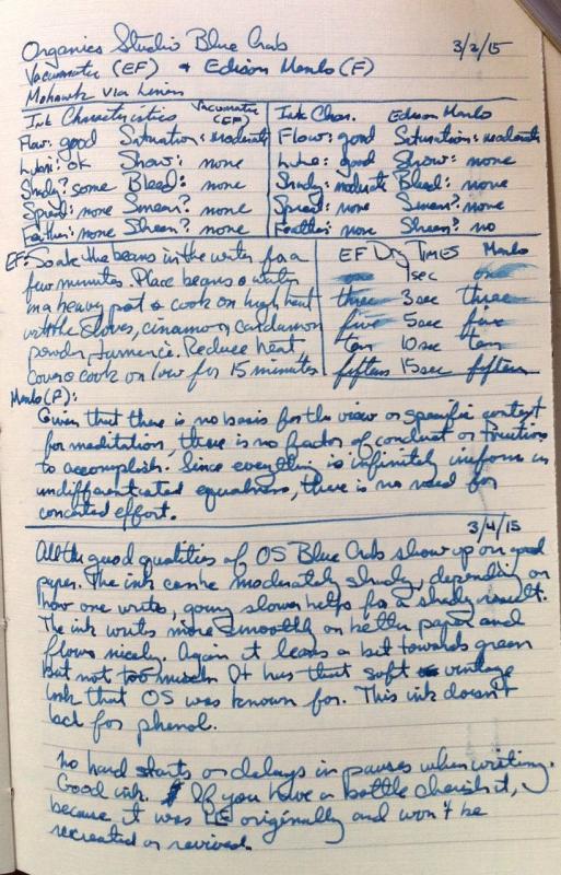
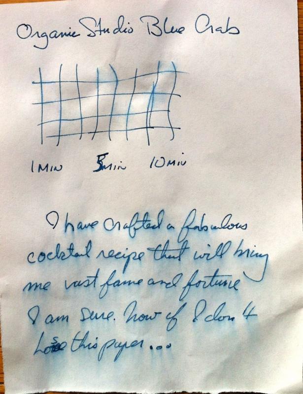
This is a mostly hand written review of Organics Studio Blue Crab ink. It was a Baltimore Pen Show special, and the leftovers were sold off by various retailers. Thus, I was able to purchase a bottle. In the artificial light here at home the color looks amazingly close to the Thistle T2 with 1/3rd more water added. It is not as shady as that ink, nor as wet, but it can appear very close. In natural light I think the Thistle is more to the green side (but that's based on memory). The ink is reasonably water resistant once dry on inkjet paper. I did not do a chromatic test of the ink while it was inked in a pen. So I don't have that. The ink is a bit on the drier side from what I love, so that's kind of my only quibble. Anderson Pens website lists OS Blue Crab in 55ml and 4oz bottles in stock as of the date of this writing. I have no affiliation with any company listed here.
-


desaturated.thumb.gif.5cb70ef1e977aa313d11eea3616aba7d.gif)