Search the Community
Showing results for tags 'blue'.
-
I have a bottle of the Raduga Blue & I I would like to know if people find it on the thick side for fountain pens? Or maybe it does not flow as well?
-
Really liking this one: Sheen: On Tomoe River: #2 vs. #14:
-
-
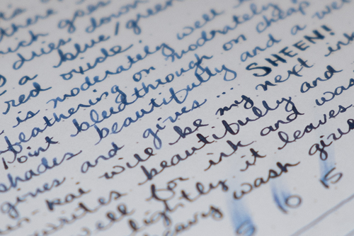
Ink Review : Diamine Blue Velvet (150th Anniversary Ink) Pen: Lamy AL-star Ocean Blue, M-nib Paper: Rhodia N° 16 notepad 80 gsm Review This ink is part of the 8-color set that Diamine released to celebrate their 150th anniversary (1864-2014). The set has quite a number of interesting colors. This pure blue ink is one of them. Blue Velvet... the name evokes the image of a bright late-spring day with a deep blue sky. At the banks of the mighty river Anduin, Galadriel - the beautiful queen of Lothlórien - dominates the scene with her blue velvet reginal robe, waving her goodbyes to the Fellowship... This ink captures the setting well. It is a deep pure-blue ink with no colored undertones, as shown in the chromatograpy. The ink flows well in my pens, and shows some nice - but not too much - shading. A simple but elegant blue for everyday writing, at home in your journal as well as in the workplace. Fortunately for Galadriel, it is a bright sunny day without rain, because this Blue Velvet ink has no water resistance at all. Both the droplet and running water tests show without any doubt that water obliterates this ink. No legible traces remain. A shame, because this ink is otherwise very well-behaving. Let's have a look at how it behaves on paper. For this, I did some tests: Rhodia N° 16 notepad 80 gsm - drying time 15-20 seconds, no feathering, no show-through nor bleed-throughPaperblanks journal paper - drying time ~20 seconds, no feathering, no show-through and no bleed-throughGeneric notepad paper 70 gsm - drying time ~15 seconds, no feathering, no show-through nor bleed-throughMoleskine journal - drying time ~5 seconds, no feathering (that's nice!), but significant show-through and very noticeable bleed-through (making the backside of the paper unusable)Blue Velvet is a very well-behaving ink. Only with the awful Moleskine paper it leaves to be desired. On other paper, it behaves perfectly. You can't go wrong here. Conclusion Blue Velvet is an all-around true blue ink, that behaves well om a wide variety of paper. It's big downside is that it has zero water resistance. Myself, I don't care much about that. But... for me the ink doesn't strike a chord. It's a decent ink for everyday use, but no queen material. This is one dress that will spent more time in the wardrobe than being worn. my overall score: B+

-
Robert Oster 1980 - Bass Straight Robert Oster is an Australian ink maker that is well-known for its unique range of colours. With this mini-series he gives us a conglomeration of colours inspired by the anything goes world of the 1980s. The inks include muted pastel-type colours along with some eye-popping disco-style hues. Definitely an interesting series. In this review I take a closer look at Bass Straight - a heavy-shading medium soft blue that is a bit green-leaning without becoming a teal. The colour is comfortable to the eye for both reading & writing, and it deviates enough from a standard blue to become interesting. I quite like the looks of it. For a Robert Oster ink, this one feels well-lubricated, and it lays down a wet and well-saturated line even with my dry Safari pens. The ink also works well with finer nibs - although you lose some of its nice shading. Overall, a good writing ink that I enjoyed using. To show you the impact of saturation on the ink's look & feel on paper, I made some scribbles where I really saturated portions of the Tomoe River paper with ink. This gives you a good idea of what the ink is capable of in terms of colour range. Bass Straight has a medium tonal range, ranging from a light blue to a dark medium blue. Nevertheless, there is quite some contrast between both ends of the spectrum, making this ink a fairly heavy shader. When writing with broader nibs, shading is very present, but remains pleasing to the eye. You definitely notice that you're writing with a fountain pen! Like most Robert Oster inks, Bass Straight has zero water resistance. Short exposures to water completely obliterate the text, leaving next to nothing on the page. This is also apparent from the lower part of the chromatography. The chroma shows an intriguingly complex mixture of dyes, and you can also clearly see the underlying green that moves this ink slightly towards teal terrain. All this translates to an interesting medium blue writing ink that I find quite appealing. I've tested the ink on a wide variety of paper - from crappy Moleskine to high-end Tomoe River. On every small band of paper I show you: An ink swab, made with a cotton Q-tip 1-2-3 pass swab, to show increasing saturation An ink scribble made with an M-nib Lamy Safari fountain pen The name of the paper used, written with a B-nib Lamy Safari A small text sample, written with an M-nib Lamy Safari Drying times of the ink on the paper (with the M-nib Lamy) Bass Straight behaves perfectly on most paper types, with no visible feathering. It even worked surprisingly well with the notoriously bad Moleskine paper, which is quite a feat. With the Moleskine paper I got a tiny amount of bleed-through, but nothing too bad. Saturation and contrast are really good across all paper types in my test set. The ink also shows some nice shading, even with finer nibs. All in all a very pleasing writing experience. Personally I prefer the ink on pure white paper. With more yellowish paper, I feel the ink starts moving a bit too much towards teal territory. I guess the yellow colour of the paper shines through the blue ink, resulting in a bit too much green for my liking. Writing with different nib sizes The picture below shows the effect of nib sizes on the writing. All samples were written with a Lamy Safari, which is typically a dry pen. I also added a visiting pen: a wet-writing Parker Sonnet with F-nib. As you can see, Bass Straight can handle all nib sizes, and even shows a bit of shading with the EF-nib. Saturation & contrast are very good across the complete nib-range, making it a fine writing ink. Related inks To compare this Bass Straight with related inks, I use my nine-grid format with the currently reviewed ink at the center. This format shows the name of related inks, a saturation sample, a 1-2-3 swab and a water resistance test - all in a very compact format. When seen next to a real teal like iroshizuku ku-jaku it is totally clear that Bass Straight is a blue ink. But it's still a bit more green-leaning when compared with e.g. Callifolio Omi Osun. Inkxperiment – thunderstorm With every review, I try to create an interesting drawing using only the ink I'm working on. Limiting myself to one ink allows me to showcase its colour-range nuances. It's often quite a challenge, but always great fun. For this drawing inspiration comes from a thunderstorm that recently passed over town, filling the air with lightning and a feeling of static electricity. I started with a piece of cardboard paper (a Fellowes binding cover), that I wetted with water-diluted ink applied with a brush through a piece of paper kitchen towel. I then painted in the little cottages on the still wet paper, and drew in the lightning & static electricity patterns in the sky with my medium-nibbed Safari. The rain-spatters in the foreground were drawn in with a Q-tip dipped in Bass Straight. When the painting was almost dry, I added the final details like doors&windows, outline of the houses, the paveway in the foreground and the trees. The resulting little picture gives you a good idea of what can be obtained when using Bass Straight as a drawing ink. Conclusion Robert Oster 1980 Bass Straight has a nice medium-blue soft colour with enough complexity in its dye composition to make it interesting. It really excels as a writing ink, capable of handling all paper types and nib sizes. I especially liked the fairly heavy shading, that never gets too harsh but remains pleasing to the eye. The ink is also a fine one for use in a more artistic setting. Technical test results on Rhodia N° 16 notepad paper, written with Lamy Safari, M-nib Back-side of writing samples on different paper types
-
http://inks.pencyklopedia.pl/wp-content/uploads/Diamine-Aqua-Blue-nazwa.png I present to test the ink Diamine Aqua Blue with a pleasant, azure color. The blue sky, clean water, recreation, vacation - looking at the color invoke such thoughts. Good drying time, the pleasure of writing, good technical characteristics - are the main advantages. I would recommend this shade of blue. Manufacturer: Diamine Series, colour: Aqua Blue Pen: Waterman Hemisphere "F" Paper: Image Volume 80 g / cm2 A drop of ink smeared with a nib http://inks.pencyklopedia.pl/wp-content/uploads/Diamine-Aqua-Blue-kleks.jpg The ink smudged with a cotton pad http://inks.pencyklopedia.pl/wp-content/uploads/Diamine-Aqua-Blue-wacik.jpg Lines http://inks.pencyklopedia.pl/wp-content/uploads/Diamine-Aqua-Blue-kreski.jpg Water Resistance http://inks.pencyklopedia.pl/wp-content/uploads/Diamine-Aqua-Blue-woda.jpg Ink drops on a handkerchief http://inks.pencyklopedia.pl/wp-content/uploads/Diamine-Aqua-Blue-chromatografia1.jpg Sample text http://inks.pencyklopedia.pl/wp-content/uploads/Diamine-Aqua-Blue-txt.jpg Specifications: Flow rate: good Lubrication: good Bleed through: possible point Shading: noticeable Feathering: unnoticeable Saturation: good Ink drying time: ~ 5 sec. Other tests carried out: Sample text in an Oxford notebook http://inks.pencyklopedia.pl/wp-content/uploads/Diamine-Aqua-Blue-Oxford.jpg Sample letters in a Rhodia notebook http://inks.pencyklopedia.pl/wp-content/uploads/Diamine-Aqua-Blue-Rhodia.jpg Chromatography http://inks.pencyklopedia.pl/wp-content/uploads/Diamine-Aqua-Blue-chromatografia2.jpg
-
I think I like this ink best in finer nibs and on Tomoe River. In any event, it reminds me a lot of OMAS Blue: A closer look: On TR: Compared to OMAS Blue:
-
This is the third review of the four Hokusai Katsushika inks from Taccia/Nakabayashi that have reached American shores. I didn't know what to expect with this ink. Would "Light Blue" mean a lighter, brighter color, more like a turquoise? Would it simply mean "not dark"? The truth of the matter is closer to the latter than the former. In a dry pen this will be more of a pastel, light blue. Very readable, with excellent shading. In a wetter pen the shading is still there, in a greater range of values (light-dark), and a bit more saturation. But I'll admit that I wasn't delighted by this ink like I was with the other three inks in the series. It could have been the pen didn't work well with this ink even though it wrote perfectly fine. But it is an ink that I had to nudge the converter down to remove air from the converter. It seemed I had to do that more with this ink in this pen than others, so it could very well be the two just didn't get along as well as one would like. Neither one's fault really, just not very compatible. The ink really has no showthrough or bleedthrough issues on the absorbent (but good quality) Mohawk via Linen paper. Inks never sheen on this paper (well the Rust Green did). Dries pretty fast comparatively. The blue leans towards green, but I don't think enough to be called teal. Closer to Cerulean I think. You can really go over how the ink looks in this image. The first part of the text is with a normal feed. Towards the end you can see where I nudged it pushed more ink into the feed and the line got noticeably darker. I don't know if these are limited edition. But this is the only ink of the Hokusai series currently in stock at Anderson Pens.
-
Robert Oster 1980 - Clearwater Rain Robert Oster is an Australian ink maker that is well-known for its unique range of colours. With this mini-series he gives us a conglomeration of colours inspired by the anything goes world of the 1980s. The inks include muted pastel-type colours along with some eye-popping disco-style hues. Definitely an interesting series. In this review I take a closer look at Clearwater Rain - an eye-popping electric cyan-blue, reminiscent of the blazing disco-lights on a 1980's dancefloor. To be honest, this is not my type of colour, but I will do my best to give it an honest review. For a Robert Oster ink, this one feels well-lubricated, and it lays down a wet and well-saturated line, even with my dry-writing Lamy Safari test pens. No complaints there - this ink works really well for writing, even with the finest nibs. If you like your inks vibrant with popping colour, this Clearwater Rain certainly fits the bill. You can't go much more vibrant than this ;-) To show you the impact of saturation on the ink's look & feel on paper, I made some scribbles where I really saturated portions of the Tomoe River paper with ink. This gives you a good idea of what the ink is capable of in terms of colour range. As you can see, Clearwater Rain is well-saturated at the light end, and becomes a darker cyan-blue on the most saturated parts. The ink doesn't have a very broad tonal range, which already gives a clue that it is less suited for single-ink drawings. Like most Robert Oster inks, Clearwater Rain has zero water resistance. Short exposures to water completely obliterate the text, leaving next to nothing on the page. This is also apparent from the lower part of the chromatography. The chroma clearly shows the blue & green components of the ink. I wouldn't call it a teal though, cyan-blue is a better term. Personally, I would describe this as the result you get when you move a sky-blue cerulean-type colour towards the green - not a scientific expression, but that's how I consider this Clearwater Rain. I've tested the ink on a wide variety of paper - from crappy Moleskine to high-end Tomoe River. On every small band of paper I show you: An ink swab, made with a cotton Q-tip 1-2-3 pass swab, to show increasing saturation An ink scribble made with an M-nib Lamy Safari fountain pen The name of the paper used, written with a B-nib Lamy Safari A small text sample, written with an M-nib Lamy Safari Drying times of the ink on the paper (with the M-nib Lamy) Clearwater Rain is a well-behaving ink on most paper types, with no visible feathering. The ink dries quite quickly around the 5 second mark (with the M-nib Lamy Safari), which surprised me because it writes really wet. With Moleskine paper, there is a tiny bit of feathering, and a fair amount of see-through and bleed-through. Saturation and contrast are really good across all paper types in my test set. The ink also shows some nice shading, even with finer nibs. All in all a very pleasing writing experience. This is my first ink review for 2020, and with a new year comes a new set of quotes. The quotes below come from Terry Pratchett novels. If you love English tongue-in-cheek humour, you can't go wrong with Pratchett's writings. I'm a big fan of his Discworld novels ! Writing with different nib sizes The picture below shows the effect of nib sizes on the writing. All samples were written with a Lamy Safari, which is typically a dry pen. I also added a visiting pen: a wet-writing Parker Sonnet with M-nib. As you can see, Clearwater Rain has no problem with even the finest nibs, exhibiting good contrast, saturation and shading with the EF-nib. This excellent performance remains across the complete nib-range, making it a really fine writing ink. Related inks To compare Clearwater Rain with related inks, I use my nine-grid format with the currently reviewed ink at the center. This format shows the name of related inks, a saturation sample, a 1-2-3 swab and a water resistance test - all in a very compact format. Inkxperiment - row, row, row your boat With every review, I try to create an interesting drawing using only the ink I'm working on. Limiting myself to one ink allows me to showcase its colour-range nuances. It's often quite a challenge, but always great fun. For this drawing I used 300 gsm rough watercolour paper. I painted in the sky with heavily water-diluted ink. The boat uses pure Clearwater Rain, drawn in using the tip of a cotton-swab. I then added the waves and the sun with a Q-tip, using multiple water/ink ratios. The resulting picture gives you an idea of what can be achieved with this cyan-blue as a drawing ink. The limited tonal range of this ink made it a difficult one for drawing. I personally appreciate it much more as a writing ink. Conclusion Robert Oster 1980 Clearwater Rain is an eye-popping cyan-blue, that works really well as a writing ink. It is well-saturated, provides great contrast with the paper, and shows prominent shading even with the fines nibs. Personally I'm not a fan of the colour, but if you happen to like it I'd say go for it! Technical test results on Rhodia N° 16 notepad paper, written with Lamy Safari, M-nib Back-side of writing samples on different paper types
-
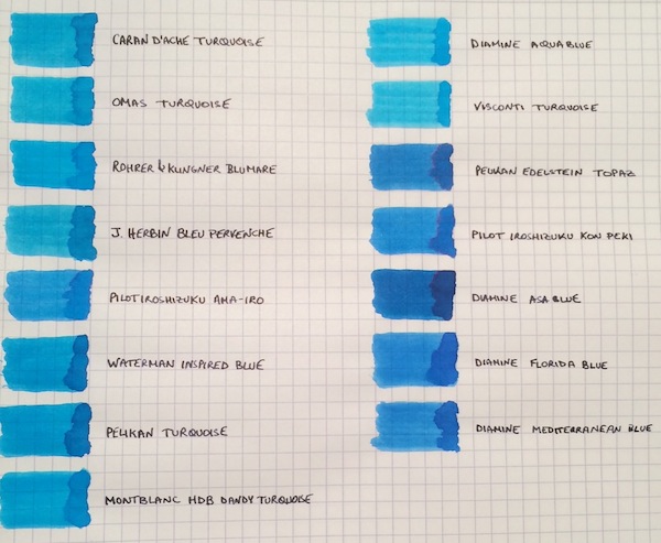
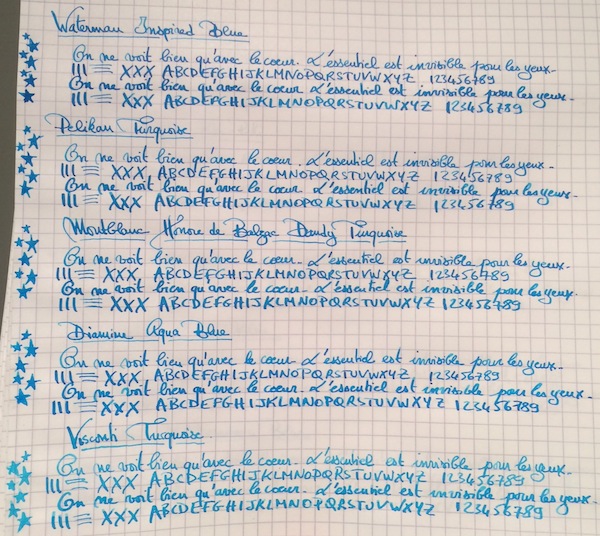
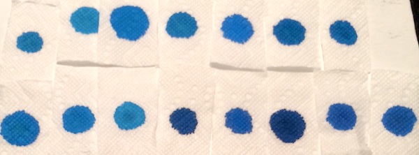
I don’t know if it’s the warm and sunny weather that just hit the northeast after a cold spell, but, more than ever, I’m not ready for summer to end! So to keep the summery vibe going, I thought why not do a comparison of turquoise and “beachy blue" inks. This is by no means a comprehensive review, because I’m missing some great turquoise inks, such as Sheaffer and Lamy Turquoise, but I saw a post come up on the boards with questions about turquoises, so I wanted to share samples of the ones I have. The 15 inks tested are: Caran d’Ache Turquoise, Omas Turquoise, Rohrer & Klingner Blu Mare, J. Herbin Bleu Pervenche, Pilot Iroshizuku Ama-Iro, Waterman Inspired Blue, Pelikan Turquoise, Montblanc Honore de Balzac Dandy Turquoise, Diamine Aqua Blue, Visconti Turquoise, Pelikan Edelstein Topaz, Pilot Iroshizuku Kon-Peki, Diamine Asa Blue, Diamine Florida Blue and Diamine Mediterranean Blue. The writing samples were done using a 1950s 146 and a Pilot Custom 74 B nib ground down to a smooth stub by Mike Masuyama. All samples were tested on Rhodia paper. Ink Swabs: Ink on Paper Towel: Top Row: Caran d’Ache Turquoise, Omas Turquoise, Rohrer & Klingner Blu Mare, J. Herbin Bleu Pervenche, Pilot Iroshizuku Ama-Iro, Waterman Inspired Blue, Pelikan Turquoise Bottom Row: Montblanc Honore de Balzac Dandy Turquoise, Diamine Aqua Blue, Visconti Turquoise, Pelikan Edelstein Topaz, Pilot Iroshizuku Kon-Peki, Diamine Asa Blue, Diamine Florida Blue and Diamine Mediterranean Blue Best Flow and Smoothness: J. Herbin Bleu Pervenche Bleu Pervenche wins hands down for me in this category and is miles ahead of every other ink in this review. With that said, although it has an excellent flow, l wish Bleu Pervenche felt a little smoother (to match the smoothness of my favorite inks). However, this is the only turquoise with a regular spot in my ink rotation. Best Turquoise Color: Rohrer & Klingner Blu Mare This is by far my favorite shade of turquoise. It offers a nice mix of blue and green that leans more towards the blue side (which I prefer). In a wet nib, it is the most vibrant of the turquoise inks tested - so vibrant in fact that it makes me want to pull out a pair of sunglasses . The ink has a good flow (though not as high as Bleu Pervenche) but is missing the high level of smoothness I look for in a go-to ink. However, I love the color so much that I did get a bottle. Best Beachy Blue Color: Pilot Iroshizuku Ama-Iro and Diamine Florida Blue (Tie) I love the color of both of these inks, but I do not own bottles of either. I consider Ama-Iro to a "beachy blue" rather than a turquoise because it needs a little more green to be a true turquoise. I really love its bright, light blue color, which screams summer fun, but didn't enjoy the feeling of writing with the ink enough in the flexy 146 to buy a full bottle especially given its higher price point. I should note that I may have been especially tough on Ama-Iro because I was expecting a higher level of smoothness from an Iroshizuku ink. Florida Blue and Mediterranean Blue are close enough in color that someone looking to keep their ink spending to a minimum wouldn't need to own both. Florida Blue has a better flow, and, since I like wetter inks, I wouldn't think twice about using it over Mediterranean Blue. (Mediterranean blue is not a dry ink but someone looking for less wetness might prefer it; it is also a little lighter and exhibits slightly more shading than its Floridian counterpart.) Highest Sheening Ink (on Rhodia): Pilot Iroshizuku Kon-Peki Kon-Peki is not a monster sheener on Rhodia (like some of the Sailor inks I’ve recently tried) but still offers a subtle and beautiful pink shimmering halo around its blue letters. Some posts have asked how it compares to Edelstein Topaz and, as others have noted, both inks are similar in that they are cerulean blues with pink sheen. (I've noticed that Topaz sheens tremendously on Tomoe River Paper, but in this comparison it barely showed any sheen around the letters.) If I had to choose only one of the two inks, it would be Kon-Peki. The color is brighter and the ink has a better flow. Lowest Performer: Caran d’Ache Turquoise I really did not like this ink and was expecting more from a $30+ ink. It was so thin that it took the fun out of writing with my favorite pen (and I almost stopped the review to change writers). Other notable mentions: Light Turquoise: Visconti and Omas Turquoise (tie) Both inks are on the lighter end of the turquoise spectrum and could be a good option for someone looking for such a shade. I prefer the flow of the Omas but like the color of the Visconti better. (I would have liked for the Visconti to perform more like its brother ink, Visconti Blue, which offers a smoother writing experience.) Dark Beachy Blue: Diamine Asa Blue Asa Blue is a beautiful and interesting color in that it is paradoxically both dark and beachy. It has a good flow but an ok smoothness. Montblanc Dandy Turquoise Alternative: Pelikan Turquoise I love this shade of turquoise and have found that with the right pen and paper combination it can offer wonderful color variation. (I've noticed much more color variation using a Visconti HS.) For anyone who was not able to get a bottle during its limited run, I think that Pelikan Turquoise is a pretty close alternative.
-
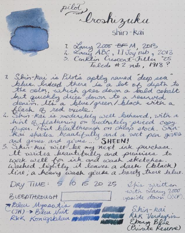
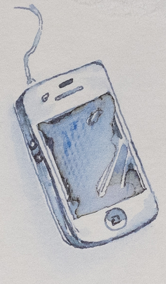
I am not a fan of blue ink. Before I found fountain pens, I used black ballpoint pens. In my pens, I use faded earthtones that lend themselves to ink and wash sketches. Iroshikuzu Shin-kai is the first blue ink I'll buy. It is fantastic. These are photos not scans. This is a difficult ink to describe, much less capture in a photo or scan. However, reasonable care has been taken to ensure color accuracy. As this was a Goulet sample, I haven't had the opportunity to make a proper attempt at sketching with this ink. If there is interest, I'll update later when I've done something worth posting. In the meantime, enjoy a 60 second sketch of my phone. Correction: I wrote in my review that Shin-kai feathers on moderately priced copy paper. It was a fluke. I've now tried it on a number of other cheap papers and no sign of feathering. Fantastic.
-
A couple of years ago Diamine brought out a lovely blue shimmer ink "Cobalt Jazz" which was extensively reviewed on this site. For those not so fond of shimmer, which Diamine ink is closest to the base colour of Cobalt Jazz?
-

Herlitz Königsblau (Royal Blue) Vs Pelikan 4001 Königsblau
AidenMark posted a topic in Ink Comparisons
An 'Inky Thoughts' thread is collating the most expensive/least expensive inks. Herlitz ink was my suggestion for cheapest retail non-bulk and I believe it is as yet without a review in this forum. Herlitz is a brand found in German supermarkets and is aimed at the office and school market. They offer notebooks, a variety of pens including fountain pens, protractors, erasers, binders and blue and black ink in bottles and cartridges. 30ml glass bottles of Herliz Royal Blue can be had for under two Euros. Having R&K, Kaweco and Pelikan 4001 royal-blue ink in my draw there was never much temptation to try it, but last weekend, a 'how bad can it be' curiosity struck. I picked up 10 universal cartridges in the local ReWe supermarket for €1.95 (they didn't have a bottle). These are the long, reversible cartridges (one end fits Pelikan, the other Lamy) and they contain about 2ml each. So that's around 20ml for €1.95, or 1cent/ml in cartridge or 0.7cent/ml in glass bottles. I fired up the Otto Hutt #4 medium nib and took the Herlitz for a test drive. The flow was good, the lubrication pleasing - this is not thin watery ink, the colour was typical school blue on the Rhodia paper but a deeper rather pleasing blue on coated paper. From the selection of royal blues my preference would be Rohrer&Klingner royal-blue but the Herlitz seemed every bit as good as Pelikan 4001. So who makes it? Consulting the package it turned out to be ... Pelikan. Wait a minute ... The scan below is a direct comparison between 4001 Royal Blue and Herliz. It was difficult to control the quantity of ink from the cartridge in the swab tests but I believe ... well, what do you think? The Lamy Safari is the standard school pen in German schools and probably Pelikan don't want to make Lamy compatible cartridges under their own brand, hence they sell the ink under the Herlitz name at a budget line, mum friendly price. Pelikan 4001 Royal-blue double length cartridges cost a little more:t €3.50 for 10. It's not a big difference: the strategy is likely driven by brand association. Further evidence: Herlitz glass bottles are identical to 4001 bottles. Since the Otto Hutt was was fully inked it accompanied me to work this week. I enjoyed writing with this well behaved, washable and legible Herlitz blue. After a day or so in the pen the colour deepened towards the more attractive tone you see in the cotton swap area. It's great for work: once dry, the ink is never smeary on the page, so your shirt cuffs don't turn blue, cartridges keep your fingers clean and, well, there is not much to dislike at the price. I am curious to try their black ink should I ever see it in the supermarket. -
Nice, well behaved, ink from Diamine. Well lubricating, vivid blue-green closer to the green end of the spectrum. The significantly compressed scan is showing a greener and lighter tinge than it is. E.g. the Ku-Jaku comparison I have shows up bluer than on the scan.
-
Please see the attached pictures. This is a new, old stock blue M625, however the inlaid stripe line pattern on the cap is no longer sharp, and seemingly smudged. Can this be fixed easily, or should I just pass this? Seller is giving it for $200.
-
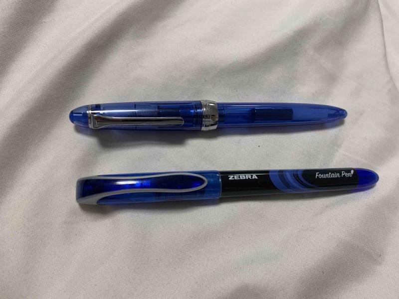
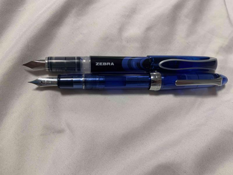
Hello people of FPN! It’s been over a year since I’ve last posted here, I’ve been busy with my first year and a half of college. In the last month or so, though, I’ve started lurking around reading the forums again, and I’ve been wanting to write another review. I just needed to find a pen that was the right balance of inexpensive and interesting, and luckily I found just the thing. As I was browsing the shelves of my college’s bookstore, procrastinating studying for my final exams, the blister pack these pens came in caught my eye. Zebra fountain pens. “An easier fountain pen” the box proudly states. I wasn’t aware that writing with pens was difficult, but that’s neither here nor there. I bought them (obviously, who wouldn’t buy a pack of 4 fountain pens you’ve never seen before for $8), and rushed them home to see what was in store. The single most important and obvious thing about these pens is that they were clearly designed to be a direct competitor to the pilot varsity. They’re made of the same materials with even the same shaped nib. They come in the same colors, and they’re sold on adjacent shelves. Zebra wanted to have a product in the disposable fountain pen market, so they emulated the most popular example of that market. Personally, I’m a huge fan of the varsity, so I’ll always be happy to see more Varsity-style pens enter the market as simple starter pens to help people make the switch and understand what fountain pens are all about. Because these pens were clearly designed to emulate the varsity, and most people have used a Varsity at some point, I’ll be comparing the pens to Varsities for the majority of this review. First off, in terms of appearance these pens aren’t terrible, but they fall short of the Varsity’s design in my opinion. There’s certainly nothing hideously ugly about them, and beauty is subjective so you’ll be able to see the pictures and make your own conclusions about the appearance, but for me the design on the Zebra’s just seems cheap. They are cheap, so that’s fine, but it would have been nice to have a design that’s a bit more clean and polished. The pen compared to a sailor procolor as a reference for size. The pens come in at least four colors (they were only offered in a four pack of purple, pink, blue, and black where I bought them, I’m not sure if more colors exist). The black is a fairly standard black, reminiscent of Parker Quink in shade. It’s not particularly dark, but it is definitely a black. The blue ink is very reminiscent of the typical blue ink you’d find in the average blue ballpoint pen. At first glance of writing with the blue pen, you might expect that it came from a ballpoint. I’m not familiar enough with pink inks to make a good comparison, but it’s what I would call a fairly standard, not too bright but not too pastel pink. As someone who doesn’t usually like pink things, I actually really like this ink color, and I plan on using it in the future. The fourth color, purple, is a pretty dark purple. It’s not so dark that it could be considered a purple-black, but it is definitely a very deep color, and in poor light conditions it can even look black. By now, you may have noticed that I’ve used a lot of words and still haven’t mentioned the most important part of any pen: how it writes. It’s complicated. Pilot Varsities are, in my experience, remarkably consistent. Especially within a particular color, every pen is exactly the same in how it writes and feels. Throughout my freshman year of college, I worked through a box of 12 Varsities, and all 12 felt exactly identical. These pens are not that. Don’t get me wrong, they all write well, and none of them are bad pens by any means, but the nibs on the four pens from the same blister pack offer vastly different writing experiences. Here is a writing sample with the four pens. Please excuse my horrific handwriting and cursive. The black and pink pens are the most similar to each other, and I have the least to say about them. They are pretty much a drier version of a Varsity. Slightly less smooth (probably because they’re more dry) but around the same width and writing behavior. The width is marked on the box as 0.6mm, and I’d call it around a Western Fine / Japanese Medium. The purple pen is wildly different from the black and pink pens. It is a very wet nib, more than a pilot varsity, and the thickness is equivalent to a western medium. Additionally, the purple pen came out of the box with ink on the inside of the cap and some ink on the grip, which may be due to a mix of the pens wetness and being moved around during shipping, but none of the other pens had that happen. There is some texture to the way it writes, it is not perfectly smooth, but the wetness makes up for any scratchiness in the nib itself and offers an enjoyable writing experience. The purple pen arrived with ink on the inside of the cap, the nib, and the grip. The blue pen is again, wildly different. This time, though, it is absolutely exceptional. The width of the pen is what pretty much every manufacturer would call an Extra Fine, and it’s incredibly smooth. I own a number of pilots with 14k fine nibs, and a number of western pens with extra fines of around the same width. This is unequivocally the best writing pen I’ve ever seen at this width. The problem is, these pens are so inconsistent that I don’t think I’d ever find another pen like it from them, no matter how many packs I opened. Still, I plan on using this pen for as long as I can (which I think will be a while with how thin the nib is and how large the ink reservoir is), and then hoping I can find another nib like it sometime in the years to come. All in all, I would recommend these pens. I would have paid the full $8 (and then some) for just the blue pen, but even without that likely fluke, these pens are a solid disposable pen. I plan on buying another pack at some point, and if the blue is like the blue in this pack then I would recommend these pens 100 times out of ten over the Varsity. That being said, if the blue I got really was a fluke, and you have a choice between these and some Varsities for around the same price, I’d probably take the Pilots.
-
A True Souvenir From Japan: Japan Blue Oita Made (Jetlagged Quick Look)
peroride posted a topic in Fountain Pen Reviews
Background: Went to Itoya to pick up a grail before we left Japan then saw this during the wait: They had the Lamy Anniversary Bauhaus Blue edition but we went for Japan Blue instead. That terrible refrain, "I don't need another pen" follow by the follow-up analysis and sleep over/can't sleep over decision making oscillation worked its way to purchase this fine souvenir. Wanted a remembrance of our 1st time in Japan and this fit the bill: Made in JapanLove of local/regional companies, handcraftedTraditional craft of indigo and hammering metal techniqueIt's a metal Sailor to Oita Made specUniqueI wanted a Medium but the last one was only a Fine and the missus loved it too. I have to share It's more of a family pen Color: Midnight blue purple indigo. Indigenous textiles was another hobby in a past life and the tie in of anodized indigo was a great pull. Visually, it's an eyecatcher and smartphone down-res photography does not do it justice. This is an accurate observation: "...a unique beauty that cannot be explained by photography" My color range is pretty conservative so for Japan Blue to make an impression spoke volumes. The pen was paired with Sailor Shikiori Nioi-Sumire to match the indigo body. My wife has the color instinct as the ink sticker bore no shade resemblance to the actual color swatch which is much darker. Though to my old eyes and the ton of blue ink variants we have, I cannot see the specialness of Nioi-Sumire other than it's the best Sailor match we could see. Material/handling: Hammered aluminum body, light unposted, slightly backweighted posted. Black plastic section is comfortable. I've only handled Classic Pens silver Sailor so if there are other metal Sailors let me know. Thankfully it's not heavy I'm a serial poster but am a little concerned about the design choice of 2 pins to hold the cap in place which posts with a click. I understand the choice over friction fit posting but it is an area for potential flaw should the pins loosen over time. I'll probably be dead before it fails though and luckily it is a great writer unposted. Nib: As stated, it is a Sailor Fine though I am fond of Sailor M at least the KOP version. Japan Blue completes my range: EF, F, MF, M Overall impression: Japan Blue is a great souvenir of our time in Japan whose craft, people and culture is much to be remembered and thankful for. Manufacture is backed by an established company, Sailor and their quality is consistent and reliable. Here are some relevant links: https://www.fountainpennetwork.com/forum/topic/345076-wancher-sailor-limited-edition-hammered-metal-finish/https://oitamade.jp/topics/news/292Arigato! -

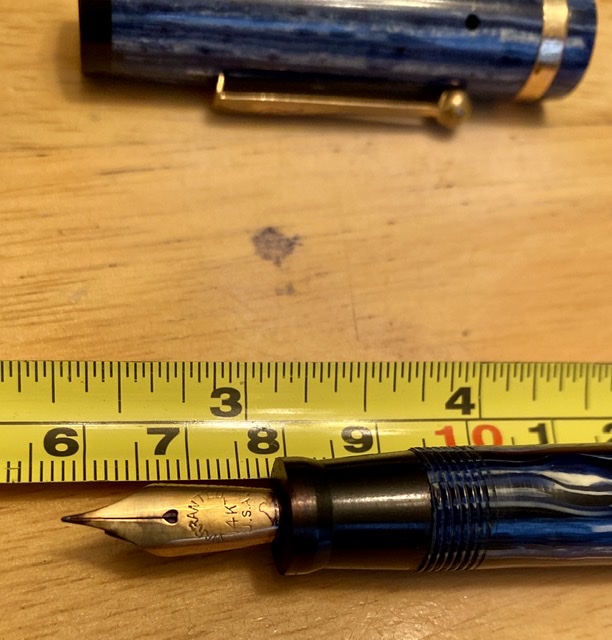
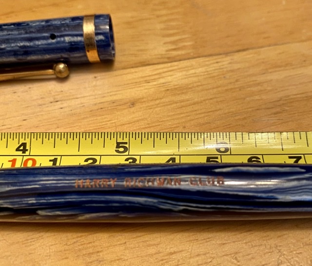
Mystery - Large Blue Ford “Harry Richman Club” Fp
svorg posted a topic in Fountain & Dip Pens - First Stop
I would love to find more info on this pen I bought years ago. It’s a good-sized blue 1920’s-ish FP with a 14k gold nib, the FORD logo on the clip, and “Harry Richman Club” stamped in orange or red on the barrel. Only recently I saw a pen like this on eBay but without the Richman stamp. Harry Richman was a singer/actor who sang the famous song “Putting on the Ritz” and owned his own namesake club in NYC for a time in the 20’s/30’s. I would love to know the connection between FORD and Richman and any estimated worth or value. Thanks! Scott
-
Because I adore the nib in my King of Pen more than any other nib I've had and because I can't seem to shake the craving for another one (as if, had I a second one, I could write with one in each hand, a double pleasure), I have been looking at Sailor's urushi Kings of Pen. For weeks and weeks I thought about the green one (https://www.nibs.com/pens/sailor/sailor-king-pen-green-urushi ). Then, hearing that in certain lights the green showed shades I wouldn't necessarily like (a cold, grayish teal or a greenish yellow), I began thinking about the blue instead. Googling around, I see the blue sometimes like navy (as in https://www.nibs.com/pens/sailor/sailor-king-pen-blue-urushi-gold, which I am not keen on) and sometimes as cobalt (as in http://www.pensinasia.com/kings_of_pens_urushi_blue_gold_plated_clip_fp___sailor.htm, which I like a lot). But photos and screens are both unreliable. In fact I don't know what either one really looks like. I wonder if anyone has a KOP in either of these colors and can tell me what the urushi looks like. Edited to add links.
-
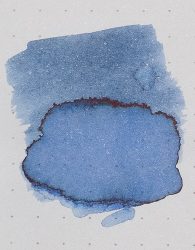
L'Artisan Pastellier Callifolio - Bleu Méditerranée L'Artisan Pastellier is a small company in southern France that specialises in natural pigments, and offers customers authentic and reliable products in beautiful colours based on mineral or vegetable pigments. In a collaboration with Loic Rainouard from Styloplume.net, the chemist Didier Boinnard from L'Artisan Pastellier created the line of Callifolio fountain pen inks. These pastel-coloured inks are traditionally crafted, and can be freely mixed and matched. Overall these inks are only moderately saturated, and have low water-resistance. The inks were specifically designed to work well with all types of paper, and all types of fountain pens. Being pastel-tinted, these inks have a watercolour-like appearance, and are not only fine inks for journaling, but are also really excellent inks for doodling & drawing. I only recently discovered them, and they are already the inks I gravitate towards for personal journaling. In this review the center stage is taken by Bleu Méditerraneé, one of the many blue inks of the series. The blue Callifolio inks are named after rivers, lakes and oceans. In this case the ink takes its name from the Mediterranean Sea, that seperates Europe from Africa. The ink's colour is best described as a light-blue - definitely not a sky/cerulean blue. It's a really nice soft blue colour, that I find quite appealing. For a Callifolio ink, this one wrote quite well in my Lamy Safari test pens. It didn't show the typical dry feeling with subpar lubrication that is a staple of many Callifolio inks. Shading is strongly present but still subtle due to the light blue nature of the ink. The result is an aesthetically pleasing look. Overall quite a nice writing ink. Well executed! To show you the impact of saturation on the ink's look & feel on paper, I made some scribbles where I really saturated portions of the Tomoe River paper with ink. This gives you a good idea of what the ink is capable of in terms of colour range. As you can see, this ink has a wide colour span ranging from a wispy light blue with a tiny bit of purple to a relatively dark light-blue. Heavily saturated parts also show a bit of a red sheen. On the smudge test - rubbing text with a moist Q-tip cotton swab - Blue Méditerranée shows its weakness. Lots of smearing, although the text remains legible. Water resistance is also quite low. There is still some ink left on the paper, but what remains is heavily smudged and near unreadable. The droplet test with non-moving water sitting on the paper for 15 minutes is still acceptable. But once running water comes into play, the dyes quickly disappear leaving only an unreadable residue. The chromatography shows that this is a rather monochromatic ink, without much colour variation in the component dyes. I’ve tested the ink on a wide variety of paper – from crappy Moleskine to high-end Tomoe River. On every small band of paper I show you: An ink swab, made with a cotton Q-tip 1-2-3 pass swab, to show increasing saturation An ink scribble made with an M-nib fountain pen The name of the paper used, written with a B-nib A small text sample, written with an M-nib Drying times of the ink on the paper (with the M-nib) Bleu Méditerranée behaved perfectly on all the paper types, with no apparent feathering even on the lower quality papers in my test set. Even Moleskine paper behaved quite well with this ink - no visible feathering, but still some bleed-through. Drying times are mostly around the 10 second mark. The ink works really well with both white and more yellowish paper. The ink also shows a remarkably consistent appearance across a wide range of paper types - well done! Writing with different nib sizes The picture below shows the effect of nib sizes on the writing. All samples were written with a Lamy Safari, which is typically a dry pen. I also added a visiting pen - a wet-writing Pelikan M120 Green-Black with an M-nib. With this wet nib, the ink writes much more saturated, losing a bit of the more prominent shading you get with a drier pen. Related inks To compare Blue Méditerranéé with related inks, I use my nine-grid format with the currently reviewed ink at the center. This format shows the name of related inks, a saturation sample, a 1-2-3 swab and a water resistance test - all in a very compact format. Inkxperiment – Rendez-Vous with Rama As a personal challenge, I try to create interesting drawings using only the ink I'm reviewing. These single-ink drawings are great for stretching my drawing skills, and - above all - they are lots of fun. With these small pieces, I try to give you an idea of what the ink is capable of in a more artistic setting. This drawing is inspired by the 1973 novel of Arthur C. Clarke, where a huge cylindrical spaceship moves through our solar system. I started off with 300 gsm watercolour paper, on which I painted the background using heavily water-diluted ink. I next used Q-tips to draw in the Rama landscape, using different water/ink ratios. The cylindrical horizon line with the mysterious Rama machinery and vegetation was added with an M-nibbed Safari using pure Bleu Méditerranée. I finished the drawing by adding some accents to the Rama landscape with my Lamy Safari pen. I quite like the colour variation that this Callifolio ink allows. The end result gives you a good idea of what can be obtained with Bleu Méditerranée as a drawing ink. Conclusion Callifolio Bleu Méditerranée is an ink that works great as both a writing and drawing ink. It has a pleasing light-blue appearance with prominent but still subtle shading. Overall a good-looking blue ink, that rightfully deserves your attention. Technical test results on Rhodia N° 16 notepad paper, written with Lamy Safari, M-nib Back-side of writing samples on different paper types
-
I believe this was a limited edition ink produced for the 2015 Commonwealth Pen Show in Boston. As always Nathan Tardif produces some inks with the most intriguing properties. I was fortunate to receive a sample of this ink just recently coincidental to some discussion of the actual color of the ink. Some original reviews indicated the ink was a "blue-black". Others who recently used the ink discovered the ink was not a blue-black, but a chalky blue, much like a traditional washable blue. Well the vial I received was of a chalky blue. Thank you inky friend! The ink is supposed to be waterproof as I understand it, but I'll have more on that in a moment. In the Edison Premiere with a Fine steel nib, the ink wrote more like a medium and exhibited some show through and varying degrees of bleed through. This was even on high quality paper such as Rhodia/Clairefontaine. But when I switched to a Pelikan M205 with a Fine steel nib that is quite frugal the writing was as expected: the fine nib wrote like a fine, with a little show through but nothing problematic, no bleed through. So my guess is the Edison was just too wet for this ink. There is a pink dye component to this ink, but that dye is not waterproof. It is that dye that spreads somewhat and penetrates to the other side of the paper. The blue dye does not budge. So after the water the recto side appears fine where one could easily recover the writing, the verso has had the pink dye bleed through. I'm not sure what this would due to the readability of the text. Anyway, this isn't an available ink. Long long gone, and it was made using dyes that Mr. Tardif couldn't obtain any longer. Also, I'm not sure how well I did on adjusting the color in the images. It was quite difficult to get the right balance of desaturation and color in order to properly present the actual ink. The ink handled well except for the show through and bleed through. There was no staining on either the converter or the barrel of the Pelikan.
-

Free Ink Samples - Noodler's Turquoise, Navy, Midnight Blue
Cursive Child posted a topic in Pay It Forward, Loaner Programs & Group Buys
Free to anyone in the US. PM me if interested. Send me postal costs via paypal for elsewhere. These are 1-2 ml samples from Goulet Pens, in plastic vials. -
Recently, I acquired several samples of Taccia Ink. Taccia Ink is newly developed in California, but made in Japan by experienced ink makers. There are 13 colors that are vibrant and pleasurable. The inspiration for the colors comes from the "Japanese way of seeing colors in a pure, honest and innocent way". The bottles are similar to Sailor bottles, but I do not know if they have the pen filler insert since I have not purchased a bottle yet. (Photo compliments of Vanness Pens) This ink can be summed up in one word: WONDERFUL! I have very rarely used an ink as pleasurable to write with as this one. From the moment I loaded into my Bexley Elegancia with medium nib - a dry nib I might add - this ink has been extraordinary. Even when writing on inexpensive copy paper, this ink is fast drying, did not bleed through, and had little show through. And the sheen on Tomoe River paper is AMAZING! The ink is well saturated and somewhat water resistant, which should appeal for professional use. And the color is consistently a strong medium blue with a strong crimson sheen. IMO this ink would do well in any pen with, maybe, the exception in a very wet, wide nibbed pen. Taccia AO Blue ink/ Bexley Elegancia medium nib pen/ Staples ARC paper Taccia AO Blue Ink/ Bexley Elegancia medium nib/Tomoe River 68 gsm paper Pros: Excellent flow Moderately lubricating Minimal bleedthrough, showthrough, feathering Fast Drying Well saturated SHEEN! SHEEN! SHEEN! Cons: Little to no shading Average blue shade Price: In the US: $12 for 40 ml at Vanness Pens, Anderson Pens, PenChalet Overall: An Excellent ink in terms of quality and price!
-
I have been using up my sample of Baystate Blue, and I cannot get over how much I LOVE the colour. Of course I experienced some of the characteristic bleeding and feathering on copier paper with it, but some diluting seemed to solve the problem. I'm not too concerned about staining, as I have a dedicated pen I have sacrificed to it (Jinhao X750), and I can can just bleach it out of existence if needed. But then I've come to the question of fading. I am confused as to what exactly will happen to it after a few months or years. Sure, UV exposure will make it fade, as will many other blue inks, though Baystate Blue happens to be the more fugitive of them. But rarely, if ever, do I go around and stick my writing in direct sunlight for weeks, if not months at a time. I use Baystate Blue mostly for notes and annotating things in my school workbooks because it is just THAT BRIGHT. After hearing a few things about it fading in closed books and fading in general on another thread here, I'm concerned that when it comes to do revision, or if I just decide to look back at them in a couple of years for the (?)fun(?) of it, they'll have faded into oblivion. Can someone please set the record straight? Anecdotal/personal experiences are encouraged.
-
Liking this one far more than I expected (and please disregard the 'recieved' typo!): On Tomoe River: On Apica: