Search the Community
Showing results for tags 'blue'.
-
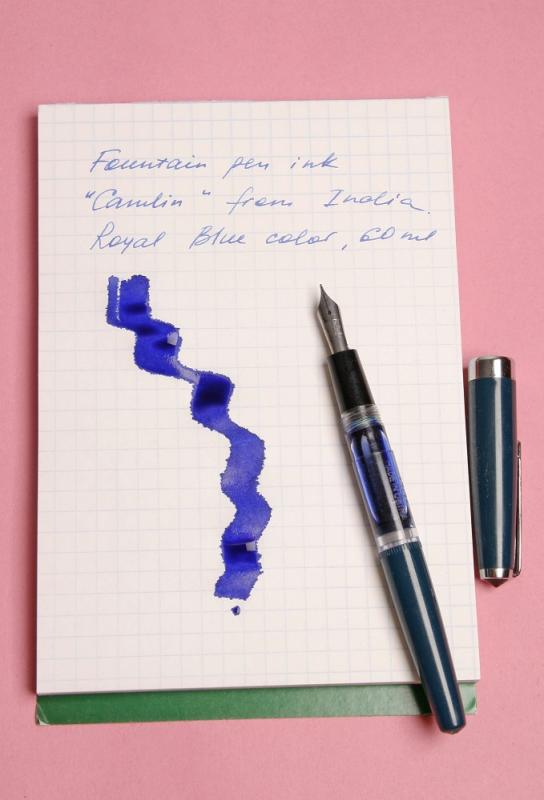
Recently got by post Indian "Camlin" Royal Blue ink 60ml. It came in a box, carefully packed. I liked the cap on a bottle - it opens easily and at the same time not a drop spilled during the transportation. The quality of ink is also nice. It's a bit more liquid than "Parker", but writes great on average quality paper (not too porous). This ink doesn't colorise the pen's grip section too fast (like for ex. USSR "Raduga") and doesn't dry if left for more than a couple of days inside the pen without writing, which are additional pluses. The smell of this ink is very light and quite pleasant. Would I buy it again? Yes, and I'd like to try other colors. Here are the pictures of the bottle and writing. At the moment this ink is one of my favourites.

-
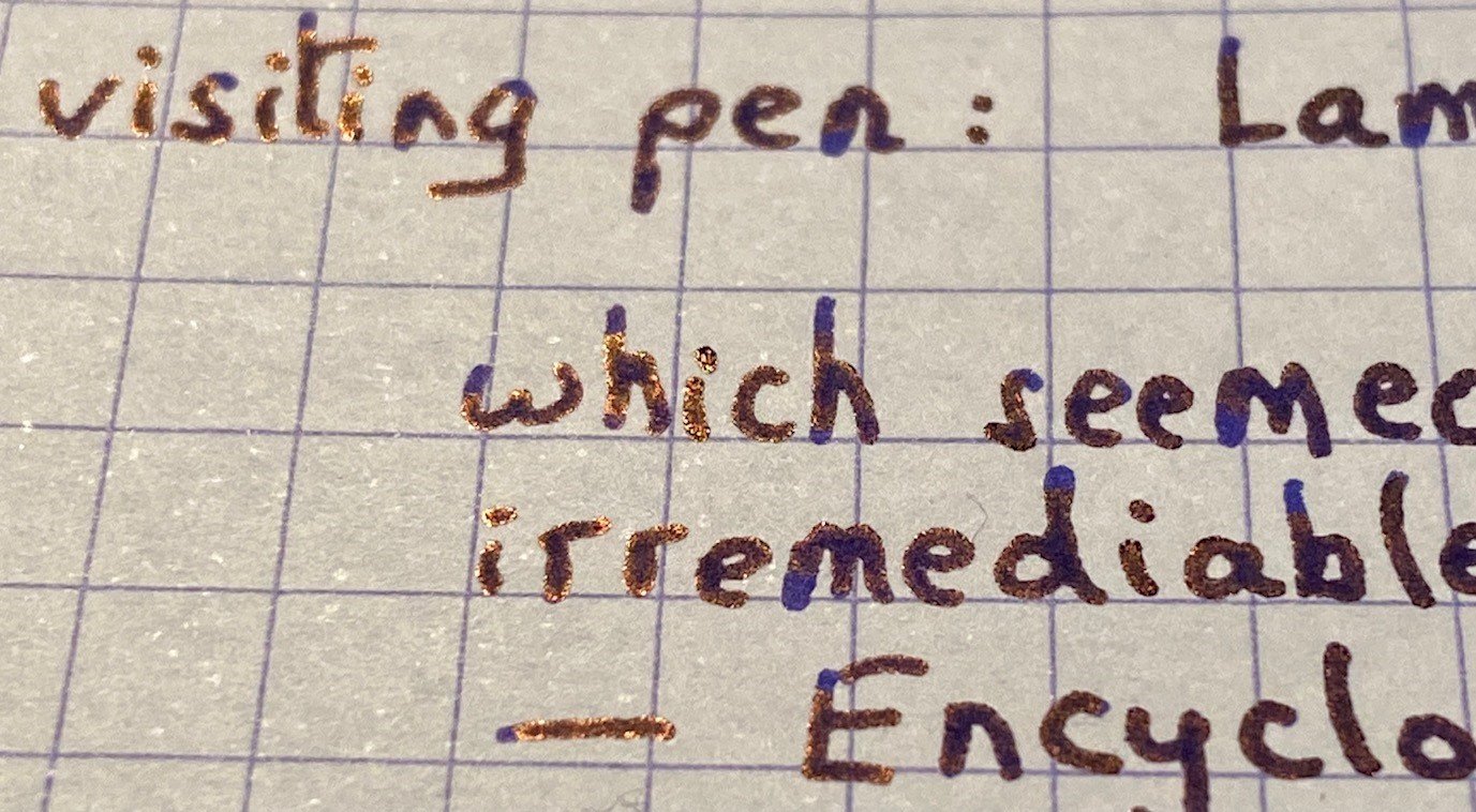
Jacques Herbin – Bleu austral La Société Herbin, Maître Cirier à Paris, was established in 1670. This makes J. Herbin probably the oldest name among European ink makers. Today, Herbin produces a range of beautiful fountain pen and calligraphy inks, writing instruments, gift sets and accessories. Herbin inks are made in France, and the finishing touches on the bottles are still done by hand in Paris. Like so many others, the company jumped on the premium product bandwagon, and started to release more high-end inks under the Jacques Herbin “Les encres essentielles” label. Nicer boxes, nicer packaging, much higher price (18,50 EUR versus the 7,50 EUR for the J. Herbin inks from the “La perle des encres” series). Nevertheless, I couldn’t resist and decided to test these new inks – are they really better than the standard J. Herbin inks? In this review, the spotlight is on Bleu austral, a strong blue leaning teal. The colour is really nicely done, and looks great on paper. The ink itself is wet-flowing and heavily saturated – in broad nibs it can even turn into a gusher. In my opinion, this is more of an ink for finer nibs and/or dry pens. Technically, the ink disappointed: it has a tendency to feather on more absorbent paper (even the one of high quality). You really need hard-surface paper for acceptable writing performance. Bleu austral is a heavy shader, and this in all nib sizes. Shading is never harsh and always looks aesthetically pleasing, due to the fairly small contrast range between light and darker parts. With wet pens, the ink really tends to oversaturate, which pushes away the shading. I therefore recommend using Bleu austral in combination with drier pens and/or fine nibs. To illustrate the ink’s colour span, I did a swab on 52 gsm Tomoe River paper where I really saturated portions of the paper with ink. This clearly demonstrates the ink’s dynamic range. On the smudge test – rubbing text with a moist Q-tip cotton swab – there was lots of smearing. The text itself remains very readable though. Water resistance is fairly low. There remains a greyish residue of the text on the page, that is still easily readable, but most of the colour disappears. This is clearly visible in the chromatography: the blue colour dissipates with the water, leaving only a grey residue behind. Not what I would call a water-resistant ink. Drying times for this Jacques Herbin ink vary with the type of paper, ranging from less than 5 seconds on absorbent paper to 10-20 seconds on hard-surfaced paper (all with my Lamy Safari M-nib test pen). With the absorbent paper, I see quite some feathering – even on higher quality paper. You also get a fair amount of see-through and bleed-through. This ink is definitely picky in the type of paper it prefers. I’ve tested the ink on a wide variety of paper – from crappy Moleskine to high-end Tomoe River. On each scrap of paper I show you: An ink swab, made with a cotton Q-tip 1-2-3 pass swab, to show increasing saturation An ink scribble made with a Lamy Safari M-nib fountain pen The name of the paper used, written with a Lamy Safari B-nib A small text sample, written with the M-nib Lamy Safari The source of the quote, written with an Edison Collier with 1.1 stub Drying times of the ink on the paper (with the M-nib Safari) Bleu austral looks equally good on white and more creamy paper. For my personal taste, it is way too saturated though – I definitely prefer a softer look in my inks. Since scans alone don’t tell the complete story, I’ve added some photos of the same writing samples to give you another view on the ink. Writing with different nib sizes The picture below shows the effect of nib sizes on the writing. All samples were written with a Lamy Safari, which is typically a dry pen. I also added a visiting pen – a wet-writing Edison Collier with a 1.1 stub. With the wet pen or with broad nibs in dry pens, the ink leaves an overly saturated line, and loses much of the shading. I personally prefer this ink in combination with a dry pen (M-nib or below) – it simply looks nicer: a blue-heavy teal with subtle shading. The wetter the pen, the darker and more one-dimensional the ink becomes. Related inks To allow for a good comparison with related inks, I employ my nine-grid format, with the currently reviewed ink at the center. Each grid cell shows the name of the ink, a saturation sample, a 1-2-3 swab and a water resistance test – all in a very compact format. As you can see, there is quite some competition in this colour segment. Personally, I would rather avoid the technical issues of this Jacques Herbin ink, and go for one of the other options. Inkxperiment – river goddess As a personal challenge, I try to create interesting drawings using only the ink I’m reviewing. With these monochromatic pieces, I get to explore all the colour-range nuances that are present in the ink. This is my favourite part of the review: experimenting with the ink, and trying to be creative… pure quality time! We recently had some severe flooding in our part of Europe. Rivers, that are normally leisurely meandering in a peaceful landscape, turned into wild and angry monsters that threatened lives and property on their shores. In ancient times, such behaviour was usually attributed to the whimsical mood of the river goddess. Wild waters were a sure sign that the goddess was displeased with her people. I tried to capture this idea in the inkxperiment, that shows the goddess against the background of a wild and choppy river. For this drawing I used an A4 piece of HP photo paper, which is my favourite medium for doing inkxperiments. The photo paper really brings out the best from the ink. I first created the river background with the wood flotsam. I used painter tape to cover up the flotsam part, and used a cut-out piece of kitchen towel to paint in the choppy river. For this I sprinkled different water/ink ratios on top of the kitchen towel, which then pressed through to the underlying photo paper. I then used a piece of cardboard and pure Bleu austral to paint in the flotsam. Next, I painted in the river goddess with a fine brush, and used a small triangular potato cut-out to stamp in the different triangles. I finally used my B-nibbed Safari pen to add some finishing touches. The resulting piece gives you an idea of what can be achieved with Bleu austral in a more artistic setting. Conclusion Jacques Herbin Bleu austral is a nice blue-leaning teal. The ink is very saturated though, and – in my opinion – too much so in wet pens or with broad nibs. The ink also has technical shortcomings, and doesn’t cooperate with more absorbent paper. For a premium product, I had higher expectations. In my opinion, this ink is not really worth the premium price: there are lots of other inks to choose from in this colour spectrum. Technical test results on Rhodia N° 16 notepad paper, written with Lamy Safari, M-nib Backside of writing samples on different paper types
-
Schneider BK406 Review Introduction & First Impressions I was looking for a cheap EF pen to dedicate to Baystate Blue and wanted something blue to match the ink. I had been leaning toward getting a blue-capped Pilot Kakuno (F) for this purpose, but when I came across this Schneider pen for less than half the price here in China (under US$5), I thought it was worth a try. I couldn’t find any reviews online for this model and the closest equivalent for sale in the West seems to be Schneider’s Zippy which is still quite different. Schneider makes several inexpensive pens for sale in China that have the same feed and general design as the BK406, but this is one of the few pens in the family that comes with an EF nib, something I felt essential for minimizing BSB’s infamous feathering issue on cheap paper. I was quite underwhelmed when it arrived. It came in a cheap plastic sleeve (see photo below) and had no instructions. Everything about the packaging screamed “disposable ballpoint.” I was still grateful that upon unscrewing the barrel I found a complimentary blue international standard ink cartridge (which I discovered after some testing to be quite waterproof) and a strange empty cartridge inserted into the nipple, perhaps to show the new owner that the pen was cleverly designed to have one cartridge in use and a spare behind it inside the barrel. This is quite clever and explains the length of the pen. Appearance & Design True to its German origin, this pen is as utilitarian as it gets. Everything from the ribs on the cap for ease of removal to the matted section with grip indentations says that this pen is designed for quick and easy use in the trenches of the office or classroom. There are no bells or whistles whatsoever. Even the nib is so plain that all it has on it is an encircled “EF.” If the appearance hadn’t convinced you, the two places where the cap tells you it was made in Germany leave no room for doubt. Like disposable pens, its cap is unfortunately marred by the brand logo and “Schneider Made in Germany” along the side where it can’t be missed. There is a rounded grip section with subtle indentations like is often found on student pens. This section’s matte finish and smooth corners make it quite comfortable to hold and allow for more variation in grip than on something with sharper angles like a Lamy Safari. The flat grooves are even less prominent than on a Pilot Plumix. I was very thankful for this feature because the nib and feed are not aligned with these grips like they usually are on other pens. Since the nib and feed are very tightly in place and appear immovable, I have to disregard the grooves in order to hold the pen the way I usually do. Thankfully, the unobtrusive nature of the grips makes this easy. At first I thought the odd alignment was a quality control issue, but my other Schneider pens have the same alignment, so I suspect it may be some ingenious German design feature. The pen writes perfectly if you hold it according to the grooves, but the alignment just looks odd. Construction & Quality Despite the impression given by the packaging, the BK406 is not a flimsy pen. The plastic barrel and cap have a slightly soft surface (just a little harder than on those disposable Bic ballpoints they have at a bank teller), but the material is thick and looks like it could easily take a beating in a purse or book bag. It feels soft but solid in the hand, certainly more so than similarly priced pens like the Platinum Preppy. Holes at the end prevent the roomy barrel from being used as an eyedropper. The pen has a molded plastic feed which is quite thin and fragile at the tip but seems adequately protected by the rolled steel nib that partly wraps around it. The nib is thick and looks like it could take some tumbles without any repercussions. I used the pen as my daily carry for over a week and it met the floor a few times and survived unscathed. I’m sure you can treat this pen like any cheap ballpoint and expect it to hold up admirably. As for manufacturing, the only flaw I found is the slight misalignment of feed and nib which doesn’t affect writing. The only visible external seam is on the grip section which isn’t really an issue with a pen this cheap and would be covered by one’s hand anyway when in use. Weight & Dimensions Measuring about 14.5cm capped, its length is just between that of a Pilot 78G and a Plumix. This makes it just a little too long to fit neatly in my T-shirt pockets, but a decent fit for the pockets on my dress shirts. It’s too long to fit in the pen pockets of some backpacks and messenger bags. In one bag I tried it stuck so high out of the pen pocket that the clip couldn’t grip the pocket. It measures 13cm uncapped, and 16cm posted, which for my smallish hands means this one is not a poster. Weighing in at 11.6 grams capped/posted and 7.2 grams uncapped, the pen is light and allows for prolonged writing sessions without any fatigue. Writing with it feels like a dream compared to the cramps I was getting from my chunky clunky Jinhao X750. Nib & Performance The BK406 is only available with an extra fine nib, but Schneider makes several similar pens in this price range in fine (e.g., BK400, BK402, Zippi). Some may scoff at using a rolled steel nib, but I find the BK406’s nib to be surprisingly smoother than the dubiously labeled “iridium point” nibs on many of my Chinese pens. It glides across the paper and only gives a little feedback if pressure is applied on rough paper. As can be expected for this price, it’s a true nail with no flexibility whatsoever. The nib and feed work well together to provide perfect flow which I would describe as moderate. I never once experienced skipping or hard starts, although I’ve only tested it with the juicy Baystate Blue and nothing drier. The line is a typical German extra-fine, which becomes somewhere between a Japanese fine and medium when using such a wet ink like BSB. BK406 with Baystate Blue vs. Pilot 78G (F) with Luxury Blue: Filling System & Maintenance The BK406 comes with a single blue Schneider international sized cartridge, but a converter can be purchased separately for nearly the same price as the pen. The converter is great and holds a lot of ink. This pen and converter combination creates a perfect workhorse for extensive writing. Although the pen functions well, it’s regrettable that the nib and feed cannot be removed for cleaning. This inability limits the pen to being used with low-maintenance inks that can be easily washed out or dedicating the pen to just one high-maintenance ink. Cost & Value As far as I know these pens are not available in the States, but here in China they are a little more expensive (32RMB=$4.87) than Chinese pens like the Duke 209 or Hero 359 (both 25RMB=$3.81). The Chinese pens may be better deals because they are often mostly metal and have a removable nib and feed. Nevertheless, I find the nib on the BK406 and other Schneider pens in the same price range to be sturdier and more reliable. For me it’s worth it to pay a little more for an all plastic pen that writes reliably and is more comfortable to use than the cheaper alternatives. Conclusion I’m completely satisfied with this pen and believe I got what I paid for. Although plastic, the BK406 feels sturdier than a lot of lower end Japanese pens that cost much more than it. It isn’t stylish or pretty by any means, but it feels great to write with and suits my needs—an ideal bright blue pen for Baystate Blue (it’s also available in black or white). That being said, I’d never give it to someone as a gift because it lacks eye appeal. If you want an inexpensive and extremely practical pen, this is a great choice.
-
Well, my guess is nearly everyone has heard of Pilot Iroshizuku line of inks, if they have not had the good fortune to actually use them. Visvamitra did a review of all of those inks not so long ago. I've had this ink for some time but only recently worked through a review. Kon-peki is a fairly bright cerulean, or sky, blue. It is not light, but it is lighter in value than Asa-gao and Tsuki-yo. Some people might call this color a turquoise. I don't think it falls quite in that range, but I could understand the comparison. When I used a wetter/wider nib, I got a deeper, richer color. So this is something to consider. These inks come in both 50 ml and 15 ml bottles, and there are three bottle sets of the smaller size. Kon-peki is paired with Momiji (pink/bright red) and Yu-jake (orange) in a set. Not advertised as water resistant, so no surprise that it isn't. I've seen much worse though. This is a single dye ink. btw, dcwaites has posted a recipe for a faux PPS using Iroshizuku inks: 1 part Kon-peki 3 parts Asa-gao 0.1 part (or less) take-sumi.
-
This is a review of the now-defunct Swedish ink manufacturer Rosendahls, their Cadet Blue fountain pen ink, of the Scrivil series, which appears to have a military theme. Since the ink is no longer in production, it can only be found vintage, although several FPN'ers have found several here & there, it is probably a challenge to acquire. Now, with that said, let's see how it looks..! The bottle looks a lot like the normal Pelikan ink bottle, and can be sat slightly on its side to allow for easy emptying when the ink level starts to get low, plus the opening is of a good size. The first writing test is with a no-name "Iridium Point Germany" pen with an EF nib, see discussions elsewhere about these pens. The ink flows very nicely, with good lubrication, and makes a potentially scratchy pen nice & smooth to write with. Color is a pale blue, I'd even call it a baby blue, which is too pale in my eyes for everyday writing. However, there is no feathering, the letters have clear definition and no shading is seen here. Second writing test is with a Jinhao X450 with the factory M nib, which is infamous for writing wet. Also here, good ink flow, nice lubrication and it just writes very well. Like the previous test, we see no feathering and each letter is clearly defined. But look at the color! This is now a medium blue instead, which is a nice surprise. It indicates a dynamic blue which will probably shade well. More on that later. If you look *very* closely, you can see shading in the letters here, but only by zooming in on a hi-res pic. Third writing test is just a quick experiment with a dip pen, which did not go super well, but still showed that the color deepens as you lay down more ink, and a little border shading is seen, but otherwise it is an example of how little I know about dip pens. Next comes the ink swab, where you clearly see color difference according to amount of ink, and border shading both in the triple layer, near bottom, plus in the circles, left. We see several shades of blue, from baby blue to navy, which is very nice to see in what you might think is just a simple, almost boring, light blue, and so it appears at first glance, but this li'l fella has more layers than an onion! 😃 The water resistance test shows that 90% of the ink goes away from having water dropped on it, making it quite the opposite of water resistant. 🤔 My conclusion is that this is an extremely well-behaved ink, fully functional despite being at least 30 years old, possibly 50, very dynamic in coloring and with great potential for shading. It dries quite quickly when writing normally, 5+ seconds, even on Rhodia paper, and in all the tests I made there was not a single bleed-thru. I had no hard starts or drying ink in the pens used. Since it's not waterproof, I wouldn't call it archival, although it might be UV-resistant, I have no data on that. What I *do* know is that this is an ink which is very easy and pleasant to use, with properties which we might wish were in more modern inks. I will finish with a writing sample inspired by Matt of The Pen Habit, showing a quote from one of my favorite authors. Stay safe, Daneaxe
-
I like inks that I can usually bring at work, ordinary enough for documents, but with that particular tone enjoyable for the user and for the reader. I was looking for a deep dark blue when I've been reccomended (by my evil stationer) to buy Pelikan Edelstein Sapphire Blue, misled by a ink swab card which looked a lot darker than the actual ink. Pelikan Edelstein Sapphire is a quite ordinary blue ink, quite similar to the Pelikan 4001 Royal Blue, but with more shading and a hue more on the purple side of the colour spectrum. It's quite difficult to describe Pelikan Edelstein, you could just say "It's an ordinary blue" without having someone contraddicting you, but I think there's something more to be told. On white paper the Edelstein Sapphire looks intense, more like a purplish blue (you can see how much purple there is in the cromatography), with a good ammount of shading. Even if this ink clearly isn't my ideal blue, it stands out compared to the cheaper cousin of the 4001 line. It behaves well on every paper, no bleedthrough or feathering on Schizza & Strappa paper and on tracing paper, a little motr on common copy paper. Has nice shading properties with all tipes of nibs and good drying times. Almost none waterproofness. On swab test It seems unable to get darker than a certain ammount: the 2nd swab and the 3rd swab are about the same on every paper I used. In the end, is this ink worth the price? Even if I like it, even if lt leaves a noble looking colour on paper and makes your writing feel somehow "important", spending from 15€ to 20€ for an ink that can be easily mistaken with the 4€ Pelikan 4001 Royal Blue (especially to those who do not share our passion) leaves me a bit lost. I don't think this ink has the right features to be in a premium ink line like the Pelikan Edelstein. Don't mistake me, it's not a bad ink, it's not a bad colour, but in my opinion there are better and more exclusive blues in the same price range. COPY PAPER SCHIZZA & STRAPPA PAPER TRACING PAPER CROMATOGRAPHY INKDROP ON TOWEL
-
I'm surprised this has not been reviewed yet. This is my favourite of KWZ's iron gall inks. Still close enough to a more traditional iron gall in terms of water fastness, colour change, dry time and performance, but with enough blue remaining to make it not just another blue-black. Dry time for normal handwriting is closer to 5 seconds, but a broader, wetter pen will be longer, hence the heavy swatch test. Dry swab was after 20 minutes, wet after 2-3. Paper is Rhodia dot.
-

Ink Shoot-Out : Diamine Prussian Blue vs kyo-no-oto aonibi
namrehsnoom posted a topic in Ink Comparisons
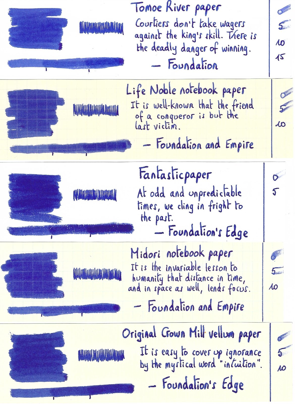
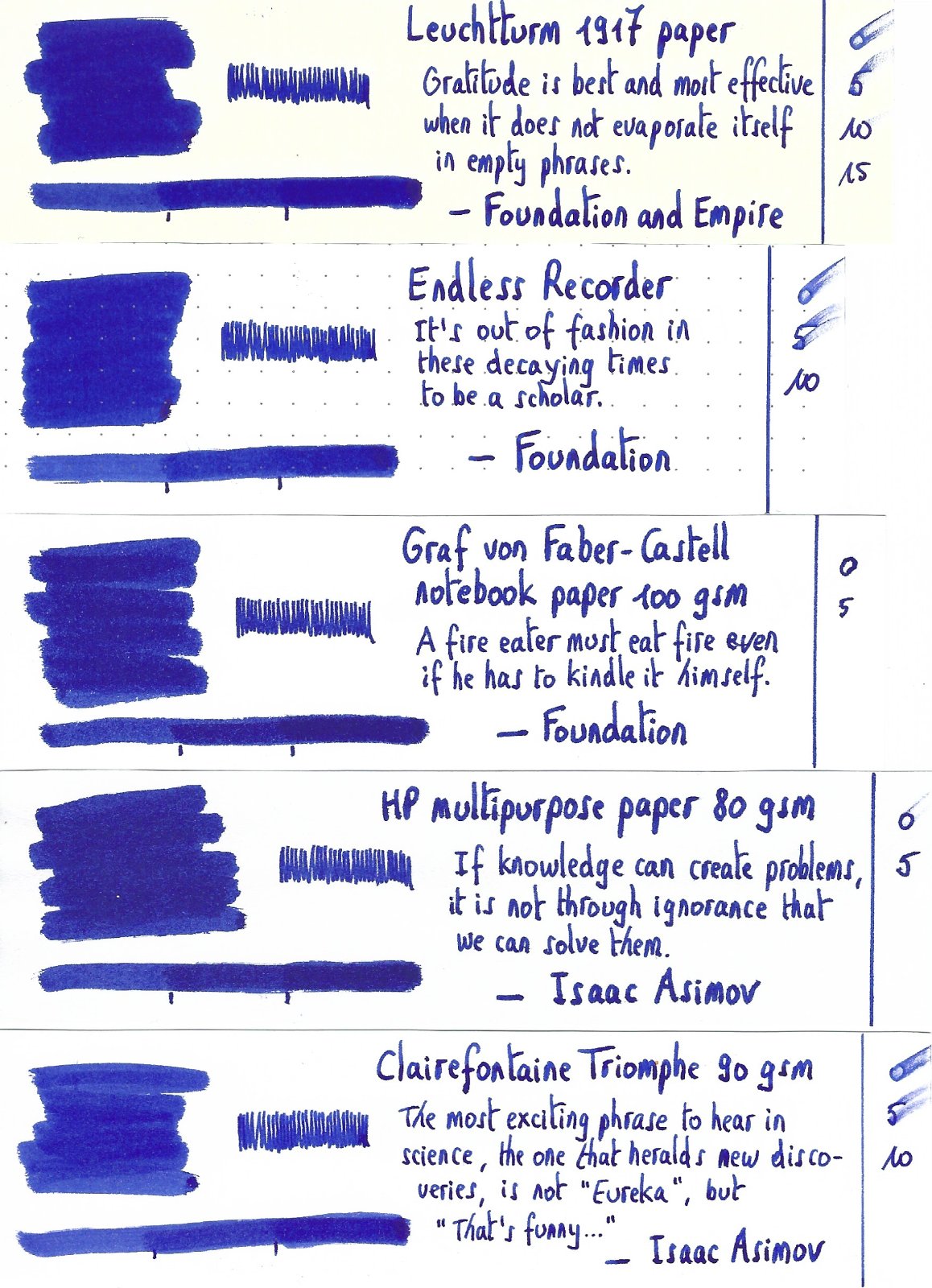
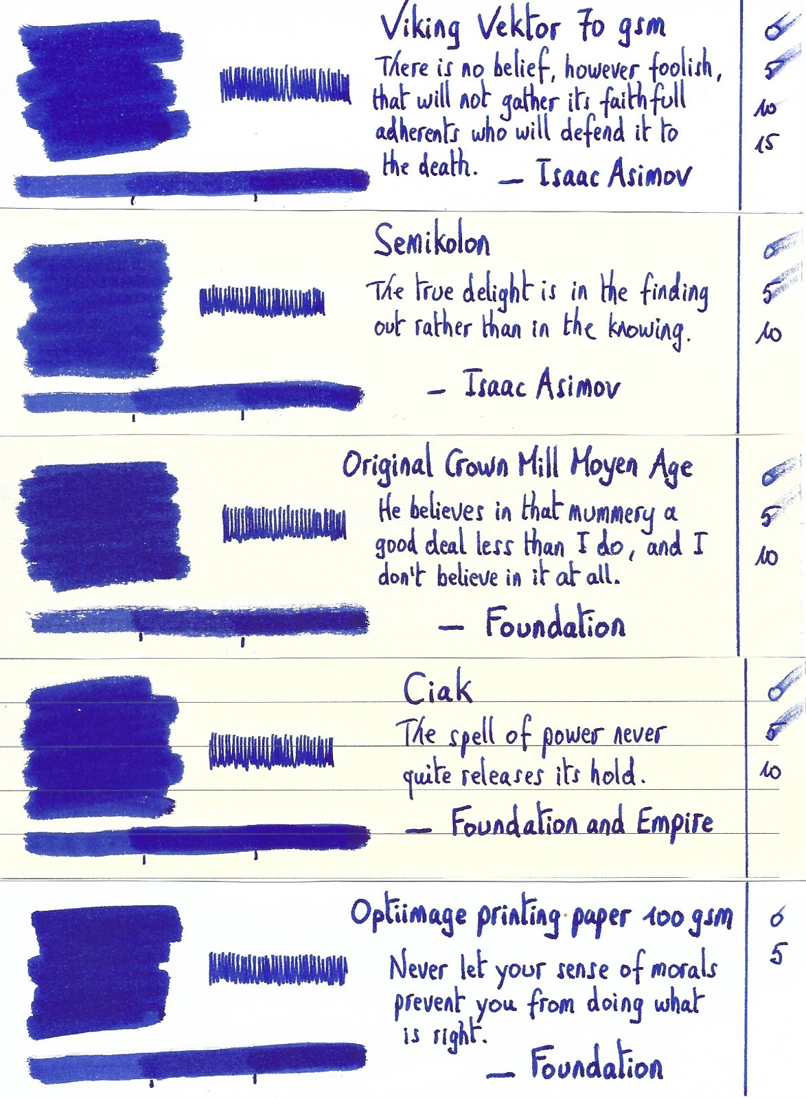
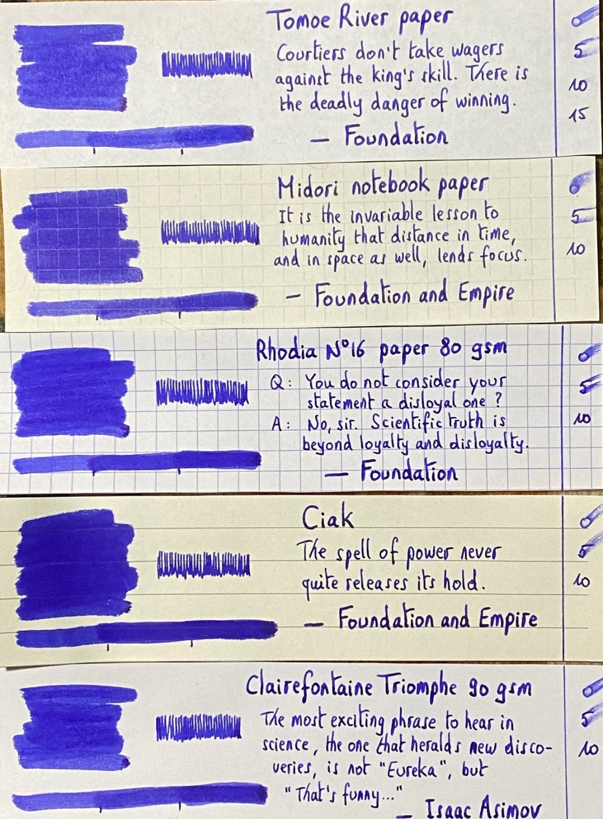
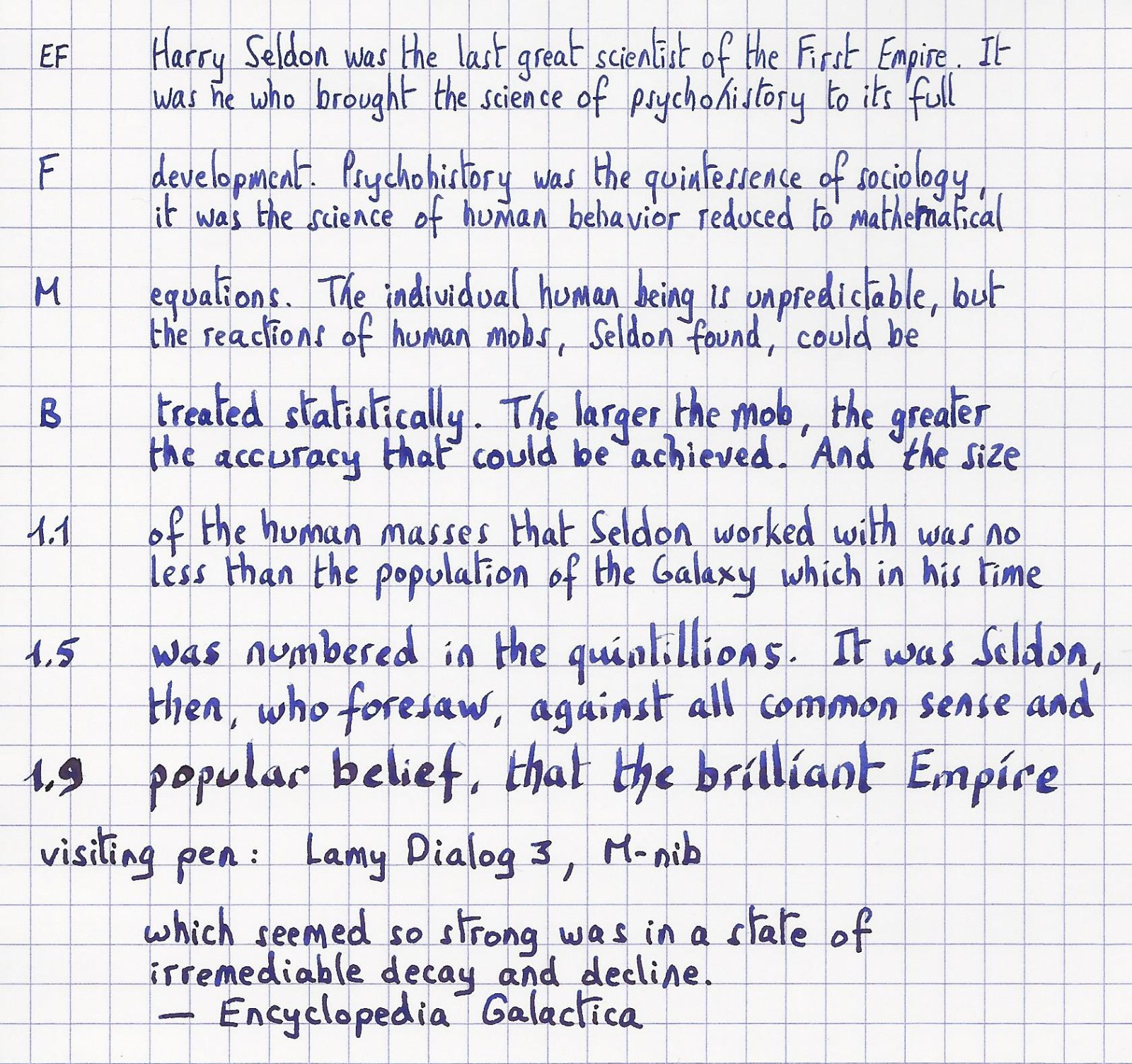
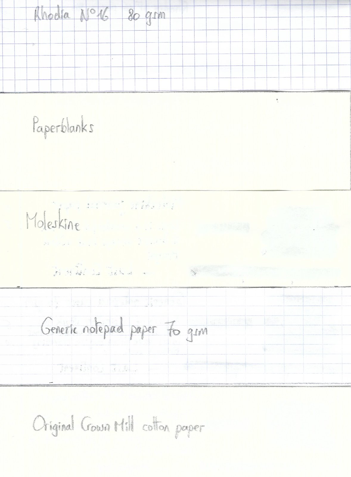
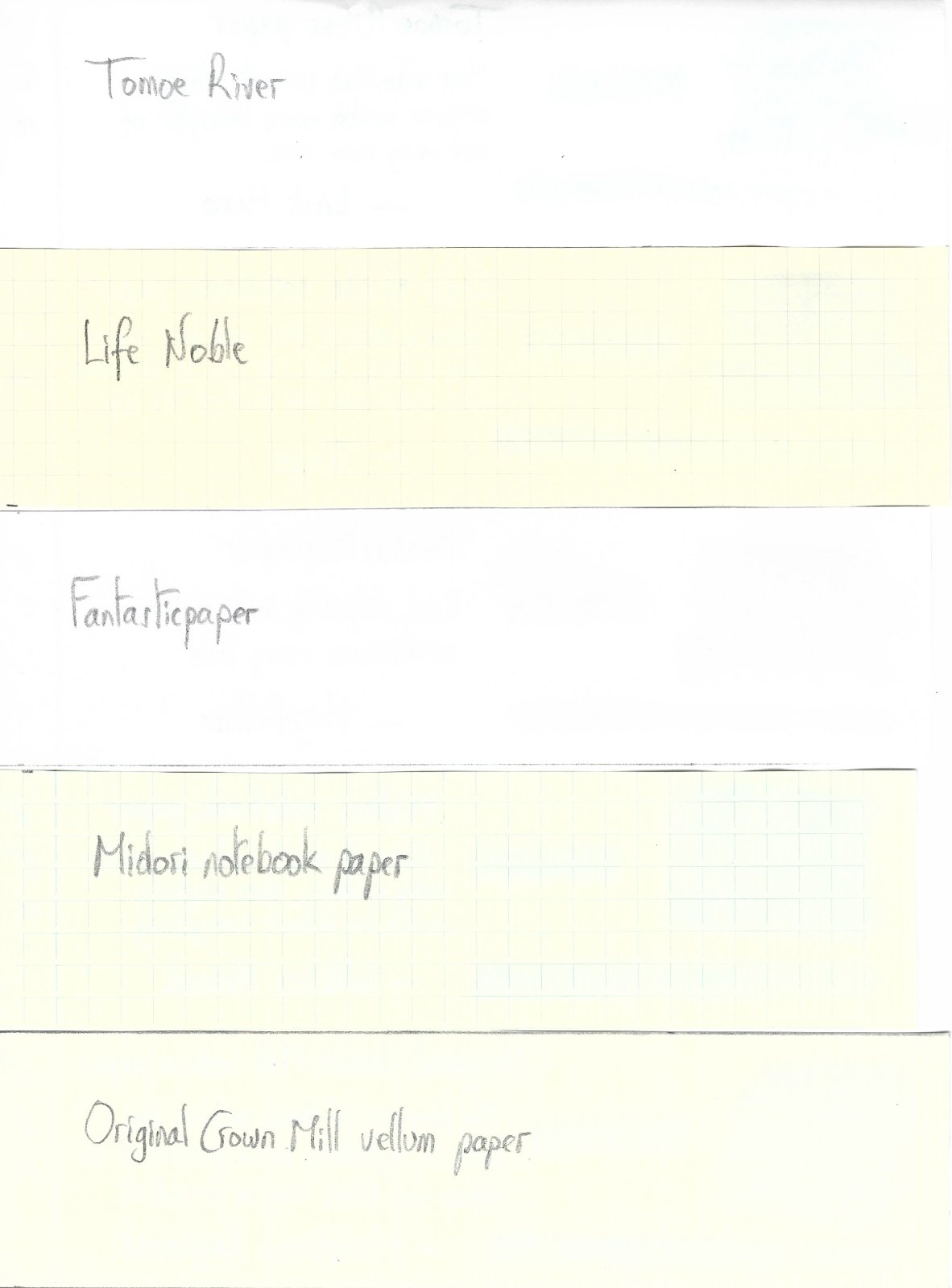
Ink Shoot-Out : Diamine Prussian Blue vs kyo-no-oto aonibi I have been playing around with some blue inks the past couple of weeks. Two of them are real beauties that definitely fit my taste: Diamine Prussian Blue and TAG Kyoto kyo-no-oto aonibi. Both are muted, toned-down blues that look really, really nice. They are definitely of the same family, but also totally different in character. This piqued my interest… time for a detailed comparison to find out which ink I like the most. Enter... the Ink Shoot-Out. A brutal fight spanning five rounds, where two inks engage in fierce battle to determine who is the winner. And tonight’s fight is really special: two world-class champions with diametrically opposed fighting styles. In the left corner, from the United Kingdom, the bulldog from Liverpool, grandmaster of free-style boxing … Diamine Prussian Blue. In the right corner, from the temple of Kyoto, the slender kung-fu master kyo-no-oto aonibi. Both champions enter the ring. The crowds go wild for what promises to be a once-in-a-lifetime fight. The bell rings, signaling the start of the first round. May the best ink win … Round 1 – First Impressions Both inks make a stellar first impression. Wonderful soft muted blues, that look great on paper – both in written text and in swabs. These inks have a definite vintage vibe, giving a certain “chic” to your writing. These champions have style! Both inks exhibit elegant and aesthetic shading, without too much contrast between the light and darker parts. Great looking stuff! In this first round, both champions give their best, and both throw serious punches at their opponent: Prussian Blue is definitely the better writing ink. It writes wet and well-lubricated. The Japanese ink also lays down a fairly wet line, but suffers from sub-par lubrication resulting in a scratchy feel of pen-on-paper. Kyo-no-oto aonibi shows a more delicate colour that soothes the senses. Prussian Blue also looks great but has more of a dirty purple-grey undertone… nothing delicate about it. Aonibi’s lines look sharper and more defined on the page. In comparison, Prussian Blue’s lines are spread wider. Both inks make a great first impression. Prussian Blue is a delight to write with, but aonibi manages to look seriously better on the paper – it just has that delicate softness that is missing from the Diamine ink. A fair fight with punches in both directions, but overall the supple moves of aonibi win the day. As such, the first round goes to the fighter-priest of Kyoto. Round 2 – Writing Sample The writing sample was done on Rhodia N°16 Notepad with 80 gsm paper. Both inks behaved flawlessly, with no feathering and no show-through or bleed-through. With the EF nib, aonibi felt really scratchy, with barely tolerable lubrication. This improved when using broader nibs, but overall the ink keeps suffering from sub-par lubrication. In contrast, Prussian Blue glides effortlessly across the page even with the EF nib. With a lightning-fast left-right, the English champion delivers a solid strike that punches through it’s opponents defenses. The crowd jumps to its feet, roaring its approval. Aonibi recovers by showing a much crisper line on the page: your writing looks sharper and more defined. And the kung-fu master’s moves are a delight, even when they fail to connect. Colourwise, aonibi just looks better! But this round is about the writing act, and here the bulldog from Liverpool certainly has the upper hand. As such, this round goes to Prussian Blue on points. The crowd cheers on the champions. A great show with superlative fighters that are closely matched! Round 3 – Pen on Paper This round allows the battling inks to show how they behave on a range of fine writing papers. From top to bottom, we have : FantasticPaper, Life Noble, Tomoe River and Original Crown Mill cotton paper. All scribbling and writing was done with a Lamy Safari M-nib. Both champions did well, with no show-through nor bleed-through. But this round is not about technicalities, it is about aesthetics and beauty. Are the fighters able to make the paper shine ? One thing is immediately apparent: these inks are at their best on pure white paper. Muted blues are no good match for creamy paper… they just don’t look right. Diamine Prussian Blue has definite purple grey undertones that are fairly obvious. Aonibi is a much purer and richer blue, which shows more depth and has a more delicate nature. It just looks more refined next to Prussian Blue, showing superior soul and character. In my opinion, there is no competition: aonibi rules the fight. The English champion tries to hit its opponent, but the kung-fu master just glides away with supple gestures. And suddenly… aonibi hits its opponent with a flurry of four thumping strikes, stopping short of the Five Point Palm Exploding Heart blow. Prussian Blue simply crumbles to the floor. For a moment the boxing hall falls to a complete silence. Then the audience explodes and roars its approval. What a fight! Round 4 – Ink Properties Both inks have drying times in the 15-20 second range with the M-nib in my Lamy Safari. The Japanese ink dries just a tad faster than Prussian Blue. To test their smudge resistance, I rubbed the text with a moist Q-tip cotton swab. Here, both inks show definite smudging, but the text itself remains crisp and clear. To test water resistance, I dripped water on the grid and let it sit there for 15 minutes, after which I removed the water with a paper towel. Both champions can survive watery accidents. Some colour disappears, but there’s enough ink left on the page to easily read what is left. Kyo-no-oto aonibi leaves more smudges on the page though. A slight advantage for the Diamine ink. Not a great round. The champions keep circling one another, without much initiative from either side. As such this round ends with a draw. Round 5 – The Fun Factor Welcome to the final round. Here I give you a purely personal impression of both inks, where I judge which of them I like most when doing some fun stuff like doodling and drawing. And for this round, both inks are simply amazing. I did the drawing on HP Advanced Photo paper. The background uses heavily water-diluted ink. For the field I added a bit more ink, and next used a brush to paint in the lines that add texture. The trees and clouds where painted in with pure ink. Diamine Prussian Blue clearly shows its dirty grey-purple undertones. Aonibi retains its delicate muted blue nature – even when diluted with water. As far as colour goes, I definitely like the Japanese ink more. But Prussian Blue surprised me by the way the ink dries… you get a strong haloing effect that gives the drawing a cartoony feel. Really special. Both inks are great looking when used in a more artistic setting. I enjoyed using them both. For this round, both champions recovered completely, and gave their best. Lightning fast punches , elegant and graceful moves, solid kicks. A stunning display of exploding energy… The crowd can’t get enough of it. This truly is the fight of the century! Round 5 is the crown jewel of this fight, but in the end both champions are equally good, and no clear winner emerges. As such, this round ends in a draw. The Verdict Both inks are great-looking soft and muted blues, that simply look fantastic on pure white paper. They have quite different characters… and I love them both. These champions deserve their place among the greatest. But the Five Point Palm Exploding Heart move cannot be ignored, and wins the day. As such, the Belgian judge declares kyo-no-oto aonibi the winner of this exciting shoot-out. -
Papier Plume - Calle Real (New Orleans Collection) Papier Plume is a stationary shop in New Orleans, that's best known on this forum for their "New Orleans Inks", that celebrate the rich colours and history of the city. One of their inks in this series is Calle Real, a nice-looking member of the royal blue family. Calle Real is named after the corresponding street in New Orleans. I won't repeat the interesting history behind the name here, but refer instead to the excellent review of Jackokun (highly recommended). Personally I'm not a fan of plain blue inks, but I liked this one. It's a vivid light blue that looks great on the page, and that shows some nice non-obtrusive shading. But the ink also has its shortcomings: a tendency to feather, and drying times that can vary wildly with paper type. The ink itself writes wet and with good lubrication in my Lamy Safari test pens. Quite a contrast with some of the other New Orleans inks. Saturation is excellent, even with EF nibs. The ink itself has a medium colour span. To illustrate this, I did a swab where I really saturated portions of the Tomoe River paper with ink, pooling it on. This beautifully illustrates the dynamics of Calle Real. The range moves from a light to a darker but still vivid blue colour, without too much contrast between both extremes. This results in elegant shading that looks aesthetically very pleasing. The shading didn't show with the finer nibs, but made its appearance starting at F/M and above. On the smudge test - rubbing text with a moist Q-tip cotton swab - the ink behaved quite badly. The inks smudges easily, even after leaving it alone for a while. Water resistance is almost non-existent. The dyes disappear quickly, leaving behind a very light purplish ghost of the text. Reconstructing your writing is possible, but you will have to put some effort into it. Not what I would call an accident-proof ink. The chromatography confirms this: some light-purple dyes remain in place at the bottom part. I've tested the ink on a wide variety of paper - from crappy Moleskine to high-end Tomoe River. On each scrap of paper I show you: An ink swab, made with a cotton Q-tip 1-2-3 pass swab, to show increasing saturation An ink scribble made with a Lamy Safari M-nib fountain pen The name of the paper used, written with a Lamy Safari B-nib A small text sample, written with the M-nib The source of the quote, written with a Parker Sonnet (F-nib) Drying times of the ink on the paper (with the M-nib) Calle Real has a slight tendency to feather, most noticeable on the lesser quality papers in my test set. Not a good choice to use on cheap office copier paper. The ink manages to look equally good on white and more yellow paper. Contrast with the paper is excellent but not overdone: even a page full of text looks pleasing to the eye. Drying times are wildly unpredictable - ranging from 0 to over 30 seconds depending on the paper. Paper with a hard surface results in super-long drying times and I mean this literally... 30 seconds and above. Forget about this ink if you're a lefty. At the end of the review, I also show the back-side of the different paper types, in the same order. Some bleed-through is present on most of the lower-quality papers. You should take care when pairing paper & ink if you want a satisfying result, i.e. avoid low-quality paper, or paper with too hard a surface. Rhodia, Fantasticpaper, Semikolon and Life Noble appeared to work the best. Writing with different nib sizes The picture below shows the effect of nib sizes on the writing. Calle Real manages to look good in all nib sizes from EF up to the 1.9 calligraphy nib. With the very fine nibs shading is quasi absent, but starting at F/M and above the elegant and eye-pleasing shading is very prominently there. I am not really into blues, but I liked the vivid character of this ink that adds character without being too obtrusive and in-your-face. Related inks To compare Calle Real with related inks, I use my nine-grid format with the currently reviewed ink at the center. This format shows the name of related inks, a saturation sample, a 1-2-3 swab and a water resistance test - all in a very compact format. As you can see, Calle Real looks quite good if you compare it to the other inks in the grid. Diamine Royal Blue and Blue Velvet come close, and show some of the same vivid-ness that I like so much in this Papier Plume ink. Inkxperiment – A Saucerful of Science With every review I try to do a single-ink drawing that shows what the ink is capable of in a more artistic setting. This is the most fun part of every ink review, and I quite enjoy brainstorming and then implementing these little pieces. Inspiration for this inkxperiment comes from the Neil deGrasse Tyson book "Welcome to the Universe" that I just finished reading. A humbling book that beautifully illustrates how small we earthlings are relative to the vastness of space and time. And my respect for the scientists that extracted this knowledge from the universe has grown substantially. So this inkxperiment is an ode to science. For this inkxperiment I started with a piece of 12x18cm HP photo paper. I applied some washi tape to divide the paper into regions that I background coloured in a number of different ways, and with different water/ink ratios. I then added some topic-specific details to some of the regions (bookcases, formulas, some mysterious-looking writing). Once dry, I removed the washi-tape to create the white dividers between the regions. The end result is not too bad, and shows what can be obtained with Calle Real as a drawing ink. Conclusion Calle Real from Papier Plume is a vivid light-blue from the Royal Blue family. A great writing ink with beautiful colour and nice shading, but only if you pair it with the correct paper. Make the wrong choice, and you'll have to deal with some feathering and really really long drying times. Make the right choice, and you'll love this ink! Technical test results on Rhodia N° 16 notepad paper, written with Lamy Safari, M-nib Backside of writing samples on different paper types
-
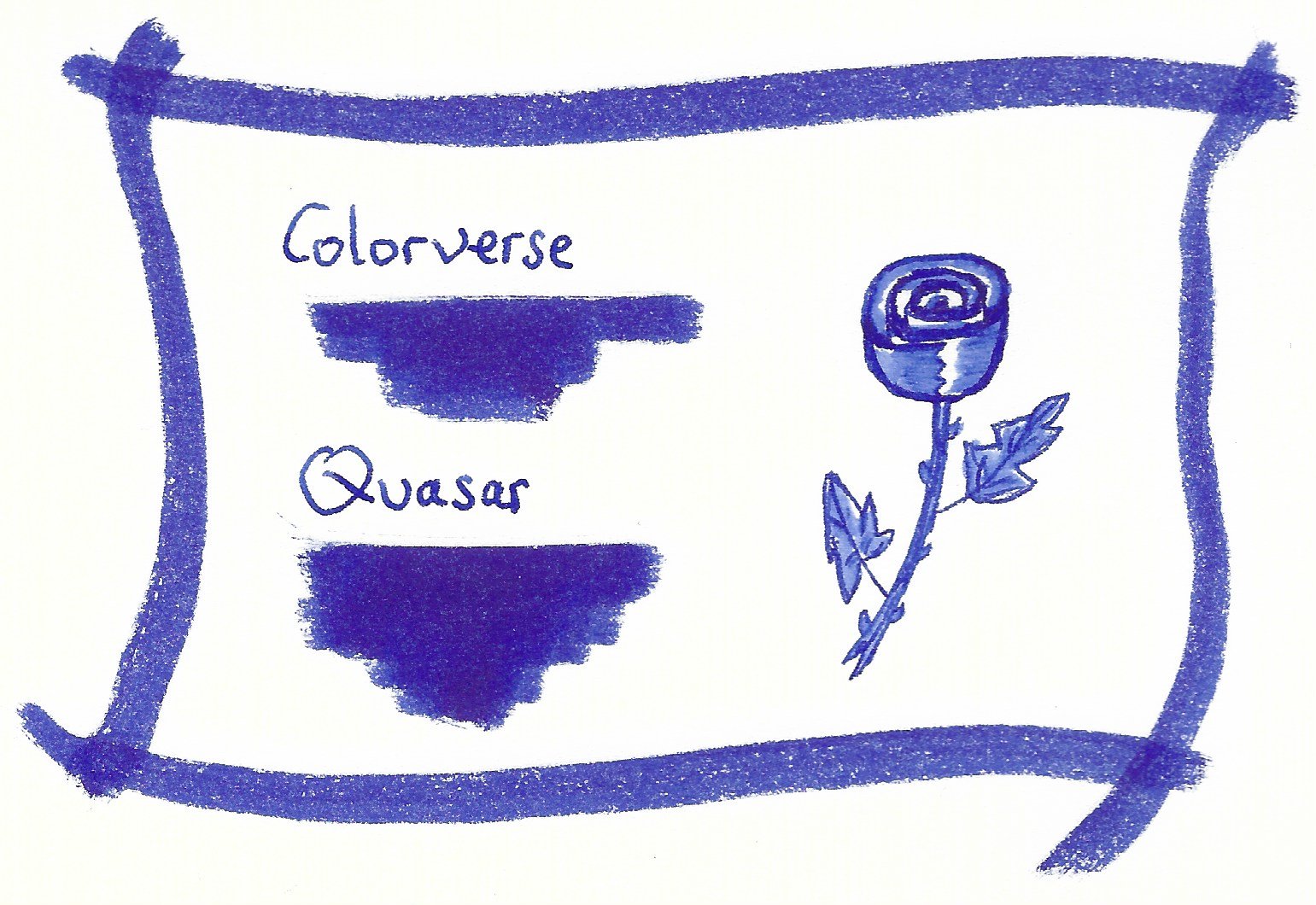
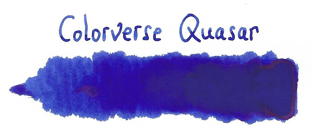
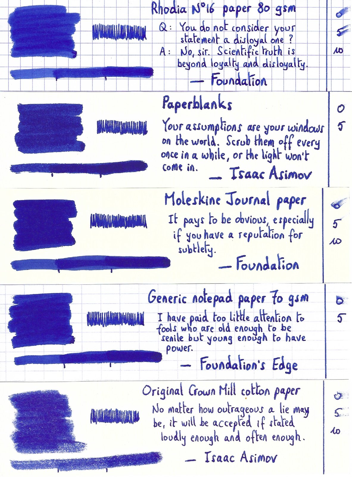
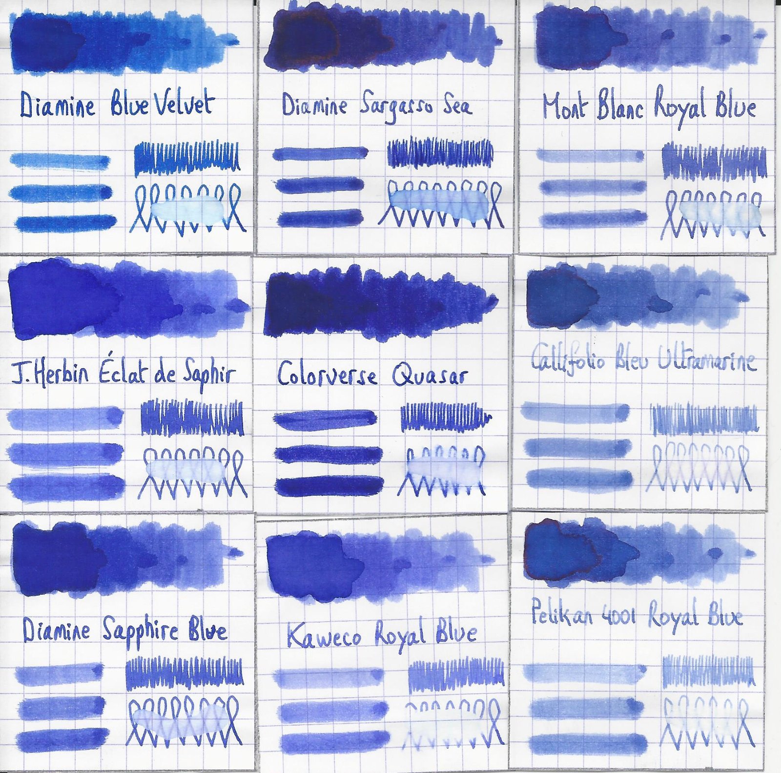
Colorverse Quasar Colorverse is a South Korean company that produces inks that are well-known for their iconic bottles and for their astronomy-related names. The Quasar in this review is from their season 2 inks that were released under the theme “Astrophysics”. The package comes with a big 65 ml bottle and a cute 15 ml small one. Fellow member Lgsoltek graciously gifted me a whole bunch of samples when leaving Paris, giving me the opportunity to try out a range of new inks. This Colorverse Quasar was one of them. Quasar is a richly saturated purple-leaning blue. The ink writes really well in all nib sizes with very good lubrication. It’s also an ink with a serious golden sheen, especially when using wet nibs. On the other hand, no shading to speak of (probably due to the high level of saturation). Personally, this is not my type of colour and the ink is too saturated for my taste. But that’s just me, you can make your own judgement using the information below. Quasar has a very limited dynamic range, with almost no contrast between light and dark parts. To illustrate this, I did a swab where I really saturated portions of the Tomoe River paper with ink, pooling it on. This lack of contrast explains why you get little shading in your writing (especially in finer nibs - the blow-up below with a B-nib is a bit misleading in this respect). You can also see that Quasar is well-saturated. As a result, the ink works great with EF nibs, where it produces a very readable and contrast-rich line. On the smudge test – rubbing text with a moist Q-tip cotton swab – there is a huge amount of smearing, but the text itself remains crisp and clear. Water resistance is completely lacking. The still water test (letting drops of water sit on the page for 15 minutes) produces a colourful mess. With the running water test all ink simply disappears, leaving next to nothing on the page (see water test at the end of the review). I’ve tested the ink on a wide variety of paper – from crappy Moleskine to high-end Tomoe River. On each scrap of paper I show you: An ink swab, made with a cotton Q-tip 1-2-3 pass swab, to show increasing saturation An ink scribble made with a Lamy Safari M-nib fountain pen The name of the paper used, written with a Lamy Safari B-nib A small text sample, written with the M-nib The source of the quote, written with the B-nib Drying times of the ink on the paper (with the M-nib) Colorverse Quasar has a slight tendency to feather on the lower quality papers in my test set, most obvious when using a wet pen. I noticed no issues with better quality paper or when using finer nibs (M-nib or below). A bummer for me was that I also got some feathering on the Paperblanks paper, which is what I use for daily journaling. This is probable due to some inconsistencies during paper production. I’ve noticed that from time to time you get a bundle of paper of lesser quality. Happened a handful of times – I did a quick calculation: 11 notebooks (of 176 pages), a handful of bad bundles (5x 12 pages): that translates to 3% suboptimal paper. A bummer when it happens, but I can live with a 97% success rate. The ink writes smoothly with good lubrication, and provides excellent contrast with the page. Writing looks good on both white and more yellow paper, but I do prefer the ink’s look on the cream paper. Drying times are fairly low – in the 5 to 10 second range with my Lamy Safari M-nib. At the end of the review, I also show the back-side of the different paper types, in the same order. A small amount of bleed-through is present on some of the lower-quality papers, but nothing too bad. Since scans alone are not always enough to give you a complete picture of the ink, I also provide you with a few photos for an alternative look at Quasar blue. Writing with different nib sizes The picture below shows the effect of nib sizes on the writing. Being a saturated ink, Quasar looks good in all nib sizes from EF up to 1.9 calligraphy nib. I personally prefer this ink with the F/M nib sizes. It’s presence on the page becomes a bit too dominant with the broader nibs. Related inks To compare Quasar with related inks, I use my nine-grid format with the currently reviewed ink at the center. This format shows the name of related inks, a saturation sample, a 1-2-3 swab and a water resistance test – all in a very compact format. Diamine Sargasso Sea comes close in colour. Inkxperiment – Looking Out The Window With every review I try to do a single-ink drawing that shows what the ink is capable of in a more artistic setting. The most fun part of the ink review, and I quite enjoy brainstorming and then implementing these little pieces. I had only a very limited amount of ink available, so I needed to maximally reuse the Q-tips used for the swabs in the writing samples. For this inkxperiment I started with a piece of 10x15 cm HP photo paper. I used the Q-tips from the swabs to draw the windows. Next, I used a kitchen sponge and heavily water-diluted ink to sponge in the background. For the window contours, I used my Lamy Safari M-nib and pure Quasar. Finally, a non-water diluted Q-tip was used to draw in the patterns, and the figure looking out the window. This little drawing gives you an idea of what can be achieved with Colorverse Quasar in a more artistic setting. Conclusion Colorverse Quasar is a very saturated blue with a strong purple undertone. The ink has a few shortcomings: prone to smudging, no water-resistance. But it works well in all nib sizes and writes flawlessly on better quality paper. I noticed a slight tendency to feather on lower-quality paper. For me personally, this ink is no good match: too saturated, and the colour doesn’t really speak to me. But that’s just me. You can draw your own conclusions with the info above. Technical test results on Rhodia N° 16 notepad paper, written with Lamy Safari, M-nib Backside of writing samples on different paper types
-
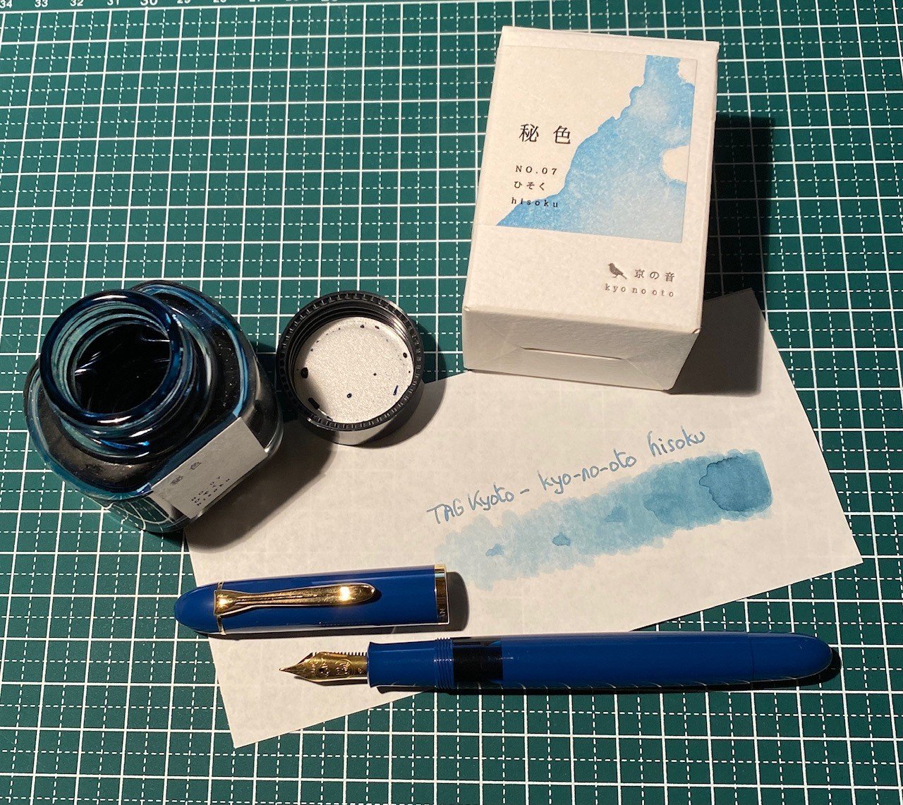
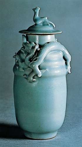
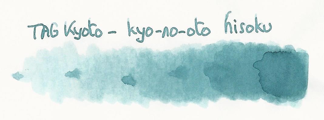
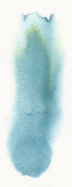
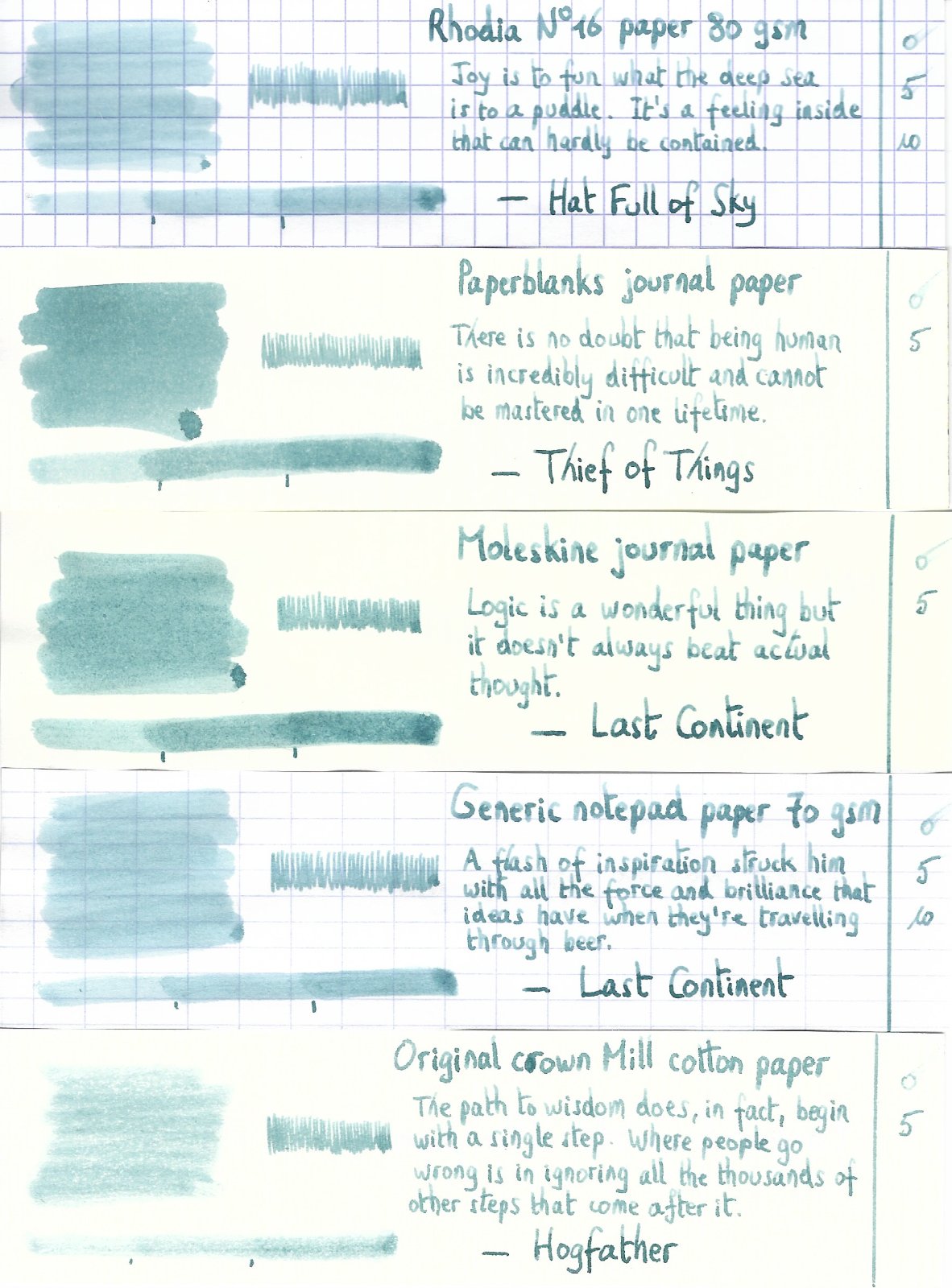
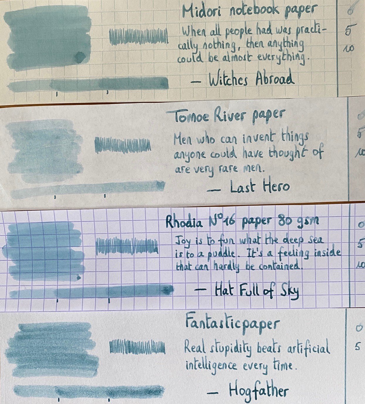
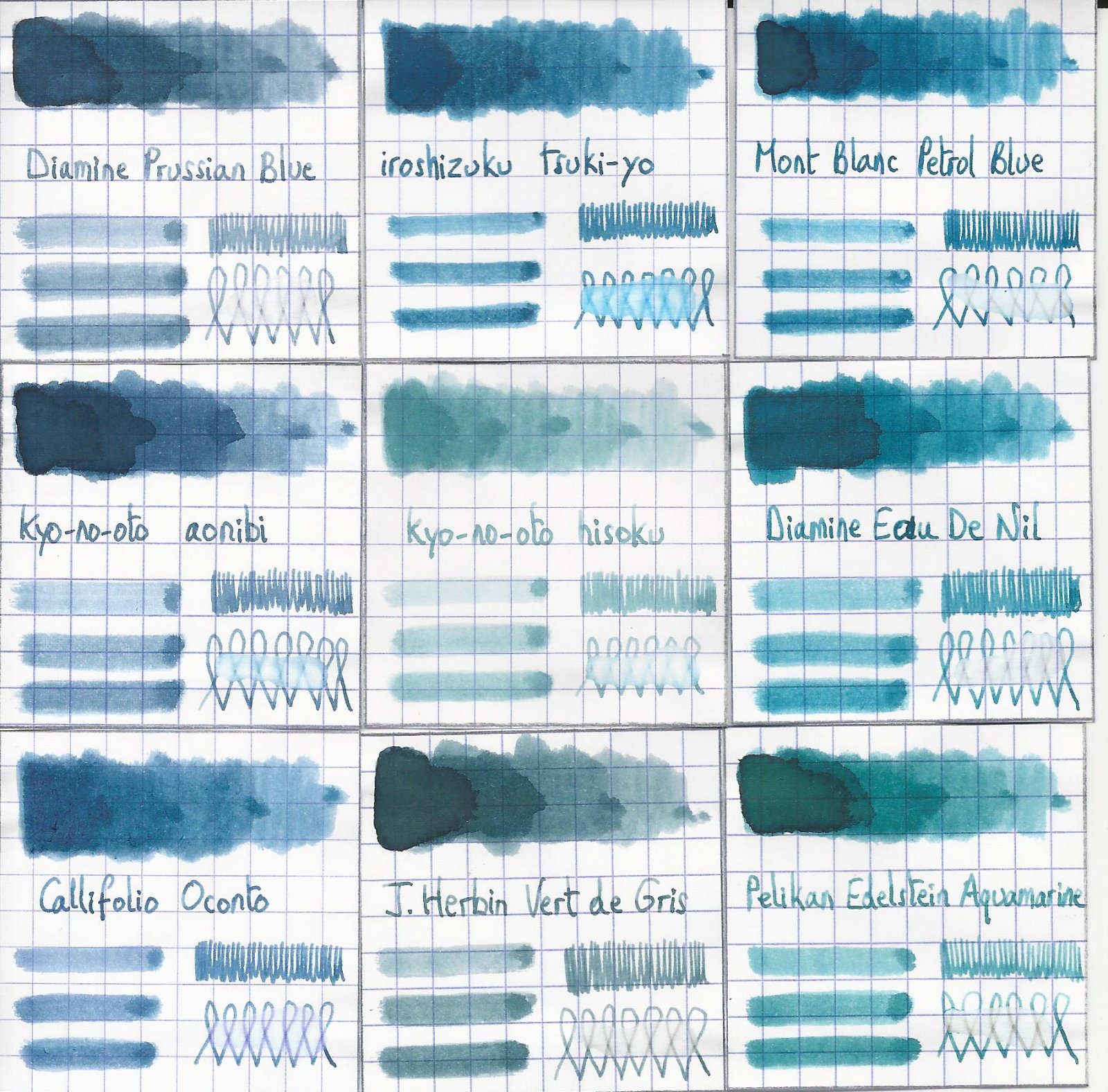
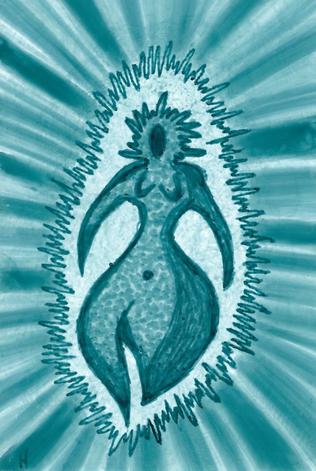
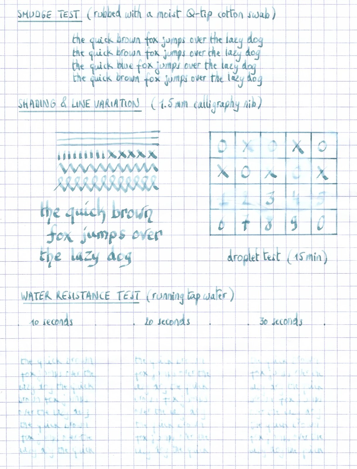
TAG Kyoto - kyo-no-oto - hisoku TAG is a stationary shop in Kyoto (Japan) that produces some interesting soft watercolour-style inks. With the kyo-no-oto series they produce a line of inks that replicates traditional Japanese dye colours. According to available only info, the manufacturing process of the kyo-no-oto inks follows traditional dying techniques dating back to the Heian era between the years 794 and 1185. The inks come in 40 ml bottles, packaged in luxurious thick paper with a texture that feels like heavy watercolour paper. In this review I take a closer look at hisoku, a grey steel-blue with green undertones. An interesting colour this one, soft and pale, but at the same time delicate as the seijit porcelain from which it draws its inspiration. Another TAG Kyoto ink that’s right up my alley. Hisoku translates to “secret colour”. It is named after the mysterious beauty of the ash-coloured blue-green unique to Celadon pottery (also known as greenware). The colour of this ink catches the porcelain’s colour perfectly. Very nicely done! The ink writes really dry with my standard Lamy Safari test pens. Saturation is also quite low, especially with the finer nibs. Nevertheless, it still leaves a very readable line even with the Lamy EF nib. This may be a soft and pale ink, it still provides enough contrast with the paper to ensure very legible writing. With wetter pens, the writing experience improves significantly. I would personally avoid this ink with drier pens. To show you the impact of saturation on the ink’s look & feel on paper, I made some scribbles where I really saturated portions of the Tomoe River paper with ink. This gives you a good idea of what the ink is capable of in terms of colour range. Hisoku has a fairly broad dynamic range, but being a pale ink, there is no harsh contrast between the light and darker parts. This translates to strong but still elegant shading. Be aware that my scanner tends to exaggerate the contrast, making the shading look harsher than in reality. I’ve therefore added some photo’s to the writing samples below, to allow you to get a better feel for the ink. The chromatography shows the soft and delicate nature of this kyo-no-oto ink. The bottom part of the chroma suggests a fair amount of water resistance, but this is not reflected in the real world. With water tests, there does remain ink on the paper, but it’s not easily readable and requires patience deciphering. Slightly accident-proof would be more accurate to characterise hisoku’s water resistance. I’ve tested the ink on a wide variety of paper — from crappy Moleskine to high-end Tomoe River. On every small band of paper I show you: An ink swab, made with a cotton Q-tip 1-2-3 pass swab, to show increasing saturation An ink scribble made with an M-nib Lamy Safari The name of the paper used, written with a B-nib Lamy Safari A small text sample, written with the M-nib Safari Source of the quote, with a wet-writing Lamy Dialog 3 with M-nib Drying times of the ink on the paper (with the M-nib Safari) Hisoku looks great on all my test papers, with no visible feathering even with the horrible Moleskine paper. Show-through and bleed-through are quasi absent — only the Moleskine gets some minor bleed-through, but still not too bad. Drying times cluster around the 5 second mark with my Lamy Safari M-nib pen. I personally prefer hisoku with pure white paper, where it looks its best. A beautiful soft & delicate pale-blue that simply looks wonderful. I really appreciate the beauty of this ink. I’ve also added a few photos to give another view on the ink. In the scanner samples above, the shading contrast in the written text is a bit exaggerated, making it look too harsh. The photos below show a more realistic view of the ink’s shading. Writing with different nib sizes The picture below shows the effect of nib sizes on the writing. Kyo-no-oto hisoku has low saturation, but still manages enough contrast with the page to make for very legible writing, even with the EF nib. Be aware that it is a dry ink, and as such no good match for dry pens like the Lamy Safari. I suggest you use this ink with wetter pens and/or broader nibs to get a more enjoyable experience. And the ink’s elegant shading is always present, enhancing your writing, no matter what pen/nib combination you choose. Related inks To compare this soft grey-blue hisoku with related inks, I use my nine-grid format with the currently reviewed ink at the centre. This format shows the name of related inks, a saturation sample, a 1-2-3 swab and a water resistance test — all in a very compact format. I really have no other ink that comes close in colour. J. Herbin Vert De Gris is from the same family but way more saturated. It doesn’t even try to match hisoku’s soft delicacy. Inkxperiment — angry Mother Earth With every review, I try to create an inkxperiment using only the ink I’m working on. These one-ink drawings are a great way to bring out the colour-range nuances that are present in the ink. I really enjoy doing them: it’s fun, and a good way to stretch my creativity and drawing skills. Inspiration comes from the evermore visible results of climate change: climbing temperature, melting icecaps, stronger storms, … Mother Earth is not happy! I started with a piece of HP photo paper on which I drew a sketch of Mother Earth with my fountain pen. I then used a rolled-up piece of kitchen paper as a stamp, and filled in the background with water-diluted hisoku. I then added the radiance using Q-tips dipped in multiple water/ink mixes, and filled in the goddess figure with a Q-tip dipped in pure ink. Extra accents were added with my fountain pen. I’m not totally satisfied with the result, but the resulting picture does give you an idea of what can be achieved with hisoku as a drawing ink. Conclusion I’ve tried a number of TAG Kyoto inks to date, and love them all. This line of inks really fits my taste – I’m glad I discovered them. Hisoku is an ink that totally nails it: a soft and delicate pale grey-blue with green undertones. A truly beautiful ink that works really well with all my test papers. Be aware that it definitely is a dry ink, and that it needs wet pens and/or broad nibs for a pleasant writing experience. Hisoku’s colour and toned-down appearance are probably not for everyone, but if you enjoy soft inks, this one is another winner from the TAG Kyoto stable. Technical test results on Rhodia N° 16 notepad paper, written with Lamy Safari, M-nib Back-side of writing samples on different paper types
-
I have a bottle of Noodlers Ottoman Azure and I really love the color. However I have been having a problem with the dry time of the ink on Midori Travellers Notebook Ultrathin paper. The ink can take up to 10 minutes to dry completely. Has anyone else had experience with this ink in the Travellers Notebook?
-
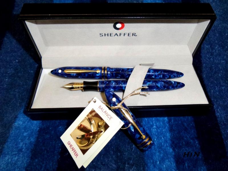
Hello After I got a couple of Sheaffer Balance a few days ago I had a hot conversation with a friend talking about - when can we name a pen as (vintage)!? and which aspect is more important!? time (how long), availability, quality ......etc Thank you for sharing us your opinions H1N
-
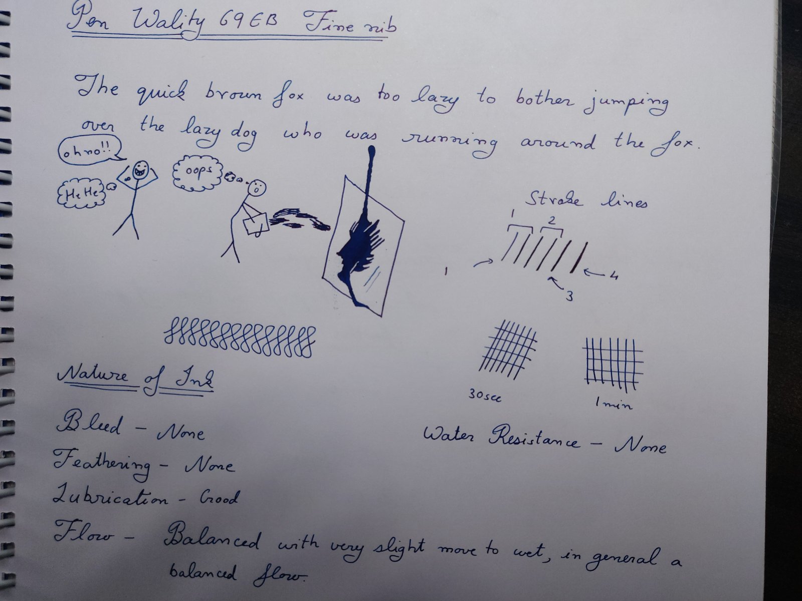
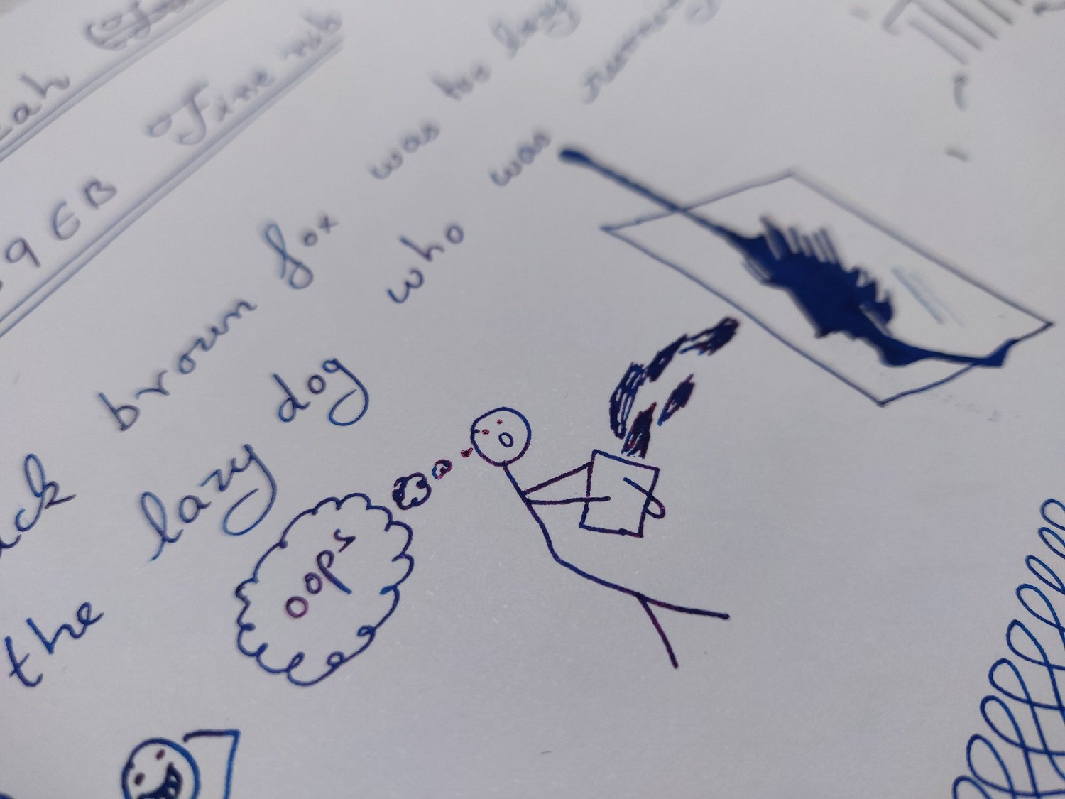
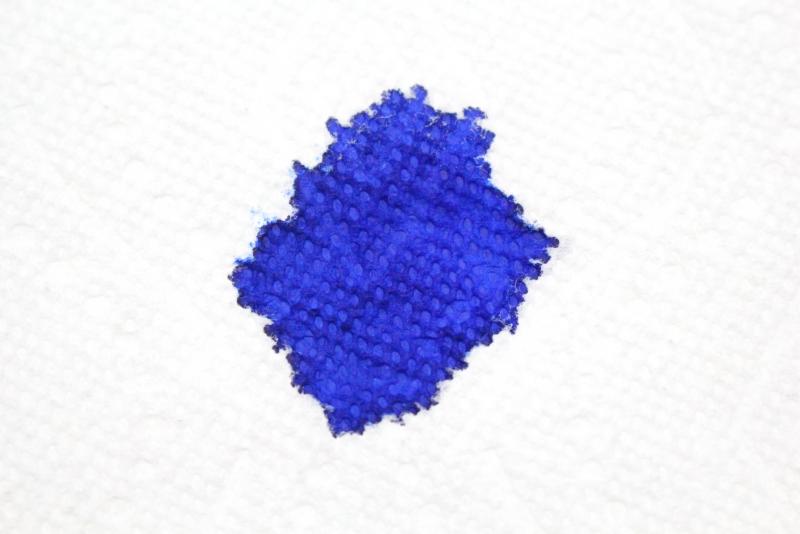
Introduction and Elephant in the room Lets take elephants out of picture. First is controversy that surrounded the bottle design which actually is a patent design of Gecko design and this was cause of issue which has been addressed since then. What happened behind the scene is of no concern to me as end result seems to be good for all. Basically ink is available to buy. Now bottle is well already quite nice looking and half of the folks (including me) would probably jump the gun for bottle over other blue ink, so before diving in ink lets clear this guy out. There are some pros and cons of this bottle design. First what the bottle was originally designed for by gecko is to be used as ink well and it works great as such, any pro and con arises from this very fact so use as you may. Ink was shipped separately outside the box to prevent mishaps during shipping so starting point is empty bottle. Pros include looks, nice design for dips and general filling of ink and well attraction factor (all those who saw the bottle ask where I got it from and if only bottle is available and if larger size is present...so yeah it attracts attention) last the separation of ink mouth and reservoir has real practical benefits when using dip pens and filling pens. There is one other from what I feel but its too vague so I won’t put here. Cons include, glass is on thinner side so be careful. There is bubble issue which happens as if reservoir has ink over channel. The issue is not really as big of deal and can be delt with by moving bottle a bit. Last is size of mouth. I have not seen problem with my pens but I have a feeling that absolute jumbo pens like ranga ganesha might not fit properly to extract the inks from mouth in respect that nib not dipping completely..can’t test it as I lack such pens. All in all its one unique bottle and sure will be liked a lot. Ink review section Paakezah in persian is a word for ‘pure’ and this ink and so the reference of ink as the complete blue on Krishna website. Ink is first in line of Krisna’s S series inks which they say is safe sheen ink for vintage pens and I agree with them on this after testing it. Test papers include 75gsm sectra copy paper 70gsm and 85gsm nightingale paper 52gsm classmate copy paper 100gsm JK Cedar bond papers. Random books back sides and some unknown real cheap papers. Ink properties Bleeding/Ghosting – None seen on any paper tested except for cheap ones. Feathering – None to minimal on very cheap ones. Saturation – Good Flow – Balanced flow with very slight tending to wet side. Dry time - varies from 12 to 20 seconds. Sheen – moderately high. Shading – Not seen as shades are pretty much sheen spots. Water Resistance – none (will not survive water). A write sample in high resolution meant to test the new limits of uploads plus general opinion of ink. The camera is pea shooter phone camera. I tried to get as accurate color as I could with phone. the image is quite accurate just tiny bit more dark then in real.... water resistance results. Paakezah shows no other color, at least in normal case I still have not tested chromatic test, other then blue and its shades. The sheen seen has metallic color and is reddish-violet. The ink show high sheen on decent papers but non-absorbing papers are preferred as with all sheen inks. I must point out though that it is by no means a sheen monster but there is enough sheen that one will not have to look for it, its simply visible on paper in all its glory when seen with naked eye and the fact that I can see such on mostly normal papers says a lot. some sheen seen in writing. The entire page has such results just hard to get photograph in one go. I feel the ink lies on darker spectrum of blue, its very blue just not light shade. All in all its interesting in respect that it manages to separate itself from usual blue lots like waterman serenity blue and lamy blue ink even without any sheen. Still sheen is the highlight and you might wanna go with decent paper on this one. screenshot if ink from Krishna inks website There were never any hard starts or skips in 3 pens that I tried with decent flow maintained in all types of writing from fast to weird. Wality 69EB, Ranga Slim Bamboo and Oliver Exam pen are 3 test lots. Now cleaning is easy and water is suffice here. As for safe..well I tried clogging the pen with the ink by letting the nib open and drying the pen for one day...still managed to clean the pens with soap water. There ware no stains left and disassembly of the pen showed no clogs or residue. So I think it should be safe for any pen. I tested these results on Oliver exam pen which is clear demonstrator and makes it easy to observe such results. other sample with full page writing. Do tell if higher resolution image is preferred over this one. All in all a nice ink even without the bottle. Conclusion For the price of Rs 949..or approx. $12.5 without delivery….its a steal especially with the bottle and by looks of it being mostly on pre-order I will say that its selling like cakes. The customer service of Krishna inks was great, all orders were placed from their website and notifications were sent via email. Any quarries and questions were replied via email and replied within 2 days. It was a pleasant experience overall. Disclaimer: entire writing seen is done on 100GSM JK cedar paper. I lack tomoe river but I am confident the ink will sheen more on that page.
-
I have bought several blue inks hoping that they were as bright as they seemed to appear. However, the results have so far been disappointing. Krisha's inks seem to be reasonably priced with a lot of interesting colours. I want advice about Krishna's blue inks from the users. If I had to pick 3 blue inks, which ones would you recommend? They should be as bright as posssible with relatively short drying times, decent lubrication and minimal feathering.
-
Manufacturer: Parker Quink Series, colour: Blue Pen: Waterman Hemisphere „F” Paper: Image Volume (gramatura 80 g / m2) Specifications: Flow rate: good Lubrication: good Bleed through: unnoticeable Shading: noticeable Feathering: unnoticeable Saturation: good A drop of ink smeared with a nib The ink smudged with a cotton pad Lines Water resistance Ink drying time Ink drops on a handkerchief Chromatography Sample text in an Image Volume (80 g / m2) Sample text in an Oxford notebook A5 (90 g / m2) Sample letters in a Rhodia notebook No 16 (90 g / m2) Palette of shades
-
Manufacturer: Parker Series, colour: Quink Washable Blue Pen: Waterman Hemisphere „F” Paper: Image Volume (gramatura 80 g / m2) Specifications: Flow rate: good Lubrication: good Bleed through: unnoticeable Shading: noticeable Feathering: unnoticeable Saturation: good A drop of ink smeared with a nib The ink smudged with a cotton pad Lines Water resistance Ink drying time Ink drops on a handkerchief Chromatography Sample text in an Image Volume (80 g / m2) Sample text in an Oxford notebook A5 (90 g / m2) Sample letters in a Rhodia notebook No 16 (90 g / m2) Palette of shades
-
How do these two blues compare in flow and wetness? Thank you to all of wonderful reviews and examples posted here of the characteristics of these two bright blues. I have read many of the posts going back some years but cannot find a direct answer to the choice I have to make. I lean toward the *slight* advantage in color and saturation of Topaz. But I am chasing another effect. Recently I found my FPR superflex #5 nib in the original Himalaya acrylic wrote WAY more consistently and quickly with some Iroshizuku tsuki-yo. That flow made the pen what it was supposed to be. Monteverde lubrication has not been able to deliver the same consistent benefit, for example. Diamine inks (which I like as a whole) are not consistent although Red Dragon seems to be good - a recent purchase. I found an new appreciation for the slightly greeny, less saturated blue of tsuki-yo, and because the bottle is low despite my having moved to other inks, I am going to buy another 50ml. But first something "bright". Comments show that many people find these Pilot colors (in this sub-brand) are formulated to flow well. But I need to know if I can get the same easy, wet, flow in the Edelstein Topaz. I write quickly and use this informal kind of flex for every day notes *and* letters, postcards. I don't write on the nice papers many of the FPN community keep at hand. I need that ink to nearly gush on cotton stationery, and even postcards. (It's a fine line between blorp (feed failure) - document ruined - and punchy, saturated color in letterforms that are consistent.) That "Superflex" nib in #5 and #6 is fussy. So, any thoughts about the flow comparison between Konpeki and Topaz?
-
Hello everyone, This is my first post back after being away from FPN for a very, very long time and I come seeking your help. I need a new blue ink. I was in love with Montblanc Meisterstuck Diamond Blue ink (see review here: https://www.fountainpennetwork.com/forum/topic/225885-montblanc-meisterstuck-diamond/) and I am drawing to the end of my supply. I liked its' subdued colouring and how it shaded. In a way it sort of reminded me of old recipe Sheaffer Blue. So I now seek your collective knowledge and help. What blue do you suggest I use that either: 1. comes close in appearance/replicating the beloved Diamond; or 2. New colour blue but has good shading and lubrication qualities. Thanks for your help, P
-
Manufacturer: Cross Series, colour: Blue Pen: Waterman Hemisphere „F” Paper: Image Volume (gramatura 80 g / m2) Specifications: Flow rate: good Lubrication: good Bleed through: possible point Shading: noticeable Feathering: unnoticeable Saturation: good A drop of ink smeared with a nib The ink smudged with a cotton pad Lines Water resistance Ink drying time Ink drops on a handkerchief Chromatography Sample text in an Image Volume (gramatura 80 g / m2) Sample text in an Oxford notebook A5 (90 g / m2) Sample letters in a Rhodia notebook No 16 (90 g / m2) Sample letters in a Clairefontaine (gramatura 120 g / m2) Palette of shades
-
Producent: Hero Seria, kolor: Washable Blue Pióro: Waterman Hemisphere „F” Papier: Image Volume (gramatura 80 g / m2) Specifications: Flow rate: good Lubrication: good Bleed through: unnoticeable Shading: noticeable Feathering: unnoticeable Saturation: good A drop of ink smeared with a nib The ink smudged with a cotton pad Lines Water resistance Ink drying time Ink drops on a handkerchief Chromatography Sample text in an Image Volume (gramatura 80 g / m2) Sample text in an Oxford notebook A5 (90 g / m2) Sample letters in a Rhodia notebook No 16 (90 g / m2) Sample letters in a Clairefontaine (gramatura 120 g / m2) Palette of shades
-
Manufacturer: Aurora Series, colour: Blue Pen: Waterman Hemisphere „F” Paper: Image Volume (gramatura 80 g / m2) Specifications: Flow rate: very good Lubrication: very good Bleed through: unnoticeable Shading: noticeable Feathering: unnoticeable Saturation: very good A drop of ink smeared with a nib The ink smudged with a cotton pad Lines Water resistance Ink drying time Ink drops on a handkerchief Chromatography Sample text in an Image Volume (gramatura 80 g / m2) Sample text in an Oxford notebook A5 (90 g / m2) Sample letters in a Rhodia notebook No 16 (90 g / m2) Sample letters in a Clairefontaine (gramatura 120 g / m2) Palette of shades
-
Robert Oster 1980 - Grey Seas Robert Oster is an Australian ink maker that is well-known for its unique range of colours. With this mini-series he gives us a conglomeration of colours inspired by the anything goes world of the 1980s. The inks include muted pastel-type colours along with some eye-popping disco-style hues. Definitely an interesting series. The centerpiece of this review is Grey Seas, a toned-down grey-blue with definite purple undertones. This pastel-style dusty blue certainly fits my taste - the colour is simply beautiful. The ink provides good contrast with the paper, even in finer nibs. Like many Robert Oster inks, this one feels rather dry and definitely needs a wet pen or broader nib to gain decent lubrication. To show you the impact of saturation on the ink's look & feel on paper, I made some scribbles where I really saturated portions of the Tomoe River paper with ink. This gives you a good idea of what the ink is capable of in terms of colour range. Grey Seas goes from a faint purple-blue at the light end of the spectrum, up to a much darker grey-blue at the most saturated part. The purple undertones are strongly present, especially in the swab. The broad tonal range indicates that this is a strong shading ink. For my personal taste, shading is even a bit too strong and harsh, with too much contrast between the light and darker parts of the text. Like most Robert Oster inks, Grey Seas has zero water resistance. Short exposures to water completely obliterate the text, leaving next to nothing on the page. This is also apparent from the lower part of the chromatography. The chroma clearly shows the purple & cerulean-blue components of the ink. You can also see that the dyes migrate away with water, and that only some faint light-purple smudges remain on the paper. I've tested the ink on a wide variety of paper - from crappy Moleskine to high-end Tomoe River. On every small band of paper I show you: An ink swab, made with a cotton Q-tip 1-2-3 pass swab, to show increasing saturation An ink scribble made with an M-nib Lamy Safari fountain pen The name of the paper used, written with a B-nib Lamy Safari A small text sample, written with an M-nib Lamy Safari Origin of the quote, written with a wet Parker Sonnet with M-nib Drying times of the ink on the paper (with the M-nib Lamy) With the writing samples, Grey Seas exhibits some technical shortcomings. The ink seems to be prone to a small amount of feathering. This typically happens on the lower quality printing paper, but I also noticed a small amount of feathering on some high quality paper, like OCM vellum paper. Drying times are in the 5 to 10 second range with my M-nib Lamy Safari. Contrast with the paper is excellent and easy on the eyes. I don't like the way Grey Seas interacts with more yellowish paper - it just doesn't look good. In my opinion, this is an ink to use with pure white paper. Writing with different nib sizes The picture below shows the effect of nib sizes on the writing. All samples were written with a Lamy Safari, which is typically a dry pen. I also added a visiting pen: a wet-writing Parker Sonnet with M-nib. As you can see, Grey Seas has no problem with even the finest nibs, exhibiting some shading even with the EF-nib. This ink is a really heavy shader. For my tastes shading is even a bit too pronounced - I prefer more subtle shading myself. Related inks To compare Grey Seas with related inks, I use my nine-grid format with the currently reviewed ink at the center. This format shows the name of related inks, a saturation sample, a 1-2-3 swab and a water resistance test - all in a very compact format. Inkxperiment – waiting for the princess With every review, I try to create an interesting drawing using only the ink I'm working on. Limiting myself to one ink allows me to showcase its colour-range nuances. It's often quite a challenge, but always great fun. Inspiration for this inkxperiment comes from the Brothers Grimm fairy tale "The Frog Prince". I started off with a piece of 300 gsm rough watercolour paper, on which I painted the background using water-diluted ink. Next I used some Q-tips dipped in 1:2 diluted Grey Seas to stamp in the trees and paint in the castle. I then used a Q-tip with a bit of ink to darken up the foreground. For the frog prince I used my Lamy Safari pens and pure Grey Seas. Finally I used a Q-tip with heavily water-diluted ink to add some texture to the path leading up to the castle. The resulting drawing is only so-so, but it does give you an idea of what can be achieved with Grey Seas as a drawing ink. Conclusion Robert Oster 1980 Grey Seas gives you a beautiful muted grey-blue colour with strong purple undertones. Unfortunately this ink has some shortcomings, the most serious of which is its tendency to feather on a number of papers. Grey Seas also needs pure-white paper - it doesn't look good on more yellowish paper. This is an ink you need to combine with the right pen and paper - if you do so, you are rewarded with a really good-looking muted grey-blue. But make the wrong choice, and you will probably be disappointed. Technical test results on Rhodia N° 16 notepad paper, written with Lamy Safari, M-nib Back-side of writing samples on different paper types
-
Monteverde's revamped line of inks recently got my attention for their comprehensive lineup of clear, distinct hues, as well as good value. A 90ml bottle can be had for about $13-$15 USD from the better known online retailers in the United States, making it a very good deal. Monteverde touts their "ITF Technology". From Monteverde's promotional material, here's how it claims to benefit us writers: At my recent visit to the 2017 LA Pen Show, Monteverde gave a free bottle of Malibu Blue ink to all show attendees. A company representative had all their inks available for sampling with swabs, as well as show discounts. I brought home four bottles of Monteverde ink, and post-show I've purchased a few more online:Malibu BlueCapri BlueHorizon BlueSapphire BlueMonteverde also offers two blues I am missing: Caribbean Blue (turquoise), and a Blue-Black. I am posting individual reviews for each of the four Monteverde inks I have. I filled a variety of pens with these four inks, with nibs ranging from fine to double-broad stubs. Here's a snapshot from my Bullet Journal Ink Log, showing the pen/ink assignments and a writing sample from each. Monteverde Horizon Blue This is Monteverde's Parker Penman Sapphire workalike. It is similar to Diamine Blue Velvet and Visconti Blue. Here is how it appears on Clairefontaine paper. Color/Saturation Horizon Blue is a deeply saturated, "pure" blue. It doesn't lean to purple or green. Shading/Sheening Horizon Blue has a light amount of shading on Tomoe River. A little bit of red sheening can be seen in the Tomoe River sample. Flow Horizon Blue is a well-behaved ink. I had no skips or hard starts on the initial flow. Horizon Blue came in second place for flow amongst the four inks tested. In my Sheaffer Prelude with M nib (a wet pen), it comes out wet but not too wet. Lubrication Like the other Monteverde inks, Horizon Blue has good lubrication, but has some stiction at the start/stop of a pen stroke. In my Clairefontaine bullet journal, my Sheaffer Prelude squeaks as I write! Dry Time Dry time is moderate, between 25 and 30 seconds on Clairefontaine paper from the Prelude. Feathering Horizon Blue performs well in the feathering test on cheap office paper. Bleedthrough There is a medium amount of bleedthrough on the other side of the page on the cheap office paper. Water Resistance Horizon Blue probably performed best of the four Monteverde inks, but still it is not a water-resistant ink in the 10 second immersion test. Before After Comparison with Other Inks Here is a tile comparing Horizon Blue with other medium blue inks. NB: The Parker Penman Sapphire is from a diluted sample and so isn't quite true in terms of saturation.
-
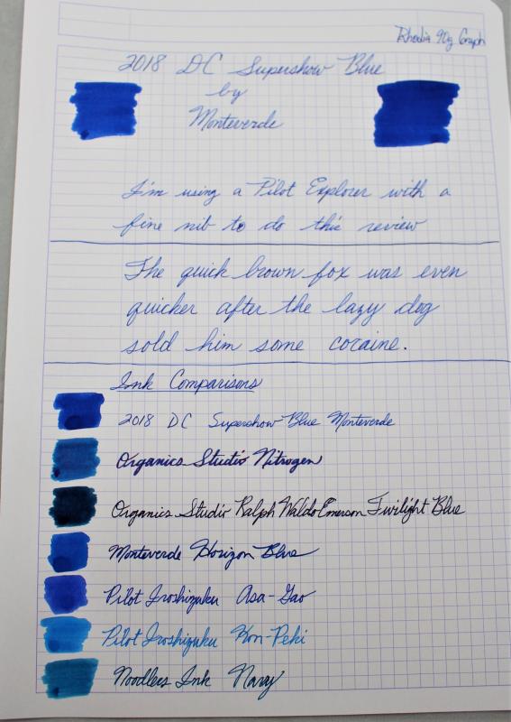
I ordered the Teal for this year, and I figured why not get last year too. Here is my review of last year's DC Supershow Blue from Monteverde. My initial impression is that it is simply another iteration of Horizon Blue. You can see from the comparison that they are very close in color. This color was just as well behaved as the Horizon blue and had just as good of flow. It didn't feather on any paper I have used so far. I really like the color but I do feel like I doubled up on colors since I already have Horizon Blue. On the bright side this may also be another one of those colors that is close to Parker Penman Sapphire. I hope you enjoy the review. I would love to hear what everyone thinks. Thanks for looking.