Search the Community
Showing results for tags 'blue ink'.
-
The University of Reading (UK) displayed Samuel Beckett's drafts for his novel Murphy and ephemeral papers from some of his theatre productions. The manuscript on display consisted of six notebooks of approximately A5 size (they were slightly smaller). On the right hand side he had written his script which consisted of single spaced text in blue fountain pen ink (looked like Parker's Quink, but it is 86 years old). He had crossed out and edited the text in black ink. It looked like a broad/thick medium nib. On the left hand page, he hadn't continued with the draft, but put doodles of golfers, cavalry men and notes. The curator told us that some of these ideas appeared in later works - so it seems that the left side was a "scratch pad" and the right hand side was his work space. On the left hand side he had the question, "What is my life, but the preference for the ginger nut biscuit?" There was also a notebook of stage directions for a production of his play and a model theatre with dolls - a mock up of John Snow's English production of Godot. The stage looks very similar to the set of productions today.
-

Pelikan's Royal Battle; Battle Of The Blue Kings
Morbus Curiositas posted a topic in Ink Comparisons
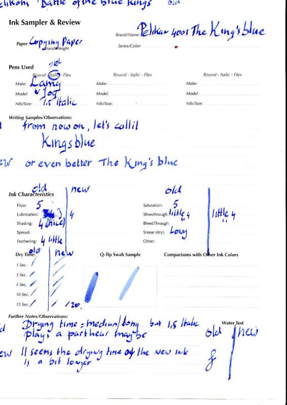
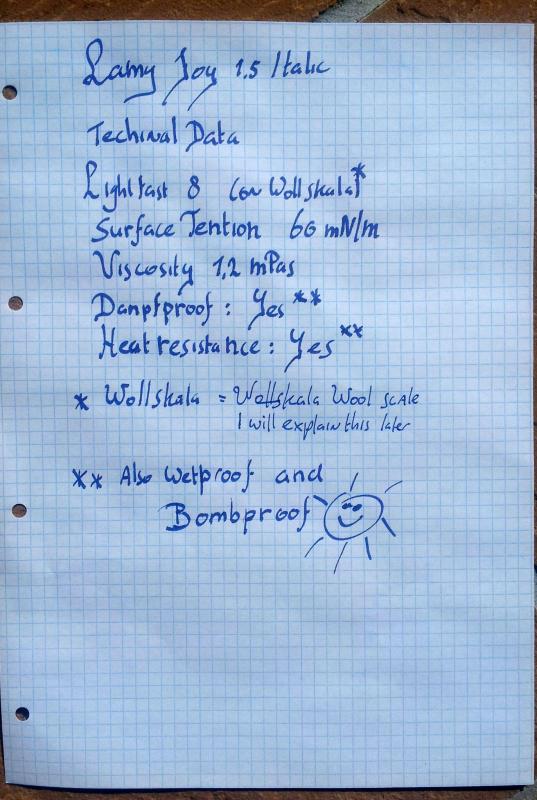
Pelikan’s Royal Battle Battle of the Blue Kings The old king vs. the new Royal Dear FPN friends, Last week I saw two reviews of Pelikan Royal Blue coming by in the Ink review forum. An old one started in 2010 (the first link) and a recent one (the second link) http://www.fountainp...001-royal-blue/ http://www.fountainp...001-royal-blue/ This gave me an Idea, since I have two bottles of Pelikan 4001 Royal Blue. An old bottle which is NINETEEN years old and a new one I recently obtained. I thought it would be a nice idea to compare the two… Please have a close look at the handwritten text since there is a Babylonian confusion of speech in the naming The 4001 series is a cheaper line of Pelikan inks, but the quality isn’t “cheaphttp://cdncache1-a.akamaihd.net/items/it/img/arrow-10x10.png” at all… It is simply a very good basic ink that has been there for decades. The ink is fairly dry but still the flowing is well. Saturation is great. And there is some nice shading to it. Though a dry ink, as mentioned by others too, the drying time is fairly long for a normal Fountain Pen ink. This makes it perhaps not the best ink for left-hand writers. The old ink has matured very well just like a great wine does. As far as I can see it gained a lot of depth and finesse, expressed in darkness and shading. The old ink appears a bit darker to me. Both inks are beautiful the new one with freshness (like a good Beaujolais) the old ink has a lot of charisma like a person like Sean Connery in older age. I think I not only build me a wine cellar (a long wished dream) but an ink cellar too! Down here are the technical specs (as suggested by Ann Finley 2007) points 1-5 1 = 5= The old King Fountain Pens: Online Best writer 0,8 Italic; Lamy Joy 1,5 Italic Paper: Leonardo Ringbuch,,average quality school note book made in Austria Drying time: test sheet points: 3 Flow: 0.8 points: 3 / 1,5 points: 4 Wetness: a bit dry points 3 Bleeding: almost absent in both pens points: 5 Shading: very nice points: 4 Feathering: 0.8 very little points: 5 / 1,5 little points 4 Waterproof: good points: 4 Package: simple bottle points: 2 Availabilty: Excellent points: 5 The new Royal Fountain Pens: Online Best writer 0,8 Italic; Lamy Joy 1,5 Italic Paper: Leonardo Ringbuch,,average quality school note book made in Austria Drying time: test sheet longer points: 2 Flow: 0.8 points: 3 / 1,5 points: 4 Wetness: a bit dry points 3 Lubrication: 0.8 nib smooth points: 3.5/ 1.5 nib smooth: 4 Bleeding:very little in both pens points: 5 Shading: still nice points: 3 Feathering: 0.8 very little points: 5 / 1,5 little points 4 Waterproof: good points: 4 Package: simple bottle points: 2 Availabilty: Excellent points: 5 Quality and overall verdict: 4001 is still a very nice ink. The quality is like most German product: like their, cars i.e. Mercedes, their Fountain Pens i.e. PELIKAN, their inks i.e. De Atramentis ,and Pelikan of coursehttp://cdncache1-a.akamaihd.net/items/it/img/arrow-10x10.png … SUPERB…. Since the ink even gets better over time must really built me my ink cellar… The best is that an excellent Pelikan or De Atramentis is much more affordable than a Romanée Conti or Chateau Margaux…. I conclude… Very nice, quality ink for only E 3.90 a 25 ml. bottle. This is the best proof that a quality ink does not have to be expensive Warmest Regards, Peter Vlutters p.s since this review is an ink comparison as well as an ink review, I have posted this review in both for a. Peter Attached Images
-
Pelikan’s Royal Battle Battle of the Blue Kings The old king vs. the new Royal Dear FPN friends, Last week I saw two reviews of Pelikan Royal Blue coming by in the Ink review forum. An old one started in 2010 (the first link) and a recent one (the second link) https://www.fountainpennetwork.com/forum/index.php/topic/167834-pelikan-4001-royal-blue/ https://www.fountainpennetwork.com/forum/index.php/topic/263912-pelikan-4001-royal-blue/ This gave me an Idea, since I have two bottles of Pelikan 4001 Royal Blue. An old bottle which is NINETEEN years old and a new one I recently obtained. I thought it would be a nice idea to compare the two… Please have a close look at the handwritten text since there is a Babylonian confusion of speech in the naming The 4001 series is a cheaper line of Pelikan inks, but the quality isn’t “cheap” at all… It is simply a very good basic ink that has been there for decades. The ink is fairly dry but still the flowing is well. Saturation is great. And there is some nice shading to it. Though a dry ink, as mentioned by others too, the drying time is fairly long for a normal Fountain Pen ink. This makes it perhaps not the best ink for left-hand writers. The old ink has matured very well just like a great wine does. As far as I can see it gained a lot of depth and finesse, expressed in darkness and shading. The old ink appears a bit darker to me. Both inks are beautiful the new one with freshness (like a good Beaujolais) the old ink has a lot of charisma like a person like Sean Connery in older age. I think I not only build me a wine cellar (a long wished dream) but an ink cellar too! Down here are the technical specs (as suggested by Ann Finley 2007) points 1-5 1 = 5= The old King Fountain Pens: Online Best writer 0,8 Italic; Lamy Joy 1,5 Italic Paper: Leonardo Ringbuch,,average quality school note book made in Austria Drying time: test sheet points: 3 Flow: 0.8 points: 3 / 1,5 points: 4 Wetness: a bit dry points 3 Bleeding: almost absent in both pens points: 5 Shading: very nice points: 4 Feathering: 0.8 very little points: 5 / 1,5 little points 4 Waterproof: good points: 4 Package: simple bottle points: 2 Availabilty: Excellent points: 5 The new Royal Fountain Pens: Online Best writer 0,8 Italic; Lamy Joy 1,5 Italic Paper: Leonardo Ringbuch,,average quality school note book made in Austria Drying time: test sheet longer points: 2 Flow: 0.8 points: 3 / 1,5 points: 4 Wetness: a bit dry points 3 Lubrication: 0.8 nib smooth points: 3.5/ 1.5 nib smooth: 4 Bleeding:very little in both pens points: 5 Shading: still nice points: 3 Feathering: 0.8 very little points: 5 / 1,5 little points 4 Waterproof: good points: 4 Package: simple bottle points: 2 Availabilty: Excellent points: 5 Quality and overall verdict: 4001 is still a very nice ink. The quality is like most German product: like their, cars i.e. Mercedes, their Fountain Pens i.e. PELIKAN, their inks i.e. De Atramentis ,and Pelikan of course … SUPERB…. Since the ink even gets better over time must really built me my ink cellar… The best is that an excellent Pelikan or De Atramentis is much more affordable than a Romanée Conti or Chateau Margaux…. I conclude… Very nice, quality ink for only E 3.90 a 25 ml. bottle. This is the best proof that a quality ink does not have to be expensive Warmest Regards, Peter Vlutters p.s since this review is an ink comparison as well as an ink review, I have posted this review in both for a. Peter
-

I've Got The Blues Magoos :) Informal Blue Comparisons
white_lotus posted a topic in Ink Comparisons
Well this is my first ever ink comparison. So I apologize if don't have very good scans, my pengirlship is poor, I lack multiple nib sizes, especially the italics, fines, and stub 1.5! I only have three pens and they're all medium nibs. I'm sorry again if I am boring. I will be adding to this thread additional scans of the other blue inks as I run through the ink already in the pens. Then I'll switch to a different blue. I simply used the regular settings on the Epson scanner I have as part of the Epson WF-7520 printer. When I scaled the images down for uploading, they were individually 3.4 Mb, so I had to make them smaller, but I set the quality to "high". Now I have smaller file sizes that I can upload. I hope the quality is preserved. The inks in this set are: Lamy Blue-black Iroshizuku Shin-kai (Deep Sea) J. Herbin Bleu Nuit Organics Studio Mark Twain Halley's Comet The pens I used were Lamy 2000 medium Aurora Ipsilon Deluxe medium Shaeffer 1960's "school pen" when my Edison Beaumont arrives, I'll add that to the mix. The papers I used were: Moleskine (I know some of you have issues) Mohawk via linen 70# text Office Max Inkjet paper After starting the project I realized from other posts on FPN that I should have tested the SAME INK in DIFFERENT PENS. But I didn't do that. It may have made more of a difference if I had different nib widths, but with them all being mediums, maybe not so important? Thanks so much for your time, and if you have any suggestions about how I can do better next time, let me know! OK, without further ado, the images!
-
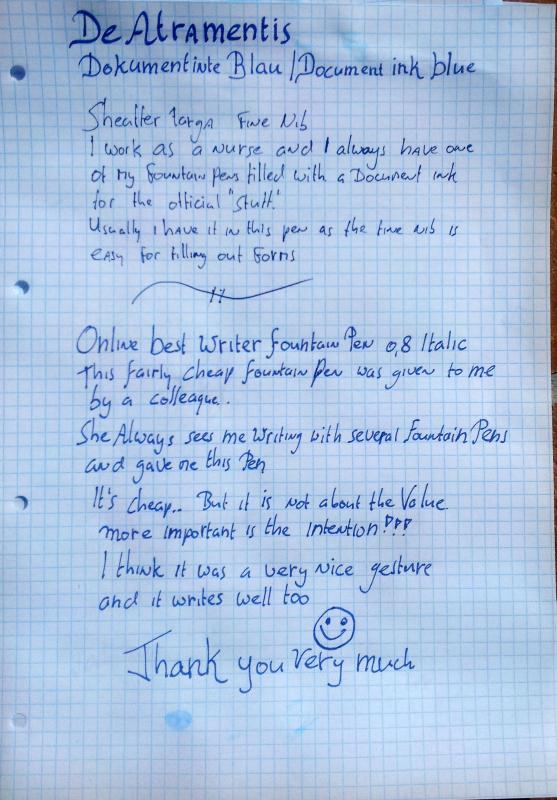
De Atramentis Dokument Tinte Blau / Document Ink Blue Dear FPN friends, This time an ink review of a very special ink. De Atramentis Document Blue. This ink is mentioned for doctors, lawyers etc. and for all who need a permanent ink for official Documents To be qualified as a document ink the ink has to meet certain standards. The standard in Europe is ISO 12757-2. This means that the ink has to be lightfast and may not be influenced by any outer influences. To show you the resilience of the inks I have poured several aggressive Fluids over it and… Nothing happened. It is like if the ink was carved in stone…. Amazing… It is not only bulletproof but also bombproof … I believe the ink even survives a nuclear accident or bomb attack (sorry for not testing that ) The ink is extremely lightfast. This is tested and certified with the Woll-Skala, wool scale in English. This may sound peculiar, but isn’t that strange on second glance. In history quite often the same pigments used for Dyeing wool where used for inks as well. The Woll-Skala reaches from 1 not lightfast over 5 extremely lightfast to 8 extreme lightfast. The ink “of course” is WS 8. There are other resilient inks like inks based on iron gall or soot. The problem is that iron gall inks are very aggressive to both paper and nib. (the paper of old Dutch documents from the golden age are often eaten away partially by the ink) Both iron gall and soot inks may also clog the feed of your fountain pen. The De Atramentis inks are, as far as I understand, made with nano-particles. According to the noble Fountain Pen King Sire Richard of Binderheart. Nano-particle inks can be safely used in Fountain pens. I always have one Fountain Pen filled with the ink for work and flush it once every 2 months… No problem at all Down here are the technical specs (as suggested by Ann Finley 2007) points 1-5 1 = Bad : 5= Excellent Fountain Pens: Sheaffer Targa F, “online Best Writer 0,8 Italic, Lamy Joy 1,5 Itaic Paper: Leonardo Ringbuch,average quality school note book made in Austria Drying time: Quicker than a camel’s bottom during a desert stroll points 5 Flow: like a Hippie on LSD points: 5 Wetness: very wet still drying fast points 5 Lubrication: very smooth points: 5 Bleeding: medium on average quality paper with ‘normal’ nib points: 3 Shading: almost none points: 1 Waterproof: what do you think points 5000000 Package: bottles only Points: 3 Availabilty: EU Excellent points: 5 USA/ASIA ??? Quality: Handmade everlasting points 5 A very good dark blue ink, it is a bit too dark for my taste. Funnily the dark blue obiously even darker but I find the colour nicer. Shading is absent. Verdict: a very nice bombproof ink for all official purposes. Next time; De Atramentis dark blue. I will ask Dr Jansen for some technical specs and ask him why the ink probably survives all mankind… Have fun
-
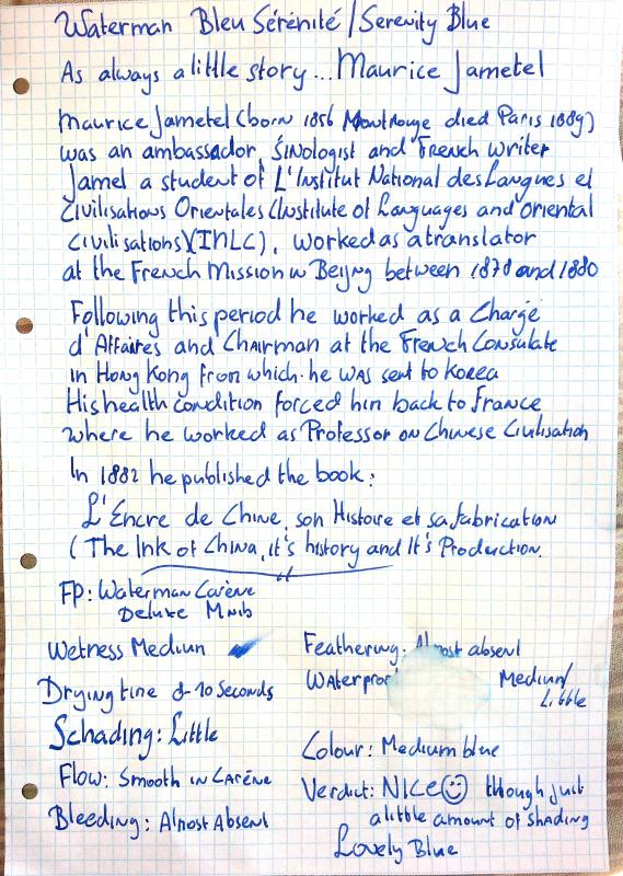
Waterman Bleu Sérénité / Waterman Serenity Blue Dear FPN friends, The lovely J Herbin blue ink I received with my excellent Pelikan M800 Fountain Pen. There is a nice little story to that, which I mentioned before in a topic by Migo984. It's a nice story about excellent service . Last year's february I bought an very nice Parker Premier fountain pen at the Fountain Pen store in Breda (Netherlands). www.tschrijfgereitje.nl The shopkeeper then offered me a free bottle of Parker quink Blue Ink. Nice or not??? Unfortunately the Nib got bended, making the writing terribly scratchy... The shopkeeper warned me (when I bought the FP, to keep the bill for guarantee purposes... What did I do... I lost the bill . Three months later I was back in Breda and visited 't schrijfgereitje.. Fortunately the shopkeeper of t'Schrijfgereitje (the Little Writing Tool... Nice name!!!) is not only friendly but also very good with fountain pens... Just come back tomorrow! I will see what I ca do for you... The next day the Nib was repaired and the Fountain Pen fully serviced... and most important... It writes like a dream now Well I thought: At this shop I will buy another Fountain Pen, when my eye fell on the splendid Pelikan M800 green biased Fountain Pen (Stresemann stripes).... Well you guessed it I bought it there ( my advice do not often buy such nice but expensive pens in one year... your budget gets more ruined than the economy of North Korea, in the shortest possible time ) and again the shop keepr offered me a bottle of ink of my choice.... FREE OF CHARGE!!! Super service wouldn't you agree ... I will contact the shop to ask wether this is the same when you order a Fountain Pen from his webshop.... I will soon let you know On topic now... The ink, though a bit dry according to some reviews I have read, is very smooth. The blue is a very rich dark blue with a noble look to it... I think it's very chique with a touch of oyal richness to it Down here are the technical specs (as suggested by Ann Finley 2007) points 1-5 1 = 5= Fountain Pens: Lamy Joy 1,5 Italic Nib; Pelikan M800 medium nib Paper: Leonardo Ringbuch,average quality school note book made in Austria Drying time: see handwritten review points: 4 Flow: like enlightenment OHM!!! points: 5 Wetness: a bit dry points 3 Lubrication: very smooth points: 5 Bleeding: medium points: 3 Shading: little points: 2 (it is a dark ink ) Feathering: None points: 5 Waterproof: medium points: 3 Package: Very nice exclusive bottle points: 5 Availabilty: Excellent points: 5 Quality: qualité superbe!!! fabriqué en (la douce) France points: 5 Vive la France!!! Lovely lovely luxury Ink
-
Waterman Bleu Sérénité / Waterman Serenity Blue Dear FPN friends, This time an ink review of another ink manufacturer, but... Still with a little touch of De Atramentis to it The ink in this review I received with my Waterman Carène DeLuxe Fountain Pen. Although it came in cartridges (quoting my Fountain Pen Hero SBRE Brown :" Real man use bottled ink" , and I believe real woman too) I really love the ink. It is just the type of vivid blue I love most. What about the touch of De Atramentis??? As always in my handwritten reviews I do a little story. As some of you might know I love De Atramentis inks and I am in frequent contact with the manufacturer, the utterly friendly Dr.Franz-Josef Jansen ( an advantage of being a polyglot) Dr Jansen kindly allowed me to translate the article on ink history on his website www.die-tintenmanufaktur.de I find these articles very interesting, and for sharing them with you, I will translate them for you . In his article "Ink history antiquity" I found the name of Maurice Jametel who wrote an illustrated book of ancient chinese ink called. "L'encre de Chine,son histoire et sa fabrication". I have retrieved the book from archive.org and I am now busy with translating the text into English, which may take a little while, since my French is a bit rusty (Have to work on that) and I am not native speaker of English... These translations will be published as soon as possible.... Vielen Dank Herr Dr. Jansen (thank you very much Dr Jansen)... Finally... On topic now... Let's start with the cons... Shading is very little and waterproof ?? er.. not really. My advice do not write in the shower . And now the happy ending... It is smooooth!!! and I find the blue very beautiful... Down here are the technical specs (as suggested by Ann Finley 2007) points 1-5 1 = 5= Fountain Pens: Waterman Carène DeLuxe,medium Nib Paper: Leonardo Ringbuch,average quality school note book made in Austria Drying time: Approx. 8-10 seconds with a medium nib / quite long with 1,5 Italic nib points 2 Flow: like a ballet dancer on speed points: 5 Wetness: certainly wet enough for a land animal points 3-4 Lubrication: very smooth points: 5 Bleeding: little points: 4 Shading: very little points: 2 Waterproof: just a tad 1 Package: Cartidges and bottles points: 4 (bottle is quite nice but the not very special, although the label is beautiful) Availabilty: Excellent points: EU 5 Quality: qualité superbe!!! fabriqué en (la douce) France points: 4 Simply a good ink with a colour I love for everyday work.. Hope the review was interesting enough for you.... Next time another ink review of , one of them will De Atramentis off course, but also a review of J. Herbin's 1670... une autre grand' encre de la Grande Nation. For those of you who are interested... I wlil publish the translations of Dr. Jansen's research on ink history and the book on chinese ink under "Inky thoughts" as soon as possible Kindest Regards Peter Vlutters
-
This ink would have to be one of my favourites in the Toucan range - though if I'm honest, I wasn't as excited on first glance. It wasn't till I saw another mini-review on this site that I decided to take a second look - and boy, am I glad I did. How is it different from the Turquoise? Hard to say - except that it's somehow 'bluer'. This ink really looks great in a wetter pen - like the Noodler's Ahab I used to write this review - but it's pretty good whatever pen you choose. Like the other inks in this range, it's dye-based and cleans out very well - though for that reason it's not very water resistant. You can buy a 2ml sample of this ink for AU$1.25 (don't ask me what you'll pay for shipping, though - it's normally a flat rate of $5!); for AU$5 you'll get a 60ml pouch, or it's AU$15 for 400 ml. When you consider a 30ml bottle of J.Herbin retails for around $18.95 plus postage, you're talking serious value for money. After 3 months trialling these inks in my pens, I have yet to see a down-side - other than the lack of waterproofness, which they share in common with most dye-based inks - and I'd have no hesitation suggesting you try them out for yourself - though at present these are only available for shipping to Australian and New Zealand addresses. There is another mini-review of this ink on FPN, and a few samples (I think in the threads in 'The Mall') - so I won't bother with the photo, just the scanned image. Here it is: http://i.imgur.com/w9v1N2k.jpg
-
Here's a saturated blue that's sadly not unique enough to strike my fancy. While its behavior on copy paper leaves me disappointed, it's very good on Rhodia, if a bit unremarkable. Being the sheen junkie that I am I'd rather find a comparable color with lots of sheen from Diamine than spend the money on Ottoman Azure. Still, there are far worse inks you could get. http://imagizer.imageshack.us/v2/xq90/18/fdnx.jpg Please remember to vote on this ink in the poll!
-
I always liked this blue ink, but is it true Sheaffer changed the formula with the new bottles. If so, does anyone have a stockpile they wouldn't mind sharing....
-
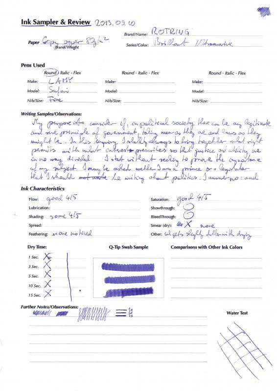
Hi fellow pen appreciators, I met the Rotring Brillant Unltramarine not long ago in a friendly shop and since the price was good I decided to try it. I wasn't disappointed. Surpised for sure, but not unpleasantly. I couldn't find any other review or even samples so I decided I should make one myself Enjoy The colour was not what it showed on the box, that is the reason for the surprise, it is not really ultramarine in real life. Instead it is a beautiful, dark elegant violet. The colour is not loud, it's reserved. Subtle unobtrusive but proudly violet. I would compare it to the darker colours of the amethyst. If you shine very bright white light on it it shows it's bluer side (as in the scan, where it's considerably bluer than IRL), but under pleasant daylight in a room it is definitely on the violet-lilac side. For the double colour-play I found it hard to really categorise the ink, but I definitely like it. I like it very much indeed. It writes without any issues, I found the ink to be pleasant to use. Dries quickly has no smear. Showthrough and bleed-through is present but not a problem even on the cheap copy paper I use. (I know there are better papers, but this is the kind of paper I use most of the times, so it only made sense to test on this paper). A pleasant feature is that it's waterproof even for longer periods. Saturation, Flow and Shading are all very subjective for the inexperienced like myself, I tried my best to convey my feeling but be warned, individual experiences may slightly vary. Lubrication and spread are left open, because those are definitions I don't really understand with inks so I didn't want to confuse anyone due to a misunderstood notion. This is probably not an ink you could use in any official letters, but for other than that it is a very nice ink indeed. I have bought other Rotring inks as well, I will upload the tests soon This is my first ever review so any advice, complaint and suggestion would be most welcome But let the ink speak for itself: Thanks to SProctor for the nice ink review form!
-
Hi, I was writing some notes on paper in dim light (near darkness) the other day, while i was wondering if there was a better option. I just used a regular cheap pen with blue ink, and i didn't really see much of what i was writing. So i thought about how a pen works - it is by laying down ink on paper. Being especially true for regular pens (as opposed to fountain pens), there is a lot of friction involved in the action, all concentrated at the tip of the nib. So i was wondering, did someone ever manage to use this energy? I could imagine that a viscous substance could be designed which would change color when it was pulled apart. But wouldn't it be cool if we could if we could design ink that would temporarily emit light when 'pulled apart', that is, during writing? Maybe related to those hand warmers one can buy where there is a chemical reaction that emits heat - moving the ink would cause a chemical reaction. In this case, while the person would be writing, the chemical reaction would be happening. Kinda like this: Inky substance in pen barrel ------- friction ------> chemical reaction emitting light ---------> blue or black ink So essentially during writing, one would see the past sentence or so, but later it would all just turn to some regular looking ink. ---- I also thought whether it would be possible to add the 'glow powder' that is used for traffic signs to be more reflective, but i suppose the grain is to large to be applied to paper in writing. Does anyone have any thoughts on this? Did you see a similar pen already made somewhere?
-
Here's a review of No. 26! Hope you like it! Certain members of this forum have been a big influence in this purchase...with all of those reviews they keep posting http://i1279.photobucket.com/albums/y529/lovementos/Ink/SNKNo26WadamisakiBlue_zps38a513a1.jpg
-
I'm relatively new to fountain pens and inks, I'm recently wanting to get a bottle of blue ink that has sheen to add some uniqueness to it. I will be using it to write Chinese characters (very compact and small compared to English EX: “有一条龙被关在笼子里” and I will be writing about 3 pages (single page) a time, guess why I decided to use fountain pens!), so any good suggestions for first time inks out there?