Search the Community
Showing results for tags 'blue ink'.
-
I've recently purchased a bottle of Diamine Dark Forest, which I was hoping would be more of a fir-tree green, but is, in fact, close to olive. What blue ink (presumably Diamine) should I blend with it to create a more beautiful, less olive, color? Thanks! Gary
-
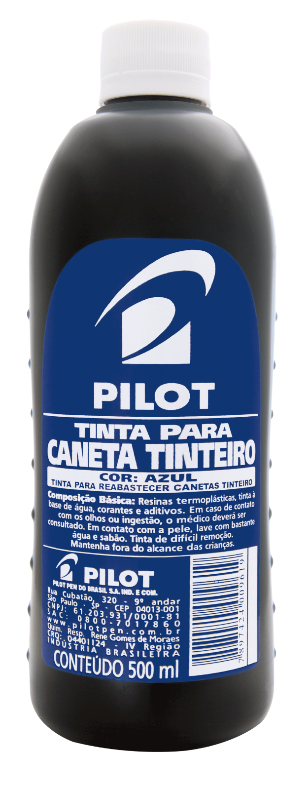
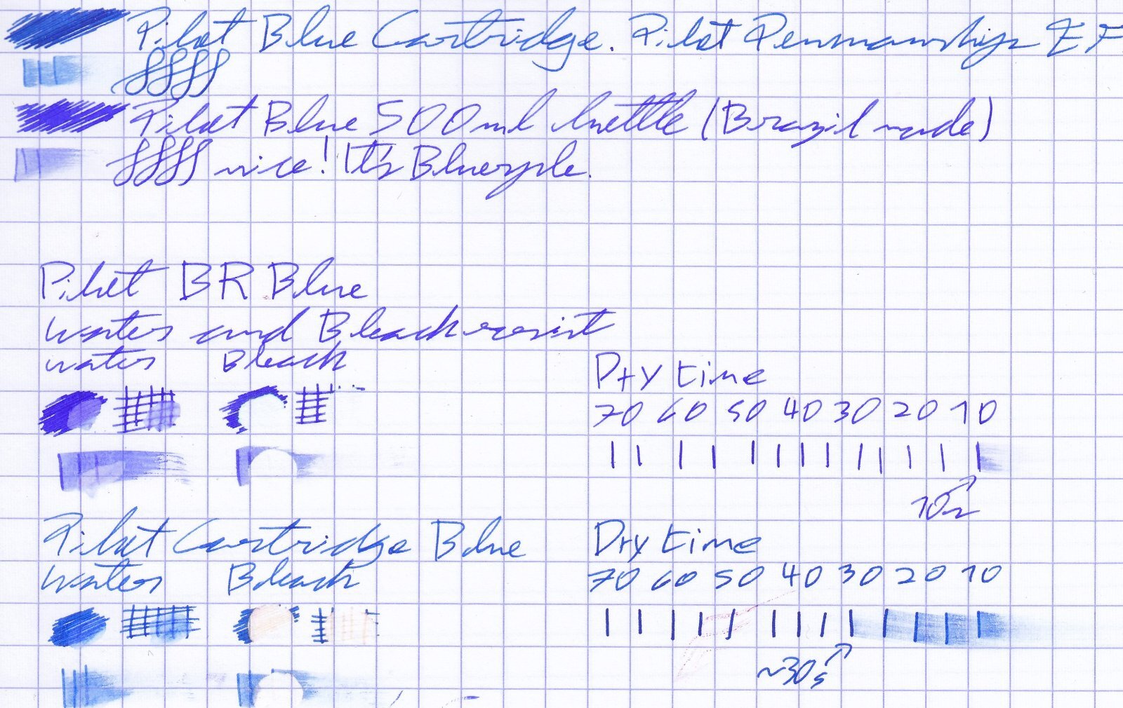
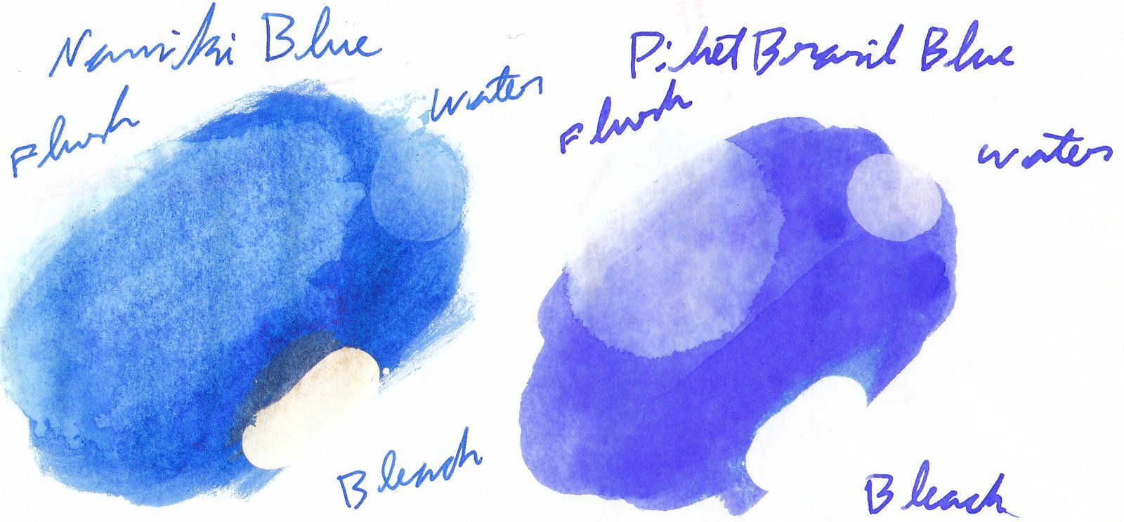
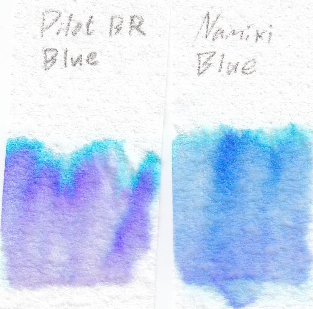
This is a comparison of two different Pilot inks, the Pilot Namiki Blue IC-100 cartridge, which came in together with one of my Pilot pens (I only have a single cartridge of it) and a Brazillian made 500ml bottle of Pilot blue ink, which I got assuming it would be the same Pilot Blue, but I got quite a different ink instead. To keep it short: It is a blurple ink, not as much of a true blue as the Pilot Namiki blue cartridge, but still looks blue when writing. It dries a bit faster, flows a bit wetter, is less resistant to water and bleach overall. No flow issues so far, I've got the Pilot Namiki blue catrdige on my pilot penmanship with an extra fine nib (also swapped in a F nib for comparisons), and the Pilot Brazil's blue in my kakuno with a fine. Here's some comparisons on Rhodia and Tomoe River paper respectively (They both do about the same on cheaper absorbent paper so I haven't scanned those). One question I have is if anyone recognizes if this ink is sold elsewhere, maybe a different product name? Here's the chromatographies for both.

-
Hello Fellow FPNers - I'm in love with J. Herbin Emerald of Chivor, not only for its gorgeous teal color but for its shimmering qualities, its saturated color and its wetness. Can anyone recommend another ink that has all these qualities but is a blue ink, rather than teal? Must be saturated, not milky or muted.
-
Hello my fellow fountain pen lovers. I love rich, vivid, deeply saturated fountain pen inks, particularly those that shade. My favorite inks are Colorverse Supernova, that shades gorgeously from a rich blue to a lighter blue, and Diamine November Rain, which in my green-and-black Pelikan M600, shades (you guessed it) from green to black beautifully. For my Lamy 2000, which I just bought to be my daily-use pocket pen, I’m searching for a waterproof ink for a specific reason: so when I sign restaurant checks with it, there is no danger of the waiter losing his tip because his check slip got wet and the ink disappeared. But my dillemma is that I love saturated, vivid inks. With one exception, all the waterproof inks I’ve tried are cloudy and unsaturated and unsatisfying. I just bought a bottle of Sailor Seiboku. To me, this is a pale, cloudy ink, the opposite of the rich, saturated colors I love. And iron gall inks are generally dry writers, so that’s a nonstarter. Got to have a wet ink. The exception is Noodler’s Baltimore Canyon Blue, which is saturated and beautiful, and in my own tests is fully waterproof, but… when I write on restaurant checks with this ink, the pen simply stops writing and has to be primed. The ink seems to react to the thermal paper restaurants use and it clogs right up. Thanks in advance for your advice! GNL
-
Hello FPNers, I’m a huge fan of shading inks but dislike sheening inks. In the blue-teal-green spectrum (and nowhere else), can you recommend high shading inks that have no sheen? My current champion blue is Colorverse Supernova and my current champion green is Diamine November Rain. But there have to be more! Again, only in the blue-teal-green spectrum. Thanks! Gary
-
Why some of us have to use a paint dropcloth instead of blotting paper
Audrey T posted a topic in Inky Thoughts
-
This is a review of my new custom color from Noodlers. Some of you may have seen my previous color Omaha Brown. Every custom fountain pen I build comes with a bottle of ink. Previously I had been sending out Omaha Brown and then I ran out. I went to the fine people at Noodlers and requested another color. My only stipulation this time was that it would be a bright Turquoisey Blue. (Okay, that is a really specific only stipulation I know) Anywho, they agreed and we went back and forth on the details. The end result is what you see in the review below. It turned out that Nathan just combined together many of the properties of Noodlers Navajo Turquoise with Noodlers Blue and came up with what you see here. The ink is waterproof and does behave pretty well. The only time I have gotten any feathering at all is on Moleskine paper.... which almost everything feathers on. It doesn't bleedthrough and didn't showthrough on any of the papers I've tested it on. It does have some shading depending on what paper you use. I had the most on Rhodia using a pretty flexible Pilot Custom Heritage 92 nib. I could go on, but I am obviously biased . I would love to hear what everyone thinks of the ink. There are 2 ways to get it. You can have a pen made or you can click on the link below and find it at my website. Thanks for looking.
-
Diamine Teal vs. De Atramentis Pigeon Blue Both these inks are inspired by colour found on birds For the people who have no knowledge of birds. The Bird on the Right is a Parakeet which modelled for Diamine and the bird on the right is a bald eagle which inspired De Atramentis Colour Comparison Just as these birds and their colour are different both inks and birds also have some familiarities The De Atramentis ins seems to be a bit bright like the colour on the Pigeon. The Teal to my eyes is darker Ink Behaviour Both inks are very smooth writers ad well saturated. Neither of these ink feater bleed or show through. Although there is no sheening in neither of these inks they do shade The Pigeon blue seems a little bit better but the diference is neglectible Both inks seem to hold their liquor I smeared both inks with wet fingers but both texts stay legible Availability La Couronne du Comte I guess Dennis and Rik would even travel to the moon to get it for you (just pay them a million or 2) Well it is safe to say that they do almost everything to satisfy their customers… Considering http://www.lacouronneducomte Bankers have Rothshield Ink lovers have the Goulet Pen Company. Rachel and Brian carry the almost* largest assortment of ink on earth an it's near surroundings http://www.gouletpens.com (*almost Dear Amberlea Davis carries the largest assortment in the universe but is not a seller Larry Post of Australia is a Great Supplier of Stationary and Artist Equipments. They carry a lot of De Atramentis Inks http://www.larrypost.com.au/ The same applies to Singapore based Arters of the utterly friendly Yitpeng and WeetekOng http://arters.com.sg Conclusion Both inks have well saturated beautiful blue greenish colours and both behave very well, they are a joy to write with. I cannot pick a favourite…. But I do not have to… I Own Both
-
Diamine Majestic Blue Vs De Atramentis Steel Blue - An Ink Comparison For A Somewhat Peculiar Reason
Morbus Curiositas posted a topic in Ink Comparisons
Diamine Majestic Blue vs De Atramentis Steel Blue An Ink comparison for a somewhat peculiar reason Notice Diamine and De Atramentis use similar lids There is of course nothing so special about comparing two inks especially then they are both blue inks. What is peculiar though that they are both very talented at smudging and staining. But I will come back to this later first have a look at the colours. I will enter in the links to the more extensive reviews of both inks at the end of this review Handwritten text comparison Let me "throw up" another comparison Q-Tipp comparison Sheeny Shiny happy Inks yeah How great both inks sheen The De Atramentis Ink sheen very well but is topped by Sheen Master Majestic Blue Judge Smudge Down here is the reason that gave me the idea for this comparison Both inks smear even after days of drying time. Just a drop of spit on the finger tip can cause this smudging It seems to be quite normal though, some inks tend to smudge alittle more, they are no IG or document inks after all In this comparisonThe Diamine seems to be the most talented when it cooms to smudging smudging. I once had Dr. J of De Atramentis test the Diamine Majestic Blue. Dr J Lsaid that the ink was perfetly well... He liked it a lot! Availability La Couronne du Comte I guess Dennis and Rik would even travel to the moon to get it for you (just pay them a million or 2) Well it is safe to say that they do almost everything to satisfy their customers… Considering http://www.lacouronneducomte Bankers have Rothshield Ink lovers have the Goulet Pen Company. Rachel and Brian carry the almost* largest assortment of ink on earth an it's near surroundings http://www.gouletpens.com (*almost Dear Amberlea Davis carries the largest assortment in the universe but is not a seller Larry Post of Australia is a Great Supplier of Stationary and Artist Equipments. They carry a lot of De Atramentis Inks http://www.larrypost.com.au/ The same applies to Singapore based Arters of the utterly friendly Yitpeng and WeetekOng http://arters.com.sg Conclusion I really do like both inks. They both are lovely blues. Normally I am not so fond of blue inks because they are so standard that i believe that they are mor sommething for boring biro writers these inksmade me change my mind and I now use blue inks quite often The Diamine is the better sheener therefore the De Atramentis seems to " hold his liquor" better https://www.fountainpennetwork.com/forum/topic/352616-diamine-majestic-blue/ https://www.fountainpennetwork.com/forum/topic/352615-de-atramentis-steel-blue/ -
Diamine Majestic Blue After reading so much nice reviews in Diamine inks I had to buy 2 bottles of their inks when I was at La Couronne du Comte. I bought the lovely teal a blue/green ink which reminded me a bit of De Aramentis Pigeon blue and this Diamine Majestic Blue. I can say one thing in advance: I love these inks. To start with I love the shape of the bottle which for me is a mixture of classy and classical Btw did you know that Diamine uses almost the same lids on their bottles as De Atramentis does. Anf there is one other thing it has in common with De Atramentis Steel blue ink… It keeps smudging but more to that later. Anyway I will post another review where I will compare these 2 Inks… Well now let’s go to business Diamine Majestic Blue points 1-5 1 = 5= Fountain Pens: Diplomat Excellence A medium Nib / Online Best Writer 1.8 Italic Nib Paper: Waldmühle Reflex Premium Drying time: fast points 3 Flow: very smooth points: 5 Lubrication: smooth in both pens points: 5 Bleeding: absent) Points 5 Shading: medium points: 3 Scheening: High points 4 Waterproof: Keeps staining with water points: 2 Package: Nice bottle points: 4 Diamine Majestic Blue is a very well behaving ink. It is smooth it is saturated and it Sheeeens!!! One thing is that itkeeps staining even after days of drying time with the smallest amount of water The Smudge test When I first wrote with this ink, I immediately loved the Colour, but I got somewhat disturbed by the smudging. It even smudges strongly after drying with jus a bit of spit on my fingertip. I showed this to Dr J of De Atramentis when I visited him at home when I drove from Austria to Holland. He tested the ink and told me the ink was perfectly well and lovely. According to Dr J some Ink (colours) tend to smudge more than others. And of course I have to say that most inks smudge a little as long as they are non-document inks… this one is just a little bit more talented at smudging 😉 Ink Comparison Availability La Couronne du Comte I guess Dennis and Rik would even travel to the moon to get it for you (just pay them a million or 2) Well it is safe to say that they do almost everything to satisfy their customers… Considering http://www.lacouronneducomte Bankers have Rothshield Ink lovers have the Goulet Pen Company. Rachel and Brian carry the almost* largest assortment of ink on earth an it's near surroundings http://www.gouletpens.com (*almost Dear Amberlea Davis carries the largest assortment in the universe but is not a seller Larry Post of Australia is a Great Supplier of Stationary and Artist Equipments. They carry a lot of De Atramentis Inks http://www.larrypost.com.au/ The same applies to Singapore based Arters of the utterly friendly Yitpeng and WeetekOng http://arters.com.sg Conclusion This one of my first bottles of Diamine Ink and it was a most pleasant experience. The smudging is a thing I am not really fond of, but I can live with it… Just be careful with fluids! Therefore I really love the colour and that awesome sheeeeeeeeennnn 😊 I want more Diamine
-
De Atramentis Steel Blue I first started using this ink when De J sent me a Diplomat Aero Fountain Pen in Blue as a thank you for the great ink comparison of all De Atramentis inks I made. Somehow I find this Steel Blue ink quite well fitting to the Blue of the Fountain Pen Before I start I hereby mention that that I will compare this ink with Diamine Majestic blue soon. The reason for this is somewhat peculiar, both inks smear strongly when a drop of water is spilled on it, even after a long period of drying. But no worries both inks are very beautiful. So I will not only post a comparison of both inks, I will also write a review of that lovely Diamine Majestic Blue ink De Atramentis Steel Blue Ink As with most De Atramentis ink it is a smooth writer. The ink flows nicely and does not feather (I said most because sometimes there are badges of some De Atramentis inks that do) Again as with most De Atramentis Inks it dries very quickly…With less than 2 seconds the Steel Blue is an ultra-fast drying ink which should be perfect for left-hand writers points 1-5 1 = 5= Fountain Pens: Diplomat Excellence A medium Nib / Online Best Writer 1.8 Italic Nib Paper: Waldmühle Reflex Premium Drying time: ULTRA fast points 5 Flow: very smooth points: 5 Lubrication: smooth in both pens points: 5 Bleeding: absent) Points 5 Shading: medium points: 3 Waterproof: Keeps staining with water points: 3 Package: Nice bottle points: 4 Text Sample Fluid smooth writing well saturated and… Funnily it is a medium shader but it is a nice sheener to 😊 Sheeny confusion OOPS I am a pillock The ink stain in the middel is of course De Atramentis STEEL BLUE, the Diamine Majstiv blue is in the upper right corner... Mommie it sheeeeens! In Vomitus Veritas Ink Comparison Availability La Couronne du Comte I guess Dennis and Rik would even travel to the moon to get it for you (just pay them a million or 2) Well it is safe to say that they do almost everything to satisfy their customers… Considering http://www.lacouronneducomte Bankers have Rothshield Ink lovers have the Goulet Pen Company. Rachel and Brian carry the almost* largest assortment of ink on earth an it's near surroundings http://www.gouletpens.com (*almost Dear Amberlea Davis carries the largest assortment in the universe but is not a seller Larry Post of Australia is a Great Supplier of Stationary and Artist Equipments. They carry a lot of De Atramentis Inks http://www.larrypost.com.au/ The same applies to Singapore based Arters of the utterly friendly Yitpeng and WeetekOng http://arters.com.sg Conclusion I much like this ink. It is a blue that makes me want to use Blue inks more. I always thought that blue inks were boring and more biro writers but this medium dark blue made me enthusiastic with it’s shading sheening and nice saturation Together with the Blue Diplomat Aero Fountain Pen it makes a perfect marriage
-
Colorverse inks seem to have just shown up to the scene. They are from South Korea and are a little pricey, but my experience so far is very good. The colors are very vibrant and seem to be pretty well behaved so far. What follows is my ink review of Colorverse Quasar, which is one of my favorite colors.... burple. I absolutely LOVE burples of all shapes and sizes. I hope you enjoy the review. I'd love to hear what everyone thinks.
-
-
Hi, I recently went on a hunt to find the best turquoise-blue ink I could find and I landed on this ink by Krishna pens. This ink is a part of their super-saturated series and the color is a super nice azure. Here's the full review: Color: The color is a super vibrant turquoise without any green undertones. this ink is a true blue. the color is somewhat similar to Robert Oster Fire and Ice and Noodler's turquoise. Drying time: THe flow of this ink is very wet. I used a medium nib and it took about 35-40 seconds before it became completely dry. the pen I used was relatively dry flowing, so if you were to use it on a wet BB nib or a flex nib, the dry time could be higher. Drip test: The ink is not advertised as being water resistant, and it is not. most of the ink washes away with water, but the writing, for the most part, remains legible. so I would say that it is moderately water resistant. Shading: This is where it shines. The ink shades like crazy! Even on regular paper, the shading is very prominent. I don't know if this is a trend with turquoise inks, but this has to be in my list of top 10 shading inks. Saturation: The ink is a part of the super-saturated series. the saturation is very good, especially since the ink flows very wet. Ease of cleaning: Since the ink is saturated, it does tend to be a little cumbersome to clean, but nothing too difficult. I would rate the easiness to be moderate. Conclusion: The ink is super vibrant and shades really well, plus the color is a delightful shade of turquoise. My only complaint would be the tiny 20ml bottle the ink comes in. The retail price for this ink is Rs. 180, or about 3 dollars US for a 20ml bottle. It's definitely one of the best turquoise inks I've tried. materials I used: Krishna Cool Breeze ink Lamy VIsta Medium nib Tomoe RIver 68gsm A4 printer paper 75gsm
-
Noodler's Polar Blue A Newbie's Perspective In my last review I mentioned that my favorite color is Green. If I had to choose a second favorite color, I would choose blue. I like this blue, yet, I wish it had shading. I really like inks that have nice shading properties. Anyways...
-
Today I'm reviewing Diamine Majestic Blue A medium to dark blue ink from the standard range, Diamine Majestic Blue seems to be discussed more frequently than most other Diamine inks. Many love it's strong blue colour and red sheen, while some report problems like it stains hands and pens. I must admit I haven't written with it for ages and am guilty of letting my half full, old style 80ml bottle, sit around, unused, in a box. I took it out and examined it carefully. First I tipped it upside down and can report there was no sign of any sludge in the bottom of the bottle. Then I turned it up and removed the cap. No signs of any sludge there either. I filled my Lamy Al-star converter with it. Then left it on my table for a few days. When I went back to the pen, it started writing straight away. No hard start. It didn't skip once, nor did it blob anywhere. It was neither particularly wet nor dry, and it felt smooth and lubricated on my Xerox smooth Colour/Mono laser 100gsm paper. It's very attractive red sheen was really obvious, as was it's saturated blue colour. Don’t have any concerns about not being able to get Parker Penman Sapphire ink. Diamine Majestic Blue is just as good! I will take a photo to show the red sheen, and will report back on whether or not the converter is stained when the pen is emptied. Flow Rate: Good. Neither particularly wet nor dry in the pen & paper combinations I used.Lubrication: Good with all 3 Lamy nibs I used.Nib Dry-out: Not noticed.Start-up: Immediate.Saturation: Very saturated.Shading Potential: Some seen.Sheen: Red sheen noticeable.Show-Through:Clairefontaine Crokbook Paper.Hobonichi Techo paper.Oxford paper.Midori paper.Field Notes.Cheaper generic 80 & 90gsm printer papers & lined pads.Spread / Feathering / Woolly Line: Not seen even on Field Notes.Nib Creep / “Crud”: Not seen, even after over 1 week in the penStaining (pen): Not seen after several days - easy clean-upStaining (hands): Two washes with bar soap. More required with liquid soap.Clogging: Not seen. Seems unlikely.Water resistance: Not sold as waterproof, but shows a little water resistance.Availability: Available from Diamine Inks web-site and many other outlets.
-
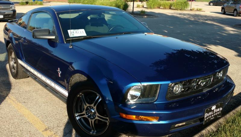
Hi, I'm pretty new to fountain pens and ink in general and I was hoping to find an ink that matches the color of my 2007 Mustang. The color name is listed as "Vista Blue" but every Google search I run that includes the words Vista and Fountain Pen just pulls up articles related to the Lamy Vista pen. I'd really appreciate any help finding a good color match for this. I've attached a picture of the car for reference
-
Onwards with my Nemosine reviews! Neptune is the farthest known planet in our solar system, with an orbital period of over 160 years. Invisible to the naked eye, it was the only planet found by mathematical prediction and first observed in 1846 Neptune blue is more of a pastel blue, quite similar to the color of neptune itself. The pictures are a bit more violet than they should be due to my slightly yellow desk lamp. The color is not bright and vivid, but it's well saturated and has some lovely mild red sheen. It's extremely well behaved on bad paper, with mild-medium water resistance, I'd call the color quite similar to noodler's polar blue with its slate color, though this has some moderate, nice shading, along with the sheen, this is an excellent everyday ink. flow is wet and smooth. Absolutely a must-have ink, particularly for $8 a bottle. Very well behaved, everyday color that has some mild red sheen when you're using it on the good stuff, quick dry times (sorry no test in here, it's about 10-15 seconds on rhodia) and overall just ticks a lot of boxes without being eye-searing. A nice slate/dusky blue indeed, and another winner. Every Nemosine Ink I've tried so far has been fantastic in color and performance. I couldn't think of any particularly good quotes related to neptune, so I just went with one from oscar winning comedian Steven Wright. The box it comes in is simple - Raised "NEMOSINE" one one side. Another has a small sticker with the color and the location of ink manufacture, Slovenia. It does bother me slightly that the stickers on most of these bottles are not adhered with much care. The bottles are fantastic. Heavy, sturdy glass with a wide mouth, quality cap with an inner liner that stays adhered and doesn't pop loose like sailor. Easy to fill from, pelikan and J. Herbin could learn from Nemosine. I like that the bottles are both understated yet classy, and love that the bottles have the geographical coordinates of where they were bottled ( Pittsburgh, PA) Beautiful, saturated blue awaits. Slightly more purple in this image than it should be, it looks almost royal blue here, but I assure you, it's a very true blue. modest shading, but it's there in an EF nib. A moderate amount of the ink comes up, but remains quite legible. You can see the outline of the red sheen on the glass pen (which is not the wettest glass pen I've seen, it's actually just like a regular, juicy M) More shading. Some sheen is visible, but it's mild. The cap of the L on Lamy with a 1.1 stub shows a lot of sheen. Definitely still legible if wet. Glass nib garbage paper test (this is actually kind of a hard test, the glass pen can lay down some very wet lines) As you can see, this stuff don't feather! Close enough to zero showthrough that I'd say any paper of any better quality would be a zero.
-
Aurora inks come in three basic colors: blue, blue black and black. The bottle holds 45 ml of ink. Inks can be also bought in cartridges. Aurora Blue is one of most recommended blue inks. I can see why as it's a problem free, low-maintenance ink. The thing is I find it mind-numbingly boring. So, even though it's a good ink, I don't use it. On the other hand if you enjoy such colors, Aurora Blue won't disappoint. It behaves well on most papers and offers excellent flow and wetness. It's slightly better than Pelikan 4001 Blue but also 4 times more expensive (in Poland) - forced to use Royal Blue I would pick Pelikan or Waterman Florida Blue or, even better, J.Herbin Eclat de Saphire. Ink Splash Drops of ink on kitchen towel Color ID Color range Discovery 70 mgsm copy paper, Aurora Ipsilon, factory stub (The quote comes from Josiah Bancroft's excellent book Senlin Ascends. Highly recommended) Leuchtturm1917, Aurora Ipsilon, factory stub Water resistance
-
Hello! as I'm writing this, I need help for cleaning ink of my hands. and the ink is a Pilot iroshizuku Asa-gao ink. i like the blue-ish color on paper but not on my hands or all over my desk. it has been tough to remove it from my hands and I tried the following: Clorox: Not quiet efficient: 3/10 + bad odor Laca thinner: not recommended. efficiency: 3/10 + sting badly and hurts and let you skin dry. Ethyl alcohol: still lots of rubbing and not so efficient: 3/10 Isopropyl alcohol: good ol' rubbing alcohol. but still rubbing needed: 4/10 Water: what do you expect? 0/10. note: at first remove the easy part but still don't do anything after 2 seconds. Water + soap: I don't have millenniums for this: 1/10 Shampoo: really? this just simply don't work: 1/10 Nail polish remover(Not pure acetone + A ton of other eter and alcohol families and perfume chemicals): this is the best i found so far but still, lots of rubbing on skin and I want something that works: 5/10 Baking soda (NaHCO₃ or bicarbonate of soda) + some water and trying to remain more pure as possible: 4.5/10. safest chemical to work with so far. just letting it sink into the solution and. seems to work to a point, but still some blue-ish remains. Milk: To Be Expected. Gasoline: To Be Expected. Borax: To Be Expected. And during the apply of these possibles "solvents" I found that this ink got oily when trying to clean it from clorox and thinner. I suspect that this ink is iron - gallotannic based ink. because one thing that let me thinking is when this ink I let it on my pilot metro for a long time and it got a black-ish blue. and then when recently refill it, it got the lovely blue that I like. So any suggestion to find the perfect solvent of this? keep in mind it had passed 24Hrs since I tried this possibles solvents. so is more difficult to remove it. My priority is my hands first, then the desk.
-
There is some water-resistance, if you get to it fast enough, but long-term, it doesn't hold up. Rhodia Writing Samples Tomoe River Writing Samples Clairefontaine Triomphe Writing Samples Original Crown Mill Laid Paper Writing Samples
-
Monteverde's revamped line of inks recently got my attention for their comprehensive lineup of clear, distinct hues, as well as good value. A 90ml bottle can be had for about $13-$15 USD from the better known online retailers in the United States, making it a very good deal. Monteverde touts their "ITF Technology". From Monteverde's promotional material, here's how it claims to benefit us writers: At my recent visit to the 2017 LA Pen Show, Monteverde gave a free bottle of Malibu Blue ink to all show attendees. A company representative had all their inks available for sampling with swabs, as well as show discounts. I brought home four bottles of Monteverde ink, and post-show I've purchased a few more online:Malibu BlueCapri BlueHorizon BlueSapphire BlueMonteverde also offers two blues I am missing: Caribbean Blue (turquoise), and a Blue-Black. I am posting individual reviews for each of the four Monteverde inks I have. I filled a variety of pens with these four inks, with nibs ranging from fine to double-broad stubs. Here's a snapshot from my Bullet Journal Ink Log, showing the pen/ink assignments and a writing sample from each. Monteverde Sapphire Blue This one is my hands-down favorite of the Monteverde inks I have tested. If I could have only one of these four inks, it would be Sapphire for sure. Clairefontaine paper sample. Color/Saturation Sapphire Blue is a rich, dark ultramarine blue. It reminds me of Levenger Cobalt Blue but without Cobalt's issues (very long dry time, smearing even after dry). I compared my writing sample of Monteverde Sapphire to Levenger Cobalt, and they're very close. Cobalt has a touch more purple. Otherwise they're dead ringers in terms of vibrancy and saturation. Shading/Sheening Shading is light to moderate on this Tomoe River sample. A little bit of a reddish-purple sheen appears in the wide lettering. Flow This ink flows beautifully from both my Pilot 78G BB Italic, and from the Lamy Safari. It is the best of the blues in this comparison. Lubrication Lubrication is also great with this ink, and is the best of the Monteverde inks I have tried so far. Like the other Monteverde inks, this one has a slight stiction feel with my Lamy Safari pen. Dry Time Dry time for this ink is very quick, under 15 seconds on Clairefontaine paper with the Lamy Safari. I should give this ink a try for note-taking. Feathering Sapphire Blue performs well in the feathering test on cheap office paper. Bleedthrough There is a medium amount of bleedthrough on the other side of the page on the cheap office paper. Water Resistance Sapphire Blue is not a water-resistant ink in the 10 second immersion test. Before After Comparison to Other Inks Here is a comparison with other ultra-marine type inks and related blues. Click on it for an enlargement.
-
Monteverde's revamped line of inks recently got my attention for their comprehensive lineup of clear, distinct hues, as well as good value. A 90ml bottle can be had for about $13-$15 USD from the better known online retailers in the United States, making it a very good deal. Monteverde touts their "ITF Technology". From Monteverde's promotional material, here's how it claims to benefit us writers: At my recent visit to the 2017 LA Pen Show, Monteverde gave a free bottle of Malibu Blue ink to all show attendees. A company representative had all their inks available for sampling with swabs, as well as show discounts. I brought home four bottles of Monteverde ink, and post-show I've purchased a few more online:Malibu BlueCapri BlueHorizon BlueSapphire BlueMonteverde also offers two blues I am missing: Caribbean Blue (turquoise), and a Blue-Black. I am posting individual reviews for each of the four Monteverde inks I have. I filled a variety of pens with these four inks, with nibs ranging from fine to double-broad stubs. Here's a snapshot from my Bullet Journal Ink Log, showing the pen/ink assignments and a writing sample from each. Monteverde Horizon Blue This is Monteverde's Parker Penman Sapphire workalike. It is similar to Diamine Blue Velvet and Visconti Blue. Here is how it appears on Clairefontaine paper. Color/Saturation Horizon Blue is a deeply saturated, "pure" blue. It doesn't lean to purple or green. Shading/Sheening Horizon Blue has a light amount of shading on Tomoe River. A little bit of red sheening can be seen in the Tomoe River sample. Flow Horizon Blue is a well-behaved ink. I had no skips or hard starts on the initial flow. Horizon Blue came in second place for flow amongst the four inks tested. In my Sheaffer Prelude with M nib (a wet pen), it comes out wet but not too wet. Lubrication Like the other Monteverde inks, Horizon Blue has good lubrication, but has some stiction at the start/stop of a pen stroke. In my Clairefontaine bullet journal, my Sheaffer Prelude squeaks as I write! Dry Time Dry time is moderate, between 25 and 30 seconds on Clairefontaine paper from the Prelude. Feathering Horizon Blue performs well in the feathering test on cheap office paper. Bleedthrough There is a medium amount of bleedthrough on the other side of the page on the cheap office paper. Water Resistance Horizon Blue probably performed best of the four Monteverde inks, but still it is not a water-resistant ink in the 10 second immersion test. Before After Comparison with Other Inks Here is a tile comparing Horizon Blue with other medium blue inks. NB: The Parker Penman Sapphire is from a diluted sample and so isn't quite true in terms of saturation.
-
Monteverde's revamped line of inks recently got my attention for their comprehensive lineup of clear, distinct hues, as well as good value. A 90ml bottle can be had for about $13-$15 USD from the better known online retailers in the United States, making it a very good deal. Monteverde touts their "ITF Technology". From Monteverde's promotional material, here's how it claims to benefit us writers: At my recent visit to the 2017 LA Pen Show, Monteverde gave a free bottle of Malibu Blue ink to all show attendees. A company representative had all their inks available for sampling with swabs, as well as show discounts. I brought home four bottles of Monteverde ink, and post-show I've purchased a few more online:Malibu BlueCapri BlueHorizon BlueSapphire BlueMonteverde also offers two blues I am missing: Caribbean Blue (turquoise), and a Blue-Black. I am posting individual reviews for each of the four Monteverde inks I have. I filled a variety of pens with these four inks, with nibs ranging from fine to double-broad stubs. Here's a snapshot from my Bullet Journal Ink Log, showing the pen/ink assignments and a writing sample from each. Monteverde Capri Blue Capri Blue is a "fun" ink, the least formal of the four Monteverde blues I have tried. Here it is on Clairefontaine paper. Color/Saturation Capri Blue is a bright shade of blue that starts to veer towards turquoise, but I stop short of calling it a turquoise. To me, it is still a blue. Shading/Sheening Capri Blue does shade nicely on both Clairefontaine and Tomoe River paper, with the Pilot's broad stub nib as well as the Safari's fine nib. On the Tomoe River paper, some red sheening appears with this ink. Flow This ink does not flow as freely as some of the other Monteverde inks. With my Pilot 78G BB Italic pen, Capri Blue left the pen dry immediately after filling from the bottle! The pen wouldn't start, and even after priming the nib it wrote dry for an entire page. The 78G pen was brand new when I filled it (I pre-flushed the pen before filling), so this might be a cause. The hard start problem has not repeated itself since. I have checked back with this particular pen every few days to see if the problem reappeared. Still, this ink writes somewhat dry in my Pilot 78G BB Italic pens. My Lamy Safari has medium flow with Capri Blue. Lubrication Lubrication is also fairly good with this ink in the Safari. Dry Time Dry time is moderate, between 25 and 30 seconds on Clairefontaine paper from the Safari. Feathering Capri Blue performs well and feathers minimally on the cheap office pad paper used in this test. Bleedthrough Bleedthrough/showthrough is moderate with the the cheap office pad paper. Water Resistance Capri Blue is not a water-resistant ink in the 10 second immersion test. Before After Comparison with Other Inks Here's a comparison tile with several turquoise and light blue inks. NB: The tile labeled "Sheaffer Turquoise" is actually the discontinued Sheaffer Peacock Blue ink.
-
Monteverde's revamped line of inks recently got my attention for their comprehensive lineup of clear, distinct hues, as well as good value. A 90ml bottle can be had for about $13-$15 USD from the better known online retailers in the United States, making it a very good deal. Monteverde touts their "ITF Technology". From Monteverde's promotional material, here's how it claims to benefit us writers: At my recent visit to the 2017 LA Pen Show, Monteverde gave a free bottle of Malibu Blue ink to all show attendees. A company representative had all their inks available for sampling with swabs, as well as show discounts. I brought home four bottles of Monteverde ink, and post-show I've purchased a few more online.Malibu BlueCapri BlueHorizon BlueSapphire BlueMonteverde also offers two blues I am missing: Caribbean Blue (turquoise), and a Blue-Black. I am posting individual reviews for each of the four Monteverde inks I have. I filled a variety of pens with these four inks, with nibs ranging from fine to double-broad stubs. Here's a snapshot from my Bullet Journal Ink Log, showing the pen/ink assignments and a writing sample from each. Monteverde Malibu Blue This is a "washable" blue ink, that is very much like the standard blue ink you see from most pen manufacturers. Monteverde sells an ink eradicator that can "erase" this ink. Monteverde gave away sample ink eradicators at the show, but I haven't tried mine yet. Clairefontaine paper sample. Color/Saturation Monteverde Malibu Blue is a light blurple, or "blue-purple" ink. This ink goes down deep and dark, and lightens considerably as it dries. The scan here is the dried writing on Clairefontaine paper. Shading/Sheening Malibu Blue has a light amount of shading on Tomoe River paper. I didn't notice any sheening. Flow This ink ranked third amongst the inks tested for flow and wetness. Loaded in my Cross ATX, wtih a super-wet, medium nib, it puts down a slightly wet line. Lubrication Malibu Blue is noticeably more lubricated than the average ink that I put into my cross ATX. Lubrication is good. This ink has some "stiction" to it - there's a little bit of resistance at the beginning and end of every pen stroke, though mid-stroke the nib feels lubricated. I've only noticed this with Monteverde inks, and it's common to them. In this review, I've noticed it with Malibu, Horizon, and Sapphire Blue. Dry Time Dry times with this ink were moderate, about 30 seconds, on Clairefontaine paper. Feathering Malibu Blue performed medium-well in the feathering test on cheap office pad paper. Some feathering is noticeable but isn't too objectionable. Bleedthrough Malibu Blue has light bleedthrough on cheap office pad paper. Water Resistance Malibu Blue is not a water-resistant ink in the 10 second water immersion test. Before After Clairefontaine paper sample.