Search the Community
Showing results for tags 'blue ink'.
-
Hello! as I'm writing this, I need help for cleaning ink of my hands. and the ink is a Pilot iroshizuku Asa-gao ink. i like the blue-ish color on paper but not on my hands or all over my desk. it has been tough to remove it from my hands and I tried the following: Clorox: Not quiet efficient: 3/10 + bad odor Laca thinner: not recommended. efficiency: 3/10 + sting badly and hurts and let you skin dry. Ethyl alcohol: still lots of rubbing and not so efficient: 3/10 Isopropyl alcohol: good ol' rubbing alcohol. but still rubbing needed: 4/10 Water: what do you expect? 0/10. note: at first remove the easy part but still don't do anything after 2 seconds. Water + soap: I don't have millenniums for this: 1/10 Shampoo: really? this just simply don't work: 1/10 Nail polish remover(Not pure acetone + A ton of other eter and alcohol families and perfume chemicals): this is the best i found so far but still, lots of rubbing on skin and I want something that works: 5/10 Baking soda (NaHCO₃ or bicarbonate of soda) + some water and trying to remain more pure as possible: 4.5/10. safest chemical to work with so far. just letting it sink into the solution and. seems to work to a point, but still some blue-ish remains. Milk: To Be Expected. Gasoline: To Be Expected. Borax: To Be Expected. And during the apply of these possibles "solvents" I found that this ink got oily when trying to clean it from clorox and thinner. I suspect that this ink is iron - gallotannic based ink. because one thing that let me thinking is when this ink I let it on my pilot metro for a long time and it got a black-ish blue. and then when recently refill it, it got the lovely blue that I like. So any suggestion to find the perfect solvent of this? keep in mind it had passed 24Hrs since I tried this possibles solvents. so is more difficult to remove it. My priority is my hands first, then the desk.
-
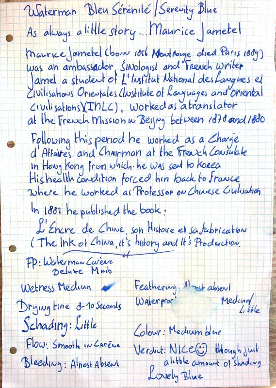
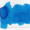
Waterman Bleu Sérénité / Waterman Serenity Blue Dear FPN friends, This time an ink review of another ink manufacturer, but... Still with a little touch of De Atramentis to it The ink in this review I received with my Waterman Carène DeLuxe Fountain Pen. Although it came in cartridges (quoting my Fountain Pen Hero SBRE Brown :" Real man use bottled ink" , and I believe real woman too) I really love the ink. It is just the type of vivid blue I love most. What about the touch of De Atramentis??? As always in my handwritten reviews I do a little story. As some of you might know I love De Atramentis inks and I am in frequent contact with the manufacturer, the utterly friendly Dr.Franz-Josef Jansen ( an advantage of being a polyglot) Dr Jansen kindly allowed me to translate the article on ink history on his website www.die-tintenmanufaktur.de I find these articles very interesting, and for sharing them with you, I will translate them for you . In his article "Ink history antiquity" I found the name of Maurice Jametel who wrote an illustrated book of ancient chinese ink called. "L'encre de Chine,son histoire et sa fabrication". I have retrieved the book from archive.org and I am now busy with translating the text into English, which may take a little while, since my French is a bit rusty (Have to work on that) and I am not native speaker of English... These translations will be published as soon as possible.... Vielen Dank Herr Dr. Jansen (thank you very much Dr Jansen)... Finally... On topic now... Let's start with the cons... Shading is very little and waterproof ?? er.. not really. My advice do not write in the shower . And now the happy ending... It is smooooth!!! and I find the blue very beautiful... Down here are the technical specs (as suggested by Ann Finley 2007) points 1-5 1 = 5= Fountain Pens: Waterman Carène DeLuxe,medium Nib Paper: Leonardo Ringbuch,average quality school note book made in Austria Drying time: Approx. 8-10 seconds with a medium nib / quite long with 1,5 Italic nib points 2 Flow: like a ballet dancer on speed points: 5 Wetness: certainly wet enough for a land animal points 3-4 Lubrication: very smooth points: 5 Bleeding: little points: 4 Shading: very little points: 2 Waterproof: just a tad 1 Package: Cartidges and bottles points: 4 (bottle is quite nice but the not very special, although the label is beautiful) Availabilty: Excellent points: EU 5 Quality: qualité superbe!!! fabriqué en (la douce) France points: 4 Simply a good ink with a colour I love for everyday work.. Hope the review was interesting enough for you.... Next time another ink review of , one of them will De Atramentis off course, but also a review of J. Herbin's 1670... une autre grand' encre de la Grande Nation. For those of you who are interested... I wlil publish the translations of Dr. Jansen's research on ink history and the book on chinese ink under "Inky thoughts" as soon as possible Kindest Regards Peter Vlutters

-
Following on from my thread announcing the launch of Diamine Shimmertastic inks I am happy to post my reviews of them. This one is Blue Pearl. This ink is medium bright blue with a great silver sheen My reviews show you my experiences with these inks in several of my pens. I’ve experimented by having these inks in my pens for weeks, and have intermittently written with them to see how they start, and how they write. I must say I’m pleasantly surprised. I’ve experienced no feathering with any of them, and they have all behaved really well for me. Diamine recommend that you gently agitate the bottle to mix the particles through the ink before filling your pen. They also recommend that you gently agitate your pen to mix the particles with the ink in your pen when starting a new writing session. I recommend good FP maintenance when using ink that contains particles. I suggest you clean your pens out a little more frequently than you might do with normal ink. These inks will come in 50ml glass bottles, and they have either gold or silver particles in them.
-
Aurora inks come in three basic colors: blue, blue black and black. The bottle holds 45 ml of ink. Inks can be also bought in cartridges. Aurora Blue is one of most recommended blue inks. I can see why as it's a problem free, low-maintenance ink. The thing is I find it mind-numbingly boring. So, even though it's a good ink, I don't use it. On the other hand if you enjoy such colors, Aurora Blue won't disappoint. It behaves well on most papers and offers excellent flow and wetness. It's slightly better than Pelikan 4001 Blue but also 4 times more expensive (in Poland) - forced to use Royal Blue I would pick Pelikan or Waterman Florida Blue or, even better, J.Herbin Eclat de Saphire. Ink Splash Drops of ink on kitchen towel Color ID Color range Discovery 70 mgsm copy paper, Aurora Ipsilon, factory stub (The quote comes from Josiah Bancroft's excellent book Senlin Ascends. Highly recommended) Leuchtturm1917, Aurora Ipsilon, factory stub Water resistance
-
Monteverde's revamped line of inks recently got my attention for their comprehensive lineup of clear, distinct hues, as well as good value. A 90ml bottle can be had for about $13-$15 USD from the better known online retailers in the United States, making it a very good deal. Monteverde touts their "ITF Technology". From Monteverde's promotional material, here's how it claims to benefit us writers: At my recent visit to the 2017 LA Pen Show, Monteverde gave a free bottle of Malibu Blue ink to all show attendees. A company representative had all their inks available for sampling with swabs, as well as show discounts. I brought home four bottles of Monteverde ink, and post-show I've purchased a few more online:Malibu BlueCapri BlueHorizon BlueSapphire BlueMonteverde also offers two blues I am missing: Caribbean Blue (turquoise), and a Blue-Black. I am posting individual reviews for each of the four Monteverde inks I have. I filled a variety of pens with these four inks, with nibs ranging from fine to double-broad stubs. Here's a snapshot from my Bullet Journal Ink Log, showing the pen/ink assignments and a writing sample from each. Monteverde Sapphire Blue This one is my hands-down favorite of the Monteverde inks I have tested. If I could have only one of these four inks, it would be Sapphire for sure. Clairefontaine paper sample. Color/Saturation Sapphire Blue is a rich, dark ultramarine blue. It reminds me of Levenger Cobalt Blue but without Cobalt's issues (very long dry time, smearing even after dry). I compared my writing sample of Monteverde Sapphire to Levenger Cobalt, and they're very close. Cobalt has a touch more purple. Otherwise they're dead ringers in terms of vibrancy and saturation. Shading/Sheening Shading is light to moderate on this Tomoe River sample. A little bit of a reddish-purple sheen appears in the wide lettering. Flow This ink flows beautifully from both my Pilot 78G BB Italic, and from the Lamy Safari. It is the best of the blues in this comparison. Lubrication Lubrication is also great with this ink, and is the best of the Monteverde inks I have tried so far. Like the other Monteverde inks, this one has a slight stiction feel with my Lamy Safari pen. Dry Time Dry time for this ink is very quick, under 15 seconds on Clairefontaine paper with the Lamy Safari. I should give this ink a try for note-taking. Feathering Sapphire Blue performs well in the feathering test on cheap office paper. Bleedthrough There is a medium amount of bleedthrough on the other side of the page on the cheap office paper. Water Resistance Sapphire Blue is not a water-resistant ink in the 10 second immersion test. Before After Comparison to Other Inks Here is a comparison with other ultra-marine type inks and related blues. Click on it for an enlargement.
-
There is some water-resistance, if you get to it fast enough, but long-term, it doesn't hold up. Rhodia Writing Samples Tomoe River Writing Samples Clairefontaine Triomphe Writing Samples Original Crown Mill Laid Paper Writing Samples
-
I have decided to review some of my inks. These aren't necessarily in any particular order. I wanted to review Twilight and Midnight consecutively to see their differences or similarities. This one is Diamine Midnight. I would call it a dark blue ink. It leans more towards the blue-red portion of the colour spectrum than Twilight and Prussian Blue. It's quite similar to Tchaikovsky although it seems to contain slightly less red, and is lighter than Regency Blue It's a well behaved, saturated ink with not much shading. I found it flowed smoothly across the page, and had no problems with lubrication in the Pilot Custom 74 M nib pen I used. This ink exhibits showthrough and a little bleedthrough on my thick paper, so I tried it on Rhodia dot pad paper. Showthrough and bleedthrough are both noticeable. The water test on the review form shows this isn't a waterproof ink. Bearing in mind the paper I use is very smooth, and the nib used at that time was a M, this ink took 16-18 secs to dry. It flows through the pen well and lubricates the nib well. I saw no skips or hard starts while I did swabs and comparisons with other inks. It is currently available in 80ml glass bottles, 30ml plastic refill bottles or cartridges. Diamine sell it directly to end-users on their web-site. It's a reasonable price
-
Monteverde's revamped line of inks recently got my attention for their comprehensive lineup of clear, distinct hues, as well as good value. A 90ml bottle can be had for about $13-$15 USD from the better known online retailers in the United States, making it a very good deal. Monteverde touts their "ITF Technology". From Monteverde's promotional material, here's how it claims to benefit us writers: At my recent visit to the 2017 LA Pen Show, Monteverde gave a free bottle of Malibu Blue ink to all show attendees. A company representative had all their inks available for sampling with swabs, as well as show discounts. I brought home four bottles of Monteverde ink, and post-show I've purchased a few more online:Malibu BlueCapri BlueHorizon BlueSapphire BlueMonteverde also offers two blues I am missing: Caribbean Blue (turquoise), and a Blue-Black. I am posting individual reviews for each of the four Monteverde inks I have. I filled a variety of pens with these four inks, with nibs ranging from fine to double-broad stubs. Here's a snapshot from my Bullet Journal Ink Log, showing the pen/ink assignments and a writing sample from each. Monteverde Capri Blue Capri Blue is a "fun" ink, the least formal of the four Monteverde blues I have tried. Here it is on Clairefontaine paper. Color/Saturation Capri Blue is a bright shade of blue that starts to veer towards turquoise, but I stop short of calling it a turquoise. To me, it is still a blue. Shading/Sheening Capri Blue does shade nicely on both Clairefontaine and Tomoe River paper, with the Pilot's broad stub nib as well as the Safari's fine nib. On the Tomoe River paper, some red sheening appears with this ink. Flow This ink does not flow as freely as some of the other Monteverde inks. With my Pilot 78G BB Italic pen, Capri Blue left the pen dry immediately after filling from the bottle! The pen wouldn't start, and even after priming the nib it wrote dry for an entire page. The 78G pen was brand new when I filled it (I pre-flushed the pen before filling), so this might be a cause. The hard start problem has not repeated itself since. I have checked back with this particular pen every few days to see if the problem reappeared. Still, this ink writes somewhat dry in my Pilot 78G BB Italic pens. My Lamy Safari has medium flow with Capri Blue. Lubrication Lubrication is also fairly good with this ink in the Safari. Dry Time Dry time is moderate, between 25 and 30 seconds on Clairefontaine paper from the Safari. Feathering Capri Blue performs well and feathers minimally on the cheap office pad paper used in this test. Bleedthrough Bleedthrough/showthrough is moderate with the the cheap office pad paper. Water Resistance Capri Blue is not a water-resistant ink in the 10 second immersion test. Before After Comparison with Other Inks Here's a comparison tile with several turquoise and light blue inks. NB: The tile labeled "Sheaffer Turquoise" is actually the discontinued Sheaffer Peacock Blue ink.
-
Monteverde's revamped line of inks recently got my attention for their comprehensive lineup of clear, distinct hues, as well as good value. A 90ml bottle can be had for about $13-$15 USD from the better known online retailers in the United States, making it a very good deal. Monteverde touts their "ITF Technology". From Monteverde's promotional material, here's how it claims to benefit us writers: At my recent visit to the 2017 LA Pen Show, Monteverde gave a free bottle of Malibu Blue ink to all show attendees. A company representative had all their inks available for sampling with swabs, as well as show discounts. I brought home four bottles of Monteverde ink, and post-show I've purchased a few more online.Malibu BlueCapri BlueHorizon BlueSapphire BlueMonteverde also offers two blues I am missing: Caribbean Blue (turquoise), and a Blue-Black. I am posting individual reviews for each of the four Monteverde inks I have. I filled a variety of pens with these four inks, with nibs ranging from fine to double-broad stubs. Here's a snapshot from my Bullet Journal Ink Log, showing the pen/ink assignments and a writing sample from each. Monteverde Malibu Blue This is a "washable" blue ink, that is very much like the standard blue ink you see from most pen manufacturers. Monteverde sells an ink eradicator that can "erase" this ink. Monteverde gave away sample ink eradicators at the show, but I haven't tried mine yet. Clairefontaine paper sample. Color/Saturation Monteverde Malibu Blue is a light blurple, or "blue-purple" ink. This ink goes down deep and dark, and lightens considerably as it dries. The scan here is the dried writing on Clairefontaine paper. Shading/Sheening Malibu Blue has a light amount of shading on Tomoe River paper. I didn't notice any sheening. Flow This ink ranked third amongst the inks tested for flow and wetness. Loaded in my Cross ATX, wtih a super-wet, medium nib, it puts down a slightly wet line. Lubrication Malibu Blue is noticeably more lubricated than the average ink that I put into my cross ATX. Lubrication is good. This ink has some "stiction" to it - there's a little bit of resistance at the beginning and end of every pen stroke, though mid-stroke the nib feels lubricated. I've only noticed this with Monteverde inks, and it's common to them. In this review, I've noticed it with Malibu, Horizon, and Sapphire Blue. Dry Time Dry times with this ink were moderate, about 30 seconds, on Clairefontaine paper. Feathering Malibu Blue performed medium-well in the feathering test on cheap office pad paper. Some feathering is noticeable but isn't too objectionable. Bleedthrough Malibu Blue has light bleedthrough on cheap office pad paper. Water Resistance Malibu Blue is not a water-resistant ink in the 10 second water immersion test. Before After Clairefontaine paper sample.
-
Does anyone know of blue inks other than Kobe Midnight that also have green sheen?
-
This is one of my all time favorite blue, and I always have several pens filled with it. I think I definitely love it more now than when I wrote the review, which was over a year ago. http://imagizer.imageshack.us/v2/xq90/673/CkHYfi.jpg I do have to note, of the three bottles I have, two of them are exactly the same, but the third has a major violet shift, which I feel is even out of Nathan's regular range of making every bottle unique. It's still an awesome ink, just more violet than the other two bottles.
-

Bril Ink - Royal Blue - Give-Away Ii (Only International)
mehandiratta posted a topic in Pay It Forward, Loaner Programs & Group Buys
Hi everybody... This is the second round of give-away for BRIL ROYAL BLUE I have 5 ink bottles (Plastic) - 25 ml filled with Bril Royal Blue. The review for the same is done here - LINK I am willing to give this to 5 people , only for International Friends as its locally easily available Kindly put in your names below and I will be choosing the people through random.org Below is the ink shot for your reference. Please check review for more depth. -
Ink Sampler and Review for Dr. Ph Martin’s Ocean Edge Blue fountain pen ink: Background: Dr. Ph. Martin's artist products are manufactured by Salis International, founded in 1934. Ben Salis, the founder's son, began to work for his family's business in 1936, at the age of 16. That year, in the height of the Great Depression, he was paid just $1 per week. Ben Salis was given the honorific title of "Dr. Martin" after he invented many graphics and color products, and obtained several design patents. Although he was not a real doctor, products with the trade name of "Doctor" earned instant respectability in the patent medicine era, so the name was applied to his inventions. Dr. Ph. Martin's products are among a handful of "doctor" products that remain on the market today. Ben Salis passed away in 1996, but his business and his legacy remain, and today his children continue to manufacture Dr. Ph. Martin's inks and color products. They are the third generation in a family tradition. (excerpt from http://www.dickblick.com/brands/dr-ph-martins). Dr. Ph. Martin’s new series of brilliant Fountain Pen Inks are pigment base inks. Originally designed for TWSBI #580 & #700 fountain pens, they can be used in similar fountain pens. Dr. Ph. Martin’s claims that these are the only pigment base fountain pen ink that is lightfast and archival. These highly saturated inks are intense in color. The colors currently available are: Ocean Edge Blue Garnet Red Rose Dark Matter Black They are AP approved Non-toxic. docmar9 kindly provided samples to test these inks, which is greatly appreciated. Materials Used: Papers used: Xerox 24lb Multi-Purpose paper purchased from Costco Tomoe River-like paper in Traveler’s Notebook refill 013 Staples Notepad paper Pens used: Jinhao 250x with medium nib Jinhao 450x with Goulet 1.1 stub nib Results: 1. Drop on paper towel. 2. Writing sample on Xerox 24lb Multi-Purpose paper using Jinhao 250x: The ink flowed nicely through the medium Jinhao nib onto the page, with little to no featherly, no bleedthrough or showthrough. The color is very saturated. It dried quickly (under 10 seconds) and did not smear, as would be expected on a relatively absorbent paper. My only complaint was that the ink also dried very quickly in the nib. It did not appear to leave any precipitate, however. 3. Writing sample on Tomoe River-like paper in Traveler’s Notebook refill 013 with Jinhao 450x: In this Jinhao 450x with Goulet 1.1 stub nib, the ink flowed very well with a nice lubricated feel. On this paper, the ink nicely accented the wider lines with nice shading and some red sheening. As expected, the ink took a great deal longer to dry - over 20 seconds to thoroughly dry without smearing. Overall, I was impressed with the color and the behavior of the ink. 4. Test for water resistance: I prepared a brief writing sample on Staples Notepad paper (an unfavorable paper for fountain pens). The ink wrote very smoothly on the paper, with very little feathering and surprisingly no bleedthrough and little showthrough. I then placed this small sheet of paper into a bowl of water and left it there for 2 hours. The ink remained on the page. There was little if any fading of the writing. After 2 hours, I removed the paper from the bowl of water, blotted it and let it air dry. I expected some of the ink to remain on the blotting towel. It did not. I then compared the dried sheet to similar writing on another sheet not subjected to water. The intensity of color was the same for both. This suggests that the ink is very close to water proof. In addition, I also poured alcohol on a writing sample and ammonia on another writing sample and let them sit for several minutes. In both cases, there was some smearing of the ink when wiped with a tissue. But, the majority of the ink remained. While I would not call this completely “bulletproof”, I would consider it clearly archival. I did not test for lightfastness, however. 5. Cleaning: Following my tests, I cleaned my pens using typical cleaning methods – cool, flowing water with a tiny amount of dishwashing soap. The nibs and converters were very difficult to clean. In spite of thorough cleaning, the converters are stained. In order to clean the nibs, I had to disassemble the nibs from the feeds to remove traces of the ink. This is far beyond my normal routine of simple rinsing nibs and converters, and thus is a disappointment (although not totally unexpected). Impressions: Bottle: The ink comes in very nicely weighted, stable, round glass bottle with an accompanying eyedropper. While the eyedropper would be convenient for many, it does not serve a useful purpose for me. I fill most of my converter type fountain pens using a separate syringe, but if I were filling a piston filler fountain pen or directly through the nib, the eyedropper might be a bit of a nuisance. Color: Edge Blue is a highly saturated medium blue with a slight lean towards turquoise. It is a pleasant color, shades nicely with a wet nib, and has a slight red sheen to it on my Tomoe River-like paper. I also used the ink on Clairfontaine writing paper, and the shading and sheen are clearly evident even with a medium nib. It is, however, an average color that is eclipsed by other similar colors such as DeAtramentis Steel Blue. The advantage of Edge Blue, however, is in its archival properties. Formulation: The ink is fairly dry in flow and needs a wet nib to show its true beauty. When I used the ink with a medium nib, once started, it flowed nicely. But the ink dried quickly in the nib despite being capped. Thus, the flow was difficult to get started at the beginning of each writing session. This was not the case in my wet stub nib. Overall: Let me preface my final comments with the fact that I generally do not use pigment inks. I have never really cared for the formulation, and by and large prefer less water resistant inks. In addition, I generally prefer inks that are less saturated in color. When I received the samples kindly provided by docmar9, I was initially not impressed. They appeared to be so saturated that they were opaque. But after testing the ink on towels and using a dip pen, I began to appreciate the color more. Then, after writing with the ink, I found it to be smooth and flowed nicely. I also appreciated that it does not feather or bleed through except with my stub nib on cheap paper. But I was most impressed with the resistance of this ink to water and other substances. Clearly, this ink has archival qualities. Perhaps the only criticism I have is that it is very difficult to clean from the nib and converters using normal methods. Otherwise, I find Edge Blue to be a very nice ink indeed. In conclusion, this is a highly saturated, archival quality ink that would be an excellent choice for someone who needs a “bulletproof” ink that shows limited feathering and bleed through even on cheap papers, but still maintains nice shading and sheen qualities on qualities papers.
-
I have stocked up lot of inks, especially inks like Chelpark, Camlin, Bril and Sulekha. All these are region specific like Chelpark is easily available in North India and Bril's availability is limited to Bangalore, Hyderabad and Chennai, and Sulekha only available in Kolkatta that too few colors against 11 colors listed on webpage and lastly Camlin is available pan India. The review is about the Bril Royal Blue Ink, which happens to be my first ink review. And before I go further I would really like to thank Visvamitra and Lgsoltek, whose ink reviews I personally like a lot and is the inspiration for the ink review. Bril inks are one of the most used and admired inks in India. Bril has been in existence since 1964 and are based out of Bangalore. Bril Royal Blue is one of the most used inks in India after Camlin Blue and it is priced at Rs. 15 (US $ 0.25) for 60 ml glass bottle. INK SPLASH Ink Splash on Bilt Matrix - 70 gsm Ink Splash on Century Copy Paper - 70 gsm Drop on Paper Napkin Color Match Writing Samples Bril Royal Blue – Writing Sample on Bilt Matrix (70 gsm) using 3 pens of varying nibs width Bril Royal Blue – Writing Sample on Camlin School Notebook using 3 pens of varying nibs width Bril Royal Blue – Writing Sample on Century Copy paper (70 gsm) using 3 pens of varying nibs width Ink Swabs Bril Royal Blue – Ink Swab Sample on Bilt Matrix (70 gsm) – 3 swabs, 2 swabs and 1 swab from Left to Right For further details and waterproof test, please visit my blog LINK
-
Can anyone recommend any saturated inks with good flow? I know mostly inks are either saturated and quite viscous, or very well flowing and much more wishy washy. I'm looking for saturated inks which also have good flow and and relatively easy to clean/ not damaging to fountain pens. The only one that comes close to me is Iroshizuku Take- Sumi, but I'm sure there must be an even darker black ink, which is still well behaved. Any recommendations? If they have good shading even better.
-
Rohrer & Klingner- China Blue (Taiwan limited edition, 2014) http://blog-imgs-84-origin.fc2.com/c/h/i/chingdamosaic/RK02.jpg http://blog-imgs-84-origin.fc2.com/c/h/i/chingdamosaic/RK03.jpg http://blog-imgs-84-origin.fc2.com/c/h/i/chingdamosaic/RK14.jpg bottle design- compared with RK Scabiosa http://blog-imgs-84-origin.fc2.com/c/h/i/chingdamosaic/RK13.jpg http://blog-imgs-84-origin.fc2.com/c/h/i/chingdamosaic/RK12.jpg Dip pen "Blue Pumpkin" on ROSSI paper: http://blog-imgs-84-origin.fc2.com/c/h/i/chingdamosaic/RK04.jpg Not waterproof. http://blog-imgs-84-origin.fc2.com/c/h/i/chingdamosaic/RK09.jpg http://blog-imgs-84-origin.fc2.com/c/h/i/chingdamosaic/RK06.jpg Comparison: with Blue Pumpkin/ glass dip pen/ Platinum 3776 14K EF nib R&K on Moleskine with Blue Pumpkin and red watercolor: http://blog-imgs-84-origin.fc2.com/c/h/i/chingdamosaic/RK10.jpg ------------------------------------------------------------------------------------------------------------------------ If you read Chinese, here's a more detailed review on my blog: http://chingdamosaic.blog.fc2.com/blog-entry-51.html Thanks:)
-
Pilot Iroshizuku Konpeki[紺碧] in Nooler's "Creaper" flex nib http://blog-imgs-84-origin.fc2.com/c/h/i/chingdamosaic/02_20151030223804ef8.jpg On beige grid paper: http://blog-imgs-84-origin.fc2.com/c/h/i/chingdamosaic/08_201510302238244a7.jpg close-ups: http://blog-imgs-84-origin.fc2.com/c/h/i/chingdamosaic/09_20151030223826aa5.jpg http://blog-imgs-84-origin.fc2.com/c/h/i/chingdamosaic/10_201510302238265e1.jpg On AQUABEE 6075(sketch paper made in Canada):[/size] http://blog-imgs-84-origin.fc2.com/c/h/i/chingdamosaic/11_2015103022410580a.jpg[/size] With dip pen(Blue pumpkin):[/size] http://blog-imgs-84-origin.fc2.com/c/h/i/chingdamosaic/12_2015103022411070b.jpg[/size] Close-ups/sheen:[/size] http://blog-imgs-84-origin.fc2.com/c/h/i/chingdamosaic/13_20151030224109daa.jpg[/size] http://blog-imgs-84-origin.fc2.com/c/h/i/chingdamosaic/14_20151030224110417.jpg[/size]
-
In the past six months I've been on an acquisition spree of OMAS pens (which is good timing considering the possible trouble the company's in nowadays), and with the three old-style Paragons came three different colors of ink: the Arco Verde came with OMAS Green; the Bronze Arco came with OMAS Blue, the darker, old version***, apparently; and the Burlwood model came with OMAS brown. So far OMAS Blue is by far my favorite of the three. ***this is based on internet research speculation and a video by the Goblets explaining the difference between old and new.
-
My latest ink is Diamine Aster from the Flowers Set. I decided I should try to complete reviewing the Flower set inks, as I have reviewed all of the Music set inks. I find the Flowers set consists of more brightly coloured inks, whereas the Music set are more muted. So sometimes I'm in the mood to write with brightly coloured inks rather than muted inks. I decided to use Diamine Mediterranean Blue, Sheaffer Skrip Washable Blue (old bottle) and Waterman Florida Blue (now Serenity Blue) as my comparison inks this time. I chose these inks as they tend to be regular, everyday blue inks. I might have also chosen Parker Quink as a regular, everyday blue ink, but I only have it in cartridges. Aster seems like it's slightly less saturated than some of the Diamine inks I have reviewed, and although it's still quite a bright blue, I think it qualifies as a regular, everyday medium blue ink. I used my new purple Lamy Al-Star M nib, from Amazon for this review. I didn't have one and I found they were available at reasonably low prices. Diamine Aster behaved beautifully in the pen I selected, and I experienced no problems with it. I wrote my 'Further notes/Observations' two days after the rest of the review, and notice that section looks a bit darker. So this is an ink that could darken over time while a fill remains in a pen. Although this isn't a waterproof ink, it shows reasonable water resistance for a relatively unsaturated ink.Bearing in mind the paper I use is thick with a shiny surface, and I used a M nib, this ink took 16-18 secs to dry.It tends towards wet rather than dry. I saw no skips or hard starts while I did swabs and dry time tests.It is currently available in 30ml glass bottles within the Flowers gift set, or in 30ml plastic refill bottles from Diamine.Diamine sell it directly to end-users on their web-site.
-
Here's a review of No. 26! Hope you like it! Certain members of this forum have been a big influence in this purchase...with all of those reviews they keep posting http://i1279.photobucket.com/albums/y529/lovementos/Ink/SNKNo26WadamisakiBlue_zps38a513a1.jpg
-
Anyone have some experience with this ink? I can get it relatively cheap but cannot find any info on it. I would really like to know how it performs, mostly regarding bleedtrough and feathering on copy paper. Thank you for any help in advance. http://fpgeeks.com/forum/images/smilies/smile.png The ink in question is this http://www.lacouronneducomte.nl/webstore/main/images/graf_inkbottle_all.jpg
-
I have a certain sensitivity to some cosmetics with the blue color. Using a blue toothpaste, for example, gets my face all red and somewhat flaky. Few weeks ago I got a bottle of Diamine Sargasso Blue and I noticed the same symptoms! I write for long times, several pages, 10 to 15 pages, twice per week (well, it looks a lot to me!). I'll go to the dermatologist this week. But may I ask in advance: has any of you had a similar experience? If it is really a sensitivity to some component that would be a little sad, since I like this ink pretty much, even though it bleeds a lot in my cheap papers! Good thing I like black better.
-
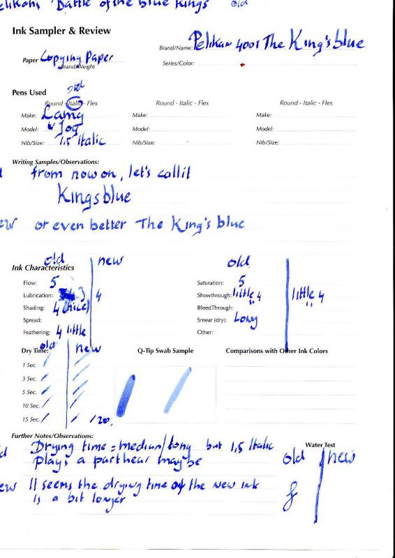
Pelikan’s Royal Battle Battle of the Blue Kings The old king vs. the new Royal Dear FPN friends, Last week I saw two reviews of Pelikan Royal Blue coming by in the Ink review forum. An old one started in 2010 (the first link) and a recent one (the second link) https://www.fountainpennetwork.com/forum/index.php/topic/167834-pelikan-4001-royal-blue/ https://www.fountainpennetwork.com/forum/index.php/topic/263912-pelikan-4001-royal-blue/ This gave me an Idea, since I have two bottles of Pelikan 4001 Royal Blue. An old bottle which is NINETEEN years old and a new one I recently obtained. I thought it would be a nice idea to compare the two… Please have a close look at the handwritten text since there is a Babylonian confusion of speech in the naming The 4001 series is a cheaper line of Pelikan inks, but the quality isn’t “cheap” at all… It is simply a very good basic ink that has been there for decades. The ink is fairly dry but still the flowing is well. Saturation is great. And there is some nice shading to it. Though a dry ink, as mentioned by others too, the drying time is fairly long for a normal Fountain Pen ink. This makes it perhaps not the best ink for left-hand writers. The old ink has matured very well just like a great wine does. As far as I can see it gained a lot of depth and finesse, expressed in darkness and shading. The old ink appears a bit darker to me. Both inks are beautiful the new one with freshness (like a good Beaujolais) the old ink has a lot of charisma like a person like Sean Connery in older age. I think I not only build me a wine cellar (a long wished dream) but an ink cellar too! Down here are the technical specs (as suggested by Ann Finley 2007) points 1-5 1 = 5= The old King Fountain Pens: Online Best writer 0,8 Italic; Lamy Joy 1,5 Italic Paper: Leonardo Ringbuch,,average quality school note book made in Austria Drying time: test sheet points: 3 Flow: 0.8 points: 3 / 1,5 points: 4 Wetness: a bit dry points 3 Bleeding: almost absent in both pens points: 5 Shading: very nice points: 4 Feathering: 0.8 very little points: 5 / 1,5 little points 4 Waterproof: good points: 4 Package: simple bottle points: 2 Availabilty: Excellent points: 5 The new Royal Fountain Pens: Online Best writer 0,8 Italic; Lamy Joy 1,5 Italic Paper: Leonardo Ringbuch,,average quality school note book made in Austria Drying time: test sheet longer points: 2 Flow: 0.8 points: 3 / 1,5 points: 4 Wetness: a bit dry points 3 Lubrication: 0.8 nib smooth points: 3.5/ 1.5 nib smooth: 4 Bleeding:very little in both pens points: 5 Shading: still nice points: 3 Feathering: 0.8 very little points: 5 / 1,5 little points 4 Waterproof: good points: 4 Package: simple bottle points: 2 Availabilty: Excellent points: 5 Quality and overall verdict: 4001 is still a very nice ink. The quality is like most German product: like their, cars i.e. Mercedes, their Fountain Pens i.e. PELIKAN, their inks i.e. De Atramentis ,and Pelikan of course … SUPERB…. Since the ink even gets better over time must really built me my ink cellar… The best is that an excellent Pelikan or De Atramentis is much more affordable than a Romanée Conti or Chateau Margaux…. I conclude… Very nice, quality ink for only E 3.90 a 25 ml. bottle. This is the best proof that a quality ink does not have to be expensive Warmest Regards, Peter Vlutters p.s since this review is an ink comparison as well as an ink review, I have posted this review in both for a. Peter
-
This is my review of Diamine Mediterranean Blue. I decided to try a sample of this ink because one of my correspondents used it in a letter to me and I thought it was a very pretty blue. When I first wrote with it I thought it didn't come across as a particularly saturated ink and I expected it to look more saturated, especially as the pen has been filled with it for several days before I wrote with it. My Waterman Phileas has a replacement 18ct gold L'Etalon M nib fitted into it, and that was the only pen I filled with this ink I don't think it's going to look significantly different with a F or stub nib. It's a nice colour, and I quite like this shade of blue, but you might think it should look brighter than it actually does when you write with it. As usual for a Diamine ink, it's a well behaved ink. It shows slight shading. I found it flowed smoothly across the page, and had no problems with lubrication in the Phileas that I used. This ink exhibits no showthrough and no bleedthrough on my thick Xerox ColorPrint paper. The water test on the review form shows this isn't a waterproof ink, but it's quite resistant. Bearing in mind the paper I use is thick with a shiny surface, and I used a M nib, this ink only took 8-10 secs to dry. That's really quick on this paper It flows through the pen well and lubricates the nib well. I saw no skips or hard starts while I did swabs and dry time tests. It is currently available in 80ml glass bottles, 30ml plastic refill bottles or cartridges. Diamine sell it directly to end-users on their web-site. It's a reasonable price
-
Hi all: After a long search for a darkish red ink, I have decided to try out a 30 ml bottle of Diamine Oxblood. It looks wonderful. I now need to find the perfect blue ink but the sheer volume is CRUSHING so I am asking for a bit of help. Can anyone who has gone thought a number of blue inks and found one they really like make a reccomendation I can follow up on? I tend to use pens that are on the big side and write with medium or broad nibs, mostly steel. Paper is Rhoda but I want to try others. My writing is all print and I take fast notes so i do not forget what clients tell me. (I forget anyway) I would love a very wet and intense blue that jumps off the page. What I want to avoid is the lighter/sky blue type colors that are wonderful but not for me. I do not care about water proof (clients no longer make me cry) and I do not care about dry time. (Under an hour WOULD be nice) Any help appreciated. Regards to you all. Bklyn