Search the Community
Showing results for tags 'blue black'.
-
Well, at long last, a review by me of an ink readily available! thanks to a sample provided by a kindly FPN member. Unfortunately, I didn't like the ink too much, perhaps I used too wet a pen. Which is surprising for me as I usually like wet inks. But I didn't find any character in the ink. As a blue-black I expected something blue, dark blue, but it was none of these things, it was black, nearly Sharpie black. When emptying the pen used in the review, there was quite a bit of blue appearing in the water in the sink, and the ink droplet revealed a good amount of blue dye. The waterfastness test also showed a wash of blue and purple. So perhaps others who've used this ink can comment, and we'll discover that my views are anomalous. The handling on the better MvL and TR papers was very good, but quite a bit of show through on the inkjet paper. It's kind of interesting that the camera picked up on the blue more so than my eyes do. And I apologize for the slightly bad word in the Shakespeare Sonnet. I picked it out to use, and started writing, and only when I got to the word that could be construed as offensive to some did I realize my error. Please accept my apologies. The word originated from Middle English, and is not related to an offensive term for African Americans. Pen: Edison Premiere (F-steel) Papers: MvL=Mohawk via Linen, TR=Tomoe River, Hij=Hammermill 28 lb inkjet, Rhodia=Rhodia 90g ivory. Camera: iPhone 7
-
Manufacturers since 1864, Diamine Inks relocated to this purpose built 'state of the art' factory in Liverpool in 1925, where they successfully carried on using the traditional methods and formulas for ink production. Over the years the company has changed hands and are now located close to the world famous Aintree Race Course http://www.diamineinks.co.uk/images/DimaineFactory.gif http://www.diaminein...uk/AboutUs.aspx Diamine Prussian Blue is a timeless classic. This color will fit most situations and uses. While I'm not crazy about it, I reckon it's more than decent ink. It's reliable, well behaved and nicely performing everyday ink.It has muted tone that I find pleasing, the flow is satisfying and the line is smooth. I remember I experienced some bleedthrough on Moleskine but, frankly, it's crappy paper and almost every ink ever crated will cause bleedthrough or feathering on it. Drops of ink on kitchen towel Software ID Color range Tomoe River, Sheaffer Prelude Signature, fine nib Leuchtturm 1917, Sheaffer Prelude Signature, fine nib No-name notebook, Montblanc 146, medium nib
-
As I said in my previous Ferro dell'Elba / Grigio Fumo / Fading Gray ink review, Stipula Inks really impressed me. I never expected to like so much a grey and a blue-black ink. Notturno Giannutri is a greysh blue-black, with really nice shading qualities that makes it stand out among most of the comparable inks that I've tried. The name "Notturno Giannutri" makes me feel about a "dark cloudy night by the sea", and that's what you get in terms of colour and feeling, really a well suited name just as "Ferro dell'Elba" was. (EDIT : the name for the US market should be Dark Blue) Good workhorse ink on cheap copy paper, shows no feathering, a little bit of shading (actually more than I was expecting), has a really good flow and lubrication. Dries quickly (about 5 sec.) On Schizza & Strappa paper this ink shows lots more of his properties: beautiful shading (especially on broader nibs), no feathering or bleedthrough, dries in about 15 sec (which is quite good for this kind of paper) Usually when I try inks on tracing paper and on schizza & strappa, I don't see really exhorbitant differences, this time they're absolutely noticeable. On tracing paper this ink is nearer to a Blue-Gray than to a Blue Black. Great adorable shading, nice silvery (and coppery? can't see clearly) sheen around inkpools (you can almost see it on the scans), no bleeding, no feathering, nice drying times (15 seconds). It's this ink worth it? If you like blue blacks, this is an ink you should try. A Beautiful, classy, elegant, greysh blue black. Has a grey component which shows a good ammount fo waterproofness, so it's suitable for work papers, letters and so on. If I had to 5 seconds to describe it, I would say that this is not another "boring blue black" but something that I enjoy a lot using, has some personality and a lot of those little extras that makes us pen nerds overjoy. COPY PAPER SCHIZZA & STRAPPA PAPER TRACING PAPER CROMATOGRAPHY WATER TEST (SUBMERGED FOR 15 MINS) INKDROP
-
Need Replacement For Diamine Blue/black And Majestic Blue
ahmet_yuce posted a topic in Inky Thoughts
Hi; Bought eight 30ml bottles of Diamine inks some time ago, have troubles since the begining. I got Pelikan, Waterman, Sailor inks usually happy with them but Diamine. When i just bought them, most of them were too wet. Bleedthrough almost on all papers, worst was Pilot MR medium nib, it was blotting while writing. After 2 years sitting in a drawer with caps firmly tightened, now they are not as wet as before. But colors shifted (most noticable is Oxblood) and now they are drier. Even Majestic Blue clogs TWSBI Classic frequently. Anyway i like Diamine's colors, price is good, but got enough trouble with them. Desperately looking for replacements especially for Diamine Blue/Black (a nice old looking blue-black with green hue) and Majestic Blue. Any suggestion wellcomed. -
I know that this topic is already kind-of discussed in various places on FPN but I can't seem to find a straight answer. My question: I would like to find a nice water resistant or proof, good performance on cheaper paper blue, black or blue-black ink safe for my vintage Sheaffers (Touchdown and Snorkel). I've been using some vintage Watermans B/B that I picked up a while ago, but it's too pale and doesn't perform very well on cheap paper. I wanted to try Namiki Blue, but I read some other reviews that people don't recommend it in vintage pens-- It's a shame. It's one of my favorite blues. Would some of the modern IG Inks ( Diamine Registrar, Rohrer & Klinger, Mont Blanc, etc....) be ok to use? Any or all suggestions would be really appreciated.
-
I bought a little glass pot of this ink powder from a local antique dealer about a year or so back and have been monkeying with different concentrations. It's a versatile ink depending on how dark you want it to be. I have always mixed it in small plastic needle bottles with distilled water (other than the time I used tap water as an experiment, which resulted in an odd green tint to the ink). It dries well, lubricates well, and has a unique look. http://imgur.com/1cLvweS
-
A while back, Pelikan introduced its Edelstein line of "boutique" inks in fancy bottles. I had looked at reviews and found many that were quite dismissive of this line. Perhaps people were expecting a Noodler's or Private Reserve from Pelikan. I don't know if the inks themselves have been re-formulated since their initial launch or not. But because the Edelsteins didn't get no respect, and were quite pricey, I bought other inks that seemed to have a better reputation. Recently I picked up Pelikan Edelstein Tanzanite, as I wanted a fairly "safe" ink for a (for me) pricey Pelikan pen, and I'm a fan of blue-blacks anyway. Well, I think this ink rocks. It has great flow, excellent saturated color, fabulous handling. As I say, I don't know if the ink has changed, but the one review I found people seem to have varying opinions. I like the ink. I don't know how the other inks in the line are, but this one is worthy of consideration. Of course, if you like dark blue ink. As usual, the papers are MvL=Mohawk via Linen, Hij=Hammermill 28lb inkjet, TR=Tomoe River. The colors are fairly close to accurate. The ink is not very water resistant, but the heavy dye load means there's something left on the paper. I don't not have an ink blot for this one, I forgot.
-

Ink Review : Diamine 1864 Blue Black (150Th Anniversary Ink)
namrehsnoom posted a topic in Ink Reviews
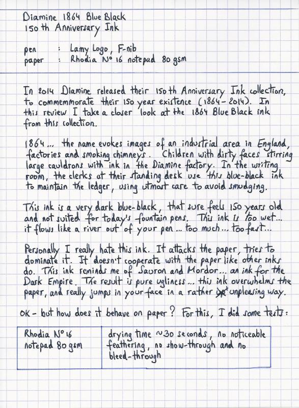
Ink Review : Diamine 1864 Blue Black (150th Anniversary Ink) Pen: Lamy Logo, F-nib Paper: Rhodia N°16 notepad 80 gsm Review In 2014 Diamine released their 150th Anniversary Ink collection, to commemmorate their 150 year existence (1864-2014). In this review I take a closer look at the 1864 Blue Black ink from this collection. 1864 ... the name evokes images of an industrial area in England, factories and smoking chimneys. Children with their dirty faces stirring large cauldrons with ink in the Diamine factory. In the writing room, the clerks at their standing desk use this blue-black ink to maintain the ledger, using utmost care to avoid smudging. This ink is a very dark blue-black, that sure feels 150 years old an not suited for today's fountain pens. The ink is too dark... too wet... it flows like a river out of your pen... too much... too fast... Personally I really dislike this ink. It attacks the paper, tries to dominate it. It doesn't cooperate with the paper like other inks do. This ink reminds me of Sauron and Mordor... an ink for the Dark Empire. The result is pure ugliness... this ink overwhelms the paper, and really jumps in your face in a rather unpleasing way. OK - but how does it behave on paper ? For this, I did some tests: Rhodia N°16 notepad 80 gsm - drying time ~30 seconds, no noticeable feathering, no show-through and no bleed-throughPaperblanks journal paper - drying time 15-20 seconds, some minor feathering, no show-through and no bleed-throughGeneric notepad paper 70 gsm - drying time ~15 seconds, no noticeable feathering, some show-through , some bleed-throughMoleskine journal - drying time ~5 seconds, noticeable feathering, major show-through and major bleed-throughThis ink had me screaming in frustration. It just behaves unpredictably. It all depends heavily on the combination of pen, nib and paper. On cheap paper and with wetter nibs it's just plain ugly. Especially if you have small handwriting. With an EF nib, the ink is much more pleasing to the eye. The flow is more controlled, the relationship between ink and paper is much more in balance. Still not my favourite blue-black, but with an EF nib I can tolerate this ink. It also shows its blue background, instead of becoming an ugly blackish blob. Message to self: only use this ink with EF nibs - the finer the better. Conclusion 1864 Blue Black is an unpredictable ink with wildly varying behaviour depending on the combination of pen, nib and paper. The ink is too wet, and looks ugly even in F or M nibs. It really needs the shackles of an EF nib to become usable. The ink also has no water resistance to speak of. my overall score: C- (or B when using an EF nib)
-
This is my first review on FPN. Apologies for the bad handwriting and/or missing a few points. I've been meaning to review this ink for a long time and just saw viswamitra's brilliant review for the same but I thought I'll upload it anyway even though it's not as detailed. I love blue and blue-black inks and I like this one. It's not my favourite but I won't mind using it every now and then. It behaves really well on cheaper paper too, with no feathering or bleedthrough. You'll also see some Pink/Purple undertones in the sample and because it's not so saturated, the nib would make a lot of difference. Thanks! If you want to ask any questions or want more photos I'll gladly add them in the comments.Though I'm pretty sure viswamitra's review will have it all covered.
-
DAYTONE BLUE BLACK INK REVIEW is simultaneously posted at my blog. Recently I received few Ink bottles from one of my friend from Indore and they are Daytone Fountain Pen Ink. Daytone Inks are manufactured by Daylight industries and they are in to ink manufacturing since 1956. More information can be found about the company here : Daytone Webpage Apart from Inks they manufacture lot of other stationary items. But this review is about one of the fountain pen inks that they manufacture. The inks that they manufacture ( 8 Nos.) are as follows: Blue Black Emerald Green Brilliant Red Crimson Turquoise Blue Deep Black Royal Blue Bright Violet Brown (In Process) My earlier Ink reviews are listed as below: Bril Royal BlueBril Laurel RoseCamlin Scarlet RedChelpark Black Also I would like to add that I got the inks as a gift from one of my friend and fountain pen enthusiast, Ricky Bhasin. This review is about BLUE-BLACK ink from Daytone. Daytone Blue Black Daytone BlueBlack comes in 60 ml plastic bottles and are priced at Rs. 20 Each (Indian Rupees). I found out that the ink is more of dark blue rather than blue black. It certainly is bit darker than Bril Royal Blue. But I was expecting something else from BlueBlack Ink. INK SPLASH Daytone Ink Splash on JK Cedar -100 gsm – Top View There is negligible sheen in this ink even if there is some massive ink pools on paper. DROP ON PAPER NAPKIN Daytone Blue-Black – Ink Drop COLOR MATCH Daytone Blue Black – Color Range WRITING SAMPLES Daytone Blue Black – Writing sample on Tomoe River Cream Paper Daytone Blue Black – Writing sample on JK Cedar 100 gsm White Paper Daytone Blue Black – Writing sample on Bilt Matrix 70 gsm Off White Paper INK SWABS Daytone Blue Black – Ink Swabs on Tomoe River Paper (Top – 3 Swabs, Middle – 2 Swabs, Bottom – 1 Swab) Daytone Blue Black – Ink Swabs on JK Cedar 100 gsm Paper (Top – 3 Swabs, Middle – 2 Swabs, Bottom – 1 Swab) Daytone Blue Black – Ink Swabs on BILT Matrix 70 gsm Paper (Top – 3 Swabs, Middle – 2 Swabs, Bottom – 1 Swab) PEN SCRIBBLE Daytone Blue Black – Pen Scribble on JK Cedar 100 gsm Paper The ink flow is smooth and the ink looks bit faded for blue black. WATERPROOF TEST The ink was quite water resistant and it was pretty mush clear and visible even after running it under tap water for 5 min and then keeping it in water container for another 5 more minutes. I must say I am pretty impressed with this property of the ink. Daytone Blue Black – Under tap Water Daytone Blue Black – After Waterproof Test CHROMATOGRAPHY Daytone Blue Black – Chromatography INK DRYING TIMES Ink drying times were tested on the Bilt Matrix paper and pen used was Jinhao 165. Daytone Blue Black – Ink Drying Test BLOW-UP WRITING SAMPLES Daytone Blue Black – Writing sample on Tomoe River – Blown Up Daytone Blue Black – Writing sample on JK Cedar – Blown Up Daytone Blue Black – Writing sample on Bilt Matrix – Blown Up Close up Pictures show that there is no shading and also no sheen and also no feathering. CONCLUSION I don’t like this blue black ink too much but it has good water resistance. Manufacturer must take note of the fact that this ink needs to have more black character. My always goto blue black ink is Edelstien Tanzanite or Pilot Blue Black. Following are the summation of ink properties: Feathering : No Sheen : No Shading : No Lubrication : Acceptable Flow : Good Water Resistance : Good Drying Times : Medium
-
I recently purchased a bottle of Lamy Blue-Black and was quite surprised by the performance. It seemed to do much better than any review would have had me believe. I initially purchased the ink more or less just to get the bottle (with the hope that I might actually like the ink), but after using this ink for a couple of weeks I have to say that I am really impressed with it. This leads me to believe that either Lamy has reformulated their reformulated version of Blue-Black, or that folks have been overly critical of what I have found to be a pretty good ink. Right now I am using this ink in a Jinhao X750 with a Knox 1.1 nib; and in a Jinhao X450 with an Anderson Pens 1.1 nib (identical to the Goulet Pens 1.1, but with different brand etchings, obviously). I have used the ink on a number of different papers all with fairly similar results. What I have found is that this ink does not write overly wet, but still tends to bleed through a little bit even on good paper. It is an unusual color, it has a nice chalky blue color that dries a little bit on the dark grey side. The most unusual finding is that the ink is actually fairly water resistant. I would not call it waterproof, but I wrote a sample on an index card with a sample written using Chesterfield Archival Vault ink (an iron gall ink) for comparison, ran the card under water, and the Lamy held up fairly well. I would never use it to address an envelope, but I have no issues using it as an every day ink. I performed three water tests with Lamy Blue-Black and all of them had the same results. The test consisted of me washing the index card under a fast moving tap for 60 seconds. While this could have been made more rigorous by actively rubbing the ink while under water or adding a soap, I feel that my test is adequate for general use conditions. Below is the index card before the test, an example of bleed through (on a Rhodia #12 pad...the bleed through is not as bad here as it is on many other papers, but it is still visible), and the index card after the test. So, either I am more accepting of Lamy Blue-Black, or it has been reformulated to be a better overall ink. I could believe either scenario, but I tend to think that I am just not as hard on this ink as other folks have been. If it is the case that I am not as harsh as other users, then I tend to think that this is due to the fact that I never tried the old iron gall formulation. In any event, taken on its own merits I think that Lamy Blue-Black is a good ink. It has either gotten a bad rap, or is now better than it used to be. I would be very interested in hearing what other folks think about this subject.
-
Given that Bung box ink is rather dear here...I would like some advise on which blue black to indulge in...deciding between 4B and Silent Night has me in a quandary. Any sage advise? BTW this would be my first purchase of a true blue black ink. I'm extraordinarily picky about ink.
-
http://inks.pencyklopedia.pl/wp-content/uploads/Diamine-150th-Anniversary-Blue-Black-nazwa.png I present to test the ink Diamine 150th Anniversary Blue Black with a wonderful, very saturated blue-black. Perfectly given the nature of blue-black. Good performance, quite fast drying. I think that the ink is worth buying. Manufacturer: Diamine Series, colour: 150th Anniversary Blue Black Pen: Waterman Hemisphere, nib "F" Paper: Image Volume (80 g / m2) Specifications: Flow rate: good Lubrication: good Bleed through: possible point (copy paper, paper Oxford) Shading: noticeable Feathering: unnoticeable Saturation: very good A drop of ink smeared with a nib http://inks.pencyklopedia.pl/wp-content/uploads/Diamine-150th-Anniversary-Blue-Black-kleks.jpg The ink smudged with a cotton pad http://inks.pencyklopedia.pl/wp-content/uploads/Diamine-150th-Anniversary-Blue-Black-wacik.jpg Lines http://inks.pencyklopedia.pl/wp-content/uploads/Diamine-150th-Anniversary-Blue-Black-kreski.jpg Water Resistance http://inks.pencyklopedia.pl/wp-content/uploads/Diamine-150th-Anniversary-Blue-Black-woda.jpg Ink drying time http://inks.pencyklopedia.pl/wp-content/uploads/Diamine-150th-Anniversary-Blue-Black-wysychanie.jpg Ink drops on a handkerchief http://inks.pencyklopedia.pl/wp-content/uploads/Diamine-150th-Anniversary-Blue-Black-chromatografia1.jpg Chromatography http://inks.pencyklopedia.pl/wp-content/uploads/Diamine-150th-Anniversary-Blue-Black-chromatografia2.jpg Sample text http://inks.pencyklopedia.pl/wp-content/uploads/Diamine-150th-Anniversary-Blue-Black-txt.jpg Sample text in an Oxford notebook A5 (90 g / m2) http://inks.pencyklopedia.pl/wp-content/uploads/Diamine-150th-Anniversary-Blue-Black-Oxford.jpg Sample letters in a Rhodia notebook No 16 (90 g / m2) http://inks.pencyklopedia.pl/wp-content/uploads/Diamine-150th-Anniversary-Blue-Black-Rhodia.jpg
-
I have been told that Hero's blue-black ink is an iron-gall ink. Now I read somewhere on this site that Pelikan's blue-black is also an iron-gall. I have three questions please; 1) Are the above inks iron-gall? 2) Are most (all?) blue-blacks made this way? 3) Any problem using iron-gall in a nice German pen? Thanks for your help. Inquiring minds want to know.
-

Aurora Inks Can Now Be Mixed Together? Reformulation? Infos?
gregamckinney posted a topic in Inky Thoughts
It is no secret I love Aurora ink. It is my go to ink for all new modern pens. (I use 1940's vintage Quink B-B for new-to-me vintage pens, but that is just an irrational new vs. vintage thing.) However, from time to time, I would like to have a nice blue-black, also a slightly darker blue might be good. I've seen posts from 2009 and 2010 that indicate fairly consistent bad results mixing Aurora's black ink with their blue ink (their only colors.) Also, I had always (as long as I've been in the hobby and been aware of Aurora ink.) Then, I saw several reports in posts from last year of posters having no problems using Aurora B-B mixes. I did not see what ratios were used. There have long been reports of Aurora ink being safe in Aurora:[non Aurora ink] mixes, but I'm specifically interested in Aurora:Aurora. Can anyone provide any information about Aurora ink (black or blue or both?) changing in any way between 2010 and 2014 that would allow it to be safely mixed? My experimental mix of 7:2 blue:black had been sitting in a glass jar for 4 days before I scrutinized it to confirm no goop, particles or weird viscosity issues. I took a deep breath and filled my Sole with it. About 2 pages of notes in, and everything seems to be working well. Color is good (darker Aurora blue) as is flow. (Some early reports when mixing did not work were that the result was a black ink with no flow properties.) So, I'm now in the "well, it works for me" camp. But, I'd still like to know if the ink changed, or if the horse learned to talk. Best Regards, greg -
Here's a great example of one of the few fountain pen friendly iron gall inks left on the market (RIP Montblanc Midnight Blue… ). It and R&K Salix are about even on like-o-meter, but I find myself preferring Registrar's Ink due to its darker final color. http://imagizer.imageshack.us/v2/xq90/537/DZc31c.jpg
-
Hi everybody, Firstly I would like to apologize as this would not be a thorough review. Just sharing my experience with an ink I just bought earlier. I got this ink from a local store for RM1.50 (~$0.40). My first impression of this ink is that this is more towards a grey ink than a blue black. However, the flow and wetness of the ink is quite good especially at this price. The ink is also surprisingly water resistant! I've read some reviews that it might be an IG ink, can anyone confirm this? These are written on rhodia lined pad with sheaffer agio M. Here are some pictures: Pictures of the bottle and the box which states no.62 on the side of the packaging The ink shades more on printed words than cursive Ink dries within 15 seconds Water resistant ink! That's it for now. Thank you for reading. Cheers Edited to add pen used
-

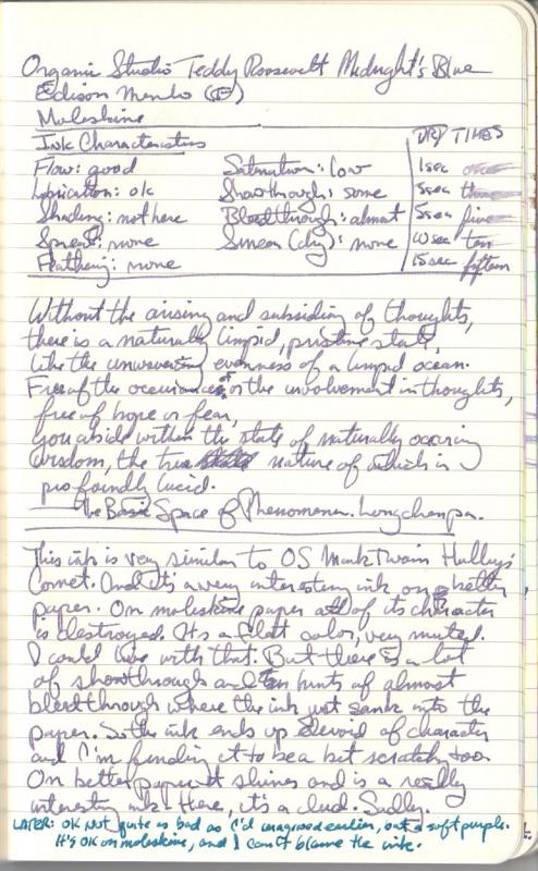
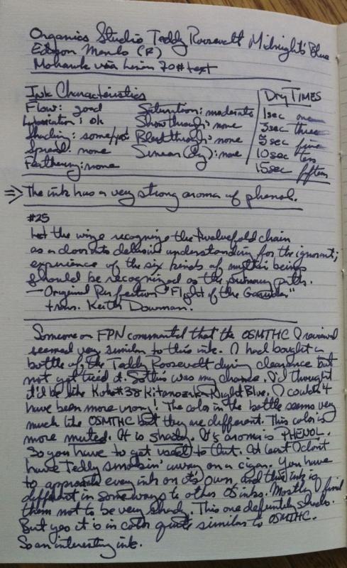
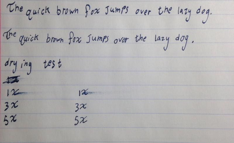
Ink Review: Organics Studio Teddy Roosevelt Midnight's Blue
white_lotus posted a topic in Ink Reviews
Here is my review of the OS Teddy Roosevelt Midnights' Blue. This ink was a special edition for a pen show I think, and Anderson pens had some extra OS, so I picked up a bottle. I don't think it's available at all any longer. The label color bar looked like a deep dark blue, and I love those kinds of colors. The ink is quite far from deep, dark blue, and much closer to OS Mark Twain Halley's Comet. This ink is a bit more muted in tone than the Mark Twain. On Moleskine, I originally didn't like it as the color came out too pale, but it's certainly usable and not bad looking. On the better paper (Mohawk via Linen) it looks nice, is quite shady. But it's not that much different from OS Mark Twain. I'll get up on this small soapbox right here: I really wish ink producers and retailers would stop calling violet and purple, "Blue". Those two colors are not blue. They have their own names. And they are not the same thing. It doesn't seem that hard to look at the color of something written, and use the color picking software on the computer to find the right color for printing on the label. No one expects it to be exact, but if the ink is violet in the bottle, and when you write with it the color is violet, there's no reason to put some other color as the indication of what the ink looks like. Many people are buying ink over the internet, they never get to see the actual ink nor write with it. They rely on the descriptions by the retailers, and the picture on the box (if any) of what the ink looks like, what color it is. OK, I'm done now. I like the color, it's just not blue, and it just seems very similar to OS Mark Twain. The first two pictures are scans from the crappy scanner. Now here are pictures from the iPhone. These definitely show the color as darker than it really is. The scans are closer in that regard.
-
Here is a review of Dromgooles Blue Steel ink. It's an exclusive to Dromgooles Fine Writing and Stationary, a B&M store in Houston, TX, USA. I was given a sample by the Inky Goddess Amber. Some of the scans imply that the ink shades. It does not. Very very little shading on the papers I used. In looking at my notes of other inks, it actually is quite similar in color to Iroshizuku Tsuki-yo. It appears to be almost completely made from a single dye, one that matches Phthalo blue. Just a small hint of a blue-green when washed out. The first three scans are done at 150 dpi as a balance between space and clarity. I don't know how to do any kind of color correction, so the settings are the basic ones from the scanner. For some reason, the FPN software makes you download the PDFs which are the scans of the review but you can see the same think with the photos. Maybe not as clear, precise. Dromgooles Blue Steel005 150dpi.pdf Dromgooles Blue Steel006 150dpi.pdf Dromgooles Blue Steel007 150 dpi.pdf Here is an ink drop spread on a damp paper towel. I hope this shows up properly. Dromgooles Blue Steel010.pdf By way of comparison here are some photos from the iPhone. Not color corrected except by iPhoto. But they look reasonable. I want to end with — I like the ink. Not as wet as I might usually go for, but it's very good and very reliable. Appears to be non-staining. If it was easier to get, and in a bit larger size, I could see myself getting a bottle. I'm in the process of using up the lovely sample. My ink collecting right now is fairly narrow in range, and so while the color fits that profile, I'll just stick with Tsuki-yo for now.
-
http://inks.pencyklopedia.pl/wp-content/uploads/Diamine-Blue-Black-nazwa.png Manufacturer: Diamine Series, colour: Blue Black Pen: Waterman Hemisphere "F" Paper: Image Volume 80 g / cm2 Specifications: Flow rate: good Lubrication: good Bleed through: unnoticeable Shading: noticeable Feathering: unnoticeable Saturation: very good A drop of ink smeared with a nib http://inks.pencyklopedia.pl/wp-content/uploads/Diamine-Blue-Black-kleks.jpg The ink smudged with a cotton pad http://inks.pencyklopedia.pl/wp-content/uploads/Diamine-Blue-Black-wacik.jpg Lines http://inks.pencyklopedia.pl/wp-content/uploads/Diamine-Blue-Black-kreski.jpg Water Resistance http://inks.pencyklopedia.pl/wp-content/uploads/Diamine-Blue-Black-woda.jpg Sample text http://inks.pencyklopedia.pl/wp-content/uploads/Diamine-Blue-Black-txt.jpg Ink drying time ca. 5-10 sec. Other tests carried out: Sample text in an Oxford notebook http://inks.pencyklopedia.pl/wp-content/uploads/Diamine-Blue-Black-Oxford.jpg Sample letters in a Rhodia notebook http://inks.pencyklopedia.pl/wp-content/uploads/Diamine-Blue-Black-Rhodia.jpg Ink drops on a handkerchief http://inks.pencyklopedia.pl/wp-content/uploads/Diamine-Blue-Black-chromatografia1.jpg Chromatography http://inks.pencyklopedia.pl/wp-content/uploads/Diamine-Blue-Black-chromatografia2.jpg
-

Inky T O D - Color Swatches - Blue/black - Please Post Your Pictures And Tell Us Your Thoughts
JimCouch posted a topic in Inky Thoughts
I was surprised to not find a samples topic for my favorite in color - Blue/Black. So here it is, post your Blue/Black swatches & thoughts here! -
http://inks.pencyklopedia.pl/wp-content/uploads/Parker-Quink-Permanent-Blue-Black-old-nazwa.png Producent: Parker Series, colour: Quink Permanent Blue Black (old) Pen: Waterman Hemisphere "F" Paper: Image Volume 80 g / cm2 http://inks.pencyklopedia.pl/wp-content/uploads/buteleczki_atrament_parker_duza_old.jpg Specifications: Flow rate: very good Lubrication: good Bleed through: unnoticeable Shading: noticeable Feathering: unnoticeable Saturation: very good Ink drying time: ~ 5-10 sec. A drop of ink smeared with a nib http://inks.pencyklopedia.pl/wp-content/uploads/Parker-Quink-Permanent-Blue-Black-old-kleks.jpg The ink smudged with a cotton pad http://inks.pencyklopedia.pl/wp-content/uploads/Parker-Quink-Permanent-Blue-Black-old-wacik.jpg Lines http://inks.pencyklopedia.pl/wp-content/uploads/Parker-Quink-Permanent-Blue-Black-old-kreski.jpg Water Resistance http://inks.pencyklopedia.pl/wp-content/uploads/Parker-Quink-Permanent-Blue-Black-old-woda.jpg Sample text http://inks.pencyklopedia.pl/wp-content/uploads/Parker-Quink-Permanent-Blue-Black-old-txt.jpg Other tests carried out: Sample text in an Oxford notebook http://inks.pencyklopedia.pl/wp-content/uploads/Parker-Quink-Permanent-Blue-Black-old-Oxford.jpg Sample letters in a Rhodia notebook http://inks.pencyklopedia.pl/wp-content/uploads/Parker-Quink-Permanent-Blue-Black-old-Rhodia.jpg Ink drops on a handkerchief http://inks.pencyklopedia.pl/wp-content/uploads/Parker-Quink-Permanent-Blue-Black-old-chromatografia1.jpg Chromatography http://inks.pencyklopedia.pl/wp-content/uploads/Parker-Quink-Permanent-Blue-Black-old-chromatografia2.jpg
-
I think I got this ink sample a looooonnnggg time ago, back when I was still enrolled in Ink Drop. That was before I formed my huge fondness for blue-black inks, so it sat and waited for the right time. And now, I hardcore need a bottle of this ink my life. This is a dark ink. At first you might mistake it for black, but it’s not. It’s also unlike most other blue-black inks I’ve tried in that it does not dry to some grey-blue color. It stays vibrant and crisp and dark, which I like. As you can see, this ink almost looks like a teal-black, and I have heard that this is what can happen when you mix certain types of blue with black - you get something that can look green, but in fact it is just blue+black. I don’t know if this is the case with most De Atramentis inks since the only other one I’ve used is also a quite dark color, Alexander Hamilton (purple), but in both of these inks it appears the black component is quite waterproof, which makes this an ink that would be favorable to everyday writing. Especially since I found it had really good flow and no troubles on most paper, though it did feather a bit on index cards: Overall, I really like this ink and it’ll be on my short-list of things to buy once I am at my new job and getting decent paychecks. The only bummer for me is the price. While a bottle is not that expensive (roughly $13 here in the States), you don’t get that much ink, since they are 35 mL bottles. Granted, for me that’s fine since it would be a challenge to even finish a bottle that small in a reasonable amount of time, but if you are looking for an ink that can be chewed through on a daily basis, this might not be it for you. I bought a bottle of Noodler’s Air Corps Blue-Black because the colors looked similar, but they are different enough for me to justify buying this one as well. Be on the lookout for that review coming next week or the week after… This ink was purchased with my own money and I am not being compensated for this review in any way. All opinions above are my own and you are free to disagree with them if you like. Full page scan of the review:
-
This ink won over my heart pretty much instantly. As much as I detest royal blues, I do still enjoy blue inks when they have a bit of personality and character. I think that’s why I tend to enjoy iron gall inks, but I don’t enjoy the cleaning that comes with those. This ink, however, gives some of that same feel while being super low maintenance. Even in the very fine nib on Pilot VP, this ink flows well, never skips or has a hard start, and shows some shading, though not as much as you would probably see with a larger nib. I find that blue-black inks tend to go one of two ways: either they wind up a dark grey with bits of blue (which isn’t bad), or a dark shade of blue with little black. This ink is one of the second kind and provides a nice change from the more greyish varieties. I had heard rumors that this ink was highly water resistant, so when I ordered my bottle I was hoping that would be true since this would be a good ink for more “official” business, aka writing up my homework. As you can see, it is indeed almost fully waterproof, which is always a nice surprise for an ink that is not explicitly advertised with those properties. It also behaves nicely on all papers, though part of that could be that I have only used it in a super fine nib. Perhaps I’ll have to eventually come back and test it in something broader and report on any changes. Overall, I love this ink. Definitely could use this ink exclusively for a while, if I had to, but I prefer not to think about something like that occurring. I also like that’s it’s not too expensive, though it does not seem to be super widely available either. You can find the proprietary Pilot cartridges at many retailers, but to find the bottled version it looks like you need to either go to JetPens, where it’s $16.50/70 mL, or eBay where it will be more expensive because it will ship from Japan. However, you can also find giant 350 mL bottles of this ink there as well. I like it, but I don’t see myself liking it that much… This ink was purchased with my own money and I am not being compensated in any way for this review. All opinions above are my own and you are free to disagree with them if you like. Full page scan of the review:
-
Here is a quick writing test on notebook paper from a Mead five start notebook. The feathering that I mentioned Is extremely hard to see and is in no way a hindrance to its use. The ink has a very nice color with some shading, the scan does not show the full range of color. The ink lubricates the nib well, it can be a little scratchy on 20 lb copy paper but it is smooth on about everything else I have tried. It has a nice even flow and rarely has any starting problems. Diamine Blue Black is a Wonderful ink and a perfect choice for students, and everyone else! Ps. I know I misspelled Written.