Search the Community
Showing results for tags 'blue black'.
-
Rohrer and Klingner Verdigris Rohrer and Klinger – founded in 1892 in Leipzig, Germany – is a company that is mainly focusing on inks for all purposes, including fountain pen inks. Their inks come in very recognizable retro-style 50 ml bottles. R&K have produced a number of really good-looking inks, and this Verdigris is one of them. It’s only quite recently that I got a bottle of it and tried it out in my pens. Probably already reviewed ad nauseum, but I’d still like to take a shot at it and give you my own opinion. R&K Verdigris is a blue-black ink at heart, but it goes beyond that. It’s balancing on the boundary between blue-black and teal… there’s some green in the mix, but not enough to cross the border and be called a true teal. I love this type of complexity in inks, where it is difficult to pinpoint the colour at a single glance. The ink is wet and saturated, and thus writes beautifully in very fine nibs. But it’s also an ink with an attitude, that doesn’t work well with lower quality paper. But in my opinion, the Force is strong in this one – a great addition to my ink stash! The chromatography shows a complex mix of dyes – the blue & black tones dominate, but there is also a strong yellow-green component. All this mixes together to a lovely and complex blue-black, that leans towards teal territory. Rohrer & Klingner’s ink-makers sure know their craft! To show you the impact of saturation on the ink’s look & feel on paper, I made some scribbles where I really saturated portions of a piece of 52 gsm Tomoe River paper with ink. This gives you a good idea of what the ink is capable of in terms of colour range. Verdigris has a narrow contrast range – even the lighter parts are already quite saturated. You can expect some subtle shading in dry pens (that typically cover the left side of the spectrum), but with wet pens the shading will mostly be drown out and disappear due to the intense saturation of the ink. Technically, the ink writes wet and well-lubricated with heavy saturation. I also noticed that this Verdigris doesn’t tolerate low-quality paper. Especially with rough-surface paper, the ink gets sucked right into and through the page, resulting in quite some see-through and bleed-through. For me, the sweet spot for this ink is dry pens and/or fine nibs, combined with good-quality paper. In the writing samples below, I use my typical variety of different paper types. This gives you a good feel for what the ink is capable of. On each scrap of paper I show you: An ink swab, made with a cotton Q-tip 1-2-3 pass swab, to show increasing saturation An ink scribble made with an M-nib Safari fountain pen The name of the paper used, written with B-nib Lamy Safari A small text sample, written with the M-nib Lamy Safari Source of the quote, with a Pelikan steel F-nib Drying times of the ink on the paper, with the M-nib Lamy Safari I’ve also added a photo to give you another view on the ink. Scanned images and photos often capture different aspects of the ink’s colour & contrast. That’s why I present them both. In this case, both scan and photo capture the ink’s colour well. The shading is more realistic in the photo (it’s washed out in the scan). Verdigris looks good on all types of paper, both white and more creamy ones. The ink definitely prefers hard-surface and high-quality paper. On more absorbent and lower quality papers (most office-type copy paper), you can see a bit of feathering, and you also get see-through and bleed-through. Drying times are in the 15 second range on most good quality papers. On absorbent copy paper, the ink gets sucked right into the page, with 0-5 second drying times. Writing with different nib sizes The picture below shows the effect of nib sizes on the writing. R&K verdigris can handle all nib-sizes, but looks at its best in finer nibs and/or dry pens (my opinion). With wet pens, the increased saturation burns away any shading, except when using EF/F nibs. I prefer to use this ink with fairly dry fine-nibbed writers – in my opinion that’s the sweet spot for this ink. And the colour looks really serious and business-like. It’s definitely a good candidate for your office pen (provided you use your own notebook with fountain-pen friendly paper). Related inks To show off related inks, I use my nine-grid format, with the currently reviewed ink at the center. This format shows the name of related inks, a saturation sample, a 1-2-3 swab and a water resistance test – all in a very compact format. Diamine Blue Black and L’Artisan Pastellier Callifolio Equinoxe(5) seem to be closest in colour to this Rohrer & Klingner Verdigris. Inkxperiment – Pyramids As a personal challenge, I try to create interesting drawings using only the ink I’m reviewing. It’s a fun extension of the hobby, and these single-ink drawings often present a real challenge. It also gives you an idea of what the ink is capable of in a more artistic setting. Inspiration for this inkxperiment comes from Terry Pratchett’s Pyramids. This book tells the story of prince Teppic of the tiny kingdom of Djelibeybi. A land where the pyramid city of the dead eclipses the city of the living. A land where pyramids accumulate energy during the day, and where the night sky is bright with the light of pyramids flaring off their energy. A land where the gods are real and walk the streets. I tried to capture these ideas in my inkxperiment. I started with an A4 sheet of HP photo paper, and covered two square cut-outs with some paper. I then used heavily water-diluted ink and a piece of paper towel to create the background. Next I stenciled in the pyramid shapes with rubber stamps, and added the flaring beams that release all that pyramid power. Finally I added the Egyptian-themed figures to the square cut-outs, completing the drawing. The king in the top-right cut-out looks a bit childish – non-abstract drawing is definitely not my forte 😉. Nevertheless, the end result gives you a good idea of what can be achieved with this Verdigris in an artistic context. Inkxpired – computational art I love experimenting with pen/ink/paper, and have added another layer as part of the hobby. I’m exploring computational art, inspired by the ink drawings I do during ink reviews. Another fun offshoot of the hobby… and all that starting with a few drops of dye-coloured water on paper. For this computational derivation, I tried to convert the ink drawing to create the impression of a photograph of a mural, painted on a recently excavated temple in the desert. Archeologists are ecstatic - the energy-flaring pyramids are unquestionably there, and serve as proof that the mystical land of Djelibeybi is more than a myth… I started by inverting the colours in the original inkxperiment drawing, and applied a glossy magazine filter to the result. I then toned down the colours using an “old paper” filter, and finally used a cooler colour scheme to achieve that old painted mural effect. I quite like the end result, that summarizes Pratchett’s novel well. Conclusion Rohrer and Klingner make some great inks, and this blue-black Verdigris is no exception. A very nice – but difficult to define – colour that works great for both writing and drawing. Best used with a fine-nibbed pen on good quality paper. Definitely an ink that appeals to me, and a great addition to the ink stash. Technical test results on Rhodia N° 16 notepad paper, written with Lamy Safari, M-nib Back-side of writing samples on different paper types
-

Büroservice Bergmann Blaufliessende Eisengallustinte (blue flowing iron gall)
yazeh posted a topic in Ink Reviews
The name is a mouthful. I discovered this ink thanks @christof. Another good ink for Iron gall ink lovers. They are made in Germany and exclusively sold by the maker Thomas Bergmann. https://www.kalligraphie-shop.com/ep...roducts/32000T They come in 2 colours: red and blue in De Atramentis type bottles. This is an almost black ink, in the true IG sense. If you’ve written with dip pen IG inks (Like Bach’s which turns into a glossy black), this one comes close, depending on the amount of ink concentration. Here is a comparaison with two other famous IGs. It has an interesting chroma While I enjoyed using it, I prefer the Red to this. Mostly because it has not the waterproofness of Essri (and I don't mean LizEf's endearing Snek . If you’re looking for a perfect waterproof ink, go for the big three Essri, Akkerman IG, or Diamine Registrars ( I haven’t tried KWZ blue black/ and Hero 232, so I can't comment on that). I rubbed the sample text (on the cheap paper), with a wet Q-tip. This was after 24 hours. Essri didn't budge. The blue component of Bergmann ink smudged. I also did the Q-tip test on a week old text on Tomoe River paper, the blue component smudged. Writing samples: TR 68gr Midori Rhodia Apica This I did with reverse medium Jinhao, which is close to an Ef, I hope (Paper is Rhodia) Field Notes (Not for Fps but the ink behaved flawlessly) This was done on atrocious, cheap, very thin, absorbent paper. Ink turned instantly black. While there seems to be ghosting and bleed through, it doesn't look as bad as the scan Here is a little fun sketch I did for Inktober on a Fabiano sketch pad: The background is all done with the IG ink. • Pens used: : Jinhao 450 (Medium/fude) /Jinhao X159 – F / Conway Stewart 330/ Pilot Kakuna • Shading: Yes • Ghosting: Only on cheap paper. It didn't ghost on Field Notes, an unfriendly FP paper. • Bleed through: No • Flow Rate: Wet • Lubrication: Quite good for an IG • Nib Dry-out: On the badly sealed X159 yes. • Start-up: On the badly sealed X159 yes. • Saturation: Nicely saturated… • Shading Potential: The ink turn almost black. Butshades • Sheen: None • Spread / Feathering / Woolly Line: Not noticed • Nib Creep / “Crud”: No • Staining (pen): No, • Clogging: Nope. • Water resistance: Good. But not as good as Essri. • Availability: 1 oz/ 30 ml bottles Comments appreciated! -

Itty bitty, teensie weensie, low-effort review of PenBBS 391 苏 拭 (Su Shi) (pigmented)
PithyProlix posted a topic in Ink Reviews
[I did most of this as a response in another thread and I might as well make it its own topic.] PenBBS 391 苏 拭 (Su Shi) is a pigmented, dark, sort-of Prussian blue. Su Shi was a noted poet, writer, calligrapher, painter, politician, and jack of other trades, from about 1000 years ago. I rather think the color is a close match to his robe in this painting of him. It could easily be considered a blue-black and, while a conservative color, it is still different enough to be interesting. The color of the text in the photos below is not quite right - the ink actually leans slightly green, which shows more in the smears - it's not a typical, boring ball point blue. It shades tastefully, at least in the pens I've used it with. No significant show-through, no bleeding, and no noticeable feathering. Haven't experienced any clogging. Seems quite waterproof but I can't say anything about permanence. I purchased it for the equivalent of about $6 USD and it's a 60ml bottle - will likely be more expensive from the sources you can get it from but likely still an excellent value. It's been my 'go to' ink for notes, filling out forms, and such on my current long trip away from home and I've been quite happy with it. Below is using a Moonman 80s (extra fine maybe? I can't remember.) and Kokuyo Campus notebook (M221BN). The second pic is after running water over it in the sink for a few seconds. The paper was still wet when I took the photo, hence the grey blotches. I also tried blotting it with a tissue while the paper was still wet: no ink came off the page.
-
Four Ostrich iron gall blue-black inks: A Serial Review
PithyProlix posted a topic in Ink Comparisons
What’s a ‘Serial Review’? Instead of tackling a comprehensive review of four inks in one shot with the result that I’d probably never do it, I’m creating a review with smaller, bite-size chunks. I plan to add more parts of the overall review in the future, all in this thread. In future ‘episodes’ I plan to show writing examples with fountain pens (Japanese fines, most likely, and perhaps some flex nibs) and on different papers, examine each ink’s properties (flow, feathering, sheen, etc.) with some detail, color change over time, and compare with other iron gall inks I have. Episode 1: Background & First Impressions I have several PenBBS inks and inks from the Ostrich Flower series and I've been very happy with those products, with very few exceptions. I have been super-curious about inks that are not widely available outside of China and have been exploring various brands the past few months. The latest exploration is four Ostrich blue-blacks, supposedly all iron gall, made by the Tianjin Ostrich Ink, Co., an ink maker that has been in business since 1935: 223 (48 ml bottle) 313 (55 ml bottle) 553 (60 ml bottle) 903 ‘Tianjin Museum’(60 ml bottle) I’m not sure but I believe this may be the first non-Chinese review of these inks. Background I noticed Ostrich’s four blue-black inks online when researching their Flower series inks a couple years back. I wrote the company, asking which of their blue-blacks are iron gall. The somewhat vague initial response was, in part, “We have two types of blue black ink.” so I replied with the same question. This time, the response was “All blue black of ours are made of iron gall. Only the differences of formulations.” [sic] Many of their ‘normal’, workhorse writing inks – blues, blue-blacks, blacks, reds, and a green – have been available off and on from the Lazada and Shopee shopping sites here in Thailand. Lazada and Shopee are Amazon.com-like sites, with country-specific sites in many SE Asian countries (and I see that Shopee has spread to some South American countries plus Mexico & Poland). The price has been OK – while low, still a bit expensive for workhorse Chinese inks – and it wasn’t until recently that I saw prices that were low enough that my curiosity could be satisfied with minimal guilt about spending money on ink I really don’t need. I ordered from Lazada, here. (Link is not an affiliate link - I make no money.) The lower price bottles – 223, 313, & 553 – range from about $2.50 to $3.00 USD, with a fairly similar price per ml. 903 is about $5.25 USD, with a significantly higher price per ml than the others. The total for the four bottles shipped and after a small promotional discount was the equivalent of ~$13.25 USD - approximately $0.06 USD per ml, which is quite low (and with proportionally low guilt). You can find at least some of these inks on AliExpress, but at higher prices. I put in the order 7 days ago, the inks shipped from China, and they arrived today, which is a typical amount of time for goods purchased on Lazada and imported from China to arrive here. Since I live way out in the country, about as far away in Thailand from Bangkok as I possibly could, it typically takes an extra day or two. Packaging The boxes look ‘classic’, not cheap, with professional-looking labelling that is nothing like many of today’s ‘boutique’ inks. Same for the bottles, all of which are classic-looking stout, glass bottles that are unlikely to tip over. Each bottle has a single label. You might have noticed that there are emus rather than ostriches on the labelling. (While I do like the name ‘Ostrich Ink’, I think ‘Emu Ink’ has a better ring to it. That said, the Chinese word for emu is a bit drab …). 223 and 313, which have similar caps that come off with a mere 2/3 of a turn, were packaged in clear plastic, zip-lock bags inside their boxes. Packing was adequate - the boxes arrived with no damage and there was no leakage. Box Front & Back Box Top & Bottom Box Sides Bottle Front & Back Bottle Side & Top Odor Note: I have a slight cold so take these with a grain of salt, please: 223 – To my nose it is a pungent & sweet odor very similar to the smell of Hero 232, another Chinese iron gall blue-black ink. 313 – Not very pungent and sweeter than 223 but not as sweet as the Rohrer & Klingner iron galls, Salix and Scabiosa, and Pelikan 4001 blue-black, another iron gall ink. (These German-brand iron gall inks all smell like some kind of sweet liqueur, at least to me.) 553 – Same odor as 223. 903 – Supposed to be “teak” scented but my nose isn’t picking that up. The least pungent and most sweet of these four Ostrich inks. But not as sweet as the Germans. Enough Boring Stuff: On With the Show I pulled out a dip pen with a “1” nib, a glass pen, a piece of Kokuyo Campus loose-leaf paper (WCN-CLL1110 – I believe this might be the old version of Kokuyo’s Sarasara, their smoother paper. It’s a fairly creamy color.), and a Rhodia pad and went to town. You can see the results below. Mobile phone photos in indirect afternoon sunlight. (I believe I must have had Hero 232 on my mind …) Kokuyo Rhodia Color and Behavior on Paper: Initial Impressions Notice that 223, 313, & 553 look the same! My initial impression is that there might be some differences in flow between these three and then there’s the different odor of 553 but, given that the Ostrich rep indicated to me that there are two types of blue-blacks, it very well could be that they are pretty much the same. I’m confident we will find out more about this in a future episode of this serial. 903 is, however, very different. While much darker it seems much more a very rich blue than a blue-black. Not a stealth black, however. Note 903’s feathering, which is unacceptable on the Rhodia paper and a little on the Kokuyo. There’s also lots of bleed-through (not shown here) and 903 has a thicker line than the others, even with the glass pen. Don’t be quick to judge - the dip pen really lays on the ink, as can the glass pen. And, on initial impression, 903 has a quick flow. Again, we’ll see more about the feathering, bleed-through, etc. in a future episode. Fading I am writing this review episode about 3 hours after I used the ink and there is very little, if any, fading of the blue color in any of the inks. I think this may be quite different than the other iron gall inks that I have experience with. Hero 232 fades towards grey much more quickly, for instance. Sheen All these inks have visible rosey gold sheen, much more prominent on the Kokuyo than Rhodia, as expected. 903 has relatively much brighter sheen, which, unlike the others, seems to tend to spread out and make more of a halo effect. All the images below are from the Kokuyo example. 223 313 553 903 [Lighting conditions changed during the last photo.] Chromatography Just ‘poor man’s’ chromatography for this pilot episode: a drop of ink on a napkin. Again, 223, 313, & 553 look the same. Also, based on this rough chromatography, I believe there is a good chance that all these inks use a single dye. Water Solubility Iron gall inks have a reputation for permanence. About an hour after I finished writing the Rhodia sample I got a small paintbrush, repeatedly dipping it in water to keep it wet, and I brushed the large numbers written with the dip pen and all the glass pen writing. Only a slight bit of 223, 313, & 553’s dye is moved – pretty amazing. More of 903’s dye is moved by the water but plenty of the ink remains in place. Watch this thread for new Ostrich blue-black review episodes! -
Comparison of two inks with a similar teal-like color, the Noodler's ink brands itself as a Blue-Black, while J. Herbin's is called a Grey-Green. Vert de Gris is very gentle and shades very well, while Prime of the Commons can be a bit temperamental on the page, but both flow very well. Prime of the commons is "Bulletproof, Eternal, Forgery Resistant and Waterproof", and will change it's color to a light blue when tampered with. I've got both inks and the Tomoe River Nebula Notebook at PurePens, so if you like them be sure to check them out! Great service and shipping prices to Brazil, where I live. Writing sample on a Nebula Notebook with Tomoe River paper, Noodler's PotC is on a Sailor Lecoule with a MF nib, and Vert de Gris is on a Pilot Puckish 500 witha fine nib: Here's some dry time and resistance tests on Rhodia dotpad, PotC dries in roughly one second: And here's some ghost/bleed through and smear tests on a 56g school notebook paper. PotC dried instantly! Couldn't smudge while writing if I wanted to.
-
Calling all L’Artisan Pastellier fans, please! I am preparing an order from L'Artisan Pastellier and having trouble picking a blue-black/blue-grey. Online samples of their Callifolio blue-blacks/blue-greys can look very similar. I already have Baikal, Gris de Payne from the Classique inks (which leans a little bit green), and I plan to order Callifolio Gris de Payne & Equinoxe (5), so I am interested in Bosphore, Botany Bay, Byzance, and Bonne Esperance. For those of you who have used these inks: which would best complement (i.e. be most different from) Classique Gris de Payne, and Callifolios Baikal, Gris de Payne, and Equinoxe (5)? (I'm happy to hear other considerations with these blue-blacks/blue-greys, as well.)
-
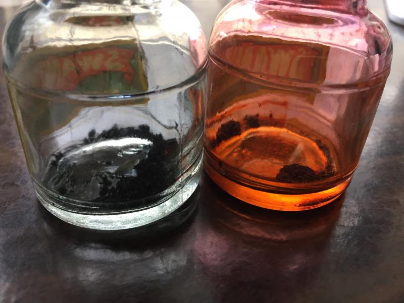
Introduction and Elephant in the Room KWZ inks at this point don’t really need an introduction of themselves so all I can say is about page on KWZ website is the best friend here. Bottle is dark glass bottle, good for inks. Now to elephant and well there are 2 different things that I noticed here, First the ink comes in a plastic wrap around the bottle, nice touch really as this prevent many issues that can arise. Second, is entire ink smells like vanilla and that was nice (typical of KWZ)....it made me want to eat ice-cream though so that’s bad. Jokes aside I can see some real practical benefit of inks condition and easy to spot any issue in ink if it arises (by smell) and that is a big plus for many. Each ink is handmade as mentioned by KWZ and might have some variations in them, take it as may that is a what it is. Variation are understandable if on asks me and I don’t think there will be any change in base formula or nature of ink, as comparison lets take processors, there is difference in each processors wafers when made and this has no real impact on processor itself but if you are overclocking the processor then it matters not for normal case. In short for most part, there should not be enough difference in actual ink nature of ink itself and that is the goal of this analysis. Ink review section Test papers include 75gsm sectra copy paper 70gsm and 85gsm nightingale paper 52gsm classmate copy paper (dot bleeds at end seen) 100gsm JK Cedar bond papers. Random books back sides and some unknown real cheap papers (slight bleed on cheap ones). Ink properties Bleeding/Ghosting – very slight on cheap papers. Feathering – None observed. Saturation – Good. Flow – Wet ink. Dry time – 5 sec to 20 sec approx. This above is when ink has been given 1 hrs to dry before pics were taken 10 day dry time has been given to ink. The color came out to be remarkably what it really is, very dark blue-black almost black in color. As with all the pea shooter phone camera at full works. This will serve as 1st case of testing, more below on that. Water Resistance – Very High. Although the dye tends to bleed out of page, content survive just fine and colour mostly. this is 10 day dry time given paper 1 min tap run, page has not been given time to dry but cloth was used to try removing ink using as soak for water and not rubbed. Pressed with cloth. The square lines have been soaked for 2 hrs in water and then crushed with dry cloth in attempt to remove ink. Color in these 3rd images is way off the mark, its little darker and paper is white, but dye loss is visible and that was intent, sadly due to nature of test its not possible to recreate the colors if one wants to I will perform another one but results will take 10 days at min...cos well 10 day time The ink is wet writer but very well behaved, I did not find any running issue even on wet pens of mine but all nibs I use are Fine ones so there is that, but I don’t think it will give trouble on this front. It does show very small bleed on cheap papers (in my experiment, the paper with bleed were some random 40 ish GSM pages which are very absorbent in nature and on 52 GSM classmate copy paper which showed dot bleeds) All in all a normal paper will not have any issue including copy pages. Cleaning well........will require hard work and regular interval is suggested as with all permanent inks. Ink is very dark blue-black and is on edge of black over blue. The beauty lies in it being blue at start and then quickly darkening to blue-black with inclination to blue for first 2 hrs or so while the real dark blue-black color takes another 2 days to fully show. No significant change after this.....yet. Personal take This ink has been on many people hit list and for obvious reasons of being liked in color and being an IG ink which also raises many questions on maintenance of ink and its general oxidization over time and this comes especially true for people like me who are burned by Sallix if I may be so bold as to say. While sallix tends to show signs of losing color this one it too early to say what changes will be. The main highlight for me was that it will darken as age, now I don’t think it will become black from already very dark, almost black color, but I hope to see it darker then sallix as it ages, The ink on box shows blue black and I suspect that is the final color of the ink (after properly oxidized). Lubrication is good, the last part of multiple pen test was left here and oliver used has some issues during testing. Dried ink for 1 hrs. 7 day dry for same page. below part of page came a bit wrong.....thanks pea camera lol.... This page will serve as second case. (more below about case). Reasoning behind other post of same ink Now begins the game of waiting and real reason to separate this post from other Blue black IG. Over the concern for IG ageing in time in current environment and uses, plus paper and well general skepticism of IG ink fade over time faster then most What I intend to do is simple, record the way the ink changes its color over the course of entire year with the way paper would be normally handled in normal situation. The tests will have 3 categories planned for testing on how the page is kept First- this is one where the page will not be used for any reference and will be opened for bare minimum like taking pics and observing the ink, but paper will lie outside shelf and wardrobe making it exposed to all weather paper might suffer. Second- Same as above but stored in wardrobe. Third-one small page will always be exposed to light of room and daylight abid diffused one to see general nature of inks movement. Possible due to east facing room with complete open windows, attempting to recreate a well naturally lit room. Fourth-Page opened and referred often to as notes, these are my geography notes. The first page of this will be posted along with others later. Oh and this is kept outside wardrobe...cos well its in constant use and I am too lazy. this is third case test page.
-
Since several intriguing and passionate posts about blue black inks were posted, I thought I'll add some historical context. When steel nibs were created and soon replaced goose quills (in early XIX century), in order to deal with the corrosive nature of iron gall inks, ink makers added dyes to the iron gall ink, which apparently tempered its corrosiveness. This made the written word legible in blue before the ink oxidized and turned black. Often iron gall ink writes in a pale, pasty grey colour until the oxidization process happenes and turns into the black colour. and overtime to brown.... I am sure many of the esteemed members with scientific background can explain it in more detail. Note on the bottle: This ink writes a clear blue and changes to an intense Black. Please feel free to add, correct or comment
-
As far as I can tell Hero 232 Blue-Black seems to be getting scarce from my online sources. (I recently ordered a bottle Hero 232 & 233 and was sent 2 bottles of 233 instead. Then the seller promptly raised the price to over 3x what I had paid ...) Hero 202 is still readily available. I did a search here: the evidence - while there's not a lot of it - seems to suggest that Hero 202 is likely iron gall. Has any more evidence turned up recently? I'll probably take a chance on it since it is so inexpensive but I need more ink that I won't use like I need a hole in my head.
-
Waterman – Blue Black I bought my very first fountain pen (a Kaweco Sport in black plastic) somewhere in 2012. Initially I just used standard royal blue ink cartridges because I didn't know any better. Sometime after that I learned on YouTube that you could syringe-fill a cartridge. That's when I made a visit to my local stationery shop and bought my very first bottle of ink - this Waterman Blue Black. And that's also the moment I got hooked! This Waterman ink was much more interesting than the standard royal blue cartridges I used until then - had that not been the case, I might have lost interest. Instead, it was the start of a very satisfying hobby. As such, this Waterman Blue Black has a special place in my heart. In this review I take a closer look at Waterman Blue Black. Exactly why this is called a blue black is a mystery to me - what I see is more of a grey-blue leaning slightly to the green. The ink does lay down a darker blue line on the page when writing, but it lightens significantly while drying. I must admit that I like the end result, which is a very eye-pleasing grey-blue. This Waterman ink writes well in all nib sizes, with good contrast to the page and with elegant shading. The ink dries fairly fast in the 5 to 10 second range. This means that while writing you observe in real-time the ink's transformation from a fairly dark blue to a much lighter grey-blue - fascinating! To show you the impact of saturation on the ink's look & feel on paper, I made some scribbles where I really saturated portions of the Tomoe River paper with ink. This gives you a good idea of what the ink is capable of in terms of colour range. As you can see, Waterman Blue Black has a fairly small colour range, without too much contrast between the light and darker parts. This translates to soft and non-obtrusive shading, exactly as I like it. Shading is present in all nib sizes, even the smaller ones. The ink's chromatography shows quite some green in the mix of dyes. From the bottom part you might get the impression that the ink remains firmly attached to the page, but sadly this is but an illusion. In reality the ink is not at all water-resistant, leaving only some smudges on the paper when coming into contact with water. I've tested the ink on a wide variety of paper - from crappy Moleskine to high-end Tomoe River. On every small band of paper I show you: An ink swab, made with a cotton Q-tip 1-2-3 pass swab, to show increasing saturation An ink scribble made with an M-nib Lamy Safari The name of the paper used, written with a B-nib Lamy Safari A small text sample, written with the M-nib Lamy Safari Source of the quote, with a Pelikan M200 with F cursive italic nib Drying times of the ink on the paper (with the M-nib Safari) Waterman Blue Black gets an almost perfect score, with only a nearly invisible amount of feathering on the HP copy paper. It behaved extremely well on the Moleskine paper, with no visible feathering and with only a tiny bit of see-through / bleed-through. Any ink that can pull this off deserves a medal - very well executed! The ink looks great on all papers, with good contrast and fast drying times in the 5-10 second range. I personally prefer this blue on pure white paper - it's less impressive on more yellow paper. Writing with different nib sizes The picture below shows the effect of nib sizes on the writing. Waterman Blue Black can handle all nib sizes without a problem. With the EF nib, you still get a nicely saturated line. Shading is present in all nib sizes. As usual, broader nibs accentuate the ink's shading capabilities, which never gets too harsh but always remains subtle and elegant. Be aware that the M-nib writing sample is too light - I had just cleaned my pen, and there happened to be some water residue in the feed that diluted the ink (and I was too lazy to redo the writing sample, so blame me and not the ink ;-). Related inks To compare Waterman Blue Black with related inks, I use my nine-grid format with the currently reviewed ink at the center. This format shows the name of related inks, a saturation sample, a 1-2-3 swab and a water resistance test - all in a very compact format. I have no other ink in my collection with this exact shade of blue, although iroshizuku tsuki-yo and Callifolio Oconto seem to come close. Inkxperiment – Blue Faery Tree With every review, I try my best to produce an interesting little drawing that shows what the ink is capable of in terms of colour range. These little inkxperiments are simply great fun, and they definitely add to the satisfaction I get from my pen & ink hobby. I really like the fact that inks can be used for all kinds of creative purposes - not just for writing. For this drawing I used a piece of 90 gsm sketching paper. I started off with heavily water diluted ink, and added more and more layers with ever-increasing amounts of Blue Black. For the tree's foliage, I used a piece of dishwashing sponge as a stamp (which worked quite well). I like the end result, which gives a good idea of what you can do with Waterman Blue Black as a drawing ink. Conclusion Waterman Blue Black is the one that introduced me to the world of bottled ink. It is a really attractive blue-grey (definitely not a blue black), that works well in all circumstances. A good all-round writing ink, with an interesting shade of blue. Technical test results on Rhodia N° 16 notepad paper, written with Lamy Safari, M-nib Back-side of writing samples on different paper types
-
Reportedly, Private Reserve is one of the companies that paved the way to the overabundance of ink colors we have now, as early on there were mostly the basic inks available, such as basic blue-black, red, green, turquoise, brown, black, and blue. PR inks come in a multitude of different hues. The original creator and owner of the ink company passed away, and the company is now under new ownership and management. Ebony Blue has been on my radar for a while. I love dark teal inks, but I'm usually pretty picky about them in person. Ebony Blue is a kind of turquoise mixed with black, and possibly some other hues in between, which results in a dark but more "clean" hue teal-black. What I mean by clean is that it's not muddy, brown-tinged like, say, Sailor Jentle Miruai. Depending on pen, paper, and illumination this ink can look more blue-teal or more green-teal. The flow is one of the interesting characteristics of this ink: it feels "creamy" to write with. I like this tactility of the ink. It does not feather nor bleed through any of the decent-to-good paper I've used it with. It has pretty decent water resistance too: while it won't look neat if you splash water on your writing, a clear, dark gray line remains behind to salvage content. There is metallic magenta sheen. This ink will work in all types of nibs: from ultra extra fine to broad. Shading becomes increasingly more prominent with broader nibs. If you use broad nibs with this ink, I recommend uncoated and more absorbent paper. It's more smear-prone on Tomoe River with broad nibs. Scan: on Fabriano Bioprima 85g ivory-toned paper with 4mm dot grid Scan: on Tomoe River 52g White Scan: on a 100g A6 uncoated paper (the first GvFC Gulf Blue should read "Cobalt Blue" instead) Scan: on Tomoe River 52g Cream paper (the first GvFC Gulf Blue should read Cobalt Blue instead) Close-up photographs:
-
I happened upon some new-old-stock bottles of "Waterman's Permanent Blue Black" ink. They were in pristine condition, and the cap sealing was good such that no ink appears to have evaporated. I see no precipitate or any other issues. The ink has a chemical scent I can't quite identify accurately, but it makes me think of paint and art supplies, for the lack of better description. I don't know if this ink has any amount of iron gall or not, but I suspect it has a small amount. If anyone wishes to contribute to this ink's description and dating, it would be great. The bottle has the following embossed on the underside: There are no visible dates on the bottle or the carton, but the following is stamped on the inner side of one of the carton flaps in black ink with silver shimmer--and it's difficult to read. Box #1: Box #2: The ink itself goes down on the page in a cool-toned (with a very slight purple tinge) hue of medium saturation and then dries to a muted very slightly teal-tinted blue. The color change is gradual over the next day or so to what you see on the photographs. The final color of the ink is quite consistent with the bottle cap. I can't explain why that is, but, subjectively, the color of this ink feels just right to me -- a classic. The water resistance test was a wash under running water, 3 days after the writing was done. I really like the look of the paper towel "chromatography" -- medium blue fading to slightly more cyan vintage light blue to almost cream. The more ink is concentrated, the more the blue is shifted toward green, as can be seen on the Col-o-Ring card. There is some red-magenta sheen. Not sure if I am going to hold on to both bottles yet--I got them out of curiosity, but it turned out that the ink inside was surprisingly good. And the bottle, along with the carton, look great on my desk. That "19 cents" printed price
-
This is my first real contribution to the site- please forgive any unintentional faux-pas! A friend of mine wanted to see what Pilot Blue-Black (one of my favorite inks ever!) looks like on Tomoe River paper, so I write a thing up for her to check out in person using lyrics to one of her favorite songs. Since I can't really figure out how to make file uploads here work just yet, I've linked to an imgur album of the pictures I took here: https://imgur.com/a/q4HSckJ The pics were taken with my phone camera, with no editing done on them at all. The only light used was the evening sunlight from my window. While the demonstration was intended merely to show off the appearance of the ink, I'll include my thoughts on its performance for you all: I love this ink. It's nondescript enough to be used in a professional setting, but also quite exciting (just look at the shading, and the SHEEN that it has on Tomoe River paper!). It's easy to clean out of a pen, and is pretty darn water resistant (so much so that I use it to address envelopes to penpals, but it isn't directly advertised as waterproof of archival by any means). In terms of flow, I would define it as being wet, but not gushy. I haven't used it on a particularly broad nib as of yet, but it has behaved marvellously on all of the EF through M nibs that I've used it with. I haven't experienced any bleed or feathering with it on cheaper paper; as such it's become my daily-carry ink, along with my EDC pen, the Lamy CP1 (f nib).
-
I recently went down to an antique shop and I happened to find some 'Swan' Ink bottles, made by Mabie Todd & Co in Sydney Australia. One bottle was labeled "PERMANENT BLUE BLACK" while the other was "VIVID RED". They appear to have what is most likely dried ink in them, though there is a chance that the permanent blue-black one contains iron oxide sediment at the bottom considering it is most likely an iron gall ink. Is it possible that I could receive some information on them (there doesn't appear to be much about it online), as well as whether it is safe to reconstitute the ink inside of them? Also. since there appears to be rust on the caps, how would I open the bottles without having to smash the glass or any other method that involve s the destruction of the bottle? (Or should they stay closed?)
-
I have an old, pre-reformulation glass bottle of Diamine Blue-Black, and a pre-reformulation glass bottle of Diamine Onyx Black. Both of these inks were purchased around 2010 and have been used periodically since then, but not very often as I don't particularly like the purple undertone of the black, and the teal undertone of the blue-black. Recently, I have noticed that both inks are drying out in multiple different pens' feeds after they have been unused for a day or so. If the pen is shaken then some ink enters the feed and a dozen or so words can be squeezed out before the pen runs totally dry again. Even then, ink flow is much reduced and proper flow can only be restored by priming the feed. For many years these inks flowed perfectly. I wonder if perhaps the inks have thickened, so to speak, as air has evaporated. Or perhaps they have just chemically degraded. I have noticed that the blue black appears to have some small solids that are adhering to the inside of the glass, even through the ink itself looks perfectly liquid otherwise. Both have been stored in a dark and relatively humid closet with a stable environment. Does anyone else have experience of inks degrading over time like these Diamines? Is this, perhaps in part, why they were reformulated?
-

Pilot Blue/black - Not Available In Bottles In The Uk - Why?
Mercian posted a topic in Inky Thoughts
Hi, I would like to buy a bottle of Pilot Blue/Black ink, because I have read many complimentary things about it on here, but... ...I live in the UK, and it seems that Pilot won’t let us British types buy it in bottles The only bottled inks that Pilot will let us buy are the 60ml bottles of Namiki Blue or Namiki Black.(Well ok, they do also sell the Iroshizuku ‘luxury’ inks here too. At much higher prices.) AFAIK, there’s only one UK retailer that even sells Pilot Blue/Black in the IC100 pack of Pilot’s proprietary cartridges.But proprietary cartridges aren’t much use to anyone who uses a piston-fill pen (e.g. a Pilot Custom Heritage 92), and nor are they much good to anyone who uses a Pilot ‘MR’.(Pilot’s version of the Metropolitan for the European market; it is a Metro that has been ‘chambered’ for ‘Short International’ cartridges.) Given that Pilot do sell the ‘Custom Heritage 92’ here, can anyone tell me definitively why they won’t sell Pilot Blue/Black in bottles to UK customers? It can not be because the ink contains has been ‘Unpersoned’ at regulatory level (e.g. for containing an ingredient that is persona non grata), because if that were the case the cartridges would be off-limits to us too. Are Pilot & Namiki perhaps two entirely-separate companies who have, after centuries of inter-Corporate feuding, agreed to a mutual-co-operation treaty for the European market that is policed by Weapons-grade Corporate lawyers, and in which Pilot have bound themselves to selling only Namiki’s bottled inks in Europe?But then, Namiki don’t even sell a blue-black, and how would the Iroshizuku range be exempt from such an arrangement? Are Pilot perhaps trying to push me towards buying the ink direct from Japan (from where I will also be able to buy a Custom Heritage 92 for much less than its UK RRP)? My thanks in advance to anyone who can solve this mystery. Cheers,M. -
Birmingham Pen Co. "pennsylvania Railroad Boiler Steam Blue/black" Ink Review
Intensity posted a topic in Ink Reviews
This is a review of Birmingham Pen Co.'s "Pennsylvania Railorad Boiler Steam Blue/Black" ink. Another, earlier review of this ink: https://www.fountainpennetwork.com/forum/topic/329493-birmingham-pennsylvania-railroad-boiler-steam-blue-black/ Birmingham Pen Company is a store in Pennsylvania with its own line of budget-friendly, mysteriously complex dark shades of inks: https://www.birminghampens.com/pages/about-us This particular ink is a classic "Blue-Black" that's more on the dirty grayed-navy side than teal--sure to please those who don't like their blue-blacks too green. The ink is not without quirks, but now that I understand it, I believe it can be very well-behaved on paper, given the right tools: Specifically, this ink has high flow, and if you use a juicy nib you might end up with a lot of ink on the page, taking a long time to dry or else quickly bleeding through cheap paper. HOWEVER, if you use a more conservative flow nib/feed or even something like a drier fine nib, the ink dries very quickly on any paper. You especially may want to use conservative amounts of this ink on cheap paper, as the inks absorbs readily and bleeds through if you put down too much. If your preferred instrument is a pen with an XF nib, you will probably be okay with cheap paper too. That said, on nicer fountain-pen-friendly paper, this ink looks great! As long as paper absorbency is not high, you begin seeing beautiful shading, as while the hue is dark, saturation is not high. It is not the kind of shading that dramatically goes from light to dark and looks distracting. Rather it is a gentle transition, especially if you write in unbroken cursive. Particularly with broader nibs, the shading looks quite striking (with the caveat of long drying time for some spots, but that doesn't bother me). There is no outlining to speak of nor noticeable sheen*. *The sheen is present, but only on very non-absorbent paper and only in very high concentration areas, where you might just about detect a hint of something metallic red. But just barely. Water resistance is respectable: the color components wash off, and clear gray line remains. Although this ink has a fairly conservative hue that's not out of place in any line of work, this ink's appearance is intriguing enough to use for personal correspondence as well. Pale cream Fabriano Bioprima paper and Col-O-Ring cards (top left card is an abbreviation of Birmingham Pen Co. "Grandview Avenue Midnight Horizon" blue): On "white" (rather creamy) Tomoe River and Col-O-Ring cards: Some lower quality paper: absorbent, no shading to speak of, bleed-through is present: Water resistance: -
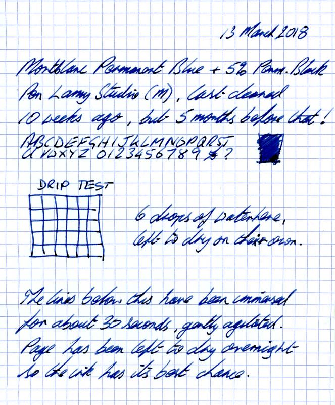
As requested, a scan of my Montblanc Permanent "Blue Black" I find my idea of waterproof differs from those frequently expressed. Many are happy if the page can be read after an encounter with water. I set the bar much higher, looking for something which is completely unchanged by its watery encounter. I don't like black. Blue could be acceptable, but blue black is the ideal. Full strength IG ink seemed promising, but a bad experience with Diamine Registrars put me off (varnish-like coating inside the ink window of an M200 after 4 days - took ages to clean). January '16 I tried Montblanc Permanent Blue and it did all I wanted. Ran happily in two Pelikans and an L2K, but was just a little too bright. By April I had acquired a bottle of Permanent Black for mixing. A little experimenting and it seemed the addition of just 5% black made all the difference needed. In July '16 this mixture took up residence on a Lamy Studio and has remained ever since. The ink is completely waterproof in all tests I have done, is (to me) an acceptable blue black and performs well with minimal maintenance. It has slightly stained the converter, there is some nib creep and it seems to need refilling before it's empty. To me these are minor irritations. Here is a sample page. Despite some fiddling, the image looks a bit too purple on my screen. With many BlBks being rather grey, it is warmer than most. But the water has had no effect at all.
-
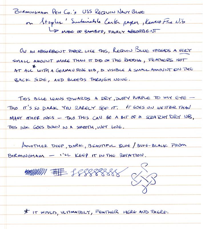
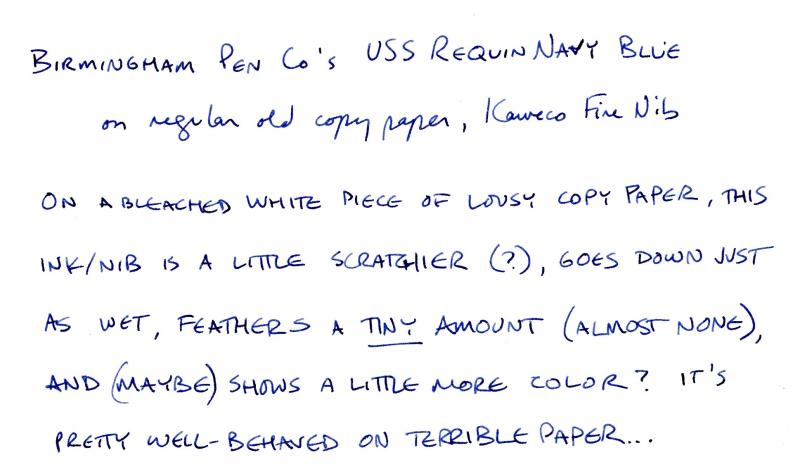
I initially thought this ink leaned towards the purple but see now that it dries to a deep navy / blue-black. It's a very well-behaved ink, and I've since loaded it into a piston-filler (Lamy 2000), run through it, and had it clean out entirely with around 10 flushes, so -- as good as any of the easiest-cleaning inks (for me, anyway). I ran through the testing rubric on Tomoe River Paper, so it gives great line definition and nice, true color -- but dry times are off the chart. Regular paper offers an under-ten-second dry time with a European medium nib (Kaweco medium tested). If you like the color -- or are, like me, forever in search of more blue-blacks -- it's a great everyday ink: almost black in a bold nib, true navy in a fine-medium, and a steely-gray-blue in an extra-fine, and office-friendly in all three. On TRP: And on my everyday office paper, Staples' Sustainable Earth (bamboo) paper: On fancy-shmancy letterhead paper (unsure of bond designation, but like the vast majority of mass-market consumer products it probably wouldn't mean anything anyway - in any case, this is a custom letterhead from Crane's): And on a piece of paper I pulled out of the laser printer: All told, it's a very versatile ink - works well on any paper provided you choose an appropriate nib and has nice variation in color with different nib sizes; I'll be putting it into the rotation, as it has all the right qualities and it actually adds something to my blue-black collection... [edit: to repost pictures, as I believe I musta bunged it up somehow]
-
Birmingham Pens Emerald View Park Oxidized Brass Based on the positive review of some of the inks from the Birmingham Pens shop in Pittsburgh, PA I ordered the full sampler pack of 30 inks. I know some won;'t be to my taste, but many seemed quite interesting. The inks certainly win the award for the longest names. I stashed the samples away for relatively easy access, and this was the first ink I blindly selected for review. Interestingly (or not) it has also been reviewed recently. This is a dark gray ink with a strong blue undertone. To me it appears as dark gray in most light, but often will appear as a dark, neutral blue. It's quite neutral in appearance, and would go well in a business setting. Normally I don't favor gray inks but this one is quite nice. It is also quite water resistant. It has decent saturation, but is easy to clean from the pen. The ink seemed quite shady across a broad range of papers, and has some sheen on Tomoe River. The handling was very good with no show through or bleed through experienced, no hard starts or skips, just a pleasant writing experience. Pen: Pelikan M400 (M) Papers: MvL=Mohawk via Linen, TR=Tomoe River, Rhodia=Rhodia 90g ivory. Camera: iPhone 7 using Camera+ app The images were fairly decent, but the FPN uploader seems to modify the images making the ink appear darker and with less range than in reality. As always with ink reviews, you may want to order a sample prior to diving in on a full bottle.
-
I found that pilot sells a "basic" blue black ink in massive 350ml bottles for $20 shipped on amazon with prime shipping. I couldn't find many comprehensive reviews. This might be one of the absolute best inks for professionals and students who go through ink like crazy, but want something that is still seriously waterproof and has some presence on the page without being ostentatious. Also, to my surprise, this ink has a LOT of sheen! even with a fine 3776, the wetter strokes show a whole lot of tasty red sheen. It's a very permeating sheen, too, not just at the edges. Color wise, it's closer to blue than black, similar-ish to de atramentis fog grey, a little more muted-grey than the really vivid parker quink BB, quite a bit more blue than lamy BB. Definitely in the middle of the blue/black world. Dry times are VERY quick. It's a medium flow, tending towards a bit dry. Shading is medium-high. more on/off, not like the color shifting of apache sunset, but it's present in all but the wettest pens. It's very well behaved in several different pens, including a scheaffer imperial, 3776 SF, italic ground pilot stub in a Wing sung 698, and the lamy CP1 test mule with nibs from EF-B and 1.1. None of the greasy feel of monteverde or the really picky feel of lamy BB. It behaves perfectly on good paper, rhodia, clairefontaine, etc. But on really bad, cheap copy paper it can feather and bleed a little bit on the wetter parts of the letter. Not bad and far from unusable, but it's there. Closest analogue to bleed and feathering that I have inked might be diamine oxblood. Overall, in a finer nib it'll handle a composition notebook, an EF can handle double sided Waterproofness is outstanding. some of the ink comes off the page, but what's left is completely legible. Overall, this is a fantastic ink and an absolutely insane deal for probably enough to get me through med school on its own. It really has everything I want, waterproof, sheen, shading, and a very professional color. You will need an empty bottle to refill from, however, since it's in a 12oz glass bottle. The lid of the bottle has a pour spout, making refills of bottles with normal sized necks very easy. I really like lamy bottles for my inks, but an iroshizuku would do, too.
-
Aurora inks come in three basic colors: blue, blue black and black. The bottle holds 45 ml of ink. Inks can be also bought in cartridges. For many years Aurora wasn't interested in expanding their color range. They seemed to think that Blue and Black are able to fully satisfy fountain pen afficionados needs. The market changed, hundreds of new colors were created, new ink makers appeared and Aurora teem decided to make a bold move and offer new exciting color, unlike any other on the market * - blue black. It's a breakthrough moment in Aurora history. Who knows, maybe they'll dare to offer green or red soon? While I'm not biggest fan of blue blacks, I tend to use them from time to time. Kyonooto Aonibi is one of my favorite inks ever but it's not classic blue black. I was interested in trying new Aurora ink (on the other hand I'm interested in trying any new ink). I bought a bottle and used it for few weeks in four pens. The results are good. To put it shortly - it's an excellent fountain pen ink. You may not enjoy the color but the behavior and smoothness are first class. The color is saturated and quite deep, the ink flows nicely and lubricates the nib in a satisfying way. level of saturation is satisfying but not crazily intense or overwhelming. There's some shading - I guess that in a right pen it can be quite intense. I haven't observed any feathering even on Moleskine (a synonyme of crappy paper). Some bleedthrough was experienced only on Moleskine (crappy paper). Drying time is reasonable (10-15 secs on Rhodia and alikes). Additionally it's fairly water resistant ink. Well done Aurora! I hope that you'll offer some new colors. Drops of ink on kitchen towel Color ID Color range Discovery 70 mgsm copy paper, Wing Sung 698, fine nib (The quote comes from Josiah Bancroft's excellent book Arm of the Sphinx. Highly recommended) Oxford Optic 90 mgsm, Visconti Homo Sapiens, medium nib Leuchtturm1917, Visconti Homo Sapiens, medium nib Leuchtturm1917, Wing Sung 698, medium nib Water resistance Mini-comparison * I'm pretty sure everyone knows I'm joking, but just to be sure - it was irony
-
Hi guys!! I require your guidance and expertise to try and make my own Blue Blacks. What I have at hand are the 40ml bottles of Parker Quink Black and Quink Blue. I was wondering if I could mix and make my own blue blacks using these two. I use a Lamy Safari F and 1.1 nib for my daily writing. I use ordinary notebooks nothing fancy. Could you please give me a ratio that would give me the right color for the ink or your favorite blue black color? I want it to look dark but not too dark that it really looks black. I hope you got me. How do I mix the inks the right way? Anything else that I need to look out for when mixing these shades please let me know. Thank you all! Pete :")
-
Hi everyone, so I've read a bunch and researched and have narrowed things down but I'm still having difficulty so I'm hoping for some help. I've narrowed it down to (I think) Sailor Sei Boku, and Noodlers 54th Mass., Bad Blue Heron, Bad Belted Kingfisher. I've a few questions I can't seem to resolve after checking out as much as I can find about these inks. I'm looking for a waterproof, archival ink that is a blue black colour. These all seem to fit the bill, but there seems to be some differences of opinion and differences in test results on the waterproofness of the Noodlers Inks. It seems to be based on the cellulose content of the paper from what I can tell? Is there a way to figure out the cellulose content of a paper before buying it ? I've looked a bit online for the papers I have but haven't been able to figure it out (Strathmore 300 series Bristol ) Canson Sketch (the popular one on amazon - side note - decent paper for fountain pens in my opinion). I have some Tomoe River paper ordered about a month ago -should be here soon. So thoughts on: 1. The colour - I can't seem to find colour samples of them in the same photo - to eliminate different camera settings/ white balances etc.. I have Platinum Pigment Blue and love the colour when it's wet and dark, but not as much the more watery looking finished product. It's ok though but don't love it. I have a Diamine 1864 blue black that looks awesome but it's not waterproof obviously. How do the colours compare to each other? I keep reading different things. Are they sufficiently different to warrant owning all of them ? If you could only have one blue black permanent, waterproof ink which one would it be ? The Noodlers seem to get complaints about feathering more than the Sailor. True ? Also, the Noodlers seem to be different colours bottle to bottle from what I'v read. I don't love that idea. Any other thoughts or opinions on this would be great. Leaning Sei Boku - Thanks.
-
Well ink loving friends, here is a review of some vintage Sheaffer's Skrip Permanent Blue Black with RC-35! There are some older reviews on our site, but not many. Let me share the story of my acquisition. Attending a preview for a living auction of someone in our area moving to an assisted living in Florida, I discovered a secretary's desk. It had been repainted a muted green, though I fail to understand the mentality that wishes to cover beautiful old, dark wood. The auctioneers weren't going to bother offering the contents separately, so near the end of the long day it came for sale. The desk itself was neat, but the contents were even better: some old pens, dip pens and nibs, other knick-knacks and bric-a-brac, and a bottle of Sheaffer Skrip ink. From a bit of research on the site this bottle comes from the era 1955-67. It was made in Ft. Madison while the Snorkel pen was on the market. It's somewhat easy here to find old bottles, less so with liquid ink in them. This ink was perfectly clear, still had a good inky aroma. In working on a project with my inks, I filled an Edison Beaumont pneumatic filler with this one. Here are the results. The images seem to have captured the ink as darker than in fact. This is not the darkest of the modern blue-black inks, it is lighter than most, but not light itself, if that makes sense. BB4B, OS Manganese, Sailor Shoushikan Sei-ran, and others are all darker overall than this ink. But these other inks don't have quite the same kind of shading as this one which ranges from fairly light to quite dark. Another review shows this ink as being much darker. But I can't elaborate on the provenance of this particular bottle other than what I have. I haven't experienced any problems with this ink. It is actually quite water resistant, so while it is said you can recover your writing under UV light if the ink is washed away, at least on the modern inkjet paper it was quite permanent. A nice trip down memory lane. Pen: Edison Beaumont pneumatic (M-steel) Papers: MvL=Mohawk via Linen, TR=Tomoe River, Hij=Hammermill 28 lb inkjet, Rhodia=Rhodia 90g ivory. Camera: iPhone 7