Search the Community
Showing results for tags 'black'.
-
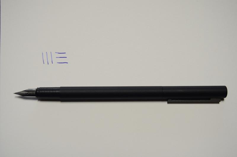
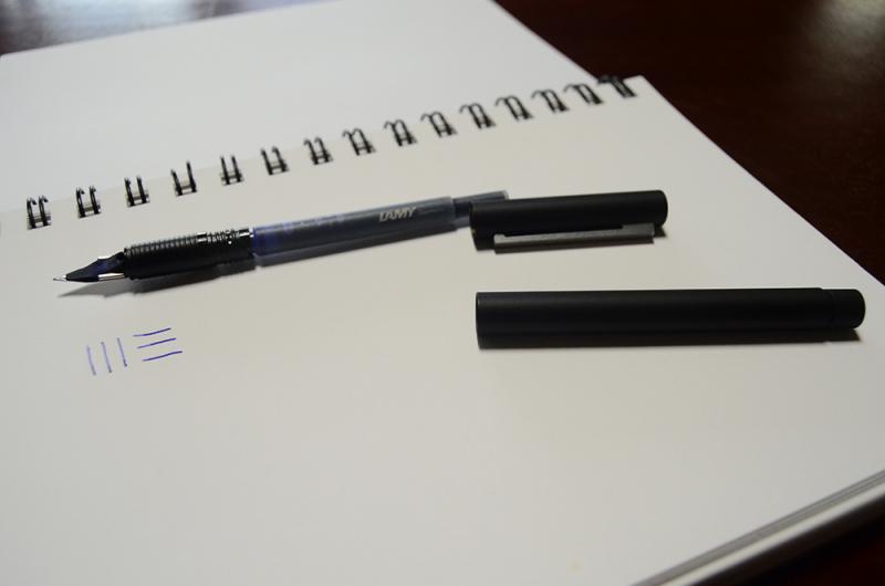
So I decided to compare the EF nibs I possess right now, with inks on hand, since I got a replacement Lamy EF nib. I wrote out both Japanese vertically and horizontally, and English, to compare alphabet and oriental script. Here are the combinations: MontBlanc Meisterstuck LeGrand, 14K EF nib, with Pelikan 4001 Royal Blue Lamy Safari EF nib with Lamy Blue Platinum Plaisir with J Herbin Encre Violette Platinum Preppy with Platinum Black Vertical Verdict: Platinum Plaisir wrote the smoothest, then Preppy, and the grand loser was MB. Lamy did fine, but not spectacularly. MB was VERY scratchy. Also, the MB width is so thicker than the other three that it looks like a medium. What gives?! Order: Plaisir, Preppy, Lamy, MB. Horizontal verdict: Platinum Plaisir wins again. Preppy lost out to Lamy; MB is a little smoother, but still scratchy. MB must hate this paper. Order: Plaisir, Lamy, Preppy, MB. English: MB wins, hands down, despite the "this is so not EF" thickness, then Plaisir, then Lamy, and Preppy decided to scratch. Order: MB, Plaisir, Lamy, Preppy. Conclusion: Lamy can do fine vertically and horizontally, but fares better with loops and curves. MontBlanc abhors vertical strokes and corners, period. Plaisir is smooth both ways, but loses an oomph when writing in English, and tends to glide too much. Preppy is acceptable in all situations, but will never, ever stand out. Considering that Japanese has a lot of vertical and horizontal strokes, as well as angles, and significantly less loops than English, it makes sense for Platinum to make pens suited for that purpose, rather than Lamy or MB making nibs that suite cursive loops more. Also, thinner the nib, easier to write Japanese, because we have sudden upward strokes. The red? Pilot VRAZOR EF point. The pink is Varsity (nib is bent for some reason). http://i1332.photobucket.com/albums/w614/GabrielleduVent/DSC_02562_zpsd09521e5.jpg
-
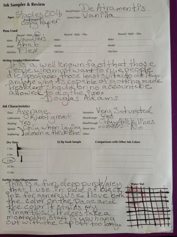
This is my review for De Atramentis Vanilla. Before I start to talk about the ink I would like to apologize for the kitten paw prints on the review itself. On the other hand, my current batch of foster kitties highly recommend this ink This ink is just a wee bit dry with an extra fine nib, but I didn't notice that until I finished my written review.

-
I received the Lamy CP1 as a gift. I was after a "non-nickable" pen - one that wasn't likely to get stolen, and was cheap enough to replace if it was. A workhorse. As an added bonus, it looks more or less like a ballpoint, so the CP-1 was ideal for my purposes. Appearence (7/10) Its simple, black flush design does look very much like a ballpoint, but a nice one. The silver clip is in stark contrast with the flush body, and neither look particularly cheap. One of these pens is not like the others! The official product shot of the CP-1 shows the pen posted, hiding its only downfall of design: The end of the pen, which features a small plastic ring that looks cheap and nasty (see picture below). This part of the design allows the cap to be posted very firmly, so it's a trade-off of design for functionality. Fortunately, while posted, the pen looks sleek and sophistocated, and there is none of this "trade-off" nonsense we see while capped. Design/Size/Weight (6.5/10) The pen is functional and well-designed. It's made almost completely from brushed metal, with the exception of the aformentioned ring and the grip, which feels quite cheap compared to the rest of the pen. It is the perfect length for my medium-sized male hands, both posted and unposted. Its width is a little too thin for my liking, and this takes its toll when writing for more than an hour. What lets the pen down is its weight. It's light. Very light, in fact, as you might expect from a pen of this size. While many may appreciate its weight for conveinence, I personally find it detrimental to my handwriting. I always find myself posting the cap to make the pen heavier. The clip has a pleasingly spring-loaded pullback, but sadly has quite a loose tooth. The clip moves from side to side a little too easily, making it feel cheap and easily breakable. Strangely, the word "Germany" can be found engraved undearneath the clip. I was surprised by this attention to detail. I really must shout out to Lamy here for their excellent clip-on cap design. I usually prefer screw-on types, but the closing click on the CP-1 is oh-so satisfying, and solid as anything once capped. Nib (6.5/10) Not particularly scratchy, but I wouldn't go so far as to say it is overly smooth either. I have the F nib, but the pen comes in B, M, F and EF. The nib is rigid, as expected from a steel nib. The horizontal line width is slightly thicker than the vertical line width. There is a fairly consistent ink flow, but it's not perfect. Filling system and maintenance (8/10) Mine came with both cartridges and a converter, both of which hold a decent, but not amazing, amount of ink (though it is worth noting that the converter contains less ink than the cartridges). Where I live, Lamy cartridges are generally cheaper than other cartridges. The pen wrote straight out of the box, and needed no help whatsoever to get a nice, solid inkflow on its first time out. I have not needed to apply maintenence yet. Cost and Value (6/10) Well, it's not the steal of the century, but it's not bad. With prices ranging from US$50-70, the pen is cheap if you look at it from a "good fountain pen" standpoint, but expensive from a "good ballpoint" one, to which the pen is somewhat more akin. I prefer to look at it as value for usage, and it looks like I'll be getting a lot of usage out of this one. Overall (7/10) If you're looking for a cheap, light, workhorse fountain pen for taking notes and not writing neat letters, the Lamy CP-1 is for you. This was my first Lamy pen, having previously thought of Lamy as a get-what-you-pay-for brand, but I was very impressed with the CP-1. I use it the most out of all of my fountain pens, and I'm not afraid to take it out. It may not produce the nicest results, but this isn't a pen that's going to get scratched or stolen. Alhough the clip may be a little flimsy, the pen is a high-quality piece of German workmanship. A true workhorse pen.
-
http://i1005.photobucket.com/albums/af174/fabienne301/blacksmackdown1_zps1b19405c.jpg http://i1005.photobucket.com/albums/af174/fabienne301/blacksmackdown2_zpsb53a0a2f.jpg This review was done especially to annoy The Good Captain. The colors you see on the screen are quite accurate. I was amazed but there you are. My scanner caught the nuances perfectly. I stand by what I concluded with: whichever one you choose, you will be right. They are both great inks. It's just that Noodlers is blacker, and that's a fact.
-
I have a Hero 616 pen and a bottle of their ink, not so sure what model since I just picked it up in China because of it's price, which is like a dollar for 15ml. I used it in my 616, which has a sac refilling system, and after the ink flows down into the bottom, the top turned orangish red from the remainder of the ink. Is that what black ink do or what?
-
COMPARISON : DIAMINE GREY, DIAMINE GRAPHITE, DIAMINE JET BLACK PAPER : RHODIA #16 A5 white lined PEN : Onoto Magna 261 Medium nib tweaked for wet flow by John Sorowka (Oxonian). Scanner : IT8-calibrated Epson V600 flatbed Colour Space : Adobe RGB Matte : 50% grey and 100% white Post-process : Unsharp Mask Colour Balance : Neutral === This is a side-by-side comparison of three of the Diamine Greys. In order top to bottom on the scan... 1. Grey, a mid-grey with a neutral tone. 2. Graphite, a dark grey with a slight hint of green. 3. Jet Black, a black that, with the right pen, can behave as a dark grey. There are many "blacker" blacks now and folks do mention this when dark greys are needed. All three inks were scanned from their own pieces of paper at the same time then moved about in Photoshop. http://www.dcoffey.co.uk/images/fountainpennetwork/ComparisonGreyGraphiteJetBlack.jpg http://www.dcoffey.co.uk/images/fountainpennetwork/ComparisonGreyGraphiteJetBlackSwab.jpg