Search the Community
Showing results for tags 'asa'.
-
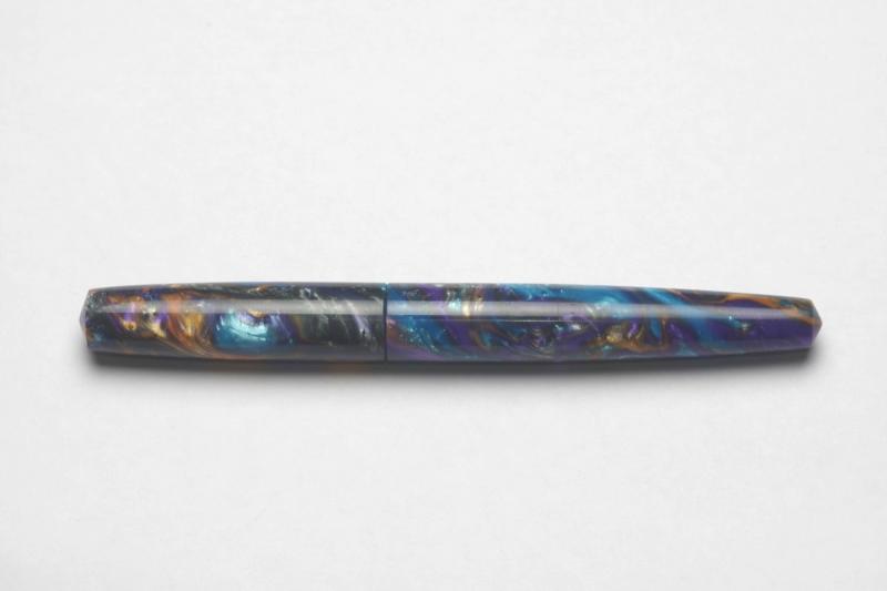
ASA Nauka in blue and red ebonite Can a humble pen offer a homily in human imperfection? This is one of the questions that the ASA Nauka, turned by a penmaker in Chennai, India, makes me want to answer. Lakshminarayanan Subramaniam runs ASA Pens, an online and bricks-and-mortar retailer offering multiple pen brands and at least 16 models specific to ASA. It is difficult to type the 16 letters of his first name, and even tougher to pronounce, so well take his lead and just go with L. In 2015, Subramaniam began collaborating with Joshua Lax, president of the Big Apple Pen Club in New York, to create a pen based on the Sheaffer Crest of the 1930s, and the Oldwin Classic of 2002, created by André Mora for the Paris company Mora Stylos. The Nauka positions the cap threads next to the nib and then gracefully sweeps, unbroken, to the end of the barrel. The Naukas huge cap looks like the stub of a cigar. Nauka means boat in Hindi and Bengali, and I think the name refers to the sweeping sheer line of nautical architecture. Uncapped, its about the size of a Montblanc 149. The development of the Nauka is equally as interesting as its conception, because it relied on a prolific group of Indian pen enthusiasts who worked together to design, prototype, and market the pens first round of manufacturing. Im not all that interested in the minutiae of dimensions, but elegant photographs in a review by FPN contributor Sagar Bhowmick display them all. I ordered a couple of Naukas, including one in a mottled Indian blue-red ebonite and another in a tasteful Conway Stewart acrylic material called Dartmoor. I had hoped the Nauka in Dartmoor would be gorgeous, and a joy to write with, and it is both. But what is remarkable is that the pen I have the most fun with is the humble, eyedropper-filled, ebonite model. This results partly from a gigantic 40-millimeter nib by Ambitious, an Indian company, with a black ebonite feed that supplies ink in reliably generous quantities. Whenever I write with it, at whatever direction or speed, however long its been sitting on my desk, the Nauka's medium nib -- more of a broad, really -- lays down a wet, glistening line of ink. The nib and feed introduce what is most interesting about the ebonite Nauka. The slits that form the fins of the feed, for example, are irregular in length. Maybe theyre hand-cut, maybe theyre not, but theyre definitely not uniform. The gold-colored nib is imprinted with the words IRIDIUM POINT, wrapped around a circle. The letters are a little eccentric. I dont know, maybe there were too many letters to wrap properly around the circle. Maybe the Ambitious nib designers ran out of energy and were rushing to make a deadline. And nothing about the rest of the pen is uniform, either, because this is a hand-made pen, made by a human being on a lathe. There arent all that many Naukas out there Im guessing 500 at the most -- but this eyedropper is different from all the rest. Mine is clipless, and I found a bronze ring in the shape of a lotus, the national flower of India, to serve as a rollstopper. If you squint, you can see imperfections in the ebonite, little dark spots about the size of an opening left by a pin. If you use a macro lens to shoot photographs of the barrel, you see marks left by the tools that created the pen. I can see one tiny nick in the cap, exactly parallel to the cap opening, and when I see that nick I can hear a curse from the lathe operator who realizes the need to spend more time to smooth that out. He Im guessing the operator is a he either smoothed out as much as he could without creating an even bigger divot in the surface, or finally said, screw it, this looks good already. Many of the lathes that turn ebonite pens in India are still foot-pedal operated, and I dont know whether ASA lathes are driven by motors or feet. But I know the humans operating those lathes had a lot more on their minds than a 1-millimeter-long tool mark. In a wonderfully hopeful turn of phrase, the FPN contributor "sandburger" wrote that Indian ebonite is like wood, gloriously inconsistent, with the power to surprise and delight. I agree completely. There is much literature on the subject of human imperfection. Robert Browning wrote a poem called Old Pictures in Florence that, among other things, talks about lesser-known artists and how they contribute to the work of greater artists. The New York-based psychiatrist Dr. Janet Jeppson Asimov, widow of the science fiction author and biochemist Isaac Asimov, wrote an essay this year for The Humanist called In Praise of Imperfection. She writes that the imperfections of human brains actually improve the way we function. We learn more from mistakes than we do from successes. When I was in university I had the good fortune to spend a few days in Venice, and one afternoon I was admiring the irregular lines of a gondola along a bridge where gondoliers were taking a break. The gondola, as you probably know, is an asymmetrical boat, because the single oar sticks out on the starboard side. The port side needs to be longer so the boat doesnt turn left all the time. And the gondola is heavier at the bow than at the stern, to account for the weight of the gondolier. If you look long enough at the polished black sides of a gondola, you see undulations and imperfections. As I was staring at one of these gondolas, hypnotized by the play of light and water on the shiny surface of the wood, I told a gondolier that it was beautiful. He responded that it was beautiful because in it you see the hand of the human being who made it. This review originally appeared on Giovanni Abrate's website, newpentrace.
-
Recently I found myself to be using more pocket pens than bigger pens but I lacked any good custom pocket pen. So I went to Lakshminarayanan Subramaniam of ASA Pen who suggested me to look into ASA SWAN ,I liked the model and thought how to spice things up .. I recently acquired only 1.5 rods of the very illusive and sold out Conway Stewart Flecked Amethyst and thought to make a custom pen based on ASA SWAN out of those blanks .. The end result http://i.imgur.com/QGnOBg7.jpg THE ASA MONAL 1. Appearance & Design:- The pen is a rod shaped pen .The body and the section is made from Conway Stewart Flecked Amethyst blank. The cap is made from black glossy Indian Ebonite and te cap finial is also made from the CS blank. I opted for this custom design mainly for two reasons . Number one being there wasnt enough CS material available anywhere to make a full size cap and number two this design shows off the fusion between EAST and WEST .. http://i.imgur.com/BH5UPPj.jpg The fusion between EAST and WEST Here the gorgeous CS blank weds the Indian shiny ebonite .. I also made a smaller cap from the CS blank ( still in making process) 2. Construction & Quality : As always ASA made a fantastic job with the CS blank. The finish is world class ,devoid of any tool marks or imperfection . I cant even feel the joint where the black ebonite meets the Flecked Amethyst finial on the cap . http://i.imgur.com/LKaYidd.jpg The cap opens in very convenient one and half turns . The section is a nice and smooth hourglass transition from the barrel and the threads are perfectly smooth http://i.imgur.com/UyESpOB.jpg The smooth barrel to section transition with hourglass section 3.Comparison :- As this pen is based on the model of ASA SWAN a comparison with it only fair. Both pens are almost equal in length when capped . However the barrel of the ASA MONAL is a little bit thicker and has flat ends . http://i.imgur.com/shct06r.jpg ASA MONAL AND ASA SWAN CAPPED Opening the cap of both of pens reveals hourglass section in both , ASA MONAL has slightly thicker section diameter which I enjoy a lot .. http://i.imgur.com/DdUe9K8.jpg ASA MONAL AND ASA SWAN UNCAPPED 4. Nib & Performance: - IF you ask anyone from India the best Indian nib , I am sure they will come up with KANWRITE .. The ASA MONAL is custom fitted with KANWRITE #35 M FLEX nib unit ( same unit in noodlers ahab) The beauty of this nib unit is that not only it writes super smooth out of the box but also you can swap the nib unit with inexpensive nib units from KANWRITE with the range of EF,F,M,B,BB, RTOBLQ,LFTOBQ ,STUB in regular line and F,M,B in flex lines . This gives an amazing adaptability of the pen .. EF TO BB just in one quick screw in and out http://i.imgur.com/DVBEg2L.jpg KANWRITE #35 M FLEX AND SCHMIDT M http://i.imgur.com/KIPa9Nu.jpg ASA MONAL DISASSEMBLED WITH #35 KANWRITE NIB UNIT TO give an size comparison of the ASA MONAL with LAMY 2000 http://i.imgur.com/DHFlzt7.jpg ASA MONAL AND LAMY 2000 CAPPED http://i.imgur.com/OFxqsKh.jpg ASA MONAL AND LAMY 2000 UNCAPPED 5. CONCLUSION AND WRITING - The ASA MONAL is an example of true custom beauty ,an wonderful writer and superb craftsmanship of ASA .. I am very much delighted to possess this beauty .. http://i.imgur.com/5eMgc0s.jpg
-
Hello Everyone, ASA Swan is one of the less advertised models in their website, so its a relatively obscure product from ASA. i found it while browsing their complete catalogue. It is a simple acrylic pen, devoid of any extra appendages. I chose the ASA Swan because of its plain and simple design, lacking any extra ornamentation or glitter. I liked its pristine look and de-glamorized appearance. As if the shiny body itself is speaking of the inherent quality. It’s a very personal choice to keep at least one pen with simplest of features. It was intended to provide the eyes some relief from the pressure of viewing all those too self-conscious gaudy Chinese pens for days on end. But I agree that the same featureless look that caught my attention may not appear attractive to many fountain pen lovers, as was evident from the flak I received from a few of my colleagues when I took it to work. Still I like this pen. Today I am not allotting marks separately as this pen is more of a subjective choice. ASA Swan 1. Appearance & Design: This is a rod shaped pen. The acrylic comes in different colours like white, light blue, green. Contrary to the common features of acrylic pens, these pens have a single coloured body with no ripples, swirls or patterns. That keeps things simpler. There are two kinds of designs, flat ended and round ended. The body tapers gently towards the section and the section has a notch like portion at the distal end, beneath the nib for easy gripping. The cap is a simple cap with ball end clip. Design-wise it may not attract all fountain pen users. It’s a light weight pen. The body and cap 2. Construction & Quality : As usual the construction and material is very good from ASA. The acrylic is of good quality, smooth and the pen feels a quality product in hand. The clip is of good quality with springiness and it doesn’t catch rust even after rough use for sometimes. I bought it for everyday usage, although someone might feel tempted to use it more aesthetically, flashing it as a part of their sophistication and aristocracy. The cap fits on the section with three turns, which is a bit frustrating, but as I am accustomed to ASA products by now, that doesn’t pose many problems. There may be some minute imperfections or asymmetry in shape, but again that’s expected for such products. The threads are well crafted, so there is no tightness or problem while closing and opening the cap. The cap lip doesn’t have any rim, but it shouldn’t crack with normal usage. 3. Weight & Dimensions: The dimensions are as follows Pen Length (Capped) 133 mm Pen Length (Un-capped- with Nib) 120 mm Pen Length (Un-capped- without nib) 101 mm Section Length 25 mm Cap Length 65 mm Cap Dia 15 mm Barrel Dia 14 mm Section Dia 11.5 mm This is a small fountain pen with slightly thicker feel. The balance is good, both in un-posted and posted state. But it’s a bit too much long for my hands while posted. No problem felt with long writing sessions. The Schimdt medium nib....also notice the notch like area for easy grip The Schimdt converter 4. Nib & Performance: It came with a Schimdt monotone medium nib unit, which was smooth but pretty dry. I had to correct it to suite my taste. The nib is a threaded one. One can choose from other no 5 nibs. There is no breather hole. No flex at all. As Schimdt nibs feature regularly in various higher end ebonite and acrylic pens, I presume that many of the users will be perfectly happy with that. If you wish for another nib, that could be arranged by ASA. 5. Filling System & Maintenance: This pen is 3-in-1 filling system. I use it with a schimdt converter as this helps me to keep the pen clean. As eyedropper the pen will hold a generous amount if ink. 6. Cost & Value (9/10): This pen is valued at INR 1250 (31 USD ). Its an affordable pen with great value on the long run. The availability is a bit of a problem as this is not one of their flagship models. I advise others to directly contact ASA for more information. 7. Conclusion: This is a nice little plain monochrome acrylic pen with a good default nib unit. Have a nice day. The whatsapp no of ASA is 9176607660 Email id: asapens.in@gmail.com, unik.services@hotmail.com. Web site: http://asapens.in/eshop/
-
ASA Azaadi in opal Creating a new ASA Azaadi in opal gave me a four-part tutorial in pen design. I commissioned the Azaadi after reading an account of a stunning similar pen in casein by Prithwijit Chaki, a prolific contributor to the Fountain Pen Network. Inspired by the fine white-on-ivory veins of the casein, I set about looking for a material that would simulate the elegance without the fragility. [/url] Capped, the Azaadi is about 1 centimeter longer than a Lamy Safari. Uncapped, it’s about the same length, and considerably thicker. Lesson No. 1 – Material Selection The Azaadi, as explained by Chaki, is based loosely on the Churchill design of the most recent version of the Conway Stewart company in the United Kingdom. When Conway Stewart closed shop in 2014, Vince Coates of The Turners Workshop in Newcastle purchased the remaining inventory of blanks and rods, and some of these materials are still available. There wasn’t a matching, veined white material, but opal offered a similar, classic quality. Coates shipped the opal to L. Subramaniam at ASA Pens in Chennai, who sometimes makes custom pens with material supplied by his clients. This opal doesn’t look like the gemstone. It includes translucent shades of amber, honey, and ivory, like the biscuit color of stained glass table lamps in the Mission, Arts and Crafts, or Tiffany styles. Whatever is underneath the acrylic opal material is visible, especially if what’s underneath is dark. The Azaadi design typically uses black acrylic for the section and finials. Because the opal material remains relatively thick near the finials, most of the black acrylic underneath is obscured. But at the section, where two sets of threads overlap (the cap to barrel and the barrel to section), the material is extremely thin. At this joint, the black section shows through the opal material. The opal material is translucent, but white teflon tape masks the black section under the barrel-to-cap threads. If I were making the pen again, I would probably select a medium-toned, opaque ivory or amber color for the finials and section. But my error also presented a solution – the white Teflon tape used by plumbers to seal pipe fittings. It’s designed to be an extremely thin, white, sealing dry lubricant. Wrapped in a single layer around the threads between section and barrel, it masks the black section underneath. The tape needs to be replaced with ink changes, like lithium grease in an eyedropper, but it’s not a particularly big deal. Lesson – think not just about material aesthetics, but about how the materials fit together. Lesson No. 2 – Ink Compatibility This pen uses a Jowo No. 6, 1.1 mm italic nib and a Schmidt K-5 cartridge-converter. I’ve used this nib in other pens, and never had an issue with ink lubrication. But this particular Jowo nib is choosy about the ink it prefers. The first ink I selected worked beautifully -- a green-olive-brown color mix created by FPN contributor Chrissy, resembling the wrapper of a “candela” cigar. It uses Noodler’s permanent Bad Blue Heron and three Diamine inks. But then I realized that specks from the permanent ink component could stain the interior of the translucent material and show through to the outside. So I swapped out the ink for a conservative Waterman brown. Too dry. I tried Diamine Saddle Brown, another conservative choice. Too dry. My fourth choice, Pilot Iroshizuku yama guri, works smoothly and beautifully. Lesson – nibs and materials sometimes require different inks. Pilot Iroshizuku yama guri ink flows smoothly in this Jowo 1.1 mm italic nib. Lesson No. 3 – Furniture The ASA Azaadi has been reviewed several times, including Chaki and Sanyal Soumitra. A regular refrain is that the furniture could be better, and they are right. Furniture is the jewelry of the pen, the first thing people notice, setting a tone for everything else. This furniture is adequate, but no match for the elegant workmanship of the rest of the pen. Lesson – clips, bands, and rings make a difference. ASA tolerances and workmanship outclass the metal furniture. Lesson No. 4 – Azaadi The Azaadi is an Indian pen derived loosely from a Conway Stewart design named after Winston Churchill. Chaki explains that the pen was named “Azaadi,” (आजादी in Hindi), meaning "independence, freedom, or liberty.” The name is partly cheeky repartee to Churchill, who strongly opposed Indian independence, and partly a reference to the pen’s launch date on August 15, Independence Day in India. Azaadi also signifies political, spiritual, and intellectual enlightenment, with various spellings in other Indian and Iranian languages. Beyond the dictionary, the concept of azaadi is rooted in the Indian struggle for independence and the role of Netaji (meaning “Respected Leader”) Subhas Chandra Bose between 1920 and 1945. Bose revamped the Indian National Army and opposed the British during World War II, creating an independent, nationalist legacy that ultimately led to a British decision to withdraw from India. Bose's clarion call -- Tum mujhe khoon do, mein tumhe azaadi doonga (Give me blood, and I promise you freedom) -- shows the importance of azaadi. Based on a British design with a British material, constructed in India, named Azaadi in response to Churchill -- the ASA Azaadi pen is a story about a complicated relationship between India and the UK. Lesson – a pen is a symbolic tool of intellectual enlightenment. Pens tell stories, but they can also be the story. In Conclusion – Taking Risks Creating a new custom pen involves risks. My risks were minimal, because the design already had been used in several other iterations. Some things in my version worked perfectly, including the elegance of the opal material, the balance, and the writing comfort of the section and the nib. Some things didn’t, including my first ink choices, the translucent barrel-to-section joint, and the furniture. In other custom pen designs, I’ve seen how some choices work and some don’t. Conclusion – regardless of whether risks result in wins or losses, they offer independence of choice, freedom to make mistakes, and opportunity to learn. Writing sample from another country's declaration of independence. This particular Jowo 1.1 mm italic nib is choosy about the ink it prefers, and permanent inks could stain the interior of the translucent material. Iroshizuku yama guri flows smoothly.
-
Hello everyone. ASA pens from Chennai is making all the right noises these days, with their beautiful and unique Nauka and Trans-nauka making the rounds and getting praise from everyone. Today I am going to review the first ebonite pen that I bought from ASA, the ‘Writer’, which gets somewhat less attention than their other offerings. My concern before buying any pens from ASA was the size of their pens, most of which are pretty large for my preference. And so one fine day I messaged Mr. Subramanium and he suggested either ‘Writer’ or ‘Genius’ and I settled for the former. I chose ‘Writer’ because this pen has the cap flushed with the body of the pen. This particular design feature seemed appealing to me. The ASA Writer, note the cap flushed with the body and the name inscription lining with ASA branding I didn’t have any idea about ebonite pens before buying this pen and Mr. Subramanium helped a lot in deciding the particulars like the nib, the finish, filling system and the site of inscription. I bought a matte/bakul finish of black ebonite with a German made medium nib-feed unit branded as ‘Versace’. I was very impressed with the pen after I received it and since then it has been one of my most reliable writers. 1. Appearance & Design (9/10): ASA Writer is a beautiful traditional cigar shaped pen with gentle tapering towards the lower end of body. The section also tapers in a smooth fashion. The cap is flushed with the body. The clip is a standard ASA ball end clip with good fit and springiness. The design feature I don’t like is the cap taking almost three turns to open. For a person who continually caps and uncaps his pen, this pen requires much effort in this respect. I have my name inscribed on the cap and that name inscription is in line with the branding just at the top end of the body. That’s a nice little bit of detailing. There is a small ring like protrusion at the top of section, just beneath the nib which probably seals the section to the cap when closed. This doesn’t pose problem while gripping. The matte/bakul finish is very attractive over the body and cap. The section is glossy ebonite. I have been using this pen for long, but the glossy section has not got many scratches. This is a light weight and well balanced pen. No pungent smell from the pen. The Writer, note the glossy section and the ring like structure near the top end of section 2. Construction & Quality (9/10): The ebonite is of good quality. The nib and ebonite feed also feels very well built. I ordered the pen with a schmidt converter which again looks solid. The cap looks thin at the border, and there is no end ring to support it. But it seems very unlikely that the cap will break with regular usage. One negative point is that the threads over section is bound to accumulate some dirt over use. I don't know foe sure, but this may have to do with static electricity formed on ebonite. 3. Weight & Dimensions (7/10): It’s a light weight pen. The dimensions are as follows Pen Length Capped 145 mm Pen Length Uncapped 130 cm. Pen Length Posted 150 mm Average Barrel diameter 14 mm at the section base & 12 mm at taper end Average Section diameter 12 mm at Base and 11mm near Lip Average Cap diameter 15 mm This pen feels very comfortable and well balanced unposted, while it becomes too large and awkward after posting. I never use any of my pen posted except the miniature pens like Pilot petit mini, so that is not an issue for me. it slips easily into hand and writes right away. From left : Sheaffer No nonsense, Waterman Hemisphere deluxe, Waterman Harley Davidson free wheels, ASA writer (all capped) From left : Sheaffer No nonsense, Waterman Hemisphere deluxe, Waterman Harley Davidson free wheels, ASA writer (all posted) 4. Nib & Performance (9/10): The #5 versace nib-feed combo that came with this pen is amazing. It is smooth with very generous flow and good line consistency. I was so impressed with this nib that I ordered my ASA Rainbow Acrylic pen with the same nib and once again I was bowled over by its performance. Later I swapped the nib with a JoWo 1.1 stub nib bought from ASA. This JoWo nib is a beautiful writer as well with perfect smoothness and flow. No feathering or blotting or burping, ink and paper remaining the same as other pens. Both nibs have very little flex. Line variations with 1.1 nib is good. There is no edginess or catching the paper at turns while writing with this stub, even at a high speed. 5. Filling System & Maintenance (10/10): This pen is 3-in-1, which means one can use it as either eyedropper, with a schmidt converter or with standard international cartridges. I have always used this pen with converter as it offers quick hassle free filling and keeps the barrel clean. No burping or any leakage noted when I tried it as an eyedropper. As mentioned earlier, the converter is of very good quality, can be disassembled and cleaned easily and fits perfectly with the body. The cap and clip 6. Cost & Value (9/10): This pen is valued at INR 1500 (38$ ). It’s a pretty impressive considering the beautiful features and 3-in-1 filling system. This has the potential to become one of the daily workhorse of any fountain pen user with little maintenance. Conclusion (Final score, 53/60): I ordered this pen as my first ebonite pen and it turned out pretty good. This pen from ASA has got little recognition, when by all standards it is one of the best pens they have to offer. You can order this pen from their website. Be sure to discuss any doubts with Mr. Subramanium before placing an order. Writing sample Have a nice day. Good bye.
-
ASA GALACTIC REVIEW INTRODUCTION This is my first review here in fountain pen network. So i have decided to keep it brief. Came to know about ASA pens from FPN. Was apprehensive of placing an order mainly because i keep my online purchases limited to major players like Flipkart,amazon,snap deal. But the pen was too tempting and i placed the order. The delivery was prompt and in a neat package. REVIEW The pen is made of transparent frosted acrylic. Its the biggest pen in my collection but it feels great in the hands.You will get used to the bulk very quickly. Its very good even for long stretches of writing. I have to say the design is very minimalist other than the bulk. Its just pure frosted transparent acrylic and looks absolutely great. I prefer to write un-posted and I don't think anyone will find it comfortable to write with such a giant pen posted. The cap is also made of frosted acrylic and it has a small silver coloured clip. It doesn't fit in most of my shirt pockets though. The pen is an eyedropper and its bigger than most and holds gallons of ink. Haven't measured the ink capacity but im sure it will more than satisfy anyone.Its my first eyedropper not counting the cheap ones i used in school .I have been staying away from eyedroppers for ever because of the problems they can give like leaking ,burping. But it does have its advantages too. NIB & PERFORMANCE I opted for the german jowo medium nib provided by ASA pens. It writes butter smooth,just glides on the paper. But i had problems with the ink flow which at times was too much and gushing onto the paper causing ink bleed . I initially used Krishna inks neelkurinhi {purple} and then changed to LAMY turquoise but the problems persisted. Then i browsed through the forums and got the idea of using a very dry ink like Pelikan 4001. I changed the ink to blue black by pelikan and the problems disappeared completely. Could write even on 70 gsm papers without ink bleed. Then came the problem of ink leakage.The ink started leaking in blobs from upper side of nib near the section. I just kept the pen away for a day and from next day it wasnt leaking. There are still blobs of ink appearing after prolonged writing but its not dripping onto the paper.I dont know if it will reappear to a disabling extent. Thing is i dont want to send the pen back to ASA pens as this has almost become my daily writer along with my safari. But if it becomes a persistent problem i will have to contact ASA pens. The writing experience if the pen stays free of problems is absolutely great. You wont feel like putting the pen down.I have to say it might be even better than my Charcoal black safari which is my best pen purely based on writing experience . CONCLUSION An absolutely great pen at a reasonable cost. If it wasnt for the nagging problems i would give it a 10/10. I know eyedroppers are notorious for leakage problems but its still kind of irritating for me when things just wont work. I would give it a 8/10. Will i recommend others to buy? Absolutely. In my opinion if you love fountain pens you just have to try this. PS: please ignore the poor handwriting

-
Introduction The cigar shape has been an all-time fountain pen classic. Whether it is the Sheaffer Balance of 1920s or modern Meisterstruck or KOP, the shape has an enduring appeal and is often the signature design for top of the line pens from their respective pen marques. The shape and form have morphed into being a hallmark of quality exemplified by such storied models such as MB 149, Sailor KOP, Namiki Emperor or even the platinum president line. Not all cigar shapes however are created equal and there are many variations within the broader design. Intrigued, I dug a bit deeper and this source provided an enlightening education on the topic. To summarize, there are two basic cigar shapes: "parejo" and "figurado." A parejo is a cigar that has straight sides and a rounded head.A figurado is any shape other than a parejo.http://i1097.photobucket.com/albums/g346/prithwijitchakiPrithwijit/Fountain%20Pen%20Reviews/ASA%20Santulan%20Review/Parejo_zpsulicy0zv.jpg We can further classify figurados into Belicoso: A figurado shaped cigar that tapers sharply at the head like some kind of munition.Pyramid: A pyramid starts tapering right at the foot of the cigar.Torpedo: A torpedo has a longer and more gradual taper than other figurado designs. http://i1097.photobucket.com/albums/g346/prithwijitchakiPrithwijit/Fountain%20Pen%20Reviews/ASA%20Santulan%20Review/Torp-Beli-Pyra_zpskt0vci95.jpg There are many torpedo shaped fountain pens. These tend to be cylindrical in shape with smooth tapering towards rounded ends. Nothing exemplifies the genesis of this shape than the classic torpedo shaped Sheaffer’s pens such as the Balance and the Sovereign series. There are many contemporary pen makers who are churning out excellent torpedo shaped pens. From top of the mind recall, a few like Ranga, Edison and Guider come to mind. I wanted a few such pens to be made from different materials and requested Mr. Subramaniam of ASApens to make a variant of the torpedo shape. This was the genesis of the pen I am about to review. Fellow FPNers Kapil (@springrainbow) and Pradeep (@pdg84) christened the pen “Santulan” which means “Balance” in Hindi and is an obvious homage to the pioneering model of this design language. Design In case my rather lengthy and rambling introduction doesn’t make it clear enough, the Santulan is a cigar shaped pen. To be a bit more pedantic it is a cigar shaped pen with a torpedo like barrel and a pyramid like cap. There is a discernible step between the barrel and the section with a fairly large area where you have the threading for the cap. The section itself is long and comfortable. It is a new design by ASA and is mildly concave with the diameter at the barrel side being just a tad larger than the diameter near the nib, thus allowing for a gentle inward slope. The material used is the Conway Stewart Red Whirl acrylic. It’s a beautiful shade of emerald green with hues of pearlescent effect. The red swirly patterns add to the mystique and brilliantly complement the Stahl Rot (“Red Steel”) nib that has been used with this pen. The entire pen has been buffed smooth and gives off a nice shine. Trims have been kept deliberately to a minimum and there is just a clip for utility purposes. It’s a beautiful regular sized, light and robust pen that is meant to be used daily. http://i1097.photobucket.com/albums/g346/prithwijitchakiPrithwijit/Fountain%20Pen%20Reviews/ASA%20Santulan%20Review/IMGP2037_zpsbikd6ct5.jpg http://i1097.photobucket.com/albums/g346/prithwijitchakiPrithwijit/Fountain%20Pen%20Reviews/ASA%20Santulan%20Review/IMGP2042_zpsvft7oudt.jpg http://i1097.photobucket.com/albums/g346/prithwijitchakiPrithwijit/Fountain%20Pen%20Reviews/ASA%20Santulan%20Review/IMGP2040_zpsmxrptdar.jpg http://i1097.photobucket.com/albums/g346/prithwijitchakiPrithwijit/Fountain%20Pen%20Reviews/ASA%20Santulan%20Review/IMGP2041_zpsy69fe6hc.jpg http://i1097.photobucket.com/albums/g346/prithwijitchakiPrithwijit/Fountain%20Pen%20Reviews/ASA%20Santulan%20Review/IMGP2048_zpsbjvqy8k4.jpg Size and Balance At 153mm capped, the specifications may indicate that this is a heavy oversized pen. Nothing can be further from the truth. This is one of the lightest, slimmest and most comfortable ASA pen that I have ever used. Partly the reason for it’s lengths is the inherent length required of torpedo and missile like shape at the two finials. But a very slim barrel width of 10mm and section width of 8mm should leave no doubt about the fact that this is firmly an EDC (Every Day Carry) pen. This is the slimmest section in an ASA pen that I have ever used and should put to rest any concerns that anyone might have with regards to the thicker than normal girth of Indian handmade pens. Not only the thickness, but also the shape of the section is meant to accentuate the feeling of comfort. Nothing beats the feeling in hand once you start writing with it and realise feather-light weight and the comfort. Needless to say, the pen is well balanced and provides comfortable writing for extended periods. http://i1097.photobucket.com/albums/g346/prithwijitchakiPrithwijit/Fountain%20Pen%20Reviews/ASA%20Santulan%20Review/IMGP2051_zpsoexo6bjv.jpg http://i1097.photobucket.com/albums/g346/prithwijitchakiPrithwijit/Fountain%20Pen%20Reviews/ASA%20Santulan%20Review/IMGP2049_zpsjnj5vh21.jpg Nib Lately I have developed a fascination for experiencing nibs made of different materials. Given that The Bock 250 triple system seems to have the widest range of conceivable material options, its hardly surprising that I have embarked on developing a collection of different Bock 250 nibs. For the Santulan I had opted to use the “Bock 250 Stahl Rot” unit in medium width. This is essentially a steel nib with an anodized red coating. The coating process gives the nib a matte red outer appearance. The nib colour brilliantly complements the red whirl finish of the material. A big thank goes out to fellow FPNer Tervinder (@romee_win) and his brother Rajdilawar who took great pains and got it for me from Germany. Filling Mechanism Like most pens that I order, the Santulan too comes in a Cartridge-Converter system and accepts standard international cartridges and compatible convertors. In my opinion this provides the the optimum combination of value, system longevity, convenience and widespread compatibility. The pen comes with a Schmidt K5 convertor out of the box. Build Quality The Santulan exhibits the standard ASA quality attributes. As usual, the fit, finish and the tolerances are excellent and the joints are seamless. A lot of attention and care has been put into polishing and buffing to ensure a very high quality of the finish. However one has to keep in mind that it is an entirely hand-made pen and there is likely to be some fine trace marks under minute inspections. Writing Experience Bock is one of the most (if not the most) renowned independent manufacturer of nibs in Europe and worldwide. Their clientele include who’s who of leading pen brands in the world. Naturally expectations were very high from the nib. Unfortunately, out of the box the nib was extremely dry and maybe even a bit scratchy. While the initial experience was underwhelming, Mr. Subramaniam assured me that once properly tuned, this nib would be a joy to use. True to his words, he has done magic with this nib. Post tuning, the nib is smooth and glides over the paper. There is just a hint of feedback and that too the sort that is usually so enjoyable and adds character to the writing experience. I am very happy with how the pen writes now and can heartily recommend a tuned Bock to all. The only additional ask if I may add would be a slightly increased ink flow which would make things perfect. The nib does not have any softness or flexing characteristics and can be considered a nail. Overall, a great nib and a wonderful writing experience. There has been one major drawback of the tuning process which I feel compelled to highlight. While flossing the nib and adjusting it, the nib started to loose its red anodized coating and some flakes of paint have chipped off revealing the steel nib underneath. This is a big disappointment and severely undermines the aesthetics of the finished pen. http://i1097.photobucket.com/albums/g346/prithwijitchakiPrithwijit/Fountain%20Pen%20Reviews/ASA%20Santulan%20Review/IMGP2050_zps0rtjibja.jpg Price and Value The Santulan was a limited run based on orders given by myself and a few other group members. While we each paid a premium for our pens, much of that premium went towards the special material and the nibs that we had ordered. ASA however made it easy thanks to the affordable pricing for making the pens. The price reflects the price of components and the effort that goes into making each pen. To summarize, the pen represents good value at an affordable price point. Specifications The measurements shared below have been taken with a simple ruler and my bare eyes. While they may lack precision, they should still be adequate to give you an overall picture of the size of the instrument. Length (capped) – 153 mm Length (uncapped) – 137 mm Length (cap) – 71.5 mm Length (section) – 23 mm Maximum width (cap) – 11 mm Maximum width (barrel) – 10 mm Maximum section width – 8 mm Minimum section width – 7 mm Conclusion Mr Subramaniam of ASA pens has been very gracious in entertaining the Santulan order even though it is not part of the standard line. The very few who have owned or used this pen, have appreciated it’s balance, comfort and overall writing experience. It is an elegant pen oversized pen this is still lightweight. The design lends itself to using most #6 nibs that are available. With the risk of inherent bias clouding my judgement, I would still have little hesitation in recommending this pen to others. I am sure all of you would enjoy it too. The only caveat I would add is to opt for other standard Bock or Jowo nibs and not the Stahl Rot colour due to the fact that it’s a poor performer out of the box and while tuning it is likely to suffer flaking or loss of coating during tuning. Useful Links Conway Stewart Red Whirl blanks from www.theturnersworkshop.co.uk Bock 250 Stahl Rot nib from www.starbond-europa.de Bock nibs are also available at www.beaufortink.co.uk Pen made by www.asapens.in
-
Hello! I would like to exchange the JoWo nib unit on my ASA Nauka with another different JoWo nib unit (of the same size), but I have been neither able to unscrew it from the pen section nor pull out the nib & feed from it. Please, does anyone know whether it's possible or not? And, if possible, how should I do it? I understand that JoWo units are screwed on the pen section, so I have tried to unscrew it... but I have exerted quite a force without it moving any millimetre! It seems to be glued or "fused" to the section... Thank you!
-
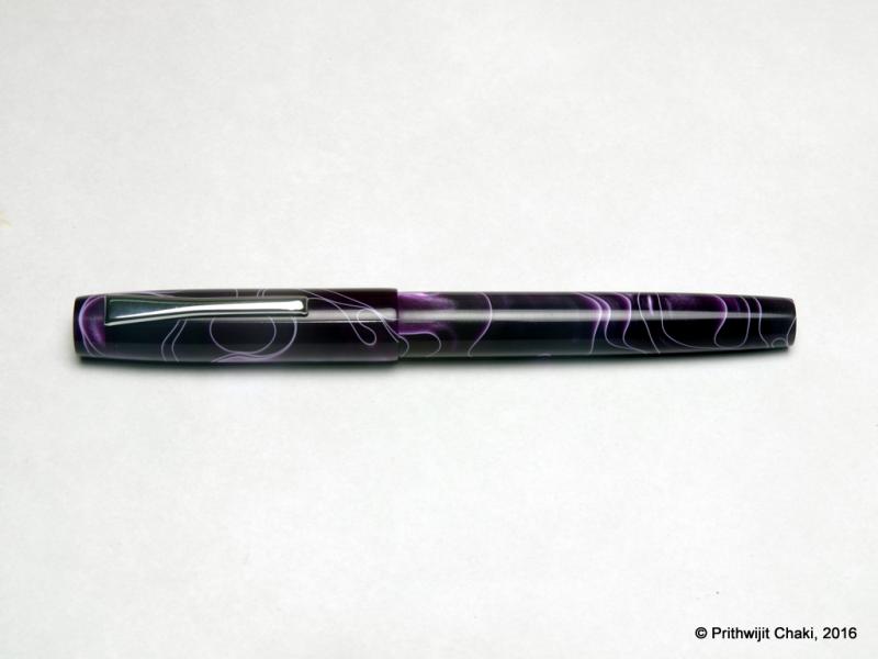
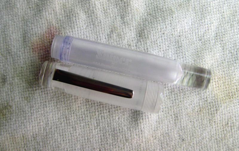
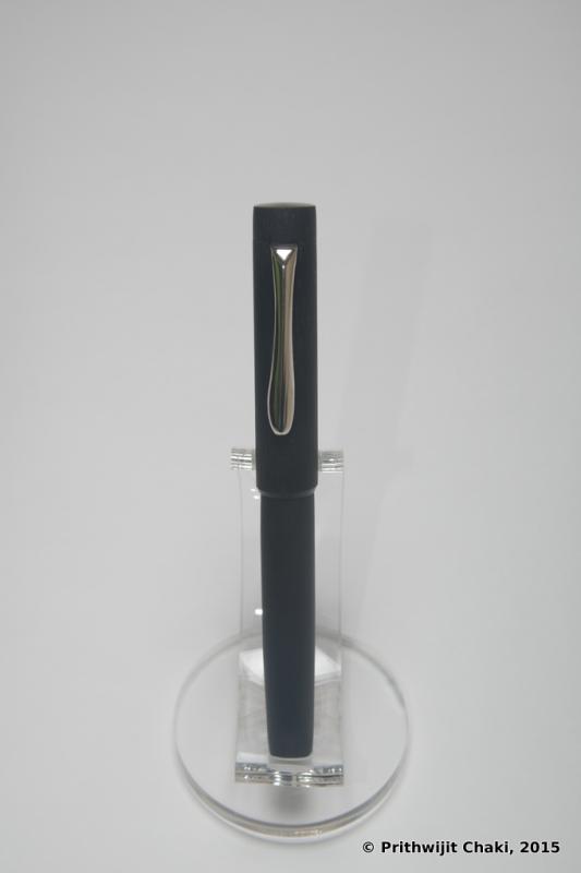
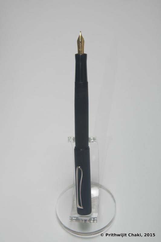
Introduction The sniper is a pen with very interesting history and one that has very close ties with FPN. The pen was launched as a group buy back in February 2015 by as a collaboration between ASApens and Vaibhav (@Mehandiratta) as just a concept without any drawing or prototype. Many enthusiastic FPNers rallied behind the concept of a hooded nib hand-made pen and the momentum was formed. We got to see the initial prototypes and the evolution of the design till the final shape took place and the pen was launched as a product. So in many ways this is a pen that has been conceived in, laboured within and delivered from the womb of FPN. Because of a variety of reasons the principal of which being my ignorance, I had not got the pen at the time. I had been meaning to remedy this for quite some time and when the opportunity arose earlier this year, I decided to go for it and get one sniper for myself. Design Much has already been written about the Sniper’s Lamy 2000 inspired design already. The key USP of this pen is a semi hooded/covered nib that looks strikingly similar to the way Lamy 2000’s nib is covered. Beyond this superficial similarity however, the pens are very different. It doesn’t use a proprietary and model specific nib like the Lamy and instead is designed to accommodate any Jowo/Win #5 open nib. This gives us a range of nib tips to choose from (EF, F, M, B, 1.1 and 1.4 italics) as well an option to have gold nibs instead of steel ones should your wallet so allow. For my personal pen, I opted to use a pair of purple twist blanks obtained from theturnersworkshop.co.uk to add a touch of exclusivity to my pen. Besides, I already had most of the standard ebonite colours in my other pens and wanted something different. Size and Balance At 152.5mm capped, this is clearly a full-sized / oversized pen. Normally such pens tend to be heavy and are meant for signing or occasional brief use for their heft. Thankfully the Sniper is not a heavy pen that imposes such restrictions on regular usage. Part of this lightness bonanza comes from it’s miserly usage of metal in it’s construction. It is a completely kitless pen with no metal other than in the nib and the clip. The pen overall is nicely balanced and the section design is sublime which adds to the comfort factor. The pen can be written both posted and unposted, but I prefer to use the pen unposted since posting does add a small element of rearward weight bias. To summarize this is a nicely balanced and light writing instrument designed to provide comfortable writing for extended periods. Nib The pen is designed to accept Jowo/Win #5 nib units. I believe the right SKU number is either 5-42 or 5-11. Since I have already have a small collection of Jowo nib units including everything from EF to 1.5mm italic nibs, I opted to get the one nib which I didn’t have, which is the 1.4mm italic nib. It’s a polished steel nib which is largely hidden from view by the hood of the section, except for the tines and the tip which obviously need to be exposed. Filling Mechanism It’s a cartridge converter pen that accepts standard international cartridges and compatible convertors. In my opinion, this is the best possible filling system and gives the best proposition around value, system longevity, convenience and widespread compatibility. Build Quality Being the current flagship model from ASApens, the pen obvious exudes the finest in quality that the marque has to offer. The general fit and finish and the tolerances are impeccable for a handmade pen and the joints are seamless. Attention has evidently been put into polishing and buffing to ensure a very high quality of the finish. Keep in mind however that this is an entirely hand-made pen and there is likely to be some fine trace marks under minute inspections. There was one small finishing issue on my pen however and that is the alignment of the nib with the hood. For whatever reasons, the alignment is just off by a couple of degrees and the result irritates my obsessive compulsive nature. I fully intend to reach out to ASA and request them to rectify this. Writing Experience By design, Italic nibs are supposed to have sharp edges and tricky to use unless you have the absolute right grip and hold the pen at the exact angle. Thankfully, this nib isn’t one of those cursive italic nibs and despite having no tipping, it is quite smooth. More than any technical aspect, what I would like stress upon is the fun aspect of writing with it. It gives your penmanship (or in my case lack of it) a flair that just begs to be experienced. You would smile after writing with this nib and it will encourage you to write more as you keep getting surprised how your own handwriting looks like. Beyond such simple pleasures, this is a highly competent calligraphic pen that helps in a host of writing styles such as Italic and Gothic. I am however not competent in any form of calligraphy and I would leave it to the experts to weigh in with their thoughts and opinions. Price and Value The Sniper is the current flagship of ASApens’ stellar collection. I find this entire series priced very attractively since the entire ASA line is such an affordable manner. The price is fully justified given the effort that goes into making each pen and that no compromises were made in using components within the constraints of what’s available in Chennai especially the nib which is the most important component. To summarize, the pen represents great value at an affordable price point. Specifications My usual disclaimer applies. The measurements in this section have not been taken with any precision instrument or laboratory techniques but should suffice to give you a fair idea of the size of the instrument. Length (capped) – 152.5 mm Length (uncapped) – 134.5 mm Length (cap) – 66 mm Length (section) – 37 mm Maximum width – 13 mm Minimum width – 8.5 mm Maximum section width – 5.5 mm (at the root of the exposed part of the feed) Minimum section width – 8.25 mm Conclusion The sniper is a beautiful looking handmade pen that exhibits a unique design. It is very light, comfortable and comes with a fabulous nib with a wide choice of tipping options. There is very little not to like in this pen and the price is just right. No wonder then that I strongly recommend this model to other connoisseurs of handmade fountain pens. Useful Links Purple Twist blanks from www.theturnersworkshop.co.uk Pen made by www.asapens.in
-
Introduction After commissioning some customized designs via ASApens I decided to change track a bit and get a few of their standard offerings. Looking around, there seemed to be a few models that had got consistently good review in FPN. One of them was the I-Can design which has been reviewed favourably here, here and here. I quite liked the classical lines of the design and decided to order it. There is one concession I made for myself, which is to use the wild cheesecake acrylic blank from theturnersworkshop.co.uk instead of stock ebonite. Also, since I prefer to use CC instead of ED pens, I requested the CC version. The cartridge converter version of the pen has actually been christened I-Will by Mr. Subramaniam and hence my review of an I-Will instead of an I-Can. Design One of the reasons I went for this pen is the design. It is a simple cylindrical barrel with the cap diameter which is slightly more than the barrel diameter. The pen is adorned with simple straight lines for the cap and with only a hint of tapering of the barrel. The top of the cap and the bottom of the barrel are flat and polished. The body of the barrel and the cap are polished smooth and shiny. Aesthetically it is simple, elegant, purposeful and the design remains an all-time classic. One can go back at-least a 100 years in fountain pen history and see pens of this design being produced by almost all manufacturers of the early era. The most famous user of this design is probably Wahl-Eversharp with their Classic 1920s gold filled, Olympia and Art Deco designs. Waterman too has numerous pens such as 12, 52 and the jumbo 20 which are variants of this design. Even Parker and Sheaffer too has used it from time to time as have numerous other known and unknown pen makers. The moment I saw it, I knew that I wanted this since it pays homage to the era or origination of fountain pens. From an usage standpoint, it is a utilitarian design. It is a full sized pen fitted with a hourglass type concave section design which is a personal favourite for the comfort it offers. The clip used is the same vintage brass ball clip that is usually a staple of the Azaadi. I must mention here that this is not the normal clip used in I-Can and I had specially requested it. The blank used for this pen is called “Wild Cheesecake”. The expectation was that the pen would not only be a fine instrument, but also look like a yummy confectionary. Unfortunately, the final outcome was far from being so elegant. Various adjectives were used to describe the pattern which ranged from “troll snot” to “unicorn barf”. Finally some kind soul described the colour as “dal fry” to ascribe it a modicum of dignity and we decided to stick to that moniker. Those of you whose culinary interests range from Pâtisserie to the standard Indian cuisine, would doubtless be able appreciate the implied travesty. Size and Balance At a capped length of 152mm, the pen may seem oversized. However, it is a completely kitless pen with very little metal being used in it’s construction. This makes it a very lightweight and that makes it a perfect EDC (Every Day Carry) pen. The shape of the pen and especially the section design is also meant to accentuate the feeling of comfort. This is a pen that you can happily use for extended writing periods. Nib I got a Schmidt #6 nib with a fine tip in golden finish. From a design standpoint, the clip and nib complement each other quite nicely thanks to the golden hues. The nib is tuned nicely and lays down a consistent fine smooth line on paper. Filling Mechanism I make no secrets about my preference for pens that accept standard international cartridges and compatible convertors. In my opinion they the optimum combination of value, system longevity, convenience and widespread compatibility. It no surprise that this pen comes with a Schmidt K5 convertor out of the box to work with the FH-452 Schmidt nib unit. Build Quality The pen exhibits the standard ASA focus on quality while retaining the handmade quirks. The fit and finish and the tolerances are fine for a handmade pen. The joints are seamless and only discernible due to pattern variations. You can sense that the pen has been made with care and a considerable amount of time has gone into polishing and buffing to ensure a very high quality of the finish. However given that the pen is entirely hand-made, there is likely to be some fine trace marks or quirks if one inspects very minutely. Writing Experience Schmidt sells excellent nibs and their wide user base are a testament to their quality. Normally, I am not a big fan of EF or F nibs since I find them too scratchy. This particular nib however is very smooth so long as you can keep the nib within its relatively small sweet spot. It almost prompts you to rethink your nib preferences and encourages you to improve your grip to keep enjoying its sweet spot. As you can realise, I am a happy camper. While it is unlikely to make me a regular user of F nibs, I would however have no hesitation of reaching out for this pen should I be in the mood for some writing with a fine nib. Price and Value The i-Can and i-Will are extremely competitively priced. In my opinion they represent one of the best value propositions amongs't ASA’s current line-up which is even otherwise composed of an impressive catalogue of excellent VFM pens. Grab an ebonite I-Will before you get anything else and you are likely to be hooked for ever. Specifications The measurements mentioned in this section were not taken with any precision measurement instruments and you would have to settle for my efforts with a simple ruler. Hopefully, that should be sufficient to give you an indication of what to expect from the pen. Length (capped) – 152 mm Length (uncapped) – 141 mm Length (cap) – 68 mm Length (section) – 22 mm Maximum width – 12.5 mm Minimum width – 9.5 mm Maximum section width – 10 mm Minimum section width – 8 mm Conclusion The ASA i-Will is a quintessential design that has existed for over a century with periodic resurgence in popular imagination. Such a longevity would not have been possible had it not been for the elegance, beauty, balance and convenience that such a pen offers. Combine that with modern niceties such as a cartridge-converter system and outstanding nibs from Schmidt or Jowo, and you have a writing experience bar none. It is little wonder therefore that the model is so popular and has been oft reviewed before. I would definitely recommend this pen to others and more so for the ebonite version of the pen given the light weight and tactile nature of ebonite as a material. Go ahead and grab one if you already haven’t. This pen will put a smile on your lips.
-
The ASA Athlete was my first ebonite pen. Purchased in mid 2015 from the ASA pens website, it has me hooked onto Indian ebonite pens since then. So what do i love about this pen- the light weight: despite its large size the pen is actually very light to hold and one does not feel it's weight at all when writing- the lovely green color of the pen. The pen is a regular in my pocket and has been a great conversation starter every single time i meet new people. - the super smooth and sharp nib. The nib is a total pleasure to write with. In fact far superior to any other pen i use- the huge capacity of the ED body. Despite my heavy use, the pen easily lasts me 2-3 weeks (about 50+ A4 sheets)My only real complain with the pen is the challenge with most India ED pens - it is occasionally susceptible to leaks and overflow from the nib. Despite all my love for the pen, I have to switch to a ball pen or a Parker when I need to sign a document or fill important forms. Hopefully once i get my hands on some silicone grease this issue would be resolved. Overall I would give this pen a 7 out of 10.
-
The ASA popsicle is the first non-eye dropper Indian handmade pen in my collection. Made in Chennai! It is a lot of fun, as the name suggests! [A copy of this here: https://fpensnme.wordpress.com/2016/02/14/the-asa-popsicle/]
-

Handwritten Review Of A Well-Used Asa Galactic
aswinsainarain posted a topic in Fountain Pen Reviews
Here is a brief handwritten review of the ASA Galactic, a handmade acrylic eyedropper fountain pen, from ASA Pens, Chennai. Bottomline: this is a great pen, with a smooth German nib, can store a lot of ink, looks galactic, and is an example of the excellent South Indian pen workmanship. [A copy of this review on my fountain pens blog: https://fpensnme.wordpress.com/2016/02/14/tha-asa-galactic/] -
Casein (from Latin caseus, "cheese") is a milk protein which we widely consume in various forms such as cheese and as a food additives. An interesting anecdote in the story of Caseins is that it was a popular ingredient for making some of the earliest plastics called Casein plastics. For a very brief period of time, casein was a popular material in fountain pen manufacturing. This was in early 1920's when it was the only plastic that could be coloured. With the advent of celluloid which was a superior type of plastic, casein quickly fell out of favour. Pens made of casein are quite rare and I have never seen an Indian pen made out of this material. So when Vince Coates (http://theturnersworkshop.co.uk) made available some casein material, a bunch of us quickly seized the opportunity to get some unique pens done. The material we received was supposedly the same used by Conway Stewart in their brief sojourn of using Casein and hence we naturally opted for getting a few Azaadis made with these imported blanks. Below are the pictures of the ASA Azaadi made of Casein and also a side by side picture with it's cousin made with normal celluloid acetate. We did not use any rings on this pen since the material was considered too soft to attempt the heat setting method of inserting rings. Also the surface was kept largely untreated (except applying emery paper) in order to retain and exhibit the natural characteristics and property of the material. Hope you guys liked the pictures. Should you8 guys wish to read my review of the ASA Azaadi, then please click here. Regards, Prithwijit
-
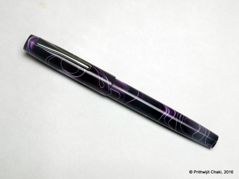
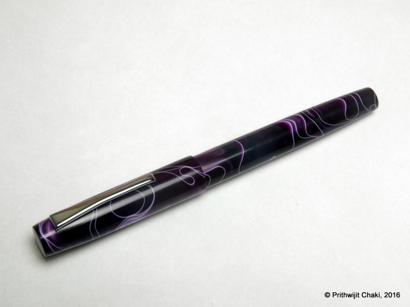
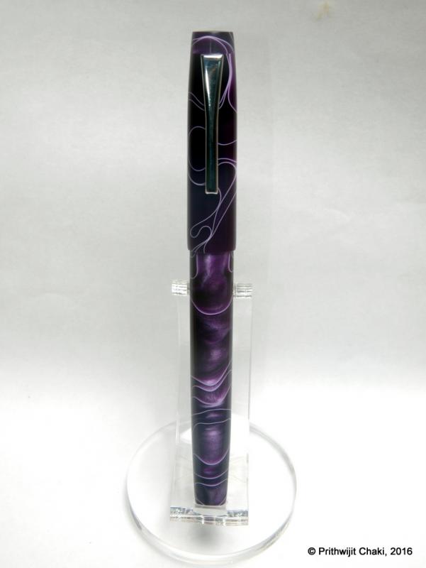
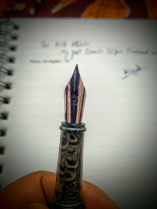
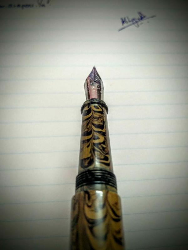
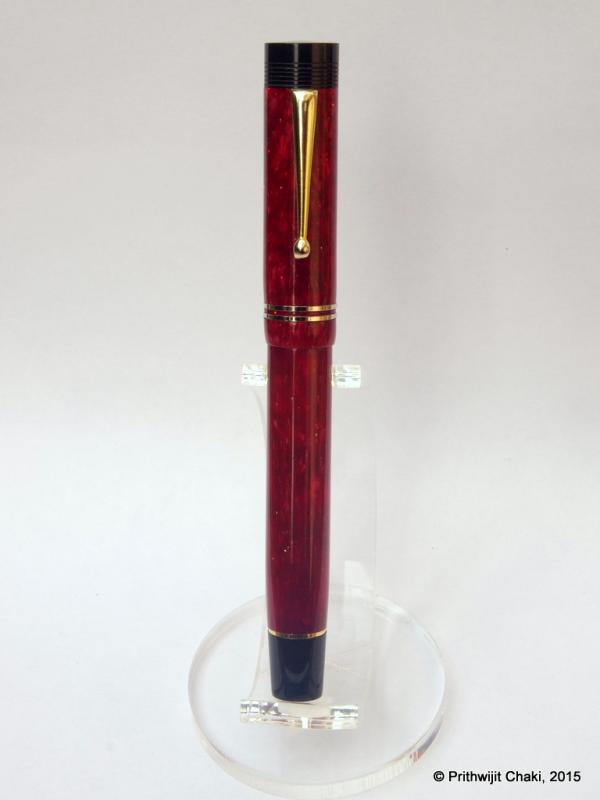
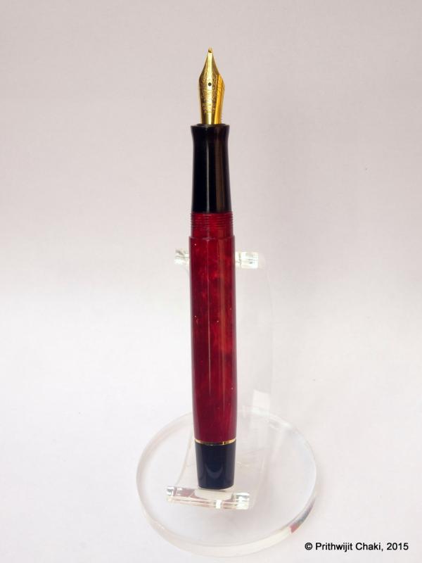
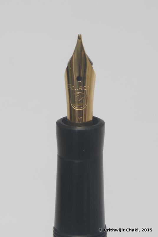
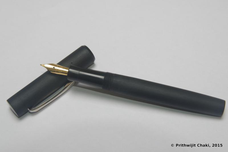
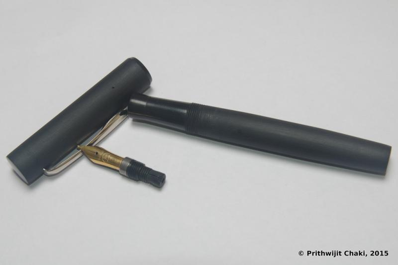
This is a pen I was going to review whether I had a good or bad experience. I'm glad to report that this is a great all-round ebonite pen. The same review is up on my blog along with reviews of some other pens (if anyone is interested). Hope you enjoy reading my review! http://a63.tinypic.com/16ga5ar.jpg I have mentioned above that the design "is" inspired by Mora Stylos' Oldwin Classic. I am not sure about that. It's my guess that it is inspired by that design. I haven't been explicitly told that it is. It could very well be a coincidence that the designs are similar. I do not want to take away from the manufacturer who worked hard on designing and making the pen. http://a68.tinypic.com/34sm3gn.jpg http://a65.tinypic.com/14e7yif.jpg http://a66.tinypic.com/fthmjs.jpg This is the first pen to get 59/60, more than any of the pens I have reviewed so far and it truly deserves it. http://a67.tinypic.com/15xuwaw.jpg http://a66.tinypic.com/2z8rneq.jpg http://a65.tinypic.com/30s7nya.jpg http://a66.tinypic.com/28b6wc4.jpg http://a66.tinypic.com/2eojm74.jpg
-
Introduction Often in life one learns to appreciate the value of something only after the object is long gone. In my case, something along the same lines happened for Conway Stewart pens. One fine evening in July of 2015 I chanced upon a store selling off the last few Conway Stewarts they had in stock and I was mesmerised by their beauty. One look at the price tag however quickly brought me back to my senses. Modern CS pens were never known to be on the value end of the price spectrum and the huge custom duties and other applicable taxes in India meant that they were well outside my grasp. I was however acutely aware that CS pens would soon not be available anywhere anymore and was desperate to get a piece of the pie. Once back home, I resorted to trawling the internet and found the source for last few CS blanks being made available from their liquidation sale by Vince Coates (www.theturnersworkshop.co.uk). With the help of fellow FPNer Kapil Apshankar (@springrainbow) I managed to source some materials in sufficient quantity to make a few pens. I did not bother receiving the material in hand and instead had those sent directly to Mr. Subramaniam of www.asapens.in with full faith that he would help me make something nice out of them. I also found out that CS essentially used Bock 250 nibs in their pens and grabbed a small collection of nib units as complete triple system from www.beaufortink.co.uk. We worked on a design that was original and yet paid homage to CS and especially their flagship model Churchill. Once the outline was worked out, we launched the pen in the “Fountain Pen Pals India” WhatsApp/Telegram group on August 15th where it was received with incredible enthusiasm. After some ups and downs, we stabilized at around 30 orders within the group. That’s quite an achievement considering the fact that at that point of time, the group has fewer number of members than 30. While everybody didn’t necessarily book one Azaadi, there were quite a few members who opted to get more than one. Since it was launched on 15th August which happens to be India’s Independence Day, it was only fitting to call the pen “Azaadi” which means “Independence” in Hindi. It was also a cheeky repartee to Churchill whose opinions about Indians and the notion of Indian Independence weren’t necessarily very appropriate. Design I knew that I wanted an original design which would not be a rip-off of any existing Conway Stewart model and yet should provide some kind of a homage to the brand. We all know that the concentric circles on the cap filial of Churchill gives it a distinctive crown like look and decided to incorporate a similar crown in black ebonite in the pen we designed as a homage element. Other than that, it is a solidly utilitarian design that combines the best of the breed in a number of areas. Size-wise, we designed it to be approximately the same size as a Lamy Safari and fitted it with the section design from ASA I-Can / I-Will in black ebonite which is a personal favourite for the comfort it offers. The end of the barrel is also made using black ebonite and the barrel end was also tapered a bit as another homage clue to the CS Churchill. The clip used was a special vintage ball clip made of brass which is quite unique in itself. Design wise it’s a classic with simple straight lines for the cap and with only a slight tapering of the barrel. The top of the cap and the bottom of the barrel are flat and polished. The body of the barrel and the cap are polished smooth and shiny. The concentric golden bands on the cap add a touch of flair. All in all the pen was designed to be regular sized, light and robust with the two ends having design cues that pay homage to CS. Final CAD drawing of the pen design that went into production Since we didn’t have CS blanks for all, the pen was launched with the option of using a broad set of acrylic materials. Unsurprisingly, the pearlescent acrylic blanks used in the ASA Rainbow turned out to be the most popular. We were pleasantly surprised how the shine of the acrylic blanks was nicely complemented by the muted colour of the ebonite components helping offset the monotony. The materials and colours complement each other and their interplay enriches the design whether posted or unposted. Size and Balance At 140mm capped, this is the perfect size for an EDC (Every Day Carry) pen. The shape of the pen and especially the section design is also meant to accentuate the feeling of comfort. But nothing beats the feeling in hand once you start writing with it and realise the comfortable. Needless to say, the pen is well balanced and provides comfortable writing for extended periods. Nib While I did get a set of different bock nibs, the quantity available wasn’t sufficient to satisfy 30 orders. Hence the pen was launched with two nib options excluding Bock. One could get a Schmidt (Model FH 452) nib in F/M/B or else go for a Jowo/WIN nib (Model 12-56) in EF/F/M/B/1.1/1.5 tip options. Since I already have a considerable collection of Jowo nibs, I opted to get the pen with a Schmidt nib with a broad tip in golden finish. From a design standpoint, the clip nib and bands complement each other quite nicely thanks to the golden colour. Filling Mechanism I am a stickler for pens that accept standard international cartridges and compatible convertors since in my opinion they the optimum combination of value, system longevity, convenience and widespread compatibility. It is therefore hardly a surprise that the ASA Azaadi supports the same and it comes with a Schmidt K5 convertor out of the box. Build Quality The Azaadi exudes the usual hallmark of quality from ASA pens. The fit and finish and the tolerances are fine for a handmade pen. The joints are seamless and only discernible due to colour variations. It is obvious that the pen has been made with care and a considerable amount of time has gone into polishing and buffing to ensure a very high quality of the finish. The only improvement area that I can think of are the bands used in the cap. It isn’t as if the bands aren’t fitted properly, but rather I wish ASA had access to better (read thicker) bands to go with this pen. Writing Experience Schmidt is a renowned maker of triple units and their systems have a large user base thanks to a number of brands that use them. Such widespread adoption wouldn’t have been possible if the nibs weren’t of top notch quality. It is little surprise then that I am very happy with how the pen writes. Being a broad tipped unit means that the nib appears extra smooth and glides over the paper laying down a nice wet line. This nib however isn’t soft or flexible and is quite rigid or nail-like. We have to accept that as a characteristic of the nib and be happy about the excellent writing experience that it provides. Price and Value The ASA Azaadi is poised to be one of the flagships within ASA’s line up and its price is currently perched as amongst the highest in the line. That however doesn’t mean much in cost terms since the entire ASA line is so affordable and the pens so wonderful. Personally to me the price reflects the effort that goes into making each pen and that no compromises were made in using components within the constraints of what’s available in Chennai. AT the end of the day, the pen represents great value at an affordable price point. Specifications Since I have the benefit of having access to the original CAD drawing, I will be quoting the specifications from that. Actual production pens are likely to have small piece to piece variances given the nature of making handmade pens. The measurements should suffice to give you a fair idea of the size of the instrument. Length (capped) – 140 mm Length (uncapped) – 135 mm Length (cap) – 65 mm Length (section) – 25 mm Maximum width – 16 mm Minimum width – 10 mm Maximum section width – 12 mm Minimum section width – 10.5 mm From top to Bottom - Jinhao 159, ASA Azaadi and Lamy Safari Conclusion It is not very often that one gets an opportunity to be involved in getting a fountain pen design. It is even rarer to get an opportunity to direct the design and see the pen getting launched as a regularly available product in the vendor’s catalogue. For that reason alone the Azaadi is very special to me. People who have got a chance to own this pen have been very positively impressed by it’s balance, comfort and writing experience. The pen has been designed from the ground up as an EDC (Every Day Carry) pen and in my opinion it fulfills that role in a fitting and stylist fashion. I have no hesitation in recommending this pen to others and I am sure you would enjoy it too.
-
Introduction Halwa / Halva (Bengali: হালুয়া) is a famous and traditional sweet of India which is slightly gelatinous and made from grain flour, typically semolina. The primary ingredients are clarified butter, flour, and sugar. So why would anyone name a pen after a confectionary item? The story behind this is really funny. It starts with me acquiring my first set of acrylic pen blanks called “Seasons” and sending a photograph of them to Mr. Subramaniam of ASA pens. Image: Seasons acrylic pen blanks Imagine my shock when he replied that the picture reminded him of Halwa. At first I was a bit miffed but then he shared a picture of a pack of Halwa and I found out more pictures of Halwa’s ready to be devoured. Image: Box pack of Halwa’s Image: Halwa’s ready to be devoured I couldn’t help but notice a certain degree of similarity in the colour themes and was amazed at the connection between the two. Ever since then, we kept on referring to these blanks as Halwa blanks and the pen that was made naturally inherited the title. Design The design brief I gave ASA for the Halwa was quite simple. I wanted it to be based on the ASA Popsicle but having ASA Daily size with an ASA I-Can section. For those of you who may not be familiar with the ASA catalogue, this essentially means that I wanted a simple and classic cigar shaped pen with the external dimensions of an ASA daily white still taking #6 nibs like that of ASA Popsicle (a larger cigar shaped pen in the ASA line up) with a section that is designed like ASA I-Can / I-Will which in my experience is extremely comfortable. The section gradually tapers from the barrel towards the nib before starting to flare out about 7mm to 8mm before it ends. As the images will stand testament to, ASA managed in delivering to me exactly what I wanted. The shape of the pen is a classic cigar shape with gradual tapering of the barrel and the cap towards the end filial. The entire pen is beautifully polished smooth and shines brilliantly. The pen comes with a chrome plated teardrop shaped clip which is similar to the one used in the ASA Daily. I wanted to see the impact of the beautiful material and contrasting colours and thus deliberately kept the design simple. As you can see, the colour combination has indeed come out very nicely. Whether posted or unposted, the interplay of the colours comes out clearly. The only fly in the ointment is the slight mismatch in colours between the cap filial and the cap itself. I reckon it has happened due to paucity of material of similar colour being available, but nevertheless wish this could be avoided somehow. Size and Balance The Halwa is a full sized pen comparable in length to the ASA Daily, MB 149, Sailor 1911 L, etc. Despite being a full sized pen, the Halwa is quite light has an amazing weight distribution making it extremely well balanced. The writing comfort is incredible and it promises hours of stress free writing experience. The light material and the cigar shape both contribute to the comfort negating any apprehensions that might be there due to the length and the diameter of the barrel. Nib The pen was paired with a Jowo/WIN #6 steel nib with Ruthenium plated finish with a medium tip. The nib is smooth and lays down a consistent medium width line on the paper. Filling Mechanism I prefer pens that accept standard international cartridges and compatible convertors. I find them to provide the best proposition around value, system longevity, convenience and widespread compatibility. The Halwa has the aforesaid filling mechanism and comes with a Schmidt K5 convertor out of the box. Build Quality As is usually the case with ASA, the fit and finish of the pen was superlative. The final polish and the attention to detail in obtaining the desired finish is impressive. It is however a hand-made pen, so there is likely to be some fine traces or quirks if one inspects very minutely. They are not visible to me with naked eye. The only area where there is still some likely room for improvement is where the cap filial meets the rest of the cap. Apart from the slight colour coordination issues I mentioned earlier, the clip ring is not flush fitting with the rest of the cap (About 0.5mm difference in diameter) and ASA can look into bettering this aspect of the design. Writing Experience The combination of the Jowo nib with WIN feeds and sleeves is very well known within the community and is usually considered a winner. The pen is smooth laying down an acceptable line of medium width. Where I found this nib a bit lacking was on the flow and it seems a bit dry to me. This is quite surprising since I have a lot of other Jowo/WIN nibs and I have generally found them to be excellent wet writers out of the box. I haven’t done any tweaking or tuning yet, but might do some simple stuff to try and increase the flow just a bit. Price and Value The Halwa was not sold as such to me like a commercial sale. Rather Mr. Subramaniam took a modest remuneration akin to cost of any pen in the ASA Stellar collection towards getting the pen made. Nib and blank costs were obviously extra. This is a great value because I am not aware of anyone else giving one off custom pens at regular pen prices and that too at the value end of the spectrum. Specifications I will put in my usual disclaimers here. I don’t have access to precision measurement instruments such as Vernier calliper and you would have to settle for the approximate measurements I made using a normal ruler and my eyes which means there might be a little bit of deviation due to parallax effect. However, given these pens are handmade and there are small piece to piece variations anyway, the measurements I am providing should give you a clear indication of what to expect from the pen. Length (capped) – 157 mm Length (uncapped) – 140 mm Length (cap) – 75 mm Length (section) – 25 mm Maximum width (Cap) – 15.5 mm Minimum width (Barrel) – 14 mm Maximum section width – 13 mm Minimum section width – 10 mm Conclusion This is the first pen I should have reviewed given that this was my first custom / semi-custom commissioned pen done from ASA. Needless to say that I am thrilled with it. Both as a writing instrument as well as a visual object or art it is superlative. Friends who have got a chance to play with my pen have commented positively on its balance, comfort and overall writing experience. Postscript Ever since getting this pen made, I have been pestering Mr. Subramaniam to release it as a regular product. I am happy to let you all know that he has finally agreed to make a small set of limited edition pens (approx. 10 to 15 pieces) using similar rainbow themed acrylic blanks. The design will be an updated/modified version of Halwa and the product is getting a proper name called “Santulan”. Let’s hope he can releases it before Christmas.
-
Introduction “A lot can happen over coffee” screams the tagline of Café Coffee Day which is a renowned café chain in India. While I may not know much about what else can happen over coffee, I am about the narrate the story of a pen that came into being thanks to a little chit-chat over the brew. It all happened when I had a business trip to Chennai which necessitated a stay over on Friday night. I opted for a late morning flight back home on Saturday and called up Mr. Subramaniam of ASA pens to set up a meeting in the early morning. The gentleman that he is, he couldn’t refuse my intrusion into his serene morning and we caught up over delicious strong filter coffee at his place. We discussed a lot of pens and I showed him the picture of a few orange coloured pens with the suggestion that he consider them for production using the orange acrylic blank that he had recently procured. Unknown to me, his mind was already on the job and a week after the meeting he surprised everyone in the “Fountain Pen Pals India” WhatsApp/Telegram group with a picture of a new prototype pen using a combination of orange and deep navy blue coloured acrylic material. Needless to say the pen looked beautiful and all of us wanted him to ensure that the pen goes into production. There was one small hitch though. The deep navy blue acrylic material used was from some vintage material stock he had and he had exhausted all of them. Only bits and pieces were left and it was not possible to make more than ten pens of that design. A mad scramble ensued and within thirty minutes all ten were booked. Since this colour combination was unlikely to be ever repeated, we decided to brand it as a Limited Edition (LE) and number code each pen. A lottery was conducted and I was lucky to get pen number 01. A number of suggestions were made for naming the pen. Fellow FPNer Kapil Apshankar (@springrainbow) shared the picture of a tropical paradise with an extremely attractive model at the beach with a Macaw on her shoulders. The picture must have been really good since I have no recollection of noticing the Macaw. Other group members who had better control over their hormones noticed how closely the colour of the pen matched that of the Macaw and voted to name the pen after the bird. Design The Macaw has a classic design in terms of simple straight lines with only a slight tapering of the barrel and the cap towards the end filial. The top of the cap and the bottom of the barrel are flat and polished. The body of the barrel and the cap are polished smooth and shiny. The section design is a homage to the traditional sections made by Indian hand-made pen makers – a simple straight section tapering slightly towards the nib and ending with a small ridge where it ends. It’s not my favourite design but does the job nicely. The pen comes with a plated beak shaped clip which is only fitting for a pen called Macaw. The highlight of the design is obviously the colour combination of the material used and how the colours have been used. To the best of my knowledge there are not too many pens with Orange and Blue colour combinations out there. The Macaw has attempted to use this unique combination and in my opinion has come out brilliantly successful. Essentially, the pen has a solid orange body and a solid blue cap. The monotony is broken by the usage of contrasting colours in the end filial of both the body and the cap. The colours complement each other and harmonizes the design. Whether posted or unposted, the interplay of the colours comes out very nicely yet subtly. . . . Size and Balance There is no beating around the bush that it is a large pen at 151mm capped. The shape of the pen also seems to accentuate the feeling of heft. But once you take it in hand and start writing you realise just how comfortable the pen is. Maybe because the material used is so light, that despite the length and the diameter of the barrel, the pen hasn’t really been penalized in terms of weight or balance. Needless to say, the pen is well balanced and provides comfortable writing for extended periods. Nib The pen comes fitted with a #6 Schmidt steel nib with paired Schmidt feed and sleeve (Model FH 452). There was a choice to go for either polished steel or gold plated model and I chose the latter and opted for a medium tip. I must mention here that this is a design that I believe would have greatly benefitted from a larger #8 nib. There is enough clearance in the cap to accommodate such a nib and the relatively larger diameter of the pen and the section would have matched nicely with a large and wide nib. Unfortunately going for Bock or Jowo #8 in gold would have made the pen prohibitively expensive and using the Ambitious 40mm nib would have meant that the pen becomes an eyedropper. So in hindsight, I believe going with the #6 nib was the right choice although I wish that in the marketspace there were options for economical but good #8 sized steel nibs as triple systems with standard international cartridge and convertor support. . Filling Mechanism I prefer pens that accept standard international cartridges and compatible convertors. I find them to provide the best proposition around value, system longevity, convenience and widespread compatibility. The ASA Macaw has the aforesaid filling mechanism and comes with a Schmidt K5 convertor out of the box. . Build Quality This is definitely one of the better handmade pens I have received from ASA. The fit and finish and the tolerances are fine for a handmade pen. If you look closely where the end filial meet the barrel and the cap you can hardly make out that there is a joint there. Only the contrasting Orange-Blue colour gives it away. That’s a testament to the quality of finishing and the amount of time spent in polishing and buffing. This is one handmade pen where you can risk calling it an injection moulded pen based on exterior finishing as it appears to the naked eye. Only the design and shape gives an indication that it’s something different and has not come off an assembly line. . Writing Experience Schmidt FH 452 is a very well known, popular and renowned nib and its merits are well known. Out of the box it is a very smooth writer laying down a nice wet line. I won’t call this nib as soft or flexible however and it is a simple honest nail. This was my first Schmidt medium nib and compared to the many Jowo and Lamy medium nibs that I have, the line width on this one seems to be a tad bit thinner. That does not however take anything away from the quality of the pen but is just a characteristic of the nib design. Should you need a nice wet line like a good Jowo medium, I suggest you consider a Schmidt broad instead. Price and Value The ASA Macaw was sold to us for a price that is comparable to the prices of recently launched pens of the ASA Stellar collection. In my opinion that is amazing value since we are getting a quasi-custom pen offered at a price that is at the value spectrum of handmade pens. Specifications I will put in my usual disclaimers here. I don’t have access to precision measurement instruments such as Vernier calliper and you would have to settle for the approximate measurements I made using a normal ruler and my eyes which means there might be a little bit of deviation due to parallax effect. However, given these pens are handmade and there are small piece to piece variations anyway, the measurements I am providing should give you a clear indication of what to expect from the pen. Length (capped) – 151 mm Length (uncapped) – 137 mm Length (cap) – 69 mm Length (section) – 19 mm Maximum width – 16 mm Minimum width – 11 mm Maximum section width – 12.5 mm Minimum section width – 11 mm Conclusion I am extremely happy with this pen. It started as a coffee table discussion and ended as a limited edition. Everybody who has this pen have been extremely impressed with its balance, comfort and writing experience. I would request Mr. Subramaniam to consider launching the pen as a regular model with other colour combinations with an option of having an Ambitious 40mm nib in eyedropper combination or with a #6 nib in cartridge-convertor version.
-
asapens recently launched a new pen, called the rainbow. This pen is available in a bunch of colours and is made of acrylic. These pens are c/c and eyedropper convertible and have Schmidt nib units. It is available in fine, medium and broad. I ordered their 'flaming orange' (quite a fancy name if you ask me!) version with broad nib and rounded ends. I must say that the pen sure does look stunning and writes equally well! BODY The pen's body is made of acrylic and looks quite nice. The quality of the acrylic is pretty good. The pen is completely hand-made. The surface has a bit of imperfections but since it is hand made, I have no problems. The acrylic has a lot of 'depth' which I could not capture well in the picture. The ASA logo is not clearly visible and one has to squint a bit to see it clearly. The cap is screw on type and takes 1 1/3 turns to fully unscrew. http://1.bp.blogspot.com/-AknkfXg_Qnw/VjNIUa8Z4zI/AAAAAAAAAG0/PwoUO4PcLLw/s640/DSC_0006.JPG http://1.bp.blogspot.com/-ynzKza8U4Qw/VjNIPlR-33I/AAAAAAAAAGo/SqtgmwBwkjE/s640/DSC_0005.JPGNIB The nib is a Schmidt Broad which writes more like a medium. It is quite smooth and has a bit of flex but it is almost negligible. It is a stainless steel nib. http://4.bp.blogspot.com/-inIaxNypaNw/VjNIQFONgNI/AAAAAAAAAGs/V2cfyPRSyHo/s640/DSC_0007.JPG This is actually a whole unit with a schmidt converter (optional). SECTIONThe section is shaped like the section of the ASA I can. It is extremely comfortable to hold and is well suited for long writing sessions. It too is made of the same Acrylic as the rest of the pen. The section can be seen in the above pic. MEASUREMENTS I compared the measurements with those on the ASA site and they seem pretty much the same. Pen Length (Capped)135mmPen Length (Un-capped)100 mm (Excl Nib)Pen Length (Un-capped)120 mm (Incl Nib)Section Length25 mmCap Length65 mmCap Dia16 mmBarrel Dia14 mmSection Dia12 mm avg. WRITING SAMPLEThe pen writes quite wet. I would rate the wetness to be 8/10. It is pretty smooth as well. In terms of smoothness, it will easily score 9/10. The ink used in this sample is parker quink blue and the paper was 70gsm century A4 sheet.http://3.bp.blogspot.com/-xchZpwmK6jk/VjNHk3AOZII/AAAAAAAAAGc/-X1FSTQ9B7A/s640/DSC_0004.JPG SUMMARYI am quite pleased with the pen. The finish is quite nice and it writes pretty well also. I have no complains with this pen and it is currently my favorite! (They are not paying me to say all this, all the opinions are my own.)http://4.bp.blogspot.com/-OQFuRaYTYmk/VjNHhgyDSHI/AAAAAAAAAGU/GQwDGiAe7Ok/s640/DSC_0003.JPG http://3.bp.blogspot.com/-CeRVxFvznMQ/VjNJP_0ejbI/AAAAAAAAAHU/uNh3XbV09vk/s640/DSC_0011.JPG http://2.bp.blogspot.com/-R9zCckjuQ64/VjNJC9syrKI/AAAAAAAAAHM/Un36nrVVPZg/s640/DSC_0010.JPG
-

Clear Acrylic Body&cap For Asa Sniper
mike.jane posted a topic in Pay It Forward, Loaner Programs & Group Buys
I recently broke 'the insides' of my ASA Sniper. Now, surely I could get replacement parts for it from ASA, but I'd rather not. Instead I now have a clear acrylic body and cap to give away to one of you. - The item is without structural defects, - Clip is good - No personalisation of any kind, - Very minor signs of use, - Some ink residue in the inner threads. You can probably still soak that out. - Free and open for/to anyone. - Will choose a winner randomly, let's say on Tuesday morning, Nov.3rd. - Due to international shipping it will take 1-2 weeks to reach you though. Best wishes mike
-
Introduction The story of this pen begins ironically with the story of my perception of a completely different pen brand which happens to be Pelikan. For quite some time there was a lot of enthusiasm in the “Fountain Pen Pals India” WhatsApp/Telegram group with people espousing the greatness of the brand and how Pelikan pens were the next best thing to sliced bread. I have been known to have a healthy dose of skepticism against any form of brand adulation and for some reason I found it very difficult to accept a steel nib lightweight M200 as being a much better pen than a Sailor 1911 standard or other pens of the same price point (we are talking street prices in India). My brief experience with a M400 and a M600 had not left me too impressed. A friend of mine was smitten with the M205 in white and I argued with him that he should preferably look elsewhere to get better deal for his money. Given my stated aversion, I was advised en masse by group members to try out a Pelikan to help change my mind. While I was open to the experience, I still wasn’t willing to spend Sailor 1911 money on a Pelikan. An opportunity arose when fellow FPNer Kapil Apshankar (@springrainbow) offered to get me a Pelikan M 200 nib unit from Europe at a cost that was substantially less than that of the entire pen. This was too good an opportunity to refuse and soon I was the proud owner of a M200 steel nib unit with medium tip. With the nib in hand, the next question was what pen to put it in. As is usually the case with me, I made an elaborate design of a beautiful pen using a mix of different acrylic rods. Unfortunately, making custom pens is a lengthy process and that design is yet to see the light of the day. I was however getting restless and reached out to Mr. Subramaniam of ASA pens to see if he has a quicker solution to the conundrum. I was pleasantly surprised to hear that this is not the first time he has encountered this request and he has in-fact got a design ready for precisely accommodating Pelikan nibs. Without any further ado I put in the order and within a few week time the Namenlos ended up in my mailbox. Design For those of you who are familiar with the ASA catalogue, you would immediately recognize the Namenlos as an adaptation of the ASA Genius. In fact the Namenlos is a slimmer version of the Genius with Cap and barrel diameters being about 3 mm less than the latter. The slimming down gives the pen a much more balanced and purposeful look and the silhouette closely resembles that of the Duofold Centennial. Like the classic Duofold this is a straight line design with only a slight tapering of the barrel and the cap towards the end filial. The top of the cap and the bottom of the barrel are flat and polished. The body of the barrel and the cap are brushed to give a bakul (matte) finish. The edge of the cap where it meets the barrel is bevelled and the polished bevelled edge provides a nice visual contrast to the matte finish. The section design has been patterned on the ASA I-Can / I-Will which in my experience is extremely comfortable. The section gradually tapers from the barrel towards the nib before starting to flare out about 7mm to 8mm before it ends. The pen comes with a chrome plated clip which in my mind resembles the shape of the beak of a Pelikan. This is probably unintended since ASA uses this clip on a number of their designs but I found this design cue very interesting. Size and Balance At 132 mm, this is a classic small pen. For the purpose of comparison, the length of the pen is very close to that of Sailor 1911 standard and the Parker Sonnet. Being made of ebonite and not having any complicated filling mechanism inside means the pen is extremely light and hence very comfortable to use. From top to bottom - Parker Sonnet Mk I, ASA Namenlos, Sailor 1911 Standard, ASA Rainbow, Kaigelu 316 The balance of the pen is very nice and can easily provide comfortable writing for extended periods. I must also make a mention here of the section design which is the best in the business from ASA and contributes immensely to the writing experience. This is one of those pens which can be used both capped as well as uncapped. Since the pen is very light, capping the pen does shift the balance a bit. I found it is great to use the pen capped when it’s fully tanked but it’s best to use the pen uncapped once the ink level goes down. My personal preference is to use the pen uncapped and enjoy the minimal weight. Nib The pen is fitted with gold plated Pelikan M200 nib with medium tipping. This is the same nib that comes in the Pelikan Souveran M200 line of pens Filling Mechanism My normal preference is to have pens with feeds that accept standard international cartridges and compatible convertors. The Pelikan nib system naturally doesn’t come with such support since it is meant to be used with a piston in the back of the barrel. I deliberated having a piston system in Namenlos but eventually for the sake of simplicity, economy and greater ink capacity, opted to have an eyedropper instead. This is where I wanted to talk about how going for an eyedropper paid off and the superior Pelikan feed with its high tolerances negated any occurrence of burps or other typical ED maladies. The unfortunate reality in my case has been exactly the opposite. While Pelikan must have designed the feed to have high enough tolerances, the ink capacity of a piston pen and an ED are just not comparable and the feed was not able to cope up. As a result I encountered all the problems of an ED while using the pen in terms of burps and ink dribbling once the ink in the barrel dropped below the halfway mark. I had taken some poor quality phone camera photos of the issue when I encountered them and am sharing them to illustrate the situation. Build Quality The pen exhibits the typical hallmark of ASA build quality. I had opted for a bakul (matte) finish and the attention to detail in obtaining the desired finish is impressive. At the end of the day however it is a hand-made pen, so there are bound to be some fine traces of tool marks visible under minute inspection. Writing Experience We have an entire section dedicated to Pelikan brand of pens in the forum with many threads and posts talking about the M200 line. So I won’t get too much about the details but would instead delve into my personal perception. There is absolutely nothing wrong with the nib. It is adequately smooth with a hint of feedback and leaves a nice wet line on the paper. Having said that, this is not a nib I would recommend to anyone. While it was good, it wasn’t great. There was nothing in this nib that would leave a smile on my face. It was a good all-rounder, but a solid middle of the class in all the subjects. I find it difficult to justify the 200% price premium that Pelikan charges over comparable #5 nibs from Schmidt, Bock or Jowo. I have a solid collection of nibs from these brands and almost all of them are comparable if not better than the nib I have. To ensure that I hadn’t got a lemon, I tried out a few more M200’s. Most were very similar to mine and exhibited similar neutral characteristics. However, fellow FPNer Hema Koppikar (@Hema) had a vintage M200 whose nib just blew me away. It was amazingly smooth and wet with a writing experience that leaves you hungry for more. I wish my M200 nib similar to hers but the sad reality is that it isn’t. Price and Value Mr Subramaniam charged me as ridiculously low amount for the pen (sans the nib of course). While the actual transaction happened in Indian rupees, translated in USD it was around $15 (may go up to $20 depending upon conversion rate applicable at that point). If this is not a good value, I am not sure what is. To the best of my knowledge there is no other proper nice ebonite pen with such a large ink capacity which is capable of using Pelikan nibs at such a price point. In case, there are such pens available, kindly let me know and I shall happily stand corrected. Specifications I will put in my usual disclaimers here. I don’t have access to precision measurement instruments such as Vernier calliper and you would have to settle for the approximate measurements I made using a normal ruler and my eyes which means there might be a little bit of deviation due to parallax effect. However, given these pens are handmade and there are small piece to piece variations anyway, the measurements I am providing should give you a clear indication of what to expect from the pen. Length (capped) – 132 mm Length (uncapped) – 123 mm Length (cap) – 66 mm Length (section) – 24 mm Maximum width – 13 mm Minimum width – 9 mm Maximum section width – 11 mm Minimum section width – 9 mm Conclusion The pen is beautiful. It is very light, very balanced, comfortable, great grip, well built and will definitely prove to be comfortable for long writing sessions. I can doubtless recommend this pen to all those who have the need or desire for such a pen for using Pelikan nibs. I am less enthusiastic about recommending the need for such a pen though since I am not sure what great element having a M200 nib brings to the table. I may have to wait to use a M800 and M1000 nib with this pen first to come to a conclusion on the subject. In the meanwhile, if you love Pelikan and would love to have a 2nd, 3rd or nth pen for your collection of Pelikan nibs and are adept at handling eyedroppers, please go ahead and get the Namenlos. It’s a steal and a very good one at that. Postscript I had considered calling Mr. Subramaniam of ASA pens to find out if he had any name in mind for the pen. But by then I had already taken a fancy to calling it Namenlos and decided to skip the step and continue with the prologue section that I had drafted.
-
Hi everyone, this is my first attempt at a fountain pen review and I have decided to review the ASA Bheeshma which is a custom design that ASA pens has made based on my request. Since this is my first effort, please go easy on the brickbats. Constructive criticisms however are always welcome. Introduction The story of Bheeshma has to start with the discussion one day that we were having in the “Fountain Pen Pals India” WhatsApp group when someone introduced me to a picture of a Scriptorium pen in Lava Explosion blank. I was stunned as to how amazingly pretty the material was and how beautiful the pen looked. Without knowing it then, I was smitten and hooked. Days passed and my urge to possess one went up in leaps and bounds. Unable to resist any further, I reached out to Eugene Soto of muttblanks.com to enquire about blanks in larger than five inch sizes for kitless pens. He suggested using two five inch blanks or he could make seven inch blanks as a custom order. I am not sure why, but I chose the second option. Maybe, in my mind I thought since I am venturing into something new then why not stretch the envelope. Anyways, after 3 excruciating weeks of waiting, the blanks finally managed to pass through the hoops of transatlantic flight and customs clearance to land up in my mailbox. The next challenge was what pen to design for the blanks. Given that I had opted for small seven inch blanks, a large pen with clips and all paraphernalia was out of question since we simply didn’t have enough material. Fellow group members and FPNers Vaibhav (@mehandiratta) and Pradeep (@pdg84) chipped in and we decided to make an adaptation of the Onyx design that Pradeep had but with some modifications to the specifications. Vaibhav was kind enough to make a CAD based on the design ideas and the outline of the pen was ready. He even christened the concept Bheeshma based on the powerful thespian from the epic Mahabharata. When it came to the question of the pen being made, there was nobody else I could think of other than Mr. Subramaniam of ASA Pens. Not only had he helped me gain knowledge on all pen related matters, but I knew I could trust him to look after my dream and nurture it like as if it is his own. So off went the blocks to him to get turned (pun intended) into a pen. Design The design is inspired by the Onyx which in itself is inspired by the classic Nakaya Piccolo design. This is a classical design that starts as a cigar shape, tapering down towards the end filial and terminates with small conical end pieces at each side. The cap is flushed with the barrel with a small step down design where the cap and barrel meet. The section design has been patterned on the ASA I-Can / I-Will which in my experience is extremely comfortable. The section gradually tapers from the barrel towards the nib before starting to flare out about 7mm to 8mm before it ends. The design is clipless, i.e., doesn’t have a clip to put in your pocket and is also designed to be used unposted. This allows for a better control over determining the balance point and is set to provide comfortable writing for everyone. Without further ado, I will let the pictures do the talking about the design. . . . . Size and Balance By classical norms this is a large sized pen at 147mm capped. But those of you are familiar with Indian handmade pens would recognize the fact that it can almost be passed off as a medium sized pen amongst its peers. Since the material used is very light, the barrel could be made a bit thicker and stronger without compromising on the weight or balance. The pen is extremely well balanced and can easily provide comfortable writing for extended periods. The section design is the best in the business from ASA and that only adds to the pleasurable writing experience. Please note that the pen has been designed to be used uncapped and that is exactly how I have used it. Nib Originally the pen was designed to accommodate a #5 Jowo nib. But once it was made Mr. Subramaniam insisted that a #6 Jowo/WIN unit would be best fit for it. I am a sucker for large nibs and happily agreed to the recommendation. We finally paired the pen with a dual tone #6 Jowo steel nib with Medium tip. Filling Mechanism I am committed to using pens that accept standard international cartridges and compatible convertors. I find them to provide the best proposition around value, system longevity, convenience and widespread compatibility. Unless there is a compelling justification to do things differently, all my pens tend to have the cartridge convertor mechanism. The ASA Bheeshma is no exception to this rule and has the aforesaid filling mechanism. Build Quality The build quality of this pen is impeccable. The quality of polish is excellent. Given that it is a handmade pen, there are some fine traces of tool marks but they are only visible under minute inspection and the overall build is not much different from a normal injection moulded pen. I am given to understand that normally Lava Explosion or similar aluminite material benefits from a lacquer coating to highlight the shine. I had requested for no such coating and yet I am very happy with the lustre which is evident in the pictures. Writing Experience Mr Subramaniam doesn’t profess to be a nibmeister but on ample occasions he has given ample hints that he does tune some nibs. I am not sure what he has done here but this nib is magic. It is incredibly smooth yet not glassy and leaves a nice wet line on the paper. I had inked the pen with Bril Violet ink to match the ink colour with the pen colour and the combination has worked real well. There are no skips or false starts and the impression it leaves on the paper is of a nice smooth medium line rich in ink. Overall, a superb writer and amongst the better Jowo nibs that I have in my collection. Price and Value Since I had procured the blanks myself, Mr Subramaniam charged me just for the nib and for making the pen. The cost is comparable to the prices of recently launched pens of the ASA Stellar collection. Personally, I found that incredible value since he had to disrupt his normal production schedule and incur significant downtime to get this pen made. Specifications This section is for those of you who thrive on hard numbers. Unfortunately I do not have access to a Vernier calliper or other precision instruments. You would have to settle for the approximate measurements I made using a normal rules and my (admittedly weak) eyes. Length (capped) – 147 mm Length (uncapped) – 143 mm Length (cap) – 62 mm Length (section) – 27 mm Maximum width – 15.5 mm Minimum width – 12.5 mm Maximum section width – 12.5 mm Minimum section width – 9.5 mm Conclusion I am extremely happy with this pen. I started with an abstract desire and my friends and ASA have given it a concrete and excellent shape. Everybody who have written with it have only been impressed with it. It is an excellent design that is very balanced, comfortable, light and ideal for long writing sessions. It would be great if ASA considers bringing it to the market as a regular product.
-
The review is about a pen which was launched on Whatsapp Group of 20 members at that time and I believe was first of its kind launch for a pen. Approximately 50 odd pens were made and beleive me on this all got sold out within half an hour. So beautiful were they to look at first site. They were RAINBOW. The Rainbow is reviewed at my blog in detail : LINK This happens to be an ED model and the updated model with C/C mechanism is soon to be launched at ASA Pens on 23rd September. My other review of ASA pens are as follows: ASA Spear ASA Galactic ASA I-Can ASA Porus ASA Patriot ASA ViraatRainbow is first multicolored acrylic pen from the house of ASA Pens. DESIGN & BUILT: 4 / 5 It’s a simple classic cigar shaped pen with rounded bottom and top. Actually nothing is much happening on the design front. it though is a small pocket sized pen. It is actually the material which is doing all the talk. ASA Rainbow – Swirled Acrylic Material The pen will to begin with eventually will come in following colors when launched. Cherry Red (in pic above) Midnight Blue (Blue and Dark Blue swirls) Black Pearl (White and Black swirls) Fiery Orange (Orange and Black swirls) The color yellow with green swirls might be added later which is being reviewed. ASA Rainbow – Cherry Red and Yellow Swirl To begin with what i really like about this pen is its size and girth. It is small pen but not that slim. Lovely part is the grip section which is the thinnest portion in whole pen. It’s so wonderful to grip and write with this pen. ASA Rainbow – Capped ASA Rainbow – Uncapped ASA Rainbow – Rounded Top and Bottom The pen has silver trims. Actually the pen has only clip as a trim and a nib. No other metal parts were used. its a minimalistic design pen. The clip is sturdy and stiff and not springy at all. fits shirt pockets easily. The pen cap has no breather hole unlike many other Made in India pens. The cap finial is threaded and can be taken out easily also. ASA Rainbow – Cap View ASA Rainbow – Cap inner View ASA Rainbow – Clip Built is amazing and is well finished and polished pen. However I have to add one thing this pen is acrylic and requires maintenance and care to ensure no scratches just by throwing pen on desk or anywhere else. Below are the few images of the pen showing comparison with other pens. Gama Kuyil vs Pilot 78G vs ASA Rainbow BALANCE: 5/5 I love the fact that the small pens don’t have to be necessarily slim and this really goes down well with me. And I love ASA Rainbow also because of its girth too. Its very well balanced pen and feels amazing in your hand whether you write with cap posted or not at the back. ASA Rainbow – Writing Unposted ASA Rainbow – Writing Posted The cap posts very securely and also posting does not add to that much heft. This one is aptly balanced pen. NIB AND INK FILLING MECHANISM: 3.5/5 Our first feedback for this beautiful pen was to make it C/C mechanism pen because ink filled in barrel changes the color of the barrel and darkens it and thus it will be soon launched with C/C mechanism on 23rd September. The nib on the pen in question is Fine-Medium Ambitious 35 mm nib (#6) and is chrome finish. I love the ambitious nibs of size 35 mm and 40 mm. This nib writes with welcome feedback and writes wet. I love the way it writes. The nib has got certain springiness to it. ASA Rainbow – Nib Unit top view ASA Rainbow – Nib Unit side view ASA Rainbow – Nib Unit angled view Though the upcoming pen with C/C filling mechanism will come in following nib options: Schmidt monotone F NibSchmidt monotone M nibSchmidt monotone B nibThis pen has an eye dropper fill mechanism and hold good 3 ml of ink. The feed is made of ebonite and fitted very tight and securely. The removal of nib will require knockout block as the nib is friction fit. ASA Rainbow – Eye dropper fill I recommend people to buyers is to chose pen with option of fountain pen testing at checkout which takes time but you get the pen which writes good out of the box and this facility is being given by ASA pens free of charge. Below are the few images showing hand written review and also certain specification, ASA Rainbow – Page 1 ASA Rainbow – Page 2 ASA Rainbow – Page 3 Conclusion : This is a beauty and I am sure it will outsell any other model ASA pens has launched because this pen has it all going for it when its launched in C/C mechanism. However i would not recommend using this pen as ED as the barrel gets discolored because of the ink not that the ink burps. Go ahead save some money to buy this one. I recommend it. Please check my BLOG for other listings.
-
A recent arrival for me is a matte black ASA Spear. It's not my first fountain pen from India. I have a Ranga ebonite made to fit a Sheaffer Imperial nib as my prior touchstone, along with an eye-dropper, also from Ranga, and a few value piston-filler pens from FPR. I first heard of ASA through FPN and had a chance to handle a white ASA Porus owned by another fountain pen enthusiast. Impressed by the reviews and on seeing an actual ASA pen for myself, I decided to try one out as my next pen from India. I chose the Spear because its sleek design called to me. Especially in matte black, with a coarse finish to the barrel and cap, it brings to mind the color of a classic Lamy 2000 and the contours of an old flat-top Parker duofold. In hand, the feel of this pen is excellent. There's something about ebonite, especially, that makes a pen feel warm on your fingers. In this unsmoothened finish, I'm reminded of the texture of wood and charcoal. It's up there, in my 50+ pen collection, in terms of how much I like the feel and grip. Size-wise, it's comes to about 148 mm, capped, which is perfect for me. With a mostly full converter inside, it weighs about 22 grams. I mostly despise heavy pens, which I feel are not made for people who actually write for extended periods, so the lighter weight of the Spear is perfect. Earlier, in a different thread, I'd discussed my apprehensions about the size of the ASA logo on the barrel. I contacted Mr. Subramaniam and, with the kind of personal service that cannot be expected of a larger fountain pen company, he was able to customize mine with a smaller logo. This excellent customer service will likely keep me coming back. The smaller logo works better for me. I definitely notice it less than I would have with the original size. With my Western tastes, I believe that the more discrete, the better. Otherwise, the branding distracts from the beauty of the pen. I would love it if one day ASA could only be seen engraved on the clip (Having "Pens" also there would be redundant). Or that ASA would find a well designed, simple, wordless mark (it's very own version of a MB "snowflake" or Parker "arrow" that would exist quietly on top of the cap). It's the way many of my famous pens do it, and I much prefer that kind of elegant branding. One thing I did modify, being the tinkerer that I am, was to change the finish for the section. The plastic section was very shiny and black. I often prefer a more unified look, the way Stephen Brown does, with a section that doesn't stand too far apart from the barrel, appearance-wise. So I used 300- and 600-grit sandpaper to create a more "brushed" look that ties with the rest of the pen. That's looks, on to the pen's performance. The fact that the ASA Spear accommodates a converter (and came with one) was also a feature that I looked for. I've tried eyedropper pens and experienced a bit of ink dripping, the kind expected of those pens after the air volume has expanded inside them. As someone who travels far from his desk, converters or piston fillers (sometimes cartridges, as back up) are my preferred filling systems. The Spear came with a good, functioning converter, as expected. The Spear's nib is certainly more interesting. It's a Jowo with ten breather holes, most of which I believe are there for decorative reasons. The default nib size for the Spear is medium, and I've found that it writes a line comparable to that of Pelikan's medium. After a few days of use, I discovered that it's relatively a slow starter. It writes well--quite wet, actually--when in continuous use, but say, if I have the pen rested upright in a shirt pocket or in my carrying bag, it usually needs a few strokes before the nib writes again. Since the nib and feed can be easily pulled out, I reset them to better effect. I'll likely tinker with this over time, perhaps widening the feed channel or separating the tines a bit more. I also adjusted the nib a little more to fit my own particular angles in writing. In my first week of use, I can say so far that this is a pen that will often make it into my rotation. I'll definitely be keeping my eye out for future offerings from ASA.
-
I'm interested in buying many ASA pens, but am hesitant because I've seen photos where the logo and inscriptions on the barrel for some pens take a large amount of visible real estate. It's not a small engraving, like on my vintage Sheaffer. Sometimes the logo takes up a whole side of the pen, like on the Spear, for example. From my perspective, it cheapens the look of a pen. If you look at other famous pen brands, none put such a large logo onto the barrel. Yes, perhaps a logo on the clip. Yes, perhaps an etching on the clutch or cap ring. None as big as on the ASA barrels. I don't want my fountain pens to have the aesthetic of a pharmacy-bought Bic ballpoint, with branding marks all over. On some level, ASA must be aware of this, as the pen photos on the site often hide the etched logo and inscription on the barrel. For ASA owners, do the large logo engravings bother you? Can you request that it not be as prominent? I'm curious, as I otherwise like the look and feel of many of the pens. I've ordered one. Hope that when I get it the logo will not be too visible every time I pick it up.