Search the Community
Showing results for tags 'art'.
-
So by now We all know how everyone here likes our Coffee and Tea, but how about Whats our favorite way to make it. Rather than use silly words lets see your best rendition of your brewing or steeping setup. Hario V-60, and Chinese tea infusing mug:

-
Any recommendations for a small sketchbook for drawing with fountain pens? I like A6 (or B6), since it's easily transportable, and probably wire bound. I realised I have no idea what to look for when buying art paper. There are papers for oil, acrylic, watercolour, bristol board... the list is seemingly endless and often don't work with pen and ink. Even a Clairefontaine sketchbook I bought feathers badly. In theory I might dabble in watercolours to try some line and wash, but my main priority is smooth-ish paper, white or light cream, that works brilliantly with fountain pen (usually Platinum Carbon pen and ink, which aren't known for feathering much).
-
Looking For Very Vibrant, Interesting Inks For Art Project
dropoutkitchen posted a topic in Inky Thoughts
Hello all! I'm doing a little art project (specifically, a kid's story book for my cousins) and wanted recommendations on some inks. I usually work in water color, but I'm interested in exploring the potential of ink as a medium as well. Specifically, I'm looking recommendations of inks that are either very intensely vibrant ("saturated" in the traditional sense), have a high degree of shading, or produce an interesting sheen or sparkle. The particular color doesn't matter, I'm looking to combine a wide palette. I want things that really create visual draw or intricacy. I'll be doing it on Tomoe river paper so feathering/bleed through won't be a concern. Some examples of the type of inks I like: Bright/Vibrant/Saturated Diamine Pumpkin Noodler's Baystate Blue Private Reserve DC Electric Purple High Level of Shading Rohrer & Klinger Alt-Goldgrun Private Reserve Avocado Noodler's Navajo Turquoise Interesting Sheen or Sparkle J. Herbin Emerald de Chivor Graff von Faber-Castell Moss Green Robert Oster Fire & Ice Thank you all for your recommendations! With so many inks and ink reviews, it's maddening making choices. -
Hi, I'm new to the forums so I'm sorry if this has been asked before. Does anyone have any suggestions for fountain pens that would be good for ink drawing? I was told that Sheaffer pens with a fine nib would work well for outlines. Any other suggestions for a fine line look with ink that flows easily but doesn't drip or run? Also, I'm assuming I'd need another type of pen for shading or filling in areas. Any suggestions for that as well? Thanks in advance for any advice. This has to be the most knowledgeable forum I've ever visited.
-
Anyone tried the AmazonBasics Ballpoint? Package of 100 (50 black, 50 blue) for less than $8. On sale today for less than $6. An add on item or Subscribe and Save. Reviews indicate decent ballpoint but the cap falls off. Medium 1.0 nib Ask because ballpoints are often suggested as an inexpensive way to start drawing. BIC usually mentioned as a good writer Wondered if these similar.
-
Here is a very simple way to draw a wooded area using simple scribble stroke. Watch the video demonstration and follow along. This simple fun drawing can be done anywhere and is always enjoyable. If you like the experience and want to adopt drawing simple landscapes with pen and ink as a creative and relaxing hobby, then check out completely free tutorials I have created for this purpose. Have fun, Rahul www.pendrawings.me
-
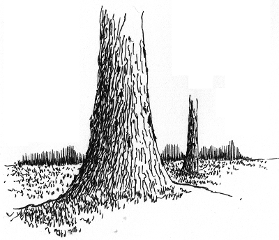
As a pen and ink artist, my aim is to help people discover drawing simple landscapes with pen and ink as a creative and relaxing hobby. I have created completely free tutorials that help absolute beginners get started drawing with pen and experience the pleasure of putting your creative expression on paper. Let this be your new year resolution In the following, you can see how easy it is to draw simple bark texture and trunk with pen. Learn to draw other elements of nature with pen and ink and get started today. Have fun Rahul www.pendrawings.me Drawing a tree trunk with pen and ink Add a horizon with distant tree line and a scattered trunk or two and you have a simple landscape.
-
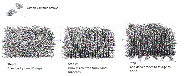
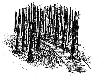
Week 2: Practice Scribble and Loop Stroke Last week we looked at how parallel lines are used to create tones in P&I drawing. This week we will look at scribble and loop strokes and how they can be used to create tree foliage. This is a very fun stroke that can be used to create pleasing trees as shown below. Scribble and Loop Stroke: These strokes are used to create tree foliage, bush, background foliage etc. In a scribble stroke, you ‘scribble’ and create feeling of small interconnected loops as shown below. In a loop stroke, each ‘loop’ is created separately by lifting the pen between strokes and because of this scribble is much faster than doing loop stroke but loop stroke gives a more open airy feel. Make sure the orientation of the scribble and loop is random and in different sizes to give it a feel of foliage. As with parallel lines, we also need to create tonal variations when using these strokes to bring out the volume of the foliage. This is done by adding more strokes where darker tone is desired. You can use smaller loops and scribble to add tone easily. Practice this stroke extensively as it is usually part of any landscapes with trees and bush. Following are some example of trees done using this stroke. First, a uniform tone of foliage is added. Next, add some dark using the stroke to bring out depth and volume. Download the outline of trees here that you can use to practice scribble stroke. Practice this stroke and create simple pleasing trees using it this week. This is part of my weekly posts to learn drawing simple landscapes in Pen and Ink. You can visit the course at pendrawings.me/course. Have fun, Rahul
-
A Course In Drawing P&i Landscapes: Week I
rahul_jain posted a topic in Fountain & Dip Pens - First Stop
I am very happy to announce release of completely free course for learning to draw pen and ink landscapes. You can get an overview of the course in this video and access the course here. Starting today, I will present activities from this course in my weekly posts. Do follow along and start your creative journey today. We start by looking at some of the choices for pens to use for drawing. As you become more proficient, you can try different choices, but to start with, it is sufficient to have a quality gel pen and a small sketch book to practice. In this video, I discuss some of the choices. Understanding some of the simple pen strokes that are used for drawing landscapes is very useful and we will do this next. In this online tutorial and video, you can study some of the basic pen strokes for drawing landscapes. Following is an overview of 'parallel line' stroke that we will practice this week. Do practice this stroke extensively this week as this is the most basic stroke in P&I drawing. ********************************************************************** Parallel Lines:This is the most important and basic technique to create a tone in P&I. Practice drawing lines equal distance from each other. It is important to make sure that your hands are not hesitant when drawing a line. In other words, DO NOT draw a line very slowly and deliberately. This will cause the line to have edges and bad impression. Instead, slowly bring your pen down to the paper and create a confident FLOWING line with a swift stroke. Don’t hurry it either. Key is to find the balance between slow deliberation and fast impatience to create a line that is confident and inviting. This will come with practice as every person has their own rhythm. Practice often and find your own rhythm. You will know when you get it. The lines also don’t have to be exactly parallel and equidistant. The key is to create an impression of ‘uniform’ tone with a set of lines. In other words, the deviations in the distance between the lines should be small enough so that our mind and eye don’t notice them. Instead our mind should instead see and focus on the lines as a whole to see a uniform tone. Initially, don’t attempt to draw longer parallel lines as this requires movement and control from the shoulder that takes more time to attain. Lines an inch or so long can be drawn using the movement of wrist and should be attempted initially. ********************************************** Have fun, Rahul -
Based on suggestions by FPN members who like to use their pens & ink to draw but find they lack motivation, I am starting this thread to encourage sketching. There are no hard and fast rules on how much time participants should spend on their work, nor how skilled the sketchers must be. This is about setting a personal goal to take time every week and draw an object. The benefit is to the individual as they hone their skills one line at a time and take pleasure in the act of creating. 1. Each theme will run Sunday - Saturday. 2. Themes will be posted on the first Sunday of each Month, for the entire month. 3. You may post your sketch at any time you wish during that week. 4. Each theme will be numbered. Please include that with your post. 5. Do not post a drawing prior to the date set for the theme. 6. If you are unable to post the week of the theme but still wish to do so later, you are free to post the image. 7. You may participate in as many or as few themes as you wish. 8. Include the materials (pen, ink, paper, etc.) you used for the sketch. Thoughts on the process are encouraged if you are willing, as we can learn from each other. 9. If you have any suggestions for themes, please email me. 10. Have fun!
-
Learn To Draw Landscapes In Pen And Ink
rahul_jain posted a topic in Fountain & Dip Pens - First Stop
Try this simple landscape and follow along with the video...You can see lot more demonstrations of how to do simple landscapes on my YouTube channel. Also I have completely Free, fully illustrated tutorials to help you get started drawing in pen and ink and adopt this relaxing and creative hobby. Have a creative weekend, Rahul www.pendrawings.me
-
I have put together few videos that show drawing a simple landscapes in pen and ink in under 30 minutes. In addition there are also fully illustrated completely free tutorials to learn drawing landscapes in pen and ink. Here is a simple drawing that you can watch and try it yourself. This is completely drawn with a fountain pen. Any feedback and comment most appreciated. Have a creative weekend, Rahul
-
Hello--has anyone used the Pilot Justus for sketching? You know, when you're on the go and you're trying to grab a quick sketch of someone who might be about to move soon, so you're using (e.g.) fast sweeping lines? I'm asking because I have a number of fountain pens that are great for writing but either become scratchy when used at speed, or the feeds just can't keep up inkwise. The adjustable softness sounds like it could be fun, but I am hesitant to buy the pen without knowing more about its behavior.
-
OMAS as you already know is a 90 year old Italian manufacturer of fine writing instruments and related luxury goods. Founded in 1925, it does carry the name of its founder, Armando Simoni. OMAS as it is, stands for Officina Meccanica Armando Simoni, which means workshop for machinery And initially from 1919 - 1925 this workshop had been producing parts and safety mechanisms for pens.. OMAS had launched its first fountain pen in 1927 and had also copied Duofolds for a while. The turning point for the company came in 1932 with the Omas Extra, a faceted celluloid pen. Today, OMAS is no longer a 100% Italian company as it was earlier, after international acquisitions, first with the French LVMH stake in 2000 and then a 90% controlling equity investment of the Hong Kong based luxury conglomerate Xinyu Hengdeli Group in 2007. Below is a link to this review on my blog with more eye-candy . So here it goes: Omas Art Vision Review As for the Arte Italiana Collection, the twelve faceted or dodecagonal pens were first launched in 1930s and they never got out of fashion over all these years. In Italy it’s called Faccettata, which is also representative of Greek Doric Columns. The Vision along with Milord and a larger Paragon belong to the same collection. They are still assembled in Omas boutique job shop one after the other, manually. The Vision comes in two distinct designs - Liquid Blue & Liquid Green limited to 331 pieces per colour. However these pieces are not individually numbered like the Ogiva Vintage runs. Liquid Blue comes trimmed with bright rhodium decor while Liquid Green is trimmed with dark ruthenium decor. The colours are inspired from watercolour shades. http://3.bp.blogspot.com/-rwB2R_oPcX4/Vebk2XYHZdI/AAAAAAAAFXc/1dU-X7ggqak/s1600/1Designs.jpg PRESENTATION The Art Vision comes in a luxurious cardboard box encased within a silvery grey paper box. The heavy box is inlined with grey felt resembling the shades of steel grey. Once you remove the top cover, you can find the pen nesting inside a grey pen sleeve, placed on a custom made bed. The inside of the lid muses with the following motto customary to Omas: Italian Creativity, History, Craftsmanship. The Pleasure of Writing. Once you flip open the velvety separator, you would notice that there are two beds for two of your pens. Underneath rest the manuals and warranty card for this pen in a separate section. http://1.bp.blogspot.com/-KtUuS-0Y-wg/VeblYyOvHKI/AAAAAAAAFZE/79L3CKGNrVA/s1600/box2.jpg DESIGN - THE SONG OF DARK & EMERALD (6/6) It’s the Game of Thrones playing in my mind or these colours of liquid green and dark ruthenium play a beautiful symphony of light and dark. These pens are made of Omas proprietary Cotton Resin which constitutes of blended cotton seeds and resin polymer derivatives. The cotton resin feels quite substantial and does reflect a luxury in its own terms of rendering hues. The entire pen gleams with emerald tunes, entrapped within hushed darkness of ruthenium giving something that is not very common to this world of art. You can actually visualise the pen as a doric column which separated long ago and fell right into your palms. The clip gleams like an arc quite subservient to an emerald haze. http://1.bp.blogspot.com/-ragZY5aUAho/Vebk9mVwxeI/AAAAAAAAFXs/iT_R5_AXqHU/s1600/DSC_5849.jpg The piston knob concludes the structure with a raised dome. The cap feels light and unscrews with a single turn, revealing a dark ruthenium plated nib converging with gleaming shades of its metallic section. It reminds me of my gun-metal frames. The section starts with a dodecagonal structure (12 sides) stepping down for commencement of the efficient threads before tapering down to a comfortable grip section, before ending with a raised loop. These are the times when soulful geometry transforms into art. I did not find the grip uncomfortable or slippery and I hold the pen 0.4 - 0.5 cm above the nib. http://1.bp.blogspot.com/-HtVo0taFm3k/VeblKWrDUyI/AAAAAAAAFYY/SlThMQlpxdc/s1600/DSC_5863.jpg Now in case you are wondering about palladium, rhodium and ruthenium icing, along with some silver cake, here goes a picture. The other one (m625) has a silver section, coated with palladium along with a rhodium coated nib. http://1.bp.blogspot.com/-8ykeiq8Kqy8/VeblGlyDApI/AAAAAAAAFX8/BeNvKoeSwGk/s1600/DSC_5869.jpg The clip acquires the shape of a convex arc before ending with a tender concavity. It has the OMAS classic roller disc (since the 1930s) which slips and secures the pen in your pocket. The finial has a dome like the piston knob and its polygonal planes define triangular precision finally being betrothed to the famous OMAS O dazzling subtly in dark ruthenium. You can see the distinct outlines of the cap insert. The centre band is engraved with OMAS and ITALY at either ends, interlocked with an architectural pattern known as the Greek key or Meandros. http://3.bp.blogspot.com/-Fln51t2uEzg/VeblZS_bRtI/AAAAAAAAFZM/UtGH4GfPblE/s1600/cap.jpg FILLING SYSTEM (5/6) The piston filling system has a sturdy but small knob and is embellished with what seems to be a single loop. The knob requires three turns for the piston to move to its end stop which reveals the loop to be a part of the piston connector. The piston is smooth and efficiently draws ink from the bottle. The piston end does go down inside the metallic grip section of the pen while filling ink, which provides the additional ink capacity compared to the similar cartridge/converter model of the Milord models. The barrel along with the grip provides a decent ink capacity of 1.2-1.4 mL http://1.bp.blogspot.com/-ZcK9uDBWbk8/VeblJ7_r6II/AAAAAAAAFYQ/F5WehzFwoxY/s1600/DSC_5920.jpg NIB - ALL THAT MATTERS (5/6) The nib comes rhodiated or rutheniated in 14k (Extra Flessible ones) or 18k alloys across four stock widths - EF (14k, Extra-Flessible), F (14k, Extra-Flessible), F & M and seven special widths - BB, OM, OMD, OBD, OBBD, Stub & Italic (untipped). This has a 18k semi-flex and comparatively responsive nib with the usual shaded geometries of the Milord/Paragon series. The size M is mentioned on the wings of the nib while the gold content is mentioned towards the tail. The content resides within an elongated hexagon. It’s kind of hard to describe the parallel hatching and geometrical patterns on the nib and you can see it for yourself. It has got some thick inclined hatching around the breather hole with OMAS branding residing in between the symmetry of it, and thinner lines of straight hatch and plains keep recurring as you move towards either of the tines. The nib is a darling to write with. http://1.bp.blogspot.com/-OYydDE20yew/VeblJjtJEEI/AAAAAAAAFYI/ETlXcPzKJKg/s1600/DSC_5936.jpg The heat set black ebonite feed has thinly spaced fins and two capillaries which ensure a good ink buffer and an extremely wet ink flow. Ebonite attract water (these are hydrophilic) as opposed to hydrophobic plastics which repel water, thereby wetting it more efficiently under the nib. Having said this, I find my plastic pelikan feeds even more efficient in this regard. http://1.bp.blogspot.com/-56Cm-GHTpXM/VeblLJIYzYI/AAAAAAAAFYc/7bIhFrpWbYQ/s1600/DSC_5961.jpg PHYSICS OF IT (6/6) – RELATIVELY SPEAKING For me, this pen is very comfortable for writing without posting the cap. The overall uncapped length is around 13.2 cm, with a decent girth of more than 1 cm. Cap has heft and weighs a third of the total weight. The section is dark and metallic with the signature ruthenium coating although I did not find it slippery as such. The section feels quite substantial along with the cotton resin and I happen to grip the pen around 0.4-0.5 cm away from the nib. Its does feel a delight to write with, simply with the responsive nib. It’s a heavy and long pen to post and you may not prefer posting the Vision. Closed Length ~ 14.5 cmPosted Length ~ 17.7 cmNib Leverage ~ 2.4 cmOverall Weight ~ 33 g (without ink, Cap ~ 11 g)Capped and uncapped comparisons with a TWSBI 580 and a Pilot Custom 823 go below for your reference. http://3.bp.blogspot.com/-PAKrd4EbDuY/VeblSHBosxI/AAAAAAAAFYo/cL8P8mDnd5o/s1600/DSC_5972.jpg http://4.bp.blogspot.com/-jtl9O4qfY74/VeblSKnTcGI/AAAAAAAAFYs/zCzzTTslBEY/s1600/DSC_5992.jpg ECONOMIC VALUE (3/6) The Visions retail at USD 495 and I am not sure if it’s a good or bad price since I do not usually find Omas pens selling at great discounts. I had a got a good, I will say steep discount from my longtime local distributor/reseller on this one. Since I have a lot of blue demos with rhodium trims, I rather went ahead with this song of dark and emerald. After the steep discount, the pen again could not make sure of value for money, but let’s not judge a piece of Art by monetary values alone! OVERALL (5/6) These 18k nibs are extremely smooth, somewhat flexible with a very wet flow. A little pressure increases the ink flow and results in thicker lines. The horizontal lines are a tad thinner than the verticals. I am not allured by flex, partly because of my bad handwriting, but I can assure these are delightfully soft and springy nibs, the best perhaps for a long long time. Being extremely wet writers out of the box, the Medium nib puts a line which takes around 30 seconds to dry GvFC Moss Green ink on MD Paper. Go for it, if you love this pen, substantial, differentiated & limited (331) with a befitting nib! http://3.bp.blogspot.com/-GblHlov2XAc/VeblUPJPe6I/AAAAAAAAFY0/Qp6MI6AlW7I/s1600/DSC_5998.jpg OTHER DEMONSTRATOR REVIEWS Pilot Custom 823 Pelikan m605 Pelikan m625 Pilot Custom Heritage 92 TWSBI 580 REFERENCES Omas Art Vision Manufacturing Process Steps Factory Visit Greek key Thank you for going through the review. You can find some more pen and paraphernalia reviews here.
-

New To Fps But I Love Me Some Ink! (Hailing From S Florida)
uberneko posted a topic in Introductions
hi all! i'm a south florida resident, newly reacquainted with calligraphy and potted inks. waaay back in high school i had fiddled around with calligraphy. at Uni, a course on Illustration introduced me to the joys of ink and nibs. i've dabbled off and on with drawing in inks but never with actual fountain pens. which might become a new love. i'm on the verge! lol PENS!!!!!!!!!!!!!! ---currently own: 1. one lonely Sheaffer med nib FP. *(silver cap, acrylic body in what i like to refer to as "blacklight purple", thin body, small, requires posting). it writes like an absolute champ. tho the ink tends to feather a bit on cheap paper, it is too bold for everyday writing. i have NO clue what the model is, though i would like to. it was purchased back in.... ugh... 1997??? maybe? (i have vague hopes of finding a converter for it and making it a drawing pen. or just using pale, colored inks) ---soon to be in my collection: 1. Pilot Prera, solid, yellow, F nib 2. Pilot Kakuno, pale blue and white, F nib 3. *Pilot Prera Iro-Ai, demonstrator, Calligraphy/Italics nib 4. *Noodler Ahab, flex nib so i went on a spending (and researching) rampage. lol!! i started with just looking at nibs to add to my collection but then the FPs became a small obsession. the Iro-Ai and the Ahab i haven't officially ordered yet. i'm very interested in inks as well. colors, shaded inks, etc. so far i have a Noodlers waterproof black on the way. artwise, i need something that can stand up to watercolor, dontcha know. i seem to be showing a bias for Pilot but that isn't really true... was just looking for a pen that fit the needs, didn't break the bank, and that LOOKED NICE. looks aren't everything, but pen that writes beautifully is even better if you like the design. i read/watched reviews and the ones i chose seemed to be good bets. PEN SHOW!!!! i'm wondering if i should wait until the Miami pen show......... or if i should go ahead and pull the trigger, so to speak, and order up the last 2. i'm super interested in refurbed vintage pens, though i'm not sure if any are in the affordable range or if they are all hundreds of dollars. MISC i'm really interested in meeting new people from all over. and those that are interested in calligraphy and art uses of FPs. also, if anyone likes to do old school snail mail with their mad callig skillz (haha. or their non-skills. whichever. lol!), i think that could be a fun way to practice! NICE TO MEET YA! -
I just stumbled across these prints and had to share them with you all: https://www.etsy.com/ca/shop/QuantumPrints/search?search_query=fountain+pen&order=date_desc&view_type=gallery&ref=shop_search They are fun patent prints, and I think they'd look fantastic in a modern, urban, or industrial design scheme.
-
Hi everyone! I'm new to fountain pens, and I quickly found Plistumi's Devil's Dictionary and I love the designs, even though maybe some of the definitions were beyond me. So I searched a bit and came across the Foolish Dictionary, which is perfect because I'm a bit of a goof ball and also excessively creative. So I've started my new Foolish Dictionary and I wanted to share it with you. I'm hoping to improve my handwriting and drawing skills along with trying out as many different inks as I can! So here it goes:
-

I Drew A Thing (With A Sailor Sapporo) And Made A Shirt Out Of It
jakob posted a topic in The Write Stuff
This was hand-drawn for a shirt design. It is a robot crushed by a boulder (see various hydraulics fluids coming out) and as such is titled "Hug Me, Boulder?" Because of it's abstract nature, it could also be interpreted as strangely misshapen, friendly robot with four hover boosters. Hug Me, Boulder? by jakoblwells, on Flickr IMG_7841 by jakoblwells, on Flickr “Hug Me, Boulder?” - on Strathmore Bristol vellum- using a Sailor Sapporo, MF nib- with Noodler’s Black- lovingly vectorized using Illustrator -
Thanks. I have found a collector to help.
-
....turn it into an art journal! I managed to fill up my Clairefontaine notebook with ink and nib tests in a very short period of time. Oops. I just can't help it--I get excited by ink. I hate to just toss it into the recycle bin, feeling I didn't do too much with it, but also no longer needing the information. So I thought of it as a little art-seed... added water.. (not the same page as above) ..and it is blossoming journal of backgrounds! Some inks are more permanent than others. Adding splashes of Stormy Grey is encouraged. Some areas that didn't bleed out all the way will be covered in other applications. Gesso, clippings, photos, more ink splashes, what have you. I'm pretty excited to see how the whole book turns out! I only have about 3/4 of the pages left to alter.
-
Hello all! I recently recieved a new Pilot (Namiki) Falcon and started using it yesterday. It is definitely superior to my other flex-nib pens in terms of how smooth it writes, and I couldn't be happier. I'm hoping to use this pen for sketching and inking, but to do that I have to abandon the Pilot/Namiki brand inks because they aren't waterproof (I like to do watercolor washes over top). I know Pilot recommends using only their inks to prevent clogs in the pen, but they don't have any waterproof inks that I know of, so I'm looking for an alternative. I normally use Platinum Carbon, Noodler's Black Eel, or Noodler's Lexington Gray in my other art pens. I was also thinking of trying De Atrementis Document Blue for a waterproof blue option. I have occassionaly tried the Platinum Pigmented Copper as a brown ink, but that's not my go-to color for art projects (I like black and gray the most). Has anyone tried any of these inks in a Pilot Falcon and had them behave successfully? Alternatively, are there any other waterproof inks you love and would recommend for this pen? Thanks! Looking forward to any recommendations.
-
In case you are itching to write some letters, but aren't sure what to write, you could volunteer for this project. I'm not affiliated with this art project, but I do plan to volunteer for it. Basically, for one week you volunteer to write other people's letters and mail them. For more details, check out the project's website at http://snailmailmyemail.org
-
Does Art Fixative Spray Work On Fountain Pen Ink?
SunFly posted a topic in Fountain & Dip Pens - First Stop
Hi all, I have letters that people wrote to me using fountain pen ink, but one day I accidentally spilled my drink over one letter which smudged almost a paragraph quite badly. The words are still somewhat readable, but it looks kind of messy. I'm trying to think of a way to save my letters in case my clumsy self repeated the incident all over again. Like the title suggests, does anyone know if art fixative spray works for securing fountain pen ink on paper surface? I'm talking about fixative spray that people use for pastels or charcoal artwork. Or any idea you guys could suggest? -
Hello Fountain Pen lovers! We are very glad to announce that Omas is going to launch its Arte Italiana Line and that we will have it soon at IGUANA SELL. We will keep you updated, but until then here you have some information about it: Omas Arte Italiana ART Fountain Pen http://www.iguanasell-pics.com/photos/promo/Omas/AI.jpg http://www.iguanasell-pics.com/photos/promo/Omas/AI2.jpg http://www.iguanasell-pics.com/photos/promo/Omas/AI3.jpg
-
This isn't really pen related but I use Diamine fountain pen ink in my illustrations (example art included below for context) and I figured this community might know a thing or two about ink. I'm considering trying to sell original artwork in the future but I'm concerned that the ink would fade when hung up on the wall. I was wondering what kind of precautions people would recommend I take to preserve my work. I'd definitely recommend keeping it out of direct sunlight and away from heat and damp. But is this enough to stop it fading? Is it just UV light that damages the ink or will it still fade over time even if it was kept in the dark? Its possible to get picture frames with glass that can block out UV light. And/Or Its also possible to use a watercolour varnish to protect the painting and block some UV light. Its available as a liquid or an aerosol. It's not really designed for ink but its a similar way of working. I'd worry that the liquid form would cause the ink to bleed? so I'd probably use aerosol in light coats but this could also darken the colour and change the texture of the paper. I was wondering if anyone had an idea how long the ink would last when in: Direct sunlight on the wall away from damp, heat and direct sunlight In a frame with UV protective glass Varnished and in a frame with UV protective glass. I'm aware that there are more hardwearing inks on the market but I didn't really think about fading when I bought my inks. I really like working with the rich colour of Diamine inks and I need large quantities as it uses ink up quickly But will it last? Thanks