Search the Community
Showing results for tags 'aircorp blue black'.
Found 5 results
-
desaturated.thumb.gif.5cb70ef1e977aa313d11eea3616aba7d.gif)
How-to: Set, or change, personal info that others can see about me
A Smug Dill posted a blog entry in Sus Minervam docet
It helps to explore this yourself, revisiting once in a while if need be, and keep in mind where each of those personal info fields are entered. Don't leave it until the urge to change something specific to come upon you, and only then bother to ask the question! Invest the time surveying upfront, instead of waste it later waiting for an answer from nobody in particular. Most of the fields shown above are self-evident as to what they are. I think the only ones that could do with explanation are: Security and Privacy: There is only one setting under there, and that is a toggle for whether your online status (including ‘last active’ date or time) is visible to others Content View Behavior: That has nothing to do with what others can see about you, but only where you would like to start reading when accessing content Enable status updates: This toggle enables/disables the public feed on your profile page; if you disable it, then nobody (including you) can post publicly visible ‘status updates’ or any other message against your profile, but if you enable it, then anyone — friend, foe, or complete stranger — can post something there whenever, without waiting for you to initiate and then only reply to what you wrote Notification Settings have nothing to do with what others can see about you, and so is out of scope for this article, and I'm not going to delve into those right now. (You can look here, here, and here to wrap your head around how notifications work with respect to followed content.) N.B. There is a possibility that some of the above settings and data fields may not be available to Bronze members and/or Silver members, but I have no way of testing that or scoping it out. — • — Another way of getting to the Edit Profile dialog, and the way to change your profile photo (or ‘avatar’), is here: — • — Freeform, custom member titles that one enters for oneself are long gone, and have not been a thing since FPN came back from a long hiatus and platform upgrade late in 2020. -
.jpg.7135e591c1859d73ed40ecc784b3a0a6.jpg)
From the album: Shades of colour
(colour-corrected and scaled down to 120dpi in GIMP)© A Smug Dill
- 0 B
- x
-
-
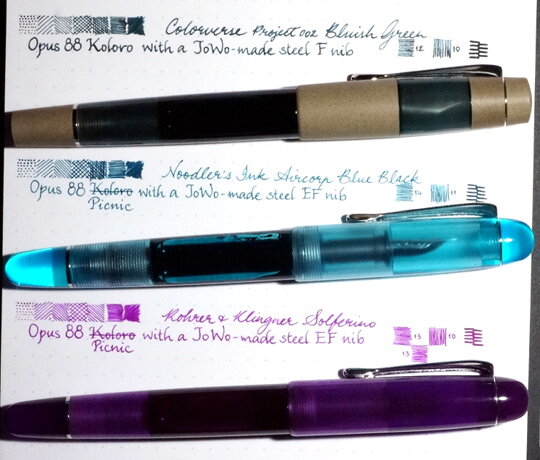
I'd like to do some comparative reviews of a few dark turquoise/teal/green-black inks and will start with this super-long name ink: Organics Studio's "Masters of Writing" series Volume No. 14 Henry David Thoreau "Walden Pond Blue" (Handmade in Maryland) http://i.imgur.com/uZHMquL.jpg?1 The ink comes in a 55ml plastic bottle, labeled simply "Walden" and appears to be highly saturated. I've seen sample reviews of this ink showing a high amount of sheen, and I can confirm it is indeed the case, though of course the sheen level depends on how much ink your pen puts down. For high flow feed/wet nibs, and especially for dip pens, this ink is an absolute sheen monster! The sheen is of very metallic burgundy/magenta color, quite nice. Shading is low to moderate, depending on pen and paper. Lubrication is at least moderate. For my review I chose my favorite paper to show off inks: Fabriano's EcoQua dot notebook made with Bioprima 85g/m2 paper. It is a bit toothier than Rhodia or the glass-smooth Clairefontaine, and is a nice pale ivory color. It also shows off color and ink saturation well, compared to my Clairefontaine paper, which makes even saturated inks look more pale and anemic (you can probably tell I'm not a fan of that paper). Unlike some of my more watery inks, I was able to use this ink with a dip pen without having to re-dip after every few letters. It seems to be more viscous/coating in that regard. This could be a great ink for ornate writing with a dip pen, if lots of metallic sheen is desired. Here is a [slightly overexposed] scan, though also see photographs that follow, the paper is actually a cream color, not white: http://i.imgur.com/Of2QhWf.jpg?1 The water test was done with a single droplet of water from the tap (more toward the left) followed by more droplets on the right side of the grid, after the ink had about 3 minutes to dry. I think it's fairly water-resistant in that the color washes away, but the lines are still visible. Because it is so saturated, it takes a while to dry, depending on your pen. I used a Lamy Safari with 1.1 italic nib for dry time testing. In the scan above, I also wrote with Noodler's Aircorp Blue Black, which is VERY close in color to this ink but completely lacks sheen. Other differences between the two are: - Noodler's ACBB is a tad less vivid teal and a shade more subdued. It also seems to be just a bit darker. I would say that ACBB is the closest match for the Lamy Safari "Petrol" pen barrel in person, followed by this Walden Pond Blue. I have also made some test writing samples for color fastness comparisons, which I will add to this review at a later date. Eventually, beside Noodler's Aircorp Blue Black, I plan to compare this ink to Sailor's Jentle Yama-Dori, Robert Oster "Tranquility", Robert Oster "Fire & Ice", Robert Oster "Aqua", and J. Herbin's "Emerald of Chivor", samples of which are on the way to me as I type this review. Photographs that show the colors and the sheen (very difficult to show correctly, but it's a greenish teal, not quite as intense as on the photos, but more intense than ACBB): http://i.imgur.com/c09I9fJ.jpg http://i.imgur.com/3Qs2kJD.jpg?1 http://i.imgur.com/TUd99uM.jpg?1 And here's the crazy levels of metallic sheen with a dip pen, basically the teal base gets completely covered up with the metallic burgundy (on Clairefontaine french ruled Triompe notebook paper): http://i.imgur.com/0fSWdJq.jpg http://i.imgur.com/R2OjUP1.jpg http://i.imgur.com/f9QNI63.jpg
-
This evening I was mixing up the faux-waterproof Noodler's Turquoise recipe I found in the ink mixing forum and I decided to do a second mix while I was at it. Taking 2 ml of Turquoise I slowly started adding Noodler's Heart of Darkness to it, testing it with a dipped pen as I went. When I got to a half-ml of HoD added, I got a lovely dark green-black color that looked a lot like Noodler's Aircorp Blue-Black after I had diluted it lots. I had to stop experimenting then due to time, but I intend to add a bit more HoD and see if it keeps getting closer to undiluted ABB in color. I'm hoping it does, because I liked that ink and if I can mix something similar to it from two inks I already have I won't have have another bottle starting at me reproachfully. ("Why aren't you using me? WRITE MORE!")