Search the Community
Showing results for tags '3776'.
-

Upgrade From Lamy Safari - Sketching / Drawing
kristof posted a topic in Fountain & Dip Pens - First Stop
Hi there! After more than one year of intense usage (mainly for drawing) of my Lamy Safari(s) I am thinking about buying a "next-level" fountain pen. In terms of performance do you think it is worth spending money on a better one (gold nib, better construction, etc.)? Is there significant difference between a budget and an expensive pen? (My budget is not that fixed, I can be persuaded - but let's say $150 is the ceiling.) What I've observed with my Safari is that 1) the feed sometimes does not give enough ink when drawing really fast sketches (maybe it is just the ink? used only Lamy and Diamine so far) and 2) I have a slight guess that there must be better performing nibs as well. My requirements of the new pen: - great feed and nib; - reliable workhorse pen - still remains a good pen after 10 years; - reverse writing - at least as good as the Safari; - classic look, the less plastic feeling the better. So far I've these pens in my mind: - Platinum 3776 PTB-5000B - Platinum 3776 PTB-10000B / PNB10000 - Pilot Namiki Falcon (maybe a too big jump?) (- Faber-Castell Loom) Maybe I should try lots of different inks (just ordered Sailor jentle) before boastfully believing I am ready to "leave behind" Safari? Thanks a lot for all the answers in advance! Kind regards, Kristof -
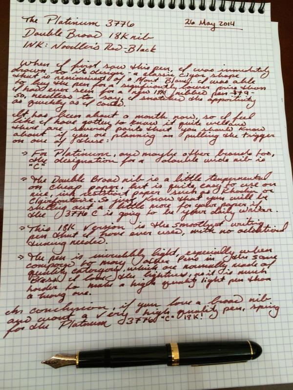
The #3776 is a marvellous piece of writing instrument that any passionate fountain pen lover would consider absolutely essential, for building up a collection. Sometimes, it’s one of the top five must haves for people like us, available perhaps at the lowest price given the gold nib. As for me, I never sensed any urgency to get one, as there were a few similar shaped pens (Pilot Custom 74, Sailor 1911 & MB 146) with me. I liked the wide flattish nib and had decided to take a Naka-ai writer later, which would address my desires of getting an urushi lacquered pen in Tamenuri finish. With time however, a few #3776s of my friends passed through my hands and then one fine day the wine red Bourgogne seemed to be unavoidable. I didn't like few of the nibs which I had encountered previously, given their low tolerance to even moderate pressures resulting in higher feedback. The similarly sized and shaped Pilot Custom 74 albeit with a smaller nib, wrote like a dream with just the softness and responsiveness one would ideally want in a fountain pen. The pluses were many if I ended up with the right kind of nib, given a great balance, an unique colour and a air-tight sealing mechanism of the cap. Below links redirects to the same review on my blog with additional eye-candy Platinum #3776 Century in Bourgogne PRESENTATION (6/6) The pen comes in a blue faux-leather gift box, packed with one blue cartridge, a converter, a warranty card and an user manual. I like the simple, no-fuss design of the box with the right amount of protection necessary for the pen. The model number of the pen, in this case tagged to the clip in a small plastic sleeve, PNB-10000 #71, encompasses both the launch price and colour within it. The 10000 refers to JPY 10,000 as the launch price and #71 to Bourgogne, in this case. DESIGNED - CLASSICAL CIGAR (5/6) The #3776 comes with plethora of names and materials ranging from resin to wood to ebonite & celluloids. The ones most commonly purchased across #3776 Century Collection is either the Chartres Blue or the Bourgogne one. The original #3776 series was designed by Japanese playwright Haruo Umeda who was incidentally also known as Mr.Fountain Pen, along with the designers at Platinum, with the intention of creating an ideal fountain pen. The first of the #3776s were made available to general public in 1978. They sold over 150,000 pens in the first six months, gaining popular use. As you might already know, #3776 expresses the height of Mt. Fuji (3776 meters), the highest peak in Japan. This new model however represents the first full model change in over 33 years. You can find a more detailed historical interlude with an amazing review of the Chartres Blue version by Garden Man on FPN. This classical cigar starts with a rounded off finial and a gold plated clip & ring combination, syncing well with concentric cap bands and concluding with a golden dazzle at the end of the barrel. The relatively dark wine red or Bourgogne coloured resin allows light to dazzle through the entirety of the pen. Bourgogne (or Burgundy) is one of France's main wine producing areas. The region is well known for both its red and white wines, mostly made from Pinot noir and Chardonnay grapes, respectively. The pen incidentally gleams in revealing wine red and striking golden hues with ambient light and these effects proliferate with light. The converter shines within, revealing the ink-levels inside. The transparency doesn't give in to all ambience of light, and keeps pacing up with the intensity of red wine. The cap disengages in less than two turns. revealing a golden glaze of the 14k nib. The grip does reveal another knot of glitter, at start of the section here. The barrel further steps down to the section, however it did not affect my writing experience. Injection-moulding threads are somewhat visible at the threads of the barrel and grip, which could have been polished off. Compared to the President nib, the #3776 nib poses serious competition in terms of size and of course flexibility. The cap with a rounded off finial preserves a classical look. A few things etched across a thicker centre band include the symbol p for brand name of PLATINUM, model number #3776 and of course MADE IN JAPAN. An concentric narrow band above renders some differential aesthetics. The simple clip is tension-fit and has a traditional shape, with a faint western resemblance. From top, you can also observe part of spring & screw of the Slip & Seal mechanism inside the finial. This new air-tight screw on cap is supposed to completely seal off the nib tip from outside air, preventing any escaping vapours. The inner cap ‘Slip & Seal’ mechanism was originally designed for the pull-on caps on lower models. In the current design, the forward upraised edge of the section pushes up against the inner cap, the inner cap rotates independently of the outer cap till a spring at the end of the inner cap pushes back the distance, thereby removing the ambient air and achieving an air-tight seal, as seen in this video. This last bit of threads on the barrel (almost the last quarter turn) which activate the air-tight seal in the inner cap, keep the nib from drying out for more than a year, according to Platinum. Overall, the building materials (resin) and the quality of gold plating seem to have improved. The resin seems reasonably resistant to scratches compared to older models but I do see a cap mark on the end of the barrel as I consistently happen to post the pen. FILLING SYSTEM (4/6) As a cartridge converter filler, the supplied convertor is limited by a volume of 0.6 mL although platinum cartridges have an advantage with capacity of more than 1 mL. Unfortunately enough, Platinum stopped manufacturing piston-fillers long back and the last one (70th Anniversary) was released way back in 1989. The #3776 takes in proprietary converters and like all other current Platinum pens and there is an adapter available for international cartridges/converters, whose production is currently stopped. The barrel disengages from the grip section with less than three turns, exposing metallic threads of the section (thus removing the eye dropper possibility). The resin barrel carries the opposite threads inside. The proprietary converter looks cool with its golden trims matching the overall trims of the pen and you can observe the ink levels through streaming transparency of red wine. As you can see, almost the entire converter capacity(albeit limited), remains exposed to your eye. NIB - ALL THAT MATTERS (5/6) The nib #3776 is made up of 14k gold alloy and it comes across in several Japanese widths - EF(Extra-Fine), F(Fine), M(Medium), B(Broad), UEF(Ultra extra-fine), SF(Soft Fine) & C(Double broad). Inscribed within the nib is the symbol of Mt. Fuji’s peak. A hearty breather hole lies above the imprint of a relatively flatly styled nib. Below the etching of #3776 and the brand symbol p, along with nib alloy (14k), width (M) and gold content(585), rest at the far end of the tail. The peaks of Mt. Fuji start parallel to the tines and achieve their summit towards the iridium tipping. These scrollwork are limited to the tines. JAPAN is engraved on one of the faceted shoulders. The nib lays a wet and smooth line and is a tad forgiving to pressure. The black plastic feed for the has spacey and stylish fins and even with the cap open for a while, it does not take an effort to lay a consistently wet line. A small feeder hole at the section end provides ink suction for the converter. This is a redesigned feeder which is wider and thicker than the 1978 one, resulting in a stronger nib alignment. The nib and feed are heat fitted and you are advised not to pull out the unit just for fun. PHYSICS OF IT – RELATIVELY SPEAKING (6/6) The cigar shape of a pen renders comfort and balance for usage. The cap weighs around 10 grams, and I prefer to post the pen to get necessary heft even for extended writing. To take notes or scribble here & there, I don't usually post the pen. The section with around 1 cm girth is another desirable element for longer writing sessions. Along with the converter, the weight and balance are what you would pretty much expect in most of the nicer pens. Length closed ~ 14 cmLength open ~ 12 cmLength posted ~ 16 cmGrip Diameter ~ 1 cmNib Leverage ~ 3.3 cmWeight (with inked converter) ~ 23-24 gWeight of cap ~ 10 g Some snaps of capped, uncapped & posted #3776 with Sailor Pro Gear, Pilot Custom 74 and Pelikan m605 go below for your reference. ECONOMIC VALUE (6/6) The pen retails at around USD 176 in the US or around Rs 10,000 in India, although you can find it significantly lower prices in Japan. I bought the pen at around the street price plus shipping which hovers around USD 80-90. The pen reached me from Pensindia Pune office next day, after placing an order. Honestly, if you are end up with the right kind of nib, this pen is the steal of a deal. It cannot get better than this, given the 14k better-sized gold nib, along with a good body in a comfortable shape. OVERALL (5.3/6) The medium nib lays a width somewhere between a western extra fine and western fine, graced with a wet and consistent flow. With free flowing inks like Waterman, Pilot Standard ones or specific Iroshizukus, the nib glides over paper with great panache. You may feel a bit of resistance, in case of more viscous/shading inks (say MBTB or even Sailors). I did feel some characteristic spring and a hint of softness with the 14k nib. It felt rigid initially, but with constant writing the nib has started to accommodate my pen-pressure with incremental reflexes. The verticals are almost as thick as the horizontals, showing an absence of any unforced line variation. With a decent buffer capacity of the plastic feed and remarkable sealing off mechanism of the cap, the nib starts like a star and glides over the paper with Iroshizuku Yama-budo ink. The ink takes around 20 seconds to dry completely on MD paper, which also points to efficiency as well as economy of Japanese manufacturing. Overall, I am glad that I have finally bought this pen for myself. Thank you for going through the review. You can find other pen and paraphernalia reviews here. REFERENCES Air-Tight Seal of Cap Platinum #3776 Century Website Platinum Izumo - President Nib Review
-
Hello all! I hope you can help me out. I recently bought a Sailor Profit Standard MF with a 21k nib and a Platinum 3776 Chartres Blue with a Soft Fine 14k nib. Problem is, my platinum skips a lot and feels scratchy while writing. I need to apply some pressure in order for the nib not to skip while writing. I also tried the Sailor, and it is a completely different experience, it has a little bit of feedback but writes smoothly. I know this terms are very subjective, but at least I can tell you the feeling of the comparison. Sailor's nib feels great, like feedback, whilst the platinum nib feels scratchy and skips. I did a small writing sample where I first applied almost no pressure and then I did. Is my Platinum Nib defective or is it that I just don't know how to use the soft fine nib?

-

2 Platinum Soft Fine Nibs, With Different Levels Of Softness
adamvanwinden posted a topic in Japan - Asia
I recently purchased two brand new platinum 3776's with 14K soft fine nibs. One in the rhodium finish and the other in the gold. Out of the box the one with the rhodium finish was remarkably softer than the gold. Is this a case of natural levels of variance within nib manufacturing or does is the rhodium one known to have greater softness? I did not read anything to that effect before purchasing. -
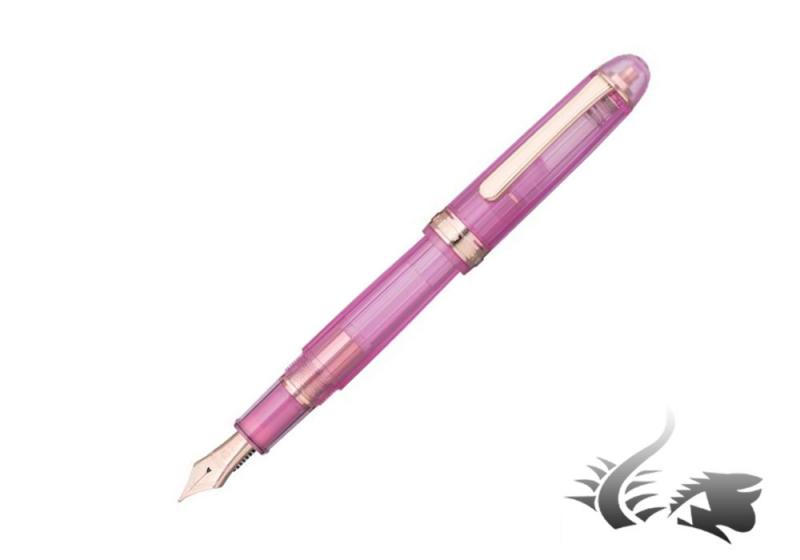
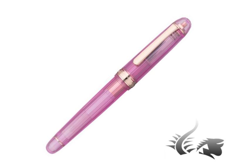
Platinum launches a new addition to their #3776 Century NICE series! This time its the new color "LILAS" featuring the image of a flower. The Nice series is inspired by the renowned city located in southern France's Côte d' Azur. This city is blessed with a mild climate, with pouring radiant sunlight something that is expressed through the fountain pen's body. Its resin transparent body features a sandblasted finish with cut grooves at precise angles which express a contrast between light and shimmering water. The name LILAS, means lilac in French, using for pink gold metal trims with a pale pink body to evoke the image of the flower. This flower symbolizes friendship, memories of adolescent, innocence and first love, pride and beauty. The first 2000 fountain pens are Limited Edition coming with a blotter card which includes a serial number. This edition includes an exclusive packaging with a chrome plating converter and blue black ink cartridge. For further information or if you would like to make your pre-order please do not hesitate to visit our web or contact us through info@iguanasell.com
-
Can't Make Up My Mind! Pilot Custom 74, Ch91, Ch92 Or Platinum 3776
AndyYNWA posted a topic in Japan - Asia
I know there have been many similar topics like this one, but I had to ask myself. I'm planning on buying myself my first gold nib as a Christmas gift to myself. I'm looking at the following pens: Pilot Custom 74 (M) Pilot Custom Heritage 91 (M) Pilot Custom Heritage 92 (M) Platinum 3776 Century (M) As I understand it, Custom 74, CH91 and CH92 all have the same feed and nib. Please correct me if I'm wrong. Are the medium #5 nibs the same width as Metropolitan medium? Is the 3776 medium nib broader or finer than the Pilot medium? Those of you who have tried both the 3776 and any of the Pilots, what are your impressions? Pros, cons? I prefer the design of the CH91 and CH92. I'm not a big fan of the cigar shape, but it's not a deal braker. I know the CH92 is a demonstrator with piston filler, which makes it slightly more expensive than the others. Is it worth the money or is any of the other a better buy? Greatful for all your input. -
Can the new Platinum Century 3776 with its advertised "airtight cap seal" considered totally airplane-safe? I know that any pen with a full converter that does not have any air in it should be safe to travel on an airplane, however sometimes you forget to check what's in your bag or forget to go through the motions of fully filling the pen right before a trip. It would be nice to have a completely "throw-in-the-bag-and-forget" kind of a traveling pen.
-
Platinum #3776 Century Review This is my second review, so please let me know what you think in the comments. Also, there is a review of the Medium version of this pen in Bourgogne, so stay tuned for that. Table of Contents IntroductionPackagingForm Factor and AppearanceNib and SectionConclusion (TLDR)Statistics · Name: Platinum #3776 Century · Nib: 14k gold fine nib · Country of Origin: Japan, imported to US · Model Number: PNB-10000#51-F · Color: Chartres Blue · Price: ¥10,000 retail. Available in the U. S. for ~$150, and from importers for $70 · Included Items: Box, warranty papers, manual, cartridge Part I: Introduction and History In 1919, Shunichi Nakata a Japanese industrialist, founded the Nakaya seisakusho (which according to the company’s website means ‘Nakata: manufacturer of fountain pens,’ in Tokyo, Japan. Nearly a decade later, in 1928, Nakata changed the name to the Platinum Fountain Pen company. In 2011, eight years prior to Platinum’s centennial, the company announced the Platinum #3776 Century fountain pen to commemorate the company’s nearly century long existence. The name of the pen comes from the height of Mount Fuji (in meters). This happens to bear very strong resemblance to the Montblanc Meisterstuck pens, which have the number 4810 (the height of Mont Blanc in meters) embossed on their nibs. The pen also serves as an ambassador, of sorts, as one of the most well-known introductory 14k gold nib pens, along with the Pilot Custom 74 and Sailor Profit 1911 series. It is also an excellent pen overall, and with its street price of $70, it is a brilliant value. The pen is also available with excellent variety, as it is available in eight nib options–UEF, F, M, B, C (double broad), SF, and Music. Its inexpensive price, high build quality, and pleasant writing experience make it one of the most popular fountain pens in the world and one I recommend immensely. <sidenote> Over the past five years, Platinum has come out with a multitude of Limited Edition Centuries to augment the permanent collection of black with gold trim, Chartres Blue with either gold or rhodium trim, and Bourgogne with gold trim. The limited edition pens are contained within two categories, those named after cities, and the ‘Fuji Lake Collection’. There are three limited edition pens named after European cities and neighborhoods—the Nice (which was announced in 2013 and named after the city on the South of France), the Nice Pur (identical to the Nice except for silver accents instead of rose gold), and the Nyhavn (which was announced in 2015 as an Engeika excusive; it was named after the entertainment district in Copenhagen). The Nice pen is clear, with a somewhat clouded resin and rose gold accents. The Nyhavn pen, on the other hand, is much more audacious in design as it has a yellow cap and section along with a rose gold barrel, nib and accents. There are also five ‘Fuji Five Lake Series’ pens: the Mostu (2011, clear resin) Shoji (2012, light blue transparent resin), Sai (2013, clear resin), Yamanaka (2015, clear textured resin), and the final just recently announced Kawaguchi pen (2016, textured blue translucent resin with silver accents). </sidenote> Part II: Packaging (85/100) Functional, could be nicer The pen arrives very well packaged. The exterior box is white, with the Platinum name and logo printed on the front. On the back of the box are Japanese recycling notifications. The actual box of the pen is very similar to those Sailor uses in pens of a similar price range. It is plastic and covered in a faux-leather material that is actually quite pleasant. There are no markings. Once opened, the platinum logo in stitched in gold thread. The rest of the box uses a satin-like white material. The pen sits in a plastic sleeve with a clip-card providing its model number. This is all tucked under a little white ribbon to keep it from moving too much in transport. Unlike, for example, the Pilot box, the base of the Platinum packaging is glued in place. The packaging feels rather brusque. Although Platinum would like to believe that you would leave it on your desk, it is really just something you’ll probably put in a drawer. It will get the pen from A to B safely, but it’s design leaves a little to be desired. Depending on the reseller, the Pen may or may not come with a Platinum converter. As my pen was a Japanese import, it did not, however, I was able to secure one rather inexpensively from the same seller on Rakuten. In the box (in all cases), comes the pen, an instruction manual, and a warranty card. It also comes with one cartridge of Platinum pigment ink. In some cases, it comes with the blue ink, and in other cases (such as mine), it arrived with blue-black ink. Part III: External Form Factor & Appearance — 95/100 The pen is a classical cigar shape with a nice diameter and tapered cap and finial. It is also rather light, being roughly 21 g without ink. It owes this to its plastic construction, which unlike some of its cousins (such as the Pilot C74), does not feel cheap at all. Rather to the contrary, the pen is solid in the hand, with a perfect and weight and measurements to be a lightweight everyday writer. Capped, the pen measures 14 cm long (the cap itself measures 6.7 cm). Uncapped, the pen measures 11.7 cm. The barrel is exactly 8 cm, and the nib and section measure 3.7 cm. The nib itself takes up a majority of the section, measuring 2.2 cm while the section itself measures a comparably small 1.5 cm. However, the writing are is rather large at 2.5 cm long as the threads on the barrel are not sharp and can be used as a grip quite easily. If you prefer to hold your pen higher, the step between the threads and the rest of the barrel is quite small. The pen has a very comfortable diameter of 1.2 cm. Compared with the Pilot C74, which has a 1 centimeter diameter, it is far more comfortable for long periods. During one of my exams two weeks ago, I used this pen to write a seven-page essay, and I can affirmably say that the pen is extremely comfortable. My hand always felt at home on the grip, and it barely even got tired. The pen is made out of strengthened PLA plastic, and when looking at the pen for the first time, you will notice that it is truly beautiful. In the case of the Chartres Blue model, the resin is a rich blue color, with just a touch of translucency. It is really something that you have to try for yourself in order to truly understand, and when you do experience it, it is a sight to be seen. The gold accenting around the clip fit in very well with the resin color and only serve to make the instrument look even better than it already does. However, the resin is a bit more prone to scratching that the Custom 74, due to it sustaining a little scratch after a drop onto hardwood flooring. <sidenote> The pen's color is called the 'Chartres Blue' model because it is based off of the stunning blue stained glass windows of the Chartres Cathedral in Chartres, France. The stained glass windows in the cathedral are known for their deep, rich, blue color, and I think that Platinum did an excellent job emulating that in their pen. </sidenote> The clip is a rounded rectangle sharper angles on the top. It is connected to the cap by a small gold pen, very similarly to the Pilot C74. Near the bottom of the cap are two bands. One thicker, raised band at the bottom which says ‘#3776 PLATINUM MADE IN JAPAN,’ and one thinner band right above it. The cap screws on in 1¾ rotations. However, this cap has Platinum’s ‘Slip and Seal’ feature which is essentially a smaller, airtight cap that secures around the nib and feed, keeping the ink from drying out. When screwing the cap onto the pen, you can feel the mechanism engage in the final quarter turn. Platinum claims that the pen can sit for two years with pigment ink, and upon your first usage in two years, Platinum claims it will start without hesitation. Although I have only had this pen for a matter of weeks, much less years, I have not been able to test this. However, I can say that it has not hard-started once in my possession. The pen also posts quite well. Posted, the pen still remains balanced, however, if you have small hands, it could feel slightly back-heavy. I personally prefer it unposted as it is extremely well balanced no matter your hand size. The pen’s build quality is also top-notch. Never, in my possession, has it creaked or cracked. Although it is made of plastic, the resin feels solid and the pen benefits from its lightness. In comparison to the Custom 74, the pen just feels a little more professional. It weighs a bit more, and it feels like more of a writing Part IV: Nib, Section, and Writing (95/100) The section on the Century is simple, but comfortable. It is 12 millimeters in diameter, and 1.5 cm long. However, the threads on the barrel are not sharp, and extend the usable grip space by another centimeter. There is a gold band on the end of the section that shows where the section ends and the barrel begins. It also has a little lip at the end to keep your hands safely away form the nib. And that brings me to the nib, the defining feature of any pen. This pen is no exception. From a visual standpoint, the nib is rather plain, albeit rather large. It has the Platinum logo, an indicator for nib size and the text 14k and 585, signifying that the nib is 58.5% gold. The word ‘Japan is etched into the right side of the nib’. The only bit of decoration on the nib is that of an etching of Mount Fuji that is simple and tasteful. Below that is the number 3776, signifying the mountain’s height. It also has a breather hole that looks like a heart that I really like. From a design perspective, however, the nib is a little more interesting. It is very broad shouldered, allowing less line variation in the writing. It is also very large. These two factors make the nib hard as a nail when writing normally, but somewhat flexible (not as much as an sf nib), when you try to create variation. As said above, under normal conditions, this nib is very stiff. It will not give an inch unless you press down. However, if you do press down you will most likely punch through your paper because the fine nib is really quite fine, for a fine nib, (and pointy). It is finer that my other Japanese fine nibs and is a hair finer than a Jowo EF or a Lamy EF. Due to this, the pen also gives a fair amount of feedback. In the beginning, the pen may even border on scratchy. However, once your break the nib in, it gives enough feedback so that you can hear it write and you can feel the paper under you. It is definitely not smooth, though. If you prefer smooth, I would recommend you try the Medium nib in this pen, which is very, very smooth (review of that model is coming soon). The pen writes rather neutrally, the ink really determines if it is smooth or dry. So far, I have found that well-lubricated pigment inks, such as the Sailor Blue-Black I currently use with it, suit it the best. The feed has never clogged or hesitated and can write just as fast as I can. I am confident that this pen will be able to write whatever I need it to. If you can deal with a slight amount of feedback, the nib is pleasure to use. Writing sample on 90g Rhodia Part V: Conclusion (TL;DR) — 275 / 300: 92% — Very well recommended Compared to the Pilot, the Platinum is not a pen for fancy, ornamented writing. It is really more of a workhorse device. It is extremely capable, and can deal with pretty much everything I can throw at it. As a student, it is a perfect pen as its fine nib (coupled with the right ink), bleeds through very little, while providing a nice, steady, fine line. It is built well, and very comfortable to write with for long periods. I recommend it highly. Thanks for reading, Caleb
-
The 5th and final of the Fuji Five Lake series Platinum 3776 pens is coming in July. The Platinum 3776 Kawaguchi Fountain Pen is a blue demonstrator pen. It comes with the "slip & Seal" cap, a 14k gold nib and a cartridge/converter fill system. For more details on the pen read out blog post: https://www.penchalet.com/blog/platinum-3776-kawaguchi-fountain-pen/ You can also register to "pre-order" the pen as well: https://www.penchalet.com/fine_pens/fountain_pens/platinum_3776_kawaguchi_fountain_pen.html
-
Hello, I am new to the fountain pen world. I have tried some cheap children pens, preppies, kakuno, kaweco and recently platinum 3776 balance UEF with steel nib. Though I like thin gel pens (0,38 UNIs) UEF is thinner than i thought. I am going to buy EF and F versions. Does anybody have experience with both, 3776 Balance (PTB-5000B) and 3776 Century (PNB-10000)? How much do nibs differ?
-
For a limited time we have the Platinum 3776 Sai fountain pen on special at 40% Off full retail. This is a great deal on a a great fountain pen. 14k Gold nib, Slip & Seal lock cap, converter style pen with a demonstrator body.
-
I recently acquired two demonstrators, one made by Sailor and one by Platinum. They are very similar visually and they both sport a B nib. I am going to provide a comparative review. The two demonstrator pens are: 1) A Sailor 1911 Profit in large size (14cm) 2) A Platinum 3776 Century special edition Censke for Nagasawa Pen Style Den (a major stationery trader with its main branches located in Kobe). The pen is already sold out, but there are plenty of other 3776 Century demonstrators that I would assume behave in a similar fashion). 1. Appearance (Platinum left, Sailor right) At first glance, the two pens are almost identical... The differences are in small details: 1) The 1911 is a tad longer, maybe 2 mm (this is consistent with official measurements). 2) The 3776 shows more... the section is exposed while it is not visible in the 1911. Also, you can see a spring mechanism in the cap. This is the famous Slip & Seal mechanism that helps closing the nib in a hermetic space and preserve the ink for a long time. 3) Both pens sport a B nib, but it is 21k on the 1911 and 14k on the 3776. 4) The 3776 has a number of customized engravings: it reads Kobe and 1882 with the logo in the shape of a (bleep). On the main ring it reads NAGASAWA Pen Style Den. 5) As expected, each pen accommodates its own proprietary converter or cartridges. See the pic below showing the pens loaded. 6) Finishes are gold plated. The central ring on the 1911 is a bit larger. 3. Filling (Platinum bottom, Sailor top) The two pens are easy to fill with their converters. The capillarity of the feed works just fantastic and they start writing right away as soon as you plug in the cartridge or the converter (I unconventionally filled the converter without the nib on). For this test they were filled with the same red Kobe ink. 3. Test drive I tested the pens both on cheap and premium paper, like the Rhodia pad pictured above. They are both great writers, but with some interesting difference: 1. The 1911 is hard as a nail, when you write you can hear the noise of the nib on the paper (it is not scratching, but you got the idea). The flow is very generous and wetter than the 3776. This is hardly surprising since the nib is marked H-B (Hard Broad). It works great with the Kobe ink permitting a good deal of shading. 2. On the other side, the 3776 B nib is very soft and writes smoothly, almost not touching the paper. The ink flow is a bit drier. Both nibs are marked B, but, as it is usual for Japanese nibs, their line is much thinner than the one left by an American or European broad nib. In this case I would say that the line is between F and Medium when compared to American and European nibs. I also have a 1911 Profit with a Naginata Togi medium nib and it performs much better (more smooth) and its line is similar to the line left by the 1911 demonstrator in terms of width (even if the Naginata treatment gives some line variation absent in regular hard nibs). 4. Conclusion The two demonstrators are two very nice pens (for those liking demonstrators of course). The nibs are very different. I wish the Platinum nib was wetter, that would have made it perfect. I personally do not dislike the hardness of the Sailor nib, but I understand that it could be too scratchy for someone. It should also be noted that the pens uncapped fall into the "small" range and could be uncomfortable depending on the pen size you need. They both post securely though.
-
Hello, I read in a review of this pen that the nib unit is not supposed to come out. https://www.fountainpennetwork.com/forum/topic/291490-platinum-3776-century-chartres-blue-soft-fine-nib/ However, my nib and feed comes out without even a tug. I just have to pull it out casually. Is this supposed to be a bad thing? Thank you.
-
Platinum 3776 Calico Celluloid Fountain Pens We have the Platinum 3776 Celluloid Fountain Pens with an 18k gold nib at 40% Off while they last. Retail: $550.00Sale: $330.00
-
Hi guys! I am a student and I recently bought a Platinum #3776 Century Bourgogne in EF from a reputable eBay seller. I received the pen and I spent 4 hours trying to get it to start and put down a consistent black line. I'm using Noodler's Heart of Darkness. I tried - flushing, cleaning, reinking, cartridge and converter, spreading the tines a little and repeated the whole process many times. I managed to get it to write properly for about an hour but then it started putting down inconsistent lines again. It mostly does this on the faster strokes or on an upstroke. When it is skipping, I pull the feed and nib out and I see that the feed is very dry and almost all of the ink is sitting on the top of the nib. You can see the problem right here: http://i.imgur.com/whKOcoY.jpg http://i.imgur.com/4KPujxl.jpg It used to be much worse than this but I still don't know how to make it write properly. TLDR: - Platinum 3776 EF, inconsistent lines with Noodler's Heart of Darkness, help?
-
Perceived Scratchiness, Extra Fine Nibs, Nails. Facts/theory/solutions?
Intellidepth posted a topic in Of Nibs & Tines
I've read a lot on here regarding the perceived scratchiness of extra fine nibs. It appears to be a very real phenomenon. What I haven't come across so much are the theories and facts as to why this occurs. I understand how it can and does occur in flex nibs, ie the inside edge of tine can only be smoothed a tiny amount before causing ink to lose connection with the paper. I don't understand how it happens with nails. I understand the difference between feedback and scratchiness. In the main it is scratchiness I am concerned about. However, if you've come across a particular nib made of a particular material that offers reduced vibratory feedback when compared to other nibs in the extra fine (or finer) category, I'm keen to know about it. I'm seeking a nail nib in extra fine for everyday use as my most frequently used note taking pen (possibly a Platinum 3776 Century - maybe even ultra extra fine). I naturally write small. The Lamy fine is too wide with the wet inks I prefer to use. I do understand the stepped difference between Western and Japanese fines. Could people please offer a dash or two of experiential wisdom? Subjective/objective comparisons between nibs you've tried or own, based on the above info, would be most helpful. Alternative pen/nib suggestions are welcome, as are threads on the topic that I may not have come across yet. I don't have access to brick and mortar stores locally that sell a reasonable range of pens. -
Quite a while ago - well, a few years ago if I am honest - I bought a Platignum 3776 from a large newsagents that normally didn't hold a lot of pens, butt hey had this one and I like the look of it. At the time I had my trusty little Sheaffer Prelude (I know; one of the world's most hated pens and all that, but I like it - sentimental reasons mainly) in daily use mode, so the Platignum went in a drawer and stayed there until a few months ago. I took it out and inked it up and it had a nib from hell. Since then the newsagents has been taken over by another company who will not honour the purchase, so no refund is possible. The right hand tine is about a mm and a half longer than the left, but the good news (or so I thought) was that it all appeared to be tipping material. I got to work with the micro mesh and was just getting to the sweet point when.....bang; the tipping material on the left hand tine came right off to reveal a tiny bubble. This I think explains the length discrepancy. It's a bit annoying because I love the size, weight and look of the pen. Are there any decent nibs that will fit (the feed and nib come out quite easily) or will I just have to bite the bullet and spend on a Platignum replacement nib (the Platignum nib looks cool)?
-
For a limited time, get 20% off all Platinum products! Everything is included, from the great #3776 fountain pens to the bargain Platinum Preppy. Explore our complete range of Platinum products here: http://www.cultpens.com/c/q/brands/platinum We're also offering the same discount on all Diplomat products (excluding the Spacetec range!). This includes the newly arrived - to us at least - Aero and Excellence A Plus ranges. You can view our Diplomat range here: http://www.cultpens.com/c/q/brands/diplomat
-
Hey Everyone! This is my first Review, so take a look and let me know what you think! I know there have been a ton of reviews on the 3776 series in general, but I have not seen much about the "C" Double-Broad nib. Thanks!!
-
As I like my Bourgogne (EF nib), I decided to get the Chartres Blue with an F nib. I saw many pictures of this pen and I am pleased with the actual pen in my hand. Compared to the other #3776 resin body pens, the Chartres Blue (and Bourgogne) is nicely weighed and seems to be well made. I am holding this pen with the Platinum converter; so, the weight of the converter is also contributing to this weight. I like the slip seal cap mechanism and the friction fit closing of the cap. Platinum's friction fit closing is different from the one with MB's Writer's edition. It is difficult to explain in words; but, all I can say is that works flawlessly. I am not a big fan of gold trim, as I like the understated silver or platinum trim. Compared to my #3776 Celluloid Blue, the Chartres Blue shows more bling. But, not to the bling-o-meter scale up to the Pelikan styles, howerver. The 14K nib is the gold trim and the stamping on the nib is the same as my Celluloid's rhodium coated 14K nib, except for the placement of the letter "F." My Celluloid is stamped with F in Japanese. I checked the nib with my loupe and the tines are perfectly aligned. So, it should write very nicely, similar to my experience with my Celluloid's F. I have also posted the family photo. One of my #3776 Sterling silver is missing from this photo as it is in my other place. http://i4.photobucket.com/albums/y115/YS2003/IMG_4718_zpsd6c91944.jpg http://i4.photobucket.com/albums/y115/YS2003/IMG_4724_zps787ef558.jpg http://i4.photobucket.com/albums/y115/YS2003/IMG_4725_zpsccfb10ae.jpg http://i4.photobucket.com/albums/y115/YS2003/IMG_4727_zps8d855d71.jpg http://i4.photobucket.com/albums/y115/YS2003/IMG_4728_zpsbf666c3e.jpg http://i4.photobucket.com/albums/y115/YS2003/IMG_4729_zps27264f1f.jpg http://i4.photobucket.com/albums/y115/YS2003/IMG_4730_zps660862e8.jpg http://i4.photobucket.com/albums/y115/YS2003/IMG_4731_zpsbb0b4f62.jpg http://i4.photobucket.com/albums/y115/YS2003/IMG_4732_zpsdd1b64fa.jpg http://i4.photobucket.com/albums/y115/YS2003/IMG_4733_zps553663c7.jpg http://i4.photobucket.com/albums/y115/YS2003/IMG_4734_zps2c3f34c3.jpg http://i4.photobucket.com/albums/y115/YS2003/IMG_4735_zps28b04c26.jpg http://i4.photobucket.com/albums/y115/YS2003/IMG_4722_zps7922ff95.jpg http://i4.photobucket.com/albums/y115/YS2003/IMG_4726_zpsc63b3304.jpg http://i4.photobucket.com/albums/y115/YS2003/IMG_4723_zpsb562470a.jpghttp://i4.photobucket.com/albums/y115/YS2003/IMG_4719_zps66bb5742.jpg http://i4.photobucket.com/albums/y115/YS2003/IMG_4720_zps5b7a129c.jpg
-
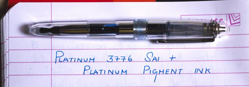
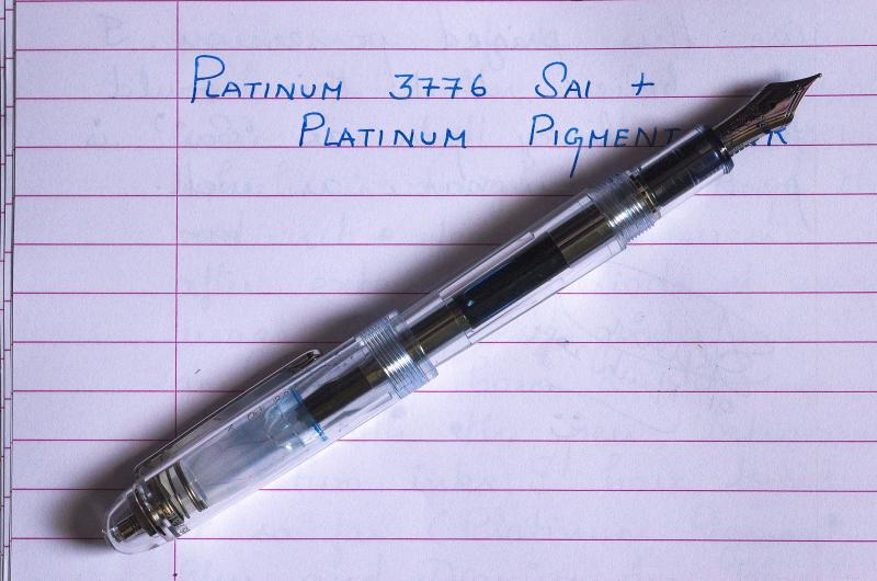
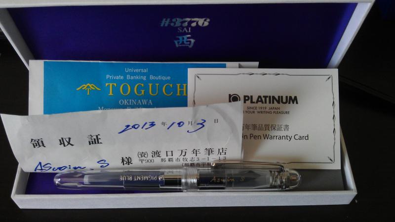
Here is the story of my purchase of a Platinum Sai FP from Toguchi store in Okinawa, and a brief review of this lovely pen! [Also see: https://www.fountainpennetwork.com/forum/index.php/topic/201123-toguchi-pens-in-okinawa/] [A copy of this review in my blog fpensnme.blogspot.com].
-
Introduction of the introduction: I’ve been a lurker for years, and own probably way too many pens for my own good. While there are certainly no shortage of reviews for a myriad of pens on this forum, when I am trying to decide on a pen (in Australia it’s difficult to try before you buy) I like to read as many reviews as possible, so I figured I should probably start reviewing them. Who knows, maybe someone will find them useful, so unless I get told how awful I am, I will continue to slowly review my collection. I’ve shamelessly copied some common aspects of reviews from others, as well as altering it slightly to my own format. Also, apologies for the photo quality, my dad “borrowed” my digital camera two years ago... Platinum - 3776 Shoji (Broad) http://farm4.staticflickr.com/3722/11044497224_8110355f6d.jpg Introduction Platinum are one of the big three manufacturers of Japan along with Pilot and Sailor, and like the other two are regarded as producing extremely high quality nibs. I would generally categorise Platinum as being the better value for money out of the other two (You could pick up a regular 3776 for around $100 if you look around) as well as being the most stylistically and technologically conservative. The 3776 series is quintessentially Platinum: cigar shaped, smooth gold nib, and a cartridge-converter only filling system. They generally sit in the middle of the road as far as size is concerned, although the century series bodies (which the Shoji is based on) are ever so slightly longer than the other versions. And just in case you’ve been living under a rock (or in Australia) since 1978, the namesake 3776 is the height of Mt Fuji, tallest mountain in Japan. In 2011, Platinum began producing yearly special edition pens based on the 3776, each appropriately named after the five lakes residing on the northern base of Mt Fuji. 2011 was Motosu, 2012 was Shoji, and as of writing 2013 is Sai. Unlike their other 3776 brethren, the five lakes series are unabashedly blingy demonstrators, each slightly different to reflect the different natures of the lakes they are named after. They are also significantly more expensive than the regular 3776 series, but then again they are limited edition (2011 units for Motosu, 2012 for Shoji, 2013 for... well you get the pattern.) This particular review is of the Shoji version, I wasn’t interested in the Motosu (Gold converters in silver trim bodies should be a crime) or the Sai (Too plain, and you can’t convert it to an eyedropper, despite looking almost perfect for it), so I only own the Shoji so far. Presentation It’s rare that I put much thought into a box after busting my loot out of its pen-prison, but the 3776 Shoji gave me pause to admire the packaging (looking at you and blowing kisses Visconti). The entire affair is large, plush and tastefully highlighted in silver. Take a look: http://farm4.staticflickr.com/3755/11044475896_a179ed6c4b.jpg In the canvas-covered box you get the pen itself, a spare gold coloured cartridge-converter (Please don’t put the gold coloured converter in a silver-highlighted pen. Seriously. Don’t make me come over there) a small #3776 brochure that showcases others in the series, a pair of 3776 Shoji demo cards, and interestingly a pair of carbon ink and pigment ink cartridges (more on that in a moment). And remember kids, the bottom of the box does not lift out, irrespective of how many times I forget and try to lift it up. Appearance A departure from the previous 3776 models I am familiar with, the 3776 Shoji has a clear body and cap with a faintly translucent light blue hue to it. The nature of the plastic is not captured well in pictures, particularly how the lighting in its surrounding environment can dramatically change its appearance: It can look completely clear: http://farm4.staticflickr.com/3779/11044503524_a0f135fe19.jpg But sometimes quite blue: http://farm3.staticflickr.com/2871/11044470716_f43a1c6aa7.jpg The Shoji like the rest of the 3776 series is cigar shaped. As you can see from the pictures, the pen is tastefully highlighted in silver. The most ostentatious aspects of the pen are its nib (coming up) the fat cap band that says “3776 PLATINUM MADE IN JAPAN” , and the interior surface of the slip and seal mechanism. If you’re not familiar with this feature, its a defining partof the 3776 series that prevents the nib drying out (I have a Sailor pen with this feature too with much less fanfare, but whatever), and on this particular model of 3776, written in silver are the names (in English mysteriously enough) of the five lakes, along with a small silver outline of each. It's nicely done, it matches the rest of the pen, and I like it. As far as Platinum is concerned, this is tantamount to an outrageous, drunken night out for their designers. http://farm6.staticflickr.com/5524/11044501804_0cffa4dc0d.jpg The slip and seal mechanism is also the reason why Platinum include a pigment and a carbon ink cartridge in the box. Both inks types are use at your own risk – they are suspended matter based, rather than the more familiar dye based liquid inks, which means if they dry in your pen, then the entire feed will need some pretty intense repair work, if it can be repared at all. Including these ink types is Platinum's way of asserting confidence over the slip and seal mechanism. It's a nice sentiment, but I am still not brave enough to try them out. Build Quality For me, the only area where the pen falls down slightly is the build quality. The cartridge-converter is the biggest casualty here – it's plasticky, unpleasantly stiff to use, has a very small ink capacity that invariably leaves a large air bubble when filled, and is generally cheap feeling. Luckily, you can always replace a catridge-converter if it breaks. The other area of concern is the barrel. On mine, it has interior scratching, the direction of the scratch marks indicate they occurred when the nib and feed were inserted. After some research this doesn't appear to be an isolated problem, but Platinum assured me that the issue is purely cosmetic, and after close inspection to determine that the rest of the plastic is just fine, I believe them. That's not to say I'm not delighted to see this kind of problem occur, if my $30 Lamy Vista can do it without scratching, why cant Platinum? The third and probably minor issue is that the pen damages itself when posted. This is necessary for me – the pen is not only too small, but way, way too light without the cap. To this end I've stuck sticky tape on the end where the posting damage occurs. http://farm4.staticflickr.com/3702/11044495994_ece2db86e6.jpg Nib http://farm6.staticflickr.com/5515/11044377245_f21eafce02.jpg Ah the nib. It wasn't my first love affair, and it certainly wont be my last, but in my current collection, this nib is my favourite. Belonging to a select group of pens that I own that I have never had to adjust, This particular one is rhodium plated, and roughly the size of a western #6 nib. It is relatively flat, and has a strangely cute heart-shaped breather hole. The nib on the whole looks mostly unassuming, yet the breather hole and lines tracing the sides and up the tines let you know that this nib has some serious attention to detail. After all, a slightly misaligned manufacturing would be instantly noticeable in the skewing of the nib detailing. I own a Sailor Reglus, Professional Gear Demonstrator (Yes I like Demonstrators. A lot.), a Pilot Custom Heritage 92 in bold and one in medium, a Prera and a Vanishing Point, and this nib beats all of them hands down. Despite use through two semesters and two sets of final exams, drawing a moustache on my dogs nose, and travelling in my backpack, the nib has *never* skipped. Ever. Nor have I pulled it out of my backpack to find a blob of ink in the bottom of the cap. And the only time it had a hard start was for a split second after leaving it uncovered for ten minutes - there are few nibs that can even pretend to be in the same category as this one. The nib is 14K gold, although as far as gold nibs are concerned this one is firmly on the stiff side (pun intended). Mine is bold , super smooth with the tiniest hint of feedback, and seems equivalent to a slightly larger western M, and is somewhat wet, which is just how I like it. Take a look at the beautiful shading you can get with a good ink: http://farm6.staticflickr.com/5528/11044498464_f6fca909d7.jpg Overall – 4.5/5 Despite its price, I refuse to leave it at home – I take it to Uni and write with it all day. This is the pen, when I get frustrated with another fountain pen, I use for a few minutes and it brings a smile back to my face. I've only used one other century and it had a similarly excellent nib (and similarly so-so body). Platinum completely deserve their reputation for their nib quality – If you find a 3776 on sale from a certain online japanese retailer, I highly recommend it - just remember to whack some sticky tape around the barrel. The Good: + A nib that veers dangerously close to perfection. + Beautiful. + Slip and seal does its job in my experience. + Limited edition, thus a somewhat unique addition to your collection. The Bad: - Converter - and a small capacity one at that. - Lightness can make it feel a little cheap. The Ugly: - Build quality, in particular the converter, for such an expensive pen is not up to scratch. Comparison Here I'll compare it to a fairly common pen so you can get an idea of it's size, a Lamy Safari. http://farm8.staticflickr.com/7389/11044554263_d83452cebd.jpg http://farm4.staticflickr.com/3758/11044371235_44b0fc96c7.jpg http://farm6.staticflickr.com/5523/11044462536_748a801d7b.jpg A note: I would like my reviews to be helpful, let me know what you'd like to see/what you hated.
-

Is It Possible To Make A Seam On My Pen Watertight?
Obedai posted a topic in Fountain & Dip Pens - First Stop
I love turning my cartridge/converter pens into eyedroppers because it is easy and lets me hold so much more ink. However, I have a Platinum Century 3776 pen that I am having trouble converting. I want to convert it because it is in the semi-transparent blue color, which makes it lovely for eyedropper filling, and I just love the way the pen writes. However, these pens have a small golden band near the bottom of the barrel that leaks out ink if I eyedropper fill it. Is there any way that you guys know of to seal this seam so that it does not leak ink? Right now I just wrap it in a single layer of electrical tape, but that is obviously ugly and not ideal. Any help you can give would be appreciated.http://fpquest.files.wordpress.com/2012/12/platinum3776bluechartres_oncap.jpg -
This is my new pen, the Platinum Koi 3776 with music nib against vintage kimono silk and blue felt. A review may be forthcoming. Thanks for looking! http://i1231.photobucket.com/albums/ee513/betweenthelens/IMG_9018_zpsa0156a52.jpg http://i1231.photobucket.com/albums/ee513/betweenthelens/IMG_9029_zps8f1f8ca1.jpg http://i1231.photobucket.com/albums/ee513/betweenthelens/IMG_9025_zps1c12aabb.jpg http://i1231.photobucket.com/albums/ee513/betweenthelens/IMG_9041_zps01f09c30.jpg The band reads: Japan, Platinum and 3776. http://i1231.photobucket.com/albums/ee513/betweenthelens/IMG_9033_zps08b353c4.jpg http://i1231.photobucket.com/albums/ee513/betweenthelens/IMG_9030_zps4fb35b42.jpg
-

Looking For Mottishaw-Modified Platinum 3776 Examples, Please...
heymatthew posted a topic in Japan - Asia
Hello all, For Christmas this year, my wife surprised me with a really lovely little Platinum 3776 Sai Demonstrator pen with a Fine-Medium nib. I was writing with it a bit, and while I love it, I'm tempted to have the nib modified by John Mottishaw. I haven't decided if I want to go with a fine stub or an added flex mod so I'd like to see some examples of his work if you guys have them handy. The Nibs.com site mentions that the Platinum 14K nibs are especially well-suited to nib modifications so I'd like to have this guy made special... I do have a Pendleton Point Fine Stub on a TWSBI 540 that is just about perfect in terms of a special writing instrument so I'm tempted to go in that direction with the Sai. Something stubby enough to give me some variation without requiring 3" gothic letters. Then again, I've been getting more and more interested in light line variation from semi-flex nibs (Pilot Justus, Falcon, etc.) so I'm wondering if the Sai might be better suited to that treatment. Things I don't like: XXXF Nibs: Too fine for me for anything but drawingBroad Nibs: Too broad for my smallish handwritingWide Stubs: Again, too broad for my smallish handwriting (ie: 0.6 ,1.1, 1.5, 1.9, etc.)Thoughts or ideas? Examples of such things would be excellent. Even if it's not a 3776 (although I'm particularly interested in seeing what he can do with these since that's what I have). Blessings, Matthew Edit: I should add that while the pen writes wonderfully, it writes just like a lot of my other pens so that's why I was thinking of having something special done to it... No other reason, really.