Search the Community
Showing results for tags '18k'.
-
20220404_164355 Waterman CF + 18K M nib.jpg
OldTravelingShoe posted a gallery image in FPN Image Albums
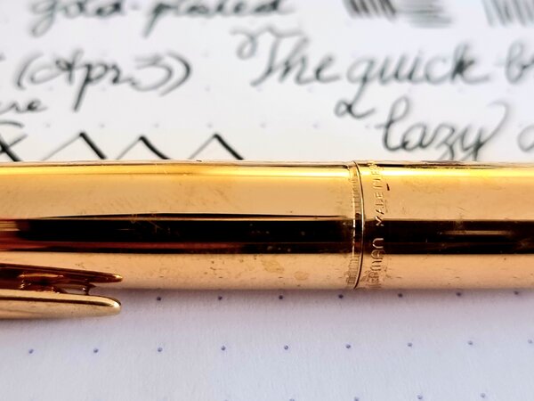
From the album: OldTravelingShoe's Random Pics of European Fountain Pens
© (c) 2022 OldTravelingShoe
- 0 B
- x
-
20220404_170448 Waterman CF + 18K M nib.jpg
OldTravelingShoe posted a gallery image in FPN Image Albums
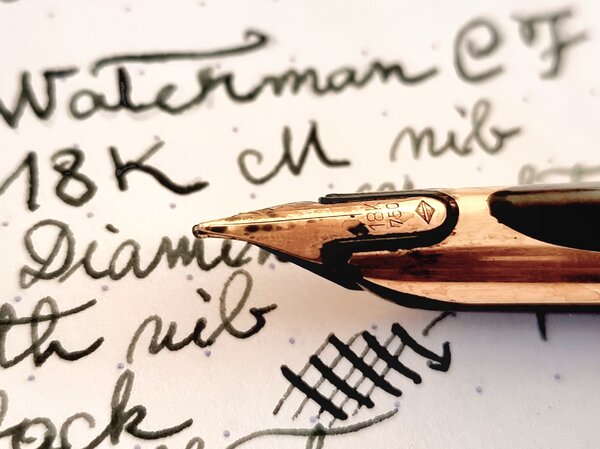
From the album: OldTravelingShoe's Random Pics of European Fountain Pens
© (c) 2022 OldTravelingShoe
- 0 B
- x
-
20220404_170502 Waterman CF + 18K M nib.jpg
OldTravelingShoe posted a gallery image in FPN Image Albums
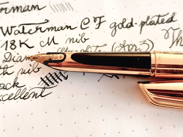
From the album: OldTravelingShoe's Random Pics of European Fountain Pens
© (c) 2022 OldTravelingShoe
- 0 B
- x
-
This is a medium Sonnet I just received, from a reputable shop, which was sold as "new old stock." The nib looks bent to me, but it writes pretty nicely. Perhaps a little scratchy in one direction, but wildly better than the custom ground nib I unexpectedly got from another shop. So this has me wondering, should the nib on this pen be straight? Or are there benefits to nibs shaped like this? Or is it a flaw that needs to be returned and corrected? (None of the photos on the site showed it from the side, so it wasn't clear that it would look like this when I ordered.)

-
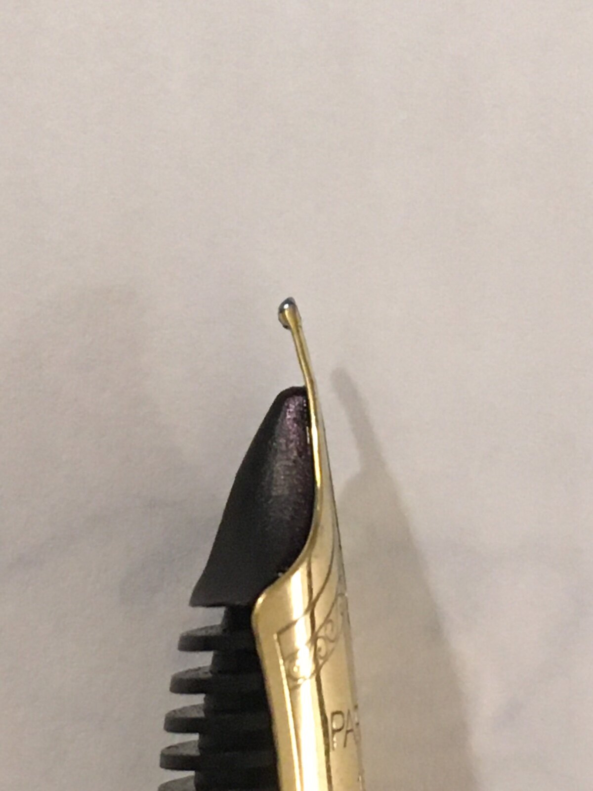
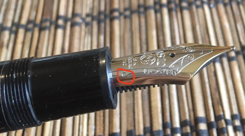
Hello, I have attached an image with a MB 149 18K bi-tone nib another image with the feed (split-ebonite). The nib has a dot sign in the lower right near the 750 mark. See the attached image. Could someone identify the nib and tell me if the sign/dot on the nib is normal and tell me what is the purpose of that sign? Thank you for your time! Best regards, Florian
-
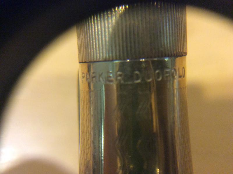
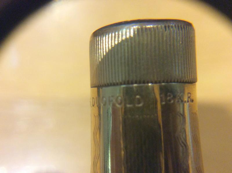
Hello fine folk of the forum! I found this at the flea market, it apears to be a vest pocket duofold, it is only slightly longer than my kaweco sport but I haven´t been able to find pictures of this pattern anywhere. I have seen some jack-knife models with these gold waves but this one has breather holes, an inner cap and the christmas tree feed. It came with a "Warranted 14k USA" nib which seems to be too small for the pen thouh it fits the feed nicely. The green section and brown tail cap would sugest they aren´t from the original pen buit they fit perfectly. Have you seen these before? Any aditional info is apreciated
-
To tell you the truth, I am heavily biased towards two of my pelicans - one is a M400 white tortoise, other is the blue striated M805. The M8XX usually considered to be the logical next step to M4XX/6XX, if some logic is still left. As with the model numbers, there is a general increase in nib size & specs, in addition to overall dimensions, when you move from M4XX to M1XXX. I also love the Souverän M 625 with dazzling sterling silver trims (Ag 92.5%). Although the blue-striated M805 in a way alludes to the 1929 classical green-striped design with a differentiated version of the striped translucency. Been a while since I wrote a review. This is a review I loved to do. Also, here is the link to the same review on my blog: The M805 Review DESIGN - THE STRIPED TRANSLUCENCY (5/6) The M800 comes in three gold-trimmed standard designs, two striped translucencies - Green, Blue and the Classical Black with a Green Ink Window, across four standard different nib widths - EF, F, M and B, although a tipped italic nib is available with a special edition. Sometimes a M800 Red also chips in. The M805s now come in silver trimmed versions of Striped Blue and Black/Green Ink Window now with monotone rhodiated nibs. Personally, I prefer the earlier two-tone nibs on these. There are several special editions of M8XX starting with the m805 demo, m800 brown tortoise, the recent m800 burnt orange which is creating a lot of fire these days, after the m805 Stresemann. The M805 hints the subtle craftsmanship associated with building this writing instrument. It’s superb balance somehow ensures all the necessary weight and balance for writing. The barrels made up of highly polished pelikan famed ‘cellulose acetate’ with its diamond cut contours, partially reveal the necessities like the piston end or ink level, while concealing the irrelevant ones. I feel that this blue stripes reveal quite conservatively compared to the green. http://1.bp.blogspot.com/-vN_i0x_9Vkw/VgqAwB1h83I/AAAAAAAAFiI/oWHJnXSEuFo/s1600/DSC_6389.jpg The blue stripes innately reflect both light and dark while preserving a formal appearance of the souverän as the silver palladium plated trims continue to stand out. The translucency is subtle but useful at the same time to note ink levels. http://4.bp.blogspot.com/-4GkInYxF2xw/VgqAwobD_sI/AAAAAAAAFiM/oUuuN5Felyc/s1600/DSC_6393.jpg The sleeve has deeply shining blue stripes and reveals itself with ambient light. It’s sleek and smooth to touch. http://2.bp.blogspot.com/-M-PSLhWSWgU/VgqArRRleTI/AAAAAAAAFh8/kHZsKijV0KM/s1600/DSC_6395.jpg The white dazzle is matched throughout the pen starting from the famed finial and the clip, through those concentric bands in the cap, before finally converging with the dual piston rings. While the white tortoise plays with light with phenomenal efficiency, the blue stripes have their conservative thoughts about exposure! (Pradeep aka pgd84 should like this pic ) http://3.bp.blogspot.com/-HKt-S86L0Pw/VgqA1EpXffI/AAAAAAAAFiU/LrCXGIde1xA/s1600/DSC_6397.jpg The cap feels substantial and unscrews with a single turn, revealing a dazzling two-tone nib. The grip reveals another knot of white glitter, towards the nib end. http://4.bp.blogspot.com/-Ke6RMLlQ6QU/VgqA--u8BDI/AAAAAAAAFi8/FTdPYRoTbss/s1600/DSC_6402.jpg Two concentric white bands with a palladium plated crown embossed with the pelikan logo, adorn the cap with a signature pelican beak-shaped clip. The thicker bottom band carries the brand imprint of PELIKAN SOUVERÄN GERMANY. A high degree of polish gives it a gleam which can coax the lustre of the bands. The logo on the finial is the one embraced by Pelikan post 2003, that of a mother pelican and its chick, gleaming in brushed palladium. You can observe the staged pillar caps of M400, 625 and 805 glittering with light. http://4.bp.blogspot.com/-4sXhoscpxSQ/VgqBEwa61eI/AAAAAAAAFjY/tdfBFmtkuwg/s1600/collagecap.jpg FILLING SYSTEM (6/6) A piston filler with a sturdy knob is embellished with two concentric loops. Like any other pelikan, it’s imbibed within the system and is hassle-free. The piston end unscrews with three to four rotations and ink is drawn into the pen with remarkable efficiency without any fuss, once the piston is screwed back on. And of course, you can observe some of it live through the striped windows. A brass spindle connector in the M8XX provides weight and balance. Everything is glistening white as you can see the connector nut in the picture. M8XX fills upto 1.85 - 2 mL of ink. These brass piston mechanisms can be dismantled using a 7mm wrench (TWSBI would fit). I don’t really find a need to do that unless there is a fault which can be addressed at home. For any problems, it might be better to send the pen to Pelikan Germany/Country Authorized Service Center. http://2.bp.blogspot.com/-HqGqr1KuF_Y/VgqA9WOLd9I/AAAAAAAAFio/7vQ1ychkJGk/s1600/DSC_6419.jpg NIB - ALL THAT MATTERS (6/6) The nib/feed section is screw-fit and comes in a standard 18k two-tone design across four stock widths - EF, F, M & B. It has the standard pelikan design with the usual convenience of a screw-fit section. Like all cousins, the nib is both exquisite and efficient. With a big feed, and a spread out nib it looks like a real delight. The silver of two-tone finish does converge with the white trims in terms of both glitter and glimmer. The tail end specifies the nib-width and composition (18 C, 75% Au) of the gold-alloy used. Three arabesques diverge along the shoulders of the nib with two of them converging near the circular breather hole. The third curve runs across the tines towards the shoulders ending with the tail end of the nib, outside of which a golden decor runs along the shoulders across the outer tines, before converging onto the iridium tip. There is of-course the dazzling golden mother-baby pelikan logo, resting above the tail. This one in the picture is a Fine nib and writes smooth and wet. No complaints on out of the box smoothness. Some ink always manages to creep on the surface of this nib. http://3.bp.blogspot.com/-7VweTHjHvDk/VgqA_gz9nxI/AAAAAAAAFjA/D7mhxz9IjPc/s1600/DSC_6453.jpg A big black plastic feed with closely spaced fins ensures a good ink buffer and dearly promises wet and smooth starts. Even with a dipped nib section, it can write a page. http://2.bp.blogspot.com/-ESn9Ya-lD4c/VgqA_15LMhI/AAAAAAAAFjE/QwpZ3dRnkQA/s1600/DSC_6455.jpg PHYSICS OF IT (6/6) – RELATIVELY SPEAKING The pen has got some heft in it but it is very comfortable for me unposted. The overall capped length is around 14.1 cm. The total weight of M80X has more than a third contribution coming from the cap. The grip diameter is around 1.1 cm. The cap threads are higher up the section and are non-obtrusive even for a higher grip. Uncapped Length ~ 13 cmPosted Length ~ 16.4 cmNib Leverage ~ 2.3 cmOverall Weight ~ 29 g (Cap ~ 11 g) Capped and uncapped comparisons with some pens like Visconti Homo Sapiens Maxi, Pilot Custom 823 & a MB146 go below for your reference along with another family pic. http://1.bp.blogspot.com/-yI3D629hjko/VYZWVtWmUWI/AAAAAAAAEpQ/nBA0-yX7x-I/s1600/014.jpg http://1.bp.blogspot.com/-wGjWaqmP_tQ/VYZWYo3cT6I/AAAAAAAAEpY/Xy-kqy2fQLw/s1600/015.jpghttp://1.bp.blogspot.com/-MKRvVUnJtLo/VatxdhNisxI/AAAAAAAAE6Q/yAypHzfnwZc/s1600/DSC_4574.jpg ECONOMIC VALUE (5/6) The M805 retails now at around GBP 290, though it might be available at lower street prices. I do not feel this pen was an impulse buy for me, since I had carefully decided before getting to a M800/1000 level. I would not undervalue this rating by much, because I feel it’s one of the phenomenally efficient pens in this segment. It could be your daily workhorse or your part-time poet, does not matter! OVERALL (5.6/6) These 18k nibs have a smooth and wet flow. The nibs have a decent spring with an inherent softness in them although without any noticeable flex. Being extremely wet writers out of the box, the Fine nib puts a relatively thick line, which takes around 20 seconds! to dry a (Hail!) Iro Tsuki-Yo line on MD Paper. The pen feels extremely well balanced for my hands. (However, for Pelikan 4001 blue ink, it takes 30 seconds). These nibs do run a size wider than Japanese. Compared to this the M1000 tines will be much easier to flex, however I find the M1000 too unwieldy for my hands. http://1.bp.blogspot.com/-xGEF4monnrw/VgqBFcss81I/AAAAAAAAFjc/LQUVBDboVqo/s1600/DSC_6458.jpg Thank you for going through the review. You can find some more pen and paraphernalia reviews here. OTHER REVIEWS & LINKS Pelikan M605 Marine Pelikan M625 Pelikan M4XX Pelikan M200 Cognac Patent Ink Capacities MB 146
-
For those who have 149s with 14k nibs as well as 18k nibs which do you prefer and why? I have a chance to exchange my 149 with a 14k f-m nib for one with an 18k ef nib. I love the finer grind but am wondering if there are any differences that make it worth the exchange.
-
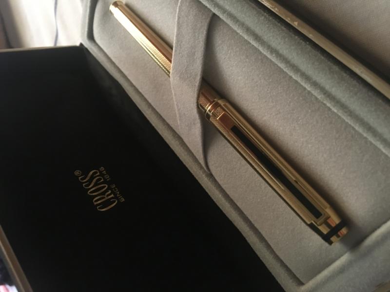
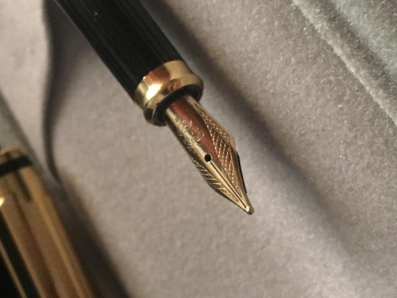
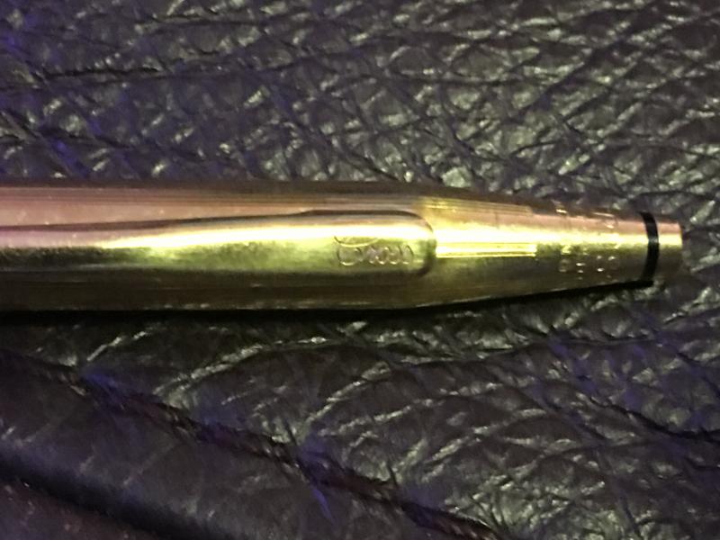
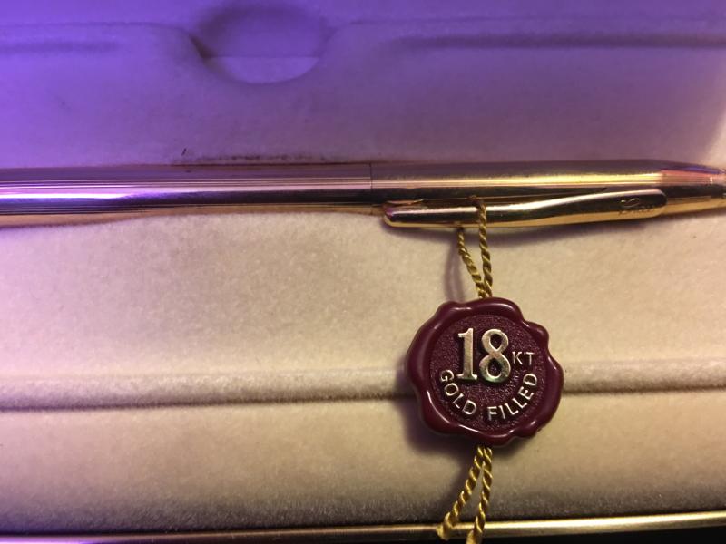
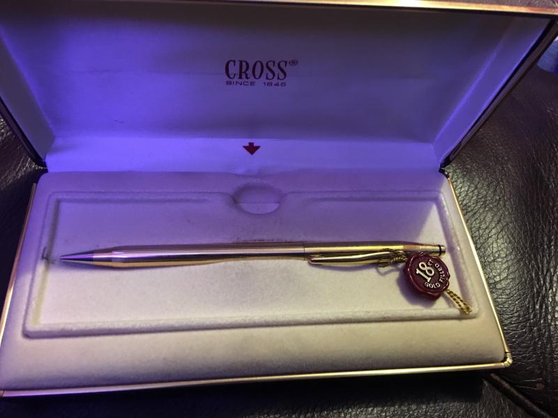
Is My 18K Gold-Filled Cross Townsend Authentic And Made In The Usa?
shuuemura posted a topic in Cross
I just bought a 18K Gold-filled Cross Townsend with a 18K BB nib from eBay, and I just wanted to ask the experts here if my pen is authentic and made in the USA. It has the script "Cross" logo on the clip, and an 18K hallmark for the rolled gold finish, but there is no marking of the country of origin on the pen itself. The pen itself writes well from the get-go, with some nib squeaking which should probably go away with use. At first I tried using a green Cross converter, but it leaked all over the place. The pen didn't leak when I switched to cartridges. Here are some pictures for your perusal. Thanks in advance! http://farm6.staticflickr.com/5478/9715995298_cd4a5437a4_b.jpg The whole pen. http://farm6.staticflickr.com/5443/9715995362_5ee7e11779_b.jpg First view of the script logo and the 18K hallmark. http://farm4.staticflickr.com/3812/9712761239_5804c4df3a_b.jpg Second view of the script logo and the 18K hallmark. http://farm3.staticflickr.com/2865/9712761281_b3fff759b2_b.jpg The nib section with an ink cartridge inserted in. I tried using a new green Cross converter but it leaked all over the place. http://farm6.staticflickr.com/5501/9712761475_e2326476ef_b.jpg Close-up of the 18K BB nib. It appears that Cross has discontinued the BB size, instead only offering F, M and B sizes nowadays. http://farm6.staticflickr.com/5493/9715995490_a142d19740_b.jpgCloseup of the feed. -

Very Disappointing Experience With A Pelikan M805 Stresemann
John545 posted a topic in Fountain & Dip Pens - First Stop
Hi Guys. I have been into fountain pens for a while now, but I hadn't bought any expensive pens until now. My collection mainly consisted of TWSBIs which I have been very happy with. I worked really hard this year for my 2nd-year exams, and I worked pretty hard over the summer in an internship so I decided I would reward myself with my first "expensive pen". I decided on the Pelikan M805 Stresemann for a couple of reasons. 1 - It looks brilliant. I really like the look of the grey stripes down the barrel. I haven't seen a pen that I like the look of so much. 2 - I had heard that Pelikan nibs are some of the best nibs around and write brilliantly out of the box. However, I opened up my new pen this morning and sadly I have never been so disappointed with a purchase. As I was opening the pen it was somewhat clear that I had been sent a pen that was previously a return. For example, the little plastic bag that the pen comes in was all screwed up. (I bought this pen from cultpens in the UK by the way). Now I'm wondering if someone else had a bad experience of this pen, sent it back, and now I've ended up with it. On the barrel, it appears that one of the grey stripes is missing. There appears to be a dark gap where it is missing. I have tried to get a picture of this but it is quite difficult to pick it up on camera! This is something that wouldn't bother me in the slightest on a much cheaper pen, but at £300 I'm not impressed by this. I decided to forget all this as the writing experience is the most important thing. So I inked up the pen with some Iroshizuku Ku-Jaku and began to write with it. The writing experience is extremely disappointing! It's almost as if I am writing with a different pen to that of the reviewers online. The nib is very dry, and not smooth at all. Also, it feels very stiff which I was surprised by as a lot of people say the Pelikan nibs have some spring to them. I grabbed my TWSBI Eco to compare the writing experience, and the eco is the clear winner. Smoother and wetter, at less than a tenth of the cost. A lot of people say that the Pelikan nibs are quite broad. For example, the medium M805 nib in the pen habits review looked more like a broad or even a double broad. So I decided I would go with a fine nib as opposed to the medium nib I usually go for. So I'm wondering, would you guys recommend returning the pen and swapping it for the same pen with a medium nib? Or do you think I would be better getting a refund and buying a different pen altogether? If you think there is a better alternative pen out there I would appreciate any recommendations - I'm looking for a pen with a really wet and smooth nib for the best writing experience possible. Around £300 or less. -
Admitting I have not read Steve Hull's excellent book cover to cover, I am a little mystified by an Onoto pen I have just acquired. It has an 18ct nib. No other vintage Onoto of which I am aware has other than a 14ct nib. The pen itself is one in the Streamline style. I will identify it properly later. The mottled red hard rubber barrel is labelled "Onoto The Pen" under which is, less clearly but present, "De La Rue & Co London", so that part is all correct. The nib has a heart breather hole characteristic of the brand and era, but whereas my nearest comparable pen has on the nib "DeLaRue // Onoto // London // 3" (most others insert "14c" between Onoto and London) this one has "DeLaRue // London // Onoto // 18ct" Has anyone encountered an 18ct nib on a vintage Onoto before? I can not say how it writes because the plunger washer is fossilised, jamming the plunger. In other respects it seems intact, although the slip cap is either a ring-in or again very unusual, having slight knurling around the top edge but otherwise apparently normal in appearance and matching the pen for colour and pattern.
-
When I didn't know better and had zero patience, I managed to mess up my two Sonnets; I have since bought two steel nibs and they are working very well, but just realized those two old nibs are 18k... I wouldn't try to improve them myself, that's what messed them up in the first place, so I would look for a nib meister... Is it worth it? I'd end up getting (used?) sections, barrels and caps (and a feed!), I do quite enjoy my Sonnets now, with nice ink and paper... A bit of wax on the caps to stop the evaporation ... And a lot more patience. I remember them being a lot more messed up, they don't look that bad now, but are very scratchy and bent... I have an aversion to gold but appreciate gliding nibs.
-
So I've always assumed one of my oldest pens was a Pelikan m400, which was fine with me, except I looked from time to time for a slightly bigger m600, which have always been beyond my budget, or more precisely how much I'm willing to spend on any pen. Except after re-reading some specialized web sites while I was looking for something else I gather it might have been an m600 all along, the "old style" which I guess was the same size as the m400...?? I love this pen either way, but I'd like to know. Length with cap: 127mm There is a single band on the barrel towards the turning knob.Two bands on the cap. Since new it's had a bicolour 18C nib, a chunky F.
-
The pen was given to me by someone recently and i want to identify the model. The nib has "CROSS 18K 750" written on it. Thanks in advance.
-
I have seen many forums on steel vs gold nibs. Article by Brian Gray helps a lot in taking the right decision. Can someone tell me the difference between JoWo 14k nib and 18k nib? I am talking about stock nibs and not the ones tweaked by the meister.
-

Please Help A Newbie Date Or Information About My Cross Pencil
smellrod83 posted a topic in It Writes, But It Is Not A Fountain Pen ....
Ladies and gentlemen I am a newbie when it comes to this, so please anything helps. What I know: I believe it is a century series It is a mechanical pencil It had above the clip, "1/20 gold filled" and "made in USA" words It has a little plastic piece attached to clip that says "18 karat gold filled" The cross logo is in italic letters on the clip The owners book had a few references to a SelecTip Any help in regards to date, or any other information would be greatly appreciated
-
Ladies and gentlemen I am a newbie when it comes to this, so please anything helps. What I know: I believe it is a century series It is a mechanical pencil It had above the clip, "1/20 gold filled" and "made in USA" words It has a little plastic piece attached to clip that says "18 karat gold filled" The cross logo is in italic letters on the clip The owners book had a few references to a SelecTip Any help in regards to date, or any other information would be greatly appreciated.
-
Introduction. It all started when I got intrigued by JoWo nibs, reading that they make nibs some for bigger names in the Fountain Pen industry. So I just set about trying to get the cheapest JoWo Gold Nibed pen. Having seen/read a lot of About Fosfor Pens, I contacted Mr.Manoj by the end of December inquiring about JoWo gold nibs and after sorting out some details, advance payment for the Nib, My nib arrived by the Middle of January. Putting all the faith in the Nib,I selected one of the Many Polyresins from the Fosfor Pens site,nothing special here and Sketched a rough drawing of my pen, I’m not a very artistic person. And after a wait of 1 month, I finally received my Pen in the 2nd Week of March. The Pen As seen by the above sketch, the dimensions and shape is pretty accurate. Weight wise, I find it perfectly balanced in the hand and sits perfectly in my hand. When capped, it is top heavy, thanks to the Silver Clip. When uncapped, there is a slight shift of weight towards the barrel end helping it settle well in the finger web space. The cap takes 1 ¾ turns to uncap. I had specifically asked Mr.Manoj for the least number of turns. The section has a bit of a concave to it and forms the perfect diameter for my gripping style. Alternate Grips: My handwriting changes considerably based on where I grip my pens, but it’s not always comfortable with all pens bodies. Fortunately this pen body works well with all my pen grips giving each a characteristic flow. Filling is done by a Schmidt converter but I guess it can be turned in a E.D. The Nib Coming to the thing that started this 3 month long journey, It’s a JoWo #5 18k Broad nib… … and man is it worth it! Amazingly smooth, Amazing Spring and the broad tip has a stub like quality to it. Getting some impressive Line variation considering it’s a Broad. This has made me want to order a Fine and see how much variation that’s going to give! Or maybe I’m one of the lucky ones to get a springy nib. Only gripe is that I didn’t opt for the #6 Nib as I feel it would have suited this size of pen better. I was told the nibs come as a unit and I find that the feed keeps up well with ink flow. Cost: The total cost of the pen was Indian Rupees 6520, or just below a USD.100. I have always been an advocate of the philosophy “ An item is worth what you are willing to pay for it” so I will leave the cost factoring upto the reader. Alternative gold nib (new)pens at this price: Platinum PTL-5000 Platinum 3776 Platinum Balance Considering this one is “one of a kind”, handmade, customized to your specifications/ inputs I’d say the price is well worth it. Conclusion: Honestly I’ve been a silent spectator of the Fountain Pen scene for the past 3 years (when I first got re-introduced to Fountain pens) and never Felt like doing a Review of a pen. This was until my Interactions with Mr.Manoj Deshmukh of Fosfor Pens. The whole process of discussion, planning, waiting has completely changed my opinion of the workmanship that goes into producing each one these pens. That may not be the case with Larger Manufacturers where all the interaction you have is going into a Boutique, dipping a pen and scratching something down on paper. But in there Internet-days even that is a novelty. But when you are associated with an item from Day 1 of its Conceptualization, it truly is an amazing experience. And I fear it’s going to be Addictive. So at the end of the Day I have a beautiful writing instrument. Tomorrow is a new day and a New Sketch for Mr. Manoj.
-

Vanishing Point Question: Vp Xf 18K Nib Vs Fine Special Alloy Nib
civil posted a topic in Japan - Asia
Vanishing point question: anybody tried/owns an extra fine 18k nib and fine special alloy nib? How do they compare in terns of small writing and scratchiness/smoothness? Some people discouraged me from getting an alloy pen as being too dry compared to the 18k, but the fine nib 18k seems a bit too wet for some uses, after initially being rather dry for a week or two. Since the alloy fine has been described as rather dry, I was wondering whether it might be better than an extra fine 18k for my purposes (smoother yet smaller writing is the goal). A wet writer defeats that purpose. -
Just over a year ago I purchased a brand new Montblanc 149 and almost to the day I bought another one. Why? Well, they are somewhat different. I will get my bias out of the way first. While the 149 is not my favourite pen of all time (I appreciate a bit of bling) I do recognise that it is possibly the most perfect pen ever made. It is quality without being overly blingy. The size and balance (to me anyway) is perfect, the nib; a thing of beauty. The filling system, great. The first Montblanc I bought was a medium nib but I had a little fight to get it adjusted so that it was wetter as a writer (it skipped and dried a bit). The second one is a fine nib. So, one being new and the other being from the late 60's, I thought I'd have a bit of a face off to see which is best. Below is a list of the differences and similarities with a conclusion at the end that hopefully some may find helpful. I'm no expert, so if there are inaccuracies in this, please do correct them. Number 1 is the first one I bought (the modern one) and number 2 is the recent purchase (the late 60's model). Nib. 1. Medium nib. Writes very wide for a medium, but I did have it adjusted for maximum wetness. It has a plastic feed with fins cut right across it. 18K gold with gold inner portion, then silver and then gold to the flanges. It is very firm but has a distinctive tooth that is very pleasing. 2. Fine nib. Writes nicely wet, but not overly so. It has a rounded ebonite feed that actually looks quite nice in comparison to the other, with fins either side. 14K gold with gold flanges only (maybe 'wings' is a better term than flange? Hopefully you know what I mean). The imprint on the nib seems more distinct and deeper to the eye on this one. It is soft and somewhat flexible. It's not quite a semi-flex but it is very pleasant to write with and provides nice line variation. It is very smooth and the distinctive 'toothless' is considerably less, although this may be more to do with age and use. The nib appears to be slightly wider (at the widest point), but sadly I lack the precision instrument to measure this, so it may be a trick of the eye. Cap & Barrel. 1. The gold furniture is bright, the imprint on the cap band is crisp with the 'Pix'. The cap has the snow peak. There is a gold ring at the piston nob. There are six rings for the screw on cap. The ink window is slightly smoked in appearance and not always easy to see the ink inside. The point where the nib meets the barrel has a flat section of one piece with two rectangular holes opposite each other and a matt collar up onto the barrel. 2. The gold furniture is somewhat dulled, which is to be expected of an older pen and the imprint on the cap band seems a little less crisp (although this may be age and wear) and there is no 'Pix'. The snow peak, to the eye at least, seems to be a fraction larger. The gold ring at the piston nob, again to the eye only, seems a tiny hair thinner. There are six rings for the screw on cap but they are placed much closer together, therefore less noticeable under the fingers when writing and there is a fine line directly underneath them. There is a tiny touch of play to the cap and barrel, but again this could be age and wear, but it's not significant enough to worry about. The ink window is very bright and clear, seems a little fraction longer and the faceting is much easier to see. The ink inside is clearly visible. The point where the nib and feed meet the barrel appears to have a cut section parallel to the nib and feed (possibly made of two parts?) and there is no collar, but there is a ridge on the barrel at the end of the grip. Filling System. 1. The piston mechanism is brass and feels sturdy and a small bit stiff. You can't really see the piston moving in the barrel through the ink window even when doing a flush to change inks. It adds a good bit of weight to the back of the pen, but not so much as to annoy me in any way. 2. The piston mechanism is black plastic and very smooth and easy to use. There is no stiffness and while it seems perfectly fine it does not feel as 'sturdy'. You can clearly see the piston coming down the barrel through the ink window. The weight is notably less due to the plastic piston and when posted, the balance of the pen is about as close to perfection as you could get in my book. Conclusion. I love my modern 149, but the late 60's model (at least I think it is late 60's!) just tips it to the post. Aspects of it feel a little better. I much prefer the softer nib and find the appearance of the nib a bit more satisfying, especially with the nice looking ebonite feed. The line variation and spring make it more interesting to use. The weight of the older model is perfection to me. Both of these pens are great and I would have no problem recommending it, but if you were looking to get a 149, I think I would strongly advise looking for a good older model. It is possible to get one at a quarter of the price of a new one with a bit of patience and a thorough search through various channels and you would end up with a pen that is probably as close to perfect as one can get. Certainly if price is a concern - and it should be, for a new 149 is not an insignificant purchase - then the older model is the way to go. I prefer the fine nib and find that it is a true European fine. I hope that makes sense, but if not and by way of explanation; I find American 'fines' tend to be 'medium' and Asian 'fines' to be 'EF's'. The older 149 wins in my book.
-
OMAS as you already know is a 90 year old Italian manufacturer of fine writing instruments and related luxury goods. Founded in 1925, it does carry the name of its founder, Armando Simoni. OMAS as it is, stands for Officina Meccanica Armando Simoni, which means workshop for machinery And initially from 1919 - 1925 this workshop had been producing parts and safety mechanisms for pens.. OMAS had launched its first fountain pen in 1927 and had also copied Duofolds for a while. The turning point for the company came in 1932 with the Omas Extra, a faceted celluloid pen. Today, OMAS is no longer a 100% Italian company as it was earlier, after international acquisitions, first with the French LVMH stake in 2000 and then a 90% controlling equity investment of the Hong Kong based luxury conglomerate Xinyu Hengdeli Group in 2007. Below is a link to this review on my blog with more eye-candy . So here it goes: Omas Art Vision Review As for the Arte Italiana Collection, the twelve faceted or dodecagonal pens were first launched in 1930s and they never got out of fashion over all these years. In Italy it’s called Faccettata, which is also representative of Greek Doric Columns. The Vision along with Milord and a larger Paragon belong to the same collection. They are still assembled in Omas boutique job shop one after the other, manually. The Vision comes in two distinct designs - Liquid Blue & Liquid Green limited to 331 pieces per colour. However these pieces are not individually numbered like the Ogiva Vintage runs. Liquid Blue comes trimmed with bright rhodium decor while Liquid Green is trimmed with dark ruthenium decor. The colours are inspired from watercolour shades. http://3.bp.blogspot.com/-rwB2R_oPcX4/Vebk2XYHZdI/AAAAAAAAFXc/1dU-X7ggqak/s1600/1Designs.jpg PRESENTATION The Art Vision comes in a luxurious cardboard box encased within a silvery grey paper box. The heavy box is inlined with grey felt resembling the shades of steel grey. Once you remove the top cover, you can find the pen nesting inside a grey pen sleeve, placed on a custom made bed. The inside of the lid muses with the following motto customary to Omas: Italian Creativity, History, Craftsmanship. The Pleasure of Writing. Once you flip open the velvety separator, you would notice that there are two beds for two of your pens. Underneath rest the manuals and warranty card for this pen in a separate section. http://1.bp.blogspot.com/-KtUuS-0Y-wg/VeblYyOvHKI/AAAAAAAAFZE/79L3CKGNrVA/s1600/box2.jpg DESIGN - THE SONG OF DARK & EMERALD (6/6) It’s the Game of Thrones playing in my mind or these colours of liquid green and dark ruthenium play a beautiful symphony of light and dark. These pens are made of Omas proprietary Cotton Resin which constitutes of blended cotton seeds and resin polymer derivatives. The cotton resin feels quite substantial and does reflect a luxury in its own terms of rendering hues. The entire pen gleams with emerald tunes, entrapped within hushed darkness of ruthenium giving something that is not very common to this world of art. You can actually visualise the pen as a doric column which separated long ago and fell right into your palms. The clip gleams like an arc quite subservient to an emerald haze. http://1.bp.blogspot.com/-ragZY5aUAho/Vebk9mVwxeI/AAAAAAAAFXs/iT_R5_AXqHU/s1600/DSC_5849.jpg The piston knob concludes the structure with a raised dome. The cap feels light and unscrews with a single turn, revealing a dark ruthenium plated nib converging with gleaming shades of its metallic section. It reminds me of my gun-metal frames. The section starts with a dodecagonal structure (12 sides) stepping down for commencement of the efficient threads before tapering down to a comfortable grip section, before ending with a raised loop. These are the times when soulful geometry transforms into art. I did not find the grip uncomfortable or slippery and I hold the pen 0.4 - 0.5 cm above the nib. http://1.bp.blogspot.com/-HtVo0taFm3k/VeblKWrDUyI/AAAAAAAAFYY/SlThMQlpxdc/s1600/DSC_5863.jpg Now in case you are wondering about palladium, rhodium and ruthenium icing, along with some silver cake, here goes a picture. The other one (m625) has a silver section, coated with palladium along with a rhodium coated nib. http://1.bp.blogspot.com/-8ykeiq8Kqy8/VeblGlyDApI/AAAAAAAAFX8/BeNvKoeSwGk/s1600/DSC_5869.jpg The clip acquires the shape of a convex arc before ending with a tender concavity. It has the OMAS classic roller disc (since the 1930s) which slips and secures the pen in your pocket. The finial has a dome like the piston knob and its polygonal planes define triangular precision finally being betrothed to the famous OMAS O dazzling subtly in dark ruthenium. You can see the distinct outlines of the cap insert. The centre band is engraved with OMAS and ITALY at either ends, interlocked with an architectural pattern known as the Greek key or Meandros. http://3.bp.blogspot.com/-Fln51t2uEzg/VeblZS_bRtI/AAAAAAAAFZM/UtGH4GfPblE/s1600/cap.jpg FILLING SYSTEM (5/6) The piston filling system has a sturdy but small knob and is embellished with what seems to be a single loop. The knob requires three turns for the piston to move to its end stop which reveals the loop to be a part of the piston connector. The piston is smooth and efficiently draws ink from the bottle. The piston end does go down inside the metallic grip section of the pen while filling ink, which provides the additional ink capacity compared to the similar cartridge/converter model of the Milord models. The barrel along with the grip provides a decent ink capacity of 1.2-1.4 mL http://1.bp.blogspot.com/-ZcK9uDBWbk8/VeblJ7_r6II/AAAAAAAAFYQ/F5WehzFwoxY/s1600/DSC_5920.jpg NIB - ALL THAT MATTERS (5/6) The nib comes rhodiated or rutheniated in 14k (Extra Flessible ones) or 18k alloys across four stock widths - EF (14k, Extra-Flessible), F (14k, Extra-Flessible), F & M and seven special widths - BB, OM, OMD, OBD, OBBD, Stub & Italic (untipped). This has a 18k semi-flex and comparatively responsive nib with the usual shaded geometries of the Milord/Paragon series. The size M is mentioned on the wings of the nib while the gold content is mentioned towards the tail. The content resides within an elongated hexagon. It’s kind of hard to describe the parallel hatching and geometrical patterns on the nib and you can see it for yourself. It has got some thick inclined hatching around the breather hole with OMAS branding residing in between the symmetry of it, and thinner lines of straight hatch and plains keep recurring as you move towards either of the tines. The nib is a darling to write with. http://1.bp.blogspot.com/-OYydDE20yew/VeblJjtJEEI/AAAAAAAAFYI/ETlXcPzKJKg/s1600/DSC_5936.jpg The heat set black ebonite feed has thinly spaced fins and two capillaries which ensure a good ink buffer and an extremely wet ink flow. Ebonite attract water (these are hydrophilic) as opposed to hydrophobic plastics which repel water, thereby wetting it more efficiently under the nib. Having said this, I find my plastic pelikan feeds even more efficient in this regard. http://1.bp.blogspot.com/-56Cm-GHTpXM/VeblLJIYzYI/AAAAAAAAFYc/7bIhFrpWbYQ/s1600/DSC_5961.jpg PHYSICS OF IT (6/6) – RELATIVELY SPEAKING For me, this pen is very comfortable for writing without posting the cap. The overall uncapped length is around 13.2 cm, with a decent girth of more than 1 cm. Cap has heft and weighs a third of the total weight. The section is dark and metallic with the signature ruthenium coating although I did not find it slippery as such. The section feels quite substantial along with the cotton resin and I happen to grip the pen around 0.4-0.5 cm away from the nib. Its does feel a delight to write with, simply with the responsive nib. It’s a heavy and long pen to post and you may not prefer posting the Vision. Closed Length ~ 14.5 cmPosted Length ~ 17.7 cmNib Leverage ~ 2.4 cmOverall Weight ~ 33 g (without ink, Cap ~ 11 g)Capped and uncapped comparisons with a TWSBI 580 and a Pilot Custom 823 go below for your reference. http://3.bp.blogspot.com/-PAKrd4EbDuY/VeblSHBosxI/AAAAAAAAFYo/cL8P8mDnd5o/s1600/DSC_5972.jpg http://4.bp.blogspot.com/-jtl9O4qfY74/VeblSKnTcGI/AAAAAAAAFYs/zCzzTTslBEY/s1600/DSC_5992.jpg ECONOMIC VALUE (3/6) The Visions retail at USD 495 and I am not sure if it’s a good or bad price since I do not usually find Omas pens selling at great discounts. I had a got a good, I will say steep discount from my longtime local distributor/reseller on this one. Since I have a lot of blue demos with rhodium trims, I rather went ahead with this song of dark and emerald. After the steep discount, the pen again could not make sure of value for money, but let’s not judge a piece of Art by monetary values alone! OVERALL (5/6) These 18k nibs are extremely smooth, somewhat flexible with a very wet flow. A little pressure increases the ink flow and results in thicker lines. The horizontal lines are a tad thinner than the verticals. I am not allured by flex, partly because of my bad handwriting, but I can assure these are delightfully soft and springy nibs, the best perhaps for a long long time. Being extremely wet writers out of the box, the Medium nib puts a line which takes around 30 seconds to dry GvFC Moss Green ink on MD Paper. Go for it, if you love this pen, substantial, differentiated & limited (331) with a befitting nib! http://3.bp.blogspot.com/-GblHlov2XAc/VeblUPJPe6I/AAAAAAAAFY0/Qp6MI6AlW7I/s1600/DSC_5998.jpg OTHER DEMONSTRATOR REVIEWS Pilot Custom 823 Pelikan m605 Pelikan m625 Pilot Custom Heritage 92 TWSBI 580 REFERENCES Omas Art Vision Manufacturing Process Steps Factory Visit Greek key Thank you for going through the review. You can find some more pen and paraphernalia reviews here.
-
[Cross-posted from Nibs and Tines forum - with apologies to anyone reading this twice! I have a question for those of you who have a longer history with the Pilot Vanishing Point - please excuse me if I'm posting this in the wrong place! I bought a matte black Pilot Vanishing Point sometime last year (back when the Australian dollar was worth something ), with a black-coated gold Fine nib. The pen wrote really smoothly, but laid a finer, drier line than is my preference. To cut a long story short, the pen took a 'nosedive' off my son's lap about a month ago, and landed nib first on a wooden floor. The two Aussie nib technicians I've spoken to feel it wouldn't be worth my while (in terms of cost) to repair the nib, so I'm looking at replacing it. So here's the question: I can buy a replacement nib (with converter) for around US$60 plus postage - that's an 18K nib, black or rhodium coated. Or I can buy a older-style 14K nib (no converter) from Anderson Pens for $50. Is it worth the cost saving, if I don't mind my matte black pen having a gold coloured nib? The 14K nibs are only available in F or B - I'd probably buy the F if I head down this direction, but am wondering: is there a significant difference between the 14K and 18K fine in terms of smoothness, wetness, line width, performance that might favour one over the other? If you've written with both, do you have a preference for one or the other - and if so, why? I know the 14K nibs were designed for the US / European (?) market - and that they've now been discontinued. Beyond that I'm completely in the dark. Any help / advice / information that might help me make a decision would be very much appreciated. [Edited to correct a typo...]
-
Which year did Lamy switch the nib's gold content from 18k to 14k on the 2000? thanks!
-

Parker Sonnet 18K Vs Edison With Steel Nib(Any Of Them) Vs Visconti Van Gogh(Steel Nib)
SotirisK posted a topic in USA - North America
Hello everyone, I am relatively new in the fountain pen world and I have a serious problem deciding wich pen to buy. I have about 130-150 eur. available and I have decided that I like those three pens. I know they are totally different, but i have no experience with pens of this price-range, so I would really apreciate reading your thoughts and ideas... if you can also suggest an other pen, I would really like to know! -
Hi, I currently own a Pelikan Souveran M250 with 14k gold nib manufactured in late 1980s or early 1990s. It's a fine pen and it has been a reliable companion. The other day, I saw the Pelikan Souveran M800 (with 18k gold nib) and I have been going back and forth about buying it. I heard that the 18k gold nib is less durable than 14k and it is prone to wear and tear from daily use. I wonder how much of this is true, and whether I should forget about M800 completely and stick to my trusty M250. Thanks. Henry