Search the Community
Showing results for 'calibrate monitor'.
-
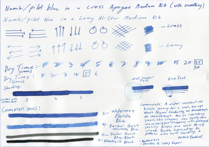
Kindly adjust the brightness & contrast of your monitor to accurately depict this Gray Scale. As the patches are neutral gray, the colour on your monitor should also be neutral. Calibrate Mac http://www.wikihow.com/Calibrate-Your-Monitor Figure 1. Gray Scale. http://i783.photobucket.com/albums/yy116/Sandy1-1/InkyThoughts2010/INK576.jpg Figure 2. Paper: HPJ1124 Laser Copy. Swabs: Waterman Florida Blue. R&K Scabiosa. http://i783.photobucket.com/albums/yy116/Sandy1-1/InkyThoughts2010/Ink%20Review%20-%20R_K%20Scabiosa/INK663.jpg NIB-ism LINK Depicts relative nib width and wetness. WRITTEN SAMPLES: Moby Dick Note - Narrow Nibs: First two rows are 5mm wide; the last two rows are 8mm wide. Figure 3. Paper: HPJ1124 Laser Copy. http://i783.photobucket.com/albums/yy116/Sandy1-1/InkyThoughts2010/Ink%20Review%20-%20R_K%20Scabiosa/INK665.jpg Figure 4. Paper: Clairefontaine Triomphe. http://i783.photobucket.com/albums/yy116/Sandy1-1/InkyThoughts2010/Ink%20Review%20-%20R_K%20Scabiosa/INK667.jpg Figure 5. Paper: G Lalo, Verge de France, White. http://i783.photobucket.com/albums/yy116/Sandy1-1/InkyThoughts2010/Ink%20Review%20-%20R_K%20Scabiosa/INK670.jpg Figure 6. Grocery List Paper: Pulp - from a one-a-day cartoon calendar. http://i783.photobucket.com/albums/yy116/Sandy1-1/InkyThoughts2010/Ink%20Review%20-%20R_K%20Scabiosa/INK673.jpg Figure 7. Out of curiosity. Paper: QuoVadis journal with ivory paper (Clairefontaine?) http://i783.photobucket.com/albums/yy116/Sandy1-1/InkyThoughts2010/Ink%20Review%20-%20R_K%20Scabiosa/INK675.jpg OTHER SAMPLES: Figure 8. HAPPY ! On glossy card stock. Smear / Dry Time. Wet samples. Paper: HPJ1124 Laser Copy. http://i783.photobucket.com/albums/yy116/Sandy1-1/InkyThoughts2010/Ink%20Review%20-%20R_K%20Scabiosa/INK674.jpg GENERAL DESCRIPTION: Type: Iron-gall fountain pen ink. Daily writer? Afraid not - for me anyway. (This is Ms Blue-Black speaking; I am not channelling Walter Cronkite, OK?)Will do very well for those who seek a very unique ink: shading and colour are without peer. Other: The visual weight and presence are a bit odd: having a warm tint, the colour wants to come forward, but somehow is bound to the plane of the page.This might be a 'Must Have' for someone who has an itch they can't scratch. USES: Business: While this is the least 'red' of all warm colours I can recall, it is still not quite a colour that might find its way into the conference room.The grey-rose may well seem conflicted or indecisive. (?)And with it being so unique, it may actually be distracting. (??)Signatures. (It's yours!)Not snappy enough and too dark for mark-up, editing, revision.For correction / grading, it does not have enough zip & zap to stand out. Illustrations / Graphics: Absolutely.Can be paired with either warm, cool or neutral colours and would complement them all. (Throw away the Colour Wheel for this one!)Lack of feathering and the i-g tight clean lines supports its use for extremely narrow lines/labels in drawings/diagrams; and the colour should provide eye-relief even when saturated, (no edge-effect).Due to the shading, it is not a candidate when even tone is required. e.g. Large areas to be blocked-out, though cross-hatching will compensate. Personal: This is the arena for this ink.It is a unique ink, so I suggest exploiting that by using a somewhat wet, but not saturating writer. As this ink seems to run at the 'true' width of a nib, I'd think a M-B nib would to it - not just a plump M. Students: While I think it certainly wonderful for notes, (good on poor paper, robust, etc.), it may not be acceptable for assignments. PHYSICAL PERFORMANCE & CHARACTERISTICS: Flow: Widely considered to be dry / dusty, which it is - in spades.Problems were encountered while preparing the Written Samples on the G Lalo. *expletive*LINKOther than the hard textured G *expletive* Lalo, Scabiosa did well. Nib Dry-out: Not noticed. Start-up: Good. Lubrication: Lean, barely adequate. (Seek a smooth nib & paper.)Typical of an i-g ink. Nib Creep: None. Staining: Not noticed in the short term. Clogging: Unlikely. Bleed Through: Not on any of the papers. Show Through: Both sides of paper may be used without a problem. Smell: Very faint.Reminiscent of blanched almonds. Hand oil sensitivity: Not noticed. Archival: Very likely. Water Resistance: (Figure 8) Excellent. Smear Results: (Figure 8) Dry within 25 seconds. Bulletproof: N/A. Clean Up: Quick & thorough with plain water.*One should cleanse pens completely, including the innards of the cap.As with other inks, I flush and cleanse a pen after use. I-G inks are not of the sort to let dry-out in a neglected pen. However, other practitioners have reported that pens inked with i-g ink start right up after not being used for months on end. Not I; use 'em then clean 'em. Mixing: No stated prohibitions / limitations, but from personal experience do not mix with Sailor nano inks: the likelihood of a precipitate / sludge forming is very real.I have used this ink to warm my sole brown, and to add even more dimension to the Herbin 'Larmes de Cassis'. THE LOOK: As mentioned above, i-g inks have a different look to them than purely dye-based inks.The i-g inks seem to reside slightly behind the plane of the writing surface; but as Scabiosa is warm, it wants to come forward. I believe this is one reason that Scabiosa can be seen as indecisive : it creates visual tension. Saturation: Struggles to achieve solid density.A wet-ish writer and compliant paper are required.And I wonder if saturation is contrary to the character of the ink; so no acts against Nature, OK?LINK Shading: Extraordinary & unique.Shading LinkShading LINK Feathering: None noticed Variance depending on pen+nib combos used: More than I though I'd see! especially with the wider nibs!! FIDELITY: Is colour name appropriate / accurate? No idea.Name has something to do with flowers - not a persistent nasty skin condition of reptiles. PAPERS: Lovely papers: This ink should look good on all white papers.Could overcome paper with optical brighteners with a bit of a tussle. Trip-wire papers: Any that are hard, dry or textured. Tinted Papers: After choking on the G Lalo VdF, I tried a sheet from the Quo Vadis Habana journal with the plain/blank ivory paper. Very nice indeed; no feathering or bleed-through either. Some show-through, but for a personal journal, no big deal. Is high-end paper 'worth it'? Within the limits of the Trip Wire papers mentioned above, it's a matter of preference over performance, especially as Scabiosa does well with lesser papers. OTHER THAN INK: Presentation : 50 ml. bottle. Country of origin: Germany. Container: A very simple cylindrical brown-tinted glass bottle, 40 mm diameter and 78 mm tall.The centred round opening is an adequate 22 mm.The text on the label is in four European languages.The hard white plastic screw cap has adequate grippy nodes, and is easy to grasp. Note: I heard the plastic lid was replaced by a metal cap.The cap is not child-proof.The cap seal is 'foam' plastic.Single tank, no filling aids, no sediment collector. Another Tsk!Label wraps around, so ink level cannot be determined - no good for Snorkels! (Bah!) Box: Pleasantly absent. Eco-Green: Bonus Points for not using a box Availability: Various on-line outlets ETC: Majik: Possible, but not sure if it'll be worth the sweat.Its pretty impressive from the bottle, so you might just try it with pens & papers at hand, then go from there. Personal Pen & Paper Pick: The Carene on Clairefontaine, but I'd go for a slightly wider nib. (Time for that stub for the Carene perhaps.) Yickity Yackity: An elusive ink, which is part of its cachet.Goes down more Red than it appears when dry and cured.Ah kushbaby, not your colour, ... I=+o+=I=+-+=I=+o+=I=+-+=I=+O+=I=+-+=I=+o+=I=+-+=I=+o+=I MATERIEL USED: These pen+nib combos: (Same as used for the Salix Ink Review.) For Written Samples: A. Esterbrook J + 9550 steel Posting XF. http://i783.photobucket.com/albums/yy116/Sandy1-1/Pen_Scans/PEN446.jpg B. *Eversharp Skyline + 14K firm F. http://i783.photobucket.com/albums/yy116/Sandy1-1/Pen_Scans/PEN439.jpg C. Pilot Custom 74 + SFM http://i783.photobucket.com/albums/yy116/Sandy1-1/Pen_Scans/PEN442.jpg D. Waterman Carene + 18K M nib. http://i783.photobucket.com/albums/yy116/Sandy1-1/Pen_Scans/PEN447.jpg E. The Notorious Pink Safari + steel B nib + body stocking. http://i783.photobucket.com/albums/yy116/Sandy1-1/Pen_Scans/PEN659.jpg F. Sailor Demonstrator + 14K MS nib. http://i783.photobucket.com/albums/yy116/Sandy1-1/Pen_Scans/PEN445.jpg * The Skyline is considered a Dealers' Choice as it has a firm nib - many in the market are or claim to be flex-ish. For lines & labels: Pilot Plumix + steel XF nib; inked with Visconti Green. On these papers: HPJ1124 24 lb. Laser Copy.Clairefontaine Triomphe.G Lalo 'Verge de France', WhitePulp - One-a-day cartoon calendar page: Esterbrook J + XF.Quo Vadis Habana Journal ivoryGlossy card stock: Sailor + MS. NOTES: To be relevant to the most members, I make an effort to use papers, pens & nibs that are readily available, for which I paid $100 or less, and are 'factory stock' - not customised. If I use something outside of my guidelines, it will be ID-ed with an asterix to denote a *Dealer's Choice. Scans were made on an Epson V600 scanner; factory defaults were accepted. Figures shown were scanned at 150 dpi & 24 bit colour. Images linked were scanned at 300 dpi & 24 bit colour. Scans were not adjusted other than cropping and straightening using iPhoto on a MacBook, but most went straight to the file sharing thingy. -30-
-
This post is my attempt to restore the pictures to Sandy1’s review of this ink, Rohrer & Klingner ‘Scabiosa’. I have ‘restored’ the pictures as links to Sandy1’s photos in her photobucket account. In order to view the photos without ‘watermarks’, you will need to click on each one, then double-click on it to open it on photobucket, and perhaps then double-click on it again. All credit for the review, and for the photos, is owed to Sandy1. ——- Kindly adjust the brightness & contrast of your monitor to accurately depict this Gray Scale. As the patches are neutral gray, the colour on your monitor should also be neutral. Calibrate Mac https://www.wikihow.com/Calibrate-Your-Monitor Figure 1. Gray Scale. Figure 2. Paper: HPJ1124 Laser Copy. Swabs: Waterman Florida Blue. R&K Scabiosa. NIB-ism LINK Depicts relative nib width and wetness. WRITTEN SAMPLES: Moby Dick Note - Narrow Nibs: First two rows are 5mm wide; the last two rows are 8mm wide. Figure 3. Paper: HPJ1124 Laser Copy. Figure 4. Paper: Clairefontaine Triomphe. Figure 5. Paper: G Lalo, Verge de France, White. Figure 6. Grocery List Paper: Pulp - from a one-a-day cartoon calendar. Figure 7. Out of curiosity. Paper: QuoVadis journal with ivory paper (Clairefontaine?) OTHER SAMPLES: Figure 8. HAPPY ! On glossy card stock. Smear / Dry Time. Wet samples. Paper: HPJ1124 Laser Copy. GENERAL DESCRIPTION: Type: Iron-gall fountain pen ink. Daily writer? Afraid not - for me anyway. (This is Ms Blue-Black speaking; I am not channelling Walter Cronkite, OK?) Will do very well for those who seek a very unique ink: shading and colour are without peer. Other: The visual weight and presence are a bit odd: having a warm tint, the colour wants to come forward, but somehow is bound to the plane of the page. This might be a 'Must Have' for someone who has an itch they can't scratch. USES: Business: While this is the least 'red' of all warm colours I can recall, it is still not quite a colour that might find its way into the conference room. The grey-rose may well seem conflicted or indecisive. (?) And with it being so unique, it may actually be distracting. (??) Signatures. (It's yours!) Not snappy enough and too dark for mark-up, editing, revision. For correction / grading, it does not have enough zip & zap to stand out. Illustrations / Graphics: Absolutely. Can be paired with either warm, cool or neutral colours and would complement them all. (Throw away the Colour Wheel for this one!) Lack of feathering and the i-g tight clean lines supports its use for extremely narrow lines/labels in drawings/diagrams; and the colour should provide eye-relief even when saturated, (no edge-effect). Due to the shading, it is not a candidate when even tone is required. e.g. Large areas to be blocked-out, though cross-hatching will compensate. Personal: This is the arena for this ink. It is a unique ink, so I suggest exploiting that by using a somewhat wet, but not saturating writer. As this ink seems to run at the 'true' width of a nib, I'd think a M-B nib would to it - not just a plump M. Students: While I think it certainly wonderful for notes, (good on poor paper, robust, etc.), it may not be acceptable for assignments. PHYSICAL PERFORMANCE & CHARACTERISTICS: Flow: Widely considered to be dry / dusty, which it is - in spades. Problems were encountered while preparing the Written Samples on the G Lalo. *expletive* LINK Other than the hard textured G *expletive* Lalo, Scabiosa did well. Nib Dry-out: Not noticed. Start-up: Good. Lubrication: Lean, barely adequate. (Seek a smooth nib & paper.) Typical of an i-g ink. Nib Creep: None. Staining: Not noticed in the short term. Clogging: Unlikely. Bleed Through: Not on any of the papers. Show Through: Both sides of paper may be used without a problem. Smell: Very faint. Reminiscent of blanched almonds. Hand oil sensitivity: Not noticed. Archival: Very likely. Water Resistance: (Figure 😎 Excellent. Smear Results: (Figure 😎 Dry within 25 seconds. Bulletproof: N/A. Clean Up: Quick & thorough with plain water. *One should cleanse pens completely, including the innards of the cap. As with other inks, I flush and cleanse a pen after use. I-G inks are not of the sort to let dry-out in a neglected pen. However, other practitioners have reported that pens inked with i-g ink start right up after not being used for months on end. Not I; use 'em then clean 'em. Mixing: No stated prohibitions / limitations, but from personal experience do not mix with Sailor nano inks: the likelihood of a precipitate / sludge forming is very real. I have used this ink to warm my sole brown, and to add even more dimension to the Herbin 'Larmes de Cassis'. THE LOOK: As mentioned above, i-g inks have a different look to them than purely dye-based inks. The i-g inks seem to reside slightly behind the plane of the writing surface; but as Scabiosa is warm, it wants to come forward. I believe this is one reason that Scabiosa can be seen as indecisive : it creates visual tension. Saturation: Struggles to achieve solid density. A wet-ish writer and compliant paper are required. And I wonder if saturation is contrary to the character of the ink; so no acts against Nature, OK? LINK Shading: Extraordinary & unique. Shading LINK Shading LINK Feathering: None noticed Variance depending on pen+nib combos used: More than I though I'd see! especially with the wider nibs!! FIDELITY: Is colour name appropriate / accurate? No idea. Name has something to do with flowers - not a persistent nasty skin condition of reptiles. PAPERS: Lovely papers: This ink should look good on all white papers. Could overcome paper with optical brighteners with a bit of a tussle. Trip-wire papers: Any that are hard, dry or textured. Tinted Papers: After choking on the G Lalo VdF, I tried a sheet from the Quo Vadis Habana journal with the plain/blank ivory paper. Very nice indeed; no feathering or bleed-through either. Some show-through, but for a personal journal, no big deal. Is high-end paper 'worth it'? Within the limits of the Trip Wire papers mentioned above, it's a matter of preference over performance, especially as Scabiosa does well with lesser papers. OTHER THAN INK: Presentation : 50 ml. bottle. Country of origin: Germany. Container: A very simple cylindrical brown-tinted glass bottle, 40 mm diameter and 78 mm tall. The centred round opening is an adequate 22 mm. The text on the label is in four European languages. The hard white plastic screw cap has adequate grippy nodes, and is easy to grasp. Note: I heard the plastic lid was replaced by a metal cap. The cap is not child-proof. The cap seal is 'foam' plastic. Single tank, no filling aids, no sediment collector. Another Tsk! Label wraps around, so ink level cannot be determined - no good for Snorkels! (Bah!) Box: Pleasantly absent. Eco-Green: Bonus Points for not using a box Availability: Various on-line outlets ETC: Majik: Possible, but not sure if it'll be worth the sweat. Its pretty impressive from the bottle, so you might just try it with pens & papers at hand, then go from there. Personal Pen & Paper Pick: The Carene on Clairefontaine, but I'd go for a slightly wider nib. (Time for that stub for the Carene perhaps.) Yickity Yackity: An elusive ink, which is part of its cachet. Goes down more Red than it appears when dry and cured. Ah kushbaby, not your colour, ... I=+o+=I=+-+=I=+o+=I=+-+=I=+O+=I=+-+=I=+o+=I=+-+=I=+o+=I MATERIEL USED: These pen+nib combos: (Same as used for the Salix Ink Review.) For Written Samples: A. Esterbrook J + 9550 steel Posting XF. LINK B. *Eversharp Skyline + 14K firm F. LINK C. Pilot Custom 74 + SFM. LINK D. Waterman Carene + 18K M nib. LINK E. The Notorious Pink Safari + steel B nib + body stocking. LINK F. Sailor Demonstrator + 14K MS nib. LINK * The Skyline is considered a Dealers' Choice as it has a firm nib - many in the market are or claim to be flex-ish. For lines & labels: Pilot Plumix + steel XF nib; inked with Visconti Green. On these papers: HPJ1124 24 lb. Laser Copy. Clairefontaine Triomphe. G Lalo 'Verge de France', White Pulp - One-a-day cartoon calendar page: Esterbrook J + XF. Quo Vadis Habana Journal ivory Glossy card stock: Sailor + MS. NOTES: To be relevant to the most members, I make an effort to use papers, pens & nibs that are readily available, for which I paid $100 or less, and are 'factory stock' - not customised. If I use something outside of my guidelines, it will be ID-ed with an asterix to denote a *Dealer's Choice. Scans were made on an Epson V600 scanner; factory defaults were accepted. Figures shown were scanned at 150 dpi & 24 bit colour. Images linked were scanned at 300 dpi & 24 bit colour. Scans were not adjusted other than cropping and straightening using iPhoto on a MacBook, but most went straight to the file sharing thingy. -30- ———————————————————————————————————————————— The only time you have too much fuel is when you're on fire. ——— This is another of Sandy1’s reviews that persuaded me to buy the ink in question. Thorough. Detailed. Humorous. Very informative. Like all her review work. As for my own opinions of R&K ‘Scabiosa’: I agree with Sandy1’s remarks about it. E.g. I found it to be such a ‘dry’ writing experience in my aerometric Parker “51” that I actually dumped the ink out of the pen. This though I find R&K’s other iron-gall ink - the blue-black ‘Salix’ - to be delightfully well-suited to my “51”s. My ‘Scabiosa’ has worked well for me in various other Parker pens (vintage and modern), and in my Pelikans and my Lamy 2000. And, just like Sandy1 said, this ink’s sui generis colour, its tight lines, its good water-resistance, and above all its beautiful shading, make it (IMO) an excellent choice for writing personal letters. Dark enough to be easily legible. Pretty enough to be ‘personal’. But why are you reading my opinions? Go back up, and read what Sandy1 wrote! 😉 Slàinte, M.
-
Kindly adjust the brightness & contrast of your monitor to accurately depict this Gray Scale. As the patches are neutral gray, the colour on your monitor should also be neutral. Calibrate Mac LINK Figure 1. Grey Scale. http://i783.photobucket.com/albums/yy116/Sandy1-1/InkyThoughts2010/INK576.jpg Figure 2. Paper: HPJ1124 Laser Copy. Swabs: Waterman Florida Blue. R&K Salix. http://i783.photobucket.com/albums/yy116/Sandy1-1/InkyThoughts2010/InkReview_RK_Salix/INK424.jpg Nib-ism Link Shows relative nib width & wetness WRITTEN SAMPLES: Moby Dick Note - Narrow Nibs: First two rows are 5mm in height; the last two rows are 8mm in height. Figure 3. Paper: HPJ1124 Laser Copy. http://i783.photobucket.com/albums/yy116/Sandy1-1/InkyThoughts2010/InkReview_RK_Salix/INK427.jpg Figure 4. Paper: Clairefontaine Triomphe. http://i783.photobucket.com/albums/yy116/Sandy1-1/InkyThoughts2010/InkReview_RK_Salix/INK428.jpg Figure 5. Paper: G Lalo, Verge de France, white. http://i783.photobucket.com/albums/yy116/Sandy1-1/InkyThoughts2010/InkReview_RK_Salix/INK429.jpg Figure 6. Grocery List Paper: Pulp - from a one-a-day cartoon calendar. http://i783.photobucket.com/albums/yy116/Sandy1-1/InkyThoughts2010/InkReview_RK_Salix/INK430.jpg Figure 7. 'Happy' Paper: Glossy card stock. http://i783.photobucket.com/albums/yy116/Sandy1-1/InkyThoughts2010/InkReview_RK_Salix/INK431.jpg OTHER SAMPLES: Figure 8. Smear / Dry Time. Wet samples. Paper: HPJ1124 Laser Copy. http://i783.photobucket.com/albums/yy116/Sandy1-1/InkyThoughts2010/InkReview_RK_Salix/INK432.jpg GENERAL DESCRIPTION: Type: Iron-gall fountain pen ink.Daily writer? Oh yes baby.Will do incredibly well for those who prefer a dark blue or blue-black, and/or must use poor paper.Other: Has visual weight commensurate with dark tone.This ink is known to be dry to the point of being 'dusty', but it performed with aplomb with all sampled pens and papers.This might be a 'Must Have' for anyone who uses MB Midnight Blue (née Blue-Black) and wants to lighten up, cut loose, and have some reckless fun while wearing a belt & braces. USES: Business: A good alternative to all dark blues and blue-blacks.Can be used without hesitation for internal and external correspondence.Posting and anything that requires tiny writing with very narrow nibs.Does well on glossy stock, so can be used for marginalia.Signatures.Not snappy enough and too dark for mark-up, editing, revision, correction, etc.Illustrations / Graphics: Absolutely.In terms of colour, it will substitute for Dark Blue.Lack of feathering and the i-g tight clean lines supports its use for extremely narrow lines/labels in drawings/diagrams.Due to the shading, it is not a candidate when even tone is required. e.g. Large areas to be blocked-out, though cross-hatching will compensate.Personal: Not quite.This is a bit too dark and not all that convivial. However, with suitable pen & paper, the ink generates sensual shading, so it cannot be dismissed outright as a personal ink.Also, with the unique look of i-g inks, (impossible to convey in a scan - I tried), it cannot be mistaken for a rollerball, gel, or some implement other than an FP.Students: A very suitable ink: easy to read, durable, good for hand-written assignments, does well on poor paper. (Pay more for ink and save on paper; or save on ink and pay more for paper.) PHYSICAL PERFORMANCE & CHARACTERISTICS: Flow: Widely considered to be dry / dusty.However, no problems were encountered while preparing the Written Samples. And this Review includes pens used in my other Reviews: this is not a set of cherry-picked ultra-wet writers.OK with all sampled nibs & feeds.Nib Dry-out: Just a tiny bit after about 10 minutes uncapped: the dry-out is the nib tip - not the entire nib.Start-up: Good.Lubrication: Lean, but adequate. (Similar to Herbin.)A little more would be welcome on the hard textured G Lalo.Typical of an i-g ink.Nib Creep: None.Staining: Not noticed in the short term.Clogging: Unlikely.Bleed Through: Not on any of the papers.Show Through: Both sides of paper may be used without a problem.Smell: Very faint.Reminiscent of green (unroasted) walnut meat.Hand oil sensitivity: Not noticed.Archival: Likely.Water Resistance: (Figure 8) Excellent.Smear Results: (Figure 8) Dry within 10 seconds.Bulletproof: Not claimed.Clean Up: Quick & thorough with plain water. :-)*One should cleanse pens completely, including the innards of the cap.Looks boring in the wash, so bring a crossword, or do some journal jotting.As with other inks, I flush and cleanse a pen after use. I-G inks are not of the sort to let dry-out in a neglected pen. However, other practitioners have reported that pens inked with i-g ink start right up after not being used for months on end. Not I; use 'em then clean 'em.Mixing: No stated prohibitions / limitations, but from personal experience do not mix with Sailor nano inks: the likelihood of a precipitate / sludge forming is very real.I have used this ink to bring the ultra-wet Private Reserve 'Tanzanite' into normal wetness range. I dubbed that mix as 'Tarzanite': the mix is mostly Tanzanite but is strengthened and made less flabby by the Salix. Also a mix of MBMB I dubbed SalixX that makes Salix a bit darker and improves flow. THE LOOK: As mentioned above, i-g inks have a different look to them than purely dye-based inks. The i-g inks seem to reside slightly behind the plane of the writing surface; and Salix, with it's light-dark shading, almost seems to make 'ripples' on the page as it goes above and below the plane of the page. Very unusual. Saturation: Has good density.A wet-ish writer may be used to suppress shading, without inducing feathering.Saturation LINKShading: Almost in-your-face, but not distracting.Shading LINKShading LINKShading LINK Feathering: None noticedN.B. As this ink is highly unlikely to feather or bleed through, a wet writer may be used.Tight line LinkInk pool LINK Variance depending on pen+nib combos used: Maintains 'The Look' across the sampled pens & papers.Even with the narrow nibs, the shading is visible. Carumba! FIDELITY: Is colour name appropriate / accurate? No idea.Name is unlikely to be a by-product of Happy Hour libations. PAPERS: Lovely papers: This ink should look good on all white papers.Could overcome paper with optical brighteners.Trip-wire papers: Can't think of one.Tinted Papers: The shading generated could provide the opportunity to generate a two-colour impression: Salix where saturation is high; and a mix of Salix and the tint of the paper where ink saturation is low. I think the G Lalo Ivory is too yellow/warm for this, but perhaps a buff or pale brown paper for an 'antique' look.Is high-end paper 'worth it'? Very much a Dealer's Choice:Salix is going to do what it does pretty much without regard for the paper. However, good paper does allow Salix to do its thing more easily and consistently.Also, due to the lean lubrication, a very smooth paper may be preferred by some practitioners. OTHER THAN INK: Presentation : 50 ml. bottle.Country of origin: Germany.Container: A very simple cylindrical brown-tinted glass bottle, 40 mm diameter and 78 mm tall.The centred round opening is an adequate 22 mm.The text on the label is in four European languages.The hard white plastic screw cap has adequate grippy nodes, and is easy to grasp. Note: I heard the plastic lid was replaced by a metal cap.The cap is not child-proof.The cap seal is 'foam' plastic.Single tank, no filling aids, no sediment collector. Another Tsk!The label obscures the ink level / surface. No fun for snorkel fillers.Box: Pleasantly absent.Eco-Green: Bonus Points for not using a boxAvailability: Various on-line outlets ETC: Majik: The high degree of shading, and tight lines provides the basis for conjuring.Personal Pen & Paper Pick: Tough one, so I'll pick two: the C74 + SFM nib on the HPJ1124; and the Notorious Pink Safari + B nib in a body stocking on the Triomphe.Runner-up: Skyline + F nib on the Lalo: an unexpected and impressive performance of a narrow nib on a hard textured paper.Yickity Yackity: A tour-de-force from an ink that I've used mostly for special purposes, and not so often for general writing.Was this an 'ugly ducking' / black swan ink?This is definitely moving forward on the ink shelf.Ah kushbaby, not your colour, but you can make the stretch ... I=+o+=I=+-+=I=+o+=I=+-+=I=+O+=I=+-+=I=+o+=I=+-+=I=+o+=I MATERIEL USED: These pen+nib combos: For Written Samples: A. Esterbrook J + 9550 steel Posting XF. B. *Eversharp Skyline + 14K firm F. C. Pilot Custom 74 + SFM D.Waterman Carene + 18K M E. The Notorious Pink Safari + steel B nib + body stocking. F. Sailor Demonstrator + 14K MS nib. For lines & labels: Pilot Plumix + steel XF nib; inked with Visconti Bordeaux. On these papers: HPJ1124 24 lb. Laser Copy.Clairefontaine Triomphe.G Lalo 'Verge de France', WhitePulp - One-a-day cartoon calendar page: Esterbrook J + XF.Glossy card stock: Sailor + MS. NOTES: To be relevant to the most members, I make an effort to use papers, pens & nibs that are readily available, for which I paid $100 or less, and are 'factory stock' - not customised. If I use something outside of my guidelines, it will be ID-ed with an asterix to denote a *Dealer's Choice. Scans were made on an Epson V600 scanner; factory defaults were accepted. Figures shown were scanned at 150 dpi & 24 bit colour. Images linked were scanned at 300 dpi & 24 bit colour. Scans were not adjusted other than cropping and straightening using iPhoto on a MacBook, but most went straight to the file sharing thingy. Scanner Densitometer Readings were generated from the 'N' in 'Ink Review' in Figure 2: Red 33; Green 134; Blue 210; Luminosity 129. -30-
-
This post is just my attempt to restore pictures to another review by Sandy1. Sandy1’s reviews got me interested in iron-gall inks, and this ink - Rohrer & Klingner ‘Salix’ - was the first i-g ink that I bought. Anyway, herebelow is her review, with her links to the photos in her photobucket account restored. All credit for this review is owed to Sandy1. Enjoy! 😊 ——— Kindly adjust the brightness & contrast of your monitor to accurately depict this Gray Scale. As the patches are neutral gray, the colour on your monitor should also be neutral. Calibrate Mac LINK Figure 1. Grey Scale. Figure 2. Paper: HPJ1124 Laser Copy. Swabs: Waterman Florida Blue. R&K Salix. Nib-ism: LINK Shows relative nib width & wetness WRITTEN SAMPLES: Moby Dick Note - Narrow Nibs: First two rows are 5mm in height; the last two rows are 8mm in height. Figure 3. Paper: HPJ1124 Laser Copy. Figure 4. Paper: Clairefontaine Triomphe. Figure 5. Paper: G Lalo, Verge de France, white: white. Figure 6. Grocery List Paper: Pulp - from a one-a-day cartoon calendar. Figure 7. 'Happy' Paper: Glossy card stock. OTHER SAMPLES: Figure 8. Smear / Dry Time. Wet samples. Paper: HPJ1124 Laser Copy. GENERAL DESCRIPTION: Type: Iron-gall fountain pen ink. Daily writer? Oh yes baby. Will do incredibly well for those who prefer a dark blue or blue-black, and/or must use poor paper. Other: Has visual weight commensurate with dark tone. This ink is known to be dry to the point of being 'dusty', but it performed with aplomb with all sampled pens and papers. This might be a 'Must Have' for anyone who uses MB Midnight Blue (née Blue-Black) and wants to lighten up, cut loose, and have some reckless fun while wearing a belt & braces. USES: Business: A good alternative to all dark blues and blue-blacks. Can be used without hesitation for internal and external correspondence. Posting and anything that requires tiny writing with very narrow nibs. Does well on glossy stock, so can be used for marginalia. Signatures. Not snappy enough and too dark for mark-up, editing, revision, correction, etc. Illustrations / Graphics: Absolutely. In terms of colour, it will substitute for Dark Blue. Lack of feathering and the i-g tight clean lines supports its use for extremely narrow lines/labels in drawings/diagrams. Due to the shading, it is not a candidate when even tone is required. e.g. Large areas to be blocked-out, though cross-hatching will compensate. Personal: Not quite. This is a bit too dark and not all that convivial. However, with suitable pen & paper, the ink generates sensual shading, so it cannot be dismissed outright as a personal ink. Also, with the unique look of i-g inks, (impossible to convey in a scan - I tried), it cannot be mistaken for a rollerball, gel, or some implement other than an FP. Students: A very suitable ink: easy to read, durable, good for hand-written assignments, does well on poor paper. (Pay more for ink and save on paper; or save on ink and pay more for paper.) PHYSICAL PERFORMANCE & CHARACTERISTICS: Flow: Widely considered to be dry / dusty. However, no problems were encountered while preparing the Written Samples. And this Review includes pens used in my other Reviews: this is not a set of cherry-picked ultra-wet writers. OK with all sampled nibs & feeds. Nib Dry-out: Just a tiny bit after about 10 minutes uncapped: the dry-out is the nib tip - not the entire nib. Start-up: Good. Lubrication: Lean, but adequate. (Similar to Herbin.) A little more would be welcome on the hard textured G Lalo. Typical of an i-g ink. Nib Creep: None. Staining: Not noticed in the short term. Clogging: Unlikely. Bleed Through: Not on any of the papers. Show Through: Both sides of paper may be used without a problem. Smell: Very faint. Reminiscent of green (unroasted) walnut meat. Hand oil sensitivity: Not noticed. Archival: Likely. Water Resistance: (Figure 😎 Excellent. Smear Results: (Figure 😎 Dry within 10 seconds. Bulletproof: Not claimed. Clean Up: Quick & thorough with plain water. 🙂 *One should cleanse pens completely, including the innards of the cap. Looks boring in the wash, so bring a crossword, or do some journal jotting. As with other inks, I flush and cleanse a pen after use. I-G inks are not of the sort to let dry-out in a neglected pen. However, other practitioners have reported that pens inked with i-g ink start right up after not being used for months on end. Not I; use 'em then clean 'em. Mixing: No stated prohibitions / limitations, but from personal experience do not mix with Sailor nano inks: the likelihood of a precipitate / sludge forming is very real. I have used this ink to bring the ultra-wet Private Reserve 'Tanzanite' into normal wetness range. I dubbed that mix as 'Tarzanite': the mix is mostly Tanzanite but is strengthened and made less flabby by the Salix. Also a mix of MBMB I dubbed SalixX that makes Salix a bit darker and improves flow. THE LOOK: As mentioned above, i-g inks have a different look to them than purely dye-based inks. The i-g inks seem to reside slightly behind the plane of the writing surface; and Salix, with it's light-dark shading, almost seems to make 'ripples' on the page as it goes above and below the plane of the page. Very unusual. Saturation: Has good density. A wet-ish writer may be used to suppress shading, without inducing feathering. Saturation LINK Shading: Almost in-your-face, but not distracting. Shading LINK Shading LINK Shading LINK Feathering: None noticed N.B. As this ink is highly unlikely to feather or bleed through, a wet writer may be used. Tight line LINK Ink pool LINK Variance depending on pen+nib combos used: Maintains 'The Look' across the sampled pens & papers. Even with the narrow nibs, the shading is visible. Carumba! FIDELITY: Is colour name appropriate / accurate? No idea. Name is unlikely to be a by-product of Happy Hour libations. PAPERS: Lovely papers: This ink should look good on all white papers. Could overcome paper with optical brighteners. Trip-wire papers: Can't think of one. Tinted Papers: The shading generated could provide the opportunity to generate a two-colour impression: Salix where saturation is high; and a mix of Salix and the tint of the paper where ink saturation is low. I think the G Lalo Ivory is too yellow/warm for this, but perhaps a buff or pale brown paper for an 'antique' look. Is high-end paper 'worth it'? Very much a Dealer's Choice: Salix is going to do what it does pretty much without regard for the paper. However, good paper does allow Salix to do its thing more easily and consistently. Also, due to the lean lubrication, a very smooth paper may be preferred by some practitioners. OTHER THAN INK: Presentation : 50 ml. bottle. Country of origin: Germany. Container: A very simple cylindrical brown-tinted glass bottle, 40 mm diameter and 78 mm tall. The centred round opening is an adequate 22 mm. The text on the label is in four European languages. The hard white plastic screw cap has adequate grippy nodes, and is easy to grasp. Note: I heard the plastic lid was replaced by a metal cap. The cap is not child-proof. The cap seal is 'foam' plastic. Single tank, no filling aids, no sediment collector. Another Tsk! The label obscures the ink level / surface. No fun for snorkel fillers. Box: Pleasantly absent. Eco-Green: Bonus Points for not using a box Availability: Various on-line outlets ETC: Majik: The high degree of shading, and tight lines provides the basis for conjuring. Personal Pen & Paper Pick: Tough one, so I'll pick two: the C74 + SFM nib on the HPJ1124; and the Notorious Pink Safari + B nib in a body stocking on the Triomphe. Runner-up: Skyline + F nib on the Lalo: an unexpected and impressive performance of a narrow nib on a hard textured paper. Yickity Yackity: A tour-de-force from an ink that I've used mostly for special purposes, and not so often for general writing. Was this an 'ugly ducking' / black swan ink? This is definitely moving forward on the ink shelf. Ah kushbaby, not your colour, but you can make the stretch ... I=+o+=I=+-+=I=+o+=I=+-+=I=+O+=I=+-+=I=+o+=I=+-+=I=+o+=I MATERIEL USED: These pen+nib combos: For Written Samples: A. Esterbrook J + 9550 steel Posting XF. B. *Eversharp Skyline + 14K firm F. C. Pilot Custom 74 + SFM D.Waterman Carene + 18K M E. The Notorious Pink Safari + steel B nib + body stocking. F. Sailor Demonstrator + 14K MS nib. (The underlined letters A-F are links to pics of the pens.) For lines & labels: Pilot Plumix + steel XF nib; inked with Visconti Bordeaux. On these papers: HPJ1124 24 lb. Laser Copy. Clairefontaine Triomphe. G Lalo 'Verge de France', White Pulp - One-a-day cartoon calendar page: Esterbrook J + XF. Glossy card stock: Sailor + MS. NOTES: To be relevant to the most members, I make an effort to use papers, pens & nibs that are readily available, for which I paid $100 or less, and are 'factory stock' - not customised. If I use something outside of my guidelines, it will be ID-ed with an asterix to denote a *Dealer's Choice. Scans were made on an Epson V600 scanner; factory defaults were accepted. Figures shown were scanned at 150 dpi & 24 bit colour. Images linked were scanned at 300 dpi & 24 bit colour. Scans were not adjusted other than cropping and straightening using iPhoto on a MacBook, but most went straight to the file sharing thingy. Scanner Densitometer Readings were generated from the 'N' in 'Ink Review' in Figure 2: Red 33; Green 134; Blue 210; Luminosity 129. -30- ———————————————————————————————————————————— The only time you have too much fuel is when you're on fire. ——— All credit for all of the above is owed to to Sandy1. Slàinte, M.
-
Extra Fine Nib Ink Review: Pilot Mixable Colour Light-green This is review #279 in my series. Here's the YouTube video: Post-recording notes: As mentioned with previous inks in this series, I'm taking them out of order because they're starting to evaporate out of the cartridge. I added a few drops of distilled water to top the cartridge off. I don't believe this has had a significant impact on color or performance. This is a bright, happy, Spring green that leans heavily yellow. It's a little brighter when wet, more muted when dry. It's a little better behaved than the others I've tested in this line. Shading seems to depend on paper. On the front side of Rhodia (not the side I reviewed on), this ink dried in roughly 1.5 minutes. Cleaning was quick and easy. The remaining ink went into a Prera with a CM (stub) nib without any dilution (didn't want to dilute what lubrication it had). Zoomed in photo (Very close. Perhaps the closest match.) Screenshot (Text is a little too dark and muted.) Scan of Completed Review (The green is a little muted, especially in the smear which is much brighter and very yellow-green in real life. On my monitor, that smear looks brownish, but there's no brownish on the page.) Absorbent Paper Close-up (top is puzzle paper like thick newsprint, bottom is old 20lb copy paper) (They're not too far off.) Line width (The "I" in "Ink:". Magnification is 100x. The grid is 100x100µm. The scale is 360µm, with twelve divisions of 30µm each. The line width for this ink is roughly 343µm. With 279 inks measured, the average line width is 296µm.) Microscope image (100x. Colors were a bit brighter / more vibrant in reality, but this is close. 'Twas dull except for these yellow-orange spikes at the edges of the slip cover (which edge you see at the top, right of the image).) Previous Review: Rohrer & Klingner Königsblau. Images also available on Instagram: @zilxodarap. Want to influence the inky sequence? Take the "next ink" poll. View a list of my inks, complete with review results in a google sheet. Need to catch up on The Adventures of Quin and Makhabesh? Find the whole story here. Hope you enjoy. Comments appreciated!
-
Hi, have you actually tried adding some distilled water to your ink? Your OP doesn’t make that clear (full disclosure: I am spectacularly obtuse). I understand that distilled/de-ionised water is really easy to buy in the US, and it’s a great thing to have on-hand for flushing or soaking one’s pens. [BTW, for future reference, If I were you I would not take your pen apart like that very often - doing so runs the risk of accidentally damaging the feed/nib. Flushing, and ‘wicking’ successive fills of water through the nib, will suffice for almost all changes of ink.] I would add water to the ink this by putting a small amount of ink into a container with your syringe, then adding distilled water to that container with the syringe. You can gradually add more water to the ink until the ink writes ‘dry’ enough for your tastes. Using the syringe means that you ought to be able to monitor the proportions of ink:water at every stage of dilution. Of course, if you find that you need to dilute the ink a lot, this might also alter its colour. But trying it can’t hurt. I wish you good luck Slàinte, M.
-
Sorry everyone for such a long break between my last reply and this one. Lot's of stuff going on and did not really have any time for inks. Hmm, the image looks significantly better than what it looks like on goulet pens or jetpens. Sadly neither seems to have a sample of the ink, and with it being a bit far off from what I am searching for I will have to pass on it for now. Oh, I don't disagree, I just have to rely on samples to some degree as I can't buy and test every red ink that is recommended. Thanks for the recommendation. Waterman Audacious Red is way too bright, doesn't really fit the bill. Diamine Noel has been recommended a second time now, so I guess I'll have to try to get a sample of it. Fritz Schimpf Morgenröte, holy what an ink, from the images on their website it seems to be THE ink I am looking for. Though, from other reviews it might be more brighter and pinker than it seems but will try to get it. The image on their website for reference. Thanks for the recommendations. Rosso Passione looks promising on some images but it has minimal outside reviews and it isn't on goulet pens or jetpens so I'll put it into the consideration pile. Taurasi Red looks more black then red IMO so quite a bit to dark for what I am looking for. Thanks for recommendations. I think I'll look into mixing when I have looked into the majority of inks and found that none are matching what I want, which I really doubt will happen. No clue if they still make the Cardinal Red, but in any case way too bright for me. I would prefer if the nib wasn't super wet, as I'd like to be able to use the ink most paper types without bleed through(and it also wastes ink). J.Herbin Rouge Hermatite seems way too bright based on this review. Noodler’s Antietam is too brown, American Eel Rattler Red is too bright, Fox Red is too bright, and Nikita looks to have slight orange tint(but its hard to tell through my monitor). Diamine Ink-Vent Red Robin is too bright and seems to not be as red as some of the other recommendations here. Sorry to shut down all your recommendations, most of them seem to be a bit too bright for what I am looking for. In any case thanks for the recommendations. Diamine Monoaco seems to be on the browner end of reds. I actually have a sample of Sailor Manyo Ume but it had a pink/purple tint to it. Thanks for the recommendations. It's hard to gauge the color of Stipula Calamo Dark Red as all the reviews and images I see are quite varied. I'll put in the consideration pile. Here's the thing, like I mentioned above in this reply I can't really test every ink that is recommended. I am forced mostly to go through and decide which inks I should buy based on reviews and images alone and as you saw I have only tried a hand full of inks so far. Not only that, there are tons of variables that make an ink "near perfect" or "good" because it such a subjective thing. There very well might be THE perfect ink in this list of recommendations and even when I get a sample and test it out, it would not be what I want. Simply because my eyes don't interpret the color perfectly, the lighting is off somehow, the paper makes it look worse, the pen is skewing the color, etc. It's hard. On top of that the majority of judging is being done through a non-color accurate display through a non-color accurate image. This especially is why a lot of inks are "close, but no cigar" I haven't really tested them yet and going off of what I can to determine if it could be a good enough contender to even enter the ring. Sorry for the small rant, just wanted to provide a explanation as to why it is so hard for me to actually say: "this is the exact I have been looking for". And, it might be that I am just really picky, but that's just how I function. If something is not near perfection, especially something that I intend to or already use daily, I will forever keep looking for the next better thing, be it the color of an ink or the technology that I use on a daily basis. Thanks for the recommendations. Seems to me that I might have to pick up a sample of Diamine Writers Blood, it's on the browner side but I have seen it be recommended time and time again; so I'll give it a go. Not sure if it matches Noodlers Black Swan, Black Swan seems to be more of pink than a red based on reviews. Thanks for the recommendations. Kind of like that tuned down red, with a slight pink to it. I'll keep it mind for if I want a tuned down red. Thanks for the recommendation. Oh yeah, I know what you mean, its somewhat similar to Monteverde Napa Burgandy in that sense. I guess musky red shall be the name for these colors from now on. I'll put in my musky red pile for now. Thanks for the recommendation. Honestly don't know why its called a dark red, in most reviews it looks quite light. Might just have to pull one out and make something new. Would be a really cool project to do too. I have made a lot of stuff myself before simply because I could never find the near perfect version of what I am looking for available on the market. Thanks for the recommendation. Yep, already on the samples list. Seems I have to try it or it will forever be recommended to me. Based on the swatch on the store it looks promising, I'll consider it. Thanks for the recommendation. Finally the list of ink samples that I intend to order soon: KWZI Maroon #2 Wearingeul Human Condition/Issue/Problem Diamine Burgundy Rose J. Herbin Rouge Grenat Teranishi Modern Red KWZ Maroon #1 Diamine Communication Breakdown(no guarantee due to Germany exclusivity) Tammy/Lil Tam Diamine Blue Edition Noel Red Fritz Schimpf Morgenröte Diamine Writers Blood All of these have shown to be quite close to that burgundy/dark red without any of the browns, oranges, purples, or pinks. I'll be ordering probably at the end of next week, so if I missed anything or if anyone has any last minute recommendations feel free to send it in. I'll probably make a review out of all of these as well since I am buying them anyways. Primarily going to be using Midori paper but can pick up some other types if anyone wants to seem them on something specific. I intend to test them all out on my daily driver the Fine Nib Lamy Safari. If anyone wants I can pick up a new pen to test with too(~50 dollar budget). Thank you everyone for taking the time out of your day to provide me with recommendations and leading the discussion to help me find THE ink. Hopefully one or more of the above pan out.
-
Please take a moment to adjust your monitor to accurately depict the Gray Scale linked below. As the patches are neutral gray, their colour on your monitor should also be neutral gray. Mac My link Wintel PC My link Gray Scale: My link=|-|= Figure 1. Swabs & Swatch Paper: HPJ1124 24 lb. Laser Copy. http://i783.photobucket.com/albums/yy116/Sandy1-1/InkyThoughts2010/Ink%20Review%20-%20Pelikan%20Edelstein%20Topaz/5b80b02c.jpg Figure 2. NIB-ism ✑ Paper: HPJ1124. http://i783.photobucket.com/albums/yy116/Sandy1-1/InkyThoughts2010/Ink%20Review%20-%20Pelikan%20Edelstein%20Topaz/cf066de5.jpg Depicts nibs' line-width and pens' relative wetness. L → R: Sumiko, Eversharp, 330, M200, Phileas & Estie.WRITTEN SAMPLES - Moby Dick Row Height is 8mm. Figure 3. Paper: HPJ1124. http://i783.photobucket.com/albums/yy116/Sandy1-1/InkyThoughts2010/Ink%20Review%20-%20Pelikan%20Edelstein%20Topaz/699c6182.jpg Figure 4. Paper: Rhodia. http://i783.photobucket.com/albums/yy116/Sandy1-1/InkyThoughts2010/Ink%20Review%20-%20Pelikan%20Edelstein%20Topaz/a97c0a4c.jpg Figure 5. Paper: G Lalo, Verge de France, white. http://i783.photobucket.com/albums/yy116/Sandy1-1/InkyThoughts2010/Ink%20Review%20-%20Pelikan%20Edelstein%20Topaz/03f69744.jpg Figure 6. Paper: Royal, 25% rag. http://i783.photobucket.com/albums/yy116/Sandy1-1/InkyThoughts2010/Ink%20Review%20-%20Pelikan%20Edelstein%20Topaz/d4678b08.jpg Figure 7. Grocery List Paper: Pulp. One-a-Day calendar page. http://i783.photobucket.com/albums/yy116/Sandy1-1/InkyThoughts2010/Ink%20Review%20-%20Pelikan%20Edelstein%20Topaz/33358cc1.jpg OTHER SAMPLES Figure 8. 'HAPPY!' on Glossy Card.Smear/Dry Time on Glossy Paper.Smear/Dry Time on HPJ1124. Wet Tests on HPJ1124. http://i783.photobucket.com/albums/yy116/Sandy1-1/InkyThoughts2010/Ink%20Review%20-%20Pelikan%20Edelstein%20Topaz/9afe29a1.jpg GENERAL DESCRIPTION Type: Dye-based fountain pen ink.Daily writer? Very possible.A go-to ink? Yes.USE Business: Balances astride the Blue - Turquoise gap with aplomb.PET has just enough gravitas for the Conference Room and most peer-to-peer external correspondence, yet sufficiently convivial for internal correspondence.It does not project power or authority; rather PET projects energy, clarity and openness. Consequently, Topaz is excellent for peer-to-peer and upward correspondence. (This is Ms Bl-Bk speaking.)PET does not have sufficient zip to be used for mark-up, editing, etc.Of little use for error correction or grading of assignments. Illustrations / Graphics: A poor choice as a gradient between Dark and Light Blue.A good choice for a transitional colour between Blue and aqua / dark cyan.In wet narrow nibs it has good saturation, so should be suitable for narrow lines on hard paper, crosshatching, etc. The reasonably low smear/dry time allows prompt reworking.Students: Certainly. PET performed well above average on the highly absorbent Royal and Pulp, so may do well on low-cost papers: no feathering or woolly lines.Quite robust; what is written should shrug off domestic mishaps.A very good choice for hand-written assignments.Personal: Quite a nice pick. This is an easy-reading ink, fleet of foot, which may appeal to those who write tomes, and would like them to be read in their entirety. PET is clear and without artifice, yet there are subtle nuances.For pro forma business writing, PET will certainly do the necessary, but it may be too nice for such use.I have tried a range of various nib sizes and shapes with PET. So far, I prefer mono-line nibs, (I am soooo boring), yet the shaped nibs do nicely. I could easily see using a nib wider than 1.0mm to splash about oodles of PET.PHYSICAL PERFORMANCE & CHARACTERISTICS Flow Rate: Just on the dry side of average.Nib Dry-out: Not apparent.Start-up: Immediate.Lubrication: Quite good.The narrow nibs ran well on the hard textured G Lalo. The pens never became slippery, and the wider nibs remained surefooted. Nib Creeping: None.Staining: None after 3 days.Clogging: Not seen. Seems unlikely.Bleed Through: No. Show Through: No. Both sides of the page may be used.Feathering / Woolly Line: No.Smear/Dry Time: Glossy: 2 - 5 secondsHPJ1124: 10 - 12 seconds. Water Resistance: ☂ 4: All legible, can be easily read and/or have light staining from re-deposit of soluble ink. Use as-is for work papers & internal use. Adjustments to a scanner may drop-out the stain. Smell: Faint; rounded esters.Reminiscent of fresh raspberries. (?)Hand oil sensitivity: Not noticed.Archival: Specifically denied by Pelikan.Clean Up: About average speed; very thorough with plain water. Mixing: No stated prohibitions.Mixing is likely to disrupt the balance of PET.Should mixing be attempted, if one hears that little 'thlllk' from behind, it may be the fire selector going from full auto to mayhem. Note: No problems with show- bleed-through, feathering or woolly lines were seen on Staples' eco-friendly white 20 lb bond, Item 813903. THE LOOK Presence: Alert. Attentive.Latent high torque.Reminiscent of going from swimming laps to swimming in open water.Saturation: Modest.Shading: Can be generated on smooth papers using a range of nibs - not only the wider & shaped nibs. When shading appears, it is exquisite. ♡Variance depending on pen+nib combos used: No more than expected, given the range of writers. High Resolution Scans: From the Estie on HPJ1124. My linkFrom the M200 on Rhodia. My linkFrom the Phileas on G Lalo. My linkFrom the Eversharp on Royal. My linkFIDELITY Is the name appropriate? Fiction. Are swatches accurate? The only swatch is on the box, which is reasonable. SIMILAR COLOURS Figure 9. http://i783.photobucket.com/albums/yy116/Sandy1-1/InkyThoughts2010/Ink%20Review%20-%20Pelikan%20Edelstein%20Topaz/db8f5199.jpg We have five 3-stage swabs; from top to bottom: Private Reserve Tropical BluePelikan Edelstein TopazPrivate Reserve American BluePelikan Edelstein TopazDiamine Kensington Blue.Note: There is also a passing similarity to Waterman South Sea_ Blue, (hence Diamine Havasue Turquoise), but when ink-on-paper samples are viewed in person, the lack of similarity becomes obvious. Waterman, South Sea_ Blue My linkDiamine, Havasu Turquoise My linkComparison : Waterman, South Sea_ Blue :: Diamine, Havasu Turquoise My linkPAPERS Lovely papers: Crisp white paper. Can handle papers with optical brighteners.Trip-wire Papers: ☠ Avoid combos of dry writers + hard papers. e.g. Figure 5 - Estie onto G Lalo.Can't think of any within reason.Tinted Papers: Could work well on any sensible tint, especially from a wet-ish writer. PrePrinted Paper: As much as I'd like to use-up the Lamy Green, PET will do just fine on pre-printed paper.On forms it will separate just enough from the [black] text.For typical grids, etc., PET may not be the best pick - perhaps due to the typical colour of ruling / grid lines. (?) Consequently, one may well use WhiteLines with confidence.Is high-end paper 'worth it'? If one prefers shading, then smooth surface harder papers, such as Rhodia & Clairefontaine Triomphe, will not disappoint.Otherwise, more a matter of preference over performance - the penny-a-page HPJ1124 was very suitable.OTHER THAN INK Presentation: 50ml bottle in a box. No HazMat warnings.Container: A clear heavy glass bottle.75x40xcapped height of 65mmThe centred round opening is an accommodating 22mm∅.The single tank is shallow; the bottle has no filling aids, no sediment collector, no etc. 3xTsk. (Gad Zooks man! Not even as functional as the 4001-series desk-top bottles!! Pelikan forgot to bring their 'A' game when doing this bottle. Eine Gruppe Dummköpfe, das nicht Füllfederhalter benutzen!)There is no label, rather a dog's dinner of four typefaces in two colours printed directly on the bottle. While bottle labelling is an unsightly debacle, the ink level can be readily determined, so over-immersion / dunking of one's pen may be avoided. Hoorah! Snorkies rejoice! (Their owners too.) The hard plastic screw cap has more than adequate grippy bits; and at 15mm is a good height for ease of use.The cap seal appears to be a sort of plastic foam.The cap is not child-proof. Box: Constructed of coated hefty card-stock.80x45x75mmIncludes a fairly accurate swatch.Eco-Green: Except for the wasteful foam padding, the bottle, cap & box are recyclable / benign.Availability: High street stationers, back street pen shops, online retailers.Note: While the Pelikan 4001 series inks can often be found in art / craft shops, I have yet to see Edelstein inks in such shops. ETC. Majik: I think that PET has the potential to be conjured.Personal Pen & Paper Pick: Only one?? The M200 on the Rhodia. Yickity Yackity: Classy but not yet a classic.Pelikan knows a thing or three about ink, which is apparent in the writing experience and on the page. Those who choose ink by colour alone may be disappointed that PET is not a 'new' colour, but the rock solid performance profile, very satisfying writing experience and reasonable malleability elevate Edelstein Topaz well above pretenders. Ah kushbaby, perhaps not up your alley, but give it a fair go. (At least a large sample, yes?){=*=}{=v=}{=*=}~{=*=}{=-|+|-=}{=*=}~{=*=}{=v=}{=*=} MATERIEL USED To be relevant to most members, I make an effort to use papers, pens & nibs that are readily available. For pens, I use those for which I paid $100 or less, new or used; and are factory stock - not customised. Pens: Sailor Sumiko + TIGP F nib. Eversharp Skyline + 14K F nib.Sheaffer 330 + steel M nib.Pelikan M200 + g-p M200-series M nib.Waterman Phileas + steel B nib. Esterbrook J + steel 9284 firm signature stub nib. For lines & labels: Pilot 78G+F nib with Noodler's Lexington Grey. On these papers: HPJ1124 24 lb. Laser Copy.Rhodia.G Lalo, Verge de France, white.Royal, 25% cotton rag. Pulp.Glossy paper.Glossy card._________________ IMAGES Scans were made on an Epson V600 scanner; factory defaults were accepted. Scanning resolution was either 96 dpi or 300 dpi; at 24 bit colour.As required, scans were cropped and straightened using iPhoto; no other changes were made._________________ DENSITOMETER READINGS (FWTW) Red 85Grn 149Blu 224Lum 151=============== -30-
-
That's a pretty good photo for the burgundies, but (on my monitor, at least) it makes the plum look a lot more blue than it does in real life. I would describe plum as a grape-y purple; the photo appears to me to be more of (what is sometimes called) a blurple, or blue-leaning purple.
-
Kindly adjust the brightness & contrast of your monitor to accurately depict this Gray Scale. As the patches are neutral gray, the colour on your monitor should also be neutral. http://i783.photobucket.com/albums/yy116/Sandy1-1/InkyThoughts2010/FPN049.jpg http://i783.photobucket.com/albums/yy116/Sandy1-1/InkyThoughts2010/FPN044.jpg http://i783.photobucket.com/albums/yy116/Sandy1-1/InkyThoughts2010/FPN045.jpg http://i783.photobucket.com/albums/yy116/Sandy1-1/InkyThoughts2010/FPN046.jpg http://i783.photobucket.com/albums/yy116/Sandy1-1/InkyThoughts2010/FPN047.jpg Higher Resolution Scan - taken from blocked text on page 1. Intended to show feathering and shading. http://i783.photobucket.com/albums/yy116/Sandy1-1/InkyThoughts2010/FPN048.jpg Paper: Clairefontaine 'Triomphe' - Page 1. Swabs: Waterman 'Florida Blue'.Parker 'Penman Sapphire'.Private Reserve 'American Blue' This Review is mostly to show how PPS is or is not changing over time. The nearly-full bottle is sound - no crud on the threads. The ink is transparent & clear. There was no sediment, slime, floaters or swimmers. No strange smells were noticed. So the ink does not show gross physical deterioration. It seems that preservation is due, in part, to the use of a solid plastic seal/liner in the cap - no cheap coated bit of cardstock that top-tier ink makers (you know who, Pilot!) still get away with. The writing experience is beyond mere words. I am using the same pen & nib that I used when I 1st used this ink: a Parker Duofold with a factory stock 18K -M- nib. |||///=@ ^. Nothing rare or exotic. As some may know, I usually include of a number of pens in my Reviews. This shall be an Paper: G Lalo 'Verge de France' - Page 2. exception as I don't feel like expending ink on [feed] floods & clean-up. Oh this is the white G. Lalo with an off-white warm base tint. This paper 'swallows' the luster of this ink. Perhaps it'll look better when the ink dries. * I wanted to mention that there's been attempts to replicate this ink. I salute those who have slaved over the mixing cauldrons & vats. I think that intangibles of this ink make it so unique. Properties that I rather doubt will or can be conveyed in a mere scan: rather akin to photographing an oil painting. Paper: Rhodia unlined; #18 pad - Page 3. Now we have the unlined Rhodia, taken from their #18 pad. So it may not be 100% equivalent to papers that are printed with various lines. So let's do some Ink review stuff: Smear Test: No smear at 12 seconds. [Pool at the end of the downstroke finally dried] Flow: A bit wet. Nib Dry-out: OK starting after ten minutes with cap off. Ink darker. Bleed/Feather: Neither on 3 papers. [sic Actually 4: I wrote on the back of a one-a-day calendar page, with the JRR Tolkien quotation; and my less lucid graffito.] Saturation: Quite high. Shading: Little if any (with this nib.) I think this ink is becoming rare, as people are writefully using it for max. effect, I hope. But just because the ink is holding up well, is no reason to hoard it. Drawn Swatch : Parallel lines from the review pen. Scanner Densitometer: Generated from the Drawn Swatch - Red 92; Green 103; Blue 178; Luminosity 115. Swirlies : From the back of a dip pen nib. Intended to show range of possible densities from this ink. Soapy Soak : Not shown - nothing left. Rain Drop : Barely there. Uses: - Business: Might be used for Internal correspondence. Signatures. - Personal: Definitely. Animated. Classy thrills. Can be used for friendly correspondence between opposite genders without imposition. - Billet Doux: Love to get one written in this ink. - Scarlett Johansson has this ink in her pen. Please, click me. My penmanship remains dreadful. Ah me. Not even an exquisite ink & pen can disguise that train wreck. -30- Note: I still have some ink left in the pen, so if you want me to include anything else, please let me know soonest. Bye, S1 Ink Review : Parker Penman Sapphire. March 29-30, 2010. By Sandy1
-
☞ For convenient viewing of the images, you may wish to scroll to the menu at the very bottom of this window, then change the FPN Theme to 'IP.Board Mobile'. Please take a moment to adjust your gear to accurately depict the Grey Scale below. As the patches are neutral grey, that is what you should see. Mac http://www.wikihow.c...te-Your-Monitor Wintel PC http://www.calibrize.com/Grey Scale: http://i783.photobucket.com/albums/yy116/Sandy1-1/InkyThoughts2010/INK576-1-2.jpg ~ ☼ ~ Samples were scanned about four months after preparation. Figure 1. Swabs & Swatch Paper: HPJ1124 24 lb. http://i783.photobucket.com/albums/yy116/Sandy1-1/FPN%20Stuff%20-%202011/Ink%20Review%20-%20ESS%20Registrars%20Blue-Black/2e29d459.jpg Figure 2. Ink Blot on paper towel. Shows separation of iron-gall from Blue dye components. LINK:http://i783.photobucket.com/albums/yy116/Sandy1-1/FPN%20Stuff%20-%202011/Ink%20Review%20-%20ESS%20Registrars%20Blue-Black/th_212937c3.jpg Figure 3. NIB-ism ✑ Paper: HPJ1124. Depicts nibs' line-width and pens' relative wetness. LINK:http://i783.photobucket.com/albums/yy116/Sandy1-1/FPN%20Stuff%20-%202011/Ink%20Review%20-%20ESS%20Registrars%20Blue-Black/th_d6c3e8c9.jpg Pens: L → R: Prera, 440+XF, M400, PPP, Parker Insignia?, Carene, Waterman 52V1/2.WRITTEN SAMPLES - Moby Dick Ruling: 8mm. Relative Humidity: 60 - 70% Figure 4. Paper: HPJ1124. http://i783.photobucket.com/albums/yy116/Sandy1-1/FPN%20Stuff%20-%202011/Ink%20Review%20-%20ESS%20Registrars%20Blue-Black/2c3bcc8a.jpg Figure 5. Paper: Rhodia. http://i783.photobucket.com/albums/yy116/Sandy1-1/FPN%20Stuff%20-%202011/Ink%20Review%20-%20ESS%20Registrars%20Blue-Black/e70d7f00.jpg Figure 6. Paper: G Lalo, Verge de France, white. http://i783.photobucket.com/albums/yy116/Sandy1-1/FPN%20Stuff%20-%202011/Ink%20Review%20-%20ESS%20Registrars%20Blue-Black/434a457e.jpg Figure 7. Paper: Royal - 25% rag. http://i783.photobucket.com/albums/yy116/Sandy1-1/FPN%20Stuff%20-%202011/Ink%20Review%20-%20ESS%20Registrars%20Blue-Black/4f9bc411.jpg Figure 8. Paper: Staples 20 lb. multi use. http://i783.photobucket.com/albums/yy116/Sandy1-1/FPN%20Stuff%20-%202011/Ink%20Review%20-%20ESS%20Registrars%20Blue-Black/84c23124.jpg Figure 9. Paper: G Lalo Velin de France. http://i783.photobucket.com/albums/yy116/Sandy1-1/FPN%20Stuff%20-%202011/Ink%20Review%20-%20ESS%20Registrars%20Blue-Black/93723cbf.jpg Figure 10. Paper: Clairefontaine Triomphe. Includes the Waterman 52V1/2 + flexi nib. http://i783.photobucket.com/albums/yy116/Sandy1-1/FPN%20Stuff%20-%202011/Ink%20Review%20-%20ESS%20Registrars%20Blue-Black/5aa9af1b.jpg Figure 11. Grocery List Paper: Pulp. One-a-Day calendar page. http://i783.photobucket.com/albums/yy116/Sandy1-1/FPN%20Stuff%20-%202011/Ink%20Review%20-%20ESS%20Registrars%20Blue-Black/ad1a38ba.jpg OTHER STUFF Figure 12. Smear/Dry Times. Opacity. Wet Tests. ☂ http://i783.photobucket.com/albums/yy116/Sandy1-1/FPN%20Stuff%20-%202011/Ink%20Review%20-%20ESS%20Registrars%20Blue-Black/afaf9137.jpg GENERAL DESCRIPTION Type: FP ink containing iron-gall.Presentation: Soft plastic 'tanker' bottle. Kindly consider decanting into non-permeable [glass] bottles for dispensing and storage.Availability: Available when Topic posted.Soul source: LINKDaily writer? Of course.A go-to ink? When a high performance classic Blue-Black iron-gall ink is desired. USE Business: (From the office of Ms Blue-Black.) With little doubt. A surfeit of gravitas appropriate for certificates of birth and death, and marriage licences.Those working in less formal operations than a Registry may prefer to have an alternate ink of a more convivial nature to hand. (I would not, but Visconti Blue has its charms.)ESSRI presents no issues for personal work product; and is not likely to be mimicked.Easily read, yet those who write extensively may prefer an ink that is a bit more fleet of foot. (I would not, but Damson has its charms.)Physical resistance to common hazards makes it a contender for those working in an untidy environment. Exceptional line quality and low potential for bleed- show though make this a likely work-around for the shortcomings of 'lowest bidder' copy papers and other FP-hostile papers; and a good pick for marginalia - especially if using hairline nibs.Editing, mark-up, error correction or grading of assignments would best be done using other more colourful ink/s. (NBsBl has its charms.) Illustrations / Graphics: I would run this from metal nib pens, avoiding brushes, etc.The ink's highly malleable colour and density call for a fair bit of sampling and experimentation. From a pen, the line quality is exceptional, though it will not hide a nib's flaws; and if shading can be suppressed it can be called upon anywhere a taut narrow line is required.Students: Easily.ESSRI has a very readable appearance, so is well suited to general notes.Study notes may well require a more animated energetic ink to keep the [under-caffeinated] reader alert. Water resistance is impressive, so should withstand most rigours of student life at less than 451℉. Performance on 20 lb. bond was outstanding, so two-sided use of 'lowest bidder' papers seems a very realistic expectation.A good pick for hand-written assignments. Although when/if a noteworthy paper may be generated, consider an ink with higher velocity.Personal: For all its formality and gravitas, I would use ESSRI for personal writing to the extent that I use other inks considered rather formal. e.g. Montblanc Midnight Blue, Pelikan Blue-Black, PR Midnight Blues, Visconti Blue. I am quite sure that others have their own notions, so please chime-in. How would you respond upon receiving a letter written in this ink?That said, if ESSRI did not have the charisma of an i-g ink and the supple shading, I may well decline to use it for 'personal' personal writing.A shoo-in for pro forma personal business writing, enduring documents, signatures, etc. I have spent a bit of time fiddling about with this ink. My direction is to run it at somewhat modest density, and accentuate its interesting line - whether by shading or line width from flex / shaped nibs, or a combination of all. ESSRI appears to be an ink well suited to nibs that have an Italic-Stub shape and some flex, but the flexi nib used, (52V1/2), ran a bit dark for my taste. Historical role players and writers of olde style romantic verse may come to embrace this ink. (A good match for those using wax seals?)Billets doux? Impossible for yours truly. PHYSICAL PERFORMANCE & CHARACTERISTICS Flow Rate: Dry.Very controlled and even.About the same as the Pelikan 4001 Royal Blue, which is quite a pleasant surprise for an i-g ink.Nib Dry-out: As with some other i-g inks, the nib tips became dry sooner than dye-based inks, but the ink in the feed was ready to go. No virga was encountered preparing the Written Samples.There is a temptation to 'nudge' the nib prior to the first stroke, but I'd rather just cap the pen when not in active use. If it becomes a nuisance, a pen with a slip-on cap, a very good collector in combination with a hooded nib may be just the thing. e.g. Parker 51. Start-up: From all capped pens, the start-up was immediate and with confidence. Lubrication: Not inviting, but not a fingernails-on-a-blackboard sort of thing either.I found the lubrication was spot on when doing some tiny detail using an Asian XF nib - no slipping at all. Nib Creep: Not seen.Staining: Not seen after three days contact.Clogging: Not seen.*Bleed- Show-Through: Not seen. Feathering / Woolly Line: Not seen.Smell: Mild.Hand oil sensitivity: Not seen.Clean Up: Thorough and rapid with plain water.* Mixing: No stated prohibition.I would place this and other i-g inks on the list of 'increased diligence' for mixing.Definitely do not mix with Sailor nano inks! ☣Archival: Claimed, "... the special Blue-Black archival quality ink. ... required for official documents ..."Smear/Dry Times & Water Resistance: As depicted in Figure 12 above.☛ That, dear reader, is a divine performance profile. :clap1: * Typical of iron-gall inks, pens used with ESSRI require higher maintenance than simple dye-based inks. Consequently, one should bring their 'A' game to the clean up regimen, including internals of caps & barrels. Opinions on the time between cleanings when using i-g inks vary a great deal, and are dependent on pen usage during that time. I am not one to let any ink linger unused in a pen. THE LOOK N.B. From a fresh bottle, and used from pens very recently inked-up, there is a pronounced and rapid shift from a Medium Blue to a quite dense Blue-Black. (May impress ink aficionadi, small children and fish.) As time passes, the ink continues to gain density, and seems to top-out within ten days. (The oxidisation effect is most obvious from i-g inks without dyes. e.g. Deatramentis 'Irongall' dip pen ink. That ink goes down nearly clear as water, then goes grey-black; its final density depending on amount of ink deposited.) The linked photos below were taken about one minute apart. The first photo shows wet ink. Photos courtesy of Cathy-Next-Door ♡ 1) http://i783.photobucket.com/albums/yy116/Sandy1-1/FPN%20Stuff%20-%202011/Ink%20Review%20-%20ESS%20Registrars%20Blue-Black/th_f4d80187.jpg 2) http://i783.photobucket.com/albums/yy116/Sandy1-1/FPN%20Stuff%20-%202011/Ink%20Review%20-%20ESS%20Registrars%20Blue-Black/th_6a2fcb13.jpgPresence: In full regalia.Highly stable.Charismatic subtlety. Saturation: Moderate.Shading: Absolutely wonderful.http://i157.photobucket.com/albums/t67/kcattx/woohoo.gifEvident from even the narrowest nib on even the most absorbent paper.Variability: Pen+nib combos used: A bit more than expected. [*]Papers used: More than expected. (Hence the extended sampling.)[*]Malleability: High.Contrary to typical practice, the wily practitioner would choose the paper first to set the basic Look, including exact ink hue (!), then select the writer to establish density and line shape.Getting the exact Look may be frustrating to some, but it is highly unlikely that ESSRI will misbehave or deliver a flawed result. That task is exacerbated by the need to wait for the ink to 'cure' while it reacts with the paper (sizing) and oxidises. I was disinclined to run samples using paper treated with gum sandarac or talc - that being more of a dip pen calligrapher's process. Hi-Res Scans: Originals are 60x30mm As I do not wish to be known as 'Queen of the Bandwidth Bandits', these are Links only. Prera on HPJ1124 http://i783.photobucket.com/albums/yy116/Sandy1-1/FPN%20Stuff%20-%202011/Ink%20Review%20-%20ESS%20Registrars%20Blue-Black/th_b13e5562.jpg Pelikan on Rhodia http://i783.photobucket.com/albums/yy116/Sandy1-1/FPN%20Stuff%20-%202011/Ink%20Review%20-%20ESS%20Registrars%20Blue-Black/th_5da61c64.jpg PPP on G Lalo http://i783.photobucket.com/albums/yy116/Sandy1-1/FPN%20Stuff%20-%202011/Ink%20Review%20-%20ESS%20Registrars%20Blue-Black/th_18afbf93.jpg Carene on Royal http://i783.photobucket.com/albums/yy116/Sandy1-1/FPN%20Stuff%20-%202011/Ink%20Review%20-%20ESS%20Registrars%20Blue-Black/th_c91c0cf4.jpg PPP on G Lalo Velin de France. http://i783.photobucket.com/albums/yy116/Sandy1-1/FPN%20Stuff%20-%202011/Ink%20Review%20-%20ESS%20Registrars%20Blue-Black/th_2678fac7.jpg 52V1/2 on Clairefontaine Triomphe. The odd size sample area was cherry-picked to show the tonal variation within the line where the nib flexed. Go for it Bo Bo! http://i783.photobucket.com/albums/yy116/Sandy1-1/FPN%20Stuff%20-%202011/Ink%20Review%20-%20ESS%20Registrars%20Blue-Black/th_9dbbb973.jpg FIDELITY Is the name appropriate? Clearly.Are swatches accurate? None available - a matter of faith really.OTHER INKS For the Blue-Black inks that I have recently reviewed, an effort was made to use several of the same papers, one or more of the same pen/s, and Written Sample format to support side-by-side comparison through manipulation of web browser windows. I hope this is sufficient to meet most ad hoc comparison requirements; if not, I welcome your request via PM. Swab Comparisons: N.B. This is quite a bit more flakey than usual for i-g inks. LINK: http://i783.photobucket.com/albums/yy116/Sandy1-1/FPN%20Stuff%20-%202011/Ink%20Review%20-%20ESS%20Registrars%20Blue-Black/th_3bd76c2a.jpg Rows 1, 3 & 5 show ESSRI from 3, 2 & 1 passes respectively.Rows 2, 4 & 6; Columns Left ➠ Right show Montblanc Midnight Blue c/w i-g, Lamy Blue-Black c/w i-g and Pilot Blue-Black from 3, 2 & 1 passes respectively.The wee ⟙ shapes are included to provide simultaneous contrast to a Black [sumi-e] ink.PAPERS Lovely papers: All.An exceptional range of density is possible.Trip-wire Papers: ☠ None seen. It seems that if it is writing paper, ESSRI will do the necessary.Tinted Papers: Absolutely.Due to the ink changing colour and density over time, it would seem wise to run samples well in advance of committing to a specific pen+paper combo.Pre-Printed Papers: Forms, etc.Born to it, but I would choose a dry narrow Stub or CI to ensure differentiation between the printed form and what's written. (Then again, with my handwriting, that's moot.)[*]For charts & graphs: May be used as an alternative to Black, so should not be used in conjunction with Black. As mentioned above, suppression of shading seems required for narrow lines. Is high-end paper 'worth it'? Very much the preference of the author.Smooth hard-surfaced papers may be called upon to generate more shading, and to show-off the high line quality with shading - especially for those using narrow nibs.ETC. Majik: So very likely - certainly more than the usual routine marvels.Personal Pen & Paper Pick: Carene on the G Lalo Velin de France.The base-tint of the paper is just into the grey, which establishes a very subtle contrast to the Blue aspect of the ink. The paper also has a very slight texture which sets off the ink's high line quality.The nib generates a quite high density, but I would cast about for a pen that is a bit less wet to accentuate the shading every so slightly, and maybe a nib an iota more narrow - more like the Sheaffer Prelude Stub. (Fussy enough?)Yickity Yackity: Zombies beware! When the big show comes to town, Papa Legba will have an all areas pass waiting for you.Ah kushbaby, so we do not have the snazzy blotter paper roll, nor the adorable dimpled-bottom bottle. Can you manage without such trifles?====== NUTS & BOLTS Pens: Written Samples: LINKhttp://i783.photobucket.com/albums/yy116/Sandy1-1/FPN%20Stuff%20-%202011/Ink%20Review%20-%20ESS%20Registrars%20Blue-Black/th_c42ebe09.jpg Pilot Prera + steel M nib.Sheaffer 440 + steel XF nib.Pelikan M400 + 14C M nib.Platinum President Purist + 22K B nib.Parker - unknown; perhaps a UK 51 Insignia. Please chime-in if you recognise this wee rascal. Waterman Carene + 18K factory Stub nib.Cameo appearance from the Waterman 52V1/2. Lines & labels: Waterman Havana from a Pilot Penmanship + EF nib. ______ Papers: HPJ1124 24 lb. laser copy.Rhodia.G Lalo, Verge de France, white. Royal, 25% cotton rag.Staples 20 lb. multi use.G Lalo, Velin de France.Clairefontaine Triomphe.Pulp. One-a-Day Calendar page.______ Images: Scans were made on an Epson V600 scanner; factory defaults were accepted. Figures shown were scanned at 200 dpi & 24 bit colour. HiRes Images linked were scanned at 300 dpi & 24 bit colour. Scans were not adjusted post-capture, other than dumb-down by Photobucket and IP.Board s/w.______ Densitometer Readings (FWIW) On HPJ1124: Red 109Grn 120Blu 147Lum 123______ Fine Print: The accuracy and relevance of this Review depends in great part upon consistency and reliability of matériel used. Ink does not require labelling/notice to indicate (changes in) formulation, non-hazardous ingredients, batch ID, date of manufacture, etc. As always, YMMV, not only from materials, methods, environment, etc., but also due to differences between the stuff I used, and that you may have. Also, I entrust readers to separate opinion from fact; to evaluate inferences and conclusions as to their merit; and to be amused by whatever tickles your fancy. ______ -30- Tags: Fountain Pen Ink Review Ecclesiastical Stationery Supplies ESS Registrars Blue Black Blue-Black iron-gall Sandy1
-
This post is just to test an alternative method for restoring photos to reviews. If this works, the whole initial post in this review thread (including its pictures) will be viewable without anyone needing to ‘Expand’ a quote box. So, here goes: ————- ☞ For convenient viewing of the images, you may wish to scroll to the menu at the very bottom of this window, then change the FPN Theme to 'IP.Board Mobile'. Please take a moment to adjust your gear to accurately depict the Grey Scale below. As the patches are neutral grey, that is what you should see. Mac https://www.wikihow.c...te-Your-Monitor Wintel PC https://www.calibrize.com/ Grey Scale: ~ ☼ ~ Samples were scanned about four months after preparation. Figure 1. Swabs & Swatch Paper: HPJ1124 24 lb. Figure 2. Ink Blot on paper towel. Shows separation of iron-gall from Blue dye components. LINK: Figure 3. NIB-ism ✑ Paper: HPJ1124. Depicts nibs' line-width and pens' relative wetness. LINK: Pens: L → R: Prera, 440+XF, M400, PPP, Parker Insignia?, Carene, Waterman 52V1/2. WRITTEN SAMPLES - Moby Dick Ruling: 8mm. Relative Humidity: 60 - 70% Figure 4. Paper: HPJ1124. Figure 5. Paper: Rhodia. Figure 6. Paper: G Lalo, Verge de France, white. Figure 7. Paper: Royal - 25% rag. Figure 8. Paper: Staples 20 lb. multi use. Figure 9. Paper: G Lalo Velin de France. Figure 10. Paper: Clairefontaine Triomphe. Includes the Waterman 52V1/2 + flexi nib. Figure 11. Grocery List Paper: Pulp. One-a-Day calendar page. OTHER STUFF Figure 12. Smear/Dry Times. Opacity. Wet Tests. ☂ GENERAL DESCRIPTION Type: FP ink containing iron-gall. Presentation: Soft plastic 'tanker' bottle. Kindly consider decanting into non-permeable [glass] bottles for dispensing and storage. Availability: Available when Topic posted. Soul source: https://www.registrarsink.co.uk {Page url/prices correct as of 2024-03-24} Daily writer? Of course. A go-to ink? When a high performance classic Blue-Black iron-gall ink is desired. USE Business: (From the office of Ms Blue-Black.) With little doubt. A surfeit of gravitas appropriate for certificates of birth and death, and marriage licences. Those working in less formal operations than a Registry may prefer to have an alternate ink of a more convivial nature to hand. (I would not, but Visconti Blue has its charms.) ESSRI presents no issues for personal work product; and is not likely to be mimicked. Easily read, yet those who write extensively may prefer an ink that is a bit more fleet of foot. (I would not, but Damson has its charms.) Physical resistance to common hazards makes it a contender for those working in an untidy environment. Exceptional line quality and low potential for bleed- show though make this a likely work-around for the shortcomings of 'lowest bidder' copy papers and other FP-hostile papers; and a good pick for marginalia - especially if using hairline nibs. Editing, mark-up, error correction or grading of assignments would best be done using other more colourful ink/s. (NBsBl has its charms.) Illustrations / Graphics: I would run this from metal nib pens, avoiding brushes, etc. The ink's highly malleable colour and density call for a fair bit of sampling and experimentation. From a pen, the line quality is exceptional, though it will not hide a nib's flaws; and if shading can be suppressed it can be called upon anywhere a taut narrow line is required. Students: Easily. ESSRI has a very readable appearance, so is well suited to general notes. Study notes may well require a more animated energetic ink to keep the [under-caffeinated] reader alert. Water resistance is impressive, so should withstand most rigours of student life at less than 451℉. Performance on 20 lb. bond was outstanding, so two-sided use of 'lowest bidder' papers seems a very realistic expectation. A good pick for hand-written assignments. Although when/if a noteworthy paper may be generated, consider an ink with higher velocity. Personal: For all its formality and gravitas, I would use ESSRI for personal writing to the extent that I use other inks considered rather formal. e.g. Montblanc Midnight Blue, Pelikan Blue-Black, PR Midnight Blues, Visconti Blue. I am quite sure that others have their own notions, so please chime-in. How would you respond upon receiving a letter written in this ink? That said, if ESSRI did not have the charisma of an i-g ink and the supple shading, I may well decline to use it for 'personal' personal writing. A shoo-in for pro forma personal business writing, enduring documents, signatures, etc. I have spent a bit of time fiddling about with this ink. My direction is to run it at somewhat modest density, and accentuate its interesting line - whether by shading or line width from flex / shaped nibs, or a combination of all. ESSRI appears to be an ink well suited to nibs that have an Italic-Stub shape and some flex, but the flexi nib used, (52V1/2), ran a bit dark for my taste. Historical role players and writers of olde style romantic verse may come to embrace this ink. (A good match for those using wax seals?) Billets doux? Impossible for yours truly. PHYSICAL PERFORMANCE & CHARACTERISTICS Flow Rate: Dry. Very controlled and even. About the same as the Pelikan 4001 Royal Blue, which is quite a pleasant surprise for an i-g ink. Nib Dry-out: As with some other i-g inks, the nib tips became dry sooner than dye-based inks, but the ink in the feed was ready to go. No virga was encountered preparing the Written Samples. There is a temptation to 'nudge' the nib prior to the first stroke, but I'd rather just cap the pen when not in active use. If it becomes a nuisance, a pen with a slip-on cap, a very good collector in combination with a hooded nib may be just the thing. e.g. Parker 51. Start-up: From all capped pens, the start-up was immediate and with confidence. Lubrication: Not inviting, but not a fingernails-on-a-blackboard sort of thing either. I found the lubrication was spot on when doing some tiny detail using an Asian XF nib - no slipping at all. Nib Creep: Not seen. Staining: Not seen after three days contact. Clogging: Not seen.* Bleed- Show-Through: Not seen. Feathering / Woolly Line: Not seen. Smell: Mild. Hand oil sensitivity: Not seen. Clean Up: Thorough and rapid with plain water.* Mixing: No stated prohibition. I would place this and other i-g inks on the list of 'increased diligence' for mixing. Definitely do not mix with Sailor nano inks! ☣ Archival: Claimed, "... the special Blue-Black archival quality ink. ... required for official documents ..." Smear/Dry Times & Water Resistance: As depicted in Figure 12 above. ☛ That, dear reader, is a divine performance profile. :clap1: * Typical of iron-gall inks, pens used with ESSRI require higher maintenance than simple dye-based inks. Consequently, one should bring their 'A' game to the clean up regimen, including internals of caps & barrels. Opinions on the time between cleanings when using i-g inks vary a great deal, and are dependent on pen usage during that time. I am not one to let any ink linger unused in a pen. THE LOOK N.B. From a fresh bottle, and used from pens very recently inked-up, there is a pronounced and rapid shift from a Medium Blue to a quite dense Blue-Black. (May impress ink aficionadi, small children and fish.) As time passes, the ink continues to gain density, and seems to top-out within ten days. (The oxidisation effect is most obvious from i-g inks without dyes. e.g. Deatramentis 'Irongall' dip pen ink. That ink goes down nearly clear as water, then goes grey-black; its final density depending on amount of ink deposited.) The linked photos below were taken about one minute apart. The first photo shows wet ink. Photos courtesy of Cathy-Next-Door ♡ 1) 2) Presence: In full regalia. Highly stable. Charismatic subtlety. Saturation: Moderate. Shading: Absolutely wonderful. Evident from even the narrowest nib on even the most absorbent paper. Variability: Pen+nib combos used: A bit more than expected. [*]Papers used: More than expected. (Hence the extended sampling.) [*]Malleability: High. Contrary to typical practice, the wily practitioner would choose the paper first to set the basic Look, including exact ink hue (!), then select the writer to establish density and line shape. Getting the exact Look may be frustrating to some, but it is highly unlikely that ESSRI will misbehave or deliver a flawed result. That task is exacerbated by the need to wait for the ink to 'cure' while it reacts with the paper (sizing) and oxidises. I was disinclined to run samples using paper treated with gum sandarac or talc - that being more of a dip pen calligrapher's process. Hi-Res Scans: Originals are 60x30mm As I do not wish to be known as 'Queen of the Bandwidth Bandits', these are Links only. Prera on HPJ1124 Pelikan on Rhodia PPP on G Lalo Carene on Royal PPP on G Lalo Velin de France. 52V1/2 on Clairefontaine Triomphe. The odd size sample area was cherry-picked to show the tonal variation within the line where the nib flexed. Go for it Bo Bo! FIDELITY Is the name appropriate? Clearly. Are swatches accurate? None available - a matter of faith really. OTHER INKS For the Blue-Black inks that I have recently reviewed, an effort was made to use several of the same papers, one or more of the same pen/s, and Written Sample format to support side-by-side comparison through manipulation of web browser windows. I hope this is sufficient to meet most ad hoc comparison requirements; if not, I welcome your request via PM. Swab Comparisons: N.B. This is quite a bit more flakey than usual for i-g inks. LINK: Rows 1, 3 & 5 show ESSRI from 3, 2 & 1 passes respectively. Rows 2, 4 & 6; Columns Left ➠ Right show Montblanc Midnight Blue c/w i-g, Lamy Blue-Black c/w i-g and Pilot Blue-Black from 3, 2 & 1 passes respectively. The wee ⟙ shapes are included to provide simultaneous contrast to a Black [sumi-e] ink. PAPERS Lovely papers: All. An exceptional range of density is possible. Trip-wire Papers: ☠ None seen. It seems that if it is writing paper, ESSRI will do the necessary. Tinted Papers: Absolutely. Due to the ink changing colour and density over time, it would seem wise to run samples well in advance of committing to a specific pen+paper combo. Pre-Printed Papers: Forms, etc. Born to it, but I would choose a dry narrow Stub or CI to ensure differentiation between the printed form and what's written. (Then again, with my handwriting, that's moot.) [*]For charts & graphs: May be used as an alternative to Black, so should not be used in conjunction with Black. As mentioned above, suppression of shading seems required for narrow lines. Is high-end paper 'worth it'? Very much the preference of the author. Smooth hard-surfaced papers may be called upon to generate more shading, and to show-off the high line quality with shading - especially for those using narrow nibs. ETC. Majik: So very likely - certainly more than the usual routine marvels. Personal Pen & Paper Pick: Carene on the G Lalo Velin de France. The base-tint of the paper is just into the grey, which establishes a very subtle contrast to the Blue aspect of the ink. The paper also has a very slight texture which sets off the ink's high line quality. The nib generates a quite high density, but I would cast about for a pen that is a bit less wet to accentuate the shading every so slightly, and maybe a nib an iota more narrow - more like the Sheaffer Prelude Stub. (Fussy enough?) Yickity Yackity: Zombies beware! When the big show comes to town, Papa Legba will have an all areas pass waiting for you. Ah kushbaby, so we do not have the snazzy blotter paper roll, nor the adorable dimpled-bottom bottle. Can you manage without such trifles? ====== NUTS & BOLTS Pens: Written Samples: LINK Pilot Prera + steel M nib. Sheaffer 440 + steel XF nib. Pelikan M400 + 14C M nib. Platinum President Purist + 22K B nib. Parker - unknown; perhaps a UK 51 Insignia. Please chime-in if you recognise this wee rascal. Waterman Carene + 18K factory Stub nib. Cameo appearance from the Waterman 52V1/2. Lines & labels: Waterman Havana from a Pilot Penmanship + EF nib. ______ Papers: HPJ1124 24 lb. laser copy. Rhodia. G Lalo, Verge de France, white. Royal, 25% cotton rag. Staples 20 lb. multi use. G Lalo, Velin de France. Clairefontaine Triomphe. Pulp. One-a-Day Calendar page. ______ Images: Scans were made on an Epson V600 scanner; factory defaults were accepted. Figures shown were scanned at 200 dpi & 24 bit colour. HiRes Images linked were scanned at 300 dpi & 24 bit colour. Scans were not adjusted post-capture, other than dumb-down by Photobucket and IP.Boards/w. ______ Densitometer Readings (FWIW) On HPJ1124: Red 109 Grn 120 Blu 147 Lum 123 ______ Fine Print: The accuracy and relevance of this Review depends in great part upon consistency and reliability of matériel used. Ink does not require labelling/notice to indicate (changes in) formulation, non-hazardous ingredients, batch ID, date of manufacture, etc. As always, YMMV, not only from materials, methods, environment, etc., but also due to differences between the stuff I used, and that you may have. Also, I entrust readers to separate opinion from fact; to evaluate inferences and conclusions as to their merit; and to be amused by whatever tickles your fancy. ______ -30- Edited October 7, 2011 by Sandy1 The only time you have too much fuel is when you're on fire. ————-
-
Please take a moment to adjust your gear to accurately depict the Gray Scale below. As the patches are neutral gray, that is what you should see. Mac http://www.wikihow.c...te-Your-Monitor Wintel PC http://www.calibrize.com/Gray Scale. http://i783.photobucket.com/albums/yy116/Sandy1-1/InkyThoughts2010/INK576.jpg * For convenient viewing of the images, you may wish to scroll to the menu at the very bottom of this window, then change the FPN Theme to 'IP.Board Mobile'. ~|~||~|~ * Ten to twelve days elapsed between preparing the written samples and scanning. Figure 1. Swabs & Swatch Paper: HPJ1124 24 lb. Laser Copy. http://i783.photobucket.com/albums/yy116/Sandy1-1/FPN%20Stuff%20-%202011/Ink%20Review%20-%20Pelikan%204001%20Blue%20Black/69ab05f0.jpg Figure 2. NIB-ism ✑ Paper: HPJ1124. Depicts nibs' down-stroke width and pens' relative wetness. Link:http://i783.photobucket.com/albums/yy116/Sandy1-1/FPN%20Stuff%20-%202011/Ink%20Review%20-%20Pelikan%204001%20Blue%20Black/th_9cfbbd35.jpg Pens: L → R: Somiko, 440+XF, Estie, PPP, Slimfold & Carene. WRITTEN SAMPLES - Moby Dick Row height is 8mm. Figure 3. Paper: HPJ1124. http://i783.photobucket.com/albums/yy116/Sandy1-1/FPN%20Stuff%20-%202011/Ink%20Review%20-%20Pelikan%204001%20Blue%20Black/0f26bad8.jpg Figure 4. Paper: Rhodia. http://i783.photobucket.com/albums/yy116/Sandy1-1/FPN%20Stuff%20-%202011/Ink%20Review%20-%20Pelikan%204001%20Blue%20Black/eed48979.jpg Figure 5. Paper: G Lalo, Verge de France, white. http://i783.photobucket.com/albums/yy116/Sandy1-1/FPN%20Stuff%20-%202011/Ink%20Review%20-%20Pelikan%204001%20Blue%20Black/10525e62.jpg Figure 6. Paper: Royal - 25% rag. http://i783.photobucket.com/albums/yy116/Sandy1-1/FPN%20Stuff%20-%202011/Ink%20Review%20-%20Pelikan%204001%20Blue%20Black/706a2b15.jpg Figure 7. Paper: Staples 20 lb. multi use. http://i783.photobucket.com/albums/yy116/Sandy1-1/FPN%20Stuff%20-%202011/Ink%20Review%20-%20Pelikan%204001%20Blue%20Black/9a26b747.jpg Figure 8. Paper: HPJ124. Inept hand + flex nib combo. http://i783.photobucket.com/albums/yy116/Sandy1-1/FPN%20Stuff%20-%202011/Ink%20Review%20-%20Pelikan%204001%20Blue%20Black/adbb0cb4.jpg Figure 9. Grocery List. Paper: Pulp. One-a-Day calendar page. http://i783.photobucket.com/albums/yy116/Sandy1-1/FPN%20Stuff%20-%202011/Ink%20Review%20-%20Pelikan%204001%20Blue%20Black/8fbedcc8.jpg OTHER STUFF Figure 10. Smear/Dry Times. Wet Tests. http://i783.photobucket.com/albums/yy116/Sandy1-1/FPN%20Stuff%20-%202011/Ink%20Review%20-%20Pelikan%204001%20Blue%20Black/eaf6a137.jpg GENERAL DESCRIPTION Type: Dye-based fountain pen ink.Daily writer? Yes.A go-to ink? Without a doubt.When a reliable robust high-performance Blue-Black is required.USE Business: (From the office of Ms Blue-Black.) PBlBk may be used for any business communication in all densities shown.For those working in a team / egalitarian organisation, one might seek a more convivial colour, such as a Dark Blue.For personal work product, I could use PBlBk without hesitation. (I am not always so convivial.)I do not consider PBlBk to have enough zip or zap for editing, mark-up, error correction, grading, etc.Illustrations / Graphics: Not an animated vibrant colour, PBlBk could be used as a transitional colour between Black and medium Blue. It is a subtle foil to dark (Blue) inks with a Cyan-Green aspect. e.g. Diamine Twilight Blue. http://i783.photobucket.com/albums/yy116/Sandy1-1/FPN%20Stuff%20-%202011/Ink%20Review%20-%20Pelikan%204001%20Blue%20Black/th_7c601d01.jpgLine quality is excellent, but only on smooth papers, so may be called upon when narrow tight lines are required. e.g. labels, crosshatching. Students: Almost wonderful.PBlBk has a very readable appearance, so is a good pick for general notes.Having a high degree of water resistance, that which is written in PBlBk should endure all but the most reckless handling; and will withstand being laundered - even if the paper might not.Demonstrated excellent performance on all papers except the textured hard-surfaced G Lalo; so use of both sides of 'lowest bidder' copy paper is quite likely. For hand-written assignments, I would suggest a more animated 'bright bulb' Blue, more in the region of PR American Blue, Herbin Eclat de Saphir, Sailor Blue, etc.Personal: A bit of care & consideration ...PBlBk can be used for distancing in personal correspondence; though some recipients may find it too business-like, hence off-putting. Yet if one generates a pale tone with sufficient shading, I believe the ink becomes considerably more personal. PBlBk suits pro forma writing to a T - if not pre-empted by another of the Forty-Aught-One cadre, the stealthy Royal Blue.Billets doux? Impossible - I don't care how nicely the shading ripples & flows.I find that I can use all but the driest writers & papers in my array with any size and shape of nib. The results have yet to be unacceptable, though some are clearly more to my taste (flavour of the day) than others. As PBlBk does demonstrate some shading with the narrow nibs, I am encouraged to spend more time writing with those nibs and this ink.PHYSICAL PERFORMANCE & CHARACTERISTICS Flow Rate: Dry.Nib Dry-out: Not noticed.Start-up: Prompt.Due to the dry nature of the ink, there is a temptation to 'nudge' the nib on the paper prior to writing. I find that unnecessary, but ...Lubrication: Better than expected, but still no more than average.Quite acceptable on papers that have a smooth or toothy surface papers, even from the narrow nibs. But writing with an XF nib on the laid texture of G Lalo Verge de France was not very pleasurable. Nib Creep: Not seen.Staining: Not seen.Clogging: Not seen.Seems unlikely. Bleed- Show-Through: Not seen on papers used.Feathering / Woolly Line: Not seen on papers used.Line width increased slightly on absorbent paper, but line quality remained crisp.Smear/Dry Time: HPJ1124: 15 - 20 seconds.Rhodia: 15 - 20 seconds.20lb.: 10 - 15 seconds.Water Resistance: ☂ ④ on the 4S Scale:All legible, can be easily read and/or have light staining from re-deposit of soluble ink. Use as-is for work papers & internal use. Adjustments to a scanner may drop-out the stain.[*]See also: Comparison & Wet Tests with Montblanc Midnight Blue & Noodler's Legal Lapis. http://www.fountainp...90#entry1701290 Smell: Rather like pasteboard - perhaps the box confers more scent than the ink itself!Hand oil sensitivity: Not seen. Clean Up: Rapid and thorough with plain water. Mixing: No prohibitions.I see no reason to mix into this ink, although a bit of surfactant may not be amiss.Archival: Not claimed.✍ Now that, dear readers, is yet another lovely performance profile. :clap1: THE LOOK Presence: Classic, yet not vintage.Stable, yet not fixed in place.Reminiscent of a business suit cut from heavy wool-silk with slightly narrow lapels.Saturation: A bit on the low side.Shading: Subtle, exquisite, persistent.Evident from all nib shapes and sizes used. With wet writers on absorbent papers, shading can be suppressed. Variability: Pen+nib combos used: A bit more than expected.The wettest (narrow) nibs can increase the density to nearly submerge the colour. [*]Papers used: A bit more than expected.I did not expect the PPP on the G Lalo to fail completely; an iffy result was expected. There was a scintilla of temptation to increase pressure on the nib and slow my pace, but that would have given a 'fudged' result. I have nothing at stake, so I just depict what happens when a certain pen+paper+ink combo is used. [*]Malleability: Quite useful. If needing a daily writer ink for one pen, then a slightly wet writer should give the most even results across a wide range of papers. PBlBk is sufficiently well-mannered that The Look can be changed considerably without encountering unacceptable performance.The choice of pen and paper seem to have little effect on the perceived colour of the ink - certainly PBlBk is not a chameleon in the manner of Noodler's Apache Sunset, Caran d'Ache Saffron or the Sailor rikyu-cha. I would think that the twenty-four samples on six papers from seven pens should have detected at least a glimmer of that characteristic, although the materiél used is not exhaustive. I see a typical variation in density (light-dark) that comes with different writers and papers, in combination with variation from shading. Hi-Res Scans: Links: Somiko on HPJ1124 http://i783.photobucket.com/albums/yy116/Sandy1-1/FPN%20Stuff%20-%202011/Ink%20Review%20-%20Pelikan%204001%20Blue%20Black/th_52c6ea20.jpg Estie on Rhodia http://i783.photobucket.com/albums/yy116/Sandy1-1/FPN%20Stuff%20-%202011/Ink%20Review%20-%20Pelikan%204001%20Blue%20Black/th_59a54b58.jpg PPP on G Lalo http://i783.photobucket.com/albums/yy116/Sandy1-1/FPN%20Stuff%20-%202011/Ink%20Review%20-%20Pelikan%204001%20Blue%20Black/th_9d410b84.jpg Carene on Royal http://i783.photobucket.com/albums/yy116/Sandy1-1/FPN%20Stuff%20-%202011/Ink%20Review%20-%20Pelikan%204001%20Blue%20Black/th_a96bf96f.jpg Waterman's on HPJ1124 http://i783.photobucket.com/albums/yy116/Sandy1-1/FPN%20Stuff%20-%202011/Ink%20Review%20-%20Pelikan%204001%20Blue%20Black/th_a485ded0.jpg FIDELITY Is the name appropriate? Yes.Are swatches accurate? Swatches on the bottle & box are reasonably accurate. On Pelikan.com, the colour is shown in a range of densities: http://i783.photobucket.com/albums/yy116/Sandy1-1/FPN%20Stuff%20-%202011/Ink%20Review%20-%20Pelikan%204001%20Blue%20Black/th_cc1bc10c.jpg DIS-SIMILAR COLOURS We have swabs of Parker Quink Blue Black [sic] and Skrip Blue Black interlaced with PBlBk at densities from three, two and one passes. LINK: http://i783.photobucket.com/albums/yy116/Sandy1-1/FPN%20Stuff%20-%202011/Ink%20Review%20-%20Pelikan%204001%20Blue%20Black/th_bedc89f6.jpg Rows 1, 3 & 5: PBlBk.Rows 2, 4 & 6: Left, PQBlBk; Right, SSBlBk. COMPARISONS Quite recently there was a ripple of interest in some Blue-Black inks. To support ad hoc comparisons by the readers, I have endeavoured to provide consistency in the format of the Written Samples, scan specs, papers and several pens. Hopefully this will make separate Comparison Posts unnecessary, but if you really must see a particular aspect presented in the same scan, please do not hesitate to send a PM. (A three-way with Pelikan, Lamy & Montblanc inks was previously requested.) ☛ Please Note: The Sheaffer 440 used here was fitted with an XF nib.SELF-COMPARISON - GENERAL PBlBk purchased in Europe, the Magrheb, and stateside over several years gave results that, for all intents and purposes, were visually equivalent and pulled no pranks. I think it unlikely that a bad batches occur: not only because Pelikan is likely to have good QA-QC, but that a bad batch would have been wide-spread and obvious, hence coming to the notice of FPN Members, such as SamCapote, who would have documented such an event in microscopic detail. Yet there are persistent reports & documentation of PBlBk with a Blue-Grey appearance. So it is not a legend such as the Loch Ness Monster or Yeti. I can only speculate that the Blue-Gray depicted and discussed in some prior Reviews is a result of apparently random contamination or decay. I suggest that upon encountering such ink, one should create & post a swab sample, seal the bottle, then contact Pelikan about sending it to them for examination. SELF-COMPARISON - ELAPSED TIME I was curious about the change of colour and density reported by some Members. As mentioned above, there is the pen giving the ink to the paper, whereupon some change occurs. There-after, do things become calm quite quickly? Or is it a tempestuous honeymoon? hh:mm 00:00 http://i783.photobucket.com/albums/yy116/Sandy1-1/FPN%20Stuff%20-%202011/Pelikan%20BlBk%20-%20Elapsed%20Time/661f390f.jpg 00:15 http://i783.photobucket.com/albums/yy116/Sandy1-1/FPN%20Stuff%20-%202011/Pelikan%20BlBk%20-%20Elapsed%20Time/29960a3c.jpg 00:53 http://i783.photobucket.com/albums/yy116/Sandy1-1/FPN%20Stuff%20-%202011/Pelikan%20BlBk%20-%20Elapsed%20Time/fcd5ea9a.jpg 03:44 http://i783.photobucket.com/albums/yy116/Sandy1-1/FPN%20Stuff%20-%202011/Pelikan%20BlBk%20-%20Elapsed%20Time/b8c23900.jpg 35:05 http://i783.photobucket.com/albums/yy116/Sandy1-1/FPN%20Stuff%20-%202011/Pelikan%20BlBk%20-%20Elapsed%20Time/0a99e092-1.jpgYes - calm indeed; boring beyond belief. (The keystone partner for a major 3D IMAX film on ink drying withdrew at the last minute, citing 'artistic differences' - even though Morgan & Uma were already in rehearsal. So perhaps with the Cirque in Vegas, yes?)PAPERS Lovely papers: White.Pure crisp white - acres of the good stuff.Runs well on papers that are sufficiently absorbent; displayed shading on all papers used.PBlBk will wrestle dirty whites into submission. Trip-wire Papers: ☠ Papers with a hard textured surface.Tinted Papers: Most reasonable tints.Seems OK to be used on warm tints into the rosy reds.Those tinted papers not suited to Blue.To compensate for the low-ish saturation of PBlBk, and minimise show-through, a wet writer may be preferred. If running samples, kindly delay final selection until the ink is stable on the page. Pre-Printed Papers: Forms, etc.Of course, but if the form is printed in Black ink, one might keep the density light enough to set it apart from the form text.[*]For charts & graphs: Easily.A welcome replacement for Black. Is high-end paper 'worth it'? Doubtful.Once again, paper is very much a matter of preference over performance.PBlBk remains quite attractive and very much itself within its performance envelope. OTHER THAN INK Presentation: 30ml bottle in a box. No HazMat warnings.Country of origin: Germany.Container: A clear glass broad-shouldered bottle; with a maximum width of 57mm, capped height of 55mm, and 33mm deep. When ink level is low, the shape of the bottle allows it to be tipped to draw more of the remaining ink.The centred round opening is a roomy 24mm ∅.Single tank, no sediment collector. Tsk ... tsk.The bottle label does not include the word 'ink'.The hard plastic screw cap has adequate grip, and is a good height for an easy grip.The cap seal seems to be a bit of plastic foam.The cap is not child-proof.Box: 57x60x36mmLightly coated card stock.The box has five swatch-like dots on all but the bottom side.Ink name is written on those five sides in German and English languages; and once in eight languages. (Take note PR.)Eco-Green: OK. All should be recyclable or benign. Availability: Very high.Also available in the 62.5 ml size, which is scaled-up to 70x65x37mm with the same 24mm∅ opening; and cartridges.Seems ubiquitous as the Pelikan 4001 Royal Blue. Commonly available from stationers and pen shops, and has been seen hanging out in book stores, art supply shops, and retailers devoted to scrapbooking and arts & crafts.One may well support local B&M shops, hence avoiding the cost, carbon footprint, lag time, and exposure to risk of loss/damage associated with shipping.ETC. Majik: While capable of routine marvels, majik lies just beyond the grasp of PBlBk.Personal Pen & Paper Pick: The PPP on the HPJ1124 gets the nod. The cool white of the paper supports the coverage of the rounded Asian B nib. The density and width of the line combine to show-off the subtle shading of PBlBk.Yickity Yackity: When you're out of PBlBk, you're out of ink.PBlBk does find its way into my off-duty carry pens for casual use, especially if water resistance may be beneficial. But it is totally unwelcome to tag along in my beach bag. While I am washing it out of a pen, I think it should be used more often; too often I realise another pen is still inked with PBlBk. Blonde enough?Ah kushbaby, why do I think you have open small bottle open, and a large one in reserve?||.:..:...|...:..:.|.:..:...|...:..:.|::|.:..:...|...:..:.|.:..:...|...:..:.|| MATERIEL USED: To be relevant to most members, I make an effort to use papers, pens & nibs that are readily available. Pens are factory stock - not customised. Pens: Link:http://i783.photobucket.com/albums/yy116/Sandy1-1/FPN%20Stuff%20-%202011/Ink%20Review%20-%20Pelikan%204001%20Blue%20Black/th_1c5dbce8.jpg Written Samples:Sailor Somiko + TIGP F nib.Sheaffer 440 + steel XF nib.Esterbrook J + steel 9668 M nib.Platinum President Purist + 22K B nib.Parker UK Slimfold + a bodacious 14K 5_ _8 nib.Waterman Carene + 18K factory stub nib.Cameo appearance by a daunting overachiever, the Waterman's BCHR 52 1/2 V + № 2 nib.[*]For lines & labels: Noodler's Burgundy from Pilot 78G+F nib. On these papers: HPJ1124 24 lb. Laser Copy.Rhodia.G Lalo, Verge de France, white. Royal, 25% cotton rag.Staples 20lb. multi use.Pulp. One-a-Day Calendar page._________________________ IMAGES: Scans were made on an Epson V600 scanner; factory defaults were accepted. Figures shown were scanned at 200 dpi & 24 bit colour. HiRes Images linked were scanned at 300 dpi & 24 bit colour. Scans were not adjusted, so went straight to Photobouquet._________________________ Densitometer Readings (FWIW): Red 93Grn 104Blu 148Lum 110_________________________ FINE PRINT The accuracy and relevance of this Review depends in great part upon consistency and reliability of materiél used. Ink does not require labelling/notice to indicate (changes in) formulation, non-hazardous ingredients, batch ID, date of manufacture, etc. As always, YMMV, not only from materials, methods, environment, etc., but also due to differences between the stuff in the bottle I used, and that in bottle/s you may have. Also, I entrust readers to separate opinion from fact; to evaluate inferences and conclusions as to their merit; and to be amused by whatever tickles your fancy. -30- Tags: FPN Ink Review Pelikan Blue Black BlBk Sandy1
-
Extra Fine Nib Ink Review: Pelikan 4001 Turquoise This is review #277 in my series. Here's the YouTube video: Post-recording notes: The microscope slide had nothing new or terribly interesting. Cleaning was quick and easy, but this is the sort of ink that dries and then flakes everywhere (invisibly, of course) when you open the bottle or remove the converter. So expect spots of turquoise to show up around wherever you've opened the bottle or filled the pen. Fortunately, plain water removes the ink. Personally, I'd go with a turquoise that has better lubrication, but otherwise, this ink is about as good as all the rest. The cameras didn't really like this color. They wanted to make it cyan, and all of them did something different. Further, I couldn't really figure out how to correct the colors very well. Please rely on the comparisons - it really does look almost exactly like all those other turquoises. Zoomed in photo (A little too cyan, but I can't seem to make it any better, so leaving it as-is.) Screenshot (This seems to be the closest to what my eyes see.) Scan of Completed Review (On one monitor, it's too cyan and light. On the other, it's too blue, but about right for darkness. It makes a person want to give up...) Absorbent Paper Close-up (top is puzzle paper like thick newsprint, bottom is old 20lb copy paper) (The absorbent paper image is closer to reality than the copy paper, but they're not awful. :D) Line width (The "I" in "Ink:". Magnification is 100x. The grid is 100x100µm. The scale is 330µm, with eleven divisions of 30µm each. The line width for this ink is roughly 317µm. With 277 inks measured, the average line width is 296µm.) Previous Review: Noodler's Pasternak. Images also available on Instagram: @zilxodarap. Want to influence the inky sequence? Take the "next ink" poll. View a list of my inks, complete with review results in a google sheet. Need to catch up on The Adventures of Quin and Makhabesh? Find the whole story here. Hope you enjoy. Comments appreciated!
-
David- Until you mentioned the Goldspot interview with Frank Zhang on YouTube I was unaware of its existence. I have gone back and had a look at it, especially in view of your very strong impression of Mr. Zhang's performance. The primary reason for this post is to ask where you got the information that "Ancora has sold the rights to the OMAS name to a new company named 'Uniluxe LLC' which is the company that makes Nahvalur and Ikakku, the principal of which is Frank Zhang?" I ask because in this interview Tom (the Goldspot YouTube guy) asks Zhang is asked about the new OMAS and, in particular, its origin. This segment begins at 26:38 of the interview. The first and most noticeable thing (at least to me) is at this point Zhang becomes very visibly nervous and remains that way throughout this portion of the interview. If I am understanding him correctly, he explains that the rights to the OMAS name were about to expire and that it was his & Caltigirone's plan to snap up those naming rights by taking them over as soon as this expiration date occurred. To me that sounds more like a hostile hijacking of the name rather than an amicable sale of the rights from Ancora to Zhang, so the source of your information would be of great interest to me as I try to sort this all out. Is there more to know? As I recall, part of the early fighting between Caltgirone's operation and Ancora was based upon the fact that Caltgirone has the US rights to the name OMAS but Ancora had the EU rights to OMAS. I think this is correct but am not 100% positive. Regardless, my recollection is they both felt they had the right to call their operation OMAS. Was what Zhang is talking about expiring the EU rights to the name? If so, and Caltigirone & Zhang did acquire them via takeover or sale then they do, indeed, have what I would guess is the worldwide rights to the name OMAS. Based upon Zhang's nervousness in that segment of the video I surmise that this is not a simple nor a "done" matter. Or, more fairly stated, were not when this video appeared about 6 months ago. It would be interesting to see if more up-to-date information is currently available. Equally interesting to me are the comments which are a part of the page where one accesses this video. Did you see them? Trust me, none of them are me; it seems that there was a lot of skepticism among those who commented about Caltigirone's role in all this........ In keeping with your report, Zhang does say on the video that he is the "managing partner" of the OMAS operation. That is certainly not inconsistent with a structure / relationship where Caltgirone is in charge ("Head Honcho" as he likes to call himself) and the day-to-day activities are managed by Zhang. One might even postulate that the structure put into place is one which was intentionally created in a way so as to protect Caltgirone and his other business assets (ASC, Pen Family, Nibs.com, Fountain Pen Hospital, etc., etc) from any OMAS related legal action(s) taken by Ancora or any others. Many of the timelines that Zhang outlines in the video were for late 2023 / early 2024. A quick look at the https://omasofficial.com/ website would suggest that they have not been kept. In the end, perhaps the most pertinent observation is your own. You have stated "I will monitor the situation and read/watch product reviews." At this point, I think that is the best course and, quite frankly, all that any of us can do pending further information & clarification from either Ancora or Zhang/Caltigirone.
-
The issue for me is one of trust in the brand - expectations of product quality and customer service. For now, I think I will monitor the situation and read/watch product reviews. The penaddict review of the 2023 CA Pen Show mentions "Jorge Mejia" as a partner with Manu and Frank Zhang in the OMAS venture. Do you know anything about Mejia? David
-
Thank you for sorting this out Mercian It may be my eyes or my monitor or a combination of both but I cannot see the red shading/background lighting that I have seen with my Penman sapphire. not sure why that should be the case, I bought my last NOS and very dusty bottle around 2006, perhaps Sandy's 2010 ink was best its best? Not sure.
-
A warning from the @LizEF of the future . That would be worth seeing As for programming... it all depends when you started. When I did there were no windows, only hardware terminals (VT52), and no virtual consoles. As I was doing very-very long running programs (serially processing huge databases), having extra monitors/consoles/terminals was a must to keep working and monitor jobs while one was running. I'd use as many as I could, even though those were the times of hardbound paper documentation (anyone remembers The Grey Wall?). If I were to go back to the basics (which I wouldn't mind, not so different from what I am still doing) I'd still want as many screens as possible. For now, I just use a laptop with an extra screen (6 local workspaces, and 6 virtual sessions each with four workspaces on different front-end servers). For inks... as a school boy I'd at least use blue, black and red, and often green. As a poor school boy, I'd chase whenever a bottle run out the cheapest same-color replacement at the time (so I'd switch brands and "models", Parker, Pelikan, Sheaffer, Waterman, Montblanc, Cross... whatever was available and on sale at any one of many B&M stores at the purchase moment -as attested by some bottles I still keep). Not that different from now either, only now I can have all simultaneously instead of sequentially --also because I don't empty bottles so fast, and now inks are comparably cheaper, and my acquisitive power has been somewhat higher than then leading me to hoard for the now coming hard times. Which I congratulate myself for having done as I am now driven into using (instead of buying) mode.
-

My new pen stand - and the monitor stand it matches
Chouffleur posted a topic in Paper and Pen Paraphernalia
Astonishingly enough, I spend much more time on my computer than I do on my fountain pens. When I bought a new desk organization setup to get my monitor up out of the way I saw that the (then) Kickstarter project had matching pen-related components. So I bought those as well. In case this sounds like something you might be interested in: https://ugmonk.com/collections/the-gather-collection I'm very happy with it. -
The picture that I'm seeing on my monitor shows what looks like a set of all very dry pens by my reckoning. I have many of these inks, and they don't put down anything like the lines that I see from these pens. It's really surprising how different they all look. Would you consider your pens to write rather dry? If so, do you specifically aim for them to write more on the dry side? Kon-Peki, Asa-gao, and Bleu du Minuit are all big surprises to me.
-
The state of affairs... Diabolo Menthe is barely legible, but I love that colour. You'll notice the wild variations depending on the pen for Kon Peki and Blue Velvet. On my old Macbook Pro all colours look vibrant, on my also old Samsung monitor everything looks kinda of dull. Catching that slightly more blueish, very vibrant Kon Peki from a Carène M is proving very difficult. While I like Tanzanite it simply doesn't do what's marked on the tin / bottle: there is very little blue in all that gray.

-
Hi @inkstainedruth. I haven't seen The Adventures of Prince Achmed. Interesting observation. If you have an apple TV or other type of Smart TV you can do "screen share" over wifi from your computer to your TV. That way you can see things better. As I get older with reading glasses or bifocals I realize that how I place the monitor or TV makes it more possible to enjoy, especially with subtitles. Reminds me of when I was young and tried to watch an opera with subtitles from the Italian. I thought I would be OK with the cheap balcony seats since I had opera glasses, but it was very hard to watch the supra-titles and the acting. I think at some point I just closed my eyes and enjoyed the music
-

Retailers say Gen Z is using bound books for lifestyle and self-care tracking rather than appointments.
inkstainedruth replied to markh's topic in Fountain & Dip Pens - First Stop
Well, as long as you're not in Pittsburgh, you can always try asking directions.... Seriously -- I have never lived ANYWHERE in my life where so many people will not go on highways or over bridges. Some of it is cultural ("OMG -- the steelworkers are going on strike! Fire them all and bring in a new ethnic group from somewhere else! Give them their own neighborhood and their own houses of worship and their own language newspaper, and make it really easy to get to the mills but REALLY hard to get anywhere else!" The old joke about asking for directions in New England and getting told "You can't there from here!" is wrong: you can get there from here and there are often multiple routes -- but they suck and are clogged up by Boston drivers.... Around here? You CAN get there from here -- but the shortest distance between two points is under construction.... Oh, and they DID have to revise street maps a number of years ago, because of the STAIRCASES masquerading as streets (seriously problematic for emergency crews like firetrucks and ambulances ). Plus of course the five-way intersections and roads that will jog half a block before continuing (and there's the infamous intersection of Beechwood Blvd. and Monitor Street -- NOT to be confused with the intersection of Beechwood and Monitor OR the intersection of Beechwood and Monitor.... (Yes, they intersect three DIFFERENT places -- I know because I followed Beechwood all the way one time from IIRC North Point Breeze to Greenfield; I knew there were TWO intersections after someone once gave my husband a ride to the wrong one years ago -- but THREE?!). And my husband once heard a non-native repeat directions the other person had been given, which literally included the phrase "Turn where the Isaly's used to be...." The non-native of course had probably never HEARD of Isaly's -- let alone where the closest location had been.... Oh, and WAZE/Google isn't really much better -- the app keeps trying to take me the long way around to the traffic light along the main drag even when I'm then going to turn LEFT at that light (and THEN go, effectively, past my street) -- and then tries to take me down a street that has SPEED HUMPS on it now -- honestly, it's just as fast IMO to go across the High Bridge into the city and then take California Avenue to Brighton Heights Blvd. to Rte. 65 -- especially if I'm going to be going south. Yeah, a couple of fewer traffic lights, but I often get the right turn signal light.... Ruth Morrisson aka inkstainedruth -
I was browsing the list of reviewed inks, and I noticed that Namiki/ Pilot blue only had a few reviews, and they seemed to be from the cartridge, not the bottle. While I'm not aware of any differences, I thought I'd post a new review up. Just a disclaimer- my scanner and monitor aren't calibrated. So, what you see on your monitor may be different to what the ink is actually like. On my monitor, it looks a bit less saturated that it appears in real life, however, I believe my scanner [CanoScan N650U] is more accurate at capturing colours than my monitor is at representing them, and so I haven't edited the scan. Its a scanned review, and its too big to post directly on here. So, I've attached a smaller, lower quality scan here, and included a link to the fullsize scan. I think I've found a way around that limitation. http://i.imgur.com/HDzyE.jpg Just some notes: The ink looks more vivid when its wet, and, as it dries it appears to look a bit more washed out. Not what I would call a washed out ink, no, but just not as vivid as before. When there is a lot of ink on the page, the ink seems to develop a reddish sheen. If you look at the 3rd swipe of "shading" part of my review, you can just see it, although its more reddish in real life. The cross nib that I've used is broader than the standard medium, as I've smoothed it and made it slightly wider. However, the Lamy medium is the standard size. On the topic of feathering, there's really nothing to see. If I had to rate it out of 10, I'd give it a 9.5. The ink has excellent water resistance. I've exposed the ink to water many times, and, while you do lose a bit of colour, its still easily visible, looking maybe 95% the same as before. Even after washing, its more saturated-looking than some other [unwashed] inks that I have used. Not bulletproof, but I'd class it as a waterproof ink. Oh, and that blotch at the bottom of the drip test was caused by me not waiting for the paper to dry before circumscribing the test area. One thing i haven't tested is fading due to sunlight. So, if that's very important to you, you may need some more research. Mixed with Noodlers Black, it makes a nice bulletproof blue black, and, in fact, that's what I use in my pens. It retains its nice colour when exposed to water, and, even if it were exposed to bleach or harsh sunlight, it would still be legible due to its black component. Of course, as you'd be mixing it yourself, you could make any shade of blue black that you wanted, which is a bonus. I think this is a great ink for those looking for a waterproof blue ink. Sweaty hands, spilt liquids and rain are no match for this lovely ink. EDIT: Bleedthrough- No bleedthrough or showthrough on normal writing, however, on the 3rd swipe with the cotton bud [in the shading test], a darker patch could be seen on the other side. Not bleedthrough, but you knew something had been put down on the opposite face.
-
Safe delivery vs porch delivery
Prof Drew replied to mke's topic in Fountain & Dip Pens - First Stop
For those of us in the US, just in case you didn't know USPS now offers a great online website that allows one to do a digital signature for packages, meaning things shouldn't be sent back to the post office, but can be left at your place. That's a special benefit for those of us who live in buildings with lockers for packages. You can also monitor tracking of packages and even get a daily email with letters and packages en route. There are many problems with USPS and the Trump-appointed Postmaster, but the new system seems to work pretty well at least in terms of tracking and final delivery, thanks to postal workers' diligence. Have a good weekend / lunar new year.