Search the Community
Showing results for 'calibrate monitor'.
-
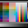
Please take a moment to adjust your gear to accurately depict this Gray Scale. As the patches are neutral gray, their colour on your monitor should also be neutral gray. Mac http://www.wikihow.com/Calibrate-Your-MonitorWintel PC http://www.calibrize.com/Figure 1. Gray Scale. http://i783.photobucket.com/albums/yy116/Sandy1-1/InkyThoughts2010/INK576-1.jpg Figure 2. Swabs http://i783.photobucket.com/albums/yy116/Sandy1-1/InkyThoughts2010/Comparison%20-%20Pelikan%20Royal%20Blue%20TO%20Diamine%20Imperia/9c15c5ba.jpg Pelikan Royal Blue x3Diamine Imperial Blue x3 Pelikan Royal Blue x2Diamine Imperial Blue x2Pelikan Royal Blue x1Diamine Imperial Blue x1Figure 3. Other Stuff http://i783.photobucket.com/albums/yy116/Sandy1-1/InkyThoughts2010/Comparison%20-%20Pelikan%20Royal%20Blue%20TO%20Diamine%20Imperia/afd89760.jpg Left Side: Pelikan Royal BlueRight Side: Diamine Imperial BlueWritten Samples - Moby Dick Figure 4. Written Samples on Rhodia http://i783.photobucket.com/albums/yy116/Sandy1-1/InkyThoughts2010/Comparison%20-%20Pelikan%20Royal%20Blue%20TO%20Diamine%20Imperia/34f0a761.jpg Left Side. Pelikan Royal Blue: Nine lines from the M200+EF; then ten lines from the 330+M; then ten lines from the Safari+1.1i .Right Side. Diamine Imperial Blue: Nine lines from the M200+EF; then ten lines from the 330+M; then ten lines from the Safari+1.1i .Figure 5. Written Samples on HPJ1124 http://i783.photobucket.com/albums/yy116/Sandy1-1/InkyThoughts2010/Comparison%20-%20Pelikan%20Royal%20Blue%20TO%20Diamine%20Imperia/82247aee.jpg 1st Line: Pelikan Royal Blue from the 330+M2nd Line: Diamine Imperial Blue from the 330+M3rd Line: Pelikan Royal Blue from the Safari+1.1i4th Line: Diamine Imperial Blue from the Safari+1.1i High Resolution Scans As I do not wish to have the sobriquet 'Queen of the Bandwidth Bandits', these are Links only. Pelikan Royal Blue from 330+M on Rhodia. http://i783.photobucket.com/albums/yy116/Sandy1-1/InkyThoughts2010/Comparison%20-%20Pelikan%20Royal%20Blue%20TO%20Diamine%20Imperia/2499e44f.jpgDiamine Imperial Blue from 330+M on Rhodia. http://i783.photobucket.com/albums/yy116/Sandy1-1/InkyThoughts2010/Comparison%20-%20Pelikan%20Royal%20Blue%20TO%20Diamine%20Imperia/30ad5842.jpgPelikan Royal Blue from Safari+1.1i on Rhodia. http://i783.photobucket.com/albums/yy116/Sandy1-1/InkyThoughts2010/Comparison%20-%20Pelikan%20Royal%20Blue%20TO%20Diamine%20Imperia/2e4cc977.jpgDiamine Imperial Blue from Safari+1.1i on Rhodia. http://i783.photobucket.com/albums/yy116/Sandy1-1/InkyThoughts2010/Comparison%20-%20Pelikan%20Royal%20Blue%20TO%20Diamine%20Imperia/09682389.jpgPelikan Royal Blue and Diamine Imperial Blue from 330+M on HPJ1124. http://i783.photobucket.com/albums/yy116/Sandy1-1/InkyThoughts2010/Comparison%20-%20Pelikan%20Royal%20Blue%20TO%20Diamine%20Imperia/2187a9aa.jpgPelikan Royal Blue and Diamine Imperial Blue from Safari+1.1i on HPJ1124. http://i783.photobucket.com/albums/yy116/Sandy1-1/InkyThoughts2010/Comparison%20-%20Pelikan%20Royal%20Blue%20TO%20Diamine%20Imperia/ef63c16b.jpgObservations: These are the things which are not apparent from the Images.These observations may differ ever so slightly from the Ink Review/s that may be in place.My contribution was to generate enough reasonable samples, then capture the appearance of those samples.If you'd like more detailed information, please send me a PM; I'll do what I can. (Within reason - you naughty FPN boys).I leave it to each viewer to interpret what is seen, and/or to initiate discussion in the usual way.Type: • Both are dye-based FP inks. Flow Rate: • Pelikan Royal Blue has a quite low flow rate. • Diamine Imperial Blue has a higher flow rate, but is slightly lower than average. Nib Dry-out: • Both inks are OK. Start-up: • Both inks are OK. Lubrication: • Pelikan Royal Blue has a slightly lower than average amount of Lubrication. • Diamine Imperial Blue has a fairly high amount of lubrication. Nib Creepies: • None for both inks. Staining: • None after 3 days for both inks. Clogging: • Not seen for both inks. Bleed Through: • None on papers used for both inks. Show Through: • Pelikan Royal Blue did not exhibit Show Through. • Diamine Imperial Blue had show through on the HPJ1124. Clean-up: • Both cleaned-up with plain water. • Diamine Imperial Blue seemed to be in Limbo. Densitometer Readings - From the Ink Reviews. (FWIW) Pelikan Royal Blue:Red 117Grn 135Blu 131Lum 150[*]Diamine Imperial Blue: Red 100Grn 107Blu 209Lum 124 |:|''||'|:|''||''|:|''||''|.|''||''|:|''||''|.|''||''|:|''||''|:|'||''|:| MATERIEL Paper: Written Samples:RhodiaHPJ1124Glossy card[*]Other: Glossy paperHPJ1124Royal - 25% cotton rag Pens: Pelikan M200 + M200-series g-p steel EFSheaffer 330 + steel MLamy Pink Safari + a rather wet steel 1.1iIMAGES: Scans were made on an Epson V600 scanner; factory defaults were accepted.Figures shown were scanned at 96 dpi & 24 bit colour.Images linked were scanned at 300 dpi & 24 bit colour.Scans went straight to the file sharing thingy. -30-
-
clearly I need to calibrate on my end. The s/w I just used on my laptop didn't help and it shouldn't be blue on any monitor. so I'll fix the image later. Meanwhile, the real take-home here is that Fuyu Syogun is grey, and Tsuki-yo is greener than Prussian Blue (which is actually a very pleasant grey-blue. good luck with the laptop. I have no brightness/contrast buttons either and had to dink with it via 7's controls which are limited. Calibrize was only slightly helpful on the laptop. The 7 calibration utility seemed a little better but not a lot. Problem with LCD screens is just a slight change in angle affects how you see gamma. I know these are cheap and light screens, but I pray my CRT on my other system never dies (unlikely, I know).
-
I am a bit skeptical that the BSB I purchased is truly BSB. The Noodler's web site shows BSB as a very vivid BLUE, just what I want. The bottle I received says BSB on the label. However, a swab sample looks PURPLE. In fact, it looks exactly like the Noodler's web site sample of Baystate Grape! The Noodler's Blue that I received at the same time looks blue, just like the Noodler's sample, which should nominally "calibrate" my eyes and computer monitor. I contacted the shop that I purchased it from and sent them a swab sample. They said that they contacted Noodler's and got confirmation that it really is BSB and not BSG in the wrong bottle. I just can't believe that this is blue. As I am writing this I decided to check the Goulet Swab Shop and Noodler's Blue looks blue and BSB looks quite, um, purple. Maybe I do have BSB. (Interesting, when I scanned a swab sample of BSB and N's Blue, the scans both looked blue.) I want the blue that I see in the N's web site. How do I get that color? Any thoughts most appreciated. Craig T.
-
You need to color calibrate your monitor, Professor. That's a bordeaux, not a red. But beautiful, absolutely. I keep a pen inked with it continuously.
-
I wish there was a "standard ink" to calibrate my monitor. On my monitor none of them look like purple except #7 and 8
-
An easy way to calibrate colours on any monitor is to start off with a decent grey-scale collection as often seen at the top of Sandy1's ink reviews. Mike
-
You should also calibrate your monitor if you are going to evaluate inks on line. This is very easy with a Mac, not so easy on a PC For posters, it's really helpful to scan a gray scale or at least an 18% gray card and color correct before posting. As noted, though, no matter what you do, photographs or scans of inks are rarely exactly the same as seeing the ink on paper due to the differences in reproduction, color gamut of the various devices, and differences in equipment. Displaying absolutely true to life colors just isn't possible, as anyone who does photography can tell you (at length!). Samples are a great way to "audition" inks, and many FPN members are willing to send you a mL or two if you ask. Peter
-
Nah, this will get a response here , even if only from me . Yes, the V500 should do fine. It si considered to be an excellent scanner. The biggest problem is calibrating your scanner so that it scans colours properly. However, you also need to calibrate your monitor in that case, and once you get to that stage, it may get out of hand a little . Anyway, personally I would go for the Canon 8800F or whatever it is called, but that is only personal preference. Never again an HP, however. My experience with those is not so great. However, obviously, YMMV. With regards to scanning pens: yes that is very well possible. When I wrote my nib smoothing article ("Grinding Nib Experiences"), I didn't have a digital camera. So, someone else took the pics for me, and the close-ups of the nib were down with a scanner. It does works, although I prefer a (half) decent camera to take pictures of pens, rather than scan them. Warm regards, Wim
-
yep, OP = original poster! You might like to take a picture with a camera, near a window that has natural sunlight (or, weather permitting, outside). Some people feel that, although the resolution might not be as good, this gets colors a little more accurate, if you don't have the patience to calibrate your monitor. I think the best thing to do is to include some well-known inks as comparisons... Enjoy your holidays... You might greatly benefit from darkening the ink, though... A little black goes a long way, but I bet you will end up with a very nice Squeteague-like color!! Thanks for the tips. I'm sorry but I've given both bottles away as a Christmas present to a friend who's only just discovered (rediscovered?) writing with FPs so unless I can get some more or they show me a sample of writing it will remain to me a mystery. But am curious to find out.... Tom
-
yep, OP = original poster! You might like to take a picture with a camera, near a window that has natural sunlight (or, weather permitting, outside). Some people feel that, although the resolution might not be as good, this gets colors a little more accurate, if you don't have the patience to calibrate your monitor. I think the best thing to do is to include some well-known inks as comparisons... Enjoy your holidays... You might greatly benefit from darkening the ink, though... A little black goes a long way, but I bet you will end up with a very nice Squeteague-like color!!
-
If OP means me (guessing something like Original Poster?) I'll let you know but it won't be till 12th Night has been and gone. Hope the suspense isn't killing...! I was hoping for something distinctly darker though; I think I'm going to be disappointed whatever the result. Oh well, impulse buying. New Year Resolution is to calibrate my monitor properly and then post some pictures. Tom
-
I tried to calibrate in expert mode and could not get it to work. I was stuck in step one, adjusting the right slider in the "native gamma" page. Just can't get the color to look right. I suspect it is the LED backlit screen? Does calibration work on your mac? It would be a great idea for everyone to have their monitors calibrated. I was editing photos and photos which looks good on the monitor doesn't look nice when printed. But there is one concern. Not everyone may like the colors of their system to be accurate. Take macs for an example. Their colors are very sharp and attractive, but I doubt they are accurate. Normal users like me may prefer warmer and saturated colors. So that's why I was thinking of calibrating the colors in the webpage only. Calibration does work. Don't fret if it isn't perfect on the first page, just squint like it says and get it as good as possible, then move on. There is a lot that has to be changed to make it right. After you're done try turning it on and off with a picture on the screen. I doubt many would prefer non-calibrated colors after 1 day using a calibrated screen. Warmer can be gotten by calibrating to different white points (I use 6500°). Saturated is something you can do to the pictures you use but having accurate colors to start with helps a lot. As far as printing, I haven't gotten that perfected. I intend to borrow the calibrator of a friend which also does scanner's and printers (mine is one of the cheap, $70 kinds). BTW, I know this is a bit delayed. I've been busy (and if I looked at all the pages to catch up it'd be 51 of them!).
-
Hence the reason why what this person is doing is relevant to the community - results will be easily calibrated on the user end, since it's the users who have so many different monitor types and color/gamma correction settings. Not to mention that it's cheap to implement - just the cost of some time. It would probably be a good idea to use a new dollar bill for most accurate color, as well as a new penny for balance on the red end of the spectrum... Not to mention that the new US $5 has Abe lookin' pretty in pink, or the $10 has yellow to calibrate to.... I was mulling over something like this before, too - I thought people could include a bill or a CMYK calibration print in their scans or photos of ink reviews, for the users to adjust their color settings to... alas, I am lacking in the scanning/picturetaking department, so I'll have to sit out on this one
-
Man - I thought my 8 was good! Something makes me think I need to work out how to calibrate my Eizo monitor... David.
-
KCat, Hi. I'm aware of the monitor "problems" but, most of the time, don't really care. Most of my computer time is spent emailing, surfing, Fountain Pen Networking, or working with spreadsheets and/or databases. I've never had to critically calibrate my monitor. For the most part, I prefer it to be a bit darker than necessary. If I were working with images, I'd be much more critical (and probably using a Mac!!). Come to think of it, when I finally replace this aging PC, I'll probably get a Mac. Now, for a really good black ink... Aurora, Diamine, Noodlers, Private Reserve,...? Any suggestions? I've been using Waterman.
-
I was able to try Private Reserve Avacado [sic] thanks to the Ink Exchange. I was wanting to learn to scan and calibrate color well, so initially focused on greens because other reviews had reported problems getting them to scan or photograph. The files I present are calibrated correct values in the file, with an embedded ICC profile for Adobe RGB. You should be able to compare any of the scans side-by-side to see the difference, because the exposure and adjustment is exactly the same in each ink scan. To aid color perception on your monitor, there is a thin white border to show the paper color (the paper is faintly blue in sunlight) and a gray matte. The matte is perfectly neutral, so judge the color relative to that. My impression using this ink is that it is rather wet, and hard to use for my lettering practice (I'm just learning cursive italic as my primary note-taking hand). Although the stroke width is normal when measured in the scan, it just seems hard to draw the letters the correct size rather than make them larger to form them better. More in the close-up below. You can see that it shades, even on the HP Prem. Laser 32# paper. In the extreme close-up, you can check for feathering. Notice the separation of color in the edges, as the cyan component of the dye moves through the paper. You can't see this without a microscope, but the wetness contributes somehow to why I don't like writing with it even though I don't think this is what you call feathering. The line width seems uneven, clear here in the horizontal strokes but better in the vertical. I think it's just sloppy, so save it for a dry writer or a bolder pen. The color is a Hue of 97° averaged across a spot a little smaller than the stroke width. The hue varies from 95 to 100 overall, showing hue variation as well as intensity change. Compared to Levenger's Gemstone Green (and I suppose others that people would call "Emerald"), that is 179°, or where the green in the vertical hue bar there fades into cyan. This ink, in contrast, is at the other end of the green where it would start to become yellow. —John
-
Actually, I would suggest including a small McBeth ColorChecker card or and IT8 target on each scan, and adjusting the scan to give as close as possible to accurate color with those tools. Best to calibrate you monitor, scanner, and software with an IT8 target first, of course (and that won't help at all when someone else views it!). You will still have trouble with some inks, as there is plenty of UV in the scanner light (it's a fluorescent bulb, after all) and many inks fluoresce (and so does paper with brightener in it, as anything with a "brightness" of over 92 or so does). This will skew the perceived color rather badly in some cases, usually making blue inks much more vivid than they really are. The scanner will "see" color you don't, especially under incandescent lighting (or LED since that's becoming more common). I shall have to try using your method for color determination, though -- I think it's about as good as we are going to get for amateurs!. For those without an IT8 target or a McBeth ColorChecker, try to obtain a Kodak neutral gray scale card. This will have deep black, 18% neutral gray, and pure white photopaper "colors" -- you can then use Photoshop or something similar to set the black to pure black, the white to pure white, and the gray to 18% gray on the scanned image. Unless you have a really out of condition scanner, this should get you pretty close to the proper neutral color balance required -- you can then use the color picker to determine lab color, etc. If you have the multiple step gray card, you can also adjust the contrast curves to get a linear gray scan, too. This would be better than a three point "curve", but you do need to have some understanding of contrast and photographic color theory to make this really usable. I still tie myself in knots once in a while attempting to get good color balance. Peter
-
I have a few questions concerning your idea. I don't have any experience with mixing inks, so if my reasoning doesn't really stand, feel free to correct me. First of all: isn't is possible that various "side chemicals" might interact between inks, potentially altering the desired light reflectance of the ink and, consequently, color? Inks have a few different solutes in there, and certain compounds might do a chemical double displacement, decomposition, etc.... creating a new compound with different physical properties. Richard Binder stated at one time that he saw certain inks turn into veritable sludge when mixed together. If that's the case, then it's fair to assume that inks can have other unwanted side effects as well. Also, I feel that your color wheel idea would have to be limited within a designated range of "safe" mixing inks. This could only be deduced by manual testing... Secondly: even though an ink looks a certain color to the human eye, it doesn't really give us a clue as to the level of saturation or types of colors that make up the ink. Let's say you have ink A, which is a certain shade of yellow... then you have ink B, which is a blue-green. Ink A was made with a low pigment concentration of yellow ink. Ink B, on the other hand, was made with a highly saturated level of both blue and green pigments. Even though we might expect a color in-between yellow and blue-green... mixing the two might actually leave you with something that's still looks heavily like Ink B. Even worse, what if ink B was made with a single, stock pigment of blue-green? The manufacturer could add tons of that pigment, heavily saturating the ink, without changing the ink's color. How would that affect the outcome of the mixture? This problem would have to be solved largely through manual testing (again). So to make this color wheel, you would have to list the ink color, brand, and specific measurement needed to attain the desired color on the wheel. This could be largely dealt with by limiting yourself to 3-5 primary inks (within the same brands), but this would limit the range of colors you could make, as well. Thirdly: if you intend to make this program for widespread use, I see it running into problems. Not everyone's monitor displays colors in the same way. A plain blue on your screen might look a few shades lighter on someone else's. If that person then mixes inks, expecting to get the exact shade he/she sees... well, that person might get a little surprise. Professional artists and designers don't run into this problem as much, because they often take steps to calibrate their monitors (they sell devices for such purposes that often cost several hundred dollars). Just some thoughts I had. Aside from those issues, your idea sounds great. I'm very interested as to how this will turn out.
-
I don't understand. Are you saying that you want the color to be like PR Plum? If so, 7 and 8 are nothing like it. #9 is very very close to PR Plum I don't know Sailor Red-Brown, but I would describe #4 as a red-brown - maybe terra cotta/brick? #5 is similar to 4, but slightly redder That is spot on in my opinion. Exactly how I would describe it coming soon. IMPORTANT: This scan isn't great as far as judging the color, but perhaps you can calibrate your monitor to the nightshade? In the scan #8 looks more purple than is, so don't use this to choose a color. However, it will do to see the differences between #8 & nightshade. I find nightshade to be the most changeable color. I've never seen two swabs, samplers etc. the same. It is very dependent on nib and paper. That being said, #8 has a bit more purple tint to it (in the right light, with the right pen) than nightshade, which seems much more black to me. http://img.photobucket.com/albums/v12/elainepnj/Nightshade.jpg There is only a hint of shading in #8 There is slightly more shading in #1, 4, 5, 7 #7 is a pure purple. Kind of what would be used for royalty.
-
For those of you who happen to have Blue Bahama readily available...is this true to color on your monitor? I'm trying to calibrate a scanner and I'm having a bear of time with it.


