Search the Community
Showing results for 'calibrate monitor'.
-
The gray section can be used as a gray card. Instead of calibrating the camera though, I use it to set the white balance after-the-fact in a raw-file converter. The little black hole is always the blackest black, and the silver ball will always have a blown out white. Handy little doodad for calibrating color. I've included it so that if you guys were inclined, you could download the photos and use it to calibrate the colors to your particular screen. Judging by the inks I am familiar with, the photos look very accurate on my monitor, without any tinkering. I used a program called Calibrize to adjust my monitor. I love this type of comparison where a large number of samples are photographed at the same time under the same lighting conditions making comparisons easy. Thank you for posting the all the photos! It would be nice if this thread were eventually moved into the Ink comparisons forum where it will be easier for people to find down the road.
-
System Preferences -> Displays -> Color To be honest, I've never needed to calibrate an Apple Monitor. The OS's default color temp is usually around D65, or 6500 Kelvin which is the temperature of sunlight around noon and the default target gamma is 1.8 which gives good contrast without washing out the colors. The only people I can think of who would need to calibrate an apple monitor would be those working in professional graphics or prepress where matching exact colors means not losing $$$.
-
Sandy1's laid out some of the issues for a fountain pen forum. However, this topic isn't new to other areas such as the photo community. There are specific measures folks can take if they're attempting to get the best possible colour renditions to post, and then in turn, for people to view. This is about as contentious topic as specific ink brands or papers, as well as being a very deep topic for discussion, so I'll touch on the issues, and folks can then research it to their hearts' content as they will. Calibrate the monitor that one will use for review of the scans/photographs (e.g., Spyder Colorimeter);Photograph or scan with a reference grey-card or a colour-card in the image (e.g., Opteka cards);Colour-correct the image to the correct WB for the reference card in the image;Pick a specific colour gamut for uploading to the internet (e.g., Adobe RGB (1998));Include data in the uploaded photo and/or in the post for gamut, along with the photo with the reference card.In some cases, viewers of the image will need to download the image to open in an appropriate photo editor or photo viewing program, as most browsers are very limited in their display. Of course, the viewer also needs a calibrated display, and may need to make additional adjustments with the downloaded image. Calibrations need to be checked periodically, as displays can shift a bit, although the new flat displays have different shifts than the older CRT displays. The "steps" noted above aren't necessarily small or trivial, and corrections of photos for "true colour" can be a lengthy process. In times past, one would shoot with colour corrected lights with specific film to minimise colour shifts. Digital cameras allow us to process for colour correction (mostly) easily on computers, but it does require some care and training to accomplish this in a consistent manner. As time has gone on, features for colour management have migrated from the higher end photo programs like Photoshop to less expensive packages, so this is now within financial reach of most computer users. Photographers of some age will remember having specific document and paper platforms equipped with flexible stand lights to provide illumination, but, once again, it's a specialist item and style of photography. Is it worth it ? Well, one has to ask how large an interest one takes in the photos/scans of inks... As noted by others, scanners are somewhat limited in their colour renditions, unless one spends a lot more on the scanner than a home user will do. Getting quality photos means shooting in RAW or similar format, which rules out many consumer digital cameras that save files only as JPEGs, and pretty much all cellphone cameras. Colorimeters cost anywhere from $100 and ascend sharply higher for some professional models. Monitors that can be recalibrated, not to forget display adapters that can be shifted sufficiently to influence display qualities aren't at the bottom end of consumer computers. The photographers here on FPN will be nodding their heads to these comments, but then, many of those photographers will already have all of these measures in place... <wry smile> Then, on top of all of this, are the posted photos intended for a general audience without any of these bells and whistles, or just for the specialists who have the ability to review the images ? John P.
-
Trying to produce color-correct scans and displays, both, is a fool's errand. The 5 different monitors I use every day are all different, and it's NOT just about calibration. It's sometimes about the monitor's capabilities. You can calibrate all you want, and some of them will never be right, and besides, I might (and do) prefer a warmer tone when working. Instead, I prefer to have enough comparison inks on the scan that at least one of them I will have some experience with. Then I can load the image up in my favorite image editing software and try to dial it in on whatever system I'm using. This will give me a good sense of the color of the ink I don't know. So, IMHO, it's more important to put a variety of inks somewhere on the page to compare to than it is to spend a lot of time and energy on calibrations that often fail. mhphoto (fivecatpenagerie.com) includes several inks at the bottom of his scans, not all of which are intended to be close in color. I find this useful for determining the color I will see in person.
-

My Colors 3- Greens, Pinks, Reds, Browns, Burgundies, Oranges
mfyorulmaz posted a topic in Ink Comparisons
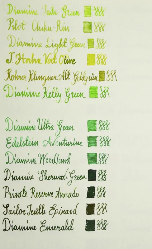
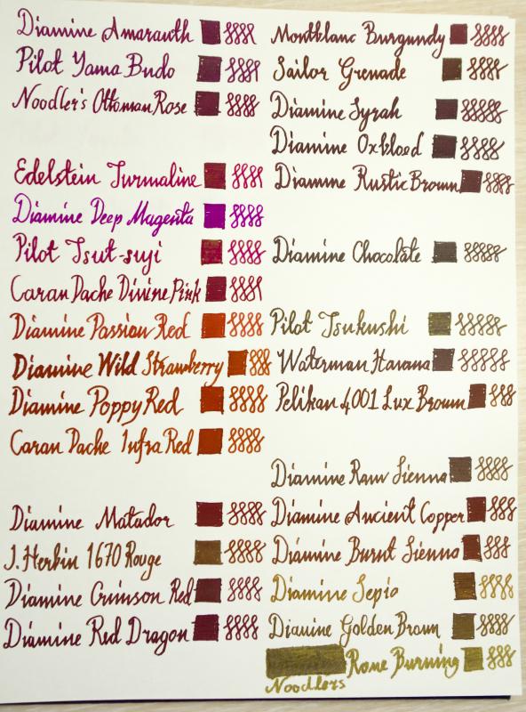
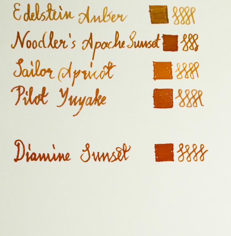
I laid down my colors and here is what came out...I thought it may be useful for other people as well when shopping for different colors. I try to adjust color tones as best as I can on Photoshop. But since what shows up on your screen may be very different due to your color settings, try to calibrate your monitor/screen first...the empty lines on the pics will be filled with my lastly ordered inks when they arrive. My favorite brands are Diamine & Pilot. Sometimes pilot inks are a little bit dry though. Favorite colors are marked with (F)...Due to upload limitations other colors will be posted on the other posts... Greens: Diamine Jade Green Pilot Chikurin Diamine Light Green J.Herbin Vert Olive Rohrer & Klingner Alt Goldgrun Diamine Kelly Green Diamine Ultra Green Edelstein Aventurine Diamine Woodland Diamine Sherwood Green Private Reserve Avacado Sailor Jentle Epinard Diamine Emerald Burgundy: Diamine Amaranth (F) Pilot Yamabudo Noodler's Ottoman Rose Montblanc Burgundy Sailor Grenade Diamine Syrah Diamine Oxblood Diamine Rustic Brown Pinks: Edelstein Turmaline Diamine Deep Magenta Pilot Tsutsuji Caran D'ache Divine Pink Reds: Diamine Passion Red Diamine Wild Strawberry (F) Diamine Poppy Red Caran D'ache Infra Red Diamine Matador (F) J.Herbin 1670 Rouge Hematite Diamine Crimson Red Diamine Red Dragon Browns: Diamine Chocolate Brown Pilot Tsukushi Waterman Havana Brown Pelikan 4001 Lux Brown (F) Diamine Raw Sienna Diamine Ancient Copper (F) Diamine Burnt Sienna (F) Diamine Sepia Diamine Golden Brown Noodler's Rome Burning Oranges: Edelstein Amber Noodler's Apache Sunset (F) Sailor Jentle Apricot Pilot Yuyake Diamine Sunset
-
Well received, but super slow to download and not sure why, but I got it anyway. Good idea to do two on one page. If you can do it in a fillable format then some of the same info (papers e.g.) that will be repeated can stay filled in and be saved, but I don't know how to do it. Maybe nextgen. Here's an updated form. I think it includes what you were looking for. Let the opinions fly. As for calibrating scanners and such. I thought about how that would affect everything. I guess my take on it is in line with some others. I can calibrate both my scanner and monitor so that everything matches. Right now I am coming very close to the color on my monitor that is in real life. The fact that the majority of people don't calibrate their monitors nor have any real reason too makes all the work I do a moot point. I did think if we have one person doing the scanning at least there is one reference point. Not sure. It seems there is a small interest in doing a full book exchange. I'm thinking the better route for me to go is to let people print the template and if they want they can send it to me to be scanned. I was planning on making the template public anyway so nothing has really changed. -penguin
-
I laid down my colors and here is what came out...I thought it may be useful for other people as well when shopping for different colors. I try to adjust color tones as best as I can on Photoshop. But since what shows up on your screen may be very different due to your color settings, try to calibrate your monitor/screen first...the empty lines on the pics will be filled with my lastly ordered inks when they arrive. My favorite brands are Diamine & Pilot. Sometimes pilot inks are a little bit dry though. Favorite colors are marked with (F)...Due to upload limitations other colors will be posted on the next posts... Blacks: J.Herbin Perle Noire Pilot Takesumi (F) Sailor Jentle Black Edelstein Onyx Noodler's Black Oranges: Edelstein Amber Noodler's Apache Sunset (F) Sailor Jentle Apricot Pilot Yuyake Diamine Sunset
-
I laid down my colors and here is what came out...I thought it may be useful for other people as well when shopping for different colors. I try to adjust color tones as best as I can on Photoshop. But since what shows up on your screen may be very different due to your color settings, try to calibrate your monitor/screen first...the empty lines on the pics will be filled with my lastly ordered inks when they arrive. My favorite brands are Diamine & Pilot. Sometimes pilot inks are a little bit dry though. Favorite colors are marked with (F)...Due to upload limitations other colors will be posted on the next posts... Blues: Pilot Shin Kai Diamine Twilight Pilot Tsukiyo Diamine Teal Pilot Kujaku (F) Diamine Eau de Nile Parker Quink Blue Black Lamy Blue Black Diamine Majestic Blue Diamine Sargasso Sea (F) Pilot Asa gao Diamine Asa Blue Diamine Florida Blue Diamine Mediterranean Sailor Skyhigh Pilot Konpeki Turquoise: Edelstein Topaz Diamine Havasu (F) Diamine Turquoise Diamine Aqua Blue Diamine Steel Blue Diamine Marine Diamine Soft Mint Purples: Sailor Ultramarine (F) J.Herbin 1670 Blue Ocean Pilot Ajisai Pelikan Tinte 4001 Diamine Sapphire Blue (F) Diamine Amazing Amethyst (F) Caran D'ache Storm Diamine Grape
-
Thank you all for your responses. I can see that I am going to need to do more research! Waterman black is indeed regarded as somewhat grey, which puzzles me as it looks nicely deep black on my monitor - does it just dry to grey? I looked at Noddler's Heart of Darkness - it seems to have a brownish tinge to me! (perhaps I need to calibrate my monitor?!?) Private Reserve Velvet Black looks velvety black - very nice - and Aurora Black doesn't look to shabby, either. I've only had a chance to check out one thread on the black ink posts linked by KCat and I am already overwhelmed. lol Don't really want to stain things, per bicfan's warning about Noodler's, though it isn't that much of a problem - most of my clothes are already stained, I am sure. I think the PR super violet is one I have to get, especially as it sounds from Dark Sides' post that it is going to be discontinued - ?? (That would figure, I'll fall in love with it and then it won't be available anymore.) And Waterman's purple is probably a go, too. I will also need to check out some of the inks you suggest, Jeffrey, though I wasn't really looking for an orange ink (assuming, perhaps incorrectly, that that is what "pumpkin" is.) Guess I am going to have to open up about six instances of Goulet Pens' swab page/interactive applet, so I can check out all of these colours. Maybe it is wise to have only two bottles of ink after all. Holly
-

Best way to do large number of brand comparisons/review?
dizzypen replied to SamCapote's topic in Inky Thoughts
Dizzy, it's interesting when I look at your photos, even going to your flicker and downloading larger image, I can't tell any difference on my monitor between the top 3 orange colors (Fuyu-gaki, Napalm, Coral), nor between the 4th & 5th (Indien & Yu-Yake) unless I look at the Q-tip swabs. It makes me wonder if scans are better, depending on the camera/lighting. Monitors make all the difference. The top three orange are very close in hue. As are those two oranges. That was intentional as I was trying to compare similar inks. This is also why I like to do dip pens and swabs as well. With the swabs you can better see the subtle differences of the inks. All of the colors look accurate on my screen. If they don't I don't post the review. I've had others comment that my colors are accurate for them and still others who say they aren't. That's just how it's going to be because everyone's computers/laptops are calibrated differently and positioned at different angles. I suspect this is true whether or not you use a scanner. As to which is better? Well that depends doesn't it? Some of the scanner images are truly horrid. You've got to get a very good scanner and it must be calibrated properly in order to get accurately colored images. The same is true of pictures. I use a camera because I don't have a scanner, and I'm not going to pay a couple hundred for one just so I can scan ink reviews and comparisons. My camera is decent (Panasonic Lumix DMC-TZ4). It gets the job done. Oh, I'm not saying you should get a scanner, nor unappreciative of your posting them. I'm just investigating ways of displaying results, and was surprised by how little difference I saw. Nothing personal!!! I looked both on my newer Samsung SyncMaster XL2370 LED monitor, and older ViewSonic CRT Graphics Series G70f, both of which are calibrated, and a non-calibrated Lenova ThinkPad. Both my wife and I see the same results on all three sources. But then there are easy differences between the inks I see with these reviews: Signum1's review of Fuhu-gaki Jmkeuning's review of Napalm girlieg33k's review of Coral or BiffyBean's photo that includes Coral hereSandy, nothing wrong with my color vision perception, thanks for your concern. My Samsung monitor comes with "MagicTune Premium" which I use to calibrate it. There are also websites like this one for testing/calibrating which I have used. Again, I'm just investigating how various displays look. I just pulled out my comparison sheet to verify. My inks look only marginally like the ones you've linked to. I checked them all against my sheet. My sample is Fuyu-gaki is no where near as red as Signum's scan. My Dragon's Napalm shows as more pink than orange as opposed to Jmkeuning's scan. The link you provided for BiffyBean's is not Diamine Coral, but compared to her swatch of coral, mine shows as more pink than orange. Girlig33k's scan of Coral is lighter and pinker than my sample. I suspect that the differences lie in the wetness of the nibs used, the papers used, and the scanners/photos. This exchange we are having reinforces that fact that scans/photos really must be viewed as an approximation of the colors. In my reviews I always try to describe what I see on the page so the reader can cross-reference with the image they see on the screen. If I had time I'd offer to mail you a copy of swabs, but I'm just getting ready to leave town, so I don't have the time to put it together now. I don't know if it will help but here is the text I provided with my comparison: Iroshizuku Fuyu-Gaki. This is a red-orange, but there is something coral/pink about it in my eyes. I like it very much. Noodler's Dragon's Napalm. What a fun color! I don't know what I'd use it for, but it is visually appealing. Definitely a Pink-Orange color. Diamine Coral. This is surprisingly similar to Dragon's Napalm. It is, however, a bit more orange. Still quite a nice pink orange. JH Orange Indien. This is one of my favorite oranges. Seems a straight orange to me. Very little red. Iroshizuku Yu-Yake. This has a little more red to it than Orange Indien. It does not photograph well here. Quite a lovely orange. Private Reserve Orange Crush. I think my bottle may be turning a bit, which is a problem with this ink. It was a bit more orange several years ago, now it's an orange-brown sort of color. I still like it though. Dizzy, thanks for helping me sort through this as a learning experience, rather than any kind of polarizing conversation. It is very useful for you to compare your sheets to those review links, and it makes you realize how much variation there is with reviews. When you get a chance, look at the variability in colors of the papers you have on your flickr site, which I suspect is another variable in terms of ambient lighting and/or camera settings. With my Canon PowerShot SX110-IS, I like to use white balance set to "Day Light" & ISO at 100, and have one of those light tents with 3 halogen CRI>97 lamps. Yeh the paper color is always a bit wonky. It's because I use natural light rather than a tent, so the degree of cloudiness effects the gray in the photos. However, when I correct for that the colors sometimes go astray. I don't have advanced photo editing software, so I've just chosen to try to get the colors "right" even if the paper color is wrong. This has been quite a useful conversation. Thanks! -

Best way to do large number of brand comparisons/review?
SamCapote replied to SamCapote's topic in Inky Thoughts
Dizzy, it's interesting when I look at your photos, even going to your flicker and downloading larger image, I can't tell any difference on my monitor between the top 3 orange colors (Fuyu-gaki, Napalm, Coral), nor between the 4th & 5th (Indien & Yu-Yake) unless I look at the Q-tip swabs. It makes me wonder if scans are better, depending on the camera/lighting. Monitors make all the difference. The top three orange are very close in hue. As are those two oranges. That was intentional as I was trying to compare similar inks. This is also why I like to do dip pens and swabs as well. With the swabs you can better see the subtle differences of the inks. All of the colors look accurate on my screen. If they don't I don't post the review. I've had others comment that my colors are accurate for them and still others who say they aren't. That's just how it's going to be because everyone's computers/laptops are calibrated differently and positioned at different angles. I suspect this is true whether or not you use a scanner. As to which is better? Well that depends doesn't it? Some of the scanner images are truly horrid. You've got to get a very good scanner and it must be calibrated properly in order to get accurately colored images. The same is true of pictures. I use a camera because I don't have a scanner, and I'm not going to pay a couple hundred for one just so I can scan ink reviews and comparisons. My camera is decent (Panasonic Lumix DMC-TZ4). It gets the job done. Oh, I'm not saying you should get a scanner, nor unappreciative of your posting them. I'm just investigating ways of displaying results, and was surprised by how little difference I saw. Nothing personal!!! I looked both on my newer Samsung SyncMaster XL2370 LED monitor, and older ViewSonic CRT Graphics Series G70f, both of which are calibrated, and a non-calibrated Lenova ThinkPad. Both my wife and I see the same results on all three sources. But then there are easy differences between the inks I see with these reviews: Signum1's review of Fuhu-gaki Jmkeuning's review of Napalm girlieg33k's review of Coral or BiffyBean's photo that includes Coral hereSandy, nothing wrong with my color vision perception, thanks for your concern. My Samsung monitor comes with "MagicTune Premium" which I use to calibrate it. There are also websites like this one for testing/calibrating which I have used. Again, I'm just investigating how various displays look. I just pulled out my comparison sheet to verify. My inks look only marginally like the ones you've linked to. I checked them all against my sheet. My sample is Fuyu-gaki is no where near as red as Signum's scan. My Dragon's Napalm shows as more pink than orange as opposed to Jmkeuning's scan. The link you provided for BiffyBean's is not Diamine Coral, but compared to her swatch of coral, mine shows as more pink than orange. Girlig33k's scan of Coral is lighter and pinker than my sample. I suspect that the differences lie in the wetness of the nibs used, the papers used, and the scanners/photos. This exchange we are having reinforces that fact that scans/photos really must be viewed as an approximation of the colors. In my reviews I always try to describe what I see on the page so the reader can cross-reference with the image they see on the screen. If I had time I'd offer to mail you a copy of swabs, but I'm just getting ready to leave town, so I don't have the time to put it together now. I don't know if it will help but here is the text I provided with my comparison: Iroshizuku Fuyu-Gaki. This is a red-orange, but there is something coral/pink about it in my eyes. I like it very much. Noodler's Dragon's Napalm. What a fun color! I don't know what I'd use it for, but it is visually appealing. Definitely a Pink-Orange color. Diamine Coral. This is surprisingly similar to Dragon's Napalm. It is, however, a bit more orange. Still quite a nice pink orange. JH Orange Indien. This is one of my favorite oranges. Seems a straight orange to me. Very little red. Iroshizuku Yu-Yake. This has a little more red to it than Orange Indien. It does not photograph well here. Quite a lovely orange. Private Reserve Orange Crush. I think my bottle may be turning a bit, which is a problem with this ink. It was a bit more orange several years ago, now it's an orange-brown sort of color. I still like it though. Dizzy, thanks for helping me sort through this as a learning experience, rather than any kind of polarizing conversation. It is very useful for you to compare your sheets to those review links, and it makes you realize how much variation there is with reviews. When you get a chance, look at the variability in colors of the papers you have on your flickr site, which I suspect is another variable in terms of ambient lighting and/or camera settings. With my Canon PowerShot SX110-IS, I like to use white balance set to "Day Light" & ISO at 100, and have one of those light tents with 3 halogen CRI>97 lamps. -
Best way to do large number of brand comparisons/review?
dizzypen replied to SamCapote's topic in Inky Thoughts
Dizzy, it's interesting when I look at your photos, even going to your flicker and downloading larger image, I can't tell any difference on my monitor between the top 3 orange colors (Fuyu-gaki, Napalm, Coral), nor between the 4th & 5th (Indien & Yu-Yake) unless I look at the Q-tip swabs. It makes me wonder if scans are better, depending on the camera/lighting. Monitors make all the difference. The top three orange are very close in hue. As are those two oranges. That was intentional as I was trying to compare similar inks. This is also why I like to do dip pens and swabs as well. With the swabs you can better see the subtle differences of the inks. All of the colors look accurate on my screen. If they don't I don't post the review. I've had others comment that my colors are accurate for them and still others who say they aren't. That's just how it's going to be because everyone's computers/laptops are calibrated differently and positioned at different angles. I suspect this is true whether or not you use a scanner. As to which is better? Well that depends doesn't it? Some of the scanner images are truly horrid. You've got to get a very good scanner and it must be calibrated properly in order to get accurately colored images. The same is true of pictures. I use a camera because I don't have a scanner, and I'm not going to pay a couple hundred for one just so I can scan ink reviews and comparisons. My camera is decent (Panasonic Lumix DMC-TZ4). It gets the job done. Oh, I'm not saying you should get a scanner, nor unappreciative of your posting them. I'm just investigating ways of displaying results, and was surprised by how little difference I saw. Nothing personal!!! I looked both on my newer Samsung SyncMaster XL2370 LED monitor, and older ViewSonic CRT Graphics Series G70f, both of which are calibrated, and a non-calibrated Lenova ThinkPad. Both my wife and I see the same results on all three sources. But then there are easy differences between the inks I see with these reviews: Signum1's review of Fuhu-gaki Jmkeuning's review of Napalm girlieg33k's review of Coral or BiffyBean's photo that includes Coral hereSandy, nothing wrong with my color vision perception, thanks for your concern. My Samsung monitor comes with "MagicTune Premium" which I use to calibrate it. There are also websites like this one for testing/calibrating which I have used. Again, I'm just investigating how various displays look. I just pulled out my comparison sheet to verify. My inks look only marginally like the ones you've linked to. I checked them all against my sheet. My sample is Fuyu-gaki is no where near as red as Signum's scan. My Dragon's Napalm shows as more pink than orange as opposed to Jmkeuning's scan. The link you provided for BiffyBean's is not Diamine Coral, but compared to her swatch of coral, mine shows as more pink than orange. Girlig33k's scan of Coral is lighter and pinker than my sample. I suspect that the differences lie in the wetness of the nibs used, the papers used, and the scanners/photos. This exchange we are having reinforces that fact that scans/photos really must be viewed as an approximation of the colors. In my reviews I always try to describe what I see on the page so the reader can cross-reference with the image they see on the screen. If I had time I'd offer to mail you a copy of swabs, but I'm just getting ready to leave town, so I don't have the time to put it together now. I don't know if it will help but here is the text I provided with my comparison: Iroshizuku Fuyu-Gaki. This is a red-orange, but there is something coral/pink about it in my eyes. I like it very much. Noodler's Dragon's Napalm. What a fun color! I don't know what I'd use it for, but it is visually appealing. Definitely a Pink-Orange color. Diamine Coral. This is surprisingly similar to Dragon's Napalm. It is, however, a bit more orange. Still quite a nice pink orange. JH Orange Indien. This is one of my favorite oranges. Seems a straight orange to me. Very little red. Iroshizuku Yu-Yake. This has a little more red to it than Orange Indien. It does not photograph well here. Quite a lovely orange. Private Reserve Orange Crush. I think my bottle may be turning a bit, which is a problem with this ink. It was a bit more orange several years ago, now it's an orange-brown sort of color. I still like it though. ETA: There is also the issue of vibrancy. The top three inks are quite vibrant colors. I've tried to capture the vibrancy by adjusting the color setting on my camera. The other photos, however, do not attempt to capture the vibrancy. -
Best way to do large number of brand comparisons/review?
SamCapote replied to SamCapote's topic in Inky Thoughts
Dizzy, it's interesting when I look at your photos, even going to your flicker and downloading larger image, I can't tell any difference on my monitor between the top 3 orange colors (Fuyu-gaki, Napalm, Coral), nor between the 4th & 5th (Indien & Yu-Yake) unless I look at the Q-tip swabs. It makes me wonder if scans are better, depending on the camera/lighting. Monitors make all the difference. The top three orange are very close in hue. As are those two oranges. That was intentional as I was trying to compare similar inks. This is also why I like to do dip pens and swabs as well. With the swabs you can better see the subtle differences of the inks. All of the colors look accurate on my screen. If they don't I don't post the review. I've had others comment that my colors are accurate for them and still others who say they aren't. That's just how it's going to be because everyone's computers/laptops are calibrated differently and positioned at different angles. I suspect this is true whether or not you use a scanner. As to which is better? Well that depends doesn't it? Some of the scanner images are truly horrid. You've got to get a very good scanner and it must be calibrated properly in order to get accurately colored images. The same is true of pictures. I use a camera because I don't have a scanner, and I'm not going to pay a couple hundred for one just so I can scan ink reviews and comparisons. My camera is decent (Panasonic Lumix DMC-TZ4). It gets the job done. Oh, I'm not saying you should get a scanner, nor unappreciative of your posting them. I'm just investigating ways of displaying results, and was surprised by how little difference I saw. Nothing personal!!! That looks like a great camera. What do you have it set to in terms of mode, ISO, white balance? I wonder how much the item's position relative to direct sunlight, sun's position, cloudiness affects color display. I see a lot of variability with the white paper, independent of the ink colors on your list of photos here. I'm just thinking about how to control for possible variations if photos are used. Please don't take offense for me "thinking out loud." I looked both on my newer Samsung SyncMaster XL2370 LED monitor, and older ViewSonic CRT Graphics Series G70f, both of which are calibrated, and a non-calibrated Lenova ThinkPad. Both my wife and I see the same results on all three sources. But then there are easy differences between the inks I see with these reviews: Signum1's review of Fuhu-gaki Jmkeuning's review of Napalm girlieg33k's review of Coral or BiffyBean's photo that includes Coral here Sandy, nothing wrong with my color vision perception, thanks for your concern. My Samsung monitor comes with "MagicTune Premium" which I use to calibrate it. There are also websites like this one for testing/calibrating which I have used. Again, I'm just investigating how various displays look. -
I calibrate my monitor before posting ink reviews. Which is also the reason why I haven't made the Garnet Red review yet - I haven't had the ColorMunki in weeks. I hope I'll get it this weekend and then I'll do that review, too.
-
There are currently (August 2013) one hundred colours available in the standard series from Diamine. Below I have written one line with each colour first on low-absorbent paper (Rhodia No 18 dotpad) and second on normal absorbent paper (our corporate printer’s stock “cartridge” paper). All lines are written with a medium Lamy Z50 nib on a Lamy Safari pen. Apologies for the corporate branding: I do not have blank cartridge stock paper. I hope it does not distract too much from the inks. If you want to calibrate your monitor, the blue and orange colours in the logo are Pantone Blue 072 and Pantone 1375, respectively. There are 25 colours on each sheet so 4 sheets in total. I will write more about the sorting of the ink colours later. For now: enjoy! and I hope this is useful. Colour set 4 Low-absorbent paper (Rhodia) Normal absorbent paper (cartridge)
-
There are currently (August 2013) one hundred colours available in the standard series from Diamine. Below I have written one line with each colour first on low-absorbent paper (Rhodia No 18 dotpad) and second on normal absorbent paper (our corporate printer’s stock “cartridge” paper). All lines are written with a medium Lamy Z50 nib on a Lamy Safari pen. Apologies for the corporate branding: I do not have blank cartridge stock paper. I hope it does not distract too much from the inks. If you want to calibrate your monitor, the blue and orange colours in the logo are Pantone Blue 072 and Pantone 1375, respectively. There are 25 colours on each sheet so 4 sheets in total. I will write more about the sorting of the ink colours later. For now: enjoy! and I hope this is useful. Colour set 3 Low-absorbent paper (Rhodia) Normal absorbent paper (cartridge)
-
There are currently (August 2013) one hundred colours available in the standard series from Diamine. Below I have written one line with each colour first on low-absorbent paper (Rhodia No 18 dotpad) and second on normal absorbent paper (our corporate printer’s stock “cartridge” paper). All lines are written with a medium Lamy Z50 nib on a Lamy Safari pen. Apologies for the corporate branding: I do not have blank cartridge stock paper. I hope it does not distract too much from the inks. If you want to calibrate your monitor, the blue and orange colours in the logo are Pantone Blue 072 and Pantone 1375, respectively. There are 25 colours on each sheet so 4 sheets in total. I will write more about the sorting of the ink colours later. For now: enjoy! and I hope this is useful. Colour set 2 Low-absorbent paper (Rhodia) Normal absorbent paper (cartridge)
-

Comparison : Diamine Imperial Blue :: Waterman Florida Blue
Sandy1 posted a topic in Ink Comparisons
Please take a moment to adjust the brightness & contrast of your monitor to accurately depict this Gray Scale. As the patches are neutral gray, their colour on your monitor should also be neutral gray. Mac http://www.wikihow.com/Calibrate-Your-MonitorWintel PC http://www.calibrize.com/Note: For convenient viewing of the images, you may wish to scroll to the menu at the very bottom of this window, then change the FPN Theme from 'IP.Board' to 'IP.Board Mobile'. Figure 1. Gray Scale. http://i783.photobucket.com/albums/yy116/Sandy1-1/InkyThoughts2010/INK576-1.jpg Figure 2. Swabs http://i783.photobucket.com/albums/yy116/Sandy1-1/InkyThoughts2010/Comparison%20-%20Diamine%20Imperial%20Blue%20TO%20Waterman%20FB/29a3e472.jpg Diamine Imperial Blue x3Waterman Florida Blue x3 Diamine Imperial Blue x2Waterman Florida Blue x2Diamine Imperial Blue x1Waterman Florida Blue x1Figure 3. Other Stuff http://i783.photobucket.com/albums/yy116/Sandy1-1/InkyThoughts2010/Comparison%20-%20Diamine%20Imperial%20Blue%20TO%20Waterman%20FB/d7cd3a1f.jpg Left Side: Diamine Imperial BlueRight Side: Waterman Florida Blue Written Samples - Moby Dick Figure 4. Written Samples on Rhodia http://i783.photobucket.com/albums/yy116/Sandy1-1/InkyThoughts2010/Comparison%20-%20Diamine%20Imperial%20Blue%20TO%20Waterman%20FB/ddeb272e.jpg Left Side. Diamine Imperial Blue: Nine lines from the M200+EF; then ten lines from the 330+M; then ten lines from the Safari+1.1i .Right Side. Waterman Florida Blue: Nine lines from the M200+EF; then ten lines from the 330+M; then ten lines from the Safari+1.1i .Figure 5. Written Samples on HPJ1124 http://i783.photobucket.com/albums/yy116/Sandy1-1/InkyThoughts2010/Comparison%20-%20Diamine%20Imperial%20Blue%20TO%20Waterman%20FB/205d5340.jpg 1st Line: Diamine Imperial Blue from the 330+M 2nd Line: Waterman Florida Blue from the 330+M 3rd Line: Diamine Imperial Blue from the Safari+1.1i 4th Line: Waterman Florida Blue from the Safari+1.1i High Resolution Scans As I do not wish to have the sobriquet 'Queen of The Bandwidth Bandits', these are Links only. Diamine Imperial Blue from 330+M on Rhodia. http://i783.photobucket.com/albums/yy116/Sandy1-1/InkyThoughts2010/Comparison%20-%20Diamine%20Imperial%20Blue%20TO%20Waterman%20FB/a81666b2.jpgWaterman Florida Blue from 330+M on Rhodia. http://i783.photobucket.com/albums/yy116/Sandy1-1/InkyThoughts2010/Comparison%20-%20Diamine%20Imperial%20Blue%20TO%20Waterman%20FB/86a0035e.jpgDiamine Imperial Blue from Safari+1.1i on Rhodia. http://i783.photobucket.com/albums/yy116/Sandy1-1/InkyThoughts2010/Comparison%20-%20Diamine%20Imperial%20Blue%20TO%20Waterman%20FB/5ba99604.jpgWaterman Florida Blue from Safari+1.1i on Rhodia. http://i783.photobucket.com/albums/yy116/Sandy1-1/InkyThoughts2010/Comparison%20-%20Diamine%20Imperial%20Blue%20TO%20Waterman%20FB/3249ace0.jpgDiamine Imperial Blue and Waterman Florida Blue from 330+M on HPJ1124. http://i783.photobucket.com/albums/yy116/Sandy1-1/InkyThoughts2010/Comparison%20-%20Diamine%20Imperial%20Blue%20TO%20Waterman%20FB/85ca29d3.jpgDiamine Imperial Blue and Waterman Florida Blue from Safari+1.1i on HPJ1124. http://i783.photobucket.com/albums/yy116/Sandy1-1/InkyThoughts2010/Comparison%20-%20Diamine%20Imperial%20Blue%20TO%20Waterman%20FB/c4a38c97.jpgObservations These are the things which are not apparent from the Images.These observations may differ ever so slightly from the Ink Review/s that may be in place.My contribution was to generate enough reasonable samples, then capture the appearance of those samples.If you'd like more detailed information, please send me a PM; I'll do what I can. (Within reason - you naughty FPN boys.)I leave it to each viewer to interpret what is seen, and/or to initiate discussion in the usual way.Type: Both are dye-based FP inks.Flow Rate: Both inks are OK.Diamine Imperial Blue is greater.Nib Dry-out: Both inks are OK.Start-up: Both inks are OK.Lubrication: Both inks are OK.Nib Creeping: None for both inks.Staining: None after 3 days for both inks.Clogging: Not seen for both inks.Bleed Through: None on papers used for both inks.Show Through: None on papers used for both inks.Both sides of the sheet may be used.Clean-up: Both cleaned-up with plain water within a reasonable time.==================== Densitometer Readings - From the Ink Reviews. (FWIW) Diamine Imperial Blue:Red 100Grn 107Blu 209Lum 124[*]Waterman Florida Blue: Red 109Grn 129Blu 225Lum 144 |.|''||'|:|''||''|:|''||''|.|''||''|:|''||''|.|''||''|:|''||''|:|'||''|.| MATERIEL Paper: Written Samples:RhodiaHPJ1124Glossy card[*]Other: Glossy paperHPJ1124Royal - 25% cotton rag Pens: Pelikan M200 + M200-series g-p steel EFSheaffer 330 + steel MLamy Pink Safari + a rather wet steel 1.1iIMAGES: Scans were made on an Epson V600 scanner; factory defaults were accepted.Figures shown were scanned at 96 dpi & 24 bit colour.Images linked were scanned at 300 dpi & 24 bit colour.Scans went straight to the file sharing thingy.Fine Print: The accuracy and relevance of this Review depends in great part upon consistency and reliability of materiel used. Ink does not require labelling/notice to indicate (changes in) formulation, non-hazardous ingredients, batch ID, date of manufacture, etc. As always, YMMV, not only from materials, methods, environment, etc., but also due to differences between the stuff in the bottle I used, and that in bottle/s you may have. Also, I entrust readers to separate opinion from fact; and to evaluate inferences and conclusions as to their merit. -30- -
Noodler's Ink: Squeteague My first review! :clap1: The Squeteague on overall is a versatile and unique ink. It is a sort of deep, blue-green-black that is almost-but-not-quite black when you write it with a fine nib. I can only describe it as the colour of a stormy night at sea. It is not your stereotypical ink and although it's modest, it gives off a subtle and unique vibe which I think is fantastic. I've tweaked the scan with photoshop to make the look as close as possible on my monitor to the real thing. The title and the ink name was written with a Noodler's Konrad which I've yet to calibrate properly as you could probably tell. I've been meaning to do a review on that as well, but I'm holding it off until I like how it writes. The rest was written with a Parker 75. Thanks, and any questions/suggestions are welcome!
-
ok, here we go. new paper. calibrate your monitor, and these were properly white balanced for my flash (set on bounce) and look very similar to how i see them here. Page 1 Page 2 overall, not unpleasant, but not something i would use daily. enjoy. -p
-
Comparison : Herbin Eclat De Saphir :: Diamine Imperial Blue
Sandy1 posted a topic in Ink Comparisons
Please take a moment to adjust your gear to accurately depict this Gray Scale. As the patches are neutral gray, their colour on your monitor should also be neutral gray. Mac http://www.wikihow.com/Calibrate-Your-Monitor Wintel PC http://www.calibrize.com/Figure 1. Gray Scale. http://i783.photobucket.com/albums/yy116/Sandy1-1/InkyThoughts2010/INK576-1.jpg Figure 2. Swabs http://i783.photobucket.com/albums/yy116/Sandy1-1/InkyThoughts2010/Comparison%20-%20Herbin%20EdS%20TO%20Diamine%20Imperial%20Blue/6ec1ec4d.jpg Herbin Eclat de Saphire x3Diamine Imperial Blue x3 Herbin Eclat de Saphire x2Diamine Imperial Blue x2Herbin Eclat de Saphire x1Diamine Imperial Blue x1Figure 3. Other Stuff http://i783.photobucket.com/albums/yy116/Sandy1-1/InkyThoughts2010/Comparison%20-%20Herbin%20EdS%20TO%20Diamine%20Imperial%20Blue/3c4b14e2.jpg Left Side: Herbin Eclat de SaphireRight Side: Diamine Imperial BlueWritten Samples - Moby Dick Figure 4. Written Samples on Rhodia http://i783.photobucket.com/albums/yy116/Sandy1-1/InkyThoughts2010/Comparison%20-%20Herbin%20EdS%20TO%20Diamine%20Imperial%20Blue/7200022e.jpg Left Side. Herbin Eclat de Saphire: Nine lines from the M200+EF; then ten lines from the 330+M; then ten lines from the Safari+1.1i .Right Side. Diamine Imperial Blue: Nine lines from the M200+EF; then ten lines from the 330+M; then ten lines from the Safari+1.1i .Figure 5. Written Samples on HPJ1124 http://i783.photobucket.com/albums/yy116/Sandy1-1/InkyThoughts2010/Comparison%20-%20Herbin%20EdS%20TO%20Diamine%20Imperial%20Blue/2225e8f6.jpg 1st Line: Herbin Eclat de Saphire from the 330+M2nd Line: Diamine Imperial Blue from the 330+M3rd Line: Herbin Eclat de Saphire from the Safari+1.1i4th Line: Diamine Imperial Blue from the Safari+1.1i High Resolution Scans As I do not wish to have the sobriquet 'Queen of the Bandwidth Bandits', these are Links only. Herbin Eclat de Saphire from 330+M on Rhodia. http://i783.photobucket.com/albums/yy116/Sandy1-1/InkyThoughts2010/Comparison%20-%20Herbin%20EdS%20TO%20Diamine%20Imperial%20Blue/7e3dd057.jpgDiamine Imperial Blue from 330+M on Rhodia. http://i783.photobucket.com/albums/yy116/Sandy1-1/InkyThoughts2010/Comparison%20-%20Herbin%20EdS%20TO%20Diamine%20Imperial%20Blue/ef03edfd.jpgHerbin Eclat de Saphire from Safari+1.1i on Rhodia. http://i783.photobucket.com/albums/yy116/Sandy1-1/InkyThoughts2010/Comparison%20-%20Herbin%20EdS%20TO%20Diamine%20Imperial%20Blue/36718b65.jpgDiamine Imperial Blue from Safari+1.1i on Rhodia. http://i783.photobucket.com/albums/yy116/Sandy1-1/InkyThoughts2010/Comparison%20-%20Herbin%20EdS%20TO%20Diamine%20Imperial%20Blue/6ea557f7.jpgHerbin Eclat de Saphire and Diamine Imperial Blue from 330+M on HPJ1124. http://i783.photobucket.com/albums/yy116/Sandy1-1/InkyThoughts2010/Comparison%20-%20Herbin%20EdS%20TO%20Diamine%20Imperial%20Blue/f464ed89.jpgHerbin Eclat de Saphire and Diamine Imperial Blue from Safari+1.1i on HPJ1124. http://i783.photobucket.com/albums/yy116/Sandy1-1/InkyThoughts2010/Comparison%20-%20Herbin%20EdS%20TO%20Diamine%20Imperial%20Blue/27725285.jpgObservations: These are the things which are not apparent from the Images.These observations may differ ever so slightly from the Ink Review/s that may be in place.My contribution was to generate enough reasonable samples, then capture the appearance of those samples.If you'd like more detailed information, please send me a PM; I'll do what I can. (Within reason - you naughty FPN boys).I leave it to each viewer to interpret what is seen, and/or to initiate discussion in the usual way.Type: • Both are dye-based FP inks. Flow Rate: • Herbin Eclat de Saphire has a slightly higher than average flow rate. • Diamine Imperial Blue has a slightly lower than average flow rate. Nib Dry-out: • Both inks are OK. Start-up: • Both inks are OK. Lubrication: • Herbin Eclat de Saphire has a very low amount of lubrication. • Diamine Imperial Blue has a fairly high amount of lubrication. Nib Creeping: • None for both inks. Staining: • None after 3 days for both inks. Clogging: • Not seen for both inks. Bleed Through: • None on papers used for both inks. Show Through: • Herbin Eclat de Saphire did not exhibit Show Through. • Diamine Imperial Blue had show through on the HPJ1124. Clean-up: • Both cleaned-up with plain water. • Diamine Imperial Blue seemed to be on Pause ❙❙ Densitometer Readings - From the Ink Reviews. (FWIW) Herbin Eclat de Saphire:Red 112Grn 125Blu 240Lum 145[*]Diamine Imperial Blue: Red 100Grn 107Blu 209Lum 124 |:|''||'|:|''||''|:|''||''|.|''||''|:|''||''|.|''||''|:|''||''|:|'||''|:| MATERIEL Paper: Written Samples:RhodiaHPJ1124Glossy card[*]Other: Glossy paperHPJ1124Royal - 25% cotton rag Pens: Pelikan M200 + M200-series g-p steel EFSheaffer 330 + steel MLamy Pink Safari + a rather wet steel 1.1iIMAGES: Scans were made on an Epson V600 scanner; factory defaults were accepted.Figures shown were scanned at 96 dpi & 24 bit colour.Images linked were scanned at 300 dpi & 24 bit colour.Scans went straight to the file sharing thingy. -30- -
WELCOME In the course of doing an Ink Review, there arose the perceived need, aka curiosity, to compare four rather different, but interesting inks: Private Reserve American BlueNoodler's Baystate BluePelikan Edelstein TopazPilot asa-gaoI have reviewed all but the NBB, and other Members have plumbed the depths and scaled the heights to wring-out NBB. So all things which comprise an Ink Review (and more) can be seen next door in the Ink Review Forum. So, please do the necessary to calibrate your gear, then we'll cut to the chase ... As the patches on the Grey Scale below are neutral gray, their colour on your monitor should also be neutral gray. Mac http://www.wikihow.c...te-Your-Monitor Wintel PC http://www.calibrize.com/ Gray Scale. http://i783.photobucket.com/albums/yy116/Sandy1-1/InkyThoughts2010/th_INK576.jpg ≈ ~ § ~ ≈ WRITTEN LINES These replace the ubiquitous but flaky swatches, which cannot reliably depict ink density, (light - dark), etc., etc., etc. To juxtapose each of the four inks, two sets are shown. Figure 1. Paper: HPJ1124 http://i783.photobucket.com/albums/yy116/Sandy1-1/FPN%20Stuff%20-%202011/Comparison%20-%20Pa-g%20PRAB%20NBsBl%20PET/7b6d5412.jpg Row 1. Pa-g Row 2. NBB Row 3. PET Row 4. PRABFigure 2. Paper: HPJ1124 http://i783.photobucket.com/albums/yy116/Sandy1-1/FPN%20Stuff%20-%202011/Comparison%20-%20Pa-g%20PRAB%20NBsBl%20PET/e47e3f02.jpg Row 1. NBB Row 2. PRAB Row 3. Pa-g Row 4. PETWRITTEN SAMPLES - Moby Dick Row Height is 8 mm. One-row Written Samples, grouped and sequenced as Lines above. Figure 3. Paper: HPJ1124 http://i783.photobucket.com/albums/yy116/Sandy1-1/FPN%20Stuff%20-%202011/Comparison%20-%20Pa-g%20PRAB%20NBsBl%20PET/21910091.jpg Row 1. Pa-g Row 2. NBB Row 3. PET Row 4. PRABFigure 4. Paper: HPJ1124 http://i783.photobucket.com/albums/yy116/Sandy1-1/FPN%20Stuff%20-%202011/Comparison%20-%20Pa-g%20PRAB%20NBsBl%20PET/5e1f5f8e.jpg Row 1. NBB Row 2. PRAB Row 3. Pa-g Row 4. PET Cell Samples. Figure 5. Paper: HPJ1124 http://i783.photobucket.com/albums/yy116/Sandy1-1/FPN%20Stuff%20-%202011/Comparison%20-%20Pa-g%20PRAB%20NBsBl%20PET/05233e59.jpg Figure 6. Paper: Rhodia http://i783.photobucket.com/albums/yy116/Sandy1-1/FPN%20Stuff%20-%202011/Comparison%20-%20Pa-g%20PRAB%20NBsBl%20PET/8e82ed87.jpg I thought it would be of interest to bring the inks to roughly the same tone (light-dark) so that the comparison is more about colour than tone.Also, as NBB has significant performance problems which dilution somewhat ameliorates, it may not be unexpected that NBB would be commonly diluted, but perhaps not to 2/3 strength. (?)Figure 7. HPJ1124 PPAB and NBB are shown at 66% strength. http://i783.photobucket.com/albums/yy116/Sandy1-1/FPN%20Stuff%20-%202011/Comparison%20-%20Pa-g%20PRAB%20NBsBl%20PET/819cfef2.jpg Hi-Res Scans of the above inks: Figure 8. Private Reserve American Blue @ 66% : http://i783.photobucket.com/albums/yy116/Sandy1-1/FPN%20Stuff%20-%202011/Comparison%20-%20Pa-g%20PRAB%20NBsBl%20PET/8d392afa.jpg Figure 9. Pelikan Edelstein Topaz : http://i783.photobucket.com/albums/yy116/Sandy1-1/FPN%20Stuff%20-%202011/Comparison%20-%20Pa-g%20PRAB%20NBsBl%20PET/d056156a.jpg Figure 10. Pilot asa-gao : http://i783.photobucket.com/albums/yy116/Sandy1-1/FPN%20Stuff%20-%202011/Comparison%20-%20Pa-g%20PRAB%20NBsBl%20PET/d1d10ef3.jpg Figure 11. Noodler's Baystate Blue @66% : http://i783.photobucket.com/albums/yy116/Sandy1-1/FPN%20Stuff%20-%202011/Comparison%20-%20Pa-g%20PRAB%20NBsBl%20PET/89e9d1b1.jpg OTHER STUFF While these wee tests were previously performed, once the ink is in the pen, it takes but a moment to generate yet another data point. I encourage practitioners to generate their own samples and data to accurately reflect their environment, materials, &tc.All inks at bottle-strength.For the Smear/Dry Time Samples, the mark-making was done from right to left in five second increments in a countdown mode.Figure 12. http://i783.photobucket.com/albums/yy116/Sandy1-1/FPN%20Stuff%20-%202011/Comparison%20-%20Pa-g%20PRAB%20NBsBl%20PET/d02e2f04.jpg [OoO]-[OoO]-[OoO] MATERIEL Pen: Rosetta Magellan + g-p steel Schmidt B nib. (This supersedes the previously favoured Pelikan M200 with a g-p BB nib from richardpens. While I like that rig, I think it is not as well suited to this sort of thing.) Paper: HPJ1124 - A 24lb. Laser Copy paper.Rhodia - A fairly common upper tier paper that is FP friendly.[oOo]-[OoO]-[oOo] ☛ As always, YMMV considerably, not only from materials, etc. that each person uses, but also inconsistencies of the stuff in the bottle. ☛ Ink does not require labelling to indicate (changes in) formulation, ingredients, etc. ☛ The accuracy of reviews, comparisons, samples, etc. depends upon consistency and reliability of associated products. - 30 -
-
Please take a moment to adjust the brightness & contrast of your monitor to accurately depict this Gray Scale. As the patches are neutral gray, their colour on your monitor should also be neutral gray. Mac http://www.wikihow.com/Calibrate-Your-MonitorWintel PC http://www.calibrize.com/Figure 1. Gray Scale. http://i783.photobucket.com/albums/yy116/Sandy1-1/InkyThoughts2010/INK576-1.jpg Figure 2. Swabs http://i783.photobucket.com/albums/yy116/Sandy1-1/InkyThoughts2010/Comparison%20-%20Visconti%20Blue%20TO%20Ottoman%20Azure/95b57f9f.jpg Visconti Blue x3Ottoman Azure x3 Visconti Blue x2Ottoman Azure x2Visconti Blue x1Ottoman Azure x1Figure 3. Other Stuff http://i783.photobucket.com/albums/yy116/Sandy1-1/InkyThoughts2010/Comparison%20-%20Visconti%20Blue%20TO%20Ottoman%20Azure/599bc11c.jpg Left Side: Visconti BlueRight Side: Ottoman AzureWritten Samples - Moby Dick Figure 4. Written Samples on Rhodia http://i783.photobucket.com/albums/yy116/Sandy1-1/InkyThoughts2010/Comparison%20-%20Visconti%20Blue%20TO%20Ottoman%20Azure/74ab8620.jpg Left Side. Visconti Blue: Nine lines from the M200+EF; then ten lines from the 330+M; then ten lines from the Safari+1.1i .Right Side. Ottoman Azure: Nine lines from the M200+EF; then ten lines from the 330+M; then ten lines from the Safari+1.1i .Figure 5. Written Samples on HPJ1124 http://i783.photobucket.com/albums/yy116/Sandy1-1/InkyThoughts2010/Comparison%20-%20Visconti%20Blue%20TO%20Ottoman%20Azure/bf84930d.jpg 1st Line: Visconti Blue from the 330+M2nd Line: Ottoman Azure from the 330+M3rd Line: Visconti Blue from the Safari+1.1i4th Line: Ottoman Azure from the Safari+1.1iHigh Resolution Scans As I do not wish to have the sobriquet 'Queen of the Bandwidth Bandits', these are Links only. Visconti Blue from 330+M on Rhodia. http://i783.photobucket.com/albums/yy116/Sandy1-1/InkyThoughts2010/Comparison%20-%20Visconti%20Blue%20TO%20Ottoman%20Azure/e4216984.jpgOttoman Azure from 330+M on Rhodia. http://i783.photobucket.com/albums/yy116/Sandy1-1/InkyThoughts2010/Comparison%20-%20Visconti%20Blue%20TO%20Ottoman%20Azure/10a6db10.jpgVisconti Blue from Safari+1.1i on Rhodia. http://i783.photobucket.com/albums/yy116/Sandy1-1/InkyThoughts2010/Comparison%20-%20Visconti%20Blue%20TO%20Ottoman%20Azure/3e303e2e.jpgOttoman Azure from Safari+1.1i on Rhodia. http://i783.photobucket.com/albums/yy116/Sandy1-1/InkyThoughts2010/Comparison%20-%20Visconti%20Blue%20TO%20Ottoman%20Azure/270bf16a.jpgVisconti Blue and Ottoman Azure from 330+M on HPJ1124. http://i783.photobucket.com/albums/yy116/Sandy1-1/InkyThoughts2010/Comparison%20-%20Visconti%20Blue%20TO%20Ottoman%20Azure/3943f259.jpgVisconti Blue and Ottoman Azure from Safari+1.1i on HPJ1124. http://i783.photobucket.com/albums/yy116/Sandy1-1/InkyThoughts2010/Comparison%20-%20Visconti%20Blue%20TO%20Ottoman%20Azure/004e6a9e.jpgObservations: These are the things which are not apparent from the Images.These observations may differ ever so slightly from the Ink Review/s that may be in place.My contribution was to generate enough reasonable samples, then capture the appearance of those samples.If you'd like more detailed information, please send me a PM; I'll do what I can. (Within reason - you naughty FPN boys).I leave it to each viewer to interpret what is seen, and/or to initiate discussion in the usual way.Type: Both are dye-based FP inks.Flow Rate: Both inks are OK.Visconti Blue is slightly higher.Nib Dry-out: Both inks are OK.Start-up: Both inks are OK.Lubrication: Both inks are OK.Visconti Blue is definitely superior.Nib Creeping: None for both inks.Staining: None after 3 days for both inks.Clogging: Not seen for both inks.Bleed Through: Visconti Blue showed none. Ottoman Azure did bleed through HPJ1124.Show Through: Visconti Blue showed none. Ottoman Azure did bleed through HPJ1124.Clean-up: Both cleaned-up within a reasonable, but slow, time with plain water.Densitometer Readings - From the Ink Reviews. (FWIW) Visconti Blue:Red 72Grn 95Blu 206Lum 112[*]Ottoman Azure: Red 65Grn 105Blu 183Lum 113 |:|''||''|:|''||''|:|''||''|.|''||''|'|''||''|.|''||''|:|''||''|:|''||''|:| MATERIEL Paper: Written Samples: Rhodia HPJ1124 Glossy card Other: Glossy paper HPJ1124 Royal - 25% cotton rag Pens: Pelikan M200 + M200-series g-p steel EF Sheaffer 330 + steel M Lamy Pink Safari + a rather wet steel 1.1i IMAGES: Scans were made on an Epson V600 scanner; factory defaults were accepted.Figures shown were scanned at 96 dpi & 24 bit colour.Images linked were scanned at 300 dpi & 24 bit colour.Scans went straight to the file sharing thingy. -30-
-
Please take a moment to adjust the brightness & contrast of your monitor to accurately depict this Gray Scale. As the patches are neutral gray, their colour on your monitor should also be neutral gray. Mac http://www.wikihow.com/Calibrate-Your-MonitorWintel PC http://www.calibrize.com/Figure 1. Gray Scale. http://i783.photobucket.com/albums/yy116/Sandy1-1/InkyThoughts2010/INK576-1.jpg Figure 2. Swabs http://i783.photobucket.com/albums/yy116/Sandy1-1/InkyThoughts2010/Comparison%20-%20Skrip%20Blue%20TO%20Diamine%20Imperial%20Blue/487e8aec.jpg Sheaffer Skrip Blue x3Diamine Imperial Blue x3 Sheaffer Skrip Blue x2Diamine Imperial Blue x2Sheaffer Skrip Blue x1Diamine Imperial Blue x1Figure 3. Other Stuff http://i783.photobucket.com/albums/yy116/Sandy1-1/InkyThoughts2010/Comparison%20-%20Skrip%20Blue%20TO%20Diamine%20Imperial%20Blue/8d04ed2f.jpg Left Side: Sheaffer Skrip BlueRight Side: Diamine Imperial BlueWritten Samples - Moby Dick Figure 4. Written Samples on Rhodia http://i783.photobucket.com/albums/yy116/Sandy1-1/InkyThoughts2010/Comparison%20-%20Skrip%20Blue%20TO%20Diamine%20Imperial%20Blue/3dbd85e4.jpg Left Side. Sheaffer Skrip Blue: Nine lines from the M200+EF; then ten lines from the 330+M; then ten lines from the Safari+1.1i .Right Side. Diamine Imperial Blue: Nine lines from the M200+EF; then ten lines from the 330+M; then ten lines from the Safari+1.1i .Figure 5. Written Samples on HPJ1124 http://i783.photobucket.com/albums/yy116/Sandy1-1/InkyThoughts2010/Comparison%20-%20Skrip%20Blue%20TO%20Diamine%20Imperial%20Blue/1b9b4214.jpg 1st Line: Sheaffer Skrip Blue from the 330+M2nd Line: Diamine Imperial Blue from the 330+M3rd Line: Sheaffer Skrip Blue from the Safari+1.1i4th Line: Diamine Imperial Blue from the Safari+1.1i High Resolution Scans As I do not wish to have the sobriquet 'Queen of the Bandwidth Bandits', these are Links only. Sheaffer Skrip Blue from 330+M on Rhodia.http://i783.photobucket.com/albums/yy116/Sandy1-1/InkyThoughts2010/Comparison%20-%20Skrip%20Blue%20TO%20Diamine%20Imperial%20Blue/593c55d0.jpg[*]Diamine Imperial Blue from 330+M on Rhodia. http://i783.photobucket.com/albums/yy116/Sandy1-1/InkyThoughts2010/Comparison%20-%20Skrip%20Blue%20TO%20Diamine%20Imperial%20Blue/6293d653.jpg[*]Sheaffer Skrip Blue from Safari+1.1i on Rhodia. http://i783.photobucket.com/albums/yy116/Sandy1-1/InkyThoughts2010/Comparison%20-%20Skrip%20Blue%20TO%20Diamine%20Imperial%20Blue/e4fa35f2.jpg[*]Diamine Imperial Blue from Safari+1.1i on Rhodia. http://i783.photobucket.com/albums/yy116/Sandy1-1/InkyThoughts2010/Comparison%20-%20Skrip%20Blue%20TO%20Diamine%20Imperial%20Blue/aae23360.jpg[*]Sheaffer Skrip Blue and Diamine Imperial Blue from 330+M on HPJ1124. http://i783.photobucket.com/albums/yy116/Sandy1-1/InkyThoughts2010/Comparison%20-%20Skrip%20Blue%20TO%20Diamine%20Imperial%20Blue/a8ff4e5d.jpg[*]Sheaffer Skrip Blue and Diamine Imperial Blue from Safari+1.1i on HPJ1124. http://i783.photobucket.com/albums/yy116/Sandy1-1/InkyThoughts2010/Comparison%20-%20Skrip%20Blue%20TO%20Diamine%20Imperial%20Blue/163cda73.jpg Observations: These are the things which are not apparent from the Images.These observations may differ ever so slightly from the Ink Review/s that may be in place.My contribution was to generate enough reasonable samples, then capture the appearance of those samples.If you'd like more detailed information, please send me a PM; I'll do what I can. (Within reason - you naughty FPN boys).I leave it to each viewer to interpret what is seen, and/or to initiate discussion in the usual way.Type: • Both are dye-based FP inks. Flow Rate: • Both inks are are slightly dry. Nib Dry-out: • Both inks are OK. Start-up: • Both inks are OK. Lubrication: • Both inks are OK. • Sheaffer Skrip Blue definitely superior. Nib Creeping: • None for both inks. Staining: • None after 3 days for both inks. Clogging: • Not seen for both inks. Bleed Through: • None on papers used for both inks. Show Through: • None on papers used for both inks. • Both sides of the sheet may be used. Clean-up: • Both cleaned-up with plain water. • Diamine Imperial Blue took its own sweet time. (yawn) Densitometer Readings - From the Ink Reviews. (FWIW) Sheaffer Skrip Blue:Red 121Grn 139Blu 231Lum 153[*]Diamine Imperial Blue: Red 100Grn 107Blu 209Lum 124 |:|''||'|:|''||''|:|''||''|.|''||''|:|''||''|.|''||''|:|''||''|:|'||''|:| MATERIEL Paper: Written Samples:RhodiaHPJ1124Glossy card[*]Other: Glossy paperHPJ1124Royal - 25% cotton rag Pens: Pelikan M200 + M200-series g-p steel EFSheaffer 330 + steel MLamy Pink Safari + a rather wet steel 1.1iIMAGES: Scans were made on an Epson V600 scanner; factory defaults were accepted.Figures shown were scanned at 96 dpi & 24 bit colour.Images linked were scanned at 300 dpi & 24 bit colour.Scans went straight to the file sharing thingy. -30-
-
I found a seller on eBay who created his own Noodler's colour sample chart and I asked him permission to post it on FPN. He agreed to it with the caveat that the file remain intact (i.e., his contact information not be removed) and that it not be used by other sellers to sell their own ink. Even if colour accuracy is difficult to obtain on the monitor, especially when a third party cannot calibrate their monitor with a scanned image, I thought it would be helpful to look at the colour differences among Noodler's ink. Note: I'm not affiliated with the seller and actually haven't even bought anything from him yet as of this posting! And here is the same chart just rotated so you don't have to tilt either your head or your monitor to read the writing on the side :-)