Search the Community
Showing results for 'calibrate monitor'.
-
Kindly adjust the brightness & contrast of your monitor to accurately depict this Gray Scale. As the patches are neutral gray, the colour on your monitor should also be neutral. Calibrate Mac http://www.wikihow.com/Calibrate-Your-Monitor Figure 1. Gray Scale. http://i783.photobucket.com/albums/yy116/Sandy1-1/InkyThoughts2010/INK576.jpg Figure 2. Paper: HPJ1124 Laser Copy. Swabs: Waterman Florida Blue. R&K Scabiosa. http://i783.photobucket.com/albums/yy116/Sandy1-1/InkyThoughts2010/Ink%20Review%20-%20R_K%20Scabiosa/INK663.jpg NIB-ism LINK Depicts relative nib width and wetness. WRITTEN SAMPLES: Moby Dick Note - Narrow Nibs: First two rows are 5mm wide; the last two rows are 8mm wide. Figure 3. Paper: HPJ1124 Laser Copy. http://i783.photobucket.com/albums/yy116/Sandy1-1/InkyThoughts2010/Ink%20Review%20-%20R_K%20Scabiosa/INK665.jpg Figure 4. Paper: Clairefontaine Triomphe. http://i783.photobucket.com/albums/yy116/Sandy1-1/InkyThoughts2010/Ink%20Review%20-%20R_K%20Scabiosa/INK667.jpg Figure 5. Paper: G Lalo, Verge de France, White. http://i783.photobucket.com/albums/yy116/Sandy1-1/InkyThoughts2010/Ink%20Review%20-%20R_K%20Scabiosa/INK670.jpg Figure 6. Grocery List Paper: Pulp - from a one-a-day cartoon calendar. http://i783.photobucket.com/albums/yy116/Sandy1-1/InkyThoughts2010/Ink%20Review%20-%20R_K%20Scabiosa/INK673.jpg Figure 7. Out of curiosity. Paper: QuoVadis journal with ivory paper (Clairefontaine?) http://i783.photobucket.com/albums/yy116/Sandy1-1/InkyThoughts2010/Ink%20Review%20-%20R_K%20Scabiosa/INK675.jpg OTHER SAMPLES: Figure 8. HAPPY ! On glossy card stock. Smear / Dry Time. Wet samples. Paper: HPJ1124 Laser Copy. http://i783.photobucket.com/albums/yy116/Sandy1-1/InkyThoughts2010/Ink%20Review%20-%20R_K%20Scabiosa/INK674.jpg GENERAL DESCRIPTION: Type: Iron-gall fountain pen ink. Daily writer? Afraid not - for me anyway. (This is Ms Blue-Black speaking; I am not channelling Walter Cronkite, OK?)Will do very well for those who seek a very unique ink: shading and colour are without peer. Other: The visual weight and presence are a bit odd: having a warm tint, the colour wants to come forward, but somehow is bound to the plane of the page.This might be a 'Must Have' for someone who has an itch they can't scratch. USES: Business: While this is the least 'red' of all warm colours I can recall, it is still not quite a colour that might find its way into the conference room.The grey-rose may well seem conflicted or indecisive. (?)And with it being so unique, it may actually be distracting. (??)Signatures. (It's yours!)Not snappy enough and too dark for mark-up, editing, revision.For correction / grading, it does not have enough zip & zap to stand out. Illustrations / Graphics: Absolutely.Can be paired with either warm, cool or neutral colours and would complement them all. (Throw away the Colour Wheel for this one!)Lack of feathering and the i-g tight clean lines supports its use for extremely narrow lines/labels in drawings/diagrams; and the colour should provide eye-relief even when saturated, (no edge-effect).Due to the shading, it is not a candidate when even tone is required. e.g. Large areas to be blocked-out, though cross-hatching will compensate. Personal: This is the arena for this ink.It is a unique ink, so I suggest exploiting that by using a somewhat wet, but not saturating writer. As this ink seems to run at the 'true' width of a nib, I'd think a M-B nib would to it - not just a plump M. Students: While I think it certainly wonderful for notes, (good on poor paper, robust, etc.), it may not be acceptable for assignments. PHYSICAL PERFORMANCE & CHARACTERISTICS: Flow: Widely considered to be dry / dusty, which it is - in spades.Problems were encountered while preparing the Written Samples on the G Lalo. *expletive*LINKOther than the hard textured G *expletive* Lalo, Scabiosa did well. Nib Dry-out: Not noticed. Start-up: Good. Lubrication: Lean, barely adequate. (Seek a smooth nib & paper.)Typical of an i-g ink. Nib Creep: None. Staining: Not noticed in the short term. Clogging: Unlikely. Bleed Through: Not on any of the papers. Show Through: Both sides of paper may be used without a problem. Smell: Very faint.Reminiscent of blanched almonds. Hand oil sensitivity: Not noticed. Archival: Very likely. Water Resistance: (Figure 8) Excellent. Smear Results: (Figure 8) Dry within 25 seconds. Bulletproof: N/A. Clean Up: Quick & thorough with plain water.*One should cleanse pens completely, including the innards of the cap.As with other inks, I flush and cleanse a pen after use. I-G inks are not of the sort to let dry-out in a neglected pen. However, other practitioners have reported that pens inked with i-g ink start right up after not being used for months on end. Not I; use 'em then clean 'em. Mixing: No stated prohibitions / limitations, but from personal experience do not mix with Sailor nano inks: the likelihood of a precipitate / sludge forming is very real.I have used this ink to warm my sole brown, and to add even more dimension to the Herbin 'Larmes de Cassis'. THE LOOK: As mentioned above, i-g inks have a different look to them than purely dye-based inks.The i-g inks seem to reside slightly behind the plane of the writing surface; but as Scabiosa is warm, it wants to come forward. I believe this is one reason that Scabiosa can be seen as indecisive : it creates visual tension. Saturation: Struggles to achieve solid density.A wet-ish writer and compliant paper are required.And I wonder if saturation is contrary to the character of the ink; so no acts against Nature, OK?LINK Shading: Extraordinary & unique.Shading LinkShading LINK Feathering: None noticed Variance depending on pen+nib combos used: More than I though I'd see! especially with the wider nibs!! FIDELITY: Is colour name appropriate / accurate? No idea.Name has something to do with flowers - not a persistent nasty skin condition of reptiles. PAPERS: Lovely papers: This ink should look good on all white papers.Could overcome paper with optical brighteners with a bit of a tussle. Trip-wire papers: Any that are hard, dry or textured. Tinted Papers: After choking on the G Lalo VdF, I tried a sheet from the Quo Vadis Habana journal with the plain/blank ivory paper. Very nice indeed; no feathering or bleed-through either. Some show-through, but for a personal journal, no big deal. Is high-end paper 'worth it'? Within the limits of the Trip Wire papers mentioned above, it's a matter of preference over performance, especially as Scabiosa does well with lesser papers. OTHER THAN INK: Presentation : 50 ml. bottle. Country of origin: Germany. Container: A very simple cylindrical brown-tinted glass bottle, 40 mm diameter and 78 mm tall.The centred round opening is an adequate 22 mm.The text on the label is in four European languages.The hard white plastic screw cap has adequate grippy nodes, and is easy to grasp. Note: I heard the plastic lid was replaced by a metal cap.The cap is not child-proof.The cap seal is 'foam' plastic.Single tank, no filling aids, no sediment collector. Another Tsk!Label wraps around, so ink level cannot be determined - no good for Snorkels! (Bah!) Box: Pleasantly absent. Eco-Green: Bonus Points for not using a box Availability: Various on-line outlets ETC: Majik: Possible, but not sure if it'll be worth the sweat.Its pretty impressive from the bottle, so you might just try it with pens & papers at hand, then go from there. Personal Pen & Paper Pick: The Carene on Clairefontaine, but I'd go for a slightly wider nib. (Time for that stub for the Carene perhaps.) Yickity Yackity: An elusive ink, which is part of its cachet.Goes down more Red than it appears when dry and cured.Ah kushbaby, not your colour, ... I=+o+=I=+-+=I=+o+=I=+-+=I=+O+=I=+-+=I=+o+=I=+-+=I=+o+=I MATERIEL USED: These pen+nib combos: (Same as used for the Salix Ink Review.) For Written Samples: A. Esterbrook J + 9550 steel Posting XF. http://i783.photobucket.com/albums/yy116/Sandy1-1/Pen_Scans/PEN446.jpg B. *Eversharp Skyline + 14K firm F. http://i783.photobucket.com/albums/yy116/Sandy1-1/Pen_Scans/PEN439.jpg C. Pilot Custom 74 + SFM http://i783.photobucket.com/albums/yy116/Sandy1-1/Pen_Scans/PEN442.jpg D. Waterman Carene + 18K M nib. http://i783.photobucket.com/albums/yy116/Sandy1-1/Pen_Scans/PEN447.jpg E. The Notorious Pink Safari + steel B nib + body stocking. http://i783.photobucket.com/albums/yy116/Sandy1-1/Pen_Scans/PEN659.jpg F. Sailor Demonstrator + 14K MS nib. http://i783.photobucket.com/albums/yy116/Sandy1-1/Pen_Scans/PEN445.jpg * The Skyline is considered a Dealers' Choice as it has a firm nib - many in the market are or claim to be flex-ish. For lines & labels: Pilot Plumix + steel XF nib; inked with Visconti Green. On these papers: HPJ1124 24 lb. Laser Copy.Clairefontaine Triomphe.G Lalo 'Verge de France', WhitePulp - One-a-day cartoon calendar page: Esterbrook J + XF.Quo Vadis Habana Journal ivoryGlossy card stock: Sailor + MS. NOTES: To be relevant to the most members, I make an effort to use papers, pens & nibs that are readily available, for which I paid $100 or less, and are 'factory stock' - not customised. If I use something outside of my guidelines, it will be ID-ed with an asterix to denote a *Dealer's Choice. Scans were made on an Epson V600 scanner; factory defaults were accepted. Figures shown were scanned at 150 dpi & 24 bit colour. Images linked were scanned at 300 dpi & 24 bit colour. Scans were not adjusted other than cropping and straightening using iPhoto on a MacBook, but most went straight to the file sharing thingy. -30-
-
This post is my attempt to restore the pictures to Sandy1’s review of this ink, Rohrer & Klingner ‘Scabiosa’. I have ‘restored’ the pictures as links to Sandy1’s photos in her photobucket account. In order to view the photos without ‘watermarks’, you will need to click on each one, then double-click on it to open it on photobucket, and perhaps then double-click on it again. All credit for the review, and for the photos, is owed to Sandy1. ——- Kindly adjust the brightness & contrast of your monitor to accurately depict this Gray Scale. As the patches are neutral gray, the colour on your monitor should also be neutral. Calibrate Mac https://www.wikihow.com/Calibrate-Your-Monitor Figure 1. Gray Scale. Figure 2. Paper: HPJ1124 Laser Copy. Swabs: Waterman Florida Blue. R&K Scabiosa. NIB-ism LINK Depicts relative nib width and wetness. WRITTEN SAMPLES: Moby Dick Note - Narrow Nibs: First two rows are 5mm wide; the last two rows are 8mm wide. Figure 3. Paper: HPJ1124 Laser Copy. Figure 4. Paper: Clairefontaine Triomphe. Figure 5. Paper: G Lalo, Verge de France, White. Figure 6. Grocery List Paper: Pulp - from a one-a-day cartoon calendar. Figure 7. Out of curiosity. Paper: QuoVadis journal with ivory paper (Clairefontaine?) OTHER SAMPLES: Figure 8. HAPPY ! On glossy card stock. Smear / Dry Time. Wet samples. Paper: HPJ1124 Laser Copy. GENERAL DESCRIPTION: Type: Iron-gall fountain pen ink. Daily writer? Afraid not - for me anyway. (This is Ms Blue-Black speaking; I am not channelling Walter Cronkite, OK?) Will do very well for those who seek a very unique ink: shading and colour are without peer. Other: The visual weight and presence are a bit odd: having a warm tint, the colour wants to come forward, but somehow is bound to the plane of the page. This might be a 'Must Have' for someone who has an itch they can't scratch. USES: Business: While this is the least 'red' of all warm colours I can recall, it is still not quite a colour that might find its way into the conference room. The grey-rose may well seem conflicted or indecisive. (?) And with it being so unique, it may actually be distracting. (??) Signatures. (It's yours!) Not snappy enough and too dark for mark-up, editing, revision. For correction / grading, it does not have enough zip & zap to stand out. Illustrations / Graphics: Absolutely. Can be paired with either warm, cool or neutral colours and would complement them all. (Throw away the Colour Wheel for this one!) Lack of feathering and the i-g tight clean lines supports its use for extremely narrow lines/labels in drawings/diagrams; and the colour should provide eye-relief even when saturated, (no edge-effect). Due to the shading, it is not a candidate when even tone is required. e.g. Large areas to be blocked-out, though cross-hatching will compensate. Personal: This is the arena for this ink. It is a unique ink, so I suggest exploiting that by using a somewhat wet, but not saturating writer. As this ink seems to run at the 'true' width of a nib, I'd think a M-B nib would to it - not just a plump M. Students: While I think it certainly wonderful for notes, (good on poor paper, robust, etc.), it may not be acceptable for assignments. PHYSICAL PERFORMANCE & CHARACTERISTICS: Flow: Widely considered to be dry / dusty, which it is - in spades. Problems were encountered while preparing the Written Samples on the G Lalo. *expletive* LINK Other than the hard textured G *expletive* Lalo, Scabiosa did well. Nib Dry-out: Not noticed. Start-up: Good. Lubrication: Lean, barely adequate. (Seek a smooth nib & paper.) Typical of an i-g ink. Nib Creep: None. Staining: Not noticed in the short term. Clogging: Unlikely. Bleed Through: Not on any of the papers. Show Through: Both sides of paper may be used without a problem. Smell: Very faint. Reminiscent of blanched almonds. Hand oil sensitivity: Not noticed. Archival: Very likely. Water Resistance: (Figure 😎 Excellent. Smear Results: (Figure 😎 Dry within 25 seconds. Bulletproof: N/A. Clean Up: Quick & thorough with plain water. *One should cleanse pens completely, including the innards of the cap. As with other inks, I flush and cleanse a pen after use. I-G inks are not of the sort to let dry-out in a neglected pen. However, other practitioners have reported that pens inked with i-g ink start right up after not being used for months on end. Not I; use 'em then clean 'em. Mixing: No stated prohibitions / limitations, but from personal experience do not mix with Sailor nano inks: the likelihood of a precipitate / sludge forming is very real. I have used this ink to warm my sole brown, and to add even more dimension to the Herbin 'Larmes de Cassis'. THE LOOK: As mentioned above, i-g inks have a different look to them than purely dye-based inks. The i-g inks seem to reside slightly behind the plane of the writing surface; but as Scabiosa is warm, it wants to come forward. I believe this is one reason that Scabiosa can be seen as indecisive : it creates visual tension. Saturation: Struggles to achieve solid density. A wet-ish writer and compliant paper are required. And I wonder if saturation is contrary to the character of the ink; so no acts against Nature, OK? LINK Shading: Extraordinary & unique. Shading LINK Shading LINK Feathering: None noticed Variance depending on pen+nib combos used: More than I though I'd see! especially with the wider nibs!! FIDELITY: Is colour name appropriate / accurate? No idea. Name has something to do with flowers - not a persistent nasty skin condition of reptiles. PAPERS: Lovely papers: This ink should look good on all white papers. Could overcome paper with optical brighteners with a bit of a tussle. Trip-wire papers: Any that are hard, dry or textured. Tinted Papers: After choking on the G Lalo VdF, I tried a sheet from the Quo Vadis Habana journal with the plain/blank ivory paper. Very nice indeed; no feathering or bleed-through either. Some show-through, but for a personal journal, no big deal. Is high-end paper 'worth it'? Within the limits of the Trip Wire papers mentioned above, it's a matter of preference over performance, especially as Scabiosa does well with lesser papers. OTHER THAN INK: Presentation : 50 ml. bottle. Country of origin: Germany. Container: A very simple cylindrical brown-tinted glass bottle, 40 mm diameter and 78 mm tall. The centred round opening is an adequate 22 mm. The text on the label is in four European languages. The hard white plastic screw cap has adequate grippy nodes, and is easy to grasp. Note: I heard the plastic lid was replaced by a metal cap. The cap is not child-proof. The cap seal is 'foam' plastic. Single tank, no filling aids, no sediment collector. Another Tsk! Label wraps around, so ink level cannot be determined - no good for Snorkels! (Bah!) Box: Pleasantly absent. Eco-Green: Bonus Points for not using a box Availability: Various on-line outlets ETC: Majik: Possible, but not sure if it'll be worth the sweat. Its pretty impressive from the bottle, so you might just try it with pens & papers at hand, then go from there. Personal Pen & Paper Pick: The Carene on Clairefontaine, but I'd go for a slightly wider nib. (Time for that stub for the Carene perhaps.) Yickity Yackity: An elusive ink, which is part of its cachet. Goes down more Red than it appears when dry and cured. Ah kushbaby, not your colour, ... I=+o+=I=+-+=I=+o+=I=+-+=I=+O+=I=+-+=I=+o+=I=+-+=I=+o+=I MATERIEL USED: These pen+nib combos: (Same as used for the Salix Ink Review.) For Written Samples: A. Esterbrook J + 9550 steel Posting XF. LINK B. *Eversharp Skyline + 14K firm F. LINK C. Pilot Custom 74 + SFM. LINK D. Waterman Carene + 18K M nib. LINK E. The Notorious Pink Safari + steel B nib + body stocking. LINK F. Sailor Demonstrator + 14K MS nib. LINK * The Skyline is considered a Dealers' Choice as it has a firm nib - many in the market are or claim to be flex-ish. For lines & labels: Pilot Plumix + steel XF nib; inked with Visconti Green. On these papers: HPJ1124 24 lb. Laser Copy. Clairefontaine Triomphe. G Lalo 'Verge de France', White Pulp - One-a-day cartoon calendar page: Esterbrook J + XF. Quo Vadis Habana Journal ivory Glossy card stock: Sailor + MS. NOTES: To be relevant to the most members, I make an effort to use papers, pens & nibs that are readily available, for which I paid $100 or less, and are 'factory stock' - not customised. If I use something outside of my guidelines, it will be ID-ed with an asterix to denote a *Dealer's Choice. Scans were made on an Epson V600 scanner; factory defaults were accepted. Figures shown were scanned at 150 dpi & 24 bit colour. Images linked were scanned at 300 dpi & 24 bit colour. Scans were not adjusted other than cropping and straightening using iPhoto on a MacBook, but most went straight to the file sharing thingy. -30- ———————————————————————————————————————————— The only time you have too much fuel is when you're on fire. ——— This is another of Sandy1’s reviews that persuaded me to buy the ink in question. Thorough. Detailed. Humorous. Very informative. Like all her review work. As for my own opinions of R&K ‘Scabiosa’: I agree with Sandy1’s remarks about it. E.g. I found it to be such a ‘dry’ writing experience in my aerometric Parker “51” that I actually dumped the ink out of the pen. This though I find R&K’s other iron-gall ink - the blue-black ‘Salix’ - to be delightfully well-suited to my “51”s. My ‘Scabiosa’ has worked well for me in various other Parker pens (vintage and modern), and in my Pelikans and my Lamy 2000. And, just like Sandy1 said, this ink’s sui generis colour, its tight lines, its good water-resistance, and above all its beautiful shading, make it (IMO) an excellent choice for writing personal letters. Dark enough to be easily legible. Pretty enough to be ‘personal’. But why are you reading my opinions? Go back up, and read what Sandy1 wrote! 😉 Slàinte, M.
-
Kindly adjust the brightness & contrast of your monitor to accurately depict this Gray Scale. As the patches are neutral gray, the colour on your monitor should also be neutral. Calibrate Mac LINK Figure 1. Grey Scale. http://i783.photobucket.com/albums/yy116/Sandy1-1/InkyThoughts2010/INK576.jpg Figure 2. Paper: HPJ1124 Laser Copy. Swabs: Waterman Florida Blue. R&K Salix. http://i783.photobucket.com/albums/yy116/Sandy1-1/InkyThoughts2010/InkReview_RK_Salix/INK424.jpg Nib-ism Link Shows relative nib width & wetness WRITTEN SAMPLES: Moby Dick Note - Narrow Nibs: First two rows are 5mm in height; the last two rows are 8mm in height. Figure 3. Paper: HPJ1124 Laser Copy. http://i783.photobucket.com/albums/yy116/Sandy1-1/InkyThoughts2010/InkReview_RK_Salix/INK427.jpg Figure 4. Paper: Clairefontaine Triomphe. http://i783.photobucket.com/albums/yy116/Sandy1-1/InkyThoughts2010/InkReview_RK_Salix/INK428.jpg Figure 5. Paper: G Lalo, Verge de France, white. http://i783.photobucket.com/albums/yy116/Sandy1-1/InkyThoughts2010/InkReview_RK_Salix/INK429.jpg Figure 6. Grocery List Paper: Pulp - from a one-a-day cartoon calendar. http://i783.photobucket.com/albums/yy116/Sandy1-1/InkyThoughts2010/InkReview_RK_Salix/INK430.jpg Figure 7. 'Happy' Paper: Glossy card stock. http://i783.photobucket.com/albums/yy116/Sandy1-1/InkyThoughts2010/InkReview_RK_Salix/INK431.jpg OTHER SAMPLES: Figure 8. Smear / Dry Time. Wet samples. Paper: HPJ1124 Laser Copy. http://i783.photobucket.com/albums/yy116/Sandy1-1/InkyThoughts2010/InkReview_RK_Salix/INK432.jpg GENERAL DESCRIPTION: Type: Iron-gall fountain pen ink.Daily writer? Oh yes baby.Will do incredibly well for those who prefer a dark blue or blue-black, and/or must use poor paper.Other: Has visual weight commensurate with dark tone.This ink is known to be dry to the point of being 'dusty', but it performed with aplomb with all sampled pens and papers.This might be a 'Must Have' for anyone who uses MB Midnight Blue (née Blue-Black) and wants to lighten up, cut loose, and have some reckless fun while wearing a belt & braces. USES: Business: A good alternative to all dark blues and blue-blacks.Can be used without hesitation for internal and external correspondence.Posting and anything that requires tiny writing with very narrow nibs.Does well on glossy stock, so can be used for marginalia.Signatures.Not snappy enough and too dark for mark-up, editing, revision, correction, etc.Illustrations / Graphics: Absolutely.In terms of colour, it will substitute for Dark Blue.Lack of feathering and the i-g tight clean lines supports its use for extremely narrow lines/labels in drawings/diagrams.Due to the shading, it is not a candidate when even tone is required. e.g. Large areas to be blocked-out, though cross-hatching will compensate.Personal: Not quite.This is a bit too dark and not all that convivial. However, with suitable pen & paper, the ink generates sensual shading, so it cannot be dismissed outright as a personal ink.Also, with the unique look of i-g inks, (impossible to convey in a scan - I tried), it cannot be mistaken for a rollerball, gel, or some implement other than an FP.Students: A very suitable ink: easy to read, durable, good for hand-written assignments, does well on poor paper. (Pay more for ink and save on paper; or save on ink and pay more for paper.) PHYSICAL PERFORMANCE & CHARACTERISTICS: Flow: Widely considered to be dry / dusty.However, no problems were encountered while preparing the Written Samples. And this Review includes pens used in my other Reviews: this is not a set of cherry-picked ultra-wet writers.OK with all sampled nibs & feeds.Nib Dry-out: Just a tiny bit after about 10 minutes uncapped: the dry-out is the nib tip - not the entire nib.Start-up: Good.Lubrication: Lean, but adequate. (Similar to Herbin.)A little more would be welcome on the hard textured G Lalo.Typical of an i-g ink.Nib Creep: None.Staining: Not noticed in the short term.Clogging: Unlikely.Bleed Through: Not on any of the papers.Show Through: Both sides of paper may be used without a problem.Smell: Very faint.Reminiscent of green (unroasted) walnut meat.Hand oil sensitivity: Not noticed.Archival: Likely.Water Resistance: (Figure 8) Excellent.Smear Results: (Figure 8) Dry within 10 seconds.Bulletproof: Not claimed.Clean Up: Quick & thorough with plain water. :-)*One should cleanse pens completely, including the innards of the cap.Looks boring in the wash, so bring a crossword, or do some journal jotting.As with other inks, I flush and cleanse a pen after use. I-G inks are not of the sort to let dry-out in a neglected pen. However, other practitioners have reported that pens inked with i-g ink start right up after not being used for months on end. Not I; use 'em then clean 'em.Mixing: No stated prohibitions / limitations, but from personal experience do not mix with Sailor nano inks: the likelihood of a precipitate / sludge forming is very real.I have used this ink to bring the ultra-wet Private Reserve 'Tanzanite' into normal wetness range. I dubbed that mix as 'Tarzanite': the mix is mostly Tanzanite but is strengthened and made less flabby by the Salix. Also a mix of MBMB I dubbed SalixX that makes Salix a bit darker and improves flow. THE LOOK: As mentioned above, i-g inks have a different look to them than purely dye-based inks. The i-g inks seem to reside slightly behind the plane of the writing surface; and Salix, with it's light-dark shading, almost seems to make 'ripples' on the page as it goes above and below the plane of the page. Very unusual. Saturation: Has good density.A wet-ish writer may be used to suppress shading, without inducing feathering.Saturation LINKShading: Almost in-your-face, but not distracting.Shading LINKShading LINKShading LINK Feathering: None noticedN.B. As this ink is highly unlikely to feather or bleed through, a wet writer may be used.Tight line LinkInk pool LINK Variance depending on pen+nib combos used: Maintains 'The Look' across the sampled pens & papers.Even with the narrow nibs, the shading is visible. Carumba! FIDELITY: Is colour name appropriate / accurate? No idea.Name is unlikely to be a by-product of Happy Hour libations. PAPERS: Lovely papers: This ink should look good on all white papers.Could overcome paper with optical brighteners.Trip-wire papers: Can't think of one.Tinted Papers: The shading generated could provide the opportunity to generate a two-colour impression: Salix where saturation is high; and a mix of Salix and the tint of the paper where ink saturation is low. I think the G Lalo Ivory is too yellow/warm for this, but perhaps a buff or pale brown paper for an 'antique' look.Is high-end paper 'worth it'? Very much a Dealer's Choice:Salix is going to do what it does pretty much without regard for the paper. However, good paper does allow Salix to do its thing more easily and consistently.Also, due to the lean lubrication, a very smooth paper may be preferred by some practitioners. OTHER THAN INK: Presentation : 50 ml. bottle.Country of origin: Germany.Container: A very simple cylindrical brown-tinted glass bottle, 40 mm diameter and 78 mm tall.The centred round opening is an adequate 22 mm.The text on the label is in four European languages.The hard white plastic screw cap has adequate grippy nodes, and is easy to grasp. Note: I heard the plastic lid was replaced by a metal cap.The cap is not child-proof.The cap seal is 'foam' plastic.Single tank, no filling aids, no sediment collector. Another Tsk!The label obscures the ink level / surface. No fun for snorkel fillers.Box: Pleasantly absent.Eco-Green: Bonus Points for not using a boxAvailability: Various on-line outlets ETC: Majik: The high degree of shading, and tight lines provides the basis for conjuring.Personal Pen & Paper Pick: Tough one, so I'll pick two: the C74 + SFM nib on the HPJ1124; and the Notorious Pink Safari + B nib in a body stocking on the Triomphe.Runner-up: Skyline + F nib on the Lalo: an unexpected and impressive performance of a narrow nib on a hard textured paper.Yickity Yackity: A tour-de-force from an ink that I've used mostly for special purposes, and not so often for general writing.Was this an 'ugly ducking' / black swan ink?This is definitely moving forward on the ink shelf.Ah kushbaby, not your colour, but you can make the stretch ... I=+o+=I=+-+=I=+o+=I=+-+=I=+O+=I=+-+=I=+o+=I=+-+=I=+o+=I MATERIEL USED: These pen+nib combos: For Written Samples: A. Esterbrook J + 9550 steel Posting XF. B. *Eversharp Skyline + 14K firm F. C. Pilot Custom 74 + SFM D.Waterman Carene + 18K M E. The Notorious Pink Safari + steel B nib + body stocking. F. Sailor Demonstrator + 14K MS nib. For lines & labels: Pilot Plumix + steel XF nib; inked with Visconti Bordeaux. On these papers: HPJ1124 24 lb. Laser Copy.Clairefontaine Triomphe.G Lalo 'Verge de France', WhitePulp - One-a-day cartoon calendar page: Esterbrook J + XF.Glossy card stock: Sailor + MS. NOTES: To be relevant to the most members, I make an effort to use papers, pens & nibs that are readily available, for which I paid $100 or less, and are 'factory stock' - not customised. If I use something outside of my guidelines, it will be ID-ed with an asterix to denote a *Dealer's Choice. Scans were made on an Epson V600 scanner; factory defaults were accepted. Figures shown were scanned at 150 dpi & 24 bit colour. Images linked were scanned at 300 dpi & 24 bit colour. Scans were not adjusted other than cropping and straightening using iPhoto on a MacBook, but most went straight to the file sharing thingy. Scanner Densitometer Readings were generated from the 'N' in 'Ink Review' in Figure 2: Red 33; Green 134; Blue 210; Luminosity 129. -30-
-
This post is just my attempt to restore pictures to another review by Sandy1. Sandy1’s reviews got me interested in iron-gall inks, and this ink - Rohrer & Klingner ‘Salix’ - was the first i-g ink that I bought. Anyway, herebelow is her review, with her links to the photos in her photobucket account restored. All credit for this review is owed to Sandy1. Enjoy! 😊 ——— Kindly adjust the brightness & contrast of your monitor to accurately depict this Gray Scale. As the patches are neutral gray, the colour on your monitor should also be neutral. Calibrate Mac LINK Figure 1. Grey Scale. Figure 2. Paper: HPJ1124 Laser Copy. Swabs: Waterman Florida Blue. R&K Salix. Nib-ism: LINK Shows relative nib width & wetness WRITTEN SAMPLES: Moby Dick Note - Narrow Nibs: First two rows are 5mm in height; the last two rows are 8mm in height. Figure 3. Paper: HPJ1124 Laser Copy. Figure 4. Paper: Clairefontaine Triomphe. Figure 5. Paper: G Lalo, Verge de France, white: white. Figure 6. Grocery List Paper: Pulp - from a one-a-day cartoon calendar. Figure 7. 'Happy' Paper: Glossy card stock. OTHER SAMPLES: Figure 8. Smear / Dry Time. Wet samples. Paper: HPJ1124 Laser Copy. GENERAL DESCRIPTION: Type: Iron-gall fountain pen ink. Daily writer? Oh yes baby. Will do incredibly well for those who prefer a dark blue or blue-black, and/or must use poor paper. Other: Has visual weight commensurate with dark tone. This ink is known to be dry to the point of being 'dusty', but it performed with aplomb with all sampled pens and papers. This might be a 'Must Have' for anyone who uses MB Midnight Blue (née Blue-Black) and wants to lighten up, cut loose, and have some reckless fun while wearing a belt & braces. USES: Business: A good alternative to all dark blues and blue-blacks. Can be used without hesitation for internal and external correspondence. Posting and anything that requires tiny writing with very narrow nibs. Does well on glossy stock, so can be used for marginalia. Signatures. Not snappy enough and too dark for mark-up, editing, revision, correction, etc. Illustrations / Graphics: Absolutely. In terms of colour, it will substitute for Dark Blue. Lack of feathering and the i-g tight clean lines supports its use for extremely narrow lines/labels in drawings/diagrams. Due to the shading, it is not a candidate when even tone is required. e.g. Large areas to be blocked-out, though cross-hatching will compensate. Personal: Not quite. This is a bit too dark and not all that convivial. However, with suitable pen & paper, the ink generates sensual shading, so it cannot be dismissed outright as a personal ink. Also, with the unique look of i-g inks, (impossible to convey in a scan - I tried), it cannot be mistaken for a rollerball, gel, or some implement other than an FP. Students: A very suitable ink: easy to read, durable, good for hand-written assignments, does well on poor paper. (Pay more for ink and save on paper; or save on ink and pay more for paper.) PHYSICAL PERFORMANCE & CHARACTERISTICS: Flow: Widely considered to be dry / dusty. However, no problems were encountered while preparing the Written Samples. And this Review includes pens used in my other Reviews: this is not a set of cherry-picked ultra-wet writers. OK with all sampled nibs & feeds. Nib Dry-out: Just a tiny bit after about 10 minutes uncapped: the dry-out is the nib tip - not the entire nib. Start-up: Good. Lubrication: Lean, but adequate. (Similar to Herbin.) A little more would be welcome on the hard textured G Lalo. Typical of an i-g ink. Nib Creep: None. Staining: Not noticed in the short term. Clogging: Unlikely. Bleed Through: Not on any of the papers. Show Through: Both sides of paper may be used without a problem. Smell: Very faint. Reminiscent of green (unroasted) walnut meat. Hand oil sensitivity: Not noticed. Archival: Likely. Water Resistance: (Figure 😎 Excellent. Smear Results: (Figure 😎 Dry within 10 seconds. Bulletproof: Not claimed. Clean Up: Quick & thorough with plain water. 🙂 *One should cleanse pens completely, including the innards of the cap. Looks boring in the wash, so bring a crossword, or do some journal jotting. As with other inks, I flush and cleanse a pen after use. I-G inks are not of the sort to let dry-out in a neglected pen. However, other practitioners have reported that pens inked with i-g ink start right up after not being used for months on end. Not I; use 'em then clean 'em. Mixing: No stated prohibitions / limitations, but from personal experience do not mix with Sailor nano inks: the likelihood of a precipitate / sludge forming is very real. I have used this ink to bring the ultra-wet Private Reserve 'Tanzanite' into normal wetness range. I dubbed that mix as 'Tarzanite': the mix is mostly Tanzanite but is strengthened and made less flabby by the Salix. Also a mix of MBMB I dubbed SalixX that makes Salix a bit darker and improves flow. THE LOOK: As mentioned above, i-g inks have a different look to them than purely dye-based inks. The i-g inks seem to reside slightly behind the plane of the writing surface; and Salix, with it's light-dark shading, almost seems to make 'ripples' on the page as it goes above and below the plane of the page. Very unusual. Saturation: Has good density. A wet-ish writer may be used to suppress shading, without inducing feathering. Saturation LINK Shading: Almost in-your-face, but not distracting. Shading LINK Shading LINK Shading LINK Feathering: None noticed N.B. As this ink is highly unlikely to feather or bleed through, a wet writer may be used. Tight line LINK Ink pool LINK Variance depending on pen+nib combos used: Maintains 'The Look' across the sampled pens & papers. Even with the narrow nibs, the shading is visible. Carumba! FIDELITY: Is colour name appropriate / accurate? No idea. Name is unlikely to be a by-product of Happy Hour libations. PAPERS: Lovely papers: This ink should look good on all white papers. Could overcome paper with optical brighteners. Trip-wire papers: Can't think of one. Tinted Papers: The shading generated could provide the opportunity to generate a two-colour impression: Salix where saturation is high; and a mix of Salix and the tint of the paper where ink saturation is low. I think the G Lalo Ivory is too yellow/warm for this, but perhaps a buff or pale brown paper for an 'antique' look. Is high-end paper 'worth it'? Very much a Dealer's Choice: Salix is going to do what it does pretty much without regard for the paper. However, good paper does allow Salix to do its thing more easily and consistently. Also, due to the lean lubrication, a very smooth paper may be preferred by some practitioners. OTHER THAN INK: Presentation : 50 ml. bottle. Country of origin: Germany. Container: A very simple cylindrical brown-tinted glass bottle, 40 mm diameter and 78 mm tall. The centred round opening is an adequate 22 mm. The text on the label is in four European languages. The hard white plastic screw cap has adequate grippy nodes, and is easy to grasp. Note: I heard the plastic lid was replaced by a metal cap. The cap is not child-proof. The cap seal is 'foam' plastic. Single tank, no filling aids, no sediment collector. Another Tsk! The label obscures the ink level / surface. No fun for snorkel fillers. Box: Pleasantly absent. Eco-Green: Bonus Points for not using a box Availability: Various on-line outlets ETC: Majik: The high degree of shading, and tight lines provides the basis for conjuring. Personal Pen & Paper Pick: Tough one, so I'll pick two: the C74 + SFM nib on the HPJ1124; and the Notorious Pink Safari + B nib in a body stocking on the Triomphe. Runner-up: Skyline + F nib on the Lalo: an unexpected and impressive performance of a narrow nib on a hard textured paper. Yickity Yackity: A tour-de-force from an ink that I've used mostly for special purposes, and not so often for general writing. Was this an 'ugly ducking' / black swan ink? This is definitely moving forward on the ink shelf. Ah kushbaby, not your colour, but you can make the stretch ... I=+o+=I=+-+=I=+o+=I=+-+=I=+O+=I=+-+=I=+o+=I=+-+=I=+o+=I MATERIEL USED: These pen+nib combos: For Written Samples: A. Esterbrook J + 9550 steel Posting XF. B. *Eversharp Skyline + 14K firm F. C. Pilot Custom 74 + SFM D.Waterman Carene + 18K M E. The Notorious Pink Safari + steel B nib + body stocking. F. Sailor Demonstrator + 14K MS nib. (The underlined letters A-F are links to pics of the pens.) For lines & labels: Pilot Plumix + steel XF nib; inked with Visconti Bordeaux. On these papers: HPJ1124 24 lb. Laser Copy. Clairefontaine Triomphe. G Lalo 'Verge de France', White Pulp - One-a-day cartoon calendar page: Esterbrook J + XF. Glossy card stock: Sailor + MS. NOTES: To be relevant to the most members, I make an effort to use papers, pens & nibs that are readily available, for which I paid $100 or less, and are 'factory stock' - not customised. If I use something outside of my guidelines, it will be ID-ed with an asterix to denote a *Dealer's Choice. Scans were made on an Epson V600 scanner; factory defaults were accepted. Figures shown were scanned at 150 dpi & 24 bit colour. Images linked were scanned at 300 dpi & 24 bit colour. Scans were not adjusted other than cropping and straightening using iPhoto on a MacBook, but most went straight to the file sharing thingy. Scanner Densitometer Readings were generated from the 'N' in 'Ink Review' in Figure 2: Red 33; Green 134; Blue 210; Luminosity 129. -30- ———————————————————————————————————————————— The only time you have too much fuel is when you're on fire. ——— All credit for all of the above is owed to to Sandy1. Slàinte, M.
-
Color management can be simple (do a white balance on a camera), or complex (you don't want to know). Just what do you want to do with the scans? If you want to view them on your monitor with approximately the same colors as original, that's pretty simple. If you want to make prints that faithfully reproduce what your original piece of paper showed, that's more complex because you also have to calibrate the printer. Scanners can be just as accurate at color reproduction as cameras. Photo scanners usually have the ability to read a reference card with a whole range of known colors on it, and then they calibrate themselves pretty accurately from that. Some scanning software will give you the same capability on a broad variety of scanners. Here's a random example of how to do all this. www.booksmartstudio.com/color_tutorial/scanners.html If you are using a monitor to view your scans, remember that needs to be calibrated as well. For example, jpg images are usually in an sRGB format while high quality scanner files might be in TIFF or other more capable formats with larger color spaces (they can show more colors). That means a TIFF file may look weird on a typical office monitor - unless you calibrate. Here's another random sample about this. https://www.makeuseof.com/tag/5-online-tools-calibrate-monitor/ To summarize, your scanner, monitor and printer all need to be using the same calibration and same color space if you are to get good color fidelity. Or just accept that red is red and don't fuss the carmine vs scarlet distinctions.
-
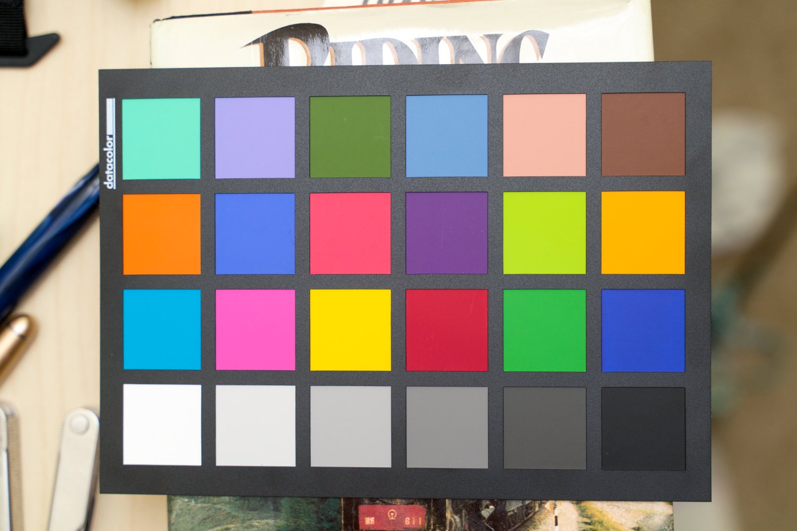
There are currently (August 2013) one hundred colours available in the standard series from Diamine. Below I have written one line with each colour first on low-absorbent paper (Rhodia No 18 dotpad) and second on normal absorbent paper (our corporate printer’s stock “cartridge” paper). All lines are written with a medium Lamy Z50 nib on a Lamy Safari pen. Apologies for the corporate branding: I do not have blank cartridge stock paper. I hope it does not distract too much from the inks. If you want to calibrate your monitor, the blue and orange colours in the logo are Pantone Blue 072 and Pantone 1375, respectively. There are 25 colours on each sheet so 4 sheets in total. I will write more about the sorting of the ink colours later. For now: enjoy! and I hope this is useful. (And if someone wants to send me samples of the special edition Diamine inks that I do not have, then I will be happy to add them. This is mainly the Music set.) Colour set 1 Low-absorbent paper (Rhodia) Normal absorbent paper (cartridge)
-

Colorverse Anti-Matter vs A Different Bottle of Anti-Matter : Crazy Difference!
Matthew TWP replied to Matthew TWP's topic in Ink Comparisons
Ahh, I see. 🙂 I should have read your question more carefully! First, I included that grey card because if there's something on screen that people KNOW is neutral, then psychologically, they can make the adjustment and have a better perception of the ink's true color. Or at least, if it doesn't look neutral on their display, they know that they're not getting an accurate representation of the color, either. Most consumer monitors are not factory calibrated to an industry standard, and there's no way to match two monitors' colors from a single point of reference (a neutral grey)... even 24 standard color swatches aren't enough for some people's needs. For photographers and other graphics professionals there's a common way to calibrate monitors so that they all show the same thing. As a photographer, I use a monitor calibrator, which hangs down from the top of my monitor and reads the color from the center of the screen during calibration, and the software that goes along with it adjusts the color output from the GPU to match an industry standard. (I use a Datacolor Spyder Elite 5, which is at least a generation old now, but still works just fine. They used to cost about $100, but prices seem to be going up.) As A Smug Dill mentioned, that does sometimes also require making some adjustments to the brightness and contrast of the monitor (you'll usually get a wizard on screen to help with that) to reach the industry standards, at least to get to the best starting-off point for the software to work from. Most of the work is done by the software, and the calibration process can take a half hour or more, as it changes the colors displayed on the screen, reads them again, makes adjustments, reads again, etc. When you're finished running the calibration software, it will give you a report about how accurate your monitor's color is and how much of the sRGB and/or AdobeRGB gamut it can display, and your graphics card / GPU will load those profile settings every time your computer starts. I calibrate once a month, but there usually isn't much change, if any. -
Different monitors display colors differently. Depending on the monitor and software, there may be ways to adjust for more accurate color. Camera and lighting also affect color rendition. Here is an article on adjusting color on a mac (I can't test it because I don't have a mac): Calibrate mac monitor Somebody on FPN in their ink reviews posted a grey scale for adjusting the brightness of your monitor to match theirs.
-
"Changing contrasts" is probably the last thing you want to do. If you are intent on accurate reproduction, you need to calibrate both the monitor and the scanner so that /they/ correct for imbalances in the lighting. Unfortunately, Monaco EZColor was discontinued decades ago. It provided functions for calibrating printer, scanner, and (rudimentary -- unless one purchased the $$$ hardware unit) monitor. One would print a special target file (note: one had to develop profiles for EACH paper used on the printer), attach a provided film target below it on the paper, then scan the print/film together. The software would first calibrate the scanner using the film image (since it "knew" what each color square was supposed to be), and then with that correction table it would develop a profile the ink/paper printed version. Monitors were usually a case of first setting the white point. Many monitors ship with an unset (~9500degK) white point (which is a rather bluish and bright setting). Photograde monitors are commonly set to something like Daylight (around 5500degK), "Cloudy" (around 6500degK -- yes, cloudy days have more blue), or Tungsten (~3400degK, red-orange). Then one has to adjust the gamma curve -- Software presents red, green, blue squares in which part of the square is middle-shade (Monaco used a large M), and the rest of the square is alternating lines of full color and black. While squinting at the monitor from a distance, one adjusted the drive so that the alternating color/black blends into the mid-tone. Having harangued you'all with that. Instead of CONTRAST adjust you want to work with (In Photoshop: LEVELS layer). Use the middle eyedropper (grey -- actually for white balance), locate a portion of the scan that is supposed to be neutral (any true grey other than pure white and pure black) and click on it. That will shift the color balance to remove any tint bias from the scan. The next two steps would be to use the white eyedropper (highlight) and click on something that is supposed to be full white, and the black eyedropper (shadow) on the darkest shadow. Those two will adjust the spread of brightness levels to the full span (hence, will tweak contrast). The last steps would be to move the gamma slider -- which will shift the mid-range brightness, and then tweak the output levels (at least one guide suggests setting output to 5 (blacks) and 250 (whites) -- which would mean you do not have full black and whites in the output/saved image; apparently they are considered "ugly" in prints, 250 means the whites get a very light speckling of dark, ...)
-
Colorverse Anti-Matter vs A Different Bottle of Anti-Matter : Crazy Difference!
Matthew TWP replied to Matthew TWP's topic in Ink Comparisons
Sorry that I didn't see these questions earlier... apparently I need to update my notification settings here. Color calibration is a pretty big topic, and of course, it's pretty useless unless everyone involved has calibrated monitors so that they're all seeing the same end result. For the type of work that I do, I have to keep my monitor calibrated anyway. Anyway, there is a relatively simple process for getting accurate colors, but you can't do it with just a grey card. (A grey card will get your greys neutral at one particular tonal value (128,128,128, for example), but darker or lighter tones might be tinted one way or the other.) Here's what you need: You need a grey card to set the correct exposure and white balance (this isn't absolutely necessary, but it makes things easier). You need a color checker card to calibrate the colors across a large section of the color gamut (and white balance, if not done with a grey card). You need to shoot RAW files in your camera so that you can adjust the colors without loss of data (color relationships). You also don't have to worry about the camera's color balance this way, since no color balance is baked into the image file. You need consistent, high quality light. Sunlight is great but hard to work with, so studio strobes are ideal for stills, or high CRI LED video lights for video. (CRI is Color Rendering Index) You need calibration software. The process is this: You set up your light source and use the grey card to get the perfect exposure for medium grey, and set your camera to manual exposure and fix the exposure there. Under the same light source (same distance, etc) at the same exposure, take a photo of the color checker. Then, under the same light, take your photos of your ink or pens, etc, and load all of the images onto your computer. Depending on what calibration software you use, the process from here may be a little different. Most color checkers come with their own software (X-rite, Spyder, etc). I use a calibration software called Lumariver, and sometimes Spyderchecker. In any case, you load the photo of the color checker into the software, and it detects the color patches, and adjusts the color settings of the image to match the calibration standards, making the colors perfect for that image... or as perfect as possible with a 24 patch color checker. There are color checkers out there with hundreds of patches, but since I know that most people who are viewing my images do not even have calibrated monitors, I can't justify spending the money on one 🙂 Anyway... then you output the color settings from that image as a color profile, and then apply it to all of the other images taken in that shoot, and they will also have perfect color. I use a little one like this: Technically, you'll need to create a profile like this for each lighting situation (natural light, LED light, tungsten light, etc) and for each lens, since each lens will render colors differently. But if you're always shooting your pictures that need to be calibrated with just one light setup with one lens, you can just do this process once, though you will have to set the white balance in Lightroom or whatever software you're using as an editor. (Of course, there are a lot of things that you can do after the fact to mess with the colors, so just because they start off accurate doesn't mean they will stay that way if you start adding saturation or playing with the curves or adding exposure, etc. ) So, it takes a little time and money, but there's nothing difficult about it. Let me know if you think it would be helpful for me to make a video about this sort of thing. Good luck!
-
The ‘Right’ Way To Do Ink Reviews To Serve One's Curiosity And Interests?
Intensity replied to A Smug Dill's topic in Ink Reviews
I love your reviews! Thank you so much for making them! Especially enjoyable are those broad-nibbed sample writing pages at the bottom with the Lord of the Rings passages. I don't usually use such broad round-point nibs, but your printing style works very well with them and shows off inks in a flattering fashion. In terms of calibration, this is such a difficult topic I use a BenQ SW2700PT photography-oriented monitor with high gamut and built-in calibration software to use with a dedicated colorimeter. I too calibrate periodically, but still, there's never guarantee that our cameras and scanners get things exactly right. And when I look at my reviews on my other monitor, my phone, and my iPad, the results differ. I now try to get a middle ground between what I like on my calibrated monitor and on my iPad--aiming for something more average. Can't help anyone who's reading reviews on uncalibrated, cheap monitors that are set to very blue white point and using browsers with no color management. Even making effort on the starting point, I know everyone else is going to see something different on their end than what I see on mine. -

A Vey Handsome Custom Heritage 92 - Blue
BaronWulfraed replied to Eric2018's topic in Fountain Pen Reviews
Off-hand, first comment would be to find out if you can calibrate the monitor https://www.digitaltrends.com/computing/how-to-calibrate-your-monitor/ (Strange -- I don't have that three-bottle set; I have three other sets. Otherwise I'd have compared the photo to the actual bottles. Is it a fairly new ink-set, or did I miss a release some four years back?) On my monitor (Dell Ultrasharp Adobe RGB gamut for photo-editing, rather than consumer sRGB gamut) the pen image is, as described, a bright Sapphire blue, similar to the synthetic stone in my HS class ring. The ink bottles: Syo-ro shows a hint of green, ama-iro is blue, and fuyu-gaki is a bright red with a hint of orange. I did find a review that indicated a touch of cyan in the ama-iro. -
Yes sorta. I can color correct my images and scans ... but the corrections are adjusted to MY monitor which I am correcting them on, not some universal generic RGB configuration. And there there is SD and HD, and even the material cabling is made of will impact quality, as will if something is shielded or not (bother network and HDMI/RGB cables.) Go to a big box store. Go to the TVs. You'll see all of the tvs are slightly different. Go look at computer monitor section. Pay attention to the reds. All slightly different. About the only thing YOU can do is order a color correcting set for both scanner and monitor and calibrate your monitor to both color cards and grey scales. But even so, that only solves 1/3 of the issue. The other third being the OPs optical gear/monitor and lastly the compression algorithms and methods used by any given site/host. I have a medical issue with my dominant eye (Central Serous Retinopathy.) It effects me thusly: I can see blue-blacks on screen and tv. In real life it only appears black to me. This happens with BB 4-B, MB Tolstoy and others. Instead of being snarky I just give the ink to the Inksters, or someone else I know would enjoy what I cannot see. I guess I would just like to say I appreciate the care, time and effort she puts into reviews. She and I have a lot of similar tastes in inks. If you don't like them, maybe you ought not click on reviews started by her.
-
desaturated.thumb.gif.5cb70ef1e977aa313d11eea3616aba7d.gif)
Weird Question About Copying Fountain Pen Ink Colors Onto Printable Word Documents...
A Smug Dill replied to TestTube's topic in Inky Thoughts
Are you talking about colour of the text as rendered on your electronic display of choice (whether that's a monitor, a tablet device, or whatever), or colour of the text when you print the document out (even specifically on your choice of paper)? Changing the colour of the text on screen is easy; whether whichever RGB values you enter closely match your perception of how an ink looks on your choice of paper is a different issue. To get that awesomeness, you need to calibrate your monitor for colour rendition, as well as obtain RGB values for what you deem to be a representative sample of your writing with that ink; you cannot rely on the ease, convenience and cost-effectiveness of just taking some values others have determined from their samples. Get a monochrome inkjet printer you can afford to mess with (or mess up), replace the cartridge with one you filled with whichever actual fountain pen ink you want to use, and have at it. You cannot get more real than that, if it's the output you want. -

The ‘Right’ Way To Do Ink Reviews To Serve One's Curiosity And Interests?
mountainofink replied to A Smug Dill's topic in Ink Reviews
This has been a very interesting discussion to read! As someone who reviews inks, and uses 3-4ml per review, I thought I would share my process a bit to answer some questions. The first thing I do when I get a sample is ink up a pen to capacity-usually up to 1ml of ink depending on the pen. I will then use that pen daily for a month to get a good sense of how the ink behaves over time, including copying a full page of writing from whatever novel I'm currently copying (right now it's The Fellowship of the Ring). I say a month because the pen is usually empty by that time. Next I use about 1ml creating swabs and ink drops. I know some consider these to be a waste of time and ink, which is fair-they aren't generally a great characterization of the ink as a whole, but they are the most requested by readers so I still create them. To test the ink on different papers and nibs I ink up 4 Pilot Vanishing Points in EF, F, M and B, as well as a flex pen. I use these pens for every ink review so my writing samples are consistent-this takes about 1 1/2ml of ink. Then I write 4 lines with each pen to make sure I have the correct saturation before starting on my writing samples-I found that if I just dip the nib the results are not the same, generally too dark or less shading and too much sheen than you would see in average use. I do dry tests and water tests not because they apply to me personally, but because readers have requested them. From start to finish each review takes me about 4 hours of time. To ensure color accuracy I do calibrate my monitor weekly, use a custom white balance for each image, as well as color-correcting every image in Lightroom. I know my process will be vastly different from the average ink reviewer's, and that's great! Every review provides a different perspective and can be helpful when a reader is looking to purchase a new ink. -
Inky T O D - Oh, The Places You'll Go, Or, Waypoints On The Inky Journey
radellaf replied to Arkanabar's topic in Inky Thoughts
This looks like a fun topic. Been staying away from here, and just occasionally glancing at FB groups, in an effort to save money. It has sorta worked, but this month has been very inky anyway. > You mean there's COLORS???!?!?!?? I sorta started here with Sheaffer's (10 colors?) cartridges and don't think I ever left this stage. Peacock blue, a gray, and a burgundy were added to the line about when I started (late 80s?). I was in love with what happened when I ran out of green (the cartridge, not draining the feed) and then popped in the peacock, or vice versa. The French teacher reading what I wrote (high school) wasn't thrilled, and FPs weren't ideal, and I had a love affair with UniBall Micro when it came out, but I never gave up the FP. It was a clear Sheaffer cartridge (flat top) model so you could look at the ink slosh back and forth. So that's another thing: ink that looks cool sloshing. The best ones are too light to write with, but dark oranges and lighter reds work. The pen leaked in the cap at the slightest jolt like dropping it on the desk, and the ink spread too much on the loose-leaf paper, but I always figured "one day I'll get a real pen and it won't do that". Mostly I got better paper and quit jolting my pen. By college I had rows of boxes of ink in ALL the colors. As in, the seven or eight Watermans, jars of the Sheaffers (incl Kings Gold), Pelikan, and some others like Omas and I think Herbin's complete line of 12? 16? Noodler's wasn't out for another 4 or 5 years, Diamine I guess had over 50 but was more or less unknown, and when PR launched I got I think all of them and used them despite all the silt in Hot Pink Bubblegum. You can't really do that now. Get all the colors. Not that it isn't tempting. I'm creeping up on diamine, 5 or 10 30mL bottles at a time plus maybe 20 80mL. I am NOT going to go nuts on Robert Oster. Too expensive and too many. Iroshizuku, once it went down in price, my 4 bottles became most of them. > Blackest Black EVAR!! Only pursued this as a part of the above. I mean, I had Aurora very early on, and Perle Noir, so it wasn't like I was really hoping for an ink any closer to being as black as midnight on a moonless night. What do I use? Well I have HoD inked in the Preppy it came with and it's fine. It's not coal dust black, but good enough. I had Quink for a long time. Extra black as it was in a pen that would evaporate ink over a couple of months, and I twice topped up the converter with more ink instead of distilled water. Perle I had inked, but I like to leave ink for a year or more, and the "new" Herbins have gotten SitP too often. The B has no S, still, so I might ink that up when I'm writing a lot and plan to use it. Really, though, and I know there's a lot of people who disagree, but for a fountain pen I think black ink is a bit of a cop-out. It's just not interesting. Grey is more so, but if it's at all neutral, then to me it's just watered down black. I hate inadequate blacks and (Pelikan) wimpy reds. The only Iroshizuku I never plan to buy is the black, though it's about on par with the really light colors like rice ear or the near invisible blues or purples that might be fun to doodle with but would be frustrating to read. I had a topic about do you feel guilty writing a letter in black ink. I pretty much do, if it's the whole thing. I haven't done my job if a letter doesn't have some color of ink from the 50+ pens I have inked, at least 40 of which would write without having to do anything. > Brightest Colors EVAR!! Yeah, yeah, started here (and was very frustrated in the 80s) and never left it. Montegrappa Fuschia the newest discovery. BSB, of course, but it really fades to normal brightness fast when exposed to light. R&K Solferino is another favorite. Saguaro or Cactus Fruit. Earliest eye-searer was a Herbin, maybe Rouge Cyclamen? > My writing shall be preserved for EVAR!! Don't think I was ever really into this one. I have enough inks that qualify including at least a dozen Noodlers that are more whatever-proof than is good for them. Used KtC for a good while (love that smell). All the Platinum Classic IGs but Khaki. Pilot's Blue-Black, and Black are pretty permanent. I'm a bit disappointed by inks that run away from the page when it gets too humid but I have always used them anyway. Except for envelope addressing, I don't worry about it. My writing will be thrown away or lost long before the ink fades unless someone leaves it all out under the sun, or office fluorescents for months on end. Paper is very much not for EVAR. Nor is digital, but I bet, if we still have the internet, you'll be able to dig up stuff I wrote on it long after the paper is gone. Unless I write that novel I keep meaning to, partly as a way to use some of the gallons of ink and dozens of reams of paper hanging around here. Even then, there's published books I can't find anywhere so that's no guarantee. Oh, and if you want your writing to last forever for posterity, vs writing documents that you don't want forged? USE A PENCIL. Graphite is not going anywhere on its own, and if somebody maliciously wants to get rid of my writing they can just get rid of the sheet it's written on vs trying to erase pages of my notebook and say "HA! I did it! Nobody shall read what he writ!" First was told that in a field biology class I took at a museum over a summer, as a... probably 10-12 year old. If you might be dropping your notebook in the swamp, then write in pencil. I also learned how many places a tick can find to settle upon one's person, and decided that I might prefer electrical engineering to biology. Tho I still kinda wonder if I should have done chem E and tried to work on ink chemistry. More likely inkjet than FP, but still (and yeah I do sometimes use printer ink in my pens, but it tends to feather more than I like. Darn resistant to clogs, tho.) > I'm in love with ! Always and often. Hated, hated, hated brown ink. Stared at that bottle of Sheaffer Brown like "why do I wanna write the color of … dirt?" Last year? Both the Iroshizukus, at least half a dozen Noodler's, filled out most of the Diamine browns. And orange, shortly thereafter, same deal. > Quest for the perfect . Not really, I don't think. Had a yen for a match to Berol rollerball green that Ku-Jaku comes pretty close to, or any number of Robert Oster blue-greens. But, no, more often I get nutty about collecting variations around a color "I'm in love with" than looking for one to settle down with. I do kinda think Diamine Sherwood Green is a perfect green, though. Pilot or Noodler's for blue. Sheaffer red, or maybe Diamine Oxblood (or is that burgundy?) or Red Dragon. Fuyu Gaki perhaps for orange, or PR Orange Crush if I could ever figure out what it's supposed to be - bright or burnt orange? Just Diamine plain Orange is good too. Or, a mix of R&K Helianthus and Fernambuk somewhere around 1:1, or 2:1 favoring the red. Purple I have no idea. Cross? Solferino? Turquoise: Kon Peki (not too light). Brown? OMG, don't ask, but I might just stick with the old Waterman Havana Brown (I am _not_ calling it Absolute or whatever the silly new names are, but especially for Havana.) Burgundy? Ugh, I love and hate this color, especially the middle of the road like Diamine Syrah. Oxblood is great, though. Or some mix-my-own with Sheaffer red and some other blue or purple added. Waterman brown + sheaffer red, alas, changes color within months back to pretty much brown. I know there's a great dark reddish purple but can't think of one. >Oooooh, shady! No, no, no, no, and... no. Yeah, I'll get it with orange and green a lot, but it always bugged me with that first Sheaffer cartridge pen and it still is more likely to bug me than seem pretty. Defect, not feature. >Oooooh, sheeny! That generally means I left the pen too long and the full converter is now down to 20% or less. Happened with Penman Sapphire, of course, with only a few days evaporation in my first Sonnet (worst sealing pen EVAR, short of maybe the Noodlers Nib Creeper even if you _do_ seal the hole). Now I have a bunch of sheeny Diamine bottles just waiting to be tried. Maybe they'll work. IDK if it's the weather here or what, but even on Rhodia and Tomoe I hardly ever get sheening. That I prefer nibs around a Pilot F (or M, at worst), and like a 4 out of 10 for flow, probably doesn't help. Also not a fan of smearing after a day's drying time. > Oooooh, subtle! Sure, sure... collect enough ink, go through enough "I'm in love with", get tired of enough "wow, that's really PURPLE", and it comes to this. Now, Poussiere de Lune was probably my first subtle, so dusky purple is my first subtle love. Now, it's probably Sailor Rikyu Chai. Tho I am seriously not happy about their new greedy ink pricing. Then again, I have a 50mL bottle, so I am probably set for life unless I really go wild with it (like writing that novel). The last bottle I got anywhere near the bottom of was an old Osmiroid Blue I used with a steel crow's quill nib in high school to write history essays. I _did_ finish a Bic Clic ballpoint in high school, too. Essays for that same teacher, different class. Lowest bottle now is Noodler's Yellow and Waterman Florida Blue, mostly from mixing in vials that are still about as full as when I mixed them. That blue really doesn't hold up in some mixes. Anyway, it's really rare to find a truly subtle ink. Sailor Sei-Boku maybe, in that it's blue or teal depending on paper. Never really mixed a subtle one. Dunno that dusky purple really counts, but I do like it. Brown is probably the most promising color to become subtle. REALLY tough to make a greenish brown that's not disgusting, though, so Rikyu is something special. > I just want it to work! Nah. I mean, I do, but I have plenty from all the other accumulation that if I'm not in the mood for "interesting", I can just use any Iroshizuku. If the paper isn't (bleep), most of the non-waterproof Noodler's (possibly 80/20 with water). R&K is pretty much universally good. Pilot, have huge bottles of the Black, Red, and Blue-Black, and if a pen/paper won't work with those, well then, there's something seriously wrong with it. I am the least like: someone who finds a black that works (MAYbe a blue or blue-black too) and just sticks with it. Still, my best FP convert was a Cross Solo F (Namiki nib I think, awesome pen, bit boring but bulletproof) and Aurora Black. He was a BP/RB guy, but also very anti-waste, so loved the idea of only throwing out (recycling) one glass bottle every year or so. Dunno if he's still using that pen and ink. Boring combo, but I respected it. As a convert. If you're making a hobby of pens, then c'mon (yeah, I know, you _can_ make a hobby of just the pens and ignore ink &/or paper). If I had to add an Inky Waystation, now that there's many mfg with over 30 colors out there, it's pure acquisitiveness or "ooh, pretty!". Diamine has got me every time there's a new release, even if I have a half dozen sheeny new ones and a rack of Guitars I haven't even swabbed most of. There's a sale on R.O.? Gimme. Colorverse has a Whole New Line and they're not $30 each? Please, 5 bottles, no questions asked. Biggest frustration that I had to let go of: Ink is not a precision color-matched product. FP ink. Printer's ink I guess you can buy guaranteed to match a Pantone number or something. But ink? No. You can not have a sample library that's canonical. Even Iroshizuku, I have at least 4 colors that my 2012 samples don't match my 2018 bottles. Doesn't match the computer screen? (yeah, of course, what does...) Doesn't even match itself. Not reliably, anyway. If you love a color, stock it up. It might be made the same way for decades, or it might not. Then again, does it matter? I usually get bored of a color halfway through a converter (remember, dry F nibs) and add some yellow, or blue, or a different teal than the teal I'm using, or whatever. Lot of ink isn't the same color on different (perfectly white) paper, for that matter. No idea why _that_ is. Dyes changing from paper pH? I think I gave up on this both from the samples, and from a bout of trying to print photos at home and color calibrate a monitor with a Canon i960 inkjet. It was fun for a while to play with the tech, but ultimately just soured me on the whole enterprise. Now I generally just send the pics out to Walgreen's and pick them up later. If I ever print anything at all any more. Fun. It's gotta be fun. If it's not fun, I pick up a UniBall micro or an Inkjoy ballpoint until I get bored and FPs are fun again. -
I've read about the sludge issue with mixing "incompatible" inks, but from what little I've heard this is usually obvious right away rather than something that occurs slowly after you put the ink in a pen. Of course this is just what I've heard and I don't know how much experience it's based on but it has to be based on more experience than I have Also I had guessed that certain inks/dyes were probably "stronger" than others which is what I was trying to say in the following extremely cryptic sentence: "From a little messing around it sort of looks like there's a nonlinear relationship between the ratio of inks used and the resulting color, or at least my perception of it. I wonder if this is true and if it is whether it differs from ink to ink." So from what you guys have said it sounds like trying to predict the outcome of mixing any two totally arbitrary inks (even ones that you have good absorbtion spectrum data on) isn't possible. Any digital tool would probably need to be limited to trying to predict the outcome of mixing certain known "well behaved" and well understood inks that have been carefully studied by someone with a photospectrometer. Regarding monitor color calibration issues: I mentioned that in the original post. Basically the idea in most operating systems is that you have "color profiles" for input devices (scanners for example) that convert the input devices color space to a standard device-independent color space called "sRGB". You then have things like monitor drivers and printer drivers that contain profiles on how to convert sRGB to the color spaces of the monitor or whatever. Of course this doesn't entirely work because there are different methods of converting between color spaces. Basically the out of gamut colors can either be "clipped" or reinterpolated to spread them over the new range of possible colors. It's also possible to either adjust or not adjust for the white point of each color space. Anyway, this is really more of an issue when going from camera -> sRGB -> monitor, and camera -> sRGB -> printer because you have several places to lose information and pick up distortion: camera -> sRGB conversion, sRGB -> monitor conversion, monitor -> sRGB "conversion" (meaning someone adjusts the image to look right on their monitor which for various reasons might not be representing sRGB accurately), and finally sRGB -> printer. At each of those boundaries you're converting from one color space to another, and you will drop or distort information at each one even if everything is calibrated exactly. In this case what we'd be doing is going from monitor <- sRGB -> ink formulation. Any tool like this would have to assume that the monitor is accurately calibrated to represent sRGB, which not-by-coincidence just happens to match the color gamut of most monitors. The fact that Pantone sells a device with software for $90 that does nothing but calibrate your monitor to properly represent sRGB is a testament to the fact that most monitors aren't actually correctly representing sRGB for whatever reason, be that due to incandescent light in the room or peoples' crazy brightness/contrast settings. It might be possible to have the user calibrate the monitor -> sRGB conversion, for the tool's purposes at least, by adjusting some sample cyan, magenta, and yellow swatches in the tool to match what they see when they use a brush or q-tip to apply their unmixed inks to white paper, essentially saying "the cyan looks like this on my monitor" etc. And of course if someone is REALLY serious they can spend $90 on the gadget to precisely calibrate their monitor's color profile so that it represents sRGB exactly, but the simple answer is that this problem isn't as difficult as color management for digital photographs or scans of ink swatches because there are fewer places where color space conversions need to happen. Since sRGB <-> monitor conversion shouldn't be that lossy, the only really difficult one should be sRGB -> ink formulation. However I wasn't really going for something as exact as pantone. People using this would have to accept some error and be willing to adjust, it's just a question of how close you can get without fancy equipment. I don't think the sRGB -> monitor issue is necessarily as bas as you think, and most likely the variation introduced by different papers, pens of different wetnesses, etc are worse than the sRGB -> monitor distortions. We're talking about fountain pen ink here and not carefully calibrated offset presses So anyway, I admit that I don't really know much about this stuff, especially the chemistry and physics aspects. That's why I posted the message, looking for other people who do to comment. I also know the whole idea isn't entirely crazy because Pantone and others have similar software for formulating lithographic ink and paint for your house, though it sounds like trying to do this for any random ink that someone has laying around is crazy even if they do have a photospectrometer sitting around. In fact the inks needed might have to be specially created for the purpose. Then again some guy did create a tool for predicting the outcome of mixing dyes (as Limner pointed out, thanks!) that weren't specially created for use with a software tool. The guy with the dye mixing tool says he'll add data to his tool if you mail him dye samples, so I might mail him some ink and see what his tool does with the data. Based on that I might invest more effort but for the time being it sounds like just experimental ink mixing is probably more practical than trying to use a mathematical model, especially if you don't want to limit your mixing to a really well understood set of 4 inks. On a related note: I'm afraid I might have offended some people by saying that I felt that what I was doing was "silly" when I was mixing drops of ink to see what would happen. I apologize for that, I didn't really mean that literally in fact I now have a new appreciation for just how difficult it is to predict the outcome of ink mixing. (At first I thought it might just require some simple linear interpolation of RGB values but that's obviously not the case at this point
-
Please take a moment to adjust the brightness & contrast of your monitor to accurately depict this Gray Scale. As the patches are neutral gray, their colour on your monitor should also be neutral gray. Mac LINK WikiLINK http://www.wikihow.com/Calibrate-Your-Monitor Figure 1. Gray Scale. http://i783.photobucket.com/albums/yy116/Sandy1-1/InkyThoughts2010/INK576.jpg Figure 2. Swabs: Waterman Florida Blue. Diamine Twilight Blue. Swatch: Drawn with the Pelikan + 1.0. Paper: HPJ1124 24 lb. Laser Copy. http://i783.photobucket.com/albums/yy116/Sandy1-1/InkyThoughts2010/Ink%20Review%20-%20Diamine%20-%20Twight%20Blue/INK876.jpg Figure 3. NIB-ism LINK Depicts nib line-width and pens' relative wetness. WRITTEN SAMPLES: Moby Dick Row Widths: Narrow nibs: 6mm. Other nibs: 8mm. Figure 4. Paper: HPJ1124. http://i783.photobucket.com/albums/yy116/Sandy1-1/InkyThoughts2010/Ink%20Review%20-%20Diamine%20-%20Twight%20Blue/INK882.jpg Figure 5. Paper: Rhodia. http://i783.photobucket.com/albums/yy116/Sandy1-1/InkyThoughts2010/Ink%20Review%20-%20Diamine%20-%20Twight%20Blue/INK883.jpg Figure 6. Paper: G Lalo, Verge de France, white. http://i783.photobucket.com/albums/yy116/Sandy1-1/InkyThoughts2010/Ink%20Review%20-%20Diamine%20-%20Twight%20Blue/INK884.jpg Figure 7. Grocery List Paper: Pulp. One-a-Day calendar page. http://i783.photobucket.com/albums/yy116/Sandy1-1/InkyThoughts2010/Ink%20Review%20-%20Diamine%20-%20Twight%20Blue/INK885.jpg OTHER SAMPLES: Figure 8. 'HAPPY!' on Glossy Card.Smear/Dry Time on Glossy Paper.Smear/Dry Time on HPJ1124. Wet Tests on HPJ1124.http://i783.photobucket.com/albums/yy116/Sandy1-1/InkyThoughts2010/Ink%20Review%20-%20Diamine%20-%20Twight%20Blue/INK877.jpg GENERAL DESCRIPTION: Type: Dye-based fountain pen ink.Daily writer? Possible.A go-to ink? When one is oh-so-tired of Blue.USES: Limited by bleed-though and show-through on HPJ1124 - a good quality 24 lb laser copy paper.Business: OK for just about anything that does not demand Blue / Blue-Black. Not so useful for mark-up / editing - lacks zip.Does not suit error correction or grading of assignments - lacks zap.Requires dry writers or dry/robust papers.Illustrations / Graphics: Possible if one is careful - it is not Blue. If there needs to be a greater increment between Black and medium Blue, this would be a good choice. Requires dry writers or dry/robust papers.Students: Nope - bleed-through & show-through make Twilight Blue a risky choice on inexpensive papers / writing both sides of the sheet.Personal: Very iffy. It is decidedly dark, and seems to suppress a potentially interesting colour. The darkness really does not appeal to me for personal correspondence - and that's Ms Blue-Black speaking. If I were to receive a letter written in Twilight Blue, I would think that the writer and I were on the outs. This ink could be used with any shape of nib, which may be necessary for personal correspondence. PHYSICAL PERFORMANCE & CHARACTERISTICS: Flow Rate: Nice. Did well on the G Lalo.Nib Dry-out: Not noticed.Start-up: Immediate.Lubrication: Good, real good.Nib Creepers: None.Staining: Not noticed in the short-term. (3 days)Clogging: Not seen. With the good flow clogging seems unlikely, however, the Waterman (Pen D) density faded, but that appears to be a thing with the pen - just can't keep up.Bleed Through: Yes.Parker 25+XF on Pulp; and Parker 25+XF, Waterman+M, and Pelikan+1.0 on HPJ1124.Show Through: Yes.Pulp & HPJ1124.Feathering / Woolly line: Imaginary, but line-width can be 'plump'. Smear/Dry Time (Figure 8) Glossy: 10 - 12 seconds.HPJ1124: 10 - 12 seconds. Water Resistance (Figure 8) -3- on the 4S Scale: "All legible, but either very faint and/or has heavy staining from re-deposit of soluble dye. Needs recovery/restoration for anything beyond personal use."Smell: Very faint.Slightly tart. Hand oil sensitivity: None noticed.Archival: Not claimed.Clean Up: Fast and thorough with plain water. Mixing: No stated limitation.Only for personal use, I would lighten the density through dilution. THE LOOK: Presence: Very much in the background.It does not seem to seek-out and engage the reader.Although the colour is interesting, it is soon overlooked.Saturation: High.Shading: Not so much: rare & elusiveHiRes Scans: Safari+M on the HPJ1124: LINKPrelude+B on the Rhodia: LINKParker 25+XF on the G Lalo: LINK Variance depending on pen+nib combos used: Not so much - typical of such a dark ink.Looks similar regardless of paper & pen. FIDELITY: Is the name appropriate? Nope. (Again!)Someone needs to find their 'A Game', friend-o.Are swatches accurate? No swatch on packaging. Tsk TskSomewhat consistent with online Diamine swatch. LINK http://www.diamineinks.co.uk/showproducts.aspx?catID=14 SIMILAR COLOURS: The resemblance to the Rohrer & Klingner 'Verdigris' is striking. (More on that later.) PAPERS: Lovely papers: Crisp brilliant white paper. The warm tint of the G Lalo VdF white is very good-looking.Trip-wire Papers: Those that cannot prevent bleed-though and show-through.Tinted Papers: Keep to the not-too-yellow ivory and creams; and pale blues.Avoid the pink/red/orange/violet/purple areas of the colour wheel.Is high-end paper 'worth it'? Mandatory.OTHER THAN INK: Presentation : 80 ml. bottle in a box. No HazMat warnings.Country of origin: UKContainer: A squat square-based, clear glass, slope shouldered bottle, 65mm tall when capped.Difficult to detect ink level.The centred round opening seems snug: 20mm in diameter. Single tank, no sediment collector, no filling aid. Tsk Tsk ... Tsk.The bake light screw cap has adequate grip.The cap is not child-proof.The cap seal seems to be some sort of plastic-coated card. (>_<)Box: 58x78x58mmNicely coated card stock.No swatch. GASP!!Labelled on top. Tsk Tsk Tsk No kidding: useless when inks are stacked, or at/above eye level. Work-around: Draw & affix your own Herbin-esque picture. Eco-Green: OK. All should be recyclable or benign. Availability: Directly from Diamine. (At time of writing.)As time passes, unless there's a recall, it is likely this ink will be available from your Diamine retail outlet.ETC: Majik: Nope. The ink does not have the jump & juice.Personal Pen & Paper Pick: Ooooo - tough one. I like the Prelude on the Lalo: the hard textured paper lightens the density and brings some warmth.Yickity Yackity: Frustrating. Cannot believe it, really cannot.Another new ink, and nothing new.Ah kushbaby, I hope you didn't read this far. <=-+-/\-+=>|<=-+-X-+=>|<=-+-\/-+=>|<=-+-X-+=>|<=-+-/\-+=> MATERIEL USED: To be relevant to most members, I make an effort to use papers, pens & nibs that are readily available. Pens are those for which I paid $100 or less, and are 'factory stock' - not customised. These pen+nib combos were used: Parker 25 + Steel XFPilot Prera + Steel MLamy Safari + Steel MWaterman + 18K MSheaffer Prelude + steel B#Pelikan M200 + g-p steel richardspens Stub 1.0 #Note: Nib is a stock item offered on the richardspens.com site - not a custom nib.For lines & labels: Pilot Penmanship + XF with Noodler's Lexington Grey. On these papers: HPJ1124 24 lb. Laser Copy.Rhodia.G Lalo, Verge de France, white. Pulp.Glossy paper.Glossy card.Images: Scans were made on an Epson V600 scanner; factory defaults were accepted. Figures shown were scanned at 96 dpi & 24 bit colour. Images linked were scanned at 300 dpi & 24 bit colour. Scans were not adjusted, and went straight to the file sharing thingy.Densitometer Readings, FWIW Red 89 Grn 117 Blu 147 Lum 117 -30-
-
You first get yourself a camera with a true 16-bit color sensor. Then you process in a ProPhoto RGB color space on a high-end fully calibrated monitor. Then you post it on the internet and go around and color calibrate every screen that views it. That's a start anyway! My point is that it's not going to be possible to get true color reproduction on an image you're viewing on a screen. Only your eyes are going to see the true color you're seeing. Everything else is going to be an approximation.
-
Please take a moment to adjust your gear to accurately depict the Gray Scale below. As the patches are neutral gray, that is what you should see. Mac http://www.wikihow.com/Calibrate-Your-Monitor Wintel PC http://www.calibrize.com/Gray Scale. http://i783.photobucket.com/albums/yy116/Sandy1-1/InkyThoughts2010/INK576.jpg ~|~I~|~ Ink Review - Monteverde Orange in cartridges. Figure 1. Swabs Paper: HPJ1124. http://i783.photobucket.com/albums/yy116/Sandy1-1/FPN%20Stuff%20-%202011/Ink%20Review%20-%20Monteverde%20Orange/INK069.jpg Figure 2. NIB-ism ✑ Paper: HPJ1124. Depicts nibs' line-width and pens' relative wetness. Link: http://i783.photobucket.com/albums/yy116/Sandy1-1/FPN%20Stuff%20-%202011/Ink%20Review%20-%20Monteverde%20Orange/th_INK068.jpg Pens: L → R: Prera, Waterman, M200. WRITTEN SAMPLES - Moby Dick Row height is 8mm. Figure 3. Paper: HPJ1124. http://i783.photobucket.com/albums/yy116/Sandy1-1/FPN%20Stuff%20-%202011/Ink%20Review%20-%20Monteverde%20Orange/INK071.jpg Figure 4. Paper: Rhodia. http://i783.photobucket.com/albums/yy116/Sandy1-1/FPN%20Stuff%20-%202011/Ink%20Review%20-%20Monteverde%20Orange/INK072.jpg Figure 5. Paper: G Lalo, Verge de France, white. http://i783.photobucket.com/albums/yy116/Sandy1-1/FPN%20Stuff%20-%202011/Ink%20Review%20-%20Monteverde%20Orange/INK073.jpg Figure 6. Paper: Royal - 25% rag. http://i783.photobucket.com/albums/yy116/Sandy1-1/FPN%20Stuff%20-%202011/Ink%20Review%20-%20Monteverde%20Orange/INK074.jpg Figure 7. Paper: Staples Creme. http://i783.photobucket.com/albums/yy116/Sandy1-1/FPN%20Stuff%20-%202011/Ink%20Review%20-%20Monteverde%20Orange/INK075.jpg Figure 8. Staples multi use. http://i783.photobucket.com/albums/yy116/Sandy1-1/FPN%20Stuff%20-%202011/Ink%20Review%20-%20Monteverde%20Orange/INK076.jpg Figure 9. Grocery List Paper: Pulp. One-a-Day calendar page. http://i783.photobucket.com/albums/yy116/Sandy1-1/FPN%20Stuff%20-%202011/Ink%20Review%20-%20Monteverde%20Orange/INK077.jpg OTHER STUFF Figure 10. Smear/Dry Times. Wet Tests. http://i783.photobucket.com/albums/yy116/Sandy1-1/FPN%20Stuff%20-%202011/Ink%20Review%20-%20Monteverde%20Orange/INK070.jpg GENERAL DESCRIPTION Type: Dye-based fountain pen ink.Daily writer? Unlikely indeed.A go-to ink? Well, you tell me ...USE Caution: Do not use MvO or similar colours for anything that must be seen under various light sources. e.g. Maps that must be used at night and/or under artificial light.Business: (From the office of Ms Blue-Black.) Maybe mark-up / editing, but only if dribs & drabs of text need to be written. Error correction or grading of assignments.Illustrations / Graphics: Very much at home in this melieu.Not a 'shocking' orange, more of a creme, so could be used at high % coverage and large-ish areas.Line quality is very high, and MvO did exceptionally well on the hard textured G Lalo; lines were plump but crisp on the Royal.Students: Fly at it.Personal: Use your imagination.Perhaps a bit too relaxed for invitations to come fire walking with me.Ditto on both for billets doux.PHYSICAL PERFORMANCE & CHARACTERISTICS Flow Rate: A bit higher than average.Nib Dry-out: Not seen.Start-up: Immediate.Lubrication: More than adequate.Nib Creeps: None. Staining: Not seen after three days.Clogging: Not seen. Bleed- Show-Through: Yes:Royal: Waterman & M200.Staples 20lb. multi-use. Feathering / Woolly Line: Not seen.Smear/Dry Time: HPJ1124: 10 - 15 seconds Rhodia: 30 - 45Staples 20lb: <10Water Resistance: ☂ -0- on the 4S Scale: "Nothing left but wrinkled paper. Recycle."Smell: Cartridges - N/A.Hand oil sensitivity: Not seen.(I would guard against contamination of the writing surface.) Clean Up: Rapid and thorough with plain water. Mixing: No prohibitions, just a gentle query: Are you signed-up as an organ donor?Archival: Not claimed.THE LOOK Presence: About as calm as Orange can be, and still be decidedly Orange.Saturation: A bit lower than expected.Shading: Yes. Oh yes!Variability: Pen+nib combos used: More than expected.[*]Papers used: Much less than expected. [*]Malleability: Middling. Useful.The wily practitioner would choose their writer to set The Look, augmented by selection of the base tint and absorbency of the paper. Hi-Res Scans: As I do not wish to earn the sobriquet 'Queen of The Bandwidth Bandits', these are lynx. Prera on HPJ1124 http://i783.photobucket.com/albums/yy116/Sandy1-1/FPN%20Stuff%20-%202011/Ink%20Review%20-%20Monteverde%20Orange/th_INK078.jpg Waterman on Rhodia http://i783.photobucket.com/albums/yy116/Sandy1-1/FPN%20Stuff%20-%202011/Ink%20Review%20-%20Monteverde%20Orange/th_INK079.jpg M200 on G Lalo http://i783.photobucket.com/albums/yy116/Sandy1-1/FPN%20Stuff%20-%202011/Ink%20Review%20-%20Monteverde%20Orange/th_INK080.jpg Waterman on Royal http://i783.photobucket.com/albums/yy116/Sandy1-1/FPN%20Stuff%20-%202011/Ink%20Review%20-%20Monteverde%20Orange/th_INK081.jpg FIDELITY Is the name appropriate? Its from Monteverde and its Orange. Two for two - that will do.Are swatches accurate? :bonk: Not at all.SIMILAR COLOURS: Hmmm. MvO is not the laughing four-year old of Helianthus; nor does it have the glow of yu-yake.PAPERS Lovely papers: Very much a matter of personal taste.Ran well on all papers used.Trip-wire Papers: None encountered.Tinted Papers: Critical to The Look; choose wisely.Pre-Printed Papers: Forms, etc.Not in my world.[*]For charts & graphs: Easily, but to make the colour more evident, consider running MvO at a high density. Is high-end paper 'worth it'? Very much dependent on absorbency and base tint.OTHER THAN INK Presentation : Eight long (magnum) international cartridges in a box.No HazMat warnings.Origin: Apparently Austria, but not stated.Packaged in USA.Container: Long international cartridge.Box: 52x80x8mmHeavily coated card stock.An adhesive dot masquerades as a swatch. Maybe just an indicator that its not Blue.Ink colour name is printed on the UPC label affixed to the back of box.Eco-Green: Daft.All should be reusable, recyclable or benign.Availability: Increasing.I am not impressed that this colour is only available in cartridges, which are not so very eco-conscious. While the current standard for Monteverde bottles is 90ml, a smaller size for less commonly used colours would be appreciated - not only by me but the Earth as well. ETC. Majik: Not quite enough latent energy for conjuring; but impressive results from those with a fair hand seem possible. Personal Pen & Paper Pick: Waterman on the G Lalo. That would be a great starting point for me; I'd just use 1.5 line spacing to let the ink breathe and to shade the pace a bit; that would also make the rippling of the paper more evident. Yickity Yackity: I really like the creme aspect of this one. It seems rather delicious and wholesome. (I think my tummy just growled.)Ah kushbaby, I reckon you're shaking your head at this one too. Ah well ...<=-+-v-+-=>:<=+-.-+->|<-:->|<-+-.-+=>:<=-+-v-+-=> MATERIEL USED: To be relevant to most members, I make an effort to use papers, pens & nibs that are readily available. Pens are those for which I paid $100 or less, and are factory stock - not customised. Pens: Pilot Prera + steel M nib. http://i783.photobucket.com/albums/yy116/Sandy1-1/Pen_Scans/th_PEN723.jpg Waterman + 18K M nib. http://i783.photobucket.com/albums/yy116/Sandy1-1/Pen_Scans/th_PEN441.jpg Pelikan M200 + g-p steel 1.0 stub nib. http://i783.photobucket.com/albums/yy116/Sandy1-1/Pen_Scans/th_PEN315.jpg Nib is a stock item from richardpens. (OoooLaLa!) For lines & labels: Herbin Bleu Nuit, and HB lead. On these papers: HPJ1124 24 lb. Laser Copy.Rhodia.G Lalo, Verge de France, white. Royal, 25% cotton rag.Staples Pastels Creme 20lb.Staples 20lb. multi use.Pulp. One-a-Day Calendar page._________________________ IMAGES: Scans were made on an Epson V600 scanner; factory defaults were accepted. Figures shown were scanned at 200 dpi & 24 bit colour. HiRes Images linked were scanned at 300 dpi & 24 bit colour. Scans were not adjusted, so went straight to Photobouquet._________________________ Densitometer Readings (FWIW): Red 252Grn 203Blu 125Lum 198__________________________ Fine Print: The accuracy and relevance of this Review depends in great part upon consistency and reliability of materiél used. Ink does not require labelling/notice to indicate (changes in) formulation, non-hazardous ingredients, batch ID, date of manufacture, etc. As always, YMMV, not only from materials, methods, environment, etc., but also due to differences between the stuff in the bottle I used, and that in bottle you may have. Also, I entrust readers to separate opinion from fact; to evaluate inferences and conclusions as to their merit; and to be amused by whatever tickles your fancy. -30-
-
The ‘Right’ Way To Do Ink Reviews To Serve One's Curiosity And Interests?
Karmachanic replied to A Smug Dill's topic in Ink Reviews
Then may I suggest you calibrate your monitor in addition to adding an 11 step gray scale to the review -
The first problem is getting a consistent ink line down on paper. Different pens will put more or less ink down on the paper, so a review by one person will show the ink colour a little differently from a review of the same ink by a different person/pen. Second, different papers will show the same ink differently, even from the same pen. The only consistent way to display an ink so others can get a a reasonably accurate idea of what it looks like is to include a commonly available ink that is similar to what you are displaying, such as Waterman Serenity or Sheaffer Skrip Blue if you are reviewing a blue ink. That way they can compare how their Serenity or Skrip blue compares to what you have on screen, and adjust their eyes accordingly for the reviewed ink. So, if the Serenity (a slightly purple blue) sample looks a little green, and the reviewed ink looks a perfect blue, it will actually be quite purple. Once you have developed a consistent way of displaying the ink on paper ( I use the same FP nib as a dip pen, on the same paper), then you can look at calibrating your scanner and monitor. However, that implies that others have the same monitor and can calibrate it just as well. Don't forget that many papers have UV sensitive optical brighteners in them that certain scanners will activate. This will result in a blue cast that will distort any blue inks you are trying to scan. It doesn't matter how well you calibrate your scanner and monitor, you can't fix that problem.
-
Scanners vs cameras is a "thing" in the art documentation community. Countless threads on the topic. Answer is that both technologies are used. Complicating factor is that some cameras (linear array) are actually scanners - though array scanning cameras are pretty rare these days. Anyway, a pro-quality system of either type will set you back tens of thousands and is totally unnecessary for ink reproduction. Just pointing out that there is no single answer. Scanners tend to have advantages when images contain both very dark and very light material - never mind why. Hmmm, sounds like ink on paper. Scanners can also be cheaper and simpler, because it is easier to control illumination. Lighting control is the single biggest problem with camera-based systems. In sum, scanners are much easier to use, cheaper for a given quality of output, more compact, don't require external lights, and require almost no skill to operate. However, a skilled photographer with decent equipment (studio lights and a DSLR) can make photographs that will be almost as good. Almost. It is easy to calibrate a reasonably cheap scanner (like an Epson V800) to yield accurate results. Various accessories will also let you match the calibration on your monitor and printer so what you scan is what you see and what you print. Remember, it is no use making an accurate scan and then displaying it on an uncalibrated monitor. Like going to an art gallery wearing rose-tinted glasses.
-
The ‘Right’ Way To Do Ink Reviews To Serve One's Curiosity And Interests?
Karmachanic replied to A Smug Dill's topic in Ink Reviews
You may also find it helpful to calibrate your scanner and monitor. In this way you can have confidence that what you post is accurate. Of course including a reference in the review, as you mentioned and as Sandy1 does for example, is very helpful. -
Hello. I'm currently thinking of building an online ink database. The ink reviews on FPN are very informative but there is one technical limitation with ink scans. Our monitors show colors differently. To solve this problem, I'm experimenting with a method to calibrate colors of images. My idea is to let users calibrate colors (in a webpage, not the system/monitor color) to a standard item which everyone has. Bank notes should be the best item for this task. However, as I am in Hong Kong I can not easily get hold of foreign currencies so help would be appreciated. I would like to ask for volunteers from different countries so I can get samples of different currency bank notes. In the first part, volunteers would have to scan the corners of two bank notes of different nomination, send them to me, and then calibrate colors on a webpage which I would send you the link. After that, I would post a link in this thread. Users can then try to calibrate colors and see if they closely match the actual object. Please note that your system settings would not be affected in this experiment. I will just adjust the rgb values in the webpage (with javascript). The experiment is successful if volunteers report that the colors on the monitor accurately matches that of the actual object. I would then attempt to develop a way to calibrate ink scans. Please send me a PM if you would like to volunteer for the first part. Please indicate which currency you are using in the PM. Thank you very much.