

ROBronzeGreenLime
By LizEF
- 367 views
- View LizEF's images
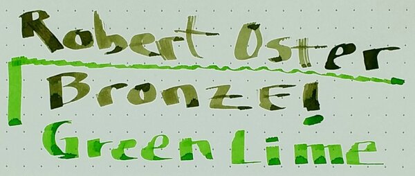
The two together. Lime should be a bit brighter and greener. Bronze should be a bit darker. (Done by dipping a Pilot Parallels pen. Rhodia dot pad.)
- 64.85 kB
- 1000x424
By LizEF
The two together. Lime should be a bit brighter and greener. Bronze should be a bit darker. (Done by dipping a Pilot Parallels pen. Rhodia dot pad.)
Recommended Comments
There are no comments to display.
Create an account or sign in to comment
You need to be a member in order to leave a comment
Create an account
Sign up for a new account in our community. It's easy!
Register a new accountSign in
Already have an account? Sign in here.
Sign In Now