

.jpg.c17eaf8701990e83d6d3fe1d107db740.jpg)
.jpg.2f2b35dc79445bc5de73853c1907202c.jpg)
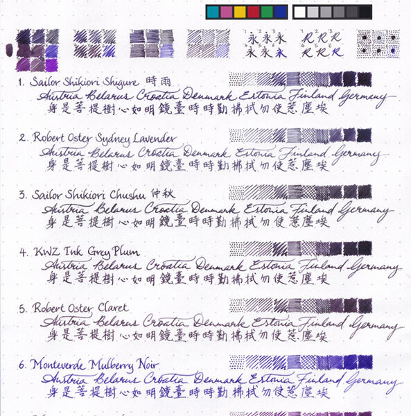
Several magenta inks compared, written with Fine and Stub nibs
desaturated.thumb.gif.5cb70ef1e977aa313d11eea3616aba7d.gif)
By A Smug Dill
- 1,011 views
- View A Smug Dill's images
Some fifteen months have elapsed between writing and scanning this sheet. While I haven't deliberately exposed the sheet to either sunlight or artificial lighting with a view to testing fade resistance, I haven't exactly taken any care to shield or hide the sheet from exposure either; at different times the sheet would have just been sitting in or on top of a pile of paper on my desk, or on a tray or in a box of stuff I put off sorting out.
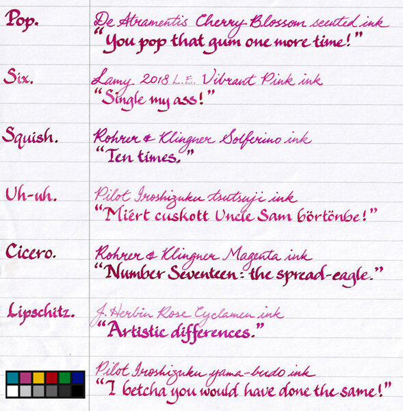
Of the inks on the sheet, it seems Lamy Vibrant Pink has faded the most, relatively speaking; it's particularly noticeable in the “Six.” left of the margin. The colours actually all look significantly lighter/brighter to my eye on the sheet than in the scanned image does on my monitor. I guess it's useful to have the tonal and colour reference patches in the image after all.
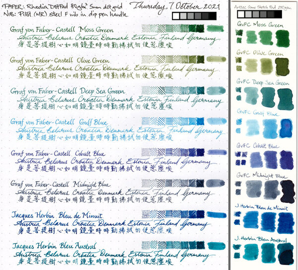
All the writing was done with two pens only — one with a Fine nib, the other a Stub — and so obviously some of these inks are more apt to spread on the page and result in thicker lines being put down with the same pens and strokes.
Copyright
- 200.35 kB
- 648x660
Recommended Comments
Create an account or sign in to comment
You need to be a member in order to leave a comment
Create an account
Sign up for a new account in our community. It's easy!
Register a new accountSign in
Already have an account? Sign in here.
Sign In Now