


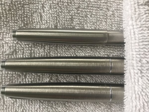
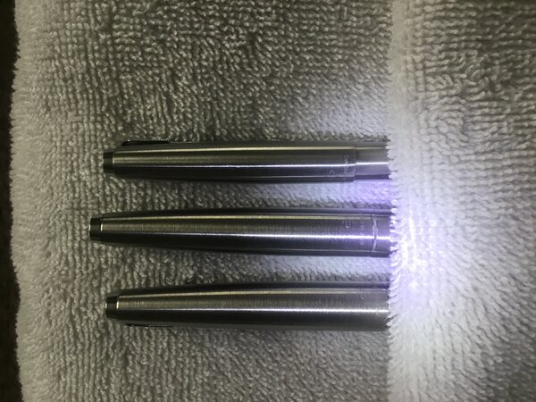
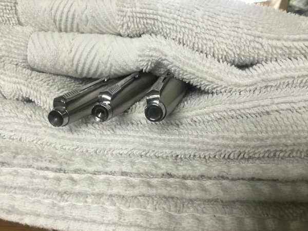
Parker 45 ‘Flighters’ showing their writing-points.jpeg

By Mercian
- 423 views
- View Mercian's images
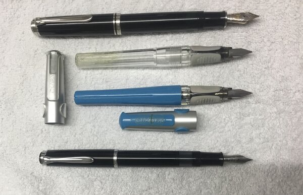
Top-Bottom:
Parker 45 ‘Flighter’ BP
I think that it was made in the late 1960s. Its clip-screw/cap-tassie is one of the ‘inverted cone’ ones.
Note the fine grooves that have been incised around the pen during manufacture to create a ‘grip-section’ near its writing tip.
This pen is the one that I reach for if I want to use a BP.
It is made to a slightly higher quality than my 1991 Parker Jotter, and to a much higher quality than my 2002 Jotter ‘Flighter’. All three of those pens were made at Parker’s factory in Newhaven, but the quality of their manufacture declined along with the fortunes of the company.
The grip section of the 45 BP is also slightly girthier than that on my Jotters, so I find it to be more-comfortable to use.
Parker 45 ‘Flighter’ FP with 14k gold nib
This pen was made in the early 1970s.
This pen has a 14k gold nib that is supposedly ‘M’.
It came to me in barely-used, ‘near mint’ condition.
I have found the nib to be very, very ‘dry’.
Under normal (light) writing pressure its line-width is only that of a Lamy Z50 nib marked ‘EF’.
Under pressure it does ‘flex’ out to give a line that is slightly wider than that of a modern Parker ‘M’, and like the line written by my two Pelikan P480 ‘Pelikanos’ (whose nibs are marked ‘F’).
But the amount of pressure that this nib requires me to apply in order to get it to open up to being wider than an ‘EF’, and to allow any ink to actually flow through it, is profoundly uncomfortable and tiring.
I have not yet found an ink that is ‘gushy’ enough to actually flow out of this nib.
I therefore suspect that it was ‘near mint’ because it is actually unusable as a pen ☹️
Parker 45 ‘Flighter’ FP with stainless steel nib
This pen was made in the late 1970s.
If one places these two FPs’ nibs tip-to-tip, the tipping on this pen appears to be ‘finer’ than that on the gold-nibbed pen above it.
I have though found that it writes with a wider line than my gold-nibbed 45 does.
I would describe its line as a narrow ‘M’, or wide ‘F’.
The steel nib is a ‘nail’, and does not flex at all, but it is a reliable writer that is comfortable to use.
- 2.37 MB
- 1600x1200
Photo Information
- Taken with Apple iPad Pro
- Focal Length 3.3 mm
- Exposure Time 1/30
- f Aperture f/2.4
- ISO Speed 80
Recommended Comments
There are no comments to display.
Create an account or sign in to comment
You need to be a member in order to leave a comment
Create an account
Sign up for a new account in our community. It's easy!
Register a new accountSign in
Already have an account? Sign in here.
Sign In Now