Jump to content

Montblanc Is Lying To Buyers About The Material Of Their Pens - Confirmed


paradigm

Recommended Posts

Not sure if this will be resolved or is actually desired to be resolved.

Latter.......One man's good old advertising hyperbole is another man's major league irritant.....Or they simply don't like the company or products.

Fred
Link to comment
Share on other sites

  • Replies 120
  • Created
  • Last Reply

Top Posters In This Topic

  • Corona688

    12

  • praxim

    9

  • TSherbs

    8

  • Honeybadgers

    7

Top Posters In This Topic

Posted Images

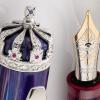
Montblanc grinds the stone to be added to a resin. You can see the same thing on the other pens you mention along with the Schiller cap from the writer's series (which I think is probably the most successful of all these types due to the way it catches the light). If you hold any of them in your hand this becomes immediately apparent. I haven't read anything from Montblanc that suggests these caps are formed from solid stone so I'm not sure what the issue is.


Can you imagine how heavy the pen would be if it were made of stone???

Edited by Shannon

My fingers are always inky and I'm always looking for something new.  Interested in trading?  Contact me!


Link to comment
Share on other sites

Montblanc's brochure states that "only genuine Malachite has been used in its creation". They did not claim, or even imply, that the material is solid carved Malachite.

Link to comment
Share on other sites

Montblanc's brochure states that "only genuine Malachite has been used in its creation". They did not claim, or even imply, that the material is solid carved Malachite.


A reading comprehension problem perhaps?

Add lightness and simplicate.


Link to comment
Share on other sites

What? Misleading statements from a luxury firm? Shocking!


Also in the news today... fire is still hot and water is still wet.


Nothing in the MB literature presented, nor that I have seen, indicates it was solid stone used for any of the pens. They are still attractive looking to me though.

If you want less blah, blah, blah and more pictures, follow me on Instagram!

Link to comment
Share on other sites

Montblanc's brochure states that "only genuine Malachite has been used in its creation". They did not claim, or even imply, that the material is solid carved Malachite.

They are not lying.


Furthermore, malachite is not a precious gemstone. It is quite common. It is used for decorative purposes and doesnt hold value (like diamonds).

Link to comment
Share on other sites

And this, boys and girls, is why I don't buy Monteblanc pens or buy into their hype (with their "precious resin" being marketing-speak for "plastic that will shatter when you drop the pen on the floor"...).

If people didn't buy into the "luxury item" BS that MB spins, they'd have to make more reasonably priced pens. I tried someone's 146 a few years ago and was not overly impressed (as in, the 1960s era Parker 45 I found for under $11 US including tax had a smoother nib, although to tell the truth we're talking an M on the Parker vs. the F on the MB). The guy's 149 did have a nicer nib than the 146, but the pen was way too large and heavy for me. As for the LE pens? Mostly they are overpriced and also kinda tacky looking (if the stripe-y Beatles pen hadn't cost and arm and a leg, I kind of liked it -- it amused me -- but the other one, with the finial designed to look like a microphone? Blecch. Made me wonder if they were aiming at the Montegrappa "tacky is good" customers.

I do like a few of the inks (even, admittedly, a couple of the LE ones -- I'm really happy with the color and behavior of the Beatles Psychedelic Purple, and Tolstoy is an interesting color). But overall? My experience with their products has been "meh"....

Ruth Morrisson aka inkstainedruth

What she said

Link to comment
Share on other sites

Well, surely even an idiot would be able to tell instantly the moment they lift the pen that it isn't carved out of stone? I mean, it has weight, but not that kind of weight. I remember reading the speil about the Schiller and Montblanc were perfectly explicit about how it was formed. I don't see anything in what you've posted from Montblanc that would suggest they are making a claim that it is carved out of stone either.


It was clear from the Schiller literature that crushed amber with resin was used.


With the catalogues shown for the others, the wording is unclear, and I think many sellers do think it is made 'from' rather than 'with' the respective materials. As a buyer, I certainly had thought it was for the Nikolai (a thin tube of malachite does not seem impossible). For the Ramses I was less sure as the colour seemed too consistent.


Haematite and the Granite 1906 are worth considering.

Edited by RSVP
Link to comment
Share on other sites

The real Montblanc crime here is the bloomin nib dry out on those stupid push caps. If that could be corrected the Tzar Nic might just be my all time favourite pen. That's something I can get excited about. Advertising spiel?......not so much.

Link to comment
Share on other sites

@Ruth: +1 all the way! Gaudy overpriced tripe, mainly. Must admit that I would definitely jump all over their vintage and antique pens given the opportunity, though. And loving my Hero H718 has made me want the 1912 that inspired it 😄

Link to comment
Share on other sites

Though I'm far from being able to afford the 1912!


Sucks being a poor college student. But thankfully I live in an era of cheap Chinese pens and the occasional splurge on pens from the expensive locals including JetPens, Goulet, Pen Boutique, and Pen Chalet.

Link to comment
Share on other sites

~ Those Hamburg gnomes have been bamboozling everyone for years!


Whatever happened to ‘truth in advertising’?


The platinum pens I use weren't forged from solid platinum, fresh from the mine.


The 1266 on my writing desk isn't 100% solid silver from cap to tip.


Don't get me started about Montblanc inks. I had such lofty hopes, yet what did they do?


Nothing turns out to be what it was labelled.


Phooey!


I'm in a snit! It's pouting time so I'll put on a grumpy mien.


Toffee Brown doesn't at all taste like toffee. It's more like my Aunt Hattie's molasses.


Burgundy Red doesn't go with anything, not even haunch of boar or opossum tripe.


Oyster Grey...who are they kidding? It's flavor is more reminiscent of Limpet Lime.


Emerald Green has no trace of emeralds in it. After heating and drying, only a dull greyish dust remained. They cheated me.


James Purdey & Sons Single Malt may have the characteristic odor, but after guzzling a couple of bottles, all I got was a stomach ache.


Elixir Parfumeur Wood & Tobacco, and Leather, are both sham inks. No tobacco specks to gum up my nib feeds and not a speck of leather. What's going on?


To the great credit of Montblanc, two of their inks are honestly labelled.


Swan Illusion is indeed an illusion and Mystery Black remains a mystery to me.


Time to toddle off to my solicitors and make them earn their fat retainer.


I demand that Montblanc labels all of its product lines with 100% accurate wording, to meet my discerning standards.


Now, where are my 100% natural, organic, fat-free snacks?


Tom the Easily Gullible


Edited by Tom Kellie
Link to comment
Share on other sites

HEY TOM , YOU JUST MISSED THE 'SKELETON' IN THE 'SKELETONS'

:rolleyes: :yikes:


~ Those Hamburg gnomes have been bamboozling everyone for years!

Whatever happened to ‘truth in advertising’?

The platinum pens I use weren't forged from solid platinum, fresh from the mine.

The 1266 on my writing desk isn't 100% solid silver from cap to tip.

Don't get me started about Montblanc inks. I had such lofty hopes, yet what did they do?

Nothing turns out to be what it was labelled.

Phooey!

I'm in a snit! It's pouting time so I'll put on a grumpy mien.

Toffee Brown doesn't at all taste like toffee. It's more like my Aunt Hattie's molasses.

Burgundy Red doesn't go with anything, not even haunch of boar or opossum tripe.

Oyster Grey...who are they kidding? It's flavor is more reminiscent of Limpet Lime.

Emerald Green has no trace of emeralds in it. After heating and drying, only a dull greyish dust remained. They cheated me.

James Purdey & Sons Single Malt may have the characteristic odor, but after guzzling a couple of bottles, all I got was a stomach ache.

Elixir Parfumeur Wood & Tobacco, and Leather, are both sham inks. No tobacco specks to gum up my nib feeds and not a speck of leather. What's going on?

To the great credit of Montblanc, two of their inks are honestly labelled.

Swan Illusion is indeed an illusion and Mystery Black remains a mystery to me.

Time to toddle off to my solicitors and make them earn their fat retainer.

I demand that Montblanc labels all of its product lines with 100% accurate wording, to meet my discerning standards.

Now, where are my 100% natural, organic, fat-free snacks?

Tom the Easily Gullible


Link to comment
Share on other sites


~ Those Hamburg gnomes have been bamboozling everyone for years!

Whatever happened to ‘truth in advertising’?

The platinum pens I use weren't forged from solid platinum, fresh from the mine.

The 1266 on my writing desk isn't 100% solid silver from cap to tip.

Don't get me started about Montblanc inks. I had such lofty hopes, yet what did they do?

Nothing turns out to be what it was labelled.

Phooey!

I'm in a snit! It's pouting time so I'll put on a grumpy mien.

Toffee Brown doesn't at all taste like toffee. It's more like my Aunt Hattie's molasses.

Burgundy Red doesn't go with anything, not even haunch of boar or opossum tripe.

Oyster Grey...who are they kidding? It's flavor is more reminiscent of Limpet Lime.

Emerald Green has no trace of emeralds in it. After heating and drying, only a dull greyish dust remained. They cheated me.

James Purdey & Sons Single Malt may have the characteristic odor, but after guzzling a couple of bottles, all I got was a stomach ache.

Elixir Parfumeur Wood & Tobacco, and Leather, are both sham inks. No tobacco specks to gum up my nib feeds and not a speck of leather. What's going on?

To the great credit of Montblanc, two of their inks are honestly labelled.

Swan Illusion is indeed an illusion and Mystery Black remains a mystery to me.

Time to toddle off to my solicitors and make them earn their fat retainer.

I demand that Montblanc labels all of its product lines with 100% accurate wording, to meet my discerning standards.

Now, where are my 100% natural, organic, fat-free snacks?

Tom the Easily Gullible


LOL!


... lies everywhere - my english self fillers newer did fill without my help.


Best

Jens

.....................................................................................................

https://www.flickr.com/photos/136145166@N02/albums

Link to comment
Share on other sites

Guest
This topic is now closed to further replies.

Announcements


  • Most Contributions

    1. amberleadavis
      amberleadavis
      43844
    2. PAKMAN
      PAKMAN
      33583
    3. Ghost Plane
      Ghost Plane
      28220
    4. inkstainedruth
      inkstainedruth
      26772
    5. jar
      jar
      26105
  • Upcoming Events

  • Blog Comments

    • Shanghai Knife Dude
      I have the Sailor Naginata and some fancy blade nibs coming after 2022 by a number of new workshop from China.  With all my respect, IMHO, they are all (bleep) in doing chinese characters.  Go use a bush, or at least a bush pen. 
    • A Smug Dill
      It is the reason why I'm so keen on the idea of a personal library — of pens, nibs, inks, paper products, etc. — and spent so much money, as well as time and effort, to “build” it for myself (because I can't simply remember everything, especially as I'm getting older fast) and my wife, so that we can “know”; and, instead of just disposing of what displeased us, or even just not good enough to be “given the time of day” against competition from >500 other pens and >500 other inks for our at
    • adamselene
      Agreed.  And I think it’s good to be aware of this early on and think about at the point of buying rather than rationalizing a purchase..
    • A Smug Dill
      Alas, one cannot know “good” without some idea of “bad” against which to contrast; and, as one of my former bosses (back when I was in my twenties) used to say, “on the scale of good to bad…”, it's a spectrum, not a dichotomy. Whereas subjectively acceptable (or tolerable) and unacceptable may well be a dichotomy to someone, and finding whether the threshold or cusp between them lies takes experiencing many degrees of less-than-ideal, especially if the decision is somehow influenced by factors o
    • adamselene
      I got my first real fountain pen on my 60th birthday and many hundreds of pens later I’ve often thought of what I should’ve known in the beginning. I have many pens, the majority of which have some objectionable feature. If they are too delicate, or can’t be posted, or they are too precious to face losing , still they are users, but only in very limited environments..  I have a big disliking for pens that have the cap jump into the air and fly off. I object to Pens that dry out, or leave blobs o
  • Chatbox

    You don't have permission to chat.
    Load More
  • Files


×
×
  • Create New...