Jump to content

What Pens Are You Using Today 2016


RMN

Recommended Posts

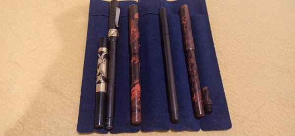
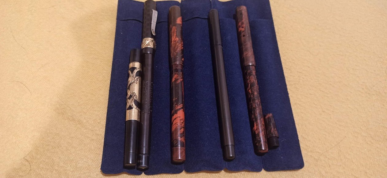
In my pen pouch today were pens with my three favourite nibs:


Pelikan M600, 14k Fine

Platinum President, 18k Medium

Pilot Custom Heritage 912, 14k PO

Inked: Sailor King Pro Gear, Sailor Nagasawa Proske, Sailor 1911 Standard, Parker Sonnet Chiselled Carbon, Parker 51, Pilot Custom Heritage 92, Platinum Preppy

Link to comment
Share on other sites

  • Replies 1.5k
  • Created
  • Last Reply

Top Posters In This Topic

  • Helen350

    167

  • Freddy

    132

  • mehandiratta

    96

  • eliweisz

    92

Top Posters In This Topic

Posted Images

Today ...


Sheaffer Legacy Heritage Deep-cut Palladium medium with Pilot Iroshizuku Yama-bodo

Waterman Carène Deluxe Large with Waterman Absolute Brown

Cross Solo white with an Edison medium steel nib --quite the writer I might add! with Diamine Graphite Grey


almost all three are out of inks so there is going to be a rotation soon :-)

Link to comment
Share on other sites

Parker Vector F italic (from the calligraphy set) with a cartridge of reconstituted PPS.

Dollar 717i, M-ish nib, with diluted Califolio Bonne Espérance.

Noodler's Konrad, flex nib, with Diamine Oxford Blue.


Ruth Morrisson aka inkstainedruth

"It's very nice, but frankly, when I signed that list for a P-51, what I had in mind was a fountain pen."

Link to comment
Share on other sites

Graf von Faber-Castell Intuition Ivory, F nib. Inked with GvFC Cobalt (stay away from this ink!).

Practice, patience, perseverance

Link to comment
Share on other sites

I'm using my brand new Lamy 2000 EF in Makrolon that just came today. An early Christmas present from my husband, who had me order it because he wasn't sure which sized nib I'd want. :D


So far, I'm loving it. My first really good, gold nib pen. I might as well clean out my Metropolitan, Safari and TWSBIs, because I don't want to use anything else now.

Link to comment
Share on other sites

Graf von Faber-Castell Intuition Ivory, F nib. Inked with GvFC Cobalt (stay away from this ink!).

Yesterday I inked the same pen with M nib with MB Corn Poppy. This pen has the broadest wettest M I have encountered, and changes the colour of Corn Poppy to be unrecognisable as the same ink I saw from a Waterman #2 nib.


I have find the Cobalt Blue quite useful and of course well behaved (now in a Dupont Orient Express). Is it the plain dark colour or some other aspect you do not like?

Edited by praxim

X

Link to comment
Share on other sites

Waterman JIF 2 fine, Parker Vector medium, Steadtler F1 fine and Herbin rollerball, with Yama-dori, Grapefruit, Tokiwa-matsu and Red Black, respectively.

It's hard work to tell which is Old Harry when everybody's got boots on.

Link to comment
Share on other sites

I have find the Cobalt Blue quite useful and of course well behaved (now in a Dupont Orient Express). Is it the plain dark colour or some other aspect you do not like?

First of all, it's terribly dry, causing skips & hard starts. Second of all, the colour is too boring. I coped with both problems last night, pulling out the cardtridge (no mess!) and adding a few drops of Visconti Turquoise. Much lovelier shade of blue, no flow issues anymore. I must add that the fine nib (pretty wet one) performed flawlessly with the previous ink.

Practice, patience, perseverance

Link to comment
Share on other sites

Doing some nib adjustment on my new old Staedtler and that no-name pen. The Staedtler nib is proving to be a bit of a pain to work with and the no-name pen has an untipped nib, which is new territory for me, adjustment-wise.


For normal writing, I stuck with my new Chinese pens today:

Wing Sung 233 with watered-down Pelikan blbk; unfortunately a bit of a hard starter (also, blbk is naturally way too dry, which was to be expected. I'll have to grab a bottle of Quink Blue if I can find one; checked the brick and mortar store today, but they only have Parker carts (but Waterman, Lamy, Pelikan, Kaweco, De Atramentis and Standardgraph bottled ink... go figure.)) but a great pen otherwise; the size and shape is really comfortable and the weight isn't too bad either.
Also, spring loaded clip, heck yeah!


Wing Sung 322 with Pelikan dark green - the more I use it, the more I love it. The nib was supposed to be F, but it's really more of an XXF. It writes surprisingly well and I really don't mind very fine nibs, so I'm quite happy about that, actually. Nibs this fine are not easy to get, after all. Getting used to the shape and size of the pen, too - it's a really small and slim pen, but it somehow doesn't bother me as much as it usually does.


Hero 616 with Standardgraph violet - the ink is absolutely glorious and the best Standardgraph ink I've used so far. Plus, it's a highly usable, slightly dusty and desaturated looking violet that looks just blue enough to be reasonably work-friendly. The pen is also a bit of a hard starter and the nib has some sweet-spot issues, but once you find that sweet spot? Writing heaven.


Kaigelu 316 with Delta Blue - switching from a Wing Sung 322 to a K316 is a surreal experience. Apart from that, the nib width makes my writing look horrible, but the writing experience as such is actually quite comfortable... plus, I keep staring at the pen; the shimmery material is simply too pretty. Slowly starting to realize just how much I hate Delta Blue, though - it's not even a badly-writing or difficult ink (very slightly on the wet side, but reasonably well behaved), but oh man, that color. Yeesh.

Link to comment
Share on other sites

To avoid cluttering this thread by my digression, I have replied in visvamitra's review of Cobalt Blue

Thank you!


Kaigelu 316 with Delta Blue - switching from a Wing Sung 322 to a K316 is a surreal experience. Apart from that, the nib width makes my writing look horrible, but the writing experience as such is actually quite comfortable... plus, I keep staring at the pen; the shimmery material is simply too pretty. Slowly starting to realize just how much I hate Delta Blue, though - it's not even a badly-writing or difficult ink (very slightly on the wet side, but reasonably well behaved), but oh man, that color. Yeesh.

Maybe next time you'll try Pelikan Brilliant Brown in your Kaigelu? The ink is very affordable, it's a good match for the Amber / Tiger Eye version of the pen, and most important, it's a bit on the dry side, making Roo's nib to write like a normal Medium.

A friendly tip: for more consistent flow, don't be shy to use cartridges for this particular pen. The Mighty Roo loves 'em!


In the meanwhile, I'm using a Carmine Striated Sheaffer Balance Admiral w/fine Feathertouch nib, inked with Diamine Syrah. A heavenly experience!

Edited by eliweisz

Practice, patience, perseverance

Link to comment
Share on other sites

Hero 329 with 328 cap. Writes a smooth medium. Nice ink flow with Chesterfield Xircon,. Apart from the round metal finial on the barrel, it is just like a Hero 616.

Link to comment
Share on other sites

Guest
This topic is now closed to further replies.


  • Most Contributions

    1. amberleadavis
      amberleadavis
      43844
    2. PAKMAN
      PAKMAN
      33554
    3. Ghost Plane
      Ghost Plane
      28220
    4. inkstainedruth
      inkstainedruth
      26728
    5. jar
      jar
      26101
  • Upcoming Events

  • Blog Comments

    • Shanghai Knife Dude
      I have the Sailor Naginata and some fancy blade nibs coming after 2022 by a number of new workshop from China.  With all my respect, IMHO, they are all (bleep) in doing chinese characters.  Go use a bush, or at least a bush pen. 
    • A Smug Dill
      It is the reason why I'm so keen on the idea of a personal library — of pens, nibs, inks, paper products, etc. — and spent so much money, as well as time and effort, to “build” it for myself (because I can't simply remember everything, especially as I'm getting older fast) and my wife, so that we can “know”; and, instead of just disposing of what displeased us, or even just not good enough to be “given the time of day” against competition from >500 other pens and >500 other inks for our at
    • adamselene
      Agreed.  And I think it’s good to be aware of this early on and think about at the point of buying rather than rationalizing a purchase..
    • A Smug Dill
      Alas, one cannot know “good” without some idea of “bad” against which to contrast; and, as one of my former bosses (back when I was in my twenties) used to say, “on the scale of good to bad…”, it's a spectrum, not a dichotomy. Whereas subjectively acceptable (or tolerable) and unacceptable may well be a dichotomy to someone, and finding whether the threshold or cusp between them lies takes experiencing many degrees of less-than-ideal, especially if the decision is somehow influenced by factors o
    • adamselene
      I got my first real fountain pen on my 60th birthday and many hundreds of pens later I’ve often thought of what I should’ve known in the beginning. I have many pens, the majority of which have some objectionable feature. If they are too delicate, or can’t be posted, or they are too precious to face losing , still they are users, but only in very limited environments..  I have a big disliking for pens that have the cap jump into the air and fly off. I object to Pens that dry out, or leave blobs o
  • Chatbox

    You don't have permission to chat.
    Load More
  • Files


×
×
  • Create New...