All Activity
- Yesterday
-

What Was Your Last Impulsive Pen Acquisition?
BamaAl replied to lgbpinho's topic in Fountain & Dip Pens - First Stop
Last weekend I got to try a Kaweco sport for the first time. Just one sentence written with it mind you. I liked it so much I came home and ordered two of them. One medium and one broad. The broad was a mistake. It was supposed to be a fine but I screwed up when I placed the order. But it sure was a lucky mistake. I’d been wanting my first broad anyway. 🤣 These things write like a dream! As good or better than some rather expensive pens.
-
Looking for Victorian and Edwardian handwriting practice books
TheFountainPenOfYouth posted a topic in Handwriting & Handwriting Improvement
Hello, I work with a lot of historical handwriting from the Victorian and Edwardian period and I am looking for a workbook or practice book from that era. I am not really looking for any fancy Copperplate or Spencerian scripts. As a historian, I have seen the handwriting of at least a hundred different people from the era, mostly British royalty and politicians, and I rarely if ever see anything closely resembling those scripts being used in their correspondence. Should I try Vere Foster? -
I miss my Prera. Gonna ink it up again....
-

Montblanc 75th Anniversary Limited Edition Skeleton Fountain Pen (1999) - Holy Grail Writing Instrument
PerpetualTraveler replied to mosh_2k7's topic in Montblanc
Amazing!!! Thank you for sharing this special piece. Such a rare and joyous occasion. -

Organics Studio "Emily" in Washington Post Article
TSherbs replied to peninkapassionista's topic in Inky Thoughts
Is this a post just to "torture" moi? I have already ranted against that terrible ink color/author combo. And now, this WaPo parody? If you wanna write about "tortured poets," at least use only tortured poets. Williams, Byron, Milton, Shelley, cummings....whaaaat? -
No where in the same flex level as a good dip pen....but for fountain pens, I've not run into better steel nibs than Osmia, which matched their grand gold nibs. This is of course the semi-flex and maxi-semi-flex level. 3 X tine spread vs a light down stroke. For something you can lay hands on... '22-mid-late 50's Osmia and later Osmia-Faber-Castell Supra nibs are (mostly) Maxi-semi-flex nibs and the gold ones do match the steel ones....stainless steel as far as I can tell. The Osmia nibs with a small diamond with the size number mostly in it are mostly semi-flex again where the gold does match the grand steel nib.... Those are those are real good nibs. The Osmium compound they bought from a Heidelberg metallurgical professor in 1922 was one of the better tipping of all time...or at least in that time. Had I then the 20-30% extra money above Pelikan level, I'd had an Osmia collection and not a Pelikan one. Geha was also made by Osmia/Degussa, So I do have a maxi-to go with once was 4 semi-flex 790's....Now three ,in I found out my lung doctor was a noobie fountain pen user....and sold a 790 semi=flex to him at a fair market price. Gives me something to talk to him when I visit. When one has 35 semi-flex, giving up a good balanced Geha 790 don't hurt. It could well be in I never got that book on nib geometry there are tiny bits of differences inthe nibs that I can't see with the steel nibs. Gold I guess is a slightly different alloy....could be the geometry...I don't look close enough...Grand is good enough for me. . But I have maxi semi-flex nibs from MB, Pelikan, Geha....because Degussa who took over Osmia's nibf actory in 1932, made gold ribbon wheels for Osmia....my WOG it being either a bookkeeper decision or a lazy warehouse worker grabbing the first gold ribbon wheel he could find...was why MB, Sonnecken, Geha, and Pelikan have maxi-semi-flex nibs they never advertised...either they dint' catch on or it wasn't worth changing the advertisements of their nibs. Degussa was and is the main gold and silver producer in Germany.It was much cheaper to buy a gold or steel ribbon wheel, than taking a gold bar and making a ribbon in the nib making shop. Degussa stopped making nibs in @ 2000.
-
 JonXVX joined the community
 -

Your Most Recent Impulsive Ink Purchase? (Replacement Bottles Don't Count.. Only 1St Timers!)
Mercian replied to MHBru's topic in Inky Thoughts
As the ‘Woad’ plant has the Linnaean name Isatis tinctoria, my guess is that the ink you used for the lines that reference it might be Rohrer & Klingner’s 2021 LE ink of that name. Or maybe, just maybe Diamine Indigo (although that was Sandy1’s reference ‘benchmark’ for ‘boring’ ink). -
Need Handwriting suggestions. Thanks everyone.
AmericanMonk replied to kealani's topic in Handwriting & Handwriting Improvement
😂 Haha! No worries there. My username is more of a statement on American culture (and my place within it) than anything else. I am not a literal man of the cloth. I do, however, enjoy practicing my handwriting with words of wisdom from the Bible, as well as proverbs from many worldwide mystic, spiritual, and religious sources. And then other times I write down quips from cartoons or whatever else I am watching. I'm not too picky. That's not a stupid question at all. I neglected pertinent details because I didn't anticipate that anybody would be replying with advice for me. My details were only meant to indicate that there have been times when my own handwriting felt alien to me and that it was frustrating when I couldn't make it better as quickly as I would have liked. I thought that maybe kealani could relate. I tried to touch upon, without saying, that one almost mourns a portion of their own identity when one's handwriting doesn't feel right or isn't as good as it used to be. But yes, when I practice underhand I turn the page 45 degrees clockwise. The 90-degree turn was the result of some advice I saw on a video, where a lefty calligraphy student was told to practice blackletter calligraphy at a 90-degree angle prior to trying Spencerian or Copperplate styles. But even with the 90-degree turn, he uses a side/underhand grip. Eventually I'll move on to some other advice, but the common denominator is to stop using the overhook, which is—by far—the most comfortable and practical option for me in every day writing. I'll eventually apply a more disciplined approach to practice, but right now I am too focused on my career, responsibilities, ever-growing list of books to read, etc. to dedicate the 30 minutes/day that I'd like to apply to improving any of my horizon-expanding endeavors. Calligraphy has been pushed back to a "when I retire" priority. At that point I'll look more into the book, tracing paper, and pencil approach that you've kindly suggested. 😊 -
 Pilgrim1678 joined the community
 -
Your Most Recent Impulsive Ink Purchase? (Replacement Bottles Don't Count.. Only 1St Timers!)
Mercian replied to MHBru's topic in Inky Thoughts
I hadn’t ever seen Montblanc Emerald Green. My first impression of it (when seeing it on the InkSwstch.com comparison that Penguincollector posted) was that its undertones reminded me of Pelikan Edelstein Jade. One can compare those two inks side-by-side by selecting them from the (very long) lists on the pulldowns on: https://andersonpens.com/ink-tool/ Or one could choose between the various inks that are shown on the InkSwatch.com comparison tool for Mb Emerald Green, and those shown by their comparison for PE Jade, and then compare those inks using the Anderson Pens comparison tool. And of course look at a few reviews on here of whichever ink(s) one think(s) may be the best substitute(s) for Mb Emerald Green. I wish you good luck in your quest! -
Montblanc 75th Anniversary Limited Edition Skeleton Fountain Pen (1999) - Holy Grail Writing Instrument
Tom Kellie replied to mosh_2k7's topic in Montblanc
~ @mosh_2k7 and @Seney724: I completely agree with the comments above. Such a generous assortment of images is a generous gift. Many, many thanks! Tom K. -
deleted, in I don't comprehend mm..as a tine spread.
-
Your Most Recent Impulsive Ink Purchase? (Replacement Bottles Don't Count.. Only 1St Timers!)
Misfit replied to MHBru's topic in Inky Thoughts
The third ink is J Herbin Cafe des Iles. And one of them is J Herbin Ter de Feu I’m guessing. -
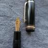
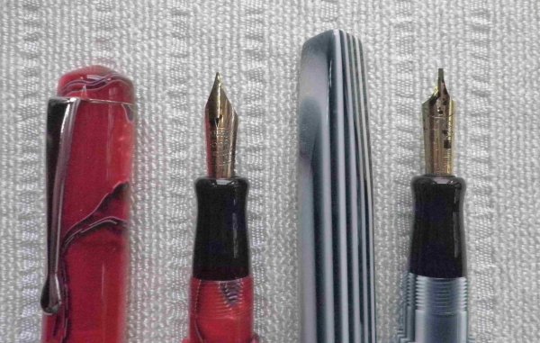
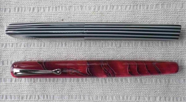
I really like the top pen in your image @pan101
-
What pen(s) are you using today?
Misfit replied to A Smug Dill's topic in Fountain & Dip Pens - First Stop
My pen of the day is the TWSBI Diamond Mini AL Silver with 1.1mm stub nib. It is filled from a sample of Kaweco Midnight Blue. -
What pen(s) are you using today?
Mercian replied to A Smug Dill's topic in Fountain & Dip Pens - First Stop
Pshaw sirrah! It is a truth universally-acknowledged that a machined all-sterling-silver pen is a ‘timeless’, and ‘elegant’, and ‘classy’ writing-implement! If you want to see something from the more ‘bling’-y (i.e. ostentatious) side of the ‘Shiny Thing’ spectrum, you need to look at pens that are entirely-gold-plated, such as my own 1980s Parker 75s: Those are ‘bling’-y! 😉 I will though add that they do look nice when one is writing by candlelight 🙂 -

Montblanc 75th Anniversary Limited Edition Skeleton Fountain Pen (1999) - Holy Grail Writing Instrument
Seney724 replied to mosh_2k7's topic in Montblanc
Wow! Spectacular! Congratulations.......... and thanks for sharing so many terrific photos with us. -
I've given away a nice Safari M and a CPM1 or such, both steel nibs that worked just fine. I wanted to hook a Coroner doctor into fountain pens. I have a 1.5 stub or CI Lamy Joy...a Safari with a long tail for a desk pen holder...It is steel and works fine. I don't believe the gold is softer myth. I have a Lamy1990 Person with a 18k nail that Pendelton Brown took from an absolutely no line variation OB to a beautiful CI B. IMO some folks started that myth by having a steel nail and a semi-nail gold nib. A nail is a nail be it gold or steel....there is no difference I can find in 120 pens....there is different flex rates....that I can match steel to gold in. Much has to do with the alloys and the nib geometry. I have a more springier than the other two new nibs, Z55 ..the same nib that impressed the hell out of me on a Imporium that I tested in a pure Lamy shop The steel M nib on my studio was just fine nail but smooth....was it a butter smooth nib...I don't know...I don't chase butter smooth. I like the level just under that.. And I had my mind on a springy nib. I got that gold springy nib in B. Any pen that arrives by mail may have a misaligned nib, in they are sent with luck in a display box....not a shipping box. I have many rants on that. The real good thing about Lamy's is many of the nibs can be swapped out with a bit of scotch tape...and if not gold, Steel Nibs are very affordable. use to be a long time ago $7.00, so would think $10 now. I was astounded by prices higher in gold for M, F, EF than for B in the Z55.. Twice as high when I bought mine. If you want a springy nib if you can find a discontinued Z55, that is better than the other two Z56 and Z57..They are springier than the steel nibs I've tried from Lamy....and the old gold Persona nib. I wouldn't buy that black coated nib as sharp as it looks, I've read noting but horror stories about the black coating flaking off. Reports say the Z56 and 57 are not quite as springy as the discontinued Z55.
-
Montblanc 75th Anniversary Limited Edition Skeleton Fountain Pen (1999) - Holy Grail Writing Instrument
mosh_2k7 posted a topic in Montblanc
Hi Today I present you with the most beautiful fountain pen that Montblanc has ever produced! It is the 1999 Montblanc 75th Anniversary Limited Edition Skeleton Fountain Pen! I still remember the day when I first saw images of this exquisite writing instrument online back in 2009 and I have been dreaming of owning this writing instrument ever since. My dream finally came true in 2019 Due to work commitments and the Covid pandemic/Brexit, I wasn’t able to collect the writing instruments until last week. This writing instrument is even more beautiful and stunning in real life! The attention to detail, the craftsmanship, the work is absolutely impeccable! I will share some photos of this gorgeous writing instrument with you Kind regards Mohsin -
What Was Your Last Impulsive Pen Acquisition?
Mercian replied to lgbpinho's topic in Fountain & Dip Pens - First Stop
If I were you I would buy bottled inks, and use the converter that came with your pen. Why? Because: ink bought in bottles costs only about 1/5-to-1/4 of the price of the same amount of ink bought in cartridges; buying ink in bottles frees you from ‘vendor lock-in’; it enables you to use far more colours/types of inks than the now rather-limited range that Parker still makes; Also, and perhaps even more importantly: filling your pen by ‘sucking ink up’ with the converter actually helps to keep your pen’s feed clean! This is because doing that means that are moving ink in both directions through the feed, and (in comparison to the rate at which it flows while you are writing), you are moving it fairly rapidly. This helps to prevent any ink from drying-out inside the feed, and/or deposits potentially building-up inside the feed’s channels/fins, and thereby restricting ink flow. The converter is also a brilliant tool if you wish to flush/clean-out your pen thoroughly, e.g. when changing types/colours of inks. This is particularly true for pens like the Duofold, whose nib/feed assembly is not as easy to remove as the nib/feed unit of e.g. a Pelikan piston-fill pen, or a Parker Sonnet. Those pens’ nib/feed units can be unscrewed manually. For clarity: you don’t need to ‘obsessively’ clean-out your pen all the time, let alone dismantle it to do so! You might want to just run cold tap water into the top of its grip section to ‘flush’ or ‘rinse’ it, once every few months. This is what manufacturers used to recommend for pens in continual use. OK, I flush my pens every time they run out of ink. But that is because I like to ‘rotate’ between my various different pens, and between different colours (& types) of inks. I use dye-based inks, acidic inks, alkaline inks, very-acidic iron-gall inks, and I use some pigment-based inks. Several of these different types of inks do not ‘play nice’ with each other! Not only does any individual pen that I own therefore tend to sit unused for months at a time, but I want (or rather, I need) to avoid the prospect of any chemical reactions occurring inside any one of my pens between any residue from its last fill of ink, and whatever I eventually put into it next time. -
Is in my Amazon basket.. Waiting for the Eagle to fly.
-

The Never-Ending Story In Three Word Segments...
I-am-not-really-here replied to RMN's topic in The Write Stuff
contained liqueur samples -
I just saw this post ... I bought a Waterman 12 last year for this feed specifically, which I had never seen before, and I was curious as well, so I made some research and it appears that this is a 1916 patent by William Ferris (the same guy that got so many Waterman patents) this patent says that the improvement is meant to help regulate the ink flow (in a nutshell) and better control air bubbles. But that portion is very thin and really looks fragile, I don't think it can easily be knocked out with a block, like we do with all vintage feeds ... I wouldn't take the risk, in any case, so taking it out from the front seems to be the only option, like with the Lucky Curves. If an expert repairer could chime in ...
-
What Was Your Last Impulsive Pen Acquisition?
ruby.monkey replied to lgbpinho's topic in Fountain & Dip Pens - First Stop
Have you checked repair suppliers like The Pendragons or Pentooling? They sell vacumatic filler wrenches for about £30/$30. -

The Never-Ending Story In Three Word Segments...
Kublai Khan replied to RMN's topic in The Write Stuff
whose cordial invitation -
What pen(s) are you using today?
Mercian replied to A Smug Dill's topic in Fountain & Dip Pens - First Stop
The black-&-white one reminds me of the ‘Op Art’ of Bridget Riley. And of the traditional British sweets called ‘Everton Mints’ 😁


-
Forum Statistics
352.3k
Total Topics4.6m
Total Posts -
Member Statistics
125,510
Total Members2,359
Most Online
Newest Member
JonXVX
Joined -
Images
-
Albums
-
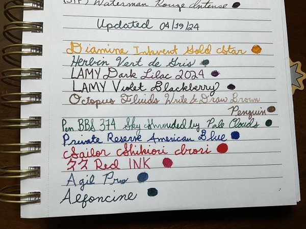
Sample Inkventory
- By Penguincollector,
- 0
- 0
- 10
-

gweimer1 gallery
- By gweimer1,
- 0
- 0
- 2
-
karmachanic 1
- By Karmachanic,
- 0
- 0
- 29
-
Mercian’s Miscellany
- By Mercian,
- 0
- 14
- 21
-
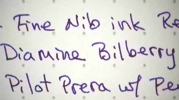
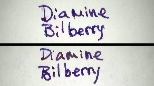
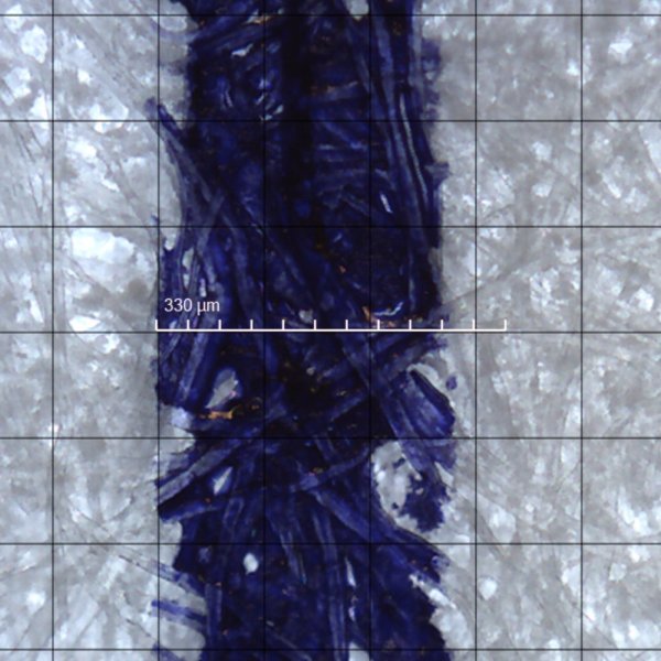
Extra Fine Nib Ink Reviews (17 of n)
- By LizEF,
- 0
- 24
- 24
-
-
Topics
-
-
Upcoming Events
-
-
Blog Comments
-

By Shanghai Knife Dude · Posted
I have the Sailor Naginata and some fancy blade nibs coming after 2022 by a number of new workshop from China. With all my respect, IMHO, they are all (bleep) in doing chinese characters. Go use a bush, or at least a bush pen. -
desaturated.thumb.gif.5cb70ef1e977aa313d11eea3616aba7d.gif)
By A Smug Dill · Posted
It is the reason why I'm so keen on the idea of a personal library — of pens, nibs, inks, paper products, etc. — and spent so much money, as well as time and effort, to “build” it for myself (because I can't simply remember everything, especially as I'm getting older fast) and my wife, so that we can “know”; and, instead of just disposing of what displeased us, or even just not good enough to be “given the time of day” against competition from >500 other pens and >500 other inks for our at -

By adamselene · Posted
Agreed. And I think it’s good to be aware of this early on and think about at the point of buying rather than rationalizing a purchase.. -
By A Smug Dill · Posted
Alas, one cannot know “good” without some idea of “bad” against which to contrast; and, as one of my former bosses (back when I was in my twenties) used to say, “on the scale of good to bad…”, it's a spectrum, not a dichotomy. Whereas subjectively acceptable (or tolerable) and unacceptable may well be a dichotomy to someone, and finding whether the threshold or cusp between them lies takes experiencing many degrees of less-than-ideal, especially if the decision is somehow influenced by factors o -
By adamselene · Posted
I got my first real fountain pen on my 60th birthday and many hundreds of pens later I’ve often thought of what I should’ve known in the beginning. I have many pens, the majority of which have some objectionable feature. If they are too delicate, or can’t be posted, or they are too precious to face losing , still they are users, but only in very limited environments.. I have a big disliking for pens that have the cap jump into the air and fly off. I object to Pens that dry out, or leave blobs o
-
-


