All Activity
- Past hour
-
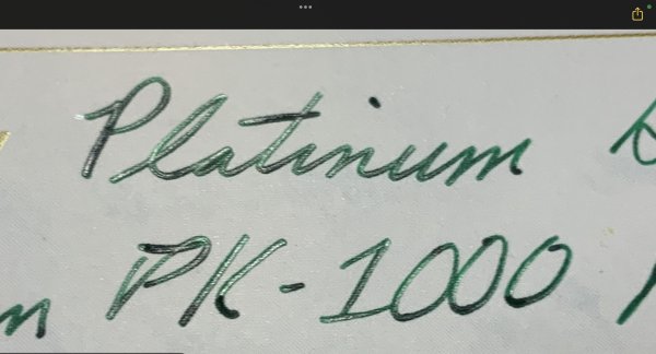
For more details/information about your lovely 400, I recommend that you open the following link to the superb website about vintage Pelikan pens that has been created by FPN’s own @tacitus: https://tacitus124.wixsite.com/vintagepelikanpens/400-ca-1952 Slàinte, M.
-
Sigh cubed. AH HA!!!!!! M&K is worth the mailing to the States...German post is still 1/3 cheaper than US.. There is three versions, all very good. The 95g once typewriter paper...now named Office paper is great ...one...sided...paper in it's typewriter paper. I haven't laid hand on the other two versions lately...but I seldom go on line. I do have 2 1/2 M&K 95g typewriter/Office. It's not a pad, but loose 100 sheets in a fold over pad like cover. It's the paper I reach for just after testing an ink on CT or Oxford Optic...always with in reach. When I got bit by that rabid paper beast, I went down town Heidelberg to every place that sold paper...having looked it up. The best Rossler was a joy to write on the feather champ...in all levels. And Brunner is poor...even it's index cards which just ended up in my Ball Point Barbarian wife's fold out office cubical. Brunner papers of all sorts...even Deckel papers where one would expect more were nothing but ball point and printer papers.................OUT SIDE OF M&K. M&K had been an extraordinary good paper companies in the '50's that was eventually bought up by Brunner and ...Not Ruined.
-
Hi, looking for some help! I've been using Online's kombi/combi cartridges in my Lamy Safari, and I really like their midnight blue (nachtblau), also called blue/black in some places. It's a very grey blue-black. Looks a little more blue when it goes on the page but dries to something more grey, with a hint of blue. However, it looks like they've discontinued them. They are shown as unavailable on Combi Ink Cartridge | ONLINE Shop (online-pen.com) and supply is drying up everywhere. So I'm looking for an equivalent in a bottle, but I'm struggling. I've tried: - Lamy Blue/black: Too light and too blue - Diamine blue black: Too blue, not really much grey - Cult Pens (Diamine) Deep Dark Blue: Way too saturated and too blue. I'm considering trying Diamine Chopin. Looking at reviews, it seems like Mont Blanc Midnight Blue might be fairly close, but it's an expensive ink and I don't want to buy that just to try it out and find it also isn't right. So.. .HELP! Have any of you tried the Online Midnight Blue cartridges yourselves? If so, have you found anything in a bottle that's close? Thanks in advance for any suggestions.
- Today
-
blood orange juice
-
Me too!
-

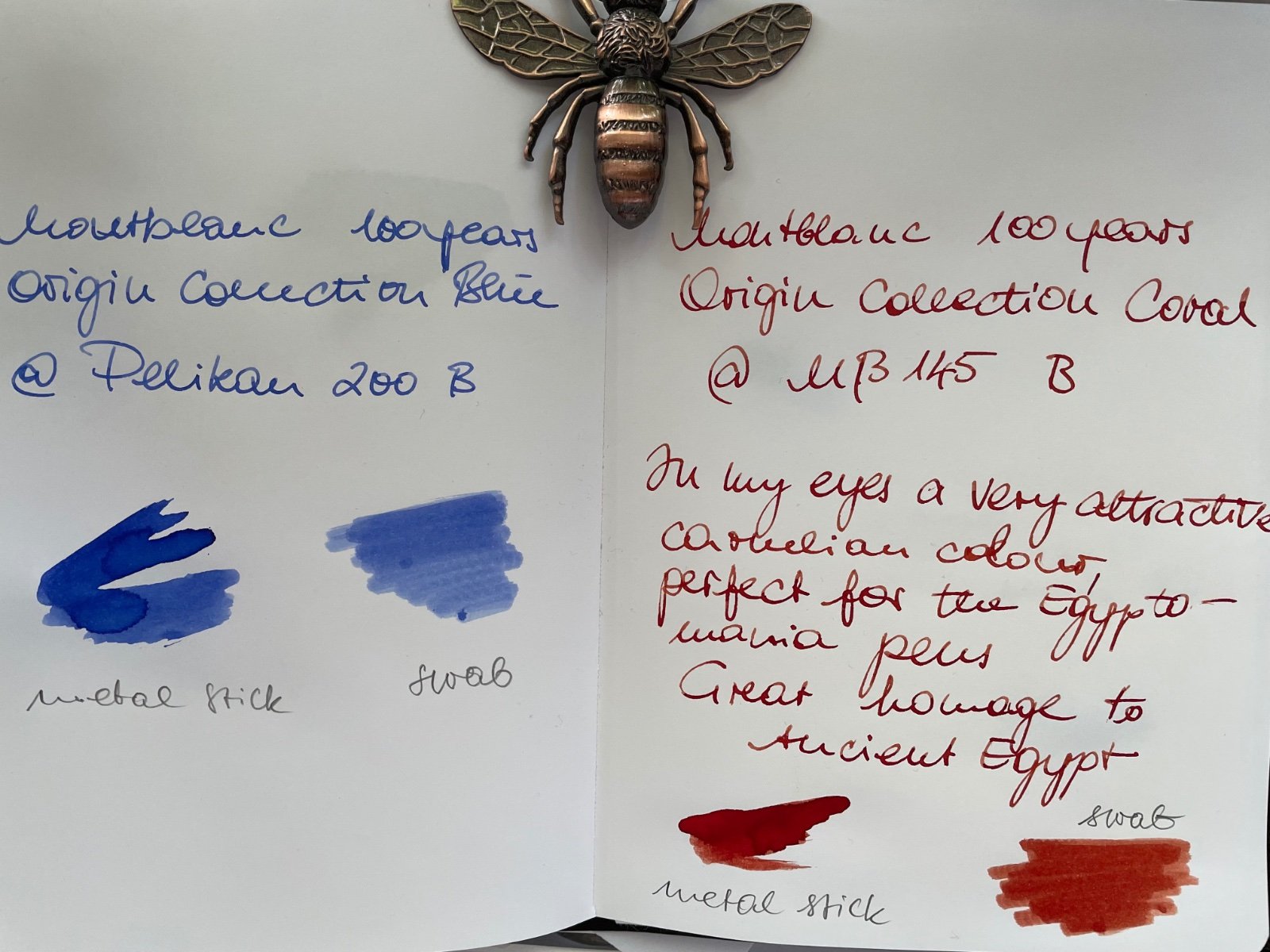
Montblanc 100y Meisterstück LE The Origin Collection — coral & blue
marlinspike replied to Todor's topic in Ink Reviews
They have not yet been sneaky enough to change that number when reusing a color under a new name -

What pen(s) are you using today?
MarcoA63 replied to A Smug Dill's topic in Fountain & Dip Pens - First Stop
so they told me. This one is made in Canada. The next one I'm eyeing is ribbed, with blue end remade. Still Canadian though -
 stemp73 joined the community
 -

Montblanc 100y Meisterstück LE The Origin Collection — coral & blue
Todor replied to Todor's topic in Ink Reviews
Wasn’t aware, one can trace this by the numbers. Pls, tell me more about that.. Here they are: Coral 2318-O401 Blue 2405-O401 -

What Was Your Last Impulsive Pen Acquisition?
Gloucesterman replied to lgbpinho's topic in Fountain & Dip Pens - First Stop
Thank you for posting the unboxing. Really interesting scrollwork on the nib. Would love to see a close-up if/when you have the time. -
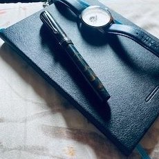
Let's see your watch and fountain pen photos
ignord replied to BostonWIS's topic in Pictures & Pen Photography

-
Montblanc 100y Meisterstück LE The Origin Collection — coral & blue
marlinspike replied to Todor's topic in Ink Reviews
What number do they give in the bottoms of the bottles, so people can see if these are reused or actually new colors. -
Sorry, I mean aesthetic flaws (though there is an unboxing of one on YouTube that has a manufacturing flaw in the trim ring). Also I do believe in videos I detect the finial being slightly off center in the metal caps, something I've seen on year 2 ATW80 solitaires
-
Just posted some first impressions on the coral and blue ink, take a look: https://www.fountainpennetwork.com/forum/topic/374967-montblanc-100y-meisterstück-le-the-origin-collection-—-coral-blue/
-
Montblanc 100y Meisterstück LE The Origin Collection — coral & blue
Todor posted a topic in Ink Reviews
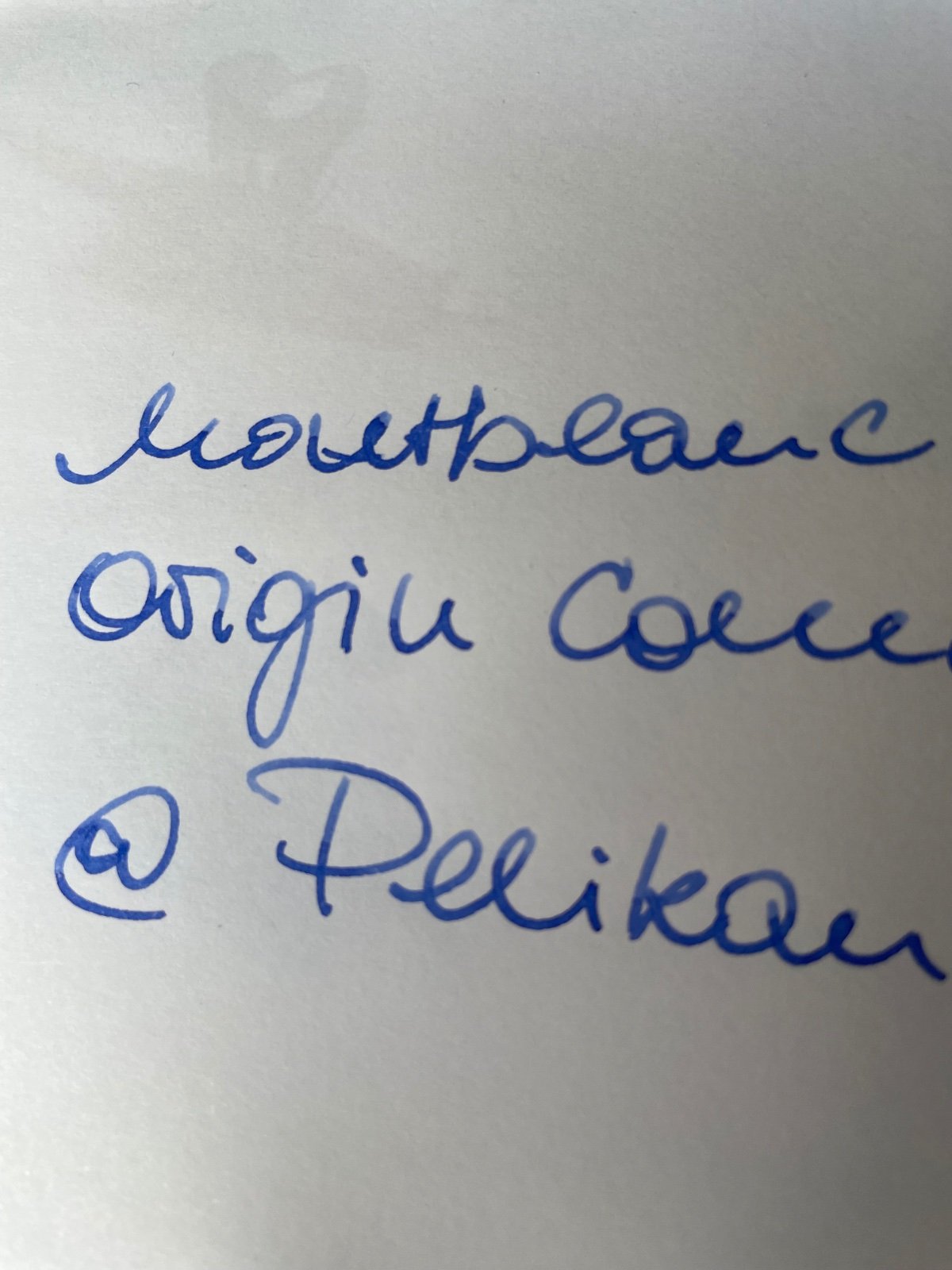
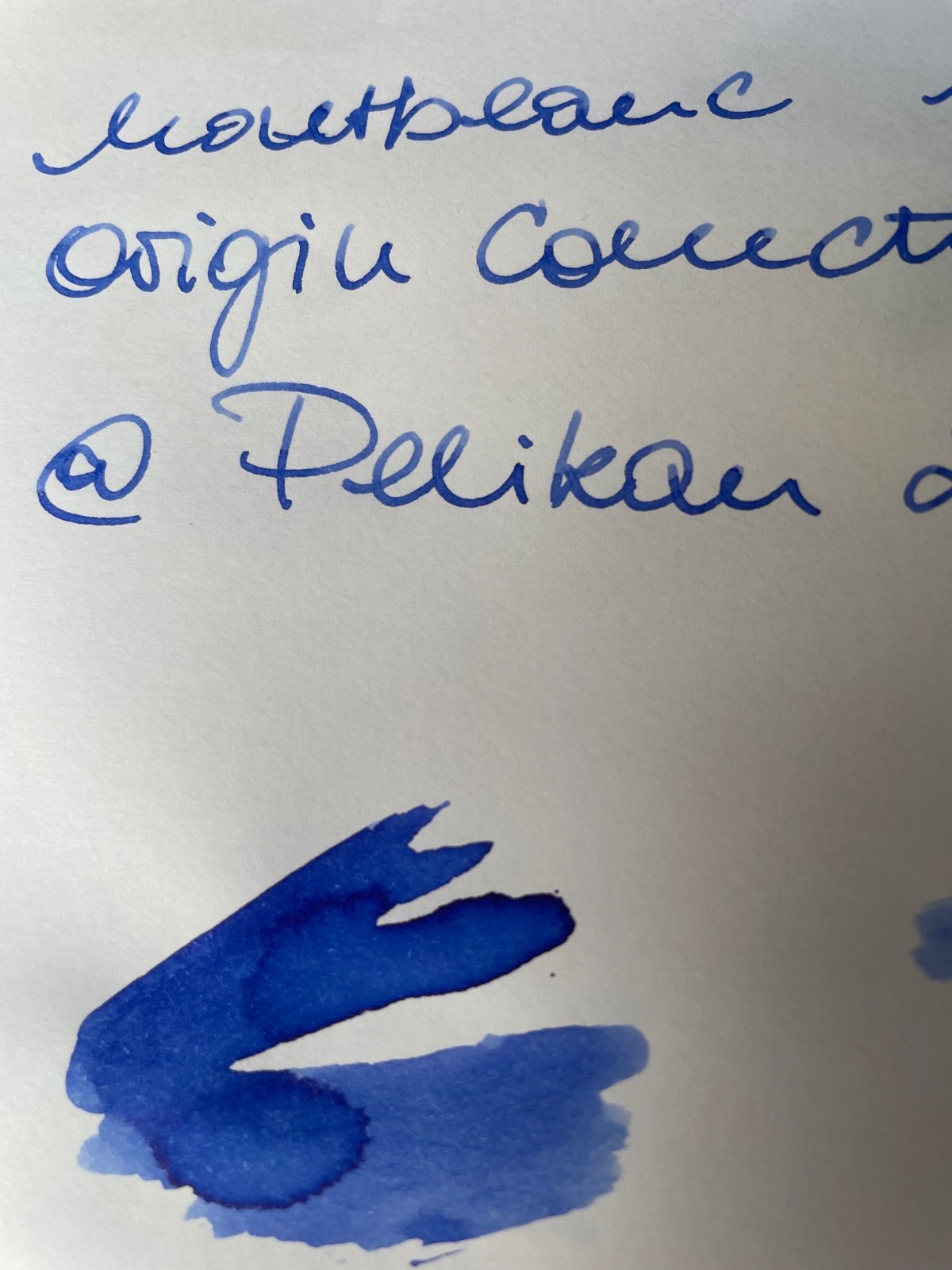
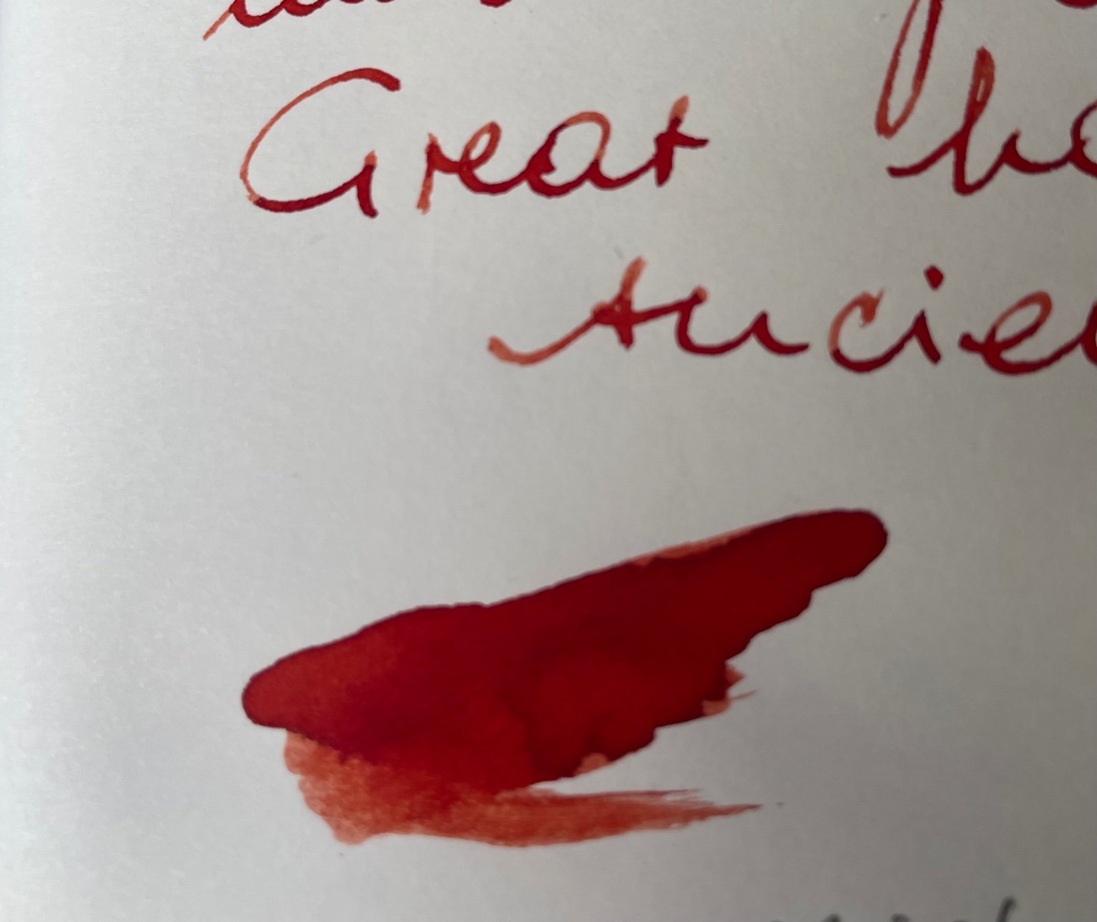
Hello everyone, Here is a first impression of the LE inks, which still have the status “coming soon”. However, I was able to buy two of them. In my eyes, the inks fit with Ancient Egypt and the iconic Montblanc’s Egyptian fountain pens in the 1920s, which have been released before the Meisterstück: The blue is a light lapis lazuli, quite common in paintings in Ancient Egypt. It is a fairly homogeneous ink with little shading, as you can see in the writing sample with a B round corn nib. It is more likely to benefit from being applied with a wider and very wet nib — e.g. Italic. The red is a carnelian tone that I really like and it has a stronger shading. The ink is not that wet. I made the writing sample with a flat cut nib corn, some may reckon MB broad nibs as Italics. In terms of color, I wouldn't describe it as "coral", as that is a quite wide spectrum and inaccurate. (My compliments to the daltonists at MB Marketing,-) I'm pretty thrilled because I was searching a lot for an authentic carnelian. It is exactly what I was looking for. Enjoy, Todor 😊
-

If You Could Only Choose One Ink for a Lifetime...
arcfide replied to 2ouvenir's topic in Inky Thoughts
Thanks for the sample! Interesting. I know that Brilliant Black is quite a bit different in color than the Parker and Waterman inks, so the color comparison isn't as useful, but I see what you mean by the fading. However, I do have some modern Waterman/Parker that will look close to that shade on some papers, though I don't know if exactly so. I think Iroful does this most dramatically. On some of these papers, the blue in the Waterman/Parker ink comes out very strongly. -
.thumb.jpg.4b37dd6ffcffa13f64fb1de9f17d4a22.jpg)
If You Could Only Choose One Ink for a Lifetime...
Vintage_BE replied to 2ouvenir's topic in Inky Thoughts
Apologies, I wrote Waterman whilst I should have referred to to Pelikan. The Parker “black” has faded as you can see from this photo.
-

Let's see your watch and fountain pen photos
Dankoh69 replied to BostonWIS's topic in Pictures & Pen Photography
For the day..
-
What pen(s) are you using today?
kazoolaw replied to A Smug Dill's topic in Fountain & Dip Pens - First Stop
Original cap & barrel ends? Beautiful pen & nib. -
Indeed, it seems to be hard to get outside Europe. The irony is in the fact that you can't buy it in dedicated office stores but in the food supermarket. There it is among the cheapest and, for pen and ink, among the best you can get. This one is the loose sheet 80 gsm paper which is OK-ish, but not great any more. Somewhen during 2023 the composition was changed. If you are lucky and can get one of the old batches, it will be excellent paper. The new is below average. Something similar happened with the formerly excellent Staufen Post, which is now in the range of toilet paper. 👎 Another one is the also discontinued Neusiedler Japan Post 80 gsm, which was available until about 2-3 years ago, but is discontinued as well. 😪 If you find some NOS, buy immediately. This one is the good Kyome (the link points to the blanc, it is also available lined or with square grid). The Brunnen letter pad is another very good paper. If you can live with heavy paper in the range of 90 to 100 gsm, the already mentioned Gohrsmühle paper in loose leafs (Amazon) or Fritz Schimpf letter pad are a strong recommendation. The 80 gsm Rhodia paper is a good choice, but is in its quality a tiny bit below Gohrmühle and Fritz Schimpf. Surprise of 2024 is the Faber Colori pad 70 gsm, which is darn cheap and has surprisingly good compatibility with pen and ink. It makes a bit thinner ink lines (ink repellent?) but is a shading master, similar to the 70 gsm Kyome!
-
What pen(s) are you using today?
MarcoA63 replied to A Smug Dill's topic in Fountain & Dip Pens - First Stop
Watermans Hundred Year Pen in maroon and amber transparent end. Akkerman ink. Medium nib
-
I'm A Sad, Pathetic Stationery Junkie.
Misfit replied to KreepyKen's topic in Paper and Pen Paraphernalia
Cool idea and reuse of an item @txomsy -

Pininfarina PF Two fountain pen -- a first look
fabri00 replied to Paul-in-SF's topic in Italy - Europe
In fact in the box and papers pictured is readable "made in Germany". -
got wind of
-
and the vampires
-
Missed this earlier on. Some of us have no sense (me for example). I have two custom Ebonite Ranga Majestics. One with a Bock Ti #8, and the other with an MB 149 14k nib -FNF housing.


-
Forum Statistics
352.3k
Total Topics4.6m
Total Posts -
Member Statistics
125,506
Total Members2,359
Most Online
Newest Member
stemp73
Joined -
Images
-
Albums
-
Mercian’s pens
- By Mercian,
- 0
- 21
- 57
-

Ink
- By Penguincollector,
- 0
- 2
- 13
-
j1tters
- By 2ouvenir,
- 0
- 1
- 23
-

namrehsnoom-14
- By namrehsnoom,
- 0
- 0
- 85
-
other
- By shalitha33,
- 0
- 0
- 31
-
-
Topics
-
-
Upcoming Events
-
-
Blog Comments
-

By Shanghai Knife Dude · Posted
I have the Sailor Naginata and some fancy blade nibs coming after 2022 by a number of new workshop from China. With all my respect, IMHO, they are all (bleep) in doing chinese characters. Go use a bush, or at least a bush pen. -
desaturated.thumb.gif.5cb70ef1e977aa313d11eea3616aba7d.gif)
By A Smug Dill · Posted
It is the reason why I'm so keen on the idea of a personal library — of pens, nibs, inks, paper products, etc. — and spent so much money, as well as time and effort, to “build” it for myself (because I can't simply remember everything, especially as I'm getting older fast) and my wife, so that we can “know”; and, instead of just disposing of what displeased us, or even just not good enough to be “given the time of day” against competition from >500 other pens and >500 other inks for our at -

By adamselene · Posted
Agreed. And I think it’s good to be aware of this early on and think about at the point of buying rather than rationalizing a purchase.. -
By A Smug Dill · Posted
Alas, one cannot know “good” without some idea of “bad” against which to contrast; and, as one of my former bosses (back when I was in my twenties) used to say, “on the scale of good to bad…”, it's a spectrum, not a dichotomy. Whereas subjectively acceptable (or tolerable) and unacceptable may well be a dichotomy to someone, and finding whether the threshold or cusp between them lies takes experiencing many degrees of less-than-ideal, especially if the decision is somehow influenced by factors o -
By adamselene · Posted
I got my first real fountain pen on my 60th birthday and many hundreds of pens later I’ve often thought of what I should’ve known in the beginning. I have many pens, the majority of which have some objectionable feature. If they are too delicate, or can’t be posted, or they are too precious to face losing , still they are users, but only in very limited environments.. I have a big disliking for pens that have the cap jump into the air and fly off. I object to Pens that dry out, or leave blobs o
-
-