All Activity
- Past hour
-

Critiques On My Handwriting?
Duffy replied to Irelaand's topic in Handwriting & Handwriting Improvement
Hello from a fellow Irishman. I myself am also practicing for about a year, so I'm no expert, but here are some observations, FWIW, along with tips/advice that have helped me. The first thing I notice is the lack of regularity, especially in the descenders. Also, while your writing slants, this too is varied and nor regular. While I can read some words, generally I struggle to read your writing. Some words are a squiggle with no definition. Things that helped me : Learning to "round off" my letters, one letter at a time. Practicing each letter individually, both capitals and small. Writing on lined paper and practicing keeping my letters on the line. Practicing an even and regular slant. You can get guide writing paper for this, or lightly rule your own lines in pencil, as I did. -
I think you're absolutely right that they are doing the watch model (or is it the LV model? Not sure who started on that path first), but I also think it doesn't bode well for them that they have been selling watches for almost 30 years now, yet still nobody cares about Montblanc watches and Montblanc is still having to force retailers to carry the watches if they want to carry the pens. Of course, all it would take is some watch influencers to push Montblanc like they did Cartier and suddenly they'll have demand. I don't think the model will ever work for the pens (it's going to be hard to get bitcoin bros and executive technical advisors at big tech to care about pens), but that's probably why they are selling watches, headphones, and backpacks now, so it will work out for the company even if it kills the pens.
-
Montblanc 75th Anniversary Limited Edition Skeleton Fountain Pen (1999) - Holy Grail Writing Instrument
mosh_2k7 replied to mosh_2k7's topic in Montblanc
Thank you for the kind words everyone Glad you guys enjoyed looking at photos of this beauty! Unfortunately this beauty will stay uninked! But I am on a look out for an inked/used example. So if I happen to come across one for a “reasonable” price, I will surely add it to my collection to use -
-
@Mercian @DilettanteG I was lucky. Seems there's no market for Jeliks. The nib is just extra fine, the rest is just the photo. But hey, I had to pay postage on top! lol.
-

Fountain pens getting more common?
pen lady replied to BambinoFortunato's topic in Fountain & Dip Pens - First Stop
🤭You bettcha!!!!! -
@Armo excellent bargain hunting skills! I guess that’s the nib my m101n pens are modeled after. Nice!
-

Need Handwriting suggestions. Thanks everyone.
Mercian replied to kealani's topic in Handwriting & Handwriting Improvement
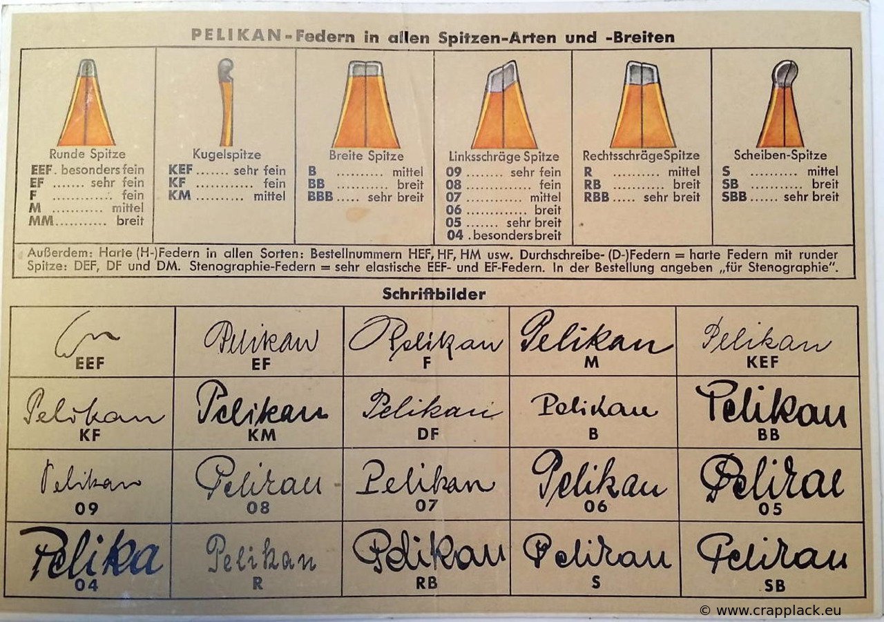
One can certainly write an ‘italic’ script with a ‘normal’ monoline (i.e.round-tipped) nib The edged-nibs for ‘calligraphy’ that are, confusingly, also referred to as ‘italic’, are not necessary for writing in an ‘italic’ script. When your copy of Write Now gets to you, you will find that its instructive pages are split into three sections: writing their ‘basic italic’ (un-joined, or ‘print’) script with a round nib; writing their ‘cursive italic’ (the same script, but with the letterforms now joined) with a round nib and; writing ‘edged-pen italic’ (their ‘basic italic’, their ‘cursive italic’, and ‘Chancery cursive’) using edged nibs. It’s a really helpful book 😊 -
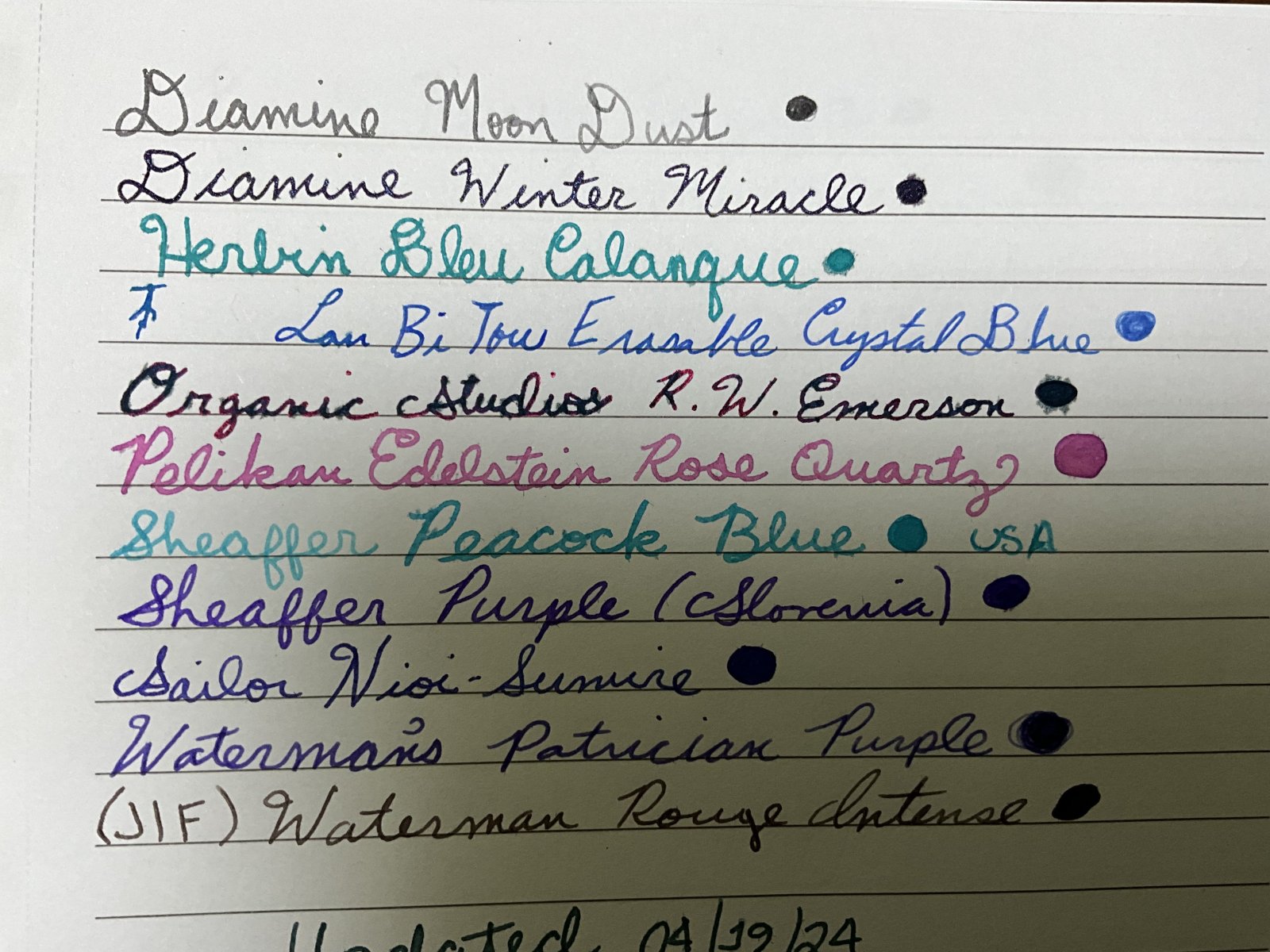
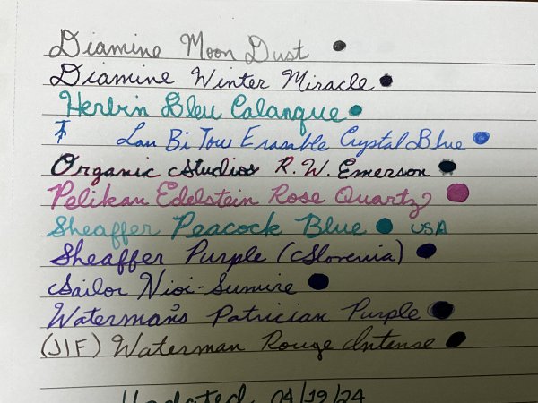
Hello everyone, I am looking to get some critiques on my handwriting and some possible feedback, and of course the obvious question of is it readable? I have been teaching myself cursive for the past year or so, but I have not been as consistent recently on maintaining my practice in copy books. However for school I take quite a bit of notes as shown in the example (some science notes about atmospheric pressure) that help me maintain practice. Currently at home I have a few books on spencerian cursive and their respective copy books, so I have looked at those for some inspiration. I think over the past year, as seen in some of my earlier posts I think my handwriting has improved in consistency and less "shaky" looking writing. My main question being is how would you guys improve my writing? Some things I like about my writing is: The slanted look of my writing larger descenders and ascenders Some things I don't like however is the overall look sometimes, it looks messy maybe? although I'm not sure about this. The below sample was written yesterday in class on atmospheric pressure. The pen I used was a 1963 Montblanc N 22 with an OM nib. The ink I used was Robert Oster Thunderstorm a very nice smooth ink, that works great for daily writing. Thanks, Max

-

Need Handwriting suggestions. Thanks everyone.
kealani replied to kealani's topic in Handwriting & Handwriting Improvement
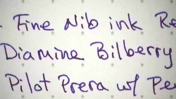
Thanks. The Pilot Metro body is too thin to write comfortably for me. I ordered the PILOT Prera Iro-Ai Calligraphy-Nib from Amazon because the body looked thicker, like a TWSBI Diamond 580. Not sure if it really is. I've found that the body size and "feel" of the TWSBI Diamond 580 ALR, Pelikan M400, etc, to be a good fit, vintage Parker Vacumatics. Question: Does "italic" have to be written with a stub nib to be "italic", or can italic be written with a regular pointed fountain pen nib in EF, F, etc? thanks again. k - Today
-
You got a 140 - with a lovely, bouncy, ‘script-logo’ nib - for under a tenner? Sumgai! In your second photo, the nib appears to be an Oblique Extra Fine. Is that correct? Or is it just an optical illusion/my shonky eyesight?
-
You're most welcome! Always cool to see sheen in the line width image. Sometimes that's the only place I see it...
-
Happy to do it. Fabulous story - even if it wasn't a fabulous experience for you.
-
Alternative to Online Nachtblau (midnight blue) cartridges?
LizEF replied to stemp73's topic in Inky Thoughts
You're very welcome. Unfortunately, now and then a swatch really looks nothing like reality (different monitors and different people making the swatches), but even so, it's a really good tool. Thanks, @yazeh! -

What Was Your Last Impulsive Pen Acquisition?
Beechwood replied to lgbpinho's topic in Fountain & Dip Pens - First Stop
The celluloid looks similar to a Perfecto Lyx. -
 ukiha joined the community
 -
The fact that you have not yet decided is not a ‘bad’ thing. You are currently in the process of doing research into different pen models, which will enable you to decide on which pen will suit you the best. Doing this research should minimise the possibility of you buying a pen that you might later find out that you do not like. I think that your actions are very sensible.
-
I don’t know whether it is or is not. And of course that would depend on where you are in India. The climate of e.g. Rajasthan is rather different to that of Himachal Pradesh, or West Bengal, or Kerala 😉 For what it is worth, I have never seen any remark/complaint on FPN by someone in e.g. Spain, or southern France, or Arizona, or California (or India) to say that the grip-section of their Parker 45 has deformed/melted in their home. My remark about heat possibly being responsible for deforming the grip-sections was a sort of ‘educated guess’. Even if it is right, I would expect that the heat would need to be over 50 degrees Centigrade, perhaps over the mid-50s Centigrade, for it to cause any shrinkage. So, if you happen to live in Rajasthan, I would definitely advise you to never leave the pen inside a closed car during the Summer. But, if you happen to live in Shimla, I would expect that would probably never have such a problem. Unless you leave your pen on top of a heater during the Winter 😉 The best way for you to check whether or not the heat in your area might cause the plastic to deform would be to go on to your local social media, and ask if anyone who lives in your area has ever had a pen (of whatever model) melt/deform because of the heat. Or, if you live in the Himalayas, whether anyone nearby has ever had a pen become very brittle in the cold during the Winter.
-
Some information was obtained as a result of researching various articles for the purpose of posting in another thread on CON-70(N). I am not sure how long the lot lasted, but the early production CON-70 had that very part that could be disassembled. After that, it was no longer possible to disassemble from that part. Once the ink started leaking, the converter was considered to be at the end of its life, but there are YouTube programs that show how to disassemble it, seal it, and reuse it. After the CON-70 became impossible to disassemble, the CON-70N was subsequently released as an improved version with an additional agitator and other shape changes to prevent the "shelf hanging phenomenon.” (棚吊り現象; A phenomenon in which ink remains in the headspace of the converter and does not drop down.) It is interesting to note that the area where ink remains in the headspace of the converter and the area of ink leakage are almost identical and multiple improvements were made there, which suggests something. @HowardC has already pointed out that this may be one of the candidate causes of ink in the cap and how to handle it.
-
What Was Your Last Impulsive Pen Acquisition?
Armo replied to lgbpinho's topic in Fountain & Dip Pens - First Stop
I came across this on fleabay, it has a Rupp nib and is a button filler. The nib is stainless and has none of the logos usually associated with Rupp (maybe because its not gold?). I don't think the clip is original. Nib reads 'Rupp Punkt Iridium Feder' which translates as Rupp iridium point feather. I like that nib translates to feather in so many languages.
-
Great info. Thanks @Bo Bo Olson.
-
, precious as well,
-
Need Handwriting suggestions. Thanks everyone.
Mercian replied to kealani's topic in Handwriting & Handwriting Improvement
The CM nib can still (at time of posting) be bought on the Pilot MR/Metropolitan pen, in various colours, from Jet Pens (in the USA): https://www.jetpens.com/Pilot-Metropolitan-Fountain-Pen-Black-Plain-Medium-Italic-Nib/pd/19271 Also, if one can find them, the Plumix was sold with its italic/calligraphy nibs in two even narrower grinds: I bought my ‘M’ Plumix (whose nib’s width is the same as the ‘CM’ nib on my Pilot Metropolitan) from eBay, and also a Plumix with one of the ‘F’ nibs. I presume that Pilot’s slightly smaller ‘Pluminix’ calligraphy pens were sold with nibs of the same widths as those on the Plumix. -
This pen was advertised as a Jelik an, so I was lucky enough to pick it up for just under a tenner. It appears to be an early 140. Has no markings on the cap or cap band and has the legend 'Export' & 'Gunther Wagner Pelikan' around the bottom of the barrel with EF on the plunder cap. It was missing a clip so I have put a generic clip on it for now.
-
Thank you @Cyrille81 for this window into future releases from The Origin Collection. As someone whose double-handful of 75 Years of Passion and Soul Meisterstück Collection pens (Solitaire 146 & 162 LE75 pieces; Solitaire 146, 162, & 144 LE1924 pieces; Resin 149, 146, 145, 163, 164, & 165 LE1924 pieces) were acquired secondhand more than two decades after their 1999 release, and handful of 90 Years of Meisterstück Collection pens (Solitaire Skeleton 149 SE piece; Solitaire 145, 163, & 164 SE pieces) were acquired more than half a decade after their 2014 release, I will most probably employ the same strategy towards the limited editions of The Origin Collection, for affordability’s sake. That is to say, if I am still in the market decades from now, and if any of the models have not appreciated in value.
-
Thank you, @LizEF, for reviewing this purple ink, for the story part and for sharing line-microscopy and ink set time secrets with us! This purple ink is fully to my taste - I guess, that's why I have already 10 (or so) inks in the deep, dark purple category. And yes, I was surprised too, seeing sheen in the cellulose fibre structure. 👍 Looking forward to learn more about the High Wizard (and about what made him say "never mind", when people play with things not belonging to them). If I would be High Wizard ... hm ... oh ... OK, I also would have other priorities.


-
Forum Statistics
352.3k
Total Topics4.6m
Total Posts -
Member Statistics
125,516
Total Members2,359
Most Online
Newest Member
ukiha
Joined -
Images
-
Albums
-
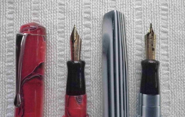
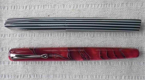
Misfit’s 4th album of Pens etc
- By Misfit,
- 99
-
Mercian’s Miscellany
- By Mercian,
- 0
- 14
- 22
-
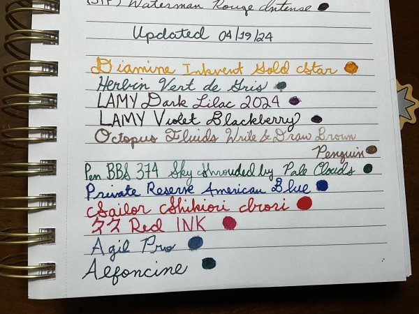
Sample Inkventory
- By Penguincollector,
- 0
- 0
- 10
-

gweimer1 gallery
- By gweimer1,
- 0
- 0
- 2
-
karmachanic 1
- By Karmachanic,
- 0
- 0
- 29
-


-
Topics
-
-
Upcoming Events
-
-
Blog Comments
-

By Shanghai Knife Dude · Posted
I have the Sailor Naginata and some fancy blade nibs coming after 2022 by a number of new workshop from China. With all my respect, IMHO, they are all (bleep) in doing chinese characters. Go use a bush, or at least a bush pen. -
desaturated.thumb.gif.5cb70ef1e977aa313d11eea3616aba7d.gif)
By A Smug Dill · Posted
It is the reason why I'm so keen on the idea of a personal library — of pens, nibs, inks, paper products, etc. — and spent so much money, as well as time and effort, to “build” it for myself (because I can't simply remember everything, especially as I'm getting older fast) and my wife, so that we can “know”; and, instead of just disposing of what displeased us, or even just not good enough to be “given the time of day” against competition from >500 other pens and >500 other inks for our at -

By adamselene · Posted
Agreed. And I think it’s good to be aware of this early on and think about at the point of buying rather than rationalizing a purchase.. -
By A Smug Dill · Posted
Alas, one cannot know “good” without some idea of “bad” against which to contrast; and, as one of my former bosses (back when I was in my twenties) used to say, “on the scale of good to bad…”, it's a spectrum, not a dichotomy. Whereas subjectively acceptable (or tolerable) and unacceptable may well be a dichotomy to someone, and finding whether the threshold or cusp between them lies takes experiencing many degrees of less-than-ideal, especially if the decision is somehow influenced by factors o -
By adamselene · Posted
I got my first real fountain pen on my 60th birthday and many hundreds of pens later I’ve often thought of what I should’ve known in the beginning. I have many pens, the majority of which have some objectionable feature. If they are too delicate, or can’t be posted, or they are too precious to face losing , still they are users, but only in very limited environments.. I have a big disliking for pens that have the cap jump into the air and fly off. I object to Pens that dry out, or leave blobs o
-
-