All Activity
- Past hour
-
it hard to say..it looks like a medium nib tip, regards.
-
I would not use Tamiya polishing compound in my practice. It's great stuff, made for scale model construction, which I also do. Tamiya nails it for polystyrenes in everything they make. But it's, my view, a bit rough for pens. I don't use Novus with pens either, prefer sunshine rags and Micro Finishing compounds. Tim
-
Hello, I'm very new to the MB journey, and trying to identify the nib size on this pen. I wrote with both Medium and EF in the local store (their floor sample), and they insist that mine is a EF. But to my inexperienced eye (by how much ink it puts on the paper) it appears to be a M. I don't want to go through a nib exchange if it is indeed an EF, but I wanted to check if there is any way to be sure what size it is? Thanks!

-
I only have single instances of the three, but for me the FA is the softest, then the SF, then the SF in my Falcon. They're all completely different beasts. The Falcon pens (aka Elabo) have completely different geometry and get their behavior mostly from the geometry, but I don't find mine to be "soft". I would describe mine as being rather stiff, but with a geometry that is intended to encourage more spread between the tines when you push on it. The FA nib, regardless of whether "FA" stands for "Falcon", are a completely different geometry from the Falcon. Then the SF nibs, they are a traditional nib geometry, they're slightly more flexible than their non-S counterparts: they require less pressure to get the same pressure and, I assume, are less likely to fail when you do that repeatedly. Then there's the size-30 nibs used in the Custom Urushi and Aya. Traditional geometry, bigger than the KoP and 149. I would put it's softness between my 743-FA and SF which IMO is perfection.
-
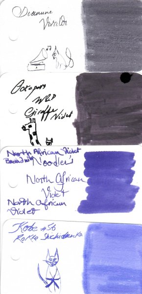
I had a sample of Vivaldi! (And one of North African Violet, which stained everything it looked at). Vivaldi was so gray it was barely purple. And I love Vivaldi's music, so yes, this ink should have been some form of red. Water Test Vivaldi Kitteh is melting. It is sad. 😢 @yazeh, thanks for this review! It's rare that I have one of your review inks.
-
Does anyone know about this company? A box of their "Parkar 51" pens was listed by an India bookseller on Ebay this morning. NOS from before 1996.
-
Thanks for sharing the interesting video. Forever learning.
-
If my cat could sing like Heifetz or MIlstein, she would be playing at the Carnegie hall or be Youtube sensation in these modern times
-
Yes, that's true.
-

What Was Your Last Impulsive Pen Acquisition?
carola replied to lgbpinho's topic in Fountain & Dip Pens - First Stop
I think I have also seen Rusewe pens with that material. And that "feather" translation is just logical. In German it can designate either the nib or the whole fountain pen. -
Yep, this one was a complete miss especially with his nick name. Yep especially with Ef/F nibs Or maybe he's holding his on to his ears not wanting to hear the violin So true. Mostly like a novice violinist A pleasure 🙏 🙏 🙏
- Today
-
... decided what Muji loose leaf and covers I "needed" --- what happened? muji.eu had sold out everything during the weekend. Sigh. Wonder when they will restock? Have fun! Claes in Lund, Sweden
-
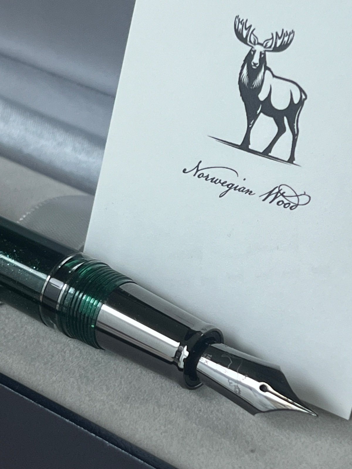
DHL showed up late last night with my first Sailor pen. I’ve looking for 2 years and finally ordered Bungubox’s new Norwegian Wood with a medium fine nib. I had been seeking a Sailor with a metal section. I like the balance of pens like their Black Luster and Soul of Chess. I was very pleasantly surprised when I saw that the hardware had the same black ionic plating as the Black Luster (which isn’t available with an MF). I now see it in Bungubox’s webpage but I thought it looked more rhodium/silver in their photos. I also love the moose on the nib, the higher capacity piston fill and the glitter green body (because it is more subtle than it looked in photos). The MF nib is finer than I remember from those I tried but I love both the smoothness and feedback that everyone writes about. So different than my Pilot Custom. As an added bonus, Bungubox threw in a bottle of their Eternal Music ink. It’s very nice and very water resistant.
-
Have any of the owners already requested a nib exchange? A retailer told me that for the 149 only M and F nibs are available with the 100th Anniversary engraving. Does anyone have more information?
-
was so wunderish
-
Majohn P139 on hand
Dan Carmell replied to Shanghai Knife Dude's topic in China, Korea and Others (Far East, Asia)
When an experienced pen person shares their thoughts about a new pen, I’m always interested and grateful. -

The Never-Ending Story In Three Word Segments...
I-am-not-really-here replied to RMN's topic in The Write Stuff
if the wunderkind -
It seems ink-makers have a penchant for picking the wrong color to go with a famous name... The color is so muted. It's hard to see the purple! Poor Vivald-kitty doesn't like water. I suspect Conductor-Mousey may have played a prank there... Love gondola-kitty. And really, cats have no trouble sounding like a screeching violin when they want to, so it seems appropriate.... Thanks, Yazeh, for another fun and educational review.
-
Critiques On My Handwriting?
Irelaand replied to Irelaand's topic in Handwriting & Handwriting Improvement
Great I'll go check that thread out! Yea I know it'll take a while just taking my time! Thanks, Max -
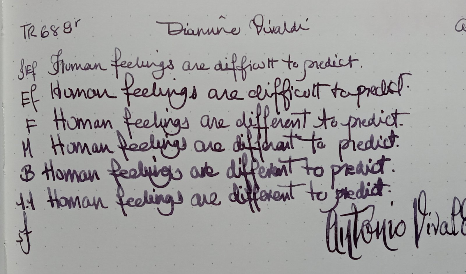
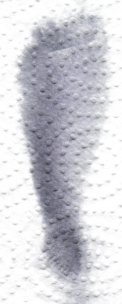
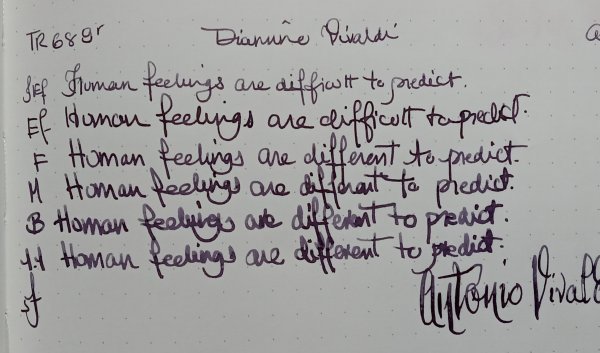
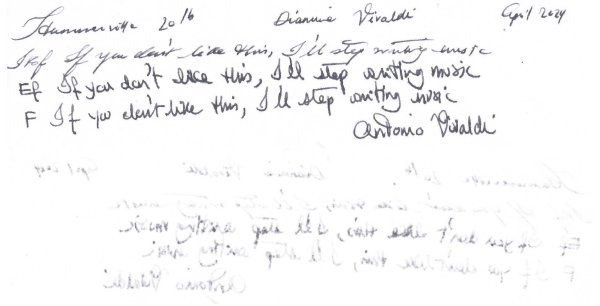
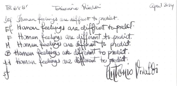
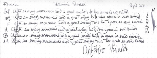
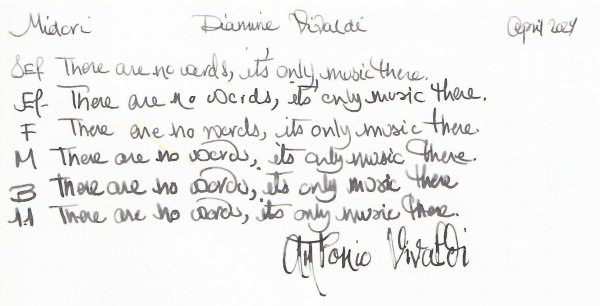
Diamine Vivaldi Thanks for @Lithium466 for the sample. This review is in three parts: Feel free to jump to your preferred part. In a nutshell: a gorgeous dark purple, which is almost black with EF nibs. It doesn’t appreciate cheap paper. It’s wet, well lubricated. It’s Diamine. Chroma: What’s in a name? I’m confused by the Diamine Music set. It’s composed of 3 baroque composers: Bach, Vivaldi and Handel. 2 Classical era composers: Mozart and Beethoven. (Cancelling Poor Haydn) And 5 romantics. Schubert and Chopin, Wagner, Tchaikovsky and Strauss. Though technically you can argue that Schubert is early romantic, and Tchaikovsky late romantic. And then there is Strauss which I’m assuming it's Richard and not one of the Johann's . I don’t understand the logic behind the names. Diamine could have chosen some fabulous English composers, granted they would be mostly renaissance, baroque, and then jump to early 20th century, Byrd, Tallis, Dowland, Hume, Purcell, Sullivan, Elgar, Delius, William, Britten etc.. Or they could have chosen one composer per European country. This is just a mishmash of composers, with no rhyme or reason. Vivaldi’s micro bio and music (1678 - 1741) Now a bit about Antonio Vivaldi. Vivaldi is one of the pillars of the Baroque era and codified the concerto form. He was the musical director of Ospedale della Pietà an orphanage. He was admired by Bach who transposed some of his concertos for Harpsichord, died in poverty and his work was promptly forgotten until the early 20th century, until his work was re-discovered. He composed some 500 concertos about 50 odds opera, religious music etc. His nicknamed was il Prete Rosso, the Red Priest. (He was ordained a priest) The Four Seasons his most famous fiery tempo, dynamics contrasts with the colour of the ink: Or his lovely Lovely lute or Mandolin concertos. Here is the slow movement of his Lute Concerto RV 93. Or If you’re an opera fan, and have 3 hours or such to spend you can try his opera Orlando furioso, don't ask me the story, it's a medieval fantasy story Ink review: Now for the ink, again I don’t understand why would any one would choose this dark purple for Vivaldi, who's nicknamed the Red Priest, thanks to his reddish hair, and his passionate music. This one is not an ink for a Vivaldi over. Writing Samples: I used a Pilot F3A for the Japanese Ef and is it semi-flexible, I flexed it at the end to give you an idea of "flex". Photo: Comparison: Water test: Decent water resistance. and finally An art work. I had a bit of difficulty. While I appreciate his music, he's not one of my favourites composers. 😛 Anyway here's is one of Vivaldi's cats playing one of his concertos on an imaginary gondola I used a bit of of Octopus Grey Merkat and the brownish ink was created by mixing the purple with De Atramentis Artist Orange: · Pens used: Pilot F3A (JEf /Semiflex)Lamy (EF/F/M/B, BB) · What I liked: Colour, Doing washes. · What I did not like: Name didn’t correspond to the fieriness of composer nor his music · What some might not like: It doesn’t like copy paper. · Shading: Only with wide nib. · Ghosting: Yes, on cheap paper. · Bleed through: Yes, on cheap paper. · Flow Rate: Wet · Lubrication: Well lubricated. · Nib Dry-out: Did not notice. · Start-up: Ok · Saturation: Dark · Shading Potential: Not so much. · Sheen: No. · Spread / Feathering / Woolly Line: Did not notice. · Nib Creep / “Crud”: Did not notice. · Staining (pen): Did not notice. · Clogging: Did not notice. · Cleaning: Easy. Though as a purple ink it might stain · Water resistance: Not bad. · Availability: 30 ml bottles. Please don't hesitate to share your experience, writing samples or any other comments. The more the merrier
-

Need Handwriting suggestions. Thanks everyone.
kealani replied to kealani's topic in Handwriting & Handwriting Improvement
lightbulb moment.... huge thanks k -
@InesF https://www.kleinanzeigen.de/s-anzeige/neusiedler-japan-post-druckpapier-x3/2725339471-225-6818 Try this one... seems to be from this year.
-

Critiques On My Handwriting?
Duffy replied to Irelaand's topic in Handwriting & Handwriting Improvement
Hi again. Another thing that springs to mind which might seem obvious but which in my opinion is crucial, is to write slowly and deliberately when practicing your letters. Then check them against the guide example and correct if necessary. Then rinse and repeat !! 😉 It takes a lot of time and patience to acquire the muscle memory for consistency. If you check one of my threads there is a sample of my writing where you can see where I drew in the slant lines myself. -
while I wondered
-
I wish there was a plan D. 😊


-
Forum Statistics
352.3k
Total Topics4.6m
Total Posts -
Member Statistics
125,518
Total Members2,359
Most Online Newest Member
clint1
Joined -
Images
-
Albums
-
March- April -2024
- By yazeh,
- 0
- 0
- 52
-
Misfit’s 4th album of Pens etc
- By Misfit,
- 99
-
Mercian’s Miscellany
- By Mercian,
- 0
- 14
- 22
-
Sample Inkventory
- By Penguincollector,
- 0
- 0
- 10
-
gweimer1 gallery
- By gweimer1,
- 0
- 0
- 2
-


-
Topics
-
-
Upcoming Events
-
-
Blog Comments
-

By Shanghai Knife Dude · Posted
I have the Sailor Naginata and some fancy blade nibs coming after 2022 by a number of new workshop from China. With all my respect, IMHO, they are all (bleep) in doing chinese characters. Go use a bush, or at least a bush pen. -
desaturated.thumb.gif.5cb70ef1e977aa313d11eea3616aba7d.gif)
By A Smug Dill · Posted
It is the reason why I'm so keen on the idea of a personal library — of pens, nibs, inks, paper products, etc. — and spent so much money, as well as time and effort, to “build” it for myself (because I can't simply remember everything, especially as I'm getting older fast) and my wife, so that we can “know”; and, instead of just disposing of what displeased us, or even just not good enough to be “given the time of day” against competition from >500 other pens and >500 other inks for our at -

By adamselene · Posted
Agreed. And I think it’s good to be aware of this early on and think about at the point of buying rather than rationalizing a purchase.. -
By A Smug Dill · Posted
Alas, one cannot know “good” without some idea of “bad” against which to contrast; and, as one of my former bosses (back when I was in my twenties) used to say, “on the scale of good to bad…”, it's a spectrum, not a dichotomy. Whereas subjectively acceptable (or tolerable) and unacceptable may well be a dichotomy to someone, and finding whether the threshold or cusp between them lies takes experiencing many degrees of less-than-ideal, especially if the decision is somehow influenced by factors o -
By adamselene · Posted
I got my first real fountain pen on my 60th birthday and many hundreds of pens later I’ve often thought of what I should’ve known in the beginning. I have many pens, the majority of which have some objectionable feature. If they are too delicate, or can’t be posted, or they are too precious to face losing , still they are users, but only in very limited environments.. I have a big disliking for pens that have the cap jump into the air and fly off. I object to Pens that dry out, or leave blobs o
-
-